
Chapter 17. Animation
WPF’s animation functionality makes it very straightforward to add dynamic effects to applications or components. It’s also one of the most obvious features in WPF to abuse! But rather than worry about a future of applications filled with bouncing Buttons and spinning Menus, think instead of all the ways in which animation can be put to good use. Subtle animations are used very effectively throughout Windows and Windows Store apps. With the features in this chapter, desktop apps can easily achieve the same effects. Sure, animation might not be appropriate for every piece of software, but many can benefit from its judicious use.
When exposed via design tools such as Blend, WPF’s animation support provides an experience reminiscent of Adobe Flash. But because it’s a core part of the WPF platform, with APIs that are fairly simple, you can easily create a wide range of animations without the help of such a tool. Indeed, this chapter demonstrates several different animation techniques with nothing more than short snippets of C# or XAML.
This chapter begins by examining WPF’s animation classes and their use from procedural code. After that, we’ll look at how to use the same classes from XAML, which involves a few additional concepts. After covering both approaches, the chapter examines more powerful forms of animation that use keyframes and/or easing functions. Finally, we’ll take a deeper look at how animations work with the Visual State Manager.
Animations in Procedural Code
When most people think about animation, they think of a cartoon-like mechanism, where movement is simulated by displaying images in rapid succession. In WPF, animation has a more specific definition: varying the value of a property over time. This could be related to motion, such as making an element grow by increasing its Width, or it could be something like varying the value of a color.
Such animation can be accomplished without the special support discussed in this chapter, and even without much work—thanks to WPF’s retained-mode graphics model. This section begins by examining the options for performing this work manually. It then introduces WPF’s many classes that can do almost all the animation work for you.
Performing Animation “By Hand”
The classic way to implement such an animation scheme is to set up a timer and a callback function that is periodically called back based on the frequency of the timer. Inside the callback function, you can manually update the target property (doing a little math to determine the current value based on the elapsed time) until it reaches the final value. At that point, you can stop the timer and/or remove the event handler.
Of course, nothing is stopping you from following this classic approach in WPF. WPF even has its own DispatcherTimer class that can be used for implementing such a scheme. You get to choose DispatcherTimer’s frequency by setting its Interval property, and you can attach an event handler to its Tick event.
Although this approach may be familiar to Windows programmers, performing animation with a timer is not recommended. The timers are not in sync with the monitor’s vertical refresh rate, nor are they in sync with the WPF rendering engine.
Instead of implementing custom timer-based animation, you could perform custom frame-based animation by attaching an event handler to the static Rendering event on System.Windows.Media.CompositionTarget. Rather than being raised at a customizable interval, this event is raised post-layout and pre-render once per frame. (This is like using enterFrame when developing Adobe Flash animations, and was used in the two examples at the end of the preceding chapter.)
Using the frame-based Rendering event is not only preferred over a timer-based approach, it’s even preferred over the animation classes that are the focus of this chapter when dealing with hundreds of objects that require high-fidelity animations. For example, collision detection or other physics-based animations should be done using this approach. Animations that morph a panel’s elements from one layout to another are also usually implemented using this approach. The Rendering event generally gives the best performance and the most customizations (because you can write arbitrary code in the event handler), although there are tradeoffs. In normal conditions, WPF renders frames only when part of the user interface is invalidated. But as long as any event handler is attached to Rendering, WPF renders frames continuously. Therefore, using Rendering is best for short-lived animations.
Introducing the Animation Classes
Although using the CompositionTarget.Rendering event is a reasonable way to implement animations, the designers of WPF wanted animation to be a simpler and more declarative process. So, WPF has many classes in the System.Windows.Media.Animation namespace that enable you to describe and apply an animation without doing manual work to perform it. These classes are extremely useful when you know how you want your animation to behave for large amounts of time in advance.
There are two important aspects to these animation classes:
 They can only vary the value of a dependency property. So, the definition of WPF animation is slightly more constrained than previously stated, unless you use one of the manual approaches with
 DispatcherTimer or the Rendering event.
They enable animations that are “time resolution independent.” Similar in spirit to the resolution independence of WPF’s graphics, animations using the WPF animation classes do not speed up as hardware gets faster; they simply get smoother! WPF can vary the frame rate based on a variety of conditions, and you as the animation developer don’t need to care.
System.Windows.Media.Animation contains many similar-looking animation classes because distinct data types are animated with a distinct animation class. For example, if you wanted to vary the value of an element’s double dependency property over time, you could use an instance of DoubleAnimation. If you instead wanted to vary the value of an element’s Thickness dependency property over time, you could use an instance of ThicknessAnimation. WPF contains built-in animation classes for 22 different data types, listed in Table 17.1.

Digging Deeper: Animation Classes and the Lack of Generics
The System.Windows.Media.Animation namespace has the following classes:
22 XXXAnimationBase classes
17 XXXAnimation classes
22 XXXAnimationUsingKeyFrames classes
22 XXXKeyFrameCollection classes
22 DiscreteXXXKeyFrame classes
17 LinearXXXKeyFrame classes
17 SplineXXXKeyFrame classes
17 EasingXXXKeyFrame classes
3 XXXAnimationUsingPath classes
(XXX represents a data type from Table 17.1.)
The classes within each of these 10 buckets are almost identical to each other, so 10 basic concepts have been exploded into a whopping 181 classes! When people familiar with .NET come across this design, the first reaction is often, “Why didn’t the WPF team use generics?” In other words, why isn’t there a single Animation<T> class that enables double to be animated with Animation<double>, Thickness to be animated with an Animation<Thickness>, and so on?
One obvious (but not very satisfactory) reason is the lack of complete support for generics in XAML prior to XAML2009. But even if generics were completely supported, there are aspects of these classes that make them a bad fit for generics. For example, the presence of an Animation<T> class implies that you could construct it with any data type, such as Animation<Window>. But there is no support for such an animation, nor is there a constraint that can be placed on the generic class that would sufficiently express what it supports.
Using an Animation
To understand how the animation classes work, let’s look at the double data type. Animating a double is not only easy to understand, but it’s a very common scenario because of the number of useful double dependency properties on many elements.
Imagine that we want a Button’s Width property to grow from 50 to 100. For demonstration purposes, we can place the Button inside a simple Window with a Canvas:
<Window x:Class="Window1" Title="Animation" Width="300" Height="300"
xmlns="http://schemas.microsoft.com/winfx/2006/xaml/presentation"
xmlns:x="http://schemas.microsoft.com/winfx/2006/xaml">
<Canvas>
<Button x:Name="b">OK</Button>
</Canvas>
</Window>
In the code-behind file, we can use DoubleAnimation to very simply express the concept of animating Width from 50 to 100:
using System.Windows;
using System.Windows.Controls;
using System.Windows.Media.Animation;
public partial class Window1 : Window
{
public Window1()
{
InitializeComponent();
// Define the animation
DoubleAnimation a = new DoubleAnimation();
a.From = 50;
a.To = 100;
// Start animating
b.BeginAnimation(Button.WidthProperty, a);
}
}
The instance of DoubleAnimation contains the initial and end values for a double property—any double property. The Button’s BeginAnimation method is then called to associate the animation with its Width dependency property and to initiate the animation at the point in time. If you were to compile and run this code, you would see the width of the Button smoothly grow from 50 to 100 over the course of 1 second.
Animation classes have a number of properties in addition to From and To that you can use to customize their behavior in interesting ways. We’ll be examining these properties throughout this section. Animation classes also have a handful of simple events, such as a Completed event that gets raised as soon the target property reaches its final value.
Linear Interpolation
It’s important to note that DoubleAnimation takes care of smoothly changing the double value over time via linear interpolation. (Otherwise, the animation would appear to be no different than a simple property set!) In other words, for this 1-second animation, the value of Width is 55 when 0.1 seconds have elapsed (5% progress in both the value and time elapsed), 75 when 0.5 seconds have elapsed (50% progress in both the value and time elapsed), and so on. Internally, there is a function being called at regular intervals performing the calculations that you would have to do if performing an animation the “raw” way. This is why most of the data types in Table 17.1 are numeric. (The nonnumeric data types, such as Boolean and String, are explained further later in this chapter.)
Figuring out how to apply an animation to get the desired results can take a little practice. Here are some examples:
If you want to make an element fade in, it doesn’t make sense to animate its Visibility property because there’s no middle ground between Hidden and Visible. Instead, you should animate its Opacity property of type double from 0 to 1.
If you want an element inside a Grid to slide across the screen, you could animate its Grid.Column attached property with an Int32Animation, but the transition from column to column would be choppy. Instead, you could give the element a TranslateTransform as a RenderTransform and then animate its X property (of type double) with a DoubleAnimation.
Animating the Width of a Grid’s column (which is useful for the “Creating a Visual Studio–Like Collapsible, Dockable, Resizable Pane” example at the end of Chapter 5, “Layout with Panels”) is not straightforward because ColumnDefinition.Width is defined as a GridLength structure, which has no corresponding animation class built in. Instead, you could animate ColumnDefinition’s MinWidth and/or MaxWidth properties, both of type double, or you could set ColumnDefinition’s Width to Auto and then insert an element in that column whose Width you animate.
Reusing Animations
The preceding code attached the animation to the Button with a BeginAnimation call. You can call BeginAnimation multiple times to apply exactly the same animation to multiple elements or even multiple properties of the same element. For example, adding the following line of code to the preceding code-behind animates the Height of the Window in sync with the Button’s Width:
this.BeginAnimation(Window.HeightProperty, a);
The result of this addition is shown in Figure 17.1. (Before you sneer at the thought of a Window that grows, keep in mind that there could actually be legitimate uses for such a mechanism. For example, you might want to enlarge a dialog when the user expands an inner Expander, and a simple animation is more visually pleasing than an abrupt jump to the new size.)

FIGURE 17.1 The same DoubleAnimation makes both the Button’s Width and the Window’s Height grow from 50 to 100.
Controlling Duration
The simple DoubleAnimation used thus far has the default duration of 1 second, but you can change the duration of an animation by setting its Duration property:
DoubleAnimation a = new DoubleAnimation();
a.From = 50;
a.To = 100;
a.Duration = new Duration(TimeSpan.Parse("0:0:5"));
This makes the animation from Figure 17.1 take 5 seconds rather than one. The typical way to construct a Duration instance is with a standard TimeSpan object, which is a part of the .NET Framework that predates WPF. By using the static TimeSpan.Parse method, you can specify the length of time with a string in the format days.hours:minutes:seconds.fraction.
Warning: Be careful when specifying the length of a Duration or TimeSpan as a string!
TimeSpan.Parse, which is also used by a type converter for Duration for the benefit of XAML, accepts shortcuts in its syntax so you don’t need to specify every piece of days.hours:minutes:seconds.fraction. However, the behavior is not what you might expect. The string "2" means 2 days, not 2 seconds! The string "0:2" means 2 minutes. Given that most animations are no more than a few seconds long, the typical syntax used is hours:minutes:seconds or hours:minutes:seconds.fraction. So, 2 seconds can be expressed as "0:0:2", and half a second can be expressed as "0:0:0.5" or "0:0:.5".
Flexibility with From and To
Right before the animation used in Figure 17.1 changes the Button’s Width and the Window’s Height from 50 to 100, these properties must jump from their natural values to 50. This isn’t noticeable for animations that begin as soon as the Window is shown. But if you were to call BeginAnimation in response to an event, the “jump” effect would be jarring.
You could fix this by setting To to the current Width/Height instead of 50, but doing so would require splitting the animation into two distinct objects—one that animates from the Button’s ActualWidth to 100 and another that animates from the Window’s ActualHeight to 100. Fortunately, there’s an alternative. Specifying the From field of the animation can be optional. If you omit it, the animation begins with the current value of the target property, whatever that might be. For example, you might try to update the previous animation as follows:
DoubleAnimation a = new DoubleAnimation();
// Comment out: a.From = 50;
a.To = 100;
a.Duration = new Duration(TimeSpan.Parse("0:0:5"));
You might expect this to animate the Button’s Width from its default value (just wide enough to fit the "OK" content, with a little padding) to 100 over the course of 5 seconds. Instead, this produces an AnimationException that provides the following explanation in its inner exception:
'System.Windows.Media.Animation.DoubleAnimation' cannot use default origin value
of 'NaN'.
Because Width is unset, it has a value of NaN. And the animation can’t interpolate any values between NaN and 100! Furthermore, applying the animation to ActualWidth (which is set to the true width rather than NaN) instead of Width isn’t an option because it’s read-only and it’s not a dependency property. Instead, you must explicitly set the Width of the target Button somewhere for the preceding animation to work. Here’s an example:
<!-- Now the animation can grow the Button without a From value: -->
<Button x:Name="b" Width="20">OK</Button>
The Window from Figure 17.1 works with the From-less animation as is because its Height is already set to 300. But note that the same animation now grows the Button’s Width from 20 to 100 yet shrinks the Window’s Height from 300 to 100! Similarly, if you set the Button’s Width to a value larger than 100, the animation would shrink its Width to 100.
Tip
Omitting an explicit From setting is important for getting smooth animations, especially when an animation is initiated in response to a repeatable user action. For example, if the animation to grow a Button’s Width from 50 to 100 is started whenever the Button is clicked, rapid clicks would make the Width jump back to 50 each time. By omitting From, however, subsequent clicks make the animation continue from its current animated value, keeping the visual smoothness of the effect. Similarly, if you have an element grow on MouseEnter and shrink on MouseLeave, omitting From on both animations prevents the size of the element from jumping if the mouse pointer leaves the element before it’s done growing or if it reenters before it’s done shrinking.
In fact, specifying the To field can also be optional! If the following animation is applied to the preceding Button, its Width changes from 50 to 20 (its explicitly marked Width) over the course of 5 seconds:
DoubleAnimation a = new DoubleAnimation();
a.From = 50;
// Comment out: a.To = 100;
a.Duration = new Duration(TimeSpan.Parse("0:0:5"));
Each animation class also has a By field that can be set instead of the To field. The following animation means “animate the value by 100 (to 150)” instead of “animate the value to 100”:
DoubleAnimation a = new DoubleAnimation();
a.From = 50;
a.By = 100; // Equivalent to a.To = 50 + 100;
Using By without From is a flexible way to express “animate the value from its current value to 100 units larger”:
DoubleAnimation a = new DoubleAnimation();
a.By = 100; // Equivalent to a.To = currentValue + 100;
Negative values are supported for shrinking the current value:
DoubleAnimation a = new DoubleAnimation();
a.By = -100; // Equivalent to a.To = currentValue - 100;
Simple Animation Tweaks
You’ve seen the core properties of animation classes: From, To, Duration, and By. But there are a lot more properties that can alter an animation’s behavior in more interesting ways.
As with the By property, some of these properties might look like silly tricks that could easily be accomplished manually with a little bit of code. That is true, but the main point of all these properties is to enable a lot of these easy-to-code tweaks purely from XAML.
BeginTime
If you don’t want an animation to begin immediately when you call BeginAnimation, you can insert a delay by setting BeginTime to an instance of a TimeSpan:
DoubleAnimation a = new DoubleAnimation();
// Delay the animation by 5 seconds:
a.BeginTime = TimeSpan.Parse("0:0:5");
a.From = 50;
a.To = 100;
a.Duration = new Duration(TimeSpan.Parse("0:0:5"));
Besides being potentially useful in isolation, BeginTime can be useful for specifying a sequence of animations that start one after the other. You can even set BeginTime to a negative value:
DoubleAnimation a = new DoubleAnimation();
// Start the animation half-way through:
a.BeginTime = TimeSpan.Parse("-0:0:2.5");
a.From = 50;
a.To = 100;
a.Duration = new Duration(TimeSpan.Parse("0:0:5"));
This starts the animation immediately, but at 2.5 seconds into the timeline (as if the animation really started 2.5 seconds previously). Therefore, the preceding animation is equivalent to one with From set to 75, To set to 100, and Duration set to 2.5 seconds.
Tip
The code in this section uses TimeSpan.Parse because it supports the same syntax used by TimeSpan’s type converter (and therefore the same syntax used in XAML). Procedural code can benefit by using other TimeSpan methods, however, such as its static FromSeconds or FromMilliseconds methods.
Note that BeginTime is of type Nullable<TimeSpan> rather than Duration because the extra expressiveness of Duration is not needed. (It would be nonsensical to set a BeginTime of Forever!)
SpeedRatio
The SpeedRatio property is a multiplier applied to Duration. It’s set to 1 by default, but you can set it to any double value greater than 0:
DoubleAnimation a = new DoubleAnimation();
a.BeginTime = TimeSpan.Parse("0:0:5");
// Make the animation twice as fast:
a.SpeedRatio = 2;
a.From = 50;
a.To = 100;
a.Duration = new Duration(TimeSpan.Parse("0:0:5"));
A value less than 1 slows down the animation, and a value greater than 1 speeds it up. SpeedRatio does not affect BeginTime; the preceding animation still has a 5-second delay, but the transition from 50 to 100 takes only 2.5 seconds rather than 5.
AutoReverse
If AutoReverse is set to true, the animation “plays backward” as soon as it completes. The reversal takes the same amount of time as the forward progress. For example, the following animation makes the value go from 50 to 100 in the first 5 seconds, then from 100 back to 50 over the course of 5 more seconds:
DoubleAnimation a = new DoubleAnimation();
a.AutoReverse = true;
a.From = 50;
a.To = 100;
a.Duration = new Duration(TimeSpan.Parse("0:0:5"));
SpeedRatio affects the speed of both the forward animation and backward animation. Therefore, giving the preceding animation a SpeedRatio of 2 would make the entire animation run for 5 seconds and giving it a SpeedRatio of 0.5 would make it run for 20 seconds. Note that any delay specified via BeginTime does not delay the reversal; it always happens immediately after the normal part of the animation completes.
RepeatBehavior
By setting RepeatBehavior, you can accomplish one of three different behaviors:
Making the animation repeat itself a certain number of times, regardless of its duration
Making the animation repeat itself until a certain amount of time has elapsed
Cutting off the animation early
To repeat an animation a certain number of times, you can set RepeatBehavior to an instance of a RepeatBehavior class constructed with a double value:
DoubleAnimation a = new DoubleAnimation();
// Perform the animation twice in a row:
a.RepeatBehavior = new RepeatBehavior(2);
a.AutoReverse = true;
a.From = 50;
a.To = 100;
a.Duration = new Duration(TimeSpan.Parse("0:0:5"));
If AutoReverse is true, the reversal is repeated as well. So, the preceding animation goes from 50 to 100 to 50 to 100 to 50 over the course of 20 seconds. If BeginTime is set to introduce a delay, that delay is not repeated. Because RepeatBehavior can be initialized with a double, you can even repeat by a fractional amount.
To repeat the animation until a certain amount of time has elapsed, you can construct RepeatBehavior with a TimeSpan instead of a double. The following animation is equivalent to the preceding one:
DoubleAnimation a = new DoubleAnimation();
// Perform the animation twice in a row:
a.RepeatBehavior = new RepeatBehavior(TimeSpan.Parse("0:0:20"));
a.AutoReverse = true;
a.From = 50;
a.To = 100;
a.Duration = new Duration(TimeSpan.Parse("0:0:5"));
Twenty seconds is needed to make the animation complete two full cycles because AutoReverse is set to true. Note that the TimeSpan-based RepeatBehavior is not scaled by SpeedRatio; if you set SpeedRatio to 2 in the preceding animation, it performs the full cycle four times rather than two.
Tip
You can make an animation repeat indefinitely by setting RepeatBehavior to the static RepeatBehavior.Forever field:
a.RepeatBehavior = RepeatBehavior.Forever;
To use RepeatBehavior as a way to cut off an animation early, you simply construct it with a TimeSpan value shorter than the natural duration. The following animation makes the value go from 50 to 75 over the course of 2.5 seconds:
DoubleAnimation a = new DoubleAnimation();
// Stop the animation halfway through:
a.RepeatBehavior = new RepeatBehavior(TimeSpan.Parse("0:0:2.5"));
a.From = 50;
a.To = 100;
a.Duration = new Duration(TimeSpan.Parse("0:0:5"));
Digging Deeper: The Total Timeline Length of an Animation
With all the different adjustments that can be made to an animation by using properties such as BeginTime, SpeedRatio, AutoReverse, and RepeatBehavior, it can be hard to keep track of how long it will take an animation to finish after it is initiated. Its Duration value certainly isn’t adequate for describing the true length of time! Instead, the following formula describes an animation’s true duration:
This applies if RepeatBehavior is specified as a double value (or left as its default value of 1). If RepeatBehavior is specified as a TimeSpan, the total timeline length is simply the value of RepeatBehavior plus the value of BeginTime.
AccelerationRatio, DecelerationRatio, and EasingFunction
By default, animations update the target value in a linear fashion. When an animation is 25% done, the value is 25% of the way toward the final value, and so on. By changing the values of AccelerationRatio and DecelerationRatio, however, you can easily make the interpolation nonlinear. This has been a popular technique for causing elements to “spring” to the final value, making the animation more lifelike.
Both properties can be set to a double value from 0 to 1 (with 0 being their default value). The AccelerationRatio value represents the percentage of time that the target value should accelerate from being stationary. Similarly, the DecelerationRatio value represents the percentage of time that the target value should decelerate to being stationary. Therefore, the sum of both properties must be less than or equal to one (100%).
Figure 17.2 illustrates what various values of AccelerationRatio and DecelerationRatio mean in practice.
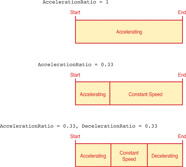
FIGURE 17.2 The effects of AccelerationRatio and DecelerationRatio as the value changes from start to end.
Starting with WPF 4.0, animations also have an EasingFunction property that can be set to any object implementing the IEasingFunction interface. Such objects can control the rate of acceleration and deceleration in arbitrarily complex ways. WPF ships with 11 objects that implement IEasingFunction, and writing your own is easy (if you know how to do the math that gives you the desired effect). See the “Easing Functions” section, later in this chapter, for more information.
IsAdditive and IsCumulative
You can set IsAdditive to true to implicitly add the target property’s current value (post-animation) to the animation’s From and To properties. This doesn’t affect repeating an animation with RepeatBehavior but rather applies to manually repeating an animation at some later point in time. In essence, this makes an animation operate on a dependency property’s post-animation value rather than continue to operate on its pre-animation value.
IsCumulative is similar to IsAdditive, except that it works with RepeatBehavior (and only works with RepeatBehavior). For example, if you use RepeatBehavior to repeat an animation from 50 to 100 three times, the default behavior is to see the value go from 50 to 100, jump back to 50 then go to 100, and then jump back to 50 one last time before ending at 100. With IsCumulative set to true, the animation instead smoothly changes the value from 50 to 200 over the same amount of time. If you take that same animation and set AutoReverse to true, you’ll see the value go from 50 to 100 to 50, then jump to 100 and go from 100 to 150 to 100, then jump to 150 and go from 150 to 200 to 150.
FillBehavior
By default, when an animation completes, the target property remains at the final animated value unless some other mechanism later changes the value. This is typically the desired behavior, but if you want the property to jump back to its pre-animated value after the animation completes, you can set FillBehavior to Stop (rather than its default value of HoldEnd).
Animations in XAML
Given that animation classes consist of a bunch of useful properties, it’s easy to imagine defining one in XAML. Here’s an example:
<DoubleAnimation From="50" To="100" Duration="0:0:5" AutoReverse="True"/>
But where do you place such an object? One option is to define it as a resource, so that you can retrieve it from procedural code and call BeginAnimation at the right time. You could even adjust properties on the animation to get different effects as conditions in the application change.
But, unsurprisingly, WPF supports initiating animations purely in XAML. The key to this support lies in the Visual State Manager as well as triggers, with their ability to contain more than just Setters but also actions.
All three types of triggers can contain actions, but this chapter focuses on event triggers because actions are the only things they can contain. Visual State Manager is covered at the end of the chapter.
EventTriggers Containing Storyboards
As mentioned in Chapter 3, “WPF Fundamentals,” an event trigger (represented by the EventTrigger class) is activated when a routed event is raised. The event is specified by the trigger’s RoutedEvent property, and it can contain one or more actions (objects deriving from the abstract TriggerAction class) in its Actions collection. Animation classes such as DoubleAnimation are not actions themselves, so you can’t add them directly to an EventTrigger’s Actions collection. Instead, animations are placed inside an object known as a Storyboard, which is wrapped in an action called BeginStoryboard.
Therefore, placing the preceding DoubleAnimation inside an event trigger that is activated when a Button is clicked can look as follows:
<Button>
OK
<Button.Triggers>
<EventTrigger RoutedEvent="Button.Click">
<EventTrigger.Actions>
<BeginStoryboard>
<Storyboard TargetProperty="Width">
<DoubleAnimation From="50" To="100"
Duration="0:0:5" AutoReverse="True"/>
</Storyboard>
</BeginStoryboard>
</EventTrigger.Actions>
</EventTrigger>
</Button.Triggers>
</Button>
These two extra objects fill the two roles that BeginAnimation plays in procedural code: Storyboard specifies the dependency property that the animation operates on with TargetProperty, and BeginStoryboard specifies when the animation begins by attaching the Storyboard to the trigger.
Tip
An animation can’t be initiated in XAML unless it is placed inside a Storyboard.
The BeginStoryboard object might feel superfluous, but WPF ships with other TriggerAction-derived classes. One action is for playing sounds (covered in the next chapter), and several other actions work in concert with BeginStoryboard to declaratively pause a storyboard, seek it, stop it, and so on. (These are called PauseStoryboard, SeekStoryboard, and so on.)
Specifying the Target Property
In the preceding XAML, Storyboard’s TargetProperty property is set to the name of a property (Width) directly on the target object. But TargetProperty’s type is PropertyPath, which supports more complicated expressions (as seen in previous chapters), such as a property with a chain of subproperties.
The following Button has a LinearGradientBrush with three GradientStops as the Background. It uses a ColorAnimation to make the middle Color repeatedly animate from black to white and back. (The idea of animating a Color might sound strange, but internally it has floating-point values representing the ScA, ScR, ScB, and ScG components, so ColorAnimation can interpolate those values much like DoubleAnimation does for its single value.) To animate the middle Color of the LinearGradientBrush, the Storyboard must have a complex TargetProperty expression:
<Button Padding="30">
OK
<Button.Background>
<LinearGradientBrush>
<GradientStop Color="Blue" Offset="0"/>
<GradientStop Color="Black" Offset="0.5"/>
<GradientStop Color="Blue" Offset="1"/>
</LinearGradientBrush>
</Button.Background>
<Button.Triggers>
<EventTrigger RoutedEvent="Button.Loaded">
<EventTrigger.Actions>
<BeginStoryboard>
<Storyboard TargetProperty="Background.GradientStops[1].Color">
<ColorAnimation From="Black" To="White" Duration="0:0:2"
AutoReverse="True" RepeatBehavior="Forever"/>
</Storyboard>
</BeginStoryboard>
</EventTrigger.Actions>
</EventTrigger>
</Button.Triggers>
</Button>
The syntax for TargetProperty mimics what you would have to type to access the property in C#, although without casting. This Storyboard assumes that the Button’s Background is set to some object with a GradientStops property that can be indexed, assumes that it has at least two items, and assumes that the second item has a Color property of type Color. If any of these assumptions is incorrect, the animation fails. Of course, in this case these are all correct assumptions, so the Button successfully animates, as shown in Figure 17.3.

Similarly, you could attach a DoubleAnimation to a TargetProperty of Background.GradientStops[1].Offset and give the Brush an animated gleam by making the highlight move from 0 to 1. If you want to animate both Color and Offset in response to the same Loaded event, you can add two BeginStoryboard actions to the trigger as follows:
<EventTrigger RoutedEvent="Button.Loaded">
<EventTrigger.Actions>
<BeginStoryboard>
<Storyboard TargetProperty="Background.GradientStops[1].Color">
<ColorAnimation From="Black" To="White" Duration="0:0:2"
AutoReverse="True" RepeatBehavior="Forever"/>
</Storyboard>
</BeginStoryboard>
<BeginStoryboard>
<Storyboard TargetProperty="Background.GradientStops[1].Offset">
<DoubleAnimation From="0" To="1" Duration="0:0:2"
AutoReverse="True" RepeatBehavior="Forever"/>
</Storyboard>
</BeginStoryboard>
</EventTrigger.Actions>
</EventTrigger>
Fortunately, WPF provides a mechanism for animating different properties within the same Storyboard. First of all, a Storyboard can contain multiple animations. Storyboard’s content property is Children, a collection of Timeline objects (a base class of all animation classes). Second, the TargetProperty property is not only a normal dependency property but also an attached property that can be applied to Storyboard’s children! Therefore, the previous XAML could be rewritten as follows:
<EventTrigger RoutedEvent="Button.Loaded">
<EventTrigger.Actions>
<BeginStoryboard>
<Storyboard>
<ColorAnimation From="Black" To="White" Duration="0:0:2"
Storyboard.TargetProperty="Background.GradientStops[1].Color"
AutoReverse="True" RepeatBehavior="Forever"/>
<DoubleAnimation From="0" To="1" Duration="0:0:2"
Storyboard.TargetProperty="Background.GradientStops[1].Offset"
AutoReverse="True" RepeatBehavior="Forever"/>
</Storyboard>
</BeginStoryboard>
</EventTrigger.Actions>
</EventTrigger>
This single Storyboard contains two animations, with each one targeting a different property on the target object. Both animations start simultaneously, but if you want a storyboard to contain animations that begin at different times, you can simply give each animation a different BeginTime value.
Specifying the Target Object
In the Storyboards shown so far, the target object containing the target property has been implicit. By default, it’s the object containing the triggers or, in the case of a Style, the templated parent. But you can specify a different target object by using Storyboard’s TargetName property. And just like TargetProperty, TargetName can be applied directly to a Storyboard or to individual children as an attached property.
Here’s a fun example using TargetName that morphs one picture to another by animating the opacity of the second picture that sits on top of the first:
<Grid xmlns="http://schemas.microsoft.com/winfx/2006/xaml/presentation">
<Grid.Triggers>
<EventTrigger RoutedEvent="Grid.Loaded">
<BeginStoryboard>
<Storyboard TargetName="jim2" TargetProperty="Opacity">
<DoubleAnimation From="1" To="0" Duration="0:0:4"
AutoReverse="True" RepeatBehavior="Forever"/>
</Storyboard>
</BeginStoryboard>
</EventTrigger>
</Grid.Triggers>
<Image Name="jim1" Source="jim1.gif"/>
<Image Name="jim2" Source="jim2.gif"/>
</Grid>
Jim, the subject of these photos, shaved his impressive beard and got a long-overdue haircut, but he took before and after photos that are eerily similar. The result of this animation is shown in Figure 17.4.
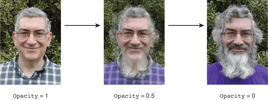
In this example, the use of TargetName is a little contrived because the event trigger could have been placed directly on jim2 rather than the parent Grid. But in larger examples (for example, a slide show of Images), it can be desirable to accumulate animations in a single location with a single event trigger, perhaps even with a single Storyboard, by using TargetName as an attached property on each animation.
EventTriggers Inside a Style
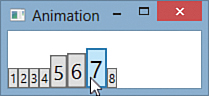
Although each XAML snippet in this section adds an event trigger directly to elements, it’s more common to see event triggers used inside a Style. Listing 17.1 applies a Style with built-in animations to eight Buttons in a StackPanel. The animations make each Button grow to twice their size on MouseEnter and shrink back to normal size on MouseLeave, resulting in a simplified version of a “fisheye” effect. Figure 17.5 shows the result.
LISTING 17.1 Styling Buttons with Built-In Animations
<Window xmlns="http://schemas.microsoft.com/winfx/2006/xaml/presentation"
xmlns:x="http://schemas.microsoft.com/winfx/2006/xaml"
Title="Animation">
<Window.Resources>
<Style TargetType="{x:Type Button}">
<Setter Property="VerticalAlignment" Value="Bottom"/>
<Setter Property="LayoutTransform">
<Setter.Value>
<ScaleTransform/>
</Setter.Value>
</Setter>
<Style.Triggers>
<EventTrigger RoutedEvent="Button.MouseEnter">
<EventTrigger.Actions>
<BeginStoryboard>
<Storyboard>
<DoubleAnimation Storyboard.TargetProperty="LayoutTransform.ScaleX"
To="2" Duration="0:0:0.25"/>
<DoubleAnimation Storyboard.TargetProperty="LayoutTransform.ScaleY"
To="2" Duration="0:0:0.25"/>
</Storyboard>
</BeginStoryboard>
</EventTrigger.Actions>
</EventTrigger>
<EventTrigger RoutedEvent="Button.MouseLeave">
<EventTrigger.Actions>
<BeginStoryboard>
<Storyboard>
<DoubleAnimation Storyboard.TargetProperty="LayoutTransform.ScaleX"
To="1" Duration="0:0:0.25"/>
<DoubleAnimation Storyboard.TargetProperty="LayoutTransform.ScaleY"
To="1" Duration="0:0:0.25"/>
</Storyboard>
</BeginStoryboard>
</EventTrigger.Actions>
</EventTrigger>
</Style.Triggers>
</Style>
</Window.Resources>
<StackPanel Orientation="Horizontal">
<Button>1</Button>
<Button>2</Button>
<Button>3</Button>
<Button>4</Button>
<Button>5</Button>
<Button>6</Button>
<Button>7</Button>
<Button>8</Button>
</StackPanel>
</Window>
This listing leverages TargetProperty as an attached property to animate both ScaleX and ScaleY in the same Storyboard. Both animations assume that LayoutTransform is set to an instance of a ScaleTransform. If LayoutTransform were instead set to a TransformGroup with a ScaleTransform as its first child, these animations could use the expressions LayoutTransform.Children[0].ScaleX and LayoutTransform.Children[0].ScaleY to access the desired properties.
Tip
The best way to animate the size and location of an element is to attach a ScaleTransform and/or TranslateTransform and animate its properties. Animating ScaleTransform’s ScaleX and ScaleY is generally more useful than animating Width and Height because it enables you to change the element size by a percentage rather than a fixed number of units. And animating TranslateTransform is better than animating something like Canvas.Left and Canvas.Top because it works regardless of what Panel contains the element.
To animate each Button via a ScaleTransform without requiring each Button to explicitly have ScaleTransform, Listing 17.1 sets LayoutTransform to an instance of ScaleTransform inside the Style. (Of course, this scheme breaks down if an individual Button has its LayoutTransform explicitly set.) From is omitted on all animations to keep the effect smooth. Duration is set with a simple string, thanks to a type converter that accepts the TimeSpan.Parse format (or "Automatic" or "Forever").
Tip
Like Duration, RepeatBehavior has a type converter that makes it easy to use in XAML. A TimeSpan-formatted string can be used to set a fixed time, "Forever" can be used to indicate RepeatBehavior.Forever, and a number followed by "x" (for example, "2x" or "3x") is treated as a multiplier.
Using Storyboard as a Timeline
A Storyboard is more than just a simple container that associates one or more animations with one or more target objects and their properties. Storyboard derives from Timeline, a base class shared with all the animation classes (DoubleAnimation, ColorAnimation, and so on). This means that Storyboard has many of the same properties and events discussed earlier in the chapter: Duration, BeginTime, SpeedRatio, AutoReverse, RepeatBehavior, AccelerationRatio, DecelerationRatio, FillBehavior, and so on.
Listing 17.2 contains a Storyboard that fades one TextBlock in and out at a time, for an effect somewhat like that of a movie trailer. The Storyboard itself is marked with a RepeatBehavior to make the entire sequence of animation repeat indefinitely. Figure 17.6 shows how this listing is rendered at three different spots of the sequence.

LISTING 17.2 A Storyboard Containing Several Animations
<Grid xmlns="http://schemas.microsoft.com/winfx/2006/xaml/presentation"
Background="Black" TextBlock.Foreground="White" TextBlock.FontSize="30">
<Grid.Triggers>
<EventTrigger RoutedEvent="Grid.Loaded">
<BeginStoryboard>
<Storyboard TargetProperty="Opacity" RepeatBehavior="Forever">
<DoubleAnimation Storyboard.TargetName="title1" BeginTime="0:0:2"
From="0" To="1" Duration="0:0:2" AutoReverse="True"/>
<DoubleAnimation Storyboard.TargetName="title2" BeginTime="0:0:6"
From="0" To="1" Duration="0:0:2" AutoReverse="True"/>
<DoubleAnimation Storyboard.TargetName="title3" BeginTime="0:0:10"
From="0" To="1" Duration="0:0:2" AutoReverse="True"/>
<DoubleAnimation Storyboard.TargetName="title4" BeginTime="0:0:14"
From="0" To="1" Duration="0:0:2" AutoReverse="True"/>
<DoubleAnimation Storyboard.TargetName="title5" BeginTime="0:0:18"
From="0" To="1" Duration="0:0:2" AutoReverse="True"/>
</Storyboard>
</BeginStoryboard>
</EventTrigger>
</Grid.Triggers>
<TextBlock HorizontalAlignment="Center" VerticalAlignment="Center" Opacity="0"
Name="title1">In a world</TextBlock>
<TextBlock HorizontalAlignment="Center" VerticalAlignment="Center" Opacity="0"
Name="title2">where user interfaces need to be created</TextBlock>
<TextBlock HorizontalAlignment="Center" VerticalAlignment="Center" Opacity="0"
Name="title3">one book</TextBlock>
<TextBlock HorizontalAlignment="Center" VerticalAlignment="Center" Opacity="0"
Name="title4">will explain it all...</TextBlock>
<TextBlock HorizontalAlignment="Center" VerticalAlignment="Center" Opacity="0"
Name="title5">WPF 4.5 Unleashed</TextBlock>
</Grid>
Setting the Timeline-inherited properties on Storyboard affects the entire set of child animations, although in a slightly different way than setting the same property individually on all children. For example, in Listing 17.2, setting RepeatBehavior="Forever" on every child animation rather than on the Storyboard itself would wreak havoc. The first title would fade in and out as expected, but then at 6 seconds both title1 and title2 would fade in and out together. At 10 seconds title1, title2, and title3 would fade in and out simultaneously. And so on.
Similarly, setting SpeedRatio="2" on each DoubleAnimation would make each fade take 1 second rather than 2, but the final animation would still start 18 seconds after the animation starts. On the other hand, setting SpeedRatio="2" on the Storyboard would speed up the entire animation, including each BeginTime, by a factor of two. Therefore, the final animation would start 9 seconds after the animation starts. Setting AccelerationRatio="1" on the Storyboard would make each animation (and the time between them) faster than the previous one. Setting Duration to a time shorter than the natural duration can cut off the entire sequence of animations early.
Keyframe Animations
The normal animation classes only support linear interpolation from one value to another (or limited forms of nonlinear interpolation, thanks to AccelerationRatio and DecelerationRatio) unless you use an easing function. If you want to specify a custom and more complicated animation declaratively, you can specify keyframes, which provide specific values at specific times. The use of keyframes requires a keyframe-enabled animation class. For example, DoubleAnimation has a companion class called DoubleAnimationUsingKeyFrames, as do all the other XXXAnimation classes.
The keyframe animation classes have the same properties and events as their counterparts, except for the From, To, and By properties. Instead, they have a KeyFrames collection that can hold keyframe instances specific to the type being animated. WPF has four types of keyframes, which this section examines.
Linear Keyframes
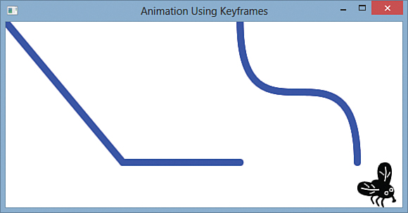
Listing 17.3 uses DoubleAnimationUsingKeyFrames to help move an Image of a house fly in a zigzag pattern, as illustrated in Figure 17.7. Because the Image is inside a Canvas, the motion is accomplished by animating the Canvas.Left and Canvas.Top attached properties rather than using the more versatile TranslateTransform.

LISTING 17.3 The Zigzag Animation for Figure 17.7
<Window xmlns="http://schemas.microsoft.com/winfx/2006/xaml/presentation"
Title="Animation Using Keyframes" Height="300" Width="580">
<Canvas>
<Image Source="fly.png">
<Image.Triggers>
<EventTrigger RoutedEvent="Image.Loaded">
<EventTrigger.Actions>
<BeginStoryboard>
<Storyboard>
<DoubleAnimation Storyboard.TargetProperty="(Canvas.Left)"
From="0" To="500" Duration="0:0:3"/>
<DoubleAnimationUsingKeyFrames Storyboard.TargetProperty="(Canvas.Top)"
Duration="0:0:3">
<LinearDoubleKeyFrame Value="0" KeyTime="0:0:0"/>
<LinearDoubleKeyFrame Value="200" KeyTime="0:0:1"/>
<LinearDoubleKeyFrame Value="0" KeyTime="0:0:2"/>
<LinearDoubleKeyFrame Value="200" KeyTime="0:0:3"/>
</DoubleAnimationUsingKeyFrames>
</Storyboard>
</BeginStoryboard>
</EventTrigger.Actions>
</EventTrigger>
</Image.Triggers>
</Image>
</Canvas>
</Window>
The fly’s motion consists of two animations that begin in parallel when the image loads. One is a simple DoubleAnimation that increases its horizontal position linearly from 0 to 500. The other is the keyframe-enabled animation, which oscillates the vertical position from 0 to 200 then back to 0 then back to 200.
Warning: An attached property must be wrapped in parentheses when specified as a TargetProperty!
Notice that in Listing 17.3, both Canvas.Left and Canvas.Top are referenced inside parentheses when used as the value for Storyboard’s TargetProperty property. This is a requirement for any attached properties used in a property path. Without the parentheses, the animation would look for a property on Image called Canvas (expecting it to return an object with Left and Top properties) and throw an exception because it doesn’t exist.
Each keyframe instance (LinearDoubleKeyFrame) in Listing 17.3 gives a specific value and a time for that value to be applied. Setting KeyTime is optional, however. If you omit one, WPF assumes that the keyframe occurs halfway between the surrounding keyframes. If you omit KeyTime on all keyframes, they are spaced evenly across the duration of the animation. (This can also be specified explicitly by setting KeyTime to KeyTimeType.Uniform, or just "Uniform" in XAML.)
Tip
KeyTime can be specified as a percentage rather than as a TimeSpan value. This is handy for expressing the timing of a keyframe independently from the duration of the animation. For example, the DoubleAnimationUsingKeyFrames from Listing 17.3 can be replaced with the following to obtain the same result:
<DoubleAnimationUsingKeyFrames Storyboard.TargetProperty="(Canvas.Top)"
Duration="0:0:3">
<LinearDoubleKeyFrame Value="0" KeyTime="0%"/>
<LinearDoubleKeyFrame Value="200" KeyTime="33.3%"/>
<LinearDoubleKeyFrame Value="0" KeyTime="66.6%"/>
<LinearDoubleKeyFrame Value="200" KeyTime="100%"/>
</DoubleAnimationUsingKeyFrames>
KeyTime can also be set to Paced, which arranges the keyframes in such a way that gives the target property a constant rate of change. In other words, a pair of keyframes that changes the value from 0 to 200 is spaced twice as far apart as a pair of keyframes that changes the value from 0 to 100.
Although the keyframes in Listing 17.3 specify the exact vertical position of the fly at 0, 1, 2, and 3 seconds, WPF still needs to calculate intermediate values between these “key times.” Because each keyframe is represented with an instance of LinearDoubleKeyFrame, the intermediate values are derived from simple linear interpolation. For example, at 0.5, 1.5, and 2.5 seconds, the calculated value is 100.
But DoubleAnimationUsingKeyFrames’s KeyFrames property is a collection of abstract DoubleKeyFrame objects, so it can be filled with other types of keyframe objects. In addition to LinearDoubleKeyFrame, DoubleKeyFrame has three other subclasses: SplineDoubleKeyFrame, DiscreteDoubleKeyFrame, and EasingDoubleKeyFrame.
Spline Keyframes
Every LinearXXXKeyFrame class has a corresponding SplineXXXKeyFrame class. It can be used just like its linear counterpart, so updating DoubleAnimationUsingKeyFrames from Listing 17.3 as follows produces exactly the same result:
<DoubleAnimationUsingKeyFrames Storyboard.TargetProperty="(Canvas.Top)"
Duration="0:0:3">
<SplineDoubleKeyFrame Value="0" KeyTime="0:0:0"/>
<SplineDoubleKeyFrame Value="200" KeyTime="0:0:1"/>
<SplineDoubleKeyFrame Value="0" KeyTime="0:0:2"/>
<SplineDoubleKeyFrame Value="200" KeyTime="0:0:3"/>
</DoubleAnimationUsingKeyFrames>
The spline keyframe classes have an additional KeySpline property that differentiates them from the linear classes. KeySpline can be set to an instance of a KeySpline object, which describes the desired motion as a cubic Bézier curve. KeySpline has two properties of type Point that represent the curve’s control points. (The start point of the curve is always 0, and the end point is always 1.) A type converter enables you to specify a KeySpline in XAML as a simple list of two points. For example, the following update changes the fly’s motion from the simple zigzag in Figure 17.7 to the more complicated motion in Figure 17.8:
<DoubleAnimationUsingKeyFrames Storyboard.TargetProperty="(Canvas.Top)"
Duration="0:0:3">
<SplineDoubleKeyFrame KeySpline="0,1 1,0" Value="0" KeyTime="0:0:0"/>
<SplineDoubleKeyFrame KeySpline="0,1 1,0" Value="200" KeyTime="0:0:1"/>
<SplineDoubleKeyFrame KeySpline="0,1 1,0" Value="0" KeyTime="0:0:2"/>
<SplineDoubleKeyFrame KeySpline="0,1 1,0" Value="200" KeyTime="0:0:3"/>
</DoubleAnimationUsingKeyFrames>

FIGURE 17.8 With KeySpline specified, the interpolation between keyframes is now based on cubic Bézier curves.
Finding the right value for KeySpline that gives the desired effect can be tricky and almost certainly requires the use of a design tool such as Blend. But several free tools can be found online that help you visualize Bézier curves based on the specified control points.
Discrete Keyframes
A discrete keyframe simply indicates that no interpolation should be done from the previous keyframe. Updating DoubleAnimationUsingKeyFrames from Listing 17.3 as follows produces the motion illustrated in Figure 17.9:
<DoubleAnimationUsingKeyFrames Storyboard.TargetProperty="(Canvas.Top)"
Duration="0:0:3">
<DiscreteDoubleKeyFrame Value="0" KeyTime="0:0:0"/>
<DiscreteDoubleKeyFrame Value="200" KeyTime="0:0:1"/>
<DiscreteDoubleKeyFrame Value="0" KeyTime="0:0:2"/>
<DiscreteDoubleKeyFrame Value="200" KeyTime="0:0:3"/>
</DoubleAnimationUsingKeyFrames>
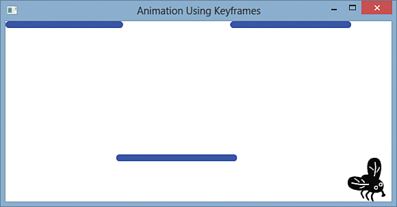
FIGURE 17.9 Discrete keyframes makes the fly’s vertical position jump from one key value to the next, with no interpolation.
Of course, different types of keyframes can be mixed into the same animation. The following mixture makes the fly follow the path shown in Figure 17.10:
<DoubleAnimationUsingKeyFrames Storyboard.TargetProperty="(Canvas.Top)"
Duration="0:0:3">
<DiscreteDoubleKeyFrame Value="0" KeyTime="0:0:0"/>
<LinearDoubleKeyFrame Value="200" KeyTime="0:0:1"/>
<DiscreteDoubleKeyFrame Value="0" KeyTime="0:0:2"/>
<SplineDoubleKeyFrame KeySpline="0,1,1,0" Value="200" KeyTime="0:0:3"/>
</DoubleAnimationUsingKeyFrames>
Because the first keyframe’s time is at the very beginning, its type is actually irrelevant. That’s because each frame only indicates how interpolation is done before that frame.
As with SplineXXXKeyFrame, every LinearXXXKeyFrame class has a corresponding DiscreteXXXKeyFrame. But WPF has five additional discrete keyframe classes that have no linear or spline counterpart. These classes enable you to animate Boolean, Char, Matrix, Object, and String. WPF supports only discrete keyframe animations with these data types because interpolation would not be meaningful (or even possible, as in the case of Boolean).
For example, here’s an animation that could be applied to a TextBlock to animate its Text from a lowercase string to an uppercase string (with each keyframe using the default KeyTime of Uniform):
<StringAnimationUsingKeyFrames Storyboard.TargetProperty="Text" Duration="0:0:.5">
<DiscreteStringKeyFrame Value="play"/>
<DiscreteStringKeyFrame Value="Play"/>
<DiscreteStringKeyFrame Value="PLay"/>
<DiscreteStringKeyFrame Value="PLAy"/>
<DiscreteStringKeyFrame Value="PLAY"/>
</StringAnimationUsingKeyFrames>
Tip
If you want to simply set a property value inside an event trigger rather than animate it in the traditional sense, you might be able to use a keyframe animation to simulate a Setter. For example, the following animation makes the Button disappear instantly when clicked by setting Opacity to 0 with a keyframe at the beginning of an otherwise empty animation:
<Button>
Click Me Once
<Button.Triggers>
<EventTrigger RoutedEvent="Button.Click">
<EventTrigger.Actions>
<BeginStoryboard>
<Storyboard>
<DoubleAnimationUsingKeyFrames Storyboard.TargetProperty="Opacity">
<DiscreteDoubleKeyFrame Value="0" KeyTime="0"/>
</DoubleAnimationUsingKeyFrames>
</Storyboard>
</BeginStoryboard>
</EventTrigger.Actions>
</EventTrigger>
</Button.Triggers>
</Button>
Easing Keyframes
Starting with WPF 4.0, every LinearXXXKeyFrame and SplineXXXKeyFrame class has a corresponding EasingXXXKeyFrame class. The easing keyframe classes have an EasingFunction property that can be set to any object implementing IEasingFunction. As with the EasingFunction property on animations, this gives the greatest flexibility in how the interpolation is done. It’s now time to see what easing functions are all about.
Easing Functions
WPF ships with 11 easing functions—classes implementing IEasingFunction—that can easily be applied to an animation or a keyframe. Each of them supports three different modes with a property called EasingMode. It can be set to EaseIn (the default value), EaseOut, or EaseInOut. Here’s how you can apply one of the easing function objects—QuadraticEase—to a basic DoubleAnimation:
<DoubleAnimation Storyboard.TargetProperty="(Canvas.Top)" From="200" To="0"
Duration="0:0:3">
<DoubleAnimation.EasingFunction>
<QuadraticEase/>
</DoubleAnimation.EasingFunction>
</DoubleAnimation>
And here is how you change EasingMode to something other than EaseIn:
<DoubleAnimation Storyboard.TargetProperty="(Canvas.Top)" From="200" To="0"
Duration="0:0:3">
<DoubleAnimation.EasingFunction>
<QuadraticEase EasingMode="EaseOut"/>
</DoubleAnimation.EasingFunction>
</DoubleAnimation>
EaseOut inverts the interpolation done with EaseIn, and EaseInOut produces the EaseIn behavior for the first half of the animation and the EaseOut behavior for the second half.
Built-In Power Easing Functions
Table 17.2 demonstrates how five of the easing functions work in all three modes by showing the path an object takes if its horizontal position animates linearly but its vertical position animates from bottom to top, with each easing function and mode applied.

All five functions do interpolation based on a simple power function. With the default linear interpolation, when time has elapsed 50% (.5), the value has changed by 50% (.5). But with quadratic interpolation, the value has changed by 25% (.5 * .5 = .25) when time has elapsed 50%. With cubic interpolation, the value has changed by 12.5% (.5 * .5 * .5 = .125) when time has elapsed 50%. And so on. Although WPF provides four distinct classes for powers 2 through 5, all you really need is the general-purpose PowerEase class that performs the interpolation with the value of its Power property. The default value of Power is 2 (making it the same as QuadraticEase) but Table 17.2 demonstrates it with Power set to 10, just to show how the transition keeps getting sharper as Power increases. Applying PowerEase with Power set to 10 can look as follows:
<DoubleAnimation Storyboard.TargetProperty="(Canvas.Top)" From="200" To="0"
Duration="0:0:3">
<DoubleAnimation.EasingFunction>
<PowerEase Power="10"/>
</DoubleAnimation.EasingFunction>
</DoubleAnimation>
Other Built-In Easing Functions
Table 17.3 demonstrates the remaining six easing functions in all three modes.
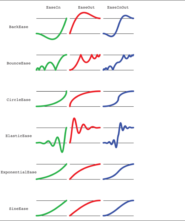
Each of these six functions has unique (and sometimes configurable) behavior:
BackEase—Moves the animated value slightly back (away from the target value) before progressing. BackEase has an Amplitude property (default=1) that controls how far back the value goes.
BounceEase—Creates what looks like a bouncing pattern (at least when used to animate position). BounceEase has two properties for controlling its behavior. Bounces (default=3) controls how many bounces occur during the animation, and Bounciness (default=2) controls how much the amplitude of each bounce changes from the previous bounce. For EaseIn, Bounciness=2 doubles the height of each bounce. For EaseOut, Bounciness=2 halves the height of each bounce.
CircleEase—Accelerates (for EaseIn) or decelerates (for EaseOut) the value with a circular function.
ElasticEase—Creates what looks like an oscillating spring pattern (at least when used to animate position). Like BounceEase, it has two properties for controlling its behavior. Oscillations (default=3) controls how many oscillations occur during the animation, and Springiness (default=3) controls the amplitude of oscillations. The behavior of Springiness is subtle: Larger values give smaller oscillations (as if the spring is thicker and more difficult to stretch), and smaller values give larger oscillations (which, in my opinion, seems to make the motion more springy rather than less.)
ExponentialEase—Interpolates the value with an exponential function, using the value of its Exponent property (default=2).
SineEase—Interpolates the value with a function based on the sine formula.
Warning: BackEase and ElasticEase can produce unexpected negative values!
Because BackEase and ElasticEase make changes to the value outside the range of From to To, any animation starting at zero (for EaseIn or EaseInOut) or ending at zero (for EaseOut or EaseInOut) will mostly likely veer into negative territory. If such an animation is applied to a value that cannot be negative, such as an element’s Width or Height, an exception will be thrown.
Writing Your Own Easing Function
Writing your own easing function is as simple as writing a class that implements IEasingFunction. The IEasingFunction interface has only one function, called Ease:
public double Ease(double normalizedTime)
{
// Return a progress value, normalized from 0 to 1
...
}
Ease is called throughout an animation with a value of time normalized to fall between 0 and 1. For any normalized time value, the implementation of Ease must return a progress value normalized to fall between 0 and 1. (However, the value can go outside this range, as is the case for BackEase and ElasticEase.)
Therefore, the following class successfully (although pointlessly) implements a linear easing function:
public class LinearEase : IEasingFunction
{
public double Ease(double normalizedTime)
{
return normalizedTime; // Linear interpolation
}
}
The following class implements a quadratic easing function, similar to the built-in QuadraticEase class:
public class SimpleQuadraticEase : IEasingFunction
{
public double Ease(double normalizedTime)
{
// Only covers the EaseIn behavior:
return normalizedTime * normalizedTime; // Quadratic interpolation
}
}
What makes this SimpleQuadraticEase class different from the built-in QuadraticEase is its lack of support for EasingMode. Fortunately, WPF provides an abstract EasingFunctionBase class (the base class of all 11 built-in easing functions) that gives you EasingMode behavior for free.
EasingFunctionBase defines the EasingMode dependency property and implements IEasingFunction. In its implementation of Ease, it calls an abstract method, EaseInCore, that derived classes must implement the same way as they would implement Ease (if the math considers only the EaseIn case). Based on the value of EasingMode, however, EasingFunctionBase modifies the value of normalizedTime before calling EaseInCore and modifies the value returned by it. These transformations make the same EaseIn logic applicable to all three modes. This is all transparent to the derived class, so implementing an easing function with complete support for EasingMode is as simple as changing the base class and renaming Ease to EaseInCore:
public class CompleteQuadraticEase : EasingFunctionBase
{
protected override double EaseInCore(double normalizedTime)
{
return normalizedTime * normalizedTime; // Quadratic interpolation
}
// Required by any subclass of EasingFunctionBase:
protected override Freezable CreateInstanceCore()
{
return new CompleteQuadraticEase();
}
}
The only complication is the need to implement CreateInstanceCore, an abstract method defined by Freezable, the base class of EasingFunctionBase. This CompleteQuadraticEase class now behaves exactly like the built-in QuadraticEase. You can use this technique to define new and interesting easing functions, such as SexticEase (which would come after QuinticEase):
public class SexticEase : EasingFunctionBase
{
protected override double EaseInCore(double normalizedTime)
{
return normalizedTime * normalizedTime * normalizedTime
* normalizedTime * normalizedTime * normalizedTime;
}
// Required by any subclass of EasingFunctionBase:
protected override Freezable CreateInstanceCore()
{
return new SexticEase();
}
}
Animations and the Visual State Manager
When a control makes use of the Visual State Manager (introduced in Chapter 14, “Styles, Templates, Skins, and Themes”), its template can include any number of VisualStates. Each VisualState is basically just a collection of Storyboards that transition properties that can be animated to their desired values for that state.
Now that you know everything there is to know about animations, you can see how easy and powerful such transitions can be. Listing 17.4 updates the Button control template from Listing 14.8 in Chapter 14, replacing its triggers with VisualStates (and handling some VisualStates that weren’t previously handled by the triggers).
LISTING 17.4 A Button ControlTemplate, Using VisualStates
<Style TargetType="{x:Type Button}">
<Setter Property="FocusVisualStyle" Value="{x:Null}"/>
<Setter Property="Background" Value="Black"/>
<Setter Property="Template">
<Setter.Value>
<ControlTemplate TargetType="{x:Type Button}">
<Grid RenderTransformOrigin=".5,.5">
<VisualStateManager.VisualStateGroups>
<VisualStateGroup Name="CommonStates">
<VisualState Name="Normal"/>
<VisualState Name="MouseOver">
<Storyboard>
<ColorAnimation Storyboard.TargetName="outerCircle"
Storyboard.TargetProperty=
"(Ellipse.Fill).(LinearGradientBrush.GradientStops)[1].(GradientStop.Color)"
To="Orange" Duration="0:0:.4"/>
</Storyboard>
</VisualState>
<VisualState Name="Pressed">
<Storyboard>
<DoubleAnimation Storyboard.TargetName="scaleTransform"
Storyboard.TargetProperty="ScaleX" To=".9"
Duration="0"/>
<DoubleAnimation Storyboard.TargetName="scaleTransform"
Storyboard.TargetProperty="ScaleY" To=".9"
Duration="0"/>
</Storyboard>
</VisualState>
<VisualState Name="Disabled">
<Storyboard>
<ColorAnimation Storyboard.TargetName="outerCircle"
Storyboard.TargetProperty=
"(Ellipse.Fill).(LinearGradientBrush.GradientStops)[1].(GradientStop.Color)"
To="Gray" Duration="0:0:.4"/>
</Storyboard>
</VisualState>
</VisualStateGroup>
<VisualStateGroup Name="FocusStates">
<VisualState Name="Unfocused"/>
<VisualState Name="Focused">
<Storyboard>
<DoubleAnimation Storyboard.TargetProperty=
"(Grid.RenderTransform).(TransformGroup.Children)[1].(TranslateTransform.Y)"
To="-20" AutoReverse="True"
RepeatBehavior="Forever" Duration="0:0:.4">
<DoubleAnimation.EasingFunction>
<QuadraticEase/>
</DoubleAnimation.EasingFunction>
</DoubleAnimation>
</Storyboard>
</VisualState>
</VisualStateGroup>
</VisualStateManager.VisualStateGroups>
<Grid.RenderTransform>
<TransformGroup>
<ScaleTransform x:Name="scaleTransform"/>
<TranslateTransform x:Name="translateTransform"/>
</TransformGroup>
</Grid.RenderTransform>
<Ellipse x:Name="outerCircle">
<Ellipse.Fill>
<LinearGradientBrush StartPoint="0,0" EndPoint="0,1">
<GradientStop Offset="0"
Color="{Binding RelativeSource={RelativeSource TemplatedParent},
Path=Background.Color}"/>
<GradientStop x:Name="highlightGradientStop" Offset="1" Color="Red"/>
</LinearGradientBrush>
</Ellipse.Fill>
</Ellipse>
<Ellipse RenderTransformOrigin=".5,.5">
<Ellipse.RenderTransform>
<ScaleTransform ScaleX=".8" ScaleY=".8"/>
</Ellipse.RenderTransform>
<Ellipse.Fill>
<LinearGradientBrush StartPoint="0,0" EndPoint="0,1">
<GradientStop Offset="0" Color="White"/>
<GradientStop Offset="1" Color="Transparent"/>
</LinearGradientBrush>
</Ellipse.Fill>
</Ellipse>
<Viewbox>
<ContentPresenter Margin="{TemplateBinding Padding}"/>
</Viewbox>
</Grid>
</ControlTemplate>
</Setter.Value>
</Setter>
</Style>
Figure 17.11 shows the results for the various Button combinations of states that you encounter in normal user interaction. The Normal state in CommonStates does nothing; it leaves the default visuals alone. The MouseOver state animates the highlight color to orange, the Pressed state scales the entire visual tree to 90%, and the Disabled state animates the highlight color to Gray. In the FocusStates state group, the default Unfocused state does nothing, but the Focused state uses a QuadraticEase easing function to give the Button a continual bounce, as long as it’s in that state. (For this type of auto-reversing repeat-forever animation, QuadraticEase actually does a better job of simulating bouncing than BounceEase!) The Style also sets FocusVisualStyle to null to avoid the dotted rectangle that would otherwise appear around the bouncing Button when it has keyboard focus.
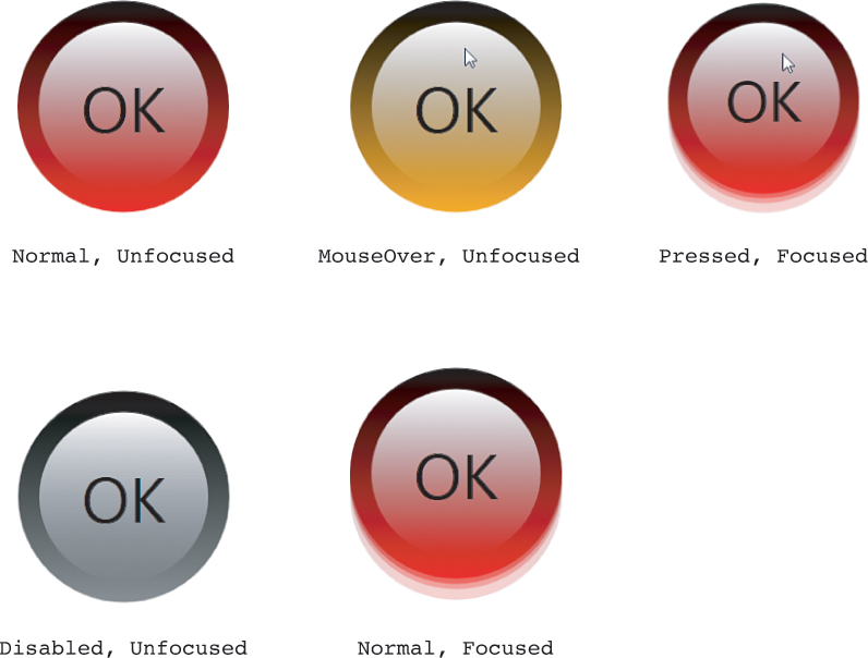
The Focused and Disabled behaviors are new compared to Chapter 14, but you can compare this listing’s MouseOver and Pressed states to the IsMouseOver and IsPressed triggers from Chapter 14:
<ControlTemplate.Triggers>
<Trigger Property="IsMouseOver" Value="True">
<Setter TargetName="outerCircle" Property="Fill" Value="Orange"/>
</Trigger>
<Trigger Property="IsPressed" Value="True">
<Setter Property="RenderTransform">
<Setter.Value>
<ScaleTransform ScaleX=".9" ScaleY=".9"/>
</Setter.Value>
</Setter>
<Setter Property="RenderTransformOrigin" Value=".5,.5"/>
</Trigger>
</ControlTemplate.Triggers>
Storyboards can’t set properties such as RenderTransform or RenderTransformOrigin, so these two properties are now set directly inside the visual tree. The animations used for the Pressed state simply update the values of ScaleX and ScaleY on the existing ScaleTransform.
Transitions
There’s a slight problem with the states as defined in Listing 17.4. The transitions from one state to another are smooth unless the state being transitioned into is Normal or Unfocused. Because they are left empty, the result is an instant jump to the default visual behavior. This could be solved by adding Storyboards with explicit animations to the default values, but one would have to be added for every property animated by any other state in the group, to account for all possible transitions.
Fortunately, VisualStateGroup has a much better solution for this. It defines a Transitions property that can be set to one or more VisualTransition objects that can automatically generate appropriate animations to smooth the transition between any states. VisualTransition has To and From string properties that can be set to the names of the source and target states. You can omit both properties to make it apply to all transitions, specify only a To to make it apply to all transitions to that state, and so on. When transitioning from one state to another, the Visual State Manager chooses the most specific VisualTransition that matches the transition. The order of precedence is as follows:
1. A VisualTransition with matching To and From
2. A VisualTransition with a matching To and no explicit From
3. A VisualTransition with a matching From and no explicit To
4. The default VisualTransition, with no To or From specified
If VisualStateGroup’s Transitions property isn’t set, the default transition between any states is a zero-duration animation.
To specify the characteristics of a VisualTransition, you can set its GeneratedDuration property to control the duration of the generated linear animation. You can also set its GeneratedEasingFunction property to get a nonlinear animation between states. For the most customization, you can even set its Storyboard property to a Storyboard with arbitrary custom animations.
Tip
The easiest way to manage VisualStates and the transitions between them is to give the animations inside each VisualState a Duration of 0—making the animations more like Setters than real animations—and specify the desired animations between states (with non-zero Durations) via VisualStateGroup’s VisualTransitions property. An exception to this would be states with continual animations, such as the bouncing done in the Focused state in Listings 17.4 and 17.5.
Listing 17.5 updates each VisualStateGroup from the previous listing to take advantage of VisualTransitions to fix the snapping problem when transitioning to the Normal and/or Unfocused states.
LISTING 17.5 Updated VisualStateGroups That Use Transitions for Listing 17.4
<VisualStateManager.VisualStateGroups>
<VisualStateGroup Name="CommonStates">
<VisualStateGroup.Transitions>
<!-- Apply to all transitions... -->
<VisualTransition GeneratedDuration="0:0:.4"/>
<!-- ...but override for transitions to/from Pressed: -->
<VisualTransition To="Pressed" GeneratedDuration="0"/>
<VisualTransition From="Pressed" GeneratedDuration="0"/>
</VisualStateGroup.Transitions>
<VisualState Name="Normal"/>
<VisualState Name="MouseOver">
<Storyboard>
<ColorAnimation Storyboard.TargetName="outerCircle"
Storyboard.TargetProperty=
"(Ellipse.Fill).(LinearGradientBrush.GradientStops)[1].(GradientStop.Color)"
To="Orange" Duration="0"/>
</Storyboard>
</VisualState>
<VisualState Name="Pressed">
<Storyboard>
<DoubleAnimation Storyboard.TargetName="scaleTransform"
Storyboard.TargetProperty="ScaleX" To=".9"
Duration="0"/>
<DoubleAnimation Storyboard.TargetName="scaleTransform"
Storyboard.TargetProperty="ScaleY" To=".9"
Duration="0"/>
</Storyboard>
</VisualState>
<VisualState Name="Disabled">
<Storyboard>
<ColorAnimation Storyboard.TargetName="outerCircle"
Storyboard.TargetProperty=
"(Ellipse.Fill).(LinearGradientBrush.GradientStops)[1].(GradientStop.Color)"
To="Gray" Duration="0"/>
</Storyboard>
</VisualState>
</VisualStateGroup>
<VisualStateGroup Name="FocusStates">
<VisualStateGroup.Transitions>
<!-- Apply only in one direction: -->
<VisualTransition To="Unfocused" GeneratedDuration="0:0:.4">
<VisualTransition.GeneratedEasingFunction>
<QuadraticEase/>
</VisualTransition.GeneratedEasingFunction>
</VisualTransition>
</VisualStateGroup.Transitions>
<VisualState Name="Unfocused"/>
<VisualState Name="Focused">
<Storyboard>
<DoubleAnimation Storyboard.TargetProperty=
"(Grid.RenderTransform).(TransformGroup.Children)[1].(TranslateTransform.Y)"
To="-20" AutoReverse="True"
RepeatBehavior="Forever" Duration="0:0:.4">
<DoubleAnimation.EasingFunction>
<QuadraticEase/>
</DoubleAnimation.EasingFunction>
</DoubleAnimation>
</Storyboard>
</VisualState>
</VisualStateGroup>
</VisualStateManager.VisualStateGroups>
In the Transitions collection for CommonStates, a VisualTransition lasting 0.4 seconds applies to all state transitions. Two additional VisualTransitions override this behavior for transitions to and from the Pressed state in order to preserve the instant-press and instant-release behavior. Because the new VisualTransition takes care of the smooth animations, the Durations of the animations defined for the MouseOver and Disabled states are changed to 0.
The VisualTransition added to the FocusStates group applies only to transitions to the Unfocused state to avoid interfering with the continual bouncing animation in the Focused sate. In order to not look out of place when transitioning out of the bouncing Focused animation, the VisualTransition is given a QuadraticEase easing function to match the animation it’s transitioning from.
Warning: VisualTransitions don’t work with animations whose target isn’t in the element tree!
You may have noticed the lengthy Storyboard.TargetProperty property paths in three of the animations from Listings 17.4 and 17.5:
<ColorAnimation Storyboard.TargetName="outerCircle"
Storyboard.TargetProperty=
"(Ellipse.Fill).(LinearGradientBrush.GradientStops)[1].(GradientStop.Color)"
To="Orange" .../>
...
<ColorAnimation Storyboard.TargetName="outerCircle"
Storyboard.TargetProperty=
"(Ellipse.Fill).(LinearGradientBrush.GradientStops)[1].(GradientStop.Color)"
To="Gray" .../>
...
<DoubleAnimation Storyboard.TargetProperty=
"(Grid.RenderTransform).(TransformGroup.Children)[1].(TranslateTransform.Y)"
To="-20" AutoReverse="True"
RepeatBehavior="Forever" Duration="0:0:.4">
...
</DoubleAnimation>
The draft version of these listings referenced the GradientStop (in the first two animations) and the TranslateTransform (in the last animation) directly via Storyboard.TargetName in order to make the property paths much simpler:
<ColorAnimation Storyboard.TargetName="highlightGradientStop"
Storyboard.TargetProperty="Color"
To="Orange" .../>
...
<ColorAnimation Storyboard.TargetName="highlightGradientStop"
Storyboard.TargetProperty="Color"
To="Gray" .../>
...
<DoubleAnimation Storyboard.TargetName="translateTransform"
Storyboard.TargetProperty="Y"
To="-20" AutoReverse="True"
RepeatBehavior="Forever" Duration="0:0:.4">
...
</DoubleAnimation>
These animations have exactly the same meaning and work the same way as the animations in Listings 17.4 and 17.5, except when you try to use VisualTransitions. The generated animations do not work with animations when the target named by TargetName isn’t in the element tree. The workaround is either to put all behavior inside VisualStates rather than using VisualTransitions, or to ensure all relevant animations use an element in the tree as their target. Listing 17.5 uses the latter approach. (In the TranslateTransform animation, the target is implicitly the root Grid.)
Notice that the animations in the Pressed state do operate directly on the ScaleTransform. These were left alone because the transitions into and out of this state are instantaneous anyway. If you want to change Listing 17.5 to produce a smooth transition into and out of Pressed, you’ll need to change the Pressed animations to use the root Grid as the target and:
"(Grid.RenderTransform).(TransformGroup.Children)[0].(ScaleTransform.ScaleX)"
and:
"(Grid.RenderTransform).(TransformGroup.Children)[0].(ScaleTransform.ScaleY)"
as the TargetProperty values.
The property paths in this section use the most explicit syntax normally reserved for attached properties, but they don’t have to be quite so long. The various property paths can be shortened as follows:
"Fill.GradientStops[1].Color"
"RenderTransform.Children[1].Y"
"RenderTransform.Children[0].ScaleX"
"RenderTransform.Children[0].ScaleY"
Summary
With animation, you can do something as simple as a subtle rollover effect (which is now commonplace in modern user interfaces) or as complex as an animated cartoon. Storyboards, which are a necessary part of performing animations purely in XAML, help to orchestrate complex series of animations.
The same could be said for other areas of WPF, but going overboard with animation can harm the usability and accessibility of an application or a component. Another factor to consider is the performance implication of animation. Too much animation could make an otherwise-useful application become unusable on a less-powerful computer, such as a low-cost tablet.
Fortunately, WPF enables you to provide rich animations (or other functionality) on powerful computers while scaling back the experience on less-powerful systems. The key to this is the RenderCapability class in the System.Windows.Media namespace. It defines a static Tier property and a static TierChanged event. When you’re running on a tier 0 computer, everything is rendered in software. On a tier 1 computer, hardware rendering is sometimes used. And on a tier 2 computer (the top tier), everything that can be rendered in hardware is rendered in hardware. Therefore, you should be reluctant to use multiple simultaneous animations (or complicated gradients or 3D) on a tier 0 system. Besides removing animations, another way to adjust to running in the bottom tier is to reduce the natural frame rate (which tends to be 60 fps) with Storyboard’s DesiredFrameRate attached property. This can decrease CPU utilization on such systems.
Tip
If you find yourself doing a lot of animation (or complicated static graphics, whether 2D or 3D), use RenderCapability.Tier to adjust your behavior. Note that although Tier is a 32-bit integer, the main value is stored in the high word. Therefore, you need to shift the value by 16 bits to see the true tier:
int tier = RenderCapability.Tier >> 16
This was done to enable subtiers in the future, but the result is pretty confusing for anyone using the API!