
Chapter 9. Content Controls
No modern presentation framework would be complete without a standard set of controls that enables you to quickly assemble traditional user interfaces. And Windows Presentation Foundation has plenty of such controls included “in the box.” You’ve seen a few of them in previous chapters. This part of the book takes you on a tour of the major built-in controls, highlighting some of what makes each control unique.
The figures in this book show WPF controls under the default theme from Windows 8. Most WPF controls contain several distinct default appearances, however. That’s because WPF ships with theme DLLs that contain control templates for Windows themes that match previous versions of Windows, as well as a high-contrast theme used by all versions.
For example, Figure 9.1 displays the default appearance of a WPF Button control under the default Windows 8 theme and under a high-contrast theme (set via the Control Panel).

In most cases, the difference in appearance is very subtle. Of course, you can give controls a radically different look (based on the current theme or theme-independent) by using custom control templates, as discussed in Chapter 14, “Styles, Templates, Skins, and Themes.”
WPF’s built-in controls can be grouped roughly into the following categories, which coincide with their inheritance hierarchy:
 Content controls (this chapter)
Items controls (Chapter 10, “Items Controls”)
Range controls (Chapter 11, “Images, Text, and Other Controls”)
Everything else (Chapter 11)
This chapter covers content controls, which are simply controls that are constrained to contain a single item. Content controls all derive from System.Windows.Controls.ContentControl, which has a Content property of type Object that contains the single item (first shown with Button in Chapter 2, “XAML Demystified”).
Because a content control’s single item can be any arbitrary object, the control can contain a potentially large tree of objects. There just can be only one direct child. Besides Content, the other interesting member of the ContentControl class is the Boolean HasContent property. This simply returns false if Content is null, and it returns true otherwise.
 FAQ: Why does ContentControl define a HasContent property? Checking for Content==null is just as easy as checking for HasContent==false!
Welcome to the world of WPF APIs, which don’t always look like your typical .NET APIs! From a C# perspective, the HasContent property is redundant. But from a XAML perspective, the property is useful. For example, it makes it easy to use a property trigger to set various property values when HasContent becomes true.
The built-in content controls come in three major varieties:
Buttons
Simple containers
Containers with headers
The Window class, already examined in Chapter 7, “Structuring and Deploying an Application,” is also a content control. Its Content is usually set to a Panel such as Grid, so it can contain an arbitrarily complex user interface.
Buttons
Buttons are probably the most familiar and essential user interface elements. WPF’s Button, pictured in Figure 9.1, has already made several appearances in this book.
Although everyone intuitively knows what a button is, its precise definition (at least in WPF) might not be obvious. A basic button is a content control that can be clicked but not double-clicked. This behavior is actually captured by an abstract class called ButtonBase, from which a few different controls are derived.
The ButtonBase class contains the Click event and contains the logic that defines what it means to be clicked. As with typical Windows buttons, a click can occur from a mouse’s left button being pressed down and then let up or from the keyboard with Enter or spacebar, if the button has focus.
ButtonBase also defines a Boolean IsPressed property, in case you want to act on the pressed state (when the left mouse button or spacebar is held down but not yet released).
The most interesting feature of ButtonBase, however, is its ClickMode property. This can be set to a value of a ClickMode enumeration to control exactly when the Click event gets raised. Its values are Release (the default), Press, and Hover. Although changing the ClickMode setting on standard buttons would likely confuse users, this capability is very handy for buttons that have been restyled to look like something completely different. In these cases, it’s a common expectation that pressing an object should be the same as clicking it.
Several controls ultimately derive from ButtonBase, and the following sections examine each of them in turn:
Button
RepeatButton
ToggleButton
CheckBox
RadioButton
Additional ButtonBase-derived controls exist, but they were designed to be used inside specific complex controls, such as Calendar and DataGrid.
Button
The WPF Button class adds two simple concepts on top of what ButtonBase already provides: being a cancel button or a default button. These two mechanisms are handy shortcuts for dialogs. If Button.IsCancel is set to true on a Button inside a dialog (that is, a Window shown via its ShowDialog method), the Window is automatically closed with a DialogResult of false. If Button.IsDefault is set to true, pressing Enter causes the Button to be clicked unless focus is explicitly taken away from it.
FAQ: What’s the difference between Button’s IsDefault and IsDefaulted properties?
IsDefault is a read/write property that enables you to decide whether a Button should be the default one. The poorly named IsDefaulted property, on the other hand, is read-only. It indicates when a default button is in a state such that pressing Enter causes it to be clicked. In other words, IsDefaulted can be true only when IsDefault is true and either the default button or a TextBox (with AcceptsReturn set to false) has focus. The latter condition enables the Enter key to click the default button without tabbing out of a TextBox.
FAQ: How can I programmatically click a Button?
Button, like many other WPF controls, has a peer class in the System.Windows.Automation.Peers namespace to support UI Automation: ButtonAutomationPeer. It can be used as follows with a Button called myButton:
ButtonAutomationPeer bap = new ButtonAutomationPeer(myButton);
IInvokeProvider iip = bap.GetPattern(PatternInterface.Invoke)
as IInvokeProvider;
iip.Invoke(); // This clicks the Button
These UI Automation classes have several members that are extremely useful for automated testing and accessibility.
RepeatButton
RepeatButton acts just like Button except that it continually raises the Click event as long as the button is being pressed. (It also doesn’t have Button’s cancel and default behaviors because it derives directly from ButtonBase.) The frequency of the raised Click events depends on the values of RepeatButton’s Delay and Interval properties, whose default values are SystemParameters.KeyboardDelay and SystemParameters.KeyboardSpeed, respectively. The default look of a RepeatButton is exactly the same as that of Button (shown in Figure 9.1).
The behavior of RepeatButton might sound strange at first, but it is useful (and standard) for buttons that increment or decrement a value each time they are pressed. For example, the buttons at the ends of a scrollbar exhibit the repeat-press behavior when you click them and hold the mouse button down. Or, if you were to build a numeric “up-down” control (which WPF still does not have built in), you would likely want to use two RepeatButtons to control the numeric value. RepeatButton is in the System.Windows.Controls.Primitives namespace because it is likely that you would use this control only as part of a more sophisticated control rather than use it directly.
ToggleButton
ToggleButton is a “sticky” button that holds its state when it is clicked (again without Button’s cancel and default behaviors). Clicking it the first time sets its IsChecked property to true, and clicking it again sets IsChecked to false. The default appearance of ToggleButton is exactly the same as that of Button and RepeatButton.
ToggleButton also has an IsThreeState property that, if set to true, gives IsChecked three possible values: true, false, or null. In fact, IsChecked is of type Nullable<Boolean> (bool? in C#). In the three-state case, the first click sets IsChecked to true, the second click sets it to null, the third click sets it to false, and so on. To vary the order of these state changes, you could either intercept the clicks by handling the preview versions of the mouse events and manually set IsChecked to the value you desire, or you could create your own subclass and override ToggleButton’s OnToggle method to perform your custom logic.
In addition to the IsChecked property, ToggleButton defines a separate event for each value of IsChecked: Checked for true, Unchecked for false, and Indeterminate for null. It might seem odd that ToggleButton doesn’t have a single IsCheckedChanged event, but the three separate events are handy for declarative scenarios.
As with RepeatButton, ToggleButton is in the System.Windows.Controls.Primitives namespace, which essentially means that the WPF designers don’t expect people to use ToggleButtons directly or without additional customizations. It is quite natural, however, to use ToggleButtons directly inside a ToolBar control, as described in Chapter 10.
CheckBox
CheckBox, shown in Figure 9.2, is a familiar control. But wait a minute...isn’t this section supposed to be about buttons? Yes, but consider the characteristics of a WPF CheckBox:
It has a single piece of externally supplied content (so the standard check box doesn’t count).
It has a notion of being clicked by mouse or keyboard.
It retains a state of being checked or unchecked when clicked.
It supports a three-state mode, where the state toggles from checked to indeterminate to unchecked.
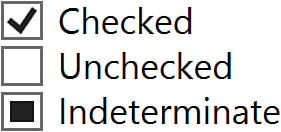
Does this sound familiar? It should, because a CheckBox is nothing more than a ToggleButton with a different appearance! CheckBox is a simple class deriving from ToggleButton that does little more than override its default style to the visuals shown in Figure 9.2.
RadioButton
RadioButton is another control that derives from ToggleButton, but it is unique because it has built-in support for mutual exclusion. When multiple RadioButton controls are grouped together, only one can be checked at a time. Checking one RadioButton—even programmatically—automatically unchecks all others in the same group. In fact, users can’t even directly uncheck a RadioButton by clicking it; unchecking can only be done programmatically. Therefore, RadioButton is designed for multiple-choice questions. Figure 9.3 shows the default appearance of a RadioButton.
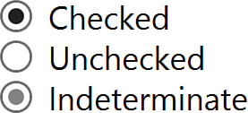
The rarely used indeterminate state of a RadioButton control (IsThreeState=true and IsChecked=null) is similar to the unchecked state in that a user cannot enable this state by clicking on it; it must be set programmatically. If the RadioButton is clicked, it changes to the checked state, but if another RadioButton in the same group becomes checked, any indeterminate RadioButtons remain in the indeterminate state.
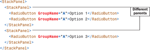
Placing several WPF RadioButtons in the same group is very straightforward. By default, any RadioButtons that share the same direct logical parent are automatically grouped together. For example, only one of the following RadioButtons can be checked at any point in time:
<StackPanel>
<RadioButton>Option 1</RadioButton>
<RadioButton>Option 2</RadioButton>
<RadioButton>Option 3</RadioButton>
</StackPanel>
If you need to group RadioButtons in a custom manner, however, you can use the GroupName property, which is a simple string. Any RadioButtons with the same GroupName value get grouped together (as long as they have the same logical root). Therefore, you can group them across different parents, as shown here:
Or you can even create subgroups inside the same parent:
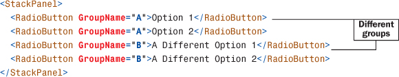
Of course, the last example would be a confusing piece of user interface without an extra visual element separating the two subgroups!
Simple Containers
WPF includes several built-in content controls that don’t have a notion of being clicked like a button. Each has unique features to justify its existence. These content controls are the following:
Label
ToolTip
Frame
Label
Label is a classic control that, as in previous technologies, can be used to hold some text. Because it is a WPF content control, it can hold arbitrary content in its Content property—a Button, a Menu, and so on—but Label is really useful only for text.
You can place text on the screen with WPF in several different ways, such as using a TextBlock element. But what makes Label unique is its support for access keys. You can designate a letter in a Label’s text that gets special treatment when the user presses the access key—the Alt key and the designated letter. You can also specify an arbitrary element that should receive focus when the user presses this access key. To designate the letter (which can appear underlined, depending on the Windows settings), you simply precede it with an underscore. To designate the target element, you set Label’s Target property (of type UIElement).
The classic case of using a Label’s access key support with another control is pairing it with a TextBox. For example, the following XAML snippet gives focus to the TextBox when Alt+U is pressed:
<Label Target="userNameBox">_User Name:</Label>
<TextBox x:Name="userNameBox"/>
Setting the value of Target implicitly leverages the NameReferenceConverter type converter described in Chapter 2. In C#, you can simply set the property to the instance of the TextBox control as follows (assuming that the Label is named userNameLabel):
userNameLabel.Target = userNameBox;
Tip
Controls such as Label and Button support access keys by treating an underscore before the appropriate letter specially, as in _Open or Save _As. (Win32 and Windows Forms use an ampersand [&] instead; the underscore is much more XML friendly.) If you really want an underscore to appear in your text, you need to use two consecutive underscores, as in __Open or Save __As.
ToolTip
The ToolTip control holds its content in a floating box that appears when you hover over an associated control and disappears when you move the mouse away. Figure 9.4 shows a typical ToolTip in action, created from the following XAML:
<Button>
OK
<Button.ToolTip>
<ToolTip>
Clicking this will submit your request.
</ToolTip>
</Button.ToolTip>
</Button>

The ToolTip class can never be placed directly in a tree of UIElements. Instead, it must be assigned as the value of a separate element’s ToolTip property (defined on both FrameworkElement and FrameworkContentElement).
Tip
You don’t even need to use the ToolTip class when setting an element’s ToolTip property! The property is of type Object, and if you set it to any non-ToolTip object, the property’s implementation automatically creates a ToolTip and uses the property value as the ToolTip’s content. Therefore, the XAML for Figure 9.4 could be simplified to the following and give the same result:
<Button>
OK
<Button.ToolTip>
Clicking this will submit your request.
</Button.ToolTip>
</Button>
or it could be simplified further, as follows:
<Button Content="OK" ToolTip="Clicking this will submit your request."/>
Because of the flexibility of WPF’s content controls, a WPF ToolTip can hold anything you want! Listing 9.1 shows how you might construct a Microsoft Office–style ScreenTip. The result is shown in Figure 9.5.
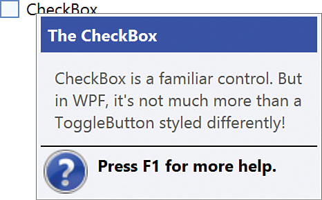
LISTING 9.1 A Complex ToolTip, Similar to a Microsoft Office ScreenTip
<CheckBox>
CheckBox
<CheckBox.ToolTip>
<StackPanel>
<Label FontWeight="Bold" Background="Blue" Foreground="White">
The CheckBox
</Label>
<TextBlock Padding="10" TextWrapping="WrapWithOverflow" Width="200">
CheckBox is a familiar control. But in WPF, it's not much
more than a ToggleButton styled differently!
</TextBlock>
<Line Stroke="Black" StrokeThickness="1" X2="200"/>
<StackPanel Orientation="Horizontal">
<Image Margin="2" Source="help.gif"/>
<Label FontWeight="Bold">Press F1 for more help.</Label>
</StackPanel>
</StackPanel>
</CheckBox.ToolTip>
</CheckBox>
Although a ToolTip can contain interactive controls such as Buttons, those controls never get focus, and you can’t click or otherwise interact with them.
ToolTip defines Open and Closed events in case you want to act on its appearance and disappearance. It also defines several properties for tweaking its behavior, such as its placement, whether it should stay open until explicitly closed, or even whether a drop shadow should be rendered. Sometimes you might want to apply the same ToolTip on multiple controls, yet you might want the ToolTip to behave differently depending on the control to which it is attached. For such cases, a separate ToolTipService static class can meet your needs.
ToolTipService defines a handful of attached properties that can be set on any element using the ToolTip (rather than on the ToolTip itself). It has several of the same properties as ToolTip (which have a higher precedence in case the ToolTip in question has conflicting values), but it also adds several more. For example, ShowDuration controls how long the ToolTip should be displayed while the mouse pointer is paused over an element, and InitialShowDelay controls the length of time between the pause occurring and the ToolTip first being shown. You can add ShowDuration to the first ToolTip example as follows:
<Button ToolTipService.ShowDuration="3000">
...
</Button>
FAQ: How do I get a ToolTip to appear when hovering over a disabled element?
Simply use the ShowOnDisabled attached property of the ToolTipService class. From XAML, this would look as follows on a Button:
<Button ToolTipService.ShowOnDisabled="True">
...
</Button>
Or from C# code, you can call the static method corresponding to the attached property:
ToolTipService.SetShowOnDisabled(myButton, true);
Frame
The Frame control holds arbitrary content, just like all other content controls, but it isolates the content from the rest of the user interface. For example, properties that would normally be inherited down the element tree stop when they reach the Frame. In many respects, WPF Frames act like frames in HTML.
FAQ: How can I forcibly close a ToolTip that is currently showing?
Set its IsOpen property to false.
Speaking of HTML, Frame’s claim to fame is that it can render HTML content in addition to WPF content. Frame has a Source property of type System.Uri that can be set to any HTML (or XAML) page. Here’s an example:
<Frame Source="http://www.adamnathan.net"/>
Tip
When using Frame to navigate between web pages, be sure to handle its NavigationFailed event to perform any error logic and set NavigationFailedEventArgs.Handled to true. Otherwise, an unhandled exception (such as a WebException) gets raised on a different thread. The NavigationFailedEventArgs object passed to the handler provides access to the exception among other details.
As explained in Chapter 7, Frame is a navigation container with built-in tracking that applies to both HTML and XAML content. So, you can think of the Frame control as a more flexible version of the Microsoft Web Browser ActiveX control or the WPF WebBrowser control that wraps this ActiveX control.
Unfortunately, when Frame hosts HTML, it has several limitations that don’t apply to other WPF controls (due to relying on Win32 for its implementation of HTML rendering). For example, the HTML content is always rendered on top of WPF content, it can’t have effects applied to it, its Opacity can’t be changed, and so on. Frame also does not support rendering an arbitrary string or stream of HTML; the content must be a path or URL pointing to a loose file. If you require the ability to display in-memory HTML strings, the best option is to use the WPF WebBrowser control instead.
Tip
Compared to using Frame, WPF’s WebBrowser control (introduced in WPF 3.5 SP1) provides a more powerful way to host HTML. It supports rendering HTML supplied from an in-memory string or Stream, as well as interactivity with the HTML DOM and its script. It also provides a slick way to host Silverlight content in a WPF application: Just give it a URL that points to a Silverlight .xap file. Note that WebBrowser is not a content control; it cannot directly contain any WPF elements.
Containers with Headers
All the previous content controls either add very simple default visuals around the content (button chrome, a check box, and so on) or don’t add any visuals at all. The following two controls are a little different because they add a customizable header to the main content. These controls derive from a subclass of ContentControl named HeaderedContentControl, which adds a Header property of type Object.
GroupBox
GroupBox is a familiar control for organizing chunks of controls. Figure 9.6 shows a GroupBox surrounding CheckBoxes, created from the following XAML:
<GroupBox Header="Grammar">
<StackPanel>
<CheckBox>Check grammar as you type</CheckBox>
<CheckBox>Hide grammatical errors in this document</CheckBox>
<CheckBox>Check grammar with spelling</CheckBox>
</StackPanel>
</GroupBox>
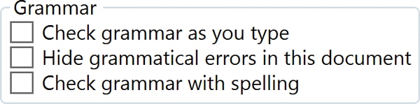
GroupBox is typically used to contain multiple items, but because it is a content control, it can directly contain only a single item. Therefore, you typically need to set GroupBox’s content to an intermediate control that can contain multiple children. A Panel, such as a StackPanel, is perfect for this.
Just like the Content property, the Header property can be set to an arbitrary object, and if it derives from UIElement, it is rendered as expected. For example, changing Header to be a Button as follows produces the result shown in Figure 9.7:
<GroupBox>
<GroupBox.Header>
<Button>Grammar</Button>
</GroupBox.Header>
<StackPanel>
<CheckBox>Check grammar as you type</CheckBox>
<CheckBox>Hide grammatical errors in this document</CheckBox>
<CheckBox>Check grammar with spelling</CheckBox>
</StackPanel>
</GroupBox>

In Figure 9.7, the Button used in the header is fully functional. It can get focus, it can be clicked, and so on.
Expander
Expander is a bit exciting because it’s the only control examined in this chapter that doesn’t already exist in Win32-based user interface technologies such as Windows Forms! Expander is very much like GroupBox, but it contains a button that enables you to expand and collapse the inner content. (By default, the Expander starts out collapsed.)
Figure 9.8 displays the Expander control in its two states. This Expander was created with the same XAML used in Figure 9.6, but with the opening and closing GroupBox tags replaced with Expander tags:
<Expander Header="Grammar">
<StackPanel>
<CheckBox>Check grammar as you type</CheckBox>
<CheckBox>Hide grammatical errors in this document</CheckBox>
<CheckBox>Check grammar with spelling</CheckBox>
</StackPanel>
</Expander>

Expander defines an IsExpanded property and Expanded/Collapsed events. It also enables you to control the direction in which the expansion happens (Up, Down, Left, or Right) with an ExpandDirection property.
The button inside the Expander is actually a restyled ToggleButton. Several of the more complicated controls use primitive controls, such as ToggleButton and RepeatButton, internally.
Summary
Never before has a button been so flexible! In WPF, Button and all the other content controls can contain absolutely anything—but they can directly contain only one item. Now, with the tour of content controls complete, it’s time to move on to controls that can directly contain more than one item—items controls.