
Chapter 11. Images, Text, and Other Controls
This chapter looks at a wide range of controls that are neither content controls nor items controls. Image, some of the text controls, and controls such as ProgressBar and Slider should be familiar to you—but with more richness than you might first expect. This chapter also covers a number of FrameworkContentElements (rather than controls) that enable the creation of flow documents, a powerful but lesser-used aspect of WPF.
The Image Control
System.Windows.Controls.Image enables images (.BMP, .PNG, .GIF, .JPG, and so on) to be rendered in a WPF user interface. It has a Source property of type System.Windows.Media.ImageSource, but thanks to a type converter (System.Windows.Media.ImageSourceConverter), you can set the property to a simple string in XAML, as in this example:
<Image Source="zoom.gif"/>
ImageSource can point to images stored at a URL, on the file system, or even embedded in an assembly. (Retrieving and displaying images embedded in assemblies is covered in the next chapter.) Image has the same Stretch and StretchDirection properties seen with Viewbox in Chapter 5, “Layout with Panels,” for controlling how it scales.
Although using Image is straightforward, some of the advanced options available for image rendering are not. The RenderOptions.BitmapScalingMode attached property can be placed on Image to optimize rendering for speed versus quality. But its most important setting, NearestNeighbor, applies nearest-neighbor bitmap scaling, which can help make images look more crisp. This was used on ToolBar and StatusBar in the preceding chapter and the Photo Gallery application from Chapter 7, “Structuring and Deploying an Application.” Here’s an example:
<Image RenderOptions.BitmapScalingMode="NearestNeighbor" Source="zoom.gif"/>
The difference this property makes is subtle when printed in this book, but the improvement in clarity can make a huge difference on the computer screen. Figure 11.1 demonstrates the images from Photo Gallery with and without NearestNeighbor applied.

Tip
Rather than leveraging the type converter to convert a simple string filename into an ImageSource, you can explicitly set Image’s Source property to any one of several ImageSource subclasses to take advantage of advanced functionality. For example, the BitmapImage subclass contains a number of properties such as DecodePixelWidth and DecodePixelHeight, which can be set to values smaller than the natural size of the image to save a potentially-significant amount of memory. The FormatConvertedBitmap subclass enables you to change the pixel format of the Image to achieve various effects such as making it grayscale. The following XAML leverages FormatConvertedBitmap to create the result in Figure 11.2:
<StackPanel Orientation="Horizontal">
<!-- Normal image with the default pixel format of Pbgra32: -->
<Image Source="photo.jpg" />
<!-- Grayscale image: -->
<Image>
<Image.Source>
<FormatConvertedBitmap Source="photo.jpg" DestinationFormat="Gray32Float" />
</Image.Source>
</Image>
<!-- Black and white image: -->
<Image>
<Image.Source>
<FormatConvertedBitmap Source="photo.jpg" DestinationFormat="BlackWhite" />
</Image.Source>
</Image>
</StackPanel>
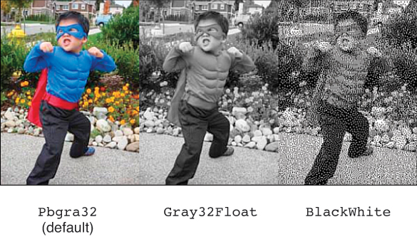
FIGURE 11.2 Displaying an Image with three different pixel formats.
The System.Windows.Media.PixelFormats enumeration contains a long list of possible formats.
Text and Ink Controls
In addition to TextBlock and Label, WPF contains a handful of controls for displaying and editing text, whether typed with a keyboard or hand-written with a stylus. This section looks a bit deeper at TextBlock and also examines the following controls:
TextBox
RichTextBox
PasswordBox
InkCanvas
The design of WPF text rendering has been optimized for large text and/or high-pixel-density displays (the kind that are now becoming commonplace, many years after WPF’s introduction) that require large text in order to be readable, accurate scaling, and high-fidelity printing. This design has historically been problematic for the size of fonts used throughout most applications. WPF text rendering has basically been ahead of its time. However, starting with version 4.0 of WPF, features were added to improve the rendering of small text and text on lower-resolution displays.
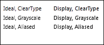
The main feature to be aware of is the TextOptions.TextFormattingMode attached property. It can be placed on individual text elements or, more likely, on a parent control such as Window to affect the text rendering for its entire tree of child elements. By setting TextFormattingMode to Display, you can opt in to text rendering that uses GDI-compatible text metrics. Its key behavior that’s important for text clarity is that every glyph is positioned on a pixel boundary (and its width is a whole multiple of pixels).
The default TextFormattingMode value—the one that has caused developers and users so much grief with blurry rendering of small text—is ironically called Ideal. In this case, the text metrics maintain high fidelity with the font definition, even if it means that glyphs don’t align nicely with pixel boundaries. On screens with a high pixel density as on some of the newest laptops and tablets, this does indeed give the best results (just like it does for large text on older displays).
The TextOptions.TextRenderingMode attached property can be set to ClearType, Grayscale, Aliased, or Auto to control WPF’s antialiasing behavior. When it is set to Auto (the default), ClearType is used unless it has been disabled on the current computer, in which case Grayscale antialiasing is used.
Figure 11.3 demonstrates the difference between the two TextFormattingMode settings and the three non-Auto TextRenderingMode settings, although it’s hard to see the difference on a printed page.
Furthermore, TextOptions.TextHintingMode can be set to Fixed, Animated, or Auto to optimize rendering based on whether the text is stationary or moving.
 FAQ: Shouldn’t I always set TextFormattingMode to Display to take advantage of better text rendering?
No. If your text is large enough (a FontSize of around 15 or greater), Ideal text is just as clear as Display text, and its glyphs are arranged better. Even more importantly, if your text is transformed, Display text renders more poorly because the pixel alignment no longer applies. Display text enlarged by ScaleTransform looks the worst of all, because WPF will scale the original text bitmap rather than re-render it at a larger size. (It does this to guarantee that the text is scaled exactly the right amount, which wouldn’t happen if pixel alignment happened at the larger size.) For typical small labels, however, Display is the clear winner.
TextBlock
TextBlock contains a number of simple properties for modifying its appearance, such as FontFamily, FontSize, FontStyle, FontWeight, and FontStretch. The big secret of TextBlock, however, is that its content property is not its Text property but rather a collection of objects called Inlines. Although the following TextBlock gives the same result as setting the Text property, you’re really setting a different property:
<!-- TextBlock.Inlines is being set here: -->
<TextBlock>Text in a TextBlock</TextBlock>
A type converter makes the value resemble a simple string, but it’s really a collection with one element called Run. Therefore, the preceding XAML is equivalent to the following:
<TextBlock><Run Text="Text in a TextBlock"/></TextBlock>
which is also equivalent to the following XAML because Text is Run’s content property:
<TextBlock><Run>Text in a TextBlock</Run></TextBlock>
A Run is simply a chunk of text with identical formatting. Using a single explicit Run doesn’t add value, but things can start to get interesting when you use multiple Runs in the same TextBlock. For example, the preceding TextBlock could be expressed as follows:
<TextBlock>
<Run>Text</Run>
<Run> in</Run>
<Run> a</Run>
<Run> TextBlock</Run>
</TextBlock>
This still doesn’t change the rendering behavior. Run, however, has several formatting properties that can override the corresponding properties on the parent TextBlock: FontFamily, FontSize, FontStretch, FontStyle, FontWeight, Foreground, and TextDecorations. The following XAML, shown in Figure 11.4, takes advantage of these:
<TextBlock>
<Run FontStyle="Italic" FontFamily="Georgia" Foreground="Red">Rich</Run>
<Run FontSize="30" FontFamily="Comic Sans MS" Foreground="Blue"> Text </Run>
<Run FontFamily="Arial Black" Foreground="Orange" FontSize="100">in</Run>
<Run FontFamily="Courier New" FontWeight="Bold" Foreground="Green"> a </Run>
<Run FontFamily="Verdana" TextDecorations="Underline">TextBlock</Run>
</TextBlock>

Although this is an extreme example, the same technique can be used for something simple like italicizing or underlining a single word in a paragraph. This is much easier than trying to use multiple TextBlocks and worrying about positioning each one correctly. And by using a single TextBlock, you get one consistent clipping and wrapping behavior across the heterogeneous text. There are many more types of Inline objects besides Run; the “Documents” section later in this chapter examines them.
Tip
When you add content to a TextBlock’s Inlines property, the (unformatted) content is appended to its Text property. Therefore, it is still valid to programmatically retrieve the value of the Text property when only Inlines is being explicitly set. For example, the value of Text is the expected “Rich Text in a TextBlock” string for the TextBlock in Figure 11.4.
Digging Deeper: Explicit Versus Implicit Runs
Although the following TextBlock:
<TextBlock>Text in a TextBlock</TextBlock>
is equivalent to this:
<TextBlock><Run>Text in a TextBlock</Run></TextBlock>
the behavior of the type converter is not always straightforward. For example, the following use of another Inline called LineBreak is valid:
<TextBlock>Text in<LineBreak/>a TextBlock</TextBlock>
whereas the following is not:
<TextBlock><Run>Text in<LineBreak/>a TextBlock</Run></TextBlock>
The last variation is not valid because Run’s content property (Text) is a simple string, and you can’t embed a LineBreak element inside a string. The content property of TextBlock (Inlines), however, is converted to one or more Runs via a type converter that specifically handles LineBreak. This type converter makes the following XAML:
<TextBlock>Text in<LineBreak/>a TextBlock</TextBlock>
equivalent to the following TextBlock containing two Runs, one on each side of the LineBreak:
<TextBlock><Run>Text in</Run><LineBreak/><Run>a TextBlock</Run></TextBlock>
TextBox
The TextBox control, pictured in Figure 11.5, enables users to type one or more lines of text. Unlike most other controls in WPF, the content of TextBox is not stored as a generic System.Object. Instead, TextBox stores it in a string property called Text.

Although it looks like a simple control on the surface, TextBox has built-in support for a variety of features: bindings for Cut, Copy, Paste, Undo, and Redo commands (as discussed in Chapter 6, “Input Events: Keyboard, Mouse, Stylus, and Touch”) and even spell checking!
TextBox contains several methods and properties for grabbing chunks of text (by selection, by line number, and so on) as well as methods for converting between a character index, a line index, and a physical point within the control. It also defines TextChanged and SelectionChanged events.
Unless the size of the TextBox is constrained by its surroundings (or unless it is given an explicit size), it grows as the text inside it grows. But when the TextBox’s width is constrained, you can make the text wrap to form additional lines by setting its TextWrapping property to Wrap or WrapWithOverflow. Wrap never allows a line to go beyond the control’s bounds, forcing wrapping even if it’s in the middle of a word. WrapWithOverflow breaks a line only if there’s an opportunity, so long words could get cut off. (TextBlock has the same TextWrapping property.)
FAQ: How can I make TextBox support multiple lines of text?
Setting AcceptsReturn to true allows users to press the Enter key to create a new line of text. Note that TextBox always supports multiple lines of text programmatically. If Text is set to a string containing NewLine characters, it displays the multiple lines regardless of the value of AcceptsReturn. Also, the multiline support is completely independent from text wrapping. Text wrapping applies only to individual lines of text that are wider than the TextBox.
RichTextBox
RichTextBox is a more advanced TextBox that can contain formatted text (and arbitrary objects embedded in the text). Figure 11.6 displays a RichTextBox control with simple formatted text.
RichTextBox and TextBox share the same base class (TextBoxBase), so many of the features described with TextBox apply to RichTextBox as well. RichTextBox has more sophisticated versions of various TextBox properties. Whereas TextBox exposes simple integer properties such as CaretIndex, SelectionStart, and SelectionEnd, RichTextBox exposes a CaretPosition property of type TextPointer and a Selection property of type TextSelection. In addition, RichTextBox’s content is stored in a Document property of type FlowDocument rather than the simple string Text property. The content can even contain embedded UIElements, and they can be interactive and raise events if RichTextBox’s IsDocumentEnabled property is set to true. FlowDocuments are discussed in the upcoming “Documents” section.
PasswordBox
PasswordBox is a simpler TextBox designed for the entry of a password. Rather than display the text typed in, it displays little circles, as shown in Figure 11.7.

PasswordBox does not derive from TextBoxBase like the two previous controls, so it doesn’t support Cut, Copy, Undo, and Redo commands (although it does support Paste), and it doesn’t support spell checking. This is, of course, quite sensible for a control meant to store passwords!
If you don’t like the circle character used to represent each letter of the password, you can choose a new one via the PasswordChar property. (The default character is an asterisk, special-cased to look like a circle.)
PasswordBox’s text is stored in a string property called Password. Internally, the password is stored in a System.Security.SecureString object for a little bit of extra protection. The contents of SecureString are encrypted and aggressively cleared, unlike with System.String, whose unencrypted contents can remain in the garbage-collected heap for an indefinite amount of time.
PasswordBox does not have TextChanged and SelectionChanged events; it defines only a PasswordChanged event. In addition, this event uses the plain RoutedEventHandler delegate, so no information about the old and new passwords is sent with the event. If you must know the current password, you can simply check the Password property within such an event handler.
InkCanvas
The amazing InkCanvas is a versatile element whose primary purpose is to capture handwriting (via a mouse or stylus, but not touch), as pictured in Figure 11.8. InkCanvas is technically not a control, as it derives directly from FrameworkElement, but it acts very much like a control (except for the fact that you can’t restyle it with a new template).

In its default mode, InkCanvas enables simple writing or drawing on its surface. When you use a stylus, its tip automatically writes, and its back end automatically erases. Each stroke is captured as a System.Windows.Ink.Stroke object and stored in InkCanvas’s Strokes collection. But InkCanvas also supports holding any number of arbitrary UIElements in its Children collection (a content property). This makes it easy to annotate just about anything with ink, as shown in Figure 11.9.

This figure was created by drawing on top of the following Window:
<Window xmlns="http://schemas.microsoft.com/winfx/2006/xaml/presentation"
SizeToContent="WidthAndHeight">
<Grid>
<InkCanvas>
<Image Source="http://adamnathan.net/blog/images/anathan.png"/>
</InkCanvas>
</Grid>
</Window>
The SizeToContent setting is pretty interesting in this example, because if you draw out of bounds, the Window automatically resizes to fit your ink strokes if you haven’t resized it manually!
With InkCanvas’s DefaultDrawingAttributes property, you can change the appearance of future strokes (width, color, and so on). Stroke has its own DrawingAttributes property, and appearance can be modified on a stroke-by-stroke basis.
InkCanvas supports several modes, and they can be applied independently to the stylus tip (or mouse) via an EditingMode property and the stylus’s back end via an EditingModeInverted property. A read-only ActiveEditingMode property tells you which of the two modes is currently being used. All three of these properties are of type InkCanvasEditingMode, which has the following values:
Ink—Draws strokes with the mouse or stylus. This is the default for EditingMode.
InkAndGesture—Like Ink but also recognizes gestures made by the user. A list of gestures (such as Up, Down, Circle, ScratchOut, or Tap) can be found in the System.Windows.Ink.ApplicationGesture enumeration.
GestureOnly—Only recognizes gestures; does not draw any strokes from user input.
EraseByStroke—Erases an entire stroke when it is touched. This is the default for EditingModeInverted.
EraseByPoint—Erases only the part of a stroke that is directly touched (like a traditional pencil eraser).
Select—Selects strokes or any UIElements when touched, such that they can be deleted, moved, or resized within the bounds of the InkCanvas.
None—Does nothing in response to mouse or stylus input.
Using the Select mode with normal elements that have nothing to do with ink is pretty interesting, as it automatically gives you a poor-man’s runtime design surface for arranging controls. InkCanvas also defines 15 events, covering everything from changing the editing mode, to changing, moving, or resizing selections, to collecting or erasing strokes, to performing gestures.
Of course, enabling ink in an application is about more than drawing mustaches on people’s faces! Often, you want to apply handwriting recognition to a collection of strokes so you can interpret it as if it were typed text. WPF has built-in gesture recognition but no handwriting recognition engine.
Documents
TextBlock and Label are made for displaying read-only text, whereas TextBox and RichTextBox are essential for displaying editable text. But when it comes to text, WPF includes much more functionality than is provided by these simple elements!
WPF contains a rich set of classes for creating, viewing, modifying, packaging, and storing high-quality documents. The focus of this section is what WPF calls flow documents. A flow document (represented by the FlowDocument element) contains text and other content that can adjust to make optimal use of the space given to the document. For example, on a wide screen, this could mean automatically adding extra columns.
Creating Flow Documents
FlowDocument is a FrameworkContentElement, the content-centric parallel to FrameworkElement. FrameworkContentElements, like FrameworkElements, support data binding, animation, and other WPF mechanisms, but they do not participate in WPF’s layout mechanism. FrameworkContentElements are ultimately housed in a FrameworkElement when displayed on the screen.
Another type of FrameworkContentElement is TextElement, an abstract class that represents content that can be placed inside a FlowDocument. This section examines the various TextElements (from the System.Windows.Documents namespace) and demonstrates how to compose them to create rich and flexible documents.
FAQ: How does WPF’s flow document support relate to the XML Paper Specification (XPS)?
Unlike the dynamic-layout documents described in this section, XPS documents have a fixed layout and always look the same, whether on screen or on paper. The .NET Framework includes APIs for creating and viewing XPS documents (in the System.Windows.Xps and System.Windows.Documents namespaces), or you can use tools such as Microsoft Word to create and view them. In WPF applications, XPS documents are typically represented as instances of FixedDocument and viewed in a DocumentViewer control.
You can think of XPS documents much like Adobe PDF documents; they both have standalone viewers (available on multiple platforms) and can be viewed in a web browser (with the right plug-in installed). One area where XPS is unique is that it’s also a native Windows spool file format (starting with Windows Vista). This ensures that XPS documents can be printed without loss of quality or fidelity and without any extra work done by the application initiating the printing.
The specifications for XPS and the Open Packaging Conventions used by XPS (whose APIs are in the System.IO.Packaging namespace) can be found at http://microsoft.com/xps.
A Simple FlowDocument
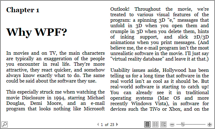
The following XAML shows a straightforward FlowDocument that is simply a collection of Paragraphs (a type of TextElement) representing a draft of Chapter 1 from WPF 4 Unleashed:
<FlowDocument xmlns="http://schemas.microsoft.com/winfx/2006/xaml/presentation">
<Paragraph FontSize="22" FontWeight="Bold">Chapter 1</Paragraph>
<Paragraph FontSize="35" FontWeight="Bold">Why WPF?</Paragraph>
<Paragraph>
In movies and on TV, the ...
</Paragraph>
<Paragraph>...</Paragraph>
<Paragraph>...</Paragraph>
...
</FlowDocument>
Figure 11.10 shows the rendered result of this XAML. You can use a FlowDocument such as this as the root of a XAML file, and it is automatically displayed in an appropriate viewer.
Two main types of TextElements exist—Blocks and Inlines. (Both of these are abstract classes derived from TextElement.) A Block is a rectangular region that can’t be separated (except when it spans multiple pages), whereas an Inline is a region that flows more freely with text, potentially occupying a nonrectangular space (flowing from the end of one line to the beginning of the next). FlowDocument supports only Blocks, such as Paragraph, as its children. (Its content property is called Blocks, which is a BlocksCollection.) We’ll look at the role of Inlines after examining Blocks more closely.
Block
WPF has five different types of Blocks:
Paragraph—Has a collection of Inlines, which typically contain the “meat” of the document. In XAML, you often see Paragraph’s content set to simple text, but internally an Inline called Run is created with that content and added to the Paragraph’s Inlines collection, just like with TextBlock.
Section—Groups one or more Blocks together without imposing any additional structure. This is handy if you want to set the same property values for multiple Blocks, such as a Background and Foreground.
List—Presents a collection of ListItems as a bulleted, numbered, or plain list. Each ListItem can contain a collection of Blocks, so creating a typical text-based List involves placing a Paragraph inside each ListItem. List’s MarkerStyle property (of type TextMarkerStyle) provides plenty of formatting options for bullets—Box, Circle, Disc (the default bullet), and Square—and for numbers—Decimal, LowerLatin, UpperLatin, LowerRoman, and UpperRoman. A plain list can be achieved by setting MarkerStyle to None.
Table—Organizes content into rows and columns, sort of like Grid but closer to an HTML TABLE. Table, unlike Grid, can contain only Blocks (and elements defining the Table’s structure).
BlockUIContainer—Hosts a single UIElement. Therefore, BlockUIContainer is the key to embedding a wide range of WPF content into a FlowDocument, whether it’s an Image, a MediaElement-hosted video, a Button, 3D content in a Viewport3D, and so on.
Listing 11.1 demonstrates the use of all five types of Blocks inside a FlowDocument. The resulting document is displayed in Figure 11.11.
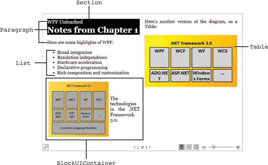
LISTING 11.1 The FlowDocument in Figure 11.11
<FlowDocument xmlns="http://schemas.microsoft.com/winfx/2006/xaml/presentation"
xmlns:x="http://schemas.microsoft.com/winfx/2006/xaml">
<Section LineHeight="2" Foreground="White" Background="Black">
<Paragraph FontSize="18">WPF 4 Unleashed</Paragraph>
<Paragraph FontSize="30" FontWeight="Bold">Notes from Chapter 1</Paragraph>
</Section>
<Paragraph>Here are some highlights of WPF:</Paragraph>
<List>
<ListItem>
<Paragraph>Broad integration</Paragraph>
</ListItem>
<ListItem>
<Paragraph>Resolution independence</Paragraph>
</ListItem>
<ListItem>
<Paragraph>Hardware acceleration</Paragraph>
</ListItem>
<ListItem>
<Paragraph>Declarative programming</Paragraph>
</ListItem>
<ListItem>
<Paragraph>Rich composition and customization</Paragraph>
</ListItem>
</List>
<BlockUIContainer>
<Viewbox>
<StackPanel Orientation="Horizontal">
<Image Source="diagram.jpg" Margin="5"/>
<TextBlock VerticalAlignment="Center" Width="100" TextWrapping="Wrap">
The technologies in the .NET Framework.
</TextBlock>
</StackPanel>
</Viewbox>
</BlockUIContainer>
<Paragraph>
Here's another version of the diagram, as a Table:
</Paragraph>
<Table CellSpacing="5" Padding="15" FontFamily="Segoe UI">
<Table.Background>
<LinearGradientBrush>
<GradientStop Color="Yellow" Offset="0"/>
<GradientStop Color="Orange" Offset="1"/>
</LinearGradientBrush>
</Table.Background>
<!-- Define four columns: -->
<Table.Columns>
<TableColumn/>
<TableColumn/>
<TableColumn/>
<TableColumn/>
</Table.Columns>
<!-- Create three rows: -->
<TableRowGroup>
<TableRow>
<TableCell ColumnSpan="4" TextAlignment="Center">
<Paragraph FontWeight="Bold">.NET Framework</Paragraph>
</TableCell>
</TableRow>
<TableRow>
<TableCell BorderBrush="Black" BorderThickness="2" Background="LightGray"
TextAlignment="Center" LineHeight="70">
<Paragraph FontWeight="Bold">WPF</Paragraph>
</TableCell>
<TableCell BorderBrush="Black" BorderThickness="2" Background="LightGray"
TextAlignment="Center">
<Paragraph FontWeight="Bold">WCF</Paragraph>
</TableCell>
<TableCell BorderBrush="Black" BorderThickness="2" Background="LightGray"
TextAlignment="Center">
<Paragraph FontWeight="Bold">WF</Paragraph>
</TableCell>
<TableCell BorderBrush="Black" BorderThickness="2" Background="LightGray"
TextAlignment="Center">
<Paragraph FontWeight="Bold">WCS</Paragraph>
</TableCell>
</TableRow>
<TableRow>
<TableCell BorderBrush="Black" BorderThickness="2" Background="LightGray"
TextAlignment="Center">
<Paragraph FontWeight="Bold">ADO.NET</Paragraph>
</TableCell>
<TableCell BorderBrush="Black" BorderThickness="2" Background="LightGray"
TextAlignment="Center">
<Paragraph FontWeight="Bold">ASP.NET</Paragraph>
</TableCell>
<TableCell BorderBrush="Black" BorderThickness="2" Background="LightGray"
TextAlignment="Center">
<Paragraph FontWeight="Bold">Windows Forms</Paragraph>
</TableCell>
<TableCell BorderBrush="Black" BorderThickness="2" Background="LightGray"
TextAlignment="Center">
<Paragraph FontWeight="Bold">...</Paragraph>
</TableCell>
</TableRow>
</TableRowGroup>
</Table>
</FlowDocument>
Paragraphs are used throughout the document, but Section is used at the beginning to give two Paragraphs different Foreground, Background, and LineHeight. List is then used with its default settings for a straightforward bulleted list. BlockUIContainer is used to contain not only an Image, but a corresponding caption in the form of a TextBlock. They are arranged in a StackPanel and then placed inside a Viewbox so both items scale nicely as the width of the document changes.
Finally, for demonstration purposes, the content of the Image is mimicked with a Table. Notice that the APIs exposed by Table (and, therefore, the structure of elements inside Table in XAML) differ considerably from those of Grid. Columns are defined by placing TableColumn elements inside Table’s Columns collection (similar to Grid’s ColumnDefinitions collection), but the rows are defined directly with the content they contain. Table contains a TableRowGroup with a bunch of TableRows placed in the order in which they appear, from top to bottom. Each TableCell inside a TableRow fills the next available column sequentially, unless ColumnSpan is set to give different behavior. TableCell is the only element that can contain the Blocks that form the content of the Table, which, in this case, are all Paragraphs.
Table can even contain multiple TableRowGroups! The content of each one is placed directly below the previous one.
Figure 11.11 shows that the Table ends up looking pretty similar to the Image embedded in the document. Of course, the two have very different behaviors. The text in the Table is selectable and scales perfectly as you zoom in to the document. But whereas the Image is never split between pages, the Table can be. The inner text content can also wrap when space is tight. Figure 11.12 shows this splitting and wrapping.

FIGURE 11.12 A different view of the FlowDocument from Figure 11.11, with the Table split between pages 2 and 3.
Inline
Inlines are elements that can be placed inside a Paragraph to make its content more interesting than plain text. As mentioned in the previous section, Paragraphs don’t really contain a simple string, but rather a collection of Inlines. And when a Paragraph defined in XAML appears to contain plain text, it really contains a single Inline known as Run. Run has a simple Text string property and a constructor that accepts a string.
Therefore, the following Paragraph defined in XAML:
<Paragraph>Here are some highlights of WPF:</Paragraph>
is equivalent to the following C# code:
Paragraph p = new Paragraph(new Run("Here are some highlights of WPF:"));
Other Inlines for enhancing a paragraph fall into three categories: spans, anchored blocks, and everything else.
Spans
The most common spans are Bold, Italic, Underline, and the familiar Hyperlink from Chapter 7. They all fittingly derive from Span, which can also be used directly in a Paragraph for applying additional effects to text. Although Paragraphs already support making their text bold, italic, and so on through the setting of properties such as FontWeight and FontStyle, these spans make it possible to apply these effects to smaller regions within the Paragraph.
The following Paragraph, which is rendered in Figure 11.13, demonstrates all these spans:
<Paragraph>
<Bold>bold</Bold>
<Italic>italic</Italic>
<Underline>underline</Underline>
<Hyperlink>hyperlink</Hyperlink>
<Span BaselineAlignment="Superscript">superscript</Span>
<Span BaselineAlignment="Subscript">subscript</Span>
<Span>
<Span.TextDecorations>
<TextDecoration Location="Strikethrough"/>
</Span.TextDecorations>
strikethrough
</Span>
</Paragraph>

Tip
Because TextBlock stores its contents as a collection of Inlines, you could replace the Paragraph tags in the previous XAML snippets with TextBlock tags, and they would still work. Label, on the other hand, does not directly support such content.
The BaselineAlignment and TextDecorations properties used on Span are common to all Inlines, so they can easily be combined with Bold, Italic, or other effects. In addition, as with Paragraph, the content of any span is actually a collection of Inlines rather than a simple string. In the previous XAML, this means that there’s an implicit Run inside every child of Paragraph. This also means that you can easily embed spans within spans, as in the following Paragraph, rendered in Figure 11.14:
<Paragraph>
a<Bold>b<Italic>c<Underline>d<Hyperlink>e</Hyperlink>f</Underline>g</Italic>h
</Bold>i
</Paragraph>
Anchored Blocks
WPF contains two Inlines that are a bit unusual because they are designed to contain Blocks. They are Figure and Floater, and both derive from the abstract AnchoredBlock class.
Figure is like a mini-FlowDocument that can be embedded in the outer FlowDocument. The inner content is isolated from the outer content, which flows around the Figure. For example, the FlowDocument representing Chapter 1 might want to have its paragraphs flow around images (just like the figures in this book). This could be done as follows:
<FlowDocument xmlns="http://schemas.microsoft.com/winfx/2006/xaml/presentation">
<Paragraph FontSize="22" FontWeight="Bold">Chapter 1</Paragraph>
<Paragraph FontSize="35" FontWeight="Bold">Why WPF?</Paragraph>
<Paragraph>
<Figure Width="130">
<BlockUIContainer>
<Image Source="wpf.png"/>
</BlockUIContainer>
</Figure>
In movies and on TV, the ...
</Paragraph>
<Paragraph>...</Paragraph>
<Paragraph>...</Paragraph>
...
</FlowDocument>
Because a Figure contains Blocks, you can place a Table, Paragraphs, and so on inside it. But using BlockUIContainer to hold an Image is all we need in this case. The result is shown in Figure 11.15.
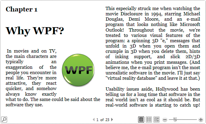
You can adjust the placement of a Figure with the HorizontalAnchor and VerticalAnchor properties (of type FigureHorizontalAnchor and FigureVerticalAnchor, respectively). The default value for HorizontalAnchor is ColumnRight, and the default value for VerticalAnchor is ParagraphTop. Both properties provide many options for placement based on the current column or Paragraph, or even relative to the bounds of the entire page. Figure 11.16 demonstrates some alternative placements for the Figure in Figure 11.15 by explicitly setting HorizontalAnchor and/or VerticalAnchor.
Floater is a simplified form of Figure. It can contain arbitrary Blocks, but it does not support positioning relative to the page bounds or even spanning columns. Rather than having HorizontalAnchor and VerticalAnchor properties, it has a simple HorizontalAlignment property (of type HorizontalAlignment) that can be set to Left, Center, Right, or Stretch. If you don’t require the full functionality of Figure, you might as well use the lighter-weight Floater instead.
Other Inlines
The two remaining Inlines don’t have anything in common other than the fact that they don’t derive from Span or AnchoredBlock. One of them is LineBreak, which functions as a newline. If you simply place an empty LineBreak element between any two characters in a paragraph, the second character will start on the following line.
Tip
To place a page break rather than a line break in a FlowDocument, set the BreakPageBefore property to true on the first Paragraph you want after the break. BreakPageBefore is defined on Block, so this also applies to Section, List, BlockUIContainer, and Table.
The last Inline is InlineUIContainer, which is just like BlockUIContainer except with the ability to be inserted into a Paragraph and flow with the rest of the text. As with BlockUIContainer, it can contain a MediaElement-hosted video, a Button, 3D content in a Viewport3D, and so on, but it’s often handy simply to include a little inline Image. The following Paragraph, rendered in Figure 11.17, demonstrates this with an inline RSS icon next to a Hyperlink to an RSS feed:
<Paragraph>
You can read more about this on my blog (
<Hyperlink NavigateUri="http://blogs.msdn.com/adam_nathan/rss.xml">
subscribe
</Hyperlink>
<InlineUIContainer>
<Image Width="14" Source="rss.gif"/>
</InlineUIContainer>
), which I try to update once a month.
</Paragraph>
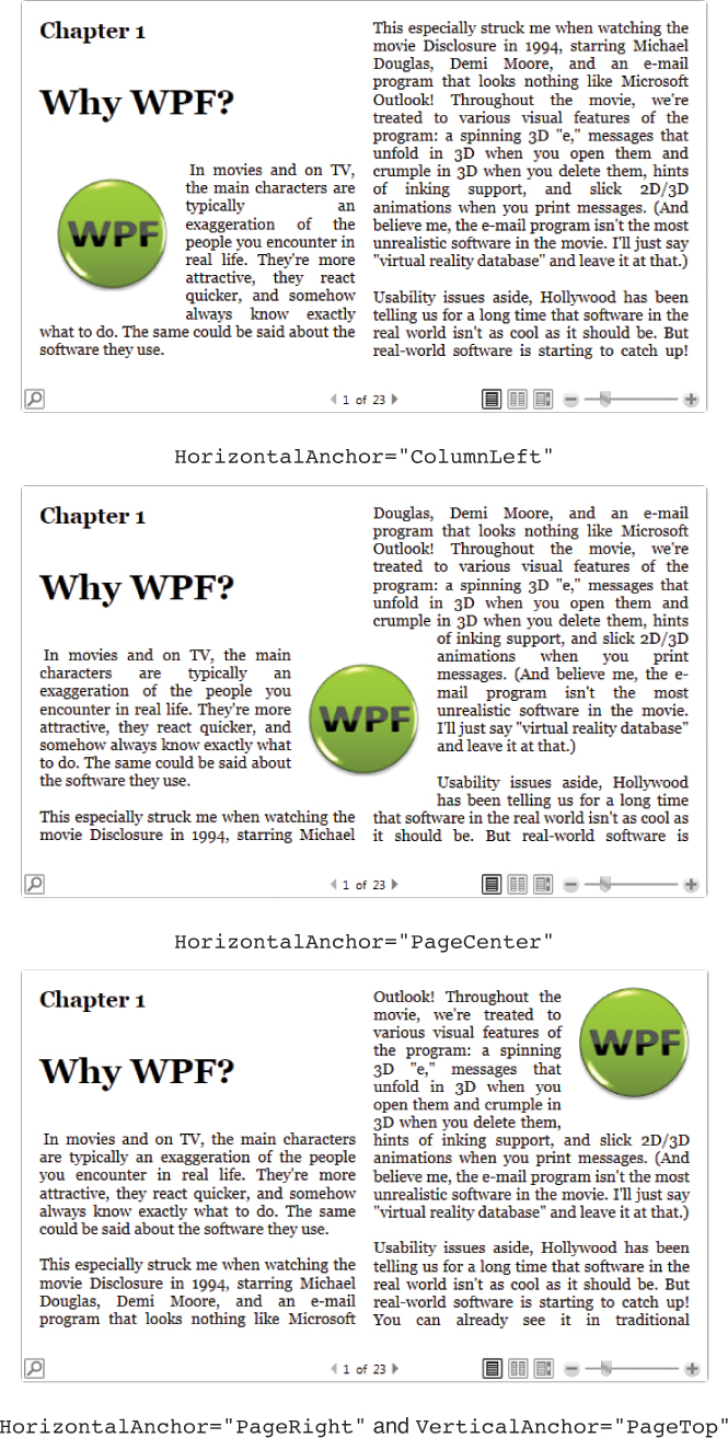
Displaying Flow Documents
As mentioned earlier, a FlowDocument can be viewed (and edited) inside a RichTextBox. Although you can prevent user edits by setting RichTextBox’s IsReadOnly property to true, RichTextBox is not meant to be the typical control that applications use for document reading.
Instead, WPF provides three additional controls for displaying flow documents. They can be hard to keep straight at first, but the differences are straightforward:
FlowDocumentScrollViewer—Displays a document as one continuous file with a scrollbar, similar to the Web Layout mode in Microsoft Word (and similar to a read-only RichTextBox inside a ScrollViewer).
FlowDocumentPageViewer—Displays a document as discrete pages, similar to the Full Screen Reading mode in Microsoft Word.
FlowDocumentReader—Combines FlowDocumentScrollViewer and FlowDocumentPageViewer into a single control and exposes additional functionality such as built-in text search. (This is the control you get by default if you use FlowDocument as the root element in your XAML file.)
Figure 11.18 shows the differences between these controls by displaying the FlowDocument containing the Chapter 1 draft. FlowDocumentReader is a rich control (somewhat like the common viewers for XPS or PDF files), but if you don’t require switching between scrolling and pagination, you might as well use one of the more lightweight viewers. Both FlowDocumentPageViewer and FlowDocumentReader (in pagination mode) automatically add/remove columns as you zoom out/in to maximize the use of available space.
Notice that FlowDocumentScrollViewer doesn’t show the zoom functionality that appears in the other two, but you can enable this by setting its IsToolBarVisible property to true.
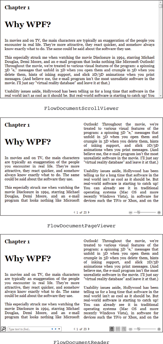
Adding Annotations
The three viewers for FlowDocument (plus DocumentViewer, the viewer for FixedDocument) support annotations, which enable users to highlight content or attach notes in the form of text or ink. The strange thing about this support is that you have to define your own user interface for enabling it; there are no default controls to reveal.
Although crafting your own custom user interface for annotations is tedious, it’s not very difficult. That’s because an AnnotationService class in the System.Windows.Annotations namespace exposes a command for each of the important annotation-controlling features:
CreateTextStickyNoteCommand attaches a new text-based StickyNoteControl as an annotation on the selected text.
CreateInkStickyNoteCommand attaches a new ink-based StickyNoteControl as an annotation on the selected text.
DeleteStickyNotesCommand deletes the currently selected StickyNoteControl(s).
CreateHighlightCommand highlights the selected text in the color passed as the command’s parameter.
ClearHighlightsCommand removes any highlighting from the currently selected text.
Listing 11.2 defines a Window that adds a few simple Buttons on top of a FlowDocumentReader. Each of these Buttons is assigned to one of the previously described commands.
LISTING 11.2 Window1.xam—The User Interface for an Annotation-Enabled FlowDocumentReader
<Window
xmlns="http://schemas.microsoft.com/winfx/2006/xaml/presentation"
xmlns:x="http://schemas.microsoft.com/winfx/2006/xaml"
xmlns:a=
"clr-namespace:System.Windows.Annotations;assembly=PresentationFramework"
Title="FlowDocumentReader + Annotations"
x:Class="Window1" Initialized="OnInitialized" Closed="OnClosed">
<StackPanel>
<StackPanel Orientation="Horizontal">
<Label>Control Annotations:</Label>
<Button Command="a:AnnotationService.CreateTextStickyNoteCommand"
CommandTarget="{Binding ElementName=reader}">
Create Text Note
</Button>
<Button Command="a:AnnotationService.CreateInkStickyNoteCommand"
CommandTarget="{Binding ElementName=reader}">
Create Ink Note
</Button>
<Button Command="a:AnnotationService.DeleteStickyNotesCommand"
CommandTarget="{Binding ElementName=reader}">
Remove Note
</Button>
<Button Command="a:AnnotationService.CreateHighlightCommand"
CommandParameter="{x:Static Brushes.Yellow}"
CommandTarget="{Binding ElementName=reader}">
Create Yellow Highlight
</Button>
<Button Command="a:AnnotationService.ClearHighlightsCommand"
CommandTarget="{Binding ElementName=reader}">
Remove Highlight
</Button>
</StackPanel>
<FlowDocumentReader x:Name="reader">
<FlowDocument>
...
</FlowDocument>
</FlowDocumentReader>
</StackPanel>
</Window>
The System.Windows.Annotations namespace is given an XML namespace prefix of a, used to refer to each of the commands on AnnotationService. Although AnnotationService is part of PresentationFramework, this namespace happens to not be included in WPF’s standard XML namespace. For the commands to work, each of these Buttons uses the FlowDocumentReader element as the command target. The Buttons become enabled and disabled automatically, based on the context in which each command is valid.
The only thing missing is the definition of the OnInitialized and OnClosed methods referenced in the XAML file. Listing 11.3 contains the code-behind file for Listing 11.2.
LISTING 11.3 Window1.xaml.cs—The Logic for an Annotation-Enabled FlowDocumentReader
using System;
using System.IO;
using System.Windows;
using System.Windows.Annotations;
using System.Windows.Annotations.Storage;
public partial class Window1 : Window
{
FileStream stream;
public Window1()
{
InitializeComponent();
}
protected void OnInitialized(object sender, EventArgs e)
{
// Enable and load annotations
AnnotationService service = AnnotationService.GetService(reader);
if (service == null)
{
stream = new FileStream("storage.xml", FileMode.OpenOrCreate);
service = new AnnotationService(reader);
AnnotationStore store = new XmlStreamStore(stream);
store.AutoFlush = true;
service.Enable(store);
}
}
protected void OnClosed(object sender, EventArgs e)
{
// Disable and save annotations
AnnotationService service = AnnotationService.GetService(reader);
if (service != null && service.IsEnabled)
{
service.Disable();
stream.Close();
}
}
}
The main purpose of the OnInitialized and OnClosed methods is to enable and disable the AnnotationService associated with the FlowDocumentReader. However, when enabling the service, you must also specify a Stream that persists the annotations. Listing 11.3 uses a standalone XML file in the current directory. When the application is closed, any annotations are saved and reappear the next time the application is run (as long as the storage.xml file remains untouched).
Figure 11.19 shows an instance of this annotation-enabled Window in action.
Tip
The StickyNoteControls used by annotations are full-blown WPF controls (in the System.Windows.Controls namespace). Therefore, you can restyle them with a completely different control template if you want to customize their look.
Range Controls
Range controls do not render arbitrary content like content controls or items controls. A range control simply stores and displays a numeric value that falls within a specified range.
The core functionality of range controls comes from an abstract class called RangeBase. This class defines properties of type double that store the current value and the endpoints of the range: Value, Minimum, and Maximum. It also defines a simple ValueChanged event.
This section examines the two major built-in range controls—ProgressBar and Slider. WPF also has a primitive ScrollBar control that derives from RangeBase, but you’re unlikely to want to use it directly. Instead, you would use a ScrollViewer object, as described in Chapter 5.
ProgressBar
In an ideal world, you would never need to use a ProgressBar in your software. But when faced with long-running operations, showing users a ProgressBar helps them realize that progress is indeed being made. Therefore, using a ProgressBar in the right places can dramatically improve usability. (Of course, it doesn’t improve usability as much as making the slow operation fast enough in the first place!) Figure 11.20 displays the default look for WPF’s ProgressBar control.
ProgressBar has a default Minimum of 0 and a default Maximum of 100. It adds only two public properties to what RangeBase already provides:
IsIndeterminate—When this is set to true, ProgressBar shows a generic animation (so the values of Minimum, Maximum, and Value don’t matter). This is a great feature when you have no clue how long something will take or are too lazy to do the work required to show true progress!
Orientation—This is set to Horizontal by default but can be set to Vertical to make progress go from bottom to top rather than left to right. I haven’t seen applications use “thermometer-style” vertical progress bars other than the old-fashioned full-screen installation applications, but this property nevertheless makes it easy to achieve such an effect!
FAQ: How can I give ProgressBar paused or stopped/error states?
Starting with Windows Vista, the Win32 progress bar can show a paused (yellow) state and a stopped/error (red) state. Unfortunately, the WPF ProgressBar does not have built-in support for this. If you want to achieve a similar effect, you need to create new templates for these states and apply them to the control programmatically, using techniques described in Chapter 14, “Styles, Templates, Skins, and Themes.”
Slider
Slider is a bit more complicated than ProgressBar because it enables users to change the current value by moving its thumb through any number of optional ticks. Slider is shown in Figure 11.21.

Slider also has a default Minimum of 0, but it has a default Maximum of 10. It also defines an Orientation property (and is Horizontal by default), but it contains several properties for adjusting the placement and frequency of ticks, the placement and precision of ToolTips that can show the current value as the thumb is moved, and whether the thumb snaps to tick values or moves smoothly to any arbitrary value. For keyboard navigation purposes, Slider also contains Delay and Interval properties that work just like RepeatButton’s properties of the same names.
Ticks are enabled by setting TickPlacement to TopLeft, BottomRight, or Both. The values for TickPlacement have odd names, but they cover both orientations of Slider. When TickPlacement is set to BottomRight, the ticks are on the bottom when the Slider is horizontal and on the right when the Slider is vertical. Similarly, when TickPlacement is set to TopLeft, the ticks are on the top when the Slider is horizontal and on the left when the Slider is vertical. When TickPlacement is set to None (the default value), the thumb is given a simpler look, as shown in Figure 11.22.

One interesting feature of Slider is its support for displaying a smaller range within the current range, as shown in Figure 11.23. If IsSelectionRangeEnabled is set to true, SelectionStart and SelectionEnd can be set to the desired values of this “subrange.” There’s nothing built in to the control that enables a user to set the subrange via keyboard or mouse, nor does it enforce that the thumb stays within the subrange. With this feature, you could make the Slider act like the one in Windows Media Player, where a background bar indicates how much of the current media has been downloaded.

Calendar Controls
Two calendar controls provide rich visualizations for selecting and displaying dates: Calendar and DatePicker.
Calendar
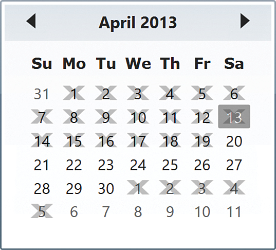
The Calendar control, displayed in Figure 11.24, displays a calendar that looks much like the main one in Windows. It supports three different modes with its DisplayMode property. The user can initiate upward transitions from Month to Year to Decade by continuing to click the text in the header, and downward transitions by clicking any of the calendar cells. Unlike the Windows calendar, the WPF Calendar control doesn’t support a century mode, and its built-in style unfortunately doesn’t perform the slick animation when transitioning between modes.

FIGURE 11.24 The WPF Calendar, displayed with each of its DisplayMode values, as it appears on April 13, 2013.
Calendar’s DisplayDate (of type DateTime) is initialized to the current day by default (April 13, 2013 in Figure 11.24). Calendar ensures that the DisplayDate is initially visible, although the specific date doesn’t appear differently from the other dates in Month mode. The reason April 13 appears in gray in Figure 11.24 is that Calendar highlights today’s date independent of DisplayDate’s value. To turn this off, you can set Calendar’s IsTodayHighlighted property to false.
One or more dates in the calendar can be selected, depending on the value of SelectionMode:
SingleDate—Only one date can be selected at a time, stored in the SelectedDate property. This is the default value.
SingleRange—Multiple dates can be selected, but only if they are in a contiguous range. The selected dates are stored in the SelectedDates property.
MultipleRange—Multiple noncontiguous dates can be selected, stored in the SelectedDates property.
None—No dates can be selected.
You can set the DisplayDateStart and/or DisplayDateEnd properties (also of type DateTime) to restrict the range of available dates displayed inside Calendar. Figure 11.25 shows what this looks like in each of the DisplayModes. The result can look a bit goofy, as the six-week layout of the Month mode and the 4x4 layout of the other two modes never change.

FIGURE 11.25 The impact of setting DisplayDateStart to April 10, 2013 and DisplayDateEnd to April 25, 2013.
Alternatively, you can choose ranges of dates to be nonselectable despite being displayed. This is accomplished with Calendar’s BlackoutDates property, which is a collection of CalendarDateRange objects. Figure 11.26 shows the result of setting BlackoutDates to a pair of ranges as follows:
<Calendar>
<Calendar.BlackoutDates>
<CalendarDateRange Start="4/1/2013" End="4/19/2013"/>
<CalendarDateRange Start="5/1/2013" End="5/5/2013"/>
</Calendar.BlackoutDates>
</Calendar>
This only affects the Month mode.
The type of the BlackoutDates property is CalendarBlackoutDatesCollection, a subclass of ObservableCollection<CalendarDateRange> that has one particularly handy method: AddDatesInPast. By calling this, you can blackout all dates before the current date. However, because calling this method requires procedural code, it might be easier to explicitly use a CalendarDateRange with a Start value of DateTime.MinValue (January 1, 0001) and an End value of DateTime.Today minus one day.
Designed for cultures where Sunday isn’t considered to be the first day of the week, Calendar’s FirstDayOfWeek property can be set to any value of the System.DayOfWeek enumeration to change its display accordingly. Calendar also has events covering all the major property changes: DisplayDateChanged, DisplayModeChanged, SelectionModeChanged, and SelectedDatesChanged (which handles both single selection and multiselect modes).
DatePicker
The other calendar control—DatePicker—is basically a TextBox for displaying and entering a date with an associated Calendar popup for visually changing the date. It is pictured in Figure 11.27.

DatePicker’s popup contains an instance of the now-familiar Calendar control, which is responsible for most of DatePicker’s interesting functionality. DatePicker contains the same properties and events as Calendar except for DisplayMode, SelectionMode, and the corresponding property change events. Instead, the popup’s DisplayMode is always Month and its SelectionMode is always SingleDate. Due to its single selection, DatePicker has a SelectedDateChanged event instead of a SelectedDatesChanged event. It also lacks Calendar’s DisplayDateChanged event, for no particular reason.
DatePicker has a few unique properties and events for controlling the behavior of its TextBox and its interaction with the popup. The Boolean IsDropDownOpen property can be used to programmatically open or close the Calendar popup, or it can be inspected to determine its current state. CalendarOpened and CalendarClosed events are raised when appropriate. SelectedDateFormat controls the format of the string that gets placed in the TextBox when a date is selected in the Calendar. With its default value of Short, it is given a format such as 4/20/2014. It can also be set to Long, which gives a format such as Friday, April 20, 2014. At any time, the string inside the TextBox can be set or retrieved via DatePicker’s Text property. If a string is entered that is not a valid date, the DateValidationError event is raised.
DatePicker’s TextBox (a TextBox-derived class called DatePickerTextBox) is not the nicest-looking control—the calendar icon that opens the popup when clicked inexplicably always shows “15” as its fake date. The only way to customize its appearance is to completely replace its control template.
Summary
You’ve now seen the major built-in controls that can be used for creating traditional (and perhaps some not-so-traditional) user interfaces. Although you can radically change the look of these controls by using the techniques discussed in Chapter 14, the core behavior described in this part of the book remains the same.