
Chapter 15. 2D Graphics
Applications and components can have many reasons for drawing rectangles, ellipses, lines, or other shapes and paths. Most custom control templates tend to require some drawing to get their custom look, as was done in the previous chapter with Button and ProgressBar templates. But applications might simply want to provide an experience with custom rendering, regardless of whether it’s done in the context of controls. This could be in the form of a product logo or simple curves to separate areas of a Window. On the Web, these types of experiences are typically created by embedding images, but with the drawing capabilities of WPF, you can do all this with vector drawings that scale perfectly to any size.
The ability to create and use vector-based 2D graphics is not unique to WPF; even GDI enabled the drawing of paths and shapes. The main difference with drawing in WPF versus GDI or any previous Windows technology is that WPF is a completely retained-mode graphics system rather than an immediate-mode graphics system.
In an immediate-mode system (GDI, GDI+, DirectX, and so on), you can draw “directly” onto the screen, but you must maintain the state of all visuals. In other words, it’s your responsibility to draw the correct pixels when a region of the screen is invalidated. This invalidation can be caused by user actions, such as resizing the window, or by application-specific actions that require updated visuals.
In a retained-mode system, you can describe higher-level concepts such as “place a 10x10 blue square at (0,0),” and the system remembers and maintains the state for you. So, what you’re really saying is, “place a 10x10 blue square at (0,0) and keep it there.” You don’t need to worry about invalidation and repainting, so this can save a significant amount of work. It’s also the key to WPF’s seamless support for overlapping objects, transparency, video, resolution independence, and so on.
As with many other things in WPF, there are multiple ways to create and use two-dimensional graphics. This chapter focuses on three important data types: Drawing, Visual, and Shape. Their relationship to each other is complex. For the most part, Drawings are simple descriptions of paths and shapes with associated fill and outline Brushes. Visuals are one way to draw Drawings onto the screen, but Visuals also unlock a lower-level and lighter-weight approach for drawing that enable you to ditch Drawing objects altogether. Finally, Shapes are prebuilt Visuals that are the easiest (but most heavyweight) approach for drawing custom artwork onto the screen. Shapes also happen to be the only one of these three data types directly exposed to Windows Store apps and Silverlight apps. As we examine Drawings, Visuals, and Shapes, we’ll look at a simple piece of clip art and see what it means to create and use it in all three contexts.
The end of the chapter covers Brushes, special effects, and features for maximizing the performance of graphics-rich applications. Brushes are a vital part of all the topics in this chapter, and they have been used throughout the book for mundane tasks such as setting a control’s Foreground and Background. WPF has many different feature-rich Brushes, which is why they deserve a dedicated section. Effects such as drop shadows or blurring are not commonly used features, but they can add really slick touches to your user interface that would be difficult to create without them.
Drawings
The abstract Drawing class represents a two-dimensional drawing. Drawing—specifically its GeometryDrawing subclass—was designed to be WPF’s version of clip art. It’s sufficient for representing any 2D illustration, and, as with all classes deriving from Animatable, it even supports animation, data binding, resource references, and more!
WPF includes five concrete subclasses of Drawing:
 GeometryDrawing—Combines a
 Geometry with a Brush that fills it and a Pen that outlines it. This is the subclass most relevant for this chapter.
ImageDrawing—Combines an ImageSource with a Rect that defines its bounds.
VideoDrawing—Combines a MediaPlayer (discussed in Chapter 18, “Audio, Video, and Speech”) with a bounding Rect.
GlyphRunDrawing—Combines a GlyphRun, a low-level text class, with a Brush for its foreground.
DrawingGroup—Contains a collection of Drawings and has a handful of properties for altering them in bulk (Opacity, Transform, and so on). DrawingGroup is itself a Drawing so it can be plugged in wherever a Drawing can be used. (This is just like the relationship between TransformGroup and Transform.)
Here’s an example of a GeometryDrawing that contains a Geometry describing an ellipse (EllipseGeometry), an orange Brush, and a black Pen:

Drawings are not UIElements; they don’t have any rendering behavior on their own. Therefore, if you try to place the preceding GeometryDrawing inside a Window or another ContentControl, you’ll get a simple TextBlock containing the string "System.Windows.Media.GeometryDrawing" (the fallback ToString rendering).
To get Drawings rendered appropriately, you can place them inside one of three different host objects:
DrawingImage—Derives from ImageSource, so it can be used inside an Image rather than the typical BitmapImage.
DrawingBrush—Derives from Brush, so it can be applied in many places, such as the Foreground, Background, or BorderBrush on a Control.
DrawingVisual—Derives from Visual and is covered in the “Visuals” section, later in this chapter.
Therefore, you can use DrawingImage with the preceding GeometryDrawing as follows to get it drawn on the screen:
<Image>
<Image.Source>
<DrawingImage>
<DrawingImage.Drawing>
<GeometryDrawing Brush="Orange">
<GeometryDrawing.Pen>
<Pen Brush="Black" Thickness="10"/>
</GeometryDrawing.Pen>
<GeometryDrawing.Geometry>
<EllipseGeometry RadiusX="100" RadiusY="50"/>
</GeometryDrawing.Geometry>
</GeometryDrawing>
</DrawingImage.Drawing>
</DrawingImage>
</Image.Source>
</Image>
Figure 15.1 shows the rendered result of this Image that ultimately contains the GeometryDrawing.

FIGURE 15.1 A simple EllipseGeometry inside a GeometryDrawing, inside a DrawingImage, inside an Image.
The fact that DrawingImage is an ImageSource opens the door to generating images for vector-based content and using them in places you might not expect. Window.Icon is an ImageSource, as are TaskbarItemInfo.Overlay and ThumbButtonInfo.ImageSource (introduced in Chapter 8, “Exploiting Windows Desktop Features”). Figure 15.2 shows what happens when you use DrawingImage to apply the same GeometryDrawing to all three of these properties, as in this example:
<Window ...>
<Window.Icon>
<DrawingImage>
<DrawingImage.Drawing>
<GeometryDrawing Brush="Orange">
<GeometryDrawing.Pen>
<Pen Brush="Black" Thickness="10"/>
</GeometryDrawing.Pen>
<GeometryDrawing.Geometry>
<EllipseGeometry RadiusX="100" RadiusY="50"/>
</GeometryDrawing.Geometry>
</GeometryDrawing>
</DrawingImage.Drawing>
</DrawingImage>
</Window.Icon>
...
</Window>

FIGURE 15.2 Applying the same EllipseGeometry to a Window’s icon, taskbar item overlay, and all its thumb buttons.
Previous chapters have used Brushes enough times that you should be fairly comfortable with the concept. Brushes have a lot more functionality than discussed so far, however, and are not specific to Drawings. Therefore, the “Brushes” section near the end of this chapter examines these features. For now, we’ll look at the two other components of GeometryDrawing: Geometry and Pen.
Geometries
A Geometry is the simplest possible abstract representation of a shape or path. It exposes methods that enable you to ask it geometric questions such as “What is your area?” or “Do you intersect this point?” Geometry has a number of subclasses, which can be grouped into basic geometries and aggregate geometries.
Basic Geometries
The four basic geometries are as follows:
RectangleGeometry—Has a Rect property for defining its dimensions and RadiusX and RadiusY properties for defining rounded corners.
EllipseGeometry—Has RadiusX and RadiusY properties, plus a Center property.
LineGeometry—Has StartPoint and EndPoint properties to define a line segment.
PathGeometry—Contains a collection of PathFigure objects in its Figures content property; a general-purpose Geometry.
The first three geometries are really just special cases of PathGeometry, provided for convenience. You can express any rectangle, ellipse, or line segment in terms of a PathGeometry. So, let’s dig a little more into the components of the powerful PathGeometry class.
PathFigures and PathSegments
Each PathFigure in a PathGeometry contains one or more connected PathSegments in its Segments content property. A PathSegment is simply a straight or curvy line segment, represented by one of seven derived classes:
LineSegment—A class for representing a line segment (of course!)
PolyLineSegment—A shortcut for representing a connected sequence of LineSegments
ArcSegment—A class for representing a segment that curves along the circumference of an imaginary ellipse
BezierSegment—A class for representing a cubic Bézier curve
PolyBezierSegment—A shortcut for representing a connected sequence of BezierSegments
QuadraticBezierSegment—A class for representing a quadratic Bézier curve
PolyQuadraticBezierSegment—A shortcut for representing a connected sequence of QuadraticBezierSegments
The following GeometryDrawing contains a PathGeometry with two simple LineSegments that create the L shape in Figure 15.3:
<GeometryDrawing>
<GeometryDrawing.Pen>
<Pen Brush="Black" Thickness="10"/>
</GeometryDrawing.Pen>
<GeometryDrawing.Geometry>
<PathGeometry>
<PathFigure>
<LineSegment Point="0,100"/>
<LineSegment Point="100,100"/>
</PathFigure>
</PathGeometry>
</GeometryDrawing.Geometry>
</GeometryDrawing>
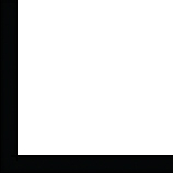
Of course, to produce the visuals in Figure 15.3, the GeometryDrawing must be hosted in something like a DrawingImage, as done previously.
Notice that the definition for each LineSegment includes only a single Point. That’s because it implicitly connects the previous point to the current one. The first LineSegment connects the default starting point of (0,0) to (0,100), and the second LineSegment connects (0,100) to (100,100). (The other six PathSegments act the same way.) If you want to provide a custom starting point, you can simply set PathFigure’s StartPoint property to a Point other than (0,0).
You might expect that applying a Brush to this GeometryDrawing is meaningless, but Figure 15.4 shows that it actually fills it as a polygon, pretending that a line segment exists to connect the last point back to the starting point. Figure 15.4 was created by adding the following Brush to the preceding XAML:
<GeometryDrawing Brush="Orange">
...
</GeometryDrawing>

To turn the imaginary line segment into a real one, you could add a third LineSegment to the PathFigure explicitly, or you could simply set PathFigure’s IsClosed property to true. The result of doing either is shown in Figure 15.5.

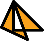
Because all PathSegments within a PathFigure must be connected, you can place multiple PathFigures in a PathGeometry if you want disjoint shapes or paths in the same Geometry. You could also overlap PathFigures to create results that would be complicated to replicate in a single PathFigure. For example, the following XAML overlaps the triangle from Figure 15.5 with a triangle that is given a different StartPoint but is otherwise identical:
<GeometryDrawing Brush="Orange">
<GeometryDrawing.Pen>
<Pen Brush="Black" Thickness="10"/>
</GeometryDrawing.Pen>
<GeometryDrawing.Geometry>
<PathGeometry>
<!-- Triangle #1 -->
<PathFigure IsClosed="True">
<LineSegment Point="0,100"/>
<LineSegment Point="100,100"/>
</PathFigure>
<!-- Triangle #2 -->
<PathFigure StartPoint="70,0" IsClosed="True">
<LineSegment Point="0,100"/>
<LineSegment Point="100,100"/>
</PathFigure>
</PathGeometry>
</GeometryDrawing.Geometry>
</GeometryDrawing>
This dual-PathFigure GeometryDrawing is displayed in Figure 15.6. If you don’t want the sharp point at each corner, you can set each LineSegment’s IsSmoothJoin property (inherited by all PathSegments) to true. Figure 15.6 also shows the result of doing this.

The behavior of the orange fill might not be what you expected to see. PathGeometry enables you to control this fill behavior with its FillRule property.
FillRule
Whenever you have a geometry with intersecting points, whether via multiple overlapping PathFigures or overlapping PathSegments in a single PathFigure, there can be multiple interpretations of which area is inside a shape (and can, therefore, be filled) and which area is outside a shape.
With PathGeometry’s FillRule property (which can be set to a FillRule enumeration), you have two choices on how filling is done:
EvenOdd—Fills a region only if you would cross an odd number of segments to travel from that region to the area outside the entire shape. This is the default.
NonZero—Is a more complicated algorithm that takes into consideration the direction of the segments you would have to cross to get outside the entire shape. For many shapes, it is likely to fill all enclosed areas.
The difference between EvenOdd and NonZero is illustrated in Figure 15.7, with the same overlapping triangles from Figure 15.6.

Aggregate Geometries
WPF’s two classes for aggregating geometries—GeometryGroup and CombinedGeometry—sound similar but behave quite differently. But like TransformGroup’s relationship to Transform and DrawingGroup’s relationship to Drawing, both aggregate geometry classes derive from Geometry, so they can be used anywhere that a simpler Geometry can be used.
GeometryGroup
GeometryGroup composes one or more Geometry instances together. For example, the previously shown XAML for creating the overlapping triangles in Figure 15.6 could be rewritten to use two geometries (each with a single PathFigure) rather than one:
<GeometryDrawing Brush="Orange">
<GeometryDrawing.Pen>
<Pen Brush="Black" Thickness="10"/>
</GeometryDrawing.Pen>
<GeometryDrawing.Geometry>
<GeometryGroup>
<!-- Triangle #1 -->
<PathGeometry>
<PathFigure IsClosed="True">
<LineSegment Point="0,100"/>
<LineSegment Point="100,100"/>
</PathFigure>
</PathGeometry>
<!-- Triangle #2 -->
<PathGeometry>
<PathFigure StartPoint="70,0" IsClosed="True">
<LineSegment Point="0,100"/>
<LineSegment Point="100,100"/>
</PathFigure>
</PathGeometry>
</GeometryGroup>
</GeometryDrawing.Geometry>
</GeometryDrawing>
GeometryGroup, like PathGeometry, has a FillRule property that is set to EvenOdd by default. It takes precedence over any FillRule settings of its children.
This, of course, begs the question, “Why would I create a GeometryGroup when I can just as easily create a single PathGeometry with multiple PathFigures?” One minor advantage of doing this is that GeometryGroup enables you to aggregate other geometries such as RectangleGeometry and EllipseGeometry, which can be easier to use. But the major advantage of using GeometryGroup is that you can set various Geometry properties independently on each child.
For example, the following GeometryGroup composes two identical triangles but sets the Transform on one of them to rotate it 25°:
<GeometryDrawing Brush="Orange">
<GeometryDrawing.Pen>
<Pen Brush="Black" Thickness="10"/>
</GeometryDrawing.Pen>
<GeometryDrawing.Geometry>
<GeometryGroup>
<!-- Triangle #1 -->
<PathGeometry>
<PathFigure IsClosed="True">
<LineSegment Point="0,100" IsSmoothJoin="True"/>
<LineSegment Point="100,100" IsSmoothJoin="True"/>
</PathFigure>
</PathGeometry>
<!-- Triangle #2 -->
<PathGeometry>
<PathGeometry.Transform>
<RotateTransform Angle="25"/>
</PathGeometry.Transform>
<PathFigure IsClosed="True">
<LineSegment Point="0,100" IsSmoothJoin="True"/>
<LineSegment Point="100,100" IsSmoothJoin="True"/>
</PathFigure>
</PathGeometry>
</GeometryGroup>
</GeometryDrawing.Geometry>
</GeometryDrawing>
The result of this is shown in Figure 15.8. Creating such a geometry with a single PathGeometry and a single PathFigure would be difficult. Creating it with a single PathGeometry containing two PathFigures would be easier but would still require manually doing the math to perform the rotation. With GeometryGroup, however, creating it is very straightforward.
Tip
Because Brush and Pen are specified at the Drawing level rather than at the Geometry level, GeometryGroup doesn’t enable you to combine shapes with different fills or outlines. To achieve this, you can use a DrawingGroup to combine multiple drawings (which might or might not have multiple geometries).
Tip
Unlike UIElements, which can have only a single parent, instances of Geometry, PathFigure, and related classes can be shared. Sharing these objects when possible can result in a major performance improvement, especially for complex geometries. If they aren’t going to change, freezing them helps performance even more.
For the GeometryGroup used for Figure 15.8, there’s no need to duplicate the identical PathFigure instances. Instead, with the PathFigure defined as a resource with the key figure, you could rewrite the GeometryGroup as follows:
<GeometryGroup>
<!-- Triangle #1 -->
<PathGeometry>
<StaticResource ResourceKey="figure"/>
</PathGeometry>
<!-- Triangle #2 -->
<PathGeometry>
<PathGeometry.Transform>
<RotateTransform Angle="25"/>
</PathGeometry.Transform>
<StaticResource ResourceKey="figure"/>
</PathGeometry>
CombinedGeometry
CombinedGeometry, unlike GeometryGroup, is not a general-purpose aggregator. Instead, it merges two (and only two) geometries using one of the approaches designated by the GeometryCombineMode enumeration:
Union—Gives the combined geometry the entire area of both geometries. This is the default.
Intersect—Gives the combined geometry only the area shared by both geometries.
Xor—Gives the combined geometry only the area that is not shared by both geometries.
Exclude—Gives the combined geometry only the area that is unique to the first geometry.
CombinedGeometry defines Geometry1 and Geometry2 properties to hold the two inputs and a GeometryCombineMode property that accepts one of the preceding values. Figure 15.9 demonstrates the result of using each GeometryCombineMode value with the overlapping triangles from Figure 15.8 as follows:
<GeometryDrawing Brush="Orange">
<GeometryDrawing.Pen>
<Pen Brush="Black" Thickness="10"/>
</GeometryDrawing.Pen>
<GeometryDrawing.Geometry>
<CombinedGeometry GeometryCombineMode="XXX">
<CombinedGeometry.Geometry1>
<!-- Triangle #1 -->
<PathGeometry>
...
</PathGeometry>
</CombinedGeometry.Geometry1>
<CombinedGeometry.Geometry2>
<!-- Triangle #2 -->
<PathGeometry>
...
</PathGeometry>
</CombinedGeometry.Geometry2>
</CombinedGeometry>
</GeometryDrawing.Geometry>
</GeometryDrawing>

FIGURE 15.9 CombinedGeometry with each of the GeometryCombineMode settings, with a surrounding square to provide a frame of reference.
Representing Geometries as Strings
Representing each segment in a Geometry with a separate element is fine for simple shapes and paths, but for complicated artwork, it can get very verbose. Although most people use a design tool to emit XAML-based geometries rather than craft them by hand, it makes sense to keep the resultant file size as small as reasonably possible.
Therefore, WPF has a GeometryConverter type converter that supports a flexible syntax for representing just about any PathGeometry as a string. For programmatic scenarios, Geometry even exposes a static Parse method that accepts the same syntax and returns a Geometry instance. (Although it’s an implementation detail, the Geometry returned by the type converter and Geometry.Parse is an instance of the efficient StreamGeometry class.)
For example, the PathGeometry representing the simple triangle displayed in Figure 15.6:
<GeometryDrawing>
<GeometryDrawing.Pen>
<Pen Brush="Black" Thickness="10"/>
</GeometryDrawing.Pen>
<GeometryDrawing.Geometry>
<PathGeometry>
<PathFigure IsClosed="True">
<LineSegment Point="0,100"/>
<LineSegment Point="100,100"/>
</PathFigure>
</PathGeometry>
</GeometryDrawing.Geometry>
</GeometryDrawing>
can be represented with the following compact syntax:
<GeometryDrawing Geometry="M 0,0 L 0,100 L 100,100 Z">
<GeometryDrawing.Pen>
<Pen Brush="Black" Thickness="10"/>
</GeometryDrawing.Pen>
</GeometryDrawing>
Representing the overlapping triangles from Figure 15.6 requires a slightly longer string:
<GeometryDrawing Geometry="M 0,0 L 0,100 L 100,100 Z M 70,0 L 0,100 L 100,100 Z">
<GeometryDrawing.Pen>
<Pen Brush="Black" Thickness="10"/>
</GeometryDrawing.Pen>
</GeometryDrawing>
These strings contain a series of commands that control properties of PathGeometry and its PathFigures, plus commands that fill one or more PathFigures with PathSegments. The syntax is pretty simple but very powerful. Table 15.1 describes all the available commands.

Pens
Looking at the three components of GeometryDrawing, geometries and Brushes are large topics, but Pens are relatively simple. A Pen is basically a Brush with a Thickness. Indeed, the two Pen properties used in previous examples are Brush (of type Brush) and Thickness (of type double). But Pen defines a few more properties for controlling its appearance:
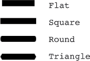
StartLineCap and EndLineCap—Customize any open segment endpoints with a value from the PenLineCap enumeration: Flat (the default), Square, Round, or Triangle. For any endpoints that join two segments, you can customize their appearance with LineJoin instead.
 FAQ: What’s the difference between PenLineCap’s Flat and Square values?
A Flat line cap ends exactly on the endpoint, whereas a Square line cap extends beyond the endpoint. Much like the Round line cap, you can imagine a square with the same dimensions as the Pen’s Thickness centered on the endpoint. Therefore, the line ends up extending half the length of the Pen’s Thickness.
LineJoin—Affects corners with a value from the PenLineJoin enumeration: Miter (the default), Round, or Bevel. A separate MiterLimit property can be used to limit how far a Miter join extends, which can otherwise be very large for small angles. Its default value is 10.
DashStyle—Can make the Pen’s stroke a nonsolid line. It can be set to an instance of a DashStyle object. The endpoints of each dash can be customized with Pen’s DashCap property, which works just like StartLineCap and EndLineCap, except that its default value is Square instead of Flat.
Figure 15.10 shows each of the PenLineCap values applied to a LineSegment’s StartLineCap and EndLineCap. Figure 15.11 demonstrates each of the LineJoin values on the corners of a triangle. Using a LineJoin of Round is like setting IsSmoothJoin to true on all PathSegments. The latter approach enables you to customize each corner individually, whereas setting Pen’s LineJoin applies to the entire geometry.

The DashStyle class defines a Dashes property, which is a simple DoubleCollection that can contain a pattern of numbers that represents the widths of dashes and the spaces between them. The odd values represent the widths (relative to the Pen’s Thickness) of dashes, and the even values represent the relative widths of spaces. Whatever pattern you choose is then repeated indefinitely. DashStyle also has a double Offset property that controls where the pattern begins.
The confusing thing about DashStyle is that because DashCap is set to Square by default, each dash is naturally wider when given the same numeric value as a space. Furthermore, giving a dash a width of 0 is common because it simply becomes the DashCap itself. However, a DashStyles class defines a few common patterns in static DashStyle properties. For example, you can use a DashDotDot pattern as follows:
<Pen Brush="Black" Thickness="10" DashStyle="{x:Static DashStyles.DashDotDot}"/>
Figure 15.12 shows each of the built-in DashStyles, along with the numeric Dashes values they use internally.
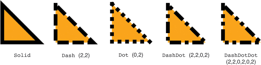
FIGURE 15.12 Each of the built-in DashStyles properties applied to a Pen, with the default Square DashCap and Miter LineJoin.
Clip Art Example
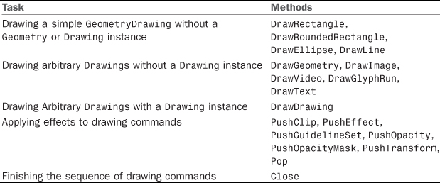
Now that you know everything there is to know about GeometryDrawing, you can create a simple piece of clip art. Listing 15.1 contains an Image-hosted DrawingGroup with three GeometryDrawings to render the ghost shown in Figure 15.13.

LISTING 15.1 The Drawing-Based Implementation of a Ghost, Hosted in an Image
<Image>
<Image.Source>
<DrawingImage>
<DrawingImage.Drawing>
<DrawingGroup>
<!-- The body -->
<GeometryDrawing Brush="Blue" Geometry="M 240,250
C 200,375 200,250 175,200
C 100,400 100,250 100,200
C 0,350 0,250 30,130
C 75,0 100,0 150,0
C 200,0 250,0 250,150 Z"/>
<!-- The eyes -->
<GeometryDrawing Brush="Black">
<GeometryDrawing.Pen>
<Pen Brush="White" Thickness="10"/>
</GeometryDrawing.Pen>
<GeometryDrawing.Geometry>
<GeometryGroup>
<!-- Left eye -->
<EllipseGeometry RadiusX="15" RadiusY="15" Center="95,95"/>
<!-- Right eye -->
<EllipseGeometry RadiusX="15" RadiusY="15" Center="170,105"/>
</GeometryGroup>
</GeometryDrawing.Geometry>
</GeometryDrawing>
<!-- The mouth -->
<GeometryDrawing>
<GeometryDrawing.Pen>
<Pen Brush="Black" StartLineCap="Round" EndLineCap="Round"
Thickness="10"/>
</GeometryDrawing.Pen>
<GeometryDrawing.Geometry>
<LineGeometry StartPoint="75,160" EndPoint="175,150"/>
</GeometryDrawing.Geometry>
</GeometryDrawing>
</DrawingGroup>
</DrawingImage.Drawing>
</DrawingImage>
</Image.Source>
</Image>
Visuals
Visual, the abstract base class of UIElement (which is the base class of FrameworkElement), contains the low-level infrastructure required to draw anything onto the screen. The previous section uses Image elements as a way to render all Drawings onto the screen. Image ultimately derives from Visual, but its two intermediate base classes, FrameworkElement and UIElement, contain a number of features that often aren’t required for drawings—Styles, data binding, resources, participation in layout, support for keyboard/mouse/stylus/touch input and focus, support for routed events, and so on.
Now imagine an application or a component that might want to perform a lot of custom rendering: perhaps a side-scrolling game in the style of Super Mario Bros. or a mapping program like Bing Maps. If implemented with WPF vector graphics, such programs could have hundreds or thousands of Drawings on the screen at any point in time. If they were all hosted in a single Image, you would not be able to support fine-grained interactivity with individual Drawings. But if each one were hosted in a separate Image, there would be an unacceptable amount of overhead for unnecessary features.
Fortunately, a different Visual subclass provides a lightweight mechanism for rendering Drawings onto the screen: DrawingVisual. DrawingVisual has a few handy properties for controlling rendering aspects, such as Opacity and Clip (which DrawingGroup also happens to have). But it also has support for a minimal amount of interaction with input devices. This comes in a form of hit testing called visual hit testing.
Because DrawingVisual operates at a much lower level than typical WPF features, its use is not very obvious. This section explains how to fill a DrawingVisual with content, how to get that content rendered to the screen, and how to perform visual hit testing.
Filling a DrawingVisual with Content
DrawingVisual does not have a simple Drawing property to which you can attach a Drawing. (It actually does have a Drawing property, but it’s read-only.) Instead, you must call its RenderOpen method, which returns an instance of a DrawingContext. You can draw into this object and then close it with its Close method.
For example, the following code places the entire ghost Drawing from Listing 15.1 inside a DrawingVisual, assuming that it’s defined as a resource with a ghostDrawing key:
DrawingGroup ghostDrawing = FindResource("ghostDrawing") as DrawingGroup;
DrawingVisual ghostVisual = new DrawingVisual();
using (DrawingContext dc = ghostVisual.RenderOpen())
{
dc.DrawDrawing(ghostDrawing);
}
This code makes use of the fact that DrawingContext implements IDisposable, mapping its Close method to Dispose (which is implicitly called in a finally block when exiting the using scope).
Listing 15.1 uses a DrawingGroup to combine the three GeometryDrawings defining the ghost simply so it can be set as the single Drawing inside a DrawingImage. With DrawingVisual, however, consolidating the GeometryDrawings in a DrawingGroup is not necessary. The following code adds each of the three GeometryDrawings to the DrawingContext individually, assuming that they are defined as resources with their own keys:
GeometryDrawing bodyDrawing = FindResource("bodyDrawing") as GeometryDrawing;
GeometryDrawing eyesDrawing = FindResource("eyesDrawing") as GeometryDrawing;
GeometryDrawing mouthDrawing = FindResource("mouthDrawing") as GeometryDrawing;
DrawingVisual ghostVisual = new DrawingVisual();
using (DrawingContext dc = ghostVisual.RenderOpen())
{
dc.DrawDrawing(bodyDrawing);
dc.DrawDrawing(eyesDrawing);
dc.DrawDrawing(mouthDrawing);
}
Later drawings are placed on top of earlier drawings, so this code preserves the proper Z ordering.
Just as you could get rid of the extra DrawingGroup layer and get the same result, you can also get rid of the Drawing objects altogether! Drawings are essentially just wrappers on top of the drawing commands that you can perform directly on DrawingContext. DrawingContext contains several methods for drawing geometries, images, and even video or text. (In other words, these methods cover the functionality provided by the entire list of Drawing types shown earlier in the chapter: GeometryDrawing, ImageDrawing, VideoDrawing, and GlyphRunDrawing.) It also supports pushing and popping a variety of effects. Table 15.2 lists all the DrawingContext methods.
The PushXXX and Pop methods enable you to not only apply the same effect, such as translucency or rotation, to a series of commands but also to nest them. The PushEffect method has been obsolete since WPF 4.0 and has no effect, but the others do what they advertise.
Listing 15.2 contains a new implementation of the ghost clip art from Listing 15.1, entirely in procedural code. In the Window’s constructor, the DrawingVisual is created and filled in without the aid of any Drawing instances. Note that the Window in this listing is still completely blank because we actually haven’t taken any steps to render the DrawingVisual! That task is saved for the next section.
LISTING 15.2 WindowHostingVisual.cs—The DrawingContext-Based Implementation of the Ghost from Listing 15.1
using System;
using System.Windows;
using System.Windows.Media;
public class WindowHostingVisual : Window
{
public WindowHostingVisual()
{
Title = "Hosting DrawingVisuals";
Width = 300;
Height = 350;
DrawingVisual ghostVisual = new DrawingVisual();
using (DrawingContext dc = ghostVisual.RenderOpen())
{
// The body
dc.DrawGeometry(Brushes.Blue, null, Geometry.Parse(
@"M 240,250
C 200,375 200,250 175,200
C 100,400 100,250 100,200
C 0,350 0,250 30,130
C 75,0 100,0 150,0
C 200,0 250,0 250,150 Z"));
// Left eye
dc.DrawEllipse(Brushes.Black, new Pen(Brushes.White, 10),
new Point(95, 95), 15, 15);
// Right eye
dc.DrawEllipse(Brushes.Black, new Pen(Brushes.White, 10),
new Point(170, 105), 15, 15);
// The mouth
Pen p = new Pen(Brushes.Black, 10);
p.StartLineCap = PenLineCap.Round;
p.EndLineCap = PenLineCap.Round;
dc.DrawLine(p, new Point(75, 160), new Point(175, 150));
}
}
}
This listing calls DrawGeometry to draw the ghost’s body, which is the simplest method for drawing a complex shape. Notice that Geometry.Parse is used so the path can be described as the same string used in Listing 15.1 rather than an explicit PathFigure containing a bunch of BezierSegment instances. The drawing of the eyes and mouth doesn’t even require using Geometry instances; DrawEllipse and DrawLine are used. A few extra lines of code are needed to initialize the Pen for the mouth because Pen’s constructor doesn’t let you specify advanced features such as the line caps.
Unlike the XAML-based Drawing in Listing 15.1, Listing 15.2 is not a particularly great way to share clip art. But it’s a valuable technique for drawing-heavy applications. Going back to the mapping program example, DrawingContext’s DrawGeometry method could be used to draw paths representing roads, lakes, and boundaries, and DrawText could be used to add labels on top of this content. Or, if the maps use satellite images, DrawImage can be used to position such images without the overhead of an Image element for each one. (DrawImage accepts an ImageSource rather than an Image.)
Therefore, the DrawingContext class is WPF’s closest analog to the Win32 device context or the Windows Forms Graphics object. Note that the use of DrawingContext doesn’t change the fact that you’re operating within a retained-mode system. The specified drawing doesn’t happen immediately; the commands are persisted by WPF until they are needed.
Tip
Using DrawingContext is a lightweight way to perform drawing because it can avoid the overhead of allocating a Drawing object on the managed heap for every line, shape, and so on. Therefore, it’s the best choice for rendering tens of thousands of items.
Displaying a Visual on the Screen
Displaying a Visual on the screen that happens to also be a UIElement is easy; if you add it as the Content of a content control such as Window, or a child in a Panel, or an item in an items control, and so on, it gets rendered appropriately based on its OnRender implementation. But if you have a non-UIElement Visual, such as the ghostly DrawingVisual, all you see rendered if you take one of these actions is the unsatisfactory ToString rendering.
To get such a Visual properly rendered, you need to manually add it to some UIElement’s visual tree. “Now, wait just a minute,” you might be saying. “I thought the whole point of using DrawingVisual was to avoid the extra overhead of UIElement!” Yes, but you still need at least one UIElement, even if that’s simply the top-level Window. In the mapping program example, you could host thousands of Visuals in a single Canvas or Window rather than having thousands of UIElements in that same host.
The tricky part about adding Visuals to an element is that you have to derive your own custom class from an existing UIElement and then override two protected virtual members: VisualChildrenCount and GetVisualChild. Listing 15.3 does this for the Window defined in Listing 15.2. This is all the code needed to display the DrawingVisual, as shown in Figure 15.14. Notice that the background is black, unlike when hosting a DrawingImage inside an Image element.
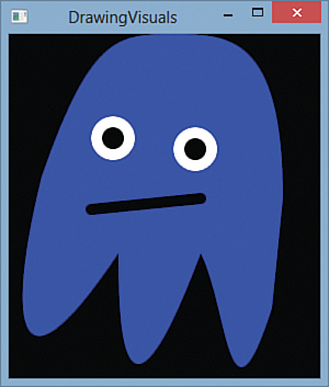
FIGURE 15.14 The ghost DrawingVisual is rendered inside the Window after VisualChildrenCount and GetVisualChild are overridden.
LISTING 15.3 WindowHostingVisual.cs—Update for Rendering the Ghost DrawingVisual
using System;
using System.Windows;
using System.Windows.Media;
public class WindowHostingVisual : Window
{
DrawingVisual ghostVisual = null;
public WindowHostingVisual()
{
Title = "Hosting DrawingVisuals";
Width = 300;
Height = 350;
ghostVisual = new DrawingVisual();
using (DrawingContext dc = ghostVisual.RenderOpen())
{
The same drawing commands from Listing 15.2...
}
// Bookkeeping:
AddVisualChild(ghostVisual);
AddLogicalChild(ghostVisual);
}
// The two necessary overrides, implemented for the single Visual:
protected override int VisualChildrenCount
{
get { return 1; }
}
protected override Visual GetVisualChild(int index)
{
if (index != 0)
throw new ArgumentOutOfRangeException("index");
return ghostVisual;
}
}
VisualChildrenCount must return the number of Visuals contained by the Window. This simple example has only the one DrawingVisual, so this property always returns 1. GetVisualChild must return the actual Visual associated with a zero-based index. Therefore, this method is implemented to return the DrawingVisual when the input is 0 and throw an exception otherwise. If you want to support multiple Visuals, you could maintain a collection of them and update these two members to use that collection. If you want to interact with the layout system, you must override two additional members—MeasureOverride and ArrangeOverride—covered in Chapter 21, “Layout with Custom Panels.”
Be aware that the VisualChildrenCount/GetVisualChild implementation in Listing 15.3 causes the Window’s Content property to never be rendered, even if it’s set. If that’s not acceptable, an easy solution is to move this Visual-hosting code to a different UIElement and then place that element in the Window as desired. For the mapping program example, this could mean hosting your custom Visuals in a Canvas-derived class and then placing that in a Window's Grid (or other Panel) so you can overlay Buttons and other controls.
Warning: Calling Visual.AddVisualChild is not enough for adding a visual child!
The name of the AddVisualChild method makes it sound like calling it is all you need to do to add a Visual child to an element. But that is not the case. You must still implement VisualChildrenCount and GetVisualChild to return the appropriate information.
Besides overriding the two members of Visual, Listing 15.3 also passes the DrawingVisual to two protected methods defined on Window’s base classes: AddVisualChild (defined on Visual) and AddLogicalChild (defined on FrameworkElement). Calling both of these isn’t strictly necessary for rendering the DrawingVisual, but it should be done to “register” the existence of this visual with the appropriate logical and visual trees. That way, features such as event routing, hit testing, and property inheritance work as expected. If you are maintaining a collection of Visual children and ever remove one of these children, you should call RemoveVisualChild and RemoveLogicalChild.
Visual Hit Testing
The term hit testing refers to determining whether a point (or set of points) intersects with a given object. Hit testing is typically done in the context of a mouse, stylus, or touch event, where the point in question is the location of the mouse pointer, stylus tip, or finger(s).
In WPF, there are two kinds of hit testing: visual hit testing, which is supported by all Visuals, and input hit testing, which is supported only by UIElements. This section describes only visual hit testing; input hit testing is covered in the “Shapes” section.
Visual hit testing is crucial for enabling a Visual to respond to user actions such as clicks, taps, or hovering because it doesn’t have any of the input events that UIElements have (MouseLeftButtonDown, MouseEnter, MouseLeave, MouseMove, and so on). By handling such events on the host UIElement and then using visual hit testing to determine whether relevant child Visuals were “hit,” you can make any Visual respond appropriately to any or all of these events.
Simple Hit Testing
Visual hit testing can be performed with the static VisualTreeHelper.HitTest method. The simplest overload of this method accepts a root Visual whose visual tree should be searched as well as the coordinate being tested (which must be expressed relative to the passed-in root). It returns a HitTestResult, which contains the topmost Visual hit by that point.
Therefore, the following method could be added to the Window in Listing 15.3 to process clicks on the ghost DrawingVisual and respond by rotating it by 1° each time (just for demonstration purposes):
protected override void OnMouseLeftButtonDown(MouseButtonEventArgs e)
{
base.OnMouseLeftButtonDown(e);
// Retrieve the mouse pointer location relative to the Window
Point location = e.GetPosition(this);
// Perform visual hit testing for the entire Window
HitTestResult result = VisualTreeHelper.HitTest(this, location);
// If we hit the ghostVisual, rotate it
if (result.VisualHit == ghostVisual)
{
if (ghostVisual.Transform == null)
ghostVisual.Transform = new RotateTransform();
(ghostVisual.Transform as RotateTransform).Angle++;
}
}
Because Image is ultimately a Visual, you could have implemented the same scheme with the Image hosting the DrawingImage version of the ghost back in Listing 15.1. (Or you could have simply attached an event handler to Image’s MouseLeftButtonDown event.) There’s an important difference between doing this with an Image and doing the visual hit testing with a DrawingVisual, however. The preceding code considers the DrawingVisual to be hit only for coordinates physically within the ghost’s body, whereas an Image is considered to be hit for any coordinates within the Image’s rectangular bounds.
Hit Testing with Multiple Visuals
Having nonrectangular hit testing is nice, but perhaps you want to hit test for individual portions of the ghost, such as the eyes versus the mouth versus the body. To accomplish this, you need to split the single DrawingVisual into three DrawingVisuals. Listing 15.4 does just that and performs the 1° rotation on any DrawingVisual each time it is clicked. Figure 15.15 shows the result of this ability to manipulate visuals independently, with a ghost that is starting to look like a Picasso painting.

FIGURE 15.15 The ghost represented by three independent DrawingVisuals, after a few clicks on the body and several clicks on the eyes.
LISTING 15.4 WindowHostingVisual.cs—Splitting the Ghost into Three DrawingVisuals for Independent Hit Testing
using System;
using System.Windows;
using System.Windows.Input;
using System.Windows.Media;
using System.Collections.Generic;
public class WindowHostingVisual : Window
{
List<Visual> visuals = new List<Visual>();
public WindowHostingVisual()
{
Title = "Hosting DrawingVisuals";
Width = 300;
Height = 350;
DrawingVisual bodyVisual = new DrawingVisual();
DrawingVisual eyesVisual = new DrawingVisual();
DrawingVisual mouthVisual = new DrawingVisual();
using (DrawingContext dc = bodyVisual.RenderOpen())
{
// The body
dc.DrawGeometry(Brushes.Blue, null, Geometry.Parse(
@"M 240,250
C 200,375 200,250 175,200
C 100,400 100,250 100,200
C 0,350 0,250 30,130
C 75,0 100,0 150,0
C 200,0 250,0 250,150 Z"));
}
using (DrawingContext dc = eyesVisual.RenderOpen())
{
// Left eye
dc.DrawEllipse(Brushes.Black, new Pen(Brushes.White, 10),
new Point(95, 95), 15, 15);
// Right eye
dc.DrawEllipse(Brushes.Black, new Pen(Brushes.White, 10),
new Point(170, 105), 15, 15);
}
using (DrawingContext dc = mouthVisual.RenderOpen())
{
// The mouth
Pen p = new Pen(Brushes.Black, 10);
p.StartLineCap = PenLineCap.Round;
p.EndLineCap = PenLineCap.Round;
dc.DrawLine(p, new Point(75, 160), new Point(175, 150));
}
visuals.Add(bodyVisual);
visuals.Add(eyesVisual);
visuals.Add(mouthVisual);
// Bookkeeping:
foreach (Visual v in visuals)
{
AddVisualChild(v);
AddLogicalChild(v);
}
}
// The two necessary overrides, implemented for the single Visual:
protected override int VisualChildrenCount
{
get { return visuals.Count; }
}
protected override Visual GetVisualChild(int index)
{
if (index < 0 || index >= visuals.Count)
throw new ArgumentOutOfRangeException("index");
return visuals[index];
}
protected override void OnMouseLeftButtonDown(MouseButtonEventArgs e)
{
base.OnMouseLeftButtonDown(e);
// Retrieve the mouse pointer location relative to the Window
Point location = e.GetPosition(this);
// Perform visual hit testing
HitTestResult result = VisualTreeHelper.HitTest(this, location);
// If we hit any DrawingVisual, rotate it
if (result.VisualHit.GetType() == typeof(DrawingVisual))
{
DrawingVisual dv = result.VisualHit as DrawingVisual;
if (dv.Transform == null)
dv.Transform = new RotateTransform();
(dv.Transform as RotateTransform).Angle++;
}
}
}
Because this Window now has three Visual children instead of one, it uses a List<Visual> collection to store them for the sake of the VisualChildrenCount and GetVisualChild implementation. Drawing into three DrawingVisuals instead of one is a simple change; the DrawingContext commands are simply split into three using blocks, one per DrawingVisual. In the processing of the HitTestResult, the code applies the rotation logic to any Visual as long as it’s a DrawingVisual.
Hit Testing with Overlapping Visuals
Visual hit testing can inform you about all Visuals that intersect a location, not just the topmost Visual. For the three-Visuals ghost example, you can set up hit testing such that clicking on the eyes tells you that the eyes were hit and the body underneath the eyes was hit. It doesn’t matter if a Visual is completely obscured; it can still be hit.
To take advantage of this functionality, you must use a more powerful form of the HitTest method that accepts a HitTestResultCallback delegate. Before this version of HitTest returns, the delegate is invoked once for each relevant Visual, starting from the topmost and ending at the bottommost.
The following code is an update to the OnMouseLeftButtonDown method from Listing 15.4 that supports hit testing on overlapping Visuals:
protected override void OnMouseLeftButtonDown(MouseButtonEventArgs e)
{
base.OnMouseLeftButtonDown(e);
// Retrieve the mouse pointer location relative to the Window
Point location = e.GetPosition(this);
// Perform visual hit testing
VisualTreeHelper.HitTest(this, null,
new HitTestResultCallback(HitTestCallback),
new PointHitTestParameters(location));
}
public HitTestResultBehavior HitTestCallback(HitTestResult result)
{
// If we hit any DrawingVisual, rotate it
if (result.VisualHit.GetType() == typeof(DrawingVisual))
{
DrawingVisual dv = result.VisualHit as DrawingVisual;
if (dv.Transform == null)
dv.Transform = new RotateTransform();
(dv.Transform as RotateTransform).Angle++;
}
// Keep looking for hits
return HitTestResultBehavior.Continue;
}
There are a few differences here from the earlier code. The most noticeable one is that the logic to process HitTestResult is moved to the callback method because this overload of HitTest doesn’t return anything. The callback method must return one of two HitTestResultBehavior values: Continue or Stop. Therefore, you can stop the probing for further Visuals at any time. If the callback always returns Stop, only the topmost Visual is processed, just like with the simpler hit-testing approach. The second parameter of this HitTest overload, where null is passed, can be set to a HitTestFilterCallback delegate to skip the processing of certain parts of a visual tree without stopping the processing altogether. You can implement very sophisticated hit-testing schemes with this approach.
Notice that this overload of HitTest isn’t given the relevant Point directly but rather is passed a PointHitTestParameters object wrapping the Point. That’s because the method accepts an abstract HitTestParameters instance, and WPF has two subclasses: PointHitTestParameters and GeometryHitTestParameters. The latter can be used to hit test against an arbitrary region. This is useful for supporting more complicated input actions, such as dragging a selection rectangle or drawing a “lasso” to select multiple objects.
FAQ: Why does the more powerful form of visual hit testing involve an awkward callback mechanism instead of simply returning an array of HitTestResults?
The callback scheme was chosen for performance reasons. This way, WPF doesn’t have to allocate any extra memory, which is important when dealing with high numbers of Visuals or frequent hit testing. In addition, the callback scheme allows for scenario-specific optimizations by giving callback methods the power to halt processing by returning HitTestResultBehavior.Stop.
Tip
If you want visual hit testing to report a hit anywhere within a Visual’s bounding box rather than its precise geometry, you can override Visual’s HitTestCore method, which is called whenever the bounding box is hit. (This method enables you to customize hit testing in other ways as well.)
A simpler way to accomplish this is to simply draw a transparent rectangle that matches the size of the bounding box inside the Visual. Visual hit testing doesn’t care about the transparency of objects; they get hit just the same, as if they are panes of glass.
Warning: Don’t modify the visual tree in your hit-testing callback methods!
Hit-testing callback methods are called while the visual tree is in the process of being walked, so altering the tree can cause incorrect behavior. If you must modify the visual tree based on certain Visuals being hit, you should store the information you need during the callbacks so that you can act on it after HitTest returns. This is pretty easy to do because HitTest doesn’t return until after all callbacks have been called.
Shapes
A Shape, like a GeometryDrawing, is a basic 2D drawing that combines a Geometry with a Pen and Brush. Unlike GeometryDrawing, however, Shape derives from FrameworkElement, so it can be directly placed in a user interface without custom code or a complex hierarchy of objects. For example, Chapter 2, “XAML Demystified,” shows how easy it is to embed a square in a Button by using Rectangle (which derives from Shape):
<Button MinWidth="75">
<Rectangle Height="20" Width="20" Fill="Black"/>
</Button>
WPF provides six classes that derive from the abstract System.Windows.Shapes.Shape class:
Rectangle
Ellipse
Line
Polyline
Polygon
Path
Most of these should look pretty familiar, as they mirror the Geometry classes discussed earlier in the chapter. The following sections examine each one individually because they work slightly differently than their Geometry counterparts. (In addition, Polyline and Polygon are Shape-specific abstractions over a PathGeometry.) Shape itself defines many properties for controlling the appearance of its concrete subclasses. The two most important ones are Fill and Stroke, both of type Brush.
FAQ: Why is Shape.Stroke a Brush rather than a Pen?
Shape’s Fill and Stroke properties have the same role as GeometryDrawing’s Brush and Pen properties: Fill is for the inner area, and Stroke is for the outline. Internally, a Pen is indeed used to create the outline of the Shape. But rather than exposing the Pen directly, Shape defines Stroke as a Brush and exposes eight additional properties to tweak the settings of the internal Pen wrapping the Stroke Brush: StrokeStartLineCap, StrokeEndLineCap, StrokeThickness, and so on.
This unfortunate inconsistency was created because setting the Pen-related properties directly on the Shape is simpler than using a separate Pen object, especially for the common case in which all you’re setting is the Brush and the Thickness.
Warning: Overuse of Shapes can lead to performance problems!
It’s tempting to use Shapes as the building blocks for any 2D drawings. They are much more discoverable and easier to work with than Drawings, and they work with the content model that WPF developers take for granted. Design tools and XAML exporters also tend to represent artwork as Shapes by default, so Shapes can sneak into your applications without you even realizing it.
When you have Shape-based artwork, every single Shape supports Styles, data binding, resources, layout, input and focus, routed events, and so on. It’s nice that you can take advantage of all this without extra work, but as discussed in the “Visuals” section, this is typically unnecessary overhead. Keep this in mind if you find yourself using more than a small number of Shapes.
Rectangle
RectangleGeometry, discussed earlier in this chapter, has a Rect property for defining its dimensions. Rectangle, on the other hand, delegates to WPF’s layout system for controlling its size and position. This could involve using its Width and Height properties (among others) inherited from FrameworkElement or controlling its location with Canvas.Left and Canvas.Top, for example.
Just like RectangleGeometry, however, Rectangle defines its own RadiusX and RadiusY properties of type double that enable you to give it rounded corners. Figure 15.16 shows the following Rectangles in a StackPanel with various values of RadiusX and RadiusY:
<StackPanel>
<Rectangle Width="200" Height="100"
Fill="Orange" Stroke="Black" StrokeThickness="10" Margin="4"/>
<Rectangle Width="200" Height="100" RadiusX="10" RadiusY="30"
Fill="Orange" Stroke="Black" StrokeThickness="10" Margin="4"/>
<Rectangle Width="200" Height="100" RadiusX="30" RadiusY="10"
Fill="Orange" Stroke="Black" StrokeThickness="10" Margin="4"/>
<Rectangle Width="200" Height="100" RadiusX="100" RadiusY="50"
Fill="Orange" Stroke="Black" StrokeThickness="10" Margin="4"/>
</StackPanel>
RadiusX can be at most half the Width of the Rectangle, and RadiusY can be at most half the Height. Setting them any higher makes no difference.
Warning: You must explicitly set Stroke or Fill for a Shape to be seen!
This might sound obvious for someone used to working with GeometryDrawings, but it’s a common pitfall for people who think of Shapes the way they think of Buttons and ListBoxes. Although each Shape internally contains the appropriate Geometry, its Stroke and Fill are both set to null by default.
Ellipse
After discovering the flexibility of Rectangle and realizing that it can be made to look like an ellipse (or circle), you’d think that a separate Ellipse class would be redundant. And you’d be right! All Ellipse does is make it easier to get an elliptical shape. It defines no settable properties above and beyond what Shape and its base classes provide. Unlike EllipseGeometry, which exposes RadiusX, RadiusY, and Center properties, Ellipse simply fills its rectangular region with the largest possible elliptical shape.
The following Ellipse could replace the last Rectangle in the previous XAML snippet, and Figure 15.16 would look identical:
<Ellipse Width="200" Height="100"
Fill="Orange" Stroke="Black" StrokeThickness="10" Margin="4"/>
The only change is replacing the element name and removing the references to RadiusX and RadiusY.
Line
Line defines four double properties to represent a line segment connecting points (x1,y1) and (x2,y2). These properties are called X1, Y1, X2, and Y2. These are defined as four properties rather than two Point properties (as in LineGeometry) for ease of use in data-binding scenarios.
The values of Line’s properties are not absolute coordinates. They are relative to the space given to the Line element by the layout system. For example, the following StackPanel contains three Lines, rendered in Figure 15.17:
<StackPanel>
<Line X1="0" Y1="0" X2="100" Y2="100" Stroke="Black" StrokeThickness="10"
Margin="4"/>
<Line X1="0" Y1="0" X2="100" Y2="0" Stroke="Black" StrokeThickness="10"
Margin="4"/>
<Line X1="0" Y1="100" X2="100" Y2="0" Stroke="Black" StrokeThickness="10"
Margin="4"/>
</StackPanel>

Notice that each Line is given the space needed by its bounding box, so the horizontal line gets only 10 units (for the thickness of its Stroke) plus the specified Margin. Line inherits Shape’s Fill property, but it is meaningless because there is never any area to fill.
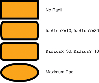
Polyline
Polyline represents a sequence of lines, expressed in its Points property (a collection of Point objects). The following four Polylines are rendered in Figure 15.18:
<StackPanel>
<Polyline Points="0,0 100,100" Stroke="Black" StrokeThickness="10" Margin="4"/>
<Polyline Points="0,0 100,100 200,0" Stroke="Black" StrokeThickness="10"
Margin="4"/>
<Polyline Points="0,0 100,100 200,0 300,100" Stroke="Black" StrokeThickness="10"
Margin="4"/>
<Polyline Points="0,0 100,100 200,0 300,100 100,100" Stroke="Black"
StrokeThickness="10" Margin="4"/>
</StackPanel>
A type converter enables Points to be specified as a simple list of alternating x and y values. The commas can help with readability but are optional. You can place commas between any two values or use no commas at all.
Figure 15.19 demonstrates that setting Polyline’s Fill fills it like an open PathGeometry, pretending that a line segment exists that connects the first Point with the last Point. This happens because, internally, Polyline is using a PathGeometry! Figure 15.19 was created simply by taking the Polylines from Figure 15.18 and marking them with Fill="Orange".

Polygon
Just as Rectangle makes Ellipse redundant, Polyline makes Polygon redundant. The only difference between Polyline and Polygon is that Polygon automatically adds a line segment connecting the first Point and last Point. (In other words, it sets IsClosed to true in its internal PathGeometry’s PathFigure.)
If you take each Polyline from Figure 15.19 and simply change each element name to Polygon, you get the result shown in Figure 15.20. Notice that the initial line segment in the first and last Polygons is noticeably longer than in Figure 15.19. This is because of the Miter corners joining the initial line segment with the final line segment (which happens to share the same coordinates). Because the angle between the two line segments is 0°, the corner would be infinitely long if not for the StrokeMiterLimit property limiting it to 10 units by default.

Both Polygon and Polyline expose the underlying PathGeometry’s FillRule with their own FillRule property.
Path
As you probably expected, just as all basic geometries can be represented as a PathGeometry, all the other Shapes can be alternatively represented with the general-purpose Path. Path only adds a single Data property to Shape, which can be set to an instance of any geometry. Therefore, Path turns out to be the easiest (and most fully featured) way to embed an arbitrary geometry directly into a user interface. There’s no need for an explicit Drawing object or low-level DrawingContext techniques; you simply set the Data, Fill, and Stroke-related properties.
The following Path produces the same result as the overlapping triangles from Figure 15.6:
<Path Fill="Orange" Stroke="Black"
StrokeThickness="10">
<Path.Data>
<PathGeometry>
<!-- Triangle #1 -->
<PathFigure IsClosed="True">
<LineSegment Point="0,100"/>
<LineSegment Point="100,100"/>
</PathFigure>
<!-- Triangle #2 -->
<PathFigure StartPoint="70,0" IsClosed="True">
<LineSegment Point="0,100"/>
<LineSegment Point="100,100"/>
</PathFigure>
</PathGeometry>
</Path.Data>
</Path>
Or, you can take advantage of Geometry’s type converter and express the whole thing as follows:
<Path Fill="Orange" Stroke="Black" StrokeThickness="10"
Data="M 0,0 L 0,100 L 100,100 Z M 70,0 L 0,100 L 100,100 Z"/>
Clip Art Based on Shapes
Let’s revisit the ghost clip art that was represented as a DrawingImage in Listing 15.1 and as a sequence of DrawingContext commands in Listings 15.2 through 15.4. Listing 15.5 places the pieces of the ghost, which are now independent Shapes, on a Canvas. The result looks identical to hosting the DrawingImage in an Image, as shown back in Figure 15.13.
LISTING 15.5 The Ghost Represented as Four Independent Shapes
<Canvas xmlns="http://schemas.microsoft.com/winfx/2006/xaml/presentation">
<Path Fill="Blue" Data="M 240,250
C 200,375 200,250 175,200
C 100,400 100,250 100,200
C 0,350 0,250 30,130
C 75,0 100,0 150,0
C 200,0 250,0 250,150 Z"/>
<Ellipse Fill="Black" Stroke="White" StrokeThickness="10"
Width="40" Height="40" Canvas.Left="75" Canvas.Top="75"/>
<Ellipse Fill="Black" Stroke="White" StrokeThickness="10"
Width="40" Height="40" Canvas.Left="150" Canvas.Top="85"/>
<Line X1="75" Y1="160" X2="175" Y2="150" StrokeStartLineCap="Round"
StrokeEndLineCap="Round" Stroke="Black" StrokeThickness="10"/>
</Canvas>
The numeric data used for the Path (body) and the Line (mouth) is identical to the data used in the original DrawingImage. The property values for both Ellipses, however, needed a bit of translation to map from the original EllipseGeometry objects to the Ellipse objects. The original eyes had a radius of 15 and a Pen thickness of 10. Because the Pen outline is centered on any geometry’s edge, it only extends the total radius to 20. That’s why the Ellipses in Listing 15.5 are given a Height and Width of 40 (the radius multiplied by 2). In this case, the entire Shape, including its outline, fits inside the bounds. As for the values chosen for Canvas.Left and Canvas.Top, they are the original EllipseGeometry Center values minus the total radius of 20.
Unlike previous implementations of the ghost, this one supports input hit testing independently on each of its four pieces (each eye is even treated separately!) because they all derive from UIElement. Input hit testing differs from visual hit testing in that it more closely represents what a user can physically hit with the mouse pointer, finger, or stylus. It only supports hitting the topmost element at any coordinate, and it allows elements to be hit only if IsEnabled and IsVisible (properties introduced by UIElement) are both true. (It also only supports hit testing against a single point rather than a geometry, but that’s just an artificial limitation rather than a philosophical difference.)
To perform input hit testing, you simply call InputHitTest on an instance of a UIElement whose visual tree you want to be tested. You can pass it a Point, and it returns an IInputElement instance (an interface implemented by UIElement and ContentElement). But input hit testing is rarely performed directly because all UIElements already have a host of events that expose whether they’ve been pressed, clicked, and so on: GotKeyboardFocus, KeyDown, KeyUp, GotMouseCapture, MouseEnter, MouseLeave, MouseMove, MouseWheel, GotStylusCapture, StylusEnter, StylusLeave, StylusInAirMove, and so on. And if the policy enforced by input hit testing is too restrictive for your needs, you can perform visual hit testing with any Shape.
Brushes
It’s not obvious when programming with WPF via XAML, but WPF elements almost never interact directly with colors. Instead, most uses of color are wrapped inside objects known as Brushes. This is an extremely powerful indirection because WPF contains seven different kinds of Brushes that can do just about everything imaginable. There are three color brushes, three tile brushes, and one special brush covered at the end of the chapter (BitmapCacheBrush). Although this section mostly demonstrates Brushes on a Drawing or Window, keep in mind that Brushes can be used as the background, foreground, or outline of just about anything you can put on the screen.
Color Brushes
WPF’s three color brushes are SolidColorBrush, LinearGradientBrush, and RadialGradientBrush. You might think you already know everything there is to know about these Brushes from their limited use in the book so far, but all of these Brushes are more flexible than most people realize.
SolidColorBrush
SolidColorBrush, used implicitly throughout this book, fills the target area with a single color. It has a simple Color property of type System.Windows.Media.Color. Because of the type converter that converts strings such as “Blue” or “#FFFFFF” into SolidColorBrushes, they are indistinguishable from their underlying Color in XAML.
The Color structure has more functionality than you might expect. It natively supports two color spaces:
sRGB—This is the standard RGB color space designed for CRT monitors and familiar to most programmers and web designers. The values for red, green, and blue are each represented as a byte, so there are only 256 possible values.
scRGB—This is an enhanced RGB color space that represents red, green, and blue as floating-point values. This enables a much wider gamut of colors that can be accurately represented. Red, green, and blue values of 0.0 represent black, whereas three values of 1.0 represent white. However, scRGB allows for values outside this range, so information isn’t lost if you apply transformations to Colors that temporarily push any channel outside its normal range. scRGB also has increased accuracy because it is a linear color space.
Color exposes sets of properties (one per channel) for both color spaces: A, R, G, and B of type Byte for the more familiar sRGB and ScA, ScR, ScG, and ScB of type Single for the more flexible scRGB. (A and ScA represent the alpha channel, for varying the opacity.) Whenever any of these properties are set, Color updates both of its internal representations. Therefore, you can mix and match these properties with the same Color instance, and everything stays in sync. You can also leverage this behavior to easily convert sRGB values to scRGB values and vice versa.
Tip
It is usually more efficient to use colors with translucency coming from their alpha channels than to use the Opacity property to apply translucency to an otherwise-opaque solid color.
Color defines operators that enable you to add, subtract, and multiply two instances and compare them for equality. However, because scRGB uses floating-point values (which should never be tested for strict equality), Color defines a static AreClose method that accepts two colors and returns true if all their channels are within a very small epsilon of each other.
Color’s type converter supports several different string representations:
A name, like Red, Khaki, or DodgerBlue, matching one of the static properties on the Colors class.
The sRGB representation #argb, where a, r, g, and b are hexadecimal values for the A, R, G, and B properties. For example, opaque Red is #FFFF0000, or more simply #FF0000 (because A is assumed to be the maximum 255, by default).
The scRGB representation sc#a r g b, where a, r, g, and b are decimal values for the ScA, ScR, ScG, and ScB properties. In this representation, opaque Red is sc#1.0 1.0 0.0 0.0, or more simply sc#1.0 0.0 0.0. Commas are also allowed between each value.
LinearGradientBrush
LinearGradientBrush, which has been used a few times already in this book, fills an area with a gradient defined by colors at specific points along an imaginary line segment, with linear interpolation between those points.
LinearGradientBrush contains a collection of GradientStop objects in its GradientStops content property, each of which contains a Color and an Offset. The offset is a double value relative to the bounding box of the area being filled, where 0 is the beginning and 1 is the end. Therefore, the following LinearGradientBrush can be applied to any version of the ghost clip art to create the result in Figure 15.21:
<LinearGradientBrush>
<GradientStop Offset="0" Color="Blue"/>
<GradientStop Offset="1" Color="Red"/>
</LinearGradientBrush>

By default, the gradient starts at the top-left corner of the area’s bounding box and ends at the bottom-right corner. You can customize these points, however, with LinearGradientBrush’s StartPoint and EndPoint properties. The values of these points are relative to the bounding box, just like the Offset in each GradientStop. Therefore, the default values for StartPoint and EndPoint are (0,0) and (1,1), respectively.
If you want to use absolute units instead of relative ones, you can set MappingMode to Absolute (rather than the default RelativeToBoundingBox). Note that this applies only to StartPoint and EndPoint; the Offset values in each GradientStop are always relative.
Figure 15.22 shows a few different settings of StartPoint and EndPoint on the LinearGradientBrush used in Figure 15.21 (with the default relative MappingMode). Notice that the relative values are not limited to a range of 0 to 1. You can specify smaller or larger numbers to make the gradient logically extend past the bounding box. (This applies to GradientStop Offset values as well.)

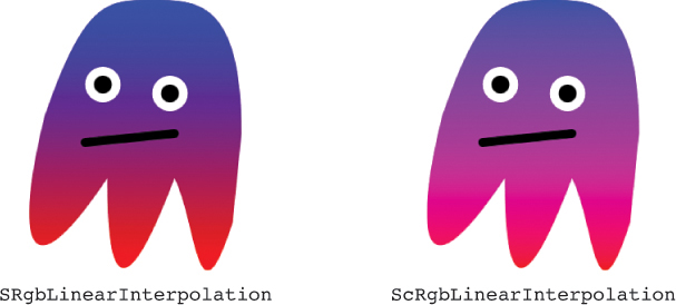
The default interpolation of colors is done using the sRGB color space, but you can set ColorInterpolationMode to ScRgbLinearInterpolation to use the scRGB color space instead. The result is a much smoother gradient, as shown in Figure 15.23.
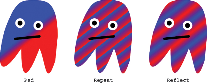
The final property for controlling LinearGradientBrush is SpreadMethod, which determines how any leftover area not covered by the gradient should be filled. This makes sense only when the LinearGradientBrush is explicitly set to not cover the entire bounding box. The default value (from the GradientSpreadMethod enumeration) is Pad, meaning that the remaining space should be filled with the color at the endpoint. You could alternatively set it to Repeat or Reflect. Both of these values repeat the gradient in a never-ending pattern, but Reflect reverses every other gradient to maintain a smooth transition. Figure 15.24 demonstrates each of these SpreadMethod values on the following LinearGradientBrush that forces the gradient to cover only the middle 10% of the bounding box:
<LinearGradientBrush StartPoint=".45,.45" EndPoint=".55,.55" SpreadMethod="XXX">
<GradientStop Offset="0" Color="Blue"/>
<GradientStop Offset="1" Color="Red"/>
</LinearGradientBrush>
And don’t forget, because Pens use a Brush rather than a simple Color to fill their area, Drawings, Shapes, Controls, and many other elements in WPF can be outlined with complicated fills. Figure 15.25 shows a version of the ghost that uses the following Pen on the GeometryDrawing defining its body:
<Pen Thickness="20">
<Pen.Brush>
<LinearGradientBrush>
<GradientStop Offset="0" Color="Red"/>
<GradientStop Offset="0.2" Color="Orange"/>
<GradientStop Offset="0.4" Color="Yellow"/>
<GradientStop Offset="0.6" Color="Green"/>
<GradientStop Offset="0.8" Color="Blue"/>
<GradientStop Offset="1" Color="Purple"/>
</LinearGradientBrush>
</Pen.Brush>
</Pen>

Notice that the Pen’s LinearGradientBrush uses six GradientStops spaced equally along the gradient path, rather than just two.
Tip
To get crisp lines inside a gradient brush, you can simply add two GradientStops at the same Offset with different Colors. The following LinearGradientBrush does this at Offsets 0.2 and 0.6 to get two distinct lines defining the DarkBlue region:
<LinearGradientBrush EndPoint="0,1">
<GradientStop Offset="0" Color="Aqua"/>
<GradientStop Offset="0.2" Color="Blue"/>
<GradientStop Offset="0.2" Color="DarkBlue"/>
<GradientStop Offset="0.6" Color="DarkBlue"/>
<GradientStop Offset="0.6" Color="Blue"/>
<GradientStop Offset="1" Color="Aqua"/>
</LinearGradientBrush>
Figure 15.26 shows this applied to the ghost’s body.

RadialGradientBrush
RadialGradientBrush works like LinearGradientBrush, except it has a single starting point, with each GradientStop emanating from it in the shape of an ellipse. RadialGradientBrush and LinearGradientBrush share a common GradientBrush base class, which defines the GradientStops, SpreadMethod, ColorInterpolationMode, and MappingMode properties already examined on LinearGradientBrush.
Figure 15.27 shows the following simple RadialGradientBrush applied to the ghost:
<RadialGradientBrush>
<GradientStop Offset="0" Color="Blue"/>
<GradientStop Offset="1" Color="Red"/>
</RadialGradientBrush>

By default, the imaginary ellipse controlling the gradient is centered in the bounding box, with a width and height matching the width and height of the bounding box. This can clearly be seen on the ghost by setting SpreadMethod to Repeat, as shown in Figure 15.28.

To customize the size and position of the imaginary ellipse, RadialGradientBrush defines Center, RadiusX, and RadiusY properties. These have default values of (0.5,0.5), 0.5, and 0.5, respectively, because they’re expressed as coordinates relative to the bounding box. Because the default size of the ellipse often doesn’t cover the corner of the area being filled (as in Figure 15.28), increasing the radii is a simple way to cover the area without relying on SpreadMethod.
RadialGradientBrush also has a GradientOrigin property that specifies where the gradient should originate independently of the defining ellipse. To avoid getting strange results, it should be set to a point within the defining ellipse. Its default value is (0.5,0.5), the center of the default ellipse, but Figure 15.29 shows what happens when it is set to a different value, such as (0,0):
<RadialGradientBrush GradientOrigin="0,0"
SpreadMethod="Repeat">
<GradientStop Offset="0" Color="Blue"/>
<GradientStop Offset="1" Color="Red"/>
</RadialGradientBrush>

If you set MappingMode to Absolute, the values for all four of these RadialGradientBrush-specific properties (Center, RadiusX, RadiusY, and GradientOrigin) are treated as absolute coordinates instead of relative to the bounding box.
Because all Colors have an alpha channel, you can incorporate transparency and translucency into any gradient by changing the alpha channel on any GradientStop’s Color. The following RadialGradientBrush uses two blue colors with different alpha values:
<RadialGradientBrush RadiusX="0.7" RadiusY="0.7">
<GradientStop Offset="0" Color="#990000FF"/>
<GradientStop Offset="1" Color="#000000FF"/>
</RadialGradientBrush>
Figure 15.30 shows the result of applying this RadialGradientBrush (quite appropriately!) to the ghost drawing, on top of a photographic background so the transparency is apparent.

FIGURE 15.30 A ghost with translucency, accomplished by using colors with non-opaque alpha channels.
Warning: When it comes to gradients, not all transparent colors are equal!
Notice that the second GradientStop for Figure 15.30 uses a “transparent blue” color rather than simply specifying Transparent as the color. That’s because Transparent is defined as white with a 0 alpha channel (#00FFFFFF). Although both colors are completely invisible, the interpolation to each color does not behave the same way. If Transparent were used for the second GradientStop for Figure 15.30, you would not only see the alpha value gradually change from 0x99 to 0, you would also see the red and green values gradually change from 0 to 0xFF, giving the brush more of a gray look.
Tile Brushes
In addition to color brushes, WPF defines three tile brushes, which all derive from the abstract TileBrush base class. A tile brush fills the target area with a repeating pattern. Depending on which tile brush you choose to use, the source of the pattern can be any Drawing, Image, or Visual.
All three tile brushes act identically except for the type that they operate on. Therefore, the following section examines the main functionality of all tile brushes, using DrawingBrush as an example. Then we’ll briefly look at the other two tile brushes: ImageBrush and VisualBrush.
DrawingBrush
Hosting a Drawing in a DrawingBrush is just like hosting one in a DrawingImage. The following XAML uses the ghost DrawingGroup from Listing 15.1 and sets it as a DrawingImage’s Drawing to be used as the background of a window:
<Window xmlns="http://schemas.microsoft.com/winfx/2006/xaml/presentation"
Title="DrawingBrush as the Background">
<Window.Background>
<DrawingBrush>
<DrawingBrush.Drawing>
<DrawingGroup>
The three GeometryDrawings from Listing 15.1...
</DrawingGroup>
</DrawingBrush.Drawing>
</DrawingBrush>
</Window.Background>
</Window>
Figure 15.31 shows the result of doing this. Unlike DrawingImage, DrawingBrush’s default background is black instead of white.

By default, the drawing is stretched to fill the area (or its bounding box, if the area is nonrectangular), but this behavior can be adjusted with the Stretch property, which can be set to one of the Stretch enumeration values covered in Chapter 5, “Layout with Panels,” with Viewbox. Figure 15.32 shows the effect of each of these values.
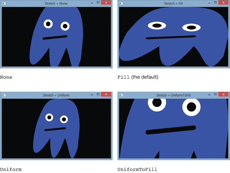
When Stretch is set to a value other than Fill, the Drawing is centered both horizontally and vertically. But this behavior can also be customized by setting AlignmentX to Left, Center, or Right and AlignmentY to Top, Center, or Bottom.
The most interesting part of DrawingBrush, and the reason it’s called a tile brush, is its TileMode property. If you set it to Tile rather than its default value of None, the Drawing can repeat itself indefinitely in both directions. For this to work, however, you must specify a Rect for the first “tile” to occupy. This is done with DrawingBrush’s Viewport property. Figure 15.33 demonstrates the effect of setting Viewport to a few different Rect values (shown with the x,y,width,height syntax supported by Rect’s type converter). The incredible thing about the third Window in Figure 15.33 is that you could zoom in with a ScaleTransform and see each ghost Drawing in full fidelity!

Just like with some of the gradient brush properties, the units of Viewport are relative to the bounding box by default. This enables you to effectively specify how many tiles you want horizontally and how many you want vertically. But you can also switch Viewport to use absolute coordinates by changing the value of ViewportUnits (a property of the familiar BrushMappingMode type).
The TileMode enumeration used by the TileMode property has more values than just Tile and None, however. It supports three more values that flip tiles in different ways:
FlipX flips the tiles in every other column horizontally.
FlipY flips the tiles in every other row vertically.
FlipXY does both of the above.
Figure 15.34 demonstrates these three settings. Although these settings might not be very interesting for the ghost Drawing, you could use them with certain types of Drawings to help create the illusion of a continuous fill.

The final piece of customization is the Viewbox property, which enables you to specify a subset of the Drawing to use as the source of each tile (or the entire brush, if TileMode is set to None). Viewbox is a rectangle specified in bounding-box-relative units by default, just like Viewport. And a separate ViewboxUnits property can be set to make Viewbox use absolute coordinates, independently of the ViewportUnits setting.
Figure 15.35 sets the DrawingBrush’s Viewbox property to the top-left quadrant of the ghost Drawing by giving it the Rect value 0, 0, 0.5, 0.5. It then mixes that setting with two different TileModes.
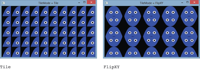
FIGURE 15.35 Setting Viewbox to retrieve only the top-left quadrant of the drawing, used with two different TileModes.
As a final note on DrawingBrush, remember that its Drawing does not have to be a GeometryDrawing. It could be a VideoDrawing, for example!
ImageBrush
ImageBrush is identical to DrawingBrush, except it has an ImageSource property of type ImageSource rather than a Drawing property of type Drawing. It is meant to hold bitmap content rather than vector content. (That said, with the existence of DrawingImage and ImageDrawing, discussed earlier in the chapter, you can make DrawingBrush contain bitmap content and ImageBrush contain vector content!)
The following XAML uses an ImageBrush as the background of a Window. The bitmap content comes from a wallpaper that ships with Windows 8:
<Window xmlns="http://schemas.microsoft.com/winfx/2006/xaml/presentation"
Title="ImageBrush with TileMode = FlipXY">
<Window.Background>
<ImageBrush TileMode="FlipXY" Viewport="0,0,0.1,0.2">
<ImageBrush.ImageSource>
<BitmapImage UriSource="C:WindowsWebWallpaperWindowsimg0.jpg"/>
</ImageBrush.ImageSource>
</ImageBrush>
</Window.Background>
</Window>
Figure 15.36 shows the resulting Window.
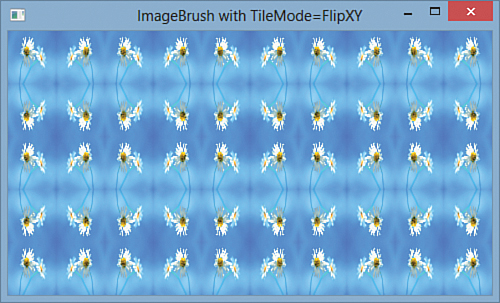
VisualBrush
VisualBrush is also identical to DrawingBrush, except it has a Visual property of type Visual instead of a Drawing property of type Drawing. The power to paint with any Visual, however, even FrameworkElements such as Button and TextBox, makes VisualBrush very unique and powerful.
The following XAML paints a Window’s background with a VisualBrush containing a simple Button. Figure 15.37 shows the rendered result.
<Window xmlns="http://schemas.microsoft.com/winfx/2006/xaml/presentation"
Title="VisualBrush with TileMode = FlipXY">
<Window.Background>
<VisualBrush TileMode="FlipXY" Viewport="0,0,0.5,0.5">
<VisualBrush.Visual>
<Button>OK</Button>
</VisualBrush.Visual>
</VisualBrush>
</Window.Background>
</Window>
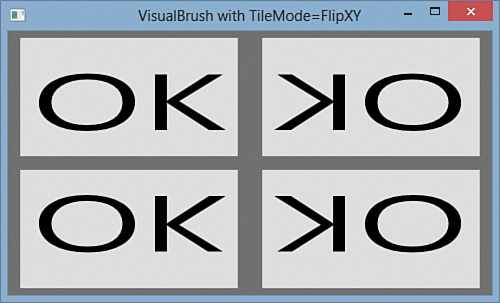
Note that the Button inside this VisualBrush can never be clicked. VisualBrush simply paints the appearance of Visuals; there is no interactivity within the area that is painted.
Rather than embedding elements directly in a VisualBrush, it’s more common to set its Visual to an instance of a UIElement already on the screen and available for user interaction. This could be done with procedural code or a simple Binding, as demonstrated with the following Window:
<Window xmlns="http://schemas.microsoft.com/winfx/2006/xaml/presentation"
xmlns:x="http://schemas.microsoft.com/winfx/2006/xaml"
Title="VisualBrush with TileMode = FlipXY">
<DockPanel>
<StackPanel Margin="10" x:Name="stackPanel">
<Button>Button</Button>
<CheckBox>CheckBox</CheckBox>
</StackPanel>
<Rectangle>
<Rectangle.Fill>
<VisualBrush TileMode="FlipXY" Viewport="0,0,0.5,0.5"
Visual="{Binding ElementName=stackPanel}"/>
</Rectangle.Fill>
</Rectangle>
</DockPanel>
</Window>
Figure 15.38 shows the result that this Window produces. The entire StackPanel docked on the left is used as the VisualBrush’s Visual. VisualBrush is applied as the Fill of a Rectangle that occupies the remainder of the Window. The “real” instances of the Button and CheckBox on the left support interactivity, but the visual copies do not. The visual copies do, however, reflect any changes to the Button and CheckBox visuals as they happen.
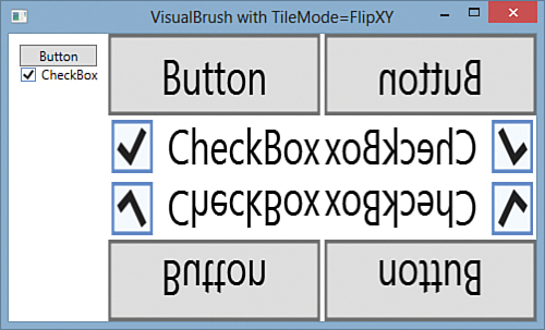
These examples may not have done a good job of convincing you that there can actually be a reasonable use for such an unusual Brush! But there are some good ones. Applications can leverage VisualBrush to provide “live previews” of inner content (perhaps documents) in a smaller, browsable form. Internet Explorer does this with its Quick Tabs view. In addition, Windows leverages the technology underlying VisualBrush to create its live preview of each window when you hover over a taskbar item or switch between windows by using Alt+Tab.
Another popular use of VisualBrush is to create a live reflection effect. The following Window creates a simple reflection below a TextBox, using essentially the same technique employed in the previous XAML snippet:
<Window xmlns="http://schemas.microsoft.com/winfx/2006/xaml/presentation"
xmlns:x="http://schemas.microsoft.com/winfx/2006/xaml"
Title="TextBox with Reflection" Width="500" Height="200" Background="DarkGreen">
<StackPanel Margin="40">
<TextBox x:Name="textBox" FontSize="30"/>
<Rectangle Height="{Binding ElementName=textBox, Path=ActualHeight}"
Width="{Binding ElementName=textBox, Path=ActualWidth}">
<Rectangle.Fill>
<VisualBrush Visual="{Binding ElementName=textBox}"/>
</Rectangle.Fill>
<Rectangle.LayoutTransform>
<ScaleTransform ScaleY="-0.75"/>
</Rectangle.LayoutTransform>
</Rectangle>
</StackPanel>
</Window>
The Rectangle containing the VisualBrush reflection is flipped upside down by using a ScaleTransform. But rather than setting ScaleY to -1, the value of -0.75 is used to give the reflection a little bit of perspective. Figure 15.39 shows the result.
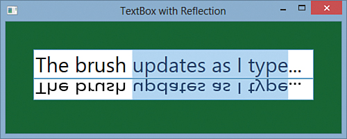
This effect isn’t quite satisfactory, however, because the reflection is too crisp and clear. You can improve this with an opacity mask, as discussed in the next section.
Brushes as Opacity Masks
All Visual subclasses (and DrawingGroup) have an Opacity property that affects the entire object evenly, but they also have an OpacityMask that can be used to apply custom opacity effects. OpacityMask can be set to any Brush, and that Brush’s alpha channel is used to determine which parts of the object should be opaque, which parts should be transparent, and which parts should be somewhere in between.
The alpha channel used by OpacityMask can come from the colors in a color brush, from drawings in a DrawingBrush, from images in an ImageBrush (for example, PNG transparency), and so on. The following Window uses a LinearGradientBrush as an OpacityMask to create the obnoxious-looking Button in Figure 15.40:
<Window xmlns="http://schemas.microsoft.com/winfx/2006/xaml/presentation"
Title="LinearGradientBrush OpacityMask">
<Window.Background>
<LinearGradientBrush>
<GradientStop Offset="0" Color="Orange"/>
<GradientStop Offset="1" Color="Brown"/>
</LinearGradientBrush>
</Window.Background>
<Button Margin="40" FontSize="80">OK
<Button.OpacityMask>
<LinearGradientBrush EndPoint="0.1,0.1" SpreadMethod="Reflect">
<GradientStop Offset="0" Color="Blue"/>
<GradientStop Offset="1" Color="Transparent"/>
</LinearGradientBrush>
</Button.OpacityMask>
</Button>
</Window>
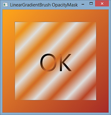
The LinearGradientBrush used for the OpacityMask defines a repetitive gradient between blue and transparent, but the blue color is immaterial because it is never seen. All that matters is that it’s a completely opaque color.
Figure 15.41 shows what this same Button would look like if the OpacityMask were instead set to a DrawingBrush containing the familiar ghost Drawing. On the left, the ghost’s body is filled with a completely opaque color. The result is no different from what you could accomplish by clipping the Button to the ghost body’s Geometry. On the right, the ghost’s body is filled with a translucent color, but its eyes and mouth are still opaque. This gives a result that you could not achieve with clipping alone.

With the features for creating a gadget-style application (setting AllowsTransparency to true and so on) described in Chapter 7, “Structuring and Deploying an Application,” you can even apply an OpacityMask to the top-level Window!
As promised, here’s how you could use OpacityMask to improve the live reflection effect from Figure 15.39:
<Window xmlns="http://schemas.microsoft.com/winfx/2006/xaml/presentation"
xmlns:x="http://schemas.microsoft.com/winfx/2006/xaml"
Title="TextBox with Reflection" Width="500" Height="200"
Background="DarkGreen">
<StackPanel Margin="40">
<TextBox x:Name="textBox" FontSize="30"/>
<Rectangle Height="{Binding ElementName=textBox, Path=ActualHeight}"
Width="{Binding ElementName=textBox, Path=ActualWidth}">
<Rectangle.Fill>
<VisualBrush Visual="{Binding ElementName=textBox}"/>
</Rectangle.Fill>
<Rectangle.LayoutTransform>
<ScaleTransform ScaleY="-0.75"/>
</Rectangle.LayoutTransform>
<Rectangle.OpacityMask>
<LinearGradientBrush EndPoint="0,1">
<GradientStop Offset="0" Color="Transparent"/>
<GradientStop Offset="1" Color="#77000000"/>
</LinearGradientBrush>
</Rectangle.OpacityMask>
</Rectangle>
</StackPanel>
</Window>
Figure 15.42 shows the result of this change, which is undoubtedly the most tasteful use of OpacityMask in this chapter.

Effects
WPF has two special visual effects built in to the System.Windows.Media.Effects namespace that can be applied to any Visual. These effects are DropShadowEffect and BlurEffect, which both derive from the abstract Effect class. Figure 15.43 shows each of them applied to a simple Button. WPF applies these effects to the rendered rasterized output as a postprocessing step.

Although Visual exposes this functionality via a protected VisualEffect property, all of its subclasses in WPF (such as UIElement) expose it as a public Effect property. To apply an effect to a relevant object, you simply set its Effect property to an instance of one of the Effect-derived classes. For example, the first Button in Figure 15.43 was created as follows:
<Button Width="200">
DropShadowEffect
<Button.Effect>
<DropShadowEffect/>
</Button.Effect>
</Button>
Warning: Don’t use the BitmapEffect property!
The first version of WPF shipped with a different form of these effect classes derived from a class called BitmapEffect. Every class with an Effect property also has a BitmapEffect property that accepts an instance of a BitmapEffect. However, BitmapEffects have been deprecated, so setting the property no longer does anything. The biggest difference with the new Effects compared to the obsolete BitmapEffects is that Effects are generally hardware accelerated, whereas BitmapEffects never were.
If you have code that uses one of these old BitmapEffects, switching to the newer BlurEffect or DropShadowEffect should be straightforward. Unfortunately, there are three other BitmapEffects that have no built-in replacements: BevelBitmapEffect, EmbossBitmapEffect, and OuterGlowBitmapEffect.
Of course, you can still use BitmapEffect in code that is running on an older version of WPF. They can easily sabotage an application’s performance, but they can be fine when used rarely and appropriately. Furthermore, just because Effects are hardware accelerated doesn’t mean they can be used with reckless abandon. They should still be used judiciously to avoid impacting performance.
Figure 15.43 uses both effects with their default settings. However, each class provides a handful of properties to customize their appearance. Table 15.3 summarizes these properties and their values.

The exciting part about WPF’s effects is not necessarily the two built-in ones but a third Effect subclass called ShaderEffect that enables you to easily inject your own custom effects. (The obsolete bitmap effects did not allow for this kind of extensibility without writing C++ COM code.) By deriving from the abstract ShaderEffect class, you can apply any pixel shader to any object with an Effect property. This leverages the pixel shader support in DirectX, which means that the shaders themselves must be written in High Level Shader Language (HLSL).
Tip
For a wide range of effects built on ShaderEffect, download the WPF Pixel Shader Effects Library from http://wpffx.codeplex.com. It contains the following single-input effects:
BandedSwirlEffect
BloomEffect
BrightExtractEffect
ColorKeyAlphaEffect
ColorToneEffect
ContrastAdjustEffect
DirectionalBlurEffect
EmbossedEffect
GloomEffect
GrowablePoissonDiskEffect
InvertColorEffect
LightStreakEffect
MagnifyEffect
MonochromeEffect
PinchEffect
PixelateEffect
RippleEffect
SharpenEffect
SmoothMagnifyEffect
SwirlEffect
ToneEffect
ToonEffect
ZoomBlurEffect
It also contains the following two-input transition effects:
BandedSwirlTransitionEffect
BlindsTransitionEffect
BloodTransitionEffect
CircleRevealTransitionEffect
CircleStretchTransitionEffect
CircularBlurTransitionEffect
CloudReveralTransitionEffect
CloudyTransitionEffect
CrumbleTransitionEffect
DissolveTransitionEffect
DropFadeTransitionEffect
FadeTransitionEffect
LeastBrightTransitionEffect
LineRevealTransitionEffect
MostBrightTransitionEffect
PixelateInTransitionEffect
PixelateOutTransitionEffect
PixelateTransitionEffect
RadialBlurTransitionEffect
RadialWiggleTransitionEffect
RandomCircleRevealTransitionEffect
RippleTransitionEffect
RotateTransitionEffect
SaturateTransitionEffect
ShrinkTransitionEffect
SlideInTransitionEffect
SmoothSwirlTransitionEffect
SwirlTransitionEffect
WaterTransitionEffect
WaveTransitionEffect
Improving Rendering Performance
Vector graphics have a lot of advantages over bitmap-based graphics, but with those advantages come inherent scalability issues. Even when using the most lightweight drawing approach (the DrawingContext class discussed in the “Visuals” section), complex drawings can be expensive to redraw. In scenarios where there might be a rapid succession of redrawing, as with a zooming animation, the cost of rendering can significantly impact the resulting user experience.
Therefore, people often look for ways to avoid drawing when possible. WPF has two interesting tricks that help in this regard. One is RenderTargetBitmap, which has been a part of WPF since its first version. The other is BitmapCache and the corresponding BitmapCacheBrush, collectively known as cached composition. Cached composition is a significant new 2D feature added in WPF 4.0.
RenderTargetBitmap
With RenderTargetBitmap, a subclass of BitmapSource (which is a subclass of ImageSource), you can render a Visual onto a bitmap and display the bitmap instead of the original Visual. Redrawing this bitmap is likely to be significantly faster than redrawing the Visual.
The following method represents a common approach for producing a RenderTargetBitmap filled with the contents of a Visual:
private static ImageSource ProduceImageSourceForVisual(Visual source,
double dpiX, double dpiY)
{
if (source == null)
return null;
Rect bounds = VisualTreeHelper.GetDescendantBounds(source);
RenderTargetBitmap bitmap = new RenderTargetBitmap(
(int)(bounds.Width * dpiX / 96), (int)(bounds.Height * dpiY / 96),
dpiX, dpiY, PixelFormats.Pbgra32);
DrawingVisual drawingVisual = new DrawingVisual();
using (DrawingContext ctx = drawingVisual.RenderOpen())
{
ctx.DrawRectangle(new VisualBrush(source), null,
new Rect(new Point(), bounds.Size));
}
bitmap.Render(drawingVisual);
return bitmap;
}
Wrapping the source Visual in a VisualBrush is a trick to respect layout in the rendered result. If the content in the Visual doesn’t require layout behavior from its parent, you can omit this wrapping.
BitmapCache
RenderTargetBitmap can work well for improving rendering performance, but it has some problems:
It uses software rendering
It works synchronously on the UI thread
It must be used with procedural code
It is separate from the element tree
The cached composition feature addresses all of these problems, and it’s much easier to use than RenderTargetBitmap! BitmapCache can be used to automatically cache any UIElement, including its tree of subelements, as a bitmap in video memory. It provides hardware rendering on the render thread in the element tree, and it’s easy to use within XAML. It’s essentially a hardware version of RenderTargetBitmap, although it doesn’t provide a mechanism for accessing the raw bits in the bitmap.
To use this feature, you set the CacheMode property on any UIElement you wish to cache. The type of the CacheMode property is the abstract CacheMode class, although BitmapCache is the only CacheMode subclass that WPF ships. Therefore, you can set it on a Grid as follows:
<Grid ...>
<Grid.CacheMode>
<BitmapCache/>
</Grid.CacheMode>
...
</Grid>
When the cached element (including any of its children) is updated, BitmapCache automatically and intelligently updates only the dirty region. Updates to any parents do not invalidate the cache, nor do updates to the element’s transforms or opacity! Furthermore, WPF automatically leverages the live element when needed in order to preserve its interactivity.
BitmapCache has three properties for controlling its behavior:
RenderAtScale—A double whose value is 1 by default. Use this to specify the scale of the element when it is rendered to the cached bitmap. This property is especially interesting when you plan on changing the size of the element. If you zoom the element to a larger size, setting RenderAtScale to the final scale avoids a degraded result. Setting RenderAtScale to a smaller scale improves performance while sacrificing quality.
SnapsToDevicePixels—A Boolean that can be set to true to enable pixel snapping on the rendered bitmap.
EnableClearType—A Boolean that can be set to true to enable ClearType rendering instead of grayscale antialiasing. If you set this to true, you must also set SnapsToDevicePixels to true to ensure proper rendering.
Changes to any of these values invalidate the cache.
Figure 15.44 shows the use of RenderAtScale on a few different Buttons, as follows:
<Button>
<Button.CacheMode>
<BitmapCache RenderAtScale="..."/>
</Button.CacheMode>
...
</Button>

Notice that the caching is applied to the entire Button, not just its content, so the Button chrome also becomes pixelated at low values of RenderAtScale.
BitmapCache falls back to software rendering when hardware acceleration is not possible. However, when rendered in software, the maximum size allowed for the cached bitmap is 2048x2048 pixels.
Tip
BitmapCache is most appropriate for static content that gets animated or scrolled, to avoid creating a bottleneck in WPF’s rendering pipeline due to the CPU-bound work of repeated tessellation and rasterization on every frame. There is a tradeoff, however. The more you cache, the bigger the memory consumption will be on the GPU.
BitmapCacheBrush
BitmapCacheBrush enables the same cached bitmap to be used multiple times, and wherever a Brush can be applied. Simply assign any Visual to BitmapCacheBrush’s Target property, and BitmapCacheBrush will leverage the cached bitmap if the Visual has CacheMode set. Even if the Visual doesn’t have CacheMode set, you can control caching directly on the BitmapCacheBrush. (BitmapCacheBrush doesn’t have a CacheMode property; instead it has a BitmapCache property of type BitmapCache that works the same way.)
Therefore, BitmapCacheBrush is a more efficient version of VisualBrush. This improved efficiency not only comes from leveraging a cached bitmap, but also from its support of dirty regions.
Warning: BitmapCacheBrush ignores pixel snapping!
BitmapCacheBrush ignores the value of SnapsToDevicePixels and always treats it as false. Therefore, you should avoid setting EnableClearType to true on BitmapCacheBrush’s BitmapCache or on the CacheMode of any Visual used as BitmapCacheBrush’s Target.
Summary
Although it might have initially seemed like a stretch to include a chapter about 2D graphics in a section about “rich media,” you hopefully now understand just how rich WPF’s 2D support is. Unlike the 2D drawing support in previous Windows technologies, WPF gives you the power of DirectX mixed with the ease of use of a retained-mode graphics system.
This chapter focused on vector graphics, but it also highlighted where bitmap-based images fit seamlessly into the same picture. You’ve also seen the first few hints of video support, which is covered further in Chapter 18.
As with many other features in WPF, a big part of the power of 2D graphics comes from the tight integration with the rest of WPF. The drawing primitives used to create lines, shapes, and ghosts are the same ones used to create Buttons, Menus, and ListBoxes. In the next chapter, we’ll see how to expand on this support to take WPF into the third dimension.