
3
THE ESSENTIALS OF TYPOGRAPHY AND TIME
Typography allows designers and communicators to convey their ideas through the form of each letter. Each font has its own personality that manifests itself through weight, proportion, and detail. Furthermore, the way each font is articulated onscreen creates an additional “voice” and character.
There is no set rule about what is the “right” font. Using the appropriate font for the appropriate project is an acquired skill that comes with time and practice. Before we look into the kinds of type we utilize today, let’s first dive into a bit of history.
Writing Systems and the Roman Capital
Writing is an organized symbolic system that can be:
1. Logographic. A system in which visual symbols represent words. This system includes ideographic scripts (graphemes are used as a graphic symbol to represent an idea or concept, such as Chinese characters) and pictographic scripts (each grapheme conveys its meaning through its visual resemblance to the physical object, such as Egyptians hieroglyphics).
2. Syllabic. A writing system that utilizes syllables. The sum of multiple adjacent syllables represents a word.
3. Alphabetic. A writing system that utilizes consonants and vowels— the alphabet. The sum of multiple adjacent letters represents a word.
The alphabet we use today is the Latin alphabet—different, of course, from the Latin language. The Latin alphabet is an alphabetic system originally derived from the Phoenicians that has reached us through a long process of geographical and linguistical transmutation.
One pioneer, the “mother” of all fonts used today, is called the Roman Capital (referred to as Capitale Romana in Italian). This font was historically used particularly in epigraphs. If you happen to take a walk in the center of Rome, you can see this font in epigraphs next to squares, buildings, or churches, and you can try to comprehend its meaning (unless you know Latin, it might be quite a hard task!). Even better, you should take a walk in the Roman Forum and take a close look at Trajan’s Column (built in 113 AD). The letters engraved in the epigraph by the column’s base are considered a point of reference in typography because of their beauty and character.
The Roman Capital was primarily used as an official public communication form; it was engraved in stone, using a V-shaped chisel. The Ordinator (from Latin, meaning the organizer) was the graphic designer responsible for creating the layout of the text and hand-drawing the letters, which were then engraved with a hammer and chisel by the Lapicida. The Ordinator would use a brush to draw the letters, which explains the differences in the widths of letter strokes in the Roman Capital.
Form Follows Function: A Roman Exercise
Let’s pretend for a moment that you are a designer who has been assigned the job of designing a font that, when engraved in stone, has to:
• Outlast time and weather conditions
• Be capable of being painted once the color fades, without re-engraving the stone
• Have depth
Put your thinking cap on and come up with a solution. Done? Now let’s lake a look at what the Romans did: By using a flat brush to draw the Roman Capital, they created thick and thin stroke weights. When these lines—used as guidelines—were engraved using a V-shaped chisel, they created enough depth that, when lit, they created the perception of depth (because of the shadows), and when the stone’s surface was repainted, the letters remained readable so they didn’t need to be re-engraved. This was a perfect solution that satisfied both function and form.
Types of Type: The Anatomy of a Typeface
Typefaces have different emotional qualities, depending on their form. Let’s start by defining some of the common type styles:
• Serif. These generally include a little stroke at the edges of each letter. In The Origin of the Serif: Brush Writing and Roman Letters (Saint Ambrose University Catich Gallery, 1991), Edward Catich demonstrates how utilizing a brush gave birth to the serif. Even though their origin is still discussed today, the truth is that serifs facilitate the letters’ alignment perception, and with it, the type’s readability. Classic serifs include Times New Roman, Garamond, and Baskerville. Serifs can also be thin and straight (like Bodoni), or thicker, also called slab serif (Rockwell, Clarendon).
• Sans serif. These are typefaces without serifs, and the stroke weight is generally uniform. Typical sans-serif typefaces include Futura, Helvetica, and Gill Sans.
• Script. These typefaces resemble calligraphy made with a brush or quill. Their stroke weight varies from thin to thick.
Figure 3.1
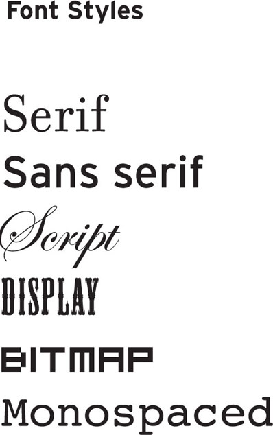
• Display. These are typefaces that, for best appearance and readability, are better displayed at a larger point size. Nowadays display is used as a synonym for decorative or articulated fonts that are appropriate for a header or title.
• Bitmap. These are screen fonts; therefore they are at 72 dpi resolution and are designed to be used at a particular font size. Zooming in on or scaling up these fonts reveals that they are composed of pixels. These fonts are displayed correctly when used on Web sites or screen-based interface designs, but they are not appropriate for printing or motion-based work that requires a resolution output higher than 72 dpi (such as titles to be printed on film) unless you want their pixilation to be a conscious stylistic choice.
• Monospaced or fixed-width. These fonts are designed similarly to the way a typewriter works; each letter occupies the same exact amount of space, regardless of the adjacent letter.
A typeface could articulate itself in a variety of weights. When that happens, it is referred to as a font family. A font family can include some or all the following individual fonts, which range in weight from lighter to heavier:
• Ultra light
• Light
• Roman
• Italic
• Semi-bold
• Bold
• Extra bold
• Black
• Small caps
Each of these font weights might have additional variations: condensed, compressed, or wide.
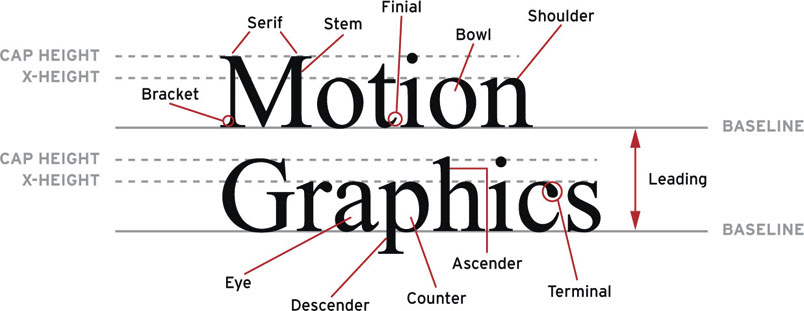
The following terminology will help you obtain a better understanding of typeface properties so that you can better articulate your title sequence type:
Figure 3.2 Font weights examples.

• X-height. The height of the body of a lowercase letter such as x or a. Different typefaces are designed with different x-heights, depending on their use (newspaper fonts, for example, are designed with a taller x-height to make them easier to read). Keep in mind that different fonts displayed at the same size might actually look smaller or bigger, depending on their x-height.
Figure 3.3 X-Height example. Notice the different x-height of these three fonts displayed at the same font size.

Understanding this small detail could help you argue with your client for the use of a particular font. Let’s say that when working on your end titles, you have a problem with screen space, like the credit roles or names are longer than usual. In this situation you might opt for a font that has a taller x-height so that you can reduce the font size and still maintain legibility.
• Stroke weight. The variance between the thin and thick strokes of a font.
• Type size. The size of a font is measured in points, depending on their output and destination. A general rule of thumb in designing titles is to start at 24 points.
• Uppercase. Capital letters, also called majuscules.
• Lowercase. Smaller letters, also called minuscule.
• Mixed case. Words or sentences that alternate upper and lower case.
• Small caps. Smaller capital letters, generally designed to be as high as the x-height.
• Ligatures. Special characters that are combined to create a single glyph—the most common ligature being f+i or f+l.
• Do’s and don’ts. If there is one set of rules you should follow from this very moment, it is the following:
• Smart quotes. If you want to avoid being bashed by the design community, when you use quotation marks do not use the straight ones (also called the prime symbol) but instead use the smart (or curly) quotes that have been designed as part of the font you are using. A typical use of primes is in indicating values of length or time; for example, if you typed 5′10″, it could mean 5 feet 10 inches or 5 minutes and 10 seconds. Smart quotation marks generally are either open or closed and should be used at the opening and closing of the quotation, respectively; they are often curled toward the center of the quote. They can be single or double. Apostrophes fall into the category of smart quotes; when you’re using apostrophes in your title cards, make sure that they display correctly, as though they were a single closed smart quote.
• Faux italic or bold. Some software programs allow the user to create a faux (or fake) bold or italic. For example, if you select your text and activate the faux bold option, your text instantly looks fat, but unhappy; the software created a Frankenstein’s monster version of what your font should have looked like if you had actually used the correctly designed bold variant of your font. Sometimes the bold variant of a font doesn’t exist or you don’t have it available. In this case I’d simply recommend you either purchase that font weight or find another font to use.
• Handwritten fonts. Do not underestimate the character and uniqueness of handwritten fonts. Although hand-drawing each title card might seem like an enormous amount of work, the results can be spectacular. Take, for example, the titles created for Where the Wild Things Are or for Juno.
What does this all mean? Well, now you have an arsenal of options. You should never leave these options to chance. Never design your title cards with the default font settings of your software. Always make a conscious decision about font usage.
To get started, ask yourself the following questions:
• Are my title cards going to be uppercase, lowercase, or mixed case?
• Does the typeface offer the option of using ligatures?
• Which font weight should I use, Roman or bold?
• How am I planning to display the difference between the talent’s names and their roles?
Every decision on how you shape and articulate your type on your title cards should be a conscious decision, motivated by the project, the audience, and your strategy.
Kerning, Tracking, and Leading
In addition to font families, there are additional parameters that allow you to personalize the text that you should take into consideration. Let’s define a few more terms:
• Baseline. The invisible horizontal line that all letters rest on. This is the line across the bottom of the x-height. The curves of some letters, descenders, and punctuation marks often go below the boundaries of the baseline.
• Kerning. Kern is the measure of space between two characters. Kerning is the process of reducing or increasing the space between specific pairs of characters. Although it might seem appropriate to check the kerning throughout your titles, it could quickly become a time-consuming activity, especially when you’re under a tight timeline. While you could be forgiven for not checking your end titles, you should absolutely check your main title card and single/double title cards for any necessary kerning adjustments. When doing so, pay attention to how each letter looks adjacent to the previous or the following one and try to make spacing consistent between each letter. Depending on the letters, the space should be reduced or increased. Common characters that require some kerning adjustments include uppercase letters that have a diagonal shape followed by a curved one or another diagonal one. To get more accustomed to this thought process, consider looking at the negative (white) space between each letter and try the following:
Figure 3.4 Example of bad (top) and good (bottom) kerning.

• Manipulate it to make it of an equal mass within similarly shaped letters (e.g., straight/round, straight/straight, round/round letters).
• Once you’ve established your point of reference, keep the negative space consistent throughout your title cards.
• Avoid letting serifs touch each other.
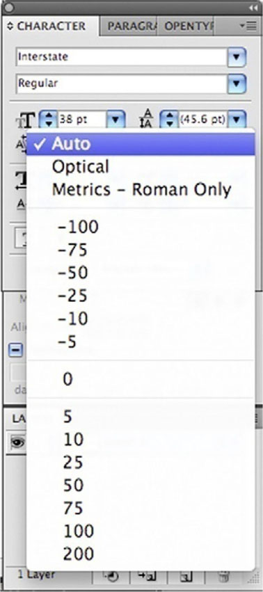
• Some typefaces require more attention than others. Generally, well-designed typefaces from a well-established font foundry require minimal kerning adjustments. Kerning requires practice, time, and attention to detail. Keep in mind that well-kerned type generally goes unnoticed, but to a trained graphic designer’s eye, badly kerned type jumps off the screen immediately. Depending on the software you use to create your title cards—such as Adobe InDesign, Illustrator, or After Effects—you might be able to control your kerning via the following options:
• Metric kerning (or auto kerning). This adjusts the kerning based on settings originally designed by the type foundry. Metric kerning refers to the font’s built-in kern pair tables and is generally the default setting.
• Optical kerning. This involves adjusting the kerning based on the actual shape of each letter. This option helps you save time while initially creating the layout of your text, but this should not be a substitute for your own judgment. You should still consider doing manual tweaks after you’ve applied optical kerning.
• Manual kerning. This involves adjusting the kerning manually, allowing you to choose a preset kern value or type in your preferred one.
Figure 3.5 Selecting a kerning option.
• Tracking (spacing). The process of reducing or increasing the space between letters in words or blocks of text. Tracking can be tight or loose. Tightening or loosening the tracking decreases or increases the overall spacing throughout the selected words or block of text by the same proportional amount. When text is tracked too tightly, the words appear crowded and touch each other, and as a result it is difficult to read. On the other hand, when the text is tracked too loosely, it presents too much white space between the words, which makes it hard to read as well. Similarly to kerning, appropriate tracking comes with practice and experience. Appropriately tracked text should go unnoticed by viewers. In tracking, follow these guidelines:
• Condensed or compressed typefaces generally require less tracking than wider typefaces.
• Smaller font sizes generally require more tracking than larger font sizes.
• Ascender. The part of a lowercase letter that stems up from its body, such as in the letters l or b.
• Descender. The part of a lowercase letter that stems down from its body, such as in the letters p or q.
• Leading (pronounced ledding). The distance between the baselines of a type that spans two or more lines of text. When you’re setting the leading for your titles, especially when you’re designing a double card or scrolling titles, pay particular attention to the ascenders and descenders and make sure they don’t touch.
Figure 3.6 Examples of a typeface’s properties.
Exercise: A Typographic Narrative
Objective: Animate one quote from a song, poem, or movie excerpt in a way that enhances its meaning.
Process: Pick a meaningful quote (don’t forget to include the quote’s author!), and focus on color(s), typeface, and camera movement to visually represent each quote in the animation.
Think of each word as individual characters. Are there any lead actors? Who are the supporting actors? How do they relate to each other? Do they interact with each other or do they stand alone?
Consider these elements in your composition: depth, scale, repetition, characters’ relationships, readability, and screen time. Arrange your composition so that you direct the viewer’s attention to a particular word when you plan it to be read, especially when multiple words appear on your screen at the same time.
Allowed assets:
• Type
• Colors
• Shapes
• Illustrations
• Video
• Audio
Technical requirements/specs:
• 720 × 540 square pixel composition
• At least 15 seconds of animation
• Motivated color
• Motivated type
• Motivated camera movement
Restrictions:
• Maximum of two font families
Which “Type” Are You?
• Type 1 (or PostScript). Originally developed by Adobe in the 1980s, Type 1 fonts include two components: an outline font and a metrics font, both necessary to print the font. This type of font is particularly preferred by Mac users because of the multitude of quality typefaces available, and also by print facilities because it allows a detailed and high-quality print of the font at any size and creates less technical trouble, since most of them use the same computer language (PostScript) to output their files.
• TrueType. Developed by Apple and Microsoft working together, TrueType fonts include only one file necessary to both display and print them. This type of font is particularly preferred by Windows users in that certain standard TrueType fonts, which are included in most operating systems, offer the user digital “hints” to improve the font’s clarity, especially when they are used in small point sizes.
• OpenType. Developed by Adobe and Microsoft together, OpenType fonts are cross-platform compatible (the same font files work on both Mac and Windows computers) and support an expanded character set—a typical Type 1 set contains 256 characters; OpenType can contain up to 65,000 characters, including ligatures, dingbats, and alternate glyphs.
On the Web Take a look at the following Web sites to see what’s out there.
Useful type Web sites:
Type ID forum:
Useful type foundries’ Web sites:
Design Blocks: Choosing a Layout
Using a Grid System
Figure 3.7
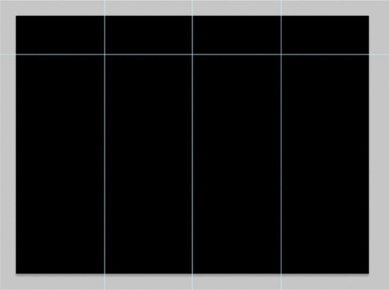
It is quite popular to use a grid system in graphic design. Grid systems are most often used on Web pages, newspapers, and magazines, but we as film title designers can still take advantage of putting a grid system in place. It boils down to how you divide up a page before you start placing elements on it.
Grid systems begin by carving out blocks. This can be done using a number of approaches. In Adobe programs you can start by creating guides, as we’ve demonstrated. Often these are divided into a group of columns or rows. The spaces are usually divided into evenly sized pieces.
 For a long time, Adobe After Effects did not have the rulers and guides that Photoshop and Illustrator have, but now we’re able to use them in the same manner as graphic design and layout software. From the View menu, choose Show Rulers, or from the keyboard press Control-R (or Command-R). From the ruler, simply drag out a guide by clicking it and moving the mouse to where you’d like to place the guide. Now, if you are preparing a Photoshop file for use in After Effects, AE will maintain your guides, but for some odd reason, it will not do this with Illustrator files. See figures 3.8 and 3.9.
Figure 3.8
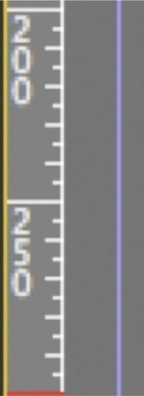
Figure 3.9

Establishing and Occupying Your Grid
Figure 3.10
Now that we know what a grid system is, let’s discuss how to implement it. In the frame in the figure above we have a shot that was created for the purpose of adding a title. Remember that when a shot is being created for the purpose of being a plate for a title, the director of photography must design the shot with the idea that a title will occupy a space in the frame.
Now, when it comes down to what will be an appealing design, it’s typically some configuration of thirds. You’ll note in the image that there are three horizontal rows, and although there are two columns, the line is placed roughly two-thirds of the way through the frame. Why thirds? Design divisions of thirds have been popular since the ancient Greeks, but let’s avoid philosophical mathematics for the duration of this text.
Figure 3.11

Now that a title has been added, you can see how the division of the space has brought us to an aesthetically pleasing spot fairly quickly. Now, the location I’ve chosen is not the only spot in the frame where the title will work, but the grid helps you narrow down and disqualify locations within the frame that are not going to work.
 If you’d like to know a bit more about why thirds have been so appealing to the human aesthetic mind for millennia, do a quick Google search of the phrase golden ratio. You will either become fascinated or bored.
Breaking the Grid
Figure 3.12
Now that the grid has been established and occupied, we could easily leave it at that. However, grids will lead you to a very rigid design. To maximize the effectiveness and the appeal of your design, it’s time to break from the grid. You can move and rearrange items to exceed above and below the grid lines to take advantage of their shapes and achieve a better design. Press Control-; (or Command-;) to hide and show your guides, and experiment by pushing design elements into and out of shapes.
Readability: Titles at the Movies, Online, and on Your Cell Phone
Now that we’ve explored some type flavors, we need to address a key component of successful typographical use: readability. Often overlooked and viewed as a secondary and less-relevant value compared to the coolness of a font or a particular layout, readability is an aspect of design that absolutely should not be overlooked. If the titles are unreadable, the information and messages don’t come across, and that can obviously cause frustration for the viewer—or even cause you to lose a client.
Readability depends on a variety of factors. The audience is sitting still, but their head and eye movements, the type’s animation, and the screen time often affect the way the audience identifies words and processes them.
For example, titles that face the viewer, displayed in 2D (as opposed to 3D) characters, allow for quick readability. In using 3D typefaces, especially if they are embedded in a 3D environment, give them slightly more screen time than 2D fonts.
What is important to understand is that there are no set-in-stone rules about readability. You will have to test each of your project’s font sizes and screen times; use your common sense, experience, judgment, and client requirements; and know how your project will be distributed (online only, in theaters, or via some other method).
Cone of Vision and Screen Dimension
While designing title cards, designers should keep in mind the viewer’s cone of vision. The screen’s dimensions and the distance from the viewer to the screen are also relevant factors. A typical cone of vision for a spectator in a movie theater or screening room is between 30 and 60 degrees total view angle. In a 30-degree cone of vision, a viewer sees 15 degrees from the right eye and 15 degrees from the left eye, for a total of 30 degrees view angle. A viewer sitting in the front row will have to use a wider cone of vision to detect the entire surface of the screen; eye and head movements will be necessary to follow the action and type on the screen, and the close proximity to the screen will result in image distortion. A viewer sitting in the last row will have to employ a narrower cone of vision; head movements are minimal, giving the eyes the entire job of deciphering the information onscreen.
Font Size and Distance
Screen readability is determined by the font size, color, contrast between the font color and its background color, and the typeface. The United States Sign Council (USSC), through extensive research, has developed a Legibility Index (LI). In Table 3.2, you can find a reference for a sans-serif font (Helvetica) and a slab-serif font (Clarendon). A title card with an LI of 29 means that the font—when its capitals are 1-inch high—should be legible at a distance of 29 feet. For example, according to this chart, when we use black Helvetica on a white background, its capitals set at 1 inch, it should be legible from 29 feet (if it’s uppercase and lowercase) or 25 feet (if it’s all capitals). If the font is displayed at 10 inches, it will be visible from 290 feet and 250 feet, if uppercase and lowercase or all caps, respectively.
Table 3.2 Legibility Index Chart
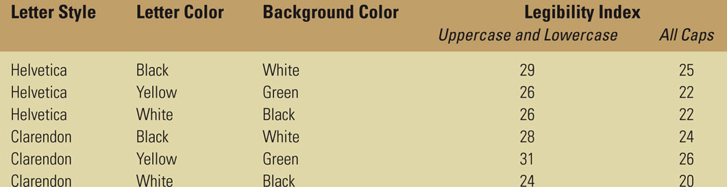
You might wonder why there is a difference between using uppercase and lowercase and using all caps when it comes to legibility. When using uppercase and lowercase, which use ascenders and descenders, the words’ shapes are more distinctive and recognizable; therefore, this is considered more readable than using only capital letters.
Some research, though, contradicts this view. Research conducted by Tinker in 1963 found that even when a font with a great x-height was used, an uppercase font is more readable at greater distances than a mix of uppercase and lowercase. Further findings by Arditi and Cho in 2007 found that when text is very small, uppercase fonts are more legible in terms of reading speed, both for normally sighted readers and for readers with reduced sighting due to visual impairments.
What does this all mean to your titles? You don’t necessarily need to use the 30-feet LI rule in your title sequence, but it is a good place to start.
In applying this information to title design, consider that signage is different from title design. Print design works with inches or a metric system; type is still measured in points, whether in print or digital format. Our main variable in working with a digital title sequence is the frame size.
Let’s take, for example, a digital title sequence for a movie, which will be output to film at 2K resolution (2048 pixels wide by 1556 pixels high at 72 pixels/inch). Its correspondent dimensions in inches are 28.44 inches wide by 21.61 inches high. To create a font size that will be 1-inch high, you will have to set your font to approximately 100–104 points. This font will be legible from 30 feet away.
Table 3.3 shows how the USSC Legibility Index translates into our screen size world.
The Department of Computer Science and Communication of the University of Milan, Italy, has developed FontReader, a program that allows a user to calculate the dimension a typeface should be based on the minimum distance from which someone would see it, to guarantee its legibility. This application was created primarily for outdoor advertising (billboard, bus ads), but it could certainly apply to designing title cards that would be readable even by viewers sitting in the front rows of movie theaters.
Table 3.3

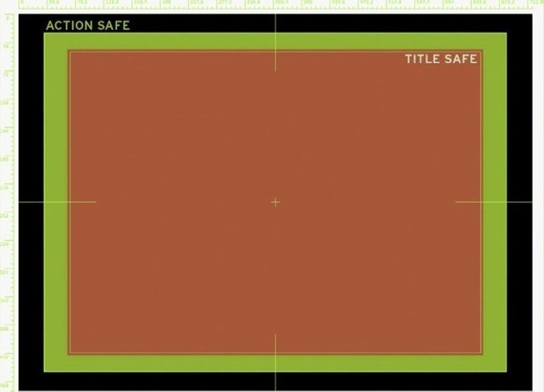
Are Your Titles Safe?
To guarantee your titles’ legibility—especially when you’re working in broadcast title design—they should be placed within a title safe boundary box. With the exception of plasma and LCD screens, most television sets scale up the video signal received and cut off some of its content by the edge of the screen. Because this cropping, also called overscan, is not consistent among the various TV brands and models, titles should be placed within a title safe boundary box, and relevant live-action or animation content should be placed within an Action Safe boundary box. A title safe box is typically 80% of its frame size. An Action Safe grid is typically 90% of its frame size.
Figure 3.13
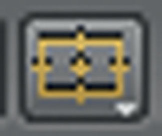
Most software programs provide options to display a Title Safe boundary box. In After Effects, you can display the Action and Title Safe boxes by clicking the Choose grid and guide option (Figure 3.14) icon on the bottom left of your Composition window. In Photoshop and Illustrator you can view the Action and Title Safe grids or overlay when you create a new file from one of the Video & Film presets.
Figure 3.14
Titles Online and On Your Cell Phone
How does a small screen compare to a large screen in a movie theater? For one thing, in a theater you are immersed in the dark, with nothing else to distract you. You empathize with the characters of your movie; the titles are readable, exciting, and entertaining. The size of the screen is wrapping around your perception, and the sound (whether stereo or Dolby 5.1 Surround Sound) is wrapping around you, immersing you in the reality of the movie. You are breathing, fighting, suffering, and loving with your characters. Compare that experience with viewing the same movie on an airplane, when you are interrupted by the passenger sitting in the window seat who needs to get up, or the hostess serving coffee, or even with looking at the same movie while in line or waiting for the next bus or train.
Regardless of the drastic dissimilarities in experiencing movies in various environments, the filmmakers’ and designers’ challenge is to create a product that will stand the technological limits and challenges posed by the new distribution channels.
There is relatively minimal concern when designing title sequences for the Web. As far as screen size, most Web sites are now designed for a screen size of 1280 × 1024 pixels, which allows movies to be embedded in the Web page at least at SD resolution. The one variable to keep an eye out for is the video codec. Depending on the film’s compression, the typographical elements of a title sequence might become unpleasantly unreadable; the font’s antialiasing could be deteriorated, and the serifs might become too thin or even disappear completely. Some Web sites might even require a maximum file weight for a video upload, and that’s when the testing begins to try to find an appropriate compression that allows for quick video streaming while maintaining the title sequence’s quality.
There are no set-in-stone rules; the compression depends on the nature and source quality of the title sequences—whether they include 3D elements, colors and textures, live action, heavy or light typographical elements, or the like. To determine the best video codec for your title sequence you should export a short segment using a variety of video codecs and then scrub through the video file to verify its result. To start off, you should try compressing your title sequence as H.264, Motion JPEG, or Apple ProRes. If you’d like to explore more compression flavors, you should import your title sequence into Apple Compressor and try a few of its presets.
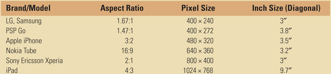
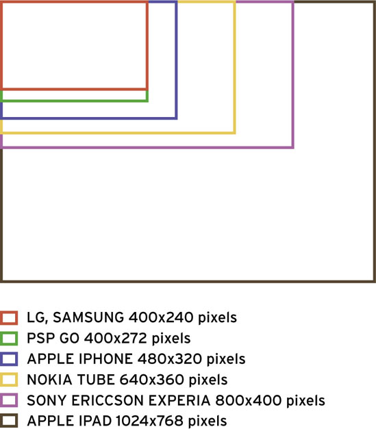
When designing a title sequence for smaller screens such as mobile devices it is important to understand that there are a variety of screen sizes and resolutions, depending on the make and model. Although you are not expected to design for each and every one of these devices, at least one version of a title sequence, redesigned to be readable on smaller screens, might be required by your client.
Table 3.4 will help you understand the frame sizes and aspect ratios of common mobile devices.
Table 3.4 Screen aspect ratio of common mobile devices
When designing title sequences for smaller screens, you can still use the USSC Legibility Index as a guideline. A black Helvetica displayed on white background at 0.1 inch high—equivalent to a 10-point typeface—will be readable from 2.9 feet (uppercase and lowercase) and 2.5 feet (all caps).
Figure 3.15
Tutorial: Modifying Text with Adobe Illustrator
One of the major strengths of Adobe’s Illustrator software is its ability to apply an artist’s touch to existing fonts. Illustrator allows users to “break” a font from the appearance it has and allow users to apply vector image editing tools to customize its appearance. This powerful feature alone often justifies a trip over to Illustrator.
Figure 3.16 The same letter in its normal presentation and after Create Outlines has been applied.

Adobe Illustrator is the industry standard for vector image editing. It allows you to use Bezier tools to change the shapes of the objects you are editing by adjusting points. In the following tutorial we’ll use Illustrator to bring a boring title to life.
1 Before we start changing the shapes of the letters involved, we should resolve any issues we need to address while the material is still being treated as text layers by the software. Make sure you are happy with the font you’ve chosen as well as the leading and kerning. We can change the leading and kerning later, but it is more difficult.
2 When you are ready to proceed, with your text layer selected, select Type | Create Outlines. Now we can begin editing the shapes of the letters.

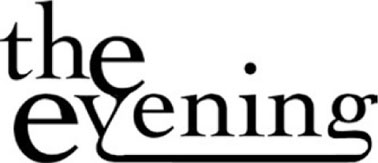
3 I’m going to use the descender from the g as an underline for the rest of the word. Use the Eraser tool and create a break on the g where we can extend the line.
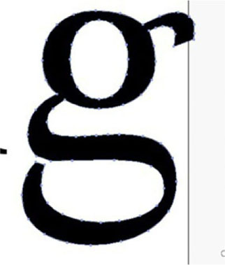
4 Use the Lasso tool and draw a circle around the left side of the g’s descender and drag it over to the left. We will connect it to the v, which will create this nice vine effect.
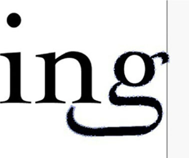
5 Done-Now take some time to experiment with changing the shapes of your letters and see how they look. It becomes very interesting and engaging when two letter forms are combined. Be careful to avoid making your type too difficult to read, but also think about how you can make a distinct look and appearance for the title graphic you are working on.

Figure 3.17 Trajan Pro has become ubiquitous, from Titanic to Lemony Snicket’s A Series of Unfortunate Events to Columbia University (and my own Web site from 2002–2008). You know a font’s over-used when the highest-grossing film of all time and the ivy league are both using it.
Creating Your Own Font
Let’s say that you are about to begin working on a title sequence for a new thriller with some big stars and a whopping paycheck. Take a breather and recall some of the great graphic design campaigns associated with this genre. Se7en, Psycho, and Jaws (1975) immediately come to my mind. What did these three movies all have in common? A memorable, unique type face designed specifically for those films. So, let’s march over to our font folder, trash Trajan Pro, and discuss creating our own typefaces.
To begin making your typeface, you will need some specialized software for creating a new font. You have a number of options when it comes to font creation software. First there is the professional application Fontlab Studio, which has been the dominant software in this area of the industry for some time. There’s also the freeware package called FontForge, which is not nearly as robust as Fontlab Studio, but is also free.
Figure 3.18 Fontlab’s Fontlab Studio is the most popular font development application available right now.

Tutorial: Creating a Custom Typeface with Fontlab
1 I began my typeface by scanning a drawing I made of a letter. Have fun and be creative with your original source material; it can be as loose or as casual as you want it to be.
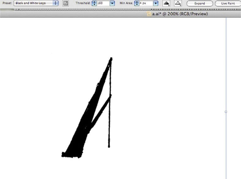
2 To get the cleanest possible appearance from the letters, we will create a vector image from the scan. Open the drawing in Adobe Illustrator and apply Live Trace to the raster image. Since color will not really be an issue, I used the Black and White Logo preset. Click Expand. While we have it here in Illustrator, take a few minutes to make any changes to paths that make up the type here. Leave Illustrator open; we will come back to it in a few minutes.
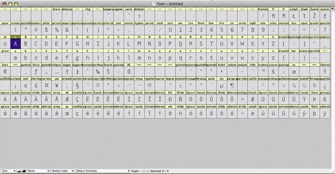
3 Launch Fontlab Studio and click File | New. This will open a new font window, which will show you a grid with all the glyphs in a font. Highlight the capital A. Go to the Glyphs menu and click Create Glyphs If Empty. Now double-click the capital A and its glyph window will open.
 A glyph, by definition, is any element of writing. In Fontlab Studio and most computer software, it simply means an individual character in a font.
4 Go back to Illustrator and select the path and Edit | Copy it. Go back over to Fontlab and Edit | Paste it into the glyph window for the capital A. Now repeat this action for each letter. You don’t have to individually scan each letter; you can draw them out on one page and Live Trace them as a group. I just demonstrated one letter for the purpose of clarity. In fact, you could build the other letters using Illustrator if you want, though that could take a while.

5 Done - When you have finished supplying the glyphs for all the characters, go to File | Generate Font. This will essentially export what you’ve done in Fontlab as a font that you can then install on your computer, like any other font.

Moving Type for the Web with Adobe Flash
It used to be that very few people watched video content on the Web, but those days are over. Title design has become an important part of new media content, and the new size issues and constraints are important issues to address. There’s also been a significant boost for Flash’s capability now that it’s an Adobe application; it has some great features that make pairing it with After Effects a powerful suite of tools.
Considerations for Web Viewing and Mobile Devices
Watching something on the Web, or a mobile phone, is a much different experience than watching on TV or the big screen. It’s not the comfortable, dedicated experience of home or theatrical viewing. Title designers must also take design considerations into account.
First, the standard size of Web video is different than TV or film. Obviously we are talking about smaller images. The problem is that the type size cannot be shrunk down relatively and still achieve maximum readability. We have to err on the side of displaying type at a larger relative size on the smaller Web/mobile device image.
In addition to the size concern, we also have to keep in mind that Web video displays the entire image. It’s still a good idea to keep our titles within title safety so their distance from the edge is still comfortable for viewers to read. In case you’ve gotten into the bad habit of leaving elements in the image area just past the domestic cutoff edge, you can’t do that when working on video for the Web.
Also, we should consider using tools that are optimized for the Web for our design work here. After Effects has some settings for working with Web-based content, but Flash is optimized for Web work.
The Differences Between After Effects and Flash
Figure 3.19
Figure 3.20 Although they might seem to do similar things, Flash (above) and After Effects (Figure 3.19) are two very different programs ideally suited for different purposes.
If you are very new to all this, the major differences between Flash and After Effects might not be immediately apparent. They are both keyframe animators, with tools that kind of resemble each other. However, they are very different software packages, and each one is meant to be a professional solution for its specific task.
Though both software packages have great capability when it comes to animation, they both are intended for different media formats. Flash began as a tool for developing high-end dynamic Web sites, and over time, it has become a development platform with its own programming language. Flash has become popular among animators because of its close resemblence to the classic “cel” process, making it the choice tool for many Web cartoonists and 2D animators.
However, Flash is not as strong a motion graphics tool as After Effects. It doesn’t have the sophisticated type animation tools that After Effects possesses, and its output settings are best designed for Web output and minimal for any other formats. The most commonly output file type from Flash is the .swf (sometimes called swish or swiff), which is a little bit like a QuickTime movie except that it is vector-based, making it easy to resize without any lost quality. Luckily, as new versions are released, there are more ways of quickly jumping between AE and Flash.
After Effects was designed for creating 2D motion graphics, but over time it has become an excellent type animation tool, a solid compositor, and a widely used VFX software package. It is designed to work with other video software and is geared toward outputting raster-formatted video. Since it’s designed for video output, AE’s exports and engine are raster-based, limiting it to set scale but photographic in its quality.
Choosing Between the Two
When to Use Flash
If the type you are animating will be part of a Web site in its final presentation, Flash’s vector output is superior. However, keep in mind that you will be extremely limited by the animation tools available for type in Flash. Often, if you are working with Flash Video, you can have the vector-animated type come before the actual video content. This will help you avoid overly compressing the titles if they are married to the video. So, within a Flash .swf file, you can have vector-animated type precede Flash Video formatted video content.
When to Use After Effects
In most cases, for any form of video, you’ll need the wide range of video output settings that a dedicated piece of software such as After Effects provides. Furthermore, After Effects boasts robust tools for type animation that few software packages can rival. Now we’ll take a look at how you can take advantage of After Effects’ excellent type tools and export to Flash using the XFL format.
Tutorial: Basic Type Animation in Adobe Flash
1 At the beginning of any Flash project, it is worth viewing the Modify | Document window and setting up your document accordingly. If it is your plan to add animated type to a Web site, it’s important to match the dimensions of the final site or, if it’s going to be a specified section of a page, to match the dimensions of the area that is already blocked out. If it’s going to be added to a Flash Video presentation, it should match the setting of the Flash Video piece.

2 Typically when I am using Flash I will move the Tools panel to the left-hand side (call me a traditionalist if you want, but having a toolbar on the right feels wrong to me). Select the familiar Type tool and lay out your text.
In Flash you adjust parameters to the elements you create with the Properties panel. Type controls are in the Character section. Auto kern has a switch. Tracking will be controlled by the oddly labeled Letter spacing number value. Also, you’ll find leading below the Paragraph heading under Spacing.
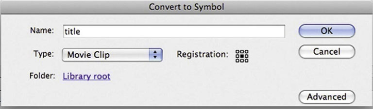
3 Our next step is to go to the Modify menu and choose Convert to Symbol (or press F8 on the keyboard). Select Movie Clip from Type. Name it title. In most cases you will need to use Convert to Symbol to create any animation.
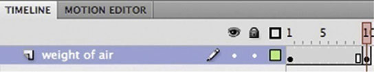
4 Now, unlike After Effects, every frame in Flash is represented by an individual box. Highlight the box below the 10-frame mark. Now go to Insert | Timeline | Keyframe (or press F6).
5 At the 10-frame mark, use the Free Transform Tool (or press Q) and scale up our text.
 For the Web savvy, you can use the Dynamic Text feature to bring your credit information from a Web page.
 Mac users will notice that Flash makes use of the F keys, which may interfere with OSX features such as Expose. You can change or turn off these keyboard commands for Expose by going to System Preferences, underExpose and Spaces.
6 Done-To execute any kind of animation in Flash, you have to tell Flash to Tween. Highlight the frames, and go to Insert | Classic Tween. Now an arrow will appear linking your first and last keyframes. Press Enter to view your animation.
Tutorial: Moving a Type Animation from After Effects to Flash with the XFL Format
Now that Flash and After Effects are both published by Adobe, we can take advantage of the strengths of both programs. In this tutorial, we’ll see how to start a project with After Effects and then export it to Flash.
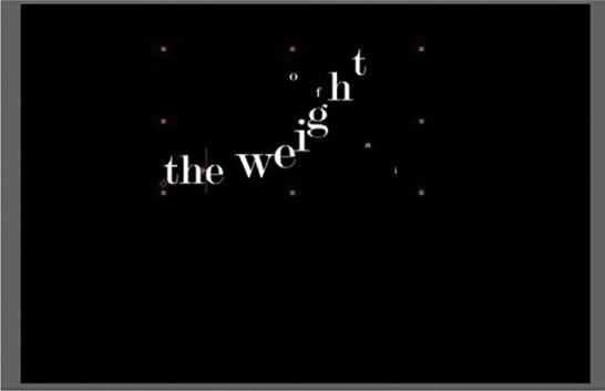
1 In After Effects I created a quick animation of a title, and I have applied the Whirl In preset to the type layer (Effects and Presets | Animation Presets | Type Animation | Curves and Spins | Whirl In).
2 Choose File | Export | Adobe Flash Professional (XFL). The XFL format works similarly to Flash’s FLA files, so after we export, you can open the XFL file as though it were a FLA.
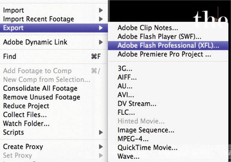
3 Flash’s engine is vector-based and AE’s is raster, so since they “speak different languages,” we have to adjust our export settings so that we preserve the appearance of our timeline. After you choose File | Export | Adobe Flash Professional (XFL), you will have to choose some export settings. Since the type animation work we are doing in After Effects would be an unsupported feature in Flash, under the heading Layers with Unsupported Features, turn on Rasterize to: and, from the pull-down menu, choose a Format. The FLV format will give you a compressed video layer in Flash, and PNG Sequence will give you a series of images. Either will support transparency.
4 Done - Grab the XFL file and open it with Flash. Now you can you use it as a part of your Flash project.
Case Study: The Alphabet Conspiracy
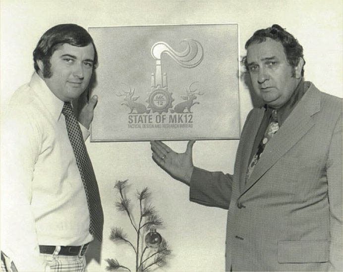
Motion Graphics Studio: MK12
Creative Directors: Ben Radatz, Tim Fisher
For Immediate Release:
For millennia, the alphabet has been the building block of human communication and cultural understanding. The Greeks, the Romans, the Turks, the Celts—all were pioneers of our own modern-day writing, passing the linguistic torch down from their civilization to our own. You could say that the alphabet—and phonemes—are so pervasive in our everyday lives that we barely give them a second thought.
And that’s what They’re counting on.
In 1962, while conducting routine experiments at the Voice Research Laboratory (VRL), scientist discovered a curious mutation on the common phoeneme ![]() : a faint, positively charged frequency that modified the implied meaning of the resulting sound. In ensuing tests conducted on primate subjects, it was observed that the modified
: a faint, positively charged frequency that modified the implied meaning of the resulting sound. In ensuing tests conducted on primate subjects, it was observed that the modified ![]() phoneme, when amplified through a common telephone headset device, evoked strong feelings of confusion and anxiety in the primates.
phoneme, when amplified through a common telephone headset device, evoked strong feelings of confusion and anxiety in the primates.
Further experiments were conducted on human subjects using additional phonemes—![]() ,
, ![]() , and
, and ![]() being the most common. These subjects also displayed increased confusion and disorientation and soon became detached and generally lethargic—most notably when the phonemes were arranged into distinct words and sentences, as with
being the most common. These subjects also displayed increased confusion and disorientation and soon became detached and generally lethargic—most notably when the phonemes were arranged into distinct words and sentences, as with ![]() .
.
There are opposing accounts of what happened next, but soon it was obvious that this subsonic Trojan horse wasn’t a daughter of nature; indeed, the scientists at VRL had stumbled on a massive linguistic conspiracy, the depths of which are only now being excavated. It was an outright hijacking of our language from the inside out. But to what end? And by whom?
This colorful, geometric televideo is an accurate account of the known facts, including several minutes of never-before-seen footage accompanied by helpful diagrams and charts. It proposes new theories and offers supporting historical and scientific context and is two minutes and forty-nine seconds long. It is most likely both entertaining and informative.
Please discuss this film on completion.
///
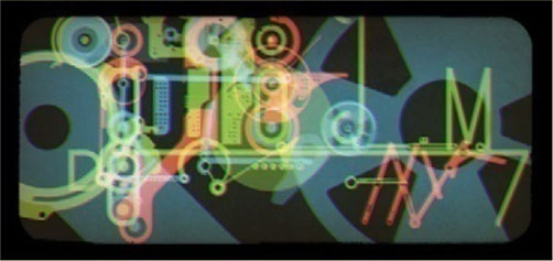
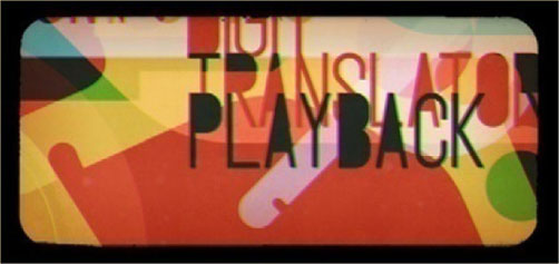
Figure 3.21a Still frames from “The Alphabet Conspiracy” by MK12.
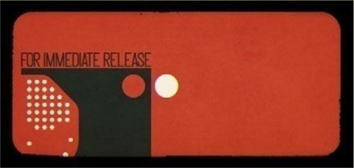
Figure 3.21b
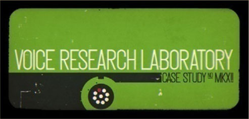
Figure 3.21c

Figure 3.21d

Figure 3.21e
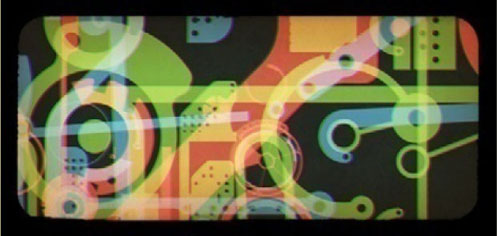
Figure 3.21f

Figure 3.21g
The Alphabet Conspiracy is a hybrid live-action/animated piece about the language working as a double agent, carrying a hidden meaning with it for reasons yet unknown.
The short came about after finding an educational film from the 1960s, also titled The Alphabet Conspiracy (we like to think of ours as a sequel of sorts). In the original, a young girl named Alice boycotts her homework and falls asleep, traveling to an enchanted world where she conspires with a Mad Hatter type to eliminate books and words (thus no homework). They’re intercepted by a kind-hearted linguist who eventually convinces Alice that the alphabet really does matter. She then wakes up.
Figure 3.21h
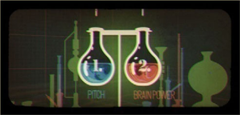
Figure 3.21i
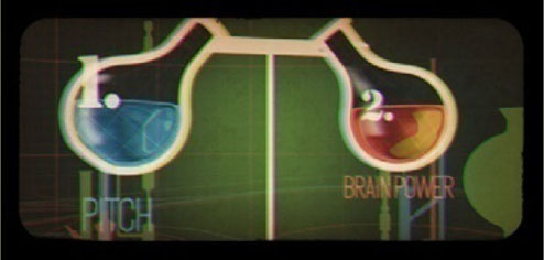
Figure 3.21j

Figure 3.21k
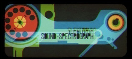
Figure 3.21l
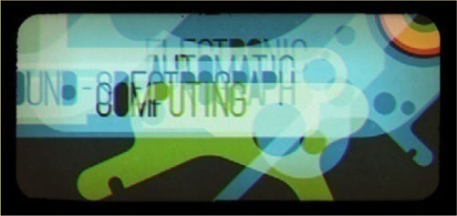
Figure 3.21m
We’d already been scripting a type-based short that was eerily close to this one, and so we figured that instead of reinventing the wheel, we’d simply add our own spin to the original. We cut up the soundtrack and remixed it into a slightly darker version of itself, and that became the foundation for the piece. From there we developed an animatic and began working in the key elements (though with nonnarrative pieces, we always treat the animatic as a general guide, since the tangents we follow while animating and designing usually end up becoming the piece).
The short takes other cues from the film as well as other educational films from days past, inspired by the awkward editing and absurd premises that often defined the genre. The color palette is simple and deliberate, and we worked with a technique in which all the elements were split out into their respective red, green, and blue channels, which usually remain superimposed to form a complete image but sometimes move independently of one another to create interesting transitional and graphic effects.
Figure 3.21n

Figure 3.21o
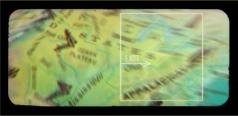
Figure 3.21p

Figure 3.21q

Figure 3.21r
Figure 3.21s

We like to design custom typefaces for our film projects, and since this piece is about the alphabet from a scientific perspective, we spent a good deal of time developing a typeface that was theoretically perfect and balanced. We were less concerned with making an aesthetically pleasing font because we were ensuring that every measurement was a reciprocal of another. We also developed a pretty rigid set of rules for how the type was to be laid out and presented on-screen, making sure that exponents and weights were always considered. It’s not something that’s necessarily meant to be picked up on; it was more a starting point for our compositions, and it felt appropriate to the subject matter.
Figure 3.22
Interview: Stacy Nimmo on Title Design
One of the wonderful things about broadcast design and kinetic typography is that there are so many different things that you can put into any piece you do. You have music, cinematography, 2D or 3D graphics, and typography, which stand on their own as a communication tool. Finding the right mixture of what to use for the message that you’re sending is the real challenge. You have to find out what your client needs, what they need to communicate, and how it needs to be. Generally, on the emotional side you tend to have things that are much more ephemeral, and then on the very clear and concise side, you have “50% off” and giant “For Sale” signs. So, between those two extremes you need to find out what your client needs to communicate and what the consumer wants to hear.
Can you talk a little about yourself and your background in graphic design?
I studied design at the University of Florida in a very, very traditional sort of program, at a time just before computers became more popular. So, not to sound like a Luddite, but I think that there were some really positive things that can be learned in design before you get on a computer. And I think at some point, especially in the foundation time, it’s actually helpful to stay away from a computer so that you deal with very basic compositions. You know, if you have After Effects or if you have Photoshop, you’re immediately capable of layering 100 layers on there, and that’s just not the case when you got a copy machine and you’re blowing up some typography; you’re physically limited to the number of things that you can do there. I think that that’s really good because it helps you focus on saying the most with the fewest number of parts. And I think that is the essence of typography: say the most with the fewest number of parts.
I still urge schools and students coming into broadcast design for the first time to not do everything with the computer, to try to do things offline and in your head and in the sketchbook as much as possible. And one of the key pieces of that is learning to understand and work with typography, getting to know the cropping, and the scale, and the kerning, and the subtle sort of things that are really helpful to have. To look at it offline, as in printmaking and using stenciling, for example, where you have a physically engaging process and you have a feel for the physical weight and positioning of the letters.
It’s almost the difference between reading a book on a computer and reading an actual book. It has a different feel and weight to it, and I think you become much more familiar with typography when it’s reflective versus when it’s on a computer screen.
Figure 3.23a Client: Symantec; Project Title: Higher Level; Duration: 00:30.
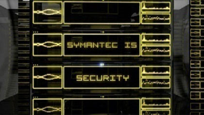
Figure 3.23b

Figure 3.23c

Figure 3.23d

Figure 3.23e
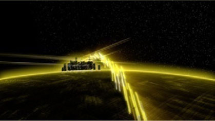
Figure 3.23f

Figure 3.23g
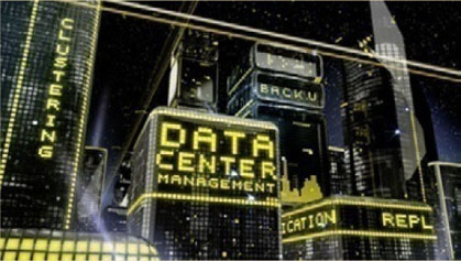
Figure 3.23h

Figure 3.23i
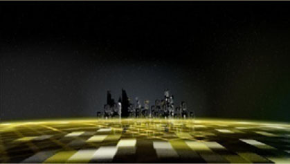
Figure 3.23j
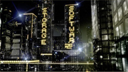
Figure 3.23k
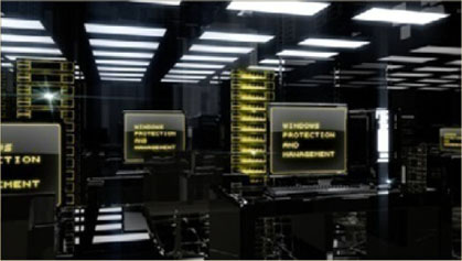
Figure 3.23l
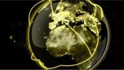
Figure 3.23m
Figure 3.23n

From studying graphic design, how did you end up specializing in motion graphics?
I went from studying design, which was primarily print design in college, to working on movie posters for Miramax in New York City in the early 1990s, when they were starting. When you look at a movie poster you have the actors, and you have them composited usually in some vague world, and then you have the title.
And the title really speaks volumes about what it is that you’re going to see; it especially has the capability of doing that, of setting the tone of the movie outside the particular image of the people. It’s about the people and about the title design. In fact, the title is so relevant to these posters that it’s actually written in contracts that certain people’s names have to be a certain relative size compared to the title: “If a title is X size, my name has to be 20% of X size.” And that’s how movie posters end up with very skinny, very tall typography, because it is a legal requirement that people’s names be the same size as the title.
I went back to film school to study traditional film production, and there’s still a lot of things that I draw on from that experience that have nothing to do with being on a live-action set but have everything to do with the way a camera moves through a 3D scene or the way drama or motion is carried through camera movement. I think that that is a very important step in the progress in anybody’s broadcast design growth.
When and how did you start Gunshop?
We started Gunshop in 2000. We’re now 10 years old, which is pretty exciting, and pretty old in this business, too, but we have a lot of benefits of having that experience. The main reason we started Gunshop was because in the late ’90s the main places that were doing sophisticated broadcast design had some very, very expensive equipment. We had started doing more and more work on the desktop with After Effects and realized that we didn’t need all these expensive tape decks, we didn’t need the Inferno, and just really began to produce jobs soup-to-nuts on the desktop. We opened up our shop as a sort of desktop solution for broadcast design. It was one of the first in the city, and it was very popular, and we ended up doing a lot of work with HBO and all their family of channels, like Cinemax, as well as Viacom and their family, like MTV and VH1.
How do your life experience, interests, and passions influence your work? And what are your interests and passions?
If someone asks me, I generally don’t refer to myself as a commercial artist, though at essence that’s what I am. I’m an artist who is working in a commercial atmosphere, in a commercial manner, basically creating commissioned works of art for the client.
So, for me, there’s a lot of creativity that goes into all these pieces. It’s very fulfilling to create, as I call them, tiny worlds. We create these tiny, very special, very specific, very branded worlds for our clients so that they can communicate whatever they need to about their product. And I think that as an artist it’s very fulfilling, I think it’s very challenging as well as it is very commercial, and you have a client that’s paying for it, so there’s a lot of negotiation, sacrifice, and changes that are involved in the process. And if you have the right team together both internally in your design company as well as with your advertising or theatrical partners, you can have some great stuff coming out of it. I think that you basically expand your team to work with the team of the client. And that’s when projects really take on a life of their own that no individual is capable of doing.
Do you have any guidelines or preferences in regard to font size and readability, whether for theatrical release, broadcast, or smaller screens?
You know, its kind of funny, but in general we have a really crappy TV here in the office, and after we do some type design we want to make sure it looks good on that crappy TV. I mean, you could do stuff in HD that will look fantastic on an HD monitor, but you also have a lot of people who have different, older, and smaller TVs, and you always want to make sure it works on the lowest common denominator, especially when half the stuff we’re doing is still in SD.
So as far as specific specs of how many point sizes, we don’t have anything that is that specific because sometimes you have a headline that’s a certain size and it’s only one word, but if it’s three words then it’s going to change that rule all together. So, it’s a little bit more about what works than our rules.
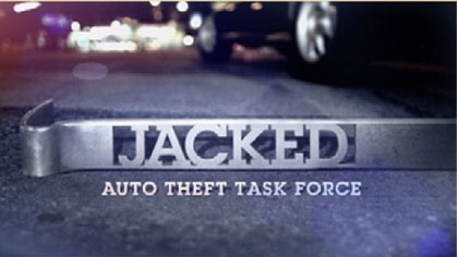
Figure 3.24a Client: Arts and Entertainment Networks; Project Title: Jacked Auto Theft Task Force; Duration: 00:16.
Figure 3.24b
Figure 3.24c

Figure 3.24d

Figure 3.24e

Figure 3.24f
Figure 3.24g

Figure 3.24h
How about screen time?
It kind of follows the same rules as our typographic size rule, which is, you want to make sure it feels right and looks right. Just like with type size, we use a bad monitor, with type timing and also sometimes with scale we’ll do a lot of those things in the edit room, which I think is a very important place to say, “Is this on long enough?” So, we may work on the files in 3D or After Effects, but at some point, or often throughout the process, we’ll bring it into the edit room and we’ll do small adjustments to scale or timing there, because you can get into a level of finesse there that is really where you want to be. You can adjust it so it’s just a little bit faster and the other piece is just a little bit slower and it’s just a little bit bigger. And you play it down and you make these micro adjustments very quickly, and I think that’s where the real magic and poetry really is, when you can make those small finesse changes very quickly. Then we take that information back into 3D or After Effects and implement that information so it’s of better quality. It’s almost like directing a piece of music. You want to have everything just in the right place, and the only way you can get to that level of finesse is if you have real-time interaction with it.
Do you design while keeping in mind the title safe boundaries?
We still adhere to title safe. I mean, granted, the monitors now don’t have such strict or massive amount of title space required, but I think it’s much easier to sort of read the typography if it doesn’t veer toward the edge of the piece. As long as you didn’t put the type up there, you don’t want to hide it. So it’s helpful to keep it in the general area. So, I think we do follow title safe. Since we do work in a tremendous range of media, we never know where it’s going to end up, so if we do a piece that’s originally going to be shown on a digital monitor at a conference and is also going to be broadcast in SD later, we want to make sure that we don’t create too much work for ourselves by doing something that’s specific to one of those mediums. We try to be a little bit more open ended so our client can use it in as many different mediums as possible. When it gets to Web and online in 320 by 240, that becomes very challenging because generally typography, even in SD typography, doesn’t work online and generally it has to be redone for small-size Web applications. But more and more clients are going to larger-size Web applications, so it’s not so much of an issue.
Can you address any of the motivations behind camera movement or even transition between one shot and another, whether it’s hard cuts or dissolves or just general relevance of the use of camera in the work that you do?
When we build tiny worlds for our clients that are very specific, we may have some that are very bare-bones, very clean, very simple, very elegant solutions, and they generally are very hard cuts. And then we have things that are meant to have a feeling of futuristic excitement, and they tend to be much more complicated, so it really depends on what is more appropriate for the project that we’re working on.
I think that camera moves in general are pretty distracting unless they’re tied into some motivating action. Or your palette is so simplified that there’s really not that much else. If you look at some really great title design that’s out there, there’s just a slight amount of atmosphere and the typography and the camera, and that’s all that really exists in the animation of the main title sequences.
Can you elaborate on the relevance of editing in the work that you do? How can you tell a story through editing?
Editing for us has two real major uses. There’s one, which is the finessing. It’s really hard, even if you have your story and you know that those are the camera angles and those are the shots you want to use. The timing and certain subtle things like scale and color correction that you can address really quickly in Final Cut are essential. I’ve seen artists work on shots for hours that end up being cut in duration in half because when you get the final piece together it really doesn’t need or justify the length of the shot. We create very tight animatics and very specific sort of durations in these things, and we trim it by a frame here or a frame there, but I think you really want to have that ability to go in and interactively work with your piece, which is just not easy to do in After Effects. There are so many layers in there, it makes it so hard to do those finessing adjustments, so people just don’t.
So, its almost like you got to get the shot out, you got to get it rendered, you got to get it into Final Cut and you got to finesse it, otherwise it’s going to come out clunky.
If you cut a few frames out of someone’s reaction, it could go from happy to sad, depending on where you end the cut. In more postproduction-oriented places, it seems like it’s more about timing and making the piece feel like a great music composition and flow from scene to scene. I don’t think there’s that much opportunity to change how the story is told in the edit suite; it’s more a matter of finessing it. Because everyone knows that the scene needs to look like this and it’s unlikely that you’ll discover it in the edit suite, well, you could drop entire shots, but it’s unlikely that you’ll create an entire shot to fill a gap in the edit suite.
Figure 3.25a Client: Symantec; Project Title: Vision 08; Duration: 00:30.

Figure 3.25b

Figure 3.25c

Figure 3.25d

Figure 3.25e

Figure 3.25f
Figure 3.25g
Figure 3.25h
Figure 3.25i

Do you generally work when you have a score or soundtrack and sound effects already in place? If so, how does it affect your work?
In general, unfortunately, the soundtracks are not done until later on in the project, and we usually work with temp tracks. As soon as we find a piece, we’ll start working on the style frames and immediately start working on what we feel is a good piece of music to cut with and to lend personality to the piece. A lot of times the animation will become overly complex just because there’s no music associated with it. That’s the natural tendency; people think, “Hey, it needs to keep doing stuff,” if you don’t put a soundtrack next to it. If you put a soundtrack next to it, you realize the design or the style of the frame carries on its own with that music. It’s kind of like saying, “Hey, I’m going to paint this painting without red and put the red in later.” It’s sort of impossible to do because it’s such a critical element.
From the beginning we work with those tracks, and it’s amazing how often those tracks, once you swap them out with the actual track, the cuts and the beats and the timing still work, because basically a lot of the cuts and motion tend to be more open, more languid, when working with the soundtrack. And as long as it’s on 4/4 time, most of the stuff just cuts right to a variety of different tracks if you’re close to the same beats.
I highly recommend working with a temp track as soon as possible and then swapping it when you get the final tracks. Voiceovers are a different story. When we get the script and we have a piece that’s being written to or being created around a voiceover, we’ll generally do a scratch voiceover track here and time it out to that, then get the real voiceover and do some finessing there. I guess it’s not that different, you’re still working with a scratch track, but you never want to have nothing under there. You certainly never want to present anything to your client with nothing or no soundtrack, because they’ll pull it apart.
Can you talk about the use of color and lighting in your work? How is that useful in regard to the emotion you want to convey for a particular client or a particular work?
I think having a controlled color palette is always very helpful, and usually the controlled color palette leads back toward a very specific look of the brand. Let’s say you’re working with a company whose logo is red or the main title of the movie is red. Chances are you’re going to work within a palette of reds and some other colors just so it doesn’t get too flat.
I think that controlling the color palette is a challenge for a lot of people. Getting the color palette that is relatively controlled and very brand specific is a great asset toward the piece and making sure that it fits within the larger format of the client’s needs. It doesn’t speak to movie titles, but it does speak to, “Hey, if I’m going to do this piece for this person and I’m doing it in CG and everything else they did was in Flash or something like that, and I’m doing it in 3D, I can make it match the rest of the body of work and their brand image, just by keeping within the color palette.”
Tools like Adobe’s Kuler are great for establishing nice harmonies of colors within a narrow palette, but for some odd reason a lot of people don’t use it. I think it’s a great tool. Another thing that you can do is pull a photograph that may be dominant in reds or something like that, and then pull the colors from the photograph, because one of the things that make a color palette so pleasant is its reflection of nature. I think that if you’re on a computer just picking colors randomly you would never find those in a real environment. Whereas if you pull your colors from a photograph, they all seem to work together, because they all came from the same color temperature, lighting, they’re all about as saturated, and stuff like that.
Can you talk about the creative process?
Going back to my background in studying design, the first step that I would make in coming up with a new design is sketching—you know, coming up with the basic idea. Sometimes before I’m sketching the composition of a frame, I’m just writing a bunch of words, saying, “Hey, what if we did this, what if we did this, what if we did this?” You can throw out a tremendous number of ideas, you’re not on the computer, you just write lines and lines of different ideas, and then you start doodling little compositions and little stories.
A lot of people, when they start just jumping forward and diving into Photoshop or After Effects, basically they’ll start down a path and they’ll continue down that path. They’ll continue to try and make it work even though maybe the idea wasn’t so good. Instead, by sketching out all these ideas, you can immediately weed off all these bad ideas and then begin pursuing something that’s fairly well defined. You don’t want to be defining something in Photoshop; if you have a bad idea there, you can try to make it better, but it’s an uphill battle. In coming up with a good idea, coming up with the basic framework of what that idea is going to look like, it’s great to work offline and then begin to go into Photoshop.
Even then, once you work in Photoshop and start beginning to add the color and add the nuance and add the detail, I also find it good to go ahead and do a whole bunch of frames and sometimes even start in Illustrator to just figure out the composition with 40 specific frames of how an idea can be arranged, with black and white and really rudimentary shapes representing people or type. Once that’s done, move on a little more into Photoshop; once you’re in Photoshop it’s really about the details. You know exactly what you’re going to do and you just need to go in and get the details.
If you start in Photoshop and look for all those different things, you’ll never get there, because once you’re in Photoshop you expect the frame to have a finish and a polish, and there’s no way you’re going to come up with 30 ideas or 300 ideas the way you would in a sketch. You’re going to come up with two ideas, at most. I’m always encouraging people to spit out as many ideas as quickly as possible and stay out of Photoshop until they really feel strongly about a couple of them, and then work on finessing them there.
What are the most challenging aspects of your work?
The most challenging aspect is integrating client feedback. It’s challenging sometimes because you feel it contradicts your idea, and the real challenge is finding ways to incorporate it while improving your idea.
How about your favorite parts?
The favorite part is the unbridled creativity that happens at the very beginning when you’re sketching through all these ideas and possibilities, and beginning to shape this world out of nothing. That’s just an awesome, great, idealistic part of the creative process.
Figure 3.26a Client: MTV; Project Title: The Word; Duration: 00:15.

Figure 3.26b

Figure 3.26c

Figure 3.26d
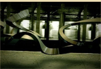
Figure 3.26e
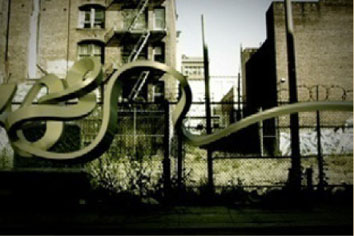
Figure 3.26f
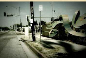
Figure 3.26g

Figure 3.26h
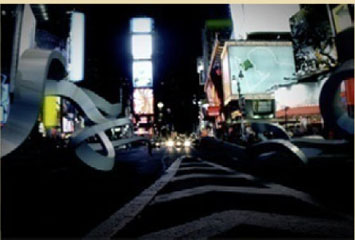
Figure 3.26i

How does technology affect your work?
It’s funny, as computers get faster, the software seems to get slower at exactly the same rate. Technology allows us to do better and better things, but it’s certainly not getting us out of this office any earlier. There are some amazing tools that you can work with right now, but everyone, lots of teams, are working with them at the same time. Motion tracking is now pretty accessible, so getting motion tracking into your project is almost expected if you’ve got live action. On one hand it’s adding possibilities, on the other hand it’s adding complexities.
What are your favorite graphic designers, type designers, or motion designers?
I’m a huge fan of someone named Tibor Kalman, who has a great book that I recommend to everybody. It’s a little bit about the advertising world and commercial design and keeping your sense of humor.
Who or what inspires you? What is your biggest influence in general?
There are a lot of fantastic Web sites and portals and books and so many great things that influence me in terms of design, but I think that in terms of a specific project it’s going to be the client that has a great deal of inspiration in terms of helping us understand their needs. You have lots of stuff out there, but is it relevant to the project you’re doing?
What are you working on right now?
Right now we’re working on a project for Sprint. And to me it’s a really great combination of all the things that are in design. We have live action, there’s CG and title design and editing, and all the stuff that makes a project fun.
What we’re moving toward is really in the live-action vein and mixing it in with the motion graphics, because I think that creates sort of a bridge. If you look at half the humorous commercials out there, half the products could be swapped. But if you take a story that’s humorous or a bunch of live action and create a world that’s very, very, very unique, you could tell that same story, or you could tell a better story that’s just so specific it’s just nontransferrable. For the consumer who’s trying to figure out, “Oh, I saw a funny bank commercial, I like the personality of the bank but I can’t remember what the product is,” if you dial in the design and the look of that world more closely than your average live-action 30-second spot and include something that’s very chromatically specific, and very design specific, and very typographically specific, the consumer will tie in that stuff to whatever brand you’re working with.