
7
SOUND IN MOVIE TITLES
Characteristics of Sound
Before we get into using sound as part of title sequences, there’s something to be gained from getting a little background on sound itself. Every sound possesses three main characteristics: pitch, tone, and amplitude. We can distinguish one sound from another based on these three characteristics.
Pitch
Pitch is dependent on frequency. Frequencies are basically a number of cycles and repetitions over the course of a period of time. A high frequency will have a wave that represents more repetitions in the same period of time than a lower frequency.
Figure 7.1 This frequency was set to 440 Hz.
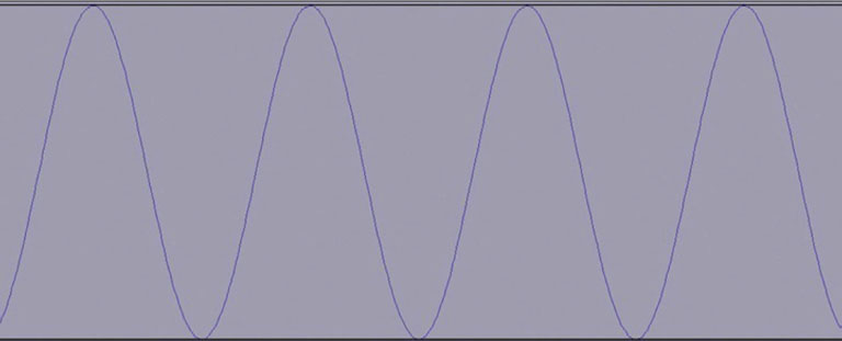
Figure 7.2 This frequency was set to 1 Hz.
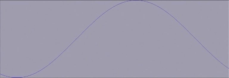
Frequencies are measured in Hertz (Hz). A 1 Hz frequency is one repetition per second. The range of human hearing is 20 Hz to 20,000 Hz (this varies from person to person and can diminish over the course of your lifetime, especially in the high-frequency range). Ultrasonic frequencies are above the human hearing range and subsonic are below it. Typically a bass guitar’s frequency range is between 30 Hz and 350 Hz, but a violin’s frequency range is 195 Hz to 3500hz. The length and size of a stringed instrument changes its frequency range.
A classic tactic of sound designers is to work with human response to a frequency range. Sounds that hover near the edge of the subsonic range will disturb people. Thunder has a very low frequency. Often animals will appear to be disturbed by an oncoming storm before people notice it. This can be due to animals having a greater range of frequencies that they can detect; they could be hearing subsonic sounds from a storm that’s farther away than the human ear can tell.
Sound designers will often use low and subsonic sounds as part of the soundtrack or sound effects to help create a disturbing atmosphere. As you approach the 20 Hz and below mark, you are approaching the area where people can’t distinctly hear a sound, but they can detect it. These are sometimes referred to as low-frequency effects.
Tone
The second major characteristic of sound is the tone, or the quality of the sound. So, let’s say that you have a very experienced musician playing a simple, single note, and then you have a very inexperienced player playing that exact same note. Why does the experienced player sound better that the novice? Since they are playing the same pitch, wouldn’t it be exactly the same? Well, it has to do with all the other sounds you’re hearing aside from the base pitch. You aren’t hearing a single sound wave; you are actually hearing many.
Most sounds do not generate a single wave at once. The base pitch of a sound is the fundamental, and then the other sounds that instrument is making are called overtones. Some sound waves will be a frequency that is a multiple of the fundamental, which are collectively called harmonics. So the reason that the experienced player sounds better playing the same pitch is that she has better control over the overtones and harmonics.
Some sounds do not have a fundamental that can be detected. These are characterized as noise. Many percussive sounds don’t have a pitch, so musical notation for drums is rhythmic but does not have pitch information.
Amplitude
Amplitude is essentially the loudness of a sound. A sound’s volume is measured in decibels. The standard decibel level of a rock concert is almost twice that of a conversation. Our ears don’t hear all frequencies at the same decibel level. The human ear is more sensitive to higher pitches than lower pitches, so a lower pitch will need a higher decibel level to match the higher pitch’s decibel level.
Reflection, Absorption, Refraction, and Propagation
When a sound is created, the cycles of the frequency begin, slow, and then eventually stop. Sounds are shaped and often change based on their container. So, a sound’s reflection is based on the changes to the shape of the wave from its contact with the shape of the surface of the container. In a large room with four walls, you’ll hear echoes because your voice is bouncing back and forth off the walls.
Some surfaces will affect the frequency differently. Absorption will occur best in shapes such as the egg crates that are commonly used in recording studios because they act like small containers that contain the sound wave bouncing quickly in the small holes until its energy is gone. However, in other cases, high and low frequencies can be absorbed at different rates, resulting in a high- or low-pass filter.
Sounds change based on their interaction with different surfaces. Some surfaces will change the frequencies. When the surface or medium changes the sound, refraction occurs, changing the sound wave. The way in which a sound wave will travel is called propagation. Think about the difference between hearing someone speak in an open field and trying to speak to your friend when you are both underwater.
Walter Murch’s Synesthesia
The term synesthesia refers to when one human sense is triggered by stimulus of another sense. When you hear a liquid trickling sound, you will think of water. You might even imagine a creek or river. Ever hear a sound that makes you think of the color red? It’s more difficult but not impossible to come up with a mental image. If the image and sound gel and feel as though they belong together, we feel more comfort and we believe the scene more readily.
Synesthesia can also work in reverse. Say that you see an image on a movie screen where actors sound like they are in a tiny room, but they are supposed to be in a cavern. You will probably feel some unease, as though something in the scene is not right, meaning that the suspension of disbelief may become fractured.
Famous film editor Walter Murch, author of one of the great books on filmmaking, In the Blink of an Eye, is also known for developing classic sound design and audio production techniques. One of his famous techniques involved creating the correct audio environment for a scene. In the 1970s Murch developed a technique whereby he would take a sound recording device and a playback device and bring them both, with the sound from a film, to a location that matched the one that the film was trying to recreate. He’d play the original sound back, allowing the space to have the effect it would have on the sound if it had been recorded originally in that environment. He’d take the two recordings and decide between how much of the effected sound should be heard in the scene and how much of the original sound should remain.
Today we have all kinds of audio plug-ins to develop the exact kind of sound we want. However, the audience must believe the sound when they hear it.
When you work on a title sequence, you are creating a reality. What does the moving type sound like? Are the words heavy? Do they clink or bang when they land on-screen? Because we are dealing in a very abstract realm, where large letters appear, that doesn’t mean that we can ignore synesthesia. The environment we build must engage the audience and make them feel as though there is some level of reality present. If a title zips by the front of the camera, it should whoosh, right?
Sound in Postproduction
Postproduction is the final stage of the filmmaking process before the film is released. In this phase, the film is edited, the visual effects are generated, and the sound is finalized. There are numerous stages to finalizing the sound as part of the postproduction process.
The Sound Edit
While an editor is editing a film, he or she is also cutting, arranging, and adding various sound elements. For example, if a character’s face is not actually facing the camera when she is speaking, the editor can go to a different take of the actor saying the same line or something different. Sometimes the original recordings will be flawed, and it might be necessary to perform additional dialogue recording (ADR). If needed, ADR is used to replaced flawed recording or performance from an actor. Also during the edit phase, sound effects are recorded. Sometimes a process known as foley is used, whereby an engineer will record sound effects while watching a movie, to sync the sound effects to what he sees on-screen. So, for footsteps, the engineer will wear shoes that are similar to the actors’ shoes and walk across a surface that is similar to the surface that was in the shot.
The editor might also have a sound editor or sound effects editor who will supervise this part of the process so the editor can remain focused on the more major issue of editing the film.
The Score
A score is an original piece of music composed to work directly with what happens on-screen. A score is quite different from a soundtrack, which is where popular music is played during parts of the movie. The score is meant to highlight narrative moments; it is sometimes meant to sit behind what is happening and at other points drive the narrative forward.
The Mix
Film editors are usually capable mixers, but they will take the audio mix to a mix professional to finalize it. All the sounds have to be mixed together to create a completely believable audio environment. Also, the mixer is responsible for processing every element so that narration, music, dialogue, and sound effects all sit correctly together.
Audio Integration with After Effects
Though After Effects was not exactly designed as a software package for purposes of mixing and editing audio, it’s still quite friendly toward a variety of audio formats. Music or sound effects can be easily imported and integrated into your timeline. After Effects supports the audio file formats listed here:
• ASND – Adobe Sound Document.
• AAC/M4A – Advanced Audio Coding.
• AIF – Audio Interchange File Format.
• MP3, MPEG, MPG, MPA, MPE – Moving Picture Experts Group formats.
• AVI, WMA – Windows formats.
• WAV – Waveform.
When you are working with an audio file, it can only be imported as footage. Files will keep their native duration. There are a number of places where you can activate and deactivate the audio. You will only hear the audio through your speakers during a RAM Preview.
Figure 7.3 The Preview window has a speaker icon switch to enable/disable audio as part of the RAM Preview. This will affect the entire composition. Basically, use it when you want to turn on and off the audio during RAM Preview playback.
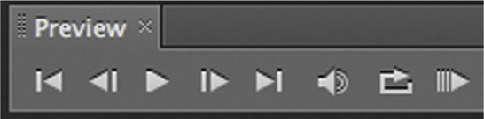
Figure 7.4
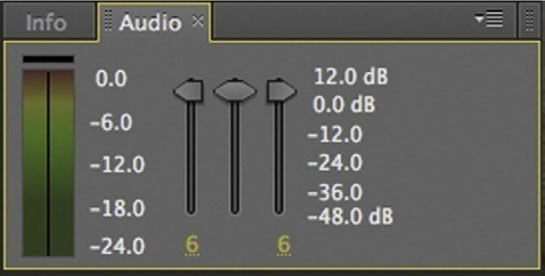
In addition, you have the Audio panel, which has a VU meter to keep track of your levels; faders for the left and right channels; and a middle fader for both channels.
Figure 7.5
Imported audio files can either be dragged and dropped into an existing timeline or placed onto the new composition icon that will create a new composition that matches the length of the audio file. If you drag an audio file into the timeline, it doesn’t really matter where you place it, since it has no visual element.
With either an audio or a video layer in your timeline, you will see a speaker switch in the far left column that allows you to turn on and turn off audio for each layer. If you are working with multiple video layers, each with audio, you will want to be sure to only leave the speaker icons on for the layers that have the audio you need.
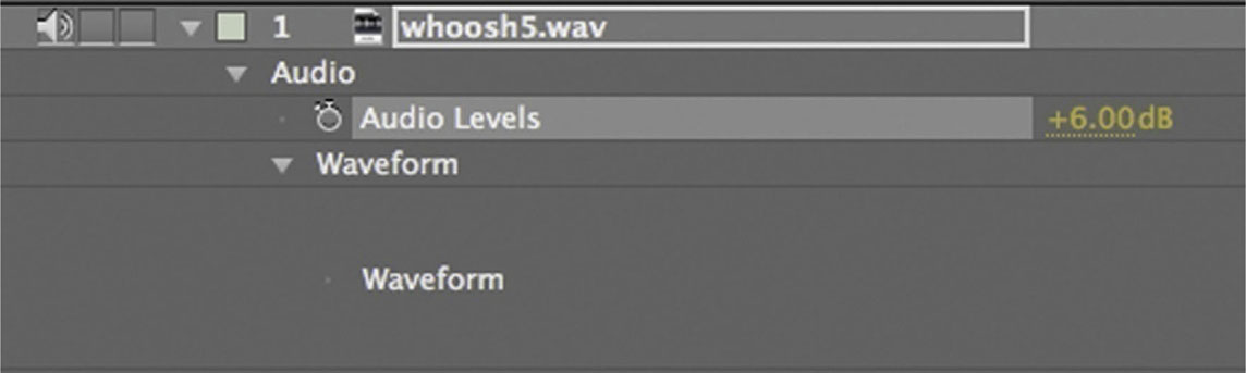
When you open the twirly arrow for the audio layer, you have an Audio heading to which you’ll have the ability to add keyframes for audio levels. If you have experience with Digital Audio Workstation (DAW) software, it’s almost the exact same process as automating your decibel level. You will also have a tab for the waveform, which will give you a visual of the audio amplitude.
Figure 7.6 Looking here and in Figure 7.7 you can see that you will most likely not hear a thing until about 3 seconds into your timeline. If you double-click your audio layer, it will open it like a clip in Layer Edit mode.
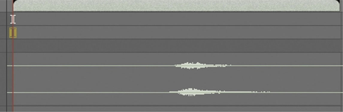
Figure 7.7
Place the playhead at the beginning of the rise in your waveform, and click the Set IN Point icon. It looks like a parenthesis. This makes the point that the playhead is sitting on the beginning of the clip.
Just as with our ability to keyframe our decibel level, AE has a brief menu of audio effects that can be found at Effects | Audio. Each effect has keyframe parameters, allowing you a little bit of sound design capability.
Figure 7.8
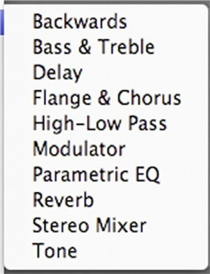
Figure 7.9
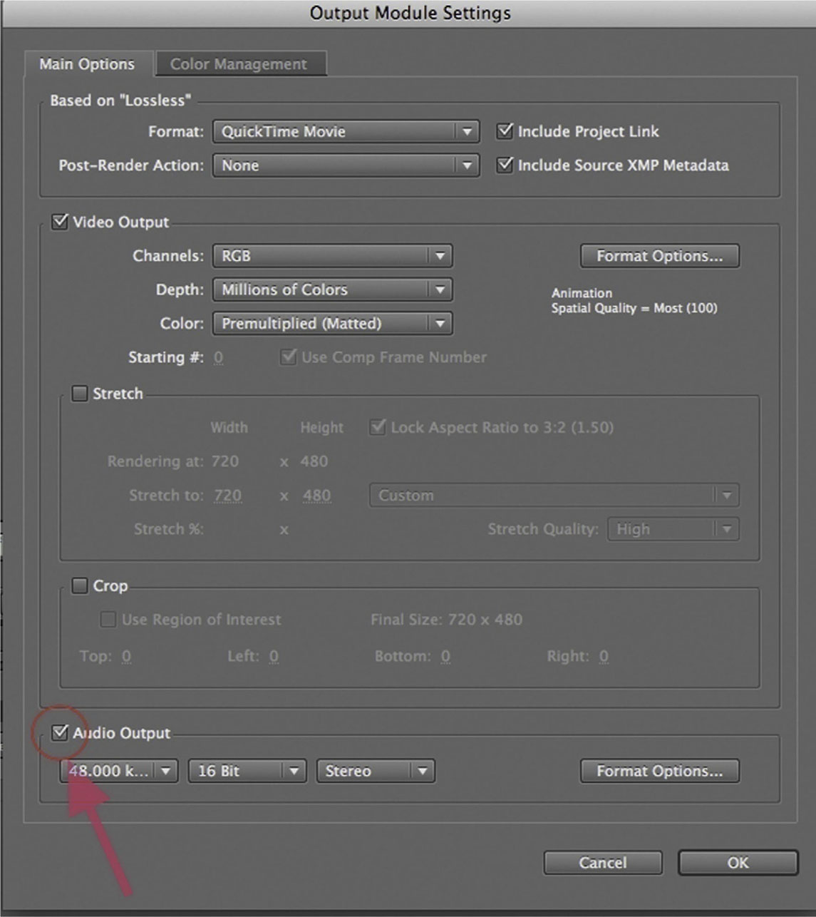
Finally, Adobe realizes that After Effects is not often used with final audio. So, by default when you render, your audio is switched off. If you want the audio embedded in the video file, you would have to open the Output Module Settings dialog and, at the bottom of the list, make sure that there’s a check on Audio Output.
Adding Sound Effects and Music to Your Title Sequence
I’m not trying to plug my previous textbook here or anything, but it does present an opportunity to demonstrate adding music and sound effects to a title animation. For the supplemental videos for that book, I created an opener with type animation and sound design. In the following tutorial I’ll take you through the full process of adding music and sound design to a type animation.
For a quick sound design lesson, let’s start by downloading the free audio editing application Audacity from sourceforge.audacity.net.
Tutorial: Introduction to Sound Design: Making a “Whoosh”
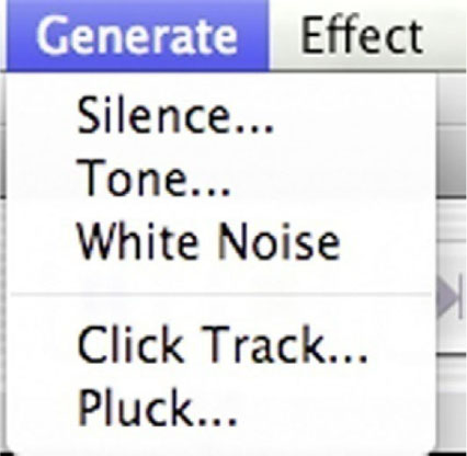
1 Launch Audacity. We are going to create a classic whoosh for the titles to fly with.
2 Go to Generate | White Noise. White Noise is basically static, a random signal. Think of it as a block of marble from which we can sculpt our sound. A window will pop up asking you to specify the length. Set it to 0.5 seconds.
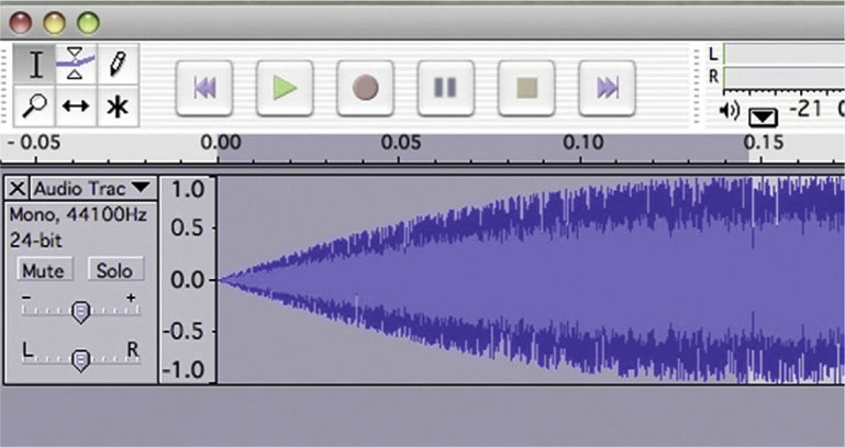
3 Highlight the first 0.15 milliseconds and apply Effect | Fade In and then apply Effect | Fade Out for the last 0.15 milliseconds.
4 Now, for the fun part, we get to apply some effects. Go to Effects | Phaser and set the Stages to around 2. Raise the Depth and experiment with the other settings until the piece sounds appropriately airy.
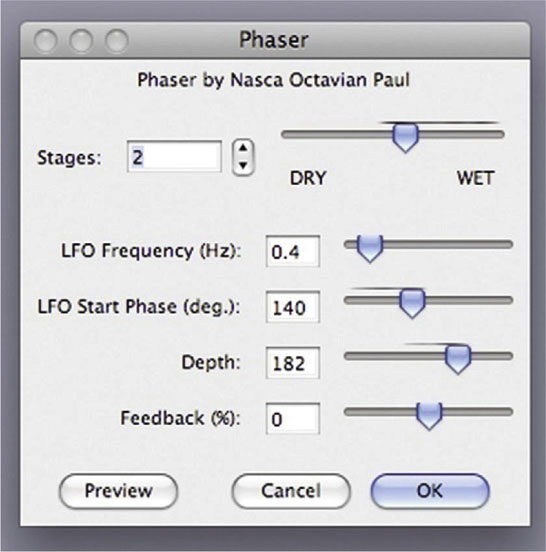
5 Done-Add Effects | High Pass Filter. Set the Cutoff Frequency to 5000. Go to File | Export .WAV and give your piece a name.
Now we’ll bring it into our animation.
Tutorial: Adding Music and Sound Effects in After Effects
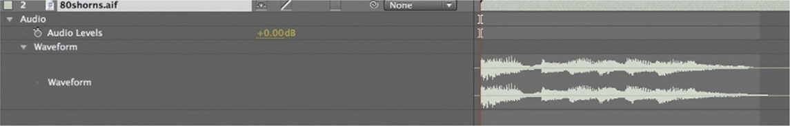
1 Import the opening.aif file and place it at the bottom of the layer order, making sure its speaker switch is active. Also check your VU meter in the Audio panel to make sure it doesn’t go into the red. Red means that it’s peaking and getting distorted.

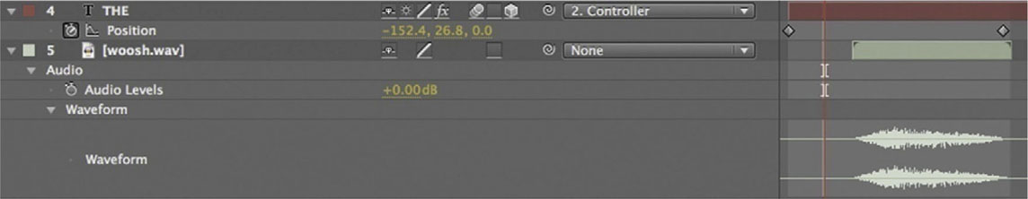
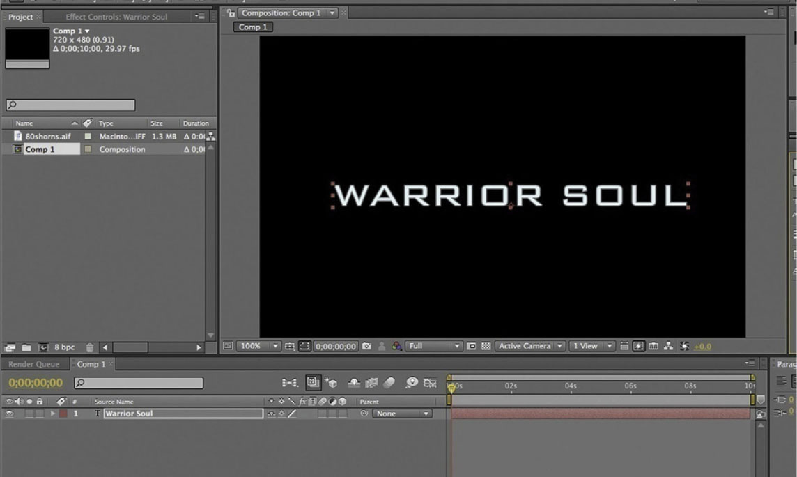
2 Import the woosh.wav file and place it in the timeline right below the layer that THE is on. It’s slightly shorter than the distance between the first two keyframes. That’s okay; it’ll do what we need it to.
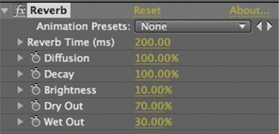
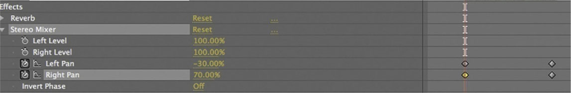
3 Add Effects | Audio | Reverb and set the parameters to about what is shown above.
4 Apply Effects | Audio | Stereo Mixer. Set keyframes for Left Pan and Right Pan. Right Pan should have the higher value first since the word begins in the lower right. Here I’ve set it to 70%, and Left Pan is set to –30%. I set another two keyframes at the end, reversing the numbers; Left Pan is now set to 70% and Right Pan is set to –30%. Now the “woosh” will follow the type’s animation on screen.
5 Done-Lower the level of our “woosh” sound effect until it sits nicely with the music. Try adding it to the other words as they fly on screen. Adjust the Stereo Mixer effect accordingly, based on the direction in which the words come on screen.
Synching Sound with Type Using After Effects Expressions
Typically with After Effects, when you want to make one parameter dependent on another, you’ll use layer parenting, but parenting has its limitations. For example, if you want to use an effect instead of Position, Scale, or Rotation, you’d have to use an expression.
Expressions use a code language to give you a whole lot of versatility where you give your layers special instructions or hook just about any parameter to any other parameters. Many professional After Effects designers don’t take enough advantage of what an expression can do for them.
Now, to sync our audio to animation, we will first convert our waveform into keyframes and then employ an expression to get better control of them.
Tutorial: Synching Sound with Type
1 Set up your After Effects composition and set your type layer. I’m going for a 1980s style here, so I wanted a big-sounding action movie.
2 Import your audio and place it in your timeline. Open its twirly arrow to see the Waveform parameter. You’ll have to click the waveform’s twirly arrow to make it appear on screen.
3 Highlight the audio layer and go to the Animation menu at the top of the screen. Open it and go to Keyframe Assistant | Convert Audio to Keyframes.
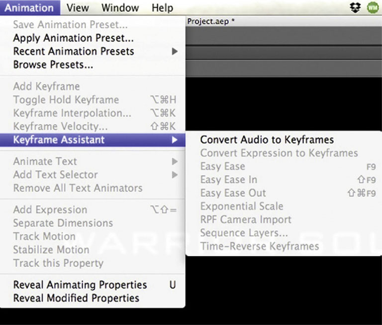
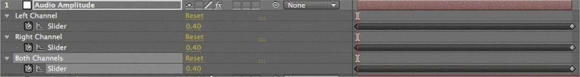
4 You now have a new Audio Amplitude layer. It’s actually a null object that has our keyframes that were gathered from our audio file stored in it. There’s three keyframe parameters, one for the Left Channel, another for the Right Channel, and finally, one for Both Channels. These are the keyframes we will use to animate our type.
5 Add the CC Light Rays effect from Effect | Generate | CC Light Rays, to the type layer. Animate the Center parameter to send the light all throughout the type layer.

6 Open the CC Light Rays effect in the timeline, hold down Alt/Option, and click on the stopwatch for the Intensity parameter. Your numerical value will turn red and you will have the field open to type out an expression.
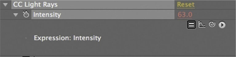
7 Highlight the pick whip and drag it to the Audio Amplitude’s Both Sliders parameter to connect the expression from Intensity to the value of Both Sliders. Take a look at your animation, and yes, it’s not so thrilling.
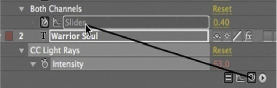
8 Done-Go back to your expression. Right after you see (“Slider”), add *5. Now it will take the value from the Both Sliders number and multiply it by 5. The effect is now clearly growing in its intensity with the sound. Experiment with this technique. Once you have it down, it adds a great deal of versatility to your ability to integrate sound into After Effects.

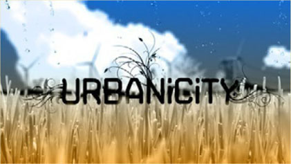
Urbanicity: A Case Study
• Motion Graphics Studio: Energi Design
• Creative Director: Steve Holmes
• © Energi Design
What was the main concept and inspiration for Urbanicity–Air?
Urbanicity is still a work in progress. It regards the pitch for a documentary on urban issues. There were a series of titles that we were going to come up with for the different stages of the show. One was on energy resources and damage to the planet, others about urban destruction, graffiti, or damage to property. Lots of different ideas. I wanted to create them with the utmost flexibility and later on add a lot more depth to them. That’s really where these two titles came out because they both stand alone very, very well and display very unique techniques, especially the 3D one.
The first one is more on the nature side of things, a story telling about clean air, essentially, going from bad to good, pointing out how we can change the world as it is at the moment.
It is a transition done with interesting time remapping. It relied a lot on stock footage suitable for time remapping, which was great. The clouds moving in the background, the grass growing in the foreground, the wind turbines were all stock footage elements. In fact that dust is as well, but I didn’t time-remap that.
I just wanted to build this sort of journey, from bad to good essentially, and make the color reflect that. You have this very dark and angry, almost fire-looking start to it, where the clouds are obviously just filthy. There’s no good there; when you look at that and think about breathing, you want to cough.
A lot of the line art imagery actually came from a book called Neubau Welt, which is an entire library of phenomenal vector art all on one CD. It’s an incredible library; I love it. This was a good starting point because it really gave us a good artwork to play with, and that’s where the crane idea came from, by the way.
I thought: “What’s going to stand against the background of that much dirt?” and I figured that something digging or pulling or mining would have been really cool. It got the job done quickly because the stock art was adding a certain amount of detail to it, which I think worked really well. The dust was added over the top, just to give that choking feeling to things.
And then the scene goes from mining and fossil fuels to electricity, which is a healthier form of power but has a visual impact on the countryside, with these massive towers and wires.
We wanted to take it on from there so you get to the wind-powered section, where you have turbines that pull the power in. They look a little more like trees and can be a little bit more hidden in some respects, and blend a little bit more into the environment. They stand alone without being connected to other items.
As we move from there to now, the grass is starting to grow again, the colors change, we’ve got water that’s falling, and a general clean feeling to it. We’ve animated the swirls on the logo to reflect the growing of the grass. We’ve also duplicated the grass clip four or five times, just to add a little depth to it. There were some really nice elements that ended up working. For instance, the water that goes behind the grass in the foreground; I think it’s kind of cool. I think the end result in this journey from dark to light just worked. The concept and the timing of it all didn’t take too much as it was a very linear process.
Each episode is going to have its own title based on the theme of the content. So if this takes off, we would have to figure out different ways to approach those. To maintain a similar feel of vector and vectorized footage and the same thematic approach, we have to think how that might work.
Figure 7.10a Still frames from Urbanicity–Air, created by Energi Design.

Figure 7.10b
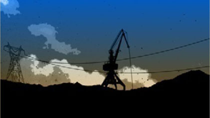
Figure 7.10c
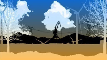
Figure 7.10d
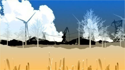
Figure 7.10e

Figure 7.10f
Can you talk a little bit about the use of colors?
There was a lot of color to start with, and when you got to the end point, because of these textures, you couldn’t see that much difference between start and finish. So, I took a step back. I was trying to get as simple as possible and make the end look very, very clean and make the beginning look the complete opposite.
The posterization of the clouds in the background, for example, had many levels, and I added more colors in each of those, so it became harder to differentiate between the changes in the air as there were too many colors. It was a very detailed, very gradual shift. So, I took everything back a few steps and went right back to two colors, then I went up to four and I think we ended up with six, to give it a bit more impact.
There’s a lot of black on the foreground, while all the graphics in the back are essentially white or very light. These are the main colors, and everything else in between had to sit quite happily in the middle, either in front of it or behind it, in terms of good versus bad.
The fact that the hillside covers the fire effect, which almost had a forest fire feel to it, as if there’s burning going on there—I wanted to cover that up as we move forward in time. That’s now hidden, so we get more to the blue, which is good.
Having drastically changed the now hidden color, the fire, we slightly introduced that fire color here in the turbines. But then as the 3D angle changes they slightly change as well—there’s actually one gradient over the top of the whole piece here—and because of the way the camera moves, certain elements appear in one color and as they move they become the other color. I think that was the kind of feeling we wanted to achieve here. We thought much on how to give a different impression from when you first see the object to when you last see it. That is a lot healthier, if you like, because it has changed its own color space.
In the end it’s all very simple, really: It is mostly blue and there’s just a little bit of detail in the grass; everything else is very clean. It was quite a simple process, all about marking the difference between start and finish, when you can really see clean versus not, and everything is in the same color space.
Would you agree with the statement that basically you’re a storyteller?
I think this word defines a lot of our work. I don’t know if that’s something we tend to do a lot or we get a lot, but it’s mostly a process of beginning, middle, and end, and what’s the story in between. I guess most commercial pieces are like that. I enjoy taking my art for that journey, if you like, and figuring out the best way to approach a story. I think sometimes it is best to present something with a story.
This piece is only 15 seconds long, but you get that sense of history and evolution, people caring about the environment, and visually, at the end you might want to say: “I want to live there.” It’s all very beautiful there, it’s green and lush, while in the beginning you realize how the different things work.
Even in such a short space of time, if you could tell a good story or figure out the best way to represent that change, it massively helps the piece to get done. You end up with a good resolve rather than focusing on one element and saying: “Here’s the title, here’s a few turbines, here’s some clouds, how do we make that last 15 seconds?” which is what we see a lot of people do. Too many artists try to take a series of elements and make them last as long as possible.
If you try to go a little bit deeper and add some narratives, I believe it helps hugely, and I would say a lot of our projects are based around that idea. I think it’s good to start and finish with a transition.
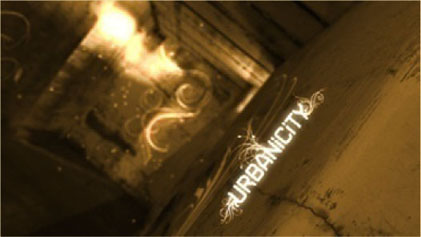
Can you talk about the other Urbanicity titles—Derelict?
This one’s a little bit more surreal. It was as much a technical challenge as anything. I was trying a technique that finally worked very well, and while this is great, I spent much time seeing how far things could be pushed and tested. I think with part of this project the technology was driving the concept. I knew what I wanted to see and I wondered if I could get there.
Figure 7.11a Still frames from Urbanicity– Derelict, created by Energi Design.
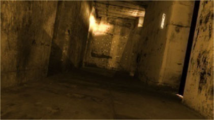
Figure 7.11b

Figure 7.11c
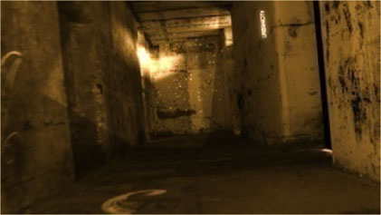
Figure 7.11d
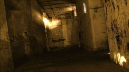
Figure 7.11e
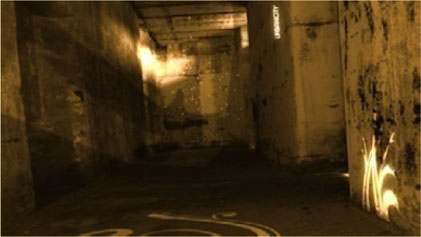
Figure 7.11f
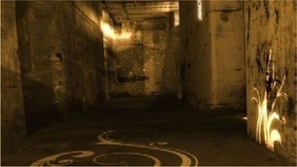
Figure 7.11g
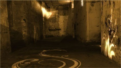
Figure 7.11h
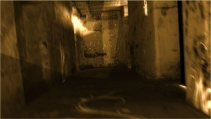
Figure 7.11i
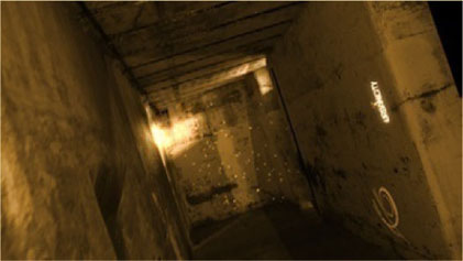
Figure 7.11j
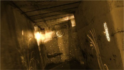
Figure 7.11k
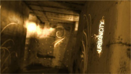
Figure 7.11l
I started by adding the glowing swirls onto the floor and they blended in so nicely. The end was more about freedom and imprisonment and the feeling of it. Hence, the dove and the shadows.
The thing I really liked about this is the original shot that just had a small beam of light in the corner. When I added the glow effect to it, the look was then very golden. I wanted to take the whole room and move it into the same color space but also take all the elements and just blend them completely in, so that they would look like they’re shiny and they’re gold, as if there is some value in them. Not material value, but more the feeling of success, like there’s light at the end of the tunnel. There’s a golden highlight to this dark feeling, there [are] things [that are] bright and shiny.
There’s a positive feeling to the elements that are being animated here. The swirls could have been black and grungy, and so everything else. Just by introducing this light, which almost illuminates the room, I think we just really added a very nice element to it; it made it stand out.
The fireflies at the end of the room are actually just periods: that’s animated type. They’re not particles or anything else, they’re just text. And that was again a technical challenge. Looking in hindsight now I could have used a particle emitter to add more of them and give them some blur, but initially it was just: “Let’s figure out an easy way to do this.” By having them glow, and given the text animation properties of After Effects, the blurs could be keyframed very quickly and apply random opacity levels, so they do tend to flicker. You can catch them occasionally; they fade in and out just as real fireflies would. This was a nice effect, it’s almost like they’re adding the color to the end of the room. It’s not just them trying to blend in, it’s almost like they are actually lighting the space. Without those the project needed something, it needed something like dust, so they might be fireflies, they might be just dust particles if we’d have added more. Things that slowly move in the 3D space, just to add some depth to it. It was more of a technical concept challenge as well as a graphical playground, if you like.
If I’d have gone back and revisited this piece, I probably would have made it a bit darker on the start, leading into the light as it progressed, like the end of the tunnel, where the light is. The shadows from the window at the end of the room would also be darker, and the logo would stand out a little bit more.
In this piece the camera movement is simulating a person exploring the space, with sort of handheld moves. How does that fit in your piece? And about the use of depth of field, as it is a little more evident in this piece, why have you decided to maximize its use here?
On the previous piece the depth of field was consistent and mathematically coherent. That piece was created so that the camera moves and its focal point were exactly positioned. The camera moves were sort of fast, and then they would slow down, and then fast and then slow; during those slow periods of about 200 pixels the point of focus was pretty much dead in the middle, so that the item that was coming into focus was always in focus during the slow move, and then the zoom would go to the next object, which would come into focus just at the right time. Everything was laid out to the pixel. The camera just moved backward and everything worked.
This project, like you say, was very human, and that was what I wanted. It was almost like someone was picking himself up off the floor. It’s the first time they stood up for a while, and they lean to one side, and then they come across it to the other side, then turn and realize there’s hope here. Something is growing and it’s bright, there’s life and it’s almost like walking out the door, knowing that around the corner things are going to be better.
This is always something I like doing—not just thinking in terms of slow movements, or handheld feel to it - this was even actually adding a person into the mix, which I thought was kind of cool, and having him start low down.
All this was just done with a series of keyframes for both the position and the focal point of the camera, which do shift independently of each other. I might have used the [After Effects] null. I’m not sure, but I believe they were just keyframed independently. I then applied random values to both of those parameters in order to get this sort of swaying effect, where they appear to be independent from each other.
The result is that the front might be doing the same movement, but the position would change accordingly, so there’s a wonderful realization that a camera is always mostly fixed pointing in a certain place, whereas with the human head, you always have so many angles of choice; plus you’ve got the eyes, added to that which is another 180 degrees in each direction.
There’s so many points of rotation there that sometimes handheld camera moves in the computer can’t really achieve that feeling. It’s harder to make that work and be believable than maybe moving it as you’re seeing through someone’s eyes, as in this case. And that’s why here and there there’s an occasional shift, because it’s not just the head moving but maybe a flick of the eye. This was cool, actually—a very good challenge.
I like the moves at the end, but again, just going back to it, once the positions were done, I would measure the distance from the camera to the logo and then adjust the depth of field when it comes into it, and make sure that everything else moved accordingly.
I did want that feeling of realization that someone’s holding onto this door and reads the sign; it worked nicely.
I’d love to develop this one a little longer and try to have the person move in and go through that door. And as they do, the brightness would have marked the transition to the intro of the documentary.
When you are working on a variety of projects like these, how do you keep your creative juices flowing?
Well, obviously going out on the bike and clearing my head up in the mountains is great. It helps. Sometimes it feels like your creative pipeline has a block, and it is building up. You know it’s there, so sometimes you just need to blow that pipeline out, and I think a good bike ride and some sunshine is always a big help for me.
I like to go and see a film; I’ll just take an afternoon off, drive into the city, which in itself is kind of different, because you are taken from the environment of a studio, with a small number of people, and a small town feel kind of thing, and then you get into the city. All of a sudden you are surrounded by a lot more visual information, and that in itself gives me a lot of ideas. I see the way colors are in storefronts, or what people are wearing, or what kind of bag someone bought from a store and how that is colored, or something like that.
I sometimes get the most inspiration from bizarre things, so I’ll go and sit somewhere and have coffee and watch people as they walk by, and see color or shape or something that catches my eye. I would then sketch that or take a note. It’s quite bizarre sometimes, people and their color: their clothing color, their fashion choices, what they’re holding, what they’re riding or walking, or what shoes they’re wearing, stuff like that can sometimes just tweak the senses enough for you to say, “Oh, that’s interesting.”
On the other side of things, going to movies and watching titles. The color and framing, the camera and the angles that they used. Occasionally I’ll see a single shot and say, “That’s just the angle I was thinking of, or the way that that color shows up at that angle,” or something like that. And then you have the titles and they always give you some sort of inspiration. It’s not that I go to the movies to get that inspiration, but it’s more that I find some inspiration in most movies.
When I’m abroad, I will bring back from every trip probably four or five design books, every single time I go away. And sometimes the books are so big and heavy I have them shipped over, because they’re too expensive to put in the suitcase. There are a few stores off the back of Covent Garden in London where I could spend all day. They tweak the senses very, very well. The color of them, the book covers themselves, the subject matter; I get a lot of joy from that. I like those stores because books are all around you and there’s books seven or eight shelves up that you have no hope of even getting to, and you look at them and go, “I want that one!” It’s beautiful; I love it. Some of my favorite books I got them from there.
How does the inspiration that you get from outside influence your work?
I think it gives me the ability to look at the project from a different angle. I sometimes find myself as if I’m in a one-way street and the project is blocking the way. I then realize I’m only going at it from one side.
Sometimes if you step away from it and come back later with some sort of inspiration, which changes your thinking or your approach, you find yourself in the same place, but it’s like with floating. You are able to move around and look at the same thing from a slightly different angle: from the other side, or climb up a ladder and look at it from here. And that’s how it actually feels when I come back to a project; I’ve got that new sense of how to look at it. And that is really cool. It doesn’t happen a lot, but sometimes you reach the same block so many times that you need that.
I really enjoy projects when you end up taking a different step, and thinking, “I never thought of that before.” All of a sudden it clicks, and that’s how a lot of projects have done well, by the way.
Like with the absinthe one; I was in France and got a chance to see some of the history of this particular product, and some of the artists associated with it, and to go into the area where it was consumed back in that time. To get a geographical feel for it helped much as well. To just come back and say, “Okay, we have a texture, we have a logo, we have a bottle” —that is so easy to do.
How does research affect your work?
I think a lot of problem solving goes through agencies these days. A lot of the work that we get is quite specific in terms of the project and has a more direct vision. The product is already established or there’s a general feeling for what it is going to look like.
It’s very rare that I have to do massive amounts of research, and absinthe again is a classic one. The research was enjoyable mainly because it was a subject matter in which I was interested and was geographically somewhere I was interested in. It drew me into a desire to actually research it myself and to look at what I could add to the project in doing so.
But a lot of projects that we get are more straightforward in that respect. I don’t want to disrespect anybody in any way by saying that, but a lot of them are predefined. I would like to have projects that do require more research so I could learn more about them and offer more to the project. But the budgets are never there for that kind of work. And that’s why that sort of stuff tends to go through an agency, because they will set aside $10,000 or $15,000 just for research and then do the work. And only after that they will come to someone like me and say, “Hey, can you do the work? We’ve done the research.”
Occasionally, research-wise, I will look into how things had been done previously. I maybe ask myself how a design was done—in case I’m doing a redesign, for example—or how it looked in the past, why it looked that way in the past, if it feels dated, what do I need to change, what is the sort of feel of typography that would go with that particular design, is that an historical choice as opposed to a personal choice. These are all possible questions I might ask.