8
ESSENTIAL TECHNIQUES
Timing
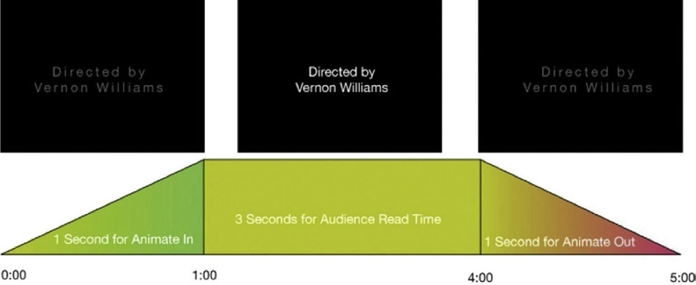
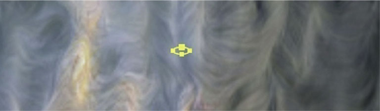
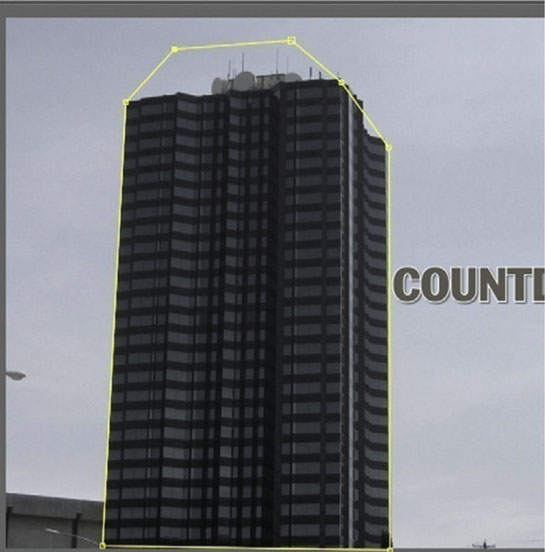
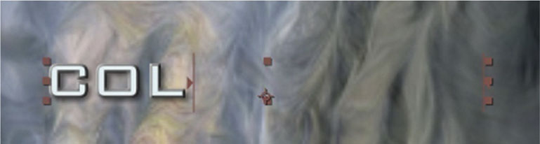
It’s crucial that we allow for the right amount of time for each title. I have a formula that I apply to every title sequence I do. First, for an audience member to have enough time read one title (that’s average in length), they will need roughly 3 seconds. However, that’s only the time it requires to be legible to the audience. Looking at Figure 8.1, in order to time it so that we have enough time to do an animated arrival and departure from the screen, we need to add 1 second at the beginning and at the end to allow for this, which puts us at 5 seconds.
Figure 8.1 How can we set up an average speed title with enough time for animating in and out and audience read time?
Now, this is true only, of course, if the title is not legible during the animate in and out. If it is, then as long as the audience has 3 seconds or close to 3 seconds to read the title, you are safe.
Now, with these considerations in mind, we can begin.
Fade Up and Fade Down
The single most common title sequence animation is the classic fade up and fade down. After Effects (in addition to most editing packages) gives you several ways to do this simple move. We’ll go through a couple variations.
Tutorial: The Basic Move
1 Even your most complex type animations will usually integrate this move as part of their effect, so this is more of a building block technique. With text layers in After Effects we can achieve our effect with either the standard Transform | Opacity or Text | Animate | Opacity. Remember that the Text | Animate versions of the Transform effects go by character, not the entire word. But with Opacity it will look the same.
2 Place the playhead at the point where you’d like your type to fade up. Start the stopwatch for Opacity and set it to 0%.

3 Go to the 1 second mark. Set the Opacity to 100%.

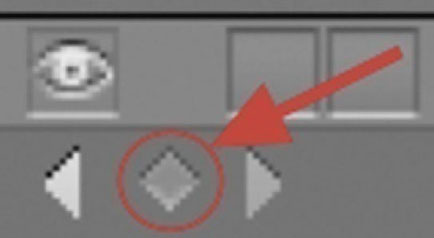
4 With keyframe animation software, the computer is calculating all the frames between keyframes for you, but when you want the value of something to remain the same, you need a keyframe that repeats the previous value so that the software knows how long to keep the value the same. So, for our Opacity, from 1 second to 4 seconds we need to keep it at 100%. So, at the 4 second mark, click the Add or Remove Keyframe button in the far left column.
5 Done-To complete our animation of Opacity, at the 5 second mark, return the percentage to 0.

Fade Up and Down by Character
Whenever you use a text animation effect that needs to address a single character at a time, the most efficient way to approach that is via the Text | Animate menu. Every one of these effects creates an animator. The animator will contain the added effect as well as range selectors. Range selectors are brackets that allow you to animate which letter or letters has an effect applied to it at one time.
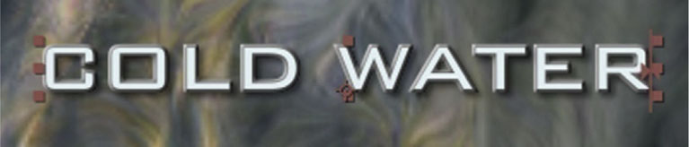
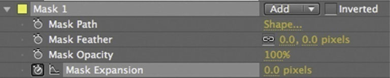
Figure 8.2 In this example, you can see that the O has a lower opacity effect. It is surrounded by the two range selector brackets to isolate the effect to the single letter.
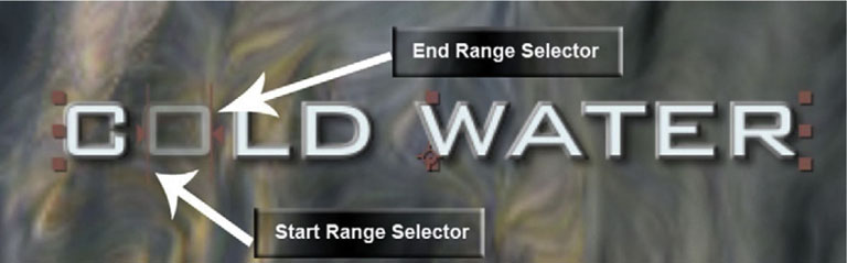
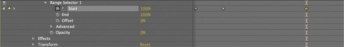
Figure 8.3
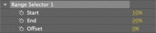
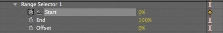
If you open Range Selector 1 for the Opacity animator, you will see you can keyframe the percentage for Start and End. In addition, you can use Offset, which will take the difference between Start and End and move it through the word. If you want to have it reveal one letter at a time, you will have to use the Text | Animate effect. Here’s how you can do that.
Tutorial: Fading Up and Down by Character
1 With your text layer highlighted, open the twirly arrow for your type layer and go to Text | Animate | Opacity.
2 Lower the Opacity to 0%.
3 Opacity can be a little confusing here. Start the stopwatch for Start. Set it to 0%. Why are we doing it this way? Well, to reveal the letters one at a time from left to right, we must gradually hide the effect of the 0% Opacity. So, as the Start bracket passes a letter, it reveals it.
4 At the 1 second mark set Start to 100%. The word will be completely revealed. Notice that the two brackets are both at the end of the word, basically making the Opacity effect completely hidden.
5 At the 4 second mark, click the Add or Remove Keyframe button for Start. This will keep the Start range selector at 100% for that time period.
6 Done-Return the percent for Start to 0% at the 5 second mark. It will now go back through the word and remove it from the screen.
Tutorial: Shaped Fade Up and Fade Down
In this next tutorial we’ll approach this task again, this time doing a reveal that shows how the fade up and fade down move from the middle of the word in and out, in a radial shape.
1 From the Mask Shape tool, choose Ellipse Tool.

2 Make a tiny elliptical mask between the two words. On other titles, choose the space that is closest to the center without being over a letter.
3 Press MM on your keyboard. At the 0 mark, start the stopwatch for Mask Expansion.
4 As we did in the previous two tutorials on this topic, we’ll keyframe to reveal the title from 0–1 seconds, hold from 1–4, and fade out from 4–5 seconds. At the 1 second mark, increase the value of Mask Expansion to reveal the whole title. Click Add or Remove Keyframe 4 seconds to hold the value, and at 5 drop it to 0.
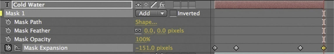
5 Done-To really finish off this effect in a handsome way, we should soften the edge of our revealing shape. On Mask Feather, increase the value to 40 pixels. That will nicely soften the edge.
 Note: When we added the Mask Feather value, we did not start stopwatches. In After Effects only start a stopwatch if you plan to animate the value. If you don’t just apply the effect and give it a number, you will see it, but it won’t move on you.
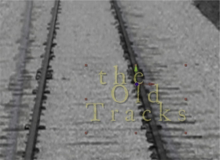
Tracking
Perhaps second in popularity to a fade up and fade down, animation of tracking is very common. A tracking animation involves adjusting the spaces between letters. Here’s how to do it.
Tutorial: Tracks
1 Alright, I know this example is a pun, but aren’t textbooks supposed to have lame puns? Anyway, highlight the type layer and open its twirly arrow.

2 Make sure that you have chosen center-justification from the Paragraph panel.
3 From the Animate menu, choose Tracking. Start a stopwatch for Tracking Amount.
4 Go to the 5 second mark and increase Tracking Amount to 25. You will see the spaces between the letters grow gradually over time.
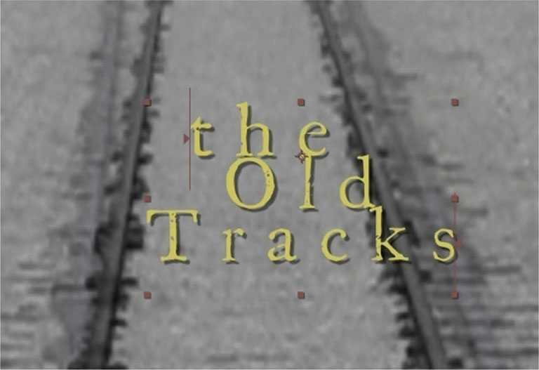
5 Done-A tracking animation will work very well with a fade up and fade down. Try adding that to our tracking animation.
Spotlight Reveal
Even though After Effects’ light and camera layers only work with layers in 3D mode, we can still take advantage of them for 2D projects. Here we’ll use an After Effects light to reveal a title.
Tutorial: Creating a Spotlight Reveal
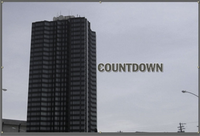
1 To begin, I’ve set up a two-layer project with the title against a brick wall. It’s nothing special, but we’ll make it look a whole lot better.
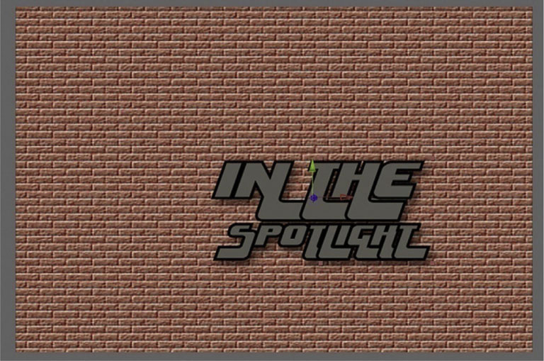
2 Put both layers into 3D Mode.
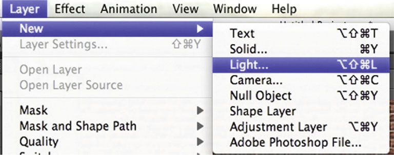
3 Go to Layers | New | Light.
4 The light’s interface is similar to that of a camera layer. It is controlled by the devices above. The Point of Interest controls the direction the light faces. The Cone controls how far out the light will spread. The anchor point controls the position of the actual light. For right now adjust the Point of Interest setting to turn the light away from the title.

5 Open the twirly arrow for the Light layer. Under Transform, start the stopwatch for Point of Interest. Also, under Light Options start the stopwatch for Intensity. Lower the Intensity to 0%.
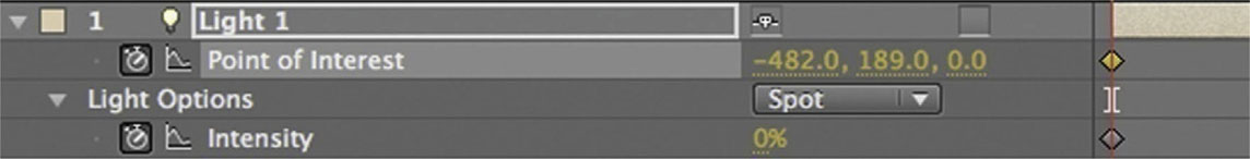
6 Done-Go to the 1 second mark. Move the Point of Interest to face the title. Also increase the Intensity to 100%. Now you’ll see the title revealed.

Text Bounce
This next tutorial is based on one of the very first techniques I learned for text animation. Although it is nothing mind-blowing anymore, I think that it helps new users think “outside the box” when it comes to what you can do with type. No fancy text menu stuff here; rather, just scale and opacity.
Tutorial: Make Your Text Bounce
1 Highlight the type layer and make sure that the center of the layer is the center of the word; the quickest way to do that on a type layer is to center-justify it with the Paragraph panel.

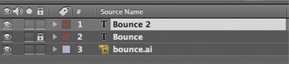
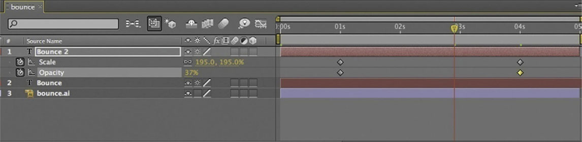
2 Duplicate the layer by pressing Ctrl-D (or Command-D). You now have two of the same type layer in your timeline. Turn on the lock on the lower one right now. Highlight the copy or Bounce 2.
3 Open up Scale for our Bounce 2 layer by pressing S on the keyboard. At the 1 second mark, start the stopwatch. At the 4 second mark, make it 250%.

4 To see our Scale keyframes at the same time as the Opacity tool, press Shift-T. Now set a stopwatch for Opacity, at the 1 second mark make it 100%, and at the 4 second mark make it 0%. The effect has the type coming toward the camera at the same time it fades out, which has a nice pulse-style effect to it.
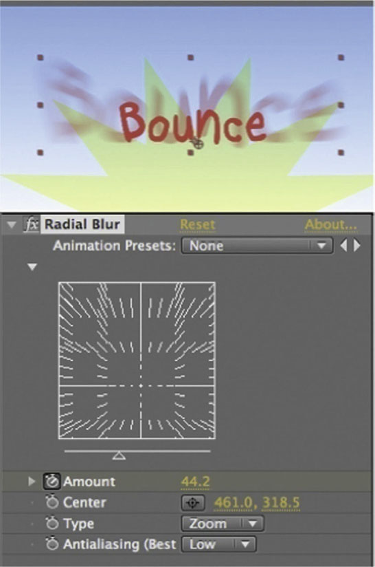
5 Done-I’m not usually happy until I can put my own spin on an effect, and this case is no different. Add Effect | Blur & Sharpen | Radial Blur. Sync its keyframes for Amount to the other animation tools, having it start at 0 and reach 65. Switch it from Spin to Zoom. A nice end touch to a handy effect.
Title Wipes
A titlewipe occurs when a title is gradually revealed in a similar way to how we did the per-character fade up and fade down. However, with wipe we can have more control of the shape that reveals the title.
Tutorial: Wiping Your Title
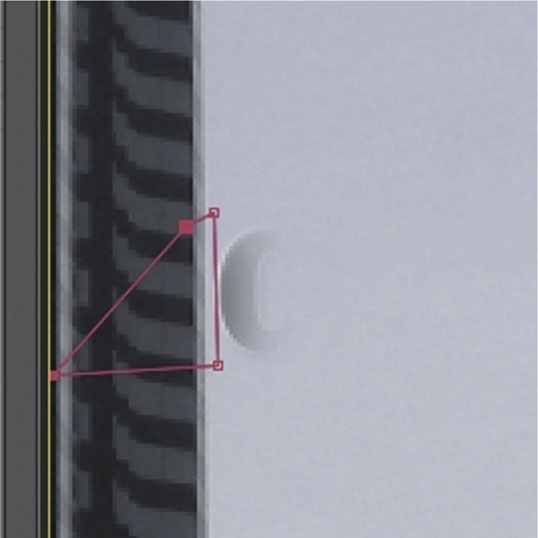
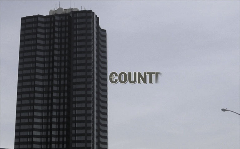
1 First a basic mask wipe. Highlight the Rectangle tool and put a mask over the text layer.
2 Adjust the mask so that the right side has an angle. You can use the Selection tool to move points. At the 1 second mark, start a stopwatch for Mask Shape. Set Mask Feather to 20 pixels, and start the stopwatch for this parameter as well.
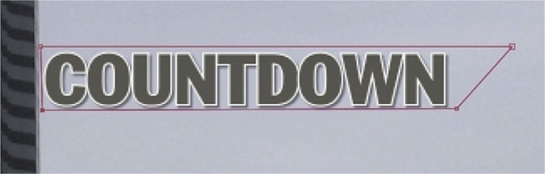
3 Using the Selection tool, highlight the two points on the right side. Go to the 0 mark in the timeline.
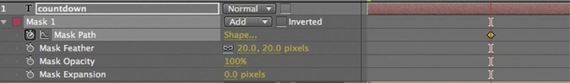
4 Drag the two points to the left, and pass the points that are already there. Also, you’ll see that there’s some of the C left over. To remove it, drop Mask Feather to 0.
5 Done-There you have it, a simple wiping effect. Adjust the size of your mask if you need to.
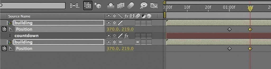
In-Scene Wipes
I’ve seen this effect quite often lately, where objects within the scene are used as part of a wipe, so here’s a basic version of that effect.
Tutorial: Creating In-Scene Wipes
1 Let’s begin by pressing Ctrl-D (or Command-D) to duplicate the footage layer.
2 Create a mask over the building on the top footage layer. It can be a garbage matte; the only thing we need to be careful of is the right side of the building.
3 Move the building layer with the cutout above the title.
4 Move the title over to the left side. It will end up behind the building.

5 Now set keyframes for Position on our two building footage layers at the 1 second mark.
6 Done-Now, at the 1:10 mark, move both layers to the left and it will reveal the title. We’ll discuss a number of techniques in this book in regard to integrating type into scene elements.
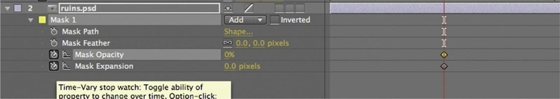
Extreme Zoom-In Effect
Type layers being vector can be a real advantage. In this tutorial we’ll do a huge zoom-in effect.
Tutorial: Creating a Zoom-In Effect
1 Start a stopwatch for Scale at 100% at the 0 mark. Set another to keep it at 100% until the 2 second mark. Also at the 2 second mark, start a stopwatch for Position.

2 At the 4 second mark, increase the Scale to 3000%. Adjust Position so it appears that the O is coming toward the camera.

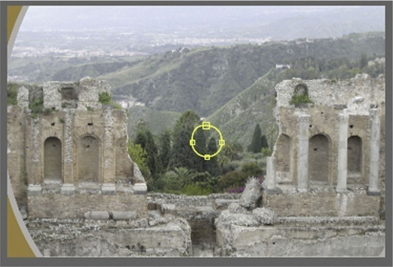
3 We can use this as a transition to a scene. Create an elliptical mask over the footage layer inside the O.

4 Start the stopwatch in the Mask tools for Mask Expansion at the 2 second mark. Start the stopwatch for Mask Opacity and set it to 0%.
5 Go to the 3 second mark, make Mask Opacity 100%, and make Mask Expansion 500 pixels.
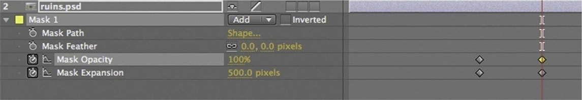
6 Done-You might want to add a Mask Feather to soften the edge of the mask. This versatile effect is very useful for thrillers and adventure-themed movies.
Falling into Place
Effects where type falls into place are fairly easy to achieve. We begin with our fade-up and fade-down technique.
Tutorial: Falling into Place
1 For this effect I am starting from an existing animation that we did for the tutorial previously in this chapter, “Fade Up and Fade Down by Character.” That lesson focused on using a range selector with Opacity. We animated the Start bracket to reveal our letters.
2 Whenever you have already animated one parameter with a range selector, we can easily add in another parameter using the same range selectors. Start by going to Add | Property and choose Position.

3 Now with Position still highlighted, drag upward any letter that is within the brackets. Here I decided on the A, but it doesn’t matter which letter you choose as long as you do it to a letter that is on the inside of the range selector brackets.
4 Done-Add on Motion Blur to give the effect some high-end veneer.
Exploding Type
Sooner or later everyone will need to blow up some type. Here’s one method for approaching this task.
Tutorial: Exploding Type
1 One secret to animating anything that explodes is to start from the ending. In a moment you will see why. In this timeline the video in the background has an explosion that we are synching to, so we will need to keep that in mind.
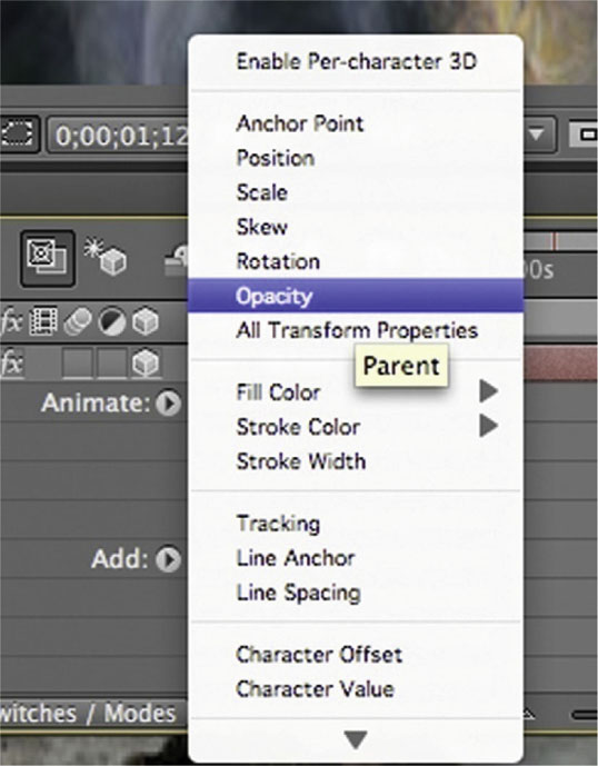
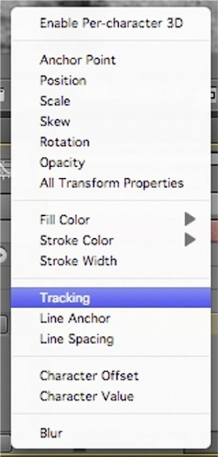
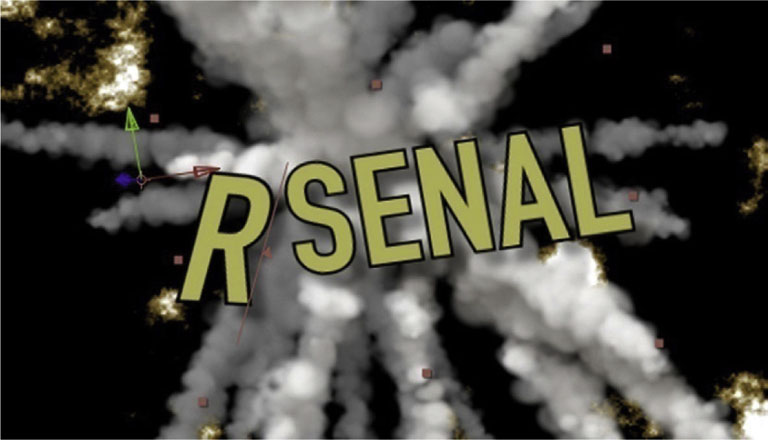
2 On your timeline, leave the playhead at the mark where the explosion in the background has finished (about the 5 second mark). Open the type layer, and click the option for Enable Per-character 3D. This gives us the 2.5D options for the characters in our type layers.

3 From the Animate menu, choose Position.
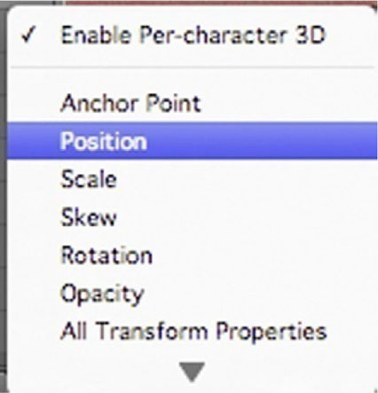
4 When you are using the Per-character 3D, you have three number values for Position instead of two. The third number value here is Z Position. Adjust this number until it is so high that the type comes toward the camera and then passes it.

5 Start the stopwatch for End in the range selector for Position. Make it 100% at the 6 second mark, and at the 4 second mark reduce it to 0%.
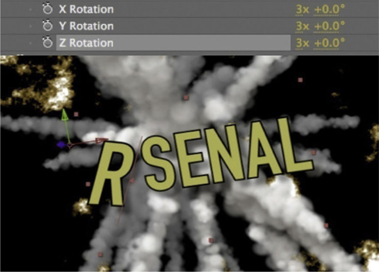
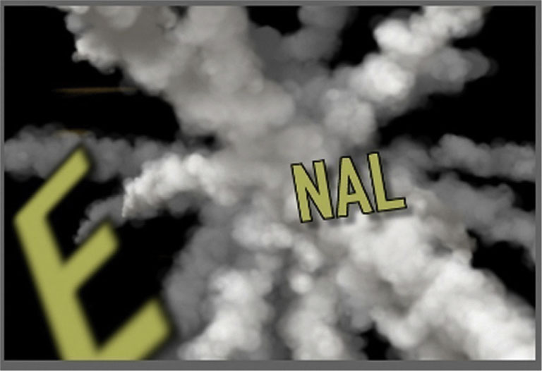
6 Go to Add | Property | Rotation. Give it three revolutions on each axis. Now this will work from our existing keyframes for End in the range selector for Position.
7 Done-Now, for one last touch, go to Add | Property | Blur and set it to about 3, and it’ll add a nice blurring effect as the letters come toward the camera. Feel free to experiment with adding other effects to augment this exploding type effect. As you might have predicted, give it a shot with Motion Blur. All you have to lose is more time spent rendering.
Stop-Motion Titles
With the success and recognition of The Fantastic Mr. Fox, there’s been more interest than ever in stop-motion animation. Stop motion is the effect of taking still images of the same subject, shot one frame at a time, with subtle movements of the object occurring between shots. When these shots are played back as video, the object appears to move on its own. In this tutorial I’ll go through a couple of techniques that use stop motion and stop-motion-related techniques.
Tutorial: Classic Stop Motion with Modern Equipment
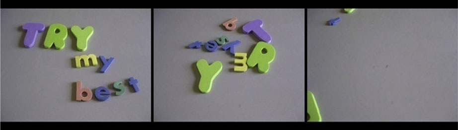
1 You’ll need a digital camera and a tripod or table pod to do a stop-motion technique like this. For this title, I wanted to create the effect that the letters were dispersed and then come together. For that technique, I arranged the letters for the last frame of the title assembled first and then worked backward.
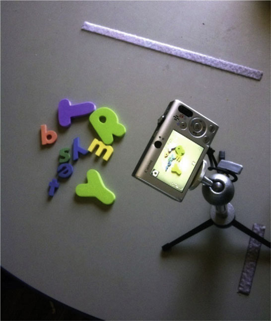
2 So, using a standard digital still camera, I shot frames at three per setup at first, to create slower movement, and then toward the end I switched to one per setup, to speed it up.
3 Use your favorite means of importing photos into your computer, and put them in an accessible folder. Import the first image of the sequence into After Effects (as Footage) and check JPEG Sequence. This is the beauty of this effect: digital cameras number the images, and AE can read a sequence of numbered images as footage.

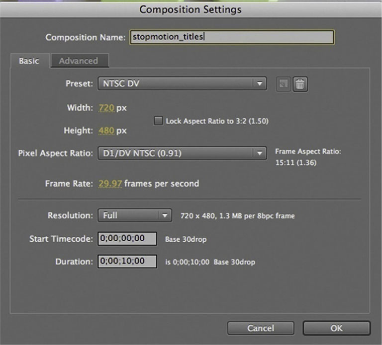
4 Create a new composition using the NTSC DV preset. Put the image sequence in this new timeline. You’ll have to Scale it down to about 22%.
5 Now, we have to reverse our footage so that it moves in the intended direction. right-click or Ctrl-click the layer and choose Time | Time Reverse Layer.
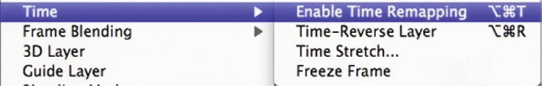
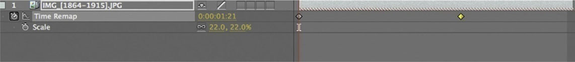
6 Our image sequence is about 1 second and 22 frames long, so we’ll have to manipulate its time setting by enabling Time Remap. right-click or Ctrl-click the layer, and go to Time | Enable Time Remapping.
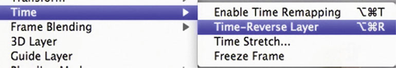
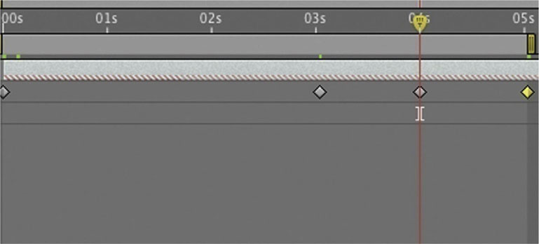
7 The Time Remap effect allows you to set keyframes for the frame that is showing at a specific point in the timeline, and between keyframes it will adjust the speed accordingly—faster or slower to match the instruction of your keyframe. Have a keyframe set to 1:21 at the beginning of the timeline. Set a second keyframe to 0:00 at the 3 second mark.
8 Done-To finish the effect, I’ve set another keyframe at 4 to keep the title up for a second, and then a final keyframe set at 1:22 at the 5 second mark.
Fine-Art Techniques
Rather than stick to the most obvious techniques, a little inventiveness goes a long way. In this section I’ll demonstrate a few ways in which fine-arts techniques such as sketching and painting can be used in a title sequence.
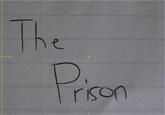
Tutorial: Painting or Writing Text on Screen
1 To create this horror-film-style handwritten or scrawled effect, I started with a pencil texture brush in Illustrator, and I put every brush stroke on its own layer. Note that this is one of many ways to get a write-on effect; we will address several in this book.
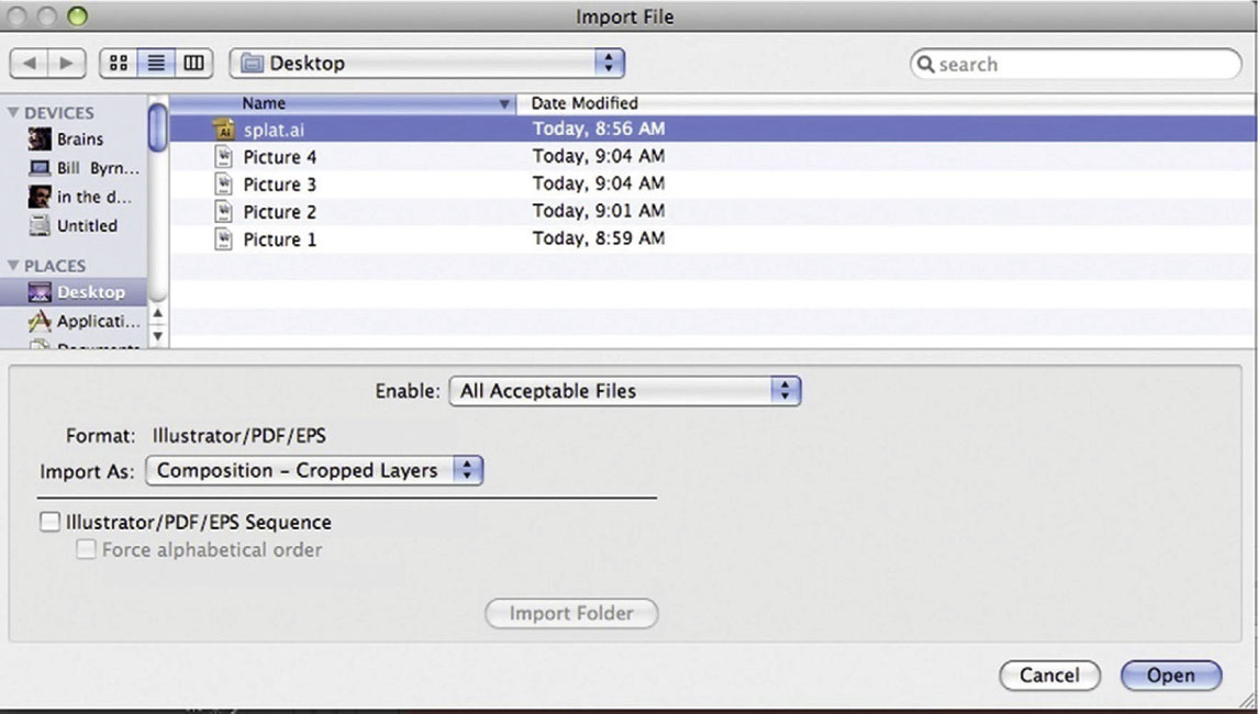
2 Import the file into After Effects as a Composition Cropped Layers.
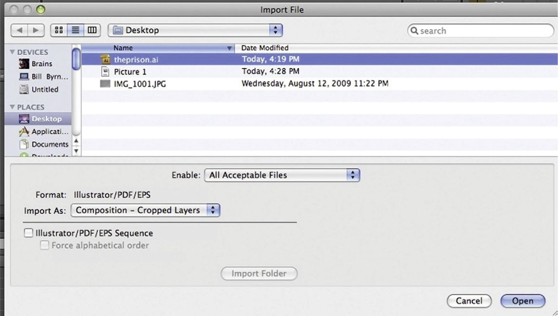
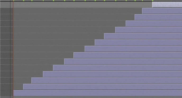
3 Arrange the document so that every 10 frames another brush stroke comes up.
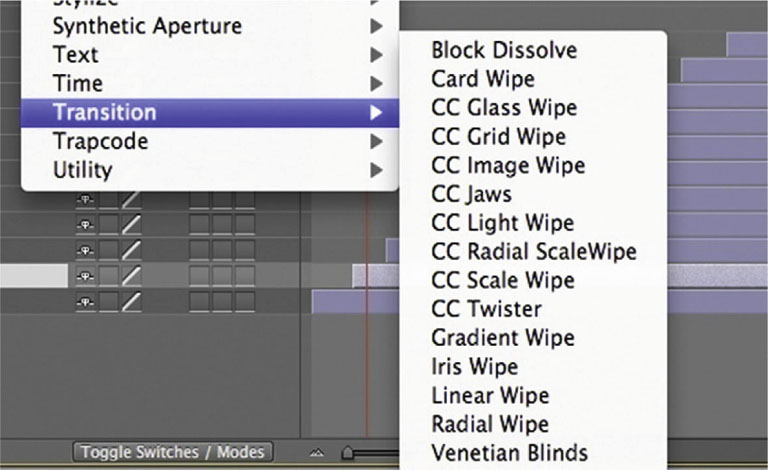
4 Though few, there are some gems in the Effects | Transition menu. Apply CC Radial Scale Wipe to your strokes.
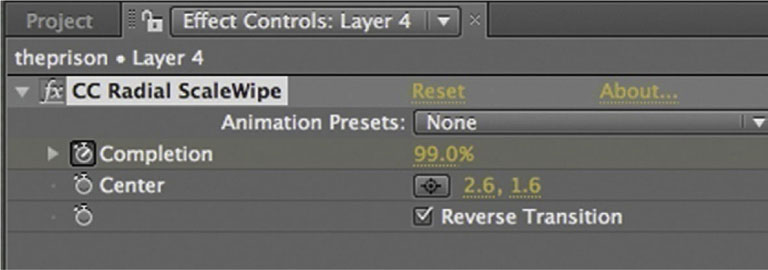
5 This next step will be somewhat time consuming but worthwhile in the end. Turn on Reverse Transition. Place the Center point where you’d like the stroke to begin. Set the Completion percentage to 100%. Go to where the next brush stroke begins and decrease to 0%. Now it’ll look like your letter’s stroke is being drawn on.
6 Done-Though the last few steps were tedious, it’s looking great. In the end it will have a totally authentic feel. Skip the O and the bulb part of the P, which won’t look great with the CC Radial Scale Wipe transition effect on it, so it’ll work just fine popping on.
Tutorial: Write-On Effect with a Font
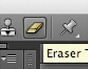
If you prefer not to draw your letters but still want a handwritten effect, you can still use After Effect’s Eraser to do the job.
1 Start by using a font that looks somewhat handwritten, to keep the effect believable.
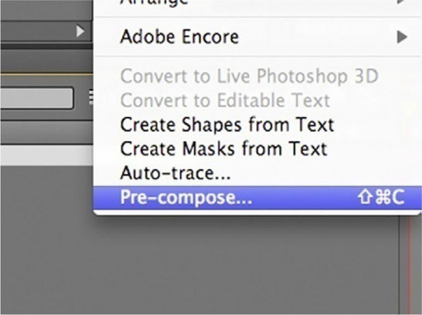
2 You can’t apply the Eraser to the text layer right away, so we’ll need to pre-compose the layer. Go to Layer | Pre-compose, with the text layer highlighted.
3 right-click or Ctrl-click your precomp and choose Open Layer. The Eraser tool can only be used in Layer Edit mode.

4 Now you can apply the Eraser tool.
5 Choose a brush that will be thick enough to erase the entire stroke of the letter in simple motion. Every case will be different, but for this one I am using a 45 pixel soft-edged brush. Switch over to the Paint panel, and choose Write on under Duration.
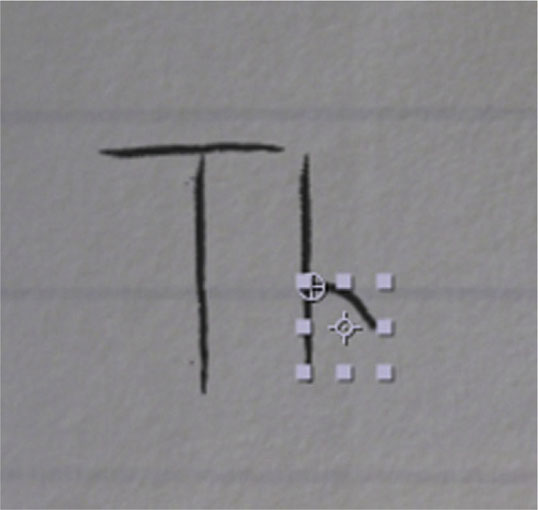
6 Use two Eraser strokes to erase the T.
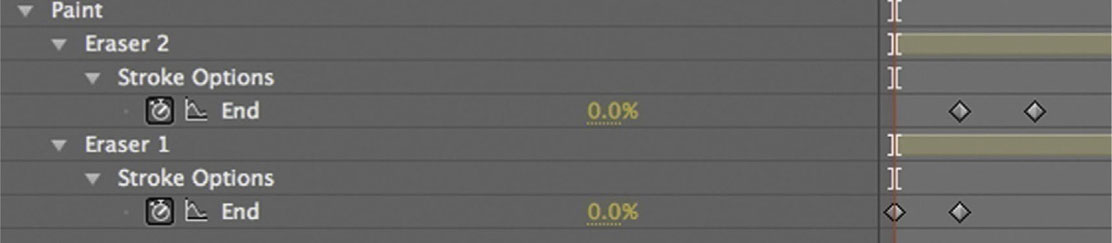
7 The Eraser tool defaults to making your strokes simultaneous, but you can press the U key to reveal the keyframes. Next, arrange the keyframes so that they come in the order you want.

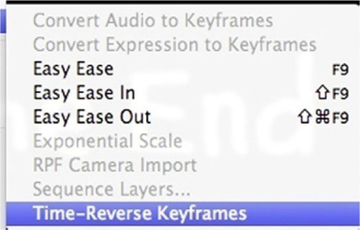
8 Highlight keyframes for the Eraser Stroke Options and go to Animation | Keyframe Assistant | Time-Reverse Keyframes. Repeat this process throughout the whole title.
9 Done-So, though complicated, there are numerous approaches for a write-on effect.

Tutorial: Painterly Effects
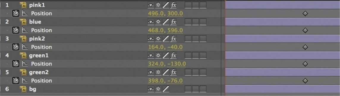
Similar to the rather lovely titles that visual artist Jeremy Blake created for the film Punch Drunk Love, I wanted to demonstrate how effective simple color use can be. This lesson shows how we can use paint splatters to reveal something that is hidden by negative space.
1 In Illustrator I have created a document in which large watercolor brush strokes are separated onto different layers.
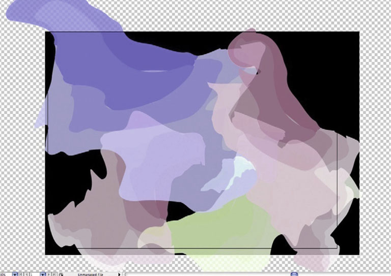
2 Import this document into After Effects as a Composition Cropped Layers.
3 Stretch the paint splatters to be very long and reach off the screen, and then apply Effects | Blur | Fast Blur selectively at different amounts for each paint splatter. At the 1 second mark, start the stopwatch for Position.
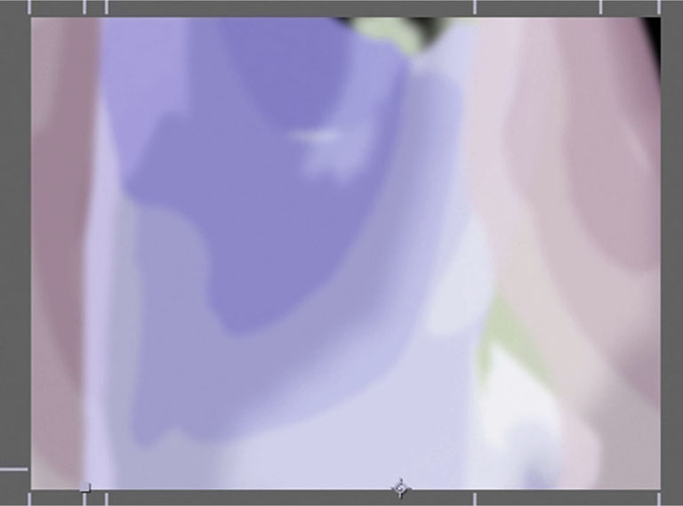
4 Go to the Type tool and create your type layer. Make sure you set the color of the type to be the same color as the background. When the paint splatters move in below the type layer, they will make it visible.

5 Go back to the 0 mark, and move all your paint splatters off the screen.
6 Done-The truly exciting part of this effect is how revealing the negative space creates the letter forms. Experiment with different amounts of blurs and glow effects to get the most out of this effect.

End Scroll
End scrolls with huge lists of names slowly scrolling might seem like an easy proposition in After Effects, but it can be surprisingly difficult, especially when you’re dealing with video. Here’s a tutorial with some basic tips up front.
Why Are End Scrolls Harder with Video?
The main reason end scrolls are more difficult with video has to do with separate field rendering. Every still image on video shows a half image, which is designed to smooth out the motion. However, with text scrolls this can lead to an incredibly ugly and somewhat disagreeable strobing effect. Editing software such as Final Cut Pro and Adobe Premiere have text tools in place to compensate for this issue.
Typefaces
Thin-stroked, serif typefaces will not work well for end scrolls. Keep it simple with a bold, sans serif typeface to get a nice clean result.
Effects
Motion Blur and Continuous Rasterize can either help or hinder. Experiment with these and see what has the best effect.
Processing and Setting
Title designers who end up typing the credits should charge more per hour. Most situations should have the producer or assistant producer sending you a Word file with the titles in it. Normally I don’t recommend that title designers be pushy, but in this case, insist that the end credits get sent to you after they have been checked and double-checked for spelling and to make sure every name is included. It is much easier to fix mistakes before you start than after.
Then I recommend moving the titles over to Illustrator. When you’re done, import that document into After Effects.
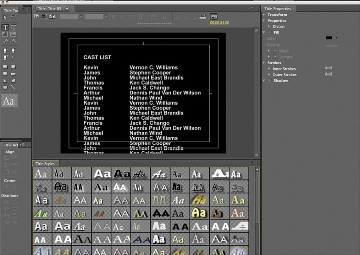
Tutorial: Animating an End Scroll
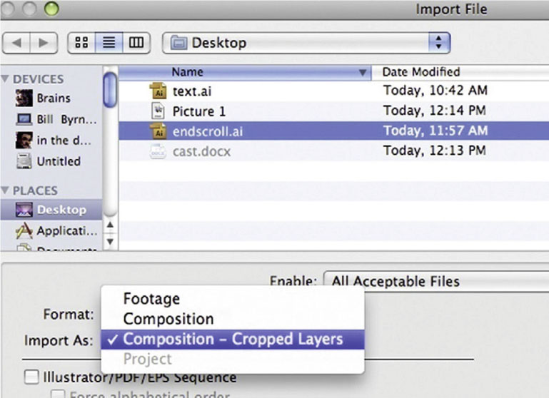
1 Do your typesetting in Adobe Illustrator; it’s much easier to manage than trying to do it in After Effects. Open the sample document endscroll.ai to check it out.
2 Import our sample document as a Composition Cropped Layers. Change the Composition Settings so that it’s a 20 second timeline.
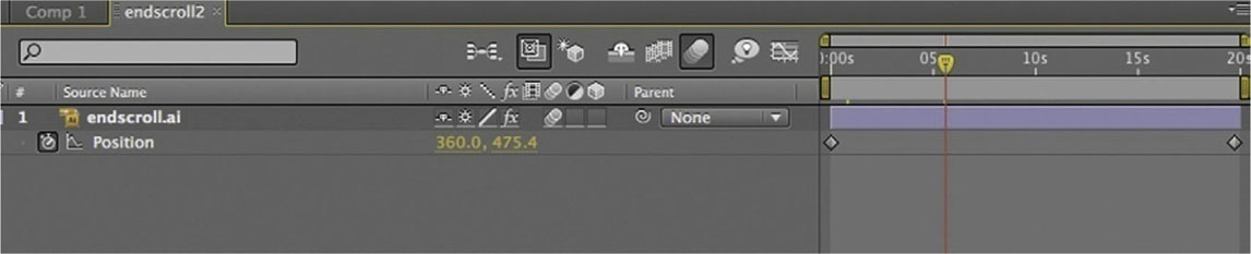
3 Animate the Y Position to scroll the type. I’ve set my keyframes at 0 and 19:22. Tweak the keyframes back and forth a little; this will have an impact on how much flicker is visible.
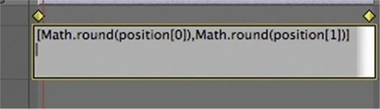
4 Only use this step when you are dealing with video. It’s unnecessary otherwise. Option-click the Position stopwatch and enter this expression: [Math.round(position[0]),Math.round(position[1])]. This expression tells the Position tool to only move the title in full pixel increments.
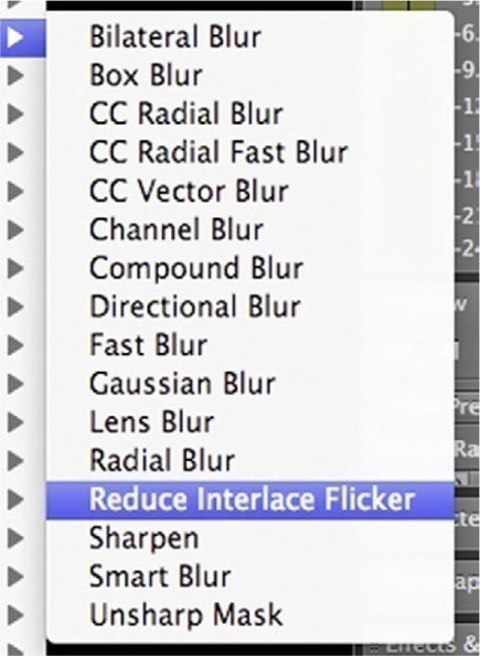
5 This one is another step that is only for video. Add Effects | Blur and Sharpen | Reduce Interlace Flicker. I set the softness on mine to 0.6. Keep it very low.
6 Done-If tweaking these keyframes leads to you pulling out your hair (you wouldn’t be the first), there’s a great Title Designer tool in Premiere Pro that blends MS Word-style word processing with automated tools to make this process much easier.