9
FAMOUS MOVIE TITLE TECHNIQUES
The Sopranos-Style Wipe
The memorable title sequence for The Sopranos features a very subtle but effective type animation. In this tutorial we will recreate that motion.
Tutorial: Creating the Sopranos-Style Wipe
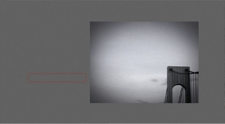
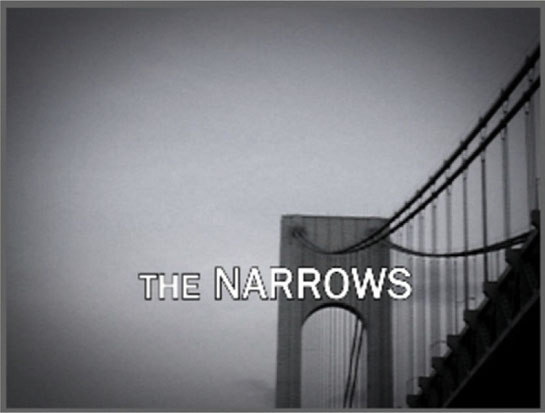
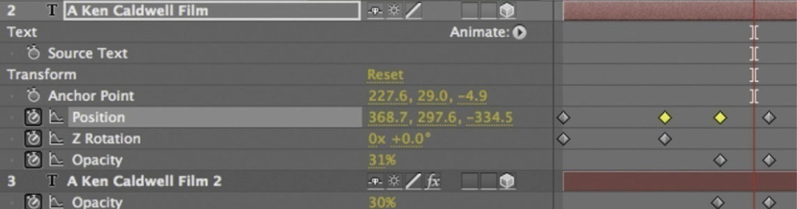
1 To match the look and feel of the Sopranos intro, I am using treated footage from the New York/New Jersey area, and the title of this project is displayed in Franklin Gothic Bold. Move The Narrows off-screen to the left side.
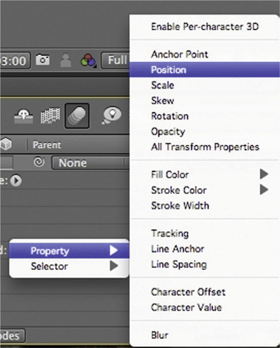
2 With the type layer still highlighted, go to Text | Animate | Property | Position. Start a stopwatch for Position where you’d like it to begin. I started mine at 3:00.
3 Fifteen frames later, move it to the center of the screen. Preview it. It doesn’t look like much yet. At 4:15, add another Position keyframe to hold it in its place, and then at 5:15 move it off-screen to the right.
4 Enable Motion Blur in the timeline and on our type layer.
5 Now you will start seeing this effect look closer to the Sopranos titles. Now, the Sopranos title sequence also has a little skewing to it, so go to Animate | Add | Property | Skew. Start the stopwatch for Skew at the same place as Position. Set the amount of Skew to –10. Fifteen frames later, once again lining up with the Position keyframe, set the Skew to 0.

6 Done-To continue lining up the Skew effect with the Position move, set a keyframe at 4:15 that keeps the Skew at 0 and at 5:15 return it to –10.

The Suspense-Style Glowing Back Light
This look has appeared in countless suspense films. It’s an easy, attractive effect. Here’s how to create this very popular look.
Tutorial: Creating the Suspense-Style Glowing Back Light
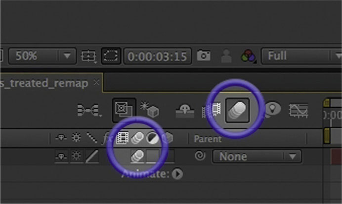
1 We’ll begin this effect by duplicating the text layer.
2 Turn on the duplicate layer’s solo switch. This makes it so that we only see the copied layer; the rest are hidden.

3 Change the color to a bright green. Turn off the Solo switch.
4 Apply Effects | Blur and Sharpen | Directional Blur to the duplicate type layer. Move the duplicate to the layer below the original. Start the stopwatch for Blur Length.
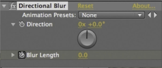
5 Done-At the 1 second mark, increase Blur Length to 70. Now a streaked glow will grow behind the type in the same shape as the original layer.

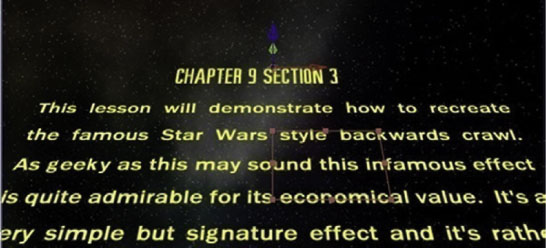
The Star Wars Backward Crawl
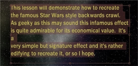
This lesson will demonstrate how to recreate the famous Star Wars-style backward crawl. As geeky as this might sound, this infamous effect is quite admirable for its economical value. It’s a very simple but signature effect, and it’s rather edifying to recreate it, or so I hope.
Tutorial: Creating the Star Wars Backward Crawl
1 First we will have to do some arranging to get our type correctly formatted. The typeface for this effect in the original movie consisted of variations on Franklin Gothic. To create your body type, since this is a large body of text, arrange your type in a word processing software package and copy it.
2 With the Text tool selected, click and drag to make a text box layer.
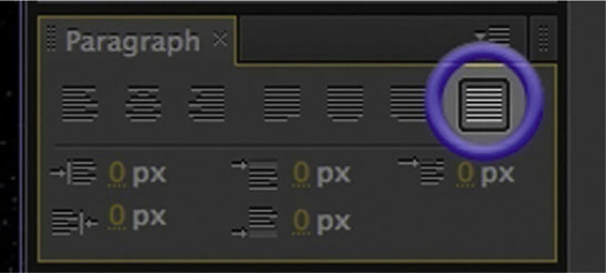
3 Paste your text within the text box. It’s not correctly formatted yet, but we are getting there.
4 Open the Paragraph panel. With your type highlighted, switch to Justify All. Now it will much more closely resemble the Star Wars back-crawl.
5 Highlight your type layers and put them into 3D mode. Create a new Null Object layer and put that into 3D mode. Parent the type layers to the Null Object.
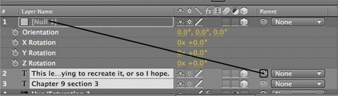
6 Adjust the Orientation on the X axis until it matches the tilt of the original. I found that around 300 degrees is where it matched up correctly.

7 Done-Now it is time to move the crawl. The best way to move it is to control its center by animating our Null layer’s Anchor Point. Test it out a few times to adjust the speed; set keyframes to take it off the screen at the bottom and over the course of time have it rise the top of the frame.
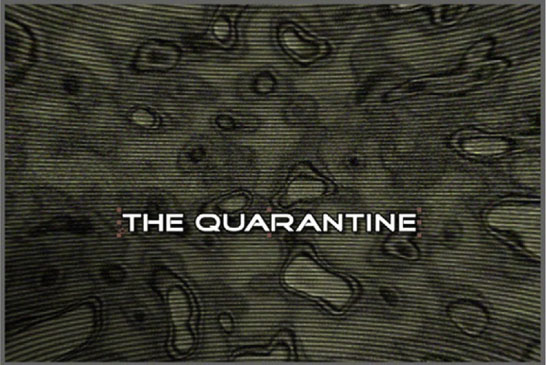
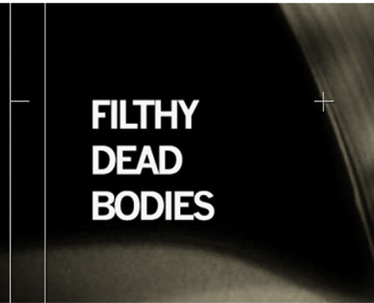
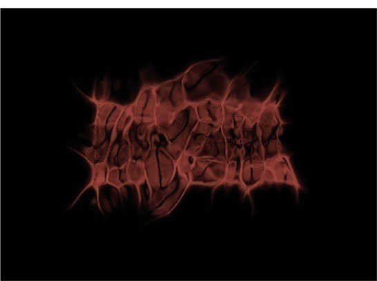
The Horror-Jittery Type in the Style of Se7en and Saw
Since 1995’s Se7en, title sequences have received much more notice. The title sequence from Se7en also set the standard for what people want to see in a horror film’s design package. The dark imagery, matched with skittering flashes of dirty, grimy images, have been a hallmark of the horror genre, and in this lesson I’ll demonstrate how you can achieve that look.
Tutorial: Creating the Horror-Jittery Type in the Style of Se7en and Saw
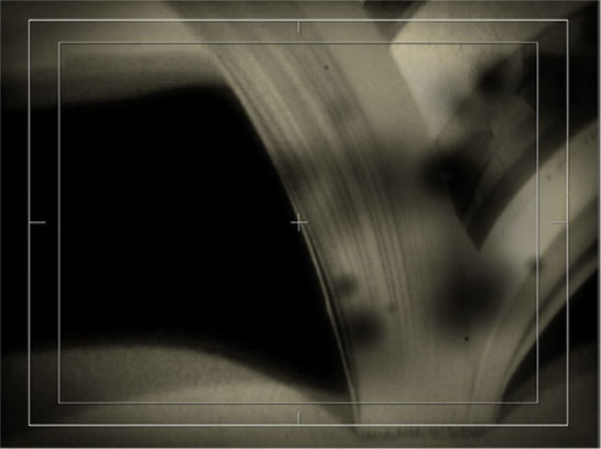
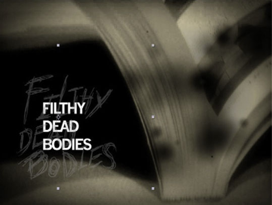
1 To match the look and feel of the background footage, you will need to process it pretty heavily. I used a close-up shot of the pages turning in a book and duplicated it with the Multiply blend mode. I also gave it some burned film effects with CC Burn. Finally, I added a color treatment to get that sepia look.
2 In Adobe Illustrator use a Wacom tablet to draw the letter forms. Since we want a hand-scrawled, rough look, use a thin, rough pencil brush and draw the lines over each other until you build up a texture that works. Make a second copy of the letters in white. Save your Illustrator file.

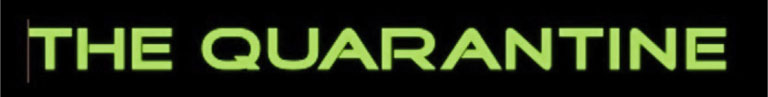
3 One issue that frequently comes up with dealing with a rough, hand-scrawled effect like this is that it becomes difficult to read, and it is very important that the type look cool and be legible. Make a new type layer and, using a tough, bold font, write the name of the movie.
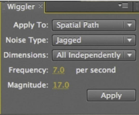
4 Now we can add our jumping/jittery animation. After Effects has the Wiggler panel, which helps us deal with randomized effects. On the type layer, set two keyframes for Position. Make a small move with your title; we really just need two keyframes for the Wiggler to create random keyframes between them. Highlight the two keyframes. In the Wiggler, set it to apply to Spatial Path so that the random values affect the actual position of the layer. The Noise Type should be set to Jagged so it is nice and rough. Under Dimensions, set it to All Independently, so that the random values appear on both the X and Y axes. Adjust the Frequency (how often a random value is created) and Magnitude (how large the randomization of the range will be) according to what makes the type appropriately jumpy without making it too difficult to read. Click Apply. Try it a few times before you settle on something.
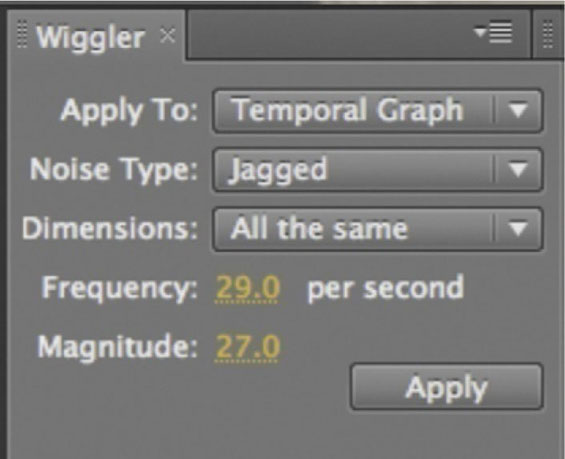
5 Put the white version of our scrawled type from Illustrator in the document above the typeface layer. Set its blend mode to Difference and lower its Opacity to 20%. Now parent the white scrawled layer to the type, and it will follow the Position animation. Start the stopwatch for Scale. Set two keyframes in sync with the first and last keyframes for Position on the type layer.
6 Highlight the two keyframes for Scale, and use the settings above on the Scale. This will give it a great jump effect that complements the original type nicely.
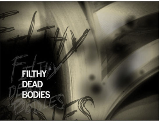
7 Done-Bring in the black version of the scrawled type. Set its blend mode to Opacity. Then add Scale and Opacity and, just as we did previously, use the Wiggler on them.
The Superman-Style Explosive Type
This memorable effect can lead to numerous uses in a modern context. Here’s how to do a digital recreation of the Superman title sequence.
Tutorial: Creating the Superman-Style Explosive Type
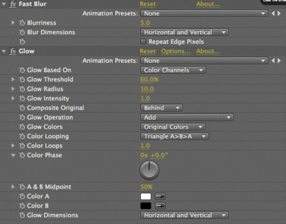
1 Create a new type layer with a blue stroke and no fill. Use a large bold font, such as Ariel Black. Duplicate it, and parent the duplicate to the original. Highlight both layers and put them into 3D mode.
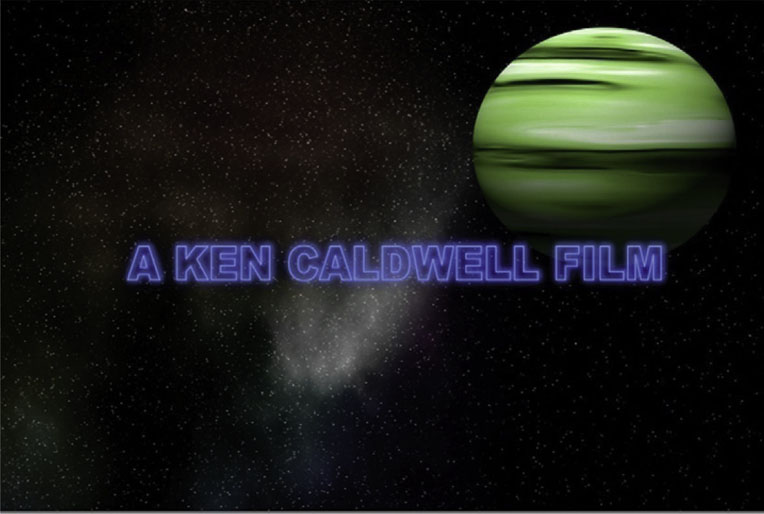
2 On the duplicate, add Effects | Stylize | Glow and Effects | Blur and Sharpen | Fast Blur. Try applying the settings shown above.
3 Using the Position and Rotation tools, animate the title flying in. Set the Z Rotation to start at 90 degrees, and 2 seconds later return it to 0. Set Position keyframes for Y to have it come in from off the screen and Z to send it further back in space.
4 Duplicate the text layer again, removing the Position and Rotation animations. At the 2 second mark, add keyframes to Scale it from 100% to 200% at the 4 second mark, and reduce the Opacity from 100% to 0%. Apply Motion Blur.

5 Now, here’s the really cool part: Add Effect | Time | Echo to the third type layer. Set a keyframe for Number of Echoes to go from 0 to 45 starting at the 2 second mark and ending at the 4 second mark.
6 Done-Now, to complete the effect, in the original Superman title sequence the base text flies forward and fades off. So, add keyframes for Position on our first type layer starting at the 3 second mark, and bring the type toward the camera. Use Opacity to fade off the type. Do the same thing for our second copy of the text, since Opacity is not affected by parenting settings.
The Matrix Raining Characters
By now The Matrix (1999) number rain has been everywhere, but I think knowing how this effect is achieved is a handy skill to have in your repertoire. Here’s one version of it that is pretty simple and effective.
Tutorial: The Matrix Raining Characters
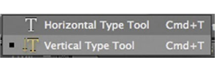
1 We’ll approach this effect as a background. To get started, switch the Type tool to Vertical.
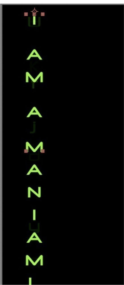
2 Use a green, futuristic font, and type out whatever text you’d like to use. Don’t worry too much about what it actually says, since we will be changing it a lot.
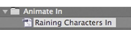
3 Open the Effects and Presets panel. Go to Animation Presets | Text | Animate In | Raining Characters In.
4 Next, let’s add an expression to loop the characters raining in. Option-click the Offset stopwatch, and add loopOutDuration(type = “cycle”, duration = 0). This will loop the animation.

5 Duplicate the type layer about eight times, distribute the copies across the screen, and change the type for each one. Also, move the keyframes for Offset around so that the loops won’t sync up.

6 Done-To complete this effect, let’s duplicate all the type layers and switch them into 3D mode. Move them back in Z Position. Add Effects | Blur and Sharpen | Directional Blur. Turn up the Blur Amount to 17. Finally, add Motion Blur, and there you have a Matrix-style raining character background.

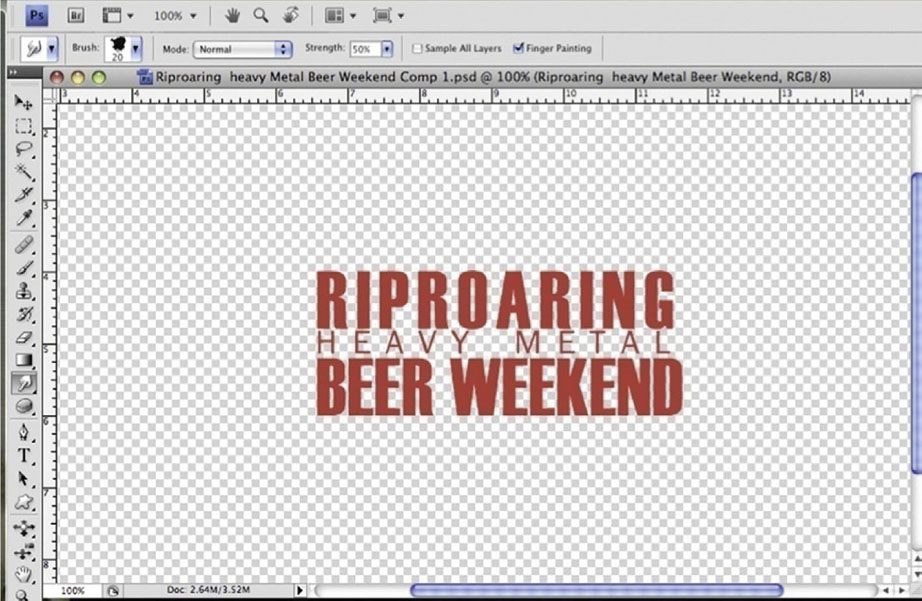
The Dawn of the Dead Blood-Splatter Type
Some of the best recent visual effects come from a combination of old school techniques aided by digital manipulation. One of my favorite recent title sequences is Dawn of the Dead (2004), which uses a very cool mix of old and new.
Tutorial: Creating the Dawn of the Dead Blood-Splatter Type
1 Begin by setting the type in After Effects and go to Save Frame As | Photoshop Layers. Call it dead1. psd. Open the exported file in Photoshop.
2 Use the Smudge tool in Finger Painting mode, and drag the red out in a smearing motion. After you’ve done that a little, save the file as dead2.psd.
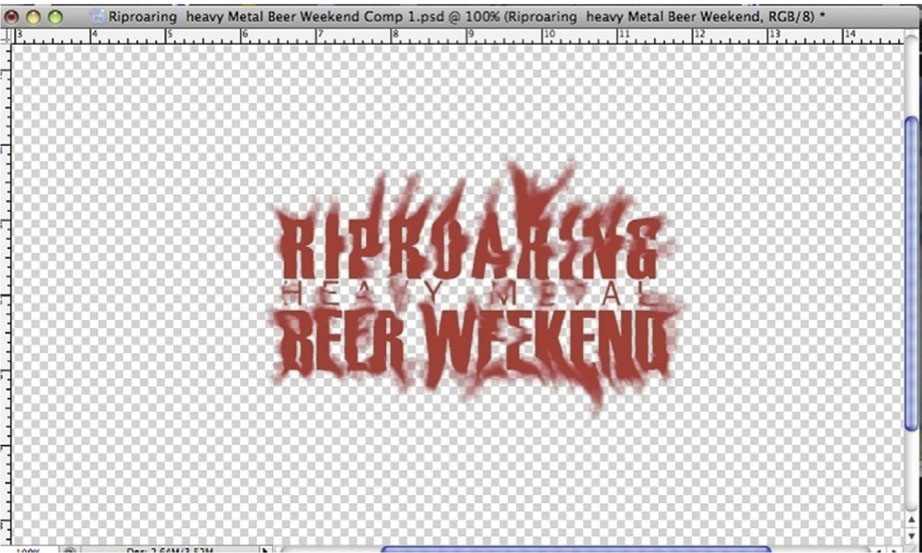
3 Repeat this process a number of times. As you spread the red out, turn off Finger Painting so that you stop adding red to the screen. Every time you’ve made a few changes hit Save As, and give each file a name that is one numerical value higher as in dead3.psd, dead4.psd. dead5.psd. As many as you feel are necessary.

4 As you get it spread out to the outer edges, switch to the Eraser tool and start removing the middle.
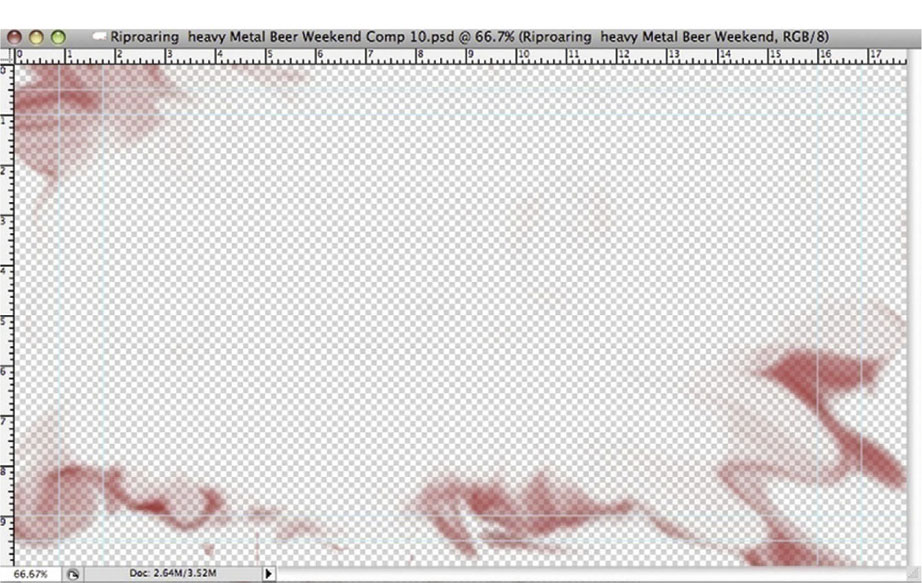
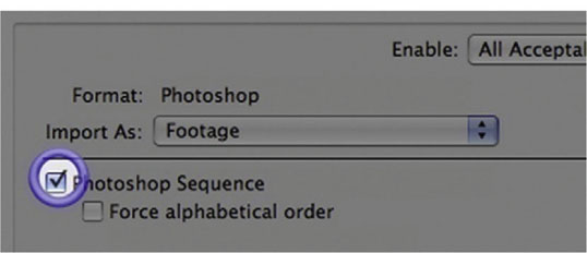
5 After you have done about 15 or 20 frames, you’ll have as many as you’ll need, so go back to After Effects. Import the dead1.psd file as Footage and turn on Photoshop Sequence.
6 Set the text layer to be 4 seconds long, and add the frame movie at the end of the text layer. Right/Control-click the frame movie and choose Time | Enable Time Remapping. Make the frame movie 1 second long.

7 Done-On the frame movie layer, add Effects | Blur and Sharpen | CC Vector Blur, and set keyframes for the Amount to go from 0–350 in the course of that last second. And there you have it—smearing blood type.
The Lost-Style Basic 3D Title
The opening to the TV series Lost has a famous animation that includes a very basic 3D effect. In this lesson we will recreate that look using a famous After Effects work-around. One of the things that After Effects desperately needs is the ability to extrude text into volumetric 3D. Until that becomes available, we can use this technique.
Tutorial: Creating the Lost-Style Basic 3D Title
1 I’ve written this out in the famously out-of-the-box Lost typeface Century Gothic. Now flip on the 3D switch.
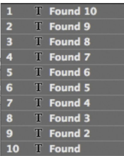
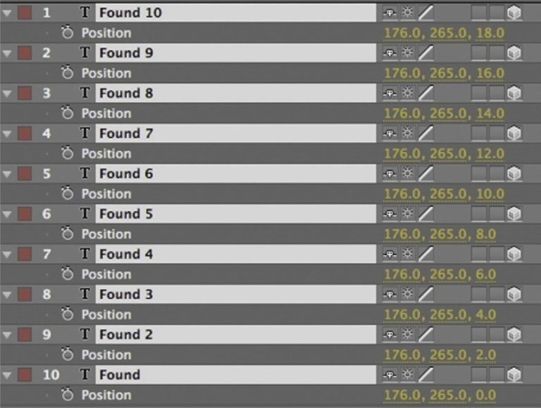
2 Duplicate the type layer 10 times. Make sure all duplicates are in 3D mode.
 This duplicating effect for 3D text is made obsolete in CS5. Photoshop’s new Repousse tool really eliminates the need to go about this effect in this way. However, since the look is somewhat different I still think it’s relevant to know to how to perform this technique.
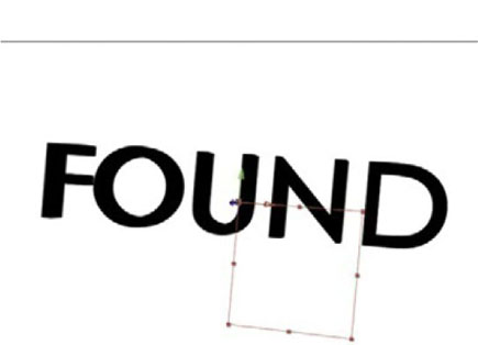
3 Open Position for all the text layers. The third number value is the Z Position. Increase the number values there in increments of 2. This is going to create two pixel gaps in Z space between each copy of the layer.
4 Go to Layer | New | Null Object. Put the new Null layer into 3D mode. Parent all the type layers to the Null layer.
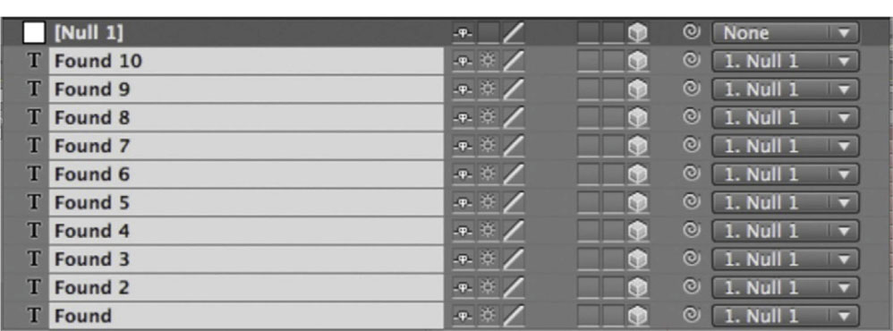
5 Done-Now we can use all the typical 3D effects and transformations, controlling it from the Null object layer, in what closely resembles true volumetric 3D.
The Spider-Man-Style Full-3D Text Animation
In this lesson we will utilize Cinema 4D and create full-3D animated text along the lines of big superhero movies like Spider-Man (2002). We will also look at the easy workflow between Cinema 4D and After Effects.
Tutorial: Creating the Spider-Man-Style Full-3D Text Animation
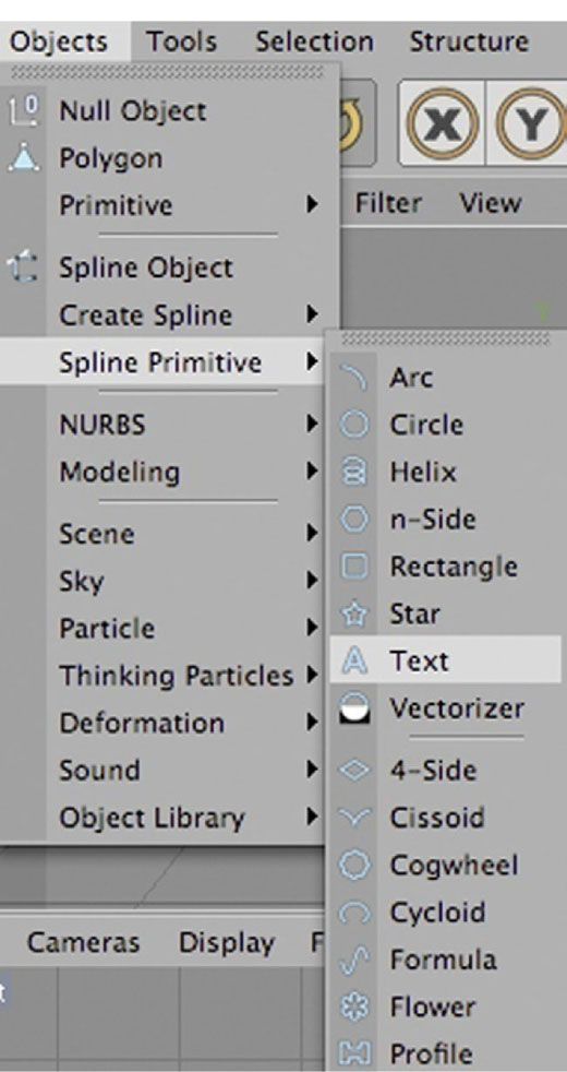
1 In Cinema 4D, go to the Object menu and choose Spline Primitive | Text to create our type object.
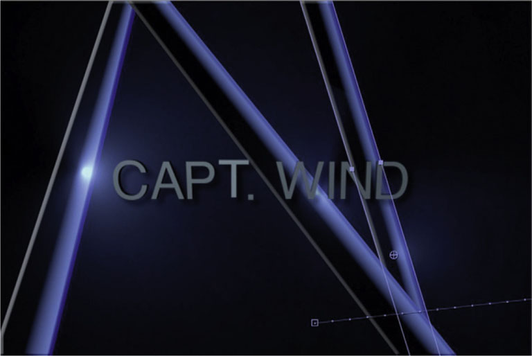
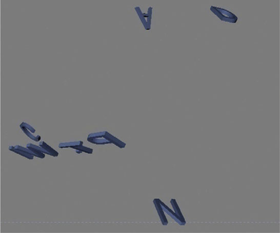
2 In the Attributes window, select Object, and then you’ll see a Text heading. Right next to it you can type your title. For our superhero movie we will create an effect in which each letter flies out on its own, so I’m creating a separate object for each letter: C, A, P, T, W, I, N, and D.

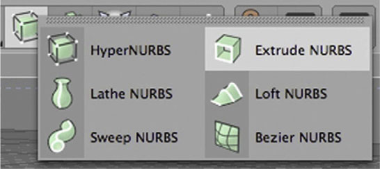
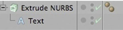
3 From the Add HyperNURBS tool, select Extrude NURBS, and make an Extrude for each letter.
4 Drag the text objects into the Extrude NURBS to make the letters 3D. Once again, do this for each letter.
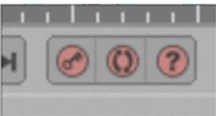
5 In the timeline, place the playhead at the 20 frame mark. Push the Record Position button (key icon) to make your first keyframe.
6 At the 30 frame mark, highlight the Extrude NURBS for the letter C, drag it up high above the rest of the text (with the Move tool), and spin it a few times (with the Rotate tool). Set another keyframe.

7 Repeat this process for each letter.
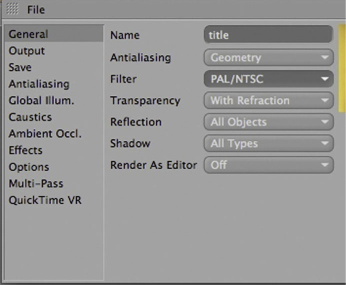
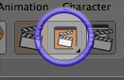
8 Now we will set this up to go over to After Effects. Go to the Render Settings tool. The Render Settings dialog will open. Under General, change the Filter to PAL/NTSC.

9 Under Output, match it to the settings you plan to use for your After Effects project. Select the appropriate size and format from Resolution. In this example I am using 720 × 480 D1 NTSC.
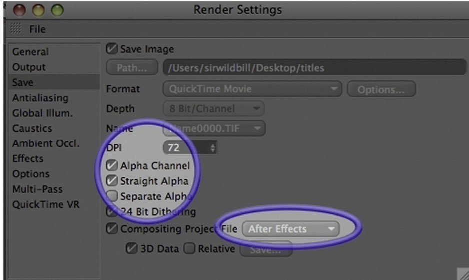
10 So we can use After Effects to animate our background, turn on Alpha Channel and Straight Alpha. Since AE and C4D are very friendly (seriously, C4D can almost be considered an honorary member of the Adobe Creative Suite; wouldn’t that be the best), we can take our C4D project right into an AE comp by turning on Compositing Project File and choosing After Effects from the menu.
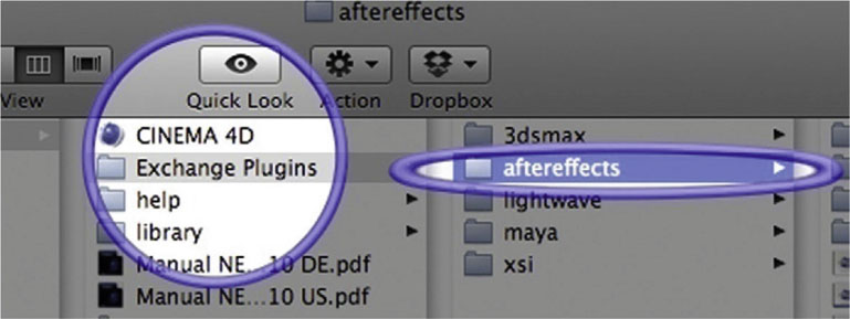
 It’s important that you install the Cinema 4D plug-in for After Effects. In the Maxon folder you’ll find an Exchange Plugins folder. You might need to get the most recent version of the plug-in from Maxon’s site; it should match the version of After Effects you are running, Figure 9.1.
Figure 9.1
11 Now we can go ahead and render.
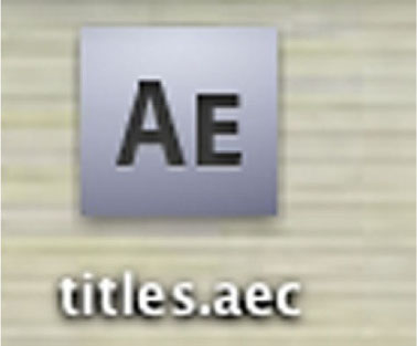
12 You will now have an .aec file that will open in After Effects, like a project file. However, make sure you have the After Effects plug-in installed or it will give you an error message.
13 Done-In After Effects I added some animated shape layers in 3D mode, to give it that superhero title sequence background feel. C4D and AE are a powerful combination, as demonstrated here.