
2
A BRIEF HISTORY OF TITLE SEQUENCES
Early Titles
The first examples of title sequences can be found in silent films. These consisted of simple, nonanimated title cards that informed the audience of the main film title, crew credits, and talent credits; they were usually placed at the very beginning of a movie.
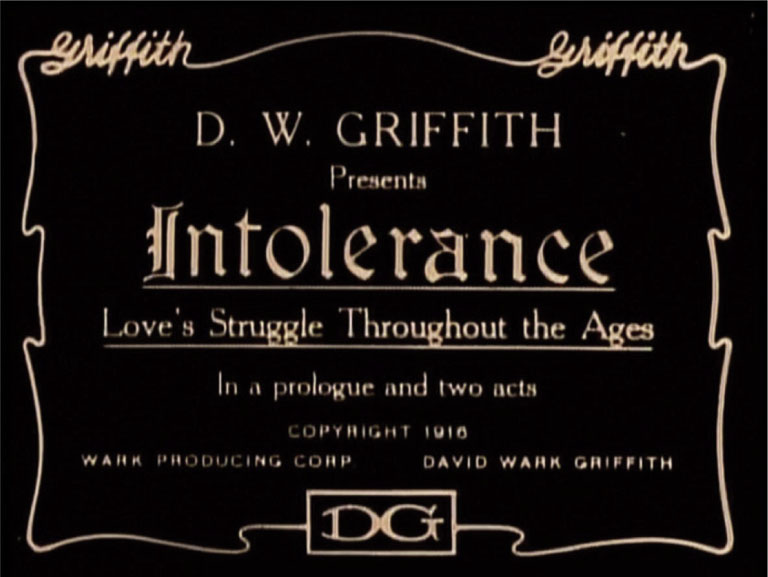
Early title cards—often created by lettering artists employed by major studios—typically presented white type on a black background, but they soon included some minor decorations such as lines, outlines, or small drawings. Some title cards worth mentioning are the ones created by pioneer director D. W. Griffith. These title cards could be considered one of the first examples of branded title cards in that Griffith included his name as a signature at the edges of each card.
Figure 2.1 Intolerance.
Because the early movies were silent, the title cards often had an additional function: They displayed dialogue that was essential to comprehending the story, and they set the time and place for individual scenes. These title cards were first photographed and then edited into the main movie.
After synchronized-sound motion pictures, known as talkies, were introduced in the 1920s and color motion pictures were introduced in the 1930s, title sequences began to articulate and develop.
Marcel Duchamp (1887–1968) created particularly unique titles. He filmed Anemic Cinema (1926) in collaboration with American Dada artist Man Ray and cinematographer Marc Allegret. On the screen we see alternating spiral designs that rotate, creating the optical illusion of three-dimensionality, the spirals moving toward and away from the viewer. Sentences are written on a spiral, so they become readable while slowly spinning. The letters were pasted one by one on round black discs, which were then glued to phonograph records and changed after each shot.
Perfectly in sync with the style of the artist and the styles of the times (Dada, Surrealism, Avant Garde), Duchamp’s fascination with language clearly emerges in this seven-minute experimental film, which presents a variety of visual and typographical play from beginning to end. First, the title. Anemic is an anagram for cinema, and Anemic Cinema becomes almost a palindrome. Second, the verbal puns appearing on the title cards are credited to Rose Sélavy, Duchamp’s female alter ego. Third, the French sentences present plenty of puns, playful rhymes, and alliterations.
In City Lights (1931), Charlie Chaplin opens the film with a number of static title cards. The first one displays the film title and his name, the second one is almost a tagline for the movie and presents his name again (“A comedy romance in pantomime written and directed by Charlie Chaplin”), and the third and fourth title cards display the names of the crew and main cast before fading to black. At this point a night shot of the city fades in with cars rolling back and forth, lights on in the buildings at each side of the street, and a square in the background. After a few seconds, accompanied by music composed by Chaplin, the main title comes onto the screen, superimposed over the street night shot. It consists of the name of the movie (City Lights) in capital letters, which are all created by white circles, reminiscent of Broadway lights or light bulbs.
These titles are an impressive demonstration of superimposing techniques done at the film laboratory through an optical process—obviously, due to the time period, done without the aid of a computer—but most important, it is one of the first examples in history in which a particular amount time and effort was applied to create a main title card that presents a level of symbolism in its simplicity, a unique act at the time.
In The Women (1939), directed by George Cukor, we start seeing how title cards became more articulated and detailed. We see, displayed in white type with a drop shadow over a wood texture, the studio credits (Metro Goldwyn Mayer), a triple title card with the main talent credits, then the main movie title card, then a number of multiple title cards displaying crew and secondary cast roles. As soon as this sequence ends with the director credit, we enter into a secondary title sequence, almost as a preamble to the movie. Title cards for the same main talent credited earlier are shown again, but this time they have one title card dedicated to each of them. In addition to their names, we see a shot of an animal, which then dissolves into a shot of the actual talent (Norma Shearer as a baby deer, Joan Crawford as a leopard, Rosalind Russell as a cat, Mary Boland as a monkey, Paulette Goddard as a fox, Joan Fontaine as a sheep, Lucile Watson as an owl, Phyllis Povah as a cow, Marjorie Main as a horse). These talent/animal comparisons intend to give the audience a glimpse of the character or behavioral traits that they will experience watching the movie. Whether successful or not, it was definitely a step forward in the history of movie titles.
In addition to film titles for live-action motion pictures, it’s worth mentioning an outstanding example in film titles for animation. In Spook Sport (1940), created by Mary Ellen Bute and animated by Norman McLaren, we see an interesting approach. This animated film features the Danse Macabre, composed by the French composer Camille Saint-Saëns, visually interpreted by scratches and painting done directly on the film by Norman McLaren.
After a number of intertitle cards display on-screen with green and red type on black background, introducing the type of work the audience is about to experience (“In the following short film novelty, color, music, movement combine to present a new type of Film-Ballet”), the main title cards show the two authors’ credits and a “program note” sets the place, time, and mood of the movie (“The story suggested here is that at the bewitching hour of midnight, spooks and ghosts arise from their graves to cavort about and make merry”). We then see something quite unique: the cast of characters. This title card presents on one side the name of the characters (Spook, Ghost, Bat, Bell, Sun) and on the other the corresponding visual representation of that character (a red checkmark-looking V, a squiggly green S, an outline of a yellow bat, a green bell, and a red circular shape for the sun) which will animate in the film. At the end of the titles, the place (“a deserted graveyard”) and the time (“midnight”) are also indicated. Although this type of title card might not surprise us today, it must be analyzed within the context of its time. As a title sequence created in the 1940s, it is quite a remarkable one. It offers the general audience the visual keys—as though they were a map legend—to interpret a piece of abstract animation.
After the Second World War, film titles began a new phase. A Hollywood strike in 1946 led to the foundation of Scenic and Title Artist 816, a union for graphic artists and designers in the film industry; among its members were sign painters and advertising artists. Title sequences tended to become more artistic and personalized, as though the graphic design branding began to bleed over to the motion picture identity. More time, resources, and budgets were dedicated to the creation of original sequences that better integrated with the subject matter and genre of the movies.
With Forbidden Games (Jeux Interdits, 1952), the first feature film made by René Clément, the history of title sequences took a turn. This movie follows main characters Paulette, beautifully played by five-year-old Brigitte Fossey, and Michel during the Nazi invasion of France in 1940. Paulette, completely in denial about the death of her parents (caused by an aerial attack at the beginning of the movie), becomes fascinated with death as she starts creating a cemetery for anything dead the children find on their way. This is a film that provokes a powerful reflection on how the atrocities of war and loss affect children.
In the original opening title sequence, each title card appears printed on pages of a book, which are masterfully turned one after another while being filmed in one take, giving the audience enough time to read the text. While the titles are on-screen, we hear a gentle and relaxing lute, setting the tone and atmosphere for a relaxing story about to be told. As soon as the last title card appears on-screen, the movie punches you in the stomach with a Nazi aerial attack on escaping Parisians.
What I found most interesting is an alternate version of the opening title sequence, which was not included in the commercially released version of the film. This version portrays the two main characters, Paulette and Michelle, approaching a river, getting comfortably seated on a tree trunk; Michel carries a book, both obviously getting ready for a nice afternoon read. “It’s the story of a little girl,” says Michel. “A little girl like who?” says Paulette. “A little girl like you, and a little boy like me.” Then Michel opens the book and begins to flip through the pages, onto which title cards are printed. After the last title card, the title sequence dissolves into the aerial attack. What is particularly remarkable in this title sequence is the new role that it takes on. On one hand, it acts as a frame for the movie, introducing it as though it were a story—in my opinion, hinting at the fact that a story that stark could only be read as a “story” by children and not as the atrocious reality of war. On the other hand, this particular opening title sequence creates a meta-movie, a movie within a movie. The two children sitting by the river and beginning to read the book are the same talents who play the protagonists of the movie the audience is about to experience, as though they were extrapolated from the movie itself and given the chance to observe it from a different frame and share their own story with the world.
Saul Bass: North by Northwest and Psycho
Saul Bass (1920–1996) was an outstanding graphic designer, title designer, filmmaker, photographer, and illustrator. His expertise masterfully ranged among static two-dimensional posters (Carmen Jones, Vertigo, the 1984 Los Angeles Olympic Games), corporate identities (Continental Airlines, Minolta, United Airlines, AT&T, Girl Scouts of the USA), packaging (Quaker, Wesson, Alcoa), sophisticated animated title sequences (The Man with the Golden Arm, Vertigo, Anatomy of a Murder, Cape Fear, The Age of Innocence, and Casino, just to mention a few), and directing short and feature films (The Searching Eye, Why Man Creates), which respectively earned him a Lion of San Marco from the Venice Film Festival and an Oscar.
His title sequences expand from the function of crediting the cast and crew. They complement the movie by piquing the audience’s interest while entertaining them with visually stunning motion graphics. In his title sequences, utilizing a variety of techniques such as paper cut-outs, live action, animation, type design, and montages, he exquisitely demonstrates a strong sense of typography, design, rhythm, pace, composition, and color theory.
It’s not a surprise that his graphic design education was imparted by the Hungarian-born designer, painter, and educator György Kepes, who worked with Lázló Moholy-Nagy in Berlin in the 1930s and was deeply influenced by the Berlin-based Gestalt psychologists, the Bauhaus design theory, and Russian Constructivism typography.
Saul Bass created title sequences over more than 40 years for directors such as Otto Preminger (whose film Carmen Jones is the first film in which the designer Saul Bass earns an on-screen credit), Alfred Hitchcock, and Martin Scorsese. Here’s how Martin Scorsese describes his work: “Bass was instrumental in redefining the visual language of title sequences. His graphic compositions in movement, coupled with the musical score, function as a prologue to the movie; setting the tone, establishing the mood, and foreshadowing the action. His titles are not simply identification tags but pieces that are integral to the work as a whole. When his work comes up on the screen, the movie truly begins” (Meggs, Philip B., ed., 6 Chapters in Design: Saul Bass, Ivan Chermayeff, Milton Glaser, Paul Rand, Ikko Tanaka, Henryk Tomaszewski; San Francisco, California: Chronicle Books, 1997).
North by Northwest, directed by Alfred Hitchcock in 1959, follows advertising executive Roger Thornhill (played by Cary Grant) in a series of intricate adventures during which he is mistaken for a government agent who is supposedly trying to smuggle microfilm containing government information.
The film opens with Bernard Herrmann’s score, the fandango. As the music builds, diagonal and vertical gray lines enter parallel to each other in the screen at an irregular rate. While intersecting, they form a grid over a pale green solid background color. Then type comes onto the screen from the top and bottom frame edges and its baseline comes to rest on one of the diagonal lines. After this first title card, a few more appear (three single title cards for the main talent, then the director’s title card), and finally the type comes onto the screen from the top and bottom frame edges to create the main title card: North by Northwest. This sequence is a fantastic example of how a main title, if designed by a skilled hand, can become and be used as a logo.
Shortly after the main title card exits the screen and a multiple title card enters frame, the pale green background dissolves to reveal the glass façade of a New York office building. Both the diagonal and vertical lines introduced in the first title cards (and now dissolved into the building shot) exactly match the structural lines of the building that is framed at a slight angle. Its windows reflect the busy streetscape, and the shots that follow portray some of the details of these streets (people exiting buildings, entering the subway, crossing the streets, and one person missing the bus—Hitchcock’s cameo!). If you look closely, even at the secondary title cards, you can notice the details of the hands of a skilled designer, such as one title card elegantly and subtly exiting the screen on the right while the camera pans left, giving the impression of the titles being embedded in the scene. Even Alfred Hitchcock’s title card exits screen right when he enters screen left, as though his entrance pushes away his own title while he tries to catch the bus.
Psycho (1960) opens with a full string orchestra playing music composed yet again by Bernard Herrmann, the New York-born composer who overall in his career collaborated with Hitchcock on nine films. “I felt that I was able to complement the black-and-white photography of the film with a black-and-white sound. I believe this is the only time in films that a purely string orchestra has been used,” Hermann said about that opening (Steiner, Fred, “Herrmann’s ‘Black and White’ Music for Hitchcock’s Psycho,”Filmmusic Notebook, Fall 1994).
On a solid gray background, horizontal black lines alternate their entrance in the frame from the right, creating a regular ruled pattern and bringing with them a couple of horizontal sections of a dissected type. With a surprising and subtle play on foreground/background visual illusion, the gray horizontal lines exit screen left, creating a black background and leaving the full stage of the first title card: “Alfred Hitchcock.” Another set of gray lines enter screen right, then exit again to the right, bringing with them and leaving on-screen the dissected pieces of the main title card: Psycho. After a couple of perfectly synced movements of the main title that emphasize their cuts, the type leaves the screen and other lines are introduced, this time vertical. The title sequence further develops with alternating horizontal and vertical lines, first inviting the type on-screen and then pushing it away to clear the way for the next title card. The result is an increasingly elaborate articulation of these seemingly innocent, but at the same time very jittery and nervous, lines dominating the screen.
While the lines evoke prison bars, cityscapes, order, and structure, their onscreen behavior and movement suggest jitteriness, nervousness, and irregularity. The dissected type in three horizontal rows evokes how something considered one unique, solid, and immovable entity can indeed be split, shattered, and dissected. It seems to allude to the fact that appearances can be misleading; after taking a first look at the movie and going back to watch the title sequence once again, we see that the type is a magnificent symbolic interpretation of the psychological state of the main character, Norman Bates (played by Anthony Perkins): split, shattered, schizophrenic, and incoherent.
“In those days,” Bass said about his work, “I liked strong, clear, structural forms against which to do things. I liked giving more zip to Psycho because it was not only the name of the picture but a word that means something. I was trying to make it more frenetic, and I liked the idea of images suggesting clues coming together” (Rebello, Stephen, Alfred Hitchcock and the Making of Psycho; New York: St Martin’s Griffin, 1998).
For this title sequence, Bass worked with Harold Adler, a hand-lettering artist who worked for the National Screen Service and who also worked on the title sequences of Vertigo and North by Northwest; animation director William Hurtz; and cameraman/production man Paul Stoleroff. The lines we see in this title sequence were actually six-foot-long aluminum bars that were sprayed black and animated on a table at different speeds and positions. The camera was rigged on top of the table, looking down.
Adler described the process: “We worked on a large white painted plywood board with push-pins to guide the bars. The bars had to follow a straight line and couldn’t wiggle. Paul [Stoleroff] and I manually pushed in each bar at predetermined distances and speeds. Each bar was precisely timed by numbers of frames per second, called ‘counts.’ Each bar had to be pushed in and shot separately. Once a bar had gone across the screen, it was tied down. There were lots of retakes because they’d come in crooked …”
Bass utilized two sets of sans-serif fonts in this title sequence, Venus Bold Extended and News Gothic Bold, all in capital. Each title card was recreated on reverse (white type on black) photostats (early projector photocopier machines that photographed documents and reproduced them onto sensitized photographic paper), which were cut into three horizontal parts. To add motion, Adler said, “I moved the top section [of the title letters] in one direction and shot it at a certain speed, moved the bottom in another direction at another speed, and the middle part at another speed. So you were really getting three images, each one a third of the height of the lettering, coming in at different speeds. For the last frame, we popped on the word Psycho, which was the intact photostat by itself. For the other big titles, like ‘Directed by Alfred Hitchcock,’ I used News Gothic Bold typeface and we did the same three-cut technique as for the title of the movie.”
Dr. Strangelove and Delicatessen
For Dr. Strangelove or: How I Learned to Stop Worrying and Love the Bomb (1964), directed by Stanley Kubrick, Pablo Ferro created an outstanding title sequence.
The movie opens with an aerial shot coupled with a voiceover giving the political context and setting of the film, followed by a scene of a U.S. Air Force plane being refueled in midair. While the scene’s details unfold (with an admittedly oddly sexual hint pervading the scene), the white titles appear superimposed on the black-and-white footage. While this imagery and type unfold on-screen, we hear a very relaxing classical soundtrack.
The type is handwritten, with alternating thin and thick strokes, outlines, and a variety of font sizes. It resembles some of the fonts typically used in comic books, giving the title sequence a comedic appeal. It seems that there is no rule that governs the font size. The crew and cast last names are displayed 300% larger than the corresponding first names, or vice versa. Articles are much larger than the following names. Every title card keeps the audience on edge. Where are the names going to be placed? What is going to come next?
This juxtaposition of the military imagery of a plane being refueled, the airy white handwritten typography, and the classical music all perfectly match the style, content, and emotional reaction that the audience is about to experience on a larger scale when they watch the entire movie: a political dark comedy.
For Repulsion (1965), directed by Roman Polanski, the title sequence was created by Maurice Binder—well known not only for his opening title sequences for the James Bond movies such as From Russia with Love, Goldfinger, and Live and Let Die but also for the spectacular opening title sequences of Charade and Arabesque.
Accompanied by a minimalistic ominous soundtrack, Repulsion’stitle sequence opens with an extreme close-up of an eye. The titles appear coming into and out of frame, except that the frame is actually the eye. The titles are masked by the edge of the eye and they have a slight rounded distortion on the edges, as though they are actually scrolling over the surface of the eye’s cornea. After the first few title cards, the camera slightly zooms out and the title cards become populated by multiple names. The type is no longer masked by the eye and enters the frame from the bottom, moving across the screen on different diagonal trajectories, and exiting the top of the frame. The interesting aspect of this part of the title sequence is that we start noticing the eye moving and looking in different directions. A careful look shows it is actually following the type moving across the screen. Considering the time (the 1960s), I believe that this title sequence offers an innovative approach in that it involved creating and orchestrating a variety of assets (video and animated type) that interacted with each other.
Fantastic Voyage (1966) is a spy sci-fi movie directed by Richard Fleischer. The movie opens with an airplane landing, and Jan Benes, a scientist vital to the scientific formula of miniaturization, is escorted away from it. When the escort is attacked, the scientist suffers a major head injury.
Following this opening scene we see the opening titles, created by Richard Kuhn; they present a quick montage of close-ups of Benes’s brain, X-rays, numbers, electroencephalograms, jump cuts of the patient in a hospital bed surrounded by doctors, medical machinery, and rolling tape. We hear heartbeats and synthetic sound effects. Title cards are superimposed on the imagery, and they appear as though they were typed in real time on a typewriter. It is a surreal title sequence that gives the audience a taste of the mysterious fantastic adventure on which they are about to embark. As soon as the quick title sequence is over, it dissolves back into the movie with a more sedate pacing.
The movie evolves into revealing that an agent will be miniaturized and will lead a group of scientists onboard a nuclear-powered submarine on a fantastic scientific expedition into the bloodstream of the scientist to try to save his life.
Matte Titling
When title cards are required to be superimposed over film footage, title designers utilize a technique called matte titling. This technique, which was thriving before the titling process became dominated by a digital workflow, is still utilized today by independent filmmakers whose movies are shot on film and who would like to avoid a digital intermediate process by creating their titles directly on film.
This technique requires the creation of two identical title cards, which are used as mattes. The first one consists of a title card with black type on white background, the second with white (or colored) type on black background. Using an optical printer, the first title card is exposed against the background footage, creating a blank area that corresponds to the title card lettering. Subsequently, the film roll is rewound and the second matte is printed over the background footage. This last optical printing pass allows the lettering to be registered over the previously blank areas. The visual result is white (or colored) titles superimposed over the footage.
In Fahrenheit 451 (1966), director Françoise Truffaut gives us an outstanding title sequence. The movie is based on the futuristic novel by Ray Bradbury, which takes place in a state that forbids reading. A fireman, Guy Montag, must find people who are hiding books and confiscate and burn the books. The opening title sequence consists of a montage of shots that zoom in from wide to a close-up of a variety of antennae on top of suburban houses, indicating that television has replaced reading in this society. The shots alternate monochromatic orange, blue, green, purple, and red antennae. Similarly to The Magnificent Ambersons (Orson Welles, 1942) and M*A*S*H (Robert Altman, 1970), rather than seeing and reading title cards, the audience actually doesn’t get to see the type on-screen but rather hears the opening titles being recited by a voiceover: “An Enterprise Vineyard production. Oskar Werner, Julie Christie … in Fahrenheit 451. Co-starring …” The soundtrack we hear is another brilliant musical composition by Bernard Herrmann. It is indeed a surprising and unexpected opening, which, in a way, poses the question at the core of the movie: “What happens in a world where there is no writing to read?”
In the same year, another movie made its impression: Uccellacci e Uccellini (Hawks and Sparrows; 1966), directed by Pier Paolo Pasolini. In this stark opening title sequence, simply designed title cards appear superimposed over a locked-down shot of a cloudy sky, accompanied by music composed by Ennio Morricone. When the title cards appear onscreen, a cheerful Domenico Modugno actually sings them. But he doesn’t limit himself to singing the names and titles of the cast and crew—he embellishes the reading with adjectives and fun facts, almost as though the narrator was the modern version of a troubadour who is singing and preparing the stage for a well-narrated story that’s about to begin. This opening fits perfectly with the movie, which has a deep political theme (the Marxism crisis of the 1950s in Italy), wrapped around a sweet-and-sour fairy tale structure.
Broadcast title design began to catch up to the creativity demonstrated by the movie title sequences of the time and definitely made their own mark. A couple of notable title sequences are the ones for ABC Movie of the Week (1969) and The Partridge Family (1970).
In the ABC Movie of the Week opening, we see titles that animate toward the viewer three-dimensionally, with exaggerated perspective. The effect was achieved by an optical technique called slit-scan. The technique’s look and feel is definitely a precursor of what would later be applied to numerous other applications, including cinematography (the “Star Gate” scene in Kubrick’s 2001: A Space Odyssey, 1968), title sequences (the 1973–1979 Doctor Who opening titles or the crawling text block that opens 1977’s Star Wars), and computer motion graphics (a number of software plug-ins are called slit-scan).
Slit Scan
Originally utilized in still photography to create blurriness or deformity, the slit-scan technique was achieved through the use of an animation stand. The image or title to be photographed is placed on the glass plate and is generally backlit. A black matte is placed over the image, with a slit in the center. The camera is arranged on a vertical rig framing down on the glass plate and can be moved up and down. When the frame is exposed, the camera moves down, creating an effect similar to a still shot with long exposure, which records the light streaks of fire or car headlights; instead of the object (car) moving, the camera is moved. When the camera reaches its desired end position, the shutter is closed and the film advances to the next frame to be exposed.
The visual result is the illusion of one, two, or even four planes of infinite proportions, moving either toward or away from the viewer.
The Partridge Family (1970) was an American sitcom broadcast on ABC from 1970–1974; the story followed a mother and her five children on their quest to seek a musical career. The opening title sequence features the theme song by Wes Farrell, “When We’re Singing,” with lyrics by Dianne Hildebrand, and animation by graphic designer Sandy Dvore, who later in his career went on to design more title sequences like the ones for Blacula (1972) and Lipstick (1976). The animation opens with an egg cracking open, from which emerges the main title, then a “mama” partridge emerging from and getting rid of the shell. The title card comes up on-screen, consisting of a monochromatic rendition of a photo of the mother, played by Shirley Jones. Then five little partridges are introduced, with all five children represented similarly to the first title card. Then the entire family of partridges walks across the screen to reveal the Mondrian-esque pattern of the back of the school bus in which the family travels, and the title sequence dissolves into the sitcom.
In the 1970s and 1980s, partly influenced by video art, we began to see computer-assisted title sequences such as Superman (1978), created by Richard and Robert Greenberg.
In the early 1990s, Adobe After Effects was released, marking another turning point in the history of title design. Title designers were now able to design, animate, and composite title sequences directly on their computers.
Delicatessen (1991), directed by Marc Caro and Jean-Pierre Jeunet, is a dark comedy film set in a post-apocalyptic France in the 1950s, where the food is scarce, animals are quasi-extinct, and a butcher hires helpers that he then butchers and sells as a delicacy to his clientele.
The film opens, revealing a sinister building in a rural street. The camera slowly enters an empty butcher shop, revealing a butcher sharpening his knife. The camera enters and continues through an air duct to reveal a man wrapping himself with paper and trash. It’s garbage day, and the man makes his way into the trash can. The escape plan seems to be going well, except that right when the trash can is about to be collected, the butcher throws his cigarette into it, burning the man and causing him to yelp, blowing his cover. The butcher opens the trash can and, with a delightful point of view shot from inside the can, we see him raise his knife in the air while smiling sadistically, and as the knife falls to slash the man, the movie cuts to the main title card, Delicatessen, coupled with a brilliant combination of sound effects and a swinging metal pig—the butcher’s logo.
After the first scene sets the mood and gives a few hints of the dark humor of the film that is about to unfold, the title sequence can truly begin.
Lulled by the calm, almost sedate version of circus-like music, the camera gently moves around and pauses to frame title cards embedded in a set composed of broken records, pictures, dirt, a variety of paper (production logs, labels, menus, newspaper articles), a vintage camera, patches, photo booth pictures, and mirrors. The camera wanders as though it is simply moving around to explore the territory, but then it pauses to allow the viewer to read and make out the title cards embedded in the set, as though they were meant to be there all along. This title sequence was artistically and skillfully orchestrated in one take; the set is composed of real props, as opposed to a computer-generated set.
Some of the type is handwritten, some is presented in varying qualities; all appears on a variety of surfaces. What is most striking is that each title card has a specific place in the set and a particular way of manifesting itself with a meaningful style: a concise summary and symbolic representation of the key people behind the movie. For example, the title card that credits the director of photography, Darius Khondji, is engraved on a vintage camera. The music credit is printed on a vinyl label, the wardrobe credit is embroidered on a patch, and the editor credit is handwritten on a set of photo booth pictures that had been hand-ripped and taped back together.
Last but not least, the transition from the end of the title sequence back into the movie is truly remarkable. After the last title card that credits both directors, the opening title sequence fades to black. We hear a paper-crumpling noise and we see the hand of the butcher taking a sheet of butcher paper off the lens (as though it was on the shelf in front of him) to wrap some meat for waiting customers. The result is a brilliant transition that throws the audience back into the swing of the movie.
Se7en, Kyle Cooper, and the Modern Title Sequence
Named by The New York Times Magazine as “one of the most important innovations of the 1990s,” the opening title sequence of Se7en (1995) presents, without any doubt, one major turning point in the history of title design.
Se7en is a psychological thriller directed by David Fincher. In an interview with Thunder Chunky, talking about title sequences, title designer Kyle Cooper states, “Each film is a different problem to solve, so each solution is different.” For Se7en’s opening title sequence, Cooper shot some extremely close-up footage, which complements the type scratched directly onto film, a technique seen in early film animation done by people such as Len Lye, Stan Brakhage, and other experimental filmmakers. The edgy soundtrack by Nine Inch Nails perfectly complements, enhances, and interweaves with the imagery.
In these titles we see overhead extreme close-up shots of a diary, fingertips cutting and taping, pages filled with handwriting, erasing words and then writing new ones with thick and intense handwriting, collecting hair, erasing eyes from pictures, and sawing pages. The title sequence alternates cross-dissolves, hard cuts, flash frames, and distorted and handwritten type, complemented by one- to two-frame shots with borderline-subliminal imagery of a variety of words, letters, and numbers.
As an audience watching this for the first time, we definitely feel the intended emotions: what we are about to experience is a piercing, fast, dark movie. We see a lot in this engaging title sequence, but what we never see is a complete picture, a long or medium shot of the setting. The audience doesn’t get the privilege of understanding where they are, what’s going on, and most important, how this montage ties into the movie they are about to experience. In the perfect vein of a thriller, they will have to piece it together, especially after the first viewing of the movie.
In the very beginning, the audience is given an important clue about how the killer was able to get away with his actions. He removes the surface of his fingertips with a razor blade so that he won’t leave any fingerprints. “David Fincher wanted to set up the film’s relationship with evil in a very direct and uncomfortable way,” Cooper notes in an interview with David Geffner. “I think we accomplished that. But in Se7en there’s also a structural concern going on. You don’t see the killer until nearly 40 minutes in, so the titles need to bridge that gap. You’re inside his head straight off, making the tension that much more intense when he does finally show up.”
Because of the aesthetical qualities of the title sequence, its superb use of content in the appropriate context and moment, and the trust given to the audience that they will put the pieces together—rather than telegraphing what they are supposed to feel and understand—this title sequence is a successful and timeless piece.
“That sequence for Se7en is only good because it is the film, because it came out of the film,” Cooper says. “I wanted to get across the idea of the killer, to make something that he would have made. That’s how you want it to be. The form should be born out of the content.”
It’s not a surprise that the style of Se7en has been admired, looked up to, and especially mimicked by a variety of designers. As Cooper mentioned, what is important to understand, what is absolutely relevant, is the concept of a title sequence. How a title sequence articulates itself visually and aurally should be a consequence, dictated by the content. That is why Se7en is such a successful piece. It was created for the movie, and it would not work for any other movie other than Se7en.
David Lynch directed 1997’s Lost Highway, a film that follows the confusing happenings—in which the boundary between reality and hallucination is very thin—of the saxophonist Fred Madison, played by Bill Pullman, when he is accused of having murdered his wife. This title sequence seems to have borrowed from an earlier concept of the 1968 title sequence for the movie Girl on a Motorcycle, but inevitably it develops into its own well-crafted, effective titles for this film.
Lost Highway’s opening title sequence, designed by Jay Johnson, consists of a driver’s point of view of a car speeding on a road in complete darkness. The only point of reference in the darkness is the middle broken yellow line that prevents the speeding car from crashing. The titles, as yellow and broken as the road’s middle line, are designed with a stencil-esque font reminiscent of the roadwork imagery. They emerge out of the darkness, they hold for a moment on-screen to allow them to be read, and then they move furiously forward as though they were crashing onto the windshield. The soundtrack of these opening titles consists of a song by David Bowie called “I’m Deranged,” perfectly complementing the feeling of the scene and the emotional rollercoaster that the audience is about to experience watching this dark and surreal movie.
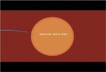
The title sequence for Monsoon Wedding (2001), directed by Mira Nair, was designed by Trollbäck+co. This opening title sequence features animated lines and circles over colorful backgrounds, while the title cards appear on-screen. The graphic elements are simple and effective, and they dance and animate in sync to the soundtrack of an upbeat Indian marching band. The lines and circles expand and contract in size, filling up the screen and transforming from a foreground element into a background one, creating seamless and effective transitions from one title card to the next. Right when we begin to expect the next abstract title card unfolding on-screen, we see two lines slowly curling around each other to create two intertwined faces that symbolize the arranged marriage that is at the fulcrum of the film.
Figure 2.2a Still frames from “Monsoon Wedding” title sequence, designed by Trollbäck+co.

Figure 2.2b

Figure 2.2c
Figure 2.2d
Figure 2.2e
Figure 2.2f
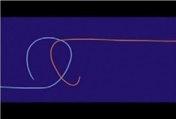
Figure 2.2g
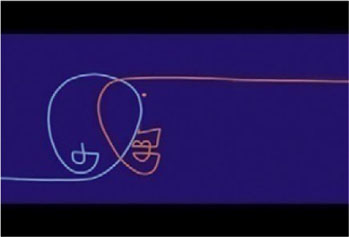
Figure 2.2h
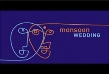
Figure 2.2i
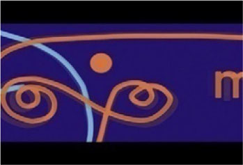
Figure 2.2j
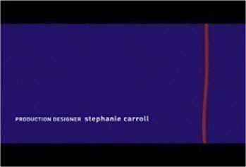
Figure 2.2k
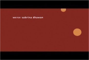
Figure 2.2l
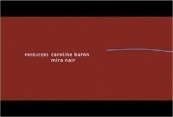
Figure 2.2m
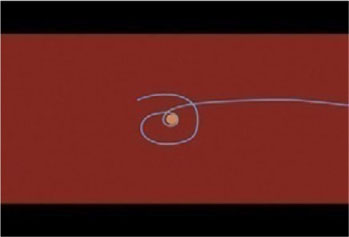
Figure 2.2n
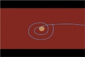
Figure 2.2o
In the provocative film Irreversible (Gaspar Noé, 2002), we see a distinctive title sequence. The film employs a nonlinear narrative: the story unfolds in reverse chronological order.
The titles literally reflect the structure of the film in that sense. At the beginning of the film—which, chronologically, is the end of the film—instead of seeing the opening titles, we see the end titles; at the end of the film—which, chronologically, is the beginning of the film—we see its opening titles.
The end titles themselves are stark and simple; first we see a justified block of text, scrolling downward, revealing the very last part of the end credit block and moving up to reveal the earlier credits. The text block begins to tilt slightly, as though the camera is losing balance. We get a glimpse of the main title as we reach the top of the credit block. As the camera starts to spin a bit faster, the credit block exits the screen and we see a quick rotating shot of one of the main characters. Immediately after, accompanied by a minimalist regular drumbeat, enormous typefaces alternate on-screen at a fast pace. Text on black background incessantly alternates onscreen, displaying the main talent’s last names in white, their credit roles in red, and the production companies in yellow. Some of the letters are flipped horizontally and vertically, as though to exaggerate and reflect the sense of irreversibility even onto the titles. The main title card appears on-screen in four different flipped-lettering variations; then, after a few title cards crediting the production and key crew roles, the movie begins—or more precisely, ends.
Case Study: Quantum of Solace, The Kite Runner, and Stranger Than Fiction
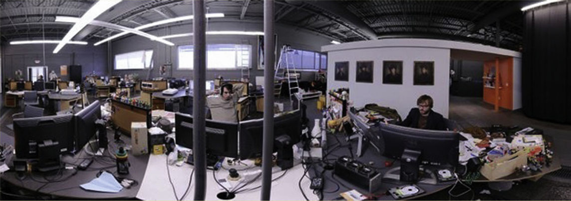
Figure 2.3 MK12 Studio in Kansas City.
Quantum of Solace
Can you talk about the creative process while working on the Bond titles, from early inspiration, development and final deliverable?
We produced quite a bit of previsualization across a few concepts throughout the entire main title process. We were originally hired to produce all of the onscreen moving graphics seen on PDAs, cell phones, laptops, monitors, etc., in the film. So, we just started to work on ideas on the off-hours, in between the waking moments of working on this other pile of VFX work.
We initially pitched one concept that was much more watery based, but in the abstract. The female form was then worked into this, as we knew this was going to be a central image that we wanted in the sequence. If QoS is a direct sequel to Casino Royale, then thematically it would make sense to revisit the woman motif, as it reflects Bond’s current character-state; within QoS, he’s become that tuxedo-wearing, martini-swilling, dandy spy that Fleming made him to be. He’s earned the 0-0-7.
Our first pitch consisted of a number of style boards and motion tests that we’d cobbled together in our spare time. Our audience was Marc [Marc Forster, the director] and the EON producers: Barbara Broccoli, Michael G. Wilson, and Gregg Wilson. They have a huge collective wealth of knowledge; their father was Albert Broccoli, the original producer of the Bond films and cofounder of Danjaq and EON Productions, who still produce the franchise. So they basically grew up with Bond, which gives them not only a great understanding but a unique perspective on the Bond character—where he’s been and where he’s going. Short of speaking with Fleming himself, this was the crowd to impress, and we did. Sort of.
The producers were very skeptical of us at first, understandably. We were there on Marc’s voucher, and they’d never worked with a non-U.K. title designer on the main open, and that made them nervous. But we did present a healthy first round, which served more as an icebreaker than anything. They saw that we took the integrity of the franchise seriously and were able to handle both narrative and abstract content in the same breath, which is the foundation of any classic Bond sequence.
Figure 2.4 MK12 creatives.

Through those conversations, we explored various conceptual and thematic elements derived from both Quantum of Solace and Casino Royale. We all liked that the title sequence could be looked at as a visual metaphor of Bond’s current mental state, his feelings toward women, relationships, and his isolation in the world, given the death of his love interest, Vesper, at the end of Casino Royale.
So we went back to the studio and continued on with more tests, adding different elements, experimenting. We eventually landed on the sand motif, and through a series of test animations, everyone agreed this was the way to go.
We found that the desert theme served as a convenient metaphor for Bond’s mental state while also referencing specific locations in the film—a perfect parallel that made for a great foundation. We liked how the sand itself worked perfectly as a centric object-element. Its ability to change form from a solid to a viscous substance was an interesting feature to us, which we explored both as a transitional element in the sequence and as a substance we could mold into whatever form we wanted. One moment it would act as an environment, the next, a field of stars.
The female forms—hidden within desert environments—could be looked at as a representation of Bond’s current relationship toward women and love, after enduring the loss of Vesper. They act as the accelerant that jarringly alters the barren landscape, i.e., Bond’s mind folding in on itself.
Other visual cues subtly parallel elements, moments, and visual motifs in QoS, finding a synergy with Marc’s ideas and the beautiful cinematography of Roberto Schaffer.
There are also instances within the film that pay homage to past Bond title work by Binder, Brownjohn, and Kleinman.
For the majority of this previz [previsualization], everyone within the studio participated by means of animated tests, mood and style boards, and conceptual storylines and themes to adhere to the sequence. We shot various tests on our stage for the various pitches we created throughout the process. We had a small shoot with a model friend-of-a-friend and borrowed a small workshop in London that we shot in for an afternoon. We also built a sandbox on our own stage and shot multiple sand and environment tests over multiple test animations. All in all, we had a wealth of visual thought and experimentation that really helped us find a voice and a clear visual dialogue for the final product.
What was the length of this project?
From start to finish, our involvement with Quantum of Solace for both VFX and the direction and animation of the film titles was a little under a year’s time.
How large was your production/postproduction team and what were their roles?
Our postproduction team consisted of our core studio artists, totaling nine at the time. We also worked with four freelance artists, three compositors, and one roto artist. We also had a senior producer working from NYC and a production manager that was with us in Kansas City. We also tracked down a particle animator in India who is literally one of the few people in the world who can do what he does.
For perspective, the live-action shoot team was at least 30+ people strong.
We work in a very organic way. Everyone wears different hats and can adapt pretty easily to whatever task is coming next down the pipeline. Of course, everybody has their strengths, which we play toward, but ultimately, we work as one giant brain, moving materials back and forth between artists within the studio.
Can you elaborate on the client dynamic?
The client dynamic, both in terms of our working relationship with the director Marc Forster and EON Productions, the owners of the Bond franchise, was a fantastic and an enjoyable experience. With Marc, it felt like any of the other projects we’ve collaborated on with him and his team in the past few years. We have a good time with those guys, and they’re a group of brilliant minds that makes the creation process exciting and challenging.
EON was also fantastic to work with. They are a bunch of great people who are really dedicated to their jobs and really believe in the character and universe that Fleming has created. They have such a vast knowledge of the Bond world. It was definitely an educational experience, to say the least.
What was your involvement in the live-action footage for the opening sequence?
MK12 directed the live shoot. We secured one of the stages at Pinewood Studios in London and sent two of us to direct one day of sand FX, two days of sandboxes and our female talent, and the remaining day with Daniel Craig. Simon Chaudoir was our DP, and our crew were mostly holdovers from the feature Bond shoot, which had just wrapped. It was pretty fantastic; these are the guys and girls who had been living Bond for the past year and a half (many of them since the Roger Moore days), so their insights were very valuable to us franchise newbies. These were also the same folks who fabricated sienna in a warehouse, so it was always amusing to brainstorm some weird contraption and then see it built five minutes later, only better. Toby, who was in the props department on QoS, became one with the sand on set, to the point of obsession. By the end of the shoot, he’d be able to make it do exactly what you wanted it to do—again, only better. And he’s just one in a long list of truly talented and dedicated crew. It was our biggest shoot by far, but those guys also made it our easiest.
We had a working animatic that incorporated the major shots that we’d be shooting passes of with the motion control rig: the Cyclops. We were using these scenes as foundational areas within the title sequence to build everything else around. It was imperative to use the motion control rig for this because of the complex scaling and speed issues that are inherent in taking a plate of a human—at human size—and compositing said plate into a world of human thighs, shoulders, faces, hips, and torsos that are meant to be viewed as mega-structures within a desert expanse. We never make it easy for ourselves.
On the female talent days, the motion control rig was situated in front of a 12 × 12 sandbox on one side of the stage. On the other side of the stage was a matching 12 × 12 sandbox. We had a jib arm on a dolly and track for nonmotion control shots. The Art Department would sculpt various environments that centered around one of our female talent half-buried in sand, and we’d spend time finding interesting angles and passes and basically collected an archive of really amazing shots that we’d work into the sequence during editorial.
With Daniel Craig, we had a shot list that consisted of various scenes of Bond walking and searching, as well as a number of stunt shots using various rigs to pull off some really cool and dynamic movements of Bond within this surrealistic desert environment. Craig is just a goddamn natural when it comes to being Bond, [so] it made for a really solid day of shooting and an overall unforgettable experience. We’d describe what we were looking for, and he’d get it on the first take. He is the authority on his character, after all—it’s not like you can tell him that he’s not being Bond enough.
What about the special effects you did throughout the movie?
Marc tasked us with the creation of all graphics related to the MI6 computer system. Conceptually, we ultimately decided that MI6 would use some sort of hi-tech proprietary software that was node-based and was built off the theory of mind mapping and radial thinking, rather than the traditional tree hierarchy that is outfitted on most personal computers today.
With these types of projects, we like to come up with complete toolboxes that showcase the full extent of data graphics that could exist, even if we don’t utilize everything. More than anything, it just helps us get our heads around the thinking behind a fictitious OS, which makes it easier for us to blueprint how the system might “act” in a given situation. So, instead of reinventing the wheel every time the OS is called for in Quantum, we’d simply refer back to our “manual” and apply the appropriate graphics and procedures.
We basically had three areas in the film with heavy kinetic graphic sequences: One was in M’s office showcasing the node-based MI6 proprietary software we designed. The next scene was in the Forensics room at MI6 HQ, which showcased a giant touch-screen forensics media table—not dissimilar to Microsoft’s tablet design—also connected with the same proprietary graphics set that we had implemented in M’s office. The third was live-tracking some baddies at an opera house through the use of Bond’s camera phone and Tanner, M’s assistant, manning computers back at the office, decoding the data in real time.
We were on set for these sequences to offer input and blocking direction so that our post-graphics materials would line up and look correct in the final output.
During the shoot in M’s office, we had markers placed on this glass wall, to eventually become a giant semitransparent monitor. Everything was voice-automated, so our main challenge on set was orchestrating eyelines so that the actors were looking at the correct area of the screen as the system did its thing.
For the forensic table sequence, we printed out markers on a big sheet of acetate that was 1:1 with the practical on-set table. We worked out blocking points with the actors, and they moved around smaller pieces of acetate that represented digital data from the table. This gave us a tactile performance from the actors, since they had something tangible to pass around and interact with. This was one of our more challenging composites in that the table was a huge, glowing white surface, which cast a believable data-light on their hands, but the final table design called for a black surface, so we had to invert the table and invent reflections to sell the composite.
We went to Bregenz, Austria, where they were filming the opera scene, where Bond is collecting photos of the baddies in the crowd. We shot all the material that eventually became Bond’s camera footage—a composite of images built on the fly from simultaneous thermal, infrared, z-depth, and true-light sources. We were often annoyed by post-filters passing as the real thing—fake scan lines on film footage comes to mind—so we tracked down a military-grade thermal camera and operator in Germany and dragged them along on the shoot.
We took all this footage home and worked with Matt Chesse, one of two editors on the film, who would pass us new edits that we’d then work graphics into. Once we hit a good graphic pass, we’d set about rotoscoping and compositing the graphic material here at MK12.
Can you elaborate on the motion graphics and film transfer workflow?
As editorial progressed, we’d receive raw live shots as DPX sequences to work with. Originally, we were working at 2k but ultimately had to move to 4k territory once we started to notice some of our finer kinetic graphic details breaking up once they hit the emulsion. That was quite taxing to our off-the-shelf Mac array.
We had around 65 shots throughout the film. We handled both the graphics and compositing on most. We were working on the main title sequence concurrently, and so all our internal resources went to use on the project in some shape or fashion.
We think we single-handedly kept FedEx alive for a good year’s period, passing hard drives of 2k frame data back and forth to London. QoS’s production HQ was based in Soho, London, which was great for our FX supervisor Kevin Tod Haug and our VFX Producer Leslie McMinn because they could walk a block in any direction and check up on any of the VFX vendors that were on the show, save for us. We were the only non-London-based VFX crew on the film, if memory serves correctly. We went over a few times to present work face to face, but otherwise, it was pretty much a series of viewable QuickTimes in low res and HD, color-corrected here and eventually replaced with DPX image strings that were too massive for either of our FTPs. Thank you, FedEx.
Did you have an available soundtrack when you were working on these titles? If so, how did that influence or inform your work?
No, we didn’t. We received the demo of the track on the last day of the main title sequence shoot. We had tried to cover all bases in terms of preproduction and the shoot, knowing that we had no idea what the track would consist of—whether it was a ballad or a faster-paced track. This is why we focused on our mini-narrative and the conceptual thematic elements within the sequence and would rely on the editorial process to really suss out the overall pacing and movement of the sequence.
Did any challenging aspects arise while you were working on this project?
Oh, yeah. In just about every direction. We never make it easy on ourselves. There were a lot of brains that melted during the post-process. We really pushed ourselves conceptually and technically, in such a short amount of production time. And motion control shots are always a challenge. There are always surprises that come out of nowhere, usually far down in the pipeline. Working with practical sand FX was also challenging in that we wanted to push that material even further, and so on top of everything else we signed up for a crash course in advanced particle dynamics.
The Kite Runner
What was the main concept and inspiration for this title sequence?
Most of the film is set in Afghanistan, and while we didn’t want to create a sequence that felt stereotypically Middle Eastern, tradition and heritage are strong themes in the film, as is a very organic, earthy palette, so we began studying Arabic script to find a good angle. There is a strong calligraphic tradition in Arabic cultures, so there was plenty of material to look through. In addition, the film’s core analogy—obviously—is kites, and there is a certain craft and aesthetic to Afghan kites that is unique to the region. The production department had sent us a few of the kites to photograph, and those patterns and colors inspired many of our early tests.
The final product ended up being a combination of animated color and texture inspired by the kites, complimented with a custom Arabic-esque typeface we designed and animated.
Can you talk about the creative process while you were working on the Kite Runner titles, from early inspiration through development and final deliverable?
We weren’t exactly sure what we were after at first, and we hadn’t seen the film yet, so we made a lot of animated tests and mood boards solely as conversation starters with Marc [director Marc Forster]. We did a fair amount of homework before presenting ideas to him, but having already been invested in the project for several years, Marc was able to give us very constructive and informed feedback, which we’d then digest and work into our next round.
There was no specific message that needed to be conveyed in the titles. The Kite Runner had been a beloved book in many circles long before the film was greenlit, and the film itself is a very faithful adaptation of the source, so the titles themselves only needed to help set the tone of the film, not necessarily address the content. Knowing that, we first eliminated a list of things we knew the sequence didn’t need to be: a micronarrative, a roller coaster ride, a backstory, and so on, and instead focused on what we believed it ought to be: a display of craftsmanship.
Craft is an interesting subtext in the film, from how Afghani kites are constructed to how they are competitively flown, to the intricacies in the relationships between the characters and their convictions in life. And specific to our influences for the titles themselves, Arabic calligraphy is an incredibly precise and symbolic craft; some argue that it can never actually be mastered. We had a deadline, but we were still very meticulous in our design of the sequence, giving special consideration to typeface development and animation, color interaction, and camera movement.
Some of the more expressionistic Arabic calligraphy uses unexpected colors and overlapping words and phrases to create new meanings and very intricate, dramatic compositions. We thought it would be interesting to take that a step further and introduce z-depth, so that the type compositions would change dynamically as the camera moved about.
Because we were working with delicate color combinations, we had to go through several rounds of film-outs (watching the sequence on film in a theater) and subsequent adjustments in order to get them right, but it really did pay off in the final piece.
Another consideration was the soundtrack. Alberto Iglesias composed a haunting piece using a traditional Arabic structure, with an aggressive drumbeat and notes that slid through the scales. We used that as our pacing cue as we moved from title card to title card, giving the camera a slight weight and drowsiness that really grabbed into the notes, as though tethered by a spring.
What was the length of this project, from the initial commission to the final deliverable?
From the time we got the call to delivery, just under six months.
How large was your production/postproduction team and what were their roles?
In total, there were seven of us on the creative side, but not always at the same time. The sequence called for a lot of specialization, i.e., understanding the basic rules behind Arabic script, animating that script, orchestrating the camera to compliment the layouts, etc., so we’d break off into smaller teams to tackle one issue at a time and come back together further down the pipe as “experts” in those areas. We’d then blend our efforts together to create the final.
Can you elaborate on the client dynamic?
We went through about a dozen rounds of internal design and revision before presenting anything to Marc. Of those, about half contained bits and pieces that we “Frankensteined” into our first official presentation; the others we mostly discarded. We formally presented only one direction, because we felt strongly about it and didn’t feel the need to contextualize it. But after that we still went through another dozen or so rounds of tweaks to that core direction, only now with Marc’s feedback.
One of Marc’s strengths as a director is his ability to surround himself with the people he’s able to trust with his vision. He has a knack for reading chemistry, so chances are if you’re in his circle, you’re already preapproved. With that said, presentations with Marc weren’t an uphill battle because we didn’t have to sell our work; we were able to focus on what we felt was the best direction, knowing that our discussions with him (even when he disagreed with us, which was often) would be a creative dialogue, not a one-way discussion.
Do you have any anecdotes related to this project that you would like to share?
If you’re in Kansas City and insist on seeing a DreamWorks film in order to start work on it, 24 hours later a DreamWorks rep with a briefcase will be at your door. He will remove a screener from the briefcase and play it for you, never leaving the room. He won’t talk much, but he’ll apologize for the formality when he asks you disclose any hidden recording devices in the room, if any. He won’t actually let you touch the disc and will insist on ejecting it himself (politely, of course). He will then thank you and immediately fly back to L.A. DreamWorks is way cooler than the CIA.
Stranger Than Fiction
What was the main concept and inspiration for the motion graphics and main-on-end title sequence in Stranger Than Fiction?
Initially, we were given a scrapbook, which was basically a personality guide to Harold Crick, Will Ferrell’s character in the film. It was put together by Zach Helm, the screenwriter. From this, we knew we were working with an obsessive/compulsive type who is also an IRS agent and math aficionado. We also were given a basic knowledge of the premise of the film: that he is being followed around by an all-knowing voice, narrating and predicting his every move. He eventually discovers that the voice is that of a famous novelist, in which whose in-progress book he is a character and who plans to kill him off at the end of the book.
From this, we distilled two directions: exploiting the cluttered, disheveled stereotype of a writer, or the anal, antiseptic nature of an IRS agent with OCD. Like a schizophrenic, we started to play with both.
Can you talk about the creative process while working on the Stranger Than Fiction graphics and main-on-end titles, from early inspiration through development and final deliverable?
Our first pitch was based purely on some initial concepts and a general understanding of what Marc [director Marc Forster] was looking for. We didn’t realize that the initial sequence had already been shot and was moving along in editorial, so we went out and filmed Timmy as Harold Crick and created this minute-long experimental short/pitch that was accompanied by a pile of style frames and mood boards. Marc and the team really liked what they saw. We were awarded the job and were passed a more or less final cut of the opening sequence.
From there, we created two concepts. The first concept was more of a collaged experimental animation style that was conceptually tied to the author character’s perspective. It consisted of visual tropes that were related back to the author/narrator, such as calendars, notes, various kinds of paper, coffee stains, etc. The typography was a typewriter derivative, which we complemented with real-time typos, corrections, and notations. Little editorial notes would appear as the story progressed. We created another set of style boards as well as a minute-long animated sketch that incorporated moving footage from the opening sequence and was cut to the spoken narration by Emma Thompson.
The second concept came from the mind of Harold Crick, which we interpreted as a stark, white graphical world that played with all sorts of infographics, data tidbits, and formulas. We felt that a clean, stylized, very orderly visual language would parallel his personality and be a perfect visual expression to depict all these other ideas and thoughts in his mind. Style boards were created, and from those a test animation was completed, showcasing the early attempts at animating and compositing this infographical world into the live-action cut.
Originally, the titles were to be integrated into the opening, but Marc liked what we were doing with the graphical overlays, so he decided to have an entirely separate title sequence at the end of the film, which we realized as a moving photo album of sorts, mashing together B-roll footage of Chicago settings with kinetic title cards. The footage was shot by Marc and DOP Roberto Schaefer.
We worked on the title sequence concurrent with the opening sequence.
Was the opening sequence at a locked-picture stage when it reached you, or did you have any editing input?
The opening sequence was around 90% locked when we started to work with it. Some of the graphics had a hand in the storytelling, but ultimately, we worked within the cut given to us by Matt Chesse, the editor. The main input we had editorially was the implementation of a Fibonacci-like golden-spiral editing transitional device, which we employed several times in the sequence. This was a technique that we had developed early on, and we were happy that it made its way into the final. Conceptually, it speaks to the mathematical mind of Crick, and it’s just a really neat visual storytelling device.
Can you elaborate on the motion graphics and film transfer workflow?
We were supplied with the opening sequence, and our other 30-ish shots were peppered throughout the film as 2K DPX file sequences. We did all the compositing ourselves, passing back full DPX sequences to the studio. We’d order film-outs consistently during the postproduction schedule, which we’d take over to a small, privately run theater in town for reviews. We were looking at graphic consistency, legibility, and overall color space compatibility.
For the main-on-end titles, we ultimately had to move into 4k plates because some of our graphic line work was just too thin for the emulsion. They would start to dance at 2K, and upping the resolution fixed the issue.
Can you elaborate on the rotoscoping and motion tracking work you did?
Oh, my God, we did so much rotoscoping during that project. It was insane. It ate up so much time but was well worth it for the final output. All roto work was done in After Effects. We did a bit of 3D tracking in Boujou but mostly utilized the built-in motion tracker in After Effects.
What was the length of this project?
We had about six months to complete the opening sequence and main-on-end titles. Half of that was conceptualizing, research, and development and the other half production.
How large was your production/postproduction team and what were their roles?
At the time, our studio was nine strong. We had seven creatives on the job and two producers on our side. The team had fluid roles, from graphical build and layout to rotoscoping and compositing.
Can you elaborate on the client dynamic?
The client dynamic was great. This was our first time working with Marc and his team. We immediately got along with everybody. There was great communication and they all were very patient and extremely helpful, as this was our first foray into the film world. It was quite educational, and they’re really good teachers.
What about the type treatment?
We started with the Carson font Thaitrade, which is a very clean sans-serif. We felt it was the best typeface to parallel Crick’s equally organized thought process. We then developed a “Swiss Army” animation technique in which all the type springs out from around him when called for. We extended this technique to the type treatments in the main-on-end sequence as well, though because they were superimposed over more ambient footage and disassociated with the character, we gave them some supporting graphic flourishes.
How about color and camera use in the main-on-end title sequence?
We thought of the sequence as a pile of photos, with an unseen hand sorting through them. Marc really wanted something energetic and bright to close the film out with, so we opted for a four-tone primary color palette and unpredictable, raw movement, both with the camera and with how the “photos” were tossed around. Instead of a front-lit light source, we chose to backlight the photos, creating interesting secondary/tertiary colors when they overlapped.
Interview: Synderela Peng on Designing Title Sequences
Can you talk about yourself and your background?
I was born in Indonesia and came to the U.S. to attend college in 1991. I went to Art Center for my undergraduate and received a degree in illustration in 1996. I then worked for a number of years, mostly in design-related jobs because work as an illustrator was hard to find and simply didn’t pay a lot. In 1999 I applied for CalArts, for a masters in graphic design, with the idea that I could do more if I knew more. CalArts was great, opened my mind up to a lot of new ideas that didn’t necessarily feed into the commercial endeavors but were invaluable nonetheless. And after I graduated in 2001 I started working at yU+co doing motion graphics and have been there since.
Figure 2.5 Synderela Peng, Art Director, yU+co.

How did you get to specialize on motion graphics and, in particular, film titles? How does your life experience influence your work?
I knew Garson (yu) from my time working prior to CalArts. And when I got done with school I applied for work at yU+co. Much of the work produced at yU+co was film titles at the time, and I’ve always enjoyed the process of creating intros, like a mini story before the movie begins. If you are in a creative field of any kind, your life experience is inseparable from your work. I love to read, particularly short stories and nonfiction, and very often the literature in my life evokes a tone and a visual. Whenever it is possible I try to bring that into my commercial work. Not a lot of that makes it into the final product, but it’s a great starting point to feed the imagination.
What are your guidelines and preferences in regard to font size and readability for theatrical releases, broadcast, and smaller screens?
Film is generally more forgiving than broadcast, for obvious reasons. So for film projects, type sizes can be a bit smaller. Occasionally we have to watch for typefaces that are too thin because as the reels get duplicated the quality deteriorates, and so will the thin type. Broadcast, general rule of thumb is to not have very thin serifs; they become muddled once pull-down is applied. Those nuances are lost.
What kind of guidelines do you usually receive from the client/studios in regard to title card order, font size, or size distinction between executives, main film title, main talent, and supporting roles?
Film companies usually send us a legal sheet that states the size relationship between the actors. Often we request waivers to unify the sizes between the actors; it makes our life as designers a little easier and gives a sense of visual unity.
Can you talk about the relevance of editing in the work you do?
Editing is integral to the process. In the case of film titles, we need the help of an editor to piece a story together. Having a good editor will make your life so much better! And in broadcast, an editor will determine the visual and audio rhythm, very important to our media-saturated world, since capturing that excitement and the eye of people with one-minute attentions spans is crucial.
Do you generally work on your titles while having the score already in place? If so, how does that affect your work?
Very often we work without the final score. About 40% of the time we get the final score when our design process begins. But the clients usually have a direction for where they want to take the piece. So we temp in music that simulates the rhythm and tone to help us along. It can be difficult to not have the music in place when you start production, but that never stops the process.
As an art director, can you elaborate on the dynamics of your team of designers, 3D artists, and illustrators?
I work with a team of rotating artists. There is a core staff of six or seven people, and we hire freelancers as required by the amount of projects. Most of the time the design process is very open and democratic. Garson puts everyone on board to contribute ideas. If the boards selected are not mine, I still get brought in to art direct, mainly to be a creative point person to interact with clients and to organize and manage.
Is there a typical length of time you are given (or a minimum amount of time you request) when you work on a title sequence project? What are the shortest and longest projects you have worked on?
Film titles, about two to three months. Shortest film title project: three weeks. Longest, I don’t really remember. Those are hard for me to work on, so I must have shut them out of my memory.
Can you elaborate on the research you do in your projects and it affects your work?
I start with words, sentences. Which very often leads to visual explorations. Sometimes random pictures inform the concept. But lately, the instincts seem to have become more honed. So I am spending less time playing around with things that may not necessarily feed into the project. It may sound less spontaneous, but it really isn’t. You just get better at narrowing your ideas down and finding fun things to explore within the constraints.
What are your main goals/objectives when you are working on a title sequence? What is your own measure of success?
First and foremost, how well we have complemented the film and how well it leads into the main body of the narrative. I don’t perceive that statement to be driven by the Bauhaus modernist notion of problem solving but more by the idea of creating the appropriate context. Film titles are kind of unique in motion design in that stylistically they can be standalone pieces, but ultimately they have to contribute well to a larger narrative in order for them to work.
What are the most challenging aspects of your work?
Communication during crunch time! I find that my sentence structure becomes very short and reductive when deadlines are impending. Almost like your mind wants to work faster than your verbal motor skills can handle. It’s a constant reminder to slow down and learn to explain things well. So, in essence I would say the communication component in production.
What are your favorite parts or aspects of the work you do?
My favorite is still design to start. And then the next high point is when you realize that the methodology you thought would work in your head actually is coming alive in previz.
How does technology affect your work?
Well, we have to embrace some of it in order to keep up. But ultimately it’s still the creative process that holds the key. Every decade people talk about how cool it is that we are “going back to the analog process” in this or that other way. The truth is, we never lost that. That human element, the tacit way of understanding is integral to any creative process, and in that sense we never need to worry about losing ourselves in techy updates. But I am an optimist in that regard.
Throughout your career, approximately how many titles (or type-oriented motion graphics) have you worked on?
I actually don’t remember … 30?
What are your favorite titles you worked on?
Sympathy for Lady Vengeance, W, Hulk, Enchanted.
What are your favorite titles (if different from the ones you worked on)? Favorite graphic designers, type designers, or motion designers? Favorite font?
I love the introduction to Goddard’s Contempt, that long panning shot following the cinematographer. Imaginary Forces’ Donnie Darko, that title sequence has such a strange hold over me that I cannot explain. Also the titles to Michael Haneke’s Funny Games (original German version), where the calming classical music is interjected by screaming death metal. Finally, Zombieland, ironic and dark, and visually so clever and good to look at.
I always enjoyed reading about Eric Gill, his was a colorful life. Big and flawed personalities are so fun.
There are too many designers I respect and love. One of the people on the top of my list is Karel Martens. And also my teacher Ed Fella; his work is so idiosyncratic.
I don’t actually have a favorite font, I’m not so much of a type geek.
Who inspires you? What is your biggest influence?
I draw from the same pool that most of my friends get their inspiration from: artists, filmmakers, and writers. A lot of painters, not for any direct influences, but that visual exposure always puts me in the right state of mind to explore new ideas. And traveling does that too, it zaps me out of the jaded mode and puts a fresh spin on my perception of the world—an antidote to so many things.
What are you working on now?
Two title sequences: a main-on-end for Shrek 4 and another one for Hot Tub Time Machine, a total dude flick.