10
COMPLETING THE CREATIVE PROCESS
Studios/Designers Clients: How Does It All Work?
Movie titles began strictly as a necessity, a means of displaying important information about a movie. However, in today’s age, the title sequence is in many ways a method for setting the mood and tone of a film. The title sequence can transport the audience into the world of the film by taking the visuals associated with the film and using music and design to introduce the audience to this new place that they will occupy for about 90 minutes.
But how does a producer or director determine who should design the titles for a film? There are, of course, numerous factors. First, there is what the director wants creatively. Does the director want something that can be achieved within the existing production team, or will she need to reach out and find someone or an entire team? Next, there is the budget; directors can’t always get what they want. Sure, that depends on the director and budget, but every film is highly dependent on the budget and the needs for the title sequence and what kind of reality can be expected.
So, again depending on the budget and the needs of the title sequence, the designer may be an individual or a full design team. For something large and expansive, a team will be needed to make the production deadline. Companies such as Imaginary Forces, A52, and many others focus on motion graphics work such as film titles.
In 2005 I created the opening titles for the film Red Doors, which was an independent film. I, not being a design team, worked directly with the producer, director, and editor. Typically, title sequences are done during postproduction, but that can be quite varied based on what is needed for the film.
In a recent interview on artofthetitle.com, designer Gareth Smith of Shadowplay Studio said that when he was working on the title sequence for the film Up in the Air, director Jason Reitman brought him in on the process quite early. Smith was sent screenplays before the film was shot, to give him and his team time to develop concepts. Not only that, what if Smith noticed in the script an opportunity to request that the production team get a specific shot? Advanced planning like this might not be the norm, but it can create amazing opportunities for the title designer.
Title designers are often chosen based on some established relationship with the creative side of the film. The great Saul Bass started his career as a graphic designer, making film posters in Hollywood, when he had the opportunity to work with Otto Preminger on a poster for the film Carmen Jones (1954). Preminger was so impressed with the Brooklyn College graduate that he contacted Bass to create opening titles for The Man With the Golden Arm. Bass was able to convince Preminger to allow him to create this extremely famous sequence, and the rest is history.
Given the way the title sequence greets the audience and transports them into the world of the film, directors usually pick a title designer that they have some kind of relationship with. You never get another chance to make a first impression on an audience, so title designers are relied on to make it count.
Depending upon the designer’s relationship to the production, budgetary concerns, and numerous other factors, the amount of time the designer spends working directly with the creative team will vary. Some directors will sit and supervise much of the creation of the title sequence. Sometimes the director is otherwise occupied, and the producer will be the point of contact for the designer. In my experience the relationship between the title designer and the editor is also important, and we will address that further a little later.
Planning a Movie Title Sequence
Everything in a movie is dependent on planning. Planning is absolutely essential to keep a movie on schedule and for the production to get the most out of the budget. Title sequences are often approached as an entire film or short film on their own. In the planning stage of the production, the concept of the title sequence should be decided. What will this title sequence do? What story should it tell?
Sometimes, as in the case of 2008’s The Incredible Hulk, the title sequence tells the film’s backstory, setting up narrative elements to clarify things that happen later in the film. It’s a very good idea to create storyboards for the title sequence. Since it reduces the amount of production time, directors and producers don’t want title designers searching for ideas when they are supposed to be making something, so a clear decision on what the title sequence is there for is crucial.
Sometimes, as in the case of big names such as Kyle Cooper, the lead designer on a title sequence is acting as a director of the short film that the title sequence will end up being. In the end, the film’s director will be making all the final creative decisions, but exactly how much influence the title designer has is completely based on the designer’s relationship with the director. In the case of Cooper, many directors refuse to work with him because his title sequences are often better than the film itself. Although that’s nice, no one really wants to be shown up by the opening act.
Title sequences, in an ideal world, are subject to the same amount of preproduction and planning as the rest of the film. The sooner a designer is involved and making decisions, the better to get the ideal title sequence. As designer Gareth Smith stated, being involved early in the process helps immensely, and he was able to request shots from the production team. However, requests from the title designer are not always possible for the production team to accommodate due to budgetary concerns. Sometimes designers will be limited to working with the elements provided by the production. In other cases, designers need to assemble their own shoots, or order stock footage, or integrate computer-generated elements into the footage or in place of footage.
Project Element Preparation
When it comes time to prepare elements for a title sequence, it can be a messy situation. Title designers often deal with the design team from the graphic design department as well as elements from the production itself and elements that they generate on their own. Bringing it all together can be quite challenging but also rewarding.
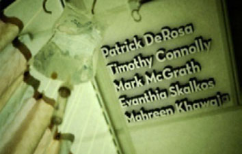
When the clients give you the credit list, request that it be as close to the final list as possible. In designing titles and end crawls, something that can easily be fixed in a word processing software package will set you back a while fixing it with design software such as After Effects and the Adobe Suite. Clients might not immediately understand this, so do your best to explain it, but they are going to send you fixes and adjustments to the credit list anyway, so try to avoid setting things up in a way that causes you problems if it needs to be fixed later.
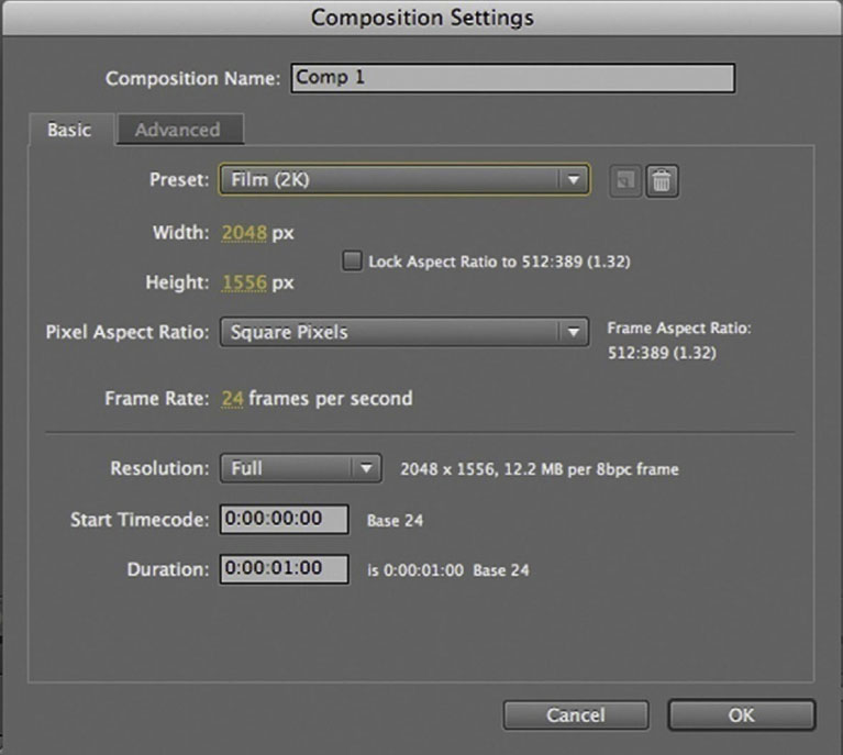
One thing that must decided early is what the title designer will be responsible for delivering. How long should it be? What format will match what the editor’s working on, and what format will the production need for the final presentation? Going back to the very beginning of this book, remember that if for some reason it is unavoidable that you have to use raster-based type, having to resize later will be a true chore. So, one recommendation is that if you are working with raster-based type, you should set up the original resolution to match the final output size or higher. If the type can remain vector in format, this is less of a concern since the size can be changed later without losing image quality.
In the early stages of production, the title designer should meet with and urge the director, producer, and editor to make a decision as to what the final output is going to be. Now, if that is determined to be a 2K or higher film format, the title designer might be best off working at a lower resolution until the final title sequence is approved and then generate the higher resolution version.
Typical Order of Credits in an Opening Title Sequence
Here is the typical credit order in an opening title sequence:
1. Name of the studio that is distributing the film.
2. Name of the production company responsible for making the film. If an investor financed a substantial portion of the movie, they will usually be credited alongside the production company with “In Association with.”
3. A (Producer’s Name) Production.
4. A Film by (Director’s Name).
5. Starring (this is optional or can be paired with the first cast member’s name), followed by the names of all principal actors.
6. Film title.
7. Featured cast members. A card that states “Featuring” used to be fairly commonplace but now appears to be falling out of fashion; in some cases, to speed up a title sequence, featured players are held off for the end crawl.
8. Casting by.
9. Music, composer, or original score.
10. Production designer.
11. At this point it can vary; you might see makeup, costume, or visual effects credits here or skip to the next few credits. At this point it should vary based on what is most important to the movie. If the movie’s a high budget sci-fi bonanza, it’s appropriate to credit the VFX team or supervising visual effects artist here; if it’s an historical epic, costume and makeup should probably get some notice here.
12. Edited by (the editor is the first of the people whose “thumbprint” is on the movie creatively; the other two are the writer and director).
13. Director of photography.
14. Producer, produced by, and executive producers. This is a sticky one. If there is one place in an opening movie title sequence where it is likely to change, it is here. Let’s say you are working on an independent feature that gets picked up by a larger distributer; that means you have more executive producers to add to the title sequence. Also, you may run into the need to add “Also Produced By.” Much of what this ends up being is controlled by the contracts of the various players involved at the studio, production company, and distributor.
15. Based on the (media name or title) by (Author’s Name). This is highly dependent on the project; if the movie is based on an existing work, this credit is necessary.
16. Story by. This credit is employed either when a script has gone through a number of changes or someone wrote a story that the film’s script is based on.
17. Writer or written by. The writing credits are highly regulated by the Writers Guild of America, so check to be sure that the credits are done correctly. A maximum of three writers can be credited on a feature, although teams of two can count as one if separated by an ampersand. However, if they worked on the script separately, they will be separated by the word and. Writers, like editors, are said to put their thumbprint on the movie.
18. Director or Directed by. The last credit belongs to the director, and the Directors Guild of America only allows one director to be credited as director on the film unless their was a death during production.
Timing/Deliverables
In the case of the sequence I made for Red Doors, a low-budget indie feature, the original plan was to finish at DV resolution. But as production progressed and the film was accepted into more festivals, an online HD version was needed and I had to up-res my titles. For the main title sequence, I had to move the animation into a larger document that matched the HD settings, but I had to render the titles by themselves without the background footage so that when the color-corrected final footage was ready, the titles could be placed over the footage.
Which leads to a concern about time. In 2005, I had been working on an older Mac G4 with a meager 2 GB of RAM. I believe I was running After Effects 7 at the time. Renders of the complete title sequence took about eight hours. Now, my little Macbook Pro with 4 GB of RAM and a dual 2.5 gHz Intel processor could run circles around that, but at the time it caused me to raise some concern. I warned my clients that any major changes that forced me to render the complete sequence again meant that we’d lose an entire business day waiting for the old Mac to putt-putt along.
Workflow for Building and Creating a Movie Title Sequence
As you can see throughout this book, a title sequence can be massive undertaking. In the following, final tutorial I will do my best to take you through the typical steps of creating a title sequence. These can vary greatly, but it should give you some sense of what this kind of project entails.
Tutorial: Building and Creating a Movie Title Sequence
1 Plan your concept or concepts. In the early stages of producing a title sequence, the title designer must settle on a plan or course of action. If it helps, and it most likely will, make a storyboard to explain your planned process as thoroughly as possible. If you happen to be brought in on the project early and it would be beneficial for you to have certain shots, see whether the production team is open to you suggesting certain shots during the shoot. If not, plan for things such as stock footage and photography to help you gather your elements. If the director has something specific in mind, listen to what he or she wants and do your best to meet and exceed those expectations. Sometimes they might present you with storyboards or a plan in mind; be open to it. Ultimately, no matter how good you get at this, the film’s director has final creative say on the movie (and let your director handle the battles with the studio).
2 Pitch your concept, with as much detail as possible. The real way to win people over to your idea is to present the idea as clearly as possible. You might need to generate a few tests or create an animatic to illustrate your idea. Creating something on your own to help someone envision your idea is never a waste of time; it’s called sales, and it is a common business tactic creative types should do more often. The slicker and more polished your pitch piece, the more impressed your clients will be.
3 If your concept is chosen or if you have been hired and handed a concept and things are going ahead, the next step is to settle on the technical issues. Technical planning is essential. Meet with the producer, director, and editor and settle on a schedule and formats for what will be delivered. Settle on how you will be interacting with the director. Is the director going to come to your workspace and supervise? In many cases that means that they get to watch lots of blue bars scrolling across screens. Many directors are hands-on and want to supervise the process, so it’s best to plan things out so that you have something to show the director. Often a director’s busy schedule won’t permit a visit to the title designer’s studio.
When you’re choosing the duration of your title sequence, ask the editor how long the title sequence should be. Set your timeline to be a little longer than that. Title sequences are typically somewhere between 3 and 7 minutes. The thing that you want to avoid is a overlong title sequence that bores the audience. Though it is an important title sequence in the history of filmmaking and to this day a favorite of mine, 1978’s Superman: The Movie’s title sequence goes on forever. To the point at which the soundtrack seems like it’s getting tired. Title sequences that lose narrative importance will start to wear on an audience.
If it becomes the case that you must show your progress via Web posts, be careful. Why? Well, there’s no better way to look like you don’t know what you are doing than to have the director ready to view and comment on your work but then discover he can’t play the video you’ve posted on your site for him. Here’s the real snag: There are many ways for videos to be unplayable in other formats. So, say you both are on Macs; you might not have all the same codecs, and that can be difficult to diagnose remotely. Do your best to find out whether your client is going to view the video on a Mac or a PC, what OS they are running—basically as much information as possible. Don’t get fancy and try an untested format you aren’t comfortable with. Also, if you know that the director or producer will be watching on a different format, try your piece on that format yourself. I have on many occasions taken videos to public PCs just so that I could make sure the files would work if the client happened to view them on a PC.
If I am able, I like to meet with the director personally, bring my laptop and present the material in the best possible light. Communication with clients via emails can lead to misunderstandings. I can’t tell you how many times a vague comment in an email set me on a course that led to major confusion.
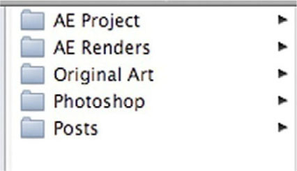
4 Project-manage your work. Project management can save you so much time. The best method I have found for project management is pictured here. Make five folders inside a main folder for your project. Use Original Art to store all provided elements from the client, so you have a path back to what you were given at the beginning of a project. When you have prepped your files, use the Save As feature to save them to your Photoshop folder. If a file will be imported into AE, you should save it to this Photoshop folder. Save your .aep After Effects project to the AE Project folder. Render all your output to the AE Renders folder, and after you encode a file to be posted online, save it in the Posts folder. Set up this folder system before you do any work on your project.
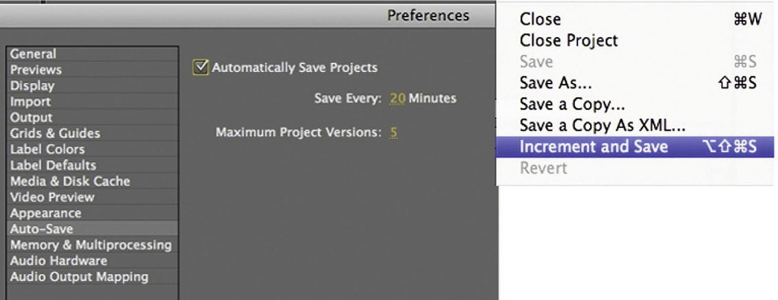
5 Protect your work. Two features that are sometimes overlooked can be absolute life-savers when it comes to protecting yourself and your work. These are AE’s Auto-Save and Increment and Save. Auto-Save can be found in the Preferences; it has its own heading, and all you have to do is turn it on, choose a time period for Auto-Save to kick in, and choose the max versions of the same project you want. So, the default is 20 minutes, but that might be too long (with powerful software like AE, you can change the world in 20 minutes), while 2 minutes will probably get on your nerves and interrupt your workflow. I usually use somewhere between 4 and 8 minutes.
Increment and Save will do a Save As for you and add a number to the end of the filename. I like to do this every time I begin a project in which I’ll be making changes from the last version. Often I will do this at the beginning of each day on job (so, if the client wants to go back to where we were two days ago, I can call that version back up in no time). Get into the habit of using these two features; lost work can cost you entire days’ worth of time.
6 Decide on the basic movement of every title. As we have seen earlier, we are going to want the same basic movements on every title, so the hardest one is the first one. Experiment with movements and animation and decide which is the best, and use this one as a template for every title that will follow. If your client wants to have creative say at this point, bring them in, but this is a very early stage, and some clients who aren’t familiar with this process might not want to come in and discuss type animation and fonts with you at this point, so use some discretion here. When we’ve settled on the style of animation we want, we will duplicate from this one for every other title.
Another helpful decision at this stage is to trim your title to the length you need it. If your trim points are hard to read, you can use Shift-Command-D to split a layer.

7 Finish the bed. The bed is the background. That might be animation, footage, photos, or many different things. If it might change, don’t render it out; use Pre-Compose. When I worked on Red Doors the editor provided me with an edited sequence over which the titles would be superimposed. Now, the footage that was in my AE timeline was never going to be in the final film, it was only there for me to get my timing.

8 Get approved, and complete the sequence. In this world, the job is over when the client is happy, not when the deadline arrives. Meet your deadlines, of course, but remember that there will be back and forth between you and the client side, with changes being made often in that period. Typically the director will back off once she is happy with the creative aspects of your work, and then the producer will take a more active role in making sure everyone is happy with their credits and that everything looks right. I know that sounds strange but the cast and crew are concerned about how long their names are up on-screen during the title sequence, so do your best to give the audience time to read everything and give every important team member their due. Names can be tough since spellcheck doesn’t exactly work with names, so check with someone on the production side that everything is correctly spelled and displayed.
9 Done-Render to client spec. Keep in mind that the title sequence will have to work with other ongoing aspects of production. Keep in close contact with the producer and the editor as to exactly what they need from you to complete the film.
Rendering Your Title Sequence
There are two main editors who work on a film. The offline editor is one you’re most likely familiar with; this editor is responsible for the creative decision making for the film’s final cut. The online editor is responsible for assembling the final footage, color-corrected and perfected to match the final editing decisions made by the offline editor.
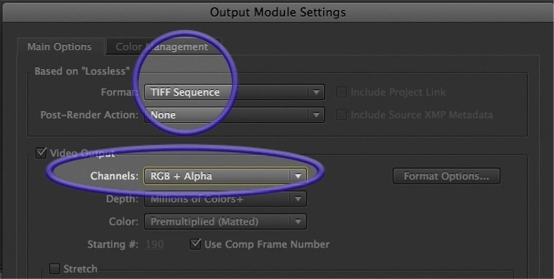
If the title designer is having her title graphics superimposed over footage from the film, she does her work leaving areas of the screen largely blank, with the exception of the title animation. She will most likely be creating titles with an alpha channel so that the titles could be placed over the final footage on software being used to complete the online edit.
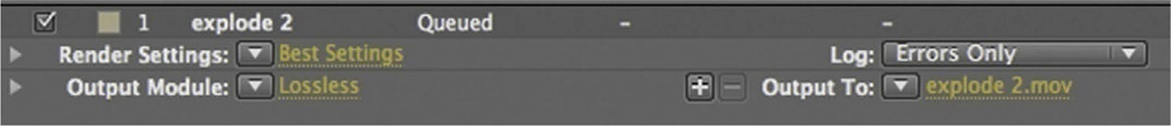
This will mean rendering with a format set to some kind of high-resolution image sequence. This can be with TIFFs or Targas or other image sequence style formats. When rendering out to image sequences, make sure that you do it to a folder, because you will be creating hundreds of files. An image sequence literally means one file per frame. At 24–30 frames per second, a 5-minute title sequence is around 1,800 files!
In After Effects, you’ll find these settings in the Output Module Settings.
Figure 10.1
Case Study: Title Sequences by Ex’pression Graduates
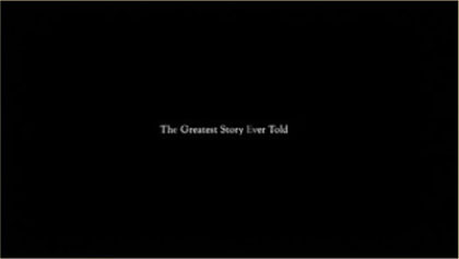
• Title: The Greatest Story Ever Told
• Genre: Drama
• Title Designer: Justin Betham
• Title Sequence: http://vimeo.com/7929995
• Portfolio: www.justinbetham.com
Synopsis of Movie
The film is about a man struggling with schizophrenia and his ability to adapt his disorder into his daily regime. His home has a basement where he converses to inanimate objects, reasons with them, and also manages to receive advice from them about his daily life.
Description
The camera moves slowly into the pieced-otogether world, traveling through the front door of a dark house, down a lonely hallway, passing by spinning swirls that complement the feeling of confusion and chaos.
We travel down a spiral stairway and end in the basement, where a paper puppet resembling the main character is hung from the ceiling in a room filled with spirals spinning in the background. I chose to portray him as a puppet for his lack of control over changes in his personality. As the camera arrives at the puppet, the screen fades to black and a reveal of the title of the film fades in. After the title fades out, it transitions into the actual basement, where the film begins and where most of the film takes place.
The end title sequence starts exactly where the beginning titles finish, and the camera reverses out of the “handmade,” isolated world. At the end of the film, the main character encounters a failed attempt to interact with a person from the outside world (a girl he met on a dating Web site). He ends up in the basement and experiences a mental breakdown. The film fades out and the camera reverses out of the room, away from the puppet, back out the stairway, and all the way out of the house.
Creative Justification
The title sequence was built to look like a fake, handmade set pieced together with a combination of heavy, thick paper and tape to resemble the main character’s pieced-together thoughts.
As far as colors, I utilized a desaturated, minimal color palette. The mix of blue and gray hues give a cold, dark feeling of a calm emptiness. The choice of lack of color resembles the emptiness the main character feels. The lack of saturation also resembles his feelings of loneliness and confusion from his long hours spent in his basement.
The choice of typeface is Goudy Old Style. This typeface is a mix of gently curved, rounded serifs and hard diamond-shaped dots in the i and j. The mix of rounded curves and harsh diamond edges resembles the main character’s mix of personalities. In the film, his mood shifts from being polite, level-headed, and pleasant to suddenly being overwhelmed with sadness, frustration, loneliness, and confusion.
Software and Techniques
The scene was created and rendered in Cinema 4D and assembled in After Effects, where typography, color adjustments, and music were applied.
Music: Hajnal (dawn), by Venetian Snares.
Figure 10.2a Still Frames from “Greatest Story Ever Told”, designed by Justin Betham.
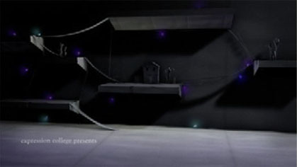
Figure 10.2b
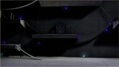
Figure 10.2c
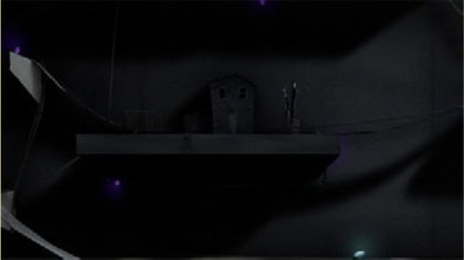
Figure 10.2d
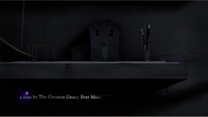
Figure 10.2e
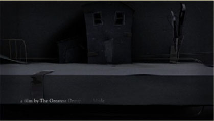
Figure 10.2f
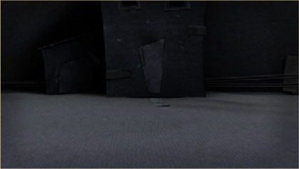
Figure 10.2g

Figure 10.2h

Figure 10.2i
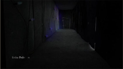
Figure 10.2j
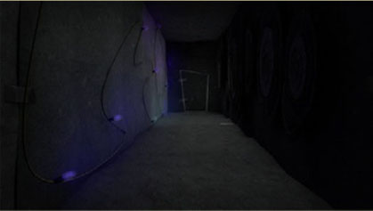
Figure 10.2k
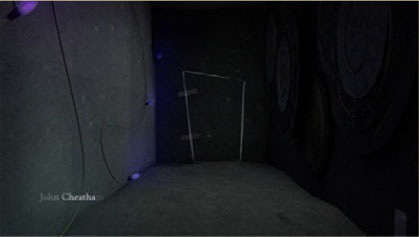
Figure 10.2l
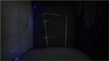
Figure 10.2m
Figure 10.2n

Figure 10.2o

Figure 10.2p

Figure 10.2q
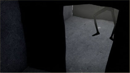
Figure 10.2r
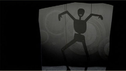
Figure 10.2s
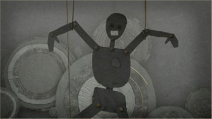
Figure 10.2t
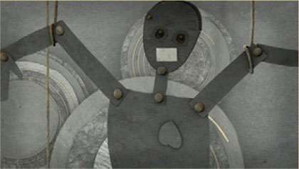
Figure 10.2u
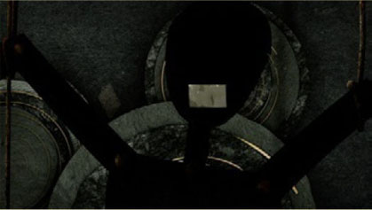
Figure 10.2v
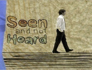
• Title: Seen and Not Heard
• Genre: Drama/Dark Comedy
• Title Designer: Ame Garrucho
Synopsis of Movie
A deaf man surrounds himself with a world of imaginary sounds. He later decides to get a cochlear implant to really hear the world. Now, being able to hear, the man is not sure if that’s what he really wants.
Description
All of the credits are handwritten and jittery to add to the organic/handmade feel of the textures in the background and masking tape borders. The credits also animate on in American Sign Language, to incorporate the theme of deafness from the film. Since the film did not have any background story behind the main character, the title sequence was meant to show a little bit of his life.
The entire sequence is based on the main character’s daily routine before he goes to work in the first scene, but with a twist. There are imaginary sounds that the man creates in his mind throughout the piece as he proceeds with his routine of getting out of bed, walking to the restroom, washing his hands, putting his clothes on, etc. All the sounds don’t match exactly with the objects, to show what the man “thinks” he is hearing.
Creative Justification
The title sequence is inspired by Shadowplay Studio’s Juno title sequence. The look and feel were developed to incorporate the unusual sound effects with organic images. Since the sounds are jarring, the visuals needed to match that and give off the same feeling. A stop-motion and handmade feel seemed to be a good way to merge the two together.
Software and Techniques
Green Screen Production, Final Cut Pro 7, Adobe Illustrator, Adobe Photoshop, and After Effects.
Technical Challenges
Creating a jarring sound design with found sounds and handwriting credits several times to create a loop.
Figure 10.3a Still Frames from “Seen and Not Heard”, designed by Ame Garrucho.
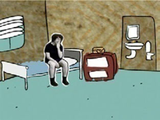
Figure 10.3b
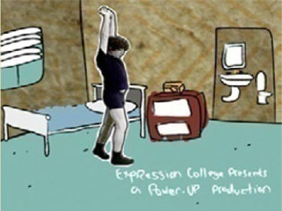
Figure 10.3c
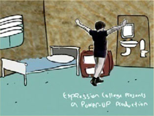
Figure 10.3d
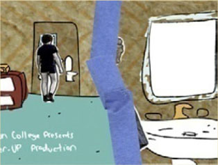
Figure 10.3e
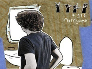
Figure 10.3f
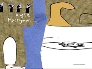
Figure 10.3g
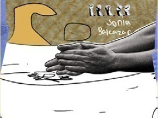
Figure 10.3h
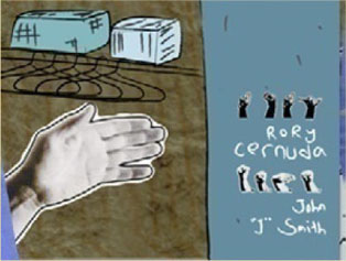
Figure 10.3i
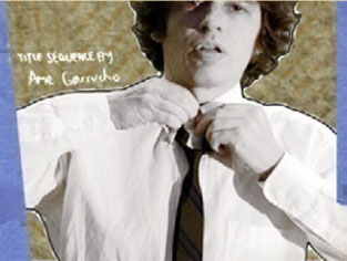
Figure 10.3j
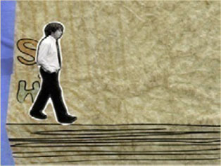
Figure 10.3k
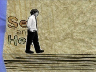
Figure 10.3l
• Title: The Better Angels
• Genre: Drama
• Title Designer: Tina Chen
• Title Sequence: http://vimeo.com/1202760
• Portfolio: www.tina-chen.com
Synopsis of Movie
A retired history professor escapes from his son’s home carrying a .38 revolver and the unflinching belief that he is Abraham Lincoln. He roams through parks and encounters various people along the way. It turns out that he is suffering from Alzheimer’s disease and dementia.
Description
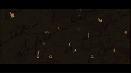
Main titles: The background is a historic letter written by Abraham Lincoln that slowly moves across the screen. The production company name fades in and out, followed by the name of the film and a single falling leaf. As the leaf falls, the letters of the title fall with it.
End titles: The background is a historic letter written by Abraham Lincoln that slowly moves across the screen. Groups of leaves blow on screen from the left and continue to move across the screen, then blow off screen to the right. The cast names fade in and blow off screen with the leaves. The leaves stop blowing as the crew names fade in and out.
Creative Justification
On one side, the historic letter gives depth and texture to the background while still having some relation to the film’s storyline. On the other, falling leaves were used to represent the ephemeral nature of life and to tie the titles to the main setting of the film; the majority of the film takes place in park settings. Using the leaves without any photos or footage gives the audience a feeling of fantasy or an altered reality. The slow falling movement of the leaves and the minimal colors of browns, reds, and golds represent the somber, dramatic pace of the film.
Software and Techniques
Adobe Illustrator, Photoshop, After Effects, Maxon Cinema 4D.
Technical Challenges
Creating a realistic falling movement for the leaves.
Figure 10.4a Still Frames from “The Better Angels”, designed by Tina Chen.
Figure 10.4b
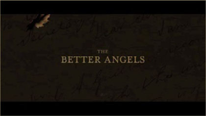
Figure 10.4c
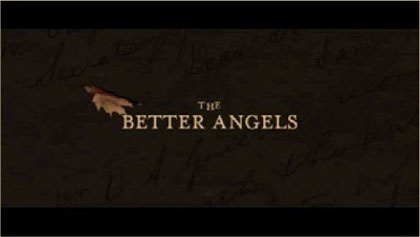
Figure 10.4d
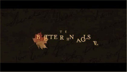
Figure 10.4e
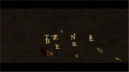
Figure 10.4f
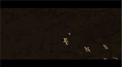
Figure 10.42g
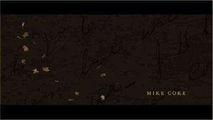
Figure 10.4h

Figure 10.4i
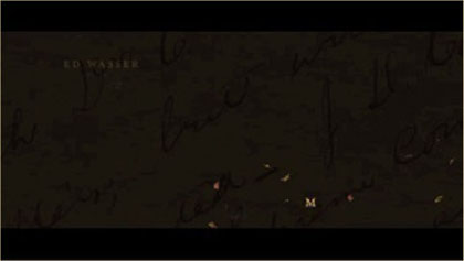
Figure 10.4j
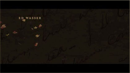
Figure 10.4k
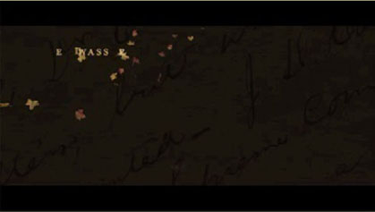
Figure 10.4l

Figure 10.4m

Figure 10.4n

Figure 10.4o
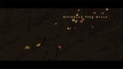
Figure 10.4p
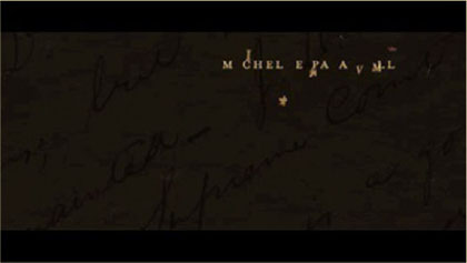
Figure 10.4q

Figure 10.4r
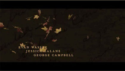
Figure 10.4s
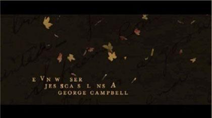
Figure 10.4t
• Title: Number 24
• Genre: Suspenseful Drama/Horror
• Title Designer: Iris Azadi
• Title Sequence: http://irisazadi.com/number.html
• Portfolio: www.IrisAzadi.com
Synopsis of Movie
A serial killer, who claims the charms and keepsakes of his victims, is about to take his 24th woman when the tables are turned.
Description
The style of the title design was minimal but detail oriented. I left much of the screen’s real estate empty but used textures and subtle blemishes to set the mood. The font choice was Baskerville Old Face, a strong serif font with character. The color palette overall was muted and desaturated, giving the titles a drowned and dark feeling (without being a typical horror movie title sequence).
Creative Justification
The objective was to set the tone and mood of the movie without giving away its plot. I used information that is implied in the movie but never shown, using it to tell a backstory. By using ambiguous items, such as the silver and gold chain, Polaroids, and news clippings, I set up the beginning of the movie as though these items belonged to the 23 other women who were not shown in the movie. The end title credits are very similar to the opening titles except they are now covered in drops of blood. I did this only in the end, to keep the ambiguous tone in the opening titles.
Software and Techniques
C4D, AE, Video.
Music
IX, by Gregg Kowalsky; stock photo of woman, by razee81.
Figure 10.5a Still Frames from “Number 24”, designed by Iris Azad.

Figure 10.5b
Figure 10.5c

Figure 10.5d

Figure 10.5e
Figure 10.5f
Figure 10.5g

Figure 10.5h
Figure 10.5i

Figure 10.5j

Figure 10.5k

Figure 10.5l

Synopsis of Movie
A retired history professor wanders into a public park with a pistol, all the while believing that he is Abraham Lincoln.
Creative Description/Treatment
Initially, I had incorporated other elements into the titles to foreshadow the main character’s belief that he is Abraham Lincoln, but I decided on a more simple and ambiguous approach.
In this final version, a shattered clock represents the main character’s fragmented perception of reality and failing memory. The gears and letterforms are scattered throughout an empty space, and as the camera slowly pushes in, the letterforms tumble into place and pass by and out of the shallow depth of field. The use of a sepia color palette and serif font reflects the historical aspect of the film as well as a solo piano piece to help set the dramatic tone.
Software and Techniques
Cinema 4D, After Effects, and Photoshop.
Figure 10.6a Still Frames from “The Better Angels”, designed by Conrad McLeod.

Figure 10.6b
Figure 10.6d
Figure 10.6c

Figure 10.6e
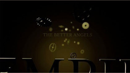
Figure 10.6f

Figure 10.6g

Figure 10.6h
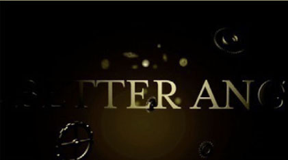
Figure 10.6i
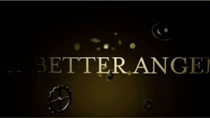
Figure 10.6j
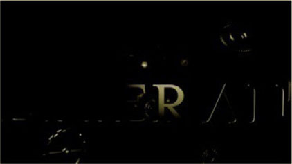
Figure 10.6k
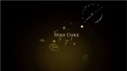
Figure 10.6l
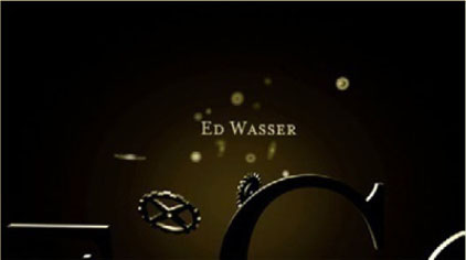
Figure 10.6m
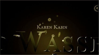
Figure 10.6n

Figure 10.6o
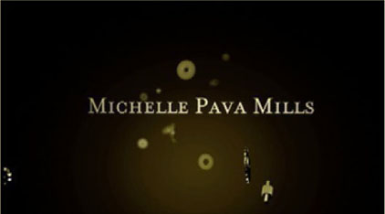
Figure 10.6p
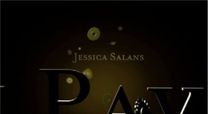
Figure 10.6q
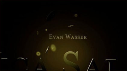
Figure 10.6r

Figure 10.6s
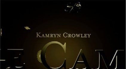
Figure 10.6t

Title: A Father’s Will
Genre: Drama
Title Designer: Nathaniel Costa; additional help in the live action shoot: Nicholas Buford
Portfolio Web site: www.nathanielcosta.com
Synopsis of Movie
Richard, a soon-to-be father struggling with a fatal case of cancer, begins an experimental treatment, keeping him in a suspended state of hibernation, and awakens unaged 70 years into the future.
Description
The title sequences for this film are meant to simulate the main character’s experience of his experimental medical treatment from a first-person point of view.
Creative Justification
The title sequence for A Father’s Will explores undefined aspects of the plot, making the titles an essential part of the storytelling process.
Software and Techniques
AE, C4D, Live Action, Still Pictures.
Figure 10.7a Still Frames from “A Father’s Will”, designed by Nathaniel Costa.

Figure 10.7b

Figure 10.7c

Figure 10.7d

Figure 10.7e
Figure 10.7f
Figure 10.7g
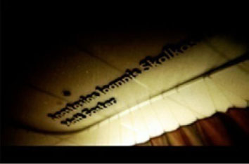
Figure 10.7h
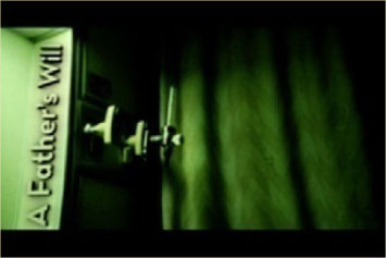
Figure 10.7i
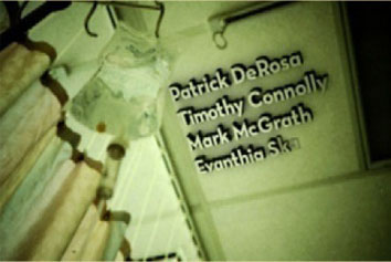
Figure 10.7j
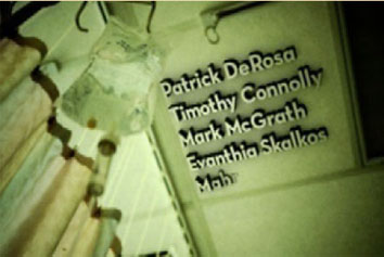
Figure 10.7k

Figure 10.7l
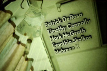
Figure 10.7m
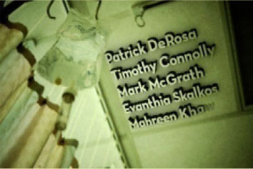
Figure 10.7n