
Chapter 31
Case Study, Part 3: Modeling And Evaluation For Performance And Interpretability
31.1 Do You Prefer The Best Model Performance, Or A Combination Of Performance And Interpretability?
This chapter and Chapter 32 address our primary objective with the Case Study of Predicting Response to Direct-Mail Marketing: that of developing a classification model that will maximize profits. However, recall that multicollinearity among the predictors can lead to instability in certain models, such as multiple regression or logistic regression. Unstable models lack interpretability, because we cannot know with confidence, for example, that a particular logistic regression coefficient is positive or negative. The use of correlated predictors for decision trees is problematic as well. For example, imagine a decision tree applied to a data set with correlated predictors ![]() and
and ![]() . Suppose the root node split is made on the uncorrelated variable
. Suppose the root node split is made on the uncorrelated variable ![]() . Then the left side of the tree may make splits based on
. Then the left side of the tree may make splits based on ![]() , while the right side of the tree makes splits based on
, while the right side of the tree makes splits based on ![]() . Decision rules based on this tree will not capture the similarity of
. Decision rules based on this tree will not capture the similarity of ![]() and
and ![]() . Thus, we need to be wary of using correlated variables for classification.
. Thus, we need to be wary of using correlated variables for classification.
As we have seen, the remedy for multicollinearity is to apply principal components analysis (PCA) to the set of correlated predictors. This solves the multicollinearity problem, but, as we shall see, somewhat degrades the performance of the classification model. The principal components capture less than 100% of the variability in the predictors, which represent a net loss of information. Therefore, the principal components usually do not perform as well at classification when compared to the original set of predictors. And, crucially, multicollinearity does not significantly affect point estimates of the target variable.
Thus, the analyst, together with the client, must consider the following question:
“Are we looking for the best possible classification performance, such as the maximum profit for our classification model, with no interest at all in interpreting any aspects of the model, or, are we looking for a model with somewhat reduced performance but retaining complete interpretability?”
- If the primary objective of the business or research problem pertains solely to classification, with no interest in the interpretability of the model characteristics (e.g., coefficients), then substitution of the principal components for the collection of correlated predictors is not strictly required. In fact, these models usually outperform analogous PCA-based models. We investigate these types of classification models in Chapter 32.
- However, if the primary (or secondary) objective of the analysis is to assess or interpret the effect of the individual predictors on the response, or to develop a profile of likely responders based on their predictor characteristics, then substitution of the principal components for the collection of correlated predictors is strongly recommended. We examine these types of classification models here in this chapter.
31.2 Modeling And Evaluation Overview
An overview of our modeling and evaluation strategy for this chapter and Chapter 32 is given by the following:
Because our strategy calls for applying many models that need to be evaluated and compared, we hence move fluidly back and forth between the modeling phase and the evaluation phase.
31.3 Cost-Benefit Analysis Using Data-Driven Costs
We use the methods learned in Chapter 16 to derive our cost matrix. We are trying to predict whether or not our customers will respond to the direct-mail promotion. Now, supposing they do respond, how much can we expect them to spend? A reasonable estimate would be the average amount spent per visit for all 28,799 customers, which is $113.59 (Figure 31.1). (The median is another reasonable estimate, which we do not use in this Case Study. By the way, why is the mean larger than the median? Hint: Check out the maximum: Imagine spending an average of $1919.88 per visit to a clothing store.) Assume that 25% of this $113.59, or $28.40, represents the mean profit. Recall that this equals a “cost” of –$28.40. Also, assume that the cost of the mailing is $2.00.
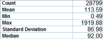
Figure 31.1 Summary statistics for Average amount spent per visit.
Finally, we review the meaning of the cells of our contingency table, given in Table 31.1.
- TN = True negative. This represents a customer who we predicted would not respond, and would not in fact have responded.
- TP = True positive. This represents a customer who we predicted would respond, and would in fact have responded to the promotion.
- FN = False negative. This represents a customer who we predicted would not respond, but would in fact have responded to the promotion.
- FP = False positive. This represents a customer who we predicted would respond, but would not in fact have responded.
Table 31.1 Generic contingency table for direct-mail response classification problem
| Predicted Category | |||
| Actual category | |||
Non-response |
TN = Count of true negatives |
FP = Count of false positives |
|
Positive response |
FN = Count of false negatives |
TP = Count of true positives |
|
We are now ready to calculate our costs.
31.3.1 Calculating Direct Costs
- True negative. We did not contact this customer, and so did not incur the $2.00 mailing cost. Thus, the cost for this customer is $0.00.
- True positive. We did contact this customer, and so incurred the $2.00 mailing cost. Further, this customer would have responded positively to the promotion, providing us with an average profit of $28.40. Thus, the cost for this customer is $2.00–$28.40 = −$26.40.
- False negative. We did not contact this customer, and so did not incur the $2.00 mailing cost. Thus, the cost for this customer is $0.00.
- False positive. We did contact this customer, and so incurred the $2.00 mailing cost. But the customer lined his parakeet cage with our flyer and would not have responded to our promotion. Thus, the direct cost for this customer is $2.00.
These costs are summarized in the cost matrix in Table 31.2. Note that the costs are completely data-driven.
Table 31.2 Data-driven cost matrix for the Case Study
| Predicted Category | |||
| Actual category | |||
Software packages such as IBM/SPSS Modeler require the cost matrix to be in a form where there are zero costs for the correct decisions. Thus, we subtract ![]() from each cell in the bottom row, giving us the adjusted cost matrix in Table 31.3.
from each cell in the bottom row, giving us the adjusted cost matrix in Table 31.3.
Table 31.3 Adjusted cost matrix
| Predicted Category | |||
| Actual category | |||
For interpretability, it is advisable now to divide each of the remaining nonzero adjusted costs by one of the remaining nonzero adjusted costs, so that one of the nonzero adjusted costs equals 1. This is so that the analyst may explain to managers or clients the relative cost of each classification error. For example, suppose we divide ![]() and
and ![]() each by
each by ![]() . This gives us
. This gives us ![]() and
and ![]() . Thus, we may say that the cost of not contacting a customer who would actually have responded is 13.2 times greater than the cost of contacting a customer who would not actually have responded.
. Thus, we may say that the cost of not contacting a customer who would actually have responded is 13.2 times greater than the cost of contacting a customer who would not actually have responded.
For decision purposes, Table 31.3 is equivalent to Table 31.2. That is, either cost matrix will yield the same decisions. However, Table 31.3 will not provide accurate estimates of the overall model cost when evaluating the classification models. Use Table 31.2 for this purpose.
31.4 Variables to be Input To The Models
The analyst should always provide the client or end-user with a comprehensive listing of the inputs to the models. These inputs should include derived variables, transformed variables, or raw variables, as well as principal components and cluster membership, where appropriate. Figure 31.2 contains a listing of all the variables input to the classification models analyzed in this section (performance and interpretability) of the Case Study.
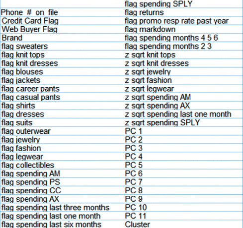
Figure 31.2 Input variables for classification models (performance and interpretability section).
Note that all of the continuous variables have been both transformed and standardized, that many flag variables have been derived. In fact, only a handful of variables remain untouched by the data preparation phase, including the flag variables Web Buyer and Credit Card Holder.
31.5 Establishing The Baseline Model Performance
How will we know when our models are performing well? Is 80% classification accuracy good enough? 90%? 95%? In order to be able to calibrate the performance of our candidate models, we need to establish benchmarks against which these models can be compared. These benchmarks often come in the form of baseline model performance for some simple models. Two of these simple models are as follows:
- The “Don't send a marketing promotion to anyone” model.
- The “Send a marketing promotion to everyone” model.
Clearly, the company does not need to employ data miners to use either of these two models. Therefore, if the performance of the models reported by the data miner, after arduous analysis, is lower than the performance of either of the above baseline models, then the data miner better try again. In other words, the models reported by the data miner absolutely need to outperform these baseline models, hopefully, by a margin large enough to justify the project.
From Figure 31.3, we see that there are 6027 customers in the test data set who do not respond to the promotion, and 1161 who do respond. The contingency/costs table (adapted from Table 31.2) for the “Don't send to anyone” model is shown in Table 31.4.
- The final model cost for the “Don't send to anyone” model is of course $0.
- The per-customer cost is $0.

Figure 31.3 Distribution of Response for the test data set.
Table 31.4 Contingency/costs table for the “Don't send to anyone” model
| Predicted Category | |||
| Actual category | |||
So, we would not make any money by not sending a promotion to anyone, which is no surprise. Next, the contingency/costs table for the “Send to everyone” model is shown in Table 31.5.
- The final model cost for the “Send to everyone” model is
 .
. - The per-customer cost is
 , where we recall that negative cost equals gain.
Table 31.5 Contingency/costs table for the “Send to everyone” model
| Predicted Category | |||
| Actual category | |||
So, we would gain an average of $2.59 per customer by sending a promotion to everyone. The revenue from the minority of customers responding would outweigh the mailing costs of sending to everyone.
Now, consider had we ignored misclassification costs, and chosen the model with the highest accuracy. The overall accuracy of the “Don't send to anyone” model is 6027/7188 = 0.8385, which is much higher than the overall accuracy of the “Send to everyone” model, which is 1161/7188 = 0.1615. Thus, had we erroneously ignored the misclassification costs, we would have chosen the “Don't send to anyone” model, based on higher accuracy. This egregious error would have cost our company tens of thousands of dollars. We know better. The “Don't send to anyone” model must be considered a complete failure, and shall no longer be discussed. However, the “Send to everyone” model is actually making money for the company. Therefore, it is this “Send to everyone” model that we shall define as our baseline model, and the profit of $2.59 per customer is defined as the benchmark profit that any candidate model should outperform.
31.6 Models That Use Misclassification Costs
Misclassification costs may explicitly be specified using Modeler's CART and C5.0 decision tree models, but may not using neural networks and logistic regression. So, at this point, we perform classification using the two algorithms where we can specify our misclassification costs: CART and C5.0. A CART model was trained on the training data set, and evaluated on the test data set. The contingency/costs table for the CART model is shown in Table 31.6, where the misclassification costs for the CART model were specified as $1 for false positive, and $13.20 for false negative.
- Total cost for the CART model is
 .
. - Per-customer cost for the CART model is
 .
.
Table 31.6 Contingency/costs table for the CART model with misclassification costs
| Predicted Category | |||
| Actual category | |||
So, the CART model beats the “Send to everyone” model by ![]() per customer.
per customer.
Next, a C5.0 decision tree model was run, with the misclassification costs given as $1 for false positive, and $13.20 for false negative. A C5.0 model was trained on the training set and evaluated on the test set. The contingency/costs table for the C5.0 model is shown in Table 31.7.
- Total cost for the C5.0 model is
 .
. - Per-customer cost for the C5.0 model is
 .
.
Table 31.7 Contingency/costs table for the C5.0 model with misclassification costs
| Predicted Category | |||
| Actual category | |||
So, the C5.0 did even better than the CART model, beating the “Send to everyone” model by ![]() per customer.
per customer.
31.7 Models That Need Rebalancing as a Surrogate for Misclassification Costs
In Chapter 16, we learned how to apply rebalancing as a surrogate for misclassification costs, where such costs cannot be expressly specified by the algorithm. In our Case Study, ![]() , so that we multiply the number of records with positive responses in the training data by b, before applying the classification algorithm, where b is the resampling ratio,
, so that we multiply the number of records with positive responses in the training data by b, before applying the classification algorithm, where b is the resampling ratio, ![]() . We therefore multiply the number of records with positive responses (Response = 1) in the training data set by 13.2. This is accomplished by resampling the records with positive responses with replacement.
. We therefore multiply the number of records with positive responses (Response = 1) in the training data set by 13.2. This is accomplished by resampling the records with positive responses with replacement.
A neural network model was trained on the rebalanced training data set, and evaluated on the test data set, with the contingency/costs table shown in Table 31.8.
- Total cost for the neural network model is
 .
. - Per-customer cost for the neural network model is
 .
.
Table 31.8 Contingency/costs table for the neural network model applied to the rebalanced data set
| Predicted Category | |||
| Actual category | |||
So, the neural network model did better than the CART model, but not as well as the C5.0 model, and beat the “Send to everyone” model by ![]() per customer.
per customer.
Finally, a logistic regression model was trained on the rebalanced training data set, and evaluated on the test data set, with the contingency/costs table shown in Table 31.9.
- Total cost for the logistic regression model is
 .
. - Per-customer cost for the logistic regression model is
 .
.
Table 31.9 Contingency/costs table for the logistic regression model applied to the rebalanced data set
| Predicted Category | |||
| Actual category | |||
So, the logistic regression model did better than the CART model, but not as well as the C5.0 model or the neural network model, and beat the “Send to everyone” model by ![]() per customer.
per customer.
31.8 Combining Models Using Voting and Propensity Averaging
Again, we combine models using model voting and propensity averaging. These methods were applied here, with mixed success. The single sufficient voting model predicts positive response if any of our four classification models (CART, C5.0, neural networks, logistic regression) predicts positive response. Similarly, twofold sufficient, threefold sufficient, and positive unanimity models were developed. The results are provided in Table 31.10. The threefold sufficient model performed best among the voting models, but still did not outperform the C5.0 singleton model.
Table 31.10 Results from combining models using voting and propensity averaging (best performance in bold)
| Model | Total Model Profit | Profit per Customer |
| “Send to All” model | $18,596.40 | $2.59 |
| CART model | ||
| C5.0 model | ||
| Neural network | ||
| Logistic regression | ||
| Single sufficient | $21,408.40 | $2.98 |
| Twofold sufficient | $22,411.60 | $3.12 |
| Threefold sufficient | $22,555.20 | $3.14 |
| Positive unanimity | $21,322.80 | $2.97 |
| Mean propensity 0.356 | $22,553.60 | $3.14 |
| Mean propensity 0.357 | $22,573.60 | $3.14 |
| Mean propensity 0.358 | $22,508.40 | $3.13 |
For clarity, profit rather than cost is listed, where profit = –cost. For completeness, the results from the singleton models are included as well.
Propensity averaging was also applied, with similar results. The propensities of positive response for the four classification models were averaged, and a histogram of the resulting mean propensity is shown in Figure 31.4. The analyst should try to determine a cutoff value where there are a high proportion of positive responses to the right, and a high proportion of negative responses to the left. It turns out that the optimal1 cutoff was found to be mean propensity = 0.357, as shown in Table 31.10. This model predicts a positive response if the mean propensity to respond positively among the four models is 0.357 or greater. This model did well, but again did not outperform the original C5.0 model.

Figure 31.4 Mean propensity, with response overlay.
The reader is invited to try further model enhancements, if desired, such as the use of segmentation modeling, and boosting and bagging.
31.9 Interpreting The Most Profitable Model
Recall that in this chapter, we are interested in both model performance and model interpretability. It is time to explain and interpret our most profitable model, the original C5.0 decision tree. Figure 31.5 contains the C5.0 decision tree, which is to read from left to right, with the root node split on the left.

Figure 31.5 Our most profitable model, among the models chosen for performance and interpretability: the C5.0 decision tree.
Our root node split is on the clusters that we uncovered in Chapter 30. Recall that Cluster 1 contains Casual Shoppers, while Cluster 2 consists of Faithful Customers. We found that the Faithful Customers had a response proportion more than four times higher than the Casual Shoppers, so it is not surprising that our classification decision tree has found the clusters to have good discriminatory power between responders and non-responders. This is reflected in the decision tree: for Cluster 1, the mode is 0 (response = 0), while for Cluster 2, the mode is 1. As you look at Figure 31.5, keep in mind that all the nodes and information in the top half of the graph pertain to the Casual Shoppers, while all the nodes and information in the bottom half pertain to the Faithful Customers. The “+” symbols shown at certain splits indicate that there are further splits in the decision tree. But we did not have enough space to render the full decision tree on the page.
Let us begin by discussing the Casual Shoppers. The next split is on principal component 7, Blouses versus Sweaters, with the tiny minority of 101 casual shoppers who have bought lots of (PC 7 > 2.76) blouses (but not sweaters) being predicted not to respond. The next split is something to take note of: among the casual shoppers, web buyers are predicted to respond positively. Even though only 23.7% of these customers are actual responders, the 13.2 – 1 misclassification cost ratio makes it easier for the model to predict these customers as responders, rather than suffer the severe false negative cost. However, there are only a small number of these (211). Continuing with the vast majority of casual shoppers, we find the next split is on principal component 1, Sales Volume and Frequency. Note that this is the first split to partition off more than a couple of hundred records. This is because the first principal component is very large and quite predictive of response, as we saw in Chapter 30. In fact, PC 1 is the first split for our faithful customers. Unsurprisingly, the 4214 casual shoppers who have very low values for PC 1 ![]() have a mode of non-response, while the remaining 8125 casual shoppers have a mode of positive response. For those with low values of PC 1, the next important split is on PC 2, Promotion Proclivity, where, unsurprisingly, the 802 casual shoppers who have very high values for PC 2 have a mode of positive response, while the remaining casual shoppers have a mode of non-response. For those with medium and high values of PC 1 (PC 1 > −0.89), the next split is again on PC 1, fine-tuning the remaining records. For the 7734 records that have PC values between −0.89 and 0.68, the next split is on PC 2, where high values have a mode of response and medium and low values have a mode of non-response.
have a mode of non-response, while the remaining 8125 casual shoppers have a mode of positive response. For those with low values of PC 1, the next important split is on PC 2, Promotion Proclivity, where, unsurprisingly, the 802 casual shoppers who have very high values for PC 2 have a mode of positive response, while the remaining casual shoppers have a mode of non-response. For those with medium and high values of PC 1 (PC 1 > −0.89), the next split is again on PC 1, fine-tuning the remaining records. For the 7734 records that have PC values between −0.89 and 0.68, the next split is on PC 2, where high values have a mode of response and medium and low values have a mode of non-response.
Next, we turn to our Faithful Customers. The first split is on PC 1, Sales Volume and Frequency, with high values predicted to respond positively without further splits. Note the simplicity of this result: In this complicated data set, all we need to know to predict that a customer will respond positively is (i) that he or she belongs to the Faithful Customers cluster, and (ii) that he or she has high Sales Volume and Frequency. This is a result that is simple, powerful, and crystal clear. Continuing, we find that the next split is also on PC 1, underscoring the importance of this large principal component. For faithful customers with PC 1 values of 0.26 or less, the next split is for web buyer, where only 69 positively responding records are split off. Next comes the markdown flag; that is, whether a customer bought an item that was marked down. But this split only partitions off 29 records. The next split is on principal component 5, Spending versus Returns. There are further splits here that would give us information on these 2017 records, but there was not enough room to show the splits here. For those with PC 1 values between 0.26 and 1.11, the next split is on web buyer, which, for the 239 web buyers, predicts positive response. Next comes principal component 5, Spending versus Returns: for low values, the prediction is positive response. For medium and high values of PC 5, there is a further split on PC 2, Promotion Proclivity.
In Chapter 32, we consider models that sacrifice interpretability for better performance.