
Chapter 2
Data Preprocessing
Chapter 1 introduced us to data mining, and the cross-industry standard process for data mining (CRISP-DM) standard process for data mining model development. In phase 1 of the data mining process, business understanding or research understanding, businesses and researchers first enunciate project objectives, then translate these objectives into the formulation of a data mining problem definition, and finally prepare a preliminary strategy for achieving these objectives.
Here in this chapter, we examine the next two phases of the CRISP-DM standard process, data understanding and data preparation. We will show how to evaluate the quality of the data, clean the raw data, deal with missing data, and perform transformations on certain variables. All of Chapter 3 is devoted to this very important aspect of the data understanding phase. The heart of any data mining project is the modeling phase, which we begin examining in Chapter 7.
2.1 Why do We Need to Preprocess the Data?
Much of the raw data contained in databases is unpreprocessed, incomplete, and noisy. For example, the databases may contain
- fields that are obsolete or redundant;
- missing values;
- outliers;
- data in a form not suitable for the data mining models;
- values not consistent with policy or common sense.
In order to be useful for data mining purposes, the databases need to undergo preprocessing, in the form of data cleaning and data transformation. Data mining often deals with data that has not been looked at for years, so that much of the data contains field values that have expired, are no longer relevant, or are simply missing. The overriding objective is to minimize garbage in, garbage out (GIGO), to minimize the Garbage that gets Into our model, so that we can minimize the amount of Garbage that our models give Out.
Depending on the data set, data preprocessing alone can account for 10–60% of all the time and effort for the entire data mining process. In this chapter, we shall examine several ways to preprocess the data for further analysis downstream.
2.2 Data Cleaning
To illustrate the need for cleaning up the data, let us take a look at some of the kinds of errors that could creep into even a tiny data set, such as that in Table 2.1.
Table 2.1 Can you find any problems in this tiny data set?
| Customer ID | Zip | Gender | Income | Age | Marital Status | Transaction Amount |
| 1001 | 10048 | M | 75,000 | C | M | 5000 |
| 1002 | J2S7K7 | F | −40,000 | 40 | W | 4000 |
| 1003 | 90210 | 10,000,000 | 45 | S | 7000 | |
| 1004 | 6269 | M | 50,000 | 0 | S | 1000 |
| 1005 | 55101 | F | 99,999 | 30 | D | 3000 |
Let us discuss, attribute by attribute, some of the problems that have found their way into the data set in Table 2.1. The customer ID variable seems to be fine. What about zip?
Let us assume that we are expecting all of the customers in the database to have the usual five-numeral American zip code. Now, customer 1002 has this strange (to American eyes) zip code of J2S7K7. If we were not careful, we might be tempted to classify this unusual value as an error, and toss it out, until we stop to think that not all countries use the same zip code format. Actually, this is the zip code (known as postal code in Canada) of St. Hyancinthe, Quebec, Canada, and so probably represents real data from a real customer. What has evidently occurred is that a French-Canadian customer has made a purchase, and put their home zip code down in the required field. In the era of free trade, we must be ready to expect unusual values in fields such as zip codes that vary from country to country.
What about the zip code for customer 1004? We are unaware of any countries that have four-digit zip codes, such as the 6269 indicated here, so this must be an error, right? Probably not. Zip codes for the New England states begin with the numeral 0. Unless the zip code field is defined to be character (text) and not numeric, the software will most likely chop off the leading zero, which is apparently what happened here. The zip code may well be 06269, which refers to Storrs, Connecticut, home of the University of Connecticut.
The next field, gender, contains a missing value for customer 1003. We shall detail the methods for dealing with missing values later in this chapter.
The income field has three potentially anomalous values. First, customer 1003 is shown as having an income of $10,000,000 per year. While entirely possible, especially when considering the customer's zip code (90210, Beverly Hills), this value of income is nevertheless an outlier, an extreme data value. Certain statistical and data mining modeling techniques do not function smoothly in the presence of outliers; therefore, we shall examine the methods of handling outliers later in this chapter.
Poverty is one thing, but it is rare to find an income that is negative, as our poor customer 1002 has. Unlike customer 1003's income, customer 1002's reported income of −$40,000 lies beyond the field bounds for income, and therefore must be an error. It is unclear how this error crept in, with perhaps the most likely explanation being that the negative sign is a stray data entry error. However, we cannot be sure, and hence should approach this value cautiously, and attempt to communicate with the database manager most familiar with the database history.
So what is wrong with customer 1005's income of $99,999? Perhaps nothing; it may in fact be valid. But, if all the other incomes are rounded to the nearest $5000, why the precision with customer 1005's income? Often, in legacy databases, certain specified values are meant to be codes for anomalous entries, such as missing values. Perhaps 99,999 was coded in an old database to mean missing. Again, we cannot be sure, and should again refer to the database administrator.
Finally, are we clear regarding, which unit of measure the income variable is measured in? Databases often get merged, sometimes without bothering to check whether such merges are entirely appropriate for all fields. For example, it is quite possible that customer 1002, with the Canadian zip code, has an income measured in Canadian dollars, not U.S. dollars.
The age field has a couple of problems. Although all the other customers have numeric values for age, customer 1001's “age” of C probably reflects an earlier categorization of this man's age into a bin labeled C. The data mining software will definitely not allow this categorical value in an otherwise numeric field, and we will have to resolve this problem somehow. How about customer 1004's age of 0? Perhaps, there is a newborn male living in Storrs, Connecticut, who has made a transaction of $1000. More likely, the age of this person is probably missing, and was coded as 0 to indicate this or some other anomalous condition (e.g., refused to provide the age information).
Of course, keeping an age field in a database is a minefield in itself, as the passage of time will quickly make the field values obsolete and misleading. It is better to keep date-type fields (such as birthdate) in a database, as these are constant, and may be transformed into ages when needed.
The marital status field seems fine, right? Maybe not. The problem lies in the meaning behind these symbols. We all think we know what these symbols mean, but are sometimes surprised. For example, if you are in search of cold water in a restroom in Montreal, and turn on the faucet marked C, you may be in for a surprise, as the C stands for chaude, which is French for hot. There is also the problem of ambiguity. In Table 2.1, for example, does the S for customers 1003 and 1004 stand for single or separated?
The transaction amount field seems satisfactory, as long as we are confident that we know what unit of measure is being used, and that all records are transacted in this unit.
2.3 Handling Missing Data
Missing data is a problem that continues to plague data analysis methods. Even as our analysis methods gain sophistication, we nevertheless continue to encounter missing values in fields, especially in databases with a large number of fields. The absence of information is rarely beneficial. All things being equal, more information is almost always better. Therefore, we should think carefully about how we handle the thorny issue of missing data.
To help us tackle this problem, we will introduce ourselves to a new data set, the cars data set, originally compiled by Barry Becker and Ronny Kohavi of Silicon Graphics, and available for download at the book series web site www.dataminingconsultant.com. The data set consists of information about 261 automobiles manufactured in the 1970s and 1980s, including gas mileage, number of cylinders, cubic inches, horsepower, and so on.
Suppose, however, that some of the field values were missing for certain records. Figure 2.1 provides a peek at the first 10 records in the data set, with two of the field values missing.
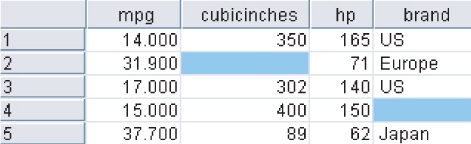
Figure 2.1 Some of our field values are missing.
A common method of “handling” missing values is simply to omit the records or fields with missing values from the analysis. However, this may be dangerous, as the pattern of missing values may in fact be systematic, and simply deleting the records with missing values would lead to a biased subset of the data. Further, it seems like a waste to omit the information in all the other fields, just because one field value is missing. In fact, Schmueli, Patel, and Bruce1 state that if only 5% of data values are missing from a data set of 30 variables, and the missing values are spread evenly throughout the data, almost 80% of the records would have at least one missing value. Therefore, data analysts have turned to methods that would replace the missing value with a value substituted according to various criteria.
Some common criteria for choosing replacement values for missing data are as follows:
- Replace the missing value with some constant, specified by the analyst.
- Replace the missing value with the field mean2
- (for numeric variables) or the mode (for categorical variables).
- Replace the missing values with a value generated at random from the observed distribution of the variable.
- Replace the missing values with imputed values based on the other characteristics of the record.
Let us examine each of the first three methods, none of which is entirely satisfactory, as we shall see. Figure 2.2 shows the result of replacing the missing values with the constant 0 for the numerical variable cubicinches and the label missing for the categorical variable brand.
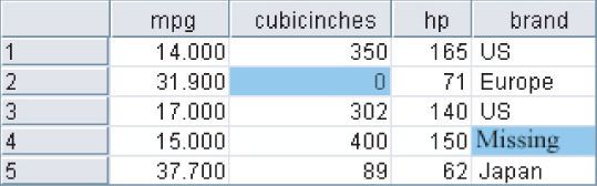
Figure 2.2 Replacing missing field values with user-defined constants.
Figure 2.3 illustrates how the missing values may be replaced with the respective field means and modes.
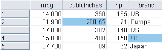
Figure 2.3 Replacing missing field values with means or modes.
The variable brand is categorical, with mode US, so the software replaces the missing brand value with brand = US. Cubicinches, however, is continuous (numeric), so that the software replaces the missing cubicinches values with cubicinches = 200.65, which is the mean of all 258 non-missing values of that variable.
Is it not nice to have the software take care of your missing data problems like this? In a way, certainly. However, do not lose sight of the fact that the software is creating information on the spot, actually fabricating data to fill in the holes in our data set. Choosing the field mean as a substitute for whatever value would have been there may sometimes work out well. However, the end-user needs to be informed that this process has taken place.
Further, the mean may not always be the best choice for what constitutes a “typical” value. For example, Larose3 examines a data set where the mean is greater than the 81st percentile. Also, if many missing values are replaced with the mean, the resulting confidence levels for statistical inference will be overoptimistic, as measures of spread will be artificially reduced. It must be stressed that replacing missing values is a gamble, and the benefits must be weighed against the possible invalidity of the results.
Finally, Figure 2.4 demonstrates how missing values can be replaced with values generated at random from the observed distribution of the variable.
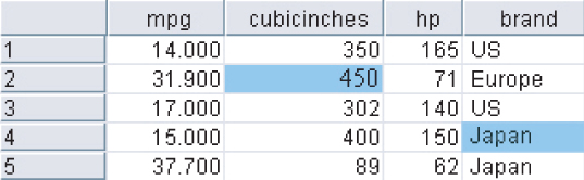
Figure 2.4 Replacing missing field values with random draws from the distribution of the variable.
One benefit of this method is that the measures of center and spread should remain closer to the original, when compared to the mean replacement method. However, there is no guarantee that the resulting records would make sense. For example, the random values drawn in Figure 2.4 has led to at least one car that does not in fact exist! There is no Japanese-made car in the database that has an engine size of 400 cubic inches.
We therefore need data imputation methods that take advantage of the knowledge that the car is Japanese when calculating its missing cubic inches. In data imputation, we ask “What would be the most likely value for this missing value, given all the other attributes for a particular record?” For instance, an American car with 300 cubic inches and 150 horsepower would probably be expected to have more cylinders than a Japanese car with 100 cubic inches and 90 horsepower. This is called imputation of missing data. Before we can profitably discuss data imputation, however, we need to learn the tools needed to do so, such as multiple regression or classification and regression trees. Therefore, to learn about the imputation of missing data, see Chapter 27.
2.4 Identifying Misclassifications
Let us look at an example of checking the classification labels on the categorical variables, to make sure that they are all valid and consistent. Suppose that a frequency distribution of the variable brand was as shown in Table 2.2.
Table 2.2 Notice anything strange about this frequency distribution?
| Brand | Frequency |
| USA | 1 |
| France | 1 |
| US | 156 |
| Europe | 46 |
| Japan | 51 |
The frequency distribution shows five classes, USA, France, US, Europe, and Japan. However, two of the classes, USA and France, have a count of only one automobile each. What is clearly happening here is that two of the records have been inconsistently classified with respect to the origin of manufacture. To maintain consistency with the remainder of the data set, the record with origin USA should have been labeled US, and the record with origin France should have been labeled Europe.
2.5 Graphical Methods for Identifying Outliers
Outliers are extreme values that go against the trend of the remaining data. Identifying outliers is important because they may represent errors in data entry. Also, even if an outlier is a valid data point and not an error, certain statistical methods are sensitive to the presence of outliers, and may deliver unreliable results.
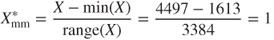
One graphical method for identifying outliers for numeric variables is to examine a histogram4 of the variable. Figure 2.5 shows a histogram of the vehicle weights from the (slightly amended) cars data set. (Note: This slightly amended data set is available as cars2 from the series web site.)

Figure 2.5 Histogram of vehicle weights: can you find the outlier?
There appears to be one lonely vehicle in the extreme left tail of the distribution, with a vehicle weight in the hundreds of pounds rather than in the thousands. Further investigation (not shown) tells us that the minimum weight is 192.5 pounds, which is
undoubtedly our little outlier in the lower tail. As 192.5 pounds is rather light for an automobile, we would tend to doubt the validity of this information.
We can surmise that perhaps the weight was originally 1925 pounds, with the decimal inserted somewhere along the line. We cannot be certain, however, and further investigation into the data sources is called for.
Sometimes two-dimensional scatter plots5 can help to reveal outliers in more than one variable. Figure 2.6, a scatter plot of mpg against weightlbs, seems to have netted two outliers.

Figure 2.6 Scatter plot of mpg against weightlbs shows two outliers.
Most of the data points cluster together along the horizontal axis, except for two outliers. The one on the left is the same vehicle we identified in Figure 2.6, weighing only 192.5 pounds. The outlier near the top is something new: a car that gets over 500 miles per gallon! Clearly, unless this vehicle runs on dilithium crystals, we are looking at a data entry error.
Note that the 192.5-pound vehicle is an outlier with respect to weight but not with respect to mileage. Similarly, the 500-mpg car is an outlier with respect to mileage but not with respect to weight. Thus, a record may be an outlier in a particular dimension but not in another. We shall examine numeric methods for identifying outliers, but we need to pick up a few tools first.
2.6 Measures of Center and Spread
Suppose that we are interested in estimating where the center of a particular variable lies, as measured by one of the numerical measures of center, the most common of which are the mean, median, and mode. The measures of center are a special case of measures of location, numerical summaries that indicate where on a number line a certain characteristic of the variable lies. Examples of the measures of location are percentiles and quantiles.
The mean of a variable is simply the average of the valid values taken by the variable. To find the mean, simply add up all the field values and divide by the sample size. Here, we introduce a bit of notation. The sample mean is denoted as ![]() (“x-bar”) and is computed as
(“x-bar”) and is computed as ![]() , where
, where ![]() (capital sigma, the Greek letter “S,” for “summation”) represents “sum all the values,” and n represents the sample size. For example, suppose that we are interested in estimating where the center of the customer service calls variable lies from the churn data set, which we will explore in Chapter 3. IBM/SPSS Modeler supplies us with the statistical summaries shown in Figure 2.7. The mean number of customer service calls for this sample of n = 3333 customers is given as
(capital sigma, the Greek letter “S,” for “summation”) represents “sum all the values,” and n represents the sample size. For example, suppose that we are interested in estimating where the center of the customer service calls variable lies from the churn data set, which we will explore in Chapter 3. IBM/SPSS Modeler supplies us with the statistical summaries shown in Figure 2.7. The mean number of customer service calls for this sample of n = 3333 customers is given as ![]() Using the sum and the count statistics, we can verify that
Using the sum and the count statistics, we can verify that

Figure 2.7 Statistical summary of customer service calls.
For variables that are not extremely skewed, the mean is usually not too far from the variable center. However, for extremely skewed data sets, the mean becomes less representative of the variable center. Also, the mean is sensitive to the presence of outliers. For this reason, analysts sometimes prefer to work with alternative measures of center, such as the median, defined as the field value in the middle when the field values are sorted into ascending order. The median is resistant to the presence of outliers. Other analysts may prefer to use the mode, which represents the field value occurring with the greatest frequency. The mode may be used with either numerical or categorical data, but is not always associated with the variable center.
Note that the measures of center do not always concur as to where the center of the data set lies. In Figure 2.7, the median is 1, which means that half of the customers made at least one customer service call; the mode is also 1, which means that the most frequent number of customer service calls was 1. The median and mode agree. However, the mean is 1.563, which is 56.3% higher than the other measures. This is due to the mean's sensitivity to the right-skewness of the data.
Measures of location are not sufficient to summarize a variable effectively. In fact, two variables may have the very same values for the mean, median, and mode, and yet have different natures. For example, suppose that stock portfolio A and stock portfolio B contained five stocks each, with the price/earnings (P/E) ratios as shown in Table 2.3. The portfolios are distinctly different in terms of P/E ratios. Portfolio A includes one stock that has a very small P/E ratio and another with a rather large P/E ratio. However, portfolio B's P/E ratios are more tightly clustered around the mean. However, despite these differences, the mean, median, and mode P/E ratios of the portfolios are precisely the same: The mean P/E ratio is 10, the median is 11, and the mode is 11 for each portfolio.
Table 2.3 The two portfolios have the same mean, median, and mode, but are clearly different
| Stock Portfolio A | Stock Portfolio B |
| 1 | 7 |
| 11 | 8 |
| 11 | 11 |
| 11 | 11 |
| 16 | 13 |
Clearly, these measures of center do not provide us with a complete picture. What are missing are the measures of spread or the measures of variability, which will describe how spread out the data values are. Portfolio A's P/E ratios are more spread out than those of portfolio B, so the measures of variability for portfolio A should be larger than those of B.
Typical measures of variability include the range (maximum − minimum), the standard deviation (SD), the mean absolute deviation, and the interquartile range (IQR). The sample SD is perhaps the most widespread measure of variability and is defined by
Because of the squaring involved, the SD is sensitive to the presence of outliers, leading analysts to prefer other measures of spread, such as the mean absolute deviation, in situations involving extreme values.
The SD can be interpreted as the “typical” distance between a field value and the mean, and most field values lie within two SDs of the mean. From Figure 2.7 we can state that the number of customer service calls made by most customers lies within 2(1.315) = 2.63 of the mean of 1.563 calls. In other words, most of the number of customer service calls lie within the interval (−1.067, 4.193), that is, (0, 4). (This can be verified by examining the histogram of customer service calls in Figure 3.12.)
More information about these statistics may be found in the Appendix. A more complete discussion of measures of location and variability can be found in any introductory statistics textbook, such as Larose.6
2.7 Data Transformation
Variables tend to have ranges that vary greatly from each other. For example, if we are interested in major league baseball, players' batting averages will range from zero to less than 0.400, while the number of home runs hit in a season will range from zero to around 70. For some data mining algorithms, such differences in the ranges will lead to a tendency for the variable with greater range to have undue influence on the results. That is, the greater variability in home runs will dominate the lesser variability in batting averages.
Therefore, data miners should normalize their numeric variables, in order to standardize the scale of effect each variable has on the results. Neural networks benefit from normalization, as do algorithms that make use of distance measures, such as the k-nearest neighbors algorithm. There are several techniques for normalization, and we shall examine two of the more prevalent methods. Let ![]() refer to our original field value, and
refer to our original field value, and ![]() refer to the normalized field value.
refer to the normalized field value.
2.8 Min–Max Normalization
Min–max normalization works by seeing how much greater the field value is than the minimum value min(X), and scaling this difference by the range. That is,
The summary statistics for weight are shown in Figure 2.8.The minimum weight is 1613 pounds, and the ![]() .
.

Figure 2.8 Summary statistics for weight.
Let us find the min–max normalization for three automobiles weighing 1613, 3384, and 4997 pounds, respectively.
- For an ultralight vehicle, weighing only 1613 pounds (the field minimum), the min–max normalization is

Thus, data values which represent the minimum for the variable will have a min–max normalization value of 0.
- The midrange equals the average of the maximum and minimum values in a data set. That is,

For a “midrange” vehicle (if any), which weighs exactly halfway between the minimum weight and the maximum weight, the min–max normalization is

So the midrange data value has a min–max normalization value of 0.5.
- The heaviest vehicle has a min–max normalization value of
That is, data values representing the field maximum will have a min–max normalization of 1. To summarize, min–max normalization values will range from 0 to 1.
2.9 Z-Score Standardization
Z-score standardization, which is very widespread in the world of statistical analysis, works by taking the difference between the field value and the field mean value, and scaling this difference by the SD of the field values. That is
Figure 2.8 tells us that mean(weight) = 3005.49 and SD(weight) = 852.49.
- For the vehicle weighing only 1613 pounds, the Z-score standardization is

Thus, data values that lie below the mean will have a negative Z-score standardization.
- For an “average” vehicle (if any), with a weight equal to mean(X) = 3005.49 pounds, the Z-score standardization is

That is, values falling exactly on the mean will have a Z-score standardization of zero.
- For the heaviest car, the Z-score standardization is

That is, data values that lie above the mean will have a positive Z-score standardization.7
2.10 Decimal Scaling
Decimal scaling ensures that every normalized value lies between −1 and 1.
where d represents the number of digits in the data value with the largest absolute value. For the weight data, the largest absolute value is ![]() , which has d = 4 digits. The decimal scaling for the minimum and maximum weight are
, which has d = 4 digits. The decimal scaling for the minimum and maximum weight are
2.11 Transformations to Achieve Normality
Some data mining algorithms and statistical methods require that the variables be normally distributed. The normal distribution is a continuous probability distribution commonly known as the bell curve, which is symmetric. It is centered at mean ![]() (“mew”) and has its spread determined by SD
(“mew”) and has its spread determined by SD ![]() (sigma). Figure 2.9 shows the normal distribution that has mean
(sigma). Figure 2.9 shows the normal distribution that has mean ![]() and SD
and SD ![]() , known as the standard normal distribution Z.
, known as the standard normal distribution Z.

Figure 2.9 Standard normal Z distribution.
It is a common misconception that variables that have had the Z-score standardization applied to them follow the standard normal Z distribution. This is not correct! It is true that the Z-standardized data will have mean 0 and SD = 1
but the distribution may still be skewed. Compare the histogram of the original weight data in Figure 2.10 with the Z-standardized data in Figure 2.11. Both histograms are right-skewed; in particular, Figure 2.10 is not symmetric, and so cannot be normally distributed.
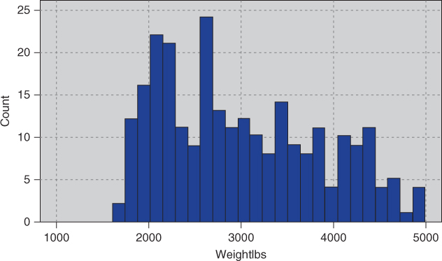
Figure 2.10 Original data.
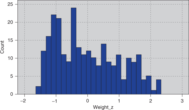
Figure 2.11 Z-standardized data is still right-skewed, not normally distributed.
We use the following statistic to measure the skewness of a distribution8
:
For right-skewed data, the mean is greater than the median, and thus the skewness will be positive (Figure 2.12), while for left-skewed data, the mean is smaller than the median, generating negative values for skewness (Figure 2.13). For perfectly symmetric (and unimodal) data (Figure 2.9) of course, the mean, median, and mode are all equal, and so the skewness equals zero.

Figure 2.12 Right-skewed data has positive skewness.
Figure 2.13 Left-skewed data has negative skewness.
Much real-world data is right-skewed, including most financial data. Left-skewed data is not as common, but often occurs when the data is right-censored, such as test scores on an easy test, which can get no higher than 100. We use the statistics for weight and weight_Z shown in Figure 2.14 to calculate the skewness for these variables.
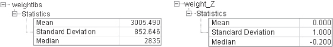
Figure 2.14 Statistics for calculating skewness.
For weight we have
For weight_Z we have
Thus, Z-score standardization has no effect on skewness.
To make our data “more normally distributed,” we must first make it symmetric, which means eliminating the skewness. To eliminate skewness, we apply a transformation to the data. Common transformations are the natural log transformation ![]() , the square root transformation
, the square root transformation ![]() , and the inverse square root transformation
, and the inverse square root transformation ![]() . Application of the square root transformation (Figure 2.15) somewhat reduces the skewness, while applying the ln transformation (Figure 2.16) reduces skewness even further.
. Application of the square root transformation (Figure 2.15) somewhat reduces the skewness, while applying the ln transformation (Figure 2.16) reduces skewness even further.

Figure 2.15 Square root transformation somewhat reduces skewness.
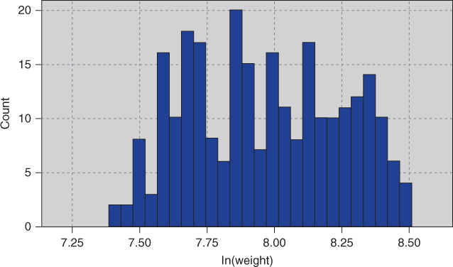
Figure 2.16 Natural log transformation reduces skewness even further.
The statistics in Figure 2.17 are used to calculate the reduction in skewness:


Figure 2.17 Statistics for calculating skewness.
Finally, we try the inverse square root transformation ![]() , which gives us the distribution in Figure 2.18. The statistics in Figure 2.19 give us
, which gives us the distribution in Figure 2.18. The statistics in Figure 2.19 give us
which indicates that we have eliminated the skewness and achieved a symmetric distribution.
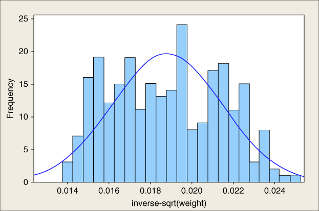
Figure 2.18 The transformation  has eliminated the skewness, but is still not normal.
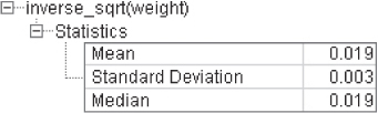
Figure 2.19 Statistics for 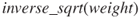 .
.
Now, there is nothing> magical about the inverse square root transformation; it just happened to work for this variable.
Although we have achieved symmetry, we still have not arrived at normality. To check for normality, we construct a normal probability plot, which plots the quantiles of a particular distribution against the quantiles of the standard normal distribution. Similar to a percentile, the pth quantile of a distribution is the value ![]() such that
such that ![]() of the distribution values are less than or equal to
of the distribution values are less than or equal to ![]() .
.
In a normal probability plot, if the distribution is normal, the bulk of the points in the plot should fall on a straight line; systematic deviations from linearity in this plot indicate nonnormality. Note from Figure 2.18 that the distribution is not a good fit for the normal distribution curve shown. Thus, we would not expect our normal probability plot to exhibit normality. As expected, the normal probability plot of inverse_sqrt(weight) in Figure 2.20 shows systematic deviations from linearity, indicating nonnormality. For contrast, a normal probability plot of normally distributed data is shown in Figure 2.21; this graph shows no systematic deviations from linearity.
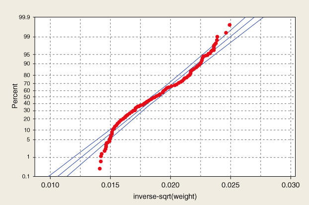
Figure 2.20 Normal probability plot of inverse_sqrt(weight) indicates nonnormality.
Figure 2.21 Normal probability plot of normally distributed data.
Experimentation with further transformations (not shown) did not yield acceptable normality for inverse_sqrt(weight). Fortunately, algorithms requiring normality usually do fine when supplied with data that is symmetric and unimodal.
Finally, when the algorithm is done with its analysis, don't forget to “de-transform” the data. Let x represent the original variable, and y represent the transformed variable. Then, for the inverse square root transformation we have
“de-transforming,” we obtain: ![]() . Results that your algorithm provided on the transformed scale would have to be de-transformed using this formula.9
. Results that your algorithm provided on the transformed scale would have to be de-transformed using this formula.9
2.12 Numerical Methods for Identifying Outliers
The Z-score method for identifying outliers states that a data value is an outlier if it has a Z-score that is either less than ![]() or greater than 3. Variable values with Z-scores much beyond this range may bear further investigation, in order to verify that they do not represent data entry errors or other issues. However, one should not automatically omit outliers from analysis.
or greater than 3. Variable values with Z-scores much beyond this range may bear further investigation, in order to verify that they do not represent data entry errors or other issues. However, one should not automatically omit outliers from analysis.
We saw that the minimum Z-score was for the vehicle weighing only 1613 pounds, and having a Z-score of ![]() , while the maximum Z-score was for the 4997-pound vehicle, with a Z-score of 2.34. As neither Z-scores are either less than
, while the maximum Z-score was for the 4997-pound vehicle, with a Z-score of 2.34. As neither Z-scores are either less than ![]() or greater than 3, we conclude that there are no outliers among the vehicle weights.
or greater than 3, we conclude that there are no outliers among the vehicle weights.
Unfortunately, the mean and SD, which are both part of the formula for the Z-score standardization, are both rather sensitive to the presence of outliers. That is, if an outlier is added to (or deleted from) a data set, then the values of mean and SD will both be unduly affected by the presence (or absence) of this new data value. Therefore, when choosing a method for evaluating outliers, it may not seem appropriate to use measures that are themselves sensitive to their presence.
Therefore, data analysts have developed more robust statistical methods for outlier detection, which are less sensitive to the presence of the outliers themselves. One elementary robust method is to use the IQR. The quartiles of a data set divide the data set into the following four parts, each containing 25% of the data:
- The first quartile (Q1) is the 25th percentile.
- The second quartile (Q2) is the 50th percentile, that is, the median.
- The third quartile (Q3) is the 75th percentile.
Then, the IQR is a measure of variability, much more robust than the SD. The IQR is calculated as IQR = Q3 − Q1, and may be interpreted to represent the spread of the middle 50% of the data.
A robust measure of outlier detection is therefore defined as follows. A data value is an outlier if
- it is located 1.5(IQR) or more below Q1, or
- it is located 1.5(IQR) or more above Q3.
For example, suppose for a set of test scores, the 25th percentile was Q1 = 70 and the 75th percentile was Q3 = 80, so that half of all the test scores fell between 70 and 80. Then the interquartile range, or the difference between these quartiles was IQR = 80 − 70 = 10.
A test score would be robustly identified as an outlier if
- it is lower than Q1 − 1.5(IQR) = 70 − 1.5(10) = 55, or
- it is higher than Q3 + 1.5(IQR) = 80 + 1.5(10) = 95.
2.13 Flag Variables
Some analytical methods, such as regression, require predictors to be numeric. Thus, analysts wishing to use categorical predictors in regression need to recode the categorical variable into one or more flag variables. A flag variable (or dummy variable, or indicator variable) is a categorical variable taking only two values, 0 and 1. For example, the categorical predictor sex, taking values for female and male, could be recoded into the flag variable sex_flag as follows:
- If sex = female = then sex_flag = 0; if sex = male then sex_flag = 1.
When a categorical predictor takes ![]() possible values, then define k − 1 dummy variables, and use the unassigned category as the reference category. For example, if a categorical predictor region has k = 4 possible categories, {north, east, south, west}, then the analyst could define the following k − 1 = 3 flag variables.
possible values, then define k − 1 dummy variables, and use the unassigned category as the reference category. For example, if a categorical predictor region has k = 4 possible categories, {north, east, south, west}, then the analyst could define the following k − 1 = 3 flag variables.
- north_flag: If region = north then north_flag = 1; otherwise north_flag = 0.
- east_flag: If region = east then east_flag = 1; otherwise east_flag = 0.
- south_flag: If region = south then south_flag = 1; otherwise south_flag = 0.
The flag variable for the west is not needed, as region = west is already uniquely identified by zero values for each of the three existing flag variables.10 Instead, the unassigned category becomes the reference category, meaning that, the interpretation of the value of north_flag is region = north compared to region = west. For example, if we are running a regression analysis with income as the target variable, and the regression coefficient (see Chapter 8) for north_flag equals $1000, then the estimated income for region = north is $1000 greater than for region = west, when all other predictors are held constant.
2.14 Transforming Categorical Variables into Numerical Variables
Would it not be easier to simply transform the categorical variable region into a single numerical variable rather than using several different flag variables? For example, suppose we defined the quantitative variable region_num as follows:
| Region | Region_num |
| North | 1 |
| East | 2 |
| South | 3 |
| West | 4 |
Unfortunately, this is a common and hazardous error. The algorithm now erroneously thinks the following:
- The four regions are ordered.
- West > South > East > North.
- West is three times closer to South compared to North, and so on.
So, in most instances, the data analyst should avoid transforming categorical variables to numerical variables. The exception is for categorical variables that are clearly ordered, such as the variable survey_response, taking values always, usually, sometimes, never. In this case, one could assign numerical values to the responses, although one may bicker with the actual values assigned, such as:
| Survey response | Survey Response_num |
| Always | 4 |
| Usually | 3 |
| Sometimes | 2 |
| Never | 1 |
Should never be “0” rather than “1”? Is always closer to usually than usually is to sometimes? Careful assignment of the numerical values is important.
2.15 Binning Numerical Variables
Some algorithms prefer categorical rather than continuous predictors,11 in which case we would need to partition any numerical predictors into bins or bands. For example, we may wish to partition the numerical predictor house value into low, medium, and high. There are the following four common methods for binning numerical predictors:
- Equal width binning divides the numerical predictor into k categories of equal width, where k is chosen by the client or analyst.
- Equal frequency binning divides the numerical predictor into k categories, each having k/n records, where n is the total number of records.
- Binning by clustering uses a clustering algorithm, such as k-means clustering (Chapter 19) to automatically calculate the “optimal” partitioning.
- Binning based on predictive value. Methods (1)–(3) ignore the target variable; binning based on predictive value partitions the numerical predictor based on the effect each partition has on the value of the target variable. Chapter 3 contains an example of this.
Equal width binning is not recommended for most data mining applications, as the width of the categories can be greatly affected by the presence of outliers. Equal frequency distribution assumes that each category is equally likely, an assumption which is usually not warranted. Therefore, methods (3) and (4) are preferred.
Suppose we have the following tiny data set, which we would like to discretize into k = 3 categories: ![]() .
.
- Using equal width binning, we partition X into the following categories of equal width, illustrated in Figure 2.22a:
- Low:
 , which contains all the data values except one.
 - Medium:
 , which contains no data values at all.
 - High:
 , which contains a single outlier.
- Low:
- Using equal frequency binning, we have n = 12, k = 3, and n/k = 4. The partition is illustrated in Figure 2.22b.
- Low: Contains the first four data values, all X = 1.
- Medium: Contains the next four data values, {1, 2, 2, 11}.
- High: Contains the last four data values, {11, 12, 12, 44}.
- Finally, k-means clustering identifies what seems to be the intuitively correct partition, as shown in Figure 2.22c.
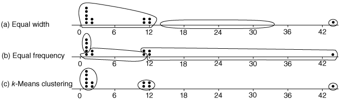
Figure 2.22 (a–c) Illustration of binning methods.
We provide two examples of binning based on predictive value in Chapter 3.
2.16 Reclassifying Categorical Variables
Reclassifying categorical variables is the categorical equivalent of binning numerical variables. Often, a categorical variable will contain too many easily analyzable field values. For example, the predictor state could contain 50 different field values. Data mining methods such as logistic regression and the C4.5 decision tree algorithm perform suboptimally when confronted with predictors containing too many field values. In such a case, the data analyst should reclassify the field values. For example, the 50 states could each be reclassified as the variable region, containing field values Northeast, Southeast, North Central, Southwest, and West. Thus, instead of 50 different field values, the analyst (and algorithm) is faced with only 5. Alternatively, the 50 states could be reclassified as the variable economic_level, with three field values containing the richer states, the midrange states, and the poorer states. The data analyst should choose a reclassification that supports the objectives of the business problem or research question.
2.17 Adding an Index Field
It is recommended that the data analyst create an index field, which tracks the sort order of the records in the database. Data mining data gets partitioned at least once (and sometimes several times). It is helpful to have an index field so that the original sort order may be recreated. For example, using IBM/SPSS Modeler, you can use the @Index function in the Derive node to create an index field.
2.18 Removing Variables that are not Useful
The data analyst may wish to remove variables that will not help the analysis, regardless of the proposed data mining task or algorithm. Such variables include
- unary variables and
- variables that are very nearly unary.
Unary variables take on only a single value, so a unary variable is not so much a variable as a constant. For example, data collection on a sample of students at an all-girls private school would find that the sex variable would be unary, as every subject would be female. As sex is constant across all observations, it cannot have any effect on any data mining algorithm or statistical tool. The variable should be removed.
Sometimes a variable can be very nearly unary. For example, suppose that 99.95% of the players in a field hockey league are female, with the remaining 0.05% male. The variable sex is therefore very nearly, but not quite, unary. While it may be useful to investigate the male players, some algorithms will tend to treat the variable as essentially unary. For example, a classification algorithm can be better than 99.9% confident that a given player is female. So, the data analyst needs to weigh how close to unary a given variable is, and whether such a variable should be retained or removed.
2.19 Variables that Should Probably not be Removed
It is (unfortunately) a common – although questionable – practice to remove from analysis the following types of variables:
- Variables for which 90% or more of the values are missing.
- Variables that are strongly correlated.
Before you remove a variable because it has 90% or more missing values, consider that there may be a pattern in the missingness, and therefore useful information, that you may be jettisoning. Variables that contain 90% missing values present a challenge to any strategy for imputation of missing data (see Chapter 27). For example, are the remaining 10% of the cases truly representative of the missing data, or are the missing values occurring due to some systematic but unobserved phenomenon? For example, suppose we have a field called donation_dollars in a self-reported survey database. Conceivably, those who donate a lot would be inclined to report their donations, while those who do not donate much may be inclined to skip this survey question. Thus, the 10% who report are not representative of the whole. In this case, it may be preferable to construct a flag variable, donation_flag, as there is a pattern in the missingness which may turn out to have predictive power.
However, if the data analyst has reason to believe that the 10% are representative, then he or she may choose to proceed with the imputation of the missing 90%. It is strongly recommended that the imputation be based on the regression or decision tree methods shown in Chapter 27. Regardless of whether the 10% are representative of the whole or not, the data analyst may decide that it is wise to construct a flag variable for the non-missing values, as they may very well be useful for prediction or classification. Also, there is nothing special about the 90% figure; the data analyst may use any large proportion he or she considers warranted. Bottom line: One should avoid removing variables just because they have lots of missing values.
An example of correlated variables may be precipitation and attendance at a state beach. As precipitation increases, attendance at the beach tends to decrease, so that the variables are negatively correlated.12 Inclusion of correlated variables may at best double-count a particular aspect of the analysis, and at worst lead to instability of the model results. When confronted with two strongly correlated variables, therefore, some data analysts may decide to simply remove one of the variables. We advise against doing so, as important information may thereby be discarded. Instead, it is suggested that principal components analysis be applied, where the common variability in correlated predictors may be translated into a set of uncorrelated principal components.13
2.20 Removal of Duplicate Records
During a database's history, records may have been inadvertently copied, thus creating duplicate records. Duplicate records lead to an overweighting of the data values in those records, so, if the records are truly duplicate, only one set of them should be retained. For example, if the ID field is duplicated, then definitely remove the duplicate records. However, the data analyst should apply common sense. To take an extreme case, suppose a data set contains three nominal fields, and each field takes only three values. Then there are only ![]() possible different sets of observations. In other words, if there are more than 27 records, at least one of them has to be a duplicate. So, the data analyst should weigh the likelihood that the duplicates represent truly different records against the likelihood that the duplicates are indeed just duplicated records.
possible different sets of observations. In other words, if there are more than 27 records, at least one of them has to be a duplicate. So, the data analyst should weigh the likelihood that the duplicates represent truly different records against the likelihood that the duplicates are indeed just duplicated records.
2.21 A Word About ID Fields
Because ID fields have a different value for each record, they will not be helpful for your downstream data mining algorithms. They may even be hurtful, with the algorithm finding some spurious relationship between ID field and your target. Thus, it is recommended that ID fields should be filtered out from the data mining algorithms, but should not be removed from the data, so that the data analyst can differentiate between similar records.
In Chapter 3, we apply some basic graphical and statistical tools to help us begin to uncover simple patterns and trends in the data structure.
R Reference
- R Core Team. R: A Language and Environment for Statistical Computing. Vienna, Austria: R Foundation for Statistical Computing; 2012. ISBN: 3-900051-07-0, http://www.R-project.org/.
Exercises
Clarifying the Concepts
1. Describe the possible negative effects of proceeding directly to mine data that has not been preprocessed.
2. Refer to the income attribute of the five customers in Table 2.1, before preprocessing.
- Find the mean income before preprocessing.
- What does this number actually mean?
- Now, calculate the mean income for the three values left after preprocessing. Does this value have a meaning?
3. Explain why zip codes should be considered text variables rather than numeric.
4. What is an outlier? Why do we need to treat outliers carefully?
5. Explain why a birthdate variable would be preferred to an age variable in a database.
6. True or false: All things being equal, more information is almost always better.
7. Explain why it is not recommended, as a strategy for dealing with missing data, to simply omit the records or fields with missing values from the analysis.
8. Which of the four methods for handling missing data would tend to lead to an underestimate of the spread (e.g., SD) of the variable? What are some benefits to this method?
9. What are some of the benefits and drawbacks for the method for handling missing data that chooses values at random from the variable distribution?
10. Of the four methods for handling missing data, which method is preferred?
11. Make up a classification scheme that is inherently flawed, and would lead to misclassification, as we find in Table 2.2. For example, classes of items bought in a grocery store.
12. Make up a data set, consisting of the heights and weights of six children, in which one of the children is an outlier with respect to one of the variables, but not the other. Then alter this data set so that the child is an outlier with respect to both variables.
Working with the Data
Use the following stock price data (in dollars) for Exercises 13–18.
| 10 | 7 | 20 | 12 | 75 | 15 | 9 | 18 | 4 | 12 | 8 | 14 |
13. Calculate the mean, median, and mode stock price.
14. Compute the SD of the stock price. Interpret what this number means.
15. Find the min–max normalized stock price for the stock price $20.
16. Calculate the midrange stock price.
17. Compute the Z-score standardized stock price for the stock price $20.
18. Find the decimal scaling stock price for the stock price $20.
19. Calculate the skewness of the stock price data.
20. Explain why data analysts need to normalize their numeric variables.
21. Describe three characteristics of the standard normal distribution.
22. If a distribution is symmetric, does it follow that it is normal? Give a counterexample.
23. What do we look for in a normal probability plot to indicate nonnormality?
Use the stock price data for Exercises 24–26.
24. Do the following.
- Identify the outlier.
- Verify that this value is an outlier, using the Z-score method.
- Verify that this value is an outlier, using the IQR method.
25. Identify all possible stock prices that would be outliers, using:
- The Z-score method.
- The IQR method.
26. Investigate how the outlier affects the mean and median by doing the following:
- Find the mean score and the median score, with and without the outlier.
- State which measure, the mean or the median, the presence of the outlier affects more, and why.
27. What are the four common methods for binning numerical predictors? Which of these are preferred?
Use the following data set for Exercises 28–30:
| 1 | 1 | 1 | 3 | 3 | 7 |
28. Bin the data into three bins of equal width (width = 3).
29. Bin the data into three bins of two records each.
30. Clarify why each of the binning solutions above are not optimal.
31. Explain why we might not want to remove a variable that had 90% or more missing values.
32. Explain why we might not want to remove a variable just because it is highly correlated with another variable.
Hands-On Analysis
Use the churn data set on the book series web site for the following exercises:
33. Explore whether14 there are missing values for any of the variables.
34. Compare the area code and state fields. Discuss any apparent abnormalities.
35. Use a graph to visually determine whether there are any outliers among the number of calls to customer service.
36. Identify the range of customer service calls that should be considered outliers, using:
- the Z-score method;
- the IQR method.
37. Transform the day minutes attribute using Z-score standardization.
38. Work with skewness as follows:
- Calculate the skewness of day minutes.
- Then calculate the skewness of the Z-score standardized day minutes. Comment.
- Based on the skewness value, would you consider day minutes to be skewed or nearly perfectly symmetric?
39. Construct a normal probability plot of day minutes. Comment on the normality of the data.
40. Work with international minutes as follows:
- Construct a normal probability plot of international minutes.
- What is preventing this variable from being normally distributed.
- Construct a flag variable to deal with the situation in (b).
- Construct a normal probability plot of the derived variable nonzero international minutes. Comment on the normality of the derived variable.
41. Transform the night minutes attribute using Z-score standardization. Using a graph, describe the range of the standardized values.