
Chapter 3
Exploratory Data Analysis
3.1 Hypothesis Testing Versus Exploratory Data Analysis
When approaching a data mining problem, a data mining analyst may already have some a priori hypotheses that he or she would like to test regarding the relationships between the variables. For example, suppose that cell-phone executives are interested in whether a recent increase in the fee structure has led to a decrease in market share. In this case, the analyst would test the hypothesis that market share has decreased, and would therefore use hypothesis testing procedures.
A myriad of statistical hypothesis testing procedures are available through the traditional statistical analysis literature. We cover many of these in Chapters 5 and 6. However, analysts do not always have a priori notions of the expected relationships among the variables. Especially when confronted with unknown, large databases, analysts often prefer to use exploratory data analysis (EDA), or graphical data analysis. EDA allows the analyst to
- delve into the data set;
- examine the interrelationships among the attributes;
- identify interesting subsets of the observations;
- develop an initial idea of possible associations amongst the predictors, as well as between the predictors and the target variable.
3.2 Getting to Know The Data Set
Graphs, plots, and tables often uncover important relationships that could indicate important areas for further investigation. In Chapter 3, we use exploratory methods to delve into the churn data set1 from the UCI Repository of Machine Learning Databases at the University of California, Irvine. The data set is also available on the book series web site, www.dataminingconsultant.com. Churn, also called attrition, is a term used to indicate a customer leaving the service of one company in favor of another company. The data set contains 20 predictors worth of information about 3333 customers, along with the target variable, churn, an indication of whether that customer churned (left the company) or not.
The variables are as follows:
- State: Categorical, for the 50 states and the District of Columbia.
- Account length: Integer-valued, how long account has been active.
- Area code: Categorical
- Phone number: Essentially a surrogate for customer ID.
- International plan: Dichotomous categorical, yes or no.
- Voice mail plan: Dichotomous categorical, yes or no.
- Number of voice mail messages: Integer-valued.
- Total day minutes: Continuous, minutes customer used service during the day.
- Total day calls: Integer-valued.
- Total day charge: Continuous, perhaps based on above two variables.
- Total eve minutes: Continuous, minutes customer used service during the evening.
- Total eve calls: Integer-valued.
- Total eve charge: Continuous, perhaps based on above two variables.
- Total night minutes: Continuous, minutes customer used service during the night.
- Total night calls: Integer-valued.
- Total night charge: Continuous, perhaps based on above two variables.
- Total international minutes: Continuous, minutes customer used service to make international calls.
- Total international calls: Integer-valued.
- Total international charge: Continuous, perhaps based on above two variables.
- Number of calls to customer service: Integer-valued.
- Churn: Target. Indicator of whether the customer has left the company (true or false).
To begin, it is often best to simply take a look at the field values for some of the records. Figure 3.1 shows the variable values for the first 10 records of the churn data set.

Figure 3.1 (a,b) Field values of the first 10 records in the churn data set.
We can begin to get a feel for the data by looking at Figure 3.1. We note, for example:
- The variable Phone uses only seven digits.
- There are two flag variables.
- Most of our variables are continuous.
- The response variable Churn is a flag variable having two values, True and False.
Next, we turn to summarization and visualization (see Appendix). Figure 3.2 shows graphs (either histograms or bar charts) and summary statistics for each variable in the data set, except Phone, which is an identification field. The variable types for this software (Modeler, by IBM/SPSS) are shown (set for categorical, flag for flag, and range for continuous). We may note that vmail messages have a spike on the length, and that most quantitative variables seem to be normally distributed, except for Intl Calls and CustServ Calls, which are right-skewed (note that the skewness statistic is larger for these variables).Unique represents the number of distinct field values. We wonder how it can be that there are 51 distinct values for State, but only three distinct values for Area Code. Also, the mode of State being West Virginia may have us scratching our heads a bit. More on this will be discussed later. We are still just getting to know the data set.

Figure 3.2 Summarization and visualization of the churn data set.
3.3 Exploring Categorical Variables
The bar graph in Figure 3.3 shows the counts and percentages of customers who churned (true) and who did not churn (false). Fortunately, only a minority (14.49%) of our customers have left our service. Our task is to identify patterns in the data that will help to reduce the proportion of churners.

Figure 3.3 About 14.49% of our customers are churners.
One of the primary reasons for performing EDA is to investigate the variables, examine the distributions of the categorical variables, look at the histograms of the numeric variables, and explore the relationships among sets of variables. However, our overall objective for the data mining project as a whole (not just the EDA phase) is to develop a model of the type of customer likely to churn (jump from your company's service to another company's service). Today's software packages allow us to become familiar with the variables, while at the same time allowing us to begin to see which variables are associated with churn. In this way, we can explore the data while keeping an eye on our overall goal. We begin by considering the categorical variables, and their relationship to churn.
The first categorical variable we investigate is International Plan. Figure 3.4 shows a bar chart of the International Plan, with an overlay of churn, and represents a comparison of the proportion of churners and non-churners, among customers who either had selected the International Plan (yes, 9.69% of customers) or had not selected it (no, 90.31% of customers). The graphic appears to indicate that a greater proportion of International Plan holders are churning, but it is difficult to be sure.

Figure 3.4 Comparison bar chart of churn proportions, by international plan participation.
In order to “increase the contrast” and better discern whether the proportions differ, we can ask the software (in this case, IBM/SPSS Modeler) to provide the same size bars for each category. Thus, in Figure 3.5, we see a graph of the very same information as in Figure 3.4, except that the bar for the yes category has been “stretched” out to be the same length as for the no category. This allows us to better discern whether the churn proportions differ among the categories. Clearly, those who have selected the International Plan have a greater chance of leaving the company's service than do those who do not have the International Plan.

Figure 3.5 Comparison bar chart of churn proportions, by international plan participation, with equal bar length.
The graphics above tell us that International Plan holders tend to churn more frequently, but they do not quantify the relationship. In order to quantify the relationship between International Plan holding and churning, we may use a contingency table (Table 3.1), as both variables are categorical.
Table 3.1 Contingency table of International Plan with churn
| International Plan | ||||
| No | Yes | Total | ||
| Churn | False | 2664 | 186 | 2850 |
| True | 346 | 137 | 483 | |
| Total | 3010 | 323 | 3333 | |
Note that the counts in the first column add up to the total number of non-selectors of the international plan from Figure 3.4: 2664 + 346 = 3010. Similarly for the second column. The first row in Table 3.1 shows the counts of those who did not churn, while the second row shows the counts of those that did churn.
The total column contains the marginal distribution for churn, that is, the frequency distribution for this variable alone. Similarly, the total row represents the marginal distribution for International Plan. Note that the marginal distribution for International Plan concurs with the counts in Figure 3.5.
We may enhance Table 3.1 with percentages, depending on our question of interest. For example, Table 3.2 adds column percentages, which indicate, for each cell, the percentage of the column total.
Table 3.2 Contingency table with column percentages
| International Plan | ||||
| No | Yes | Total | ||
| Churn | False | Count 2664 Col% 88.5% |
Count 186 Col% 57.6% |
Count 2850 Col% 85.5% |
| True | Count 346 Col% 11.5% |
Count 137 Col% 42.4% |
Count 483 Col% 14.5% |
|
| Total | 3010 | 323 | 3333 | |
We calculate the column percentages whenever we are interested in comparing the percentages of the row variable for each value of the column variable. For example, here we are interested in comparing the proportions of churners (row variable) for those who belong or do not belong to the International Plan (column variable). Note that 137/(137 + 186) = 42.4% of the International Plan holders churned, as compared to only 346/(346 + 2664) = 11.5% of those without the International Plan. Customers selecting the International Plan are more than three times as likely to leave the company's service and those without the plan. Thus, we have now quantified the relationship that we uncovered graphically earlier.
The graphical counterpart of the contingency table is the clustered bar chart. Figure 3.6 shows a Minitab bar chart of churn, clustered by International Plan. The first set of two bars represents those who do not belong to the plan, and is associated with the “No” column in Table 3.2. The second set of two bars represents those who do belong to the International Plan, and is associated with the “Yes” column in Table 3.2. Clearly, the proportion of churners is greater among those belonging to the plan.

Figure 3.6 The clustered bar chart is the graphical counterpart of the contingency table.
Another useful graphic for comparing two categorical variables is the comparative pie chart. Figure 3.7 shows a comparative pie chart of churn, for those who do not (“no”) and those who do (“yes”) belong to the International Plan. The clustered bar chart is usually preferred, because it conveys counts as well as proportions, while the comparative pie chart conveys only proportions.
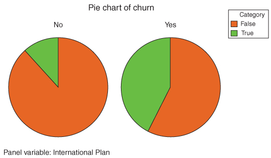
Figure 3.7 Comparative pie chart associated with Table 3.2.
Contrast Table 3.2 with Table 3.3, the contingency table with row percentages, which indicate, for each cell, the percentage of the row total. We calculate the row percentages whenever we are interested in comparing the percentages of the column variable for each value of the row variable. Table 3.3 indicates, for example, that 28.4% of churners belong to the International Plan, compared to 6.5% of non-churners.
Table 3.3 Contingency table with row percentages
| International Plan | ||||
| No | Yes | Total | ||
| Churn | False | Count 2664 Row% 93.5% |
Count 186 Row% 6.5% |
2850 |
| True | Count 346 Row% 71.6% |
Count 137 Row% 28.4% |
483 | |
| Total | Count 3010 Row% 90.3% |
Count 323 Row% 9.7% |
3333 | |
Figure 3.8 contains the bar chart of International Plan, clustered by Churn, and represents the graphical counterpart of the contingency table with row percentages in Table 3.3. The first set of bars represents non-churners, and is associated with the “False” row in Table 3.3. The second set of bars represents churners, and is associated with the “True” row in Table 3.3. Clearly, the proportion of International Plan holders is greater among the churners. Similarly for Figure 3.9, which shows the comparative bar chart of International Plan holders, by whether or not they have churned (“True” or “False”).
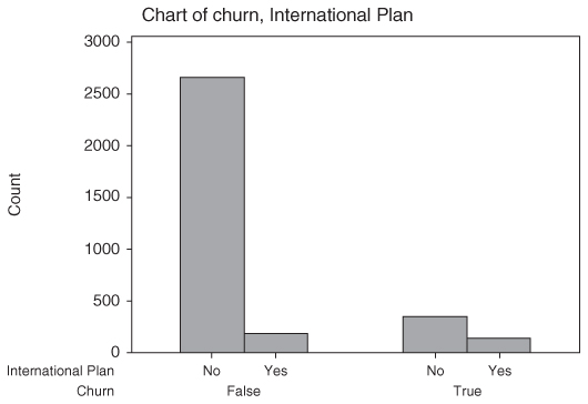
Figure 3.8 Clustered bar chart associated with Table 3.3.
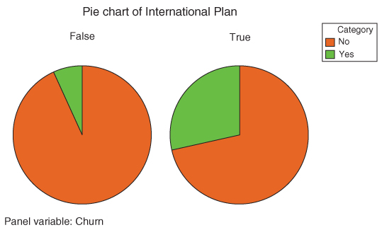
Figure 3.9 Comparative pie chart associated with Table 3.3.
To summarize, this EDA on the International Plan has indicated that
- perhaps we should investigate what is it about our international plan that is inducing our customers to leave;
- we should expect that, whatever data mining algorithms we use to predict churn, the model will probably include whether or not the customer selected the International Plan.
Let us now turn to the Voice Mail Plan. Figure 3.10 shows, using a bar graph with equalized lengths, that those who do not have the Voice Mail Plan are more likely to churn than those who do have the plan. (The numbers in the graph indicate proportions and counts of those who do and do not have the Voice Mail Plan, without reference to churning.)

Figure 3.10 Those without the voice mail plan are more likely to churn.
Again, we may quantify this finding by using a contingency table. Because we are interested in comparing the percentages of the row variable (Churn) for each value of the column variable (Voice Mail Plan), we choose a contingency table with column percentages, shown in Table 3.4.
Table 3.4 Contingency table with column percentages for the Voice Mail Plan
| Voice Mail Plan | ||||
| No | Yes | Total | ||
| Churn | False | Count 2008 Col% 83.3% |
Count 842 Col% 91.3% |
Count 2850 Col% 85.5% |
| True | Count 403 Col% 16.7% |
Count 80 Col% 8.7% |
Count 483 Col% 14.5% |
|
| Total | 2411 | 922 | 3333 | |
The marginal distribution for Voice Mail Plan (row total) indicates that 842 + 80 = 922 customers have the Voice Mail Plan, while 2008 + 403 = 2411 do not. We then find that 403/2411 = 16.7% of those without the Voice Mail Plan are churners, as compared to 80/922 = 8.7% of customers who do have the Voice Mail Plan. Thus, customers without the Voice Mail Plan are nearly twice as likely to churn as customers with the plan.
To summarize, this EDA on the Voice Mail Plan has indicated that
- perhaps we should enhance our Voice Mail Plan still further, or make it easier for customers to join it, as an instrument for increasing customer loyalty;
- we should expect that, whatever data mining algorithms we use to predict churn, the model will probably include whether or not the customer selected the Voice Mail Plan. Our confidence in this expectation is perhaps not quite as high as for the International Plan.
We may also explore the two-way interactions among categorical variables with respect to churn. For example, Figure 3.11 shows a multilayer clustered bar chart of churn, clustered by both International Plan and Voice Mail Plan.
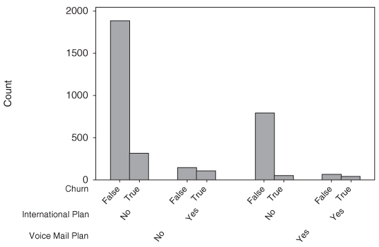
Figure 3.11 Multilayer clustered bar chart.
The statistics associated with Figure 3.11 are shown in Table 3.5. Note that there are many more customers who have neither plan (1878 + 302 = 2180) than have the international plan only (130 + 101 = 231). More importantly, among customers with no voice mail plan, the proportion of churners is greater for those who do have an international plan (101/231 = 44%) than for those who do not (302/2180 = 14%).There are many more customers who have the voice mail plan only (786 + 44 = 830) than have both plans (56 + 36 = 92). Again, however, among customers with the voice mail plan, the proportion of churners is much greater for those who also select the international plan (36/92 = 39%) than for those who do not (44/830 = 5%).Note also that there is no interaction among the categorical variables. That is, international plan holders have greater churn regardless of whether they are Voice Mail plan adopters or not.
Table 3.5 Statistics for multilayer clustered bar chart
 |
Finally, Figure 3.12 shows a directed web graph of the relationships between International Plan holders, Voice Mail Plan holders, and churners. Web graphs are graphical representations of the relationships between categorical variables. Note that three lines lead to the Churn = False node, which is good. However, note that one faint line leads to the Churn = True node, that of the International Plan holders, indicating that a greater proportion of International Plan holders choose to churn. This supports our earlier findings.

Figure 3.12 Directed web graph supports earlier findings.
3.4 Exploring Numeric Variables
Next, we turn to an exploration of the numeric predictive variables. Refer back to Figure 3.2 and for histograms and summary statistics of the various predictors. Note that many fields show evidence of symmetry, such as account length and all of the minutes, charge, and call fields. Fields not showing evidence of symmetry include voice mail messages and customer service calls. The median for voice mail messages is zero, indicating that at least half of all customers had no voice mail messages. This results of course from fewer than half of the customers selecting the Voice Mail Plan, as we saw above. The mean of customer service calls (1.563) is greater than the median (1.0), indicating some right-skewness, as also indicated by the maximum number of customer service calls being nine.
Unfortunately, the usual type of histogram (such as those in Figure 3.2) does not help us determine whether the predictor variables are associated with the target variable. To explore whether a predictor is useful for predicting the target variable, we should use an overlay histogram, which is a histogram where the rectangles are colored according to the values of the target variable. For example, Figure 3.13 shows a histogram of the predictor variable customer service calls, with no overlay. We can see that the distribution is right skewed with a mode of one call, but we have no information on whether this variable is useful for predicting churn. Next, Figure 3.14 shows a histogram of customer service calls, with an overlay of the target variable churn.
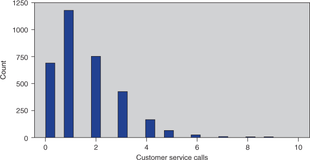
Figure 3.13 Histogram of customer service calls with no overlay.

Figure 3.14 Histogram of customer service calls with churn overlay.
Figure 3.14 hints that the churn proportion may be greater for higher numbers of customer service calls, but it is difficult to discern this result unequivocally. We therefore turn to the “normalized” histogram, where every rectangle has the same height and width, as shown in Figure 3.15. Note that the proportions of churners versus non-churners in Figure 3.15 is exactly the same as in Figure 3.14; it is just that “stretching out” the rectangles that have low counts enables better definition and contrast.

Figure 3.15 “Normalized” histogram of customer service calls with churn overlay.
The pattern now becomes crystal clear. Customers who have called customer service three times or less have a markedly lower churn rate (red part of the rectangle) than customers who have called customer service four or more times.
This EDA on the customer service calls has indicated that
- we should carefully track the number of customer service calls made by each customer. By the third call, specialized incentives should be offered to retain customer loyalty, because, by the fourth call, the probability of churn increases greatly;
- we should expect that, whatever data mining algorithms we use to predict churn, the model will probably include the number of customer service calls made by the customer.
Important note: Normalized histograms are useful for teasing out the relationship between a numerical predictor and the target. However, data analysts should always provide the companion a non-normalized histogram along with the normalized histogram, because the normalized histogram does not provide any information on the frequency distribution of the variable. For example, Figure 3.15 indicates that the churn rate for customers logging nine service calls is 100%; but Figure 3.14 shows that there are only two customers with this number of calls.
Let us now turn to the remaining numerical predictors. The normalized histogram of Day Minutes in Figure 3.16b shows that high day-users tend to churn at a higher rate. Therefore,
- we should carefully track the number of day minutes used by each customer. As the number of day minutes passes 200, we should consider special incentives;
- we should investigate why heavy day-users are tempted to leave;
- we should expect that our eventual data mining model will include day minutes as a predictor of churn.
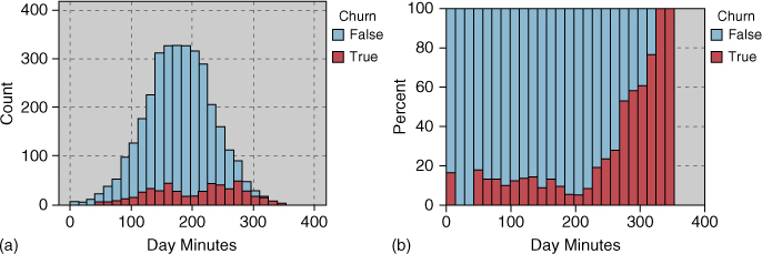
Figure 3.16 (a) Non-normalized histogram of day minutes. (b) Normalized histogram of day minutes.
Figure 3.17b shows a slight tendency for customers with higher evening minutes to churn. Based solely on the graphical evidence, however, we cannot conclude beyond a reasonable doubt that such an effect exists. Therefore, we shall hold off on formulating policy recommendations on evening cell-phone use until our data mining models offer firmer evidence that the putative effect is in fact present.

Figure 3.17 (a) Non-normalized histogram of evening minutes. (b) Normalized histogram of evening minutes.
Figures 3.18b indicates that there is no obvious association between churn and night minutes, as the pattern is relatively flat. In fact, EDA would indicate no obvious association with the target for any of the remaining numeric variables in the data set (except one), although showing this is left as an exercise.

Figure 3.18 (a) Non-normalized histogram of night minutes. (b) Normalized histogram of night minutes.
Note: The lack of obvious association at the EDA stage between a predictor and a target variable is not sufficient reason to omit that predictor from the model. For example, based on the lack of evident association between churn and night minutes, we will not necessarily expect the data mining models to uncover valuable predictive information using this predictor. However, we should nevertheless retain the predictor as an input variable for the data mining models, because actionable associations may still exist for identifiable subsets of the records, and they may be involved in higher-dimension associations and interactions. In any case, unless there is a good reason for eliminating the variable before modeling, then we should probably allow the modeling process to identify which variables are predictive and which are not.
For example, Figure 3.19a and 3.19b, of the predictor International Calls with churn overlay, do not indicate strong graphical evidence of the predictive importance of International Calls. However, a t-test (see Chapter 5) for the difference in mean number of international calls for churners and non-churners is statistically significant (Table 3.6, p-value = 0.003; p-values larger than, say, 0.10 are not considered significant; see Chapter 5), meaning that this variable is indeed useful for predicting churn: Churners tend to place a lower mean number of international calls. Thus, had we omitted International Calls from the analysis based on the seeming lack of graphical evidence, we would have committed a mistake, and our predictive model would not perform as well.
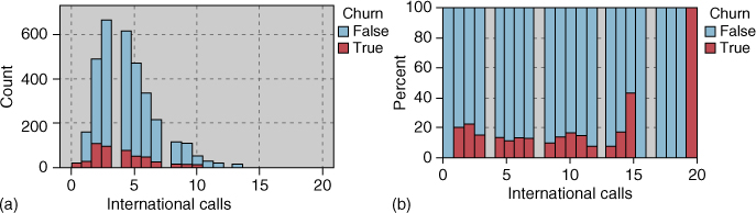
Figure 3.19 (a) Non-normalized histogram of international calls. (b) Normalized histogram of international calls.
Table 3.6 t-test is significant for difference in mean international calls for churners and non-churners
 |
A hypothesis test, such as this t-test, represents statistical inference and model building, and as such lies beyond the scope of EDA. We mention it here merely to underscore the importance of not omitting predictors, merely because their relationship with the target is nonobvious using EDA.
3.5 Exploring Multivariate Relationships
We next turn to an examination of the possible multivariate associations of numeric variables with churn, using scatter plots. Multivariate graphics can uncover new interaction effects which our univariate exploration missed.
Figure 3.20 shows a scatter plot of day minutes versus evenings minutes, with churners indicated by the darker circles. Note the straight line partitioning off the upper right section of the graph. Records above this diagonal line, representing customers with both high day minutes and high evening minutes, appear to have a higher proportion of churners than records below the line. The univariate evidence for a high churn rate for high evening minutes was not conclusive (Figure 3.17b), so it is nice to have a multivariate graph that supports the association, at least for customers with high day minutes.
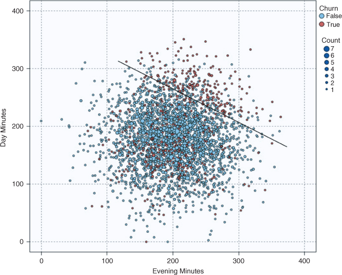
Figure 3.20 Customers with both high day minutes and high evening minutes are at greater risk of churning.
Figure 3.21 shows a scatter plot of customer service calls versus day minutes. Churners and non-churners are indicated with large and small circles, respectively. Consider the records inside the rectangle partition shown in the scatter plot, which indicates a high-churn area in the upper left section of the graph. These records represent customers who have a combination of a high number of customer service calls and a low number of day minutes used. Note that this group of customers could not have been identified had we restricted ourselves to univariate exploration (exploring variable by single variable). This is because of the interaction between the variables.

Figure 3.21 There is an interaction effect between customer service calls and day minutes with respect to churn.
In general, customers with higher numbers of customer service calls tend to churn at a higher rate, as we learned earlier in the univariate analysis. However, Figure 3.21 shows that, of these customers with high numbers of customer service calls, those who also have high day minutes are somewhat “protected” from this high churn rate. The customers in the upper right of the scatter plot exhibit a lower churn rate than those in the upper left. But how do we quantify these graphical findings?
3.6 Selecting Interesting Subsets of the Data for Further Investigation
Graphical EDA can uncover subsets of records that call for further investigation, as the rectangle in Figure 3.21 illustrates. Let us examine the records in the rectangle more closely. IBM/SPSS Modeler allows the user to click and drag a box around data points of interest, and select them for further investigation. Here, we select the records within the rectangular box in the upper left. Figure 3.22 shows that about 65% (115 of 177) of the selected records are churners. That is, those with high customer service calls and low day minutes have a 65% probability of churning. Compare this to the records with high customer service calls and high day minutes (essentially the data points to the right of the rectangle). Figure 3.23 shows that only about 26% of customers with high customer service calls and high day minutes are churners. Thus, it is recommended that we red-flag customers with low day minutes who have a high number of customer service calls, as they are at much higher risk of leaving the company's service than the customers with the same number of customer service calls, but higher day minutes.

Figure 3.22 Very high proportion of churners for high customer service calls and low day minutes.

Figure 3.23 Much lower proportion of churners for high customer service calls and high day minutes.
To summarize, the strategy we implemented here is as follows:
- Generate multivariate graphical EDA, such as scatter plots with a flag overlay.
- Use these plots to uncover subsets of interesting records.
- Quantify the differences by analyzing the subsets of records.
3.7 Using EDA to Uncover Anomalous Fields
EDA will sometimes uncover strange or anomalous records or fields that the earlier data cleaning phase may have missed. Consider, for example, the area code field in the present data set. Although the area codes contain numerals, they can also be used as categorical variables, as they can classify customers according to geographic location. We are intrigued by the fact that the area code field contains only three different values for all the records, 408, 415, and 510 (which all happen to be California area codes), as shown by Figure 3.24.
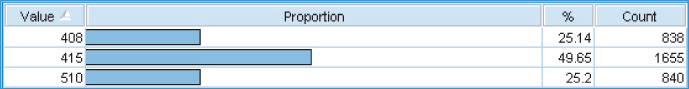
Figure 3.24 Only three area codes for all records.
Now, this would not be anomalous if the records indicated that the customers all lived in California. However, as shown in the contingency table in Figure 3.25 (shown only up to Georgia, to save space), the three area codes seem to be distributed more or less evenly across all the states and the District of Columbia. Also, the chi-square test (see Chapter 6) has a p-value of 0.608, supporting the suspicion that the area codes are distributed randomly across all the states. Now, it is possible that domain experts might be able to explain this type of behavior, but it is also possible that the field just contains bad data.
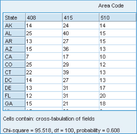
Figure 3.25 Anomaly: three area codes distributed randomly across all 50 states.
We should therefore be wary of this area code field, and should not include it as input to the data mining models in the next phase. Further, the state field may be in error as well. Either way, further communication with someone familiar with the data history, or a domain expert, is called for before inclusion of these variables in the data mining models.
3.8 Binning Based on Predictive Value
Chapter 2 discussed four methods for binning numerical variables. Here we provide two examples of the fourth method: Binning based on predictive value. Recall Figure 3.15, where we saw that customers with less than four calls to customer service had a lower churn rate than customers who had four or more calls to customer service. We may therefore decide to bin the customer service calls variable into two classes, low (fewer than four) and high (four or more). Table 3.7 shows that the churn rate for customers with a low number of calls to customer service is 11.3%, while the churn rate for customers with a high number of calls to customer service is 51.7%, more than four times higher.
Table 3.7 Binning customer service calls shows difference in churn rates
| CustServPlan_Bin | |||
| Low | High | ||
| Churn | False | Count 2721 Col% 88.7% |
Count 129 Col% 48.3% |
| True | Count 345 Col% 11.3% |
Count 138 Col% 51.7% |
|
This binning of customer service calls created a flag variable with two values, high and low. Our next example of binning creates an ordinal categorical variable with three values, low, medium, and high. Recall that we are trying to determine whether there is a relationship between evening minutes and churn. Figure 3.17b hinted at a relationship, but inconclusively. Can we use binning to help tease out a signal from this noise? We reproduce Figure 3.17b here as Figure 3.26, somewhat enlarged, and with the boundaries between the bins indicated.

Figure 3.26 Binning evening minutes helps to tease out a signal from the noise.
Binning is an art, requiring judgment. Where can I insert boundaries between the bins that will maximize the difference in churn proportions? The first boundary is inserted at evening minutes = 160, as the group of rectangles to the right of this boundary seem to have a higher proportion of churners than the group of rectangles to the left. And the second boundary is inserted at evening minutes = 240 for the same reason. (Analysts may fine tune these boundaries for maximum contrast, but for now these boundary values will do just fine; remember that we need to explain our results to the client, and that nice round numbers are more easily explained.) These boundaries thus define three bins, or categories, shown in Table 3.8.
Table 3.8 Bin values for Evening Minutes
| Bin for Categorical Variable | Values of Numerical Variable |
| Evening Minutes_Bin | Evening Minutes |
| Low | |
| Medium | |
| High |
Did the binning manage to tease out a signal? We can answer this by constructing a contingency table of EveningMinutes_Bin with Churn, shown in Table 3.9.
Table 3.9 We have uncovered significant differences in churn rates among the three categories
| EveningMinutes_Bin | ||||
| Low | Medium | High | ||
| Churn | False | Count 618 Col% 90.0% |
Count 1626 Col% 85.9% |
Count 606 Col% 80.5% |
| True | Count 69 Col% 10.0% |
Count 138 Col% 14.1% |
Count 138 Col% 19.5% |
|
About half of the customers have medium amounts of evening minutes (1626/3333 = 48.8%), with about one-quarter each having low and high evening minutes. Recall that the baseline churn rate for all customers is 14.49% (Figure 3.3). The medium group comes in very close to this baseline rate, 14.1%. However, the high evening minutes group has nearly double the churn proportion compared to the low evening minutes group, 19.5–10%. The chi-square test (Chapter 6) is significant, meaning that these results are most likely real and not due to chance alone. In other words, we have succeeded in teasing out a signal from the evening minutes versus churn relationship.
3.9 Deriving New Variables: Flag Variables
Strictly speaking, deriving new variables is a data preparation activity. However, we cover it here in the EDA chapter to illustrate how the usefulness of the new derived variables in predicting the target variable may be assessed. We begin with an example of a derived variable which is not particularly useful. Figure 3.2 shows a spike in the distribution of the variable Voice Mail Messages, which makes its analysis problematic. We therefore derive a flag variable (see Chapter 2), VoiceMailMessages_Flag, to address this problem, as follows:
If Voice Mail Messages> 0 thenVoiceMailMessages_Flag = 1;otherwiseVoiceMailMessages_Flag = 0.
The resulting contingency table is shown in Table 3.10. Compare the results with those from Table 3.4, the contingency table for the Voice Mail Plan. The results are exactly the same, which is not surprising, as those without the plan can have no voice mail messages. Thus, as VoiceMailMessages_Flag has identical values as the flag variable Voice Mail Plan, it is not deemed to be a useful derived variable.
Table 3.10 Contingency table for VoiceMailMessages_Flag
| VoiceMailMessages_Flag | |||
| 0 | 1 | ||
| Churn | False | Count 2008 Col% 83.3% |
Count 842 Col% 91.3% |
| True | Count 403 Col% 16.7% |
Count 80 Col% 8.7% |
|
Recall Figure 3.20 (reproduced here as Figure 3.27), showing a scatter plot of day minutes versus evening minutes, with a straight line separating a group in the upper right(with both high day minutes and high evening minutes) that apparently churns at a greater rate. It would be nice to quantify this claim. We do so by selecting the records in the upper right, and compare their churn rate to that of the other records. One way to do this in IBM/SPSS Modeler is to draw an oval around the desired records, which the software then selects (not shown). However, this method is ad hoc, and not portable to a different data set (say the validation set). A better idea is to
- estimate the equation of the straight line;
- use the equation to separate the records, via a flag variable.

Figure 3.27 Use the equation of the line to separate the records via a flag variable.
This method is portable to a validation set or other related data set.
We estimate the equation of the line in Figure 3.27 to be:
That is, for each customer, the estimated day minutes equals 400 min minus 0.6 times the evening minutes. We may then create a flag variable HighDayEveMins_Flag as follows:
If Day Minutes > 400–0.6 Evening Minutes thenHighDayEveMins_Flag = 1;otherwiseHighDayEveMins_Flag = 0.
Then each data point above the line will have HighDayEveMins_Flag = 1, while the data points below the line will have HighDayEveMins_Flag = 0. The resulting contingency table (Table 3.11) shows the highest churn proportion of any variable we have studied thus far, 70.4 versus 11%, a more than sixfold difference. However, this 70.4% churn rate is restricted to a subset of fewer than 200 records, fortunately for the company.
Table 3.11 Contingency table for HighDayEveMins_Flag
| HighDayEveMins_Flag | |||
| 0 | 1 | ||
| Churn | False | Count 2792 Col% 89.0% |
Count 58 Col% 29.6% |
| True | Count 345 Col% 11.0% |
Count 138 Col% 70.4% |
|
3.10 Deriving New Variables: Numerical Variables
Suppose we would like to derive a new numerical variable which combines Customer Service Calls and International Calls, and whose values will be the mean of the two fields. Now, as International Calls have a larger mean and standard deviation than Customer Service Calls, it would be unwise to take the mean of the raw field values, as International Calls would thereby be more heavily weighted. Instead, when combining numerical variables, we first need to standardize. The new derived variable therefore takes the form:
where CSC_Z represents the z-score standardization of Customer Service Calls and International_Z represents the z-score standardization of International Calls. The resulting normalized histogram of CSCInternational_Z indicates that it will be useful for predicting churn, as shown in Figure 3.28b.

Figure 3.28 (a) Non-normalized histogram of CSCInternational_Z. (b) Normalized histogram of CSCInternational_Z.
3.11 Using EDA to Investigate Correlated Predictor Variables
Two variables x and y are linearly correlated if an increase in x is associated with either an increase in y or a decrease in y. The correlation coefficient r quantifies the strength and direction of the linear relationship between x and y. The threshold for significance of the correlation coefficient r depends not only on the sample size but also on data mining, where there are a large number of records (over 1000), even small values of r, such as ![]() may be statistically significant.
may be statistically significant.
One should take care to avoid feeding correlated variables to one's data mining and statistical models. At best, using correlated variables will overemphasize one data component; at worst, using correlated variables will cause the model to become unstable and deliver unreliable results. However, just because two variables are correlated does not mean that we should omit one of them. Instead, while in the EDA stage, we should apply the following strategy.

Figure 3.29 Matrix plot of day minutes, day calls, and day charge.
Table 3.12 Correlations and p-values
 |
There does not seem to be any relationship between day minutes and day calls, nor between day calls and day charge. This we find to be rather odd, as one may have expected that, as the number of calls increased, the number of minutes would tend to increase (and similarly for charge), resulting in a positive correlation between these fields. However, the graphical evidence in Figure 3.29 does not support this, nor do the correlations in Table 3.12, which are r = 0.07 for both relationships, with large p-values of 0.697.
However, there is a perfect linear relationship between day minutes and day charge, indicating that day charge is a simple linear function of day minutes only. Using Minitab's regression tool (see Table 3.13), we find that we may express this function as the estimated regression equation: “Day charge equals 0.000613 plus 0.17 times day minutes.” This is essentially a flat rate model, billing 17 cents per minute for day use. Note from Table 3.13 that the R-squared statistic is precisely 100%, indicating a perfect linear relationship.
Table 3.13 Minitab regression output for Day Charge versus Day Minutes
 |
As day charge is perfectly correlated with day minutes, we should eliminate one of the two variables. We do so, arbitrarily choosing to eliminate day charge and retain day minutes. Investigation of the evening, night, and international components reflected similar findings, and we thus also eliminate evening charge, night charge, and international charge. Note that, had we proceeded to the modeling phase without first uncovering these correlations, our data mining and statistical models may have returned incoherent results, due, for example, to multicollinearity in multiple regression. We have therefore reduced the number of predictors from 20 to 16 by eliminating one of each pair of perfectly correlated predictors. A further benefit of doing so is that the dimensionality of the solution space is reduced so that certain data mining algorithms may more efficiently find the globally optimal solution.
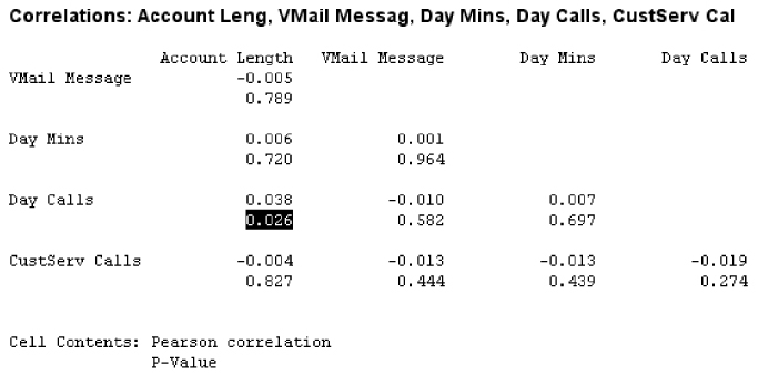
After dealing with the perfectly correlated predictors, the data analyst should turn to step 2 of the strategy, and identify any other correlated predictors, for later handling with principal components analysis. The correlation of each numerical predictor with every other numerical predictor should be checked, if feasible. Correlations with small p-values should be identified. A subset of this procedure is shown here in Table 3.14. Note that the correlation coefficient 0.038 between account length and day calls has a small p-value of 0.026, telling us that account length and day calls are positively correlated. The data analyst should note this, and prepare to apply the principal components analysis during the modeling phase.
Table 3.14 Account length is positively correlated with day calls
 |
3.12 Summary of Our EDA
Let us consider some of the insights we have gained into the churn data set through the use of EDA. We have examined each of the variables (here and in the exercises), and have taken a preliminary look at their relationship with churn.
- The four charge fields are linear functions of the minute fields, and should be omitted.
- The area code field and/or the state field are anomalous, and should be omitted until further clarification is obtained.
Insights with respect to churn are as follows:
- Customers with the International Plan tend to churn more frequently.
- Customers with the Voice Mail Plan tend to churn less frequently.
- Customers with four or more Customer Service Calls churn more than four times as often as the other customers.
- Customers with both high Day Minutes and high Evening Minutes tend to churn at a higher rate than the other customers.
- Customers with both high Day Minutes and high Evening Minutes churn at a rate about six times greater than the other customers.
- Customers with low Day Minutes and high Customer Service Calls churn at a higher rate than the other customers.
- Customers with lower numbers of International Calls churn at a higher rate than do customers with more international calls.
- For the remaining predictors, EDA uncovers no obvious association of churn. However, these variables are still retained for input to downstream data mining models and techniques.
Note the power of EDA. We have not applied any high-powered data mining algorithms yet on this data set, such as decision trees or neural network algorithms. Yet, we have still gained considerable insight into the attributes that are associated with the customers leaving the company, simply by careful application of EDA. These insights can be easily formulated into actionable recommendations so that the company can take action to lower the churn rate among its customer base.
R References
- Wickham H. ggplot2: Elegant Graphics for Data Analysis. New York: Springer; 2009.
- R Core Team. R: A Language and Environment for Statistical Computing. Vienna, Austria: R Foundation for Statistical Computing; 2012. ISBN: 3-900051-07-0, http://www.R-project.org/.
Exercises
1. Explain the difference between EDA and hypothesis testing, and why analysts may prefer EDA when doing data mining.
2. Why do we need to perform EDA? Why should not we simply proceed directly to the modeling phase and start applying our high-powered data mining software?
3. Why do we use contingency tables, instead of just presenting the graphical results?
4. How can we find the marginal distribution of each variable in a contingency table?
5. What is the difference between taking row percentages and taking column percentages in a contingency table?
6. What is the graphical counterpart of a contingency table?
7. Describe what it would mean for interaction to take place between two categorical variables, using an example.
8. What type of histogram is useful for examining the relationship between a numerical predictor and the target?
9. Explain one benefit and one drawback of using a normalized histogram. Should we ever present a normalized histogram without showing its non-normalized counterpart?
10. Explain whether we should omit a predictor from the modeling stage if it does not show any relationship with the target variable in the EDA stage, and why.
11. Describe how scatter plots can uncover patterns in two-dimensions that would be invisible from one-dimensional EDA.
12. Make up a fictional data set (attributes with no records is fine) with a pair of anomalous attributes. Describe how EDA would help to uncover the anomaly.
13. Explain the objective and the method of binning based on predictive value.
14. Why is binning based on predictive value considered to be somewhat of an art?
15. What step should precede the deriving of a new numerical variable representing the mean of two other numerical variables?
16. What does it mean to say that two variables are correlated?
17. Describe the possible consequences of allowing correlated variables to remain in the model.
18. A common practice among some analysts when they encounter two correlated predictors is to omit one of them from the analysis. Is this practice recommended?
19. Describe the strategy for handing correlated predictor variables at the EDA stage.
20. For each of the following descriptive methods, state whether it may be applied to categorical data, continuous numerical data, or both.
- Bar charts
- Histograms
- Summary statistics
- Cross tabulations
- Correlation analysis
- Scatter plots
- Web graphs
- Binning.
Hands-On Analysis
21. Using the churn data set, develop EDA which shows that the remaining numeric variables in the data set (apart from those covered in the text above) indicate no obvious association with the target variable.
Use the adult data set from the book series web site for the following exercises. The target variable is income, and the goal is to classify income based on the other variables.
22. Which variables are categorical and which are continuous?
23. Using software, construct a table of the first 10 records of the data set, in order to get a feel for the data.
24. Investigate whether we have any correlated variables.
25. For each of the categorical variables, construct a bar chart of the variable, with an overlay of the target variable. Normalize if necessary.
- Discuss the relationship, if any, each of these variables has with the target variables.
- Which variables would you expect to make a significant appearance in any data mining classification model we work with?
26. For each pair of categorical variables, construct a cross tabulation. Discuss your salient results.
27. (If your software supports this.) Construct a web graph of the categorical variables. Fine tune the graph so that interesting results emerge. Discuss your findings.
28. Report on whether anomalous fields exist in this data set, based on your EDA, which fields these are, and what we should do about it.
29. Report the mean, median, minimum, maximum, and standard deviation for each of the numerical variables.
30. Construct a histogram of each numerical variables, with an overlay of the target variable income. Normalize if necessary.
- Discuss the relationship, if any, each of these variables has with the target variables.
- Which variables would you expect to make a significant appearance in any data mining classification model we work with?
31. For each pair of numerical variables, construct a scatter plot of the variables. Discuss your salient results.
32. Based on your EDA so far, identify interesting sub-groups of records within the data set that would be worth further investigation.
33. Apply binning to one of the numerical variables. Do it in such a way as to maximize the effect of the classes thus created (following the suggestions in the text). Now do it in such a way as to minimize the effect of the classes so that the difference between the classes is diminished. Comment.
34. Refer to the previous exercise. Apply the other two binning methods (equal width, and equal number of records) to this same variable. Compare the results and discuss the differences. Which method do you prefer?
35. Summarize your salient EDA findings from the above exercises, just as if you were writing a report.