
Chapter 20
Kohonen Networks
20.1 Self-Organizing Maps
Kohonen networks were introduced in 1982 by Finnish researcher Tuevo Kohonen.1 Although applied initially to image and sound analyses, Kohonen networks are nevertheless an effective mechanism for clustering analysis. Kohonen networks represent a type of self-organizing map (SOM), which itself represents a special class of neural networks, which we studied in Chapter 12.
The goal of SOMs is to convert a complex high-dimensional input signal into a simpler low-dimensional discrete map.2 Thus, SOMs are nicely appropriate for cluster analysis, where underlying hidden patterns among records and fields are sought. SOMs structure the output nodes into clusters of nodes, where nodes in closer proximity are more similar to each other than to other nodes that are farther apart. Ritter3 has shown that SOMs represent a nonlinear generalization of principal components analysis, another dimension-reduction technique.
SOMs are based on competitive learning, where the output nodes compete among themselves to be the winning node (or neuron), the only node to be activated by a particular input observation. As Haykin describes it: “The neurons become selectively tuned to various input patterns (stimuli) or classes of input patterns in the course of a competitive learning process.” A typical SOM architecture is shown in Figure 20.1. The input layer is shown at the bottom of the figure, with one input node for each field. Just as with neural networks, these input nodes perform no processing themselves, but simply pass the field input values along downstream.

Figure 20.1 Topology of a simple self-organizing map for clustering records by age and income.
Like neural networks, SOMs are feedforward and completely connected. Feedforward networks do not allow looping or cycling. Completely connected means that every node in a given layer is connected to every node in the next layer, although not to other nodes in the same layer. Like neural networks, each connection between nodes has a weight associated with it, which at initialization is assigned randomly to a value between 0 and 1. Adjusting these weights represents the key for the learning mechanism in both neural networks and SOMs. Variable values need to be normalized or standardized, just as for neural networks, so that certain variables do not overwhelm others in the learning algorithm.
Unlike most neural networks, however, SOMs have no hidden layer. The data from the input layer is passed along directly to the output layer. The output layer is represented in the form of a lattice, usually in one or two dimensions, and typically in the shape of a rectangle, although other shapes, such as hexagons, may be used. The output layer shown in Figure 20.1 is a 3 × 3 square.
For a given record (instance), a particular field value is forwarded from a particular input node to every node in the output layer. For example, suppose that the normalized age and income values for the first record in the data set are 0.69 and 0.88, respectively. The 0.69 value would enter the SOM through the input node associated with age, and this node would pass this value of 0.69 to every node in the output layer. Similarly, the 0.88 value would be distributed through the income input node to every node in the output layer. These values, together with the weights assigned to each of the connections, would determine the values of a scoring function (such as Euclidean distance) for each output node. The output node with the “best” outcome from the scoring function would then be designated as the winning node.
SOMs exhibit three characteristic processes:
- Competition. As mentioned above, the output nodes compete with each other to produce the best value for a particular scoring function, most commonly the Euclidean distance. In this case, the output node that has the smallest Euclidean distance between the field inputs and the connection weights would be declared the winner. Later, we examine in detail an example of how this works.
- Cooperation. The winning node therefore becomes the center of a neighborhood of excited neurons. This emulates the behavior of human neurons, which are sensitive to the output of other neurons in their immediate neighborhood. In SOMs, all the nodes in this neighborhood share in the “excitement” or “reward” earned by the winning nodes, that of adaptation. Thus, even though the nodes in the output layer are not connected directly, they tend to share common features, due to this neighborliness parameter.
- Adaptation. The nodes in the neighborhood of the winning node participate in adaptation, that is, learning. The weights of these nodes are adjusted so as to further improve the score function. In other words, these nodes will thereby have an increased chance of winning the competition once again, for a similar set of field values.
20.2 Kohonen Networks
Kohonen networks are SOMs that exhibit Kohonen learning. Suppose that we consider the set of m field values for the nth record to be an input vector xn = xn1, xn2, …, xnm, and the current set of m weights for a particular output node j to be a weight vector wj = w1j, w2j, …, wmj. In Kohonen learning, the nodes in the neighborhood of the winning node adjust their weights using a linear combination of the input vector and the current weight vector:
where η, 0 < η < 1, represents the learning rate, analogous to the neural networks case. Kohonen4 indicates that the learning rate should be a decreasing function of training epochs (runs through the data set) and that a linearly or geometrically decreasing η is satisfactory for most purposes.
The algorithm for Kohonen networks (after Fausett5) is shown in the accompanying box. At initialization, the weights are randomly assigned, unless firm a priori knowledge exists regarding the proper value for the weight vectors. Also at initialization, the learning rate η and neighborhood size R are assigned. The value of R may start out moderately large but should decrease as the algorithm progresses. Note that nodes that do not attract a sufficient number of hits may be pruned, thereby improving algorithm efficiency.
20.3 Example of a Kohonen Network Study
Consider the following simple example. Suppose that we have a data set with two attributes, age and income, which have already been normalized, and suppose that we would like to use a 2 × 2 Kohonen network to uncover hidden clusters in the data set. We would thus have the topology shown in Figure 20.2.
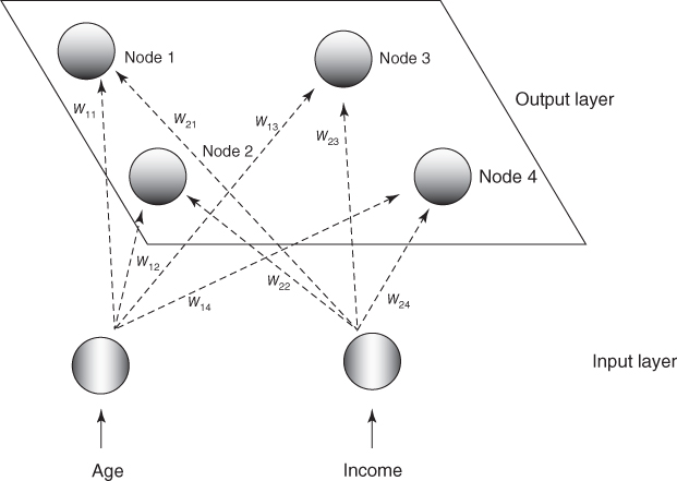
Figure 20.2 Example: topology of the 2 × 2 Kohonen network.
A set of four records is ready to be input, with a thumbnail description of each record provided. With such a small network, we set the neighborhood size to be R = 0, so that only the winning node will be awarded the opportunity to adjust its weight. Also, we set the learning rate η to be 0.5. Finally, assume that the weights have been randomly initialized as follows:
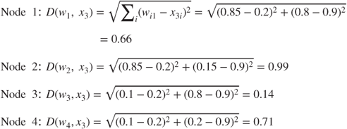
For the first input vector, x1 = (0.8, 0.8), we perform the following competition, cooperation, and adaptation sequence.
- Competition. We compute the Euclidean distance between this input vector and the weight vectors for each of the four output nodes:
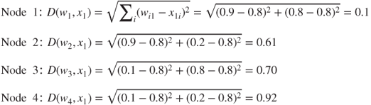
The winning node for this first input record is therefore node 1, as it minimizes the score function D, the Euclidean distance between the input vector for this record, and the vector of weights, over all nodes.
Note why node 1 won the competition for the first record (0.8, 0.8). Node 1 won because its weights (0.9, 0.8) are more similar to the field values for this record than are the other nodes' weights. For this reason, we may expect node 1 to exhibit an affinity for records of older persons with high income. In other words, we may expect node 1 to uncover a cluster of older, high-income persons.
- Cooperation. In this simple example, we have set the neighborhood size R = 0 so that the level of cooperation among output nodes is nil! Therefore, only the winning node, node 1, will be rewarded with a weight adjustment. (We omit this step in the remainder of the example.)
- Adaptation. For the winning node, node 1, the weights are adjusted as follows:

For j = 1 (node 1), n = 1 (the first record) and learning rate η = 0.5, this becomes wi1, new = wi1, current + 0.5(x1i − wi1, current) for each field:


Note the type of adjustment that takes place. The weights are nudged in the direction of the fields' values of the input record. That is, w11, the weight on the age connection for the winning node, was originally 0.9, but was adjusted in the direction of the normalized value for age in the first record, 0.8. As the learning rate η = 0.5, this adjustment is half (0.5) of the distance between the current weight and the field value. This adjustment will help node 1 to become even more proficient at capturing the records of older, high-income persons.
Next, for the second input vector, x2 = (0.8, 0.1), we have the following sequence:
- Competition
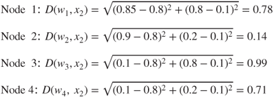
Winning node: node 2. Note that node 2 won the competition for the second record (0.8, 0.1), because its weights (0.9, 0.2) are more similar to the field values for this record than are the other nodes' weights. Thus, we may expect node 2 to “collect” records of older persons with low income. That is, node 2 will represent a cluster of older, low-income persons.
- Adaptation. For the winning node, node 2, the weights are adjusted as follows: For j = 2 (node 2), n = 2 (the first record), and learning rate η = 0.5, we have wi2, new = wi2, current + 0.5(x2i − wi2, current) for each field:
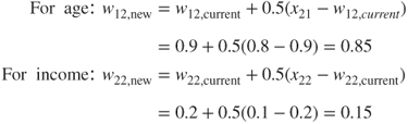
Again, the weights are updated in the direction of the field values of the input record. Weight w12 undergoes the same adjustment w11 above, as the current weights and age field values were the same. Weight w22 for income is adjusted downward, as the income level of the second record was lower than the current income weight for the winning node. Because of this adjustment, node 2 will be even better at catching records of older, low-income persons.
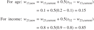
Next, for the third input vector, x3 = (0.2, 0.9), we have the following sequence:
- Competition
The winning node is node 3 because its weights (0.1, 0.8) are the closest to the third record's field values. Hence, we may expect node 3 to represent a cluster of younger, high-income persons.
- Adaptation. For the winning node, node 3, the weights are adjusted as follows: wi3, new = wi3, current + 0.5(x3i − wi3, current), for each field:
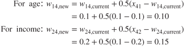
Finally, for the fourth input vector, x4 = (0.1, 0.1), we have the following sequence:
- Competition

The winning node is node 4 because its weights (0.1, 0.2) have the smallest Euclidean distance to the fourth record's field values. We may therefore expect node 4 to represent a cluster of younger, low-income persons.
- Adaptation. For the winning node, node 4, the weights are adjusted as follows:
 , for each field:
Thus, we have seen that the four output nodes will represent four distinct clusters if the network continues to be fed data similar to the four records shown in Figure 20.2. These clusters are summarized in Table 20.1.
Table 20.1 Four clusters uncovered by Kohonen network
| Cluster | Associated with | Description |
| 1 | Node 1 | Older person with high income |
| 2 | Node 2 | Older person with low income |
| 3 | Node 3 | Younger person with high income |
| 4 | Node 4 | Younger person with low income |
Clearly, the clusters uncovered by the Kohonen network in this simple example are fairly obvious. However, this example does serve to illustrate how the network operates at a basic level, using competition and Kohonen learning.
20.4 Cluster Validity
To avoid spurious results, and to assure that the resulting clusters are reflective of the general population, the clustering solution should be validated. One common validation method is to split the original sample randomly into two groups, develop cluster solutions for each group, and then compare their profiles using the methods below or other summarization methods.
Now, suppose that a researcher is interested in performing further inference, prediction, or other analysis downstream on a particular field, and wishes to use the clusters as predictors. Then, it is important that the researcher do not include the field of interest as one of the fields used to build the clusters. For example, in the example below, clusters are constructed using the churn data set. We would like to use these clusters as predictors for later assistance in classifying customers as churners or not. Therefore, we must be careful not to include the churn field among the variables used to build the clusters.
20.5 Application of Clustering Using Kohonen Networks
Next, we apply the Kohonen network algorithm to the churn data set from Chapter 3 (available at the book series web site; also available from http://www.sgi.com/tech/mlc/db/). Recall that the data set contains 20 variables worth of information about 3333 customers, along with an indication of whether that customer churned (left the company) or not. The following variables were passed to the Kohonen network algorithm, using IBM/SPSS Modeler:
- Flag (0/1) variables
- International Plan and VoiceMail Plan
- Numerical variables
- Account length, voice mail messages, day minutes, evening minutes, night minutes, international minutes, and customer service calls
- After applying Z-score standardization to all numerical variables.
The topology of the network was as in Figure 20.3, with every node in the input layer being connected with weights (not shown) to every node in the output layer, which is labeled in accordance with their use in the Modeler results. The Kohonen learning parameters were set in Modeler as follows. For the first 20 cycles (passes through the data set), the neighborhood size was set at R = 2, and the learning rate was set to decay linearly starting at η = 0.3. Then, for the next 150 cycles, the neighborhood size was reset to R = 1, while the learning rate was allowed to decay linearly from η = 0.3 to η = 0.

Figure 20.3 Topology of 3 × 3 Kohonen network used for clustering the churn data set.
As it turned out, the Modeler Kohonen algorithm used only six of the nine available output nodes, as shown in Figure 20.4, with output nodes 01, 11, and 21 being pruned. (Note that each of the six clusters is actually of constant value in this plot, such as (0,0) and (1,2). A random shock (x, y agitation, artificial noise) was introduced to illustrate the size of the cluster membership.)
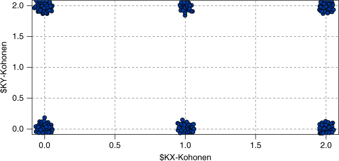
Figure 20.4 Modeler uncovered six clusters.
20.6 Interpreting The Clusters
How are we to interpret these clusters? How can we develop cluster profiles? Consider Figure 20.5, which plots the clusters similar to Figure 20.4, but with panels for whether a customer is an adopter of the International Plan. Figure 20.5 shows that International Plan adopters reside exclusively in Clusters 12 and 22, with the other clusters containing only non-adopters of the International Plan. The Kohonen clustering algorithm has found a high-quality discrimination along this dimension, dividing the data set neatly among adopters and non-adopters of the International Plan.
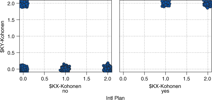
Figure 20.5 International Plan adopters reside exclusively in Clusters 12 and 22.
Figure 20.6 shows the VoiceMail Plan adoption status of the cluster members. The three clusters along the bottom row (i.e., Cluster 00, Cluster 10, and Cluster 20) contain only non-adopters of the VoiceMail Plan. Clusters 02 and 12 contain only adopters of the VoiceMail Plan. Cluster 22 contains mostly non-adopters and also some adopters of the VoiceMail Plan.
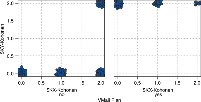
Figure 20.6 Similar clusters are closer to each other.
Recall that because of the neighborliness parameter, clusters that are closer together should be more similar than clusters that are farther apart. Note in Figure 20.5 that all International Plan adopters reside in contiguous (neighboring) clusters, as do all non-adopters. Similarly for Figure 20.6, except that Cluster 22 contains a mixture.
We see that Cluster 12 represents a special subset of customers, those who have adopted both the International Plan and the VoiceMail Plan. This is a well-defined subset of the customer base, which perhaps explains why the Kohonen network uncovered it, even though this subset represents only 2.4% of the customers.
Figure 20.7 provides information about how the values of all the variables are distributed among the clusters, with one column per cluster and one row per variable. The darker rows indicate the more important variables, that is, the variables that proved more useful for discriminating among the clusters. Consider Account Length_Z. Cluster 00 contains customers who tend to have been with the company for a long time, that is, their account lengths tend to be on the large side. Contrast this with Cluster 20, whose customers tend to be fairly new.
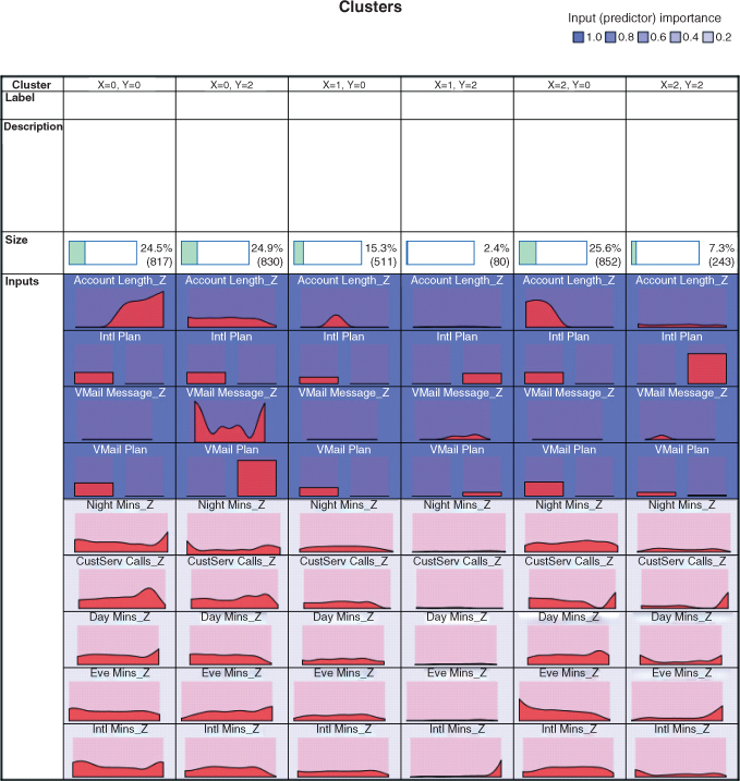
Figure 20.7 How the variables are distributed among the clusters.
For the quantitative variables, the data analyst should report the means for each variable, for each cluster, along with an assessment of whether the difference in means across the clusters is significant. It is important that the means reported to the client appear on the original (untransformed) scale, and not on the Z scale or min–max scale, so that the client may better understand the clusters.
Figure 20.8 provides these means, along with the results of an analysis of variance (see Chapter 5) for assessing whether the difference in means across clusters is significant. Each row contains the information for one numerical variable, with one analysis of variance for each row. Each cell contains the cluster mean, standard deviation, standard error (![]() ), and cluster count. The degrees of freedom are
), and cluster count. The degrees of freedom are ![]() and
and ![]() . The F-test statistic is the value of
. The F-test statistic is the value of ![]() for the analysis of variance for that particular variable, and the Importance statistic is simply 1 − p-value, where p-value
for the analysis of variance for that particular variable, and the Importance statistic is simply 1 − p-value, where p-value ![]() .
.

Figure 20.8 Assessing whether the means across clusters are significantly different.
Note that both Figures 20.7 and 11.8 concur in identifying account length and the number of voice mail messages as the two most important numerical variables for discriminating among clusters. Next, Figure 20.7 showed graphically that the account length for Cluster 00 is greater than that of Cluster 20. This is supported by the statistics in Figure 20.8, which shows that the mean account length of 141.508 days for Cluster 00 and 61.707 days for Cluster 20. Also, tiny Cluster 12 has the highest mean number of voice mail messages (31.662), with Cluster 02 also having a large amount (29.229). Finally, note that the neighborliness of Kohonen clusters tends to make neighboring clusters similar. It would have been surprising, for example to find a cluster with 141.508 mean account length right next to a cluster with 61.707 mean account length. In fact, this did not happen.
In general, not all clusters are guaranteed to offer obvious interpretability. The data analyst should team up with a domain expert to discuss the relevance and applicability of the clusters uncovered using Kohonen or other methods. Here, however, most of these clusters appear fairly clear-cut and self-explanatory.
20.6.1 Cluster Profiles
- Cluster 00: Loyal Non-Adopters. Belonging to neither the VoiceMail Plan nor the International Plan, customers in large Cluster 00 have nevertheless been with the company the longest, with by far the largest mean account length, which may be related to the largest number of calls to customer service. This cluster exhibits the lowest average minutes usage for day minutes and international minutes, and the second lowest evening minutes and night minutes.
- Cluster 02: Voice Mail Users. This large cluster contains members of the VoiceMail Plan, with therefore a high mean number of voice mail messages, and no members of the International Plan. Otherwise, the cluster tends toward the middle of the pack for the other variables.
- Cluster 10: Average Customers. Customers in this medium-sized cluster belong to neither the Voice Mail Plan nor the International Plan. Except for the second-largest mean number of calls to customer service, this cluster otherwise tends toward the average values for the other variables.
- Cluster 12: Power Customers. This smallest cluster contains customers who belong to both the VoiceMail Plan and the International Plan. These sophisticated customers also lead the pack in usage minutes across three categories and are in second place in the other category. They also have the fewest average calls to customer service. The company should keep a watchful eye on this cluster, as they may represent a highly profitable group.
- Cluster 20: Newbie Non-AdoptersUsers. Belonging to neither the VoiceMail Plan nor the International Plan, customers in large Cluster 00 represent the company's newest customers, on average, with easily the shortest mean account length. These customers set the pace with the highest mean night minutes usage.
- Cluster 22: International Plan Users. This small cluster contains members of the International Plan and only a few members of the VoiceMail Plan. The number of calls to customer service is second lowest, which may mean that they need a minimum of hand-holding. Besides the lowest mean night minutes usage, this cluster tends toward average values for the other variables.
Cluster profiles may of themselves be of actionable benefit to companies and researchers. They may, for example, suggest marketing segmentation strategies in an era of shrinking budgets. Rather than targeting the entire customer base for a mass mailing, for example, perhaps only the most profitable customers may be targeted. Another strategy is to identify those customers whose potential loss would be of greater harm to the company, such as the customers in Cluster 12 above. Finally, customer clusters could be identified that exhibit behavior predictive of churning; intervention with these customers could save them for the company.
Suppose, however, that we would like to apply these clusters to assist us in the churn classification task. We may compare the proportions of churners among the various clusters, using graphs such as Figure 20.9. From the figure we can see that customers in Clusters 12 (power customers) and 22 (International Plan users) are in greatest danger of leaving the company, as shown by their higher overall churn proportions. Cluster 02 (VoiceMail Plan users) has the lowest churn rate. The company should take a serious look at its International Plan to see why customers do not seem to be happy with it. Also, the company should encourage more customers to adopt its VoiceMail Plan, in order to make switching companies more inconvenient. These results and recommendations reflect our findings from Chapter 3, where we initially examined the relationship between churning and the various fields. Note also that Clusters 12 and 22 are neighboring clusters; even though churn was not an input field for cluster formation, the type of customers who are likely to churn are more similar to each other than to customers not likely to churn.

Figure 20.9 Proportions of churners among the clusters.
20.7 Using Cluster Membership as Input to Downstream Data Mining Models
Cluster membership may be used to enrich the data set and improve model efficacy. Indeed, as data repositories continue to grow and the number of fields continues to increase, clustering has become a common method of dimension reduction.
We will illustrate how cluster membership may be used as input for downstream data mining models, using the churn data set and the clusters uncovered above. Each record now has associated with it a cluster membership assigned by the Kohonen networks algorithm. We shall enrich our data set by adding this cluster membership field to the input fields used for classifying churn. A classification and regression tree (CART) decision tree model was run, to classify customers as either churners or non-churners. The resulting decision tree output is shown in Figure 20.10.
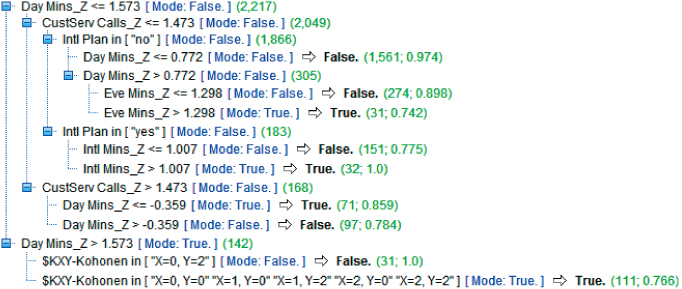
Figure 20.10 Output of CART decision tree for data set enriched by cluster membership.
The root node split is on whether DayMin_Z (the Z-standardized version of day minutes; the analyst should untransform these values if this output is meant for the client) is greater than about 1.573. This represents the 142 users who have the highest day minutes, 1.573 standard deviations above the mean. For this group, the second-level split is by cluster, with Cluster 02 split off from the remaining clusters. Note that for high day minutes, the mode classification is True (churner), but that within this subset, membership in Cluster 02 acts to protect from churn, as the 31 customers with high day minutes and membership in Cluster 02 have a 100% probability of not churning. Recall that Cluster 02, which is acting as a brake on churn behavior, represents Voice Mail Users, who had the lowest churn rate of any cluster.
R References
- 1. R Core Team. R: A Language and Environment for Statistical Computing. Vienna, Austria: R Foundation for Statistical Computing; 2012. ISBN: 3-900051-07-0, http://www.R-project.org/. Accessed 2014 Sep 30.
- 2. Wehrens R, Buydens LMC. Self- and super-organising paps in R: the Kohonen package Journal of Statistical Software, 2007;21(5).
Exercises
1. Describe some of the similarities between Kohonen networks and the neural networks of Chapter 7. Describe some of the differences.
2. Describe the three characteristic processes exhibited by SOMs such as Kohonen networks. What differentiates Kohonen networks from other SOM models?
3. Using weights and distance, explain clearly why a certain output node will win the competition for the input of a certain record.
4. For larger output layers, what would be the effect of increasing the value of R?
5. Describe what would happen if the learning rate η did not decline?
6. This chapter shows how cluster membership can be used for downstream modeling. Does this apply to the cluster membership obtained by hierarchical and k-means clustering as well?
Hands-On Analysis
Use the adult data set at the book series Web site for the following exercises.
7. Apply the Kohonen clustering algorithm to the data set, being careful not to include the income field. Use a topology that is not too large, such as 3 × 3.
8. Construct a scatter plot (with x/y agitation) of the cluster membership, with an overlay of income. Discuss your findings.
9. Construct a bar chart of the cluster membership, with an overlay of income. Discuss your findings. Compare to the scatter plot.
10. Construct a bar chart of the cluster membership, with an overlay of marital status. Discuss your findings.
11. If your software supports this, construct a web graph of income, marital status, and the other categorical variables. Fine-tune the web graph so that it conveys good information.
12. Generate numerical summaries for the clusters. For example, generate a cluster mean summary.
13. Using the information above and any other information you can bring to bear, construct detailed and informative cluster profiles, complete with titles.
14. Use cluster membership as a further input to a CART decision tree model for classifying income. How important is clustering membership in classifying income?
15. Use cluster membership as a further input to a C4.5 decision tree model for classifying income. How important is clustering membership in classifying income? Compare to the CART model.