
Chapter 8
Simple Linear Regression
Regression modeling represents a powerful and elegant method for estimating the value of a continuous target variable. In this chapter, we introduce regression modeling through simple linear regression, where a straight line is used to approximate the relationship between a single continuous predictor variable and a single continuous response variable. Later, in Chapter 9, we turn to multiple regression, where several predictor variables are used to estimate a single response.
8.1 An Example of Simple Linear Regression
To develop the simple linear regression model, consider the Cereals data set,1 an excerpt of which is presented in Table 8.1. The Cereals data set contains nutritional information for 77 breakfast cereals, and includes the following variables:
- Cereal name
- Cereal manufacturer
- Type (hot or cold)
- Calories per serving
- Grams of protein
- Grams of fat
- Milligrams of sodium
- Grams of fiber
- Grams of carbohydrates
- Grams of sugar
- Milligrams of potassium
- Percentage of recommended daily allowance of vitamins (0%, 25%, or 100%)
- Weight of one serving
- Number of cups per serving
- Shelf location (1 = bottom, 2 = middle, 3 = top)
- Nutritional rating, as calculated by Consumer Reports.
Table 8.1 Excerpt from Cereals data set: eight fields, first 16 cereals
| Cereal Name | Manufacture | Sugars | Calories | Protein | Fat | Sodium | Rating |
| 100% Bran | N | 6 | 70 | 4 | 1 | 130 | 68.4030 |
| 100% Natural Bran | Q | 8 | 120 | 3 | 5 | 15 | 33.9837 |
| All-Bran | K | 5 | 70 | 4 | 1 | 260 | 59.4255 |
| All-Bran Extra Fiber | K | 0 | 50 | 4 | 0 | 140 | 93.7049 |
| Almond Delight | R | 8 | 110 | 2 | 2 | 200 | 34.3848 |
| Apple Cinnamon Cheerios | G | 10 | 110 | 2 | 2 | 180 | 29.5095 |
| Apple Jacks | K | 14 | 110 | 2 | 0 | 125 | 33.1741 |
We are interested in estimating the nutritional rating of a cereal, given its sugar content. However, before we begin, it is important to note that this data set contains some missing data. The following four field values are missing:
- Potassium content of Almond Delight
- Potassium content of Cream of Wheat
- Carbohydrates and sugars content of Quaker Oatmeal.
We shall therefore not be able to use the sugar content of Quaker Oatmeal to help estimate nutrition rating using sugar content, and only 76 cereals are available for this purpose. Figure 8.1 presents a scatter plot of the nutritional rating versus the sugar content for the 76 cereals, along with the least-squares regression line.
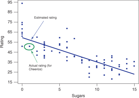
Figure 8.1 Scatter plot of nutritional rating versus sugar content for 77 cereals.
The regression line is written in the form: ![]() , called the regression equation, where:
, called the regression equation, where:
 is the estimated value of the response variable;
 is the y-intercept of the regression line;
 is the slope of the regression line;
 and
and  , together, are called the regression coefficients.
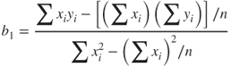
The regression equation for the relationship between sugars (x) and nutritional rating (y) for this sample of cereals is ![]() . Below we demonstrate how this equation is calculated. This estimated regression equation can be interpreted as “the estimated cereal rating equals 59.953 minus 2.4614 times the sugar content in grams.” The regression line and the regression equation are used as a linear approximation of the relationship between the x (predictor) and y (response) variables, that is, between sugar content and nutritional rating. We can then use the regression equation to make estimates or predictions.
. Below we demonstrate how this equation is calculated. This estimated regression equation can be interpreted as “the estimated cereal rating equals 59.953 minus 2.4614 times the sugar content in grams.” The regression line and the regression equation are used as a linear approximation of the relationship between the x (predictor) and y (response) variables, that is, between sugar content and nutritional rating. We can then use the regression equation to make estimates or predictions.
For example, suppose that we are interested in estimating the nutritional rating for a new cereal (not in the original data) that contains x = 1 gram of sugar. Using the regression equation, we find the estimated nutritional rating for a cereal with 1 gram of sugar to be ![]() . Note that this estimated value for the nutritional rating lies directly on the regression line, at the location (x = 1,
. Note that this estimated value for the nutritional rating lies directly on the regression line, at the location (x = 1, ![]() ), as shown in Figure 8.1. In fact, for any given value of x (sugar content), the estimated value for y (nutritional rating) lies precisely on the regression line.
), as shown in Figure 8.1. In fact, for any given value of x (sugar content), the estimated value for y (nutritional rating) lies precisely on the regression line.
Now, there is one cereal in our data set that does have a sugar content of 1 gram, Cheerios. Its nutrition rating, however, is 50.765, not 57.3916 as we estimated above for the new cereal with 1 gram of sugar. Cheerios' point in the scatter plot is located at (x = 1, y = 50.765), within the oval in Figure 8.1. Now, the upper arrow in Figure 8.1 is pointing to a location on the regression line directly above the Cheerios point. This is where the regression equation predicted the nutrition rating to be for a cereal with a sugar content of 1 gram. The prediction was too high by 57.3916 − 50.765 = 6.6266 rating points, which represents the vertical distance from the Cheerios data point to the regression line. This vertical distance of 6.6266 rating points, in general ![]() , is known variously as the prediction error, estimation error, or residual.
, is known variously as the prediction error, estimation error, or residual.
We of course seek to minimize the overall size of our prediction errors. Least squares regression works by choosing the unique regression line that minimizes the sum of squared residuals over all the data points. There are alternative methods of choosing the line that best approximates the linear relationship between the variables, such as median regression, although least squares remains the most common method. Note that we say we are performing a “regression of rating on sugars,” where the y variable precedes the x variable in the statement.
8.1.1 The Least-Squares Estimates
Now, suppose our data set contained a sample of 76 cereals different from the sample in our Cereals data set. Would we expect that the relationship between nutritional rating and sugar content to be exactly the same as that found above: Rating = 59.853 − 2.4614 Sugars? Probably not. Here, ![]() and
and ![]() are statistics, whose values differ from sample to sample. Like other statistics,
are statistics, whose values differ from sample to sample. Like other statistics, ![]() and
and ![]() are used to estimate population parameters, in this case,
are used to estimate population parameters, in this case, ![]() and
and ![]() , the y-intercept and slope of the true regression line. That is, the equation
, the y-intercept and slope of the true regression line. That is, the equation
represents the true linear relationship between nutritional rating and sugar content for all cereals, not just those in our sample. The error term ![]() is needed to account for the indeterminacy in the model, because two cereals may have the same sugar content but different nutritional ratings. The residuals
is needed to account for the indeterminacy in the model, because two cereals may have the same sugar content but different nutritional ratings. The residuals ![]() are estimates of the error terms,
are estimates of the error terms, ![]() . Equation (8.1) is called the regression equation or the true population regression equation; it is associated with the true or population regression line.
. Equation (8.1) is called the regression equation or the true population regression equation; it is associated with the true or population regression line.
Earlier, we found the estimated regression equation for estimating the nutritional rating from sugar content to be ![]() . Where did these values for
. Where did these values for ![]() and
and ![]() come from? Let us now derive the formulas for estimating the y-intercept and slope of the estimated regression line, given the data.2
come from? Let us now derive the formulas for estimating the y-intercept and slope of the estimated regression line, given the data.2
Suppose we have n observations from the model in equation (8.1); that is, we have
The least-squares line is that line that minimizes the population sum of squared errors, ![]() First, we re-express the population SSEs as
First, we re-express the population SSEs as
Then, recalling our differential calculus, we may find the values of ![]() and
and ![]() that minimize
that minimize ![]() by differentiating equation (8.2) with respect to
by differentiating equation (8.2) with respect to ![]() and
and ![]() , and setting the results equal to zero. The partial derivatives of equation (8.2) with respect to
, and setting the results equal to zero. The partial derivatives of equation (8.2) with respect to ![]() and
and ![]() are, respectively:
are, respectively:
We are interested in the values for the estimates ![]() and
and ![]() , so setting the equations in (8.3) equal to zero, we have
, so setting the equations in (8.3) equal to zero, we have
Distributing the summation gives us
which is re-expressed as
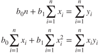
Solving equation (8.4) for ![]() and
and ![]() , we have
, we have
where n is the total number of observations, ![]() is the mean value for the predictor variable and
is the mean value for the predictor variable and ![]() is the mean value for the response variable, and the summations are i = 1 to n. The equations in (8.5) and (8.6) are therefore the least squares estimates for
is the mean value for the response variable, and the summations are i = 1 to n. The equations in (8.5) and (8.6) are therefore the least squares estimates for ![]() and
and ![]() , the values that minimize the SSEs.
, the values that minimize the SSEs.
We now illustrate how we may find the values ![]() and
and ![]() , using equations (8.5), (8.6), and the summary statistics from Table 8.2, which shows the values for
, using equations (8.5), (8.6), and the summary statistics from Table 8.2, which shows the values for ![]() , and
, and ![]() , for the Cereals in the data set (note that only 16 of the 77 cereals are shown). It turns out that, for this data set,
, for the Cereals in the data set (note that only 16 of the 77 cereals are shown). It turns out that, for this data set, ![]() ,
, ![]() ,
, ![]() , and
, and ![]() .
.
Table 8.2 Summary statistics for finding b0 and b1
| Cereal Name | X = Sugars | Y = Rating | X*Y | X2 |
| 100% Bran | 6 | 68.4030 | 410.418 | 36 |
| 100% Natural Bran | 8 | 33.9837 | 271.870 | 64 |
| All-Bran | 5 | 59.4255 | 297.128 | 25 |
| All-Bran Extra Fiber | 0 | 93.7049 | 0.000 | 0 |
| Almond Delight | 8 | 34.3848 | 275.078 | 64 |
| Apple Cinnamon Cheerios | 10 | 29.5095 | 295.095 | 100 |
| Apple Jacks | 14 | 33.1741 | 464.437 | 196 |
| Basic 4 | 8 | 37.0386 | 296.309 | 64 |
| Bran Chex | 6 | 49.1203 | 294.722 | 36 |
| Bran Flakes | 5 | 53.3138 | 266.569 | 25 |
| Cap'n Crunch | 12 | 18.0429 | 216.515 | 144 |
| Cheerios | 1 | 50.7650 | 50.765 | 1 |
| Cinnamon Toast Crunch | 9 | 19.8236 | 178.412 | 81 |
| Clusters | 7 | 40.4002 | 282.801 | 49 |
| Cocoa Puffs | 13 | 22.7364 | 295.573 | 169 |
| Wheaties Honey Gold | 8 | 36.1876 | 289.501 | 64 |
 |
 |
Plugging into formulas (8.5) and (8.6), we find:
and
These values for the slope and y-intercept provide us with the estimated regression line indicated in Figure 8.1.
The y-intercept ![]() is the location on the y-axis where the regression line intercepts the y-axis; that is, the estimated value for the response variable when the predictor variable equals zero. The interpretation of the value of the y-intercept
is the location on the y-axis where the regression line intercepts the y-axis; that is, the estimated value for the response variable when the predictor variable equals zero. The interpretation of the value of the y-intercept ![]() is as the estimated value of y, given x = 0. For example, for the Cereals data set, the y-intercept
is as the estimated value of y, given x = 0. For example, for the Cereals data set, the y-intercept ![]() represents the estimated nutritional rating for cereals with zero sugar content. Now, in many regression situations, a value of zero for the predictor variable would not make sense. For example, suppose we were trying to predict elementary school students' weight (y) based on the students' height (x). The meaning of height = 0 is unclear, so that the denotative meaning of the y-intercept would not make interpretive sense in this case. However, for our data set, a value of zero for the sugar content does make sense, as several cereals contain 0 grams of sugar.
represents the estimated nutritional rating for cereals with zero sugar content. Now, in many regression situations, a value of zero for the predictor variable would not make sense. For example, suppose we were trying to predict elementary school students' weight (y) based on the students' height (x). The meaning of height = 0 is unclear, so that the denotative meaning of the y-intercept would not make interpretive sense in this case. However, for our data set, a value of zero for the sugar content does make sense, as several cereals contain 0 grams of sugar.
The slope of the regression line indicates the estimated change in y per unit increase in x. We interpret ![]() to mean the following: “For each increase of 1 gram in sugar content, the estimated nutritional rating decreases by 2.4614 rating points.” For example, Cereal A with five more grams of sugar than Cereal B would have an estimated nutritional rating 5(2.4614) = 12.307 ratings points lower than Cereal B.
to mean the following: “For each increase of 1 gram in sugar content, the estimated nutritional rating decreases by 2.4614 rating points.” For example, Cereal A with five more grams of sugar than Cereal B would have an estimated nutritional rating 5(2.4614) = 12.307 ratings points lower than Cereal B.
8.2 Dangers of Extrapolation
Suppose that a new cereal (say, the Chocolate Frosted Sugar Bombs loved by Calvin, the comic strip character written by Bill Watterson) arrives on the market with a very high sugar content of 30 grams per serving. Let us use our estimated regression equation to estimate the nutritional rating for Chocolate Frosted Sugar Bombs:
In other words, Calvin's cereal has so much sugar that its nutritional rating is actually a negative number, unlike any of the other cereals in the data set (minimum = 18) and analogous to a student receiving a negative grade on an exam. What is going on here? The negative estimated nutritional rating for Chocolate Frosted Sugar Bombs is an example of the dangers of extrapolation.
Analysts should confine the estimates and predictions made using the regression equation to values of the predictor variable contained within the range of the values of x in the data set. For example, in the Cereals data set, the lowest sugar content is 0 grams and the highest is 15 grams, so that predictions of nutritional rating for any value of x (sugar content) between 0 and 15 grams would be appropriate. However, extrapolation, making predictions for x-values lying outside this range, can be dangerous, because we do not know the nature of the relationship between the response and predictor variables outside this range.
Extrapolation should be avoided if possible. If predictions outside the given range of x must be performed, the end-user of the prediction needs to be informed that no x-data is available to support such a prediction. The danger lies in the possibility that the relationship between x and y, which may be linear within the range of x in the data set, may no longer be linear outside these bounds.
Consider Figure 8.2. Suppose that our data set consisted only of the data points in black but that the true relationship between x and y consisted of both the black (observed) and the gray (unobserved) points. Then, a regression line based solely on the available (black dot) data would look approximately similar to the regression line indicated. Suppose that we were interested in predicting the value of y for an x-value located at the triangle. The prediction based on the available data would then be represented by the dot on the regression line indicated by the upper arrow. Clearly, this prediction has failed spectacularly, as shown by the vertical line indicating the huge prediction error. Of course, as the analyst would be completely unaware of the hidden data, he or she would hence be oblivious to the massive scope of the error in prediction. Policy recommendations based on such erroneous predictions could certainly have costly results.
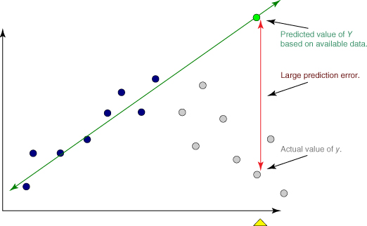
Figure 8.2 Dangers of extrapolation.
8.3 How Useful is the Regression? The Coefficient of Determination, 2
Of course, a least-squares regression line could be found to approximate the relationship between any two continuous variables, regardless of the quality of the relationship between them, but this does not guarantee that the regression will therefore be useful. The question therefore arises as to how we may determine whether a particular estimated regression equation is useful for making predictions.
We shall work toward developing a statistic, ![]() , for measuring the goodness of fit of the regression. That is,
, for measuring the goodness of fit of the regression. That is, ![]() , known as the coefficient of determination, measures how well the linear approximation produced by the least-squares regression line actually fits the observed data.
, known as the coefficient of determination, measures how well the linear approximation produced by the least-squares regression line actually fits the observed data.
Recall that ![]() represents the estimated value of the response variable, and that
represents the estimated value of the response variable, and that ![]() represents the prediction error or residual. Consider the data set in Table 8.3, which shows the distance in kilometers traveled by a sample of 10 orienteering competitors, along with the elapsed time in hours. For example, the first competitor traveled 10 kilometers in 2 hours. On the basis of these 10 competitors, the estimated regression takes the form
represents the prediction error or residual. Consider the data set in Table 8.3, which shows the distance in kilometers traveled by a sample of 10 orienteering competitors, along with the elapsed time in hours. For example, the first competitor traveled 10 kilometers in 2 hours. On the basis of these 10 competitors, the estimated regression takes the form ![]() , so that the estimated distance traveled equals 6 kilometers plus twice the number of hours. You should verify that you can calculate this estimated regression equation, either using software, or using the equations in (8.7) and (8.8).
, so that the estimated distance traveled equals 6 kilometers plus twice the number of hours. You should verify that you can calculate this estimated regression equation, either using software, or using the equations in (8.7) and (8.8).
Table 8.3 Calculation of the SSE for the orienteering example
| Predicted Score | Error in Prediction | (Error in Prediction)2 | |||
| Subject | X = Time | Y = Distance | |||
| 1 | 2 | 10 | 10 | 0 | 0 |
| 2 | 2 | 11 | 10 | 1 | 1 |
| 3 | 3 | 12 | 12 | 0 | 0 |
| 4 | 4 | 13 | 14 | −1 | 1 |
| 5 | 4 | 14 | 14 | 0 | 0 |
| 6 | 5 | 15 | 16 | −1 | 1 |
| 7 | 6 | 20 | 18 | 2 | 4 |
| 8 | 7 | 18 | 20 | −2 | 4 |
| 9 | 8 | 22 | 22 | 0 | 0 |
| 10 | 9 | 25 | 24 | 1 | 1 |
This estimated regression equation can be used to make predictions about the distance traveled for a given number of hours. These estimated values of y are given in the Predicted Score column in Table 8.3. The prediction error and squared prediction error may then be calculated. The sum of the squared prediction errors, or the sum of squares error, SSE = ![]() , represents an overall measure of the error in prediction resulting from the use of the estimated regression equation. Here we have SSE = 12. Is this value large? We are unable to state whether this value, SSE = 12, is large, because at this point we have no other measure to compare it to.
, represents an overall measure of the error in prediction resulting from the use of the estimated regression equation. Here we have SSE = 12. Is this value large? We are unable to state whether this value, SSE = 12, is large, because at this point we have no other measure to compare it to.
Now, imagine for a moment that we were interested in estimating the distance traveled without knowledge of the number of hours. That is, suppose that we did not have access to the x-variable information for use in estimating the y-variable. Clearly, our estimates of the distance traveled would be degraded, on the whole, because less information usually results in less accurate estimates.
Because we lack access to the predictor information, our best estimate for y is simply ![]() , the sample mean of the number of hours traveled. We would be forced to use
, the sample mean of the number of hours traveled. We would be forced to use ![]() to estimate the number of kilometers traveled for every competitor, regardless of the number of hours that person had traveled.
to estimate the number of kilometers traveled for every competitor, regardless of the number of hours that person had traveled.
Consider Figure 8.3. The estimates for distance traveled when ignoring the time information is shown by the horizontal line ![]() Disregarding the time information entails predicting
Disregarding the time information entails predicting ![]() kilometers for the distance traveled, for orienteering competitors who have been hiking only 2 or 3 hours, as well as for those who have been out all day (8 or 9 hours). This is clearly not optimal.
kilometers for the distance traveled, for orienteering competitors who have been hiking only 2 or 3 hours, as well as for those who have been out all day (8 or 9 hours). This is clearly not optimal.
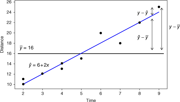
Figure 8.3 Overall, the regression line has smaller prediction error than the sample mean.
The data points in Figure 8.3 seem to “cluster” tighter around the estimated regression line than around the line ![]() , which suggests that, overall, the prediction errors are smaller when we use the x-information than otherwise. For example, consider competitor #10, who hiked y = 25 kilometers in x = 9 hours. If we ignore the x-information, then the estimation error would be
, which suggests that, overall, the prediction errors are smaller when we use the x-information than otherwise. For example, consider competitor #10, who hiked y = 25 kilometers in x = 9 hours. If we ignore the x-information, then the estimation error would be ![]() kilometers. This prediction error is indicated as the vertical line between the data point for this competitor and the horizontal line; that is, the vertical distance between the observed y and the predicted
kilometers. This prediction error is indicated as the vertical line between the data point for this competitor and the horizontal line; that is, the vertical distance between the observed y and the predicted ![]() .
.
Suppose that we proceeded to find ![]() for every record in the data set, and then found the sum of squares of these measures, just as we did for
for every record in the data set, and then found the sum of squares of these measures, just as we did for ![]() when we calculated the SSE. This would lead us to SST, the sum of squares total:
when we calculated the SSE. This would lead us to SST, the sum of squares total:
SST, also known as the total sum of squares, is a measure of the total variability in the values of the response variable alone, without reference to the predictor. Note that SST is a function of the sample variance of y, where the variance is the square of the standard deviation of y:
Thus, all three of these measures—SST, variance, and standard deviation—are univariate measures of the variability in y alone (although of course we could find the variance and standard deviation of the predictor as well).
Would we expect SST to be larger or smaller than SSE? Using the calculations shown in Table 8.4, we have SST = 228, which is much larger than SSE = 12. We now have something to compare SSE against. As SSE is so much smaller than SST, this indicates that using the predictor information in the regression results in much tighter estimates overall than ignoring the predictor information. These sums of squares measure errors in prediction, so that smaller is better. In other words, using the regression improves our estimates of the distance traveled.
Table 8.4 Finding SST for the orienteering example
| Student | X = Time | Y = Distance | |||
| 1 | 2 | 10 | 16 | −6 | 36 |
| 2 | 2 | 11 | 16 | −5 | 25 |
| 3 | 3 | 12 | 16 | −4 | 16 |
| 4 | 4 | 13 | 16 | −3 | 9 |
| 5 | 4 | 14 | 16 | −2 | 4 |
| 6 | 5 | 15 | 16 | −1 | 1 |
| 7 | 6 | 20 | 16 | 4 | 16 |
| 8 | 7 | 18 | 16 | 2 | 4 |
| 9 | 8 | 22 | 16 | 6 | 36 |
| 10 | 9 | 25 | 16 | 9 | 81 |
Next, what we would like is a measure of how much the estimated regression equation improves the estimates. Once again examine Figure 8.3. For hiker #10, the estimation error when using the regression is ![]() , while the estimation error when ignoring the time information is
, while the estimation error when ignoring the time information is ![]() . Therefore, the amount of improvement (reduction in estimation error) is
. Therefore, the amount of improvement (reduction in estimation error) is ![]() .
.
Once again, we may proceed to construct a sum of squares statistic based on ![]() . Such a statistic is known as SSR, the sum of squares regression, a measure of the overall improvement in prediction accuracy when using the regression as opposed to ignoring the predictor information.
. Such a statistic is known as SSR, the sum of squares regression, a measure of the overall improvement in prediction accuracy when using the regression as opposed to ignoring the predictor information.
Observe from Figure 8.2 that the vertical distance ![]() may be partitioned into two “pieces,”
may be partitioned into two “pieces,” ![]() and
and ![]() . This follows from the following identity:
. This follows from the following identity:
Now, suppose we square each side, and take the summation. We then obtain3
:
We recognize from equation (8.8) the three sums of squares we have been developing, and can therefore express the relationship among them as follows:
We have seen that SST measures the total variability in the response variable. We may then think of SSR as the amount of variability in the response variable that is “explained” by the regression. In other words, SSR measures that portion of the variability in the response variable that is accounted for by the linear relationship between the response and the predictor.
However, as not all the data points lie precisely on the regression line, this means that there remains some variability in the y-variable that is not accounted for by the regression. SSE can be thought of as measuring all the variability in y from all sources, including random error, after the linear relationship between x and y has been accounted for by the regression.
Earlier, we found SST = 228 and SSE = 12. Then, using equation (8.11), we can find SSR to be SSR = SST − SSE = 228 − 12 = 216. Of course, these sums of squares must always be nonnegative. We are now ready to introduce the coefficient of determination, ![]() , which measures the goodness of fit of the regression as an approximation of the linear relationship between the predictor and response variables.
, which measures the goodness of fit of the regression as an approximation of the linear relationship between the predictor and response variables.
As ![]() takes the form of a ratio of SSR to SST, we may interpret
takes the form of a ratio of SSR to SST, we may interpret ![]() to represent the proportion of the variability in the y-variable that is explained by the regression; that is, by the linear relationship between the predictor and response variables.
to represent the proportion of the variability in the y-variable that is explained by the regression; that is, by the linear relationship between the predictor and response variables.
What is the maximum value that ![]() can take? The maximum value for
can take? The maximum value for ![]() would occur when the regression is a perfect fit to the data set, which takes place when each of the data points lies precisely on the estimated regression line. In this optimal situation, there would be no estimation errors from using the regression, meaning that each of the residuals would equal zero, which in turn would mean that SSE would equal zero. From equation (8.11), we have that SST = SSR + SSE. If SSE = 0, then SST = SSR, so that
would occur when the regression is a perfect fit to the data set, which takes place when each of the data points lies precisely on the estimated regression line. In this optimal situation, there would be no estimation errors from using the regression, meaning that each of the residuals would equal zero, which in turn would mean that SSE would equal zero. From equation (8.11), we have that SST = SSR + SSE. If SSE = 0, then SST = SSR, so that ![]() would equal SSR/SST = 1. Thus, the maximum value for
would equal SSR/SST = 1. Thus, the maximum value for ![]() is 1, which occurs when the regression is a perfect fit.
is 1, which occurs when the regression is a perfect fit.
What is the minimum value that ![]() can take? Suppose that the regression showed no improvement at all, that is, suppose that the regression explained none of the variability in y. This would result in SSR equaling zero, and consequently,
can take? Suppose that the regression showed no improvement at all, that is, suppose that the regression explained none of the variability in y. This would result in SSR equaling zero, and consequently, ![]() would equal zero as well. Thus,
would equal zero as well. Thus, ![]() is bounded between 0 and 1, inclusive.
is bounded between 0 and 1, inclusive.
How are we to interpret the value that ![]() takes? Essentially, the higher the value of
takes? Essentially, the higher the value of ![]() , the better the fit of the regression to the data set. Values of
, the better the fit of the regression to the data set. Values of ![]() near one denote an extremely good fit of the regression to the data, while values near zero denote an extremely poor fit. In the physical sciences, one encounters relationships that elicit very high values of
near one denote an extremely good fit of the regression to the data, while values near zero denote an extremely poor fit. In the physical sciences, one encounters relationships that elicit very high values of ![]() , while in the social sciences, one may need to be content with lower values of
, while in the social sciences, one may need to be content with lower values of ![]() , because of person-to-person variability. As usual, the analyst's judgment should be tempered with the domain expert's experience.
, because of person-to-person variability. As usual, the analyst's judgment should be tempered with the domain expert's experience.
8.4 Standard Error of the Estimate,
We have seen how the ![]() statistic measures the goodness of fit of the regression to the data set. Next, the s statistic, known as the standard error of the estimate, is a measure of the accuracy of the estimates produced by the regression. Clearly, s is one of the most important statistics to consider when performing a regression analysis. To find the value of s, we first find the mean square error (MSE):
statistic measures the goodness of fit of the regression to the data set. Next, the s statistic, known as the standard error of the estimate, is a measure of the accuracy of the estimates produced by the regression. Clearly, s is one of the most important statistics to consider when performing a regression analysis. To find the value of s, we first find the mean square error (MSE):
where m indicates the number of predictor variables, which is 1 for the simple linear regression case, and greater than 1 for the multiple regression case (Chapter 9). Like SSE, MSE represents a measure of the variability in the response variable left unexplained by the regression.
Then, the standard error of the estimate is given by
The value of s provides an estimate of the size of the “typical” residual, much as the value of the standard deviation in univariate analysis provides an estimate of the size of the typical deviation. In other words, s is a measure of the typical error in estimation, the typical difference between the predicted response value and the actual response value. In this way, the standard error of the estimate s represents the precision of the predictions generated by the estimated regression equation. Smaller values of s are better, and s has the benefit of being expressed in the units of the response variable y.
For the orienteering example, we have
Thus, the typical estimation error when using the regression model to predict distance is 1.2 kilometers. That is, if we are told how long a hiker has been traveling, then our estimate of the distance covered will typically differ from the actual distance by about 1.2 kilometers. Note from Table 8.3 that all of the residuals lie between 0 and 2 in absolute value, so that 1.2 may be considered a reasonable estimate of the typical residual. (Other measures, such as the mean absolute deviation of the residuals, may also be considered, but are not widely reported in commercial software packages.)
We may compare s = 1.2 kilometers against the typical estimation error obtained from ignoring the predictor data, obtained from the standard deviation of the response,

The typical prediction error when ignoring the time data is 5 kilometers. Using the regression has reduced the typical prediction error from 5 to 1.2 kilometers.
In the absence of software, one may use the following computational formulas for calculating the values of SST and SSR. The formula for SSR is exactly the same as for the slope ![]() , except that the numerator is squared.
, except that the numerator is squared.
Let us use these formulas for finding the values of SST and SSR for the orienteering example. You should verify that we have ![]() ,
, ![]() ,
, ![]() ,
, ![]() , and
, and ![]() .
.
Then,![]() .
.
And, 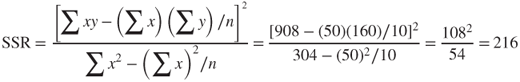 .
.
Of course, these are the same values found earlier using the more onerous tabular method. Finally, we calculate the value of the coefficient of determination ![]() to be
to be
In other words, the linear relationship between time and distance accounts for 94.74% of the variability in the distances traveled. The regression model fits the data very nicely.
8.5 Correlation Coefficient
A common measure used to quantify the linear relationship between two quantitative variables is the correlation coefficient. The correlation coefficient r (also known as the Pearson product moment correlation coefficient) is an indication of the strength of the linear relationship between two quantitative variables, and is defined as follows:

where ![]() and
and ![]() represent the sample standard deviations of the x and y data values, respectively.
represent the sample standard deviations of the x and y data values, respectively.
The correlation coefficient r always takes on values between 1 and −1, inclusive. Values of r close to 1 indicate that x and y are positively correlated, while values of r close to −1 indicate that x and y are negatively correlated. However, because of the large sample sizes associated with data mining, even values of r relatively small in absolute value may be considered statistically significant. For example, for a relatively modest-sized data set of about 1000 records, a correlation coefficient of r = 0.07 would be considered statistically significant. Later in this chapter, we learn how to construct a confidence interval for determining the statistical significance of the correlation coefficient r.
The definition formula for the correlation coefficient above may be tedious, because the numerator would require the calculation of the deviations for both the x-data and the y-data. We therefore have recourse, in the absence of software, to the following computational formula for r:
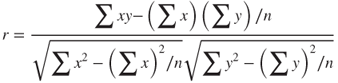
For the orienteering example, we have
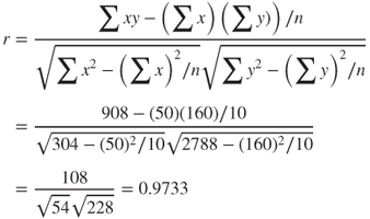
We would say that the time spent traveling and the distance traveled are strongly positively correlated. As the time spent hiking increases, the distance traveled tends to increase.
However, it is more convenient to express the correlation coefficient r as ![]() . When the slope
. When the slope ![]() of the estimated regression line is positive, then the correlation coefficient is also positive,
of the estimated regression line is positive, then the correlation coefficient is also positive, ![]() ; when the slope is negative, then the correlation coefficient is also negative,
; when the slope is negative, then the correlation coefficient is also negative, ![]() In the orienteering example, we have
In the orienteering example, we have ![]() . This is positive, which means that the correlation coefficient will also be positive,
. This is positive, which means that the correlation coefficient will also be positive, ![]() .
.
It should be stressed here that the correlation coefficient r measures only the linear correlation between x and y. The predictor and target may be related in a curvilinear manner, for example, and r may not uncover the relationship.
8.6 Anova Table for Simple Linear Regression
Regression statistics may be succinctly presented in an analysis of variance (ANOVA) table, the general form of which is shown here in Table 8.5. Here, m represents the number of predictor variables, so that, for simple linear regression, m = 1.
Table 8.5 The ANOVA table for simple linear regression
| Source of Variation | Sum of Squares | Degrees of Freedom | Mean Square | F |
| Regression | SSR | m | ||
| Error (or residual) | SSE | |||
| Total |
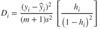
The ANOVA table conveniently displays the relationships among several statistics, showing, for example, that the sums of squares add up to SST. The mean squares are presented as the ratios of the items to their left, and, for inference, the test statistic F is represented as the ratio of the mean squares. Tables 8.6 and 8.7 show the Minitab regression results, including the ANOVA tables, for the orienteering example and the cereal example, respectively.
Table 8.6 Results for regression of distance versus time for the orienteering example
 |
Table 8.7 Results for regression of nutritional rating versus sugar content
 |
8.7 Outliers, High Leverage Points, and Influential Observations
Next, we discuss the role of three types of observations that may or may not exert undue influence on the regression results. These are as follows:
- Outliers
- High leverage points
- Influential observations.
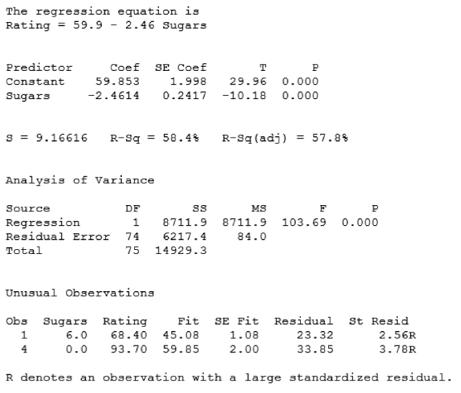
An outlier is an observation that has a very large standardized residual in absolute value. Consider the scatter plot of nutritional rating against sugars in Figure 8.4. The two observations with the largest absolute residuals are identified as All Bran Extra Fiber and 100% Bran. Note that the vertical distance away from the regression line (indicated by the vertical arrows) is greater for these two observations than for any other cereals, indicating the largest residuals.
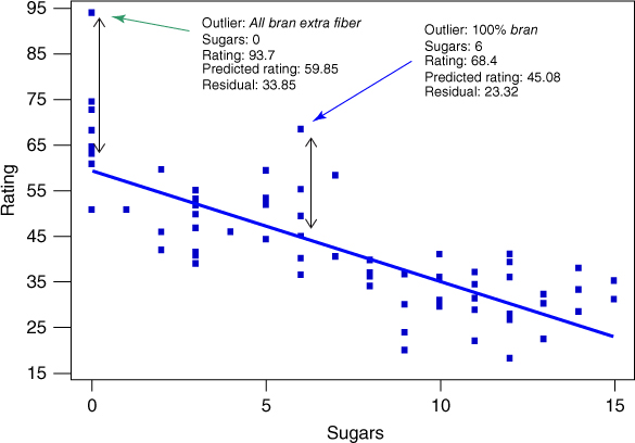
Figure 8.4 Identifying the outliers in regression of nutritional rating versus sugars.
For example, the nutritional rating for All Bran Extra Fiber (93.7) is much higher than predicted (59.85), based on its sugar content alone (0 grams). Similarly, the nutritional rating for 100% Bran (68.4) is much higher than would have been estimated (45.08) based on its sugar content alone (6 grams).
Residuals may have different variances, so that it is preferable to use the standardized residuals in order to identify outliers. Standardized residuals are residuals divided by their standard error, so that they are all on the same scale. Let ![]() denote the standard error of the ith residual. Then
denote the standard error of the ith residual. Then
where ![]() refers to the leverage of the ith observation (see below).
refers to the leverage of the ith observation (see below).
And the standardized residual equals:
A rough rule of thumb is to flag observations whose standardized residuals exceed 2 in absolute value as being outliers. For example, note from Table 8.7 that Minitab identifies observations 1 and 4 as outliers based on their large standardized residuals; these are All Bran Extra Fiber and 100% Bran.
In general, if the residual is positive, we may say that the observed y-value is higher than the regression estimated, given the x-value. If the residual is negative, we may say that the observed y-value is lower than the regression estimated, given the x-value. For example, for All Bran Extra Fiber (which has a positive residual), we would say that the observed nutritional rating is higher than the regression estimated, given its sugars value. (This may presumably be because of all that extra fiber.)
A high leverage point is an observation that is extreme in the predictor space. In other words, a high leverage point takes on extreme values for the x-variable(s), without reference to the y-variable. That is, leverage takes into account only the x-variables, and ignores the y-variable. The term leverage is derived from the physics concept of the lever, which Archimedes asserted could move the Earth itself if only it were long enough.
The leverage ![]() for the ith observation may be denoted as follows:
for the ith observation may be denoted as follows:

For a given data set, the quantities ![]() and
and ![]() may be considered to be constants, so that the leverage for the ith observation depends solely on
may be considered to be constants, so that the leverage for the ith observation depends solely on ![]() , the squared distance between the value of the predictor and the mean value of the predictor. The farther the observation differs from the mean of the observations, in the x-space, the greater the leverage. The lower bound on leverage values is
, the squared distance between the value of the predictor and the mean value of the predictor. The farther the observation differs from the mean of the observations, in the x-space, the greater the leverage. The lower bound on leverage values is ![]() , and the upper bound is 1.0. An observation with leverage greater than about
, and the upper bound is 1.0. An observation with leverage greater than about ![]() or
or ![]() may be considered to have high leverage (where m indicates the number of predictors).
may be considered to have high leverage (where m indicates the number of predictors).
For example, in the orienteering example, suppose that there was a new observation, a real hard-core orienteering competitor, who hiked for 16 hours and traveled 39 kilometers. Figure 8.5 shows the scatter plot, updated with this 11th hiker.

Figure 8.5 Scatter plot of distance versus time, with new competitor who hiked for 16 hours.

The Hard-Core Orienteer hiked 39 kilometers in 16 hours. Does he represent an outlier or a high-leverage point?
Note from Figure 8.5 that the time traveled by the new hiker (16 hours) is extreme in the x-space, as indicated by the horizontal arrows. This is sufficient to identify this observation as a high leverage point, without reference to how many kilometers he or she actually traveled. Examine Table 8.8, which shows the updated regression results for the 11 hikers. Note that Minitab correctly points out that the extreme orienteer does indeed represent an unusual observation, because its x-value gives it large leverage. That is, Minitab has identified the hard-core orienteer as a high leverage point, because he hiked for 16 hours. It correctly did not consider the distance (y-value) when considering leverage.
Table 8.8 Updated regression results, including the hard-core hiker
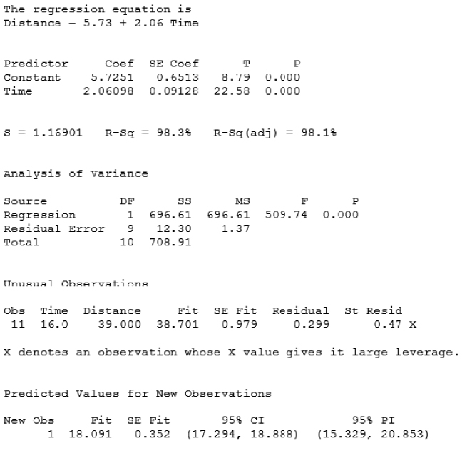 |
However, the hard-core orienteer is not an outlier. Note from Figure 8.5 that the data point for the hard-core orienteer lies quite close to the regression line, meaning that his distance of 39 kilometers is close to what the regression equation would have predicted, given the 16 hours of hiking. Table 8.8 tells us that the standardized residual is only ![]() , which is less than 2, and therefore not an outlier.
, which is less than 2, and therefore not an outlier.
Next, we consider what it means to be an influential observation. In the context of history, what does it mean to be an influential person? A person is influential if their presence or absence significantly changes the history of the world. In the context of Bedford Falls (from the Christmas movie It's a Wonderful Life), George Bailey (played by James Stewart) discovers that he really was influential when an angel shows him how different (and poorer) the world would have been had he never been born. Similarly, in regression, an observation is influential if the regression parameters alter significantly based on the presence or absence of the observation in the data set.
An outlier may or may not be influential. Similarly, a high leverage point may or may not be influential. Usually, influential observations combine both the characteristics of large residual and high leverage. It is possible for an observation to be not-quite flagged as an outlier, and not-quite flagged as a high leverage point, but still be influential through the combination of the two characteristics.
First let us consider an example of an observation that is an outlier but is not influential. Suppose that we replace our 11th observation (no more hard-core guy) with someone who hiked 20 kilometers in 5 hours. Examine Table 8.9, which presents the regression results for these 11 hikers. Note from Table 8.9 that the new observation is flagged as an outlier (unusual observation with large standardized residual). This is because the distance traveled (20 kilometers) is higher than the regression predicted (16.364 kilometers), given the time (5 hours).
Table 8.9 Regression results including person who hiked 20 kilometers in 5 hours
 |
Now, would we consider this observation to be influential? Overall, probably not. Compare Table 8.9 (the regression output for the new hiker with 5 hours/20 kilometers) and Table 8.6 (the regression output for the original data set) to assess the effect the presence of this new observation has on the regression coefficients. The y-intercept changes from ![]() to
to ![]() , but the slope does not change at all, remaining at
, but the slope does not change at all, remaining at ![]() , regardless of the presence of the new hiker.
, regardless of the presence of the new hiker.
Figure 8.6 shows the relatively mild effect this outlier has on the estimated regression line, shifting it vertically a small amount, without affecting the slope at all. Although it is an outlier, this observation is not influential because it has very low leverage, being situated exactly on the mean of the x-values, so that it has the minimum possible leverage for a data set of size n = 11.

Figure 8.6 The mild outlier shifts the regression line only slightly.
We can calculate the leverage for this observation (x = 5, y = 20) as follows. As ![]() , we have
, we have
Then the leverage for the new observation is
Now that we have the leverage for this observation, we may also find the standardized residual, as follows. First, we have the standard error of the residual:
So that the standardized residual equals:
as shown in Table 8.9. Note that the value of the standardized residual, 2.22, is only slightly larger than 2.0, so by our rule of thumb this observation may considered only a mild outlier.
Cook's distance is the most common measure of the influence of an observation. It works by taking into account both the size of the residual and the amount of leverage for that observation. Cook's distance takes the following form, for the ith observation:
where ![]() represents the ith residual, s represents the standard error of the estimate,
represents the ith residual, s represents the standard error of the estimate, ![]() represents the leverage of the ith observation, and m represents the number of predictors.
represents the leverage of the ith observation, and m represents the number of predictors.
The left-hand ratio in the formula for Cook's distance contains an element representing the residual, while the right-hand ratio contains functions of the leverage. Thus Cook's distance combines the two concepts of outlier and leverage into a single measure of influence. The value of the Cook's distance measure for the hiker who traveled 20 kilometers in 5 hours is as follows:
A rough rule of thumb for determining whether an observation is influential is if its Cook's distance exceeds 1.0. More accurately, one may also compare the Cook's distance against the percentiles of the F-distribution with (m, n − m − 1) degrees of freedom. If the observed value lies within the first quartile of this distribution (lower than the 25th percentile), then the observation has little influence on the regression; however, if the Cook's distance is greater than the median of this distribution, then the observation is influential. For this observation, the Cook's distance of 0.2465 lies within the 22nd percentile of the ![]() distribution, indicating that while the influence of the observation is small.
distribution, indicating that while the influence of the observation is small.
What about the hard-core hiker we encountered earlier? Was that observation influential? Recall that this hiker traveled 39 kilometers in 16 hours, providing the 11th observation in the results reported in Table 8.8. First, let us find the leverage.
We have n = 11 and m = 1, so that observations having ![]() or
or ![]() may be considered to have high leverage. This observation has
may be considered to have high leverage. This observation has ![]() , which indicates that this durable hiker does indeed have high leverage, as mentioned earlier with reference to Figure 8.5. Figure 8.5 seems to indicate that this hiker (x = 16, y = 39) is not however an outlier, because the observation lies near the regression line. The standardized residual supports this, having a value of 0.46801. The reader will be asked to verify these values for leverage and standardized residual in the exercises. Finally, the Cook's distance for this observation is 0.2564, which is about the same as our previous example, indicating that the observation is not influential. Figure 8.7 shows the slight change in the regression with (solid line) and without (dotted line) this observation.
, which indicates that this durable hiker does indeed have high leverage, as mentioned earlier with reference to Figure 8.5. Figure 8.5 seems to indicate that this hiker (x = 16, y = 39) is not however an outlier, because the observation lies near the regression line. The standardized residual supports this, having a value of 0.46801. The reader will be asked to verify these values for leverage and standardized residual in the exercises. Finally, the Cook's distance for this observation is 0.2564, which is about the same as our previous example, indicating that the observation is not influential. Figure 8.7 shows the slight change in the regression with (solid line) and without (dotted line) this observation.

Figure 8.7 Slight change in regression line when hard-core hiker added.
So we have seen that an observation that is an outlier with low influence, or an observation that is a high leverage point with a small residual may not be particularly influential. We next illustrate how a data point that has a moderately high residual and moderately high leverage may indeed be influential. Suppose that our 11th hiker had instead hiked for 10 hours, and traveled 23 kilometers. The regression analysis for these 11 hikers is then given in Table 8.10.
Table 8.10 Regression results for new observation with time = 10, distance = 23
 |
Note that Minitab does not identify the new observation as either an outlier or a high leverage point. This is because, as the reader is asked to verify in the exercises, the leverage of this new hiker is ![]() , and the standardized residual equals −1.70831.
, and the standardized residual equals −1.70831.
However, despite lacking either a particularly large leverage or large residual, this observation is nevertheless influential, as measured by its Cook's distance of ![]() , which is in line with the 62nd percentile of the
, which is in line with the 62nd percentile of the ![]() distribution.
distribution.
The influence of this observation stems from the combination of its moderately large residual with its moderately large leverage. Figure 8.8 shows the influence this single hiker has on the regression line, pulling down on the right side to decrease the slope (from 2.00 to 1.82), and thereby increase the y-intercept (from 6.00 to 6.70).

Figure 8.8 Moderate residual plus moderate leverage = influential observation.
8.8 Population Regression Equation
Least squares regression is a powerful and elegant methodology. However, if the assumptions of the regression model are not validated, then the resulting inference and model building are undermined. Deploying a model whose results are based on unverified assumptions may lead to expensive failures later on. The simple linear regression model is given as follows. We have a set of n bivariate observations, with response value ![]() related to predictor value
related to predictor value ![]() through the following linear relationship.
through the following linear relationship.
On the basis of these four assumptions, we can derive four implications for the behavior of the response variable, y, as follows.
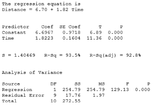
Figure 8.9 For each value of x, the  are normally distributed, with mean on the true regression line, and constant variance.
If one is interested in using regression analysis in a strictly descriptive manner, with no inference and no model building, then one need not worry quite so much about assumption validation. This is because the assumptions are about the error term. If the error term is not involved, then the assumptions are not needed. However, if one wishes to do inference or model building, then the assumptions must be verified.
8.9 Verifying The Regression Assumptions
So, how does one go about verifying the regression assumptions? The two main graphical methods used to verify regression assumptions are as follows:
- A normal probability plot of the residuals.
- A plot of the standardized residuals against the fitted (predicted) values.
A normal probability plot is a quantile–quantile plot of the quantiles of a particular distribution against the quantiles of the standard normal distribution, for the purposes of determining whether the specified distribution deviates from normality. (Similar to a percentile, a quantile of a distribution is a value ![]() such that
such that ![]() of the distribution values are less than or equal to
of the distribution values are less than or equal to ![]() .) In a normality plot, the observed values of the distribution of interest are compared against the same number of values that would be expected from the normal distribution. If the distribution is normal, then the bulk of the points in the plot should fall on a straight line; systematic deviations from linearity in this plot indicate non-normality.
.) In a normality plot, the observed values of the distribution of interest are compared against the same number of values that would be expected from the normal distribution. If the distribution is normal, then the bulk of the points in the plot should fall on a straight line; systematic deviations from linearity in this plot indicate non-normality.
To illustrate the behavior of the normal probability plot for different kinds of data distributions, we provide three examples. Figures 8.10–8.12 contain the normal probability plots for 10,000 values drawn from a uniform (0, 1) distribution, a chi-square (5) distribution, and a normal (0, 1) distribution, respectively.

Figure 8.10 Normal probability plot for a uniform distribution: heavy tails.

Figure 8.11 Probability plot for a chi-square distribution: right-skewed.
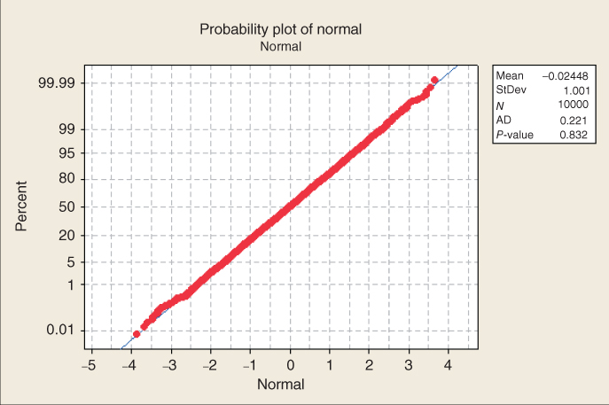
Figure 8.12 Probability plot for a normal distribution: Do not expect real-world data to behave this nicely.
Note in Figure 8.10 that the bulk of the data do not line up on the straight line, and that a clear pattern (reverse S curve) emerges, indicating systematic deviation from normality. The uniform distribution is a rectangular-shaped distribution, whose tails are much heavier than the normal distribution. Thus, Figure 8.10 is an example of a probability plot for a distribution with heavier tails than the normal distribution.
Figure 8.11 also contains a clear curved pattern, indicating systematic deviation from normality. The chi-square (5) distribution is right-skewed, so that the curve pattern apparent in Figure 8.11 may be considered typical of the pattern made by right-skewed distributions in a normal probability plot.
Finally, in Figure 8.12, the points line up nicely on a straight line, indicating normality, which is not surprising because the data are drawn from a normal (0, 1) distribution. It should be remarked that we should not expect real-world data to behave this nicely. The presence of sampling error and other sources of noise will usually render our decisions about normality less clear-cut than this.
Note the Anderson–Darling (AD) statistic and p-value reported by Minitab in each of Figures 8.10–8.12. This refers to the AD test for normality. Smaller values of the AD statistic indicate that the normal distribution is a better fit for the data. The null hypothesis is that the normal distribution fits, so that small p-values will indicate lack of fit. Note that for the uniform and chi-square examples, the p-value for the AD test is less than 0.005, indicating strong evidence for lack of fit with the normal distribution. However, the p-value for the normal example is 0.832, indicating no evidence against the null hypothesis that the distribution is normal.
The second graphical method used to assess the validity of the regression assumptions is a plot of the standardized residuals against the fits (predicted values). An example of this type of graph is given in Figure 8.13, for the regression of distance versus time for the original 10 observations in the orienteering example.
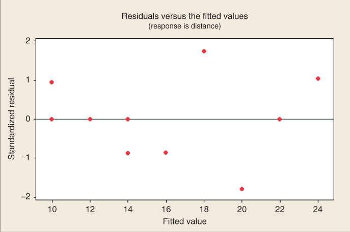
Figure 8.13 Plot of standardized residuals versus predicted values for orienteering example.
Note the close relationship between this graph and the original scatter plot in Figure 8.3. The regression line from Figure 8.3 is now the horizontal zero line in Figure 8.13. Points that were either above/below/on the regression line in Figure 8.3 now lie either above/below/on the horizontal zero line in Figure 8.13.
We evaluate the validity of the regression assumptions by observing whether certain patterns exist in the plot of the residuals versus fits, in which case one of the assumptions has been violated, or whether no such discernible patterns exists, in which case the assumptions remain intact. The 10 data points in Figure 8.13 are really too few to try to determine whether any patterns exist. In data mining applications, of course, paucity of data is rarely the issue. Let us see what types of patterns we should watch out for. Figure 8.14 shows four pattern “archetypes” that may be observed in residual-fit plots. Plot (a) shows a “healthy” plot, where no noticeable patterns are observed, and the points display an essentially rectangular shape from left to right. Plot (b) exhibits curvature, which violates the independence assumption. Plot (c) displays a “funnel” pattern, which violates the constant variance assumption. Finally, plot (d) exhibits a pattern that increases from left to right, which violates the zero-mean assumption.

Figure 8.14 Four possible patterns in the plot of residuals versus fits.
Why does plot (b) violate the independence assumption? Because the errors are assumed to be independent, the residuals (which estimate the errors) should exhibit independent behavior as well. However, if the residuals form a curved pattern, then, for a given residual, we may predict where its neighbors to the left and right will fall, within a certain margin of error. If the residuals were truly independent, then such a prediction would not be possible.
Why does plot (c) violate the constant variance assumption? Note from plot (a) that the variability in the residuals, as shown by the vertical distance, is fairly constant, regardless of the value of x. However, in plot (c), the variability of the residuals is smaller for smaller values of x, and larger for larger values of x. Therefore, the variability is non-constant, which violates the constant variance assumption.
Why does plot (d) violate the zero-mean assumption? The zero-mean assumption states that the mean of the error term is zero, regardless of the value of x. However, plot (d) shows that, for small values of x, the mean of the residuals is less than 0, while, for large values of x, the mean of the residuals is greater than 0. This is a violation of the zero-mean assumption, as well as a violation of the independence assumption.
When examining plots for patterns, beware of the “Rorschach effect” of seeing patterns in randomness. The null hypothesis when examining these plots is that the assumptions are intact; only systematic and clearly identifiable patterns in the residuals plots offer evidence to the contrary.
Apart from these graphical methods, there are also several diagnostic hypothesis tests that may be carried out to assess the validity of the regression assumptions. As mentioned above, the AD test may be used to indicate fit of the residuals to a normal distribution. For assessing whether the constant variance assumption has been violated, either Bartlett's test or Levene's test may be used. For determining whether the independence assumption has been violated, either the Durban–Watson test or the runs test may be applied. Information about all of these diagnostic tests may be found in Draper and Smith (1998).4
Note that these assumptions represent the structure needed to perform inference in regression. Descriptive methods in regression, such as point estimates, and simple reporting of such statistics, as the slope, correlation, standard error of the estimate, and ![]() , may still be undertaken even if these assumptions are not met, if the results are cross-validated. What is not allowed by violated assumptions is statistical inference. But we as data miners and big data scientists understand that inference is not our primary modus operandi. Rather, data mining seeks confirmation through cross-validation of the results across data partitions. For example, if we are examining the relationship between outdoor event ticket sales and rainfall amounts, and if the training data set and test data set both report correlation coefficients of about −0.7, and there is graphical evidence to back this up, then we may feel confident in reporting to our client in a descriptive manner that the variables are negatively correlated, even if both variables are not normally distributed (which is the assumption for the correlation test). We just cannot say that the correlation coefficient has a statistically significant negative value, because the phrase “statistically significant” belongs to the realm of inference. So, for data miners, the keys are to (i) cross-validate the results across partitions, and (ii) restrict the interpretation of the results to descriptive language, and avoid inferential terminology.
, may still be undertaken even if these assumptions are not met, if the results are cross-validated. What is not allowed by violated assumptions is statistical inference. But we as data miners and big data scientists understand that inference is not our primary modus operandi. Rather, data mining seeks confirmation through cross-validation of the results across data partitions. For example, if we are examining the relationship between outdoor event ticket sales and rainfall amounts, and if the training data set and test data set both report correlation coefficients of about −0.7, and there is graphical evidence to back this up, then we may feel confident in reporting to our client in a descriptive manner that the variables are negatively correlated, even if both variables are not normally distributed (which is the assumption for the correlation test). We just cannot say that the correlation coefficient has a statistically significant negative value, because the phrase “statistically significant” belongs to the realm of inference. So, for data miners, the keys are to (i) cross-validate the results across partitions, and (ii) restrict the interpretation of the results to descriptive language, and avoid inferential terminology.
8.10 Inference in Regression
Inference in regression offers a systematic framework for assessing the significance of linear association between two variables. Of course, analysts need to keep in mind the usual caveats regarding the use of inference in general for big data problems. For very large sample sizes, even tiny effect sizes may be found to be statistically significant, even when their practical significance may not be clear.
We shall examine five inferential methods in this chapter, which are as follows:
- The t-test for the relationship between the response variable and the predictor variable.
- The correlation coefficient test.
- The confidence interval for the slope,
 .
. - The confidence interval for the mean of the response variable, given a particular value of the predictor.
- The prediction interval for a random value of the response variable, given a particular value of the predictor.
In Chapter 9, we also investigate the F-test for the significance of the regression as a whole. However, for simple linear regression, the t-test and the F-test are equivalent.
How do we go about performing inference in regression? Take a moment to consider the form of the true (population) regression equation.
This equation asserts that there is a linear relationship between y on the one hand, and some function of x on the other. Now, ![]() is a model parameter, so that it is a constant whose value is unknown. Is there some value that
is a model parameter, so that it is a constant whose value is unknown. Is there some value that ![]() could take such that, if
could take such that, if ![]() took that value, there would no longer exist a linear relationship between x and y? Consider what would happen if
took that value, there would no longer exist a linear relationship between x and y? Consider what would happen if ![]() was zero. Then the true regression equation would be as follows:
was zero. Then the true regression equation would be as follows:
In other words, when ![]() , the true regression equation becomes:
, the true regression equation becomes:
That is, a linear relationship between x and y no longer exists. However, if ![]() takes on any conceivable value other than zero, then a linear relationship of some kind exists between the response and the predictor. Much of our regression inference in this chapter is based on this key idea, that the linear relationship between x and y depends on the value of
takes on any conceivable value other than zero, then a linear relationship of some kind exists between the response and the predictor. Much of our regression inference in this chapter is based on this key idea, that the linear relationship between x and y depends on the value of ![]() .
.
8.11 t-Test for the Relationship Between x and y
Much of the inference we perform in this section refers to the regression of rating on sugars. The assumption is that the residuals (or standardized residuals) from the regression are approximately normally distributed. Figure 8.15 shows that this assumption is validated. There are some strays at either end, but the bulk of the data lie within the confidence bounds.

Figure 8.15 Normal probability plot of the residuals for the regression of rating on sugars.
The least squares estimate of the slope, ![]() , is a statistic, because its value varies from sample to sample. Like all statistics, it has a sampling distribution with a particular mean and standard error. The sampling distribution of
, is a statistic, because its value varies from sample to sample. Like all statistics, it has a sampling distribution with a particular mean and standard error. The sampling distribution of ![]() has as its mean the (unknown) value of the true slope
has as its mean the (unknown) value of the true slope ![]() , and has as its standard error, the following:
, and has as its standard error, the following:

Just as one-sample inference about the mean ![]() is based on the sampling distribution of
is based on the sampling distribution of ![]() , so regression inference about the slope
, so regression inference about the slope ![]() is based on this sampling distribution of
is based on this sampling distribution of ![]() . The point estimate of
. The point estimate of ![]() is
is ![]() , given by
, given by
where s is the standard error of the estimate, reported in the regression results. The ![]() statistic is to be interpreted as a measure of the variability of the slope. Large values of
statistic is to be interpreted as a measure of the variability of the slope. Large values of ![]() indicate that the estimate of the slope
indicate that the estimate of the slope ![]() is unstable, while small values of
is unstable, while small values of ![]() indicate that the estimate of the slope
indicate that the estimate of the slope ![]() is precise. The t-test is based on the distribution of
is precise. The t-test is based on the distribution of ![]() , which follows a t-distribution with n − 2 degrees of freedom. When the null hypothesis is true, the test statistic
, which follows a t-distribution with n − 2 degrees of freedom. When the null hypothesis is true, the test statistic ![]() follows a t-distribution with n − 2 degrees of freedom. The t-test requires that the residuals be normally distributed.
follows a t-distribution with n − 2 degrees of freedom. The t-test requires that the residuals be normally distributed.
To illustrate, we shall carry out the t-test using the results from Table 8.7, the regression of nutritional rating on sugar content. For convenience, Table 8.7 is reproduced here as Table 8.11. Consider the row in Table 8.11, labeled “Sugars.”
- Under “Coef” is found the value of
 , −2.4614.
 - Under “SE Coef” is found the value of
 , the standard error of the slope. Here,
  .
. - Under “T” is found the value of the t-statistic; that is, the test statistic for the t-test,
 .
. - Under “P” is found the p-value of the t-statistic. As this is a two-tailed test, this p-value takes the following form:
 , where
  represent the observed value of the t-statistic from the regression results. Here,
  , although, of course, no continuous p-value ever precisely equals zero.
Table 8.11 Results for regression of nutritional rating versus sugar content
 |
The hypotheses for this hypothesis test are as follows. The null hypothesis asserts that no linear relationship exists between the variables, while the alternative hypothesis states that such a relationship does indeed exist.
- H0:
 (There is no linear relationship between sugar content and nutritional rating.)
 - Ha:
 (Yes, there is a linear relationship between sugar content and nutritional rating.)
We shall carry out the hypothesis test using the p-value method, where the null hypothesis is rejected when the p-value of the test statistic is small. What determines how small is small depends on the field of study, the analyst, and domain experts, although many analysts routinely use 0.05 as a threshold. Here, we have ![]() , which is surely smaller than any reasonable threshold of significance. We therefore reject the null hypothesis, and conclude that a linear relationship exists between sugar content and nutritional rating.
, which is surely smaller than any reasonable threshold of significance. We therefore reject the null hypothesis, and conclude that a linear relationship exists between sugar content and nutritional rating.
8.12 Confidence Interval for the Slope of the Regression Line
Researchers may consider that hypothesis tests are too black-and-white in their conclusions, and prefer to estimate the slope of the regression line ![]() , using a confidence interval. The interval used is a t-interval, and is based on the above sampling distribution for
, using a confidence interval. The interval used is a t-interval, and is based on the above sampling distribution for ![]() . The form of the confidence interval is as follows.5
. The form of the confidence interval is as follows.5
For example, let us construct a 95% confidence interval for the true slope of the regression line, ![]() . We have the point estimate given as
. We have the point estimate given as ![]() . The t-critical value for 95% confidence and n − 2 = 75 degrees of freedom is
. The t-critical value for 95% confidence and n − 2 = 75 degrees of freedom is ![]() . From Figure 8.16, we have
. From Figure 8.16, we have ![]() . Thus, our confidence interval is as follows:
. Thus, our confidence interval is as follows:

We are 95% confident that the true slope of the regression line lies between −2.9448 and −1.9780. That is, for every additional gram of sugar, the nutritional rating will decrease by between 1.9780 and 2.9448 points. As the point ![]() is not contained within this interval, we can be sure of the significance of the relationship between the variables, with 95% confidence.
is not contained within this interval, we can be sure of the significance of the relationship between the variables, with 95% confidence.
Figure 8.16 Probability plot of ln rating shows approximate normality.
8.13 Confidence Interval for the Correlation Coefficient ρ
Let ![]() (“rho”) represent the population correlation coefficient between the x and y variables for the entire population. Then the confidence interval for
(“rho”) represent the population correlation coefficient between the x and y variables for the entire population. Then the confidence interval for ![]() is as follows.
is as follows.
This confidence interval requires that both the x and y variables be normally distributed. Now, rating is not normally distributed, but the transformed variable ln rating is normally distributed, as shown in Figure 8.16. However, neither sugars nor any transformation of sugars (see the ladder of re-expressions later in this chapter) is normally distributed. Carbohydrates, however, shows normality that is just barely acceptable, with an AD p-value of 0.081, as shown in Figure 8.17. Thus, the assumptions are met for calculating the confidence interval for the population correlation coefficient between ln rating and carbohydrates, but not between ln rating and sugars. Thus, let us proceed to construct a 95% confidence interval for ![]() , the population correlation coefficient between ln rating and carbohydrates.
, the population correlation coefficient between ln rating and carbohydrates.

Figure 8.17 Probability plot of carbohydrates shows barely acceptable normality.
From Table 8.12, the regression output for the regression of ln rating on carbohydrates, we have ![]() , and the slope
, and the slope ![]() is positive, so that the sample correlation coefficient is
is positive, so that the sample correlation coefficient is ![]() . The sample size is n = 76, so that n – 2 = 74. Finally,
. The sample size is n = 76, so that n – 2 = 74. Finally, ![]() refers to the t-critical value with area 0.025 in the tail of the curve with 74 degrees of freedom. This value equals 1.99.6 Thus, our 95% confidence interval for
refers to the t-critical value with area 0.025 in the tail of the curve with 74 degrees of freedom. This value equals 1.99.6 Thus, our 95% confidence interval for ![]() is given by
is given by
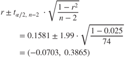
We are 95% confident that the population correlation coefficient lies between ![]() and
and ![]() . As zero is included in this interval, then we conclude that ln rating and carbohydrates are not linearly correlated. We generalize this interpretation method as follows.
. As zero is included in this interval, then we conclude that ln rating and carbohydrates are not linearly correlated. We generalize this interpretation method as follows.
Table 8.12 Regression of ln rating on carbohydrates
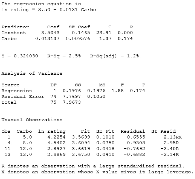 |
8.14 Confidence Interval for the Mean Value of Given
Point estimates for values of the response variable for a given value of the predictor value may be obtained by an application of the estimated regression equation ![]() . Unfortunately, these kinds of point estimates do not provide a probability statement regarding their accuracy. The analyst is therefore advised to provide for the end-user two types of intervals, which are as follows:
. Unfortunately, these kinds of point estimates do not provide a probability statement regarding their accuracy. The analyst is therefore advised to provide for the end-user two types of intervals, which are as follows:
- A confidence interval for the mean value of y given x.
- A prediction interval for the value of a randomly chosen y, given x.
Both of these intervals require that the residuals be normally distributed.
Before we look at an example of this type of confidence interval, we are first introduced to a new type of interval, the prediction interval.
8.15 Prediction Interval for a Randomly Chosen Value of Given
Baseball buffs, which is easier to predict: the mean batting average for an entire team, or the batting average of a randomly chosen player? Perhaps, you may have noticed while perusing the weekly batting average statistics that the team batting averages (which each represent the mean batting average of all the players on a particular team) are more tightly bunched together than are the batting averages of the individual players themselves. This would indicate that an estimate of the team batting average would be more precise than an estimate of a randomly chosen baseball player, given the same confidence level. Thus, in general, it is easier to predict the mean value of a variable than to predict a randomly chosen value of that variable.
For another example of this phenomenon, consider exam scores. We would not think it unusual for a randomly chosen student's grade to exceed 98, but it would be quite remarkable for the class mean to exceed 98. Recall from elementary statistics that the variability associated with the mean of a variable is smaller than the variability associated with an individual observation of that variable. For example, the standard deviation of the univariate random variable x is ![]() , whereas the standard deviation of the sampling distribution of the sample mean
, whereas the standard deviation of the sampling distribution of the sample mean ![]() is
is ![]() . Hence, predicting the class average on an exam is an easier task than predicting the grade of a randomly selected student.
. Hence, predicting the class average on an exam is an easier task than predicting the grade of a randomly selected student.
In many situations, analysts are more interested in predicting an individual value, rather than the mean of all the values, given x. For example, an analyst may be more interested in predicting the credit score for a particular credit applicant, rather than predicting the mean credit score of all similar applicants. Or, a geneticist may be interested in the expression of a particular gene, rather than the mean expression of all similar genes.
Prediction intervals are used to estimate the value of a randomly chosen value of y, given x. Clearly, this is a more difficult task than estimating the mean, resulting in intervals of greater width (lower precision) than confidence intervals for the mean with the same confidence level.
Note that this formula is precisely the same as the formula for the confidence interval for the mean value of y, given x, except for the presence of the “1+” inside the square root. This reflects the greater variability associated with estimating a single value of y rather than the mean; it also ensures that the prediction interval is always wider than the analogous confidence interval.
Recall the orienteering example, where the time and distance traveled was observed for 10 hikers. Suppose we are interested in estimating the distance traveled for a hiker traveling for ![]() ,
, ![]() hours. The point estimate is easily obtained using the estimated regression equation, from Table 8.6:
hours. The point estimate is easily obtained using the estimated regression equation, from Table 8.6: ![]() . That is, the estimated distance traveled for a hiker walking for 5 hours is 16 kilometers. Note from Figure 8.3 that this prediction
. That is, the estimated distance traveled for a hiker walking for 5 hours is 16 kilometers. Note from Figure 8.3 that this prediction ![]() falls directly on the regression line, as do all such predictions.
falls directly on the regression line, as do all such predictions.
However, we must ask the question: How sure are we about the accuracy of our point estimate? That is, are we certain that this hiker will walk precisely 16 kilometers, and not 15.9 or 16.1 kilometers? As usual with point estimates, there is no measure of confidence associated with it, which limits the appicability and usefulness of the point estimate.
We would therefore like to construct a confidence interval. Recall that the regression model assumes that, at each of the x-values, the observed values of y are samples from a normally distributed population with a mean on the regression line (![]() ), and constant variance
), and constant variance ![]() , as illustrated in Figure 8.9. The point estimate represents the mean of this population, as estimated by the data.
, as illustrated in Figure 8.9. The point estimate represents the mean of this population, as estimated by the data.
Now, in this case, of course, we have only observed a single observation with the value x = 5 hours. Nevertheless, the regression model assumes the existence of an entire normally distributed population of possible hikers with this value for time. Of all possible hikers in this distribution, 95% will travel within a certain bounded distance (the margin of error) from the point estimate of 16 kilometers. We may therefore obtain a 95% confidence interval (or whatever confidence level is desired) for the mean distance traveled by all possible hikers who walked for 5 hours. We use the formula provided above, as follows:
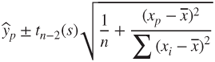
where
 , the point estimate,
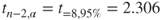 ,
,- s = 1.22474, from Table 8.6,
- n = 10,

 .
.
We have ![]() , and we therefore calculate the 95% confidence interval as follows:
, and we therefore calculate the 95% confidence interval as follows:

We are 95% confident that the mean distance traveled by all possible 5-hour hikers lies between 15.107 and 16.893 kilometers.
However, are we sure that this mean of all possible 5-hour hikers is the quantity that we really want to estimate? Wouldn't it be more useful to estimate the distance traveled by a particular randomly selected hiker? Many analysts would agree, and would therefore prefer a prediction interval for a single hiker rather than the above confidence interval for the mean of the hikers.
The calculation of the prediction interval is quite similar to the confidence interval above, but the interpretation is quite different. We have

In other words, we are 95% confident that the distance traveled by a randomly chosen hiker who had walked for 5 hours lies between 13.038 and 18.962 kilometers. Note that, as mentioned earlier, the prediction interval is wider than the confidence interval, because estimating a single response is more difficult than estimating the mean response. However, also note that the interpretation of the prediction interval is probably more useful for the data miner.
We verify our calculations by providing in Table 8.13 the Minitab results for the regression of distance on time, with the confidence interval and prediction interval indicated at the bottom (“Predicted Values for New Observations”). The Fit of 16 is the point estimate, the standard error of the fit equals  , the 95% CI indicates the confidence interval for the mean distance of all 5-hour hikers, and the 95% PI indicates the prediction interval for the distance traveled by a randomly chosen 5-hour hiker.
Table 8.13 Regression of distance on time, with confidence interval and prediction interval shown at the bottom
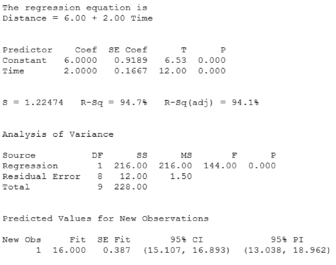 |
8.16 Transformations to Achieve Linearity
If the normal probability plot shows no systematic deviations from linearity, and the residuals-fits plot shows no discernible patterns, then we may conclude that there is no graphical evidence for the violation of the regression assumptions, and we may then proceed with the regression analysis. However, what do we do if these graphs indicate violations of the assumptions? For example, suppose our normal probability plot of the residuals looked something such as plot (c) in Figure 8.14, indicating non-constant variance? Then we may apply a transformation to the response variable y, such as the ln (natural log, log to the base e) transformation. We illustrate with an example drawn from the world of board games.
Have you ever played the game of Scrabble®? Scrabble is a game in which the players randomly select letters from a pool of letter tiles, and build crosswords. Each letter tile has a certain number of points associated with it. For instance, the letter “E” is worth 1 point, while the letter “Q” is worth 10 points. The point value of a letter tile is roughly related to its letter frequency, the number of times the letter appears in the pool.
Table 8.14 contains the frequency and point value of each letter in the game. Suppose we were interested in approximating the relationship between frequency and point value, using linear regression. As always when performing simple linear regression, the first thing an analyst should do is to construct a scatter plot of the response versus the predictor, in order to see if the relationship between the two variables is indeed linear. Figure 8.18 presents a scatter plot of the point value versus the frequency. Note that each dot may represent more than one letter.
Table 8.14 Frequency in Scrabble®, and Scrabble® point value of the letters in the alphabet
| Letter | Frequency in Scrabble® | Point Value in Scrabble® |
| A | 9 | 1 |
| B | 2 | 3 |
| C | 2 | 3 |
| D | 4 | 2 |
| E | 12 | 1 |
| F | 2 | 4 |
| G | 3 | 2 |
| H | 2 | 4 |
| I | 9 | 1 |
| J | 1 | 8 |
| K | 1 | 5 |
| L | 4 | 1 |
| M | 2 | 3 |
| N | 6 | 1 |
| O | 8 | 1 |
| P | 2 | 3 |
| Q | 1 | 10 |
| R | 6 | 1 |
| S | 4 | 1 |
| T | 6 | 1 |
| U | 4 | 1 |
| V | 2 | 4 |
| W | 2 | 4 |
| X | 1 | 8 |
| Y | 2 | 4 |
| Z | 1 | 10 |
Figure 8.18 Scatter plot of points versus frequency in Scrabble®: nonlinear!
Perusal of the scatter plot indicates clearly that there is a relationship between point value and letter frequency. However, the relationship is not linear, but rather curvilinear, in this case quadratic. It would not be appropriate to model the relationship between point value and letter frequency using a linear approximation such as simple linear regression. Such a model would lead to erroneous estimates and incorrect inference. Instead, the analyst may apply a transformation to achieve linearity in the relationship.
Frederick, Mosteller, and Tukey, in their book Data Analysis and Regression4, suggest “the bulging rule” for finding transformations to achieve linearity. To understand the bulging rule for quadratic curves, consider Figure 8.19 (after Mosteller and Tukey4).

Figure 8.19 The bulging rule: a heuristic for variable transformation to achieve linearity.
Compare the curve seen in our scatter plot, Figure 8.18, to the curves shown in Figure 8.19. It is most similar to the curve in the lower left quadrant, the one labeled “x down, y down.” Mosteller and Tukey7 propose a “ladder of re-expressions,” which are essentially a set of power transformations, with one exception, ![]() .
.
Figure 8.20 After applying square root transformation, still not linear.
We therefore move one more notch down the ladder of re-expressions, and apply the natural log transformation to each of frequency and point value, generating the transformed variables ln points and ln frequency. The scatter plot of ln points versus ln frequency is shown in Figure 8.21. This scatter plot exhibits acceptable linearity, although, as with any real-world scatter plot, the linearity is imperfect. We may therefore proceed with the regression analysis for ln points and ln frequency.
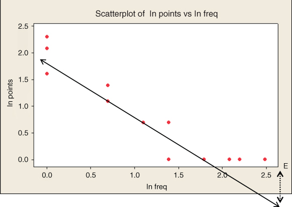
Figure 8.21 The natural log transformation has achieved acceptable linearity (single outlier, E, indicated).
Table 8.15 presents the results from the regression of ln points on ln frequency. Let us compare these results with the results from the inappropriate regression of points on frequency, with neither variable transformed, shown in Table 8.16. The coefficient of determination for the untransformed case is only 45.5%, as compared to 87.6% for the transformed case, meaning that, the transformed predictor accounts for nearly twice as much of the variability in the transformed response than in the case for the untransformed variables.
Table 8.15 Regression of ln points on ln frequency
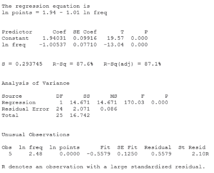 |
Table 8.16 Inappropriate regression of points on frequency
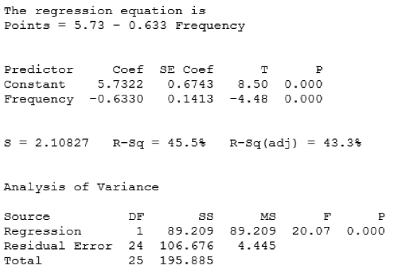 |
We can also compare the predicted point value for a given frequency, say frequency = 4 tiles. For the proper regression, the estimated ln points equals 1.94 − 1.01 (ln freq) = 1.94 − 1.01 (1.386) = 0.5401, giving us an estimated ![]() points for a letter with frequency 4. As the actual point values for letters with this frequency are all either one or two points, this estimate makes sense. However, using the untransformed variables, the estimated point value for a letter with frequency 4 is 5.73 − 0.633 (frequency) = 5.73 − 0.633 (4) = 3.198, which is much larger than any of the actual point values for letter with frequency 4. This exemplifies the danger of applying predictions from inappropriate models.
points for a letter with frequency 4. As the actual point values for letters with this frequency are all either one or two points, this estimate makes sense. However, using the untransformed variables, the estimated point value for a letter with frequency 4 is 5.73 − 0.633 (frequency) = 5.73 − 0.633 (4) = 3.198, which is much larger than any of the actual point values for letter with frequency 4. This exemplifies the danger of applying predictions from inappropriate models.
In Figure 8.21 and Table 8.15, there is a single outlier, the letter “E.” As the standardized residual is positive, this indicates that the point value for E is higher than expected, given its frequency, which is the highest in the bunch, 12. The residual of 0.5579 is indicated by the dashed vertical line in Figure 8.21. The letter “E” is also the only “influential” observation, with a Cook's distance of 0.5081 (not shown), which just exceeds the 50th percentile of the ![]() distribution.
distribution.
8.17 Box–Cox Transformations
Generalizing from the idea of a ladder of transformations, to admit powers of any continuous value, we may apply a Box–Cox transformation.8 A Box–Cox transformation is of the form:
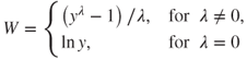
For example, we could have ![]() , giving us the following transformation,
, giving us the following transformation, ![]() . Draper and Smith9 provide a method of using maximum likelihood to choose the optimal value of
. Draper and Smith9 provide a method of using maximum likelihood to choose the optimal value of ![]() . This method involves first choosing a set of candidate values for
. This method involves first choosing a set of candidate values for ![]() , and finding SSE for regressions performed using each value of
, and finding SSE for regressions performed using each value of ![]() . Then, plotting
. Then, plotting ![]() versus
versus ![]() , find the lowest point of a curve through the points in the plot. This represents the maximum-likelihood estimate of
, find the lowest point of a curve through the points in the plot. This represents the maximum-likelihood estimate of ![]() .
.
R References
- Juergen Gross and bug fixes by Uwe Ligges. 2012. nortest: Tests for normality. R package version 1.0-2. http://CRAN.R-project.org/package=nortest.
- R Core Team. R: A Language and Environment for Statistical Computing. Vienna, Austria: R Foundation for Statistical Computing; 2012. ISBN: 3-900051-07-0, http://www.R-project.org/.
- Venables WN, Ripley BD. Modern Applied Statistics with S. Fourth ed. New York: Springer; 2002. ISBN: 0-387-95457-0.
Exercises
Clarifying The Concepts
1. Indicate whether the following statements are true or false. If false, alter the statement to make it true.
- The least-squares line is that line that minimizes the sum of the residuals.
- If all the residuals equal zero, then SST = SSR.
- If the value of the correlation coefficient is negative, this indicates that the variables are negatively correlated.
- The value of the correlation coefficient can be calculated, given the value of
 alone.
 - Outliers are influential observations.
- If the residual for an outlier is positive, we may say that the observed y-value is higher than the regression estimated, given the x-value.
- An observation may be influential even though it is neither an outlier nor a high leverage point.
- The best way of determining whether an observation is influential is to see whether its Cook's distance exceeds 1.0.
- If one is interested in using regression analysis in a strictly descriptive manner, with no inference and no model building, then one need not worry quite so much about assumption validation.
- In a normality plot, if the distribution is normal, then the bulk of the points should fall on a straight line.
- The chi-square distribution is left-skewed.
- Small p-values for the Anderson–Darling test statistic indicate that the data are right-skewed.
- A funnel pattern in the plot of residuals versus fits indicates a violation of the independence assumption.
2. Describe the difference between the estimated regression line and the true regression line.
3. Calculate the estimated regression equation for the orienteering example, using the data in Table 8.3. Use either the formulas or software of your choice.
4. Where would a data point be situated that has the smallest possible leverage?
5. Calculate the values for leverage, standardized residual, and Cook's distance for the hard-core hiker example in the text.
6. Calculate the values for leverage, standardized residual, and Cook's distance for the 11th hiker who had hiked for 10 hours and traveled 23 kilometers. Show that, while it is neither an outlier nor of high leverage, it is nevertheless influential.
7. Match each of the following regression terms with its definition.
| Regression Term | Definition |
| a. Influential observation | Measures the typical difference between the predicted response value and the actual response value. |
| b. SSE | Represents the total variability in the values of the response variable alone, without reference to the predictor. |
| c. |
An observation that has a very large standardized residual in absolute value. |
| d. Residual | Measures the strength of the linear relationship between two quantitative variables, with values ranging from −1 to 1. |
| e. s | An observation that significantly alters the regression parameters based on its presence or absence in the data set. |
| f. High leverage point | Measures the level of influence of an observation, by taking into account both the size of the residual and the amount of leverage for that observation. |
| g. r | Represents an overall measure of the error in prediction resulting from the use of the estimated regression equation. |
| h. SST | An observation that is extreme in the predictor space, without reference to the response variable. |
| i. Outlier | Measures the overall improvement in prediction accuracy when using the regression as opposed to ignoring the predictor information. |
| j. SSR | The vertical distance between the predicted response and the actual response. |
| k. Cook's distance | The proportion of the variability in the response that is explained by the linear relationship between the predictor and response variables. |
8. Explain in your own words the implications of the regression assumptions for the behavior of the response variable y.
9. Explain what statistics from Table 8.11 indicate to us that there may indeed be a linear relationship between x and y in this example, even though the value for ![]() is less than 1%.
is less than 1%.
10. Which values of the slope parameter indicate that no linear relationship exist between the predictor and response variables? Explain how this works.
11. Explain what information is conveyed by the value of the standard error of the slope estimate.
12. Describe the criterion for rejecting the null hypothesis when using the p-value method for hypothesis testing. Who chooses the value of the level of significance, ![]() ? Make up a situation (one p-value and two different values of
? Make up a situation (one p-value and two different values of ![]() ) where the very same data could lead to two different conclusions of the hypothesis test. Comment.
) where the very same data could lead to two different conclusions of the hypothesis test. Comment.
13. (a) Explain why an analyst may prefer a confidence interval to a hypothesis test. (b) Describe how a confidence interval may be used to assess significance.
14. Explain the difference between a confidence interval and a prediction interval. Which interval is always wider? Why? Which interval is probably, depending on the situation, more useful to the data miner? Why?
15. Clearly explain the correspondence between an original scatter plot of the data and a plot of the residuals versus fitted values.
16. What recourse do we have if the residual analysis indicates that the regression assumptions have been violated? Describe three different rules, heuristics, or family of functions that will help us.
17. A colleague would like to use linear regression to predict whether or not customers will make a purchase, based on some predictor variable. What would you explain to your colleague?
Working with the Data
For Exercises 18–23, refer to the scatterplot of attendance at football games versus winning percentage of the home team in Figure 8.22.
Figure 8.22 Scatter plot of attendance versus winning percentage.
18. Describe any correlation between the variables. Interpret this correlation.
19. Estimate as best you can the values of the regression coefficients ![]() and
and ![]() .
.
20. Will the p-value for the hypothesis test for the existence of a linear relationship between the variables be small or large? Explain.
21. Will the confidence interval for the slope parameter include zero or not? Explain.
22. Will the value of s be closer to 10, 100, 1000, or 10,000? Why?
23. Is there an observation that may look as though it is an outlier? Explain.
For Exercises 24 and 25, use the scatter plot in Figure 8.23 to answer the questions.

Figure 8.23 Scatter plot.
24. Is it appropriate to perform linear regression? Why or why not?
25. What type of transformation or transformations is called for? Use the bulging rule.
For Exercises 26–30, use the output from the regression of z mail messages on z day calls (from the Churn data set) in Table 8.17 to answer the questions.
Table 8.17 Regression of z vmail messages on z day calls
 |
26. Is there evidence of a linear relationship between z vmail messages (z-scores of the number of voice mail messages) and z day calls (z-scores of the number of day calls made)? Explain.
27. Use the data in the ANOVA table to find or calculate the following quantities:
- SSE, SSR, and SST.
- Coefficient of determination, using the quantities in (a). Compare with the number reported by Minitab.
- Correlation coefficient r.
- Use SSE and the residual error degrees of freedom to calculate s, the standard error of the estimate. Interpret this value.
28. Assuming normality, construct and interpret a 95% confidence interval for the population correlation coefficient.
29. Discuss the usefulness of the regression of z mail messages on z day calls.
30. As it has been standardized, the response z vmail messages has a standard deviation of 1.0. What would be the typical error in predicting z vmail messages if we simply used the sample mean response and no information about day calls? Now, from the printout, what is the typical error in predicting z vmail messages, given z day calls? Comment.
For Exercises 31–38, use the output from the regression of an unspecified y on an unspecified x in Table 8.18 to answer the questions.
Table 8.18 Regression of an unspecified y on an unspecified x
 |
31. Carefully state the regression equation, using words and numbers.
32. Interpret the value of the y-intercept ![]() .
.
33. Interpret the value of the slope ![]() .
.
34. Interpret the value of the standard error of the estimate, s.
35. Suppose we let ![]() . Perform the hypothesis test to determine if a linear relationship exists between x and y. Assume the assumptions are met.
. Perform the hypothesis test to determine if a linear relationship exists between x and y. Assume the assumptions are met.
36. Calculate the correlation coefficient r.
37. Assume normality. Construct a 90% confidence interval for the population correlation coefficient. Interpret the result.
38. Compare your results for the hypothesis test and the confidence interval. Comment.
Hands-On Analysis
Open the Baseball data set, a collection of batting statistics for 331 baseball players who played in the American League in 2002, available on the book website, www.DataMiningConsultant.com. Suppose we are interested in whether there is a relationship between batting average and the number of home runs a player hits. Some fans might argue, for example, that those who hit lots of home runs also tend to make a lot of strike outs, so that their batting average is lower. Let us check it out, using a regression of the number of home runs against the player's batting average (hits divided by at bats). Because baseball batting averages tend to be highly variable for low numbers of at bats, we restrict our data set to those players who had at least 100 at bats for the 2002 season. This leaves us with 209 players. Use this data set for Exercises 39–61.
39. Construct a scatter plot of home runs versus batting average.
40. Informally, is there evidence of a relationship between the variables?
41. What would you say about the variability of the number of home runs, for those with higher batting averages?
42. Refer to the previous exercise. Which regression assumption might this presage difficulty for?
43. Perform a regression of home runs on batting average. Obtain a normal probability plot of the standardized residuals from this regression. Does the normal probability plot indicate acceptable normality, or is there skewness? If skewed, what type of skewness?
44. Construct a plot of the residuals versus the fitted values (fitted values refers to the ![]() 's). What pattern do you see? What does this indicate regarding the regression assumptions?
's). What pattern do you see? What does this indicate regarding the regression assumptions?
45. Take the natural log of home runs, and perform a regression of ln home runs on batting average. Obtain a normal probability plot of the standardized residuals from this regression. Does the normal probability plot indicate acceptable normality?
46. Construct a plot of the residuals versus the fitted values. Do you see strong evidence that the constant variance assumption has been violated? (Remember to avoid the Rorschach effect.) Therefore conclude that the assumptions are validated.
47. Write the population regression equation for our model. Interpret the meaning of ![]() and
and ![]() .
.
48. State the regression equation (from the regression results) in words and numbers.
49. Interpret the value of the y-intercept ![]() .
.
50. Interpret the value of the slope ![]() .
.
51. Estimate the number of home runs (not ln home runs) for a player with a batting average of 0.300.
52. What is the size of the typical error in predicting the number of home runs, based on the player's batting average?
53. What percentage of the variability in the ln home runs does batting average account for?
54. Perform the hypothesis test for determining whether a linear relationship exists between the variables.
55. Construct and interpret a 95% confidence interval for the unknown true slope of the regression line.
56. Calculate the correlation coefficient. Construct a 95% confidence interval for the population correlation coefficient. Interpret the result.
57. Construct and interpret a 95% confidence interval for the mean number of home runs for all players who had a batting average of 0.300.
58. Construct and interpret a 95% prediction interval for a randomly chosen player with a 0.300 batting average. Is this prediction interval useful?
59. List the outliers. What do all these outliers have in common? For Orlando Palmeiro, explain why he is an outlier.
60. List the high leverage points. Why is Greg Vaughn a high leverage point? Why is Bernie Williams a high leverage point?
61. List the influential observations, according to Cook's distance and the F criterion.
Next, subset the Baseball data set so that we are working with batters who have at least 100 at bats. Use this data set for Exercises 62–71.
62. We are interested in investigating whether there is a linear relationship between the number of times a player has been caught stealing and the number of stolen bases the player has. Construct a scatter plot, with “caught” as the response. Is there evidence of a linear relationship?
63. On the basis of the scatter plot, is a transformation to linearity called for? Why or why not?
64. Perform the regression of the number of times a player has been caught stealing versus the number of stolen bases the player has.
65. Find and interpret the statistic that tells you how well the data fit the model.
66. What is the typical error in predicting the number of times a player is caught stealing, given his number of stolen bases?
67. Interpret the y-intercept. Does this make any sense? Why or why not?
68. Inferentially, is there a significant relationship between the two variables? What tells you this?
69. Calculate and interpret the correlation coefficient.
70. Clearly interpret the meaning of the slope coefficient.
71. Suppose someone said that knowing the number of stolen bases a player has explains most of the variability in the number of times the player gets caught stealing. What would you say?
For Exercises 72–85, use the Cereals data set.
72. We are interested in predicting nutrition rating based on sodium content. Construct the appropriate scatter plot. Note that there is an outlier. Identify this outlier. Explain why this cereal is an outlier.
73. Perform the appropriate regression.
74. Omit the outlier. Perform the same regression. Compare the values of the slope and y-intercept for the two regressions.
75. Using the scatter plot, explain why the y-intercept changed more than the slope when the outlier was omitted.
76. Obtain the Cook's distance value for the outlier. Is it influential?
77. Put the outlier back in the data set for the rest of the analysis. On the basis of the scatter plot, is there evidence of a linear relationship between the variables? Discuss. Characterize their relationship, if any.
78. Construct the graphics for evaluating the regression assumptions. Are they validated?
79. What is the typical error in predicting rating based on sodium content?
80. Interpret the y-intercept. Does this make any sense? Why or why not?
81. Inferentially, is there a significant relationship between the two variables? What tells you this?
82. Calculate and interpret the correlation coefficient.
83. Clearly interpret the meaning of the slope coefficient.
84. Construct and interpret a 95% confidence interval for the true nutrition rating for all cereals with a sodium content of 100.
85. Construct and interpret a 95% confidence interval for the nutrition rating for a randomly chosen cereal with sodium content of 100.
Open the California data set (Source: US Census Bureau, www.census.gov, and available on the book website, www.DataMiningConsultant.com), which consists of some census information for 858 towns and cities in California. This example will give us a chance to investigate handling outliers and high leverage points as well as transformations of both the predictor and the response. We are interested in approximating the relationship, if any, between the percentage of townspeople who are senior citizens and the total population of the town. That is, do the towns with higher proportions of senior citizens (over 64 years of age) tend to be larger towns or smaller towns? Use the California data set for Exercises 86–92.
86. Construct a scatter plot of percentage over 64 versus popn. Is this graph very helpful in describing the relationship between the variables?
87. Identify the four cities that appear larger than the bulk of the data in the scatter plot.
88. Apply the ln transformation to the predictor, giving us the transformed predictor variable ln popn. Note that the application of this transformation is due solely to the skewness inherent in the variable itself (shown by the scatter plot), and is not the result of any regression diagnostics. Perform the regression of percentage over 64 on ln popn, and obtain the regression diagnostics.
89. Describe the pattern in the normal probability plot of the residuals. What does this mean?
90. Describe the pattern in the plot of the residuals versus the fitted values. What does this mean? Are the assumptions validated?
91. Perform the regression of ln pct (ln of percentage over 64) on ln popn, and obtain the regression diagnostics. Explain how taking the ln of percentage over 64 has tamed the residuals versus fitted values plot.
92. Identify the set of outliers in the lower right of the residuals versus fitted values plot. Have we uncovered a natural grouping? Explain how this group would end up in this place in the graph.