13. Using Behaviors and Navigation Objects
Dreamweaver provides a number of JavaScript actions you can easily add to your pages. No prior knowledge of JavaScript is required to use them. Adobe calls these JavaScript actions behaviors. Behaviors can add interactivity to your site. Many times the behavior is triggered by some action of the user; for example, the behavior will happen when the user clicks a link or hovers over a link. Other behaviors happen without any overt action from the user, such as a browser check for a needed plug-in as a page loads.
In Dreamweaver, you add many behaviors with the Behaviors panel. There are also some behaviors available in the Insert Bar menu. And finally, Dreamweaver imports behaviors from other Adobe software such as Fireworks.
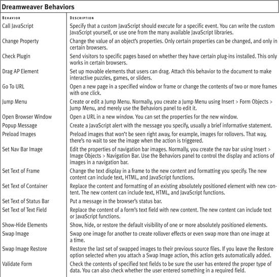
In this chapter you’ll learn how to use behaviors to add rollovers, open new windows, check for plug-ins, validate forms, insert jump and pop-up menus, and add navigation bars. Table 13.1 gives a list of some of the available behaviors.
Table 13.1. The primary behaviors available through Dreamweaver. Only the most commonly used are covered in this chapter, but you can add any of these to your page.
Using the Behaviors Panel
In order to add interactivity to your site, you’ll want to add behaviors to the objects on your pages, such as images and links. You’ll use the Dreamweaver Behaviors panel to add, modify, and remove behaviors. Objects can have multiple behaviors attached, so you’ll also need to know how to rearrange their order.
To add a behavior
1. If the Behaviors panel is not visible, choose Window > Behaviors (Shift-F4).
2. Select an object on the page such as an image or a text link.
3. Click the plus button  on the Behaviors panel to see the list of available actions for the selected object (Figure 13.1). If a choice is grayed out, that action is not available for the object selected. Click to choose an action.
Figure 13.1. The Behaviors are shown in black if they are available for the particular element you chose, and in gray if they aren’t. You can’t select a grayed-out behavior.

4. The dialog for the chosen action opens (Figure 13.2). Enter the requested information in the dialog.
Figure 13.2. The Go To URL dialog is nice and simple. If you’re using frames, frame names appear in the Open in box.

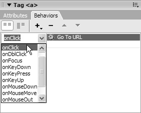
5. The default event for that action is displayed in the events column on the left side of the Behaviors panel (Figure 13.3). If you want a different event, select it from the pop-up menu in the events column (Figure 13.4) by clicking the default.
Figure 13.3. The Behaviors panel shows the event handler and the behavior name.

Figure 13.4. If you want to change the event handler, click the event. An arrow appears, and clicking it brings up the pop-up menu.
To edit a behavior
1. Select an object with a behavior attached.
2. Double-click the behavior name in the behaviors column of the Behaviors panel.
or
Select the behavior name and press Enter (Return). The dialog for the behavior opens.
3. Change any parameters and click OK.
To change the order of behaviors
• If more than one behavior is attached to an object, the behaviors run in the order listed in the Behaviors panel, from the top to the bottom (Figure 13.5). Select an event and use the up  or down arrow
  to change the order.
Figure 13.5. Any behaviors attached to an element execute in the order they are listed in the Behaviors panel.

To delete a behavior
1. On your Web page, select an object with an attached behavior.
2. In the Behaviors panel, select the name of the behavior you want to delete.
3. Click the minus button  .
.
or
Press Delete.
 Tips
Tips
• You can extend Dreamweaver by adding additional behaviors from the Adobe Dreamweaver Exchange. See “Finding and Installing Extensions” in Appendix B for more information about extending Dreamweaver.
• JavaScripts you write yourself can be inserted in Dreamweaver. To learn more about JavaScript, check out another of our books: JavaScript and Ajax for the Web: Visual QuickStart Guide (now in its sixth edition) (Peachpit Press).
• If you’re familiar with older versions of Dreamweaver, you might be wondering where some of your other behaviors, such as Play Sound, disappeared to. They’re still there; they’re just hiding in the ~Deprecated submenu. This is Dreamweaver’s way of telling you that using those behaviors is a bad idea and that they aren’t guaranteed to work in some browsers. If you’re using them in existing sites, consider removing them or replacing them with other functionality.
• Whether or not you’ve worked with previous versions of Dreamweaver, you might be wondering about those behaviors in the Effects submenu. We’ll cover them in Chapter 14, “Building Dynamic Pages with Spry.”
Figure 13.6. When you select Show Events For, you can choose from a list of browsers.

Table 13.2. Not all events available in Dreamweaver are listed. Some event handlers available in JavaScript are not available in Dreamweaver.

Adding Rollovers
Web users love rollovers, also called mouseovers. There’s something endlessly pleasing about running a mouse over a page and watching things change. A color changes, an image changes, an image somewhere else on the page changes or pops up. Web users also expect rollovers—if they move their mouse over an image and nothing happens, they’ll assume that it’s not a link and move on to something else.
To add a rollover
1. Prepare two images, such as those in Figures 13.7 and 13.8, for the rollover’s Up and Over states.
Figure 13.7. An example of an Up state image.
Figure 13.8. An example of an Over state image.

2. Position the insertion point in the document where you want the rollover to appear.
3. On the Common tab of the Insert Bar, click the arrow beside the image icon (Figure 13.9).
Figure 13.9. The image icon on the Common tab of the Insert Bar has a pop-up menu with several options.

4. Select Rollover Image.
or
Select Insert > Image Objects > Rollover Image.
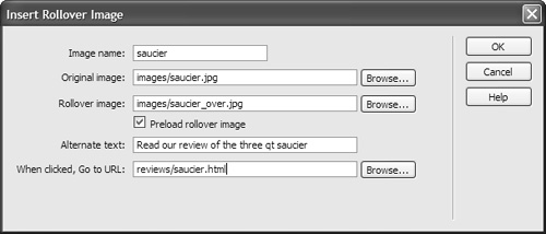
5. The Insert Rollover Image dialog appears (Figure 13.10). Fill out the fields:
• Image name: This is the name that JavaScript uses internally to refer to this image.
• Original image: The path to the Up state of the image, which is what displays when the page is loaded.
• Rollover image: The path to the Over state of the image, which is what displays when the user’s cursor is over the image.
• Preload rollover image: This should be selected so the Over version of the image is in the browser’s cache when it’s needed. Don’t make the users wait for the Over image to download—they might think the page isn’t working and give up on your site.
• Alternate text: This is the alternate information for users with non-graphical browsers.
• When clicked, Go to URL: This is the URL of the Web page you want to open when the user clicks the image.
Figure 13.10. Specify both the up and over images to insert a rollover image.
6. Click OK to accept the changes.
7. Check the newly created events in the Behaviors panel to be sure it’s what you want (Figure 13.11).
Figure 13.11. Be sure the Swap Image Restore behavior is added along with the Swap Image behavior.

Tips
• Dreamweaver won’t display the rollover. You must preview the page in a browser to see it.
• Select the behavior in the Behaviors panel if you want to change the mouse events or edit the parameters of the Insert Rollover Image dialog.
• To create multiple rollovers, use the Set Nav Bar Image behavior instead, as described later in this chapter.
• Adding a single rollover adds two events to the Behaviors panel: one for the action of moving the mouse over the image, and one for the action of moving the mouse off the image. Check to make sure that both parts are added or your rollover won’t work the way you expect it to.
Adding Navigation Bars
A Dreamweaver navigation bar (nav bar) consists of a set of images that change in response to a user action. Before you use the Insert Navigation Bar command, you must prepare the image sets for each individual image (or button) that will appear in the navigation bar. If you want to use four image states, you’ll need four images for each button similar to the four variations on the FOOD button you see in Figure 13.12.
Figure 13.12. Save image variations with names that relate to the image state they represent.

To add a navigation bar
1. Select the insertion point in the document window where the navigation bar goes.
2. Select Insert > Image Objects > Navigation Bar.
or
Select Navigation Bar from the pop-up menu next to the Image icon in the Common tab of the Insert Bar.
3. The Insert Navigation Bar dialog opens (Figure 13.13), and displays the following fields:
• Nav bar elements: Don’t enter anything here. As you add each element to your nav bar, this list grows automatically.
• Element name: This is the unique name that identifies the object. JavaScript objects must have unique names. On a nav bar, it makes sense to use a name that’s the same or similar to the menu choice on the button. Remember, no spaces are allowed in the name.
• Up image: This is the path of the Up (default) version of the image.
• Over image: This is the path of the Over version of the image.
• Down image: The path of the image displayed when the user clicks the image.
• Over while down image: The path to the version of the image that appears when the user moves the mouse after clicking the image.
• Alternate text: This is what displays for users with non-graphical browsers.
• When clicked, Go to URL: This is the page the user sees when the menu is clicked. Specify the window in which you want the URL to open. If you’re using frames (see Chapter 12, “Adding Frames”), put the name of one of the frames here. If you’re not using frames, leave it at “Main window.”
• Options: Always check Preload images. Select show “Down image” initially on an individual page-by-page basis only if you’re using the down version of the image to indicate the current page. When this option is selected, an asterisk appears after the element in the Nav bar elements list.
• Insert: This pop-up menu lets you choose either a horizontal or vertical layout for the nav bar.
• Use tables: If this check box is selected, the nav bar uses a table layout.
Figure 13.13. Those helpful image names come in handy when you’re trying to manage four images for each button.

4. Click the plus button to add other elements and complete the dialog for each new element.
5. When you’re done adding elements, click OK to accept your entries.
6. Check the default actions in the Behaviors panel to be sure they’re the ones you want.
Tips
• If you want a navigation bar with only Up and Over image changes, leave the “Down image” and “Over while down image” fields blank.
• Remember, alternate text appears when the image isn’t visible. Write text that replaces the image effectively. If the button says “FOOD,” for example, it’s a good idea to use the word “FOOD” as the alternate text.
• You can save some time if you copy and paste your navigation bar onto other pages. If you want to change the parameters for the navigation bar on individual pages, use the Modify > Navigation Bar command or the Set Nav Bar Image behavior.
• You can save even more time by making your navigation bar into a reusable library item. (See Chapter 15, “Making Life Easier: Using Templates, Libraries, and Snippets,” for more about library items.) You can’t customize a library item on individual pages.
Modifying a Navigation Bar
No matter how often you think that you’ve got it just right when you first create your navigation, something’s going to come along and make you change it. Some changes will be to the navigation bar itself, and some changes will be for only the images in the bar. How they’re each changed differs slightly.
To modify a navigation bar
1. Select the navigation bar in the document.
2. Select Modify > Navigation Bar. The Modify Navigation Bar dialog opens (Figure 13.14).
Figure 13.14. Some of the choices from Figure 13.13 are no longer available when you use the Modify Navigation Bar dialog.
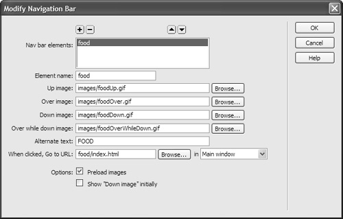
3. Make your changes as needed. This dialog’s fields are set just like those in the original Insert Navigation Bar dialog.
To modify images in a navigation bar
1. Select one of the image elements in your navigation bar and double-click one of the Set Nav Bar Image actions in the Behaviors panel (Figure 13.15).
Figure 13.15. Double-click any behavior in the Behaviors panel to edit it. Alternatively, select it and press Return (Enter) to edit.

2. The Set Nav Bar Image dialog opens (Figure 13.16). This dialog looks similar to the Insert Navigation Bar dialog, but there are some major differences. You’re only dealing with a single object from the nav bar, and you have tabs for basic and advanced modifications.
Figure 13.16. The Basic tab of the Set Nav Bar Image dialog deals with just the specific button.

On the Basic tab, you can modify any of the parameters for Element name, image URLs, Alternate text, and the URL for the page to open. The Options let you set the image to be in the Down state initially.
With the Advanced tab (Figure 13.17), use nav bar image actions to swap additional images elsewhere on the page with “Also set image.”
Figure 13.17. The Advanced tab has options to change other images besides just the selected button.

For example, an image of an entrée might appear somewhere on the page when the FOOD button is in the Over state, or an image of a wine bottle might appear somewhere on the page when the WINE button is in the Over state. This type of fancy footwork—called a disjoint rollover in Dreamweaver—allows you to have multiple images that change due to a single event.
Tip
• A default opening image must be in place in the document before you can use the Advanced tab in the Set Nav Bar Image dialog to create a swap image behavior.
Opening a New Browser Window
It isn’t a good idea to open a new browser window unless you really, really need one. Some users may not realize that a new window opened. Users may become lost or confused by the grayed-out Back button. Users may not realize they must close the new window to get back to the original page. Certain browsers, particularly those used by people with accessibility needs, may not deal with new windows in a way that helps the user understand what’s happening. Depending on the action you use to trigger the opening of the new window, some users may not see it at all. For example, setting a new window to open during an onLoad event is the trick to getting a pop-up ad in a user’s face. Therefore, many users set their browsers so pop-up windows won’t open, ever.
Given all that, when is a new browser window justified? Consider it if the content of the new window is a small example or elaboration on one idea. Small means smaller than a normal-sized browser window. Small also means small in concept: if the main content of your page is clear already, a new window can add a little something people can check if they’re interested. For instance, a good use of a new window is to show an enlarged image of a product.
You should explicitly tell the user that their click would cause a new window to open: “Click the image to see a larger view—opens in new window.” Leave the decision about whether to click up to your users—don’t blindside them with windows that automatically open without warning.
To add the Open Browser Window action
1. Prepare an HTML page or an image to appear in the new window.
2. Select an object such as a link or image in the document window.
3. In the Behaviors panel, click the plus sign to add a new behavior. Choose Open Browser Window from the pop-up menu, and the Open Browser Window dialog appears (Figure 13.18).
Figure 13.18. When you open a new browser window, you have all kinds of control over how that new window will appear.
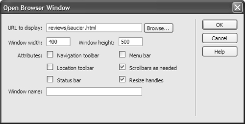
4. Fill out the following fields:
• URL to display: This is the HTML page or image that will appear in the new window.
• Window width and Window height: Set an exact pixel size for the new window.
• Navigation toolbar: Checking this box adds Back, Forward, Home, and Reload buttons.
• Location toolbar: Checking this box adds a location text box with the page URL showing.
• Status bar: Checking this box adds a display at the bottom of the browser window showing status information.
• Menu bar: Checking this box adds browser menu items, such as File, Edit, View, Go, and Help. This option only applies to Windows users; Mac users always have access to the menu.
• Scrollbars as needed: Checking this box adds scrollbars (either horizontal or vertical) only if needed. If unchecked, there will be no scrollbars. It’s a good idea to always check this.
• Resize handles: Checking this box adds a gripper in the lower-right corner of the window for the user to drag, and a maximize button at the top of the window. If unchecked, the user can’t resize the window by either method. This is another good attribute to routinely include.
• Window name: This is a required identifier needed by JavaScript. Remember, no spaces are allowed in this name.
5. Click OK to accept.
6. Check the default event. If it isn’t the event you want, select another event from the pop-up menu.
Tips
• If the new window contains only an image, the pixel dimensions of the image and the pixel dimensions of the window aren’t an exact match. For better control, many designers put the single image on an HTML page and link to the HTML page.
• Dreamweaver can be extended with an action to add a “Close Window” script to an HTML page. It’s a good idea to give users an obvious way to close the new window. See “Finding and Installing Extensions” in Appendix B for more information about extending Dreamweaver.
• The event choices are determined by the targeted browsers. If an event you want is not available, check to see what’s selected in the Show Events For submenu of the Add behavior menu.
Checking for Plug-ins
The Check Plugin behavior sends users to different pages depending on whether they have particular plug-ins. For example, if a user has Shockwave installed, you might send them to one page; otherwise, you might send them to a page where they get the same information but without Shockwave.
You can depend on most Dreamweaver behaviors to work on a wide variety of browsers, but the Check Plugin action smacks into some browser issues. You can’t detect plug-ins in Internet Explorer for Windows using JavaScript. Dreamweaver adds a VBScript plug-in detector when you select Flash or Director. This only works with Internet Explorer on Windows. There’s no way to use Dreamweaver behaviors to check for plug-ins on the old Internet Explorer on Macintosh.
To add the Check Plugin action
1. In the document window, use the tag selector to select either the document (the body tag) or a link (the a tag).
2. In the Behaviors panel, click the plus sign and select the Check Plugin action. The Check Plugin dialog opens (Figure 13.19) and shows the following:
• Choose a plug-in from the pop-up menu: Flash, Shockwave, Live Audio, Quick Time, or Windows Media Player.
or
• Click the Enter radio button and type the name of a plug-in in the text box. The name must be exactly the same as the name in bold on the About Plug-ins page in a Mozilla-based browser such as Firefox. To see the About Plug-ins page, enter about:plugins in the Firefox address field.
• If found, go to URL: Enter the URL in this text box. This field is optional; if you leave it blank the user stays on the same page if the plug-in is detected.
• Otherwise, go to URL: Enter the alternate URL in the text box. If you leave this field blank, users without the plug-in stay on the same page.
• Always go to first URL if detection is not possible: If detection is impossible, the user is sent to the URL in the “Otherwise, go to URL” box. If you select this check box, then the user instead goes to the first URL (the one labeled “If found, go to URL”). If this is checked, users may be prompted by the browser to download the plug-in.
Figure 13.19. You can check for any plug-in, if you know the correct name for it.

3. Click OK to accept changes.
4. Check the default event in the Behaviors panel to be sure it’s the one you want.
Tips
• All Netscape browsers since version 2.0 can detect plug-ins. By “Netscape browser,” we mean Netscape Navigator, Communicator, Mozilla, Firefox, and other browsers based on any of these.
• Microsoft Internet Explorer for Mac does allow checking of plug-ins via JavaScript; however, Dreamweaver doesn’t allow it to work for this one browser. Why they did this, we don’t know. We also don’t know why Microsoft was able to put real plug-in detection into their Mac browser but not their Windows browser. If you’re on a Mac, though, you should be using Safari or Firefox, in which case this would not affect you.
Using Jump Menus
A jump menu is a pop-up menu listing links to documents or files. When a user chooses an item, they “jump” directly to the new URL.
Jump menus save space on the page. For example, to find a retailer in your area for a particular product, you might be asked to select your state or country. A list of states or countries could be very lengthy. Putting the links in a jump menu saves you from listing them in full as part of the page layout.
In addition to the required list of linked items, a jump menu can optionally include a menu selection prompt, such as “Select one,” and a Go button.
To insert a jump menu
1. Place the insertion point in the document.
2. Select Insert > Form > Jump Menu.
or
In the Form tab of the Insert Bar, click the Jump Menu button.
The Insert Jump Menu dialog appears (Figure 13.20). Fill it out as follows:
• Menu items: Don’t type anything in this list. As you add items to the menu, they automatically appear.
Move items up or down in the Menu items list by selecting one and using the up or down arrow to change its order.
• Text: Type the text you want for the menu item. You can type a prompt such as “Choose one” here. For text to be a prompt, leave the URL blank.
• When selected, go to URL: Browse for or type the URL to go here.
• Open URLs in: Select the window where you want the URL to display. If you’re using frames (See Chapter 12, “Adding Frames”), choose one of the frames here.
• Menu ID: Type a name in here for JavaScript to use; as always, it cannot contain any spaces.
• Insert go button after menu: Select this if you want a Go button. The Go button isn’t required to make the menu work for users with JavaScript enabled in their browsers. If the user’s browser doesn’t use JavaScript or if the site uses frames, the Go button is needed.
• Select first item after URL change: If you use a prompt, select this.
Figure 13.20. Here’s a brand-new Insert Jump Menu dialog, ready for you to add as many items as you want.

3. Click OK to accept your changes., and the jump menu shows up on your page.
To edit a jump menu
1. Double-click the behavior name in the Behaviors panel. The Jump Menu dialog opens (Figure 13.21).
Figure 13.21. When you edit a jump menu, some of the original options are missing, particularly the “Insert go button after menu” choice.

2. Make any changes as needed.
3. Click OK to accept the changes, and the revised jump menu appears in your document.
To insert a jump menu Go button
1. Select an insertion point in the document window. A jump menu must already exist in the document.
2. Insert a button from the Form tab of the Insert Bar. In the Property Inspector, set the button’s Action to None and its Value to Go (or something similar, as in Figure 13.22).
Figure 13.22. Make sure your new button has a value and that it doesn’t have an action.

3. In the document, select your new button. In the Behaviors panel, click the plus button and select Jump Menu Go. The Jump Menu Go dialog opens (Figure 13.23).
Figure 13.23. The Jump Menu Go dialog attaches a Go button to an existing jump menu of your choice.

4. Select a menu for the Go button to activate. A Go button needs to be associated with a jump menu in order to work. If you only have one jump menu on the page, you can take the default.
5. Click OK to add the behavior to the button.
Tip
• A jump menu requires a form, which Dreamweaver adds automatically. You’ll notice the red form indicator bordering the jump menu in the document window and you’ll see a form tag in the tag selector bar.
Validating Forms
Dreamweaver behaviors can check up on how users complete forms. You can require certain fields, check to make sure that a user has entered a value in a required field, or check to make sure that the user entered the correct type of information in a field.
With the Validate Form behavior you can set parameters for an entire form. You can also use the Validate Form behavior on individual fields. See Chapter 11, “Using Forms and Fields,” for more information about making a form with Dreamweaver, and Chapter 14, “Building Dynamic Pages with Spry” for the new Spry form validation routines.
To validate a form
1. In the document window, select the Submit button.
or
Select the form tag from the tag selector.
2. On the Behaviors panel, click plus and select Validate Form. The Validate Form dialog opens (Figure 13.24) and displays the fields:
• Fields: Select the first field in the box.
• Required: Select this if the user must enter data in this field in order for the form to be accepted.
• Anything: Check this radio button if any combination of text and numbers is acceptable.
• Number: Check this if you want the user to enter a zip code, phone number, or other strictly numerical data.
• Email address: Choose this if you want to check for an @ symbol within the entered data.
• Number from: Select this if you need to check for a number within a specified range.
Figure 13.24. One form validation option is to require an email address from the user.

3. Select the remaining fields in the Fields box and set the parameters for each until you have completed the dialog for each field in the form.
4. Click OK to accept your changes.
Tips
• You can also select an individual form field and add a validate form behavior. The dialog is the same but the event handler (that’s the real name for those fields on the Behaviors panel) is different. Check the Behaviors panel to be sure it’s the correct event (onBlur or onChange) when setting validation parameters field by individual field. Be careful with this method, because it can get annoying to a user who wants to skip certain questions and come back to them later. Saving the validation for last, when the user finally clicks the Submit button, is a better idea.
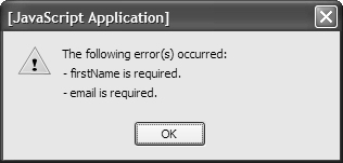
• When a user enters something incorrectly or neglects to fill in a required field, a JavaScript alert box similar to Figure 13.25 pops up with a message about the error.
Figure 13.25. The user sees an alert if the form validation requirements aren’t met.
• It’s good practice to give users an explicit cue when a field is required. An asterisk next to a required field is a common visual cue, along with a note to the user that the asterisk denotes a required field. You may have colorblind users, so merely formatting the required field labels in a different color isn’t considered adequate.
• The Dreamweaver behaviors for validating forms are different from server-side scripts used to handle submitted information. The same validity checks on user data you add with Dreamweaver should also be done with server-side scripts. Why both? The server-side checks are necessary because not everyone has JavaScript. The client-side JavaScript checks added here are also useful because they give faster feedback to users.
Inserting Fireworks Pop-Up Menus
If you own Fireworks, you can use it to create a pop-up menu. When you insert a Fireworks pop-up menu into a Dreamweaver document, it’s best to use the round-trip editing feature to edit the menu in Fireworks. You will be able to edit the pop-up menu in Dreamweaver, but if you do, you lose the ability to edit it in Fireworks later. Stick with Fireworks.
When you have the Fireworks pop-up menu completed, simply export it. Fireworks creates all the image and HTML files for you and adds them to the Dreamweaver site root folder. With the files in your site folder, you’re ready to insert the menu in Dreamweaver.
To insert a Fireworks pop-up menu
1. Place the insertion point in the document where you want the menu.
2. Choose Insert > Image Objects > Fireworks HTML.
or
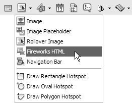
Select Fireworks HTML from the pop-up menu by the Image icon in the Common tab of the Insert Bar (Figure 13.26).
Figure 13.26. You can choose to add Fireworks HTML from the Image icon in the Common tab of the Insert Bar.
The Insert Fireworks HTML dialog opens (Figure 13.27).
Figure 13.27. Getting Fireworks HTML into Dreamweaver is as easy as pointing to the HTML file.
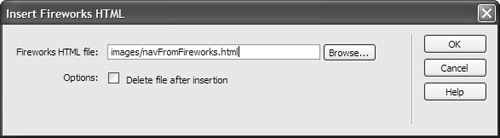
3. Browse for or type the name of the Fireworks HTML file.
4. Select the “Delete file after insertion” option if you no longer want the Fireworks HTML to be stored as a separate file. Selecting this option won’t affect the source PNG file associated with the HTML file, or your ability to use round-trip editing to edit the pop-up menu in Fireworks.
5. Click OK to insert your menu. All the HTML, image links, and JavaScript connected to the pop-up menu are inserted in the appropriate areas in the document.
Tip
• Deleting the HTML file after insertion has its pros and cons. You might want to keep it around to use elsewhere, or you might want to delete it to clean up after yourself. Either way, you can re-create it inside Fireworks, so if you delete it accidentally, it’s not the end of the world.