Ordinal Predicted Variable
The winner is first, and that's all that he knows, whether
Won by a mile or wonbyanose. But
Second recalls every inch of that distance, in
Vivid detail and with haunting persistence.1
This chapter considers data that have an ordinal predicted variable. For example, we might want to predict people's happiness ratings on a 1‒to‒7 scale as a function of their total financial assets. Or we might want to predict ratings of movies as a function of the year they were made.
One traditional treatment of this sort of data structure is called ordinal or ordered probit regression. We will consider a Bayesian approach to this model. As usual, in Bayesian software, it is easy to generalize the traditional model so it is robust to outliers, allows different variances within levels of a nominal predictor, or has hierarchical structure to share information across levels or factors as appropriate.
In the context of the generalized linear model (GLM) introduced in Chapter 15, this chapter's situation involves an inverse-link function that is a thresholded cumulative normal with a categorical distribution for describing noise in the data, as indicated in the fourth row of Table 15.2 (p. 443). For a reminder of how this chapter's combination of predicted and predictor variables relates to other combinations, see Table 15.3 (p. 444).
23.1 Modeling ordinal data with an underlying metric variable
Suppose we ask a bunch of people how happy they are, and we make them respond on a discrete rating scale with integer values from 1 to 7, with 1 labeled “extremely unhappy” and 7 labeled “extremely happy.” How do people generate a discrete ordinal response? It is intuitively plausible that people have some internal feeling of happiness that varies on a continuous metric scale, and they have some sense of thresholds for each response category. People respond with the discrete ordinal value that has thresholds that bracket their underlying continuous metric feeling of happiness. A key aspect of this idea is that the underlying metric value is randomly distributed across people (or across moments within a person). We will assume that the underlying metric value is normally distributed.
As another example, suppose we ask a teacher to assign letter grades to essays from a class of students, and we ask her to respond on a discrete rating scale from 1 to 5, with those integers labeled “F,” “D,” “C,” “B,” and “A.” How does the teacher generate a discrete ordinal grade? It is intuitively plausible that she carefully reads each essay and gets a sense of its quality on an underlying continuous metric scale. She also has some thresholds for each outcome category, and she assigns the discrete ordinal value that has thresholds that bracket the underlying metric value. We will assume that the underlying metric value is normally distributed across students (or across time within the teacher).
You can imagine that the distribution of ordinal values might not resemble a normal distribution, even though the underlying metric values are normally distributed. Figure 23.1 shows some examples of ordinal outcome probabilities generated from an underlying normal distribution. The horizontal axis is the underlying continuous metric value. Thresholds are plotted as vertical dashed lines, labeled θ. In all examples, the ordinal scale has 7 levels, and hence, there are 6 thresholds. The lowest threshold is set at θ1 = 1.5 (to separate outcomes 1 and 2), and the highest threshold is set at θ6 = 6.5 (to separate outcomes 6 and 7). The normal curve in each panel shows the distribution of underlying continuous values. What differs across panels are the settings of means, standard deviations, and remaining thresholds.

The crucial concept inFigure 23.1is that the probability of a particular ordinal outcome is the area under the normal curve between the thresholds of that outcome. For example, the probability of outcome 2is the area under the normal curve between thresholds θ1 and θ2. The vertical bars in Figure 23.1 indicate the probabilities of the outcomes by the heights of the bars. Each bar is annotated with its corresponding outcome value and probability (rounded to the nearest 1%).
How is the area of an interval computed? The idea is that we consider the cumulative area under the normal up the high-side threshold, and subtract away the cumulative area under the normal up to the low-side threshold. ![]() ecall that the cumulative area under the standardized normal is denoted Φ(z), as was illustrated in Figure 15.8 (p. 440). Thus, the area under the normal to the left of θk is Φ((θk ‒ μ)/σ), and the area under the normal to the left of Φ((θk-1 ‒ μ)/σ). Therefore, the area under the normal curve between the two thresholds, which is the probability of outcome k, is
ecall that the cumulative area under the standardized normal is denoted Φ(z), as was illustrated in Figure 15.8 (p. 440). Thus, the area under the normal to the left of θk is Φ((θk ‒ μ)/σ), and the area under the normal to the left of Φ((θk-1 ‒ μ)/σ). Therefore, the area under the normal curve between the two thresholds, which is the probability of outcome k, is
Equation 23.1 applies even to the least and greatest ordinal values if we append two “virtual” thresholds at ‒∞ and +∞. Thus, for the least ordinal value, namely y = 1, the probability is

And, for the greatest ordinal value, denoted y = K, the probability is

The top panel of Figure 23.1 shows a case in which the thresholds are equally spaced and the normal distribution is centered over the middle of the scale, with a moderate standard deviation. In this case, the bar heights mimic the shape of the normal curve fairly well. Exercise 23.1 shows you how to verify this in ![]() .
.
The second panel of Figure 23.1 shows a case in which the mean of the normal distribution falls below the lowest threshold, and the standard deviation is fairly wide. In this case, the lowest ordinal response has a high probability because much of the normal distribution falls below the lowest threshold. But higher ordinal responses also occur because the standard deviation is wide. Thus, in this case, the distribution of ordinal values does not look very normal, even though it was generated by an underlying normal distribution. An example of real data with this type of distribution will be discussed later.
The third and fourth panels of Figure 23.1 show cases in which the thresholds are not equally spaced. In the third panel, the middle values have relatively narrowly spaced thresholds compared to the penultimate thresholds. The normal distribution in this case is not very wide, and the result is a “broad shouldered” distribution of ordinal values. This type of distribution can arise, for example, when the end categories are labeled too extremely for them to occur very often (e.g., How often do you tell the truth? 1 = I have never told the truth; 7 = I have always told the truth, never even telling a “white lie“). The fourth panel shows a case in which the middle interval is wide compared to the others, and the normal distribution is wide, which yields a three-peaked distribution of ordinal values.
Thus, a normally distributed underlying metric value can yield a clearly non-normal distribution of discrete ordinal values. This result does not imply that the ordinal values can be treated as if they were themselves metric and normally distributed; in fact it implies the opposite: We might be able to model a distribution of ordinal values as consecutive intervals of a normal distribution on an underlying metric scale with appropriately positioned thresholds.
23.2 The case of a single group
Suppose we have a set of ordinal scores from a single group. Perhaps the scores are letter grades from a class and we would like to know to what extent the mean grade falls above or below a “C.” Or perhaps the scores are agree-disagree ratings and we would like to know the extent to which the mean ratings fall above or below the neutral midpoint. Our goal is to describe the set of ordinal scores according to the model illustrated in Figure 23.1. We will use Bayesian inference to estimate the parameters.
If there are K ordinal values, the model has K + 1 parameters: θ1, …, θK-1, μ, and σ. If you think about it a moment, you'll realize that the parameter values trade-off and are undetermined. For instance, we could add a constant to all the thresholds, but have the same probabilities if we added the same constant to the mean. In terms of the graph of Figure 23.1, this is like sliding the x-axis underneath the data an arbitrary distance left or right. Moreover, we could expand or contract the axis to an arbitrary extent, centered at the mean, but have the same probabilities by making a compensatory adjustment to the standard deviation (and thresholds). Therefore, we have to “pin down” the axis by setting two of the parameters to arbitrary constants. There is no uniquely correct choice of which parameters to fix, but we will fix the two extreme thresholds to meaningful values on the outcome scale. Specifically, we will set
This setting implies that our estimates of the other parameters are all with respect to these meaningful anchors. For example, in Figure 23.1, the thresholds were set according to Equation 23.4, and therefore, all the other parameter values make sense with respect to these anchors.
23.2.1 Implementation in JAGS
To estimate the parameters, we need to express Equations 23.1-23.4 in JAGS (or Stan), and establish prior distributions. The first part of the JAGS model specification says that each ordinal datum comes from a categorical distribution that has probabilities computed as in Equations 23.1-23.3. In the JAGS code below, Ntotal is the total number of data points, nYlevels is the number of outcome levels, and the matrix pr[i,k] holds the predicted probability that datum y[i] has value k. In other words, pr[i,k] is p(yi = k|μ, σ, {θj}). ![]() ecall that the cumulative normal function in JAGS (and
ecall that the cumulative normal function in JAGS (and ![]() ) is called pnorm. Now, see if you can find Equations 23.1-23.3 in the first part of the model specification:
) is called pnorm. Now, see if you can find Equations 23.1-23.3 in the first part of the model specification:
In the JAGS model specification above, the cumulative normal probabilities that are written as
could instead be coded as
This alternative form (above) better matches the form in Equation 23.1 and may be used instead if it suits your aesthetic preferences. I avoid the form with 0 and 1 because it can be dangerous, from a programming perspective, to use unlabeled constants.
You may be wondering why the expression for pr[i,k], above, uses the maximum of zero and the difference between cumulative normal probabilities. The reason is that the threshold values are randomly generated by the MCMC chain, and it is remotely possible that the value of thresh[k] would be less than the value of thresh[k−1], which would produce a negative difference of cumulative normal probabilitieswhich makes no sense. By setting the difference to zerothe likelihood of y = k is zero, and the candidate threshold values are not accepted.
The model specification continues with the prior distribution on the parameters. As usual, in the absence of specific prior knowledge, we use a prior that is broad on the scale of data. The mean and standard deviation should be somewhere in the vicinity of the data, which can only range from 1 to nYlevels on the ordinal outcome scale. Thus, the prior is declared as:
The prior on the thresholds centers θk at k + 0.5 but allows a considerable range:
Notice above that only the non-end thresholds are given priors, because only they are estimated. The end thresholds are fixed as specified in Equation 23.4. But how is Equation 23.4 implemented in JAGS? This requires specifying the fixed components of the threshold vector in the data list that is delivered to JAGS separately. The other components of the threshold vector are estimated (i.e., stochastically set by the MCMC process). Estimated components are given the value NA, which JAGS interprets as meaning that JAGS should fill them in. Fixed components are given whatever constant values are desired. Thus, in ![]() , we state:
, we state:
The full specification is in the program Jags-Yord-Xnom1grp-Mnormal.R, which is called from the high-level script Jags-Yord-Xnom1grp-Mnormal-Example.R.
23.2.2 Examples: Bayesian estimation recovers true parameter values
Figures 23.2 and 23.3 show results of two examples. In both cases, the data were generated from the model with particular known parameter values, and the goal of the examples is to demonstrate that Bayesian estimation accurately recovers the parameter values even when μ is extreme and when the thresholds are not evenly spaced.
Figure 23.2 shows an example in which the ordinal data happen to be piled up on one end of the scale. The data are shown as the histogram in the top-right subpanel of the figure. (A real case of this sort of distribution will be provided later.) The generating parameter values are μ = 1.0 and σ = 2.5, with the thresholds equally spaced at θ1 = 1.5, θ2 = 2.5, θ3 = 3.5, θ4 = 4.5, θ5 = 5.5, and θ6 = 6.5. As you can see in the marginal posterior distributions of μ and σ, the Bayesian estimation very accurately recovers the generating parameters.
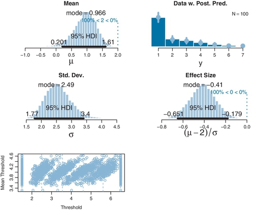
The top-right subpanel of Figure 23.2 superimposes posterior predictive probabilities of the outcomes. At each outcome value, a dot plots the median posterior predictive probability and a vertical segment indicates the 95% HDI of posterior predictive probabilities. A key aspect of this thresholded cumulative-normal model is that it accurately describes the ordinal data distribution.
The posterior distribution of an effect size is shown in the second row, right column of Figure 23.2. Effect size for a single group must be defined with respect to a comparison value C; for purposes of illustration, the comparison value here is chosen to be C = 2.0. Effect size is defined as the difference between the mean and the comparison value, relative to the standard deviation: (μ ‒ C)/σ. (This type of effect size was introduced in the case of a single group of metric values, as displayed in Figure 16.3, p. 457.) The posterior distribution leaves no doubt that the effect size is different from zero. A similar conclusion is reached by examining the posterior distribution of μ relative to the comparison value C = 2: We see that credible values of μ are clearly different from 2. Later, we will see that a conventional t test, treating the ordinal data as if they were metric, comes to a very different conclusion.
The bottom panel of Figure 23.2 shows the posterior distribution on the thresholds. The plot does not show the marginal distributions of individual thresholds because the threshold values are strongly correlated with each other, and therefore, the marginal distributions can be misleading. ![]() emember that, at each step in the MCMC chain, the parameter values are jointly credible. Consider what happens at a particular step in the chain. If θ2 is randomly chosen to be a bit higher than usual, the upward shift of the threshold not only increases the likelihood of outcome 2 but also decreases the likelihood of outcome 3. To compensate and maintain the likelihood of outcome 3, threshold θ3 also is chosen to be a bit higher than usual. This domino effect continues through all the thresholds. Consequently, if one threshold is higher than usual, all thresholds tend to be higher than usual, and if one threshold is lower than usual, then all thresholds tend to be lower than usual. In other words, the thresholds are strongly correlated across steps in the chain. To display this linkage of the thresholds, I have chosen to plot the threshold values against the mean of the thresholds. At a particular step s in the MCMC chain, the jointly credible threshold values are θ1 (s),…, θK-1(s), and the mean threshold at that step in the chain is
emember that, at each step in the MCMC chain, the parameter values are jointly credible. Consider what happens at a particular step in the chain. If θ2 is randomly chosen to be a bit higher than usual, the upward shift of the threshold not only increases the likelihood of outcome 2 but also decreases the likelihood of outcome 3. To compensate and maintain the likelihood of outcome 3, threshold θ3 also is chosen to be a bit higher than usual. This domino effect continues through all the thresholds. Consequently, if one threshold is higher than usual, all thresholds tend to be higher than usual, and if one threshold is lower than usual, then all thresholds tend to be lower than usual. In other words, the thresholds are strongly correlated across steps in the chain. To display this linkage of the thresholds, I have chosen to plot the threshold values against the mean of the thresholds. At a particular step s in the MCMC chain, the jointly credible threshold values are θ1 (s),…, θK-1(s), and the mean threshold at that step in the chain is ![]() . The threshold values are then plotted as the points
. The threshold values are then plotted as the points ![]() . Notice that these points are all at the same height on the vertical axis. At different steps in the chain, the mean threshold will be higher or lower. You can see in the bottom panel of Figure 23.2 that this plotting method produces distinct clusters of points for each threshold value. You can see that the clusters for θ1 and θK−1 have fixed values at 1.5 and K ‒ 0.5, as they should. Each cluster has a vertical dashed line that indicates its mean. The mean values for the estimated thresholds are very near the values that generated the data. You can also see that the higher thresholds have greater uncertainty than the lower thresholds, which makes sense because there are fewer high data points than low data points.
. Notice that these points are all at the same height on the vertical axis. At different steps in the chain, the mean threshold will be higher or lower. You can see in the bottom panel of Figure 23.2 that this plotting method produces distinct clusters of points for each threshold value. You can see that the clusters for θ1 and θK−1 have fixed values at 1.5 and K ‒ 0.5, as they should. Each cluster has a vertical dashed line that indicates its mean. The mean values for the estimated thresholds are very near the values that generated the data. You can also see that the higher thresholds have greater uncertainty than the lower thresholds, which makes sense because there are fewer high data points than low data points.
A second example is shown in Figure 23.3. This example illustrates a case in which the thresholds are not equally spaced, such that the penultimate ordinal values are emphasized and the overall data distribution is bimodal. The caption of the figure reports the true values of the parameters. You can see from the posterior distribution that the true parameter values are accurately estimated, including the thresholds. Importantly, the posterior predictive distribution in the top-right subpanel accurately describes the bimodal distribution of the outcomes.

23.2.2.1 Not the same results as pretending the data are metric
In some conventional approaches to ordinal data, the data are treated as if they were metric and normally distributed. When the data of Figure 23.2 are treated this way, the result is that they are described as normally distributed with a mean of 1.95 and a standard deviation of 1.40, which badly mispredicts the probabilities of the ordinal values in this case, putting highest predicted probability on an outcome of 2 and nearly equal predicted probabilities on outcomes 1 and 3. When a NHST t test is applied to the data, the mean is not significantly different from a comparison value of μ= 2.0: M = 1.95, t = 0.36, p = 0.722, with 95% CI of 1.67-2.23, and with effect size d = 0.036. The sample standard deviation is S = 1.40. The t test assumes that the data are normally distributed, which clearly is not the case here.
When the data of Figure 23.3 are treated as metric and normally distributed, the estimated mean is not far from the Bayesian estimate, but the predictions of individual outcome probabilities are terrible (because the actual probabilities are bimodal, not normal), and the t test comes to a different conclusion than the Bayesian analysis: The mean is significantly different from μ = 4.0: M = 3.47, t = 2.47, p = 0.016, with 95% CI of 3.04-3.90, and effect size d = 0.295. The sample standard deviation is S = 1.79.
In the two examples, the conclusions of the two approaches differed. For the data of Figure 23.2, the cumulative-normal Bayesian estimation showed that the underlying mean differed from a comparison value of 2.0, but the ordinal-as-metric t test concluded that the mean was not significantly different from 2.0. For the data of Figure 23.3, the cumulative-normal Bayesian estimation showed that the underlying mean had a 95% HDI that included a comparison value of 4.0, but the ordinal-as-metric t test concluded that the mean was significantly different from 4.0. Which of the analyses yields the more trustworthy conclusion? The one that describes the data better. In these cases, there is no doubt that the cumulative-normal model is the better description of the data. Bayesian estimation is an excellent way to estimate the parameters of the model and examine the uncertainty of the estimates.
23.2.2.2 Ordinal outcomes versus Likert scales
In the social sciences, the most common source of ordinal data is questionnaire items that have an ordinal-response interface. For example, rate how much you agree with the statement, “Bayesian estimation is more informative than null-hypothesis significance testing,” by selecting one option from the following: 1 = strongly disagree; 2 = disagree; 3 = undecided; 4 = agree; 5 = strongly agree. This sort of ordinal response interface is often called a Likert-type response (Likert, 1932, pronounced LICK-ert not LIKE-ert). Sometimes, it is called a Likert “scale” but the term “scale” in this context is more properly reserved for referring to an underlying metric variable that is indicated by the arithmetic mean of several meaningfully related Likert-type responses (e.g., Carifio & Perla, 2007, 2008; Norman, 2010).
A metric Likert scale derives from several ordinal-response items. The idea is that all the ordinal responses are generated randomly from the same underlying metric variable. If it is assumed that the ordinal responses are linearly related to the underlying metric scale, then the ordinal values are averaged, and the average is described as normally distributed on a metric scale. More sophisticated approaches can treat the underlying metric scale as a latent factor and generate the ordinal responses with a thresholded cumulative-normal model.
The main point for our purposes is that this chapter assumes that we are interested in describing the ordinal outcomes themselves, not (necessarily) the arithmetic average of several ordinal responses. If there are many related items on a multiitem questionnaire, then the model of the ordinal data can use latent factors to express relations among the items. We will not be exploring such models in this book, however.
23.3 The case of two groups
There are many situations in which we would like to compare two groups of ordinal outcomes. Consider a questionnaire that has people indicate how much they agree with various statements about social issues. The ordinal response interface allows people to select one level of 1 = strongly disagree; 2 = disagree; 3 = undecided; 4 = agree; and 5 = strongly agree. One statement on the questionnaire is “Left-handed people should be given equal rights under the law.” Another statement on the questionnaire is “Homosexual people should be given equal rights under the law.” The two statements could be given to separate groups of respondents if within-subject contrast effects are a concern. We may be interested in how different the responses are to the two questions.
As another example, suppose we ask people to rate their happiness on a 5-point ordinal scale, from very unhappy to very happy. One group of people just sat through 10 min of video advertisements for luxury items such as jewelry and sports cars. Another group of people just sat through 10 min of video advertisements for local charities. We may be interested in how different the responses are of the two groups.
In both examples in the preceding text, the two groups of outcomes were on the same ordinal scale. In the first example, both questionnaire statements were answered on the same disagree–agree scale. In the second example, both groups responded on the same very unhappy–very happy scale. Therefore, we assume that both groups have the same underlying metric variable with the same thresholds. What differs across groups is the mean and standard deviation. Thus, in the case of the questionnaire, ratings of all statements access the same underlying metric scale for disagreement or agreement, with the same thresholds for ordinal responses, and what differs across statements is the mean and variance of the feeling of agreement. In the case of the happiness ratings, we assume that all respondents access a similar underlying metric scale with thresholds for happiness ratings, and what differs across groups is the mean and variance of the feeling of happiness.
23.3.1 Implementation in JAGS
The model specification in JAGS is a simple extension of the specification for one group that was explained in the previous sections. The extension merely uses two means and two standard deviations (one for each group). It uses the same thresholds for both groups. As in the one-group case, the number of outcome levels is denoted nYlevels and the total number data points across both groups is denoted Ntotal. As was the case for two groups of metric data explored in Section 16.3 (p. 468), the group index of respondent i is denoted x[i] (and can have values 1 or 2). The JAGS model specification is virtually identical to the case of one group, except what was mu is now mu[x[i]] and what was sigma is now sigma[x[i]]:
The complete model specification and other functions are defined in Jags-Yord-Xnom2grp-MnormalHet.R, and the high-level script that calls the functions is named Jags-Yord-Xnom2grp-MnormalHet-Example.R.
23.3.2 Examples: Not funny
Figure 23.4 shows a case with artificial data to demonstrate accurate recovery of known parameters. In this case, the ordinal data emphasize the low end of the scale. The true parameters have different means but equal variances, and the thresholds are equally spaced. The figure caption provides exact values. The posterior distribution shows that the parameter values are accurately recovered, and the posterior predictive distribution accurately describes the distribution of data. However, the uncertainty is large enough that 95% HDI on the effect size includes zero.

When the data of Figure 23.4 are treated as if they were metric and submitted to NHST, the conclusions are different. In particular, a t test concludes that the means are significantly different and an F test concludes that the variances are also significantly different (see the figure caption for details). These conclusions are not to be trusted because their p values assume that the data are normally distributed, which is clearly not the case here.
Figure 23.5 shows a case with real ordinal data that hug one end of the response scale. The data are funniness ratings of two jokes.2 For each of 25 jokes, people were asked “How funny did you find the joke?” on a rating scale from 1 to 7 with 1 marked “Not at all” and 7 marked “Very.” Figure 23.5 shows results from two of the jokes that were rated as relatively less funny than others.3 I won't report the jokes here because, after all, people did not think these particular jokes were very funny! As can be seen in the posterior distribution of Figure 23.5, Bayesian estimation shows clear differences in the underlying means and variances of the two jokes, while simultaneously describing the data distributions very well. However, if the data are treated as metric and submitted to NHST, no significant differences emerge, as detailed in the caption. Again, the conclusions from NHST are not to be trusted because the p values assume that the data are normally distributed, which is clearly not the case here.

23.4 The case of metric predictors
We now consider the case of an ordinal predicted value with metric predictors. For example, we could predict people's subjective ratings of happiness as a function of their monetary income and years of education. Or we could predict people's ratings of the funniness of a joke as a function of how much alcohol they have consumed and their age. You can glance ahead at Figures 23.7 and 23.8 for examples of a single metric predictor, and at Figures 23.9 and 23.10 for examples with two metric predictors.
We will use a model that combines the basic ideas of linear regression with the thresholded cumulative-normal model of ordinal outcome probabilities. The model is illustrated in Figure 23.6. The right side of Figure 23.6 shows the familiar linear regression model, with the metric predictor on the horizontal axis, and the predicted value μ on the vertical axis. This portion of the diagram is analogous to the linear regression diagram in Figure 17.1 (p. 478). The predicted value of the linear regression is of an underlying metric variable, however, not the observed ordinal variable. To get from the underlying metric variable to the observed ordinal variable, we use the thresholded cumulative-normal model. The left side of Figure 23.6 shows the mapping from underlying metric to observed ordinal variables, displaying Equations 23.1-23.3 at the corresponding intervals between thresholds. As before, we must pin down the metric underlying variable by setting anchors as in Equation 23.4: θ1 ≡ 1.5 and θK‒1 ≡ K ‒ 0.5.
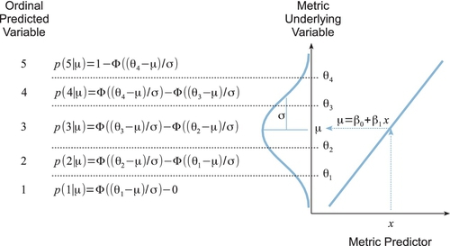
It is important to understand what happens in Figure 23.6 for different values of the predictor. The figure is displayed with x at a middling value. Notice that if x were set at a larger value, then μ would be larger (because of the positive slope in this example). When μ is larger, the normal distribution is pushed upward on the vertical axis (because μ is the mean of normal distribution). Consequently, there is larger area under the normal in higher ordinal intervals, and smaller area under the normal in lower ordinal intervals, which is to say that the probability of higher ordinal values increases and the probability of lower ordinal values decreases. The analogous logic implies that lower values of the predictor x produce increased probability of lower ordinal values (when the slope is positive).
This type of model is often referred to as ordinal probit regression or ordered probit regression because the probit function is the link function corresponding to the cumulative‒normal inverse‒link function (as you will fondly recall from Section 15.3.1.2, p. 439). But, as you know by now, I find it more meaningful to name the models by their inverse‒link function, which in this case is the thresholded cumulative normal.
23.4.1 Implementation in JAGS
The model of Figure 23.6 is easy to implement in JAGS (or Stan). In the program, we generalize to multiple metric predictors (instead of only one metric predictor). There are only two changes from the model specification of the previous applications. First, μ is defined as a linear function of the predictors, just as in the previous programs for multiple regression (linear, logistic, softmax, or conditional logistic). Second, the predictors are standardized to improve MCMC efficiency, again as in the programs for multiple regression. Here is the JAGS model specification:
You will have noticed in the code, above, that the predicted values were not standardized. Why? Because the predicted values are ordinal and do not have meaningful metric intervals between them. The ordinal values are just ordered categories, with probabilities described by the categorical distribution dcat in JAGS, which is a distribution over integer indices. Because the predicted values are not standardized, the transformation from standardized parameters to original-scale parameters is exactly like what was used for logistic regression, back in Equation 21.1 (p. 625). Full details are in the files Jags-Yord-XmetMulti-Mnormal.R and Jags-Yord-XmetMulti-Mnormal-Example.R.
23.4.2 Example: Happiness and money
We start with examples that have a single metric predictor. First, a case with fictitious data generated by known parameter values, which demonstrates that Bayesian estimation accurately recovers the parameter values. Figure 23.7 shows the data in its upper panel. The ordinal predicted values range from 1 to 7 in this case. You can see that when the predictor value (x) is small, there are a preponderance of small y values, and when the predictor value is large, there are mostly large y values. The parameter values that were used to generated the data are specified in the figure caption.
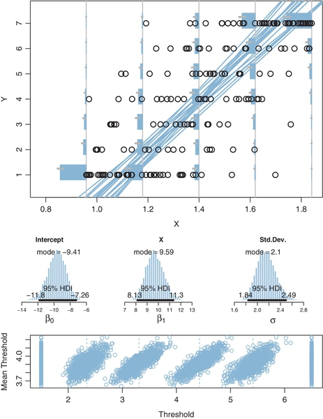
Figure 23.7 displays aspects of the posterior predictive distribution superimposed on the data. A smattering of credible regression lines is displayed. It must be remembered, however, that the regression lines refer to the underlying metric predicted variable, not to the ordinal predicted variable. Thus, the regression lines are merely suggestive and should be used to get a visual impression of the uncertainty in the slope and intercept. More directly pertinent are the posterior predicted probabilities of each outcome at selected x values marked by vertical lines. At the selected x values, the posterior predicted probabilities of the outcomes are plotted as horizontal bars “rising” leftward away from the vertical baseline. To see the probability distribution, it is easiest to tilt your head to the left, and imagine the bars as if marking the probabilities of intervals under the normal curve. In this example, when x is small, the bars on small values of y are tall relative to the bars on large values of y. And when x is large, the bars on small values of y are short relative to the bars on large values of y.
The main point of the example in Figure 23.7, other than familiarizing you with the graphical conventions, is that Bayesian estimation accurately recovers the true parameter values that generated the data. This is in contrast with estimates derived by treating the ordinal data as if they were metric. The least-squares estimates of the slope, intercept, and residual standard deviation are reported in the caption of the figure, and they are much too small in this case.
Our second example involving a single metric predictor uses real data from the Chinese household income project of 2002, which surveyed personal income and other aspects of people in urban and rural areas of the People's ![]() epublic of China (Shi, 2009). In particular, one survey item was a person's total household assets, measured in Chinese yuan (which had an exchange rate in 2002 of about 8.27 yuan per 1.00 US dollar). Another survey item asked, “Generally speaking, do you feel happy?” with response options of 1 = not happy at all, 2 = not very happy, 3 = so-so, 4 = happy, and 5 = very happy (and “don't know,” which was given just 1% of the time and is excluded from this analysis).4 There were 6,835 data points, as plotted in Figure 23.8.
epublic of China (Shi, 2009). In particular, one survey item was a person's total household assets, measured in Chinese yuan (which had an exchange rate in 2002 of about 8.27 yuan per 1.00 US dollar). Another survey item asked, “Generally speaking, do you feel happy?” with response options of 1 = not happy at all, 2 = not very happy, 3 = so-so, 4 = happy, and 5 = very happy (and “don't know,” which was given just 1% of the time and is excluded from this analysis).4 There were 6,835 data points, as plotted in Figure 23.8.
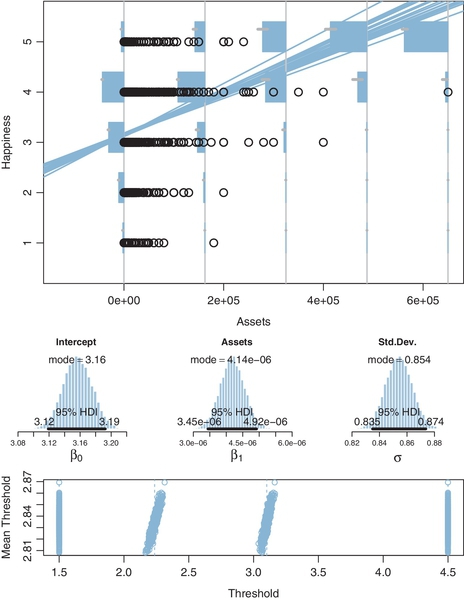
One thing to notice from the data in Figure 23.8 is that most happiness ratings are 4, with the next most prominent being 3. One way that this preponderance of “4” ratings is handled by the parameter estimates is by setting the thresholds for categories 2 and 3 to relatively low values, as shown in the bottom panel. This makes the interval for 4 relatively wide.
The posterior distribution in Figure 23.8 indicates that the mean happiness rating clearly increases as assets increase. But it's not a huge increase: If assets go up by 82,770 yuan (the equivalent of 10,000 US dollars in 2002), then mean happiness increases 0.34 points (on the underlying metric scale). Moreover, at any given level of assets, there is large variability in happiness ratings: The marginal posterior distribution of σ has a mode of about 0.85 (on a response scale that ranges from 1 to 5). Note that the value of σ is estimated with high certainty, in that its 95% HDI extends only from about 0.83 to 0.88. This is worth reiterating to be sure the meaning of σ is clear: σ indicates variance in the data, and it is big, but the posterior estimate of the variance is also precise because the sample size is large.
If we were to treat the ordinal ratings as if they were metric values, the least-squares estimates of the regression parameters are a bit less than the Bayesian estimates, as reported in the caption of Figure 23.8, despite this being a case in which the data fall mostly in the middle of the response scale. For an example of treating these happiness data as metric, see Jiang, Lu, and Sato (2009), who defended the practice by citing comparisons reported by Ferrer-i-Carbonell and Frijters (2004).
The general trends indicated by this analysis are typical findings in many studies. But the analysis given here is meant only for pedagogical purposes, not for drawing strong conclusions about the relation of happiness to money. In particular, this example used linear trend for simplicity, and more sophisticated analyses (perhaps with other data) could examine nonlinear trends. Of course, there are many influences on happiness other than money, and the link between money and happiness can be mediated by other factors (e.g., Blanchflower & Oswald, 2004; Johnson & Krueger, 2006, and references cited therein).
23.4.3 Example: Movies—They don't make 'em like they used to
We now consider a case with two predictors. A movie critic rated many movies on a 1-7 scale5 and the data about the movies included their length (i.e., duration in minutes) and year of release. These data were assembled by Moore (2006) and come from reviews by Maltin (1996). It's not necessary that there should be any relation between length or year of release and the reviewer's ratings, linear or otherwise. Nevertheless, we can apply thresholded cumulative-normal linear regression to explore possible trends.
Figure 23.9 shows the data and results of the analysis. The upper panel of Figure 23.9 shows a scatter plot in which each point is a movie, with each datum plotted as a numeral 1-7 that indicates the movie's rating, positioned on axes that indicate the length and year of the movie. You can see that there is considerable variation in the ratings that is not accounted for by the predictors, because movies of many different ratings are intermingled among each other.

Despite the “noise” in the data, the analysis reveals credibly nonzero relationships between the predictors and the reviewer's ratings. The marginal posterior distribution on the regression coefficients indicates that ratings tend to rise as length increases, but ratings tend to decline as year of release increases. In other words, the reviewer tends to like old, long movies more than recent, short movies.
To get a visual impression of the linear trend in the data, Figure 23.9 plots a few credible threshold lines. At a step in the MCMC chain, consider that jointly credible thresholds and regression coefficients. We can solve for the 〈 x1, x2〉 loci that fall exactly at threshold θk by starting with the definition of the predicted value μ and setting it equal to θk:
hence,
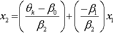
The lines determined by Equation 23.5 are plotted in Figure 23.9 at a few different steps in the MCMC chain, with thresholds from the same step plotted with lines of the same type (solid, dashed, or dotted). Threshold lines from the same step in the chain must be parallel because the regression coefficients are constant at that step, but are different at another step. The threshold lines in Figure 23.9 are level contours on the underlying metric planar surface, and the lines reveal that the ratings increase toward the top left, that is, as x1 decreases and x2 increases.
Curiously, however, the extreme thresholds fall beyond where any data occur. For instance, the threshold line for transitioning from 6 to 7 appears at the extreme upper left of the plotting region and there are no data points at all in the region corresponding to 7 above the 6-to-7 threshold. The analogous remarks apply to the lower-right corner: There are no data points in the region corresponding to 1, below the 1-to-2 threshold. How can this be? The next section explains.
23.4.4 Why are some thresholds outside the data?
To motivate an understanding of the thresholds, consider the artificial data presented in Figure 23.10. These data imitate the movie ratings, but with two key differences. First and foremost, the artificial data have much smaller noise, with σ = 0.20 as opposed to σ ≈ 1.25 in the real data. Second, the artificial data have points that span the entire range of both predictors, unlike the real data which had points mostly in the central region.

Bayesian estimation was applied to the artificial movie data in the same way as the real movie ratings. Notice that the posterior predictive thresholds plotted in Figure 23.10 very clearly cleave parallel regions of distinct ordinal values. The example demonstrates that the threshold lines do make intuitive sense when there is low noise and a broad range of data.
This leaves us needing an intuitive explanation for why the thresholds do not seem so clear for the real data. Figure 23.11 is designed to drive your intuition. The figure shows a single predictor on the horizontal axis of the panels, with the probability of outcome on the vertical axis. Each outcome is marked by a different line style (solid, dashed, dotted, and so on). All that changes across panels is the amount of noise. In the top panel, the noise is small, with σ = 0.1. Notice in this case that each outcome clearly dominates its corresponding interval. For example, outcome 2 occurs with nearly 100% probability between θ1 = 1.5 and θ2 = 2.5, and outcome 2 rarely occurs outside that interval. The next panel down has a bit more noise, with σ = 0.5. You can see that each outcome has maximum probability within its corresponding interval, but there is considerable smearing of outcomes into adjacent intervals. This smearing is worse in the next panel where σ = 1.0. When the noise is large, as in the bottom panel where σ = 2.0, there is so much “smearing” of outcomes across thresholds that the most probable outcome within intervals is not necessarily the outcome centered on that interval. For example, between θ1 = 1.5 and θ2 = 2.5 the most probable outcome is 1, not 2. To understand why this happens, imagine the normal distribution (from Figure 23.6) centered on θ1 = 1.5. A full 50% of the normal falls below θ1 = 1.5, so the probability of outcome 1 is 50%, but the probability of outcome 2 is much less because only a small portion of the normal distribution falls within the interval from θ1 = 1.5to θ2 = 2.5.
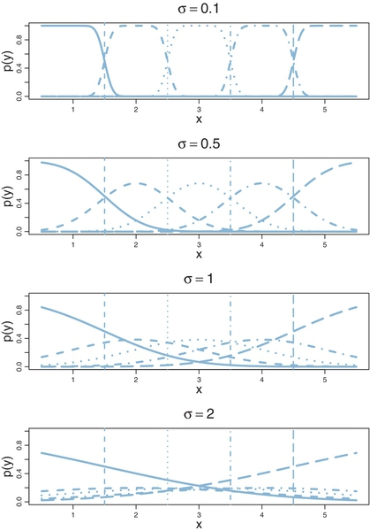
Suppose that the noise is large and that the range of the predictor values in the data is narrow relative to the thresholds. For example, suppose that the predictor values in the data go only from 2 to 4 in the bottom panel of Figure 23.11. Because of the smearing of outcome probabilities, the data would probably have many outcomes of 1 and 5 despite the fact that the predictor values never are less than θ1 or greater than θ4. It is this situation that occurs for the real movie data: The most credible parameter values are a large value for σ with the extreme thresholds set a bit outside the predictor values that actually occur in the data.
The preceding discussion has referred to σ as “noise” merely for linguistic ease. Calling the outcomes “noisy” does not mean the underlying generator ofthe outcomes is inherently wildly random. The “noise” is merely variation in the outcome that cannot be accounted for by the particular model we have chosen with the particular predictors we have chosen. A different model and/or different predictors might account for the outcomes well with little residual noise. In this sense, the noise is in the model, not in the data.
23.5 Posterior prediction
Throughout the examples of this chapter, it has been shown that the thresholded cumulative-normal model makes posterior predictions of the probabilities of each outcome. For example, when dealing with a single group of data, the top right panel of Figure 23.3 (p. 680) shows predicted probabilities with 95% HDIs on each outcome. As another example, when dealing with a single predictor, the top panel of Figure 23.8 (p. 692) again shows predicted probabilities with 95% HDIs on each outcome at selected values of the predictor. How is this accomplished and how is it generalized to multiple predictors?
The answer is this: At each step in the MCMC chain, we compute the predicted outcome probabilities p(y|μ(x),σ,{θk}) using Equations 23.1-23.4 with μ(x)=β0+∑jβjxj. Then, from the full chain of credible posterior predicted outcome probabilities, we compute the central tendency (e.g., mean, median, or mode) and 95% HDI.
To make this concrete, consider the case of a single metric predictor. The value of x at which we want to know the predicted outcome probabilities is denoted xProbe, and we assume it has already been given a value earlier in the program. The following code is processed by ![]() (not by JAGS) and is executed after JAGS has returned the MCMC chain in a coda object named codaSamples. Please read through the following code; the comments explain each successive line.
(not by JAGS) and is executed after JAGS has returned the MCMC chain in a coda object named codaSamples. Please read through the following code; the comments explain each successive line.
The last few lines above used the function apply, which was explained in Section 3.6 (p. 56). The function HDI of MCMC is defined in the utility programs for this book and is described in Section 25.2 (p. 725). The result in outMed is a vector ofmedian predicted probabilities for the outcomes, with the corresponding limits of the HDI's in the columns of the matrix outHdi.
23.6 Generalizations and extensions
The goal of this chapter is to introduce the concepts and methods of thresholded cumulative-normal regression (a.k.a. ordinal or ordered probit regressed), not to provide an exhaustive suite of programs for all applications. Fortunately, it is usually straight forward in principle to program in JAGS or Stan whatever model you may need. In particular, from the programs provided in this chapter, it should be easy to implement any case with one or two groups or metric predictors.
If there are extreme outliers in the data, it is straight forward to modify the programs. There are at least two reasonable approaches to outliers. One approach is to use a heavy-tailed distribution instead of a normal distribution to describe noise. Thus, in Figure 23.6, instead of a normal distribution imagine a t distribution. And, in Equations 23.1-23.3, instead of using a cumulative normal function, use a cumulative t function. Fortunately, this is easy to do in JAGS (and ![]() and Stan) because the cumulative t function is built in as the function pt (analogous to pnorm). Everywhere in the program that pnorm is used, substitute pt, making sure to include the normality parameter (which could be estimated or fixed at a small value). A second approach to describing outliers is to treat them not as mean-centered noise but instead as unrelated to the predictor. In particular, the outcome probabilities from the thresholded cumulative‒normal model can be mixed with a random-outcome model that assigns equal probabilities to all the outcomes. This is the method that was used for dichotomous logistic regression in Section 21.3 (p. 635). The predicted probabilities of the thresholded cumulative-normal model are mixed with a “guessing” probability as in Equation 21.2 (p. 635), with the guessing probability being 1 over the number of outcomes. Exercise 23.2 provides details.
and Stan) because the cumulative t function is built in as the function pt (analogous to pnorm). Everywhere in the program that pnorm is used, substitute pt, making sure to include the normality parameter (which could be estimated or fixed at a small value). A second approach to describing outliers is to treat them not as mean-centered noise but instead as unrelated to the predictor. In particular, the outcome probabilities from the thresholded cumulative‒normal model can be mixed with a random-outcome model that assigns equal probabilities to all the outcomes. This is the method that was used for dichotomous logistic regression in Section 21.3 (p. 635). The predicted probabilities of the thresholded cumulative-normal model are mixed with a “guessing” probability as in Equation 21.2 (p. 635), with the guessing probability being 1 over the number of outcomes. Exercise 23.2 provides details.
Variable selection can be easily implemented. Just as predictors in linear regression or logistic regression can be given inclusions parameters, so can predictors in thresholded cumulative-normal regression. The method is implemented just as was demonstrated in Section 18.4 (p. 536), and the same caveats and cautions still apply, as were explained throughout that section including subsection 18.4.1 regarding the influence of the priors on the regression coefficients.
The model can have nominal predictors instead of or in addition to metric predictors. For inspiration, consult the model diagram in Figure 21.12 (p. 642). The only change is putting thresholds on the normal noise distribution to create probabilities for the ordinal outcomes.

23.7 Exercises
Look for more exercises at https://sites.google.com/site/doingbayesiandataanalysis/
Exercise 23.1
[Purpose: Hands on experience with computing the cumulative normal, to build intuitions for the predicted probabilities in the figures and for using pnormin![]() and JAGS.]
and JAGS.]
(A) Confirm the interval probabilities displayed in Figure 23.1 by using the pnorm function in ![]() . Hint: For each panel, do something like the following:
. Hint: For each panel, do something like the following:
(B) Confirm, approximately, the posterior predicted probabilities shown in Figure 23.3 (p. 680) by using the modal posterior estimates of μ,σ, and thresholds displayed in the figure. Just “eyeball” the modal thresholds from the dashed vertical lines. Use ![]() code from the previous part of the exercise.
code from the previous part of the exercise.
(C) Confirm, approximately, the posterior predicted probabilities shown in Figure 23.8 for assets= 1.6e5 yuan and for assets= 4.9e5 yuan. Use the modal posterior estimates of the parameters shown in Figure 23.8, and “eyeball” the modal estimates of the thresholds. Extend the ![]() code from the first part; you'll have to compute mu from the intercept and slope at the probed values of x.
code from the first part; you'll have to compute mu from the intercept and slope at the probed values of x.
Exercise 23.2
[Purpose: Modifying the program to handle outliers.] Suppose we suspect that the data have a lot of outlying values, relative to an underlying normal distribution.
(A) In this part, we extend the thresholded cumulative-normal model so it includes a random guessing mixture. For a review of the idea, see Section 21.3 (p. 635). Copy Jags-Yord-XmetMulti-Mnormal.R to a new file with a new name for the guessing model. In the new program, make the following modifications. In the data section of the JAGS model, add
In the model section, change the y[i] line from
At the end of the model, give the mixture coefficient a prior like this:
![]() un the model on the movie data. Be sure you source the new program, not the original program; and, change the fileNameRoot for saving the output files so that the nonrobust files are not overwritten. Report the results and discuss any differences from the results of the nonguessing model in Figure 23.9. In particular: (i) Show the posterior distribution of the guessing parameter (alpha). (ii) Are the regression coefficients a little more extreme (yes), and why? (iii) Is there anything unusual about the posterior distribution on the thresholds (see Figure 23.12), and why? Hint: Even if the thresholds are randomly inverted in the MCMC chain, and the outcome probabilities from that component are zero, the random component still gives the outcomes a nonzero probability.
un the model on the movie data. Be sure you source the new program, not the original program; and, change the fileNameRoot for saving the output files so that the nonrobust files are not overwritten. Report the results and discuss any differences from the results of the nonguessing model in Figure 23.9. In particular: (i) Show the posterior distribution of the guessing parameter (alpha). (ii) Are the regression coefficients a little more extreme (yes), and why? (iii) Is there anything unusual about the posterior distribution on the thresholds (see Figure 23.12), and why? Hint: Even if the thresholds are randomly inverted in the MCMC chain, and the outcome probabilities from that component are zero, the random component still gives the outcomes a nonzero probability.
(B) In this part, change the thresholded cumulative‒normal model to a thresholded cumulative‒t‒distribution model (with no random guessing mixture). For a review of using the t distribution to handle outliers in linear regression, see Section 17.2.1 (p. 483). Copy Jags-Yord-XmetMulti-Mnormal.R to a new file with a new name and work on the new copy. You will only need to change the lines of the JAGS model specification that involve pr[i,…] from pnorm to pt (yes, pt not dt, because we want the cumulative probability function), being sure to include the normality parameter. ![]() un the model on the movie data. Answer the same questions as the previous part. In particular, are the thresholds ever inverted? Hint: The thresholds will not be inverted in this model because that would yield zero probability for the outcomes in the affected intervals.
un the model on the movie data. Answer the same questions as the previous part. In particular, are the thresholds ever inverted? Hint: The thresholds will not be inverted in this model because that would yield zero probability for the outcomes in the affected intervals.