Excel Lesson 8: Advanced Data Analysis
In this lesson, you will learn advanced data analysis skills with Excel. You will learn how to summarize large data sets using PivotTables. You will also learn how to arrange, filter, and format PivotTables and how to produce a PivotChart. In addition, you will learn how to perform what-if analysis on your data with the Goal Seek and Scenario commands.
What you’ll learn in this lesson:
- • Creating a PivotTable
- • Rearranging a PivotTable
- • Updating data
- • Creating a PivotChart
- • Performing What-If Analysis
Starting up
You will work with files from the Excel08lessons folder. Make sure you have loaded the OfficeLessons folder onto your hard drive from www.digitalclassroombooks.com/Office2013. If you need further instructions, see “Loading lesson files” in the Starting up section of this book.
Introduction to PivotTables
As discussed in Lesson 6, “Working with Data,” Excel offers an excellent set of tools to track and manage lists of information. The real dilemma occurs when you need to quickly summarize the data or produce informative reports. A PivotTable allows you to do just that.
A PivotTable is an interactive table that summarizes data in an existing worksheet list or table. You can quickly rearrange the table by dragging and dropping fields to create a new report without changing the structure of your worksheet.
When you create a PivotTable from a list, column labels are used as row, column, and filter fields, and the data in the list become items in the PivotTable. When the data in the list contains numeric items, Excel automatically uses the SUM function to calculate the values in the PivotTable.
|
PivotTable fields |
|
|
Area |
Description |
|
Columns |
Items arranged in a columnar orientation. Items in this field appear as column labels. |
|
Rows |
Items arranged in a linear orientation. Items in this field appear as row labels. |
|
Filters |
Field is used to filter the data displayed. Items in this field appear as labels. |
|
Values |
Summarized numeric data. |
Creating a PivotTable
A PivotTable is made up from data entered in a list format. The column labels contained in the header row of the list are used to construct the table. Once you have indicated the range of data to include, you can select how to organize the data in the PivotTable. When you click within any cell of a list, Excel automatically detects the table.
1 Choose File > Open, click Computer, and click Browse. Navigate to the Excel08lessons folder and open the file named Sales_Report.
2 Choose File > Save As, navigate to the Excel08lessons folder, and name the file Sales_Report_work.
3 Click in cell A6 and choose PivotTable from the Insert tab.

Quickly summarize large data sets with the PivotTable.
4 Select Existing Worksheet and click in cell H6.

PivotTables can be added directly to the worksheet.
5 Click OK to open the PivotTable Fields pane.
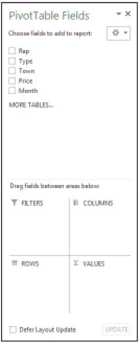
Select the fields you want to summarize in the PivotTable.
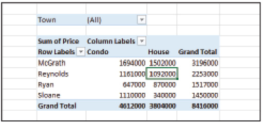
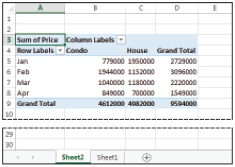
6 Select Rep, Type, Town, and Price in the Choose fields to add to report. As you select the fields, Excel automatically places them into the report layout in a single column layout.
7 To arrange the PivotTable in a more readable layout, click and drag Town to the Filters box, Rep to the Columns box, and leave Type in the Rows box and Price in the Values box. Excel redraws the PivotTable to display data organized by Type.
Arrange the layout of a PivotTable by dragging the fields to the appropriate location.
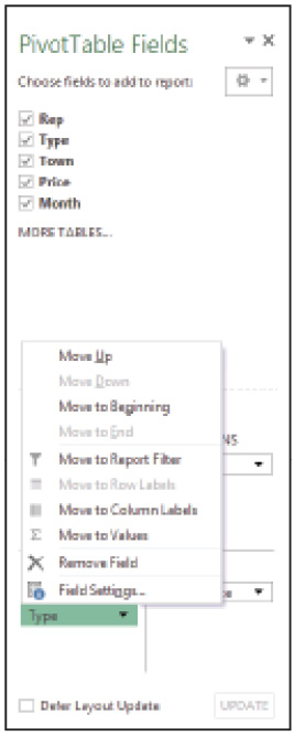
8 Choose Field List from the Show group on the Analyze tab to close the PivotTable Fields pane.
9 Save the file, but don’t close it; you will use it the next section.
Rearranging a PivotTable
Once you have constructed a PivotTable, you can easily rearrange it through click and drag. When you drag fields to new locations, the PivotTable is automatically redrawn. To nest levels of data, add more than one field to the appropriate section. Note that removing fields from a PivotTable does not remove the data from the worksheet.
Rearranging fields
To arrange fields in a PivotTable:
1 Click in the PivotTable.
2 Choose Field List from the Analyze tab to redisplay the PivotTable Fields pane.
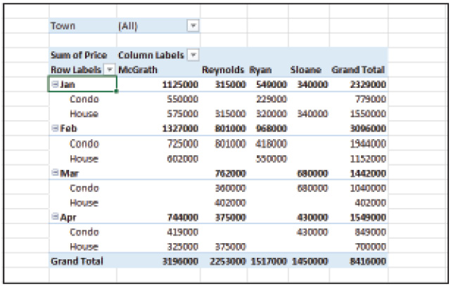
3 Drag Type to the Columns area and Rep to the Rows area. Excel redraws the PivotTable so that the data is arranged by Rep.
Rearrange the layout of a PivotTable by dragging the fields to different locations.
Adding fields to a PivotTable
To add fields to a PivotTable:
1 Click in the PivotTable.
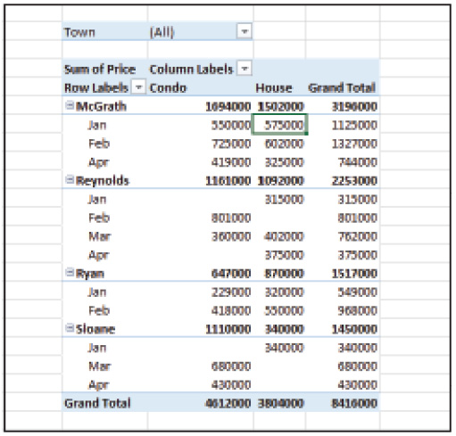
2 Select Month in the PivotTable Fields pane. Excel automatically adds it to the Rows area of the PivotTable.
Nest data in a PivotTable by adding a new field to the column or row area.
3 Drag Rep to the Columns area and Type to the Rows area, below the Month field. Excel rearranges the PivotTable to display the data from the Rep field in each column and the data from the Type field in each row.
Removing fields from a PivotTable
To remove fields from a PivotTable:
1 Click in the PivotTable.
2 In the Rows area, click the arrow next to Type to display the drop-down menu, and then choose Remove Field.
Remove a field from the PivotTable by deselecting its name from the Fields List.
3 From the fields list, select Type to add it back to the Rows area to add the Type data back to the PivotTable.
4 Save the file, but don’t close it; you’ll use it in the next section.
 A quicker way to remove a field from a PivotTable is to deselect it from the Fields list in the PivotTable Fields pane.
Formatting a PivotTable
You can format a PivotTable through any of the customization options available in Excel, which include changing the style of the table, adjusting number formats, and altering font and font sizes. The Design tab, a context-sensitive menu, appears in the Ribbon bar whenever the cell pointer is within a PivotTable.
PivotTables automatically nest multiple layers of data.
Changing the layout
When you change the layout of the PivotTable, you can elect to display as little or as much information as you need to. By default, Excel automatically applies the Compact layout to any new PivotTable you create.
|
PivotTable layouts |
|
|
Layout |
Description |
|
Compact |
Keeps related data together in a nested format rather than spread out horizontally. |
|
Outline |
Data is displayed in a hierarchy across columns. |
|
Tabular |
Shows all data in table form, including subtotal and grand total amounts. |
To change the PivotTable layout:
1 Using the file you used in the previous exercises, click in the PivotTable.
2 From the Design tab, choose Report Layout and select Show in Outline Form.
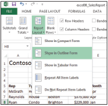
Change the Report Layout of your PivotTable to display more or less detail.
The data in the PivotTable appears with a column for each field.
Data in Outline form is displayed with a column for each field.
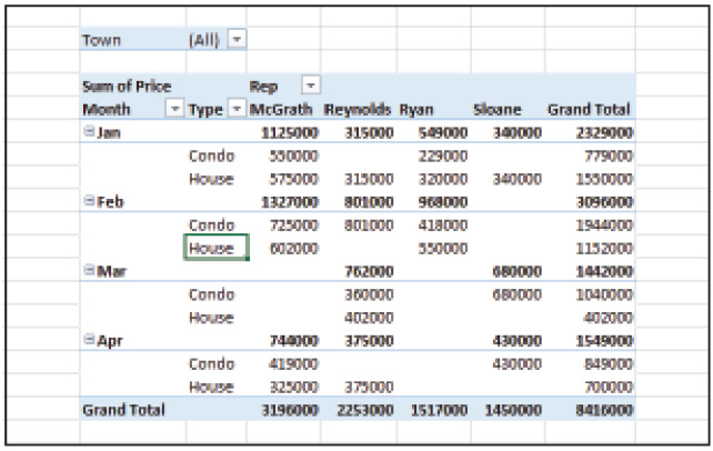
3 From the Design tab, choose Report Layout once again.
4 Select Show in Tabular Form. All the data in the PivotTable appears, including subtotals and grand totals.

The Tabular Layout displays all of the data in the PivotTable, including sub and grand totals.
5 From the Design tab, choose Report Layout for the third time.
6 Select Show in Compact Form. The PivotTable appears in the default layout that Excel uses when you create a new PivotTable.
Applying a style
The PivotTable Styles are predefined formatting options that you can apply to the PivotTable for clarity. For example, adding banded columns or banded rows make large tables easier to read with shading.
To apply a style to your PivotTable:
1 Make sure your cell pointer is still in the PivotTable.
2 From the PivotTable Style Options group of the Design tab, choose Banded Rows.
3 From the PivotTable Styles group, select Pivot Style Light 16 if its not already selected.
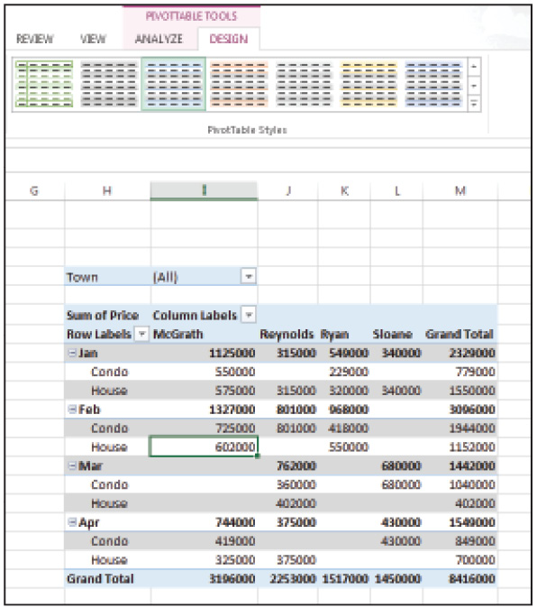
Add banding and shading to a PivotTable to make large tables easier to read.
Changing number formats in a PivotTable
The values area of a PivotTable displays the numeric data from a worksheet list. The data displayed here is assigned the General numeric format by default.
To change the number format of your PivotTable:
1 Click in the PivotTable.
2 From the PivotTable Fields pane, click the Sum of Price button in the Values area.
3 Choose Value Field Settings from the resulting menu.
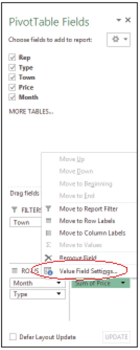
Change the numeric format of the Values data.
4 In the Value Field Settings dialog box, click Number Format.
5 Choose Currency and decrease the Decimal Place setting to 0.
6 Click OK in the Format Cells dialog box and click OK in the Value Field Settings dialog box. The Price values are now displayed in the Currency format.

Change the numeric format of the Values data in a PivotTable.
Editing and updating a PivotTable
When you create a PivotTable, a link is established between the source data in the worksheet and the PivotTable. If you make changes to the source data by adding new records or editing existing records, you need to update the PivotTable to reflect the changes.
Updating data in a PivotTable
When you make changes to the source data in the worksheet, you must update the data in the PivotTable to reflect those changes.
To update data in your PivotTable:
1 Click in cell D23.
2 Type 975000 and press Enter.
3 Click any cell in the PivotTable.
4 From the Analyze tab, click the arrow below Refresh.
5 Select Refresh All to update the PivotTable with the latest data.
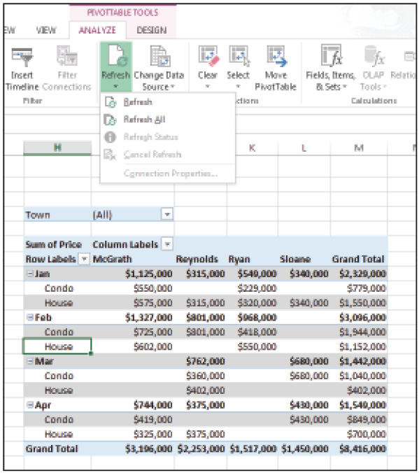
Use the Refresh All command to update data in a PivotTable.
Expanding the source data range
Whenever you add more records to the source range in the worksheet, you must update the data in the PivotTable.
To expand the source data range for your PivotTable:
1 Click in cell A27 and type Sloane; in cell B27 type House; in cell C27 type Cambridge; in cell D27 type 778000; and in cell E27 type Mar.
2 Click any cell in the PivotTable.
3 From the Analyze tab, choose Change Data Source. Excel automatically highlights the source data range.
4 Press and hold Shift and press the Down Arrow key on your keyboard to extend the selection by one row.

You must change the source range after adding new records in the source list.
5 Click OK to change the data source. You can see that Sloane’s house sale in Mar is updated in cell L16.
Changing the calculation
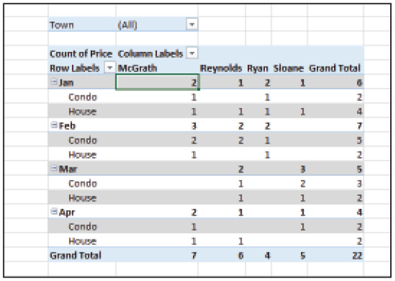
After generating a PivotTable, you can change the way you choose to summarize the values and the way you choose to display them. When the items displayed in the Values area of the PivotTable are numeric, Excel automatically uses the SUM function to summarize the data. However, there are several other functions that you can use in the values area. The most commonly used function is SUM, but you can also use COUNT to display the number of items in the table; AVERAGE to find the Average amount; or MAX and MIN to find the maximum or minimum amounts.
Changing the summary function
In the sample sales worksheet that you’ve been using for all the previous exercises, you will switch the summary function from SUM to COUNT so you can see how many total units were sold by each sales rep.
1 Click in cell I8.
2 From the Active Field group of the Analyze tab, choose Field Settings.
3 From the Summarize Value Field by list, choose Count and then click OK.
Change the Summary Function to calculate different values.
Excel changes the summary function to calculate the total items sold by each sales rep. Note the currency format is still in effect.
4 Choose Field Settings, click Number format, and select General.
5 Click OK twice to return to the worksheet.
Count the number of items sold.
Changing the summary type
By changing the summary type, you can choose the manner in which the values in the PivotTable are displayed. For example, you could calculate values based on the values of other cells; you could calculate the difference between items; or calculate the items as a percentage of a total. In our example, we will calculate the values as a percentage of total sales.
1 Click in cell I8.
2 From the Active Field group of the Analyze tab, choose Field Settings.
3 In the Summarize value field by, select Sum.
4 Click the Show Values As tab.
5 In the Show Values As box, select % of Grand Total, and then click OK. Sales are calculated as a percentage of Total.
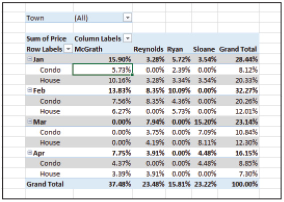
Calculate sales as a percentage of Total.
Hiding and showing data in a PivotTable
Working with data in a PivotTable is similar to working in outline mode. If your PivotTable is large, you can collapse some areas and expand others, or you can build additional structure into the table by grouping related items together. For instance, if you would like to summarize data at a level that is not present in the source data, you can group the data together in the PivotTable. In our sample worksheet, we can group the months into fiscal quarters and view the data that way.
Grouping items
To group items in your PivotTable:
1 Click in cell H8, press and hold the Ctrl key, and then click H11 and H14.
2 From the Analyze tab, choose Group Selection. Excel adds a new layer, Group1 to the PivotTable.
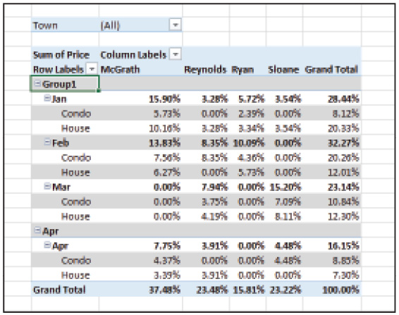
Group similar items into a new category with the Group Selection command.
3 Click in the Active Field box, type Quarter, and press Enter. The cells you selected are grouped together into a new category.
Ungrouping items
To ungroup items in your PivotTable:
1 Click in cell H8.
2 Choose Ungroup from the Analyze tab. Excel removes the group heading from the PivotTable and the Quarter field.
Collapsing and expanding PivotTable data
The expand and collapse buttons, similar to those displayed in Outline mode, are added to a PivotTable when multiple levels of data are displayed. For instance, in the sales report, data is organized by month and then by type. You can collapse the level of detail when you want to see the big picture and expand it again to view the details.
To collapse and expand data in your PivotTable:
1 Click the Collapse button, located to the left of the Jan field label, to collapse data for January.
2 Do the same for Feb, Mar, and Apr fields.
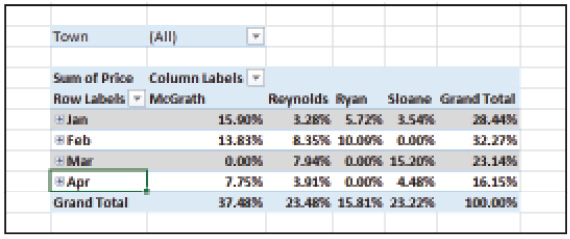
Collapse detailed levels when you only want to view the big picture.
3 Click the Expand button for each month to display detail levels of data.
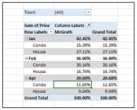
Filtering PivotTable data
When you add a field to the Filter area of a PivotTable, data is automatically filtered by that field. Initially, all data is displayed in the PivotTable. To switch to the filter, click the Filter button and select the label by which you want to filter data.
To filter data in your PivotTable:
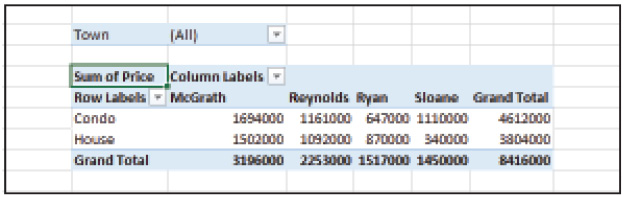
1 Click the Filter button adjacent to the Town field in cell I4.
2 Select Boston and click OK. Excel displays sales data for the Boston area only.

Filter data in a PivotTable to display certain data.
3 Click the filter next to Boston and choose (All) and click OK.
You can also filter records using the filter buttons for the row and column fields.
1 Click the Filter button adjacent to the Column Labels field.
2 Click Select All to deselect the option.
3 Select McGrath and click OK. Excel filters the PivotTable to display data for sales rep McGrath only.
You can filter data at the column and row level.
4 Click the Filter button next to Column Labels, choose (Select All) so all check boxes are filled, and click OK.
Adding subtotals to a PivotTable
When you create a PivotTable, subtotal and grand total amounts are automatically generated for each level of data. You can decide where and when these amounts should be displayed.
Before adding subtotals to the Sales Report PivotTable, perform the following steps to redisplay the data as sales values instead of percentages.
1 Click cell I9 and choose Field Settings from the Analyze tab.
2 Click the Show Values As tab and select No Calculation from the drop-down menu.
3 Click Number Format and select Currency with 0 decimal places and click OK. Click OK again.
4 Click in cell I14 and choose Options from the PivotTable group on the Analyze tab.
5 In the Format section of the PivotTable Options dialog box, type 0 in the For empty cells show box. Click OK.
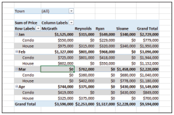
Here the PivotTable displays a zero rather than a blank cell.
Formatting subtotal amounts
To format subtotal amounts in your PivotTable:
1 Click in cell H9.
2 From the Design tab, choose Subtotals.
3 Choose Show all Subtotals at Bottom of Group.
Subtotal amounts are displayed at the bottom of each group.
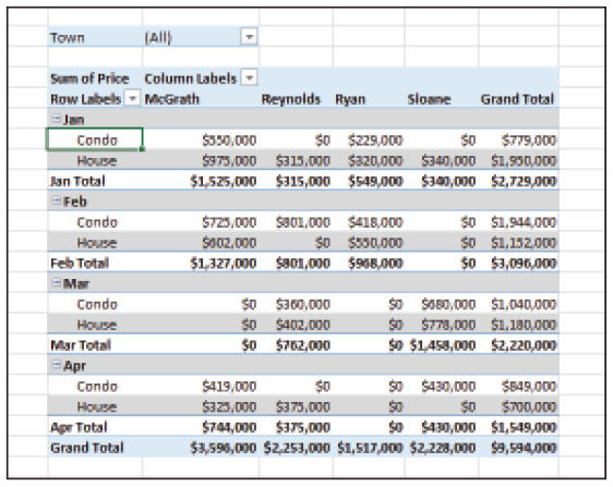
Formatting grand total amounts
When you add grand total amounts to a PivotTable, they are calculated at the row and column level. Excel allows you to dictate where these amounts are added.
To format grand total amounts in your PivotTable:
1 Click in cell H9.
2 From the Design tab, choose Grand Totals.
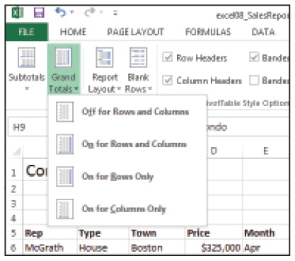
Grand Totals are added at the row and column level.
3 To display grand total amounts for rows only, choose On for Rows Only.

Display Grand Total amounts for rows only in the PivotTable.
4 From the Design tab, choose Grand Totals again.
5 To display grand total amounts for columns only, choose On for Columns Only.
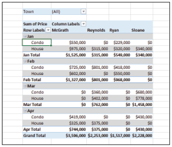
Display Grand Total amounts for columns in the PivotTable.
6 To display grand total amounts for rows and columns again, choose On for Rows and Columns from the Grand Totals command.
7 Choose File > Save and then File > Close.
Using recommended PivotTables
The Recommended PivotTables command, similar to the Recommended Charts command, assists in creating PivotTables by selecting an appropriate layout based on the data in the list. When you use this command, Excel automatically creates the PivotTable on a new worksheet.
1 Choose File > Open, navigate to the Excel08lessons folder and double-click Sales_Report_B.
2 Choose File > Save As, navigate to the Excel08lessons folder, name the file Sales_Report_B_work, and click Save.
3 Click in cell A6 and choose Recommended PivotTables from the Insert tab.
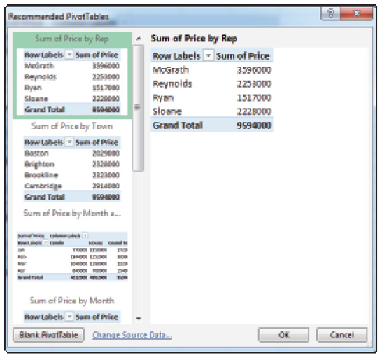
Recommended PivotTables creates a layout based on the data in the list.
4 Select Sum of Price by Month and Type and click OK.
Excel inserts the PivotTable on a new worksheet.
Moving a PivotTable
Once you’ve created a PivotTable, you can move it to a new location in the current worksheet or to a new, blank worksheet. You can also move a PivotTable to an existing worksheet.
1 Click in cell B5 of the newly constructed worksheet.
2 From the Analyze tab, choose Move PivotTable.
3 In the resulting Move PivotTable dialog box, click the Sheet1tab, and click in cell N6.

Excel inserts the PivotTable on a new worksheet.
4 Click OK. Excel moves the PivotTable to cell N6 of Sheet1.
5 Click Undo to move the PivotTable back to Sheet2.
Working with PivotCharts
A PivotChart is an interactive chart based on data in a PivotTable. Unlike a regular chart, which displays static data, a PivotChart is dynamic. Simply click the field buttons within the chart window and redisplay the data accordingly. You can filter data and change the summary function of the data values. You can also add and remove data fields and watch the chart update automatically. Note that any changes you make in the PivotChart, such as removing fields or filtering data, is also reflected in the PivotTable.
Creating a PivotChart
To create a PivotChart:
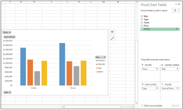
1 Click in cell H9 on Sheet1 and choose PivotChart from the Analyze tab.
2 Click OK to accept the Clustered Column chart type. Excel adds the PivotChart to your worksheet.

A PivotChart is a dynamic representation of a PivotTable.
Updating a PivotChart
To update your PivotChart:
1 Click and drag the PivotChart down to cell F26.
2 Use the scroll bars to scroll down so that the entire chart is displayed.
3 Resize the chart so that it is a little bigger by clicking and dragging a corner of the chart window. Release when the chart spans the range F26:M46.
4 Select Month in the PivotTable Fields pane to remove the field from the chart. Excel redraws the charts without the data for Month.
Note that the data displayed in the chart reflects the data in the PivotTable so that when you remove the Month field from the chart the Month field is also removed from the PivotTable.
Remove data from the chart by deselecting the field name in the PivotTable Fields pane.
Filtering a PivotChart
To filter your PivotChart:
1 Click the Rep field button found directly above the legend on the right side of the chart.

Filter data in the chart by selecting the items you want to see.
2 Deselect the Select All option.
3 Click McGrath and Sloane and click OK. Excel redraws the chart and displays data for Reps McGrath and Sloane only.
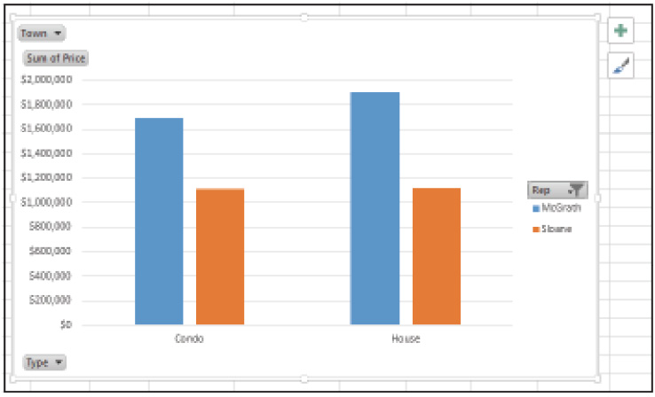
The PivotChart is redrawn to display filtered data.
4 From the Analyze tab, choose Clear, and then choose Clear Filters. All the data is redisplayed.
Working with tables
Data arranged in a list format, which we discussed in Lesson 6, can also be converted to an interactive table. When you convert a list to a table, Excel adds the filter buttons to the header row, and the data in the table is automatically selected. Once a list has been converted to a table, you can filter records, apply special table formatting, and add subtotal amounts to the data.
Creating a table
To create a table:
1 On Sheet1, click in cell A6 and choose Table from the Insert tab.

Indicate the range containing the table in the Create Table dialog box.
2 In the Create Table dialog box, click OK.
Excel adds the filter buttons to the table and selects the table range. These filters are used to rearrange the data in the table by clicking the appropriate filter button.
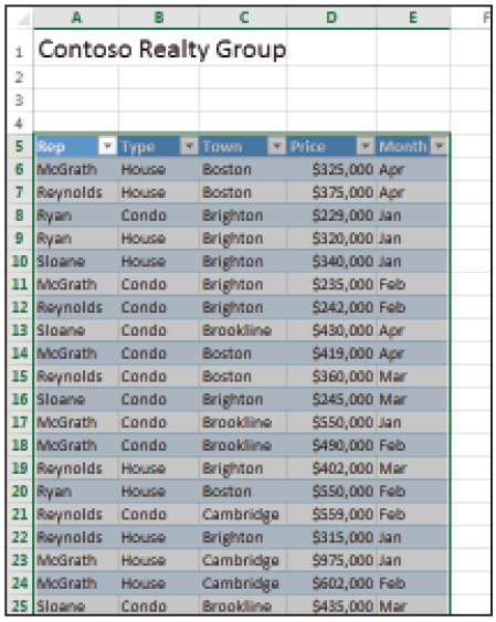
Filter buttons are automatically added to the header row in the table.
Inserting slicers
Slicers are similar to the filter buttons in that they allow you to dictate how you want to view the data in the table. Slicers are added to the worksheet in the form of an interactive button that makes it easy to change the views.
To insert slicers to your table:
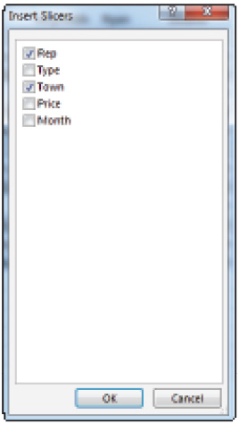
1 With the table still selected, choose Insert Slicer from the Design tab.
2 From the Insert Slicers dialog box, select Rep and Town. Then click OK. Excel adds two slicer objects to the worksheet: one for Rep and another for Town.
Slicers offer a more visual way to filter worksheet data.
3 Click and drag the Rep slicer to cell F5 so that it is adjacent to the table. Click and drag the Town slicer so that it sits directly below the Rep slicer.

Since the buttons sit on top of your worksheet, you can clearly see which item is filtering the data.
4 Click the McGrath button in the Rep slicer. Only those records containing McGrath as the rep are displayed in the table.
5 Press and hold the Ctrl key, and then click the Reynolds button. Only those records containing sales for McGrath and Reynolds are displayed.
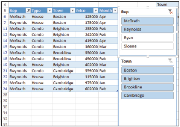
Slicers appear highlighted when they are in use.
6 To clear the filters in use, click the Clear Filter button in the upper right area of the Slicer object.
Formatting a table
With Table Styles, you can apply styles to the range of data in the table. You can also change the color of the slicer objects.
To format your table:
1 Select A5:E27 the Design tab, choose Table Styles. Notice that styles are categorized by Light, Medium, and Dark color.

Table Styles are categorized according to color.
2 Choose Table Style Light 21.
3 Click the Rep slicer and click the Options tab.
4 Choose Slicer Style Light 6.
5 Click the Town slicer and choose Slicer Style Light 6 from the Options tab.
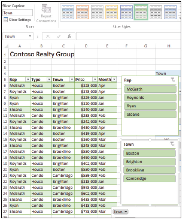
Slicers and Tables can use the same style for consistency.
6 Choose File > Save and File > Close.
What-If analysis
As discussed in Lesson 4, “Using Formulas,” you can use formulas to calculate values based on data stored in worksheet cells. Whenever you change the values in the referenced cells, Excel recalculates the formula to reflect that change. What-if analysis enables you to test possible end results by entering a series of different values in those referenced cells.
Excel offers three tools for performing What-If analysis: Goal Seek, Scenarios, and Data Tables. With Goal Seek, you can achieve a desired result by changing values used within the formula. Scenarios allow you to store the result of each what-if analysis for comparison. A Data Table allows you to create a range of results by substituting multiple variables in the formula.
Using Goal Seek
With the Goal Seek command, you can test out a specific result by changing a variable in a formula. For example, you can find out how much of a mortgage you could afford based on a budgeted monthly payment by adjusting the mortgage amount variable.
1 With Excel open, choose File > Open and click Computer in the Backstage view. Navigate to the Excel08lessons folder and open the file named What_If.
2 Choose File > Save As, navigate back to the Excel08lessons folder, name the file What_If_work, and click Save.
3 Click in cell B11 and choose What-If Analysis from the Data tab.
4 Choose Goal Seek from the resulting drop-down menu.
Alter data in formulas to achieve specific results with Goal Seek.
5 In the To value field, type 1800.
6 In the By changing cell field, type B9.

Adjust the principal amount so the monthly payment can be met.
7 Click OK. Excel recalculates the formula until a result is found that meets the monthly payment variable.
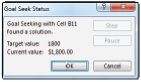
Goal Seek adjusts the amount of the principal to meet the monthly payment requirement.
8 Click OK to close the Goal Seek Status dialog box.
Managing scenarios
Scenarios allow you to save a set of variables and the resulting formulas. You can then compare results by flipping through each saved scenario. For example, you could find out how much a monthly mortgage payment would be based on a 30 or 15-year fixed interest rate.
1 Using the file from the previous exercise, select range B7:B8 and choose What-If Analysis from the Data tab.
2 From the resulting drop-down menu, choose Scenario Manager.
3 In the Scenario Manager dialog box, click the Add button.
4 In the Scenario Name box, type 30 YR Fixed and click OK.
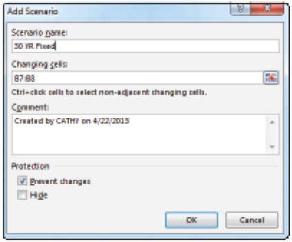
Save a set of variables as a scenario.
5 In the first variable box, Type .0345 and click Add.

Enter the variables in the Scenario Values dialog box.
6 In the Scenario Name box, type 15 YR Fixed and click OK.
7 Type .02625 in the first variable box, 15 in the second variable box, and then click OK.
8 Click the 15 YR Fixed scenario and click Show. Excel switches the data in the worksheet to reflect the data variables in the scenario. You may need to click and drag the Scenario Manager dialog box over to the right so you can see the data changes.
9 Click the 30 YR Fixed Scenario and click Show to switch back to the 30 YR Fixed amount.

Show the results of a scenario in the worksheet.
10 Click Close to close the Scenario Manager.
Create a data table
A data table is made up of a single formula and a range of input values that are substituted for a specific variable in the formula. A two-variable data table allows you to substitute two separate variables in the formula. For example, in a one-variable table, you could enter a series of interest rates and Excel would calculate the monthly payment based on the interest rate amount. In a two-variable table, you could enter a series of interest rates and principal amounts to return a table of monthly loan payments.
To create a one-input variable table:
1 Click in cell F8, type .020, and press the Tab key.
2 In cell G8, type .025 and press Enter.
3 Select range F8:G8 and click and drag the Fill handle to the left to cell M8.
4 Type =PMT(B7/12,B8*12,B9) in cell E9 and press Enter. Note that Excel automatically applies the Currency format to the cell.
5 Select range F8:M8 and choose Percentage from the Number Format drop-down menu on the Home tab. Then, click the Decrease Decimal button to remove one decimal space.
6 Select range E8:M9 and choose What-If Analysis from the Data tab.
7 Choose Data Table from the resulting drop-down menu.
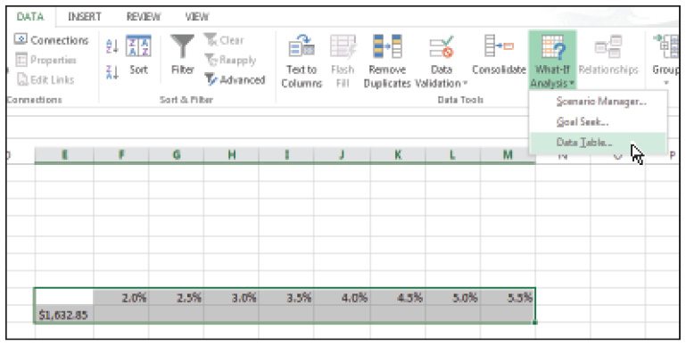
Enter a range of Input variables.
8 In the Row input cell box, type B7 and click OK. Excel generates a table of monthly payments based on the Interest rate amounts.
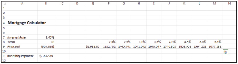
A Data Table generates a table of values based on the input variables.
To create a 2-Input Variable Table:
1 Select range F8:M8, choose Copy from the Home tab, click in cell F12, and press Enter.
2 In cell E12, type =PMT(B7/12,B8*12,B9) and press Enter.
3 In cell E13, type 300000; in cell E14, type 325000.
4 Select range E13:E14 and click and drag the Fill handle downwards to cell E25.
5 Select range E12:M25 and choose What-If Analysis from the Data tab.
6 Choose Data Table from the resulting menu.
7 In the Row Input box, type B7; in the Column Input box, type B9. Click OK to generate the results.

The data table generates monthly payments based on the interest rate and principal amount.
8 Choose File > Save and then File > Close.
Self study
1 Open the worksheet named Sales_Report_work and use the Recommended PivotTable command to generate a PivotTable based on Sum of Price by Type.
2 Add the Town field to the Rows area and the Rep field to the Columns area.
3 Change the numeric format of the Price summary to Currency with 0 decimal places.
Review
Questions
1 If data is changed in the source list, does the PivotTable automatically reflect the change?
2 How do you remove a field from a PivotTable?
3 Can a PivotTable be removed from a worksheet?
4 What is a slicer, and how do you add slicers to a data table?
5 What is a Scenario?
Answers
1 PivotTables are not automatically updated if the source data changes, so you must refresh the table manually. To do so, click any cell within the PivotTable and choose Refresh from the Analyze tab. Choose Refresh All from the resulting drop-down menu.
2 There are two ways to remove a field from a PivotTable. First, click any cell within the PivotTable to display the PivotTable Fields pane. Click the field button you want to remove from the current area. Choose Remove Field from the resulting menu. The second method is to deselect the field you want to remove from the Fields list.
3 Before you can remove a PivotTable from a worksheet, you must select it. To do so, click any cell within the PivotTable and choose Select from the Analyze tab. Choose Entire PivotTable from the resulting drop-down menu. Once the PivotTable is selected, choose Clear All from the Analyze tab.
4 A slicer is an interactive button pane that you can add to a data table. To do so, click any cell within the table and choose Insert Slicer from the Analyze tab. Select the fields you want to use as slicers and click OK.
5 A scenario is a saved set of variables in a worksheet. When you switch to each saved scenario, Excel displays the variables and the results of those variables in the worksheet.