
Excel Lesson 5: Working with Charts

In this lesson, you will learn how to create charts from your worksheet data. You will learn how to use recommended chart types, customize chart elements, and change formatting options. You will also learn how to spot trends in your data with Sparkline charts. Finally, you’ll learn how to print your worksheet charts.
What you’ll learn in this lesson:
- • Creating a chart
- • Using chart recommendations
- • Updating data in a chart
- • Enhancing chart options
- • Printing a chart
Starting up
You will work with files from the Excel05lessons folder. Make sure you have loaded the OfficeLessons folder onto your hard drive from www.digitalclassroombooks.com/Office2013. If you need further instructions, see “Loading lesson files” in the Starting up section of this book.
Understanding chart types
Excel offers a number of different chart types. From bar graphs and pie charts to scatter plots and area charts, Excel provides a chart type for the data you want to present. The new Recommended Charts feature helps to remove some of the guesswork by offering a number of chart types based on your selected data. You can also change the chart from one type to another once it is complete. The following table lists the 12 chart types that Excel offers.
|
Chart types |
||
|
Type |
Icon |
Description |
|
Area |
|
Shows the relative importance of values over time. An area chart emphasizes the magnitude of change over time more than a line chart does. |
|
Bar |
|
Illustrates individual values at a specific point in time. |
|
Bubble |
|
A type of XY chart that uses three values instead of two. In the third data series, Excel displays the plot points as bubbles; the larger the bubble, the larger the value. |
|
Column |
|
Shows variations in data over time or compares individual items. |
|
Combo |
|
Highlights different types of information in a single chart. |
|
Doughnut |
|
Shows how individual parts relate to a whole. A doughnut chart can display multiple data series, with each ring representing a different series. |
|
Line |
|
Illustrates changes in a large number of values over time. |
|
Pie |
|
Shows the relationship of each part to the whole. |
|
Radar |
|
Shows changes in multiple data series relative to a center point as well as to each other. |
|
Stock |
|
Shows the fluctuation of values over a certain time period, such as stock prices or temperature fluctuations. |
|
Surface |
|
Plots trends in values across two dimensions in a continuous curve, and applies color to indicate where data series are in the same range. This is useful for comparing two data series to find the best combinations between them. |
|
XY Scatter |
|
Shows the relationship between numeric values in multiple data series that may not be apparent from looking at the data. |
Creating a chart
Charts enable you to present worksheet data in graphical form. They also allow you to highlight trends, see the parts that make up a whole, or show comparisons. When you create a chart, the source worksheet data is linked to the chart. So when you update the data in your worksheet, the chart gets updated, too. In Excel, you can add a chart directly to the worksheet as an object or you can create a separate chart worksheet.
Creating a chart
You will now create a Clustered Column type of chart from a range of data contained within the exercise file.
1 Choose File > Open, click Computer in the Backstage view, and click Browse.
2 Navigate to the Excel05lessons folder and open the file named excel05_charts.
3 Choose File > Save As, and choose Computer.
4 Click the Browse button, navigate to the Excel05lessons folder, name the file excel05_charts_final, and click Save.
5 Select range A4:C8.
6 From the Insert tab, choose Insert Column Chart.

Convert your worksheet data into easy-to-read charts.
7 From the 2-D Column section of the drop-down menu, select Clustered Column.
Excel adds the chart to the worksheet and highlights the source data used by the chart.
 When you select the data for a chart, include headings and labels but do not include totals and subtotals.
Understanding chart elements
When you create a chart, Excel adds it to the worksheet as an object, which then sits on top of the worksheet and can be manipulated separately from the worksheet data. The Key Charting Terms table details key terms related to working with charts.

A. Legend. B. Chart Area. C. Horizontal Axis. D. Vertical Axis. E. Gridline. F. Chart Title. G. Data Marker. H. Plot Area.
|
Term |
Definition |
|
Key charting terms |
|
|
Term |
Definition |
|
Chart area |
Everything inside the chart window. |
|
Chart title |
Identifies the subject of the chart. |
|
Data Series |
A set of values used to plot the chart. |
|
Vertical (value) axis |
Also known as the value or y-axis, shows the data values in the chart, such as hours worked or units sold. |
|
Gridlines |
Horizontal and vertical extensions of the tick marks on each axis; they make the chart easier to read. |
|
Horizontal (category) axis |
Also known as the category or x-axis, shows the categories in the chart, such as months of the year or branch offices. |
|
Legend |
A key that identifies patterns, colors, or symbols associated with a data series. |
|
Plot area |
The area in the chart where the data is plotted; includes the axes and data markers. |
|
Data marker |
A symbol on the chart that represents a single value in the worksheet, such as a bar in a bar chart or a wedge in a pie chart. A group of related data markers (such as all the green columns in the example on the previous page) constitute a single data series. |
Using chart recommendations
The most difficult part in creating charts is deciding the type that best suits your data and the message you want to convey. When you use Recommended Charts, Excel suggests a set of chart types based on your selected data. Follow the steps below for an example of how this works.
1 Using excel05_charts_final, select range A4:C8.
2 From the Insert tab, choose Recommend Charts.
3 In the resulting Change Chart Type dialog box, select Clustered Bar from the Recommended Charts tab and click OK.

Chart recommendations suggest chart types based on your data.
Excel inserts a clustered bar graph in your worksheet. Note that the bar graph is now sitting directly on top of the column chart you created in the previous exercise.
Moving and resizing charts
When you add a chart to a worksheet, Excel adds it to the middle of the workspace area. To move the chart to another location, click and drag the chart object. Alternatively, you can manually move the chart to a new worksheet.
When you click a chart, Excel displays a set of selection handles around the chart area and a set of Chart Tools appear in the Ribbon bar. The Design and Format tabs contain context-sensitive tools for editing and formatting charts.

When you click a chart to select it, two new tabs appear in the Ribbon bar.
 For the next four exercises (Moving a Chart, Resizing a Chart, Creating a Chart Sheet, and Deleting a Chart), use the same Excel exercise file that you used for the previous exercises, so don’t close the file at the end of each set of steps.
Moving a chart
To move a chart:
1 Click near the outside edge of the Clustered Bar chart to select it.
2 Position the pointer within the chart area. When the pointer changes into a four-headed arrow, click and drag the chart to the vicinity of B13.

Click and drag the chart object to move it to a new position.
3 Click and drag the Clustered Column graph to the vicinity of I13.
Resizing a chart
To resize a chart:
1 Click the Clustered Bar chart to select it.
2 Point at the corner of the chart area. When the pointer changes into a double-headed arrow, click and drag to resize the charts. Release when the chart is the desired size.
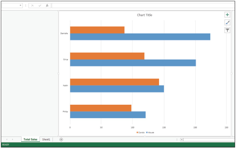
Creating a chart sheet
To create a chart sheet:
1 Make sure the Clustered Bar chart is still selected.
2 From the Design tab, choose Move Chart in the Location group.
3 In the Move Chart dialog box, select New Sheet and type Total Sales in the name box.

Enter a name for the chart sheet.
4 Click OK. The Clustered Bar chart appears on a Chart Sheet.
When you create a Chart sheet, the chart is displayed on its own sheet.
5 From the Design tab, choose Move Chart.
6 From the Move Chart dialog box, select Object in and click OK. The Clustered Bar is moved back to the worksheet.
 When you move a chart from a chart sheet to a worksheet, Excel deletes the chart sheet from the workbook.
Deleting a chart
To delete a chart:
1 Click the Clustered Bar chart to select it.
2 Press the Delete key. Excel removes the chart object from the worksheet.
3 Save your exercise file, but don’t close it. You will continue using it in the next section.
Enhancing a chart
An important step when creating charts is to provide adequate explanations of the data represented in the chart. Excel enables you to add descriptive titles and legends, adjust the scale and orientation, and add data labels and gridlines. These chart elements are in either an on or off state. That is, to add an element, click the check box to mark it; to remove an element, click the check box to clear it.
 For all seven exercises in this section, use the same exercise file you have been using till now. Don’t close the file at the end of each exercise.
Using Quick Layouts
The Quick Layouts feature contains a set of predefined layout options that you can assign to a chart with a single click.
1 Click the Clustered Column chart to select it.
2 From the Chart Layouts group on the Design tab, choose Quick Layout.
3 As you hover over each option, your chart is updated to reflect the layout.
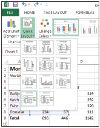
Quick Layouts allow you to quickly change the layout of the chart.
4 Click Layout 10 to select it.
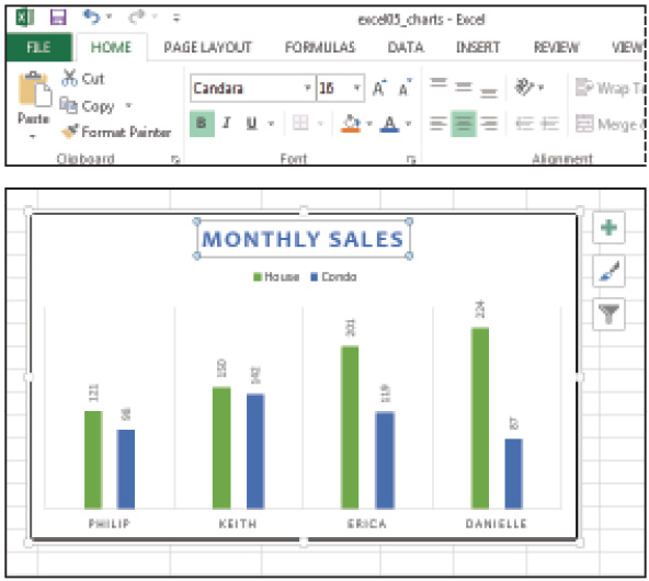
Adding a chart title
To add a chart title:
1 In the Clustered Column chart, click the text box labeled Chart Title.
2 Click inside the box to set the insertion point.
3 Type Monthly Sales.

Click to set the Chart Title.
Displaying a data table
When you add a data table to your chart, Excel adds the source data to the chart area in table form.
1 Click the Monthly Sales chart to select it.
2 From the Design tab, choose Add Chart Element; or click the Chart Elements button that appears to the right of the chart.
3 Select Data Table and and in the Data Table drop-down menu, choose No Legend Keys.
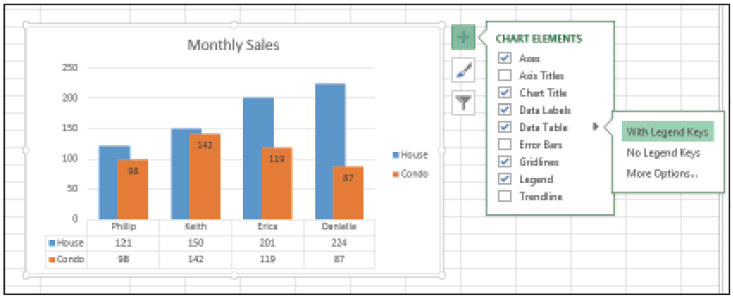
Data tables display the source data used to generate the chart.
Adding data labels
With Data Labels, Excel labels each data marker in the chart with the source value. The Quick Layout we selected before added Data Labels to the Condo Data Series. Here, we will add Data Labels to the House Data Series.
1 Click the Monthly Sales chart to select it.
2 From the Design tab, choose Add Chart Element; or click the Chart Elements button.
3 Click the drop-down arrow next to Data Labels and choose Inside End.

Data Labels include the data values behind the chart.
Adding gridlines
To add gridlines:
1 Click the Monthly Sales chart to select it.
2 From the Design tab, choose Add Chart Element; or click the Chart Elements button.
3 Click the drop-down arrow next to Gridlines and choose Primary Minor Horizontal.
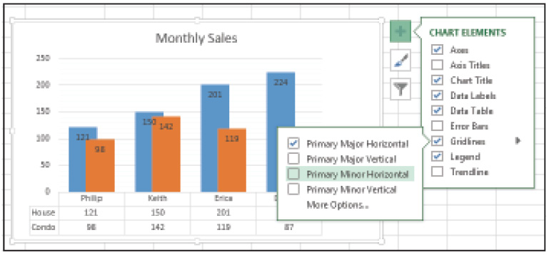
Gridlines help to guide the eye along the data points.
Adding or moving legends
Legends describe the color-coded data series in each chart.
1 Click the Monthly Sales chart to select it.
2 From the Design tab, choose Add Chart Element; or click the Chart Elements button.
3 Click the drop-down arrow next to Legend and choose Left to place the Legend box to the left of the chart area.

Legends contain descriptive data that explains the data series.
Removing chart elements
You can remove chart elements from the chart display by deselecting the item. For instance, when you click the Chart Elements button, any element that is currently employed has a check mark indicating it is selected. To remove the element, deselect it.
You can also remove a chart element by selecting the element you want to remove and pressing the Delete key. When you select an element, selection handles are displayed around the selected object.
To remove an element with the Delete key:
1 Click the Monthly Sales chart to select it.
2 Click the gridlines and press Delete. Excel removes the gridlines from the chart object.
3 Click Undo to revert the action and place the gridelines back into the chart.
To remove an element via Chart Elements:
1 Click the Monthly Sales chart to select it.
2 Click the Chart Elements button.
3 Deselect Data Labels and Data Table.

To remove an element from the chart, deselect the option.
4 Save the exercise file, but don’t close it.
Formatting a chart
Excel provides many formatting options and commands that allow you to make charts visually appealing. You can change the colors used by the data series, change text attributes, and adjust alignment, among other options. You can also apply a chart style, which is a set of predefined formatting options that help to maintain uniformity and design.
 For all four exercises in this section, use the same exercise file you have been using till now. Don’t close the file at the end of each exercise.
Applying chart styles
To apply chart styles:
1 Click the Monthly Sales chart to select it.
2 Click the Chart Styles button and select the second style option displayed.

Chart styles consist of a collection of related formatting options.
3 Click the Chart Styles button again to close the menu.
Changing the color scheme
To change the color scheme:
1 Click the Monthly Sales chart to select it.
2 Click the Chart Styles button.
3 From the Chart Styles menu, select Color; from the Colorful section, choose Color 4.

Change the color scheme used by your chart style.
4 Click the Chart Styles button again to close the menu.
Adding borders
To add borders:
1 Click the Monthly Sales chart to select it.
2 From the Format tab, choose Format Selection in the Current Selection group.
3 In the Format Chart Area window, select Chart Options.
4 Click Border, select Solid Line, and change the width to 4 pt.
5 Click the Outline Color button and select Black.

Add borders to the chart area to set it apart from the rest of the worksheet.
6 Close the Format Chart Area window by clicking the X in the upper-right corner.
Formatting text
To format text:
1 Click the Monthly Sales title box.
2 On the Home tab, click the Font button.
3 Select the Candara font and Blue for the text color.
Change the text in your chart using the Font menu.
Editing a chart
When you create a chart, Excel plots the data according to the selected data range. When you edit the source data in the worksheet, the chart is updated to reflect those changes.
You can also add a new data set to an existing chart. If the range of data you want to add is adjacent to the source data, you can click and drag to extend the selection so it includes the additional data. If the new data set is not adjacent, you can add the data via the Data Source dialog box.
First, let’s add an additional data series to the worksheet you have been using for all the previous exercises.
1 Click to select Column D, and in the Cells group of the Home tab, choose Insert.
2 Enter the following: Apt in cell D4, 75 in cell D5, 112 in cell D6, 98 in cell D7, and 42 in cell D8. As you can see, Excel’s automatic error checker detects problems with the Total values we moved from column D to E.
3 Click in cell E5 and choose Update Formulas to Include Cells from the Error Check menu.
4 Do the same for cells E6:E8.
5 Finally, copy the formula in cell C9 to range D9:E9.
Adding a data series by selecting
To add a data series by selecting the adjacent data:
1 Click the Monthly Sales chart to select it. Excel highlights the source data, range A4:C8, in the worksheet.
2 Click and drag the sizing handle to include the new data in range D4:D8. The chart is automatically updated.

Click and drag to extend the data range to add a new data series to the chart.
3 Click Undo to revert the action so the Monthly Sales chart only shows the data in range A4:C8. (You need the Monthly Sales chart to only show this data for the next exercise.)
Adding a data series manually
To add a data series manually:
1 Click the Monthly Sales chart to select it. Excel highlights the source data, range A4:C8, in the worksheet.
2 From the Design tab, choose Select Data in the Data group.
3 In the Select Data dialog box that appears, choose Add.

Use the Data Source dialog box when the data you want to add to the chart is not nearby.
4 Click in the Series Name box and select cell D4.
5 Click in the Series Values box removing any text that was prepopulated and select range D5:D8. Then click OK.
6 Click OK to close the dialog box. The Monthly Sales chart now includes the new data series.
Changing the order of a data series
You can rearrange the order of the data series in your chart.
1 Click the Monthly Sales chart to select it.
2 From the Design tab, choose Select Data.
3 From the Legend Entries box, select Condo.

Rearrange the order of the series by clicking the Move Up and Move Down buttons.
4 Click the Move Up button to move the Condo series to the first position, and then click OK.
Removing a data series
The easiest way to remove a data series from a chart is to click the data series in the chart window and then press Delete; Excel adjusts the chart accordingly. You can also remove a data series via the Data Source dialog box.
1 Click the Monthly Sales chart to select it.
2 From the Design tab, choose Select Data, click in the Chart data range text box and select range A4:D8. Then click Apt series.
3 Click Remove, and then click OK to update the chart.
Rearranging the data series order
You can switch the order of the data as it appears on the x and y axes.
1 Click the Monthly Sales chart to select it.
2 From the Design tab, choose Switch Row/Column. Excel swaps the order of the data.

Swap out the series on the axis to get another look at your data.
Filtering data in a chart
When you filter data in a chart, you can hide the display of the data series rather than remove it outright.
1 Click the Monthly Sales chart to select it.
2 Click the Chart Filters button.
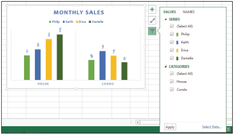
Filter your charts to only display the series or categories you want.
3 Click the check box adjacent to Erica to remove her data from the chart, and then click Apply. Erica’s data no longer appears in the chart.
4 Click the Chart Filters button again to close the tab.
Changing the chart type
To change the chart type:
1 Click the Monthly Sales chart to select it.
2 From the Design tab, choose Change Chart Type.
3 Select Bar, choose Clustered Bar, and then click OK.

Switch the Chart Type via the Change Chart dialog box.
4 You can choose to save the exercise file, but don’t close it, since you will need it for the next section.
Customizing the chart
Excel automatically plots the data along the axes according to the data used to create the chart. You can adjust the values used in the chart scale and change the numeric format of those values. Before we customize the chart, we will revert some earlier changes.
 For this section, use the same exercise file you have been using till now. Don’t close the file at the end of each exercise.
Reverting earlier changes
1 Click the Monthly Sales chart to select it and choose Switch/Row Column from the Design tab.
2 Choose Change Chart Type and select Column > Clustered Column and click OK.
3 Click the Chart Elements button and deselect the Data Labels option.
4 Click the Chart Filters button, select Erica and click Apply to add her data back to the chart.
Changing the chart scale
To change the chart scale:
1 Click the Monthly Sales chart to select it.
2 Click the Chart Elements button, select Axes, and choose Primary Vertical.
3 Choose Gridlines, select Primary Major Horizontal, and deselect Primary Major Vertical. Click the Chart Elements button again to close the menu.
4 Double-click the vertical axis scale.
5 Select the Axis Options tab and under Bounds enter 300 as the Maximum value.
6 Change the Major value to 25 in the Units section.

Adjust the values in the chart scale to highlight your data.
7 Click the X to close the Format Axis pane.
Formatting the scale
To format the scale:
1 Click the Monthly Sales chart to select it.
2 Double-click the Vertical Axis scale.
3 From the Axis Options tab and at the very bottom of the tab, select Number.
4 From the Category box, choose Number and change the number of decimal places to 0.

Change the numeric format of your axis scales.
5 Click the X to close the Format Axis pane.
6 You can choose to save the exercise file, but don’t close it, since you will need it for the next section.
Printing a chart
You have two options for printing charts. You can print the chart alongside the worksheet data, or you can print the chart itself. When you choose the latter, the chart is printed in full page version.
Printing with worksheet data
To print with worksheet data:
1 Select range A1:M29.
2 Choose File > Print.
3 From the Printer Properties menu, select the printer you want to use.
4 In the Scaling box, choose Fit Sheet On One Page; then click Print.
Printing the chart
To print the chart:
1 Click the Monthly Sales chart to select it.
2 Choose File > Print.
3 From the Printer Properties menu, select the printer you want to use, and then click Print.
4 Choose File > Save to save your work.
5 Choose File > Close to close the worksheet.
Using Sparklines
Sparklines are mini charts placed in a single cell, each representing a row of data in your worksheet. They are useful when you want to show trends in your data without having to create a full-blown chart. You can add markers, such as high points and low points, and adjust the color to draw attention to important details.
|
Sparkline chart types |
||
|
Type |
Icon |
Description |
|
Line |
|
Illustrates change. |
|
Column |
|
Compares items. |
|
Win/Loss |
|
Compares items, with all of the positive values displayed above the line and negative values below. |
Creating a Sparkline
In this exercise, you will create a Sparkline.
1 Choose File > Open, click Computer, and click Browse.
2 Navigate to the Excel05lessons folder and open the file named excel05_MonthlySalesCharts.
3 Choose File > Save As, and choose Computer.
4 Click the Browse button, navigate to the Excel05lessons folder, name the file excel05_MonthlySalesCharts_final, and click Save.
5 Select range B6:M9.
6 Click the Quick Analysis button.
7 Choose Sparklines and select Line.
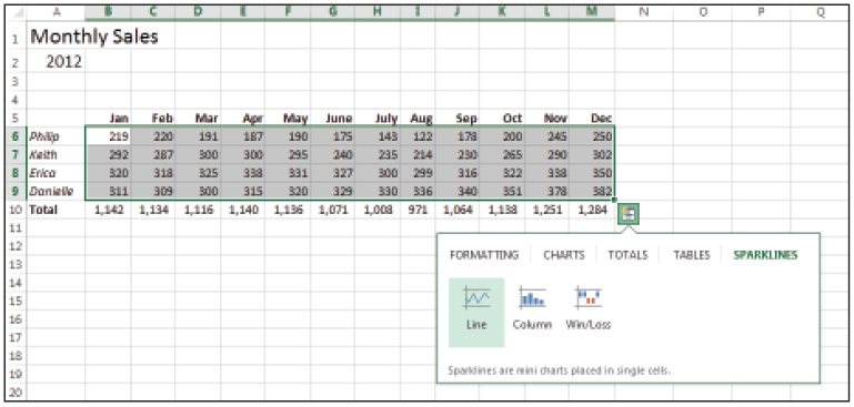
Choose Sparkline from the Quick Analysis button to add a Sparkline to the worksheet.
Excel adds the Sparkline to the cells immediately adjacent to the selected range, beginning in cell N6 and a Sparkline Tools tab is added to the Ribbon.
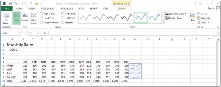
The Sparkline Tools tab is added to the Ribbon bar when you add a Sparkline to the worksheet.
 Excel treats Sparklines applied to a multi-row range as a single group, so any changes you make affects the entire group. To treat the charts individually, you must first ungroup them by choosing Ungroup from the Sparkline Tools tab.
Adding data markers
To add data markers:
1 Using excel05_MonthlySalesCharts_final, select cell N6. Notice that N6 through N9 are selected.
2 From the Show group of the Sparkline Tools tab, select High Point, Low Point, and First Point. Excel adds these details to your Sparkline.

Add details such as High Point and Low Point values to make your Sparkline pop.
Changing Sparkline Type
To change the Sparkline type:
1 Make sure N6:N9 is still selected.
2 From the Sparkline Tools tab, choose Column from the Type group. Excel switches to a columnar display and retains the Marker options.

When you switch the Sparkline type, Excel retains the Marker settings.
Removing Sparklines
To remove the Sparklines:
1 Make sure N6:N9 is selected.
2 Choose Clear from the Sparkline Tools tab and choose Clear All from the drop-down menu. Excel removes the Sparklines from the worksheet.
3 Choose File > Save to save the current worksheet.
Self study
1 Using the excel05_MonthlySalesCharts_final file, create a Line graph from range A5:M9.
2 Use the Chart Elements button to add axis titles to the chart.
3 Print the Line graph on a separate sheet.
Review
Questions
1 What is the difference between a bar and a column chart?
2 How do you create a chart on a separate sheet?
3 How do you change the current chart type?
4 How do you change the values on the y-axis scale?
5 When would you use a Sparkline over a traditional chart?
Answers
1 The difference between a bar and a column chart is that a bar chart is best used when you want to illustrate individual values at a specific point in time; whereas a column chart shows variations in data over time.
2 To create a chart on a separate sheet, click the chart and choose Move Chart from the Design tab. In the Move Chart dialog box, select New Sheet, enter a name for the sheet, and then click OK.
3 To change the current chart type, click the chart to select it and choose Change Chart Type from the Design tab. Select the Chart Type from the resulting dialog box and click OK.
4 To change the values on the y-axis scale, double-click the y-axis, and choose Axis Options from the Format Axis pane. Enter the Minimum and Maximum values you want. Click the X to close the Format Axis pane.
5 A Sparkline should be used when you want to highlight trends in a range of data. Since Sparklines are inserted within a single cell, they also take up less real estate in the worksheet.