PowerPoint Lesson 4: Using Tables, Charts, and SmartArt

On a slide seen from across the room, a picture is worth a lot more than a thousand words. This lesson introduces a variety of tools to turn text and raw data into elegant, customizable visuals.
What you’ll learn in this lesson:
- • Transforming bulleted lists into diagrams and charts
- • Automatically fitting custom art to an existing document theme
- • Adding visual emphasis by styling individual SmartArt pieces
- • Linking charts in a slide show to live external data
Starting up
You will work with files from the PPT04lessons folder. Make sure that you have loaded the OfficeLessons folder onto your hard drive from www.digitalclassroombooks.com/Office2013. If you need further instructions, see “Loading lesson files” in the Starting up section of this book.
Giving structure to your content
Tables, charts, and SmartArt occupy a middle ground between straight text and graphics: tables and SmartArt turn structured text content into styled visuals, while charts represent relationships between data points with shapes and colors. Tables can also be used to fit an entire slide’s layout to a grid, turning cell text into a visual element.
In this lesson, you’ll build slides around tabular data, format structured text as editable SmartArt, and transform spreadsheet data into graphs and charts. You’ll also link a chart to an Excel document to include live external data in your slide.
Transforming text into SmartArt
The SmartArt feature available in Office lets you format lists as flowcharts, Venn diagrams, cycle diagrams, family trees, and other infographics. Moreover, if you build an organization chart from a bulleted list (for example), any later edits you make to the list will be reflected automatically in the diagram. And like other visual slide elements, SmartArt is easily styled using document themes.
1 Begin the lesson by launching PowerPoint 2013.
2 Open the document for this lesson, pp04a.pptx, located in the PPT04lessons folder. (For a look at its finished form, open pp04a-finished.pptm.)
 For a Microsoft article that lists of all the SmartArt types, see the Descriptions of SmartArt graphics article in Microsoft’s Support page at the following URL: http://office.microsoft.com/en-us/powerpoint-help/descriptions-of-smartart -graphics-HA010057065.aspx
Formatting bulleted lists as SmartArt
Unsurprisingly, the most common text format in PowerPoint slides is used as the building block of PowerPoint SmartArt: the bulleted list. In this part of the lesson, we’ll take a handful of lists and transform each into a different kind of diagram. (Note that lists needn’t actually be bulleted to generate SmartArt, but bullets make a nice clear distinction between text levels 1 and 2.)
1 In pp04a.pptx, select slide 2, Mamet Code Process Outline.
2 Right-click the text of the bulleted list and select Convert to SmartArt > More SmartArt Graphics.
3 From the Cycle group, select the Cycle Matrix type near the bottom and click OK.
PowerPoint automatically styles top-level bullets as cycle elements and treats level 2 as text. The original list is preserved in the SmartArt’s Text pane if it did not open automatically, from which you can directly edit the SmartArt’s contents as well.
4 If the Text pane isn’t already open, do so now: Click the cycle diagram, and then click the small arrow handle on the left edge of the selection box.
5 In the Text pane, change the Free heading to Reset.
Because the diagram and its source list remain linked, editing either the Text pane or the image text will automatically update the other.

The Text pane offers a convenient editing interface to the SmartArt.
Note that the two lower level 2 text pieces are set too close to the cycle diagram. You can easily fix this, since the various components of a SmartArt diagram can be formatted just as any other floating slide element with the Format pane.
6 Right-click the SmartArt’s lower-right label and choose Size and Position to open the Format Shape pane. In the Text Box section, set Vertical alignment (of the text) to Bottom; then click in the lower-left label and do the same to it.
7 Choose File > Save As and navigate to the PPT04lessons folder. Type pp04a_work in the File name text field and click Save.
Visually editing a flowchart
Slide 3 in the sample deck can be turned into a flowchart without making changes to it, but you can customize its content and visual style with the SmartArt Design and Format tabs.
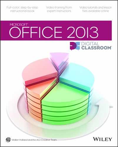
1 Advance to slide 3. Transform the list of names into an organization chart (Home > Paragraph > Convert to SmartArt Graphic > Organization Chart).
2 Click the Robeson box in the chart, and then click SmartArt Tools > Design > Add Shape > Add Assistant to insert an assistant box beneath it. Enter the name Paul in the new text box.
3 Right-click Pilfer and choose Add Shape > Add Assistant from the context menu. Enter Drudge in the text box.
4 Open the org chart’s Text pane if it is not already opened. In the text pane, select Atchison and the lines below and press Ctrl+X to move them to the clipboard. Then Paste them between Paul and Pilfer in the Text pane by moving your cursor before Pilfer and pressing Ctrl+V. The entire Atchison branch of the chart moves to the center of the graphic.
5 Click Atchison in the SmartArt itself, and select SmartArt > Design > Create Graphic > Layout > Right Hanging to switch that branch to a narrower layout.

SmartArt layouts affect not just the look, but the meaning of your diagram.
The other two branches in this SmartArt can’t switch to the compact Right or Left Hanging layouts without confusing assistants with lower branches; not all layouts are created equal in terms of the information they format. That said, this new layout might not be the best choice: at present, it’s reasonable to (incorrectly) read Topeka as Atchison’s assistant. We may need a different visual scheme.
6 Click Undo in the Quick Access Toolbar to change the layout back.
Styling a piece of SmartArt
PowerPoint provides three sets of tools for altering the appearance of a piece of SmartArt. As usual, the document theme establishes the baseline appearance of your diagrams. The SmartArt Design tab lets you add structural elements (for example, additional nodes in an org chart), try out diagram variants, switch between sets of Theme Colors, and apply visual effects to the whole diagram with a SmartArt Style. Finally, the SmartArt Format tab provides access to the usual formatting tools for slide elements: lines, fills, colors, and so on.
We’ll use each of these tools to give our org chart a coherent visual scheme; then we will discard the standard Org Chart format to make our organizational hierarchy clearer.
1 Deselect the SmartArt and delete the small text box in the upper right of the slide. In the Design tab, apply the Banded theme (it has a white stripe through the middle) and select the third (charcoal/white) variant. All four slides take on the new look.
2 Reselect the SmartArt. In the SmartArt Design tab, change to the Hierarchy List layout found near the bottom. Then click Change Colors > Colorful – Accent Colors.
The available color schemes draw from the Theme Colors; you can further customize the SmartArt’s coloration by going block by block through the chart, but that’s not really a sustainable method.
3 Apply the Brick Scene 3-D SmartArt Style.
Note that Paul and Drudge, the assistants, have been dropped to the bottom of their respective branches; the Hierarchy List and Org Chart treat assistants differently. This works for our present purposes: we’ll just individually style the assistant elements to show their special status.
4 Shift+click Paul and Drudge. Click SmartArt > Format > Shapes > Smaller five times. Then click Shape Styles > Subtle Effect – Brown, Accent 6 to give the assistant nodes an appropriately modest look.
You can individually move and style the components of a piece of SmartArt, but the entire graphic appears as a single entry in the Selection pane. We’ll use the pane to grab the whole SmartArt object at once.
5 Open the Selection pane (Home > Editing > Select > Selection Pane) and select the Content Placeholder entry, which refers to the SmartArt. Close the Selection pane and Format Shape pane to clear screen real estate, then drag the diagram to center it in the charcoal region of the slide.
A more readable, less ambiguous org chart built from the same data.
6 Choose File > Save to save your work.
Piecing together SmartArt
Slide 4 of our test presentation requires some adjustments, mostly Cut and Paste, before you can transform it from text to SmartArt. To see what the slide will look like when you’re done, see slide 4 of pp04a-finished.pptm in the PPT04lessons folder.
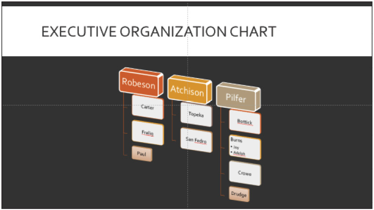
1 To start with, select the left bulleted list and convert it to the Balance SmartArt graphic (Home > Paragraph > Convert to SmartArt Graphic > More SmartArt Graphics > Relationship > Balance). With its Text pane open, you can see what’s happening: the Balance graphic takes two level 1 paragraphs (Fast and Dependable) to compare them and leaves out any other level 1 text.
Studying the text pane provides insight into how to structure text for future SmartArt conversion.
To make this SmartArt graphic work, we’ll need a bulleted list with two level 1 entries (ACME and FredCo), each with several pros/cons at level 2.
2 Right-click the bounding box of the SmartArt and choose Convert to Text to turn the SmartArt back into a bulleted list, then make the necessary changes to the list.
3 Cut and Paste the list to the right (FredCo) to the bottom of the ACME list. When you have a single list of seven lines, select all the text in the list and click Home > Paragraph > Increase List Level.
4 Insert the word ACME as a level 1 line at the top of the list, and insert FredCo at level 1 between Expensive and Sluggish.
5 Delete the ACME and FredCo headings above the two content areas, and then change the layout of slide 4 to Title and Content (Home > Slides > Layout > Title and Content).
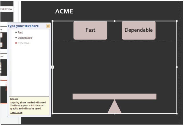
6 Now place your cursor in the list and reapply the Balance SmartArt graphic (in the Relationships collection).
The balance tilts to the right, but the balance is dynamically set to tilt toward the side that has more level 2 text. Now let’s make a frivolous change to the image and have Future-proof tip over and fall off the scale altogether.
7 Drag the Future-proof box a bit to the right, and use its rotate handle to tip it roughly 45 degrees clockwise. Then open the Text pane and change Future-proof to Open format.
8 To close, give the SmartArt a bit of panache by applying the Intense Effect SmartArt Style from the SmartArt Styles in the Design tab.
Apply the Intense Effect SmartArt Style.
As you can see, the Open format text box is still linked to its source list line despite having moved around; bullet order is unrelated to, and unaffected by, any graphical manipulations you might do. But deleting text (or a text box) from the graphic itself will still modify the bulleted list. In fact, if you delete the Cheap box from our teeter totter, the Open format box will snap into its place, and the balance will tilt back to the center.
To help you understand SmartArt better, think of it as unusually complicated text formatting, not as graphics with text labels.
Linking and embedding external data
Because PowerPoint presentations are often used to show off other work, PowerPoint 2013 lets you link and embed external data in a presentation. A table in a slide can pull its contents from an Excel file, for instance, and automatically update when changes are made in Excel. You can even insert an entire Word 2013 document into a slide, which opens a copy of Word within PowerPoint, to bring the full power of Word’s formatting and layout abilities to that slide.
In this part of the lesson, you’ll use Excel, Word, and MS Paint to edit directly the contents of your presentation.
Embedding an Excel worksheet as an object
The Insert > Object command lets you create objects representing external data and add them to your presentation. An embedded object becomes part of the .pptx file itself (significantly increasing file size); double-clicking the object within the presentation launches the appropriate editing application. For instance, double-clicking an Excel worksheet embedded in a slide opens an instance of Excel 2013 right inside PowerPoint. If you embed an object created from an external file, changes to the original file won’t affect the copy inside the presentation because the embedded version is a copy of the original.
A linked object, on the other hand, stays connected to its source data. If you create a link to an Excel spreadsheet in your slide deck, editing the object opens the original file (if it can still be found).
Embedding data as a slide object is as simple as inserting an image:
1 Add a new slide, slide 5, to pp04a_work.pptx, with layout Title Only and title it Stock Holdings.
2 Select Insert > Text > Object. Select Create from file, and Browse to your PPT04lessons folder. Select pp04b.xlsx and click OK. Click OK again to insert the object.
3 Resize the object to fit in the content area and place it at the center of the slide.
Excel objects can be minimally formatted; if you click the embedded worksheet, the Drawing Tools > Format tab is mostly greyed out. However, the Shape Fill is still available.
4 Click Format > Shape Styles > Shape Fill and select White.
Notice that the cells that fill in with white are the ones that haven’t otherwise been colored in the original Excel document; this occurs because the unformatted cell are effectively transparent from PowerPoint’s perspective.
Unformatted cells in the original Excel file match the charcoal presentation background; white fill affects only those cells.
Editing embedded objects
To edit an embedded object, double-click it. If it’s an Office document (in this case, an Excel worksheet), Windows launches an embedded version of the appropriate app within PowerPoint.
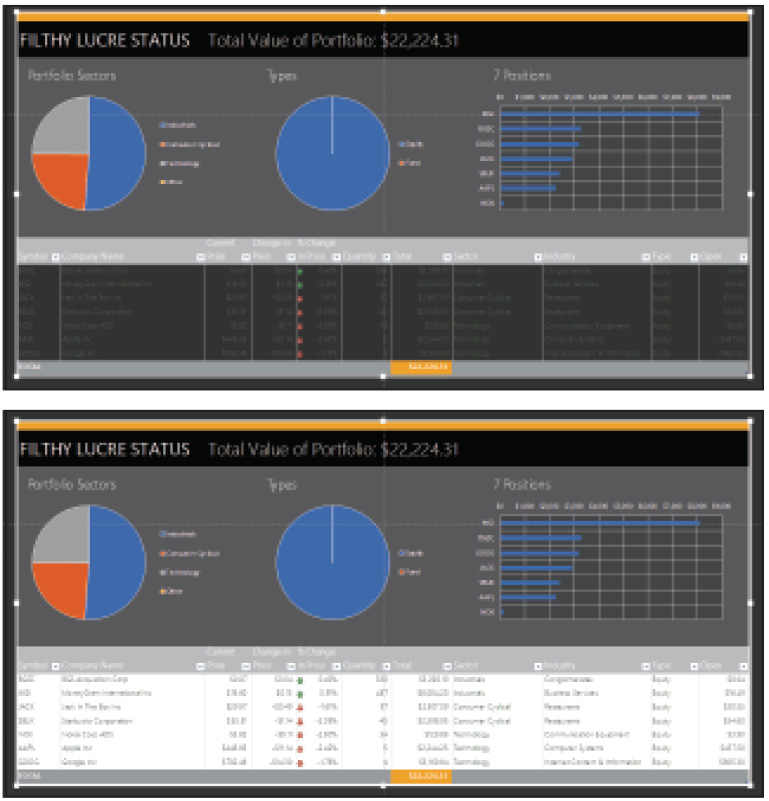
1 Double-click the portfolio spreadsheet object.
The File menu returns, along with a full Excel Ribbon, when you edit an Excel object within PowerPoint.
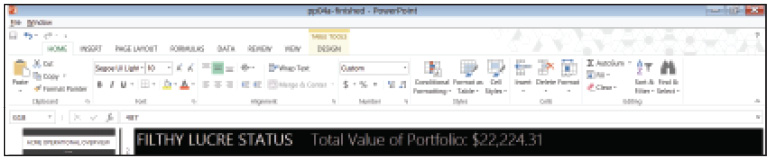
2 Click the word FILTHY (cell B2). Change the words FILTHY LUCRE STATUS to CURRENT HOLDINGS.
3 Press Escape to return to PowerPoint. The Excel object updates to reflect the new heading.
The editing interface for an embedded Excel worksheet can be a bit confusing: Excel’s version of the Ribbon appears, but the File and Window menus float above it, and the PowerPoint application menu appears in the top left corner of the window. The PowerPoint Ribbon vanishes utterly; you can’t change the enclosing presentation while you edit the embedded object. Remember that the Escape key functions literally here: pressing Escape pops you out of the embedded editor back to PowerPoint proper.
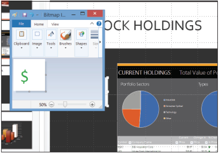
The same principles apply when you insert a Paint object, but to edit a bitmap image, Windows launches a full version of MS Paint.
1 Select Insert > Text > Object > Create new > Bitmap Image and click OK. MS Paint launches.
2 Switch to a dark green color. Draw a picture of a dollar sign ($) in the white space provided.
3 Press Alt+F4 to close Paint and return to PowerPoint. Place the new image, resized to fit in the white band, in the upper-right corner.
You don’t need to save your Paint document; you’re not working on a separate Paint file as such, you’re editing an object within your PowerPoint (.pptx) file using Paint as its borrowed editing interface. In fact, if you keep both PowerPoint and Paint visible at once while editing the bitmap, you’ll see any changes you make in Paint reflected instantly in the slide.
An embedded object differs from a linked file in that its data exists only within the .pptx file.
4 Choose File > Save to save your work.
Creating a linked object
Linked objects can be created using the Paste Special command to link to data on the clipboard, or with the Insert Object command. We’ll use Insert Object in this section, building on the exercises you’ve just completed.
1 Add a new slide to your presentation with the title Expectations Management Plan.
2 Click Insert > Object. Select Create from file, and click Browse. Select pp04c.docx in your PPT04lessons folder, and click OK and click OK again.
PowerPoint takes a snapshot of the contents of the Word document and inserts it into the current slide, but leaves the data in the source file (keeping the presentation document itself slim). To edit, just double-click as usual; the original file opens in Word.
You can also choose to create a linked file, rather than an embedded one, when using the Insert Picture control in a slide: instead of clicking Insert after selecting your image, select Insert and Link, or Create a Link, from the Insert drop-down menu.
Creating a chart from tabular data
Sometimes an audience wants to see raw data, but more often it wants a visual that highlights relationships between data: a graph or chart instead of a table (however cleverly designed). Excel offers a suite of immensely powerful tools for representing data visually; PowerPoint borrows some of these tools to let you include charts and graphs in your slides.
We’ll add charts to our presentation in two ways: directly in PowerPoint (in an embedded Excel editing window), and by pasting in an Excel chart linked to its source data.
Generating charts in PowerPoint
If you create a chart from scratch in PowerPoint, a mini Excel worksheet opens to let you enter data. This is a great way to quickly add simple info-graphics to your slide show.
1 Add a new Title and Content slide (slide 7) to your open presentation, with layout Title and Content. Title it Fall Semester Sales.
2 Click Insert Chart in the content area. Select the 3-D Column layout and click OK.
3 Insert the following data into the Excel sheet that appears:
|
|
CPU |
Monitor |
RAM |
|
Wilson |
4.3 |
2.4 |
2 |
|
Johnson |
2.5 |
4.4 |
2 |
|
Clarkson |
3.5 |
1.8 |
3 |
|
Wolfson |
4.5 |
2.8 |
5 |
4 Close the embedded Chart in the Microsoft PowerPoint window. Click the chart area, open the Chart Elements handle (+), and uncheck Legend.
5 Apply Chart > Design > Quick Layout > Layout 7 and Chart Style 11 to the chart.
6 Finally, right-click anywhere on the chart and select Edit Data > Edit Data to reopen the worksheet.
If you need the full features of Excel to edit your data, you can open Excel 2013 through the Edit Data mini-sheet or the Edit Data context command.
Editing individual chart elements
Just as SmartArt pieces stay connected to elements in an underlying bulleted list, the individual pieces of PowerPoint charts (such as the red and orange bars in our sample chart) are linked to cell data in the associated table; you can tailor a chart’s appearance and content by editing individual chart elements. To see how this works, let’s give Wolfson and Johnson’s RAM sales some extra emphasis:
1 If pp04a_work.ppt isn’t open, open the file now. In the chart, click Johnson’s yellow RAM sales bar in the back row; the entire RAM row is selected. (Hovering your mouse over the bar will bring up a tooltip identifying the bar and showing its source data.) Click the bar again to select the individual bar.
2 Click Chart > Format > Shape Styles > Colored Outline – Orange, Accent 2 to format that individual bar.
3 Do the same with Wolfson’s much larger RAM sales bar.

PowerPoint’s chart tools offer fine-grained control over both aesthetics and content.
Every element of the chart is equally customizable. Indeed, you can even right-click the tiny gridlines that run along the edges of the graph, and then open the Format pane (Format Gridlines) to change any of their visual parameters. Clicking through the various components of the graph with the Format pane open will show you how customizable your graph’s visuals are. The Chart Design and Format tabs remain available, as they would for any floating slide element.
Linking a chart to external Excel data
Naturally, you can paste a chart directly from an existing Excel document, just as any other image. Since Excel charts are linked to the sheets that generate them, you can choose to maintain that link when you copy the chart into PowerPoint. Your presentation can then update to reflect changes to the underlying chart data.
1 Add another slide (slide 8) to your presentation, entitled Sales Comparison.
2 Navigate to your PPT04lessons folder and open pp04e.xlsx in Excel 2013. Select the Seasonal Beverage Sales graph and press Ctrl+C to copy it. Make sure you’re selecting the entire chart and not just one element; click in an empty region of the image to be sure.
3 In PowerPoint, click Home > Paste > Use Destination Theme & Link Data.
4 Place the chart near the lower left corner of the slide, then drag the upper right handle further up and to the right to fill the slide’s content area.
5 Navigate back to pp04e.xlsx and change the PepDrink Spring sales value to 20. Save the file as pp04e_work in the PPT04lessons folder and close Excel.
The data should automatically refresh, but in case it has failed to do so, we’ll manually refresh the data in PowerPoint.
6 In PowerPoint, click the chart and choose Chart Tools > Design > Data > Refresh Data.
Styling charts and graphs
As with a chart created directly in PowerPoint, double-clicking a chart linked to Excel opens the Format pane. From there you can make subtle or dramatic changes to your graphics’ look.
1 Double-click the graph to open the Format pane. Select one of the gridlines; the Pane’s heading changes to Format Major Gridlines.
2 In the Fill & Line subpane, click the Gradient line option button; PowerPoint recolors the gridlines along a gradient, using an accent color from the current theme.
3 With the gridlines still selected, click the drop-down menu beside the Major Gridline Options heading in the pane. Select Chart Area from the drop-down menu.
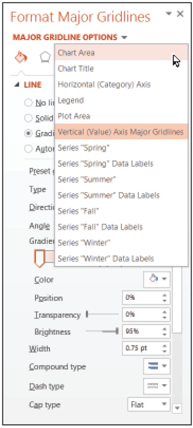
From the Format pane, you can select any chart element for styling.
The Chart Options drop-down menu displays a list of every editable chart element so you don’t have to search for half-hidden objects in the chart’s back row. There’s also space to translate your content for visually impaired audiences:
4 In the Chart Options > Size & Properties tab, edit the Alt Text: set the Title to Seasonal Beverage Product Sales by Product and the Description to Breakdown of 5 soda product sales by season.
As is the case with text and SmartArt, when you need to do fine-grained editing of floating slide elements such as charts and graphics (which you’ll do in the next lesson), you’ll spend a lot of time inside the Format pane. If you have the screen real estate, you could leave several editing/formatting panes open all the time, and switch back and forth between Normal Mode and Reading Mode to get a wide-angle look at your slides. As always, your location in PowerPoint’s natural workflow will shape how you use the application’s interface.
5 Choose File > Save to save your work.
Self study
1 Experiment with different SmartArt formats to see how they make use of level 1 and 2 bulleted text; visit office.microsoft.com and search the help library for SmartArt description PowerPoint 2013 to view a Descriptions of SmartArt graphics reference page.
2 The org chart exercise in this lesson showed how changing SmartArt formats can introduce ambiguity to your data. Explore different options for styling visual elements to resolve this ambiguity; for instance, resize or color graph elements to set them off from the other data.
3 For a newspaper-like look, try bringing a short multicolumn Word document into your slide show, with and without its own visual theme.
Review
Questions
1 Which document settings affect the colors of a piece of SmartArt?
2 What tool would you use to add or remove chart elements such as axis labels or a legend?
3 How do you add live Excel data to a PowerPoint slide?
Answers
1 The document settings that affect the colors of a piece of SmartArt are: Theme, Variant, Chart/Shape Styles, per-character and per-shape formatting.
2 The tool to use to add or remove chart elements such as axis labels or a legend is the Chart Elements popup.
3 To add live Excel data to a PowerPoint slide, create a linked object by choosing Insert > Object > From file, and then click the check box to link data.