
Before we implement our first linear regression model, we will introduce a new dataset, the Housing dataset, which contains information about houses in the suburbs of Boston collected by D. Harrison and D.L. Rubinfeld in 1978. The Housing dataset has been made freely available and is included in the code bundle of this book. The dataset has been recently removed from the UCI Machine Learning Repository but is available online at https://raw.githubusercontent.com/rasbt/python-machine-learning-book-2nd-edition/master/code/ch10/housing.data.txt. As with each new dataset, it is always helpful to explore the data through a simple visualization, to get a better feeling of what we are working with.
In this section, we will load the Housing dataset using the pandas read_csv function, which is fast and versatile—a recommended tool for working with tabular data stored in a plaintext format.
The features of the 506 samples in the Housing dataset are summarized here, taken from the original source that was previously shared on https://archive.ics.uci.edu/ml/datasets/Housing:
CRIM: Per capita crime rate by townZN: Proportion of residential land zoned for lots over 25,000 sq. ft.INDUS: Proportion of non-retail business acres per townCHAS: Charles River dummy variable (= 1 if tract bounds river; 0 otherwise)NOX: Nitric oxide concentration (parts per 10 million)RM: Average number of rooms per dwellingAGE: Proportion of owner-occupied units built prior to 1940DIS: Weighted distances to five Boston employment centersRAD: Index of accessibility to radial highwaysTAX: Full-value property tax rate per $10,000PTRATIO: Pupil-teacher ratio by townB: 1000(Bk - 0.63)^2, where Bk is the proportion of [people of African American descent] by townLSTAT: Percentage of lower status of the populationMEDV: Median value of owner-occupied homes in $1000s
For the rest of this chapter, we will regard the house prices (MEDV) as our target variable—the variable that we want to predict using one or more of the 13 explanatory variables. Before we explore this dataset further, let us copy it from the UCI repository into a pandas DataFrame:
>>> import pandas as pd
>>> df = pd.read_csv('https://raw.githubusercontent.com/rasbt/'
...                  'python-machine-learning-book-2nd-edition'
...                  '/master/code/ch10/housing.data.txt',
...                  header=None,
...                  sep='s+')
>>> df.columns = ['CRIM', 'ZN', 'INDUS', 'CHAS',
...               'NOX', 'RM', 'AGE', 'DIS', 'RAD',
...               'TAX', 'PTRATIO', 'B', 'LSTAT', 'MEDV']
>>> df.head()
To confirm that the dataset was loaded successfully, we displayed the first five lines of the dataset, as shown in the following figure:

Note
You can find a copy of the Housing dataset (and all other datasets used in this book) in the code bundle of this book, which you can use if you are working offline or the web link https://raw.githubusercontent.com/rasbt/python-machine-learning-book-2nd-edition/master/code/ch10/housing.data.txt is temporarily unavailable. For instance, to load the Housing dataset from a local directory, you can replace these lines:
df = pd.read_csv('https://raw.githubusercontent.com/rasbt/'
             'python-machine-learning-book-2nd-edition'
             '/master/code/ch10/housing.data.txt',
             sep='s+')
Replace them in the following code example with this:
df = pd.read_csv('./housing.data.txt'), sep='s+')Exploratory Data Analysis (EDA) is an important and recommended first step prior to the training of a machine learning model. In the rest of this section, we will use some simple yet useful techniques from the graphical EDA toolbox that may help us to visually detect the presence of outliers, the distribution of the data, and the relationships between features.
First, we will create a scatterplot matrix that allows us to visualize the pair-wise correlations between the different features in this dataset in one place. To plot the scatterplot matrix, we will use the pairplot function from the Seaborn library (http://stanford.edu/~mwaskom/software/seaborn/), which is a Python library for drawing statistical plots based on Matplotlib.
You can install the seaborn package via conda install seaborn or pip install seaborn. After the installation is complete, you can import the package and create the scatterplot matrix as follows:
>>> import matplotlib.pyplot as plt
>>> import seaborn as sns
>>> cols = ['LSTAT', 'INDUS', 'NOX', 'RM', 'MEDV']
>>> sns.pairplot(df[cols], size=2.5)
>>> plt.tight_layout()
>>> plt.show()
As we can see in the following figure, the scatterplot matrix provides us with a useful graphical summary of the relationships in a dataset:

Due to space constraints and in the interest of readability, we only plotted five columns from the dataset: LSTAT, INDUS, NOX, RM, and MEDV. However, you are encouraged to create a scatterplot matrix of the whole DataFrame to explore the dataset further by choosing different column names in the previous sns.pairplot call, or include all variables in the scatterplot matrix by omitting the column selector (sns.pairplot(df)).
Using this scatterplot matrix, we can now quickly eyeball how the data is distributed and whether it contains outliers. For example, we can see that there is a linear relationship between RM and house prices, MEDV (the fifth column of the fourth row). Furthermore, we can see in the histogram—the lower-right subplot in the scatter plot matrix—that the MEDV variable seems to be normally distributed but contains several outliers.
Note
Note that in contrast to common belief, training a linear regression model does not require that the explanatory or target variables are normally distributed. The normality assumption is only a requirement for certain statistics and hypothesis tests that are beyond the scope of this book (Introduction to Linear Regression Analysis, Montgomery, Douglas C. Montgomery, Elizabeth A. Peck, and G. Geoffrey Vining, Wiley, 2012, pages: 318-319).
In the previous section, we visualized the data distributions of the Housing dataset variables in the form of histograms and scatter plots. Next, we will create a correlation matrix to quantify and summarize linear relationships between variables. A correlation matrix is closely related to the covariance matrix that we have seen in the section about Principal Component Analysis (PCA) in Chapter 5, Compressing Data via Dimensionality Reduction. Intuitively, we can interpret the correlation matrix as a rescaled version of the covariance matrix. In fact, the correlation matrix is identical to a covariance matrix computed from standardized features.
The correlation matrix is a square matrix that contains the Pearson product-moment correlation coefficient
(often abbreviated as Pearson's r), which measure the linear dependence between pairs of features. The correlation coefficients are in the range -1 to 1. Two features have a perfect positive correlation if ![]() , no correlation if
, no correlation if ![]() , and a perfect negative correlation if
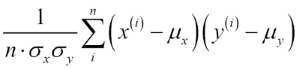
, and a perfect negative correlation if ![]() . As mentioned previously, Pearson's correlation coefficient can simply be calculated as the covariance between two features x and y (numerator) divided by the product of their standard deviations (denominator):
. As mentioned previously, Pearson's correlation coefficient can simply be calculated as the covariance between two features x and y (numerator) divided by the product of their standard deviations (denominator):

Here, ![]() denotes the sample mean of the corresponding feature,
denotes the sample mean of the corresponding feature, ![]() is the covariance between the features x and y, and
is the covariance between the features x and y, and ![]() and
and ![]() are the features' standard deviations.
are the features' standard deviations.
Note
We can show that the covariance between a pair of standardized features is in fact equal to their linear correlation coefficient. To show this, let us first standardize the features x and y to obtain their z-scores, which we will denote as ![]() and
and ![]() , respectively:
, respectively:

Remember that we compute the (population) covariance between two features as follows:

Since standardization centers a feature variable at mean zero, we can now calculate the covariance between the scaled features as follows:

Through resubstitution, we then get the following result:

Finally, we can simplify this equation as follows:

In the following code example, we will use NumPy's corrcoef function on the five feature columns that we previously visualized in the scatterplot matrix, and we will use Seaborn's heatmap function to plot the correlation matrix array as a heat map:
>>> import numpy as np
>>> cm = np.corrcoef(df[cols].values.T)
>>> sns.set(font_scale=1.5)
>>> hm = sns.heatmap(cm,
...            cbar=True,
...            annot=True,
...            square=True,
...            fmt='.2f',
...            annot_kws={'size': 15},
...            yticklabels=cols,
...            xticklabels=cols)
>>> plt.show()
As we can see in the resulting figure, the correlation matrix provides us with another useful summary graphic that can help us to select features based on their respective linear correlations:

To fit a linear regression model, we are interested in those features that have a high correlation with our target variable MEDV. Looking at the previous correlation matrix, we see that our target variable MEDV shows the largest correlation with the LSTAT variable (-0.74); however, as you might remember from inspecting the scatterplot matrix, there is a clear nonlinear relationship between LSTAT and MEDV. On the other hand, the correlation between RM and MEDV is also relatively high (0.70). Given the linear relationship between these two variables that we observed in the scatterplot, RM seems to be a good choice for an exploratory variable to introduce the concepts of a simple linear regression model in the following section.