
Most of the business reports are printed on greyscale printer. This recipe will highlight the importance of choosing the right colors when reports are meant for printing.
- Open the report in Report Studio. Select the list column titles.
- From properties, open the Background Color dialog. Go to the Web Safe Colors tab.
- Select the #CC99FF color (6th Column, 10th Row).
- Now select the Product line footer (sub-total) row and set its background color to #CCFF33 (13th Column, 10th Row).

- Run the report and examine colors. Now print the report and examine colors. You will notice that though both the colors are very different (one is a shade of green and other is purple), they look almost the same on the grayscale printout.
- Now change the List Column titles to any color from 9th or 11th row. Print the output and you see that the colors are distinguishable now.
If you print the whole palette on a grayscale printer, you will notice that rows have alternating light and dark shades. Hence, any two cells from the same row will have very similar output, but those from neighboring rows will have distinguishable shades.
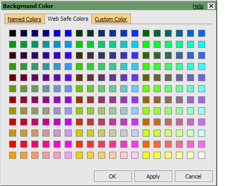
Hence you should always choose one color from an odd numbered row and the other color from an even numbered row.
..................Content has been hidden....................
You can't read the all page of ebook, please click here login for view all page.