
9 MODELING PERIODIC SYSTEMS
Calculus is the mathematics that lets us see how systems move and change. In the last chapter, we looked at things that grew (or died away) with distance, time, or some other variable. Many other systems, though, are periodic: their motion repeats over and over. Planets orbiting around the sun, or the regular swing of a pendulum, are examples of these predictable motions. More subtly, the natural cycles of the number of predators and prey in a field repeats over and over, but in a more complex way.
In this chapter, first we learn more about the math of the most basic repeating systems, those with behaviors over time that trace out sine and cosine curves. We show you how to make a few simple models out of stuff from a junk drawer to prove that the equations work. Then we learn about classic equations that describe an astonishing number of real physical systems, and build some 3D printed models to help us understand and predict the behavior of ecosystems.
Going Around in Circles
The simplest repetitive motion to think about is a point going around and around a circle. Imagine we had a circle with a radius equal to 1, or a unit circle. This circle is drawn so that its center is where an x and y axis cross (Figure 9-1). Imagine a triangle drawn so that its sides are on the x axis and parallel to the y axis, with a vertex somewhere on the circle. Now let’s focus on the angle made between the x axis and hypotenuse of this right triangle.
If the length of the hypotenuse (radius of the circle) equals 1, then the x and y coordinates of the central angle are cosine and sine of that angle, respectively. You can prove to yourself that triangles in the upper left and two lower quadrants of the circle have equivalent relationships, except for a sign. The sine will have a positive sign in the upper two quadrants, and negative in the lower two. Cosine, on the other hand, will be positive in the right two quadrants, and negative in the left two. For details of this, check out our 2021 book Make: Geometry, or other geometry or basic trigonometry books or websites.
If we plot out these x and y values versus the central angle, as we continuously increase the central angle of the triangle from zero degrees through a full circle, our x coordinate value would describe a cosine curve, and our y, a sine curve. Sines, cosines, and various ratios of them are collectively called trigonometric functions. Sine and cosine, which are continuous functions, are called sinusoids, or, for reasons that should now be obvious, circular functions. Search online for “unit circle animation” to see how this works for the entire curve.
If you would rather do your own mental animation, imagine the line connecting the origin to the circle (the radial blue line in Figure 9-1) as the minute hand of a clock. If you were to measure the x coordinate of the end of the minute hand each minute over the course of an hour and plot those measurements, what would the shape of the curve be? How about the y coordinate? (Conventionally, mathematicians like to think about sweeping out the unit circle in a counter-clockwise direction so that the central angle is increasing, but the shape of the curve is the same.)

FIGURE 9-1: The unit circle, and coordinates of an arbitrary point
Phase Shifts
If your data is periodic, you know you might be dealing with some combination of sinusoids (sine and/or cosine curves). You might want to assume that your data can be modeled with a function like
Where a is the curve’s amplitude at its highest point, and b is the curve’s frequency, which has units of 1/time and tells you how often the curve completes a full cycle. For example, if b equals 2 cycles/second, two full cycles of would happen over one second. We have seen both of these before, in Chapter 4’s introduction to sine and cosine functions.
What is new since the earlier chapters, though, is the parameter c which is a phase shift that starts the curve at a different time. Sine and cosine curves are of course the same thing with values of c, that are 90 degrees (or 2 radians) different in phase, and a 180 degree (or radians) phase shift gives you the negative version of the same function.
There are some useful systems that can be modeled very well with just a single sinusoid. Many signal processing and other systems add up many different curves to convey information and perform an unimaginable number of other tasks.
Sine and Cosine Derivative Relationships
In Chapter 4, we used the derivativeintegral.scad model shown in Figures 4-8 and 4-9 to show the relationships between sine and cosine functions and their derivatives. Before diving into this section, you might want to revisit the model description around those Figures. We are now going to do more qualitative discussion about how the derivatives of sine and cosine functions relate to each other. If you created it back in Chapter 4, having that model on hand might be helpful for what follows.
If you place a sine and cosine curve next to each other, some relationships are easy to see. First, you will notice that you can shift one over by one quarter of a period (90 degrees, or radians) to get the other one. Shifting a sine function to the right will give you a cosine curve, and shifting a cosine to the left gives you a sine (Figure 9-2).
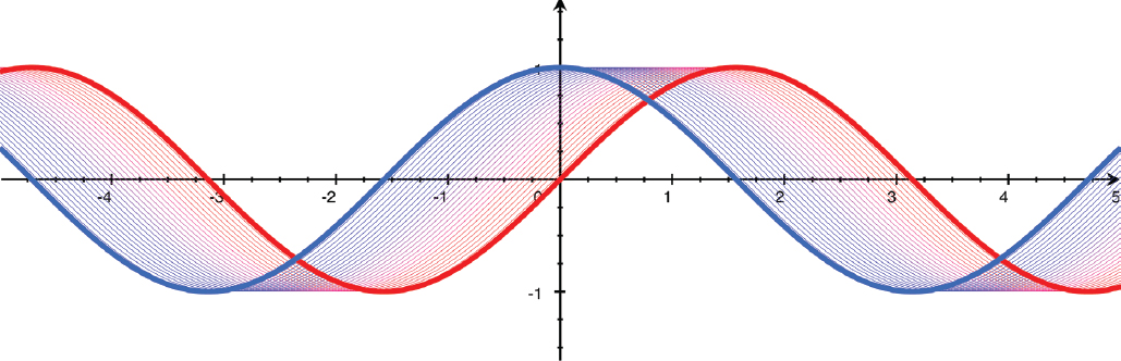
FIGURE 9-2: Shifts to rotate sine, cosine onto each other
When the value of sin(x) = 0, cos(x) will be either or , and vice versa. The cosine is when the sine is zero and going upward (when its slope is positive), and when the sine has a value of zero and is going downward (when its slope is negative). Then, as the sine curve reaches a maximum of or a minimum of , it flattens out and changes direction. At those points, its slope is zero (as we saw in Chapter 5 when we talked about curve maxima, minima and inflection points). These are the points where the cosine’s value is zero. Table 9-1 summarizes these observations.
x (radians) | sin(x) | Slope of sin(x) | cos(x) |
|---|---|---|---|
0 | 0 | increasing | 1 |
1 | 0 | 0 | |
0 | decreasing | -1 | |
-1 | 0 | 0 |
TABLE 9-1: Sine and cosine
The “Approximating Sine and Cosine” sidebar explores some limiting relationships among sinusoids, lines, and circles, in case you wanted to sketch a sine or cosine curve. Next up, we will see how sinusoids play out in modeling physical systems that repeat their behavior over and over.
If you want to see these concepts with more detailed algebra, you can check out the last few chapters of the book. In Chapter 11, we see a different way of thinking about the unit circle. In Chapter 12, we walk through an algebraic way of approximating and reasoning about sinusoids. Finally, Chapter 13 contains a variety of trigonometric identities, ways to substitute expressions with less-complex ones, that can sometimes make calculation faster.
Simple Harmonic Motion
There are many real-word systems that have some aspect, like their position over time, that approximates a sine or cosine curve. A feature of these curves is that their second derivatives are the negative of the original curve (except, perhaps, for some constants hanging around).
We just saw that we can think of taking a first derivative of a pure sinusoid as shifting the curve by 90 degrees, and thus a second derivative is a shift of 180 degrees. So, just as exponentials are very convenient in equations with a function and its first derivative, so too sinusoids are convenient if we are dealing with a function and its second derivative. For example, if an object’s position and acceleration (second derivative of position) are related in some way, sinusoidal behavior might result.
One special case of this is simple harmonic motion, in which a system’s behavior comes from an equation that ties together the position of an object and its second derivative. Systems like a mass bobbing on a spring, or a pendulum swinging back and forth, are examples of simple harmonic motion. (Note that we are thinking about position varying as a function of time, and we are taking derivatives with respect to time.)
For example, assume we have a heavy ball attached to the side of an ice rink (which, of course, gives us an extremely low-friction surface) by a big spring. If we pull the ball along the ice, we are pulling against the spring. Compressing or extending the spring (ignoring gravity, friction, and other effects) stores energy in the spring. When we let go, this energy is converted into a force on the ball, and the spring pushes or pulls the ball, trying to get back to its neutral position. This force was analyzed by Robert Hooke a little after Newton’s time. Hooke measured that it would be a constant times the distance that the spring is compressed or extended. When this happens, the energy in the spring acts as a “restoring force,” pushing back on the mass. This restoring force is
Where F is the force, x is the distance that the mass has moved from the neutral position, and k is called the spring constant. The spring constant tells us how much a spring resists being compressed. Newton also told us, though, in one of his famous Laws of Motion, that
Which we can read as (force) F equals mass (m) times acceleration (a). Of course, the mass is constant in this example, but force, acceleration, and displacement all change over time. We could write force as F(t), acceleration as a(t), and displacement as x(t). We show that explicitly from here on out.
Acceleration, we know, is the second derivative of distance with respect to time. So we can change this last equation to look like this:
Setting these two expressions for force equal to each other, dividing both sides by m, and assuming that x(t) is a function of time, t, we get
Now we can see that we have a function and its second derivative being related just by a constant and a change in sign. Where have we seen that before?
Second Order Ordinary Differential Equations
We can interpret the equation at the end of the last section as saying that x(t) will be some function that, if you differentiate it twice, will only differ from the original function by a sign and a constant multiplier. It is a function whose acceleration scales negatively with its value.
This type of equation is called a second order ordinary differential equation. Second order means we have second derivatives, as opposed to the first-order ones we saw in the last chapter. It will be no surprise at this point in the chapter that either sine or cosine will work perfectly here. If we start out with
with a, b, and c just being constants, we can guess that we might be able to plug this in to our equation for x(t) and have it work out. The constant a is called the amplitude of a sine wave, the maximum value of the curve, (not to be confused with acceleration, which we will start referring to as .
The constant b is called the frequency of the wave, and shows you how many cycles of all values of a sine or cosine wave fit into 360 degrees (or 2π radians). Finally, c is the phase of our sine or cosine wave, which might have started before or after time t = 0. We will need the second derivative of this function. The derivatives are
Let’s go back to the equation for the motion of a spring at the end of the last section:
We now have two different equations for . If we set them equal to each other, we get
Now substitute the cosine function for the second derivative:
If we compare the two sides we can see that the a drops out, and the two minus signs on the right cancel out. If equals , they will also cancel out, making the two sides of the equation match. Therefore,
Note that we could have equally well used sine. The only difference between and for this purpose is where we start our oscillation when t = 0, and thus the value of c.
We need to both specify an initial position and one other parameter of the system, like the maximum excursion of the ball on the spring, or the velocity (first derivative of distance) at t = 0. We will define x(t) = 0 as being in the middle of the ball’s travel between and . We also know that the velocity has to be zero when the mass turns around at each end of its travel, at x equal to plus and minus a.
Let’s say we let go of the ball at , which lets us set the phase offset to c = 0. If we use the fact that we know this system will have a sinusoidal solution, we can see that fits all the constraints (because velocity is zero at ).
The constant, b, is called a frequency and has units of 1/time, and the constant c is called a phase and is dimensionless (all its units cancel out, leaving it with none). Our original amplitude constant, a, is independent of the other two; we get it from knowing the maximum amplitude of the ball’s oscillation. It will have the same units as x(t). We can substitute now for the constant b in our equation for x(t) to get
If, at the beginning of our process (at t = 0), we had grabbed the ball and pulled the spring out to its maximum extent and then released it, it would (in the absence of friction or air resistance) slide back and forth over the ice forever. If the ball was heavier, it would take more time to go from one end to the other. If the spring had a higher spring constant, k, then the ball would move back and forth faster. Spring constants are given in force per unit distance, Newtons per meter, N/m. A Newton is in turn Dividing this by mass and length, we get units of .
Figure 9-6 shows a model of the behavior of a system like this over time for several values of . Time goes from left to right, is the vertical axis, and the different curves have different values of . If k is very small or m is very large, there is very little oscillation. But if it is the other way around, then there is very rapid vibration.

FIGURE 9-6: Simple harmonic motion
If is zero, which would be the case if the spring constant was zero, or if the mass, and thus the momentum that the spring must overcome, was infinite, the system will just sit there. You can see that where this parameter is zero (red line), that x(t) is a constant. But if becomes relatively large (purple line) you will have more oscillations in a given period of time.
There are many more examples, such as electrical circuits with a capacitor of capacitance C and inductor of inductance L (and no resistance) that has the current varying in time as . A capacitor stores energy as an electric field, but an inductor in a magnetic field. The system (in the idealized absence of resistance) will pass current back and forth between these two types of energy storage.
All these systems are governed by second-order differential equations. A little searching will bring up simulations, such as those at mathlets.org or phet.colorado.edu. You might try playing with these to get insight on the dynamics.
Spring Experiment
We can do an experiment modeling simple harmonic motion of an object on a spring by scrounging around the toybox a bit. Get a light spring (a one-inch-diameter “Slinky Junior” is perfect) and attach a washer or other weight to one end (Figure 9-7). Have a friend hold it (Figure 9-8) or securely attach it to a table top.

FIGURE 9-7: Simple spring setup

FIGURE 9-8: Running the experiment
Although this case (a spring pulled down by gravity) is slightly messier to derive, it turns out that the frequency is the same as the side to side spring arrangement. Test it out with different weights. If you really want to be fancy, buy a spring assortment (get very light springs so they will oscillate with a reasonable weight) and vary the spring constant as well. You will also see that if you hold the spring so that only part of it is free to oscillate (a shorter spring) the frequency does not change. There are a lot of variables here that will cause some variation from the expected values, but you should get general qualitative behavior.
You can measure the frequency by counting how many seconds it takes to come back to the same place 10 times. Divide that number by 10 to get the period; 1/period is the frequency. Since it is tricky to exactly capture when the next cycle starts, measuring 10 cycles will be a little more accurate.
Pendulum Experiment
Many physical systems can be modeled with simple harmonic motion. An ideal pendulum that is moving back and forth at small amplitudes has a frequency of , where g is the acceleration due to gravity, also called the gravitational constant (9.8 on Earth) and l is the length of the pendulum. This works out to units of 1/time, as it was for the spring. Interestingly the period of a pendulum is independent of its mass.
Deriving the equations of motion for a pendulum are a little messy; if you want to see them in detail, search on “equation of a pendulum.” You can make a very simple pendulum by tying a thin string on a washer, and tying the string to some point where it can swing freely. Vary the mass of the pendulum; the period should not change. If you vary the length, though, the period should decrease proportional to the square root of the length.
First, take two washers and tie them to each end of a piece of string or thread (Figure 9-9). The second washer will keep the upper end in place. Slip the second washer under a book or other weight on a table so that the first washer hangs freely. Move the free washer through an angle from the vertical to get it swinging (Figure 9-10). Technically this only works for small excursions of the pendulum, so don’t get too carried away in pulling too far to one side or the other to get started.

FIGURE 9-9: Pendulum experiment setup

FIGURE 9-10: Pendulum experiment start
If you were weightless in space, how would this look? Search on “weightless pendulum” to see videos of experiments done by astronauts in space. Increase the weight and note that the frequency does not change, assuming you do not inadvertently change the length of the pendulum. Count the frequency as we described for the spring. Very careful setups like this were early ways of measuring gravity, but obviously those experiments need much more controlled experiments than we have here!
Systems of Differential Equations
To this point in the book, we have mostly looked at concepts in isolation. In Chapters 4 and 5, we thought about derivatives, which show how something is moving or changing. In Chapters 6 and 7, we looked at integrals, which show us how to figure out how fast something is adding up. In the last chapter, we were introduced to the idea of a differential equation and its discrete version, the difference equation.
In this chapter, we think about how to deal with systems of more than one equation, each of which include derivatives. Equations like these relate how something is changing (over time, for instance) to other variables, or perhaps tie together how the rates of change of several variables drive each other’s behavior.
Some classic equations can be manipulated algebraically to get a solution. This solution will be an equation with the variables related to each other in some explicit way. We say those have closed-form solutions, and we saw two simple examples in Chapter 8 (which we solved in discrete form just to make the point that we can do that for any equation). Here we will look at equations that give solutions that are periodic, but are not sinusoids.
Reprising the Logistic Equation
In Chapter 8, we looked at the simplest possible differential equation (the exponential growth equation) and then the next step up, the logistic equation, which had a solution that was a combination of a few different exponentials. The logistic equation looked at how a population would grow in a resource-limited environment — say, rabbits in an area with a finite amount of foraging available to them. In real life, though, we often want to look at the outcomes of several different interacting factors all at once. How can we do that?
The Lotka-Volterra Equations
There are a famous pair of differential equations that describe the rise and fall of populations of a predator and its prey in a closed environment over time, like a population of rabbits and foxes in a field. Rabbits like to breed, and foxes like to eat rabbits. How do the populations vary over time, with some simplistic assumptions? These are the Lotka-Volterra equations, named for Alfred J. Lotka and Vito Volterra, who wrote about them independently (for differing applications) in several publications over about 20 years starting in 1910.
It turns out that variations apply in many other circumstances, too, like parasite populations in a host, chemical reactions, and economic theories. The ability to solve several interacting equations at once makes it possible to predict behavior of complicated systems that can’t be modeled with just one equation. It requires a bit more bookkeeping than the single equations we talk about in Chapter 8, but conceptually it is not very different. The Lotka-Volterra equations describe interacting biological systems, like a predator and its prey in a closed ecosystem. Both because the equations loosely model real behavior and because they create a simple model, they are often used to teach about differential equations.
The population of prey, without any predators around, would just be a rate of population growth times the current population. If we then add predators to the system, some of the prey will be eaten. The rate at which the prey are eaten is increased by a large number of predators, because there are more of them hunting for the prey, but it also increases if the prey are more abundant, because the predators have an easier time finding them.
Population Behavior Over Time
The time plot of the predator and prey populations is just a line in 3D (predator, prey, and time) space. We could have made a model in any of three orientations, supporting the curve using each of the axes as a base. But none of these really let you think about the relationships all that easily. Our early attempts at this model also made it easy to lose track of which direction was positive, and how far a value was from zero, in at least one axis. We evolved instead to a model of two intersecting surfaces (Figures 9-11 and 9-12) that we think more clearly shows all three projections (predator, prey, and time) more clearly.
In Figure 9-11 (on the following page), time goes from left to right, the rabbit population is vertical, and the fox population is at right angles, out of the page. As you can see, the solutions are periodic. If you have the ability to print out this model, run your finger along the line that forms the top front to help you intuit the behavior.

FIGURE 9-11: Lotka-Volterra equation solution, focused on prey time behavior
In Figure 9-12, we have taken a photo at roughly right angles to Figure 9-11. This view shows mostly the changes in prey. Notice that we have written some letters on Figure 9-11 and 9-12. Now, either follow along with a copy of the model you have printed for yourself, or go back and forth between Figures 9-11 and 9-12. Both figures have five labels — the labels are in the same physical spot on the print in both views, to give you a sense of how the model can be manipulated. In the narration that follows, (a), (b), (c), (d), and (e) refer to those points on the models.

FIGURE 9-12: Lotka-Volterra equation solution, focused on predator time behavior
Beginning in the prey view in Figure 9-11 at point (a), we start off with a small number of rabbits and they multiply, as rabbits do, up to point (c). But if you also pay attention to the fox view (Figure 9-12), you will see that it begins to grow in response, but with a bit of a lag, not until point (b). Then the rabbit population falls, starting at point (c). The fox population gets too big and reaches its maximum (point (d)), then it too begins to fall off. At point (e), the rabbit population levels off at its minimum point, and the cycle repeats from there.
Figure 9-13 shows three views of the same model, looking at the time behavior of rabbits (top of the model on the left), the time behavior of the fox population (top of view of the middle model) and looking down the time axis (foxes along the bottom, rabbits in the vertical). If it bothers you to think of populations of fractional rabbits and foxes, just imagine that we are talking about population in thousands, or millions. We go into that more in the section later in this chapter where we talk about the attofox problem.

FIGURE 9-13: Looking at the prey versus time (left), predator versus time (center), and down the time (right) axis
Exploring the Lotka-Volterra Equations
For simplicity’s sake, the equations don’t worry about the time between prey being born and reproducing. The increase in the predator birth rate due to prey population changes is also assumed to happen instantaneously on the model’s timescale. On the other hand, the predators will starve to death if there isn’t enough food for them, so more predators will lead to a higher death rate by starvation. Their numbers will increase again if their population drops below the level at which the prey population is sufficient to sustain them. So, the equation for rate of change in the two populations looks like this:
Where
t = time
x = rabbit population, a function of time
= rate of change of rabbit population with time
y = fox population, a function of time
= rate of change of fox population with time
a = rabbit population growth rate
b = rate of predation of rabbits
p = starvation rate of foxes
q = rate of fox population growth as a function of available rabbits
All numbers are positive real numbers. That is, there are no negative foxes or rabbits, or backwards growth rates. The equations are truly three-dimensional in (x, y, t), so let’s explore what can be learned by creating and then manipulating a 3D printed model of the time variation of these two populations.
You will notice that we specified an initial condition for x and y. To create this 3D printed model, we have to create points along the line by moving forward in time in discrete steps based on our equations for x and y, as we described in Chapter 8’s discussion of Euler’s method:
Next value of x = Current value of
Next value of y = Old value of
Where is the time step between successive computed values.
And of course, we know and from
To get things rolling, we also need initial values of x and y. In the next section, we will see what varying those starting values does to the behavior. The behavior of these systems looks like they are some sort of sine or cosine curve, but as we see in the next section, they are not. It is possible for something to be periodic without being a pure sine or cosine curve.
Creating the Models
To try out the models in this chapter for yourself, use the model predPreyIntersection.scad. The parameters a, b, p, q and K (and which we will talk about in later sections) correspond to the Lotka-Volterra coefficients defined in the chapter. To create the variants throughout the chapter, change the variables at the top of the file. Figures 9-11 through 9-13, 9-15, 9-16, and 9-18 through 9-20 show parts created by this model.
Case | a | b | p | q | K | Starting point |
|---|---|---|---|---|---|---|
Baseline, Figs. 9-11 to 9-13, 9-15 to 9-17, 9-18 (left) | 2/3 | 4/3 | 1 | 1 | 0 | [0.6, 0.4] |
Figs. 9-18 (right) | 2/3 | 4/3 | 1 | 1 | 0 | [1.5, 0.1] |
Figs. 9-19 | 4/3 | 4/3 | 1 | 1 | 0 | [0.4, 0.6] |
Figs. 9-20 | 2/3 | 4/3 | 1 | 1 | 4 | [0.6, 0.4] |
TABLE 9-3: Values used in predPreyIntersection.scad model
Later Figures change parameters in ways described in the text. Because these are just parameter changes (changing a few numbers at the top of the file) we are only including the baseline STL file. We encourage you to change these parameters in OpenSCAD and see what happens with the system behavior. Later in the chapter we have a summary table of the parameters used.
Phase Space
This pair of equations has what is called an “implicit” solution. That is, you can’t get a tidy relationship with an x or a y on one side and a function of the other variable on the other. In a later section we show the algebra to get this, which uses a technique called separation of variables. For now, though, let’s just accept that when we do a little algebra we find the following relationship between x and y:
Where is C, just a constant. It’s not pretty, but if we put in values of x and y into this equation we get a surface of possible values of C. If we use the same values of a, b, p, and q as we have so far in this chapter and plot the values of C for each x and y, we get a surface (Figure 9-14). This is called a plot in phase space, showing the relationship of x and y for all time. Figure 9-14 was created in OpenSCAD using the TriangleMeshSurface.scad model. This surface as-is is nearly impossible to print, because of the sharp edges and steep gradients near the edges, so we have not included the details of creating it. (It was also a little clumsy to stuff the closed-form solution into the model.) We’ve discovered, in sources from Wikipedia (look up "Lotka-Volterra equations") to Joan’s venerable undergrad differential equations textbook (Simmons, 1972), that it is common practice to transform this into something more convenient which gives more insight.

FIGURE 9-14: Screenshot, original phase space (in OpenSCAD)
Common practice is that one raises both sides to an exponential power, rearranges it, and has the height of the surface plotted in terms of . Plotting this instead still maintains the relationships between x and y (2D projections of the surface onto the (x, y) plane remain the same) but compresses the nasty steep gradients near the edges and expands the area near the stable point. Figure 9-15 shows this (printable!) model for the same rabbit-fox system we have been showing so far. Making a physical model of a mathematical function can give a lot of insight into the structural details and properties of possible transformations.

FIGURE 9-15: Phase space baseline print
What does this surface mean? We just said that we are plotting out values of , for each x and y. Lines of constant are lines of constant height, and, as it happens, also the layer lines on the 3D print in Figure 9-15. If this bothers you, see the details of the algebra down in the section in this chapter about separation of variables. A few of the curves are emphasized, with initial values of x and y = .
Also, if we look at the view of our models in Figure 9-11 that showed the time variation of the predator and prey functions and look at the view down the time axis, we get another clue. The elliptical-ish curves are the same ones we would see if our model was translucent enough to see the bottom of the curves as we look down the time axis. Each of these closed curves is the trace of a cycle of predator and prey populations over time. Since the system is periodic, it will go around and around these orbits, and not jump between them. You can see how this alignment works in Figure 9-16.

FIGURE 9-16: Alignment of phase space and time-domain plots
Phase Space Model
Models like the ones in Figures 9-11 and 9-12 are often referred to as time-domain plots, since they show time behavior of the two populations. If you flatten out the time behavior, though, and just graph how (in our case) predator and prey vary with each other for all values of time, that is called phase space. In systems like this, where we have two interacting variables changing over time, phase space plots can show us whether the behavior is periodic (forming closed orbits like the ones on the model in Figure 9-15), or maybe spirals out or inward, or maybe just is all over the place.
The highest point is the stable point, and oscillations get bigger as you get farther from it. The vertical axis does not really have a physical meaning per se, but lets you get a sense of how the system behaves as you go toward and away from the stable point. This is sort of an equivalent of going around a circle for a sinusoid; the fact that we are going around a closed curve that isn’t symmetrical gives us more complex behavior.
That explains one curve on the surface of Figure 9-15, but what makes us jump from one curve to another? And how is the behavior of the curves different? Just looking at the surface, we can see that the curves get tighter and tighter around a maximum point. So, as we go farther from that maximum point the oscillations get bigger. Can we figure out what the value of the two populations are at that maximum point?
The phase space models in Figures 9-15, 9-16, and 9-19 are created by the model phaseSpace.scad. As with the model in Figure 9-11, the only thing that changes for the rest of the chapter is the various parameters. We encourage you to test out how the behavior changes when parameters are varied. Table 9-4 lists the variables used for the cases in this chapter.
Case | a | b | p | q | K | Starting point |
|---|---|---|---|---|---|---|
Baseline, Figs. 9-13 to 9-15 (computer vectors) | 2/3 | 4/3 | 1 | 1 | 0 | [0.6, 0.4] |
4/3 | 4/3 | 1 | 1 | 0 | [0.4, 0.6] |
TABLE 9-4: Values used in phaseSpace.scad model
Slope Fields
You can think of these phase space prints as a replacement for plots of the slope field. A slope field is a plot of the tangents to the curves relating (x, y) — our orbits here. Computer programs like Mathematica or Desmos can draw short line segments showing these tangents, which are short lines of slope at a particular (x, y) point.
To put it another way, if you have an equation for a particular (x, y) you can plug in those x and y values and use that numerical value as the slope of a short line passing through (x, y). Slope fields are used when it is easy to plot the derivatives but perhaps not so easy (or impossible) to solve for actual curves relating x and y.
They are, however, tedious to plot by hand. If you are asked to match a differential equation with its slope field, “sanity check” a few values to see if you are right. Figure 9-17 is the slope field for the baseline equations, which we plotted by using an adapted version of the OpenSCAD surface model. (This was a little convoluted to do, though, and you will want to use a different tool.) The desmos.com package has good tools for complex plotting that are free as of this writing.

FIGURE 9-17: Slope field of Lotka-Volterra baseline (created in OpenSCAD)
Stable Point
When we learned about derivatives in Chapter 3, we found out that derivatives are equal to zero at maximum and minimum points. If we set the derivatives in equations and to zero, we get
For that to be true, either or . Similarly, we have
which gives us and .
Therefore, there are two stable (x, y) points: both populations go extinct at (x,y) = (0,0) or they oscillate about and . In the case we are looking at so far in this chapter, , , and so the stable point is . The farther away we are from this stable point, the bigger the oscillations we will see.
Figure 9-18 shows the time behavior of populations with two different starting points: on the left, and on the right . The one on the right has bigger oscillations. On the model in Figure 9-15, it corresponds to a bigger closed curve farther away from the stable point. We’ll call those curves orbits, like orbits of planets around the sun. For printability and to be able to see the zero point, we have added material from each curve down to its respective zero point. Time is increasing away from you here; rabbits increase from right to left, and foxes in the vertical direction.

FIGURE 9-18: Two time-domain curves with different start times and baseline parameters
The stable point (high point) , is also the average value of x and y over any orbit. This means the velocity farther from the stable point must be higher. It’s a little messy to prove; it involves some tricky substitutions and integrating by parts, which we will see in Chapter 13. If you want to see the proof in all its algebraic glory, do an internet search on a phrase like, “proof Lotka-Volterra average values”.
Whether you choose to do the algebra at some point or not, look at the phase space model and think about how the dynamics of the system change as you change your initial starting conditions. You can notice, in particular, that the maximum and minimum distances in x and in y from the stable point line up for all orbits. If you run a line connecting the maximum and minimum distances y from the stable point and do the same thing in x, the two lines will intersect at the stable point. The shape of orbits goes from nearly-circular near the stable point, to more irregular for orbits that start farther away.
Changing Population Ratios
To get further intuition about the system, we can try changing some of the coefficients a, b, p, and q in the Lotka-Volterra equation. For example, what happens if we double a, the birth rate of the prey species, and keep all the other parameters the same? Figure 9-19 shows the time domain and phase space for the case when , and .
The stable point is now (1, 1), and the starting point for the time-domain print is . As you can see in Figure 9-19, this makes the time domain quite a bit “spikier” than the cases earlier in this chapter which had a rabbit birth rate half of that here. Since the start point is farther from the stable point in this system than it was in the original one the oscillations are bigger.

FIGURE 9-19: Time domain and phase space for doubling rabbit birth rate
One last variation on these equations is to ask what happens if the rabbits cannot reproduce without limit, but instead we introduce a carrying capacity limit as we did with the logistics equation in Chapter 8. This might represent a limit on the amount of food available to the rabbits, for example. This changes the Lotka-Volterra equation for rabbits to
Where K is the carrying capacity for rabbits. The resulting system (with the same values for everything except K as Figure 9-11) is shown in Figure 9-20. The increase in the rabbit population will slow as it approaches a maximum, as the rabbits’ food supply becomes more scarce. There are many variations here that can add in different constraints, such as different predators competing for the same prey, and so on. Think about how adding each of these terms might change the time and phase space behavior. You can have many different equations that are interrelated in complex ways and scale the techniques used here to test out your assumptions.

FIGURE 9-20: Constrained Lotka-Volterra
Make the K variable in the models introduced for Figures 9-11 and 9-12 not equal to zero (we used 4 here) and experiment with the baseline or other parameters kept constant. How does the system behave? Thinking as a population biologist, how is the behavior of this ecosystem different from the baseline one? If you want an ambitious project, starting with the repository file for the predator-prey time domain plot, add in a term that takes carrying capacity into account for the prey and predator species, and interpret your result.
Attofox Problem
Any model of reality is at least a little imperfect. These equations have a particular issue that populations recover even from very low values that in real life would probably lead to extinction. If we start off with a value very far from the stable point, we will swing down to correspondingly tiny populations as we orbit around the stable point. This is called the attofox problem by people who study mathematics of systems like this. The prefix “atto” means – so an “attofox” would be a hypothetical one-quintillionth of a fox, obviously not useful for starting up a population again!
Separation of Variables
In the earlier section in this chapter where we talked about phase space, we mentioned in passing that we could use a technique called separation of variables to start with the Lotka-Volterra equations and combine them to get the closed-form solution. In this technique, we try to combine our two equations such that we get all the terms in one variable on one side of an equation, and all the terms in another on the other. Then we can integrate both sides to get a closed-form solution, if we are lucky! (If we’re not lucky, then we might have to resort to solving the equation numerically, or seeing whether it fits one of the many special-case solutions that are out there.)
Back in Chapter 5, we learned about the chain rule, which said that we can manipulate ordinary (not partial) derivatives like this:
Given that, we can write, based on the original Lotka-Volterra equations,
If we shuffle that around a little to separate the x and y terms, we get
which rearranges to
We can integrate both sides of the equation to get
Where A and B are constants that we will combine into one constant, C. (The indefinite integral of is .) Rearranging to get the constant by itself, we get
Or, alternatively, we can take the exponential of both sides of one equation back, to get
Since and are just constants, we can combine into another one we’ll call to be consistent with the phase space discussion earlier in this chapter and get
This is what we are actually plotting in our phase-space models, like the ones in Figures 9-15 and 9-19. The height of these phase-space plots are values of , and a given set of values for a, b, p, and q, and initial conditions will cause the system to orbit around at the level of that constant. Notice that this approach does not work for the constrained equation with a carrying capacity added in, because that adds a term that does not separate out. This does not stop us from exploring the time behavior of the system numerically, though, and we could pretty easily plot the slope field.
Chapter Key Points
In this chapter, we covered the idea of using more than one differential equation to describe how several different factors might interact to create complex behavior. We focused particularly on the Lotka-Volterra equations and on the system that they modeled. Periodic systems like these are very commonly encountered in many physical sciences, like biology and chemistry.
You can see how you might add terms for the equations to model different behaviors of an actual system, or a numerical model. Modeling and prediction are some of the core real-world functions of calculus. Not every system has tidy periodic behavior like this one, though!
Terminology and Symbols
Here are some terms from the chapter you can look up for more in-depth information:
- • Lotka-Volterra equations
- • Dynamical system
- • Second-order differential equation
- • Separation of variables
- • Phase space
- • Time domain
References
- Begon, M., Harper, J. L., & Townsend, C. R. (2008). Essentials of Ecology (3rd ed.). Blackwell.
- Simmons, G. F. (1972). Differential Equations: With Applications and Historical Notes. McGraw-Hill.