The power of a database is that information can be easily accessed, managed, queried, and updated. A Revit project is essentially a database that makes it easy to quickly identify elements, control their visibility and graphics, and generate reports based on this information. The data is highly structured, but you have tremendous liberty when it comes to the representation of that data. This flexibility lets you have as many views as you want or need to convey your design intent. Every view is a filtered, graphical representation of an underlying database, and you're free to make as many views of this data as you deem necessary.
The sooner you embrace this concept and start exploring the opportunities it presents, the better. If you can't get your drawings to look just right, chances are you just haven't dug deep enough. Throughout this book we'll give you suggestions and techniques that we hope will inspire you to think creatively about how to exploit the data to get the output you want.
In this chapter, you'll learn to:
Understand Revit parametric elements
Work with the Revit user interface
Modify the Revit user interface
Use the Project Browser
Navigate views and view properties
Every element in Revit is considered a family, and each family belongs to a category. Figure 2.1 shows the basic Revit object model. In this section, we'll discuss how Revit organizes all these families into categories and why this makes sense from a workflow and consistency point of view. We'll next look at the different types of families, the principles of their behavior, and how to create them.

Revit uses a classification system to organize all the families in the model. This system of organization is based specifically on the AEC industry and is set up to help manage relationships between classes of elements as well as the graphical representation for each class. To see all the categories available in a Revit project, go to the Manage tab, and from the Project Settings panel, choose Settings
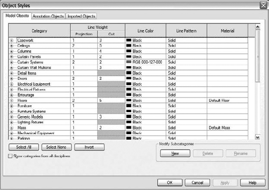
At the core of this organization is a fixed list of categories to which all elements ultimately belong. Although this may seem stringent, it works well and will help you maintain a consistent graphical representation across your projects. As you can see, every element belongs to a category, and that category is either a model or an annotation object. In addition, each element is either 2D or 3D in nature. Whenever the mouse hovers over an element, a tooltip appears and tells you what kind of element it is and what category it belongs to. In Figure 2.3, for example, the element on the left is part of an unshared project and omits the workset name. The element on the right is part of a workset named Shell and Core.
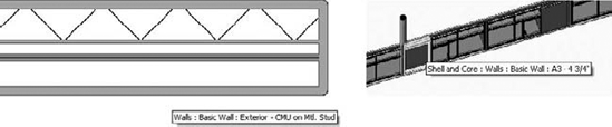
Figure 2.3. Using tooltips to define elements. The element on the left is part of an unshared project and omits the workset name; the element on the right is part of a workset named Shell and Core.
Let's look quickly at some of the main types of model categories.
Model Object categories—the first tab in the Object Styles dialog box—include all the real-world types of objects typically found in buildings. These object categories include elements such as walls, floors, roofs, and furniture, along with other categories that make sense in an architectural project.
The model categories Detail Items and Lines are used for elements that represent real-world objects used for 2D detailing such as detail components. In Revit, these objects are not modeled as 3D elements but added as 2D representations, as shown in Figure 2.4.
For elements that don't fit into any obvious category, there is the Generic Models category. This can be used for objects or parts of an overall assemblage that do not need to be scheduled. An example might be a canopy or reception desk.
Model elements appear by default in all views. In other words, if you draw a wall in plan, it will show up in any other applicable plans, elevations, sections, and 3D views. Remember, you're working on a single building model: all views in Revit are just different ways to look at the same model. Detail components, on the other hand, appear only in the view in which they were placed. If you want them to appear in other views as well, you will need to manually copy them to those other views.
As we'll discuss in more detail shortly, you can turn the visibility on and off for any category or element in any view. For example, imagine you've placed furniture in your model. The furniture is 3D geometry that will be visible by default in many views. Revit lets you turn off the visibility of the furniture in one floor plan while leaving it visible in another floor plan, or turn it off in plan view while having it visible in section view. The furniture isn't deleted; it's made visible or not depending on the information you need to convey in particular drawings.
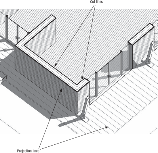
Because model elements appear in all other views, two types of graphic representation are defined for each category: projection and cut, as shown in the Object Styles dialog box in Figure 2.2. The projection graphics define the graphics for the element in elevation, 3D views, or any other view where the element isn't being cut by the view. The cut graphics define how the element will look when cut by sections and plan views. Typically, the section cut graphic is bolder than the projection lines, to emphasize that the element is being cut by the view plane.
Surface and cut patterns are always drawn with line weight 1 and can't be made thicker.
Figure 2.5 shows how the wall line weight differs between cut and projection. Also notice that patterns are applied to the walls and floors. Patterns can be added to give additional graphic representation to a material and are always drawn with a thin line weight.
Categories also make it easy to interchange elements. You can swap out elements of the same category with another type of element with only few clicks of the mouse. This deliberate limiting of choices to only those that make sense is what streamlines the process of swapping out types of elements. For example, you can swap a lighting fixture with another lighting fixture by selecting the element and then seeing what other lighting fixtures are available in the Type Selector. Choosing another type swaps out the type instantly.
Revit is smart about this interchange—it offers only different types of the same category of elements. For example, when you select a door, you don't get a list of plumbing fixtures or windows to swap it with; you get a list of other door families.
Annotation Object categories include all the annotations, symbols, and descriptive data added to a view to describe the building. These are listed in the second tab of the Object Styles dialog box. Most annotations are view-specific 2D elements and appear only in the view in which they were created. Examples include dimensions, tags, callouts, and text notes. Annotations such as sections, levels, and grids are 2D graphics, but they have 3D characteristics and appear in other views. These elements (levels, grids, sections) appear in many views thanks to BIM application functionality. Levels, grids, and section marks extend throughout the model and can be edited from multiple views. You don't need to draw these elements in each view as separate, disconnected graphics. With Revit, they're truly 3D annotations. (Levels, grids, and section marks never appear in 3D views.)
Within each category are many subcategories that let you control the graphics of an element with finer precision. This is what makes the concept of categories so much more powerful and natural to work with than layers. Go to the Manage tab, and in the Project Settings panel, choose Settings

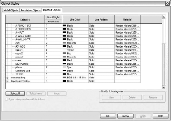
When a CAD file is imported into Revit, all of its layers are represented as subcategories in the Imported Objects tab of the Object Styles dialog box. Layers have a projection line weight, a color, and a pattern.
These can be overridden at any time to suit your requirements. Each import appears as a category in this dialog box, as shown in Figure 2.7. There is no need to remap CAD layers into Revit taxonomy. If you're used to the layer conventions set up in CAD, these will be mapped directly into the Object Styles dialog box with the same names, line weights, and colors. This is true unless you have consciously chosen Invert Colors during the CAD import.
Views are also considered parametric elements in Revit, and they have many properties to help you define how they should display information. A view doesn't change the model in any way—it only acts as a filter through which you view the model. This also applies to schedules and material take-offs. Although schedules are more abstract ways to think of a view, they're still parametric views into the model. Throughout the book, you'll be asked to make views, and we'll guide you through various methods for making views convey specific information about your design.
A parametric element is something that can change size, material, and graphic look but is still the same fundamental element. Most elements in Revit are designed with parameters that allow for the creation of variations of a base type. Take a typical Revit door family as an example. Each family can have many types built into it, where each type typically represents a variation in size, material, color, or other defining characteristic. Although each type can vary in shape and size, the base geometry for each type is derived from the same family.
Depending on how the family is built, parameters can affect either the type or the instance. A change of type parameters affects all instances of this type in the same family used in the model, whereas instance parameters affect only the selected instance. This is an important distinction: you can change instance properties only when you have an element selected, but you can change type properties without selecting anything.
Consider a round table. You might define its shape using a type parameter for the radius. If you placed 20 types of tables with a 2′ (60cm) radius and then changed that radius to 3′ (90cm), all 20 tables would update automatically. Now, if the radius parameter were an instance parameter, changing the radius would affect only the table you currently had selected. The same logic can be applied to other dimensional constraints and materiality. Revit forces you to consider what an element is and what it means to change the element's defining characteristics. For example, most content in Revit doesn't let you arbitrarily change dimensions of every instance, on the fly, whenever you want—this would make tracking the notion of object type difficult and would make mass-updating more tedious. Think of a type as something you'll eventually have to schedule, spec, and install as a real-world commodity.
Objects with parameters that can be edited are nothing new in the world of software. But what makes Revit unique is its ability to go beyond 3D objects with parameters and create relationships between objects. This ability, which includes the parametric relationships and the underlying change engine, is a core technological advantage built into Revit.
For example, walls can be attached to a roof, and if the roof changes to a new shape or size, all walls attached to the roof automatically adapt to the roof shape. Figure 2.8 shows that changing a roof pitch automatically adjusts other roofs and walls to keep them joined.
Another powerful manifestation of interrelationships occurs among walls, floors, roofs, components, and levels. They all have explicit relationships to levels, so that if a level changes elevation, all elements associated with that level update automatically. Not only do the bases of the walls attached to a level change, but the tops of the walls attached to this level also change. This is fundamentally different from other BIM software applications, where elements understand the relationship with the level on which they are placed but not the level to which they extend. Thus, if you change the height of a story (level), there will be a gap in the walls, columns, and other elements, and, due to the lack of relationship to the level above, they will not understand that they need to become taller. Similarly, when you change the size of a room by moving walls to new positions, you're changing not only the wall positions but also everything those walls affect in the model: the size of the room (area and volume), color-fill schemes applied to the rooms, and the shape and size of ceilings and floors. Doors, windows, and any other wall-hosted elements, such as light fixtures or sockets, will move with the wall when the wall changes position, and any dimensions to that wall will automatically update.
Revit tries to keep things joined and connected in order to eliminate huge amounts of tedious editing. You'll begin to take it for granted after a few days with Revit, but remember: when you drag a wall that has other walls attached to it, those other walls will automatically stretch with your move. Not only that, but rooms, dimensions, floors, components, and tags will also move. Of course, if you don't want all this intelligent behavior, Revit provides other options. For example, if you right-click a wall's end control, you can disallow it from joining other walls (see Figure 2.9). Or you can select Disjoin available in the Options bar once you've selected a wall, and then selected the Move command—doing so will detach the smart relationships between the wall and the rest of the model and treat the wall as an independent entity.

Figure 2.9. By right-clicking the end of a wall join, you can stop the wall from autojoining to other walls.
This parametric behavior extends to annotations and sheet management as well. Tags aren't simple graphics and text; they're interactive graphical parameters of the element being tagged. To edit a tag is to edit the element or tag family, and vice versa. This is also known as a bidirectional associactivity. You can edit the elements and the tag and maintain consistent data. A great example is easily demonstrated with a view and a sheet. When you place a section view onto a sheet, the section key automatically references the sheet number and detail number on the sheet. Change the sheet number, and the section tag updates instantly. This is what a real parametric engine is and what ensures total coordination of documentation. You've probably heard this phrase before, but it's worth repeating: the parametric engine guarantees that a "change anywhere is a change everywhere."
In a real-world project, the height of a level is bound to change in the design process, which in turn will change floor-to-ceiling heights and roof locations and will influence the building's overall height. Consider a scenario in which keeping the top of the roof below a maximum height was a design requirement. Not to worry—with Revit, changing the height of levels (floor-to-floor heights) at any point in the process updates all dimensions and elements associated with that level.
If changing the Roof level pushes the roof peak too high, this is easy to fix. By editing the roof and changing its slope parameter, you can lower the roof height, and all the walls attached to the roof update to reflect the change. There is no need to edit the walls independently in order to get the correct results.

With one edit, you change the roof height. The walls and roof update immediately.
With an edit to the roof property for slope, the roof updates, as do the walls attached to it.
During the design phase, you may want to apply some dimensional rules to the design and make sure they aren't altered. These rules might be a minimum hallway width for code compliance or a maximum office square footage for a particular user. Whatever the restriction, Revit dimensions make it possible to lock it down and create a constraint. This constraint is independent, but it's related to the dimension. If you delete the dimension, you can keep the constrained condition and know that the model will maintain those relationships. The point is that a dimension can be much more than a 2D annotation.
These design rules are used all the time, but not many software applications let you capture this design intent in the model. If you run a dimension string from level to level and lock the dimensions (as in Figure 2.10), you're locking the relationship between these elements in the whole model. By locking down elements, you make it harder for other elements in the model to break this important design intent and thus keep the model more intact and predictable.
Some practical examples of situations in which this is particularly useful are when you want your door jamb always positioned 4″ (10cm) from the wall corner; or you want three windows in a room to be always positioned at equal distances throughout the length of the exterior wall in a room. By defining and locking these relationships, you embed design intent into the model. And these relationships will react to any later change of the model; if the side wall moves, the door will move as well, to keep the locked 4″ rule; or the windows will reposition to maintain the rule of being equally spaced.
Revit families are used to create your model. There are three overarching methods for creating families in Revit:
The difference between them lies in their creation method, in what context they're created, and the types of parameters available. Let's review each of these types of families.
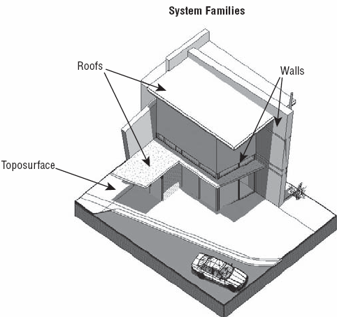
Model system families are made up of a limited set of categories: walls, roofs, floors, ceilings, stairs, railings, ramps, mullions, curtain panels, mechanical equipment, and toposurfaces (topography). See Figure 2.11 for examples of system families. These families are created in the context of each project, using some predefined types. These families also have various creation methods that are specific to the type of the family. For example, to make walls you can just start drawing (placing a wall), whereas to make a floor or roof, you enter a Sketch mode in which you define the outer shape with lines that then generate a 3D model of the floor. For stairs and railings, you enter a more detailed Sketch mode that has additional features not available for floors or roofs. When making toposurfaces, you use a Sketch mode that lets you edit 3D points specific to toposurfaces. As you can see, system families all have slightly different creation methods.
You can create new types of system families by duplicating existing types and editing their parameters. If you've been using Revit for any length of time, then this method of duplicating a type to create new types should be familiar territory for you.
You can't create new categories in Revit. These categories are predefined within Revit and limited to the list available. This is primarily to maintain control over the graphics from project to project.
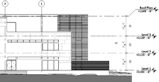
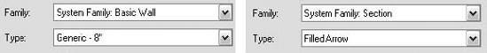
If you aren't sure whether an element is a system family, open the Element Properties and in the Instance Properties dialog box, check the family name. If the element is a system family, it is embedded in the family name. Figure 2.12 shows that Basic Wall and Section are both system families.
System families are also used for many annotation categories, such as sections, elevations, levels, grids, text, and dimensions—they aren't limited to model elements.
Another characteristic of system families is that you can't save them outside of your project to a shared library as a standalone component. Even so, it's still possible to reuse system families in other projects. To transfer system families between projects, go to the Manage tab, and from the Project Settings tab, choose Transfer Project Standards to display the Select Items to Copy dialog box (Figure 2.13). This dialog box gives you a feel for the number of different types of system families used in a Revit project.

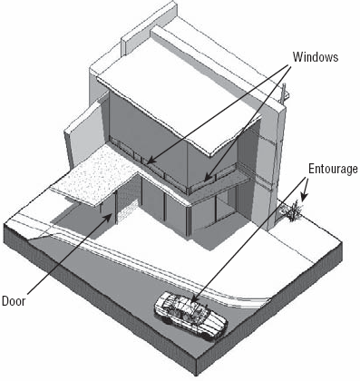
Component or "standard" families (see Figure 2.14) are created outside of the project environment using the Family Editor. They're stored in an external library (folders on your hard drive) and can be loaded into a project for use at any point. Every component family belongs to a specific Revit category so that when it's loaded into a project, it adopts the graphic rules defined for its category in the Object Styles dialog box. This guarantees graphic consistency throughout your project without your having to manage changes to new families constantly. This also guarantees that when you schedule a category, you get all elements that belong to that category.
For example, if you find a lighting fixture family on the Web and load it into your project, it will use the Lighting Fixtures object style in your project to represent the family. It will be scheduled with other lighting fixtures. You aren't forced to open the family and adjust line weights or colors or add metadata to the element, because this is all controlled at the project level. This illustrates the value of having a fixed number of categories to manage—you can rest assured that the project won't inflate with endless, oddly named layers that are difficult, if not impossible, to decode.
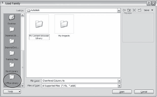
Component families have their own file format extension (.rfa) and can be stored outside the project environment for later use in other projects. Revit ships with a predefined folder structure to help manage the vast numbers of families available. Go to the Insert tab and from the Load from Library panel, choose Load Family to see how Revit organizes information (see Figure 2.15).
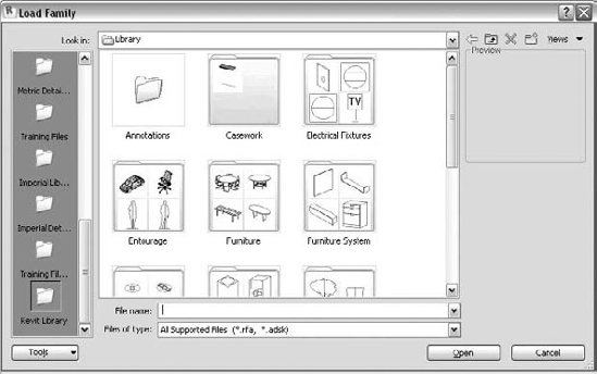
Organizing Your Office Library
In your office you're free to organize your families in whatever way makes the most sense. You can use a read-only, shared office library or per-project mini-libraries. Whatever route you go, be sure to add your library locations to your Revit file load dialog box.
To do this from the Load Family dialog box, browse to your office library and choose Tools

Another option is to use the Options dialog box located in the Applications menu. To open it, go to the Applications menu and click the Settings button located at the bottom right and then click the File Locations tab. Add a new path to the Libraries table.

Once you do this, a new link appears in the Open dialog box with the name of your library. Clicking the icon takes you directly to your office library.
To create variations of a component family, duplicate an existing one in the project and modify its properties. To make more radical geometrical changes to the family, you need to open it in the Family Editor and change the form there. The process of editing a family supports an iterative design workflow: by selecting any family, you have the option either to edit its properties or to open it in the Family Editor and make changes to it and then load it right back into your project. Families can be complex, but at least you won't need to learn any specialized scripting languages to create smart, parametric content. This goes for all forms of component families, from totally parametric windows and doors to one-off pieces of furniture or lighting fixtures.
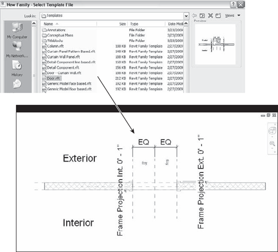
Revit provides a set of starting family templates you can use to make content from scratch. When you want to start creating a new library element (family), you first need to select the correct template. To open a template, go to the Application Menu and choose New
Doors, windows, balusters, casework, columns, curtain wall panels, entourage, furniture, massing elements, generic objects, and plantings are all examples of standard Revit family categories.
To move families between projects, you can copy and paste them or save your families to disk and then load them into another project.
In-place families are custom elements that are specific to a project and the conditions of the project. An in-place family accesses functionality available in the Family Editor in the context of a project environment. The model grays out and becomes unselectable when you make such families. A nonvertical, sweeping wall shape is a good example for when you would use an in-place family.
You can copy and paste in-place families from project to project, but you can't save them as RFA (Revit projects have the extension .rvt, Revit families .rfa) as you can with standard families. Figure 2.17 shows an in-place family added to a façade in order to create some nonorthogonal mullions.
There are no layers in Revit. Revit uses object categories and subcategories (not layers) to define the graphics for each element class as well as to control visibility (which is the purpose of layers in other software). The Object Styles dialog box (accessed from the Manage tab, in the Project Settings panel, under Settings) establishes the default graphics for every category; however, in any view, you can override these graphics using the Visibility/Graphics Overrides dialog box (on the View tab, in the Graphics panel click Visibility/Graphics) shown in Figure 2.18. The two dialog boxes look very similar—the difference is that Object Styles shows the defaults preset for a project, whereas Visibility/Graphic Overrides is the place to review and make changes to those default settings on a per-view basis. The same familiar categories and subcategories displayed in the Object Styles dialog box are displayed in this dialog box as well.
The same level of visual control for line weight, color, and pattern is provided here but in a slightly different interface. In addition to line overrides, you can override cut and surface patterns and choose to show a category as halftone, transparent, or at a different level of detail. Figure 2.19 shows the Roof category overridden to be transparent in the 3D view, allowing you to see through the roof and look into the rooms beneath while keeping the shape of the roof visible. Changes made using this dialog box are applied only to your current view.
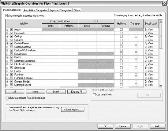
The same categories are used to control the visibility of elements in a view. You can turn off entire categories, subcategories, or individual elements in any view.
In this section we look at how Revit appears out of the box when you first open it and familiarize you with how the interface is organized. One of the things you'll notice from the beginning is that Revit is tailored for the architectural design community. The tools, commands, and objects that you use in Revit are based on tasks and requirements taken directly from the practice of architecture.
If you have used earlier versions of Revit, you will notice that the user interface (UI) of Revit 2010 is dramatically different from its previous version. Revit, along with an entire family of Autodesk products, has moved to the "ribbon" paradigm, allowing both easier use of Revit itself and easier adoption of multiple Autodesk products that have a similar user interface. To help current users, we will be calling out the location of certain commands that we believe are not obvious in their placement in the new ribbonized UI.
There are several ways to start Revit: by double-clicking the Revit icon that was automatically created on your desktop during installation, by going to C:Program FilesRevit Architecture 2010Program and double-clicking Revit.exe, or by double-clicking on any file with the .rvt extension.
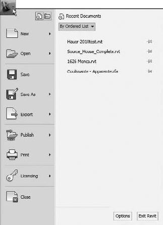
When you start Revit, you should see the screen shown in Figure 2.20. (However, when you first start the new product, you might not see any project thumbnails, as they only show once you have worked on projects.)
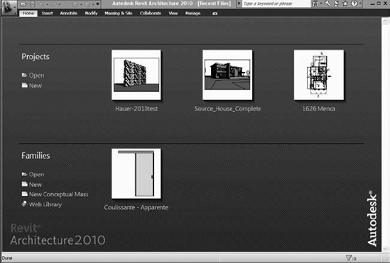
The startup screen is also redesigned to this release of Revit 2010, offering the following possibilities:
Projects:
Open a recent project (select one of the preview thumbnails)
Open any existing project (click the Open button)
Create a new project (click the New button)
Families:
Open a recently created or modified family (select Open under Families)
Create a new family (click the New button)
Create a new Conceptual Mass (click New Conceptual Mass)—this option is new to Revit 2010
Link to the Revit library on the Web (click the Web Library button)
The Revit interface (Figure 2.21), new to Revit 2010, is conceptualized around the ribbon paradigm: a simple idea of grouping workflow-based functions and tools in separate ribbons and exposing only task-relevant options to the user, saving workspace and making the UI less overwhelming.
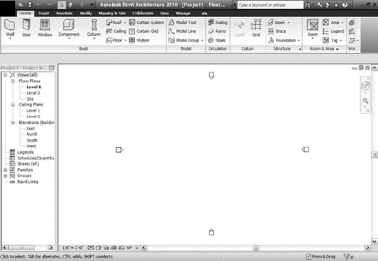
The application frame has nine main parts, which we'll now discuss in the following sections.
Let's take a look at each of these components.
- The Application Menu
The big purple R letter on top left of your screen (Figure 2.22) is what we will be referring to as the application button. Pressing this button opens the Application Menu, which offers options for creating new projects or families; opening existing projects or families; saving projects or families; exporting the project in various CAD, schedule, and other formats; and publishing and printing. The Application Menu also displays the licensing information. All of this will be more or less extensively covered in the remainder of this book. In this chapter we will discuss in detail only those features that will not be covered later in the book.
At the bottom right of the Application Menu, you will also find the Options button, which hosts options for various project settings. (Figure 2.23). Located in various tabs are different settings that you can change to accommodate your decisions about file location selection, rendering path, settings relevant to the SteeringWheels, the view cube, spelling, and macros, as well as some general settings such as setting the username, saving reminder intervals, and setting the application frame display theme.
- The Quick Access toolbar
The quick access toolbar (Figure 2.24) is located at the top left of the application frame and is new in Revit 2010. It enables quick access to the most-used commands such as Open, Save, Undo-Redo, and Switch to 3D View, as well as options for forcing synchronization of local files to the central file when in a worksharing environment.
- InfoCenter
The InfoCenter is also new in the Revit 2010 interface. The Info Center toolbar is located in the same zone as the Quick Access toolbar and the title bar, on the far top right of the applications frame (Figure 2.25).
Links to a variety of information sources are located in the Info Center toolbar. From left to right, the first feature is a search field where you can type a term (function, feature) that you are searching for. The search function (binoculars icon) looks into the Revit help file as well as various resources on the Web, thanks to the Autodesk Online services. The Subscription Center (key icon) links to various benefits and services available only to subscription users are accessible. The Communication Center (satellite dish icon) links to product updates and various product announcements. The favorites button (star icon) links to topics you identify as your favorites throughout your work with Revit. To add topics to your favorites, click the icon that appears next to the link on the Info Center Search results panel, Subscription Center panel or Communication Center panel. The last button is the help button, which links to the Revit Architecture help directory.
- The status bar
The status bar is located at the very bottom of the application window, on the far left. Here you will see helpful text that describes what you have selected and what you should do when in a command. Whenever you aren't sure what the next step should be, look at the status bar. See Figure 2.26 for three examples of the status bar in action.
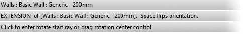
Figure 2.26. The status bar when (top) selecting or hovering over a wall, (center) drawing a wall, and (bottom) using the Rotate command.
To the right of the status bar, in the same zone, you will find two more useful tools: the Count Selection tool and the Press & Drag option.
- Count Selection tool
The Count Selection tool is located on the far right in the same zone as the status bar. The Count Selection tool gives information about the number of Revit elements currently selected.

Clicking anywhere over the Count Selection tool invokes the Selection Filter dialog box, where you can narrow a selection if needed. You can also access the Count Selection tool by clicking the Filter button located in the Ribbon under the Multi-Select tab (a tab that is activated automatically upon multiple selections of elements of different categories) (Figure 2.27).
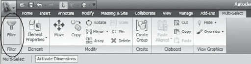
Figure 2.27. The Filter command appears in the Ribbon upon selection of multiple elements of different categories.
Next to the Count Selection tool, you will find a check box for Press & Drag. What that means is that when this option is checked, you can drag an element without having to select it.
- The Ribbon
The newly introduced Ribbon stores all Revit commands and tools necessary to create and edit your project information. The Ribbon displays automatically by opening a file or creating a new project in Revit.
The Ribbon can be minimized for maximum use of the drawing area and has three different display settings (Figure 2.28) accessible by selecting the drop-down arrow located to the far right of the tabs part of the Ribbon:
Full Ribbon (displays the Ribbon in all its glory)
Panel tiles (semi-minimized state of the Ribbon that shows only the Panel and Label tabs)
Tabs

Figure 2.28. Different display settings of the Ribbon—from top down: Full Ribbon; Panel tiles, Tabs.
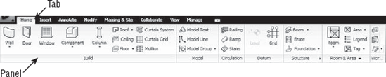
The Ribbon is organized in tabs that are themselves organized in panels. Each panel holds logically connected tools for executing a certain type of activity.
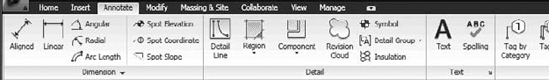
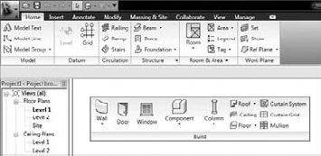
Figure 2.29 shows the Home tab. It has seven panels containing the creation tools for almost all modeling elements in Revit.
Let us just spend few minutes explaining the logic of the ribbon.
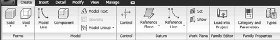
There are eight tabs in Revit: Home, Insert, Annotate, Modify, Massing & Site, Collaborate, View, and Manage. The Family Editor has one additional tab called the Create tab.
- Home
The Home tab contains all tools necessary to build 3D elements in Revit or to create the building model.

- Create
Available only in the Family Editor, the Create tab gives you a set of tools necessary to create a family.
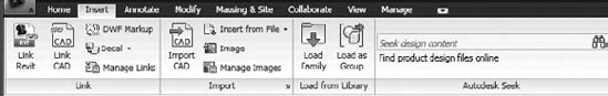
- Insert
Raster images and CAD files are often inserted in a Revit file as a help/support or as additional information for your project. This tab contains tools for importing and managing these files.
- Annotate
To describe or enhance the display of the building model, we often use 2D elements. This tab contains all the tools for adding 2D elements in the project.
- Modify
Once they are created, all elements need to be changed or edited. This tab contains all editing tools. You first need to select the element to be edited and then the tool to edit it.

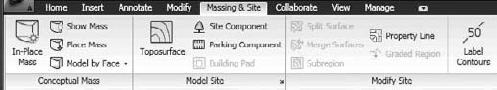
- Massing & Site
Creating and modifying conceptual mass studies is a way to start a project in Revit. You will find all conceptual massing tools under this tab.
- Collaborate
It is rare that only one person works on a project. Tools that aid in collaborating on the same project and managing that collaboration are located under this tab.

- View
The Revit project is described through many views that are different queries of the Revit database. Tools for creating and managing those views are located under this tab.

- Manage
Design options as well as many project-related settings and options are all located here.

If you notice additional tabs on your Revit ribbon, you (or someone you work with) probably have installed some separately purchased add-ins.
We have now covered almost all you need to know about the ribbon interface of Revit. To finish up, we just want to turn your attention to a few tools that are somewhat invisible or are hidden in the expanded panels and dialog launchers.
- Expanded panels
These are accessible upon selection of the drop-down arrow at the bottom of a panel. When you expand the panel, additional tools and controls will be displayed. To keep a panel expanded, click the push-pin icon in the bottom-left corner of the expanded panel.

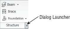
- Dialog launchers
These are types of panels that when expanded, allow you to access additional settings or complete a task. A dialog-launcher arrow on the bottom of a panel opens a dialog. For example, the Structure panel has a dialog launcher. Clicking the arrow opens the Structural Settings dialog box.

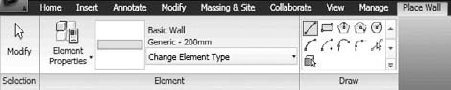
As you work on a project, the contextual tabs automatically change to reflect what tool has been selected. If, for example, you select the Wall tool from the Home tab, the Place Wall contextual tab (Figure 2.30) will automatically appear, offering options for placement of new walls of that type, different shapes of the wall segment (straight, curved), as well as access to the Element properties of the Wall tool. This contextual menu will be automatically closed the moment you quit (escape) the Wall command. That is basically the principle that is applied to all Revit tools.
The principle of contextual tabs is also applied when modifying elements. If, for example, you select one or multiple walls, a new contextual tab called Modify Walls (Figure 2.31) will be displayed on the Ribbon, offering tools that are logically dependent on your selection. The content of these contextual menus thus depends on what has been selected. As in the previous case, the moment the selection is undone, the contextual tab closes.
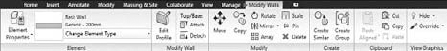
Note that in both of the mentioned cases, the Element panel is present. This panel is very important as it contains the Type Selector available under the Change Element Type button) and the Element Properties button.
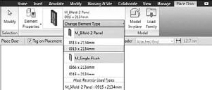
The type selector allows selection of a family type. For example, for the Wall object (Wall family) you will find in the Type Selector a list of all available wall types in the project. For the Door tool, all door types available in the project will be listed under the type selector.
A notable improvement of the type selector in this release of Revit is that it gives you a little visual preview of the types in the list and then lists all sizes of the type (Figure 2.32).
Also new and improved in this release is access to Type properties. You can directly access the Type properties of an element without having to go through the Instance Properties dialog box. To do that, just expand the Element Properties button and pick Type Properties (Figure 2.33). Click the small arrow on the right-hand side of the Element Properties button to display a menu where you can choose to open Instance or Type properties.

Figure 2.33. Click the small arrow on the right-hand side of the Element Properties button to expand the menu where you can choose to open Instance or Type properties.
Some elements in Revit are created starting from a sketch. Examples include floors, ceilings, roofs, and stairs. A sketch is a collection of 2D lines that will define the base shape for a 3D object. The sketch tools vary depending on the object you will be creating or modifying (see Figure 2.34). A roof sketch becomes a roof by definition of the sketch shape as well as slopes of the roof; the stair sketch on the other side consists of the lines that defined the run, the landing, and so on. As a visual aid, the color of the background of the buttons in Sketch mode is changeable: It turns green and the button is automatically closed the moment you accept or cancel the line work.

One very useful addition to this new edition of Revit is the tooltip that appear when you hover over any of the tools in the panels. The tooltips appear in two levels: the first is just a textual description and the second textual description supported by visual graphical image as help for the description. To display just the first tooltip leave the mouse over any of the tools for one second. If you want to see the visual tooltip, leave it a bit longer, approximately two seconds, over the tool in question.

If you have already used previous versions of Revit and cannot find some of the commands displayed in the old UI, go to the Where Is My Command? tool located in the list that appears when you click the Help button in the Info Center.

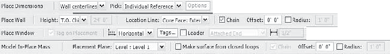
- The Options bar
The Options bar is located right below the Ribbon. Its content varies depending on the selected element that needs to be created or edited. Its purpose is to offer options relevant to that tool. In Figure 2.35, you can see four examples of how the Options bar looks when different elements or tools are selected.
The View window is where all the action takes place. Here you add elements, modify them, and construct and document your model. The view area can tile multiple views, allowing you to visualize the model from multiple vantage points concurrently. We don't recommend tiling the views if you have more than six or so open views because the views get too small and it becomes difficult to work effectively.
To arrange views, go to the View tab and in the Windows panel try the Cascade or Tile option. You'll also see the option Close Hidden Windows.
The Close Hidden Windows feature is a great way to clear your workspace when you have an unmanageable number of views open. Selecting Close Hidden Windows closes all but one view for each project or family you have open. This is advisable to improve performance when you're working on a complex project.
Views in Revit show the same model from different vantage points. Thus, when selecting an element in one view, you'll see that the element becomes selected in all views. You can try this by opening two views (click on the view names in the Project Browser) and tile the views (View tab, Windows panel, Tile). This simple interaction shows that when you make a change to an element in one view the change is instantly reflected in other views. This is a great way to conceptually understand the reality of a true BIM modeler.
Each view has properties, and some of these properties are exposed at the bottom of the View window in what is called the View Control bar (Figure 2.36).
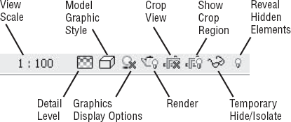
These controls allow you to change the display of the view quickly without having to dig into a Properties dialog box. The available controls include View Scale, Detail Level, Model Graphic Style, Graphics Display Options, Rendering, Crop View, Show Crop Region, Temporary Hide/Isolate, and Reveal Hidden Elements.
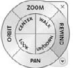
Whenever you open a 2D view in a project, you will see a floating palette located on the far right of the View window. (Figure 2.37). That palette is called Navigation bar.
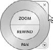
In a 2D view, in the Navigation bar you will see two tools: the Full Navigation Wheel and the Zoom tool. Upon selection of the Full Navigation Wheel, the SteeringWheel appears on the screen; it follows (travels with) the mouse to provide quick access to the navigation tools in the context of the work you do. When placed in 2D view, the wheel looks like Figure 2.38 and offers three functionalities: zoom, pan, and rewind.
The SteeringWheel in 3D view looks slightly different, as shown in Figure 2.39, which displays the Full Navigation Wheel. You can choose different versions of the Navigation Wheel by expanding the list that appears when you select the arrow below the wheel icon on the floating palette. You can set the default appearance of the SteeringWheels from the Applications menu at the same time as you select the Options button and the SteeringWheels tab.
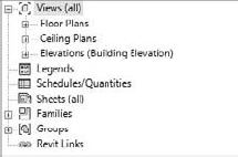
The Project Browser allows you to navigate to all your views, create new views, access element properties, and place elements. All the views (including schedules and sheets), families, and linked files of your project are stored here, making it possible to organize and navigate through a project from one location.
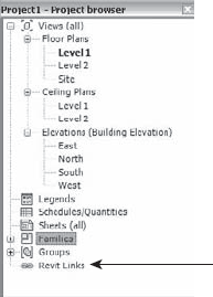
Figure 2.40 shows a collapsed view of a typical Project Browser.
The Project Browser is the backbone of your project. We'll devote much of the rest of this chapter to exploring its use.
Revit 2010's new ribbonized UI in can be changed and customized, although not to the extent permitted by other software applications. This feature is new in this release of Revit. A full customization and change of the UI are still not possible, but you can make certain changes to it, such as changing the panel order or moving a panel off the Ribbon to your desktop.
This version of Revit also supports double screens, a response to a longstanding wish of the current users.
You can make the following changes to the UI:
- Change order of panels
You can change the order of the panels within the contextual tabs and also undock a panel from the Ribbon so to have it floating in the workspace and visible at all times. Figure 2.41 shows the Build panel undocked from the Home tab. With the double-screen monitor support you can position the floating menu on the second screen. To modify the order of the panels in the contextual tabs, click the title of the panel, hold the click, and move to another location.
- Return panels to the Ribbon
Once you've undocked it, you can place a floating toolbar back on the Ribbon by hovering the mouse over the undocked, floating bar and clicking the arrow that will appear on the top right of the dialog box that opens that activates the command Return Panels to Ribbon (Figure 2.42).

All changes that you are making to the UI are memorized and stored so that they are there each time you open Revit from zero.
- Restore original settings
If, however, you played around with customization of the UI a bit too much and wish to revert to the original state of the Ribbon at installation, you can do that by deleting the file in which these changes have been recorded. The name of that file is
UIState.dat. It is usually located as follows:- Undock the Project Browser
As did previous releases of Revit, Revit 2010 lets you undock the Project Browser and make it float over the drawing area, as shown in the two images below.
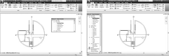
Users with double screens can now place the Project Browser in the second screen. Revit2010 will remember all changes to the interface and will display them in the next launch of the application.
- Use keyboard shortcuts
Keyboard shortcuts are surely the fastest way to work with Revit. The shortcuts assigned to the existing Revit commands are unfortunately not as obvious in the new UI as they were previously. To visualize the assigned keyboard shortcuts, you have to hover over a tool, wait for the tooltip to appear, and then look for the assigned shortcut, which is described with two capital letters (Figure 2.43). To change the automatically assigned shortcuts, you should, as in previous releases of Revit, edit the
KeyboardShortcuts.txtfile located inProgram FilesAutodesk Revit Architecture 2010.You will have to restart Revit after changing the keyboard shortcuts in the
.txtfile.- Display keytips
Revit 2010 introduced a new concept called keytips. To display the keytips of the Quick Access toolbar or the main toolbars, press the Alt key (Figure 2.44).


If you want to display the keytips for all the tools within a contextual tab, press the Alt key followed by the letter that describes that tab (H for Home; N for Manage, and so on).
You can navigate through a Revit project in a number of ways. As you start working in real projects, the number of views and drawings that accumulate will become quite large. Being able to find your views and move between them is critical to an effective workflow. We'll look at the various methods of moving between views, explore best practices, and show you how to customize the display of these views using the Project Browser.
A view is a graphical way to look at the database of information you're creating. Plan, section, schedule table, 3D view—all of these are just different ways to look at and query the same underlying database that describes your building. Revit organizes all the views of your project in the Project Browser. Your plans, sections, elevations, 3D views, and schedules are all stored there. Double-clicking a view name from the Project Browser opens the view in the View window. When you close a window using the controls at the top right on each window, you don't need to save the view first—it's always accessible from the Project Browser.
The default organization of the Project Browser is based on the view type and presented as nodes in a tree structure. The default organization when all the nodes are collapsed looks like this:

The Project Browser allows you to define an organization of views per your needs. We will go into how to do this in more detail later in this chapter.
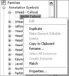
With a node expanded, right-click a view name to access additional options for any view (see Figure 2.45). From the context menu, you can open views, rename them, duplicate them, and apply view templates.

Note that you can multiselect views in the Project Browser. When more than one view is selected, you can right-click to bring up the context menu (Figure 2.46).

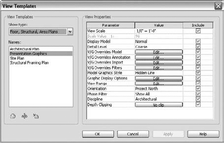
For example, from the context menu you can create and apply view templates. This is a way to give views a consistent scale and graphical appearance, among other things. Let's look at how to use the Project Browser to drive properties from one view to another:
Open
Foundation_ch02.rvtfrom the Chapter 2 folder on this book's companion website (www.sybex.com/go/masteringrevit2010).Open Plan: Level 1.
Right-click the view and duplicate it.
Rename the view Level 1 - Presentation.
Type
VGto open the Visibility/Graphic Overrides dialog box.Select the Annotations tab, and turn off visibility of all annotations by clearing the Show Annotation Categories in This View check box at the top of the table.
Go back to the view in the Project Browser, and right-click the view. Select Create View Template from View (Figure 2.47).
Name the template Presentation Graphics.
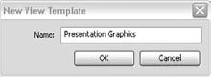
Right-click the view name, and choose Apply View Template.
Choose Presentation Graphics from the list in the dialog box shown in Figure 2.48.
The plan now has the same properties as the Level 1 - Presentation view.

Working in a data-driven model, you can use View properties to customize how the browser sorts and organizes all your views. This is a great way to manage the large number of views that will fill your project. Clicking the top of the Project Browser window (not a view) makes it the active selection.
Use these steps to customize the Project Browser's organization:
With the
Foundation_ch02.rvtfile still open, select the Views icon in the Project Browser.The Type Selector lists Browser - Views (all).

Right-click and open the Properties dialog box.
Change the Type to Not on Sheets. You'll see the browser reorganize the list and remove views that are on sheets.
Now let's make a custom sort based on your name (or initials) by applying a new Drawn By parameter to all views and then using that parameter to sort the views in the browser:
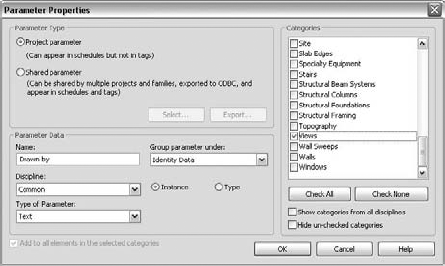
From the Manage tab, under the Project Settings panel, select Project Parameters.
In the resulting dialog box, click the Add button to add a new parameter.
Choose the Views category on the right side of the Parameter Properties dialog box (see Figure 2.49) under Categories, and under the Parameter Data give the parameter the name Drawn by. In the Group Parameter under drop-down list, select Identity Data. Click OK. Validate your choice in the Parameter Value dialog box that opens next.
Go back to the Project Browser.
Right-click View All and select Properties. Under Type make sure Not on Sheets is selected, and choose Duplicate. Name the duplicate My Drawings.
Click the Folders button.
Change the Group by setting to Drawn by (Figure 2.50), and click OK.
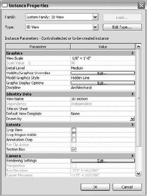
Go to any view, and open its View properties.
The project parameter you added appears in the Identity Data group as Drawn by. Type your initials or name in the Value field, and click OK (Figure 2.51).

Sheets are special views that are your final documents—the actual sheets you'll be sharing with your contractor, client, or team members. This is where the collections of drawings that eventually get printed are stored. Under each sheet node you see all the views placed on that sheet. As with any other view in Revit, if you double-click the node, the sheet view opens in the View window.
To make a new sheet, go to the View tab, and from the Sheet Composition panel, select New Sheet. This lets you select a title block family to use.
Activating a View on a Sheet
Double-clicking a view on a sheet is the same as opening the view from the view's node. Double-clicking the sheet name opens the sheet. From the sheet, you can directly edit views on the sheet by right-clicking a view and choosing the Activate View option. This opens the view and grays out the sheet context, allowing you to edit elements in the view from the context of your sheet. To get back to the sheet, use the context menu again, and choose Deactivate View.

In the Project Browser you can see all the loaded families in your project. Loaded means available from within the project and usually also indicates something loaded along with the template. You can load additional families while working on the project, and each one you load will be available in this location in the Project Browser. From here, you can drag and drop families into the drawing area, query their properties, create new types of elements, and even select all instances of a given element in the model in order to locate them or perform wholesale changes.
The context menu for families (Figure 2.52) is different from that for views. Note that if you choose the option to edit a family, you'll open the family in the Family Editor, where you can make changes to the component and then reload it. If you expand the family node to expose all the family types, you can right-click a type and choose Select All Instances from the context menu. All instances in the model become selected, even if you can't see them in your current view. This lets you make edits to the family type in one interaction. For example, you can select all instances of a door family and swap it with a different door type.
Revit links (other Revit files that are linked into your project) are also listed in the Project Browser. Using the context menu, you can reload, unload, open, copy, and visually identify the links in your project.
Groups are associated collections of elements that can be repeatedly placed throughout the model. Groups are used for repeating entities (furniture composed of a table and six chairs, a typical bathroom layout with fixtures and partitions, or a typical hotel room, for example). When one group changes, all other instances of that group also change. Whenever a group is created, it appears in the Project Browser. You can place a group from the Project Browser by dragging it into the View window.
As we've mentioned, all views have properties that determine characteristics such as scale, graphics display, and view depth. Each view type has special characteristics and options, and it is important to understand them when you're using Revit. We'll look at the different view types and explain their defining features and how to use them. To access View properties, use any of these access methods:
Right-click anywhere in the View window, and select View Properties from the context menu
Right-click a view in the Project Browser, and select Properties from the context menu
From the Ribbon, select the View tab, and on the Graphics panel, click View Properties
Use the keyboard shortcut
VPto access the View Properties dialog box directly
Plan views are used to show horizontal slices through your building. Each plan view in Revit is associated with a level. A level is a horizontal datum that establishes major floor-to-floor heights and other critical horizontal working planes. Figure 2.53 shows that each level generates a plan view. By default, the plan is cut 4″ (1–1.2 m) above the actual level height, but this value can be customized to suit your requirements.

Each plan view can show a range of the model based on levels. This aspect of Revit is often misunderstood, so let's take a moment to demystify it.
When creating your documents, you want them to represent your elements correctly. Using the Object Styles dialog box and graphic overrides, you can get your drawings to look exactly the way you want them to look. However, you also may often wish to add a level of abstraction to the drawing that involves elements that aren't typically visible in the view. For example, you may want to see rooflines overhead or see down into an atrium a few levels below. This is where the View Range options come in handy.
The options available in the View Range dialog box allow you to define how elements in a view are represented based on their location in space. View Range values are stored as a property of the view and are included when you save a view as a view template.
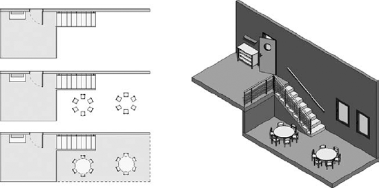
Figure 2.54 shows three ways to represent the same space and elements by using different View Range settings. Think of the mess you might end up with if you had to do this using a layering system!
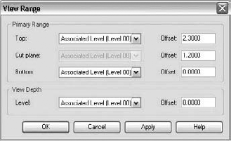
To access the View Range dialog box, go to the View properties of a plan or ceiling plan view, and choose to edit the View Range parameter. Doing so opens the dialog box shown in Figure 2.55.

The View Range dialog box is divided into two parameter groups: Primary Range and View Depth. Let's start by looking at the primary range. It is defined by horizontal planes. Three of them (Top, Cut Plane, and Bottom) define the primary range, and a fourth plane defines the view depth.
Top Defines the top limit of the view range.
Cut Plane Defines the height of the Cut plane.
Bottom Defines the bottom limit of the view range.
Note that the positioning of these is always relative to a level. The Cut plane always references the level of the view in which you're working, and the other two can reference any level of the project.
Revit doesn't offer a graphical representation of the View Range settings that we are describing here, but it shouldn't be difficult to imagine their position in space. Look at Figure 2.56, a representation of different positions of the horizontal planes of a view range. In a floor plan view, the direction of the view is from top to bottom—so you're looking from above.

In a ceiling plan, the view direction is exactly the opposite—you're looking from below, upward (see Figure 2.57).
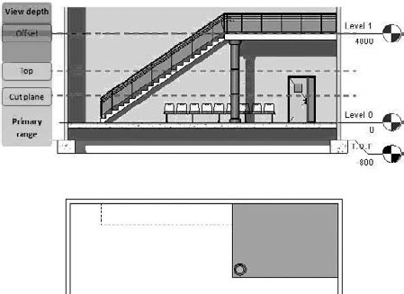
Figure 2.57. Position of the view range for ceiling plans (top) and the associated plan view (bottom)
Depending on the positioning of the elements with respect to the view range and its parameters, the graphical display of those elements can vary. The Cut Plane parameter can radically change the appearance of your view, because every element in Revit has a physical location in space. Elements look different depending on whether they're cut by the Cut plane, above the Cut plane, or below the Cut plane.
Does a Category Allow Cutting?
How do you determine whether a category allows its elements to be cut? A fast way is to look it up in the Revit Help file under Revit Architecture 2010 User's Guide
There is another method as well, which may be more practical. In the Visibility Graphic Overrides dialog box or the Object Styles dialog box is a Cut column. For certain categories, this column is grayed out; this is the indicator that the category doesn't allow cutting.

Not all Revit elements behave the same with respect to the Cut plane. Some Revit categories don't support the notion of being cut (furniture families, for example); even if a Cut plane intersects them, they're always represented as if viewed from above (not cut). Figure 2.58 shows that a stool looks the same, no matter where the Cut plane happens to intersect it.

Now that you have a general understanding of how the Cut plane affects elements in a view, let's dig deeper into the primary range concept. As we mentioned, this range consists of two other planes, Top and Bottom, which are placed respectively above and below the Cut plane. The exact positioning of these two planes is defined by an offset value relative to a level:

The Top plane can reference any level above the current one. The Bottom plane can reference any level below the current one. Let's look at some examples:
If an element is cut by a Cut plane, it's visible in the view, as shown in Figure 2.59.
If an element is below the Cut plane but within the primary range (partially or completely), it's visible in the plan view as if it were looked at from above, as shown in Figure 2.60.
If an element is above the Cut plane and completely within the view range, it doesn't appear unless it's the category Windows, Casework, or Generic Model. It appears as if seen from above, as shown in Figure 2.61. Because the wall shelf is the category Casework, and it's within the primary range, it appears in plan view.


The View Depth is defined by a horizontal plane that is below the view range. The positioning of this plane uses the same principle as the planes in the view range—it's defined by an offset referencing a level:

This plane is often confused with the Bottom plane of the view range. Remember this: the View Depth cannot be above the Bottom plane. View Depth allows you to see elements below. The default is set to show nothing, because it's associated with the active level and has no offset.
The View Depth is easy to misunderstand: it sounds confusing to have a Bottom plane in the view range and also have this additional View Depth parameter. The idea here is that you need the ability to control the display of elements that are below the primary range but within the View Depth. Consider a wall with a footing. The wall is placed on Level 0 and goes up to Level 1. In the plan view of Level 0, using the default settings, you don't see the footing (see Figure 2.62).
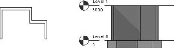
Figure 2.63 shows the effect of the default view range when it's set to be coincident with the view's associated level, in this case Level 0. Lowering the depth of the view makes the footings visible in plan view. They're represented with the Beyond line style, which in this example uses a dashed line. To make the footing visible in the Level 0 plan view, you need to do one of the following:
Lower the height of the Bottom plane in the primary range, and define the View Depth to be coincident with it
Define the View Depth so that it's below the base of the footing
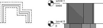
Figure 2.63. Modifying the view range for the footing of a wall makes the footing visible in plan view.
In the second case, you don't need to change anything about the Bottom plane. In addition, you can obtain a different graphic presentation for the footings (without modifying the Visibility/Graphic Overrides settings). The View Depth allows elements that are below the current level to appear in a unique line style named Beyond. To control that line style, go to the Manage tab, and in the Project Settings panel and from the Settings choose Line Styles.
To display the elements in view in a specific way, you'll need to play with various parameter settings in the View Range dialog box. See Figure 2.64, in which the View Range settings work in the vertical dimension (view shown in elevation) and affect plan views (corresponding plan view shown below).

Figure 2.64. The View Range settings work in the vertical dimension (view shown in elevation) and affect plan views (corresponding plan view shown below).
To fully understand this example, it's essential to understand the categories of the elements participating in this view (from left to right in Figure 2.65):
- The door
The door belongs to the Door category. It's cut by the Cut plane. Its graphic presentation is controlled by the Cut style in the Object Styles or Visibility/Graphic Overrides dialog box. The arc representing the door swing is a 2D symbolic element and thus can't be cut by the Cut plane.
- The low cabinet
The low cabinet belongs to the Furniture category. Because it's placed below the Cut plane but still within the View Depth, it's visible in plan view. It uses the Beyond line style.
- The wall-mounted shelf
The wall shelf belongs to the Furniture System category. The shelf is above the Cut plane but within the view range. Its category allows it to be represented in plan view. Its graphics are controlled by the Projection column in the Visibility/Graphic Overrides or Object Styles dialog box.
- The desk-chair-drawer family
The desk with a chair and a drawer (all one family) belongs to the Furniture category. This family is cut by the Cut plane. Its category doesn't allow for it to be cut, and its graphics are thus controlled by the Projection style in the Visibility/Graphic Overrides or Object Styles dialog box.
- The window
The window belongs to the Window category. It's cut by the Cut plane. Its graphics are controlled by the Cut style in the Visibility/Graphic Overrides or Object Styles dialog box.
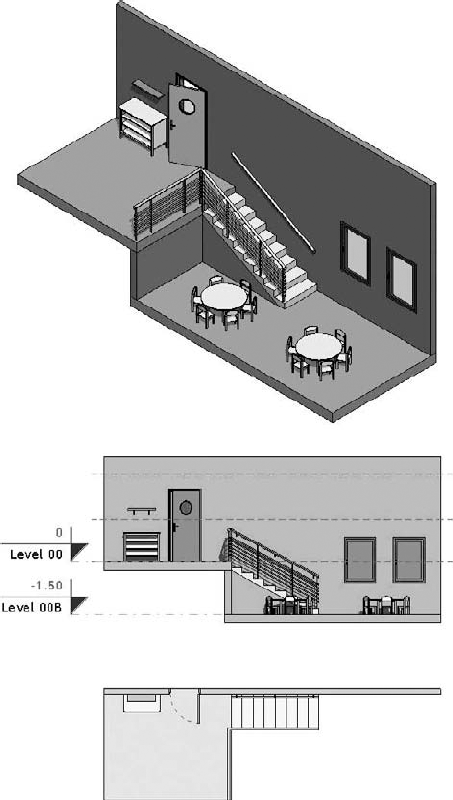
Figure 2.65 is a model of a simple space that we'll use to understand view range. We have chosen a split-level example to show you the power of various settings and resulting displays of the View Range parameters. The goal is to create a plan view of Level 0 that displays information from a lower level. We want to display elements placed on Level 00B with a dashed line style.
Follow these steps:
Open the file
ViewRange.rvtfrom the Chapter 2 folder on the book's companion web page.In the elevation view (South Elevation) you can see the various planes shown in Figure 2.65. The View Depth is defined to be the same as the Bottom plane.
From the Level 00 plan view, go to View Properties, and open the View Range dialog box (Figure 2.66).
The default Revit settings are currently being used. Notice in Figure 2.67 that Level 00B and all elements placed on it are not visible in this view. The low cabinet is visible in the view, because it's placed on Level 00 and is within the primary range. The wall shelf above the low cabinet belongs to the category Furniture Systems and is also visible, even though it's above the Cut plane.
Change the Bottom and View Depth settings to Level Below (Level 00B), and click Apply.
Having defined the Bottom plane as well as the View Depth to be coincident to Level 00B, you've managed to show the elements of Level 00B in the Level 00 plan view. The problem is that it will be difficult to assign a dashed-line style to the elements placed on Level 00B, as you initially desired. You could manually override all the elements, but you'd have to do so in each view manually—let's look at a smarter way to do this.
The furniture in this level is below the Cut plane. To change the graphic display of it, you could use the Projection column in the Visibility/Graphic Overrides or Object Styles dialog box, but in that case, the presentation of the furniture on Level 00 would be affected—and that isn't what you want to happen.
Set the Bottom plane to Level 00, and give the View Depth a −4′ (−1.2m) offset below Level 00. Click Apply. In the elevation in Figure 2.68, you can see the various planes in dashed-line style. As you'll notice, the chairs are now visible but not the table—this is because the chairs are partially within the view but the tables aren't (they're below the View Depth). The chairs belong to the Furniture category, which doesn't support a cut representation; they're shown as if they were seen from above, even though they're intersected by the View Depth.
Set View Depth to Level Below (Level 00B) and give it a −4′ (−1m) offset. In the elevation in Figure 2.69, you can see the various planes in dashed-line style.
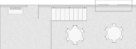
By changing the View Depth, you have achieved your goal of seeing the furniture from below in a dashed-line style; however, the windows don't look quite right. To fix that, Revit provides a tool that allows you to selectively alter the view range for certain parts of the view using a plan region. This tool lets you draw a rectangle and then define the view range for that rectangle as a way to override the View Range settings of the view.
In the View tab, under the Create panel, click Plan Views, select the Plan Region tool, and sketch a rectangle around the windows, as shown in Figure 2.70. This region will make it possible to show the windows as if they were cut.
From the Element panel, click Plan Region Properties, and change the view range of the plan region. In this example, to show the window, set the level the Cut plane is referencing to Level 00B (see Figure 2.71).
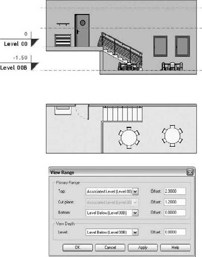


If you need to adjust the properties of the plan region later, select it, go to its Element Properties, select View Range, and go back to the settings.
Section views are traditionally live cuts through the building model. They can be generated using the Section View tool from the View or Basics Design bar. You can place section lines in plans, elevations, and other section views, and they will appear in other views that cross the section perpendicular to the Cut plane. A section has two graphic symbols associated with it that appear at either end of the section line. Check the Ribbon when placing a new section—you'll notice that you can choose a section type (Building, Wall, Detail) and in the Options bar you can preset the scale. These are the options available when placing a section:
You define the section line by making two clicks in the view. Once a section has been created, you can move it by dragging it. The amazing thing is that when you move the section line, the view it references is automatically regenerated. A section line always shows what it's cutting when the view is displayed. It's impossible to have a section that is out of sync with the model.
Some special properties are available for sections that help you create the drawings you want. We'll focus on those next.
The default section graphic is shown as a solid line with a section head and section tail at the ends. You can break a section cut line by clicking the little squiggle icon in the center of the line. Doing this lets you create a graphic, as shown in Figure 2.72.
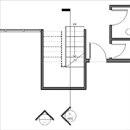
As you draw a section line, you'll notice that you can only draw a straight segment. Often, however, you'll want the section line to pass through important parts of the building that don't lie on the same line—you'll need to break the section line and make it jog. You can jog the section line around elements in plan to change what is shown in the view. To do this, click the Split Segment button available in the Section panel when a section is selected. The cursor changes to a knife. Click to split the section, and begin dragging the segment. Figure 2.73 shows an example of a section split that jogs around an elevator core but cuts through classrooms.

When a section is selected, you can control the extents of the view interactively using the crop boundaries. The right and left sides directly affect the section view size on a sheet. The far clip limits how much geometry is visible in depth. To improve performance and get the right representation, be aware of how deep your sections are. Show only what is needed. By default, a new section extends the entire depth of the model. To change that, pull the far clip closer to the Cut plane (see Figure 2.74). The same logic applies to elevation depth.

It's possible for sections to disappear from time to time as you change the scale of a view. If you check the visibility settings or try Reveal Hidden Elements mode, it won't be clear why the sections aren't visible. This behavior is a result of a little-known feature: Hide at Scales Coarser Than. This parameter lets you set a scale beyond which the section will no longer be visible. In most circumstances, the benefit of this feature will be nearly invisible—Revit will do the right thing, and you'll go about your business as usual.
Elevations are made by placing elevation tags in floor plan views. Depending on where you place the elevation in the model, you'll get different resulting views. Revit assumes that if you place an elevation in the model (in a room, for example), you're creating interior elevations. The view shows only the walls visible in that room. If you place an elevation outside your model, a building elevation is created that shows the entire façade.
Elevations are a lot like sections in terms of how they behave in Revit: they have a clip plane, a crop boundary, and a symbol; and they can be opened directly by double-clicking the symbol. Elevation tags can have as many as four views related to one tag for the purpose of creating interior elevations of rooms. This is great for interior elevations but limits your ability to customize the graphics of these tags.
In a ¼″ (1:50) floor plan view, you may have many wall sections, building sections, and interior elevation tags visible. However, with a ⅛″ plan (1:100), you want to see only the building sections and exterior elevation tags. Using the Hide at Scales Coarser Than option, you can do this. Select your interior elevation tags, and set their Type property to hide at scales coarser than ¼″ (1:50). (Make sure you select the view direction arrow, not the view reference part.) Next time you open the ⅛″ (1:100) plan, they won't be visible. Do the same for your wall sections. Because this is an instance property, you must first select the elements to which you want to apply this rule.

In many scenarios, the symbol used for an exterior building elevation is identical to the symbol used for section heads. Currently in Revit, this can't be done with a standard elevation symbol. For this use case, we suggest a common workaround:
Create a building section, and open its properties. Click the Edit/New button, and then duplicate the section. Name the new type Exterior Elevation, as shown in Figure 2.75.
When you go to place an exterior elevation, choose the Section tool instead. Draw the section so that it creates an exterior view of the model.

Turn off the visibility of the section tail by clicking the cycle icon.
Drag the section line so it disappears into the section head.
In Figure 2.76, the elevation still appears in the sections node, but it's appended with the Exterior Elevation type. You can rename the section if needed. (Note that the elevation tag looks like the section tag.)
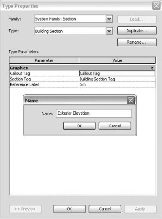
If you go this route, be aware that to adjust the cropping, you must select the section line you just worked so hard to hide. You'll need to zoom in close and use the Tab key to select that line again. Once it's selected, you'll have full access to the other controls associated with the section.
One of the most obvious benefits of working with BIM is the 3D nature of the model. When using Revit, you'll find yourself constantly generating different 3D views, examining the space from various vantage points, and making presentations you would not be able to do using a 2D application. You can create two types of 3D views in Revit: axonometric and perspective. Each has special characteristics that you need to be aware of.
Perhaps the most compelling feature of the axon view is its ability to orient to other views. To do this, right-click on view cube to access the context menu, and then choose to Orient to View. When you do this, a 3D section box is enabled in the view that cuts the model with all six faces of the box. You can go from a very dense, hard-to-read model to a focused representation. Figure 2.77 shows a 3D view that was oriented to a section view. You're free to create new elements and edit the model from these types of views.

You can then spin the model to get a 3D representation. With Revit, these types of views are easily generated; they suggest a new type of drawing to be included in standard construction and presentation document sets.
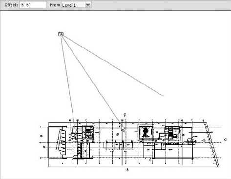
Perspectives in Revit (bird's-eye and worm's-eye views) follow the metaphor of placing a camera in space. To make a new camera, start from a floor plan, and use the Camera tool from the View Design tab. The first click establishes where the camera is placed in the model. Look at the Options bar: you can set the camera height prior to placement if you want. The default puts the camera 5′−6″ (1.8m) above the active level you're on. You then give the camera a direction and set the center of rotation by clicking a second time. The view automatically opens for you to reveal what your camera sees. The camera placement is shown in Figure 2.78.
Once in the camera view, you can navigate by using the mouse buttons to orbit and pan. For even more options, enable the SteeringWheels from the Navigation panel in the main view window, shown in Figure 2.79.

Use the small arrow icon in the lower-right corner of the SteeringWheel to access additional options and change which wheel is active.
Once a camera has been placed, you won't see it in other views. Its default state is to be invisible. To make a camera visible, select the view in the Project Browser, and choose Show Camera from the context menu. You'll see a graphic of the camera and its available controls, such as the camera, target, and far clip plane (if it's enabled). Select any controls, and drag them around to alter the location of the camera. Clicking empty space or another element deselects the camera; it will disappear.
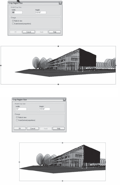
Unlike axon views, perspective cameras don't have a view scale that determines how big the view is. A perspective has no scale, so you use the crop region to define the size of the image. Click on one of the lines of the crop region, and from the Crop panel select Size Crop. This opens the Crop Region Size dialog box.
The width and height are controlled here—this is the size of the image if it was printed out on paper. If you start editing the values, you'll see the crop boundary resize. The default option (Field of View) adjusts the width and height independently, and the model becomes more or less cropped. Figure 2.80 shows the effect of changing Width from 16″ to 12″.
If you choose the Scale (Locked Proportions) option and change either Width or Height, the image looks exactly the same but is scaled up or down. If you like the proportions of your shot but you want a bigger version of it, choose this option.
- Understand Revit parametric elements.
Although you can find references to objects, families, instances, and components, in the end everything is an element.
- Master It
What are Revit elements, and how are they managed graphically?
- Work with the Revit user interface.
As in any software application, you need to know where all the major components are and what tasks they support.
- Master It
How do you change the graphics of a category for all views? What if you need to change the graphics for only one view?
- Use the Project Browser.
This UI component provides access to all elements in your model. Become accustomed to using it to locate views, families, groups, and links.
- Master It
Knowing how to navigate views in Revit is essential to completing work. What are some of the ways to open views in Revit?
- Navigate views and view properties.
Views are also elements. Just like the walls, floors, and roofs you add to the model, you'll also add views. They have properties you should become familiar with.
- Master It
You need to change the scale of a plan view from ⅛″ to ¼″. How do you do this with Revit?