
Chapter 15. Using the Chart Control
Not too long ago, the only way to add robust charting and graphing capabilities to your application was to buy a third-party control suite. This was mainly due to the complexity involved; the task of writing your own chart control was too time-consuming and error-prone. This has recently changed.
In 2008, Microsoft released a free charting control that enabled developers to add rich, browser-based charts to ASP.NET 3.5 web applications. These components are now part of ASP.NET 4 and are included by default with the .NET Framework.
This chapter shows you how to use ASP.NET Chart Control to add dynamic, data bound graphics such as bar graphs or pie charts to your web application. We provide an overview of Chart Control and the different types of charts and graphs that it can produce. We cover the different ways you can customize a chart’s appearance by modifying the plotting area and adding borders, backgrounds, and legends. Finally, we show you how to extend your charts with Ajax by adding tooltips, drill-down functionality, and other interactive features.
To get the most out of this chapter, we recommend that you run the samples in your environment and play around with changes to configurations and options to see how it alters the behavior of the charts.
Chart Control Fundamentals
In this section, you learn how to use the Chart control to provide graphical representations of data. You also learn how to group, sort, and filter data to customize the way your chart displays.
Displaying Data with the Chart Control
The Chart control has three main components:
• Series—Developers familiar with charting and graphing terminology recognize this term immediately. A series is a collection of data points. Different types of charts render a series in different ways, but the underlying format for specifying a series of data points remains the same.
• Chart area—Define the plot areas for which a series is plotted. For instance, a line graph would be defined as a single plot area. If you want to display a line graph and a bar graph on a single chart, you would define two chart areas.
• Data points—A single point of data within a series. As you read through this chapter you see more about what data points look like and how they are used.
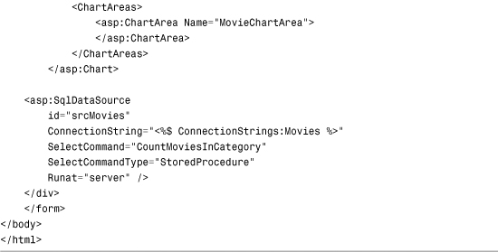
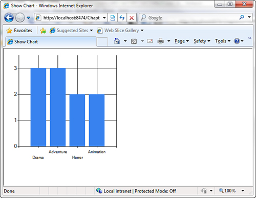
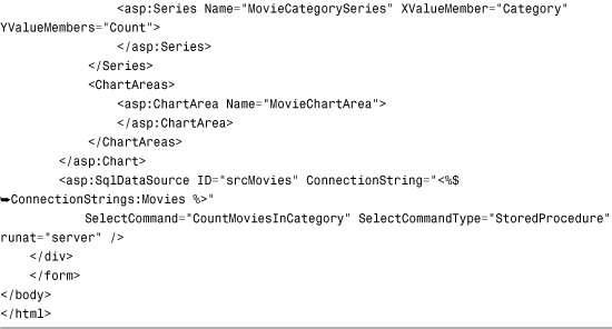
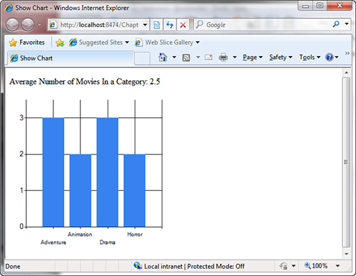
Series, chart areas, and data points can all be specified either declaratively or programmatically. The page in Listing 15.1 displays a simple chart showing the number of movies in different categories using declarative data binding (see Figure 15.1).
Figure 15.1. Displaying a chart of movie categories.

Listing 15.1. ShowChart.aspx

In Listing 15.1, we reuse the CountMoviesInCategory stored procedure from Chapter 9, “Using the SqlDataSource Control.” The Chart is bound to the SqlDataSource control through the DataSourceID property, and the chart’s x-and y-axes are associated to the dataset’s returned columns through the XValueMember and YValueMembers properties on the Series.
Unlike the previous chapter’s code samples, we have an additional Register declaration at the top of the page. Although the Chart control is shipped as part of the .NET 4 Framework, it is still located in a separate assembly and requires an explicit declaration to include it in the page.
Note
In addition to the Register declaration, you need to modify your web.config file to get the Chart functionality to work. The Chart control uses a separate HTTP Handler to render the image, and by default, your application isn’t aware of it. Add the following section to the system.web section of the web.config file, and your charts render the following:
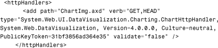
You can read more about how the Chart renders to the browser later in this chapter.
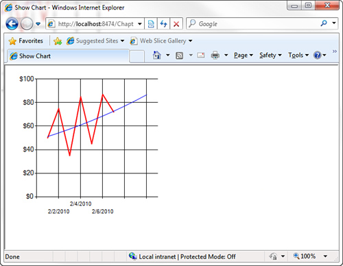
The default chart type is Column, which displays each data point as a vertical bar. You can change the way the data points display by setting the ChartType property on the Series. Listing 15.2 shows the same data as a line graph (see Figure 15.2):
Figure 15.2. Displaying a line chart.

Listing 15.2. ShowLineChart.aspx


Charting is a massive topic and has consumed entire books in the past. You can use more than 30 different chart types to provide visualizations of your data. In the interest of keeping this chapter small and easy to read, the following provides an overview of just a few of the available chart types:
• Area—Shows the rate of change over time by shading the area under the line
• Bar—Similar to a Column chart but displays the values horizontally instead of vertically
• Line—Displays changes in data by rendering data points as a single continuous line
• Point—Displays each value as a point on the chart
• Pie—Shows how much each data point contributes to the entire data set by rendering it as a percentage
• Box Plot—Shows how data is distributed across a data set by displaying one or more boxes
• Candlestick—Commonly used to display stock information, such as the high and low values, along with the opening and closing prices
Note
You can find the complete set of possible chart types on the MSDN website at http://msdn.microsoft.com/en-us/library/dd489233(VS.100).aspx.
Sorting and Filtering Data
An instance of a chart control contains a DataManipulator property that can be used to sort and filter the chart data. You can sort any series in the chart by any axis (X, Y, Y2, and so on), and you can choose to sort in either an ascending or descending order. The DataManipulator property provides a Sort method to do this.
To use the sorting functionality, your chart must already be populated with data. To ensure this, we wait until the OnDataBound event to invoke our sorting code. Listing 15.3 sorts the movie categories from highest count to lowest count by executing the chtMovies_DataBound method after it binds to the SqlDataSource (see Figure 15.3).
Figure 15.3. Sorting a chart.
Listing 15.3. SortChart.aspx


Filtering chart data is similar to sorting it. The DataManipulator provides a FilterTopN method that enables you to only display the top “n” number of data points. For example, Listing 15.4 shows only the three movie categories with the highest counts (see Figure 15.4).
Figure 15.4. Filtering chart data.

Listing 15.4. FilterChart.aspx

Note
It is also possible to define custom sorts and filters for your chart. The DataManipulator provides a Sort method that takes an object of type IComparer as a parameter, along with a Filter method that takes an object of type IDataPointFilter as a parameter. You can write classes that implement these interfaces and build the logic that sorts or filters your data however you like.
Using Statistical Formulas
Statistical analysis goes hand in hand with charting and data visualization, and the ASP.NET charting control provides a wealth of functionality in this area. The DataManipulator property makes it easy to add statistical analyses to your charts. You can use the Statistics property on the DataManipulator to perform statistical analyses on data series without having to hand-write custom algorithms. (Though you can do that too, if necessary.)
The code in Listing 15.5 illustrates adding a label to the top of a page that contains a chart showing the mean value of a series of data points (see Figure 15.5).
Figure 15.5. Displaying the mean.
Listing 15.5. ShowMean.aspx


You can also use these calculated statistics to display strip lines—a band across any axis to bring attention to a value or range of values. Strip lines can be defined declaratively on any axis within ChartArea. Listing 15.6 adds a strip line to display the average count (mean) within the chart by declaring a StripLine on the AxisY axis (see Figure 15.6).
Figure 15.6. Displaying a strip line.

Listing 15.6. ShowMeanStripLine.aspx


The Statistics property provides common formulas such as mean, median, normal distribution, correlation, and covariance. Advanced calculations specific to financial analyses can be performed by using the FinancialFormula method on the DataManipulator object. Some common financial formulas that can be calculated with the FinancialFormula method follow:
• MovingAverage—An average of data calculated over a period of time.
• ExponentialMovingAverage—Similar to a MovingAverage, except recent days have more weight in the calculation.
• Forecasting—Predicts the future values by analyzing the historical data.
• MassIndex—Predicts the reversal of a trend by comparing the difference and range between the high and low values in a dataset.
• StandardDeviation—Calculates the difference between values in a dataset.
Listing 15.7 demonstrates how to perform financial analysis on a sample set of data and display it as a series (see Figure 15.7).
Figure 15.7. Displaying a financial analysis series.
Listing 15.7. ShowFinancialAnalysis.aspx


Note
The second parameter in the FinancialFormula method is a string representing a set of parameters for the analysis. This parameter set is different for every formula. The Forecasting formula used in Listing 15.7 uses a parameter set of RegressionType, Period, ApproxError, ForecastError that enables you to optionally customize how the analysis is performed.
You can find the complete set of parameters for every formula on the MSDN website.
The statistical and financial formulas built into the Chart control make it easy to add powerful analyses to your web applications with little custom code. In the past, adding things such as striplines and performing additional calculations on a data series was either something you had to code yourself or something that cost a great deal of extra money when buying charting controls from vendors. With ASP.NET 4, all that functionality is not only available, but also it is available in an easily accessible, easy to use API.
Customizing a Chart’s Appearance
The Chart control enables you to customize almost every aspect of its appearance. In addition to customizing the plot area, specifying border details, adding axis titles, and inserting legends, the Chart control also enables you to easily render your data in 3D.
Customizing the Background and Plotting Area
The Chart control provides many properties to customize almost every aspect of the background and plotting area, including the background color, border colors and widths, gradients, and data point colors. Some of the properties you can use to customize a chart’s appearance follow:
• BackColor—The color of the chart’s background.
• BackGradientStyle—Specifies how a gradient should be applied to the background.
• BackSecondaryColor—The secondary color used for background gradients.
• Palette—Specifies the color palette to use for chart’s data points.
• BorderSkin-SkinStyle—Provides a number of built-in styles to render a shaded, three-dimensional border around the entire chart.
Most of these properties apply to the ChartArea as well, so you can customize the actual plotting area differently from the overall chart’s appearance. Furthermore, many of them also apply to the Series, so you can control the appearance of your data points.
Listing 15.8 demonstrates some of the styles you can apply to a chart, including a left-to-right background gradient, a colored chart area background, and an embossed border around the chart (see Figure 15.8).
Figure 15.8. Customizing a chart’s appearance.

Listing 15.8. ChartAppearance.aspx


The Chart control also provides many options for displaying titles and legends. You can provide a chart title declaratively in the Titles section under the Chart. Similarly, axis titles and their styles can be defined declaratively in the ChartArea.
There is also a Legends section under the Chart property that enables you to define a chart legend and position it wherever you want. Listing 15.9 demonstrates how to add a legend and titles to a chart (see Figure 15.9).
Figure 15.9. Adding titles and a legend.

Listing 15.9. ShowChartTitles.aspx


By default, the legend is placed on the right of the chart. In Listing 15.9, we set the Width property on the Chart to give it more space; otherwise, the default width would have been used, and the actual chart area would have rendered significantly smaller.
Three-Dimensional Charts
With all the powerful and flexible functionality that we have seen so far that comes with the ASP.NET charting control, it would be easy to assume that to get 3D charts we have to do a bunch of difficult low-level customization and coding. Thankfully, this is not the case, and 3-D charting is every bit as easy to use as 2D charting.
To turn on 3D charts, you simply modify the Area3DStyle set of properties. If you look at the property editor in the designer for a ChartArea, you see a collapsable section called Area3DStyle. The first and most important property here is the Enabled property. When enabled, you can change a host of 3D-related properties including the rotation angles, lighting, perspective, depth, and more.
Figure 15.10 shows a 3D number chart depicting the number of zombie sightings of various types.
Figure 15.10. Using 3D charts.

Go back through some of the samples already created in this chapter, turn on 3D for the charting areas, and play with the various properties to see how they affect the look and feel of the final chart.
Drill-Down Reports
Those of us who have created reports for business stakeholders and customers alike know that rendering the chart is merely the tip of the iceberg. People want to know where the data came from and want their charts to be interactive.
Again, this is where we typically end up spending large amounts of money for complicated third-party vendor control suites that enable for the injection of code to enable for drill-downs and clickable charts. As we’ve seen throughout this chapter, ASP.NET Chart Control actually builds images rendered in-place on the page. If this is the case, then how can we create clickable data points?
One of the most powerful features within ASP.NET Chart Control is that we can assign a value to the Url property of any given data point. This means we can click any dot in a scatter plot diagram, or we can click any bar in a bar graph, and we will be redirected to that URL.
To see how this works, let’s take a look at the ASPx markup that produced the preceding chart illustrating the various types of zombie sightings within a given data series:

Given this chart, we want to make it so that when you click a particular bar for that type of sighting, you are redirected to a drill-down page displaying a chronologically sorted list of all zombie sightings of that type. To do this, we assign a URL to each of the data points in the graph, as shown here in the Page_Load() event handler for this page:
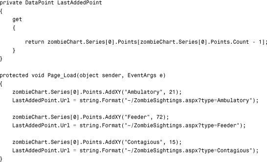
Now when you run this application and you hover the mouse over each of the bar graph data points, you see the appropriate URL show up in the status bar at the bottom of your browser (assuming you have that enabled). Clicking the Feeder bar in the middle takes you to the page ZombieSightings.aspx?type=Feeder. The ability to assign arbitrary URLs to any data point within a series is incredibly useful and enables an endless variety of drill-down reporting scenarios that normally would only be possible in reporting tools such as SQL Server Reporting Services or expensive third-party control suites. (And many of them don’t support clickable data points!)
Summary
This chapter provided you with an introduction to ASP.NET Chart Control. You have seen several code samples that illustrate its simplicity, but at the same time, its tremendous power. In many cases developers can now add charting functionality, dashboards, and drill-down reports into their applications without resorting to large enterprise tools such as SQL Server Reporting Services or buying expensive third-party charting control suites.
ASP.NET Chart Control is just one more tool in the ever-growing toolbox of incredibly powerful features and functionality available to developers of ASP.NET 4 applications.