
Chapter 22. Using the Navigation Controls
In This Chapter
• Using the SiteMapPath Control
• Building a SQL Hierarchical Data Source Control
• Summary
In this chapter, you learn how to use the SiteMapPath, Menu, and TreeView controls. You can use all three of these controls to enable users to navigate your website. Furthermore, you can use the Menu and TreeView controls independently of website navigation. You can bind these two controls to other data sources such as XML documents or database data.
This chapter explores different methods of binding the Menu and TreeView controls to different data sources and shows you how to format the rendered output of both of these controls. You also learn how to take advantage of Ajax when working with the TreeView control.
In the final section, we build a SqlHierarchicalDataSource control, which enables you to bind controls such as the TreeView and Menu controls to hierarchical database data.
Understanding Site Maps
Before you learn about the navigation controls, you first need to understand Site Maps. All three navigation controls use Site Maps to retrieve navigation information. A Site Map enables you to represent the navigational relationships between the pages in an application, independent of the actual physical relationship between pages as stored in the file system.
Site Maps use the provider model. In the next chapter, you learn how to create custom Site Map providers to store Site Maps in custom data stores such as database tables. The examples in this chapter take advantage of the default XML Site Map provider, which enables you to store a Site Map in an XML file.
By default, the navigation controls assume the existence of an XML file named Web.sitemap, which is located in the root of your application.
For example, Listing 22.1 contains a simple Site Map.
Listing 22.1. Web.sitemap

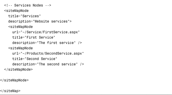
A Site Map file contains <siteMapNode> elements. There can be only one top-level node. In the case of Listing 22.1, the top-level node represents the website’s home page.
A <siteMapNode> supports three main attributes:
• title—A brief title that you want to associate with a node.
• description—A longer description that you want to associate with a node.
• url—A URL that points to a page or other resource.
The url attribute is not required. Both the Products and Services nodes do not include a url attribute because these nodes do not represent pages to which you can navigate.
Each <siteMapNode> can contain any number of child nodes. In Listing 22.1, both the Products and Services nodes include two child nodes.
The Site Map in Listing 22.1 represents a website that has the following folder and page structure:
Default.aspx
Products
FirstProduct.aspx
SecondProduct.aspx
Services
FirstService.aspx
SecondService.aspx
The navigational structure of a website as represented by a Site Map is not required to have any relationship to the navigational structure of a website as stored in the file system. You can create any relationship between the nodes in a Site Map that you want.
Using the SiteMapPath Control
The SiteMapPath control enables you to navigate easily to any parent page of the current page. It displays the standard breadcrumb trail that you see on many popular websites (see Figure 22.1).
Figure 22.1. Breadcrumb trail at Yahoo.com.

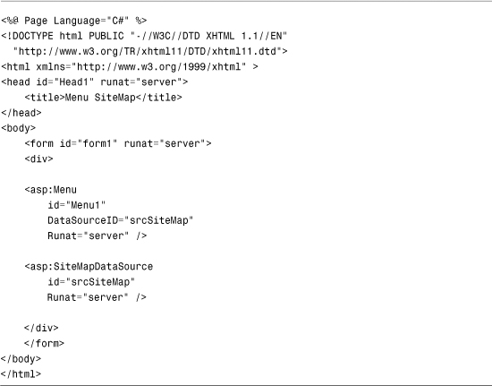
You can use the SiteMapPath control simply by declaring the control in a page. The control automatically uses the Web.sitemap file located in the root of your application. For example, the page in Listing 22.2 includes the SiteMapPath control (see Figure 22.2).
Figure 22.2. Displaying the SiteMapPath control.

Listing 22.2. UsingSiteMapPath/DisplaySiteMapPath.aspx

You can click the Home link rendered by the SiteMapPath control to navigate to the website’s home page. The SiteMapPath uses both the title and description attributes from the <siteMapNode> elements contained in the Web.sitemap file. The title attribute is used for the node (link) text, and the description attribute is used for the node tool tip.
Note
Typically, you do not add a SiteMapPath control to individual pages in your website. If you add a SiteMapPath control to a Master Page, you can display the SiteMapPath control automatically on every page. To learn more about Master Pages, see Chapter 5, “Designing Websites with Master Pages.”
The SiteMapPath control supports the following properties:
• ParentLevelsDisplay—Enables you to limit the number of parent nodes displayed. By default, a SiteMapPath control displays all the parent nodes.
• PathDirection—Enables you to reverse the order of the links displayed by the SiteMapPath control. Possible values are RootToCurrent (the default) or CurrentToRoot.
• PathSeparator—Enables you to specify the character used to separate the nodes displayed by the SiteMapPath control. The default value is >.
• RenderCurrentNodeAsLink—Enables you to render the SiteMapPath node that represents the current page as a link. By default, the current node is not rendered as a link.
• ShowToolTips—Enables you to disable the display of tool tips.
• SiteMapProvider—Enables you to specify the name of an alternative Site Map provider to use with the SiteMapPath control.
• SkipLinkText—Enables you to specify more specific text for skipping the links displayed by the SiteMapPath control. The default value for this property is Skip Navigation Links.
Web Standards Note
All the navigation controls automatically render a skip navigation link to meet accessibility requirements. The skip navigation link is read by a screen reader, but it is not displayed in a normal browser.
If you are interacting with a web page through a screen reader, you don’t want to hear the list of navigation links every time you open a page. (It is the equivalent of listening to a phone menu every time you open a page.) The skip navigation link enables users of screen readers to skip the repetitive reading of links.
Formatting the SiteMapPath Control
You can use either styles or templates to format the SiteMapPath control.
The control supports the following Style objects:
• CurrentNodeStyle—Formats the SiteMapPath node that represents the current page.
• NodeStyle—Formats every node rendered by the SiteMapPath control.
• PathSeparatorStyle—Formats the text displayed between each SiteMapPath node.
• RootNodeStyle—Formats the root (first) node rendered by the SiteMapPath control.
For example, the page in Listing 22.3 takes advantage of all four Style properties to modify the default appearance of the SiteMapPath control (see Figure 22.3).
Figure 22.3. Using styles with the SiteMapPath control.

Listing 22.3. UsingSiteMapPath/SiteMapPathStyle.aspx


Furthermore, you can use templates with the SiteMapPath control to format the appearance of the control (and change its behavior). The SiteMapPath control supports the following templates:
• CurrentNodeTemplate—For the SiteMapPath node that represents the current page.
• NodeTemplate—For each SiteMapPath node that is not the current or root node.
• PathSeparatorTemplate—For the text displayed between each SiteMapPath node.
• RootNodeTemplate—For the root (first) node rendered by the SiteMapPath control.
For example, the SiteMapPath control in Listing 22.4 includes a NodeTemplate. The NodeTemplate includes a HyperLink control that displays the current SiteMapPath node. The template also displays a count of the child nodes of the current node (see Figure 22.4).
Figure 22.4. Using a template with the SiteMapPath control.

Listing 22.4. UsingSiteMapPath/SiteMapPathTemplates.aspx
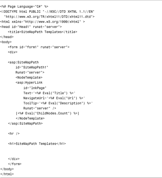
Within a template, the data item represents a SiteMapNode. Therefore, you can refer to any of the properties of the SiteMapNode class in a databinding expression.
Using the Menu Control
The Menu control enables you to create two types of menus. You can use the Menu control to create the left-column menu that appears in many websites. In other words, you can use the Menu control to display a vertical list of links.
You also can use the Menu control to create a menu that more closely resembles the drop-down menus that appear in traditional desktop applications. In this case, the Menu control renders a horizontal list of links.
Unlike the SiteMapPath control, the Menu control can represent other types of data than Site Map data. Technically, you can bind a Menu control to any data source that implements the IHiearchicalDataSource or IHiearchicalEnumerable interface.
In this section, you learn how to create different types of menus with the Menu control. First, you learn how to add menu declaratively items to a Menu control. Next, we discuss how the Menu control can be used with the MultiView control to display a tabbed page.
You also examine how you can bind the Menu control to different types of data sources. You learn how to use the Menu control with Site Map data, XML data, and database data.
Declaratively Adding Menu Items
You can display a menu with the Menu control by adding one or more MenuItem objects to its Items property. For example, the page in Listing 22.5 uses a Menu control to create a simple vertical menu (see Figure 22.5).
Figure 22.5. Displaying a menu with the Menu control.

Listing 22.5. MenuHyperLink.aspx

The Menu in Listing 22.5 is created from MenuItem objects. Each menu item in Listing 22.5 contains a link to another page.
MenuItem objects can be nested. The second MenuItem object—Services—includes two child MenuItem objects. When you hover your mouse over a parent menu item, the child menu items display.
Each MenuItem in Listing 22.5 includes a Text and NavigateUrl property. Rather than use a MenuItem to link to a new page, you also can use a MenuItem to link back to the same page. In other words, each MenuItem can act like a Linkbutton control instead of a HyperLink control.
For example, each MenuItem object in Listing 22.6 includes a Text and Value property. When you click a menu item, the same page is reloaded, and the value of the selected menu item displays (see Figure 22.6).
Figure 22.6. Selecting menu items.

Listing 22.6. MenuLinkButton.aspx
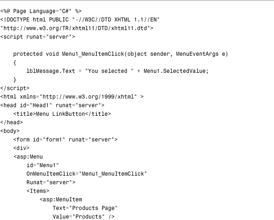
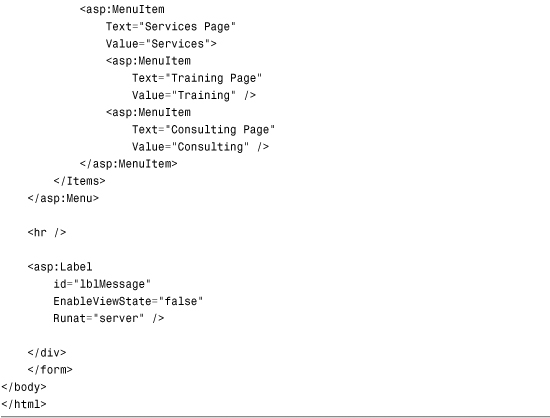
The page includes a MenuItemClick event handler. When you click a MenuItem (and the MenuItem does not have a NavigateUrl property), the MenuItemClick event is raised.
In Listing 22.6, the MenuItemClick handler displays the value of the selected MenuItem in a Label control.
Using the Menu Control with the MultiView Control
When the Menu control is used with the MultiView control, you can create tabbed pages. You use the Menu control to display the tabs, and the MultiView control to display the content that corresponds to the selected tab.
For example, the page in Listing 22.7 displays three tabs (see Figure 22.7).
Figure 22.7. Displaying a tabbed page.

Listing 22.7. MenuTabStrip.aspx


After you open the page in Listing 22.7 and click a tab, the MenuItemClick event is raised. The MenuItemClick event handler changes the ActiveViewIndex property of the MultiView control to display the content of the selected tab.
Binding to a Site Map
Like the SiteMapPath control, you can use the Menu control with a Site Map. Users can click menu items to navigate to particular pages in your website. Unlike the SiteMapPath control, however, the Menu control does not automatically bind to a Site Map. You must explicitly bind the Menu control to a SiteMapDataSource control to display nodes from a Site Map.
For example, the page in Listing 22.8 contains a menu that contains links to all the pages in a website (see Figure 22.8).
Figure 22.8. Displaying a Site Map with a Menu control.
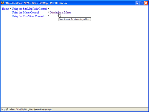
Listing 22.8. UsingMenu/MenuSiteMap.aspx
When you initially open the page in Listing 22.8, the only menu item that appears is the link to the Home page. If you hover your mouse over this link, links to additional pages display.
Normally, you do not want the Home link to display in a navigation menu. Instead, you want to display the second level of menu items. You can use the ShowStartingNode property of the SiteMapDataSource control to hide the topmost node in a Site Map.
For example, the page in Listing 22.9 uses a Menu control that renders a standard left-column navigational menu (see Figure 22.9).
Figure 22.9. Displaying a navigation menu.

Listing 22.9. UsingMenu/MenuNavigate.aspx
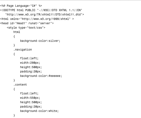
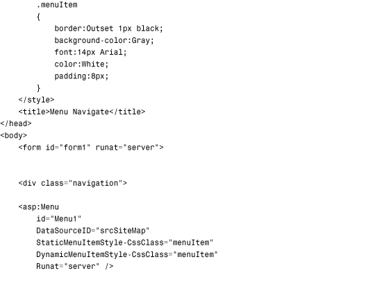

When you open the page in Listing 22.9, the second-level nodes from the Site Map initially display. Furthermore, the Menu control is styled to appear more like a traditional website navigation menu.
Binding to an XML File
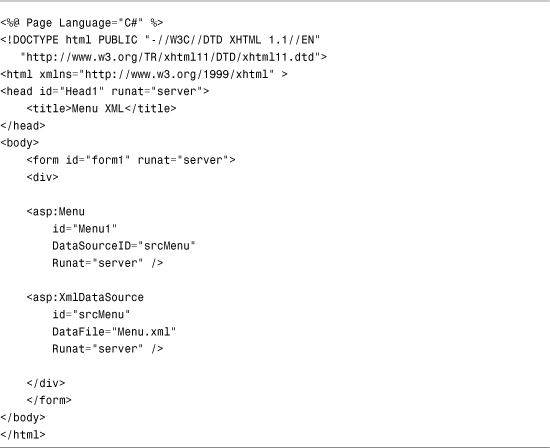
As an alternative to binding a Menu control to a SiteMapDataSource control, you can bind the control to an XML document by using the XmlDataSource control. For example, suppose that you have the XML file in Listing 22.10.
Listing 22.10. Menu.xml

The page in Listing 22.11 displays the contents of Listing 22.10 by using an XmlDataSource control to represent the XML document.
Listing 22.11. MenuXML.aspx
When using the XmlDataSource control, you can use the XPath property to supply an xpath query that restricts the nodes returned by the XmlDataSource. You also can use either the Transform or TransformFile property to apply an XSLT Style Sheet to the XML document and transform the nodes returned by the XmlDataSource.
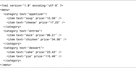
The XML file in Listing 22.10 is simple. The nodes do not contain any attributes. When you bind the Menu control to the XML file, the ToString() method is called on each XML file node.
You also can bind the Menu control to more complex XML documents. For example, the item nodes in the XML document in Listing 22.12 include two attributes: text and price.
Listing 22.12. MenuComplex.xml
When you bind to the XML document in Listing 22.12, you must specify one or more menu item bindings. The menu item bindings specify the relationship between node attributes and the menu items displayed by the Menu control.
The Menu control in Listing 22.13 includes MenuItemBinding subtags (see Figure 22.10).
Figure 22.10. Displaying an XML document with the Menu control.

Listing 22.13. MenuXMLComplex.aspx

The Menu control includes a <DataBindings> element. This element includes two MenuItemBinding subtags. The first subtag represents the relationship between the category nodes in the XML file and the menu items. The second subtag represents the relationship between the item nodes in the XML file and the menu items.
Binding to Database Data
You can’t bind a Menu control directly to database data. Neither the SqlDataSource nor ObjectDataSource controls implement the IHierachicalDataSource interface. Therefore, if you want to represent database data with the Menu control, you need to perform some more work.
One option is to create your own SqlHiearachicalDataSource control. You can do this either by deriving from the base HiearchicalDataSourceControl class or implementing the IHiearchicalDataSource interface. You take this approach in the final section of this chapter, when a custom SqlHierarchicalDataSource control is built.
A second option is to build the menu items programmatically in the Menu control. This is the approach followed here.
Imagine that you want to represent the contents of the following database table with a Menu control:

This database table represents product categories. The categories are nested with the help of the ParentId column. For example, the Orange Juice category is nested below the Juice category, and the Juice category is nested below the Beverages category.
The page in Listing 22.14 illustrates how you can display this database table with a Menu control (see Figure 22.11).
Figure 22.11. Displaying database data with the Menu control.

Listing 22.14. MenuDatabase.aspx


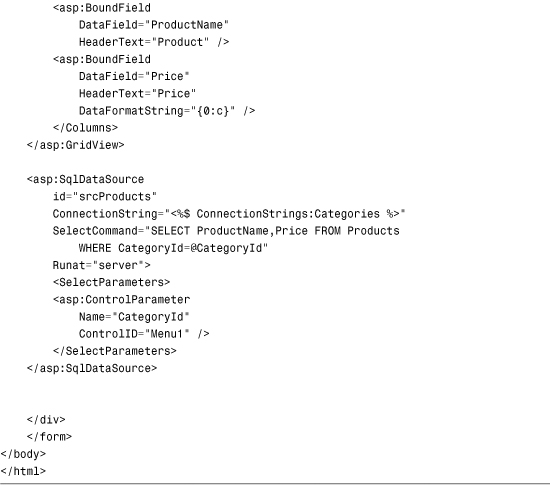
The menu items are added to the Menu control in the PopulateMenu() method. This method first grabs a DataTable that contains the contents of the Categories database table. Next, it creates a menu item for each row that does not have a parent row (each row where the ParentId column has the value null).
The child menu items for each menu item are added recursively. The ParentId column is used to filter the contents of the Categories DataTable.
The page in Listing 22.14 also includes a GridView control that displays a list of products that match the category selected in the menu. GridView is bound to a SqlDataSource control, which includes a ControlParameter that filters the products based on the selected menu item.
Formatting the Menu Control
The Menu control supports an abundance of properties that can be used to format the appearance of the control. Many of these properties have an effect on static menu items, and many of these properties have an effect on dynamic menu items. Static menu items are menu items that always appear. Dynamic menu items are menu items that appear only when you hover your mouse over another menu item.
First, the Menu control supports the following general properties related to formatting:
• DisappearAfter—Enables you to specify the amount of time, in milliseconds, that a dynamic menu item is displayed after a user moves the mouse away from the menu item.
• DynamicBottomSeparatorImageUrl—Enables you to specify the URL to an image that appears under each dynamic menu item.
• DynamicEnableDefaultPopOutImage—Enables you to disable the image (triangle) that indicates that a dynamic menu item has child menu items.
• DynamicHorizontalOffset—Enables you to specify the number of pixels that a dynamic menu item is shifted relative to its parent menu item.
• DynamicItemFormatString—Enables you to format the text displayed in a dynamic menu item.
• DynamicPopOutImageTextFormatString—Enables you to format the alt text displayed for the popout image.
• DynamicPopOutImageUrl—Enables you to specify the URL for the dynamic popout image. (By default, a triangle is displayed.)
• DynamicTopSeparatorImageUrl—Enables you to specify the URL to an image that appears above each dynamic menu item.
• DynamicVerticalOffset—Enables you to specify the number of pixels that a dynamic menu item is shifted relative to its parent menu item.
• ItemWrap—Enables you to specify whether the text in menu items should wrap.
• MaximumDynamicDisplayLevels—Enables you to specify the maximum number of levels of dynamic menu items to display.
• Orientation—Enables you to display a menu horizontally or vertically. (The default value is Vertical.)
• ScollDownImageUrl—Enables you to specify the URL to an image that is displayed and that enables you to scroll down through menu items.
• ScrollDownText—Enables you to specify alt text for the ScrollDown image.
• ScrollUpImageUrl—Enables you to specify the URL to an image that is displayed and that enables you to scroll up through menu items.
• ScrollUpText—Enables you to specify alt text for the ScrollUp image.
• SkipLinkText—Enables you to modify the text displayed by the skip link. (The skip link enables blind users to skip past the contents of a menu.)
• StaticBottomSeparatorImageUrl—Enables you to specify the URL to an image that appears below each static menu item.
• StaticDisplayLevels—Enables you to specify the number of static levels of menu items to display.
• StaticEnableDefaultPopOutImage—Enables you to disable the default popout image that indicates that a menu item has child menu items.
• StaticItemFormatString—Enables you to format the text displayed in each static menu item.
• StaticImagePopOutFormatString—Enables you to specify the alt text displayed by the popout image.
• StaticPopOutImageUrl—Enables you to specify the URL for the popout image.
• StaticSubMenuIndent—Enables you to specify the number of pixels that a static menu item is indented relative to its parent menu item.
• StaticTopSeparatorImageUrl—Enables you to specify the URL to an image that appears above each static menu item.
• Target—Enables you to specify the window in which a new page opens when you click a menu item.
This list includes several interesting properties. For example, you can specify images for scrolling up and down through a list of menu items. These images appear when you constrain the height of either the static or dynamic menu.
The Menu control also exposes several Style objects. You can use these Style objects as hooks to which you can attach Cascading Style Sheet (CSS) classes:
• DynamicHoverStyle—Style applied to a dynamic menu item when you hover your mouse over it.
• DynamicMenuItemStyle—Style applied to each dynamic menu item.
• DynamicMenuStyle—Style applied to the container tag for the dynamic menu.
• DynamicSelectedStyle—Style applied to the selected dynamic menu item.
• StaticHoverStyle—Style applied to a static menu item when you hover your mouse over it.
• StaticMenuItemStyle—Style applied to each static menu item.
• StaticMenuStyle—Style applied to the container tag for the static menu.
• StaticSelectedStyle—Style applied to the selected static menu item.
Furthermore, you can apply styles to menu items based on their level in the menu. For example, you might want the font size to get progressively smaller depending on how deeply nested a menu item is within a menu. You can use three properties of the Menu control to format menu items, depending on their level:
• LevelMenuItemStyles—Contains a collection of MenuItemStyle controls, which correspond to different menu levels
• LevelSelectedStyles—Contains a collection of MenuItemStyle controls, which correspond to different menu levels of selected menu items
• LevelSubMenuStyles—Contains a collection of MenuItemStyle controls, which correspond to different menu levels of static menu items
For example, the page in Listing 22.15 illustrates how you can apply different formatting to menu items that appear at different menu levels (see Figure 22.12).
Figure 22.12. Applying styles to different menu levels.

Listing 22.15. MenuLevelStyles.aspx


The MenuItemStyle controls are applied to the menu level that corresponds to their order of declaration. The first MenuItemStyle is applied to the first menu level, the second MenuItemStyle is applied to the second menu level, and so on.
Finally, the MenuItem class itself includes several useful formatting properties:
• ImageUrl—Enables you to specify the URL for an image that is displayed next to a menu item.
• PopOutImageUrl—Enables you to specify the URL for an image that is displayed when a menu item contains child menu items.
• SeparatorImageUrl—Enables you to specify the URL for an image that appears below a menu item.
• Selectable—Enables you to prevent users from selecting (clicking) a menu item.
• Selected—Enables you to specify whether a menu item is selected.
• Target—Enables you to specify the name of the window that opens when you click a menu item.
For example, the page in Listing 22.16 displays a menu that resembles a traditional desktop application menu (see Figure 22.13).
Figure 22.13. Displaying a desktop application menu.

Listing 22.16. MenuDesktop.aspx


Using Templates with the Menu Control
The Menu control supports templates. You can use templates to completely customize the appearance of the Menu control.
The Menu control supports the following two templates:
• DynamicItemTemplate—Applied to dynamic menu items.
• StaticItemTemplate—Applied to static menu items.
The page in Listing 22.17 uses both templates to display menu items. The templates display a count of child items for each menu item (see Figure 22.14).
Figure 22.14. Using templates with the Menu control.

Listing 22.17. MenuTemplates.aspx


You do not need to create LinkButton controls in the templates. The content of the template is wrapped in a link automatically when it is appropriate.
Using the TreeView Control
The TreeView control is similar to the Menu control. Like the Menu control, you can use the TreeView control to display hierarchical data. The TreeView control binds to any data source that implements the IHierarchicalDataSource or IHiearchicalEnumerable interface.
In this section, you learn how to add items declaratively to the TreeView control. You also learn how to bind a TreeView control to hierarchical data sources such as the SiteMapDataSource and XmlDataSource controls.
You also see how you can use the TreeView control with database data. A TreeView is built programmatically from database data.
Finally, you learn how you can use AJAX with the TreeView control to display large sets of data efficiently. By taking advantage of AJAX, you can update a TreeView without posting a page back to the server.
Declaratively Adding Tree Nodes
A TreeView control is made up of TreeNode objects. You can build a TreeView control by declaring TreeNode objects in the TreeView control’s Items collection.
For example, Listing 22.18 contains a TreeView which renders a nested set of links to pages (see Figure 22.15).
Figure 22.15. Displaying a TreeView control.

Listing 22.18. TreeViewDeclare.aspx


Some of the TreeNodes in Listing 22.18 include a Text property, and some of the TreeNodes include both a Text and NavigateUrl property. You can click the TreeNodes that include a NavigateUrl property to link to a new page.
You also can associate a Value property with a TreeNode. This is useful when you want to post back to the same page. For example, the page in Listing 22.19 enables you to display the value of the selected TreeNode in a Label control (see Figure 22.16).
Figure 22.16. Selecting a TreeView node.
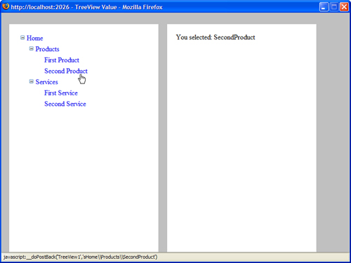
Listing 22.19. TreeViewValue.aspx
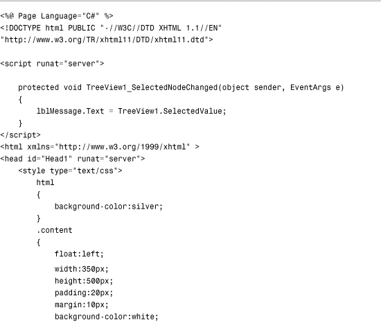
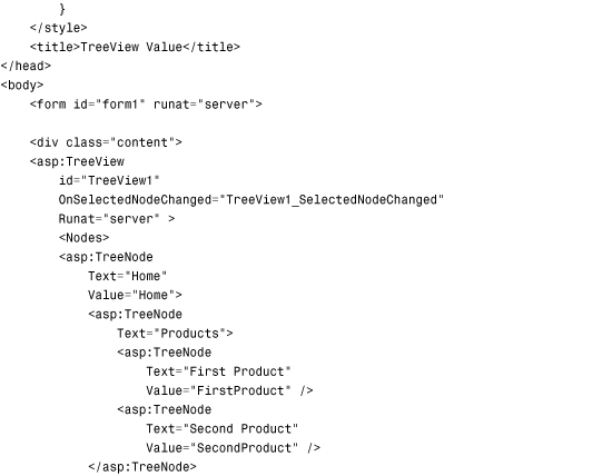
The page in Listing 22.19 includes a SelectedNodeChanged event handler. When you select a new node, the SelectedNodeChanged event handler displays the value of the selected TreeNode in a Label control.
Displaying Check Boxes with the TreeView Control
You can display check boxes next to each node in a TreeView control by assigning a value to the ShowCheckBoxes property. This property accepts the following values:
• All
• Leaf
• None
• Parent
• Root
You can use a bitwise combination of these values when specifying the nodes to display with check boxes.
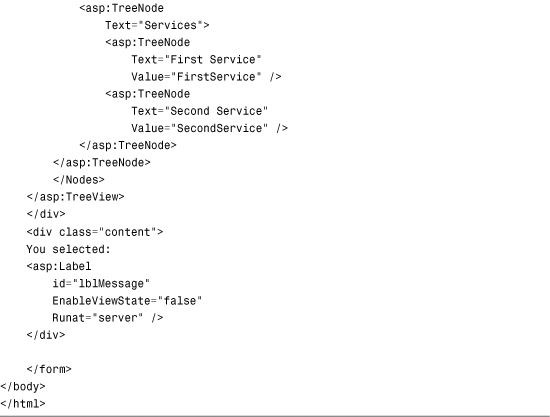
The page in Listing 22.20 illustrates the ShowCheckBoxes property (see Figure 22.17).
Figure 22.17. Displaying TreeView check boxes.

Listing 22.20. TreeViewCheckBoxes.aspx
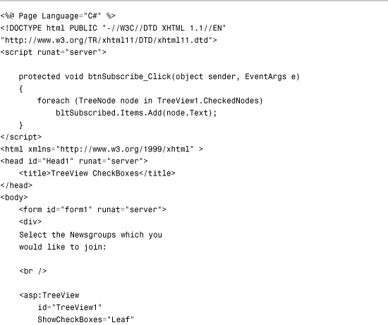

The page in Listing 22.20 displays nested newsgroups. You can subscribe to the newsgroups by clicking the Subscribe button.
When you click the Subscribe button, the CheckedNodes property returns a list of all the checked TreeNodes. This list displays in a BulletedList control.
Binding to a Site Map
You can use a TreeView control as a navigation element in your pages by binding the TreeView to a Site Map. The page in Listing 22.21 demonstrates how you can bind a TreeView to a SiteMapDataSource control (see Figure 22.18).
Figure 22.18. Displaying a Site Map with a TreeView control.

Listing 22.21. UsingTreeView/TreeViewSiteMap.aspx

When you open the page in Listing 22.21, all the nodes from the Site Map display automatically in the TreeView control. By default, the SiteMapDataSource uses the XmlSiteMapProvider, which represents a file named Web.sitemap located at the root of an application.
Note
You can add a TreeView and SiteMapDataSource control to a Master Page to show the TreeView in multiple pages. To learn more about Master Pages, see Chapter 5.
Binding to an XML File
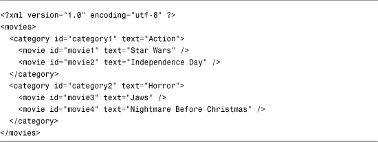
Because an XmlDataSource control returns hierarchical data, you can bind a TreeView directly to an XmlDataSource. For example, imagine that you need to display the XML document contained in Listing 22.22.
Listing 22.22. Movies.xml

The page in Listing 22.23 illustrates how you can display the contents of this XML document with a TreeView control.
Listing 22.23. TreeViewXml.aspx

The Movies.xml document in Listing 22.22 is extremely simple. The elements do not include any attributes. You can display more complicated XML documents with the TreeView control by declaring one or more TreeNodeBinding elements.
For example, the nodes in the XML document in Listing 22.24 include id and text attributes.
Listing 22.24. MoviesComplex.xml
The page in Listing 22.25 displays the contents of the XML document in Listing 22.24.
Listing 22.25. TreeViewXMLComplex.aspx


The TreeView in Listing 22.25 includes a DataBindings subtag. This tag includes two TreeNodeBinding elements. The first TreeNodeBinding specifies the relationship between <category> nodes in the XML document and TreeView nodes. The second TreeNodeBinding specifies the relationship between <movie> nodes and TreeView nodes.
Binding to Database Data
You cannot bind a TreeView control directly to a SqlDataSource or ObjectDataSource control because neither of these two controls exposes hierarchical data. If you want to display database data with the TreeView control, you have a choice: create a custom SqlHierarchicalDataSource control or programmatically bind the TreeView to the database data.
The hard option is to build a SQL hierarchical DataSource control. You can do this by deriving a new control from the base HierarchicalDataSourceControl class or by implementing the IHierarchicalDataSource interface. We explore this option in the final section.
The second option is to build the TreeView control programmatically from a set of database records. This is the approach that we follow in this section.
Imagine that you have a database table that looks like this:
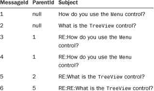
This database table represents a discussion forum. The relationship between the messages is determined by the ParentId column. The messages that have a null ParentID represent the threads, and the other messages represent replies to the threads.
The page in Listing 22.26 uses a TreeView control to display the contents of the Discuss database table (see Figure 22.19).
Figure 22.19. Displaying database data with a TreeView control.

Listing 22.26. TreeViewDatabase.aspx

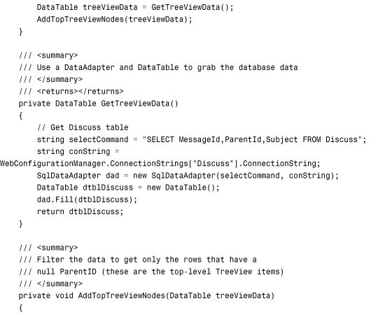

The page in Listing 22.26 filters the contents of the Discuss database table by its ParentID column. First, the top-level nodes are added to the TreeView. Next, the child nodes are recursively added to the TreeView with the help of the AddChildTreeViewNodes() method.
Using Populate On Demand and AJAX
You can use the TreeView control even when working with a large set of data. For example, the Microsoft MSDN website (msdn.Microsoft.com) has links to thousands of articles. This website uses a tree view to display the nested links to the articles.
Because thousands of articles are hosted at the MSDN website, not all the tree nodes are downloaded to the browser when you open a page. Instead, additional nodes are downloaded to your browser only when you expand a particular node.
You can use a feature named Populate On Demand with the TreeView control. When you enable the PopulateOnDemand property for a Tree node, child nodes are not added to the parent node until the parent node is expanded.
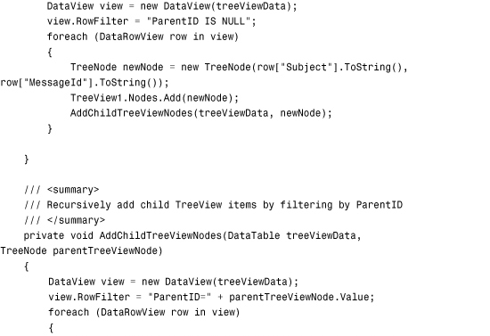
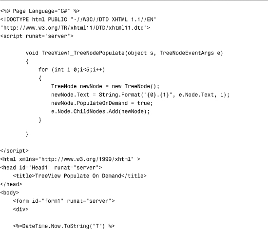
For example, the page in Listing 22.27 contains an infinitely expanding TreeView. Each time you expand a Tree node, five new child nodes display. Each time you expand a child node, five more child nodes display, and so on (see Figure 22.20).
Figure 22.20. An infinitely expanding TreeView control.

Listing 22.27. TreeViewPopulateOnDemand.aspx

The TreeView in Listing 22.27 includes a single statically declared TreeNode. This TreeNode includes a PopulateOnDemand property set to the value True.
Additionally, the TreeView control itself includes a TreeNodePopulate event handler. When you expand a TreeNode that has its PopulateOnDemand property enabled, the TreeNodePopulate event handler executes. In the case of Listing 22.27, the event handler adds five new TreeNodes to the TreeNode that was expanded.
When you use the Populate On Demand feature, the page containing the TreeView is not posted back to the server when you expand a TreeNode. Instead, the browser uses AJAX (Asynchronous JavaScript and XML) to communicate with the web server. The additional TreeNodes are retrieved from the server, without performing a postback.
The page in Listing 22.27 displays the current time when you open the page. The time is not updated when you expand a particular TreeNode. The time is not updated because the only content in the page that is updated when you expand a node is the TreeView content. AJAX can have a dramatic impact on performance because it does not require the entire page to be re-rendered each time you expand a TreeNode.
Note
If, for some reason, you don’t want to use AJAX with Populate On Demand, you can assign the value False to the TreeView control’s PopulateNodesFromClient property.
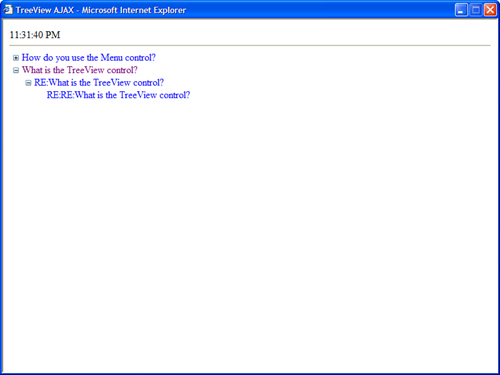
The page in Listing 22.28 contains a more realistic sample of using Populate On Demand and AJAX. This page uses a TreeView control to display the contents of the Discuss database table (see Figure 22.21).
Figure 22.21. Displaying database data with AJAX.
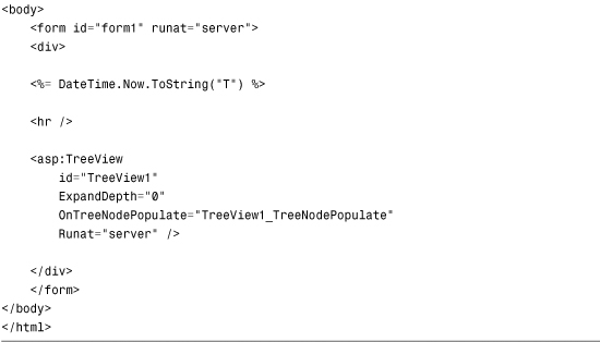
Listing 22.28. TreeViewAJAX.aspx


When the page in Listing 22.28 first opens, only the first-level message subjects display. These messages are retrieved by the PopulateTopNodes() method.
When you expand a thread, the matching replies are retrieved for the thread. These replies are retrieved in the TreeView1_TreeNodePopulate() event handler.
The TreeView in Listing 22.28 performs well even when working with a large set of data. At any time, only the child messages of a message are retrieved from the database. At no time are all the messages retrieved from the database.
When the page is used with a modern browser, AJAX retrieves the messages from the web server. The page does not need to be posted back to the web server when you expand a particular message thread.
Formatting the TreeView Control
The TreeView control supports an abundance of properties that have an effect on how the TreeView is formatted.
Following are some of the more useful properties of a TreeView control, which modify its appearance (this is not a complete list):
• CollapseImageToolTip—Enables you to specify the title attribute for the collapse image.
• CollapseImageUrl—Enables you to specify a URL to an image for the collapse image.
• ExpandDepth—Enables you to specify the number of TreeNode levels to display initially.
• ExpandImageToolTip—Enables you to specify the title attribute for the expand image.
• ExpandImageUrl—Enables you to specify the URL to an image for the expand image.
• ImageSet—Enables you to specify a set of images to use with the TreeView control.
• LineImagesFolder—Enables you to specify a folder that contains line images.
• MaxDataBindDepth—Enables you to specify the maximum levels of TreeView levels to display when binding to a data source.
• NodeIndent—Enables you to specify the number of pixels to indent a child Tree node.
• NodeWrap—Enables you to specify whether or not text is wrapped in a Tree node.
• NoExpandImageUrl—Enables you to specify the URL to an image for the NoExpand image (typically, an invisible spacer image).
• ShowCheckBoxes—Enables you to display check boxes next to each Tree node. Possible values are All, Leaf, None, Parent, and Root.
• ShowExpandCollapse—Enables you to disable the expand and collapse icons that appear next to each expandable node.
• ShowLines—Enables you to show connecting lines between Tree nodes.
• SkipLinkText—Enables you to specify the text used for skipping the contents of the TreeView control. (The Skip Link contains hidden text that is accessible only to users of assistive devices.)
• Target—Enables you to specify the name of the window that opens when you navigate to a URL with the TreeView control.
The two most interesting properties in this list are the ImageSet and the ShowLines properties. You can set the ImageSet property to any of the following values to modify the images displayed by the TreeView control:
• Arrows
• BulletedList
• BulletedList2
• BulletedList3
• BulletedList4
• Contacts
• Custom
• Events
• Faq
• Inbox
• Msdn
• News
• Simple
• Simple2
• WindowsHelp
• XPFileExplorer
The ShowLines property causes connecting line images to be rendered between TreeView nodes. Displaying lines between Tree nodes can make it easier to visually discern the nested relationships between nodes. If you want to create custom lines, you can specify a value for the LinesImagesFolder property.
Visual Web Developer Note
Visual Web Developer includes a TreeView Line Image Generator that enables you to create custom connecting lines. You can open this tool in Design view by selecting the TreeView control and opening the Tasks dialog box and selecting Customize Line Images.
The page in Listing 22.29 illustrates how to use both the ImageSet and ShowLines properties (see Figure 22.22).
Figure 22.22. Formatting a TreeView with an image set and lines.

Listing 22.29. TreeViewImageSet.aspx


The TreeNode object itself also supports several properties that have an effect on the appearance of its containing TreeView. Following is a list of the most useful properties of the TreeNode object:
• Checked—Enables you to check the check box that appears next to the Tree node.
• Expanded—Enables you to initially expand a node.
• ImageToolTip—Enables you to associate alt text with a Tree node image.
• ImageUrl—Enables you to specify an image that appears next to a Tree node.
• NavigateUrl—Enables you to specify the URL to which the current Tree node links.
• SelectAction—Enables you to specify the action that occurs when you click a Tree node. Possible values are Expand, None, Select, or SelectExpand.
• Selected—Enables you to specify whether the current Tree node is selected.
• ShowCheckBox—Enables you to display a check box for the current Tree node.
• Target—Enables you to specify the name of the window that opens when you navigate to a URL.
• ToolTip—Enables you to specify a title attribute for the current Tree node.
You can style the TreeView control by attaching Cascading Style Sheet classes to the Style object exposed by the TreeView control. The TreeView control supports the following Style objects:
• HoverNodeStyle—Applied to a Tree node when you hover your mouse over a node.
• LeafNodeStyle—Applied to leaf Tree nodes (Tree nodes without child nodes).
• NodeStyle—Applied to Tree nodes by default.
• ParentNodeStyle—Applied to parent nodes (Tree nodes with child nodes).
• RootNodeStyle—Applied to root nodes (Tree nodes with no parent nodes).
• SelectedNodeStyle—Applied to the selected node.
For example, the page in Listing 22.30 uses several of these Style objects to format a TreeView control (see Figure 22.23).
Figure 22.23. Using Styles with the TreeView control.

Listing 22.30. TreeViewStyles.aspx


Furthermore, you can apply styles to particular Tree node levels by taking advantage of the TreeView control’s LevelStyles property. The page in Listing 22.31 uses the LevelStyles property to format first level nodes differently than second level nodes and third level nodes (see Figure 22.24).
Figure 22.24. Applying styles to different TreeView node levels.

Listing 22.31. TreeViewLevelStyles.aspx


Building a SQL Hierarchical Data Source Control
In this final section of this chapter, we build a SqlHierarchicalDataSource control. This custom control enables you to declaratively and (thus) easily bind controls such as the Menu and TreeView controls to data retrieved from a database.
Note
The code samples in this section can be found in the SqlHierarchicalDataSourceVB and SqlHierarchicalDataSourceCS applications in the accompanying source code on the book’s website.
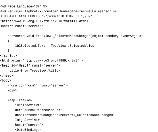
The page in Listing 22.32 illustrates how you can use the SqlHierarchicalDataSource control to bind a Menu control to a database table that contains nested categories.
Listing 22.32. ShowMenu.aspx


When you open the page in Listing 22.32, all the rows from the Categories table display in the Menu control.
The SqlHierarchicalDataSource control includes two properties: DataKeyName and DataParentKeyName. The DataKeyName property represents the name of a database column that contains a unique value for each database table row. The DataParentKeyName column represents the name of a database column that relates each row to its parent row.
Furthermore, the Menu control includes a MenuItemBinding, which associates the database Name column with the Menu item Text property and the Name column with the Menu item Value property.
You also can use the SqlHierarchicalDataSource control when working with the TreeView control. The page in Listing 22.33 displays all the rows from the Discuss database table in a TreeView control.
Listing 22.33. ShowTreeView.aspx
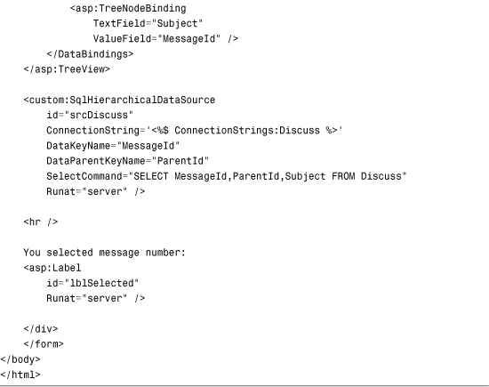
When you open the page in Listing 22.33, the contents of the Discuss database table display in the TreeView control.
All the code for the SqlHierarchicalDataSource control is included on the book’s website. The control is composed out of five separate classes:
• SqlHierarchicalDataSource—Represents the actual control. It inherits from the base SqlDataSource control and implements the IHierarchicalDataSource interface.
• SqlHierarchicalDataSourceView—Represents the hierarchical data returned by the control. It inherits from the base HierarchicalDataSourceView class.
• SqlHierarchicalEnumerable—Represents a collection of SqlNodes.
• SqlNode—Represents a particular database row from the data source. It includes methods for retrieving child and parent rows.
• SqlNodePropertyDescriptor—Inherits from the base PropertyDescriptor class. It converts the database columns represented by a SqlNode into class properties so that you can bind to the columns using TreeView and Menu control DataBindings.
Summary
In this chapter, you learned how to use the SiteMapPath, Menu, and TreeView controls. First, you learned how to use the SiteMapPath control to display a breadcrumb trail. You learned how to format the SiteMapPath control with styles and templates.
Next, you explored the Menu control. You learned how to create both vertical and horizontal menus. You also learned how you can bind a Menu control to different data sources such as Site Maps, XML documents, and database data.
The TreeView control was also discussed. You learned how to display check boxes with a TreeView control. You also learned how to bind a TreeView control to different data sources such as Site Maps, XML documents, and database data. You learned how to display a large set of Tree nodes efficiently by using AJAX and the TreeView control.
Finally, we created a custom SqlHierarchicalDataSource control that enables you to easily bind controls such as the Menu and TreeView controls to hierarchical database data.