
Chapter 14. Using the ListView and DataPager Controls
In this chapter, we examine the two databound controls that were introduced in version 3.5 of .NET Framework: the ListView and the DataPager controls. The ListView control is extremely flexible. You can use it in many of the same situations in which you would have used the GridView, DataList, FormView, or Repeater control in the past.
The DataPager control works with the ListView control. It enables you to add support for paging to a ListView control.
Using the ListView Control
You can think of the ListView control as a super-flexible GridView control. Like a GridView control, the ListView control can be used to display, edit, delete, select, page through, and sort database data. However, unlike the GridView, the ListView control is entirely template-driven. Furthermore, unlike the GridView control, you can use the ListView control to insert new data into a database.
You also can think of the ListView control as a replacement for the DataList control. Like a DataList control, the ListView control can be used to display database records in multiple columns. For example, you can use the ListView control to render a photo gallery.
Finally, you can think of the ListView control as a super-fancy Repeater control. Like a Repeater control, the ListView control is entirely template driven. However, unlike a Repeater control, the ListView control can be used to edit, page through, and sort database data.
The ListView control supports the following templates:
• LayoutTemplate—Specifies the containing element for the contents of the ListView.
• ItemTemplate—Formats each item rendered by the ListView.
• ItemSeparatorTemplate—Displays content between each item rendered by the ListView.
• GroupTemplate—Specifies the containing element for a group of items rendered by the ListView.
• GroupSeparatorTemplate—Displays content between each group of items rendered by the ListView.
• EmptyItemTemplate—Renders content for the remaining items in a GroupTemplate.
• EmptyDataTemplate—Specifies content that displays when no items are returned from the ListView control’s data source.
• SelectedItemTemplate—Specifies the content displayed for the selected item in the ListView.
• AlternatingItemTemplate—Renders different content for alternating items in a ListView.
• EditItemTemplate—Renders content for editing an item in a ListView.
• InsertItemTemplate—Renders content for inserting a new item in a ListView.
You learn how to use these various types of templates in the following sections.
Using the LayoutTemplate and ItemTemplate
Let’s start with a ListView control simple scenario in which you might want to use the ListView control. Suppose that you have a set of database records that you want to display in a set of HTML <div> tags. The page in Listing 14.1 illustrates how you can use the LayoutTemplate and ItemTemplate templates to display the records from the Movie database table.
Listing 14.1. SimpleListView.aspx


The ListView control in Listing 14.1 contains five templates. First, the LayoutTemplate creates a single containing <div> tag for all the items rendered by the ListView. The content contained in the LayoutTemplate is rendered once and only once. In the page in Listing 14.1, the LayoutTemplate displays a <div> tag with a dashed border (see Figure 14.1).
Figure 14.1. Displaying database records with a ListView control.

Note
In ASP.NET 3.5, the LayoutTemplate was required and it needed to contain a server-side control with an ID of itemContainer. In ASP.NET 4, LayoutTemplate is no longer required.
The ItemTemplate renders each of the items from the data source (or every other item when an AlternatingItemTemplate is present). In Listing 14.1, the ItemTemplate renders a <div> tag with a solid border. A data-binding expression is used with the <div> tag to display the value of the database Title column.
The AlternatingItemTemplate is optional. If it is present, every other item displayed by the ListView control is rendered with the AlternatingItemTemplate. In Listing 14.1, the AlternatingItemTemplate is used to give alternating items a silver background color.
Finally, the EmptyDataTemplate displays content when no results are retrieved from the data source. In Listing 14.1, the EmptyDataTemplate is used to display the text No Records Found when no items are returned from the data source.
You can use the ListView control to render any HTML elements you can imagine. You can use the ListView control to render bulleted lists, an HTML table, a blog tag cloud, or even the elements of a JavaScript array. For example, the page in Listing 14.2 uses a ListView control to render an HTML table.
Listing 14.2. TableListView.aspx


Notice that the itemContainer in Listing 14.2 is the <tbody> element. The <tbody> element contains each row of the table. Each row is rendered by the ItemTemplate (see Figure 14.2).
Figure 14.2. Displaying a table with a ListView control.

Using the GroupTemplate
You can use the ListView control’s GroupTemplate to group multiple items together. Grouping items is useful when you want to display items in multiple columns. For example, you might want to display a photo gallery in which three pictures are displayed per row.
The page in Listing 14.3 displays a set of photographs within a series of HTML <div> tags. A maximum of three photographs display in each <div> tag (see Figure 14.3).
Figure 14.3. Displaying a photo gallery with a ListView control.

Listing 14.3. PhotoGallery.aspx
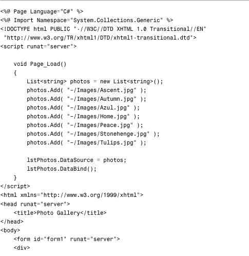

In Listing 14.3, the photographs are represented with a List collection. The List is bound to the ListView programmatically in the Page_Load() method.
Notice that the ListView includes a LayoutTemplate, GroupTemplate, and ItemTemplate. In previous listings, the LayoutTemplate included an element with an ID of itemContainer. In this listing, the LayoutTemplate includes an element with an ID of groupContainer. The contents of the GroupTemplate are added to the element in the LayoutTemplate with an ID of groupContainer.
The GroupTemplate includes the itemContainer element. The contents of the ItemTemplate are rendered within the itemContainer element in the GroupTemplate.
Notice that the ListView control includes a GroupItemCount attribute. This property determines the number of items displayed in a GroupTemplate before a new GroupTemplate is created.
Note
The ListView control also supports an EmptyItemTemplate that can be used to render content for the leftover items in a GroupTemplate. For example, if you set the GroupItemCount property to 3 and there are four items, the contents of the EmptyItemTemplate display for the final two items.
Selecting a Row
You can set up the ListView control so you can use it to select items. This is useful when you want to create a master/detail form.
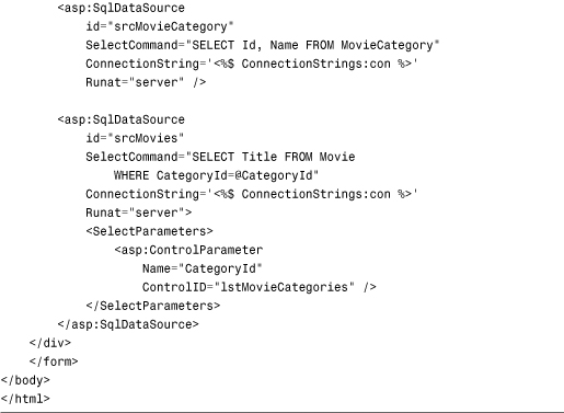
For example, the page in Listing 14.4 contains two ListView controls. The first ListView works like a tab strip. It enables you to select a movie category. The second ListView displays a numbered list of matching movies.
Listing 14.4. MasterDetail.aspx

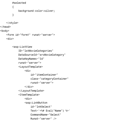

The first ListView control in Listing 14.4 renders something resembling a tab strip (see Figure 14.4). Notice that this ListView control has its DataKeyNames property set. Setting the DataKeyNames property causes the ListView control to build a hidden collection of primary key values when the ListView is bound to its data source. Each item in the ListView is associated with an ID value.
Figure 14.4. Displaying a master/detail form with a ListView control.

Furthermore, notice that the ListView control includes a SelectedItemTemplate. The contents of this template are rendered for the selected item in the ListView. You select an item by clicking one of the links rendered by the ListView control’s ItemTemplate. The links are rendered with a LinkButton control. Notice that the CommandName property of the LinkButton has the value Select. This magic command name causes the ListView to change the selected item.
The second ListView control uses the first ListView control as the source value for a select parameter. When you select a new item in the first ListView control, the second ListView control displays matching movies.
Sorting Database Data
You can sort the items in a ListView control by adding one or more button controls to ListView that have a CommandName property set to the value Sort and a CommandArgument property set to the name of a property to sort by. For example, the page in Listing 14.5 contains a ListView control that renders an HTML table. You can click the column headers to sort the table by a particular column (see Figure 14.5).
Figure 14.5. Sorting data with the ListView control.

Listing 14.5. SortListView.aspx


The two LinkButtons used for sorting the items in the ListView are contained in the LayoutTemplate. Both LinkButtons have a CommandName property set to the value Sort. The first LinkButton sorts by the Title property and the second LinkButton sorts by the Director property.
Editing Database Data
You can use the ListView control to update, delete, and insert items. The page in Listing 14.6 illustrates how you can use the ListView to modify or delete the records in the Movie database table (see Figure 14.6).
Figure 14.6. Editing database data with the ListView control.

Listing 14.6. EditListView.aspx

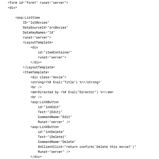


The ListView control in Listing 14.6 has an ItemTemplate that contains two LinkButtons. The first LinkButton has a CommandName property set to the value Edit and the second LinkButton has a CommandName property set to the value Delete. When you click the first LinkButton, the ListView control’s EditItemTemplate displays. When you click the second LinkButton, the current database record is deleted (after you confirm that you really want to delete the movie record).
The EditItemTemplate contains a form for editing a movie record. The form contains two TextBox controls that have two-way data-binding expressions assigned to their Text properties. The form also contains two LinkButton controls. The first LinkButton control has a CommandName of Update. When you click this button, the database is updated with the form changes and the EditItemTemplate switches back to the normal ItemTemplate. If you click the Cancel button, the EditItemTemplate switches to an ItemTemplate without updating the database.
When editing with a ListView, you need to assign the primary key column names to the ListView control’s DataKeyNames property. The ListView control uses this to determine which database record to update.
Notice that all the ListView editing is driven by the following magic command names: Edit, Delete, Update, and Cancel. By setting button control CommandName properties to these magic command names, you can control how the ListView edits items.
You also can use the ListView control to insert new records into a database table. The ListView control supports an InsertItemTemplate. The page in Listing 14.7 illustrates how you can use the InsertItemTemplate to create a simple customer feedback form (see Figure 14.7).
Figure 14.7. Inserting new records with the ListView control.

Listing 14.7. InsertListView.aspx


The InsertItemTemplate appears only when you set the ListView control’s InsertItemPosition property. You can set this property to the value FirstItem, LastItem, or None. In Listing 14.7, it’s set to the value FirstItem so that the insert form appears above all the current items.
The InsertItemTemplate contains a single TextBox control that has its Text property set to a data-binding expression. The template also contains a Button control that has a CommandName property set to the value Insert. When you click the button, the new item is inserted into the database.
Using the DataPager Control
The DataPager control displays a user interface for navigating through multiple pages of items. The DataPager control works with any control that supports the IPageableItemContainer interface. Unfortunately, there is currently only a single control that supports this interface: the ListView control. So this means that you can only use the DataPager with the ListView control.
The DataPager control includes the following properties:
• PageSize—Gets or sets the number of items to display at a time.
• PagedControlId—Gets or sets the control to page. (The control must implement IPageableItemContainer.)
• Fields—Gets the fields contained by the DataPager.
• StartRowIndex—Gets the index of the first item to show.
• MaximumRows—Gets the maximum number of rows to retrieve from the data source.
• TotalRowCount—Gets the total number of items available from the data source.
You set the PageSize to control the number of items to display per page. The PagerControlId property is optional. If you place the DataPager within the ListView control’s LayoutTemplate, you don’t need to set the PagerControlId property. If, on the other hand, you place the DataPager outside of the ListView control, you need to set the PagerControlId property to the ID of the ListView.
If you add a DataPager to a page and do nothing else, the DataPager won’t render anything. To display a user interface for the DataPager, you need to add one or more fields to the DataPager. The DataPager control supports the following fields:
• NextPreviousPagerField—Used to display Next, Previous, First, and Last links.
• NumericPagerField—Used to display Next, Previous, and page numbers links.
• TemplatePagerField—Used to create a custom user interface for paging.
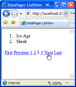
The page in Listing 14.8 demonstrates how you can use the DataPager control to page through movies displayed by a ListView control (see Figure 14.8).
Figure 14.8. Using a DataPager control with the ListView control.
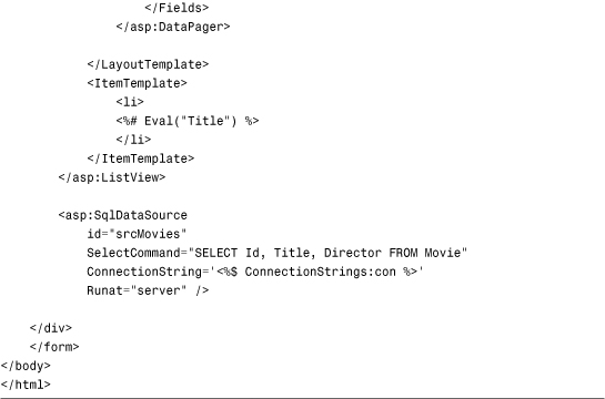
Listing 14.8. DataPagerListView.aspx


The DataPager contains three fields: NextPreviousPagerField, NumericPagerField, and NextPreviousPagerField. Notice that the DataPager contains two NextPreviousPagerFields. The first one displays the First and Previous links, and the second one displays the Next and Last links.
Creating a Custom User Interface for Paging
If you need total and complete control over the paging user interface, you can use the TemplatePagerField to customize the appearance of the DataPager. The page in Listing 14.9 illustrates how you can use the TemplatePagerField.
Listing 14.9. DataPagerTemplate.aspx


The TemplatePagerField in Listing 14.9 contains two LinkButton controls (see Figure 14.9). The first LinkButton has a CommandName set to the value Previous, and the second LinkButton control has a CommandName set to the value Next.
Figure 14.9. Creating a custom paging user interface.

The page also contains an event handler for the TemplatePagerField’s PagerCommand event. The actual work of paging is done within this event handler. The second argument passed to the event handler is an instance of the DataPagerCommandEventArgs class. You change the current page by assigning new values to this object’s NewStartRowIndex and NewMaximumRows properties.
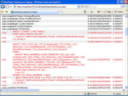
Data Source Paging with the DataPager Control
You can take advantage of the DataPager control when performing data source paging. The page in Listing 14.10 contains a ListView control bound to a LinqDataSource control. Because the LinqDataSource control has its AutoPage property set to the value true, it performs paging on the database server.
Note
The LinqDataSource control and LINQ to SQL are discussed in Chapter 20, “Data Access with LINQ to SQL.”
Listing 14.10. DataPagerDataSource.aspx


So that you can verify that the paging is happening through the database, I’ve set the DataContext to log to ASP.NET trace. If you look at the Trace Information section at the bottom of the page, you can see the actual SQL commands executed by the LinqDataSource control (see Figure 14.10).
Figure 14.10. Performing data source paging with the DataPager control.
Summary
I’m a huge fan of the new ListView and DataPager controls. I’m constantly running into layout limitations when using the GridView control. Because ListView is entirely template-driven, it is not subject to these same limitations.
In this chapter, you learned how to use the ListView control to display, sort, edit, and insert data. You also learned how to take advantage of the DataPager control to add paging to the ListView control. You learned how to create a custom pager template and how to perform data source paging.