
Chapter 13. Using the Repeater and DataList Controls
Both the Repeater and DataList controls—the subjects of this chapter—enable you to display a set of data items at a time. For example, you can use these controls to display all the rows contained in a database table.
The Repeater control is entirely template-driven. You can format the rendered output of the control in any way that you want. For example, you can use the Repeater control to display records in a bulleted list, a set of HTML tables, or even in a comma-delimited list.
The DataList control is also template-driven. However, unlike the Repeater control, the default behavior of the DataList control is to render its contents into an HTML table. The DataList control renders each record from its data source into a separate HTML table cell.
In this chapter, you learn how to use both of these controls to display database data. You also learn how to use each of the different types of templates that each of the controls supports. Finally, you can see how to handle the different types of events that the controls expose.
Using the Repeater Control
The Repeater control provides you with the maximum amount of flexibility in rendering a set of database records. You can format the output of the Repeater control in any way that you want. In this section, you learn how to display data with the Repeater control and handle Repeater control events.
Displaying Data with the Repeater Control
To display data with the Repeater control, you must create an ItemTemplate. For example, the page in Listing 13.1 displays the contents of the Movies database table (see Figure 13.1).
Figure 13.1. Displaying data with a Repeater control.

Listing 13.1. ShowRepeater.aspx


The Repeater control in Listing 13.1 displays each record in a separate HTML <div> tag. A databinding expression is used to display the value of each column.
In Listing 13.1, declarative databinding is used to bind the Repeater to the SqlDataSource. You also can databind a Repeater control programmatically.
For example, the page in Listing 13.2 contains a Repeater control that renders a JavaScript array. The Repeater control is programmatically databound to the list of files in the Photos directory.
Listing 13.2. ShowRepeaterPhotos.aspx


The page in Listing 13.2 randomly displays a different photo every 5 seconds. A random image is selected from the JavaScript array and displayed by the JavaScript showImage() function. An Internet Explorer transition filter is used to create a fade-in effect.
Web Standards Note
The transition filter is an Internet Explorer-only extension to Cascading Style Sheets (CSS). The page still works with Opera and Firefox, but you don’t get the fade-in effect.
Using Templates with the Repeater Control
The Repeater control supports five different types of templates:
• ItemTemplate—Formats each item from the data source.
• AlternatingItemTemplate—Formats every other item from the data source.
• SeparatorTemplate—Formats between each item from the data source.
• HeaderTemplate—Formats before all items from the data source.
• FooterTemplate—Formats after all items from the data source.
You are required to use only an ItemTemplate; the other types of templates can be used at your own discretion. The order in which you declare the templates in the Repeater control does not matter.
You can use the SeparatorTemplate to create a banding effect (as in old-time computer paper). In other words, you can use the SeparatorTemplate to display alternating rows with a different background color. This approach is illustrated by the page in Listing 13.3 (see Figure 13.2).
Figure 13.2. Displaying an HTML table with the Repeater control.

Listing 13.3. ShowRepeaterTable.aspx


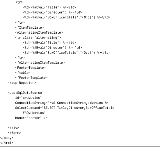
The Repeater control in Listing 13.3 renders an HTML table in which every other row appears with a gray background color. This Repeater control uses four out of five of the templates supported by Repeater: the ItemTemplate, AlternatingItemTemplate, HeaderTemplate, and FooterTemplate.
The AlternatingItemTemplate contains almost exactly the same content as the ItemTemplate. The only difference is that the <tr> tag includes a class attribute that changes its background color.
The SeparatorTemplate is used to add content between each data item from the data source. For example, the page in Listing 13.4 uses a SeparatorItemTemplate to create a tab strip with the Repeater control (see Figure 13.3).
Figure 13.3. Displaying a tab strip with the Repeater control.

Listing 13.4. ShowSeparatorTemplate.aspx


The page in Listing 13.4 contains two Repeater controls. The first Repeater control displays a tab strip of movie categories. The second Repeater control displays a bulleted list of matching movies.
Handling Repeater Control Events
The Repeater control supports the following events:
• DataBinding—Raised when the Repeater control is bound to its data source.
• ItemCommand—Raised when a control contained in the Repeater control raises an event.
• ItemCreated—Raised when each Repeater item is created.
• ItemDataBound—Raised when each Repeater item is bound.
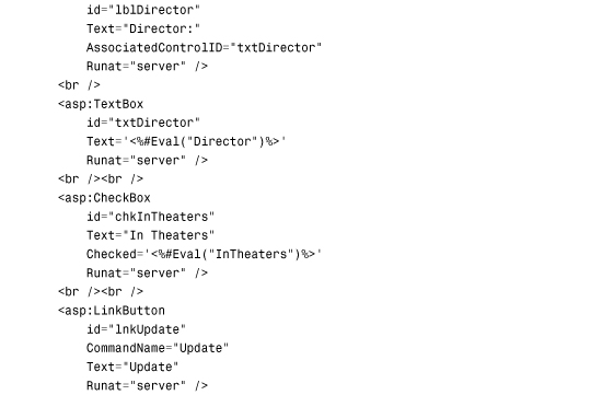
The page in Listing 13.5 illustrates how you can use the DataBinding, ItemCommand, and ItemDataBound events. This page uses a Repeater control to update, delete, and insert database records (see Figure 13.4).
Figure 13.4. Editing database records with the Repeater control.

Listing 13.5. EditRepeater.aspx


In Listing 13.5, the ItemDataBound event handler builds a collection of primary keys from the data source. The collection of primary keys is stored in ViewState so that they will be available after a postback to the server.
The DataBinding event handler clears the primary key collection when the Repeater is rebound to its data source (after a record is updated or deleted). If you don’t clear the collection, you get duplicates of the primary keys and an exception is raised.
The ItemCommand event handler takes care of processing the button click events. When you click an Insert, Update, or Delete button, the event bubbles up and raises the ItemCommmand event. The ItemCommand event handler grabs the values from the form fields and calls the Insert(), Update(), or Delete() methods of the SqlDataSource control.
Using the DataList Control
The DataList control, like the Repeater control, is template driven. Unlike the Repeater control, by default, the DataList renders an HTML table. Because the DataList uses a particular layout to render its content, you are provided with more formatting options when using the DataList control.
In this section, you learn how to use the DataList control to display data. You also learn how to render database records in both single-column and multicolumn HTML tables. We also explore how you can edit data with the DataList control.
Displaying Data with the DataList Control
To display data with the DataList control, you must supply the control with an ItemTemplate. The contents of the ItemTemplate are rendered for each data item from the data source.
For example, the page in Listing 13.6 uses a DataList to display the contents of the Movies database table. The ItemTemplate displays the values of the Title, Director, and BoxOfficeTotals columns (see Figure 13.5).
Figure 13.5. Displaying database records with the DataList control.

Listing 13.6. ShowDataList.aspx


The DataList in Listing 13.6 renders an HTML table. Each data item is rendered into a separate table cell (<td> tag). The rendered output of the DataList control in Listing 13.6 looks like this:
<table id="dlstMovies" cellspacing="0" border="0"
style="border-collapse:collapse;">
<tr>
<td>
<h1>Titanic</h1>
Directed by:
James Cameron
<br />
Box Office Totals:
$600,000,000.00
</td>
</tr>
<tr>
<td>
<h1>Star Wars</h1>
Directed by:
George Lucas
<br />
Box Office Totals:
$500,000,000.00
</td>
</tr>
...
</table>
The default behavior of the DataList control is to render an HTML table. However, you can override this default behavior and display the contents of each data item in a separate HTML <span> tag. This approach is illustrated in Listing 13.7.
Listing 13.7. ShowFlowDataList.aspx

The DataList control in Listing 13.7 includes a RepeatLayout property that has the value Flow. Each movie title is rendered in a <span> tag followed by a line-break tag (<br>).
The RepeatLayout property accepts one of the following two values:
• Table—Data Items are rendered in HTML table cells.
• Flow—Data Items are rendered in HTML <span> tags.
Displaying Data in Multiple Columns
You can render the contents of a DataList control into a multicolumn table in which each data item occupies a separate table cell. Two properties modify the layout of the HTML table rendered by the DataList control:
• RepeatColumns—The number of columns to display.
• RepeatDirection—The direction to render the cells. Possible values are Horizontal and Vertical.
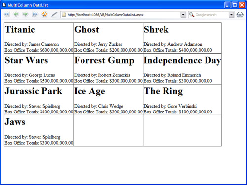
For example, the page in Listing 13.8 displays the contents of the Movies database table in a three-column layout (see Figure 13.6).
Figure 13.6. Displaying a multicolumn DataList.
Listing 13.8. MultiColumnDataList.aspx

The DataList control in Listing 13.8 includes a RepeatColumns property that has the value 3.
If you set the RepeatDirection property to the value Horizontal and do not assign a value to the RepeatColumns property, the DataList renders its data items horizontally without end.
Note
You can display data items in multiple columns when the DataList is in Flow layout mode. In that case, <br> tags create the row breaks.
Using Templates with the DataList Control
The DataList control supports all the same templates as the Repeater control:
• ItemTemplate—Formats each item from the data source.
• AlternatingItemTemplate—Formats every other item from the data source.
• SeparatorTemplate—Formats between each item from the data source.
• HeaderTemplate—Formats before all items from the data source.
• FooterTemplate—Formats after all items from the data source.
In addition, the DataList supports the following templates:
• EditItemTemplate—Displays when a row is selected for editing.
• SelectedItemTemplate—Displays when a row is selected.
The DataList control in Listing 13.9 includes both a HeaderTemplate and a FooterTemplate. The HeaderTemplate contains the caption for the table. The FooterTemplate contains a Label control that displays the total for all the preceding rows (see Figure 13.7).
Figure 13.7. Displaying a HeaderTemplate and FooterTemplate.

Listing 13.9. ShowDataListTemplates.aspx


The total displayed in the FooterTemplate is calculated by the ItemDataBound event handler. The Label control is extracted by the FindControl() method and the total is assigned to the control’s Text property.
Selecting Data with the DataList Control
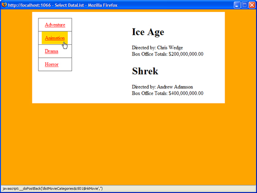
You can use a DataList control as a menu by taking advantage of the control’s SelectedValue property. For example, the page in Listing 13.10 enables you to pick a movie category and display a list of matching movies (see Figure 13.8).
Figure 13.8. Selecting a row in the DataList.
Listing 13.10. SelectDataList.aspx


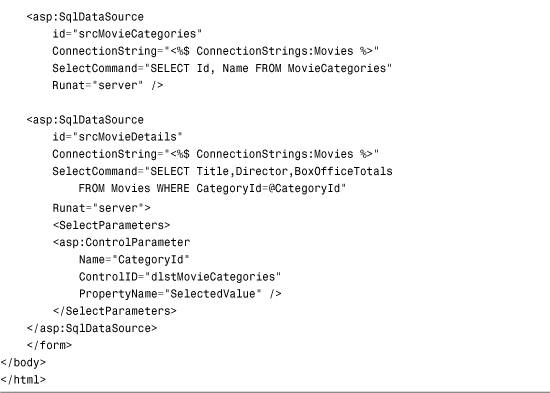
The page in Listing 13.10 contains two DataList controls. The first control displays a menu of movie categories and the second DataList control displays a list of matching movies.
The first DataList in Listing 13.10 includes a DataKeyField property. The DataKeyField property accepts the name of a primary key column from the data source. When this property is set, the DataList control’s DataKeys collection is populated with the primary keys from the data source when the control is bound to its data source.
The first DataList contains a LinkButton inside its ItemTemplate, which looks like this:
<asp:LinkButton
id="lnkMovie"
Text='<%#Eval("Name") %>'
CommandName="Select"
Runat="server" />
Because the LinkButton control’s CommandName property has the value Select, clicking the button changes the value of the DataList control’s SelectedValue property. The DataList control’s SelectedValue property is used by the second SqlDataSource control to return movies that match the selected category.
Note
Unlike the GridView, DetailsView, ListView, and FormView controls, you cannot assign the names of multiple primary key columns to the DataKeyField property.
Editing Data with the DataList Control
You can use the DataList control to edit database records. However, editing with the DataList control requires more coding than editing with other DataBound controls, such as the GridView, FormView, or DetailsView controls.
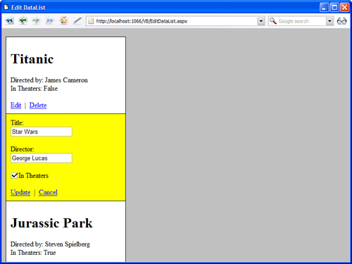
The page in Listing 13.11 illustrates how you can edit and delete database records with the DataList control (see Figure 13.9).
Figure 13.9. Editing database records with the DataList control.
Listing 13.11. EditDataList.aspx
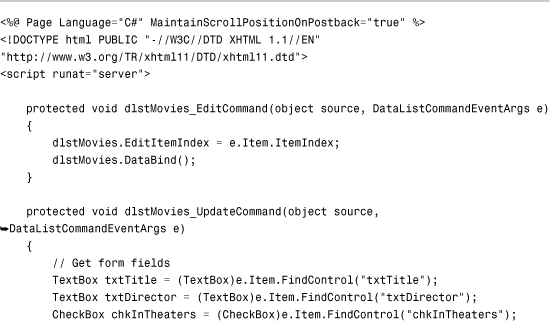


The ItemTemplate contained in the DataList in Listing 13.11 includes an Edit LinkButton and a Delete LinkButton. When you click the Edit LinkButton, the DataList raises its EditCommand event and the dlstMovies_Edit() method is executed. Clicking the Delete LinkButton raises the DeleteCommand event and the dlstMovies_Delete() method is executed.
The dlstMovies_Edit() method sets the EditItemIndex property of the DataList control. The EditItemTemplate is displayed for the item in the DataList that matches the EditItemIndex.
The EditItemTemplate includes form fields for editing a movie record and an Update and Cancel LinkButton. These LinkButtons raise the UpdateCommand and CancelCommand events, and execute the corresponding event handlers.
Note
The <%@ Page %> directive includes a MaintainScrollPositionOnPostback attribute. This attribute causes a page to scroll to the same position whenever you post the page back to the server. For example, when you click the Edit link next to a row in the DataList, the page scrolls to the Edit link that you clicked.
Formatting the DataList Control
The DataList control includes a rich set of properties that you can use to format the HTML rendered by the control. If you want to associate Cascading Style Sheet (CSS) rules with different elements of the DataList, you can take advantage of any of the following properties:
• CssClass—Enables you to associate a CSS class with the DataList.
• AlternatingItemStyle—Enables you to format every other row of DataList.
• EditItemStyle—Enables you to format the DataList row selected for editing.
• FooterStyle—Enables you to format the footer row of DataList.
• HeaderStyle—Enables you to format the header row of DataList.
• ItemStyle—Enables you to format each row displayed by DataList.
• SelectedItemStyle—Enables you to format the selected row in DataList.
• SeparatorStyle—Enables you to format the row separator displayed by DataList.
When formatting the DataList, you also need to work with the following properties:
• GridLines—Enables you to add rules around the cells in the DataList. Possible values are None, Horizontal, Vertical, and Both.
• ShowFooter—Enables you to show or hide the footer row.
• ShowHeader—Enables you to show or hide the header row.
• UseAccessibleHeader—Enables you to render HTML <th> tags instead of <td> tags for the cells in the header row.
Web Standards Note
To make a page that contains a DataList more accessible to persons with disabilities, you should always include a HeaderTemplate and enable the UserAccessibleHeader property.
The page in Listing 13.12 illustrates how you can take advantage of several of these formatting properties (see Figure 13.10).
Figure 13.10. Formatting a DataList.

Listing 13.12. FormatDataList.aspx


Summary
In this chapter, you learned how to use the Repeater control and the DataList control to display a set of database records. First, you learned how to use the Repeater control to display and edit database records. For example, you learned how to use the Repeater control to enable users to edit, delete, and insert database records.
In the second half of this chapter, you learned how to work with the DataList control. You learned how to render both single and multicolumn tables with the DataList control. You also learned how to select rows with the DataList control. Finally, you learned how to edit records using the DataList control.