
Chapter 4. Using the Rich Controls
In previous chapters we examined the ASP.NET controls that you use in just about any application. In this chapter we examine a more specialized set of controls known collectively as the rich controls.
In the first section, you learn how to accept file uploads at your website. For example, you learn how to allow users to upload images, Microsoft Word documents, or Microsoft Excel spreadsheets.
Next, you learn how to work with the Calendar control. You can use the Calendar control as a date picker. You can also use the Calendar control to display upcoming events (such as a meeting schedule).
We also discuss the AdRotator control. This control enables you to display banner advertisements randomly on your website. The control enables you to store a list of advertisements in an XML file or a database table.
Next, you learn about the MultiView control. This control enables you to hide and display areas of content on a page. You learn how to use this control to divide a page into different tabs.
In the following section, you learn about the Wizard control, which enables you to display multistep forms. This control is useful when you need to divide a long form into multiple subforms.
Finally, you learn how to display Silverlight content on your page. Silverlight controls enable you to add rich, interactive media to your website. You learn how to add Silverlight content to your page and display alternative content when a user doesn’t have Silverlight installed on their computer.
Accepting File Uploads
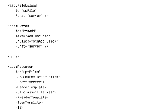
The FileUpload control enables users to upload files to your web application. After the file is uploaded, you can store the file anywhere you please. Normally, you store the file either on the file system or in a database. This section explores both options.
The FileUpload control supports the following properties (this is not a complete list):
• Enabled—Enables you to disable the FileUpload control.
• FileBytes—Enables you to get the uploaded file contents as a byte array.
• FileContent—Enables you to get the uploaded file contents as a stream.
• FileName—Enables you to get the name of the file uploaded.
• HasFile—Returns True when a file has been uploaded.
• PostedFile—Enables you to get the uploaded file wrapped in the HttpPostedFile object.
The FileUpload control also supports the following methods:
• Focus—Enables you to shift the form focus to the FileUpload control.
• SaveAs—Enables you to save the uploaded file to the file system.
The FileUpload control’s PostedFile property enables you to retrieve the uploaded file wrapped in an HttpPostedFile object. This object exposes additional information about the uploaded file.
The HttpPostedFile class has the following properties (this is not a complete list):
• ContentLength—Enables you to get the size of the uploaded file in bytes.
• ContentType—Enables you to get the MIME type of the uploaded file.
• FileName—Enables you to get the name of the uploaded file.
• InputStream—Enables you to retrieve the uploaded file as a stream.
The HttpPostedFile class also supports the following method:
• SaveAs—Enables you to save the uploaded file to the file system.
Some redundancy exists here. For example, you can get the name of the uploaded file by using either the FileUpload.FileName property or the HttpPostedFile.FileName property. You can save a file by using either the FileUpload.SaveAs() method or the HttpPostedFile.SaveAs() method.
Note
Adding a FileUpload control to a page automatically adds a enctype="multipart/form-data" attribute to the server-side <form> tag.
Saving Files to the File System
The page in Listing 4.1 illustrates how you can upload images to an application by using the FileUpload control.
Listing 4.1. FileUploadFile.aspx


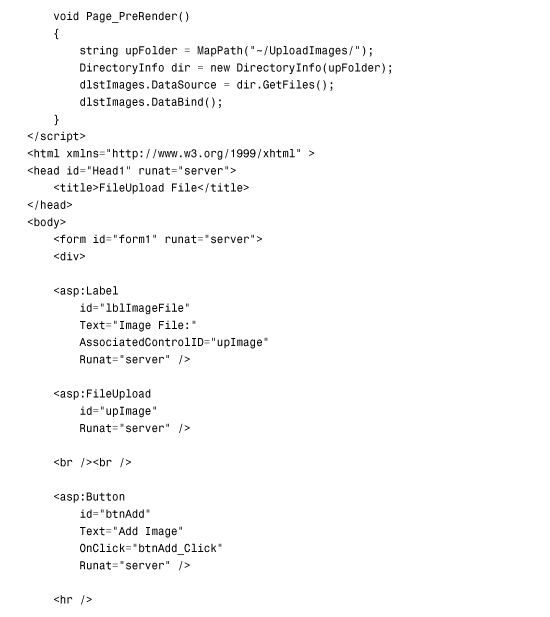
Listing 4.1 includes both a FileUpload control and a DataList control. When you upload a file, the file is saved to a folder named UploadImages. The DataList control automatically displays the contents of the UploadImages folder. The result is an image gallery (see Figure 4.1).
Figure 4.1. Displaying a photo gallery.

The page includes a method named CheckFileType(), which prevents users from uploading a file that does not have the .gif, .jpeg, .jpg, or .png extension. The method restricts the type of file that can be uploaded based on the file extension.
Note
The HTML 4.01 specifications define an accept attribute that you can use to filter the files that can be uploaded. Unfortunately, no browser supports the accept attribute, so you must perform filtering on the server (or use some JavaScript to check the filename extension on the client).
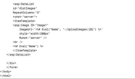
To save a file to the file system, the Windows account associated with the ASP.NET page must have sufficient permissions to save the file. For Windows 2003 and Windows 2008 servers, an ASP.NET page executes in the security context of the NETWORK SERVICE account. In the case of every other operating system, an ASP.NET page executes in the security context of the ASPNET account.
To enable ASP.NET Framework to save an uploaded file to a particular folder, you need to right-click the folder within Windows Explorer, select the Security tab, and provide either the NETWORK SERVICE or ASPNET account Write permissions for the folder (see Figure 4.2).
Figure 4.2. Adding Write permissions for the ASPNET account.
Saving Files to a Database
You also can use the FileUpload control to save files to a database table. Saving and retrieving files from a database can place more stress on your server. However, it does have certain advantages. First, you can avoid file system permissions issues. Second, saving files to a database enables you to more easily back up your information.
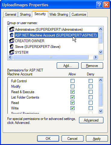
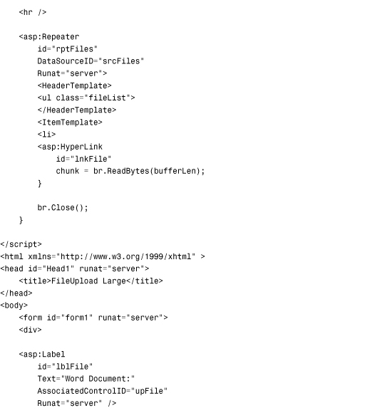
The page in Listing 4.2 enables you to save Microsoft Word documents to a database table (see Figure 4.3).
Figure 4.3. Uploading Microsoft Word documents.
Listing 4.2. FileUploadDatabase.aspx

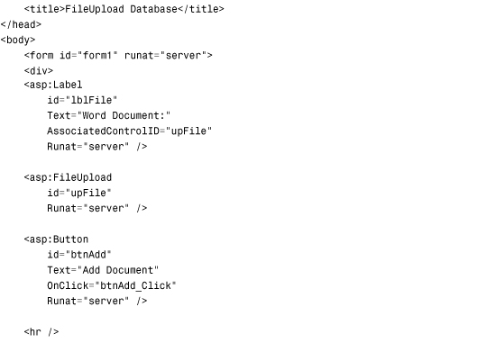

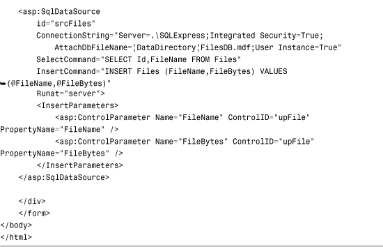
When you submit the form in Listing 4.2, the btnAdd_Click() method executes. This method checks the file extension to verify that the file is a Microsoft Word document. Next, the SqlDataSource control’s Insert() method is called to insert the values of the FileUpload control’s FileName and FileBytes properties into a local SQL Express database table. The SQL Express database table, named Files, looks like this:
The page also displays a list of the current Microsoft Word documents in the database. You can click any file and view the contents of the file. Exactly what happens when you click a file is browser (and browser settings) dependent. With Microsoft Internet Explorer, for example, the document opens directly in the browser.
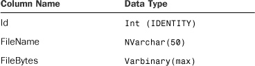
Clicking the name of a document links you to a page named FileHandler.ashx. The FileHandler.ashx file is a generic HTTP Handler file. Chapter 25, “Using the ASP.NET URL Routing Engine,” discusses HTTP Handlers in detail. An HTTP Handler enables you to execute code when someone makes a request for a file with a certain path.
The FileHandler.ashx file is contained in Listing 4.3.
Listing 4.3. FileHandler.ashx
When the FileHandler.aspx page is requested, the ProcessRequest() method executes. This method grabs a query string item named Id and retrieves the matching record from the Files database table. The record contains the contents of a Microsoft Word document as a byte array. The byte array is sent to the browser with the Response.BinaryWrite() method.
Uploading Large Files
You must do extra work when uploading large files. You don’t want to consume your entire server’s memory by placing the entire file in memory. When working with a large file, you need to work with the file in more manageable chunks.
First, you need to configure your application to handle large files. Two configuration settings have an effect on posting large files to the server: the httpRuntime maxRequestLength and httpRuntime requestLengthDiskThreshold settings.
The maxRequestLength setting places a limit on the largest form post that the server can accept. By default, you cannot post a form that contains more than 4MB of data—if you try, you get an exception. If you need to upload a file that contains more than four megabytes of data, you need to change this setting.
The requestLengthDiskThreshold setting determines how a form post is buffered to the file system. In an older version of ASP.NET (ASP.NET 1.1), uploading a large file could do horrible things to your server. The entire file was uploaded into the server memory. While a 10-megabyte video file was uploaded, for example, 10 megabytes of server memory was consumed.
The ASP.NET 4 Framework enables you to buffer large files onto the file system. When the size of the file passes the requestLengthDiskThreshold setting, the remainder of the file is buffered to the file system (in the Temporary ASP.NET Files folder).
By default, the ASP.NET framework is configured to buffer any post larger than 80KB to a file buffer. If you are not happy with this setting, you can modify the requestLengthDiskThreshold to configure a new threshold (The requestLengthDiskThreshold setting must be less than the maxRequestLength setting.)
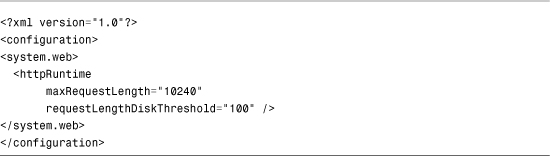
The web configuration file in Listing 4.4 enables files up to 10MB to be posted. It also changes the buffering threshold to 100KB. Changing the buffering threshold controls the amount of information stored in memory before it is flushed to disk.
Listing 4.4. Web.Config
When working with large files, you must be careful about the way that you handle the file when storing or retrieving the file from a data store. For example, when saving or retrieving a file from a database table, you should never load the entire file into memory.
The page in Listing 4.5 demonstrates how you can save a large file to a database table efficiently.
Listing 4.5. FileUploadLarge.aspx

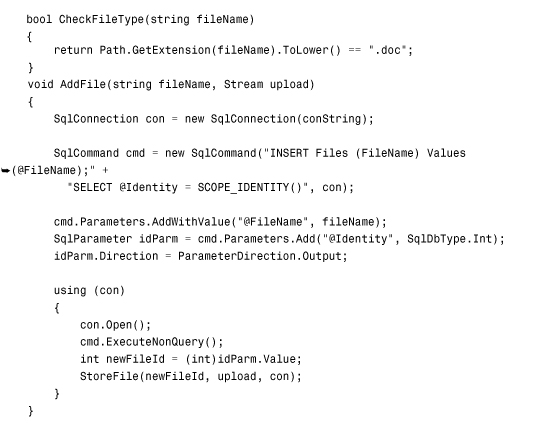
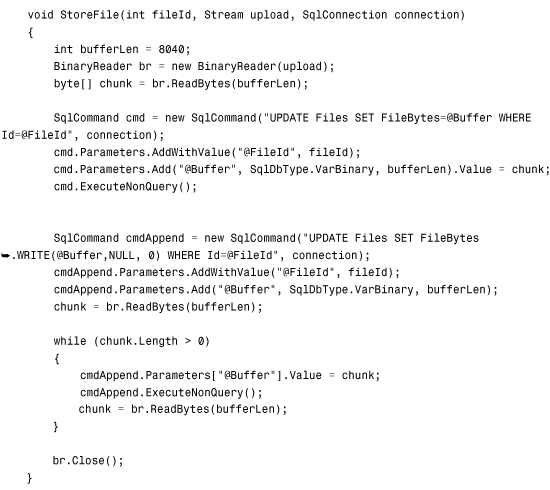


In Listing 4.5, the AddFile() method is called. This method adds a new row to the Files database table that contains the filename. Next, the StoreFile() method is called. This method adds the actual bytes of the uploaded file to the database. The file contents are divided into 8040-byte chunks. The SQL UPDATE statement includes a .WRITE clause used when the FileBytes database column is updated.
Note
Microsoft recommends that you set the buffer size to multiples of 8,040 when using the .WRITE clause to update database data.
The page in Listing 4.5 never represents the entire uploaded file in memory. The file is yanked into memory from the file system in 8,040-byte chunks and fed to SQL Server in chunks.
When you click a filename, the FileHandlerLarge.ashx HTTP Handler executes. This handler retrieves the selected file from the database and sends it to the browser. The handler is contained in Listing 4.6.
Listing 4.6. FileHandlerLarge.ashx


The HTTP Handler in Listing 4.6 uses a SqlDataReader to retrieve a file from the database. The SqlDataReader is retrieved with a CommandBehavior.SequentialAccess parameter that enables the SqlDataReader to load data as a stream. The contents of the database column are pulled into memory in 8,040-byte chunks. The chunks are written to the browser with the Response.BinaryWrite() method.
Response buffering is disabled for the handler. The Response.Buffer property is set to the value False. Because buffering is disabled, the output of the handler is not buffered in server memory before being transmitted to the browser.
Warning
The method of working with large files described in this section only works with SQL Server 2005 and SQL Server 2008. When using earlier versions of SQL Server, you need to use the TEXTPTR() function instead of the .WRITE clause.
Displaying a Calendar
The Calendar control enables you to display a calendar. You can use the calendar as a date picker or to display a list of upcoming events.
The page in Listing 4.7 displays a simple calendar with the Calendar control (see Figure 4.4).
Figure 4.4. Displaying a calendar with the Calendar control.

Listing 4.7. ShowCalendar.aspx

The Calendar control supports the following properties (this is not a complete list):
• DayNameFormat—Enables you to specify the appearance of the days of the week. Possible values are FirstLetter, FirstTwoLetters, Full, Short, and Shortest.
• NextMonthText—Enables you to specify the text that appears for the next month link.
• NextPrevFormat—Enables you to specify the format of the next month and previous month link. Possible values are CustomText, FullMonth, and ShortMonth.
• PrevMonthText—Enables you to specify the text that appears for the previous month link.
• SelectedDate—Enables you to get or set the selected date.
• SelectedDates—Enables you to get or set a collection of selected dates.
• SelectionMode—Enables you to specify how dates are selected. Possible values are Day, DayWeek, DayWeekMonth, and None.
• SelectMonthText—Enables you to specify the text that appears for selecting a month.
• SelectWeekText—Enables you to specify the text that appears for selecting a week.
• ShowDayHeader—Enables you to hide or display the day names at the top of the Calendar control.
• ShowNextPrevMonth—Enables you to hide or display the links for the next and previous months.
• ShowTitle—Enables you to hide or display the title bar displayed at the top of the calendar.
• TitleFormat—Enables you to format the title bar. Possible values are Month and MonthYear.
• TodaysDate—Enables you to specify the current date. This property defaults to the current date on the server.
• VisibleDate—Enables you to specify the month displayed by the Calendar control. This property defaults to displaying the month that contains the date specified by TodaysDate.
The Calendar control also supports the following events:
• DayRender—Raised as each day is rendered.
• SelectionChanged—Raised when a new day, week, or month is selected.
• VisibleMonthChanged—Raised when the next or previous month link is clicked.
The SelectionMode property enables you to change the behavior of the calendar so that you can not only select days, but also select weeks or months. The page in Listing 4.8 illustrates how you can use the SelectionMode property with the SelectedDates property to select multiple dates (see Figure 4.5).
Figure 4.5. Selecting weeks and months with a Calendar control.
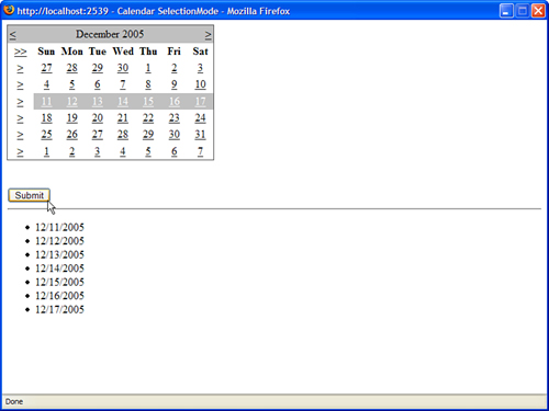
Listing 4.8. CalendarSelectionMode.aspx


When you select a date, or group of dates, from the Calendar control in Listing 4.8, the set of selected dates display in a BulletedList control.
Creating a Pop-Up Date Picker
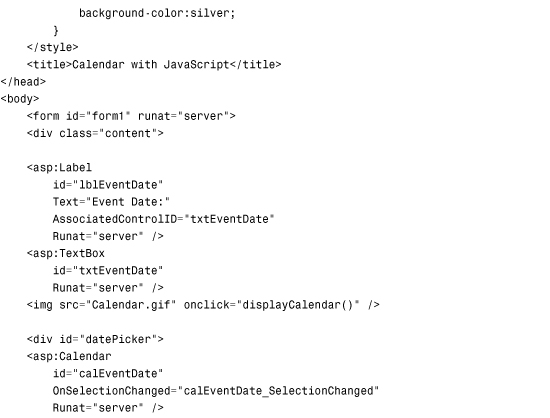
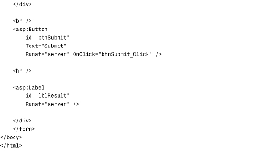
You can use a Calendar control to create a fancy pop-up date picker if you are willing to add a little JavaScript and some Cascading Style Sheet (CSS) rules to a page. The page in Listing 4.9 contains a TextBox and Calendar control (see Figure 4.6).
Figure 4.6. Displaying a pop-up calendar.

The Calendar control is hidden until you click the calendar image. The #datePicker style sheet rules sets the display property to none. When you click the image of the calendar, the JavaScript displayCalendar() function executes and sets the CSS display property to the value block.
When you select a date from the calendar, the page is posted back to the server and the SelectionChanged server-side event is raised. The SelectionChanged event handler updates the TextBox control with the selected date.
Listing 4.9. CalendarJS.aspx


Rendering a Calendar from a Database Table
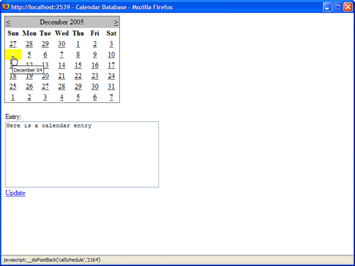
You also can use the Calendar control to display events in a calendar. In this section, we build a simple schedule application that enables you to insert, update, and delete calendar entries. Each schedule entry is highlighted in a Calendar control (see Figure 4.7).
Figure 4.7. Displaying a calendar from a database.
The code for the schedule application is contained in Listing 4.10.
Listing 4.10. CalendarDatabase.aspx


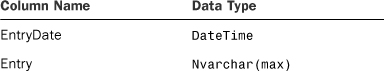
The page in Listing 4.10 saves and loads entries from a SQL Express database named ScheduleDB. The contents of the schedule are contained in a table named Schedule that has the following schema:
The tricky part in Listing 4.10 is the code for highlighting the current entries in the calendar. In the Page_PreRender event handler, a list of all the current entries is retrieved from the database. The list is represented by a DataView object.
The DayRender event is raised when the Calendar renders each day (table cell). In the DayRender event handler in Listing 4.10, if an entry is in the database that corresponds to the day being rendered, the day is highlighted with a yellow background color.
Displaying Advertisements
The AdRotator control enables you to randomly display different advertisements in a page. You can store the list of advertisements in either an XML file or in a database table.
The AdRotator control supports the following properties (this is not a complete list):
• AdvertisementFile—Enables you to specify the path to an XML file that contains a list of banner advertisements.
• AlternateTextField—Enables you to specify the name of the field for displaying alternate text for the banner advertisement image. The default value is AlternateText.
• DataMember—Enables you to bind to a particular data member in the data source.
• DataSource—Enables you to specify a data source programmatically for the list of banner advertisements.
• DataSourceID—Enables you to bind to a data source declaratively.
• ImageUrlField—Enables you to specify the name of the field for the image URL for the banner advertisement. The default value for this field is ImageUrl.
• KeywordFilter—Enables you to filter advertisements by a single keyword.
• NavigateUrlField—Enables you to specify the name of the field for the advertisement link. The default value for this field is NavigateUrl.
• Target—Enables you to open a new window when a user clicks the banner advertisement.
The AdRotator control also supports the following event:
• AdCreated—Raised after the AdRotator control selects an advertisement but before the AdRotator control renders the advertisement.
The AdRotator control includes a KeywordFilter property. You can provide each banner advertisement with a keyword and then filter the advertisements displayed by the AdRotator control by using the value of the KeywordFilter property.
This property can be used in multiple ways. For example, if you display more than one advertisement in the same page, you can filter the advertisements by page regions. You can use the KeywordFilter to show the big banner advertisement on the top of the page and box ads on the side of the page.
You can also use the KeywordFilter property to filter advertisements by website section. For example, you might want to show different advertisements on your website’s home page than on your website’s search page.
Note
If you cache a page that contains an AdRotator control, the AdRotator control is excluded from the cache. In other words, even if you cache a page, randomly selected banner advertisements still display. The AdRotator control takes advantage of a feature of the ASP.NET Framework called post-cache substitution. You learn more about this feature in Chapter 29, “Caching Application Pages and Data.”
Storing Advertisements in an XML File
You can store the list of advertisements that the AdRotator displays in an XML file by setting the AdRotator control’s AdvertisementFile property. For example, the page in Listing 4.11 contains three AdRotator controls that retrieve banner advertisements from an XML file named AdList.xml (see Figure 4.8).
Figure 4.8. Displaying advertisements from an XML file.

Listing 4.11. AdRotatorXML.aspx


The page in Listing 4.11 contains an AdRotator control that displays a banner advertisement at the top of the page. The page also contains two AdRotator controls that display box advertisements on the right of the page.
The first AdRotator has a KeyworldFilter property that has the value banner, and the remaining two AdRotator controls have KeywordFilter properties with the value box. The first AdRotator displays only banner advertisements, and the remaining two AdRotator controls display only box advertisements.
All three AdRotator controls get their list of banner advertisements from a file named AdList.xml. This file is located in the App_Data folder for security reasons. The files in the App_Data folder cannot be opened in a web browser.
Note
There is nothing wrong with assigning different XML files to different AdRotator controls. For example, you could create distinct BannerAd.xml and BoxAd.xml files, and then you would not have to worry about the KeywordFilter property.
The file in Listing 4.12 contains the contents of the AdList.xml file.
Listing 4.12. AdList.xml
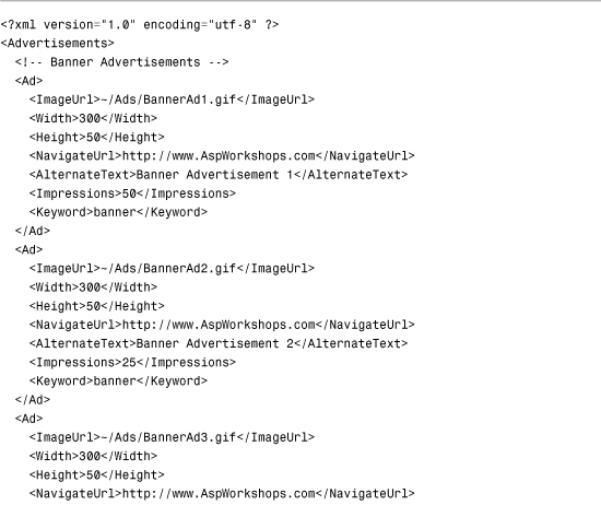

The Impressions attribute in the file in Listing 4.12 determines how often each banner advertisement displays. For example, the first banner advertisement displays 50% of the time, and the remaining two banner advertisements display 25% of the time.
Storing Advertisements in a Database Table
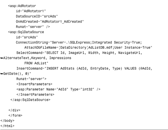
Rather than store the list of advertisements in an XML file, you can store the list in a database table. For example, the AdRotator control contained in Listing 4.13 is bound to a SqlDataSource control. The SqlDataSource control represents the contents of a database table named AdList, which is located in a SQL Express database named AdListDB.
Listing 4.13. AdRotatorDatabase.aspx

To use the page in Listing 4.13, you need to create the AdList database table. This table has the following schema:

The columns in the AdList database table correspond to the attributes in the AdList.xml file discussed in the previous section.
Tracking Impressions and Transfers
Normally, when you display advertisements, you do it to make money. Your advertisers want statistics on how often their advertisements display (the number of impressions) and how often their advertisements are clicked (the number of transfers).
To track the number of times that an advertisement displays, you need to handle the AdRotator control’s AdCreated event. To track the number of times that an advertisement is clicked, you need to create a redirect handler.
Warning
If you create an event handler for the AdCreated event and you cache the page, the content rendered by the AdRotator control is also cached. When handling the AdCreated event, use partial page caching to cache only part of a page and not the AdRotator control itself.
The page in Listing 4.14 displays a banner advertisement with the AdRotator control. The page includes an event handler for the AdRotator control’s AdCreated event.
Listing 4.14. AdRotatorTrack.aspx
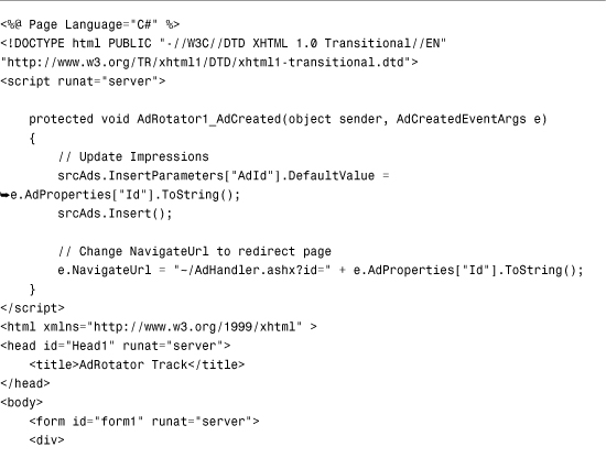
The AdCreated event handler does two things. First, it inserts a new record into a database table named AdStats, which records an advertisement impression. Second, the handler modifies the NavigateUrl so that the user is redirected to a handler named AdHandler.ashx.
The AdStats database table looks like this:
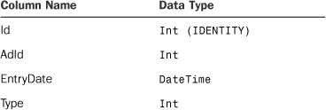
The Type column records the type of entry. The value 0 represents an advertisement impression, and the value 1 represents an advertisement transfer.
When you click an advertisement, you link to a file named AdHandler.ashx. This file is contained in Listing 4.15.
Listing 4.15. AdHandler.ashx


The handler in Listing 4.15 performs two tasks. First, it inserts a new record into the AdStats database table, recording that a transfer is taking place. Next, it grabs the NavigateUrl from the AdList database table and sends the user to the advertiser’s website.
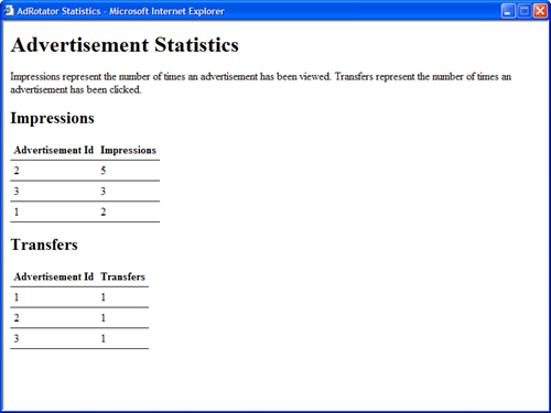
The final page displays advertiser statistics from the AdStats database table (see Figure 4.9). This page is contained in Listing 4.16.
Figure 4.9. Displaying advertiser statistics.
Listing 4.16. AdRotatorStats.aspx


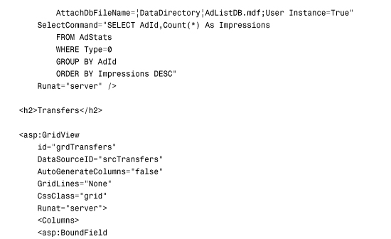
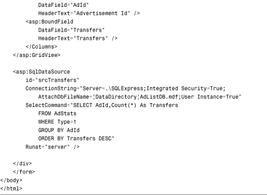
The page in Listing 4.16 contains two GridView controls bound to two SqlDataSource controls. The first GridView displays statistics on impressions, and the second GridView displays statistics on transfers.
Displaying Different Page Views
The MultiView control enables you to hide and display different areas of a page. This control is useful when you need to create a tabbed page. It is also useful when you need to divide a long form into multiple forms.
The MultiView control contains one or more View controls. You use the MultiView control to select a particular View control to render. (The selected View control is the Active View.) The contents of the remaining View controls are hidden. You can render only one View control at a time.
The MultiView control supports the following properties (this is not a complete list):
• ActiveViewIndex—Enables you to select the View control to render by index.
• Views—Enables you to retrieve the collection of View controls contained in the MultiView control.
The MultiView control also supports the following methods:
• GetActiveView—Enables you to retrieve the selected View control.
• SetActiveView—Enables you to select the active view.
Finally, the MultiView control supports the following event:
• ActiveViewChanged—Raised when a new View control is selected.
The View control does not support any special properties or methods. Its primary purpose is to act as a container for other controls. However, the View control does support the following two events:
• Activate—Raised when the view becomes the selected view in the MultiView control.
• Deactivate—Raised when another view becomes the selected view in the MultiView control.
Displaying a Tabbed Page View
When you use the MultiView control with the Menu control, you can create a tabbed page view. (To make it look pretty, you need to use some CSS.)
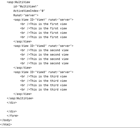
For example, the page in Listing 4.17 contains a MultiView control with three View controls. The Menu control switches between the View controls (see Figure 4.10).
Figure 4.10. Displaying a tabbed page with the MultiView control.

Listing 4.17. MultiViewTabs.aspx
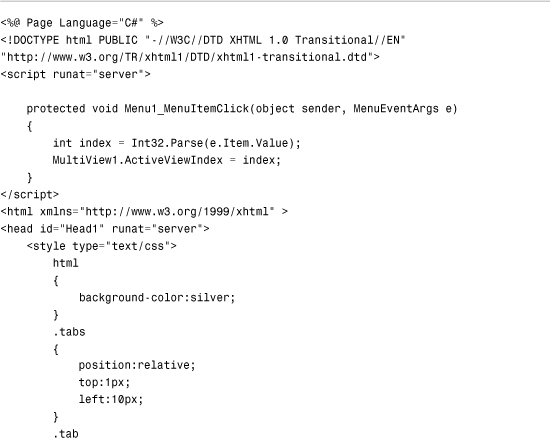

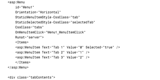
In Listing 4.17, the Menu control is associated with a CSS class named tabs. This class relatively positions the Menu control down one pixel to merge the bottom border of the Menu control with the top border of the <div> tag that contains the MultiView. Because the selected tab has a white bottom border, the border between the selected tab and the tab contents disappears.
Displaying a Multipart Form
You can use the MultiView control to divide a large form into several subforms. You can associate particular commands with button controls contained in a MultiView. When the button is clicked, the MultiView changes the active view.
The MultiView control recognizes the following commands:
• NextView—Causes the MultiView to activate the next View control.
• PrevView—Causes the MultiView to activate the previous View control.
• SwitchViewByID—Causes the MultiView to activate the view specified by the button control’s CommandArgument.
• SwitchViewByIndex—Causes the MultiView to activate the view specified by the button control’s CommandArgument.
You can use these commands with any of the button controls—Button, LinkButton, and ImageButton—by setting the button control’s CommandName property and, in the case of the SwitchViewByID and SwitchViewByIndex, by setting the CommandArgument property.
The page in Listing 4.18 illustrates how you can use the NextView command to create a multipart form.
Listing 4.18. MultiViewForm.aspx
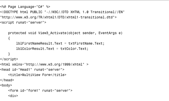
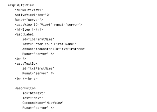


The first two View controls in Listing 4.18 contain a Button control. These Button controls both have a CommandName property set to the value NextView.
Displaying a Wizard
You can use the Wizard control, like the MultiView control, to divide a large form into multiple subforms. The Wizard control, however, supports many advanced features not supported by the MultiView control.
The Wizard control contains one or more WizardStep child controls. Only one WizardStep displays at a time.
The Wizard control supports the following properties (this is not a complete list):
• ActiveStep—Enables you to retrieve the active WizardStep control.
• ActiveStepIndex—Enables you to set or get the index of the active WizardStep control.
• CancelDestinationPageUrl—Enables you to specify the URL where the user is sent when the Cancel button is clicked.
• DisplayCancelButton—Enables you to hide or display the Cancel button.
• DisplaySideBar—Enables you to hide or display the Wizard control’s side bar. The side bar displays a list of all the wizard steps.
• FinishDestinationPageUrl—Enables you to specify the URL where the user is sent when the Finish button is clicked.
• HeaderText—Enables you to specify the header text that appears at the top of the Wizard control.
• WizardSteps—Enables you to retrieve the WizardStep controls contained in the Wizard control.
The Wizard control also supports the following templates:
• FinishNavigationTemplate—Enables you to control the appearance of the navigation area of the finish step.
• HeaderTemplate—Enables you control the appearance of the header area of the Wizard control.
• SideBarTemplate—Enables you to control the appearance of the side bar area of the Wizard control.
• StartNavigationTemplate—Enables you to control the appearance of the navigation area of the start step.
• StepNavigationTemplate—Enables you to control the appearance of the navigation area of steps that are not start, finish, or complete steps.
The Wizard control also supports the following methods:
• GetHistory()—Enables you to retrieve the collection of WizardStep controls that have been accessed.
• GetStepType()—Enables you to return the type of WizardStep at a particular index. Possible values are Auto, Complete, Finish, Start, and Step.
• MoveTo()—Enables you to move to a particular WizardStep.
The Wizard control also supports the following events:
• ActiveStepChanged—Raised when a new WizardStep becomes the active step.
• CancelButtonClick—Raised when the Cancel button is clicked.
• FinishButtonClick—Raised when the Finish button is clicked.
• NextButtonClick—Raised when the Next button is clicked.
• PreviousButtonClick—Raised when the Previous button is clicked.
• SideBarButtonClick—Raised when a side bar button is clicked.
A Wizard control contains one or more WizardStep controls that represent steps in the wizard. The WizardStep control supports the following properties:
• AllowReturn—Enables you to prevent or allow a user to return to this step from a future step.
• Name—Enables you to return the name of the WizardStep control.
• StepType—Enables you to get or set the type of wizard step. Possible values are Auto, Complete, Finish, Start and Step.
• Title—Enables you to get or set the title of the WizardStep. The title displays in the wizard side bar.
• Wizard—Enables you to retrieve the Wizard control containing the WizardStep.
The WizardStep also supports the following two events:
• Activate—Raised when a WizardStep becomes active.
• Deactivate—Raised when another WizardStep becomes active.
The StepType property is the most important property. This property determines how a WizardStep is rendered. The default value of StepType is Auto. When StepType is set to the value Auto, the position of the WizardStep in the WizardSteps collection determines how the WizardStep renders.
You can explicitly set the StepType property to a particular value. If you set StepType to the value Start, a Previous button is not rendered. If you set the StepType to Step, both Previous and Next buttons are rendered. If you set StepType to the value Finish, Previous and Finish buttons are rendered. Finally, when StepType is set to the value Complete, no buttons are rendered.
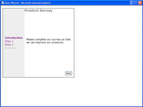
The page in Listing 4.19 illustrates how you can use a Wizard control to display a multiple part form (see Figure 4.11).
Figure 4.11. Displaying a wizard with the Wizard control.
Listing 4.19. ShowWizard.aspx
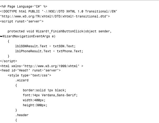


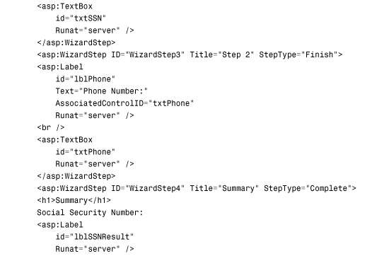

The Wizard control in Listing 4.19 contains four WizardStep controls. The StepType property is explicitly set for the last two WizardStep controls. When the Finish WizardStep is rendered, a Finish button is rendered. When the Complete WizardStep is rendered, no buttons are rendered.
The Wizard control’s FinishButtonClick event is handled with a method named Wizard1_FinishButtonClick(). This method updates the final WizardStep with a summary of the answers entered in the previous WizardStep controls.
Displaying Silverlight Content
Silverlight is a framework that enables you to incorporate rich, animated, interactive content to your website. To display this content, your website visitors must have the Silverlight runtime installed on their computer.
Note
You can download and install the Microsoft Silverlight runtime (for both Windows and Macintosh) from http://www.silverlight.net.
Unlike the other controls we discussed in this chapter, Silverlight content is not added to an ASP.NET application using a server control. Instead, a standard HTML object element is used to add the content. You should set the following attributes on the object:
• Width—The width of your Silverlight control, in pixels.
• Height—The height of your Silverlight control, in pixels.
• Data—Indicates the type of object you use, which should be set to “data:application/x-silverlight-2,”.
• Type—Indicates the type of object you use, which should be set to “application/x-silverlight-2”.
Silverlight applications are stored in a file with an extension of .xap; XAP files are similar to EXEs and DLLs in that they are the compiled binary versions of source code. The Silverlight content that you want to use on your page must be on your web server in XAP format. Then, the source parameter on the HTML object must be set to the path of the XAP file.

Note
Silverlight applications are built using the Silverlight SDK and Visual Studio using specific markup called XAML. Building the actual Silverlight content is beyond the scope of this book. For more information on building applications in Silverlight, check out Silverlight 4 Unleashed from SAMS Press.
You can specify several other parameters on your Silverlight HTML object to customize the content (this is not a complete list):
• Background—The color to set the background to.
• MinRuntimeVersion—The minimum version of Silverlight required.
• AutoUpgrade—Indicates whether to automatically upgrade to the required version of Silverlight if it is not installed.
• OnError—The name of a JavaScript function that should get called if an error occurs.
If Silverlight is not installed on the user’s computer, you can display alternative content by providing standard HTML before the closing </object> tag. A common practice is to display the default installation image that links to the Silverlight download page.
The listing in 4.20 illustrates how to display a Silverlight control on your page and demonstrates the usage of the preceding parameters. Alternative content also displays if the user doesn’t have Silverlight installed (see Figure 4.12).
Figure 4.12. Displaying Silverlight content with an object tag.

Listing 4.20. ShowSilverlight.aspx

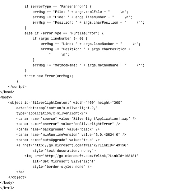
Listing 4.20 displays a simple web page with a Silverlight control. The SilverlightApplication1.xap file is located in the same folder as our web page, as the source tag indicates. The background of the control is set to black, and we require a minimum version of Silverlight 3. If a user visits this page and has only Silverlight 1 or 2 installed, they are automatically prompted to upgrade to the newer version. The a and img HTML tags toward the bottom of the object display only if the user does not have the Silverlight runtime installed and shows the default Get Microsoft Silverlight installation button.
Summary
This chapter tackled the rich controls. You learned how to perform file uploads with the FileUpload control. You also saw how to accept and display large file uploads by dividing the file into smaller chunks.
You also learned how to use the Calendar control to display a date picker and render a schedule of events. Using a tiny bit of JavaScript, you learned how to create a fancy pop-up date picker.
This chapter also discussed the AdRotator control. You learned how to store a list of advertisements in both an XML file and a database table. You also learned how to track advertisement impressions and transfers and build a statistics page.
You also learned how to use the MultiView control to display different views of a page. You learned how to create a tabbed page by using the MultiView control with the Menu control. You also learned how to use the MultiView to divide a large form into multiple subforms.
We also discussed the Wizard control. You learned how to use the Wizard control to render navigation elements automatically for completing a multistep task.
Finally, you learned how to add rich content to your site with Silverlight. You learned how to add Silverlight and how to display alternative content when a user doesn’t have Silverlight installed.