
Chapter 11. Using the GridView Control
In This Chapter
• GridView Control Fundamentals
• Using Fields with the Gridview Control
• Working with GridView Control Events
• Extending the GridView Control
• Summary
The GridView control is the workhorse of ASP.NET Framework. It is one of the most feature-rich and complicated of all the ASP.NET controls. The GridView control enables you to display, select, sort, page, and edit data items such as database records.
Note
The GridView control supersedes the DataGrid control included in the ASP.NET 1.x Framework. The DataGrid control is still included in ASP.NET 4 for backward compatibility, but you should use the GridView instead because it is a more powerful control.
In this chapter, you learn everything you ever wanted to know about the GridView control. You learn how to use all the basic features of the GridView control. For example, you learn how to use this control to display, select, sort, page, and edit database records. You also learn how to use AJAX with the GridView control when sorting and paging records.
You also get the chance to tackle several advanced topics. For example, you learn how to highlight certain rows in a GridView depending on the data the row represents. You also learn how to display column summaries.
Finally, you learn how to extend the GridView control by building custom GridView fields. At the end of this chapter, we build a LongTextField, a DeleteButtonField, and a ValidatedField.
GridView Control Fundamentals
In this section, you learn how to take advantage of all the basic features of the GridView control. In particular, you learn how to display, select, sort, page, and edit database data with a GridView control. We also discuss GridView formatting options.
Displaying Data
GridView renders its data items in an HTML table. Each data item renders in a distinct HTML table row. For example, the page in Listing 11.1 demonstrates how you can use GridView to display the contents of the Movies database table (see Figure 11.1).
Figure 11.1. Displaying data with the GridView control.

Listing 11.1. ShowMovies.aspx

In Listing 11.1, the GridView control is bound to a SqlDataSource control, which represents the Movies database table. The GridView associates with its data source through its DataSourceID property.
The GridView control automatically renders a check box for any Boolean fields. In the case of Listing 11.1, GridView renders a check box for the InTheaters database column. For all other types of fields, GridView simply renders the contents of the field.
Web Standards Note
The GridView control was designed to meet XHTML and accessibility guidelines. For example, the control uses the <th> tag to render its headers. Furthermore, each header tag includes a scope="col" attribute.
Visual Web Developer Note
You can add a GridView and SqlDataSource control to a page quickly by dragging a database table from the Database Explorer window onto a page in Design view. When you drag a database table onto the page, a SqlDataSource is automatically created, which retrieves all the rows and all the columns from a database table.
The GridView control also supports programmatic databinding. In Listing 11.2, the GridView control displays a list of shopping list items represented by a Generic List collection.
Listing 11.2. ShowShoppingList.aspx

GridView is bound to the shopping list in the Page_Load() method. Its DataSource property points to the List collection, and its DataBind() method is called to load the items from the List collection and display them.
Selecting Data
You can allow a user to select a particular row in a GridView control. This is useful when you want to build single-page Master/Details forms. For example, the page in Listing 11.3 contains two GridView controls. The first GridView displays a list of movie categories. When you select a category, the second GridView displays a list of matching movies (see Figure 11.2).
Figure 11.2. Selecting a GridView row.

Listing 11.3. SelectGridView.aspx


The first GridView has its AutoGenerateSelectButton property enabled. When this property has the value True, a Select link displays next to each row.
You can determine which row is selected in a GridView control by using any of the following methods:
• SelectedDataKey()—Returns the DataKey object associated with the selected row. (This is useful when there are multiple data keys.)
• SelectedIndex()—Returns the (zero-based) index of the selected row.
• SelectedValue()—Returns the data key associated with the selected row.
• SelectedRow()—Returns the actual row (GridViewRow object) associated with the selected row.
In most cases, you use the SelectedValue() method to determine the value associated with a particular row. The SelectedValue() method returns the data key associated with a row. The following section discusses data keys.
Note
When a user changes the page in GridView, you might not want the selected row to remain in the selected state when new data populates. You can set the PersistedSelection property to True to avoid this. When the user changes a GridView page, the selection goes away, and if they go back to the original page, the selection reappears.
Using Data Keys
You associate a value with each row in a GridView by providing a value for the GridView control’s DataKeyNames property. You can assign the name of a single database column to this property, or you can assign a comma-separated list of column names to this property.
For example, the Employees database table uses two columns—the employee first and last name—as a primary key. The page in Listing 11.4 displays employee details when you select a particular employee (see Figure 11.3).
Figure 11.3. Displaying employee details.

Listing 11.4. SelectDataKeys.aspx


In Listing 11.4, the SelectedDataKey() method retrieves the primary key of the selected employee. The SelectedDataKey() method is used in both of the ControlParameters contained in the second SqlDataSource control. If you use SelectedValue() instead of SelectedDataKey(), you can return only the value of the first data key and not both values.
A GridView stores data keys in a collection called the DataKeys collection. This collection is exposed by the GridView control’s DataKeys property. You can retrieve the data key associated with any row by using a statement that looks like this:
Object key = GridView1.DataKeys[6].Value;
This statement returns the value of the data key associated with the seventh row in the GridView. (Remember that the rows collection is zero-based.) If you have assigned multiple data keys to each row, you can use a statement that looks like this:
Object key = GridView1.DataKeys[6].Values["LastName"];
This statement retrieves the value of the LastName key for the seventh row in the GridView.
Sorting Data
You can sort the rows rendered by a GridView control by enabling the AllowSorting property. For example, the page in Listing 11.5 illustrates how you can sort the contents of the Movies database table.
Listing 11.5. SortGrid.aspx

When AllowSorting has the value True, column headers render as links. When you click a column header, you can sort the rows contained in the GridView in the order of the selected column.
Note
When using explicitly specified fields with a GridView, such as BoundFields, you need to specify values for the fields’ SortExpression properties. Otherwise, nothing happens when you click a header.
The GridView supports ascending and descending sorts. In other words, if you click a column header more than once, the rows toggle between being sorted in ascending and descending order.
Sorting with AJAX
By default, whenever you click a column header to sort the rows contained in a GridView, the page containing the GridView is posted back to the server. When sorting records with the GridView control, you can avoid posting the entire page back to the server by taking advantage of Ajax (Asynchronous JavaScript and XML).
We get into the details of Ajax in Part IX, “ASP.NET AJAX.” In this section, I provide you with a quick code sample that demonstrates how to use Ajax with the GridView control. The page in Listing 11.6 illustrates how you can take advantage of AJAX when sorting records.
Listing 11.6. AjaxSorting.aspx

GridView in Listing 11.6 is contained in an UpdatePanel control. When you sort GridView, only the region of the page contained in the UpdatePanel is updated.
The current time displays at the top of the page. The time is not updated when you sort the records in GridView. The entire page is not posted back to the server; only the content of the UpdatePanel control is updated.
Note
An alternative method for Ajax sorting with the GridView control is to enable the GridView control’s EnableSortingAndPagingCallbacks property. I don’t suggest that you use this method because it limits the types of fields that you can add to GridView. For example, if you enable EnableSortingAndPagingCallbacks, you can’t use TemplateFields with GridView. The UpdatePanel control is not subject to these same limitations.
Customizing the Sorting Interface
You can customize the appearance of the sort links by handling the GridView control’s RowDataBound event. This event is raised for each row rendered by GridView after GridView is bound to its data source.
For example, the page in Listing 11.7 displays an image that represents whether a column is sorted in ascending or descending order (see Figure 11.4).
Figure 11.4. Displaying an image when sorting.

Listing 11.7. ImageSorting.aspx


In Listing 11.7, the image is added to the header row in the grdMovies_RowDataBound() method. The current row’s RowType property is checked to verify that the row is a header row. Next, an HTML <img> tag is added to the LinkButton that matches the column currently selected for sorting.
If you need to completely customize the appearance of the sorting user interface, you can call the GridView control’s Sort() method programmatically. Listing 11.8 illustrates this approach (see Figure 11.5).
Figure 11.5. Displaying a custom sorting interface.

Listing 11.8. CustomSorting.aspx


The page in Listing 11.8 includes a DropDownList control, which you can use to sort the contents of the GridView. When a list item is selected from the DropDownList control and the Sort button is clicked, the btnSort_Click() method executes. This method calls the Sort() method of the GridView control to sort the contents of GridView.
Paging Through Data
When working with a large number of database rows, it is useful to display the rows in different pages. You can enable paging with the GridView control by enabling its AllowPaging property.
For example, the page in Listing 11.9 enables you to page through the records in the Movies database table (see Figure 11.6).
Figure 11.6. Paging through records in a GridView control.

Listing 11.9. PageGrid.aspx

The GridView in Listing 11.9 displays three database records per page. You can modify the number of records displayed per page by modifying the GridView control’s PageSize property. (If you don’t specify a value for PageSize, the GridView defaults to displaying 10 records per page.)
Warning
This section describes how you can enable user interface paging with the GridView control. When you use user interface paging, all the database records load into memory and divide into separate pages. For example, when paging through a database table that contains three billion database records, all three billion records load into memory even when you display only three records in a single page. You should not use user interface paging when working with large sets of data. Instead, use the ObjectDataSource control’s support for data source paging. This option is discussed in Chapter 18, “Using the ObjectDataSource Control.”
Paging with AJAX
The default behavior of the GridView control is to post back to the server every time you navigate to a new page of records; however, there is an alternative. You can take advantage of AJAX when paging through records with the GridView control.
The page in Listing 11.10 illustrates how you can use AJAX with the GridView control.
Listing 11.10. AjaxPaging.aspx


The page in Listing 11.10 includes an UpdatePanel control. Because the GridView is contained in the UpdatePanel, the page containing GridView is not posted back to the server when you page through GridView.
The page in Listing 11.10 displays the current time at the top of the page. When you page through the records rendered by the GridView control, the time does not change. Only the contents of the GridView control are modified.
Customizing the Paging Interface
By default, when paging is enabled, GridView renders a list of page numbers at the bottom of the grid. You can modify the user interface for paging through records by modifying the GridView control’s PagerSettings property. For example, the page in Listing 11.11 contains a GridView that renders First, Previous, Next, and Last links at both the top and bottom of GridView (see Figure 11.7).
Figure 11.7. Modifying pager settings.

Listing 11.11. PageGridPreviousNext.aspx

The PagerSettings class supports the following properties:
• FirstPageImageUrl—Enables you to display an image for the first page link.
• FirstPageText—Enables you to specify the text for the first page link.
• LastPageImageUrl—Enables you to display an image for the last page link.
• LastPageText—Enables you to specify the text for the last page link.
• Mode—Enables you to select a display mode for the pager user interface. Possible values are NextPrevious, NextPreviousFirstLast, Numeric, and NumericFirstLast.
• NextPageImageUrl—Enables you to display an image for the next page link.
• NextPageText—Enables you to specify the text for the next page link.
• PageButtonCount—Enables you to specify the number of page number links to display.
• Position—Enables you to specify the position of the paging user interface. Possible values are Bottom, Top, TopAndBottom.
• PreviousPageImageUrl—Enables you to display an image for the previous page link.
• PreviousPageText—Enables you to specify the text for the previous page link.
• Visible—Enables you to hide the paging user interface.
The PageButtonCount requires more explanation. Imagine that you display the contents of a database table that contains 3 billion records and you display two records per page. In that case, you need to render an overwhelming number of page numbers. The PageButtonCount property enables you to limit the number of page numbers displayed at once. When PageButtonCount has a value less than the number of page numbers, GridView renders ellipses, which enables a user to move between ranges of page numbers.
The GridView control includes a PagerTemplate, which enables you to completely customize the appearance of the paging user interface. For example, the page in Listing 11.12 uses a Menu control in a PagerTemplate to display a list of page numbers. The PagerTemplate also includes two LinkButton controls, which represent a Previous and Next link (see Figure 11.8).
Figure 11.8. Using a template for the paging interface.

Listing 11.12. PageTemplateGrid.aspx


The GridView in Listing 11.12 includes a PagerTemplate that contains a Menu control. When GridView is bound to its data source, the grdMovies_DataBound() method executes and creates menu items that correspond to each page in GridView. When you click a menu item, the page index of GridView is updated.
To customize the PagerTemplate, you can add button controls to the template such as the Button, ImageButton, or LinkButton controls. Set the CommandName property of the Button control to the value Page and the CommandArgument property to one of the following values:
• Next—Causes the GridView to display the next page of data items.
• Prev—Causes the GridView to display the previous page of data items.
• First—Causes the GridView to display the first page of data items.
• Last—Causes the GridView to display the last page of data items.
• Integer Value—Causes the GridView to display a particular page of data items.
Editing Data
The GridView control also enables you to edit database data. The amazing thing is that you can use the GridView to edit the contents of a database table row without writing a single line of code.
The page in Listing 11.13 illustrates how you can update and delete records in the Movies database table by using the GridView control (see Figure 11.9).
Figure 11.9. Editing records with the GridView.
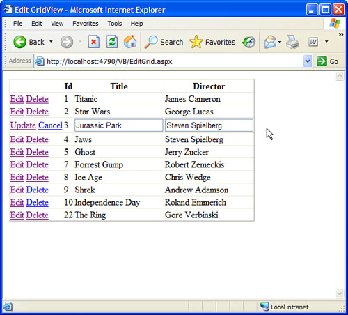
Listing 11.13. EditGrid.aspx
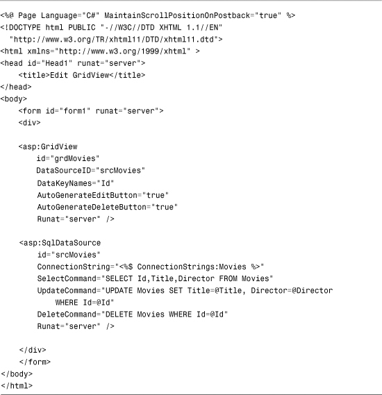
In Listing 11.13, the GridView control has both its AutoGenerateEditButton and AutoGenerateDeleteButton properties enabled. When these properties are enabled, Edit and Delete links are automatically rendered next to each row in the GridView.
Note
You can take advantage of the <%@ Page %> directive’s MaintainScrollPositionOnPostback attribute to scroll a page back automatically to the same position whenever the page is posted back to the server. For example, if you add this attribute and click an Edit link rendered by a GridView, the page automatically scrolls to the record being edited. This attribute works with Internet Explorer 6+, Firefox 1+, and Opera 8+.
When you click an Edit link, you can edit a particular database row. The GridView automatically renders a check box for any Boolean columns and a text field for any other type of column.
Note
The GridView control does not support inserting new records into a database table. If you need to insert new records, use the ListView, DetailsView, or FormView control.
Furthermore, the GridView control includes a DataKeyNames property. When editing and deleting rows with the GridView, you need to assign the name of the primary key field from the database table being modified to this property. In Listing 11.13, the Movies ID column is assigned to the DataKeyNames property.
Finally, the SqlDataSource control associated with the GridView control includes a SelectCommand, UpdateCommand, and DeleteCommand property. These properties contain the SQL statements executed when you display, insert, and delete records with the GridView control.
The SQL statements contained in both the UpdateCommand and DeleteCommand include parameters. For example, the UpdateCommand looks like this:
UPDATE Movies SET Title=@Title, Director=@Director
WHERE Id=@Id
The @Title and @Director parameters represent the new values for these columns that a user enters when updating a record with the GridView control. The @Id parameter represents the primary key column from the database table.
Handling Concurrency Issues
The GridView control can track both the original and modified value of each database column. The GridView control tracks the original and updated values of a column so that you can handle concurrency conflicts. Imagine that you are building a massive order entry system. Your company has hundreds of employees modifying orders with a page that contains a GridView control. If two employees open the same customer record at the same time, one employee might overwrite changes made by the other employee. You can prevent this type of concurrency conflict by using the page in Listing 11.14.
Listing 11.14. Concurrency.aspx
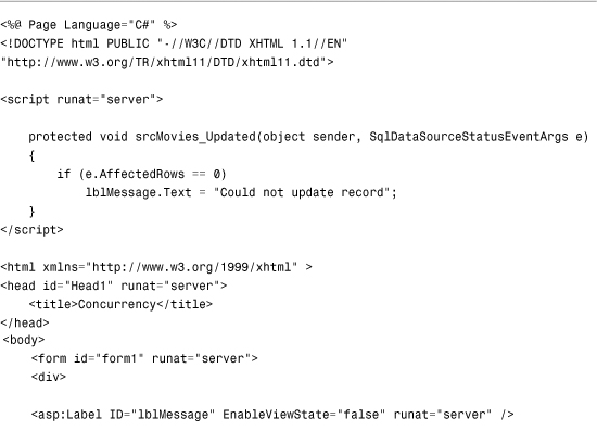

In Listing 11.14, the SqlDataSource control includes both a ConflictDetection and OldValuesParameterFormatString property. These two properties cause the SqlDataSource control to track both the original and modified versions of each column.
The ConflictDetection property can have one of the following two values:
• CompareAllValues
• OverwriteChanges
By default, the ConflictDetection property has the value OverwriteChanges, which causes the SqlDataSource control to overwrite the previous value of a column with its new value. When ConflictDetection is set to the value CompareAllValues, the SqlDataSource tracks both the original and modified version of each column.
The OldValuesParameterFormatString property provides a distinguishing name for the original value of a column. For example, the value of the SqlDataSource control’s UpdateCommand looks like this:
UPDATE Movies SET Title=@Title, Director=@Director
WHERE Id=@original_Id AND Title=@original_Title
AND Director=@original_Director
The @original_Id, @original_Title, and @original_Director parameters represent the original values of these columns. If the value of the Title or Director columns has changed in the underlying database, the record is not updated. In other words, if someone else beats you to the record change, your modifications are ignored.
The page in Listing 11.14 includes an Updated event handler for the SqlDataSource control. If there is a concurrency conflict, no records will be affected by the update. The event handler displays an error message when the e.AffectedRows property has the value 0.
Displaying Empty Data
GridView includes two properties that enable you to display content when no results are returned from the GridView control’s data source. You can use either the EmptyDataText property or the EmptyDataTemplate property to handle empty data.
For example, the page in Listing 11.15 contains a movie search form. If you enter a search string that does not match the start of any movie title, the contents of the EmptyDataText property display (see Figure 11.10).
Figure 11.10. Displaying a message when no records match.

Listing 11.15. ShowEmptyDataText.aspx


If you use the search form in Listing 11.15 to search for a movie that doesn’t exist, an icon of a frowning face and the text No Matching Movies! is displayed.
The initial value of the GridView control’s Visible property is set to False. The GridView displays only after you click the button. If you did not add this additional logic, the EmptyDataText message would display when the page first opens.
As an alternative to using the EmptyDataText property, you can use an EmptyDataTemplate to display content when a data source does not return any results. For example, the page in Listing 11.16 prompts you to enter a new movie when no matching movies are found (see Figure 11.11).
Figure 11.11. Displaying a template when no records match.

Listing 11.16. ShowEmptyDataTemplate.aspx


The EmptyDataTemplate in Listing 11.16 contains some text and a DetailsView control that you can use to insert a new movie into the Movies database table. You can add any HTML content or ASP.NET controls to EmptyDataTemplate that you need.
Formatting the GridView Control
The GridView control includes a rich set of formatting properties that you can use to modify its appearance. I recommend that you don’t use most of these properties because using these properties results in bloated pages. Instead, I recommend that you use Cascading Style Sheets (CSS) to format the GridView control.
The GridView control includes a CssClass property. The control also exposes several Style objects that include the CssClass property:
• AlternatingRowStyle—Enables you to format every other row.
• FooterStyle—Enables you to format the footer row.
• HeaderStyle—Enables you to format the header row.
• PagerStyle—Enables you to format the pager row.
• RowStyle—Enables you to format each row.
• SelectedRowStyle—Enables you to format the selected row.
For example, the page in Listing 11.17 contains a GridView control formatted with CSS rules (see Figure 11.12).
Figure 11.12. A GridView control formatted with CSS.

Listing 11.17. FormatGrid.aspx


In Listing 11.17, the column header text is left-aligned. Also, banding is added to the table rendered by GridView. Alternating rows render with a gray background.
The GridView control has a few formatting properties that you might need to use even when formatting GridView with Cascading Style Sheets. For example, in Listing 11.17, the GridLines property was assigned the value None to suppress the default rendering of borders around each table cell. Following is a list of these properties:
• GridLines—Renders borders around table cells. Possible values are Both, Vertical, Horizontal, and None.
• ShowFooter—When True, renders a footer row at the bottom of the GridView.
• ShowHeader—When True, renders a header row at the top of the GridView.
Using ViewState with the GridView Control
By default, the GridView control stores the values of all the columns contained in all the rows that it renders in ViewState. In other words, all the rows that the GridView retrieves from its data source are stuffed in a hidden form field.
The advantage of using ViewState is that the GridView does not need to query the database for the same set of records every time a page containing GridView displays. The records are retrieved from the database only when the page first loads.
The disadvantage of using ViewState is that it means that a lot of information might need to be pushed over the wire to a user’s browser. All ViewState information is stored in a hidden form field. When a large number of rows display, this hidden form field can become enormous. When ViewState becomes too large, it can significantly impact a page’s performance.
You can disable ViewState by assigning the value False to the GridView control’s EnableViewState property. Even if you disable ViewState, you can still display, sort, page, and edit database records with the GridView control. (GridView uses ControlState to track vital state information.) When displaying a large number of records, you should turn ViewState off.
You can view the amount of ViewState that GridView uses by enabling tracing for the page that contains GridView. Add the Trace="True" attribute to the Page directive like this:
<%@ Page Trace="true" %>
When tracing is enabled, a Control Tree section is appended to the end of a page when the page renders in a browser. The Control Tree section displays the ViewState size used by each control contained in the page.
Using Fields with the GridView Control
In all the sample code in the previous section, the GridView control was used to render automatically an HTML table that contains a list of data items. However, there is a problem with allowing GridView to render its columns automatically. The result does not look professional.
For example, the column headers are simply the names of the underlying database columns. Displaying the column name EntryDate as a column header seems, well, a little cheesy. We really need to specify custom column headers.
Another problem with enabling GridView to render its columns automatically is that you give up any control over column formatting. For example, the BoxOfficeTotals column displays as a decimal amount without any currency formatting. The EntryDate column always displays in short-date and long-time format.
Furthermore, it would be nice to display the values of certain columns as images, drop-down lists, or hyperlinks. If you use the automatically generated columns, you are stuck with the user interface you are given. The solution to all these problems is to specify explicitly the fields that GridView displays. The GridView control supports the following types of fields:
• BoundField—Enables you to display the value of a data item as text.
• CheckBoxField—Enables you to display the value of a data item as a check box.
• CommandField—Enables you to display links for editing, deleting, and selecting rows.
• ButtonField—Enables you to display the value of a data item as a button (image button, link button, or push button).
• HyperLinkField—Enables you to display the value of a data item as a link.
• ImageField—Enables you to display the value of a data item as an image.
• TemplateField—Enables you to customize the appearance of a data item.
The following sections examine how you can take advantage of each of these different types of fields.
Note
You can create custom fields that work with the GridView control. This option is explored in the final section of this chapter.
Using BoundFields
A BoundField always displays the value of a data item as text when a row is in normal display mode. When a row is selected for editing, a BoundField displays the value of a data item in a single-line text field.
The most important three properties of the BoundField class are the DataField, DataFormatString, and HeaderText properties. The page in Listing 11.18 illustrates how to use these properties when displaying a list of movies (see Figure 11.13).
Figure 11.13. Using BoundFields with the GridView control.

Listing 11.18. ShowBoundField.aspx


The GridView control includes an AutoGenerateColumns property assigned the value False. If you don’t disable automatically generated columns, both columns represented by the BoundFields and all the columns from the data source display redundantly.
In Listing 11.18, BoundFields display the Title, Director, and BoxOfficeTotals columns. The DataField property represents the column that a BoundField displays. The HeaderText property determines the column header.
The BoundField used to display the BoxOfficeTotals column includes a DataFormatString property. This format string formats the values of the BoxOfficeTotals column as a currency amount.
Note
For more information about string formatting, see the Formatting Types topic in the Microsoft .NET Framework Documentation.
A BoundField supports several other useful properties:
• AccessibleHeaderText—Enables you to add an HTML abbr attribute to the column header.
• ApplyFormatInEditMode—Enables you to apply the DataFormatString to the field when the row is in edit display mode.
• ConvertEmptyStringToNull—Enables you to convert an empty string "" into the value Nothing (null) when editing a column.
• DataField—Enables you to specify the name of the field that the BoundField displays.
• DataFormatString—Enables you to use a format string to format a data item.
• FooterStyle—Enables you to format the column footer.
• FooterText—Enables you to display text in the column footer.
• HeaderImageUrl—Enables you to display an image in the column header.
• HeaderStyle—Enables you to format the column header.
• HeaderText—Enables you to display text in the column header.
• HtmlEncode—Enables you to HTML-encode the value of a data item, which enables you to avoid script injection attacks.
• InsertVisible—Enables you to not display a column when inserting a new record (does not apply to the GridView control).
• ItemStyle—Enables you to format a data item.
• NullDisplayText—Enables you to specify text displayed when a data item has the value Nothing (null).
• ReadOnly—Enables you to prevent the data item from being edited in edit mode.
• ShowHeader—Enables you to display the column header.
• SortExpression—Enables you to associate a sort expression with the column.
• Visible—Enables you to hide a column.
Using CheckBoxFields
A CheckBoxField, as you can probably guess, displays a check box. When a row is not in edit mode, the check box displays but is disabled.
The page in Listing 11.19 illustrates how you can use a CheckBoxField (see Figure 11.14).
Figure 11.14. Using the CheckBoxField with the GridView control.

Listing 11.19. ShowCheckBoxField.aspx


The CheckBoxField inherits from the BoundField class, so it includes all the properties of the BoundField class. It also supports the following property:
• Text—Displays text next to each check box.
Using CommandFields
You can use a CommandField to customize the appearance of the Edit, Delete, Update, Cancel, and Select buttons displayed by the GridView control. For example, the page in Listing 11.20 uses icons for the standard edit buttons (see Figure 11.15).
Figure 11.15. Using a CommandField with the GridView control.
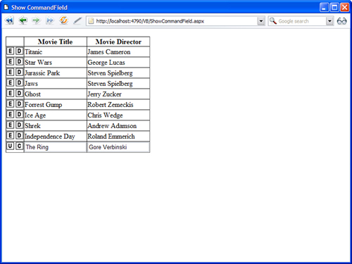
Listing 11.20. ShowCommandField.aspx


You do not enable the AutoGenerateEditButton or AutoGenerateDeleteButton properties when using a CommandField. Instead, you use the CommandField to set up the standard editing buttons explicitly.
The CommandField supports the following properties:
• ButtonType—Enables you to specify the type of button displayed by the CommandField. Possible values are Button, Image, and Link.
• CancelImageUrl—Enables you to specify an image to display for the Cancel button.
• CancelText—Enables you to specify the text to display for the Cancel button.
• CausesValidation—Enables you to disable validation when an Edit button is clicked.
• DeleteImageUrl—Enables you to specify an image to display for the Delete button.
• DeleteText—Enables you to specify the text to display for the Delete button.
• EditImageUrl—Enables you to specify an image to display for the Edit button.
• EditText—Enables you to specify the text to display for the Edit button.
• InsertImageUrl—Enables you to specify an image to display for the Insert button.
• InsertText—Enables you to specify the text to display for the Insert button.
• NewImageUrl—Enables you to specify an image to display for the New button (does not apply to GridView).
• NewText—Enables you to specify the text to display for the New button.
• SelectImageUrl—Enables you to specify the image to display for the Select button.
• SelectText—Enables you to specify the text to display for the Select button.
• ShowCancelButton—Enables you to display the Cancel button.
• ShowDeleteButton—Enables you to display the Delete button.
• ShowEditButton—Enables you to display the Edit button.
• ShowInsertButton—Enables you to display the Insert button (does not apply to GridView).
• ShowSelectButton—Enables you to display the Select button.
• UpdateImageUrl—Enables you to specify the image to display for the Update button.
• UpdateText—Enables you to specify the text to display for the Update button.
• ValidationGroup—Enables you to associate the edit buttons with a validation group.
Using Button Fields
You use a ButtonField to display a button in a GridView. You can use ButtonField to represent a custom command or one of the standard edit commands.
For example, GridView in Listing 11.21 contains two ButtonFields that a user can click to change the display order of the movie category records (see Figure 11.16).
Figure 11.16. Using ButtonFields with the GridView control.

Listing 11.21. ShowButtonField.aspx


When you click either the Move Up or Move Down buttons in the page in Listing 11.21, the GridView control’s RowCommand event is raised. This event is handled by the grdMovieCategories_RowCommand() method.
The grdMovieCategories_RowCommand() method retrieves the index of the row containing the button that was clicked. The row index is grabbed from the GridViewCommandEventArgs’s CommandArgument property passed as the second parameter to the event handler.
The grdMovieCategories_RowCommand() method updates the position of a record by setting the SqlDataSource control’s Update parameters and calling the SqlDataSource control’s Update() method.
A ButtonField supports the following properties:
• ButtonType—Enables you to specify the type of button displayed by the CommandField. Possible values are Button, Image, and Link.
• CausesValidation—Enables you to disable validation when the button is clicked.
• CommandName—Enables you to associate a standard edit command with the ButtonField. Possible values include Delete, Edit, Update, and Cancel.
• DataTextField—Enables you to use a data column to specify the button text.
• DataTextFormatString—Enables you to format the button text.
• Text—Enables you to specify the button text.
• ValidationGroup—Enables you to associate the button with a validation group.
You can use CommandName to associate a ButtonField with one of the standard edit commands. For example, you can create a Delete button by assigning the value Delete to the CommandName property.
Using HyperLink Fields
You use HyperLinkField to create a link to another page; HyperLinkField is particularly useful when you need to build two page Master/Detail forms.
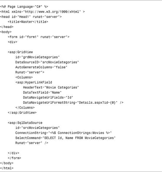
For example, the page in Listing 11.22 displays a list of movie categories, and the page in Listing 11.23 displays a list of movies that match the selected category.
Listing 11.22. Master.aspx
Listing 11.23. Details.aspx

The page in Listing 11.22 includes a GridView control that contains HyperLinkField, which creates a link to the Details.aspx page and passes the movie category ID as a query string parameter.
The HyperLinkField looks like this:

The DataNavigateUrlFields property represents the fields used with the DataNavigateFormatString, which plugs the value of the ID column from the DataNavigateUrlFields into the {0} placeholder.
Note
The DataNavigateUrlFields property accepts a comma-separated list of column names. You can use multiple placeholders in DataNavigateUrlFormatString.
When you link to the page in Listing 11.23, the list of matching movies displays. The SqlDataSource control includes a QueryStringParameter that represents the movie category ID query string parameter.
You also can use HyperLinkFields when working with frames. For example, the page in Listing 11.24 employs GridView to display a list of movies. The page also includes iframe (inline frame), which displays details for a particular movie; iframe displays the page contained in Listing 11.25 (see Figure 11.17).
Figure 11.17. Displaying a single-page Master/Detail form.

Listing 11.24. FrameMaster.aspx


Listing 11.25. FrameDetails.aspx

The HyperLinkField contained in Listing 11.24 includes a Target property, which contains the name of the iframe. When you click a movie link, the FrameDetails.aspx page opens in the named iframe.
HyperLinkField supports the following properties:
• DataNavigateUrlFields—Represents the field or fields from the data source to use with DataNavigateUrlFormatString.
• DataNavigateUrlFormatString—Represents a format string that can be used to create the hyperlink.
• DataTextField—Represents a field from the data source to use for the hyperlink label.
• DataTextFormatString—Represents a format string that can be used to format the hyperlink label.
• NavigateUrl—Represents a fixed link to another page.
• Target—Represents the target of a link. Possible values include blank, parent, self, and top. You can also supply the name of a frame or iframe.
• Text—Represents fixed text to display as the label for the hyperlink.
Using ImageFields
You use ImageField to display an image stored on the server’s hard drive. You can’t use ImageField to display images stored in a database table.
The page in Listing 11.26 illustrates how you can use ImageField when creating a simple photo gallery (see Figure 11.18).
Figure 11.18. Using ImageField with the GridView control.

Listing 11.26. ShowImageField.aspx


The GridView in Listing 11.26 contains ImageField that looks like this:

The DataImageUrlField property contains the name of a field from the data source that represents the path to an image on the server hard drive. The DataImageUrlFormatString enables you to format this path. Finally, the DataAlternateTextField enables you to specify the value of the alt attribute used by the <img> tag.
Web Standards Note
Always supply an alt attribute for your <img> tags so that blind users of your web application can interpret an image’s meaning. In the case of purely decorative images, create an empty alt attribute (alt="").
An ImageField supports the following properties:
• AlternateText—Enables you to specify fixed alternate text.
• DataAlternateTextField—Enables you to specify a field that represents the alternate text.
• DataAlternateTextFormatString—Enables you to format the alternate text.
• DataImageUrlField—Enables you to specify a field that represents the image path.
• DataImageUrlFormatString—Enables you to format the image path.
• NullImageUrl—Enables you to specify an alternate image when the DataImageUrlField is Nothing (null).
Using TemplateFields
A TemplateField enables you to add any content to a GridView column that you need, which can contain HTML, DataBinding expressions, or ASP.NET controls.
TemplateFields are particularly useful when you use GridView to edit database records. You can use TemplateField to customize the user interface and add validation to the fields being edited.
For example, the page in Listing 11.27 contains a GridView that enables you to edit the records contained in the Movies database table. TemplateFields render the user interface for editing the movie title and category columns (see Figure 11.19).
Figure 11.19. Using TemplateFields with the GridView control.

Listing 11.27. ShowTemplateField.aspx


GridView in Listing 11.27 contains two TemplateFields. The first TemplateField enables you to display and edit the value of the Title column. The contents of ItemTemplate display when a row is not selected for editing. The contents of EditItemTemplate display when the row is selected for editing.
EditItemTemplate for the Title column includes a RequiredFieldValidator control. This RequiredFieldValidator control prevents a user from updating a record without entering a value for the Title column.
The second TemplateField displays the value of the movie category column. EditItemTemplate contains a DropDownList control, which enables you to change the movie category associated with the record being edited.
TemplateField supports the following six types of templates:
• AlternatingItemTemplate—The contents of this template display for every other row rendered by GridView.
• EditItemTemplate—The contents of this template display when a row is selected for editing.
• FooterTemplate—The contents of this template display in the column footer.
• HeaderTemplate—The contents of this template display in the column header.
• InsertItemTemplate—The contents of this template display when a new data item is inserted (does not apply to the GridView control).
• ItemTemplate—The contents of this template display for every row rendered by the GridView.
Working with GridView Control Events
The GridView control includes a rich set of events that you can handle to customize the control’s behavior and appearance. These events can be divided into three groups.
First, the GridView control supports the following set of events raised when the control displays its rows:
• DataBinding—Raised immediately before GridView is bound to its data source.
• DataBound—Raised immediately after GridView is bound to its data source.
• RowCreated—Raised when each row in GridView is created.
• RowDataBound—Raised when each row in GridView is bound to data.
Second, the GridView control includes the following set of events raised when you edit records:
• RowCommand—Raised when an event is raised by a control contained in GridView.
• RowUpdating—Raised immediately before GridView updates a record.
• RowUpdated—Raised immediately after GridView updates a record.
• RowDeleting—Raised immediately before GridView deletes a record.
• RowDeleted—Raised immediately after GridView deletes a record.
• RowCancelingEdit—Raised when you cancel updating a record.
Finally, the GridView control supports the following events related to sorting, selecting, and paging:
• PageIndexChanging—Raised immediately before the current page changes.
• PageIndexChanged—Raised immediately after the current page changes.
• Sorting—Raised immediately before sorting.
• Sorted—Raised immediately after sorting.
• SelectedIndexChanging—Raised immediately before a row is selected.
• SelectedIndexChanged—Raised immediately after a row is selected.
In this section, you learn how to handle the RowDataBound event (my favorite event included with the GridView control) to create GridView special effects. You learn how to handle the RowDataBound event to highlight particular rows and show column summaries, and create nested Master/Detail forms.
Highlighting GridView Rows
Imagine that you want to highlight particular rows in GridView. For example, when displaying a table of sales totals, you might want to highlight the rows in which the sales are greater than a certain amount.
You can modify the appearance of individual rows in a GridView control by handling the RowDataBound event. For example, the page in Listing 11.28 displays every movie that has a box office total greater than $300,000.00 with a yellow background color (see Figure 11.20).
Figure 11.20. Highlighting rows in the GridView control.

Listing 11.28. HighlightRows.aspx


In Listing 11.28, the grdMovies_RowDataBound() method is executed when GridView renders each of its rows (including its header and footer). The second parameter passed to this event handler is an instance of the GridViewRowEventArgs class. This class exposes a GridViewRow object that represents the row being bound.
The GridViewRow object supports several useful properties (this is not a complete list):
• Cells—Represents the collection of table row cells associated with the row being bound.
• DataItem—Represents the data item associated with the row being bound.
• DataItemIndex—Represents the index of the data item in its DataSet associated with the row being bound.
• RowIndex—Represents the index of the row being bound.
• RowState—Represents the state of the row being bound. Possible values are Alternate, Normal, Selected, and Edit. Because these values can be combined (for example, RowState can be Alternate Edit), use a bitwise comparison RowState.
• RowType—Represents the type of row being bound. Possible values are DataRow, Footer, Header, NullRow, Pager, and Separator.
In Listing 11.28, the RowType property verifies that the row is DataRow (not a header row or some other type of row). The DataItem property retrieves the database record associated with the row. The DataBinder.Eval() method retrieves the value of the BoxOfficeColumn.
Displaying Column Summaries
Imagine that you want to display a column total at the bottom of a column. In that case, you can handle the GridView RowDataBound event to sum the values in a column and display the summary in the column footer.
For example, the page in Listing 11.29 contains a GridView control that displays a summary column representing the total box office sales of all movies (see Figure 11.21).
Figure 11.21. Displaying a column summary.
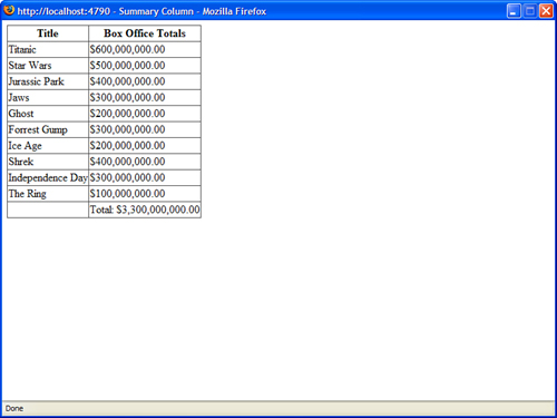
Listing 11.29. SummaryColumn.aspx

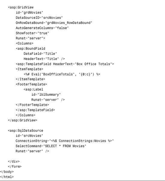
The GridView control uses a TemplateField to represent the BoxOfficeTotals column. The TemplateField includes a <FooterTemplate> that contains a Label control. The grdMovies_RowDataBound() method displays the total of the box office totals in this Label control.
Displaying Nested Master/Details Forms
You also can handle the RowDataBound event to create nested Master/Details forms. The page in Listing 11.30 displays a list of movie categories and displays a list of matching movies under each category (see Figure 11.22).
Figure 11.22. Displaying a nested Master/Detail form.
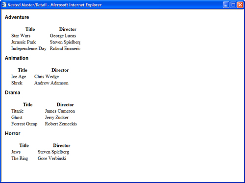
Listing 11.30. NestedMasterDetail.aspx


The grdMovieCategories_RowDataBound() method handles the RowDataBound event. This event handler grabs the movie category ID from the current row’s DataItem property. Next, it retrieves the SqlDataSource control contained in the grdMovieCategories TemplateField. Finally, it assigns the movie category ID to a parameter contained in the SqlDataSource control’s SelectParameters collection.
Note
You must use the FindControl() method to get the SqlDataSource control from the TemplateField. The templates in a TemplateField each create their own naming containers to prevent naming collisions. The FindControl() method enables you to search a naming container for a control with a matching ID.
Extending the GridView Control
Like any other control in the ASP.NET Framework, if you don’t like any aspect of the GridView control, you always have the option of extending the control. In this section, you learn how to extend the GridView control with custom fields.
To create a custom field, you can inherit a new class from any of the existing fields or any of the following base classes:
• DataControlField—The base class for all fields.
• ButtonFieldBase—The base class for all button fields, such as the ButtonField and CommandField.
In this section, you learn how to create a long text field, a delete button field, and a validated field.
Creating a LongTextField
None of the existing GridView fields do a good job of handling large amounts of text. You can fix this problem by creating a custom field, named the LongTextField, which you can use to display the value of text columns regardless of the length of the text.
In normal display mode, LongTextField displays the text in a scrolling <div> tag. In edit display mode, the text appears in a multiline TextBox control (see Figure 11.23).
Figure 11.23. Displaying a long text field.

To create a custom field, a new class must be inherited from the base BoundField control. The custom LongTextField is contained in Listing 11.31.
Listing 11.31. LongTextField.cs


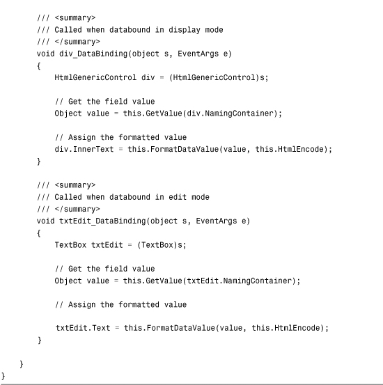
In Listing 11.31, the InitializeDataCell() method is overridden. This method is responsible for creating all the controls that the custom field contains.
First, a check is made to determine whether the field is rendered when the row is selected for editing. A bitwise comparison must be performed with the rowState parameter because the rowState parameter can contain combinations of the values Alternate, Normal, Selected, and Edit (for example, RowState can be both Alternate and Edit).
When the row is not in edit mode, a <div> tag is created to contain the text. HtmlGenericControl represents the <div> tag. When GridView is bound to its data source, the <div> tags get the value of its innerText property from the div_DataBinding() method.
When the row is selected for editing, a multiline TextBox control is created. When GridView is bound to its data source, the TextBox control’s Text property gets its value from the txtEdit_DataBinding() method.
You can experiment with LongTextField with the page in Listing 11.32. This page uses LongTextField to display the value of the Movie Description column.
Listing 11.32. ShowLongTextField.aspx


Creating a DeleteButtonField
I don’t like the Delete button rendered by the GridView control’s CommandField. The problem is that it does not provide you with any warning before you delete a record. In this section, we fix this problem by creating a Delete button that displays a client-side confirmation dialog box (see Figure 11.24).
Figure 11.24. Displaying a confirmation dialog box.

DeleteButtonField inherits from the ButtonField class. The code for the custom field is contained in Listing 11.33.
Listing 11.33. DeleteButtonField.cs


Most of the work in Listing 11.33 is handled by the base ButtonField class. The InitializeCell() method is overridden so that the button can be grabbed. The button is added to the cell by the base ButtonField’s InitializeCell() method.
To create the confirmation dialog box, an onclick attribute is added to the button. If the JavaScript confirm statement returns false, the button click is canceled.
You can test the DeleteButtonField with the page in Listing 11.34. This page enables you to delete records from the Movies database table.
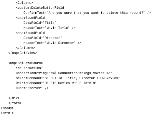
Listing 11.34. ShowDeleteButtonField.aspx

Creating a ValidatedField
In this final section, we create a ValidatedField custom field, which automatically validates the data that a user enters into GridView when editing a record. ValidatedField uses RequiredFieldValidator to check whether a user has entered a value, and CompareValidator to check whether the value is the correct data type (see Figure 11.25).
Figure 11.25. Using ValidatedField to edit a record.

ValidatedField is a composite field. The field contains three child controls—a TextBox, RequiredFieldValidator, and CompareValidator—wrapped up in a container control.
The code for the ValidatedField is too long to include in this chapter. The entire source code (in both C# and VB.NET) can be downloaded from the book’s website.
The source code for the ValidatedField contains two classes. It contains the ValidatedField class and the EditContainer class.
The ValidatedField class derives from the BoundField class and overrides the InitializeDataCell() method. When a row is not selected for editing, the field simply displays the value of the data item associated with it. When a row is selected for editing, the field creates a new EditContainer control.
The EditContainer control contains a TextBox, RequiredFieldValidator, and CompareValidator; EditContainer implements the INamingContainer interface. Implementing this interface prevents naming collisions when more than one instance of ValidatedField is used in a GridView row.
ValidatedField is used in the page in Listing 11.35. This page contains a GridView control that you can use to edit the Movies database table. The GridView control includes three ValidatedFields: for the Title, DateReleased, and BoxOfficeTotals columns.
If you edit a column and attempt to submit the column without entering a value, a validation error displays. Furthermore, if you attempt to enter a value that is not a date for the DateReleased column or a value that is not a currency amount for the BoxOfficeTotals column, a validation error displays.
Listing 11.35. ShowValidatedField.aspx


Summary
In this chapter, you learned how to use the GridView control to display, select, sort, page, and edit database records. You also learn how to customize the appearance of the columns rendered by a column by using different types of fields. In particular, you learned how to use BoundFields, CheckboxFields, CommandFields, ImageFields, TemplateFields, ButtonFields, and HyperLinkFields.
Next, you learned how to handle the RowDataBound event to create GridView special effects. For example, you learned how to add column summaries to a GridView.
Finally, you learned how to extend the GridView control with custom fields. We created custom fields, which enable you to display large text fields, display a confirmation dialog box before a record is deleted, and display validation error messages when editing a record.