
Chapter 39. Using the ASP.NET AJAX Control Toolkit
In This Chapter
• Using the ASP.NET AJAX Control Toolkit
• Overview of the Toolkit Controls
• Using the AutoComplete Control
• Using the FilteredTextBox Control
• Using the MaskedEdit Control
• Using the UpdatePanelAnimation Control
• Summary
The ASP.NET AJAX Control Toolkit consists of more than 40 server-side Ajax controls that you can use in your ASP.NET applications. You can take advantage of the controls to create website special effects such as animations, rounded corners, and modal pop-ups. You can also use the controls for more serious applications such as implementing auto-complete and masked edit text fields.
The controls in the ASP.NET AJAX Control Toolkit are Ajax controls in the broad sense of the word Ajax. All the Toolkit controls use client-side JavaScript. However, most of the controls do not perform asynchronous postbacks. So, they are Ajax controls in the sense that they take advantage of a lot of JavaScript.
Almost all the controls in the Toolkit are extender controls. The controls extend the functionality of existing ASP.NET controls, such as the standard TextBox and Panel controls, with new functionality. Almost all the Toolkit controls have a TargetControlID property that you use to point to a control to extend.
In the first part of this chapter, you learn how to install and use the Toolkit controls in an ASP.NET application. Next, you are provided with a brief overview of each of the controls. Finally, we examine six of the controls in more detail: AutoComplete, DragPanel, FilteredTextBox, MaskedEdit, Animation, and UpdatePanelAnimation.
Using the ASP.NET AJAX Control Toolkit
The ASP.NET AJAX Control Toolkit is not included with ASP.NET 4 Framework. The Toolkit is continuously updated; a new release of the Toolkit is available every couple months. The Toolkit is maintained as a project at Microsoft CodePlex. You can download the latest release of the ASP.NET AJAX Control Toolkit at http://ajaxcontroltoolkit.codeplex.com/.
The “download” link will give you the 3.5 version of the toolkit, which won’t work with our ASP.NET 4 websites. To get the toolkit that’s compatible with .NET 4, click the “other downloads” link.
When you download the Toolkit, you have the choice of either (1) downloading the controls and the source code or (2) downloading the controls only. You need to unzip the download onto your hard drive.
As part of the download, you get a sample website that demonstrates each of the Toolkit controls. You can open the sample website by launching Visual Web Developer, selecting File, Open Website and browsing to the SampleWebSite folder in the unzipped download.
The ASP.NET AJAX Control Toolkit is not installed in the Global Assembly Cache. You must copy the AjaxControlToolkit.dll assembly from the /Bin folder of the SampleWebSite to the /Bin folder in your application. You can do this in multiple ways:
• Copy the assembly by hand—You can simply copy the AjaxControlToolkit.dll assembly from the SampleWebSite /Bin folder to a /Bin folder located in a new website.
• Add an assembly reference—Follow these steps:
1. Within Visual Web Developer, select Website, Add Reference.
2. Select the Browse tab.
3. Browse to the AjaxControlToolkit.dll assembly located in the SampleWebSite /Bin folder.
• Add the Toolkit to your Toolbox (see Figure 39.1)—You can add the ASP.NET AJAX Control Toolkit to the Visual Web Developer Toolbox by following these steps:
1. Within Visual Web Developer, create a new ASP.NET page.
2. Right-click in the Toolbox window and select Add Tab. Create a new tab named Toolkit.
3. Right-click under the new tab and select Choose Items.
4. Click the Browse button located at the bottom of the .NET Framework Components tab.
5. Browse to the /Bin folder of the SampleWebSite and select the AjaxControlToolkit.dll assembly.
6. When you drag a control from the Toolbox onto a page, the AjaxControlToolkit.dll is copied to the Website /Bin folder automatically.
Figure 39.1. Adding the ASP.NET AJAX Control Toolkit to the Toolbox.

The majority of the controls in the ASP.NET AJAX Control Toolkit are extender controls. Visual Web Developer provides additional designer features for working with extender controls. For example, if you add a standard TextBox control to the Designer, an Add Extender link appears in the Common TextBox Tasks dialog box (See Figure 39.2).
Figure 39.2. The Add Extender task.
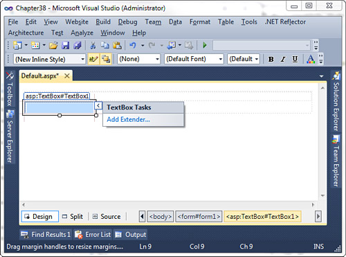
If you click the Add Extender link, a dialog box appears that enables you to pick an extender that can be applied to the TextBox control (see Figure 39.3). Different extenders appear for different controls. For example, because you can apply a ConfirmButton extender to a Button control but not a TextBox control, the ConfirmButton extender appears only when you click Add Extender for the Button control.
Figure 39.3. Selecting an extender control.

When you extend a control, additional properties appear for the control being extended in the extended control’s Properties window. For example, if you extend a TextBox control with the AutoComplete extender, the AutoComplete extender control’s properties appear when you open the TextBox control’s Properties window (see Figure 39.4).
Figure 39.4. Viewing extender control properties.

Overview of the Toolkit Controls
This section, provides you with a brief overview of each of the current Toolkit controls. I recommend that you open the ASP.NET AJAX Control Toolkit sample website and experiment with the controls while reading this chapter.
• Accordion—Enables you to create a Microsoft Outlook-like expanding and collapsing menu. The Accordion control can contain one or more AccordionPane controls. One AccordionPane can be selected at a time. The selected pane is expanded; the other panes are collapsed.
• AlwaysVisibleControl—Enables you to display content that is fixed at one location in the browser window even when you scroll the window. The control works like the position:fixed Cascading Style Sheet (CSS) attribute. However, unlike the CSS attribute, AlwaysVisibleControl works with Microsoft Internet Explorer 6.0.
• Animation—Enables you to add fancy animation effects to your website. For example, you can move, resize, and fade elements in a page. We examine the Animation control in detail in the section “Using the Animation Control.”
• AsyncFileUpload—Enables you to upload files asynchronously to the server.
• AutoComplete—Enables you to display suggestions as a user types text into a text field. We discuss this control in detail in the section “Using the AutoComplete Control.” (This control is used in the sample application described in the last chapter.)
• Calendar—Displays a pop-up calendar next to TextBox. It enables you to select a year, month, and date by clicking dates in a pop-up calendar.
• CascadingDropDown—Enables you to make the list of items displayed in one DropDownList control dependent on the list of items displayed in another DropDownList control. The DropDownList items are updated by performing an asynchronous postback.
• CollapsiblePanel—Enables you to hide or display content contained in a Panel control. When you click its header, the content either appears or disappears.
• ColorPicker—Provides an interactive pop-up control that enables you to graphically choose colors.
• ComboBox—Is similar to a traditional ASP.NET DropDownList, except it provides functionality similar to the ComboBox control found in Windows Forms, such as the ability to type in free-form text.
• ConfirmButton—Enables you to display a confirmation dialog box when a user clicks a button. The confirmation dialog box can be the default JavaScript confirmation box. Alternatively, you can associate a modal dialog box with the ConfirmButton control.
• DragPanel—Enables you to create a panel that you can drag with your mouse around the page. It enables you to create a virtual floating window. We discuss the DragPanel control in the section “Using the DragPanel Control.”
• DropDown—Enables you to create a SharePoint-style drop-down menu.
• DropShadow—Enables you to add a drop shadow to a Panel control. You can set properties of the drop shadow, such as its width and opacity.
• DynamicPopulate—Enables you to dynamically populate the contents of a control, such as a Label control, by performing an asynchronous call to the server. You can set up the DynamicPopulate control so that the asynchronous request is triggered by another control such as a Button control.
• FilteredTextBox—Enables you to prevent certain characters from being entered into TextBox. The FilteredTextBox is discussed in the section “Using the FilteredTextBox Control.”
• HoverMenu—Displays a pop-up menu when you hover over another control.
• HTMLEditor—Enables you to easily create HTML through a rich WYSIWYG editor. A toolbar is provided with controls for formatting, color selections, cut and paste, and more.
• ListSearch—Enables you to perform an incremental search against the items in either a ListBox or DropDownList control.
• MaskedEdit—Forces a user to enter a certain pattern of characters into a TextBox control. The MaskedEdit control is discussed in the section “Using the MaskedEdit Control.”
• ModalPopup—Enables you to display a modal pop-up. When the modal pop-up appears, the remainder of the page is grayed out, preventing you from interacting with the page.
• MultiHandleSlider—Enables you to select multiple values through a graphical slider interface.
• MutuallyExclusiveCheckBox—Enables you to treat a set of CheckBox controls like a set of RadioButton controls. Only one CheckBox can be selected at a time.
• NoBot—Attempts to prevent spam robots from posting advertisements to your website. The control attempts to detect whether a human or robot is posting content.
• NumericUpDown—Enables you to display up and down buttons next to a TextBox control. When you click the up and down buttons, you can cycle through a set of numbers or other items such as month names or flavors of ice cream.
• PagingBulletedList—Enables you to display different content depending on the bullet clicked in a BulletedList control.
• PasswordStrength—Enables you to display a pop-up box that indicates the security strength of a password as a user selects a new password. (This control is used in the sample application described in the last chapter.)
• PopupControl—Displays a pop-up window.
• Rating—Enables you to rate an item on a scale. (This control is used in the sample application described in the last chapter.)
• ReorderList—Enables you to render an interactive list of items that supports reordering through drag and drop.
• ResizableControl—Enables you to resize images and other content contained on a web page.
• RoundedCorners—Enables you to add rounded corners around an element on a page.
• SeaDragon—Provides functionality to interact with an image, such as zooming in, zooming out, and making the image fill the entire browser window.
• Slider—Enables you to create either a horizontal or vertical slider for selecting a particular value in a range of values.
• SlideShow—Displays a slide show of images. The control can render Next, Previous, Play, and Stop buttons.
• Tabs—Enables you to create a tabbed interface. Switching tabs does not require a postback.
• TextBoxWatermark—Enables you to display background text inside of a TextBox control. When focus is given to TextBox, the background text disappears.
• ToggleButton—Enables you to customize the appearance of a CheckBox control. Instead of displaying a check box, you can display a thumbs-up or thumbs-down image.
• UpdatePanelAnimation—Enables you to display an animation while UpdatePanel is performing an asynchronous postback. We discuss the UpdatePanelAnimation control in the section “Using the UpdatePanelAnimation Control.”
• ValidatorCallout—Can be used with any of the standard ASP.NET validation controls to create a callout effect when a validation error occurs.
In the following sections, we examine six of the controls in more detail: AutoComplete, DragPanel, FilteredTextBox, MaskedEdit, Animation, and UpdatePanelAnimation.
Using the AutoComplete Control
The one control I use most often from the ASP.NET AJAX Control Toolkit is the AutoComplete control, which enables you to convert a standard ASP.NET TextBox control into something resembling a combo box. As you enter text into the TextBox control, a list of matching options displays beneath the control (see Figure 39.5).
Figure 39.5. Using the AutoComplete extender control.

The cool thing about the AutoComplete control is that it retrieves the matching options from the web server, using an Ajax call, while you type. You can use the AutoComplete control to efficiently search through a database of billions of items because the entire database of items never needs to be downloaded to the browser.
The AutoComplete control is smart enough to cache items on the client. If you enter the same text into a TextBox control that you enter previously, the AutoComplete control can grab the suggestions from its cache instead of performing another Ajax call to retrieve the same information.
In this section, you learn how to use the AutoComplete extender control. You learn how to expose the items displayed by the AutoComplete control from a web method contained in the same page as the AutoComplete control and from a web method exposed by a separate web service. Finally, you learn how to associate hidden values (such as primary keys) with each item displayed by the AutoComplete control.
Using the AutoCompleteExtender with a Page Method
If you don’t need to use suggestions in more than one page, it makes sense to expose the list of auto-complete suggestions from a page method. You can create a web method that is a static method on a page.
For example, the page in Listing 39.1 contains an AutoComplete extender control, which displays movie title suggestions while the user enters a movie title into a TextBox control.
Listing 39.1. AutoCompletePageMethod.aspx


In Listing 39.1, the AutoComplete extender control is declared like this:

The TargetControlID property refers to the control that is extended. In this case, the AutoComplete extender extends a TextBox control named txtMovieTitle with auto-complete functionality.
Note
Notice that the extended TextBox control includes an AutoComplete="off" attribute. This attribute is necessary to disable the built-in browser auto-complete for Internet Explorer and Firefox. Realize that there is an important difference between AutoComplete="off" and AutoComplete="false".
The MinimumPrefixLength property represents the number of characters that must be entered before suggestions displays. The default value for this property is 3. I’ve changed the default to 1 so that suggestions appear immediately after you start typing.
The ServiceMethod property refers to the name of a web method. In this case, the web method is defined in the same page as the AutoComplete control as a static page method. The GetSuggestions() method looks like this:
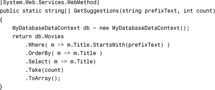
The GetSuggestions() method is declared as a static method—this is a requirement. Furthermore, notice that the method is decorated with the WebMethod attribute.
The GetSuggestions() method must have prefixText and count parameters. The prefixText parameter represents the text entered into the TextBox being extended so far. The count parameter represents the number of suggestions to return.
The GetSuggestions() method returns matching movie titles from the Movie database table. A LINQ to SQL query retrieves movie records that start with the prefix text.
Using the AutoCompleteExtender with a Web Service Method
If you prefer, you can retrieve the auto-complete suggestions from a separate web service instead of a page method. For example, the web service in Listing 39.2, the FileService web service, retrieves a list of matching filenames from the file system.
Listing 39.2. FileService.asmx

The web service in Listing 39.2 includes a web method named GetSuggestions() that returns a list of filenames that match the prefix text passed to the web method. A LINQ query is used to return the matching results.
The FileService class is decorated with a ScriptService attribute. This attribute is required when exposing a web method to an Ajax request. If you don’t include the ScriptService attribute, the web service cannot be called from the client side.
The page in Listing 39.3 contains an AutoComplete extender control that calls the web service.
Listing 39.3. AutoCompleteWebService.aspx


As you enter text into TextBox rendered by the page in Listing 39.3, a list of matching filenames is retrieved by calling the GetSuggestions() method declared in the web service. The AutoComplete control is declared like this:

The AutoComplete control is declared with values assigned to its ServiceMethod and ServicePath properties. ServicePath represents the path to the web service.
Using Text and Value Pairs with the AutoCompleteExtender
In the previous two sections, you saw how you can use the AutoComplete control to display suggestions as you enter text into a TextBox control. For example, you saw how you can display matching movie titles as you type. After entering a title in TextBox, you might want to retrieve the entire movie database record.
However, you run into a problem here. The GetSuggestions() method retrieves the movie titles from the database and not the movie IDs. You need the movie ID to do a lookup for the matching movie database record. You need some way of retrieving both the movie title and movie ID when using the AutoComplete control.
The AutoComplete control includes a static method named CreateAutoCompleteItem() that returns a single string that represents a text and value pair. You can use this method when returning a string array from the GetSuggestions() method to include a primary key with each suggestion.
A TextBox control, however, can represent only a single value. To represent the ID of the selected movie, you need to add a hidden form field to your page. You can update the value of the hidden field whenever a user selects a new suggestion.
The page in Listing 39.4 illustrates how you can retrieve the primary key associated with the suggestion that a user selects when using the AutoComplete control.
Listing 39.4. AutoCompleteTextValue.aspx


Several aspects of the page in Listing 39.4 require explanation. Let’s start with the GetSuggestions() web method. This method is declared like this:

The GetSuggestions() web method consists of two LINQ queries. The first LINQ query, a LINQ to SQL query, retrieves matching movies from the database. The second LINQ query, a standard LINQ query, calls the AutoCompleteExtender.CreateAutoCompleteItem() method for each movie. This method combines the movie Title and Id into a single string.
The AutoComplete extender is declared in the page with an associated HiddenField control, like this:

The AutoComplete extender control includes an OnClientItemSelected property. When a new suggestion is selected, the ace1_itemSelected() JavaScript method executes. The ace1_itemSelected() method updates the value of the HiddenField with the value of the selected suggestion. This JavaScript method looks like this:

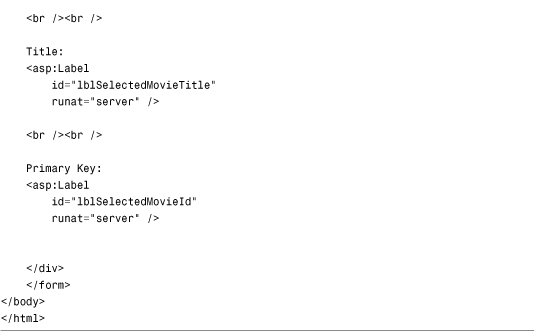
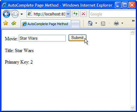
The second parameter passed to the JavaScript method includes a value property that represents the primary key of the selected suggestion. The primary key is assigned to the HiddenField so that it can be read when the page is posted back to the server. When you select a movie and click the Submit button, both the title of the selected movie and the primary key associated with the selected movie are displayed in Label controls (see Figure 39.6).
Figure 39.6. Selecting a primary key value with auto-complete.
Using the DragPanel Control
The DragPanel extender control enables you to create a virtual window for your web application. The DragPanel can be used to extend the Panel control so that you can drag the Panel around the page.
The DragPanel extender has the following properties:
• TargetControlID—The ID of the Panel control to drag.
• DragHandleID—The ID of the control that the user clicks to drag the Panel control.
The page in Listing 39.5 contains a GridView control that lists the current movies in the Movie database table. When you click the Add Movie link, a draggable window appears that contains a form for inserting a new movie (see Figure 39.7).
Figure 39.7. A virtual pop-up window created with the DragPanel control.

Listing 39.5. ShowDragPanel.aspx


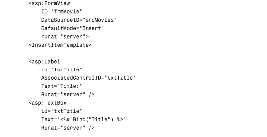


In Listing 39.5, the DragPanel extender control is declared like this:
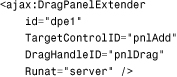
Both the TargetControlID and DragHandleID properties point at Panel controls. The outer Panel, pnlAdd, is the Panel that gets dragged. The inner Panel, pnlDrag, is the Panel that you click to drag the outer Panel control.
When you first open the page, the Panel does not appear. The Cascading Style Sheet (CSS) rule associated with the Panel hides the Panel with display:none. The page includes the following link that displays the draggable Panel:
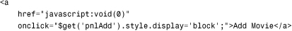
The $get() method is an alias for the document.getElementById() method. When you click the link, the display style for the pnlAdd Panel is set to block, and the Panel and its contents appear.
Using the FilteredTextBox Control
The FilteredTextBox extender control enables you to prevent users from entering the wrong type of content into TextBox. You can use the FilteredTextBox extender control, for example, to create TextBox that accepts only numbers.
The page in Listing 39.6 illustrates how to use the FilteredTextBox control. The page contains two TextBox controls. The first TextBox accepts only numbers. The second TextBox accepts lowercase letters, underscores, and exclamation marks.
Listing 39.6. ShowFilteredTextBox.aspx


You specify the type of characters that a TextBox extended with the FilteredTextBox control accepts by setting the FilterType property. This property accepts the following constants: Numbers, LowercaseLetters, UppercaseLetters, and Custom. You can assign more than one of these constants to the FilterType property by separating the constants with a comma.
If at least one of the FilterType constants is Custom, you can create either a list of valid characters or list of invalid characters for the filter. The second FilteredText control in Listing 39.6 has its FilterMode property set to the value ValidChars. The ValidChars property lists two valid characters (_ and !) that a user can enter in addition to lowercase letters.
Using the MaskedEdit Control
The MaskedEdit extender control renders a user interface that guides you as to what type of input a TextBox control accepts. For example, you can use the MaskedEdit control to force a user to enter a date, a number, or a currency amount in a certain format.
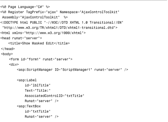
The page in Listing 39.7 includes a movie date released field. This field requires a date in the format mm/dd/yyyy. The MaskedEdit control enforces that format (see Figure 39.8).
Figure 39.8. Using the MaskedEdit control when entering a date.

Listing 39.7. ShowMaskedEdit.aspx
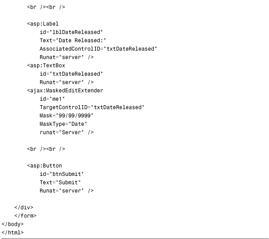
The MaskedEdit control has three important properties:
• TargetControlID—The TextBox to extend.
• Mask—The mask to apply to the TextBox.
• MaskType—The type of mask to apply. Possible values are None, Number, Date, Time, and DateTime.
The TargetControlID and Mask properties are required. You should also set the MaskType property if you want the resulting text to be formatted correctly.
The Mask property accepts a character pattern. You can use the following special characters:
• 9—Only a numeric character.
• L—Only a letter.
• $—Only a letter or a space.
• C—Only a custom character (case-sensitive).
• A—Only a letter or a custom character.
• N—Only a numeric or custom character.
• ?—Any character.
• /—Date separator.
• :—Time separator.
• .—Decimal separator.
• ,—Thousands separator.
• —Escape character.
• {—Initial delimiter for repetition of masks.
• }—Final delimiter for repetition of masks.
The final two special characters listed are curly braces. They enable you to specify how many times a character is allowed to be repeated. For example, you can use the following TextBox and MaskedEdit controls to force someone to enter a Social Security number in the format 555-55-5555:

The character pattern 9{3} requires the user to enter three numbers in a row.
Note
The ASP.NET AJAX Control Toolkit also includes a MaskedEditValidator control that accompanies the MaskedEdit control. You can take advantage of the MaskedEditValidator control to provide the user with validation error messages when a user enters the wrong type of value into a TextBox extended with the MaskedEdit control.
Using the Animation Control
The Microsoft ASP.NET AJAX Control Toolkit includes a rich, declarative animation framework. You can use this framework to create animation special effects in your pages. For example, you can fade, move, and resize elements in a page. These animations are created without the benefit of Flash or Silverlight. The effects are written entirely in JavaScript.
Several of the Toolkit controls support the animation framework. For example, earlier in this chapter, we discussed the AutoComplete extender control. You can use the animation framework to create an animation when the list of suggestions appear and disappear. For instance, you might want the list of suggestions to fade in and out of view.
In this section, you learn about the Animation extender control. This control enables you to target one or more elements in a page and play an animation. The page in Listing 39.8 uses the Animation control to move a Panel control into the center of the page and then fade it out.
Listing 39.8. ShowAnimationSimple.aspx


In Listing 39.8, the Animation control targets a Panel control named pnl. The Panel control is moved to the center of the page and then is faded out.
Note
Notice that the page in Listing 39.8 includes an inline style that sets several style attributes of the Panel control. In particular, the Panel control is given an absolute position. This is a requirement when using the Move animation.
When you create an animation, you must specify the event that triggers the animation. You can use any of the following events:
• OnLoad—Animation plays when the page loads.
• OnClick—Animation plays when the target control is clicked.
• OnMouseOver—Animation plays when you move your mouse over the target.
• OnMouseOut—Animation plays when you move your mouse away from the target.
• OnHoverOver—Animation plays when you hover your mouse over the target (stops any OnHoverOut animation).
• OnHoverOut—Animation plays when you hover your mouse away from the target (stops any OnHoverOver animation).
In the page in Listing 39.8, the animation starts as soon as the page loads.
An animation can consist of a set of animation effects that play in sequence or play in parallel. In Listing 39.8, the animation plays in sequence. First, the Panel was moved and then it was faded.
The ability to play animations in parallel is powerful because it provides you with a method of composing more complex animations out of simpler ones. For example, the Panel contained in the page in Listing 39.9 fades into view at the same time as it grows in size.
Listing 39.9. ShowAnimationComposite.aspx
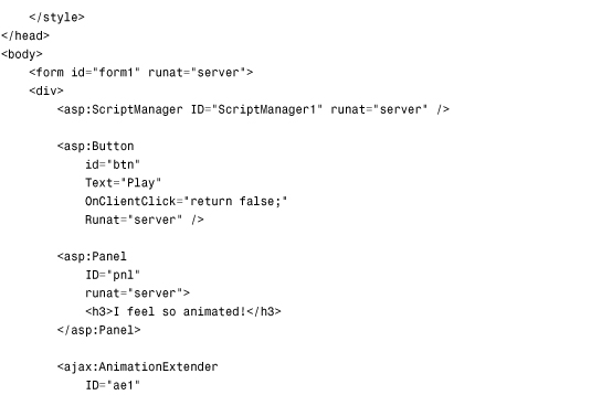


When you click the button rendered by the page in Listing 39.9, the following sequence of animations are rendered
• EnableAction—This animation is used to disable the button that started the animation.
• StyleAction—This animation is used to display the Panel control. When the page first opens, the Panel control has a style of display:none.
• FadeIn—This animation is used to fade the Panel into view.
• Scale—This animation is used to grow the Panel into view.
The FadeIn and Scale animations are contained in a <Parallel> tag, which causes these two animation effects to play simultaneously.
The animation framework supports the following types of animations:
• Parallel Animation—Plays a set of animations in parallel.
• Sequence Animation—Plays a set of animations in sequence.
• Condition Animation—Plays an animation when a JavaScript expression evaluates to true; otherwise, it plays another animation (the else clause).
• Case Animation—Plays one animation from a list of animations depending on the evaluation of a JavaScript expression.
• Fade Animation—Plays either a fade-in or fade-out animation.
• FadeIn Animation—Plays a fade-in animation.
• FadeOut Animation—Plays a fade-out animation.
• Pulse Animation—Plays fade-in and fade-out animations in rapid succession.
• Discrete Animation—Plays an animation by setting a property of the target element to a sequence of values.
• Interpolated Animation—Plays an animation by changing a property gradually between a range of values represented by startValue and endValue.
• Color Animation—Plays an animation by changing a property gradually between a range of values represented by a start color and an end color.
• Length Animation—Plays an animation by changing a property gradually between a range of values representing a start and end unit of length.
• Move Animation—Plays an animation by moving an element (either relatively or absolutely) across the page.
• Resize Animation—Plays an animation by resizing an element by changing the element’s width and height.
• Scale Animation—Plays an animation by resizing an element by using a scale factor.
• Enable Action—An action that disables or enables an element on the page (such as a Button control).
• Hide Action—An action that hides an element by setting display:none.
• Style Action—An action that applies a style attribute to an element.
• Opacity Action—An action that modified the transparency of an element.
• Script Action—An action that executes a JavaScript script.
To learn more about the properties that you can use with each of these different types of animations, refer to the Animation Reference included with the ASP.NET AJAX Control Toolkit SampleWebSite website.
Using the UpdatePanelAnimation Control
The final Toolkit control that we need to discuss in this chapter is the UpdatePanelAnimation extender control. This control can play an animation both when an UpdatePanel is initiating an asynchronous postback and when postback results are returned from the web server.
Performing some type of animation while an UpdatePanel is performing an asynchronous postback provides the user with a way to know that your web application hasn’t frozen. The animation indicates that some work is being done in the background.
Note
In the previous chapter, we discussed the UpdateProgress control, which enables you to display a busy wait indicator while an UpdatePanel performs an asynchronous postback. In my opinion, playing an animation seems like a less intrusive method of indicating UpdatePanel control progress.
The page in Listing 39.10 demonstrates how you can use the UpdatePanelAnimation control to create a yellow fade effect while an UpdatePanel is performing an update.
Listing 39.10. ShowUpdatePanelAnimation.aspx


The page in Listing 39.10 contains two UpdatePanel controls. The first UpdatePanel control contains a form that asks you to enter your favorite color. When you submit the form, the color that you entered appears in a Label control that is contained in the second UpdatePanel control.
The yellow fade effect is applied to both UpdatePanel controls. When you submit the form, the background colors of both UpdatePanel controls fade to yellow. Then, gradually, the background colors fade back to white.
There are two good reasons to use a yellow fade effect in the page in Listing 39.10. First, this animation effect is used with the first UpdatePanel to show that work is being done.
During an asynchronous postback, a user cannot look at the browser progress bar to detect progress. You need to provide the user with some indication of work.
The second UpdatePanelAnimation control applies a yellow fade effect to the UpdatePanel that displays the value that the user entered into the form. The other reason to use a yellow fade effect is to highlight the areas of a page that have been updated. Because Ajax enables you to quietly update different regions of a page, you need some way of drawing a user’s attention to the areas that have been updated. The UpdatePanelAnimation control provides you with an easy way to grab the user’s attention and focus it on areas of the page that have been changed.
Note
The yellow fade effect was invented and popularized by Matthew Linderman at 37signals. You can read the original description of this technique at the following address: http://www.37signals.com/svn/archives/000558.php.
Summary
This chapter provided you with an overview of the ASP.NET AJAX Control Toolkit. In the first part of this chapter, you were provided with a brief overview of each of the controls currently contained in the Toolkit. Next, we focused on six of the controls: AutoComplete, DragPanel, FilteredTextBox, MaskedEdit, Animation, and UpdatePanelAnimation.
You learned how to use the AutoComplete control to display auto-complete suggestions while a user is entering text into a TextBox. You learned how to expose the suggestions from a web method contained in a page and a web method contained in a separate web service. You also learned how to associate a primary key value with each suggestion.
Next, we examined the DragPanel control. You learned how to use the DragPanel control to create a pop-up, draggable virtual window.
We then looked at two controls that can be used to restrict user input into a TextBox. You learned how to use the FilteredTextBox control to allow only certain characters to be entered in a TextBox. You also learned how to use the MaskedEdit control to provide a user interface that indicates the type of content a TextBox accepts.
Finally, we explored the topic of animation. You were provided with an overview of the rich, declarative animation framework included with the ASP.NET AJAX Control Toolkit. You also learned how to play an animation while an UpdatePanel control performs an asynchronous postback.