
A picture is worth a thousand words. When it comes to reports, a picture is worth a thousand numbers as well. By adding charts, gauges, and maps, a report will tell an entire story. I often joke that the higher up the organizational chart you go, the more pictures you need in the report. These pictures tell a busy executive about trends and the health of the company with just a glance.
In Chapter 4, you saw how images stored in a database can be added to a report. In Chapter 10, you will learn about an exciting new feature that also takes advantage of visual elements, Mobile Reports. In this chapter, you will add data connected visual elements to the reports and create a dashboard. The look of all the visual elements have been updated in 2016, so they will appear much different from those in previous versions.
Adding Charts and Graphs to Reports
SQL Server Reporting Services (SSRS) gives you the ability to add charts and graphs to your reports with the chart control. What is the difference between a chart and a graph? Strictly speaking, a graph displays the relationship of data over time while a chart compares categories. For example, a graph might display the sales over a year by month while a chart might compare the sales among territories for a particular year. You can see the difference in Figure 7-1.

Figure 7-1. Comparing a graph to a chart
If you would like to see the design used for these data elements, look for a report named Chart and Graph in the Code/Download area of the Apress web site ( www.Apress.com ) for this book. Before diving in to create charts and graphs, take a look at Figure 7-2 so that you will understand the parts that make up one of these visual elements.

Figure 7-2. The parts of a chart
SSRS has a wealth of different chart types. Some of them are 3-D ; however, use 3-D sparingly and with caution. Making a visual element 3-D doesn’t add anything to the value, and it can distort the sizes and make understanding the data represented by the control more difficult. In this section, you will learn how to add charts and graphs to your reports. Follow these steps to get started:
Create a new SSRS project named Visual Reports. The solution name should be Beginning SSRS Chapter 7.
Add a new shared data source pointing to the AdventureWorks2016 database named AdventureWorks2016 to the project. Remember to refer back to Chapter 3 if you need to review how to add data sources and datasets.
Add a new shared dataset named Year to the project. It should point to the AdventureWorks shared data source. This dataset will be used in several reports, so it makes sense to be able to reuse it. Here is the query:
SELECT YEAR(OrderDate) AS OrderYearFROM Sales.SalesOrderHeaderGROUP BY YEAR(OrderDate)ORDER BY YEAR(OrderDate);Be sure to correct the shared dataset file if the fix from Microsoft is not available. See Chapter 6 for more information.
Add a new report named Charts to the project.
Add a data source to the report named AdventureWorks pointing to the shared data source.
Add a new dataset to the report named Year. Select Use a shared dataset and select the Year dataset from the project. The dialog should look like that in Figure 7-3.

Figure 7-3. The Year dataset
Add an embedded dataset named Sales pointing to the AdventureWorks data source with the following query:
SELECT SUM(TotalDue) AS TotalSales, MONTH(OrderDate) AS OrderMonth,T.TerritoryID, T.Name AS TerritoryName,Sum(Sum(TotalDue)) OVER(PARTITION BY T.TerritoryID) AS TerritoryTotalFROM Sales.SalesOrderHeader AS SOHJOIN Sales.SalesTerritory AS T ON T.TerritoryID = SOH.TerritoryIDWHERE YEAR(OrderDate) = @YearGROUP BY MONTH(OrderDate), T.TerritoryID, T.Name;The query is filtered by @Year. The dataset will automatically create a parameter. Expand the Parameters folder and bring up the properties of the Year parameter.
Select the Available Values page and select Get values from a query.
Set Dataset to Year. Set the Value Field and Label Field to OrderYear. The Available Values page should look like Figure 7-4.
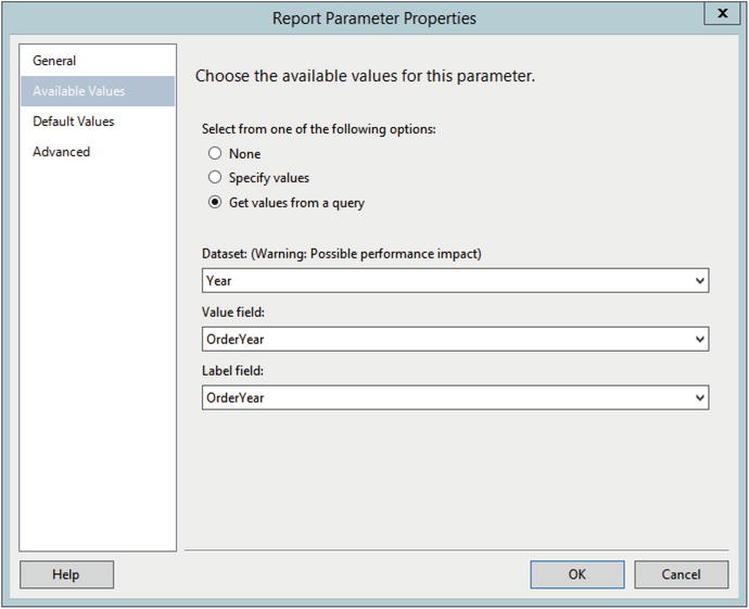
Figure 7-4. The Available Values properties
Set a default value of 2012. The Default Values page should look like Figure 7-5.

Figure 7-5. The Default Values properties
Click OK to accept the changes.
The Report Data window should now look like Figure 7-6.

Figure 7-6. The Report Data window after all report objects added
Take a look at the Toolbox as shown in Figure 7-7. The Chart, Gauge, and Map are usually added as stand-alone objects in the report. The Data Bar, Sparkline, and Indicator are usually added to a cell of Tablix. In this section, you will learn about the chart control.

Figure 7-7. The Toolbox
Follow these steps to add a chart to the report:
In design view, drag a chart to the design canvas.
This opens the Select Chart Type dialog shown in Figure 7-8 where you can select one of many types of charts.

Figure 7-8. The Select Chart Type dialog
The default type is the Column chart. Click OK to add it to the report.
Before making any modifications, the chart will look like Figure 7-9.
Figure 7-9. The chart control
To connect the data to the chart, double-click the chart. This opens the Chart Data window as shown in Figure 7-10.

Figure 7-10. The Chart Data window
The Chart Data window is divided into three sections. The ∑ Values window holds the field you want to measure, represented by the height of the bar. Click the plus sign and navigate to the TotalSales field from AdventureWorks ➤ Sales to add it. It will automatically sum.
The Category Groups section holds the values used for the horizontal axis. Change from the default of Details to TerritoryName. If left as the default, it will display a bar for each row in the dataset. In our case, we want one bar per territory.
Series Groups allows you to break down the category into multiple smaller items. You will learn about this in a later example. For now, the Chart Data window should look like Figure 7-11.

Figure 7-11. The Chart Data window with the properties filled in
Increase the size of the chart so that it is about five inches (13 cm) wide by four inches (10 cm) tall. To assist with resizing the chart, you can add the ruler by right-clicking the report and selecting View ➤ Ruler.
Preview the report. The chart should look like Figure 7-12.

Figure 7-12. The chart before formatting
At this point, you can see that the bars are different heights, and you can see some of the territory names along the horizontal axis. Obviously, this chart needs quite a bit of work, and, fortunately, it is highly customizable. Each section of the chart has its own property window which you can use to control format and position. Following is a list of items that need to be corrected:
Display all territory names.
Add the two axis titles.
Change the Chart Title to Total Sales by Territory along with the year.
Remove the legend.
Format the vertical axis.
Add a tooltip with the exact amount for each territory.
Follow these steps to format the chart:
Switch back to design view.
Right-click the horizontal axis and select Horizontal Axis Properties.
This brings up the Horizontal Axis Properties dialog box. On the Axis Options page, change the Interval property to 1 and click OK. This will cause all territories to display on the chart.
Right-click the horizontal axis and select Show Axis Title.
Right-click the horizontal Axis Title and select Axis Title Properties.
This brings up the Axis Title Properties dialog. Change the Text Title to Territory and click OK.
Right-click the vertical axis and select Show Axis Title.
In addition to changing the axis title by bringing up the Axis Title Properties dialog, you can also change an axis title by clicking into it and typing. Change the vertical Axis Title to Sales in thousands.
Right-click the Chart Title and bring up the properties.
Next to the Title Text, click fx to open the Expressions dialog.
To add the year parameter to the title, the expression should be
="Total Sales by Territory for " & Parameters!Year.ValueClick OK twice to accept the properties.
Select the chart legend, Total Sales, and click the Delete key. In this case, the chart legend doesn’t add anything to the report.
Right-click the vertical axis and select Vertical Axis Properties.
On the Number page of the Vertical Axis Properties dialog, select Currency under Category.
Change Decimal places to 0.
Check Use 1000 separator (,) and check Show values in Thousands. The Number page should look like Figure 7-13.

Figure 7-13. The Number properties of the vertical axis
Click OK to accept the properties.
Right-click one of the bars and select Series Properties.
On the Series Data page of the Series Properties dialog, click the fx symbol next to Tooltip.
The expression should be
=FormatCurrency(Sum(Fields!TotalSales.Value),0)Click OK twice to accept the change.
Now when you preview the report, the chart should resemble Figure 7-14. Be sure to hold the cursor over one or more of the bars to see the tooltip.

Figure 7-14. The chart with formatting
The report looks pretty good, but you can do more. What about sorting the bars by the total sales instead of alphabetically? To do this, follow these steps:
Switch to design view and double-click the chart to open the Chart Data window.
Click the down arrow next to TerritoryName and select Category Group Properties as shown in Figure 7-15.

Figure 7-15. Select Category Group Properties
Select the Sorting page and change the Sort by property from TerritoryName to TerritoryTotal. This field has been pre-aggregated as a sum for each territory. You cannot use the Sum(TotalDue) expression to sort.
Click OK and preview the report. The report should look like Figure 7-16.

Figure 7-16. The chart sorted by total sales
This chart type is probably the best way to display this information, but there are several other types you could use. A pie chart could be used, but it would be difficult for the user to understand because of the high number of categories. Funnel or pyramid charts may work as well, but you could also choose the tree map control. This type of chart is new with SSRS 2016.
Follow these steps to learn how to use the new tree map chart :
Switch back to design view.
Increase the length of the report canvas to make room for the next chart.
Add a chart to the report.
On the Select Chart Type dialog, select the Tree Map as shown in Figure 7-17 and click OK.

Figure 7-17. Select the new Tree Map chart
Increase the size of the chart.
Open the Chart Data window by double-clicking the chart.
Add TotalSales to the ∑ Values section.
Set the Category Groups values to TerritoryName. This will create a section for each territory, but they will be the same color.
To make each territory a different color, also set the Series Groups to TerritoryName.
Preview the report. At this point, the chart will look like Figure 7-18.

Figure 7-18. The Tree Map chart before formatting
Notice that some of the cells have the territory displayed twice, but some do not have anything displayed. To get around this, use a tooltip to display the information. Follow these steps to add the tooltip and complete the formatting:
Switch back to design view.
Right-click a series cell and click Show Data Labels as shown in Figure 7-19. This actually switches the labels at the bottom to the total sales.

Figure 7-19. Show Data Labels
Right-click one of the numbers and select Series Label Properties.
Select the Number page of the Series Label Properties dialog and format as Currency with no decimal places and use the 1000 separator.
Click OK to accept the change.
Right-click a series cell and select Series Properties.
Click fx next to the ToolTip property and use the following expression:
=Fields!TerritoryName.Value & " " &FormatCurrency(Sum(Fields!TotalSales.Value),0)Click OK twice to dismiss the dialogs.
Change the Chart Title to the following expression:
="Sales by Territory for " & Parameters!Year.ValuePreview the report. The chart should look similar to Figure 7-20.

Figure 7-20. The formatted tree map chart
The Line chart type is also interesting. With it you can create a graph that compares multiple categories over time. In this case, you will create a graph that displays the sales for the territories over each month for one year. Follow these steps to create the graph:
Switch back to design view.
Expand the size of the report canvas.
Add a new chart to the report as shown in Figure 7-21.

Figure 7-21. Select the Line chart
Increase the size of the chart.
Set the Chart Data properties as shown in Figure 7-22. The Series Groups property will split the line into individual territories.

Figure 7-22. The Chart Data properties
Change the Interval property of the horizontal axis to 1 so that all months will display.
To change the months in the horizontal axis to the month name instead of number, click the down arrow in the Chart Data window next to OrderMonth and select Category Group Properties as shown in Figure 7-23.

Figure 7-23. Select Category Group Properties
Click the fx icon next to Label and add this expression:
=MonthName(Fields!OrderMonth.Value)Click OK twice to dismiss both dialog boxes.
Select one of the series lines and select Series Properties.
Change the tooltip property to this expression:
=Fields!TerritoryName.Value & " " & FormatCurrency(Fields!TotalSales.Value,0)Click OK to dismiss the Expressions dialog and then select the Markers page.
Change the Marker Type to Circle and click OK.
Right-click the legend and bring up the properties.
Change the Legend position to the top as shown in Figure 7-24.

Figure 7-24. The Legend position
Click OK to accept the change.
Change the Chart Title to
="Sales by Month for " & Parameters!Year.ValueBring up the Vertical Axis properties and format the vertical axis so that it displays currency with no decimal places and with a thousands separator.
Only show values in thousands and click OK to save the changes.
Right-click the vertical axis and select Show Axis Title. The title should say Sales in Thousands.
Set the Interval property of the horizontal axis to 1 so that all months display.
Preview the report. It should look similar to Figure 7-25.

Figure 7-25. The sales graph
Adding Gauges to Reports
Charts and graphs compare values over categories, time, or both. A gauge can be used to show if a single goal was met. Meeting a sales quota is a good example. Gauges look like thermometers and dials, and they are more complex to configure than charts.
Before diving in to the details, take a look at the different parts that make up a gauge as shown in Figure 7-26.

Figure 7-26. The parts of a gauge
The scale represents the range of values you expect. It can be in terms of a numeric value such as dollars or a percent. The top value of the scale could be the goal or quota. However, if it is possible to exceed the goal, you may want to make the top value higher than the goal, such as the goal plus 25%.
The range highlights certain areas on the scale. For example, you may want to highlight the goal. You can customize the range with color, and one way might be to color the range from red to green. It’s possible to add multiple ranges to have even more granular control over the color.
The pointer represents the value achieved. At a glance, you can tell if the goal was met by how close it lands to the target. Several types of gauges are available, including those with two dials and those with logarithmic scales. To learn how to work with gauges, follow these steps:
Add a new report to the project named Gauges.
Set up a data source pointing to AdventureWorks2016 named AdventureWorks.
Add a dataset named Year with pointing to the Year shared dataset.
There is a table with quotas in the AdventureWorks database, but the values do not make much sense compared to the sales. Instead, create a dataset named SalesQuota with this query containing hard-coded values:
SELECT * FROM(VALUES(2011,1000, 899),(2012,1000,1010),(2013,1200,1100),(2014,1200,1220))AS Quota ([Year],[Target],Sales)WHERE [Year] = @Year;A Year parameter will automatically be created. Change the Available Values to Get values from a query. The Dataset is Year. The Value field and Label field should be set to OrderYear.
Add a gauge to the report. Select the Radial graph as shown in Figure 7-27.

Figure 7-27. Add a Radial gauge to the report
When you click the gauge, the Gauge Data window opens. Under LinearPointer1, change Unspecified to Sales. It will automatically sum as shown in Figure 7-28.

Figure 7-28. The Gauge Data properties
Right-click inside the gauge. Select Gauge Panel ➤ Scale Properties.
By default, the scale goes from 0 to 100. To change it to match the values in the data, click the fx symbol for the Maximum property on the General page.
Change the expression to
=Fields!Target.Value * 1.25Switch to the Number page and format as Currency with no decimal places.
Click OK to accept the properties.
Bring up the Range Properties of the top range by right-clicking the gauge and selecting Gauge Panel ➤ Range (LinearRange3) Properties.
On the General page, change the Start range at scale value property to the following expression:
=Fields!Target.Value * .95Change the End range at scale value to this expression:
=Fields!Target.Value * 1.25Click OK to accept the properties.
Bring up the Range Properties of the middle range, LinearRange2.
Set the Start range at scale value to
=Fields!Target.Value * .75Set the End Range at Scale Value to
=Fields!Target.Value * .95Click OK.
Bring up the Range Properties of the bottom range, LinearRange1.
Set the End range at scale value to
=Fields!Target.Value * .75Click OK.
Right-click the scale and select Scale Properties.
Select the Labels page.
Uncheck Show labels at end of scale.
Click OK.
Now when you preview the report and select 2014 for the Year parameter, the gauge will look like Figure 7-29.

Figure 7-29. The configured gauge
While you will generally see gauges as a stand-alone section of a report, you can also add gauges to a table cell. Follow these steps to learn how to do it:
Switch to design view.
To display all years in one report, add a new dataset named SalesAllYears with the following query:
SELECT * FROM(VALUES(2011,1000, 899),(2012,1000,1010),(2013,1200,1100),(2014,1200,1220))AS Quota ([Year],[Target],Sales);Add a table to the report.
Add the fields Year, Target, and Sales to the table from the SalesAllYears dataset.
Add a new column to the right.
Drag a gauge into the new data cell.
Select the Linear Horizontal guage as shown in Figure 7-30.

Figure 7-30. The Linear horizontal gauge
Expand the height and width of the cell so that the table design looks like Figure 7-31.

Figure 7-31. The table design
Double-click the gauge to bring up the Guage Data window. Change the value under LinearPointer1 to Sales. It will automatically sum.
Bring up the Scale Properties and change the Maximum to the following expression:
=Fields!Target.Value * 1.25Change the Interval property to 200.
On the Number page, change the Category to Currency.
Change to 0 decimal places and check Use 1000 separator (,).
On the Labels page, uncheck Show labels at the end of scale.
Click OK to accept the changes.
Right-click the gauge and select Add Range.
Bring up the Range properties.
Change both Start range at scale value and End range at scale value to Sum(Target).
On the Border page, change the Line Width to 5 pt.
Click OK to accept the changes.
Select the cell that holds the gauge.
In the Properties window, change the BorderStyle Default property to Solid and BorderColor property to LightGray.
When you preview the report, the table should look like Figure 7-32.

Figure 7-32. The table with an embedded gauge
Adding Data Bars, Sparklines, and Indicators to Tables
You saw that you can add gauges to table cells in the last section. Three visual controls, data bars, sparklines and indicators, are meant to be used within cells. Indicators are simplified gauges. Data bars and sparklines are simplified charts and graphs. To learn how to add an indicator , follow these steps:
Add a new report named SmallControls to the project.
Add the AdventureWorks data source pointing to the shared AdventureWorks2016 dataset.
Add an embedded dataset named Sales with the following query:
SELECT YEAR(OrderDate) AS OrderYear, MONTH(OrderDate) AS OrderMonth,SUM(TotalDue) AS SalesFROM Sales.SalesOrderHeaderGROUP BY YEAR(OrderDate), MONTH(OrderDate);Add a table to the report.
Add the Sales field to the detail row.
Right-click the detail row and select Add Group ➤ Parent Group.
In the Tablix Group dialog, select OrderYear for the Group by property.
Check Add group header. The dialog should look like Figure 7-33.
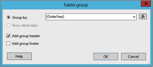
Figure 7-33. The OrderYear group
Click OK.
Delete the detail row by right-clicking the row and selecting Delete rows.
Click OK when asked if you want to delete the row and group.
In the data cell under Sales, select Sales. It will automatically sum.
Drag an Indicator from the Toolbox to the third data cell in the row.
Select the default Directional style and click OK.
Delete the empty column.
Click the cell with the Indicator. You’ll see GaugePanel1 in the Properties window. Change the BorderStyle Default property to Solid.
Double-click the cell holding the indicator. Change the Gauge Data value to Sales. It will automatically sum as shown in Figure 7-34.

Figure 7-34. The Gauge Data properties
When you run the report, it will look like Figure 7-35.

Figure 7-35. The report with the indicator
By default, the indicator is set to display the three possible icons based on the percentage of sales. In design view, right-click the cell and select Indicator Properties. You can change the behavior of the indicator on the Value and States page as shown in Figure 7-36.

Figure 7-36. The Value and States page
Change the Start and End values to match Figure 7-37.

Figure 7-37. The new indicator properties
Click OK to accept the changes. Now when you run the report, all sales indicators at the 50th percentile will be the red down arrow as shown in Figure 7-38.

Figure 7-38. The results after the indicator change
This report displays the data at the year level. You can use a sparkline to display the sales over the months. Follow these steps to learn how:
Switch to design view.
Add a new column to the right of the indicator.
Drag a sparkline control to the new data cell.
Select the Line with Markers sparkline type as shown in Figure 7-39 and click OK.

Figure 7-39. The Line with markers sparkline
Double the width of the table cell containing the sparkline.
Double-click the cell to bring up the Chart Data properties.
Change the ∑ Value to Sales and the Category Groups to OrderMonth.
Click the sparkline until the markers light up.
Right-click the sparkline and select Series Properties.
Change the ToolTip property to the following expression and click OK:
=MonthName(Fields!OrderMonth.Value) & " "& FormatCurrency(Fields!Sales.Value,0)Select the cell with the sparkline. In the Properties window, change the BorderStyle Default property to Solid.
Now, when you run the report, you can run your cursor over the line to see the month name and the total sales for that month. Figure 7-40 shows how the report should look:

Figure 7-40. The report with a sparkline
A data bar can be added and configured just like the sparkline. The difference is that there will be separate bars for each data point instead of a line. Follow these steps to add the data bar:
Switch to design view.
Add a new column to the table.
Drag a data bar to the new cell.
Select the Data Column type as shown in Figure 7-41.

Figure 7-41. Add a data bar
Expand the width of the cell.
In the Chart Data window, select Sales under the ∑ Value property.
Add OrderMonth to the Category Groups section.
In this case, you will sort by value instead of the month. Click the arrow next to OrderMonth in the Category Groups section.
Select Category Group Properties.
On the Sorting page, replace OrderMonth with Sales.
Click OK.
Click the cell. In the Properties window, change the BorderStyle Default property to Solid.
Click one of the data bars until a small circle appears above each of them.
Right-click and bring up Series Properties.
Add the following expression to the Tooltip property:
=MonthName(Fields!OrderMonth.Value) & " "& FormatCurrency(Fields!Sales.Value,0)
When previewing the report, it should look like Figure 7-42.

Figure 7-42. The report with the data bars
Adding a Map to a Report
Arguably the most intriguing feature of SSRS is the ability to add maps to reports. In this section, you will learn how to add a map connected to geographic data from AdventureWorks. This just touches the surface of what can be done with maps. In fact, an entire book could be written on this topic. Follow these steps to learn how to add a simple map to a report:
Add a new report named Map to the project.
Add a data source named AdventureWorks pointing to the shared AdventureWorks2016 data source.
Add a dataset named Year pointing to the shared Year dataset.
Add an embedded dataset named MapData with the following query:
DECLARE @Year INT = 2013;SELECT SUM(TotalDue) AS Sales, vS.CountryRegionName, vS.StateProvinceNameFROM Sales.SalesOrderHeader AS SOHJOIN Person.BusinessEntityAddress AS BEAON BEA.BusinessEntityID = SOH.CustomerIDJOIN Person.Address AS A ON BEA.AddressID = A.AddressIDJOIN Person.vStateProvinceCountryRegion AS vSON A.StateProvinceID = vS.StateProvinceIDWHERE CountryRegionName = 'United States'AND YEAR(OrderDate) = @YearGROUP BY A.City, vS.CountryRegionName, vS.StateProvinceName;The Year parameter will be added automatically. Connect the available values to the Year dataset. At this point, the MapData dataset is hard-coded for 2013, which is needed to get the map wizard to work. Once the map is done, you will make the report dynamic.
Add a map control to the report which kicks off a wizard.
On the Choose a source of spatial data page, select Map gallery and choose USA by State as shown in Figure 7-43.

Figure 7-43. Select the source of map data
Click Next.
On the Choose Spatial Data and Map View Options page , you can modify the resolution, position, and zoom level of the map. Make the map slightly smaller by dragging down the pointer on the left. Adjust the position by grabbing the map and moving it so that Alaska, Hawaii, and the continental United States are visible. Click Next.
On the Choose Map Visualization page , select the Color Analytical Map and click Next.
On the Choose the Analytical Dataset, select MapData and click Next.
The Specify the Match Fields for Spatial and Analytical Data page is where you connect the map properties to fields in the data. Check the box next to STATENAME.
In the Analytical Dataset Fields dropdown box, select StateProvinceName. You can verify that you made the correct choices by comparing the highlighted columns in the two bottom sections as shown in Figure 7-44.

Figure 7-44. Map data connected to the dataset column
Click Next.
On the Choose color theme and data visualization page select Sum(Sales) from the Field to Visualize list.
In the Color Rule list, select Red-Yellow-Green.
The page should look like Figure 7-45.

Figure 7-45. The Choose color theme and data visualization page
Click Finish.
Open the MapData dataset properties.
Remove this text from the following query:
DECLARE @Year INT = 2013;Click OK to accept the change. In order to connect the data to the map, a value for the parameter had to be provided. Now that the map is complete, this line can be removed.
When you preview the report and select 2012, you should see the populated map as shown in Figure 7-46.

Figure 7-46. The populated map
To add a tooltip to the map follow these steps:
Switch back to design view.
Click the map to open the Map Layers window.
Click the down arrow in the PolygonLayer and select Polygon Properties as shown in Figure 7-47.

Figure 7-47. Open the polygon properties
Change the Tooltip property to the following expression:
=Fields!StateProvinceName.Value & " " & FormatCurrency(Fields!Sales.Value,0)Change the Map Title to the following expression:
="US Sales by State " & Parameters!Year.ValueRight-click the map legend and bring up the properties. Change the Legend Position to the bottom of the map.
Check Show legend outside the viewport as shown in Figure 7-48.

Figure 7-48. Change the map legend position
Click OK.
Change the map legend title from Title to Sales.
Remove the Color Scale.
Remove the Distance Scale.
When you run the report and select 2012, the report should look like Figure 7-49.

Figure 7-49. The final map report
Building a Dashboard
Dashboards allow busy executives to see the current status of the business with just a glance. They can see trends over time and how key performance indicators are being met. In this section, you will combine several of the visualizations you created into one report.
To get started, follow these steps:
Add a new report named Dashboard.
Open the Report Properties from the Report menu.
Change the layout of the report to Landscape.
Change the margins so that each margin is 0.25 inches or 0.625 cm as shown in Figure 7-50.

Figure 7-50. The Report Properties page
Click OK to save the changes.
Add a data source to the report named AdventureWorks pointing to the AdventureWorks2016 shared data source.
Add a dataset named Year pointing to the shared Year dataset.
Add a parameter named Year of data type integer. The General page should look like Figure 7-51.

Figure 7-51. The Year parameter properties
Connect the available values to the Year dataset.
Add a default to the parameter with the value 2014.
Click OK.
Create a new embedded dataset named Sales pointing to AdventureWorks with the following query:
SELECT SUM(TotalDue) AS TotalSales, MONTH(OrderDate) AS OrderMonth,T.TerritoryID, T.Name AS TerritoryName,Sum(Sum(TotalDue)) OVER(PARTITION BY T.TerritoryID) AS TerritoryTotalFROM Sales.SalesOrderHeader AS SOHJOIN Sales.SalesTerritory AS T ON T.TerritoryID = SOH.TerritoryIDWHERE YEAR(OrderDate) = @YearGROUP BY MONTH(OrderDate), T.TerritoryID, T.Name;Add a page header to the report.
Add a text box to the header with the following expression:
="Sales Dashboard for " & Parameters!Year.ValueIncrease the font size of the text box to 16 pt.
Expand the width of the text box.
Open the Charts report in design view.
Copy the bar chart from the report using the CTRL+C shortcut and paste it into the Dashboard report.
When you run the report, it should look like Figure 7-52.

Figure 7-52. The dashboard with the first visualizations
You can continue adding embedded visualizations to the dashboard, but you can also add subreports that contain tables or visualizations. Follow these steps to add subreports:
Switch to design view of the Map report.
Drag the map to the upper left corner of the report.
Drag in the margins of the report as far as possible.
Save the report.
In design view of the Dashboard report, add a subreport control to the right of the bar chart.
Adjust the size of the subreport so that it is about the same size as the bar chart.
Right-click the subreport and select Subreport Properties.
Set the Use This Report as a Subreport property to Map.
On the Parameters page you map any parameters needed for the subreport to values from the parent report. Click Add to add the first parameter.
Select Year under Name. This is the parameter required by the subreport.
Under Value, select the fx icon to open the Expression builder.
Change the expression to =Parameters!Year.Value and click OK twice.
Preview the report. You can adjust the size of the map in the Map report and the subreport as required. The report should look like Figure 7-53.

Figure 7-53. The dashboard with two visualizations
Open the SmallControls report in design view.
Drag the table to the upper left corner.
Drag in the report edges.
If you haven’t done it previously, format the sales field as currency with no decimal places and with a thousands separator.
Save the SmallControls report.
Add the SmallControls report as a subreport to the Dashboard report below the bar chart. This subreport doesn’t have a parameter to map.
When you view the report, it should resemble Figure 7-54.

Figure 7-54. The completed dashboard
Summary
SSRS provides a wide variety of visual elements that connect to datasets. These objects also have many configurable properties that can enhance the visual appeal of reports and dashboards. This chapter introduced you to all of the charts, gauges, and maps, including several that are meant to fit inside a Tablix cell.
In Chapter 8, you will learn how to publish reports to the new Reporting Services Web Portal.