
I had a birthday party when I turned six. I remember requesting chocolate cake with chocolate icing, chocolate ice cream, and chocolate milk. I also wanted my cake to be a multilayer wedding cake. I didn’t get a wedding cake until years later at my actual wedding reception, and I’m sure the cake that my mom baked for my sixth birthday was a one-layer chocolate pan cake.
The reports you created in Chapters 3 and 4 displayed just one level in each table, much like that simple cake at my birthday party. In this chapter you will learn how to create reports with multiple grouping levels, including matrix reports.
Designing Your Report
The most important phase of any project, big or small, is the design. You must know what you are trying to accomplish before you start building the solution. A SQL Server Reporting Services (SSRS) report by itself is a relatively small project, but you will save time and frustration by understanding the requirements and coming up with a design before launching SQL Server Data Tools (SSDT).
Depending on the requirements for documentation at your company or department, you may end up just using a white board or paper to sketch out your design. For reports that require multiple grouping levels, calculations, or any advanced features, spend some time figuring out how the report should look. If you are lucky, the person requesting the report will provide a design layout along with the requirements.
Your company may have a very formal procedure to follow for new report requests with explicit requirements. Or, maybe a report request will made with just a phone call. In this chapter, you’ll go through the process of building a report based on a simple request.
The Report Requirements
You have been given a report request from the sales department manager:
We would like a report that shows sales by territory and year.
At this point, you could start building the report, but maybe you should ask some questions before you launch SSDT.
How do I determine the territory? What fields need to show on the report? Do you need to see subtotals or other calculations? Should the report be grouped first by territory and then by year or the opposite? What is the lowest detail that needs to be shown on the report?
When meeting with the manager, you find out the following:
The query will be provided.
Group first by year, then within the year, group by territory.
For each year, show the total sales and the average sales over the territories.
For each territory, display the territory name, ID, and total sales.
Display store name, customer ID, and total sales as the lowest detail.
Sort the detail by total sales in descending order.
Sort the years by descending order.
Sort the territories alphabetically.
You now have more specific requirements that may or may not be complete. In my experience, the person requesting the report will often have a better idea about what should be on the report and how it should be organized once he or she sees an actual report.
The Report Layout
Now that you have more details, you can begin to mock up the report layout on a white board or paper. You come up with the design shown in Figure 5-1.

Figure 5-1. The report layout
The sales manager approves the layout, and you are ready to build the actual report.
Building a Report with Grouping Levels
This report will have three levels, but it will still be a relatively simple report. The skills you learn in this chapter will be easily applied to more complex reports.
Note
Chapter 3 covers working with data source and datasets. Chapter 4 covers adding controls and how to modify the properties. Refer to those chapters if you need step-by-step assistance with these topics.
Follow these steps to get started:
Using SSDT, create a new report project with the name Grouping Level Reports in a solution called Beginning SSRS Chapter 5.
Create a shared data source pointing to AdventureWorks2016 and also named AdventureWorks2016.
Add a new report to the project named Sales by Territory.
Add a data source named AdventureWorks to the report. The data source should point to the AdventureWorks2016 shared data source.
Add an embedded dataset to the report named SalesByTerritory that uses the AdventureWorks data source. Use this query:
SELECT YEAR(OrderDate) AS OrderYear, C.CustomerID, SUM(TotalDue) AS Sales,T.TerritoryID, T.Name AS Territory, s.Name AS StoreFROM sales.SalesOrderHeader AS SOHJOIN Sales.SalesTerritory AS T ON SOH.TerritoryID = T.TerritoryIDJOIN Sales.Customer AS C ON SOH.CustomerID = C.CustomerIDJOIN Sales.Store AS S ON S.BusinessEntityID = C.StoreIDGROUP BY C.CustomerID, T.TerritoryID, T.Name,YEAR(OrderDate), S.Name;Add a table to the report design canvas.
Add the CustomerID, Store, and Sales fields to the Data row.
The report design should look like Figure 5-2.

Figure 5-2. The report design
Add a Grouping Level to a Table Row
So far, the detail row is in place. The detail row will be nested inside a grouping level which is based on TerritoryID. There are two ways to add grouping levels, and you will learn both methods. Follow these steps to add a grouping level to a table:
Right-click any cell in the data row.
Select Add Group ➤ Row Group ➤ Parent Group as shown in Figure 5-3.

Figure 5-3. Add a parent group
This brings up the Tablix group dialog box. Select TerritoryID in the Group by dropdown box.
Select Add group header.
The dialog should look like Figure 5-4.

Figure 5-4. The Tablix group properties
Click OK. Figure 5-5 shows the table with the first grouping level.

Figure 5-5. The first group added to table
In this figure, the Sales data cell is selected. Notice that an orange bracket on the left of the CustomerID cell is visible. This indicates the grouping level of the selected cell. In this case, it is the detail level. Click one of the empty cells. Now the bracket can be found on the TerritoryID cell as shown in Figure 5-6.
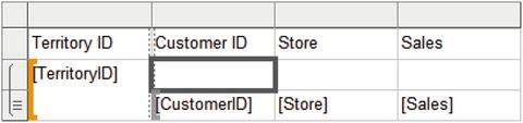
Figure 5-6. The bracket is located on TerritoryID
This means that the cells in the middle row belong to the TerritoryID group. Add the Sales field to the empty cell on the right. Because this is a grouping level outside the details, the field is automatically summed as shown in Figure 5-7.

Figure 5-7. Sales is automatically summed
In the CustomerID column, add the Territory field to the empty cell. The placeholder doesn’t show it, but it is the first value found in the group. Since there is one Territory for each TerritoryID, this expression will work. Preview the report; it should look like Figure 5-8 at this point.

Figure 5-8. The report preview
Add a Grouping Level to the Grouping Window
The grouping window at the bottom of the report provides another way to add and configure grouping levels. Column Groups, on the right, are used for matrix reports. You’ll learn about matrix reports in the section “Building a Matrix Report” later in this chapter.
At this point, you should see the TerritoryID row group in the window after switching back to design view. To add the next grouping level, follow these steps:
If the Grouping window is not visible below the report canvas, right-click the report and select View ➤ Grouping.
In the Row Groups window, click the down arrow next to TerritoryID.
Select Add Group ➤ Parent Group as shown in Figure 5-9.

Figure 5-9. Add aParent Group
Select OrderYear for the Group by property in the Tablix Group dialog.
Check Add group header.
Click OK. The Row Groups section will now look like Figure 5-10.

Figure 5-10. The row groups
In the empty cell in the Sales column, add Sales. This will be the total for the year.
In the empty cell in the Store column and second row, create an expression with the following formula: =Sum(Fields!Sales.Value)/CountDistinct(Fields!TerritoryID.Value). This will give the average sales over the territories, in other words, the average of the sum.
The report design should look like Figure 5-11.

Figure 5-11. Thereport design
When you preview the report, you will see that there is some cleanup to do. The report looks like Figure 5-12at this point.

Figure 5-12. The report inpreview mode
Formatting the Report
Follow these steps to begin formatting the report:
Switch to design view.
Format the four cells referring to the Sales field to currency with a thousands separator and no decimal points. Remember that once you format one cell, you can select the other three and paste in the format at one time.
Decrease the width of the Order Year and Territory ID columns.
Increase the width of the Store column.
The report is in the default group layout that you get when adding grouping levels to the report, but you can always rearrange it. You will now add two new rows to modify the layout. Follow these steps:
Right-click the TerritoryID cell and select Insert Row ➤ Inside Group ➤ Above. This adds a new row to the TerritoryID group.
Right-click the TerritoryID cell again and select Insert Row ➤ Outside Group ➤ Above. This adds a new row to the OrderYear group. The table layout should look like Figure 5-13.
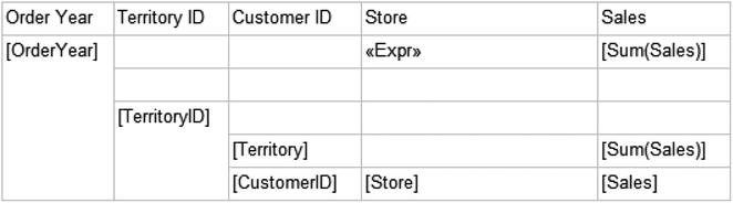
Figure 5-13. The report layout with two new rows
In column 2, move the Territory ID heading to the cell above TerritoryID.
In column 3, move the Territory data field up one row.
Move the Customer ID heading above the CustomerID data cell.
Type the word Name above the Territory data cell. The layout should look like Figure 5-14 at this point.

Figure 5-14. The report preview after rearranging cells
In column 4, move the Store heading to the cell above the Store data cell.
In the top row, above the average sales expression, type in Average Sales. The layout should look like Figure 5-15.

Figure 5-15. The layout after rearranging column 4
In column 5, change the heading in row 1 to Total Sales.
In row 3, the territory header row, type in Total Sales.
In row 4, add the Sales field which will automatically sum.
Format the cell as currency with no decimals and with a thousands separator.
In row 5, the detail header row, change from the Sales field to the words Total Sales. The layout should look like Figure 5-16.

Figure 5-16. The layout after rearranging column 5
Select the Average Sales column. Set the alignment to Align Right.
Select the Total Sales column. Set the alignment to Align Right.
Preview the report. It should look like Figure 5-17.

Figure 5-17. The formatted report in preview mode
You can use color and other formatting aspects to highlight the grouping levels. Follow these steps to format the groups:
Switch back to design view.
Select the top row and view the Properties window. Change the FontSize to 12 pt, the BackgroundColor to CornflowerBlue, and the Color property found in the Font section to White.
Repeat the formatting to the second row.
Select the third row. Change the BackgroundColor to LightBlue and FontWeight to Bold.
Repeat the formatting to the fourth row.
Select the fifth row. Bold the font.
Now when you preview the report, it looks like Figure 5-18.

Figure 5-18. The report preview with formatting
As you scroll through the report , you will see that the headings are lost on subsequent pages. To enable the headings to repeat on each page, follow these steps:
Switch back to design view.
Click the down arrow located on the right of the Column Groups window and select Advanced Mode as shown in Figure 5-19.

Figure 5-19. Select Advanced Mode
When Advanced Mode is selected, the Row Groups and Column Groups will expand. You will see Static sections as shown in Figure 5-20.

Figure 5-20. The expanded grouping window
Using the Properties window , change the RepeatOnNewPage value to True for each Static area found under Row Groups.
Now when you preview the reports, the headings will repeat on each page.
Sorting the Groups
There is one requirement that hasn’t been addressed, sorting. The details must be sorted by the total sales in descending order. The report must also be sorted by year in descending order. Follow these steps to modify the sort order according to the requirements.
In the Row Groups window, right-click the Details group and select Group Properties.
In the Group Properties dialog, select the Sorting page.
Click Add.
Select Sales in the Sort by property.
Select Z to A in the Order property. The Group Properties dialog box should look like Figure 5-21.

Figure 5-21. The Sorting Properties dialog
Click OK to accept the properties.
Modify the OrderYear group properties so that the report sorts in OrderYear descending order. The group automatically sorts by the grouping field.
Right-click the TerritoryID group and bring up the Group Properties.
Select the Sorting Page. Change the existing sort order from the TerritoryID field to the Territory field. Click OK when done.
Finalizing the Report
The report is almost ready to show the manager. Follow these steps to complete the report:
Switch to design view.
Drag the table to the top and left of the report.
Drag in the bottom and right edges of the report canvas.
From the Report menu, click Add Page Header and Add Page Footer.
Add a text box to the page header. Type in Territory Sales.
Expand the text box to the width of the canvas.
Center the text.
Increase the font size to 18 pt.
From Built-in Fields in the Report Data window, drag the Execution Time to the report footer.
Double the width of the text box.
Add another text box to the footer.
Add this expression to the text box:
="Page " & Globals!PageNumber & " of " & Globals!TotalPagesLaunch the Report Properties dialog from the Report menu.
Change the Top and Bottom margins to 0.25 in or 0.635 cm.
View the report. Adjust any settings that make sense.
Now you are ready to show the report to the manager for feedback.
Building a Report with an Alternate Layout
After viewing the report, the manager verifies that the numbers are correct but would like a different layout. The alternate layout resembles the report you created with the wizard in Chapter 2 as shown in Figure 5-22.

Figure 5-22. An alternate report layout
To create a report with this layout follow these steps:
Add a new report to the project named Sales by Territory 2.
Add a data source to the report named AdventureWorks pointing to the AdventureWorks2016 shared data source.
Add an embedded dataset to the report named SalesByTerritory pointing to the AdventureWorks data source with this query:
SELECT YEAR(OrderDate) AS OrderYear, C.CustomerID, SUM(TotalDue) AS Sales,T.TerritoryID, T.Name AS Territory, s.Name AS StoreFROM sales.SalesOrderHeader AS SOHJOIN Sales.SalesTerritory AS T ON SOH.TerritoryID = T.TerritoryIDJOIN Sales.Customer AS C ON SOH.CustomerID = C.CustomerIDJOIN Sales.Store AS S ON S.BusinessEntityID = C.StoreIDGROUP BY C.CustomerID, T.TerritoryID, T.Name,YEAR(OrderDate), S.Name;Add a table to the report canvas.
Add CustomerID, Store, and Sales to the Data row.
Add a parent row group to CustomerID.
On the Tablix group dialog, fill in TerritoryID as the Group by property.
Check Add group header. Click OK to accept the properties.
Add a parent row group to TerritoryID.
Fill in OrderYear as the Group by property.
Check Add group header. Click OK to accept the properties. The report should look like Figure 5-23.

Figure 5-23. The report design with grouping levels
Delete the Order Year and Territory ID columns. This does not delete the groups.
Right-click the Customer ID column and select Insert Column ➤ Left.
Repeat three more times so that there are four empty columns.
Type these values in the header row: Order Year, Average Sales, Territory ID, Name. The report design should look like Figure 5-24.

Figure 5-24. The report layout after adding headings
The second row is part of the OrderYear group, but if you drag OrderYear to the cell underneath the Order Year heading, it will automatically sum since it is a numeric field. Type in [OrderYear] instead.
In the third row of the Territory ID column, type in [TerritoryID]. Again, make sure that this field doesn’t sum the values.
Add the Territory field to the cell under Name in the third row.
Using the Expression dialog, add this expression to the cell under Average Sales in the second row:
=Sum(Fields!Sales.Value)/CountDistinct(Fields!TerritoryID.Value)Add the Sales field to the two empty cells under the Sales header. These will automatically sum which is correct.
Now you have a grouping report with an alternate layout. When you preview the report, it should look like Figure 5-25.

Figure 5-25. The report preview before formatting
You are now ready to format the report. Follow these steps:
Format all cells involving Sales to currency with no decimal points and use a thousands separator.
Select the header row and view the Properties window. Change the BackgroundColor to CornflowerBlue.
Change the FontSize to 12 pt and the Color property in the Font section to White.
Decrease the width of Order Year, Average Sales, Territory ID, and Name columns.
Increase the width of the Store column.
Change the BackgroundColor of the second row to #8fb3f3.
Change the BackgroundColor of the third row to #c7d9f9.
Right-align the Sales column. The report design should look like Figure 5-26.

Figure 5-26. The report layout with formatting
The report has very specific instructions for sorting each level. Follow these steps to sort the data:
Through the Group Properties dialog, change the sort order of the OrderYear group to descending.
Change the sort order of the detail row to Sales descending.
Change the sort order of the TerritoryID group to use Territory instead of TerritoryID.
The final set of tasks is to add the header and footer and modify the behavior of the headers. Follow these steps to complete the report:
Enable the Advanced Mode of the grouping window.
Set the RepeatOnNewPage to True in the Properties window for each Static level found in the Row Groups side.
Change the KeepWithGroup to After for each Static level found in the Row Groups.
To allow the header row to stay in place when scrolling down, select the top Static item.
Change the FixedData property to True.
Reposition the table so that it is in the top left corner.
Tighten the canvas by dragging in the edges.
Add a Report Page footer and Report Page header.
Add a text box to the header with the text Territory Sales.
Change the font size to 18 pt. Center the text box.
Add the Execution Time to the footer by dragging the field from the Built-in Fields folder in the Report Data window.
Add a text box with this expression to the footer:
="Page " & Globals!PageNumber & " of " & Globals!TotalPagesChange the report’s top and bottom margins to 0.25in or 0.635cm.
Preview the report and try out the scrolling feature. Make any additional adjustments that are needed. The report should look like Figure 5-27.

Figure 5-27. The Territory Sales report with an alternate layout
If you scroll down, you should see that the header row stays in place.
Building a Report with a Space-Saving Layout
The alternate layout shown in the previous section may be preferred, but it takes more space than the default layout. There is a way to save some space, however. Follow these steps to create a report with a space-saving layout:
Right-click the Sales by Territory 2 report in Solution Explorer and select Copy.
Press CTRL + V to create a copy of the report.
Change the name to Sales by Territory 3.
Double-click the new report so that it is open in design view.
Right-click the second row and select Insert Row ➤ Inside Group – Below.
In the cell found in the third row under Order Year, type Territory ID.
Expand the Order Year column.
In the cell found in the third row under Average Sales, type Name.
In the cell found in the fourth row under Order Year, add [TerritoryID]. Type in the placeholder to avoid summing the values.
In the cell found in the fourth row under Average Sales, add the Territory field.
Delete the Territory ID and Name columns. The report layout should look like Figure 5-28.

Figure 5-28. The space-saving layout
You can now decrease the width of the report canvas or add some additional fields to the report as needed. You may also want to modify the some of the formatting such as bolding the second row.
You can take advantage of the Padding property of the text box to indent the contents of a cell to create a hierarchical effect. Follow these steps to see how to do this:
Align the first column to the left.
Select the four cells related to the territory as show in Figure 5-29.

Figure 5-29. Selecting the territory cells
Open the Properties window.
Locate the Indent property in the Alignment category.
Change the Left Indent property to 15 pt.
Expand the width of the second column slightly. When you preview the report, it will look like Figure 5-30.

Figure 5-30. The report with territory cells indented
Building a Matrix Report
The manager is happy with the Sales by Territory 2 report but has another request. He would like you to create a matrix report that summarizes the sales by territory pivoted by the order year. Pivoting means that the data in the field will become a column header.
While a matrix report may seem daunting at first, it is really easy to create. Just like a regular report, spend some time figuring out the grouping levels. In this case, the row level group will be TerritoryID and the column level group will be OrderYear. You also need to determine the data field. This is the value that you wish to aggregate.
Figure 5-31 shows the matrix control before any cells are populated. Notice that the Data cell is the intersection of row and column groups.

Figure 5-31. The matrix control
To create a matrix report, follow these steps:
Add a new report to the project named Sales by Territory Matrix.
Add a data source named AdventureWorks pointing to the AdventureWorks2016 shared data source.
Add an embedded dataset named SalesByTerritory pointing to the AdventureWorks data source with this query:
SELECT YEAR(OrderDate) AS OrderYear, C.CustomerID, SUM(TotalDue) AS Sales,T.TerritoryID, T.Name AS Territory, s.Name AS StoreFROM sales.SalesOrderHeader AS SOHJOIN Sales.SalesTerritory AS T ON SOH.TerritoryID = T.TerritoryIDJOIN Sales.Customer AS C ON SOH.CustomerID = C.CustomerIDJOIN Sales.Store AS S ON S.BusinessEntityID = C.StoreIDGROUP BY C.CustomerID, T.TerritoryID, T.Name,YEAR(OrderDate), S.Name;Drag a matrix control to the report.
In the Columns cell, add OrderYear. This is the pivoted data.
In the Rows cell, add TerritoryID.
In the Data cell, add Sales. It will automatically sum, which is what you need.
Right-click the first column and select Insert Columns ➤ Inside Group Right.
Add the Territory field to the new cell in the second row.
In the first row, change Territory heading to Name. The matrix layout should look like Figure 5-32.

Figure 5-32. The matrix report layout
Format the data cell as currency with no decimal places and use a thousands separator.
Bold the first row.
Preview the report. It should look like Figure 5-33.

Figure 5-33. The matrix report preview
Switch back to design view.
Right-click the Sum(Sales) cell and select Add Total ➤ Row.
Right-click the cell again and select Add Total ➤ Column. The report layout should look like Figure 5-34.

Figure 5-34. The matrix after adding totals
Add the Sales field to the empty cell under Total. It will automatically sum.
That cell will not pick up the formatting, so format it like the other Sales cells.
Bold the bottom row.
Bold the rightmost column. When you preview the report, it should look like Figure 5-35.

Figure 5-35. The matrix after formatting the totals
One of the interesting aspects of the table and matrix controls, is that you can start with one and, by modifying the groups, switch to the other. That is the reason that these controls are called Tablix. To change a matrix to a table, follow these steps:
Switch to design view.
Select the matrix and right-click the cross-section of the handle. Figure 5-36 shows where to right-click.

Figure 5-36. Right-click the handle intersection
Click Copy and then paste into the report canvas to create a copy of the matrix.
Select the new matrix and click right-click the OrderYear2 grouping level in the column grouping window.
Delete the group.
On the Delete Group dialog, select Delete Group and Related Rows and Columns. Click OK.
The matrix is now a table as shown in Figure 5-37. You can also start with a table and turn it into a matrix by adding a column group.

Figure 5-37. The matrix is now a table
Summary
Creating reports is an iterative process. You may start with a simple request and need to work with the requester to finalize the design. Or, you may start with an elaborate set of requirements including a detailed layout. Whenever you are creating a report with multiple grouping levels or complex features, be sure to sketch out the layout if a design is not given to you.
Most reports require one or more grouping levels. This chapter walked you through adding grouping levels and formatting the report using several techniques. You also created a simple matrix report. Be sure you understand how to add and configure groups before moving on to the next chapter.
In Chapter 6, you will learn how to make your report dynamic by adding parameters, linking reports, allowing the user to control sorting, and more.