
Now that the environment is in place, you are ready to learn SQL Server Reporting Services (SSRS) report development. Before you begin to tackle the many details, you can take advantage of a built-in wizard that will enable you quickly create a report.
Software wizards ask the user a series of questions to automate a complex process. I like to compare them to the auto assembly line used by Henry Ford. Mr. Ford said, “Any customer can have a car painted any colour that he wants so long as it is black.” You have many choices today when buying an automobile, but if you want something the manufacturer doesn’t offer, you must add it later.
A wizard can do a lot of the work for you, but it is impossible to include everything that every report may require. Simple reports, with a bit of tweaking, may be good enough to deploy. At a minimum, it is a great way to start learning.
Creating Your First Report
Using the wizard, you can add new reports to existing projects. For this exercise, you will use it to create the project as well.
Follow these instructions to start the project:
1. Launch SQL Server Data Tools 2015. If you don’t find it, and you have followed the instructions in Chapter 1, look for Visual Studio 2015 instead.
2. Click File ➤ New ➤ Project to launch the New Project dialog.
3. On the left, expand Installed, Templates, and Business Intelligence.
4. Select Reporting Services.
5. Select Report Server Project Wizard as shown in Figure 2-1.

Figure 2-1. Selecting the Report Server Project Wizard
At the bottom of the dialog, you will fill in project and solution names and the location for the project. By default, the project is saved in a Projects folder in My Documents under Visual Studio 2015. I suggest that you create a destination specifically for working with this book in a location that you prefer but that will be easy for you to locate. For the Name, type in Wizard Reports. This is actually the name of the project. As you type in the project name, it will automatically fill in the Solution Name. Override that by typing in Beginning SSRS Chapter 2. Before clicking OK, make sure that the properties look similar to those in Figure 2-2. In this case, I have created a folder called Learn SSRS where all my projects and solutions related to this book will go.

Figure 2-2. The name and location of the project
After you click OK to create the project, the Report Wizard will launch. Follow these instructions to step through the wizard:
1. Click Next to move past the welcome screen.
2. The Select the Data Source screen allows you to set up connections to the data, called a data source. You will learn more about data sources in Chapter 3. For this exercise, click Edit shown in Figure 2-3 to bring up the Connection Properties dialog.

Figure 2-3. The Select the Data Source dialog
3. Make sure that the Data source property is set to Microsoft SQL Server (SqlClient).
4. Next you must fill in your Server name. You can specify a locally installed SQL Server by using (local), localhost, or a dot (.). If your instance has an instance name, such as Inst1, you will need to follow with a backslash and the instance name: (local)Inst1. If you are not sure about the name of your instance, see the section “Determining the SQL Server Name” in Chapter 1. If your SQL Server instance is installed in your network, request help from your database administrator.
5. If your SQL Server is installed locally, accept the default of Use Windows Authentication in the Log on to the server property. Otherwise, check with your database administrator to see if you will use Windows authentication or if you will need to supply a user name and password.
6. In the Connect to a database section, choose Select or enter a database name and then find AdventureWorks2016 in the list.
Note
At the time of the SQL Server 2016 release, Microsoft had not made an AdventureWorks2016 database available. Instead, there was a beta version database called AdventureWork2016ctp3 . If your database is named AdventureWorks2016CTP3, run this command in a new query window in SSMS to change the name:
ALTER DATABASE AdventureWorks2016CTP3 MODIFY NAME = AdventureWorks2016;
7. Click Test Connection and click OK to dismiss the dialog if the test is successful. If not, you may need to ask your database administrator for help or make sure that you have the correct information supplied.
8. The properties will look something like those in Figure 2-4. After reviewing, click OK to create the data source.
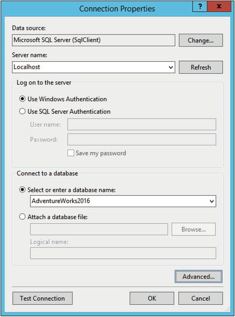
Figure 2-4. The connection properties
9. The Select the Data Source dialog will resemble Figure 2-5. The Connection String property will vary depending on your SQL Server instance.

Figure 2-5. The Data Source property
10. Click Next to move to the Design the Query page. On this page, you can either use the Query Builder to visually create the query or you can directly type in a query with no extra assistance. Since this book is not meant to teach you T-SQL, the query has been provided. The book Beginning T-SQL (Third Edition), also written by the author (Apress, 2014), may be used to learn more about the T-SQL query language.
11. Type or paste in this code which is available in the Source Code/Download area of the Apress web site (Apress.com) and then click Next.
SELECT T.[Group], T.Name AS Region, YEAR(OrderDate) AS OrderYear,Month(OrderDate) AS OrderMonth, OrderDate, SalesOrderID, TotalDueFROM Sales.SalesOrderHeader AS SOHJOIN Sales.SalesTerritory AS T ON SOH.TerritoryID = T.TerritoryID;12. On the Select the Report Type page, make sure that you select Tabular. You will create a Matrix report later in the chapter. Click Next.
13. On the Design the Table page, you will specify which pieces of information will make up the grouping levels of the report. You will learn more about grouping levels in Chapter 5. For now, configure the page to match Figure 2-6.

Figure 2-6. Grouping the data
14. Click Next to get to the Choose the Table Layout page. Make sure that Stepped, Include subtotals, and Enable drilldown are all selected as shown in Figure 2-7.

Figure 2-7. The table layout
15. On the final page of the wizard, type First Report in the Report Name property and click Finish.
Note
In previous versions of SQL Server, the wizard had an additional page to select a color scheme. At the time of SQL Server 2016 release, this option was not available.
Once the wizard is complete, you will have a new solution, project, and report. The report will be visible in design view as shown in Figure 2-8.

Figure 2-8. The report in design view
Within Visual Studio, you can view the report in three ways: design, preview, and code. To see the code, after expanding the Reports folder in Solution Explorer, right-click the name of the report and select View Code. Figure 2-9 shows part of the code file, which is XML.

Figure 2-9. The report code
Close the code window and click Preview to run the report. Figure 2-10 shows the first page of the report .

Figure 2-10. Page 1 of the report
Notice that you are looking at page 1, but the number of pages is two with a question mark. In order to return results more quickly to the end user, the beginning of the report may be returned before the middle and end are constructed. Click the right arrow to view additional pages. Once you reach the last page of the report, the question mark disappears, since now the page count is known, as shown in Figure 2-11.

Figure 2-11. The last page of the report
On the Choose the Table Layout page of the wizard (see Figure 2-7), you checked the Enable drilldown property. This is why you see the plus sign next to Australia. Click the plus sign to expand the section. The Order Year data is now in view. Click to expand 2011 and Order Month 6. Now the details for that section are in view. To see how the drilldown property is set up, go to design view and select the Region row. In the Row Groups section beneath the report, right-click the table1_OrderYear group and select Group Properties. The Visibility page shows how the Region controls the visibility of the OrderYear group as shown in Figure 2-12. In practice, I have not found this to be a popular feature.

Figure 2-12. The Visibility property
Preview the report again and expand the sections. Figure 2-13shows how the report should look.

Figure 2-13. The report
Using the Preview Buttons
You may notice that there are some formatting issues with this report, but before you learn how to correct them, take a look at the buttons located above the report shown in Figure 2-14 that are available when you are previewing the report.

Figure 2-14. The report preview icons
To the right of the navigation controls, you will see an arrow pointing left, the Back to parent button. You will use this in Chapter 6 when you develop reports that link to each other. You will also see a button to stop execution of a long-running report and one to refresh the report. In the middle, there is a Print button. The most interesting buttons are found to the right of the Print button.
The Print Layout Button
After deploying a group of reports about a dozen years ago, I received a frantic phone call from the project manager. Why, she asked, was the report printing a blank page after every printed page? Of course, while previewing the reports from Visual Studio or Report Manager, the report looked perfect. It was only when printing did the problems surface.
In order to see just how the reports will look when printed, you should click the Print Layout button. This button, just to the right of the print button, toggles the view between the online view and the print view.
By scrolling through the report pages in print layout view, you will find problems that you can correct before the report is deployed. Make sure that you view every report you create in print layout before deploying it.
The Page Setup Button
The Page Setup button allows you to adjust the margins of the report and choose the paper size and source and the orientation. By default, the report will have one-inch margins. These margins may be too large. By modifying the properties, you will make sure that the report fits better on the printed page. You will learn about additional ways to fit reports on the page in Chapter 4. Figure 2-15 shows the Page Setup dialog box.

Figure 2-15. The Page Setup dialog
Additional Buttons
To the end user, exporting reports is just as important as printing them. An Export button with a variety of export types is available such as to XML, Excel, Word, and PDF. The results of the exported report will vary depending on the functionality of the export type.
You can magnify the preview window to several sizes with the Zoom button and search for text within the report with the Find and Next buttons.
Formatting the Wizard Report
The tabular report created with the wizard looks pretty good, but it can be improved. While looking at the preview, make a list of things to fix. This is what I came up with:
Remove time from OrderDate
Round dollar amounts to the nearest cent
Format amounts as currency
Remove summary values of SalesOrderID
Change OrderMonth from numbers to month name
Modify column widths
Add a grand totals for each Group and the overall report.
Click Design to see the design view of the report. Find the OrderDate field in the bottom of the grid. Right-click the cell and select Text Box Properties.
Note
It may take a bit of practice when selecting cells in the table grid. You can select the cell or the contents of the cell. When selecting the cell, it will be outlined. If you have trouble, try clicking the edge of the cell.
In the Text Box Properties dialog , select Number on the left. Under Category, choose Date. For the type, select a date format without the time as shown in Figure 2-16 and click OK.

Figure 2-16. Change the date format
Right-click the TotalDue cell at the bottom right of the grid and select Text Box Properties. Select Number, but this time choose Currency. Check Use 1000 separator (,). The properties will look like those in Figure 2-17if you are in the United States.

Figure 2-17. Format the TotalDue field
Click OK to accept the format. Now, to avoid repeating this process for the three summary fields, bring up the Properties window. You can bring this up by pressing F4 or find it in the View menu. Locate the Format property. Figure 2-18 shows what you are looking for .

Figure 2-18. The format property
Copy the Format value to the Clipboard . Hold down the shift key and select the three summary boxes under the TotalDue heading. The property window is now selected for all three text boxes. Find the Format property and paste in the value.
Feel free to preview the report as often as you would like to check the progress. Each time you preview, the report definition is saved. At this point, the report should resemble Figure 2-19 after expanding the sections.

Figure 2-19. The report with some formatting
The wizard automatically created summaries for the SalesOrderID column since it contains numeric data. Summing up this value doesn’t make sense. Go back to design view and remove [Sum(SalesOrderID)] by clicking within each cell with that formula and pressing the delete key. It needs to be removed from the second, third, and fourth rows.
The next item on the list is to change the Order Month column to display the month name. To change it to display the name instead, follow these steps:
1. In design view, right-click the OrderMonth cell and select Expression.
2. This brings up the Expression dialog box. You can see the existing expression, =Fields!OrderMonth.Value.
3. Expand Common Functions in the Category box.
4. Select Date & Time.
5. Position the cursor between the equal sign and the letter F in the expression.
6. Double-click MonthName in the Item list.
7. Add a closing parentheses at the end of the expression. The expression should now be =MonthName(Fields!OrderMonth.Value). The Expression dialog should look like Figure 2-20.

Figure 2-20. The expression for month name
8. Click OK after verifying the expression. Now that the expression is more complex, the cell value will change to <<Exp>>.
Some of the headings would look better if the columns were wider. When the table is selected, handles at the top and left appear. By clicking in the divisions between the columns of the header handle and dragging, you can expand or narrow the column widths to accommodate the column headings.
There is one more task on the list, adding a grand total and a total for each Group (US, Europe, and Pacific). This is easier to do than you might think. You’ll learn more about working with grouping levels in Chapter 2, but understand at this point that a total added at one level lands at the next level up. For example, a total added at the Region level is displayed in the Group level. Follow these steps to add the Group totals:
1. In design view, right-click the cell located at Region and Total Due as shown in Figure 2-21.

Figure 2-21. The cell found at Region and Total Due
2. Select Add Total. A new row will show up at the bottom of the grid containing the [Sum(TotalDue)] expression.
3. Type the following into the cell found at the bottom of the grid in the Sales Order ID column: Total for [Group]. Notice that you were able to include text and a field, called a placeholder, in the same cell without creating an expression.
The report definition should look like Figure 2-22.

Figure 2-22. The report definition after adding the Group total
At the bottom of the design window, you will see the Row Groups and Column Groups sections, which you will learn more about in Chapter 5. Grouping levels can be added and configured in these sections. Select the Group text box at the top of the report which changes what appears in the Row Groups section. Right-click list1_Group under Row Groups, and select Add Total ➤ After as shown in Figure 2-23.

Figure 2-23. Adding a grand total
This just adds a row where you will need to add the expression. Right-click the new text box at the bottom of the report and select Expression. Type in this expression and click OK:
="Grand Total " & FormatCurrency(Sum(Fields!TotalDue.Value),2,0,True,True)At the top of the screen, you will see a formatting menu bar as shown in Figure 2-24. This menu bar is similar to working in other programs such as Microsoft Word.
Figure 2-24. The formatting menu bar
Make sure that the new text box is selected and click the icon to align right. Click the B icon to bold the text. The report definition should now resemble Figure 2-25.

Figure 2-25. The report definition after adding totals
Now preview the report. Each page will have a total for the group. The very last page will have a grand total. Figure 2-26 shows page 3 of the report with the new totals.

Figure 2-26. Page 3 of the formatted report with the new totals
Creating a Matrix Report
During the previous exercise, you created the solution and project along with the report while running the wizard. You can also add a new report to an existing project with the wizard. In this section, you will add a matrix report to the project.
A matrix report is often a more compact report than a tabular report. In a matrix report, one or more of the columns of the data will be pivoted to become a column header. In this example, the data will be pivoted by year. To show how this works, view the results of this query that returns the total sales by year for North America.
SELECT T.[Group], T.Name As Region, YEAR(OrderDate) AS OrderYear,SUM(TotalDue) AS TotalSalesFROM Sales.SalesOrderHeader AS SOHJOIN Sales.SalesTerritory AS T ON SOH.TerritoryID = T.TerritoryIDWHERE T.[Group] = 'North America'GROUP BY T.[Group], T.Name , YEAR(OrderDate)ORDER BY Region, OrderYear;
You can see the partial results of the query in Figure 2-27.

Figure 2-27. The partial results of the total sales by year
In order to compare by year—in other words, to easily compare the 2011 Canadian sales to the 2011 Central sales—you can pivot the data. Here is a query that pivots the values of OrderYear into columns.
SELECT [Group], Region,[2011], [2012], [2013], [2014]FROM(SELECT T.[Group], T.Name As Region, YEAR(OrderDate) AS OrderYear,SUM(TotalDue) AS TotalSalesFROM Sales.SalesOrderHeader AS SOHJOIN Sales.SalesTerritory AS T ON SOH.TerritoryID = T.TerritoryIDWHERE T.[Group] = 'North America'GROUP BY T.[Group], T.Name , YEAR(OrderDate)) AS SourceTablePIVOT(SUM(TotalSales)FOR OrderYear IN ([2011], [2012], [2013], [2014]))AS PivotTableORDER BY Region;
Figure 2-28 shows the results.

Figure 2-28. The pivoted results
The T-SQL pivot query syntax is complex, and you must hard-code the column names in the query. Fortunately, creating pivoted results in SSRS is really easy, and no hard-coding is involved.
Follow these steps to create the matrix report:
1. To kick off the wizard within the project, right-click the Reports folder in the Solution Explorer window and select Add New Report as shown in Figure 2-29.

Figure 2-29. How to kick off the wizard
2. Once the wizard starts up, click Next to go past the welcome page.
3. On the Select the Data Source page, click Edit to bring up the Connection Properties. Fill in the connection information as was done in the section “Creating Your First Report” earlier in this chapter.
4. After configuring the data source, click Next. In the Design the Query page, use the same query that was used in the earlier example:
SELECT T.[Group], T.Name As Region, YEAR(OrderDate) AS OrderYear,Month(OrderDate) AS OrderMonth,OrderDate, SalesOrderID, TotalDueFROM Sales.SalesOrderHeader AS SOHJOIN Sales.SalesTerritory AS T ON SOH.TerritoryID = T.TerritoryID;5. Click Next to move to the Select the Report Type page. Select Matrix and click Next.
6. Configure the Design the Matrix page as shown in Figure 2-30. When you select a field on the right, the section of the report where it will show is highlighted. This can help you figure out which fields go where.

Figure 2-30. The matrix fields configuration
7. Click Next and fill in a report name. Call this Matrix Report.
8. Click Finish to complete the wizard.
Now you will see two reports in the Reports folder of the Solution Explorer. To open a report, double-click the name. You can also switch between open reports in the design area. To see how the matrix report turned out, click Preview. The report should look like Figure 2-31.

Figure 2-31. View the matrix report
The big difference between tabular and matrix reports is that matrix reports have grouping levels across the columns. You will learn much more about matrix reports in Chapter 5. In the meantime, go back to the design view of the report to view the properties. Figure 2-32 shows how simple the design of the matrix report really is.

Figure 2-32. The matrix report design
Using the skills you have learned earlier in the chapter, format the summary textbox. To make this report more complete, you will add three total fields. Follow these instructions to add the totals.
1. Right click on the textbox containing the expression [Sum(TotalDue)].
2. Choose Add Total ➤ Row.
3. Now repeat the process but this time select Add Total ➤ Column.
4. Right-click the cell at the intersection of Region and Total. Select Add total.
5. Select the Total column and click B in the design menu to bold the font.
6. Select the bottom row and click B to bold the font.
7. Right align the first row.
The report design will now look like Figure 2-33.

Figure 2-33. The report design after adding the totals
Preview the report. You now have totals for all the regions and totals across the years. Figure 2-34 shows the report.

Figure 2-34. The matrix report with totals
Summary
Most reports, especially if they take advantage of some of the advanced features of SSRS, cannot be created with the wizard. The wizard is, however, perfect for simple reports. It is also a great tool to help you begin learning to develop SSRS reports. In this chapter, you created two reports. You then modified the properties so that they looked professional and were ready to be deployed.
In Chapter 3, you will learn how to configure data sources and datasets, the most basic elements of reports.