Here we present a very brief review of methods for summarizing and visualizing data. For deeper coverage, see Discovering Statistics, Second Edition, by Daniel Larose (W.H. Freeman, second edition, 2013).
Part 1: Summarization 1: Building Blocks Of Data Analysis
Descriptive statistics refers to methods for summarizing and organizing the information in a data set.
Consider Table A.1, which we will use to illustrate some statistical concepts.
The entities for which information is collected are called the elements. In Table A.1, the elements are the 10 applicants. Elements are also called cases or subjects.
A variable is a characteristic of an element, which takes on different values for different elements. The variables in Table A.1 are marital status, mortgage, income, rank, year, and risk. Variables are also called attributes.
The set of variable values for a particular element is an observation. Observations are also called records. The observation for Applicant 2 is:
Applicant
Marital Status
Mortgage
Income ($)
Rank
Year
Risk
2
Married
Y
32,000
7
2010
Good
Variables can be either qualitative or quantitative.
A qualitative variable enables the elements to be classified or categorized according to some characteristic. The qualitative variables in Table A.1 are marital status, mortgage, rank, and risk. Qualitative variables are also called categorical variables.
A quantitative variable takes numeric values and allows arithmetic to be meaningfully performed on it. The quantitative variables in Table A.1 are income and year. Quantitative variables are also called numerical variables.
Data may be classified according to four levels of measurement: nominal, ordinal, interval, and ratio. Nominal and ordinal data are categorical; interval and ratio data are numerical.
Nominal data refer to names, labels, or categories. There is no natural ordering, nor may arithmetic be carried out on nominal data. The nominal variables in Table A.1 are marital status, mortgage, and risk.
Ordinal data can be rendered into a particular order. However, arithmetic cannot be meaningfully carried out on ordinal data. The ordinal variable in Table A.1 is income rank.
Interval data consist of quantitative data defined on an interval without a natural 0. Addition and subtraction may be performed on interval data. The interval variable in Table A.1 is year. (Note that there is no “year 0.” The calendar goes from 1 BC to AD 1.)
Ratio data are quantitative data for which addition, subtraction, multiplication, and division may be performed. A natural 0 exists for ratio data. The interval variable in Table A.1 is income.
A numerical variable that can take either a finite or a countable number of values is a discrete variable, for which each value can be graphed as a separate point, with space between each point. The discrete variable in Table A.1 is year.
A numerical variable that can take infinitely many values is a continuous variable, whose possible values form an interval on the number line, with no space between the points. The continuous variable in Table A.1 is income.
A population is the set of all elements of interest for a particular problem. A parameter is a characteristic of a population. For example, the population is the set of all American voters, and the parameter is the proportion of the population who supports a $1 per ton tax on carbon.
The value of a parameter is usually unknown, but it is a constant.
A sample consists of a subset of the population. A characteristic of a sample is called a statistic. For example, the sample is the set of American voters in your classroom, and the statistic is the proportion of the sample who supports a $1 per ton tax on carbon.
The value of a statistic is usually known, but it changes from sample to sample.
A census is the collection of information from every element in the population. For example, the census here would be to find from every American voter whether they support a $1 per ton tax on carbon. Such a census is impractical, so we turn to statistical inference.
Statistical inference refers to methods for estimating or drawing conclusions about population characteristics based on the characteristics of a sample of that population. For example, suppose 50% of the voters in your classroom support the tax; using statistical inference we would infer that 50% of all American voters support the tax. Obviously, there are problems with this. The sample is neither random nor representative. The estimate does not have a confidence level, and so on.
When we take a sample for which each element has an equal chance of being selected, we have a random sample.
A predictor variable is a variable whose value is used to help predict the value of the response variable. The predictor variables in Table A.1 are all variables, except risk.
A response variable is a variable of interest whose value is presumably determined at least in part by the set of predictor variables. The response variable in Table A.1 is risk.
Part 2: Visualization: Graphs and Tables For Summarizing And Organizing Data
2.1 Categorical Variables
The frequency (or count) of a category is the number of data values in each category. The relative frequency of a particular category for a categorical variable equals its frequency divided by the number of cases.
A (relative) frequency distribution for a categorical variable consists of all the categories that the variable assumes, together with the (relative) frequencies for each value. The frequencies sum to the number of cases; the relative frequencies sum to 1.
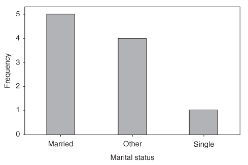
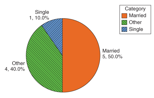
For example, Table A.2 contains the frequency distribution and relative frequency distribution for the variable marital status for the data from Table A.1.
Table A.2 Frequency distribution and relative frequency distribution
Category of Marital Status
Frequency
Relative Frequency
Married
5
0.5
Other
4
0.4
Single
1
0.1
Total
10
1.0
A bar chart is a graph used to represent the frequencies or relative frequencies for a categorical variable. Note that the bars do not touch.
A Pareto chart is a bar chart, where the bars are arranged in decreasing order. Figure A.1 is an example of a Pareto chart.
A pie chart is a circle divided into slices, with the size of each slice proportional to the relative frequency of the category associated with that slice. Figure A.2 shows a pie chart of marital status.
Quantitative data are grouped into classes. The lower (upper) class limit of a class equals the smallest (largest) value within that class. The class width is the difference between successive lower class limits.
For quantitative data, a (relative) frequency distribution divides the data into nonoverlapping classes of equal class width. Table A.3 shows the frequency distribution and relative frequency distribution of the continuous variable income from Table A.1.
Table A.3 Frequency distribution and relative frequency distribution of income
Class of Income
Frequency
Relative Frequency
$24,000–$29,999
3
0.3
$30,000–$35,999
4
0.4
$36,000–$41,999
2
0.2
$42,000–$48,999
1
0.1
Total
10
1.0
A cumulative (relative) frequency distribution shows the total number (relative frequency) of data values less than or equal to the upper class limit (Table A.4).
Table A.4 Cumulative frequency distribution and cumulative relative frequency distribution of income
Class of Income
Cumulative Frequency
Cumulative Relative Frequency
$24,000–$29,999
3
0.3
$30,000–$35,999
7
0.7
$36,000–$41,999
9
0.9
$42,000–$48,999
10
1.0
A distribution of a variable is a graph, table, or formula that specifies the values and frequencies of the variable for all elements in the data set. For example, Table A.3 represents the distribution of the variable income.
A histogram is a graphical representation of a (relative) frequency distribution for a quantitative variable (Figure A.3). Note that histograms represent a simple version of data smoothing and can thus vary in shape depending on the number and width of the classes. Therefore, histograms should be interpreted with caution. See Discovering Statistics, Second Edition by Daniel Larose (W.H. Freeman), Section 2.4, for an example of a data set presented as both symmetric and right-skewed by altering the number and width of the histogram classes.
Figure A.3 Histogram of income.
A stem-and-leaf display shows the shape of the data distribution while retaining the original data values in the display, either exactly or approximately. The leaf units are defined to equal a power of 10, and the stem units are 10 times the leaf units. Then each leaf represents a data value, through a stem-and-leaf combination. For example, in Figure A.4, the leaf units (right-hand column) are 1000's and the stem units (left-hand column) are 10,000's. So “2 4” represents , while “2 55” represents two equal incomes of $25,000 (one of which is exact, while the other is approximate: $25,100). Note that Figure A.4, turned 90° to the left, presents the shape of the data distribution.
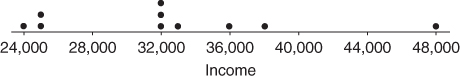
In a dotplot, each dot represents one or more data values, set above the number line (Figure A.5).
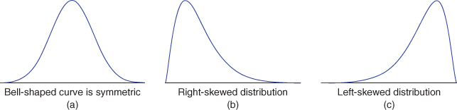
A distribution is symmetric if there exists an axis of symmetry (a line) that splits the distribution into two halves that are approximately mirror images of each other (Figure A.6a).
Right-skewed data has a longer tail on the right than the left (Figure A.6b). Left-skewed data has a longer tail on the left than the right (Figure A.6c).
Part 3: Summarization 2: Measures Of Center, Variability, and Position
The summation notation means to add up all the data values x. The sample size is n and the population size is N.
Measures of center indicate where on the number line the central part of the data is located. The measures of center we will learn are the mean, the median, the mode, and the midrange.
The mean is the arithmetic average of a data set. To calculate the mean, add up the values and divide by the number of values. The mean income from Table A.1 is:
The sample mean is the arithmetic average of a sample, and is denoted (x-bar).
The population mean is the arithmetic average of a population, and is denoted (“mew,” the Greek letter for m).
The median is the middle data value, when there are odd numbers of data values and the data have been sorted into ascending order. If there are even numbers, the median is the mean of the two middle data values. When the income data is sorted into ascending order, the two middle values are $32,100 and $32,200, the mean of which is the median income, $32,150.
The mode is the data value that occurs with the greatest frequency. Both quantitative and categorical variables can have modes, but only quantitative variables can have means or medians. Each income value occurs only once, so there is no mode. The mode for year is 2010, with a frequency of 4.
The midrange is the average of the maximum and minimum values in a data set. The midrange income is
Skewness and measures of center. The following are tendencies, and not strict rules:
For symmetric data, the mean and the median are approximately equal.
For right-skewed data, the mean is greater than the median.
For left-skewed data, the median is greater than the mean.
Measures of variability quantify the amount of variation, spread, or dispersion present in the data. The measures of variability we will learn are the range, the variance, the standard deviation, and, later, the interquartile range (IQR).
The range of a variable equals the difference between the maximum and minimum values. The range of income is: range = .
A deviation is the signed difference between a data value, and the mean value. For Applicant 1, the deviation in income equals . For any conceivable data set, the mean deviation always equals 0, because the sum of the deviations equals 0.
The population variance is the mean of the squared deviations, denoted as (sigma-squared):
The population standard deviation is the square root of the population variance: .
The sample variance is approximately the mean of the squared deviations, with n replaced by n–1 in the denominator in order to make it an unbiased estimator of . (An unbiased estimator is a statistic whose expected value equals its target parameter.)
The sample standard deviation is the square root of the sample variance: .
The variance is expressed in units squared, an interpretation that may be opaque to nonspecialists. For this reason, the standard deviation, which is expressed in the original units, is preferred when reporting results. For example, the sample variance of income is dollars squared, the meaning of which may be unclear to clients. Better to report the sample standard deviation .
The sample standard deviation is interpreted as the size of the typical deviation, that is, the size of the typical difference between data values and the mean data value. For example, incomes typically deviate from their mean by $7201.
Measures of position indicate the relative position of a particular data value in the data distribution. The measures of position we cover here are the percentile, the percentile rank, the Z-score, and the quartiles.
The pth percentile of a data set is the data value such that p percent of the values in the data set are at or below this value. The 50th percentile is the median. For example, the median income is $32,150, and 50% of the data values lie at or below this value.
The percentile rank of a data value equals the percentage of values in the data set that are at or below that value. For example, the percentile rank of Applicant 1's income of $38,000 is 90%, as that is the percentage of incomes equal to or less than $38,000.
The Z-score for a particular data value represents how many standard deviations above or below the mean the data value lies. For a sample, the Z-score is:
For Applicant 6, the Z-score is
The income of Applicant 6 lies 1.2 standard deviations below the mean.
We may also find data values, given a Z-score. Suppose no loans will be given to those with incomes more than 2 standard deviations below the mean. Then, , and the corresponding minimum income is:
No loans will be provided to applicants with incomes below $18,138.
If the data distribution is normal, then the Empirical Rule states that:
about 68% of the data lies within 1 standard deviation of the mean;
about 95% of the data lies within 2 standard deviations of the mean;
about 99.7% of the data lies within 3 standard deviations of the mean.
The first quartile (Q1) is the 25th percentile of a data set; the second quartile (Q2) is the 50th percentile (median); and the third quartile (Q3) is the 75th percentile.
The IQR is a measure of variability that is not sensitive to the presence of outliers. .
In the IQR method for detecting outliers, a data value x is an outlier if either
The five-number summary of a data set consists of the minimum, Q1, the median, Q3, and the maximum.
The boxplot is a graph based on the five-number summary, useful for recognizing symmetry and skewness. Suppose for a particular data set (not from Table A.1) we have min = 15, Q1 = 29, median = 36, Q3 = 42, and Max = 47. Then the boxplot is shown in Figure A.7.
The box covers the “middle half” of the data from Q1 to Q3.
The left whisker extends down to the minimum value which is not an outlier.
The right whisker extends up to the maximum value that is not an outlier.
When the left whisker is longer than the right whisker, then the distribution is left skewed and vice versa.
When the whiskers are about equal in length, the distribution is symmetric. The distribution in Figure A.7 shows evidence of being left-skewed.
Part 4: Summarization And Visualization Of Bivariate Relationships
A bivariate relationship is the relationship between two variables.
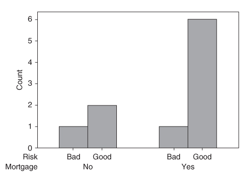
The relationship between two categorical variables is summarized using a contingency table, which is a cross-tabulation of the two variables, and contains a cell for every combination of variable values (i.e., for every contingency). Table A.5 is the contingency table for the variables mortgage and risk. The total column contains the marginal distribution for risk, that is, the frequency distribution for this variable alone. Similarly, the total row represents the marginal distribution for mortgage.
Much can be learned from a contingency table. The baseline proportion of bad risk is 2/10 = 20%. However, the proportion of bad risk for applicants without a mortgage is 1/3 = 33%, which is higher than the baseline; and the proportion of bad risk for applicants with a mortgage is only 1/7 = 1%, which is lower than the baseline. Thus, whether or not the applicant has a mortgage is useful for predicting risk.
A clustered bar chart is a graphical representation of a contingency table. Figure A.9 shows the clustered bar chart for risk, clustered by mortgage. Note that the disparity between the two groups is immediately obvious.
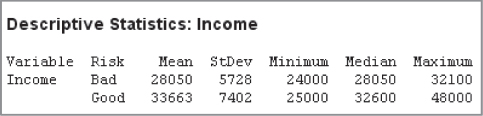
To summarize the relationship between a quantitative variable and a categorical variable, we calculate summary statistics for the quantitative variable for each level of the categorical variable. For example, Minitab provided the following summary statistics for income, for records with bad risk and for records with good risk. All summary measures are larger for good risk. Is the difference significant? We need to perform a hypothesis test to find out (Chapter 4).
Figure A.8 Individual value plot of income versus risk.
To visualize the relationship between a quantitative variable and a categorical variable, we may use an individual value plot, which is essentially a set of vertical dotplots, one for each category in the categorical variable. Figure A.8 shows the individual value plot for income versus risk, showing that incomes for good risk tend to be larger.
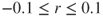
A scatter plot is used to visualize the relationship between two quantitative variables, x and y. Each (x, y) point is graphed on a Cartesian plane, with the x axis on the horizontal and the y axis on the vertical. Figure A.10 shows eight scatter plots, showing some possible types of relationships between the variables, along with the value of the correlation coefficient r.
The correlation coefficient r quantifies the strength and direction of the linear relationship between two quantitative variables. The correlation coefficient is defined as
where and represent the standard deviation of the x-variable and the y-variable, respectively. .
In data mining, where there are a large number of records (over 1000), even small values of r, such as may be statistically significant.
If r is positive and significant, we say that x and y are positively correlated. An increase in x is associated with an increase in y.
If r is negative and significant, we say that x and y are negatively correlated. An increase in x is associated with a decrease in y.
Table A.5 Contingency table for mortgage versus risk
Mortgage
Yes
No
Total
Risk
Good
6
2
8
Bad
1
1
2
Total
7
3
10
Figure A.9 Clustered bar chart for risk, clustered by mortgage.
Figure A.10 Some possible relationships between x and y.


 , while “2 55” represents two equal incomes of $25,000 (one of which is exact, while the other is approximate: $25,100). Note that Figure A.4, turned 90° to the left, presents the shape of the data distribution.
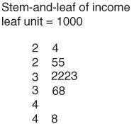
 means to add up all the data values x. The sample size is n and the population size is N.
 (x-bar).
 (“mew,” the Greek letter for m).
 .
. . For any conceivable data set, the mean deviation always equals 0, because the sum of the deviations equals 0.
 (sigma-squared):

 .
. . (An unbiased estimator is a statistic whose expected value equals its target parameter.)

 .
. dollars squared, the meaning of which may be unclear to clients. Better to report the sample standard deviation
  .
. is interpreted as the size of the typical deviation, that is, the size of the typical difference between data values and the mean data value. For example, incomes typically deviate from their mean by $7201.

 , and the corresponding minimum income is:

 .
.

 and
and  represent the standard deviation of the x-variable and the y-variable, respectively.
  .
. may be statistically significant.
