Programming Ribbons
The ribbon interface was introduced in SharePoint 2010 and is an important element of the user interface. Most of the commands in SharePoint 2010 are available through the ribbons. The ribbons are context sensitive—that is, they change according to the current user interface area. For example, when you edit the page and select an existing web part on the page, the ribbon menu changes to show commands related to the web part as shown in Figure 6.2.
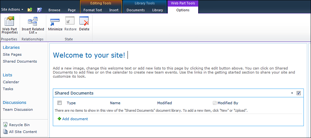
Figure 6.2. Options tab in the ribbon for a web part
Customizing a ribbon is also done through CustomActions. For ribbons the Location attribute of the CustomAction element has to be one of the following:
• Ribbon.DisplayForm—Location corresponds to the display form for the list.
• CommandUI.Ribbon.ListView—Location corresponds to the list view.
• CommandUI.Ribbon.NewForm—Location corresponds to the new form for the list.
• CommandUI.Ribbon.EditForm—Location corresponds to the edit form for the list.
You use the CommandUIExtension element to extend the ribbon interface. The CommandUIDefinitions element, which is a child of the CommandUIExtension, contains a collection of the CommandUIDefinition element. The CommandUIDefinition element defines a new command in the ribbon.
Similarly there is a hierarchy in which the CommandUIHandlers element, which is a child of the CommandUIExtension element, contains a collection of CommandUIHandler elements. The CommandUIHandler element defines an event handler for the ribbon commands.
This entire hierarchy is demonstrated in Figure 6.3.
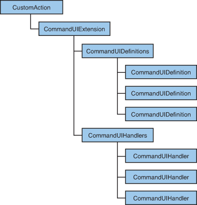
Figure 6.3. Custom action XML schema hierarchy
Try It Yourself: Add a Custom Command to a Ribbon
1. Create a new Empty SharePoint project called CustomRibbonDemo.
2. Add a new item of type Module named HelloWorldRibbon. Delete the sample.txt file and add edit the Elements.xml as follows:
<?xml version="1.0" encoding="utf-8"?>
<Elements xmlns="http://schemas.microsoft.com/sharepoint/">
<CustomAction
Id="CustomListRibbon"
Location="CommandUI.Ribbon"
RegistrationId="100"
RegistrationType="List"
>
<CommandUIExtension>
<CommandUIDefinitions>
<CommandUIDefinition Location="Ribbon.ListItem.New.Controls._children">
<Button
Id="SharePoint.Ribbon.ListItem.New.HelloWorld"
Sequence="40"
Command="SharePoint.Ribbon.ListItem.New.HelloWorld.CommandHelloWorld"
Image16by16="/_layouts/images/webAnalytics.png"
Image16by16Top="-94"
Image16by16Left="-16"
Image32by32="/_layouts/images/webAnalytics.png"
Image32by32Top="0" Image32by32Left="-96"
LabelText="Hello World"
ToolTipTitle="Hello world demo command"
ToolTipDescription="Click to see hello world message box"
TemplateAlias="o1"/>
</CommandUIDefinition>
</CommandUIDefinitions>
<CommandUIHandlers>
<CommandUIHandler
Command="SharePoint.Ribbon.ListItem.New. HelloWorld.CommandHelloWorld"
CommandAction="javascript:ShowHelloWorldDialog()" />
</CommandUIHandlers>
</CommandUIExtension>
</CustomAction>
<CustomAction
Id="SharePoint.Ribbon.ListItem.New.HelloWorld.Script"
Location="ScriptLink"
ScriptBlock="
function ShowHelloWorldDialog()
{
var _html = document.createElement('div'),
_html.innerHTML =
'<b>Hello World! SharePoint is amazing!!! <b>';
var _options = { html: _html };
SP.UI.ModalDialog.showModalDialog(_options);
}"
/>
</Elements>
3. Deploy the solution. Browse to any custom list in your SharePoint site, and you should be able to see a new button next to the New Folder button as shown in Figure 6.4.
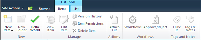
Figure 6.4. Custom command in the ribbon
Click the Hello World button and you should see a dialog with the text “HelloWorld! SharePoint is amazing!!!”
Let’s see what exactly we defined in the XML. First a new custom action was defined with Location as CommanUI.Ribbon. The RegistrationType and RegistrationID attributes indicate that the new custom action will be scoped to a custom list. Then a new command is defined using the CommandUIDefinition element with the location of the command as Ribbon.ListItem.New.Controls._children. Ribbon.ListItem.New is the id of the group in the tab Item of the ribbon. This is defined in <14 Hive>TEMPLATEGLOBALXMLCMDUI.XML file. You can find a list of all the possible values of the Location attribute at http://msdn.microsoft.com/en-us/library/ee537543.aspx. Now that we have got the group name, use the syntax Controls._children to specify that we are going to add a child control. Since we want the user interface of our command to be a button, we define the Button element and give it some id. The Command attribute of the Button element refers to the Id of a CommandUIHandler defined within the CommandUIHandlers tag. The CommandUIHandler specifies the JavaScript function to be called when the button is clicked. The JavaScript function itself is defined through another custom action with the Location as ScriptLink. This JavaScript function calls the client side library of SharePoint to show a modal dialog.
The other things to understand are the attributes starting with Image. This is the image rendered for the button that you defined. These define the image for the button. We use the out of the box image /_layouts/images/webAnalytics.png. This is a special image where a collection of images is basically in one image. When you use this image or any other image where a collection of images is in a single file, you have to use the Image32by32Top and the Left attributes to render properly. These define the top and left coordinates of the image within the larger image. The value is always a negative integer or zero. You can easily find these coordinates by opening the image in Microsoft Paint software and hovering your mouse over the top left of the images. The coordinates are shown in the left-hand side of the status bar. The TemplateAlias property is used to specify which template alias to use from the Group Template Layout, which is defined by the CMDUI.XML file. This specifies how the control is positioned. In this case we use “o1” to display a large button. We could have used “o2” for a medium button.