
15.3 Control Charts for Variables
Control charts for the mean, and the range, R, are used to monitor processes that are measured in continuous units. Examples of these would be weight, height, and volume. The -chart (x-bar chart) tells us whether changes have occurred in the central tendency of a process. This might be due to such factors as tool wear, a gradual increase in temperature, a different method used on the second shift, or new and stronger materials. The R-chart values indicate that a gain or loss in uniformity has occurred. Such a change might be due to worn bearings, a loose tool part, an erratic flow of lubricants to a machine, or sloppiness on the part of a machine operator. The two types of charts go hand in hand when monitoring variables.
The Central Limit Theorem
The statistical foundation for -charts is the central limit theorem. In general terms, this theorem states that, regardless of the distribution of the population of all parts or services, the distribution of s (each of which is a mean of a sample drawn from the population) will tend to follow a normal curve as the sample size grows large. Fortunately, even if n is fairly small (say, 4 or 5), the distribution of the averages will still roughly follow a normal curve. The theorem also states that (1) the mean of the distribution of the -s (called ) will equal the mean of the overall population (called ) and (2) the standard deviation of the sampling distribution, will be the population deviation, divided by the square root of the sample size, n. In other words,
Although there may be times when we may know (and ), often we must estimate this with the average of all the sample means (written as ).
Figure 15.2 shows three possible population distributions, each with its own mean, , and standard deviation, If a series of random samples ( and so on), each of size n, is drawn from any one of these, the resulting distribution of s will appear as in the bottom graph of that figure. Because this is a normal distribution (as discussed in Chapter 2), we can state that
99.7% of the time, the sample averages will fall within of the population mean if the process has only random variations.
95.5% of the time, the sample averages will fall within of the population mean if the process has only random variations.
If a point on the control chart falls outside the control limits, we are 99.7% sure that the process has changed. This is the theory behind control charts.
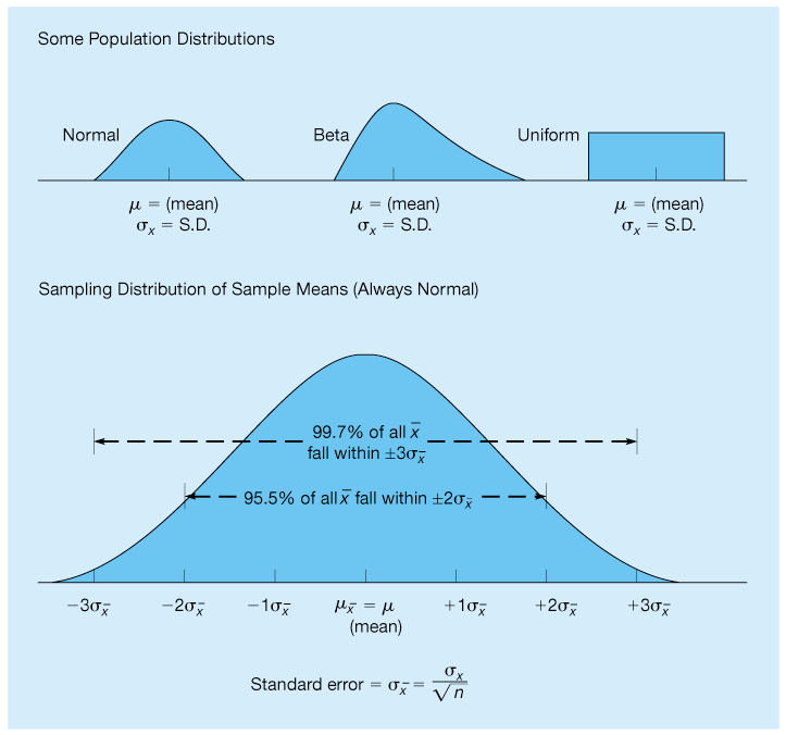
Figure 15.2 Population and Sampling Distributions
Setting X -Chart Limits
If we know through historical data the standard deviation of the process population, we can set upper and lower control limits by these formulas:
where
mean of the sample means
number of normal standard deviations (2 for 95.5% confidence, 3 for 99.7%)
standard deviation of the sampling distribution of the sample means
Box-Filling Example
Let us say that a large production lot of boxes of cornflakes is sampled every hour. To set control limits that include 99.7% of the sample means, 36 boxes are randomly selected and weighed. The standard deviation of the overall population of boxes is estimated, through analysis of old records, to be 2 ounces. The average mean of all samples taken is 16 ounces. We therefore have ounces, ounces, and The control limits are
If the process standard deviation is not available or is difficult to compute, which is usually the case, these equations become impractical. In practice, the calculation of control limits is based on the average range rather than on standard deviations. We can use the equations
where
average of the samples
value found in Table 15.2 (which assumes that )
mean of the sample means
Table 15.2 Factors for Computing Control Chart Limits When
| Sample Size, n | Mean Factor, | Upper Range, | Lower Range, |
|---|---|---|---|
| 2 | 1.880 | 3.268 | 0 |
| 3 | 1.023 | 2.574 | 0 |
| 4 | 0.729 | 2.282 | 0 |
| 5 | 0.577 | 2.114 | 0 |
| 6 | 0.483 | 2.004 | 0 |
| 7 | 0.419 | 1.924 | 0.076 |
| 8 | 0.373 | 1.864 | 0.136 |
| 9 | 0.337 | 1.816 | 0.184 |
| 10 | 0.308 | 1.777 | 0.223 |
| 12 | 0.266 | 1.716 | 0.284 |
| 14 | 0.235 | 1.671 | 0.329 |
| 16 | 0.212 | 1.636 | 0.364 |
| 18 | 0.194 | 1.608 | 0.392 |
| 20 | 0.180 | 1.586 | 0.414 |
| 25 | 0.153 | 1.541 | 0.459 |
| Source: Reprinted, with permission, from Special Technical Publication 15-C, “Quality Control of Materials,” pp. 63 and 72, © American Society for Testing and Materials International, 100 Barr Harbor Drive, West Conshochocken, PA 19428. | |||
Using Excel QM For Box-Filling Example
The upper and lower limits for this example can be found using Excel QM, as shown in Program 15.1. From the Excel QM menu, select Quality Control and specify the X-Bar and R Chartsoption. Enter the number of samples (1) and select Standard Deviation in the initialization window. When the spreadsheet is initialized, enter the sample size (36), the standard deviation (2), and the mean of the sample (16). The upper and lower limits are immediately displayed.

Program 15.1 Excel QM Solution for Box-Filling Example
Super Cola Example
Super Cola bottles soft drinks labeled “net weight 16 ounces.” An overall process average of 16.01 ounces has been found by taking several batches of samples, in which each sample contained five bottles. The average range of the process is 0.25 ounce. We want to determine the upper and lower control limits for averages for this process.
Looking in Table 15.2 for a sample size of 5 in the mean factor column, we find the number 0.577. Thus, the upper and lower control chart limits are
The upper control limit is 16.154, and the lower control limit is 15.866.
Using Excel QM For Super Cola Example
The upper and lower limits for this example can be found using Excel QM, as shown in Program 15.2. From the Excel QM menu, select Quality Control and specify the X-Bar and R Charts option. Enter the number of samples (1) and select Range in the initialization window. The sample size (5) can be entered in this initialization window or in the spreadsheet. When the spreadsheet is initialized, enter the range (0.25) and the mean of the sample (16.01). The upper and lower limits are immediately displayed.
Setting Range Chart Limits
We just determined the upper and lower control limits for the process average. In addition to being concerned with the process average, managers are interested in the dispersion or variability. Even though the process average is under control, the variability of the process may not be. For example, something may have worked itself loose in a piece of equipment. As a result, the average of the samples may remain the same, but the variation within the samples could be entirely too large, and the x-bar charts could be unreliable. For this reason, it is necessary to find a control chart for ranges in order to monitor the process variability. The theory behind the control charts for ranges is the same as for the process average. Limits are established that contain standard deviations of the distribution for the average range With a few simplifying assumptions, we can set the upper and lower control limits for ranges:

Program 15.2 Excel QM Solution for Super Cola Example
where
values from Table 15.2
Range Example
As an example, consider a process in which the average range is 53 pounds. If the sample size is five, we want to determine the upper and lower control chart limits.
Looking in Table 15.2 for a sample size of five, we find that The range control chart limits are
A summary of the stpng used for creating and using control charts for the mean and the range follows.
Five Stpng to Follow in Using X and R-Charts
Collect 20 to 25 samples of typically each from a stable process, and compute the mean and range of each.
Compute the overall means and ); set appropriate control limits, usually at the 99.7% level; and calculate the preliminary upper and lower control limits. If the process is not currently stable, use the desired mean, instead of to calculate limits.
Graph the sample means and ranges on their respective control charts, and determine whether they fall outside the acceptable limits.
Investigate points or patterns that indicate the process is out of control. Try to find an assignable cause for the out-of-control condition, address it accordingly, and then resume the process.
Collect additional samples and, if necessary, revalidate the control limits using the new data.