4
LIGHTS, COLOR, AND CLARITY: PREPARING YOUR TITLES
Color and lighting are essential components to your titles. Choosing the correct color scheme and lighting setup will help you obtain the level of style you want, create the mood you seek, and provoke the desired emotional response from your title sequence. In this chapter we explore the fundamentals of color theory and lighting and begin to explore some text styles you might want to use to increase the clarity of your titles.
Understanding Color
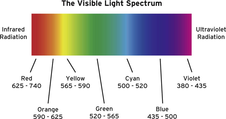
Human beings recognize a visible spectrum of seven colors: red, orange, yellow, green, cyan, blue, and violet.
The visible spectrum is the portion of the optical electromagnetic spectrum that is visible to the human eye. The other portions, which are invisible to the eye, include radio waves, microwaves, terahertz waves, infrared, ultraviolet, X-rays, and gamma rays. Each of these waves carries unique ranges of wavelength, frequency, and energy. The wavelength of the light is measured in nanometers (nm) and affects the color perceived by the eye.
On one side of the spectrum is violet, with a lower wavelength value that presents a higher frequency; the wave cycles fast with a short distance between the wave’s peaks. On the opposite side is red, with a higher wavelength value and lower frequency.
We perceive color when light hits objects that surround our environment, and these objects absorb or subtract the unwanted wavelengths of the visible spectrum and bounce back only the ones that pertain to the surface of the object itself. For example, a red apple will reflect only the red wavelengths. The eye perceives these wavelengths and sends the message to the brain.
Other species recognize wavelengths outside the visible spectrum that humans see. For example, bees and insects can detect ultraviolet patterns on flowers, which help them find nectar.
Figure 4.1
It is important to understand which color you should be using in your titles and credits because we experience a psychological and emotional response to colors. When utilized appropriately, colors can evoke moods and emotions that enhance the meaning of the images, whether they are on a movie screen, a TV, or a computer monitor.
For centuries, artists have used the psychology of color to convey an emotional response and mood they wanted to evoke. Think of the use of color in the works of Van Gogh, Chagall, and Degas and the use of color and light in Caravaggio, Rembrandt, and Whistler’s works.
Whether you use a color palette because of a personal like or dislike for other colors or with a particular color motivation in mind, you want to make sure that the color choices you make do not conflict with the message you are trying to convey. Or, if the medium and the message conflict, it should be an intentional choice. Understanding a bit of color history, the basics of color theory, and color symbolism will help you find a logical and dependable way to utilize color in your title sequences.
A Bit of History
Aristotle (384 B.C.–322 B.C.)
In De Coloribus (translation: On Color), possibly attributable to Aristotle’s disciples, Aristotle theorizes that colors are derived from following natural phenomena: sunlight, firelight, air, and water. These four elements, mixed with darkness (black) and light (white), create color. Additionally, in the text On Sense and Sensibilia, written around 350 B.C., Aristotle identifies a linear sequence of color he deducted from observing the changes in the light during the course of a day, from white to yellow, orange, and red. After sunset, the light becomes purple, sometimes green, then dark blue and black. From his observations, he theorized a linear color system. This color theory was accepted for about 17 centuries.
Leon Battista Alberti (1404–1472)
In De Pictura (On Painting, 1436), a treatise intended to define the rules of visual arts, Alberti states, “Through the mixing of colors infinite other colors are born, but there are only four true colors—as there are four elements—from which more and more other kinds of colors may be thus created. Red is the color of fire, blue of the air, green of the water, and of the earth gray and ash … Therefore there are four genera of colors, and these make their species according to the addition of dark and light, black or white.” Alberti builds on Aristotle’s color theory with the exception of white and black, which are demoted to noncolors.
Leonardo da Vinci (1452–1529)
As a true Renaissance man, da Vinci investigated the topic of color. In his Trattato della Pittura (Treatise on Painting), published posthumously in 1651, he identifies six primary colors: white, yellow, green, blue, red and black. Each color had a direct physical manifestation of the natural world: white for light, yellow for earth, green for water, red for fire, blue for air, and black for night. He also wrote about what would later be referred to as simultaneous contrast: “Of different colors equally perfect, that will appear most excellent which is seen near its direct contrary blue near yellow, green near red: because each color is more distinctly seen when opposed to its contrary than to any other similar to it.”
Isaac Newton (1642–1726)
Newton was the first person to analyze color and view it as a result of light hitting objects and reflecting colors that are perceived by our eyes. In 1666, he conducted the famous prism experiment in which he demonstrated how light is responsible for color. A prism, when placed next to a window and hit by the sunlight, casts a seven-color spectrum: red, orange, yellow, green, blue, indigo, and violet. In 1704, Newton published Opticks, a “treatise of the reflections, refractions, inflexions, and colours of light.” Newton rearranged the linear color system into a circular one in which the circular color diagram shows the relationship between primary colors and secondary colors. White is in the center of the diagram, to signify that the sum of all colors results in white light.
Johann Wolfgang von Goethe (1749–1832)
Geothe, in addition to being an outstanding poet and novelist, wrote Zur Farbenlehre (Theory of Colors) in 1810. He disagrees with Newton and theorizes that the way we see color is affected not only by the light and the object but also by our perception. Color has “sensual qualities within the content of consciousness,” he says. Goethe clearly moved beyond Newton’s study of color as physical matter and entered the realm of psychology. He developed a symmetric six-color wheel in which he arranged the colors on a circle to support his color theory. He divided colors into two main categories. The plus-side colors (yellow, orange, red) provoke warm, exciting, lively, and comfortable feelings, whereas the minus-side colors (green, blue, violet) provoke unsettling, weak, and cold feelings. Goethe also furthered the study of complementary contrasts.
Michel Chevreul (1786–1889)
Chevreul furthered the knowledge of color theory by advancing the concepts of simultaneous contrast, the optical illusion that appears to darken or lighten the hues of two bold colors placed in close proximity of each other, and optical mixing, the blending of two colors to create a third one.
Symbolism and the Psychology of Color
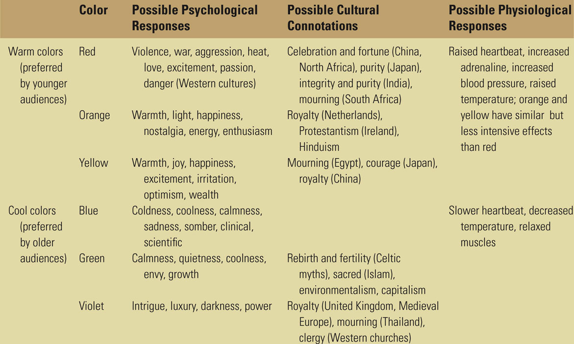
Color influences our mood and even the way we taste food. Color is deeply rooted in cultural, political, and sociological connotations. These associations are constantly changing throughout cultures, years, and generations.
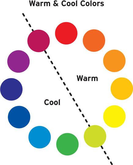
One common emotional response, originally theorized by Goethe, is provoked by cool or warm colors. Cool colors are the ones close to the green/purple spectrum and evoke distance and coldness. Warm colors, on the other hand, are the ones close to the yellow/red spectrum and evoke urgency, action, and closeness.
Cool colors tend to recede in the background of a screen or Web page, whereas warm colors tend to pop to the front.
Table 4.1 Color’s Emotional Response and Screen Depth

When deciding the color palette for your title sequence, cultural connotations are another factor. Certain colors can acquire a particular significance, depending on the cultural background and codex. Red, for example, is often interpreted as danger, as exemplified by stop signs.
The following are some of the scientific, symbolic, and emotional connotations to keep in mind while you work with color:
• Color affects our mood. In a study conducted by Shashi Caan Collective, called Spatial Color—Live Experiment, color affected physical activity. The Collective built three identical but differently colored rooms and held a cocktail party in each one. In the red and yellow rooms, people were dynamically interacting, gesturing, and moving around. In the blue room there was little social interaction and the people were more still and calm.
• Color has cultural and sociological connotations.
• White is associated with mourning in Japan.
• Red signifies good luck in China but mourning in South Africa.
• Black is associated with mourning in Western countries but signifies honor in Japan.
• Purple is associated with mourning in Thailand but signifies royalty in Europe.
• Color has political connotations.
• Red: Labor, left wing, communism, socialism
• Green: Green Party
• White: Pacifism, surrender
• Black: Anarchism
• Color has a religious connotation.
• Blue: Hinduism
• Green: Islam
• Color can influence other senses. A survey conducted by researchers at the Institute of Psychology at Johannes Gutenberg University Mainz in Germany found that colored lighting has an influence on how we taste wine. Wine that was drunk in an ambiance illuminated by red or blue lighting received a higher taste rating than the same wine which was drunk in an ambiance illuminated by green or white lights.
• Color palettes can evoke places, memories, and personal associations. Think of colors that evoke a particular childhood memory, season, or place where you spent time. Memory can influence the perception of color; studies indicate that we recall colors as more saturated than they actually were, as though we replaced the original memory of the image with something different. These memory colors do not affect our perception of reality, but they do affect our color preferences. In research published by the Journal of Experimental Psychology, Karl Gegenfurtner stated, “It appears as if our memory system is tuned to the color structure found in the world. If stimuli are too strange, the system simply doesn’t engage as well, or deems them unimportant.” Co-author Felix Wichmann said, “In order to engage or grab one’s attention, bright colors might well be most suitable … If, on the other hand, the aim is more to have an image stick in the viewer’s memory, unnatural colors may not be suitable.” Based on these studies, while you are working on your title sequence, if you wish to make a particular element endure in the audience’s memory, you could try to enhance it with color (for example, the lipstick’s vivid red in the True Blood title sequence).
• Color as therapy. In chromotherapy, an alternative medical treatment, color and light exposure is used to heal and restore a physical or emotional imbalance.
• Color preference is affected by culture and geographical location. In the book Eidetic Imagery, E. R. Jaensch explains that human beings living in hot climates have to adapt to the long waves of light because of the increased amount of sunlight, which could create a different pigmentation in the retina. People affected in this way are referred to as red-sighted and their color preference is warm, vivid hues. On the other hand, green-sighted people have adapted to a shorter amount of sunlight and have developed a preference for blues and greens. Another study, conducted by Marc H. Bornstein, resulted in evidence that people living closer to the Equator do not distinguish blue from green.
• Color preference is affected by age. In the book Color Psychology and Color Therapy, color expert and industry consultant Faber Birren states that yellow is the color of preference for children, but their preference for it declines as they grow into adulthood, at which point blue becomes more popular. He says, “With maturity comes a greater liking for hues of shorter wave length (blue, green) than for hues of longer wave length (red, orange, and yellow).”
Take a glance at the following table to see some of the most common emotional, political, and cultural connotations generally associated with colors. Keep in mind that these associations are only a starting point; before you embark on a project you should do research to ensure that you have the most up-to-date information on what colors represent to changing attitudes, generations, and cultures.
For example, even though white has traditionally been associated with mourning in China, brides have started to wear white gowns in addition to traditional red dresses, mimicking Western brides. Or consider the use of violet in Thai Airways’ branding. Even though the color violet is culturally associated with mourning in Thailand, the airline’s decision to use violet in its branding is most likely dictated by the fact that the target audience for Thai Airways is foreigners who often associate the color purple with luxury.
Table 4.2 Common Emotional and Cultural Color Connotations
Color Systems
Now that you’ve learned about color’s history and cultural and psychological connotations, let’s dig into the nuts and bolts of color theory.
A number of color systems are used today; most can be found in common computer applications. The most common color systems are:
• RGB. An additive color system that applies to devices using light, such as computer monitors, TV sets, and digital projections. The concept behind RGB is that its primary colors (R = red, G = green, B = blue), when combined, create all other hues. An equal amount of red, green, and blue creates a white light.
• RYB. A color subtractive color system most commonly used in visual arts. Its primary colors are red, yellow, and blue, and its secondary colors are VOG—violet, orange and green.
Figure 4.2

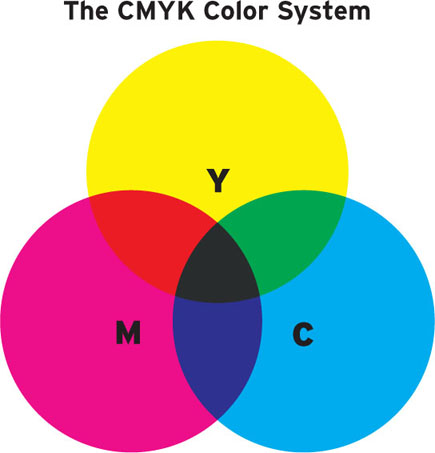
• CMYK. A subtractive color system used in print design, which can be found when using dyes, inks, and pigments. Its primary colors (C = cyan, M = magenta, Y = yellow, K = black), when combined, create all other hues. An equal amount of cyan, magenta, yellow, and black creates gray.
Figure 4.3

• Pantone (PMS). A color system that utilizes a proprietary system, the Pantone Matching System, or PMS, that allows control over and color matching of its unique color formulas. Historically it has been an industry standard in print design, offering designers tools such as the Formula guides, color chips, and Process guides, but recently, with the introduction of Pantone Goe, designers are able to match solid Pantone colors with their respective RGB values, allowing a precise rendition of Pantone’s colors to use in web and broadcast design.
• HSL (or HSI). A color system that measures the values of hue (H), saturation (S), and luminosity (L), which is sometimes also called intensity (I), of a color. The hue is measured by the position in a circle. The saturation and luminance are measured on a scale of 100 units and are determined by the color’s position on the radial line drawn from the center to the perimeter of the color circle.
Figure 4.4
• HSV (or HSB). A color system that measures the values of hue (H), saturation (S), and value (V), which is sometimes also called brightness (B), of a color.
• YUV. A color system initially developed in the 1950s to allow black-and-white analog televisions to still receive a signal. It is used in NTSC, PAL, and SECAM video standards. It utilizes one luminosity channel (Y) and two chroma channels: blue minus luma (U) and red minus luma (V).
Each color value in a system can generally be translated into another color system, although that might create some differences in the richness of colors. For example, when converting CMYK colors directly to RGB, the colors might look a bit washed out.
Figure 4.5
When working with computer software, a new document can be created utilizing a specific color mode (e.g., RGB), but you can create design or typographical elements that contain colors picked from a different color system and apply them to the color system in use. This particular case applies when, for example, you are given a style guide, which includes instructions on how to appropriately use the logo, typeface, and color palette of a specific project. If a print designer created the style guide to follow their work done on the logo of a movie or the movie poster, the color palette will most likely display color values in the form of CMYK and/or Pantone colors.
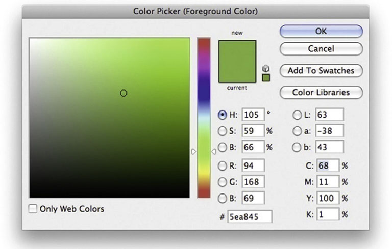
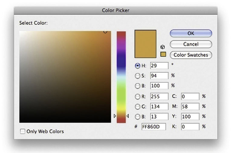
The task of a title designer is to find the corresponding colors in the RGB system. An easy solution is to identify the CMYK or Pantone color in the color picker of your software, using the color system indicated in the style guide provided, and then convert it to RGB. Some color palettes, such as the ones in Adobe Photoshop, simultaneously display the corresponding values in HSB, RGB, LAB, and CMYK, so you could simply enter your value in CMYK and you’ll automatically have the corresponding RGB value.
Figure 4.6 Photoshop’s Color Picker.
Adobe Illustrator has a similar color picker palette that simultaneously displays the HSB, RGB, and CMYK color values. If you are creating a new swatch color or working in the Edit Color palette, you simply click the pull-down menu to select the CMYK color, enter the known values, and then switch the pull-down back to RGB to know its corresponding values and to use the color in your project.
Figure 4.7 Illustrator’s Color Palette.
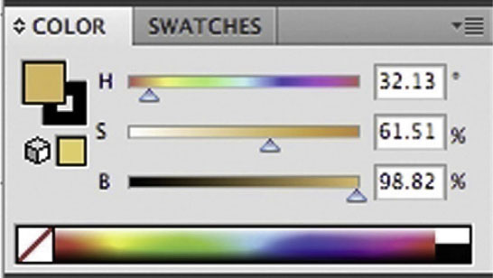
Figure 4.8 Illustrator’s New Swatch window.
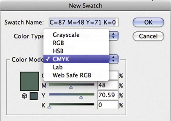
Figure 4.9 Illustrator’s Color Picker.
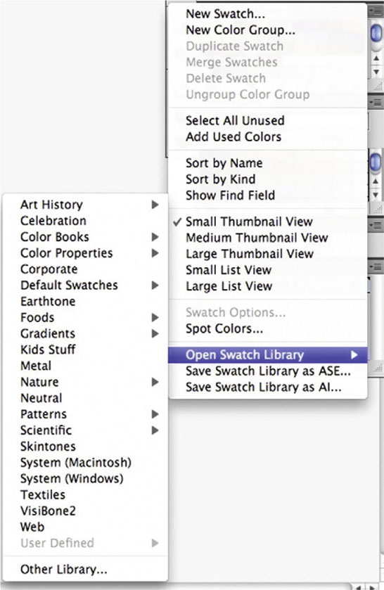
In both Illustrator and Photoshop, you can add a variety of palettes called swatch libraries (in Illustrator) or swatches (in Photoshop). You can find anything from default swatches (which include CMYK and RGB) all the way to a variety of Pantone palettes.
When deciding which color system to use on your project, it depends on what you are working on. When you are working on film titles, the answer is simple: RGB. It is the color system used when working with video. When working on a movie poster (or any material that will be printed), you should use CMYK.
Color motion picture film uses a color system that was originally introduced by Kodak in 1934. It employs a single-strip multilayer emulsion (as opposed to multiple strips of film, which included a variety of in-camera recording techniques devised to achieve color in film). In this system, three thin layers of emulsion are applied to the film’s base, and each one of them is sensitive to specific colors of light. A typical color filmstrip contains a blue, a green, and a red emulsion layer. You could say that film records its information in the RGB color system, but when the film gets processed at a film lab—through chemical processes in which the oxidized developer is formed and silver halide crystals are removed from the film strip—dye couplers will produce a colored dye. The topmost blue layer creates a yellow dye, the middle green layer creates a magenta dye, and the bottom red layer releases a cyan dye. The sum of CMY creates the full color picture.
Figure 4.10 Adding a new Swatch Library in Illustrator.
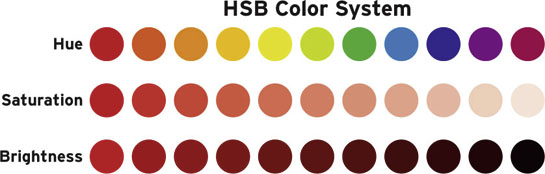
Primary, Secondary, and Tertiary; Hue, Brightness, and Saturation
The basic color wheel is composed of colors grouped into three main categories:
• Primary colors. The color system’s main colors, from which all other colors are generated. Primary colors differ depending on the color system in use. A popular color wheel is the RYB, and its primaries are red, yellow, and blue.
• Secondary colors. The colors located opposite the primary colors in the color wheel. In an RGB system, the secondary colors are yellow, cyan, and magenta. In an RYB system, the secondary colors are purple, orange, and green. Secondary colors are also called complementary colors, since they complement the primary color. Also note that the primary color’s secondary color is created by mixing the other two primary colors. For example, purple, the secondary of yellow, is created by mixing red and blue.
• Tertiary colors. Colors that are created by mixing a secondary color with its adjacent primary. In an RGB system, tertiary colors are red-magenta, red-yellow, green-yellow, green-cyan, blue-cyan, and blue-magenta. In an RYB system, the tertiary colors are yellow-orange, yellow-green, blue-green, blue-purple, red-purple, and red-orange.
Color has three basic properties:
• Hue. The property that distinguishes a color from others in the visible spectrum. The words hue and color are often used interchangeably.
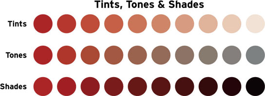
• Value/brightness. A property determined by the amount of black and white added to a color, generally identified as the lightness or darkness of a hue. You create a darker value by adding black, and you create a lighter value by adding white. The following terminology is used when talking about value:
• Tints. Colors mixed with white. These colors, also referred to as pastel, tend to produce lighter, softer hues, such as baby blue or peach.
• Tones. Colors mixed with neutral gray.
• Shades. Colors mixed with black. These colors are bolder, richer, and darker, such as navy blue or burgundy.
• Saturation/intensity. A property determined by the dominance of its hue. Highly saturated colors are bright and vivid. Less saturated colors are muted. Pure saturated colors are located on the outside perimeter of the color wheel, and less saturated colors are closer to the center of the wheel, where the hue dominates less.
Color Harmonies
As in music, where you can experience consonant and dissonant chords, colors can intensify or create tension with each other, depending on the characteristics we’ve explored so far.
Figure 4.11
Color harmonies are groups of harmonious colors that you will want to keep consistent when you are designing your title sequences and collateral designs such as posters, postcards, and other materials.
Simple color harmonies might be based on one color, and more complex ones can be based on mathematical rules. The following describe a number of techniques available to create color harmonies, also called schemes:
• Achromatic. Literally meaning without color, these color harmonies present very low values of saturation; therefore they utilize white, gray, and black. Warm and cool achromatic harmonies can be created by adding yellow or blue.
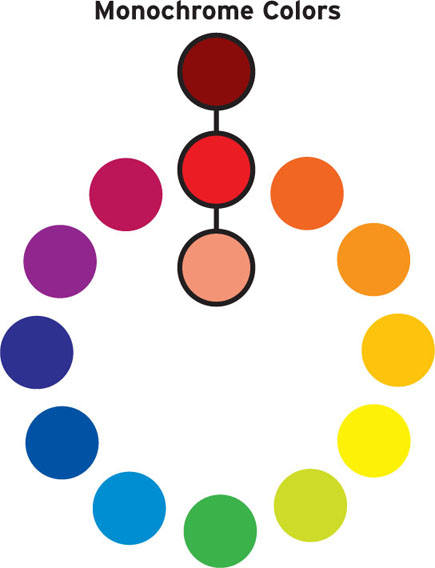
• Monochromatic. Literally meaning one color, these color harmonies are based only on one hue and its related tints and shades.
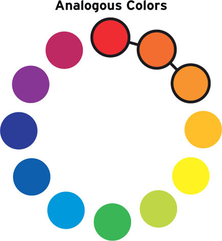
• Analogous. Literally meaning similar, analogous color harmony consists of three colors adjacent to each other in the color wheel. The middle color is generally the dominant color, the second one a supporting color, and the third one is used as an accent.
Figure 4.12
• Complementary. These are colors that are, in the color wheel, directly opposite of one other, such as green and red, purple and yellow, and blue and orange in the RYB color system. Elements designed using pure complementary colors create a visual noise generally called simultaneous contrast (see “Color Contrasts: Color and Type Combinations That Work”). Complementary colors are vibrant and they complete each other. In fact, if you mixed two complementary colors, you would create gray. Complementary color schemes can be obtained using pure hues or their corresponding shades or tints.
• Split complementary. A variation of the complementary color scheme, split complementary creates a more subtle effect. It uses the main color and, instead of its complement, uses its two adjacent colors. Split complementary color schemes can be obtained using pure hues or their corresponding shades or tints.
Figure 4.13
• Triadic. Composed of three colors located equidistant from each other in the color wheel. Again, they can be obtained using pure hues or shades or tints.
• Tetradic (rectangle). Composed of four colors, which are two complementary pairs. If you connected the colors with lines in the color wheel, you’d draw a rectangle.
Figure 4.14

Figure 4.15
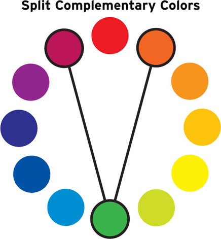
Figure 4.16

• Square. Composed of four colors equidistant from each other in the color wheel.
• Cool. Composed of colors that belong to the cool colors from the color wheel.
• Warm. Composed of colors that belong to the warm colors from the color wheel.
Figure 4.17
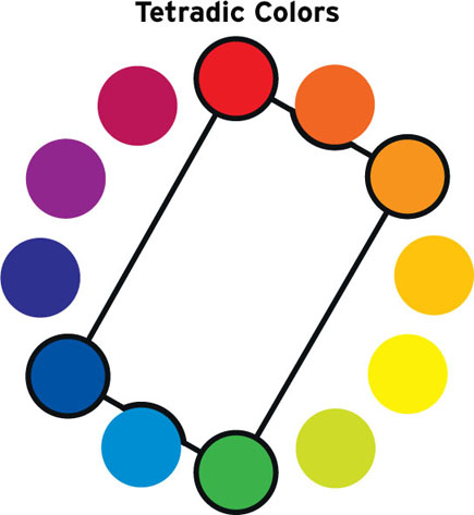
Figure 4.18
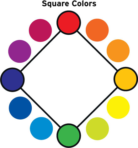
Figure 4.19
Online Resources
If you’d like to explore more about color, take a look at these fantastic online resources:
• http://kuler.adobe.com. A Web site for exploring, creating and sharing color themes. You can save color themes to show privately to your clients, or extract and create themes from an uploaded image.
• http://colorschemedesigner.com. Lets you quickly create mono, complement, triad, or tetrad color schemes and export them for use in your project.
• www.colourlovers.com. A place to discuss and share color palettes and patterns, color talks, trends, and more.
Color Deficiency
As designers we must understand that our work will be experienced by a variety of people with a variety of characteristics. Generally the creative brief will take into account some of them; the target audience and how the work will be viewed might affect the type size that you will use.
When dealing with color, though, keep in mind that a considerable number of people have various levels of color deficiency (also sometimes referred to as color blindness or Daltonism, because of John Dalton’s studies). This section should be taken as information that may or may not influence the design direction and color choices of your work.
Color deficiency prevents people from distinguishing certain shades of color or perceiving certain colors at all. There are several levels of color deficiency, from subtle anomalies to full deficiency, in which a person can only see in black and white or shades of gray. Most people affected by this color deficiency have difficulty discriminating reds and greens (approximately 8–10% of the male population) or blues and yellows (approximately 1–2% of the male population).
If your target audience includes any color-deficient users or if you want to play it safe, you should:
• Avoid picking colors of similar hues, since they are harder to distinguish from one another.
• Avoid using red characters on a dark background. Since red could be perceived as a dark brown or black, it would be hard to distinguish any lettering from the background.
• Avoid conveying relevant information in couples of green and red, especially when used as foreground or background design elements. Deteuranopes—the most common form of color deficiency, in which people have difficulty discriminating red and green hues—wouldn’t be able to read anything.
• Use saturated colors, since they are easier to distinguish than less saturated colors.
• Alternate brightness levels in the designed elements, since colors with similar brightness are more difficult to tell apart. For example, a very dark red and a light green might be easier to distinguish than a red and a green of similar brightness. A quick-and-dirty test is to convert your image to black and white and verify that the brightness levels are actually substantially different.
 If you are interested in seeing how your title sequence looks to people affected by color blindness, visit www.vischeck.com and run the online simulator by either uploading a still picture or the URL of your Web site.
Color Contrasts: Color and Type Combinations That Work
It is common knowledge that black type on a light background is very readable. In filmmaking, we often see the opposite: white type on a black background, especially dealing with end title credits. In this section we’ll explore how the readability of text changes depending on the background color.
First, let’s identify two main elements: foreground (text) and background elements. We talked about type in the previous chapter. Now we’ll explore possible backgrounds.
The background elements can consist of:
• Solid color
• Patterns, gradients
• Live-action footage
• Animation
• Motion graphics
Think of color combinations that you experience every day: street and highway signs. These signs need to be readable by a variety of people who are moving at different speeds. The most common street or highway sign color combinations are black on white, white on blue, white on green, white on red, and yellow on black.
In the case of title sequences, the reader will most likely be still while the type is animating on-screen. The following are some considerations to keep in mind when you’re making your color choices for your foreground and background:
• Contrast. When using a color palette that utilizes colors with similar values and saturation, the contrast between foreground type and background color diminishes, causing the type to be less legible.
• When you use two or more colors that have greater contrast, you create some dimensionality. Keep in mind that darker and cooler colors tend to recede into the background, as opposed to brighter and warmer colors, which tend to pop forward.
Figure 4.20 Lower-contrast colors used as text and background decrease readability.
• Size. If you increase the font size of a hard-to-read text/colored background combination, the readability obviously improves.
• Complementary.
• Complementary colors as text and background make reading a challenge. On one hand, it intensifies the colors and can definitely get the audience’s attention. On the other hand, putting the two colors adjacent to each other creates a vibrating or pulsating effect, making them uncomfortable to look at and tiring the reader’s eyes. They create an effect called color simultaneous contrast.
• An interesting workaround if you’d like to utilize complementary colors without discomforting viewers is to outline each color with a white, gray, or black line.
Figure 4.21 When using lower-contrast color combinations, a larger font size increases readability.
Figure 4.22 Complementary colors used as text and background decrease readability.
• Black. If your title sequence will be played primarily in a movie theater, a black background helps blend the dark environment of the theater with your title sequence. The edge of the screen will not be immediately discernable, and you might fully immerse viewers in the movie. This can be particularly effective at the beginning of the movie, when the viewer has not yet fallen into the typical suspension of disbelief on which all movies rely.
Figure 4.23 When using complementary color as text and background, adding a stroke increases readability.

Afterimage
An afterimage is an image created by the brain that persists momentarily in your retina, even after you are no longer looking at the original image. Try this experiment:
Stare at the red square for 20 to 30 seconds from about 10 inches away. Close your eyes and wait 10 to 15 seconds until you see a green square.
Notice that when you focus on a strong stimulus such as the red square, your eyes and brain absorb the color you observed, and the photoreceptors in the eye become overstimulated. The eye contains two types of photoreceptor cells: rods (sensitive to light and dark) and cones (sensitive to red, green, and blue light). These photoreceptors adapt to the image’s overstimulation (in regard to both its darkness and its color) and become less responsive to it. If, after staring at the stimulus, you move your eyes to stare at a white surface or even close your eyes, you will experience an afterimage of the inverse or complement of the image. That’s because the photoreceptors that are least depleted produce a stronger signal than the overstimulated ones.
Figure 4.24

Why don’t we experience this phenomenon every day? Generally the eye moves rapidly when we’re observing images. This phenomenon is particularly evident when we stare at a strong stimulus for a number of seconds.
How long does an after image last? Afterimages last for a few seconds to up to a minute. Photoreceptors are relatively quick to adapt to and readjust to the absence of the stimulus.
Does this phenomenon work only with red? This experiment can be done with any colors of the visible spectrum and any shape.
Understanding Light
Through lighting you can manipulate images and typographical elements so that you better produce the desired emotions in the audience.
Understanding lighting and its correct use is important for directors of photography, color timers, and lighting directors.
You need to understand lighting when you’re working on a title sequence so that you can:
• Create a CG environment for titles that is different from the look and feel of the movie.
• Create a live-action environment for titles that matches the look and feel of the movie or opening scene.
• Composite titles over existing footage.
You could start thinking about lighting as early as the moment you receive an idea or a directorial instruction, when you receive a frame or scene sample of the animation being produced, or when you receive the background plates that were shot on the green screen that the director wants you to use to introduce each character.
In any case, your job is to both collect information about lighting schemes utilized in the footage (when footage is provided) and research the lighting environment you will either have to create or in which your title sequence will have to be composited.
You should pay extreme attention to samples or plates you receive and determine what kind of lighting has been used, depending on whether you need to match it or not. If you are working with live-action footage that’s already been shot, a useful tool is a sketch of the lighting setup that was used on the set so that you can try to mimic it with CG. The gaffer or the director of photography generally creates a sketch of the lighting setup. If you have been involved early in the process, you might want to ask the director if you can visit the set so you can sketch the lighting setup yourself, take a few pictures, or at least talk with the director of photography about it.
If that is not possible, you will need to determine what the setup was based on the quality of light in the footage, references received, or your best guess. Take a look at the shadows and see whether are they hard or soft. Where is the light source? Is it straight on, coming from the side, bottom, or top, and from what height?
On the other hand, if you need to create your own plates, you will need to perform accurate research and collect as much visual reference material as possible about the environment you want to recreate. You could start with a simple online search and further your research by visiting a library, bookstore, or newsstand and even doing a field trip to snap some reference pictures.
To better help you in this process, you need to understand how light works and the various sources of light.
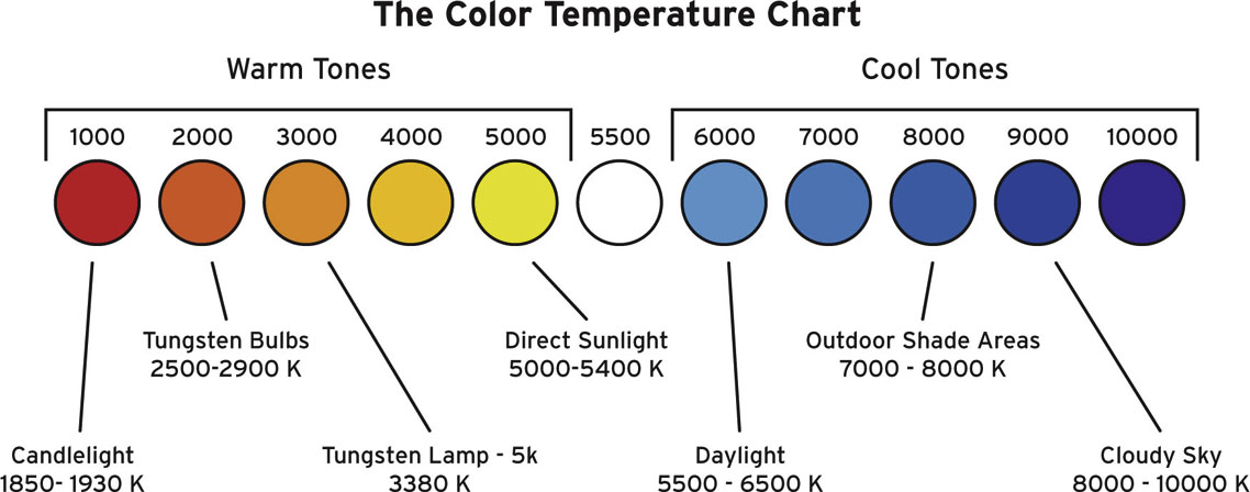
Color Temperature
Light is energy transformed into the visible spectrum. Depending on their temperatures, different objects or lights (flames, fireworks, lava, auroras) have different ranges of colors.
Color temperature is the scale used to relate to the different hues given off by various temperatures of light. The temperature is measured on the Kelvin scale, abbreviated with a K after the numerical value. A high color temperature of 5,000K or more, such as direct sunlight, produces bluer hues. A lower temperature of 3,000K, such as a tungsten light bulb or candlelight, produces orange hues.
Figure 4.25
In film and video production there are two main color temperature light fixtures (or light fixtures with exchangeable light bulbs): tungsten and daylight.
• Tungsten light fixtures’ color temperatures range between 3,200K and 3,400K, giving the light a warm, orange hue. Their name derives from their inner tungsten filament, which is made incandescent by an electric current. These lights are appropriate to use indoors, and they will match the color temperature of most general household light bulbs. To create perfectly matching color temperatures, household light bulbs can be replaced by Photoflood bulbs, which are designed to output a specific Kelvin temperature. These lights are generally used indoors and will match the color temperature of a fire (fireplace or campfire), candlelight, lantern, some flashlights, lighthouses, and some car headlights.
• Daylight light fixtures’ color temperatures range between 5,600K and 6,000K, giving the light a cool, blue hue. Daylight lamps can be direct current arcs (such as carbon arcs) or alternating current arc such as hydrargyum medium arc-length iodide, or HMI. These lights are generally used outdoors because they will match the color temperature of sunlight and moonlight.
The director of photography usually plans which lights to use in different situations, whether the scenes are outdoors or indoors. If a scene is being shot indoors but next to a real or fake window, the director of photography might decide to use all daylight lamps in order to match or recreate the color temperature of the light coming from outdoors. In the opposite situation, if a scene is being shot outdoors but next to a shop, telephone booth, or street lamp, the director of photography might decide to use tungsten lamps to match or recreate the color temperature of indoor lighting.
Sometimes light bulbs can be mixed and matched to create a more subtle variation in the color temperature. For example, the versatile four-banks Kino-Flo lamps (which present four light bulbs) can be swapped to include three daylight bulbs and one tungsten bulb. The result would be still be a dominant blue hue but with a hint of orange to warm it up a bit.
Something else to keep in mind is that when people refer to a light being cool, as in its hue, it is not to be confused with blue light being a cool temperature. A light that produces bluish hues is actually a higher temperature, around 5,600K, than a light that produces orange hues, which is around 3,200K.
Color-Balancing Film and Video Cameras
Our visual perception adapts to the different lighting color. We perceive a white T-shirt as white whether we are indoors and using warm artificial lighting or outdoors in sunlight. Our eyes and brain recalibrate what we read as white, based on our own experience and points of reference. On the other hand, film and video cameras need to be guided in recording with the correct color temperature setting. If they are not, they will read that T-shirt as orange under candlelight and blue under sunlight.
• Film cameras. Color film stocks have a color temperature rated for tungsten or daylight. With a tungsten-balanced film stock utilizing tungsten lights as illumination, the whites will be reproduced as white. With a tungsten film stock used with daylight lights, the whites will be reproduced with a blue color cast.
• Similarly, with daylight-balanced film stock and daylight lights, the whites will be reproduced as white. With daylight film stock used with tungsten lights, the whites will be reproduced with an orange color cast.
• Sometimes the color casts are an aesthetic choice, and sometimes they might be a choice driven by necessity (for example, if the production client has budgeted only for daylight film stock). In either case, with the aid of camera filters or colored gels on lights, you can correct unwanted color casts.
• When shooting with daylight film and tungsten lighting, adding an 80A blue filter in front of the film camera lens will correct the unwanted orange color cast. The filter raises the color temperature from 3,200K to approximately 5,600K so that the tungsten-lit scene appears to be now lit for daylight.
Alternatively, when shooting with tungsten film and daylight lighting, adding an 85 orange filter in front of the film camera lens will correct the unwanted blue color cast. The filter drops the color temperature from 5,600K to approximately 3,200K so that the daylight-lit scene appears to be now tungsten-lit.
The same principles can be applied to lighting gels. Clipping a full value of a color temperature Blue (CTB) gel in front of a light fixture will change the color temperature of tungsten lights into daylight. Clipping a full value of a color temperature orange (CTO) gel in front of a light fixture will change the color temperature of daylight into tungsten. This could be a useful tip to apply when color-correcting camera filters might not be available or when you don’t have the desired color temperature light fixture at your disposal.
• Video cameras. As opposed to recording on film stock, video cameras use tape or digital-based media, which can’t be rated for daylight or tungsten. You will need to identify the correct color temperature in the camera settings. Most cameras offer presets that allow the user to select one of two main color temperatures: exterior (6,500K) or interior (3,400K). Sometimes you can even enter the exact number of Kelvin degrees. Depending on the location, set, and lighting, picking the appropriate preset allows the whites to be recorded as white without recording an unwanted color cast.
• In addition to the presets, most video cameras allow the user to sample a white element in the frame as a point of reference so that the camera can determine the appropriate color temperature intended for the recorded footage. This feature is called the white balance. Refer to your camera manual to accurately perform a white balance.
• The ideal place and time to perform a white balance is after the entire set’s lighting (including light gels) is in place. Typically a person with a white card will stand at a place in the set where most of the scene’s action is performed, so that the person is adequately lit, the camera zooms into the white cards, and the white balance is performed. As long as lighting fixtures are not changed nor gels or filters added between shots, the whites will be read as whites.
• Just as with film cameras, camera filters can be added in front of the video camera’s lenses to change their color temperature or even modify the set’s lighting color temperature.
Something that can be done with a video camera, but not with a film camera, is purposefully faking the white balance to create an intentional color cast, such as the “day-for-night” look, when you are shooting in daylight but you’d like to make your footage look like nighttime.
There are two situations in which you could alter the classic use of white balance with a video camera:
• Add gels in front of light fixtures after the white balance. If color temperature gels are added in front of the lights after performing a simple white balance, they will create color casts. If you add colored gels before you white balance, most likely the white balance itself will neutralize the color you intend to keep in the lighting.
• Add gels or filters in front of the camera lens before the white balance. If a color temperature gel is added in front of the camera lens before performing a simple white balance, it will create a color cast. For example, if you placed a full CTO gel in front of the lens, the camera will read the orange as the true white and will correct its color temperature. The camera is thinking that it is reading an awful lot of orange in that white and that it needs to correct its color temperature by adding some blue. As soon as you remove the orange gel from the front of the lens, your entire scene will have a blue color cast. This technique is typically useful when you want to create a dramatic effect or even a very subtle effect. You could add a half or quarter CTB gel if you simply need to warm up some people’s skin tones or remove a slight unwanted blue color cast.
Qualities of Light: Size, Distance, Angle, and Color
One of the most immediate and dramatic differences in different light sources is the light’s hardness or softness. In coming to understand the qualities of a light, a good starting point is to figure out the light’s make and model and train your eye to distinguish the quality of the shadow the light fixture produces. Are the shadows dark with sharp edges? Then it’s a hard light. Are the shadows gray with soft edges? That’s a soft light.
Typical hard light sources are the sun, a clear glass light bulb, a candle, or light fixtures like spotlights. Hard lights are used in film and video production to create a strong statement. Because a hard light casts such sharp and defined shadows, most three-dimensional details, such as textures or engravings in an object or even skin imperfections, all become much more noticeable. When overused, hard lights could create an extreme, full-contrast look, almost as though the image is a duotone comic book with lots of dimensionality in the frame.
On the other hand, soft light sources include an overcast day, a light that bounces off any reflective or light-colored surfaces, a Chinese lantern, or light fixtures such as zip lights. Soft lights are used in film and video production to light large areas of a set, allowing the actors to move more freely across it. They create a natural look and more subtle statement than hard lights. Because soft lights cast gentle and soft shadows, most three-dimensional details become less noticeable. The light wraps around the three-dimensional object, creating a soft, even, and less dramatic look. The drawback to soft lights is that they are harder to control than hard lights. That’s why they are often used in conjunction with flags, which keep light off areas where it’s not wanted. When overused, soft lights can create a flat, even look, without much dimensionality in the frame.
On a set, the quality of a light depends on the following:
• The lamps’ size and output. Light sizes could be as little as 100 watts, all the way up to 5,000 or 10,000 watts (also referred to as 5K or 10K). A small light fixture, such as a 100 watt, will generally create a harder light and sharper shadows than a larger diffused light fixture, such as a 5K.
• The lamps’ model and settings, parameters, or accessories. There are a number of models within each brand. Some of the most common brands are Arri, Kino-Flo, Mole-Richardson, Dedo, Source 4 Leko, and Light Panels. There are two main distinctions regarding the light’s casing: Fresnel and open face.
• Fresnel lights have a built-in lens in front of the light, which helps create a more even light by containing and controlling its beam. They also create sharper shadows and are focusable, meaning you can change the distance between the filament and the lens. Fresnel lights have a knob that can be turned to select two different settings: a flood mode (when the filament is closest to the lens and produces a wider spread of light, creating softer shadows) and a spot mode (when the filament is farthest from the lens and produces a narrower and focused light beam, creating sharper shadows).
• Open face lights provide a larger light beam, which is useful for creating a soft lighting look. They don’t contain a built-in lens, and not all of them are focusable. Some open face lights have lenses that can be placed in front of the light’s face, which can further control the quality of light; some lenses are flat or frosted, wide or narrow. The open face lights include the family of soft lights. Some are created by a lighting manufacturer, and some might be created by gaffers.
• One kind of soft light that lends itself to be hung over a stage to create an even, soft light across the set is a space light. This circular light creates a soft pool light beam and is controlled on its sides by skirts, which can be solid (made out of black solid duvatine, keeping the light focused downward) or silk (creating a silky diffused lighting on the edges), and gels can be added to it.
• Larger and increasingly popular lights include balloon lights, which are typically used to create a soft, even light on large sets, whether interior or exterior, day or night, and can be easily installed without heavy rigging or cranes because they are incredibly light. Most models are self-supporting, with the space light suspended in the middle of a balloon filled with helium. After the balloon is inflated, it can be elevated as high as the model goes and can be further elevated by a weight-assisted cable.
• The intensity of light. The film and video production world uses the word intensity instead of brightness. The most common tool used to measure the intensity of light is a light meter, which measures incidental light (light that falls on a subject) or reflective values (light that is bounced off the illuminated subject). See Chapter 6 for more on this subject.
• Keep in mind that the intensity of light falling onto an object or subject depends on the angle from which you are looking at it. This is particularly important when you’re taking a reading with an incidental light meter.
• The intensity of light is measured in a couple of units:
• Lumen. A light fixture’s output is measured in lumens, which is the luminous energy created by a source. The light output of other items such as light bulbs and projectors is also measured in lumens.
• Footcandle. When light falls on surfaces, the correct unit of measure is footcandles (or lux). This international unit of illumination measures the density of light on a given point on a surface. Its measurement is often accomplished with the aid of a light meter positioned on that given point and pointed toward the light source.
• You can manipulate the light’s intensity if you modify the following:
• Distance. One instantly gratifying modification you can apply to a light fixture—especially when it’s mounted on a light stand—is to change its distance from the subject you are illuminating. The farther you move it, the lower the light’s intensity. The closer you move it, the higher its intensity.
• Scrims. When a light fixture cannot be moved, a quick solution is to slide a scrim in front of the light fixture, in the slot between the front of the light and its barndoors. A scrim is a metal wire mesh that, when placed in front of a light fixture, reduces its intensity. A single scrim has a single layer of wire mesh and a green border and reduces the exposure of approximately ½ f-stop. A double scrim has a double layer of metal mesh and a red border and reduces the exposure of approximately 1 f-stop.
• Gels. To manipulate the light’s intensity, you could use neutral density (ND) gels and diffusion gels. Neutral density gels do not affect the color temperature of the light fixture; they look gray and they decrease the intensity of light, as though you were putting a pair of sunglasses on. They can be found in a variety of weights, from ND2, which reduces the exposure of 1 f-stop, to ND64, which reduces the exposure of 6 f-stops. In addition to ND gels, you have at your disposal a range of diffusion gels. These gels are translucent and they do not affect the color temperature of the light. They can be found in a variety of densities, from light diffusion such as opal gels, which add a slight soft touch to your light without compromising its intensity, to heavier diffusion such as 250. The primary function of these gels is to diffuse lights, but heavier-density gels, which are thicker, reduce the lights’ intensity more.
• Dimmers. These are external controllers that you can add to lights so that you can control their output. They generally work with the aid of a knob, which you can mark and turn to reduce or increase the light’s intensity. Dimmers generally do affect the color temperature by shifting it to warmer hues.
• The angle of light. The angle at which you place a light will affect its quality. Imagine a camera and a subject. Place a light right beside the camera and start moving it horizontally around the subject. When your light is in the front, you will benefit from the full intensity of the light. The more you rotate it around the subject, the intensity lowers, but you also create more dimensional light. When you position the light behind the subject, you create a back light; only the rim around the subject is visible. Now go back to the first position of the light next to the camera, facing the subject. Instead of moving it horizontally, raise the light higher or lower and tilt it up or down to keep illuminating the subject. High- and low-angle lighting creates more dramatic effects and deeper shadows than a light that is placed at the subject’s eye level or slightly higher.
Functions of Lights
When lighting a set, lights (regardless of their make and model) have a designated name based on their function. One classic lighting scheme is three-point lighting. It consists of a key light, a fill light, and a backlight:
• Key light. The main light source of the set or the main source that lights the subject. Its angle and ratio with the fill light determine the mood of the lighting. When placed at an angle from the camera’s position, it adds dimensionality to the shot. For a classical three-point lighting setup, the key light is generally positioned at a 45-degree angle from the camera and with roughly a 30–45 degree down-tilt.
• Fill light. A soft and lower-intensity light generally used to fill in some of the shadows created by the key light. It is generally positioned at a 90-degree angle, opposite the key light.
• Kicker. A backlight, generally a very hard light, that is positioned above and behind the subject, pointing down at them. It creates a hard edge, which helps detach the subject from the background, creating dimensionality. This light is sometimes also called a backlight or hair light when it is aimed specifically at the subject’s hair. A kicker is usually positioned directly opposite the key light, almost as though it were aimed toward the camera but pointed down.
• Eyelight. A tiny light that is placed slightly above the camera, generally at a similar angle line to the key light, that helps create dimensionality and create a sparkle in a subject’s eyes.
• Background. Lights that illuminate the background and further create some distinction and detachment between the subject and background. You will definitely need focus background lights if you are shooting on a green screen, so that the screen will be evenly lit.
Tips for Lighting a Set
When you are lighting a set to shoot footage for your title sequence, whether on a green screen, a stop-motion set, or on location, you should start by doing the following:
1. Staging/blocking. Understand the main positions of your characters (whether they are actors, letters, or props) and identify their movements and/or camera movements.
2. Roughing-in. Roughly set up position, height, and intensity of the lighting along with the camera(s). Quickly run through the shot with stand-ins and verify that the lights are in their correct positions and that the right lights are being used.
3. One at a time. Turn off all the lights and turn on each light, one at a time, to verify their effectiveness. Start from the key, then go to the fill, kicker, and any other additional lighting you have. Make changes if necessary, then slowly turn on the lights again, and again make any necessary changes.
4. Fine-tuning. Add colored or diffusion gels, move the light stands’ positions if they are in the middle of a shot, and refine the angles of the lights.
5. Rehearsal. Perform a full rehearsal with the talent and any necessary camera movements.
6. Shoot!
Emotive Lighting
By orchestrating a set of light fixtures, which fill particular functions and possess specific qualities, we obtain a lighting style. Lighting styles are inevitably responsible for suggesting moods and evoking emotions and psychological states dictated by the content of a scene. Two common lighting styles are high key and low key. These styles are not to be confused with hard and soft lights, although they play fundamental roles.
A low-key lighting scheme is dominated by deep shadows, and the few illuminated areas are well exposed or sometimes overexposed. To achieve this lighting scheme, hard light sources are often used in conjunction with minimal or no soft lights. The contrast ratio between bright and dark areas of the scene is high; sometimes parts of the talent’s faces or parts of the set are obscured and dark. Visually, high contrast ratios add depth and dimensionality to the frame. Emotionally, they evoke urgency and high stakes. It’s no surprise that low-key lighting was used at the beginning of the century in German Expressionist films, then later adopted and heavily utilized for the film noir of the 1940s and 1950s. Today, low-key lighting is usually associated with crime, horror, mystery, and psychological films.
A high-key lighting scheme is characterized by an overall brightness. The majority of the frame is well (sometimes overly) lit, with very few shadows. This lighting scheme presents a low contrast ratio between the key and fill lights. The fill light’s intensity, in fact, is raised to one similar to the key light so that it creates an overall bright, flat, and even look, without casting any major shadows on the characters or on the set. This low-contrast look evokes upbeat moods and focuses on nuances rather than making a hard statement. High-key lighting is usually associated with the look and feel of musicals and comedies.
Similarly to the mise-en-scene decisions of what you’d like to compose in the frame or not, deciding what to light and what not to light can have a profound effect on and evoke different emotions in the audience.
A good exercise that will quickly train your eye to lighting is to observe and analyze paintings and even photographs. Try to pay attention to the light source(s), the effect of light on skin tones and objects, and the kind of shadows they cast. Can you identify the position and angle of the key light and even the fill, kicker, or background light? Are they a soft or a hard source? Does the composition present low-key or high-key lighting? Being able to recognize at a glance the effects produced by different lighting setups will inform and educate the way you approach lighting in your own title sequence.
Computer-Generated Lighting
Now that you know about film lighting in the real world, understanding how most of the industry-standard software programs deal with lighting will be easy. Similar to real-world lights, CG lights need a bit of artistry in their arrangements. In a way, you have fewer limitations and less setup time. You don’t have to put lights on stands or rig them to an overhead grid. You can simply place any light wherever you’d like in your composition, using 3D coordinates and manipulating a few parameters.
On the other hand, adding lights to your project might increase your render time and sometimes even your screen preview. As with real-world lighting, a good way to start is to add one light at a time, find its desired type of light, position, and point of interest (where the light is aimed), and then add all the additional lights. If you think you have overdone it, turn all the lights off, then turn them on one at a time. Verify that each one is effective, see how they work together, and modify them if necessary.
One major difference to keep in mind when working with CG lights is that their position in the 3D environment does not affect the lights’ intensity as it does in the real world. In CG, you can move a light closer or farther away from the subject, but the intensity will remain the same. If you want to affect the intensity of CG lights, you need to change their intensity value (as we discuss shortly).
Just as with lighting in the real world, start by roughing in a key light, then a fill light, and then you can further articulate the set by adding a backlight. Depending on the software you are using, you might need to explore and modify the light’s properties to obtain the lighting style you want.
In Adobe After Effects you can add a light to your composition by selecting Layer | New | Light. A pop-up window displays the light’s options. To begin with, you can pick one of four types of lights:
• Spot. Your typical spotlight resembles the real-world spotlights used in theatrical lighting. In your composition, the wireframe outline of a cone visually represents the spotlight’s position— the point being the apex of the light, which can be modified through its own properties. The base of the cone represents the direction and wideness of the light beam.
Figure 4.26 After Effect’s Spot Light.

• Parallel. A directional light that emits a parallel light beam that mimics the effect of the sun’s light. Its distance from the subject it is illuminating doesn’t actually affect the range of influence of the light (as happens with the spotlight; when you move a spotlight closer to the subject, the cone of light shrinks, and when you move it away from the subject, the cone of light widens). To manipulate the parallel light effectively, you can change its point of interest and its intensity.
Figure 4.27 After Effect’s Parallel Light.

• Point. This lights creates an omnidirectional illumination in the 3D space, like a bare light bulb.
• Ambient. This light creates a flat, overall illumination in all directions and doesn’t have an actual source point in the composition. In fact, this light doesn’t even have transform properties, so you cannot even move it. When you want to create an even lighting across your composition, maybe in addition to your key, fill, or a color cast, this is the light of choice.
Figure 4.28 After Effect’s Point Light.

Figure 4.29 After Effect’s Ambient Light.

To see your lighting setup in action, you might want to import or create other elements in your composition. You might start with a simple solid. Make sure that you turn any elements that you want to illuminate with a light into a 3D layer by clicking its 3D layer icon (the one that looks like a cube).
Figure 4.30 After Effect’s 3D Layer Icon.

Each light has a variety of options to modify according to your own taste or project necessity:
• Intensity. Similar to a light fixture’s wattage, this option regulates the intensity of light. There is no direct measurement of the light’s intensity other than your own judgment. Move your mouse pointer over the canvas to read the RGB value of your light through the Info palette, and avoid reaching an overexposed true white light (R = 255, G = 255, B = 255) to keep within the ranges of broadcast-safe color.
• Color. This is like adding a colored gel in front of the light fixture. You can click on the color well to dynamically select your color, or click on the color picker and select a color from another element of your composition.
Figure 4.31 After Effect’s Light Options.

• Cone angle. A wide cone produces a wide spotlight, and a narrow cone produces a narrow spotlight. The light’s cone angle can range between 0 degrees (invisible) and 180 degrees (very wide cone angle). This feature is similar to, but with wider ranges than, the flood/spot setting of a real-world light.
• Cone feather. If you’d like to add a soft edge to your spotlight, this is the place to do it. A cone feather of 0% creates a very sharp edge, as opposed to a 100% one, which creates very soft and blurry edges. Keep in mind that when you increase the cone’s feather value, you will visually decrease the cone angle at the same time, to make up for the pixels it needs to blur the edges. To compensate for it, you might want to consider readjusting the cone angle after you have reached your desired cone feather setting. Do not confuse this feature with soft lights in the real world. A cone feather will soften only the edges of the light beam, not the light itself.
• Cast shadows. This option can be on or off, and it cannot be keyframed. If you want the light to cast shadows on layers stacked below (in z-space), the ones you are illuminating, keep it on. If you don’t want this light to cast any shadows, keep it off. Remember that if you’re not getting the result you’re looking for, you might need to do some troubleshooting. In After Effects, if you are trying to recreate a spotlight illuminating an object, which casts a shadow onto another object, but you are having trouble achieving that effect, check the following parameters:
1. First, check to see whether the material options of the layer you are lighting has the Cast Shadows property on.
2. Reduce its light transmission to 0%.
3. Check to see whether the material option of the layer you are trying to cast a shadow onto has the Accept shadows property on.
• That should do the trick. Now you should have a proper working light and shadow.
• Shadow darkness. This regulates how dark you’d like the light’s shadow to be. Make sure that this property is set to at least 50% so that you can visualize the shadow on your composition. This property could be somewhat compared to the properties of hard and softlights in the real world. If you’d like your CG light to have a softer shadow, then set its Shadow darkness to a lower percentage. If you’d like to recreate the impression of a hard light, then increase the percentage.
• Shadow diffusion. This regulates how you’d like the shadow to be diffused. It is particularly noticeable around the edges of the cast shadow. It is advisable to start with a lower setting (even at 0 pixels) and then fine-tune it as necessary.
• Lights add up in intensity. The more lights you add to your composition, the more you increase the intensity of light or brightness level of your composition.
• Layer stacking is not relevant. Regardless of the light’s layer stacking (whether they are on the top or at the bottom of the layer stack), they will equally affect your other layers, but only if they are 3D layers.
• Lights in AE use the RGB additive color system. For example, if you overlap a green and a red light, they create a yellow intersection.
• To change the type of light, you simply double-click the light’s layer or change the pull-down in Light options.
Figure 4.32 Lights in After Effects use the RGB additive color system.

In Apple Motion there are four types of lights, very similar to the ones in After Effects but with different parameters. In Motion you can add a light to your composition by selecting Object | New Light (or by the keyboard shortcut Shift + Command + L). A new light is automatically created and added to your canvas. If you currently don’t have any 3D group in your project, a dialog window will be displayed, asking you whether you want to keep your groups as 2D or change them to 3D. Lights only affect 3D groups. The default light is spot, but in the heads-up display (HUD) you can change it to ambient, directional (similar to the parallel light in After Effects), or point.
Figure 4.33 Motion’s Spot Light.
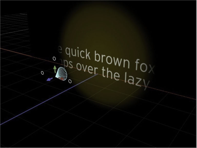
Figure 4.34 Motion’s Directional Light.
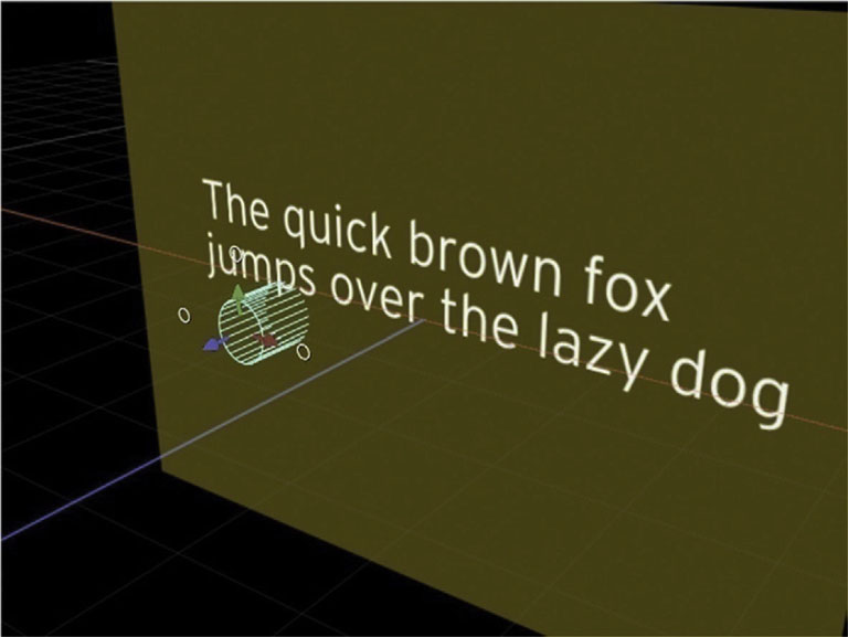
Figure 4.35 Motion’s Point Light.
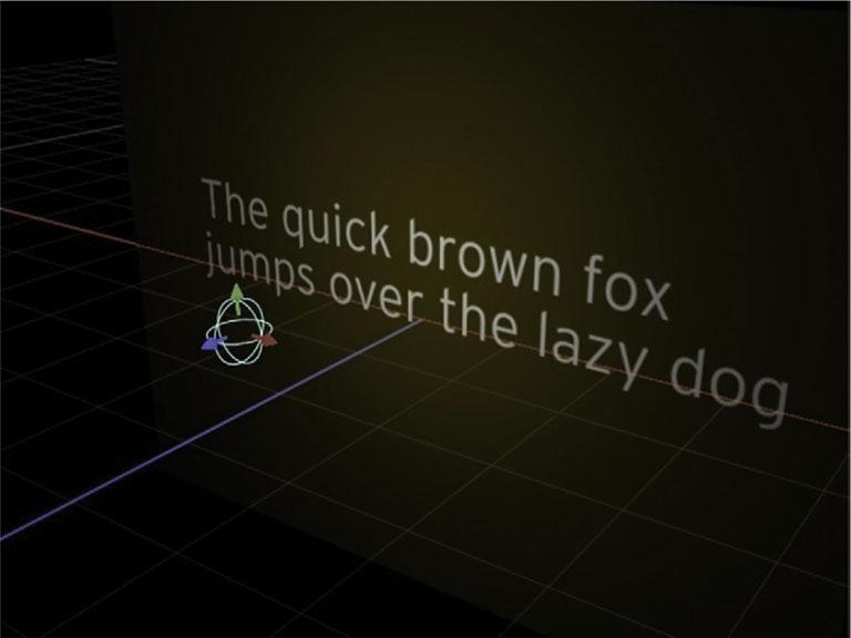
Figure 4.36 Motion’s Ambient Light.
Each light has different properties than the ones in After Effects. In Motion, all lights can be modified by changing their color and intensity. Point lights and spotlights can be changed by modifying their:
• Falloff start (point and spot)
• Falloff (point and spot)
• Cone angle (spot only)
• Soft edge (spot only)
Figure 4.37 Motion’s Spot Light’s HUD (Heads-Up Display).

Using Photoshop Layer Styles with Type
With the variety of potential colors and shapes in a background, whether animated, footage, or even a solid color, you will need to employ a number of additional effects on type to keep it readable. Additionally, type effects will help add that level of professional slickness necessary to help your titles stand out and be memorable.
Photoshop’s live-editable layer styles are useful on a number of levels. First, as a design effect, they are quite useful in easily recreating a wide variety of light, shadow, glow, texture, and depth effects that come from the real world. Second, layer styles now comfortably integrate with Adobe After Effects to make integrating them in animation much easier than before.
Figure 4.38

Adding and Adjusting Layer Styles
To add a layer style, highlight the layer you want to apply it to and click the ![]() icon. You’ll choose an effect, and now below your layer you’ll see a heading for Effects, and then below that you can find the name of the effect applied. If you want to delete it, you can drag it to the Trash like a layer. To duplicate the effect with the same setting on another later, Option-click and drag it to the layer that you’d like to apply it to.
icon. You’ll choose an effect, and now below your layer you’ll see a heading for Effects, and then below that you can find the name of the effect applied. If you want to delete it, you can drag it to the Trash like a layer. To duplicate the effect with the same setting on another later, Option-click and drag it to the layer that you’d like to apply it to.
Figure 4.39

Whenever you apply a layer style, the dialog box specific to that layer style will open.
The Layer Styles
Now let’s go through what each layer style does and the options for each.
• Drop Shadow. Creates a shadow behind the layer based on the shape of the layer.
• Inner Shadow. Creates a shadow that falls inside the contents of the layer.
• Outer Glow. Creates a glow that extends out from the contents of the layer.
• Inner Glow. Adds a glow from the edge of the layer inward.
• Bevel and Emboss. Creates a false depth based on highlights and shadows.
• Satin. Adds interior shading to create a glossy surface on the layer.
• Color Overlay. Lays a color over the layer contents.
• Gradient Overlay. Places a gradient over the layer contents.
• Stroke. Creates an outline along the edge of the layer.
Using Global Light
Figure 4.40
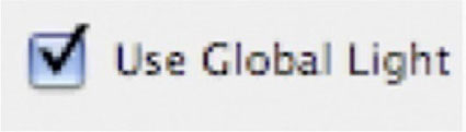
Drop Shadow, Inner Shadow, and Bevel and Emboss use an artificial light source that can be synced across all the layer styles that use a light source. It’s called Use Global Light, and you’ll see a checkbox to the left of it to turn it on. Below you’ll see the three effects we’ve mentioned, with a synced Global Light and the same effect.
In this example the layer styles’ light sources are synced with Use Global Light.
Figure 4.41

In this example the layer styles’ light sources are switched off and at varying angles.
Figure 4.42

Contour
Drop Shadow, Inner Shadow, Outer and Inner Glow, Bevel and Emboss, and Satin all have Contour settings controlling the shape of the shading. Each of these is controlled with a Bezier curve. You have 12 contour presets, as pictured, and you can click on the contour and create a custom shape.
Figure 4.43
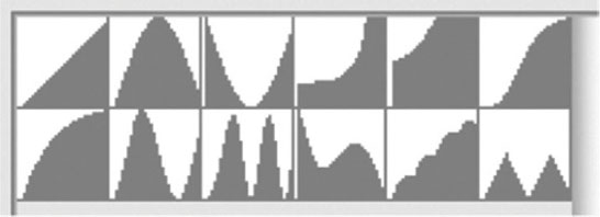
Figure 4.44

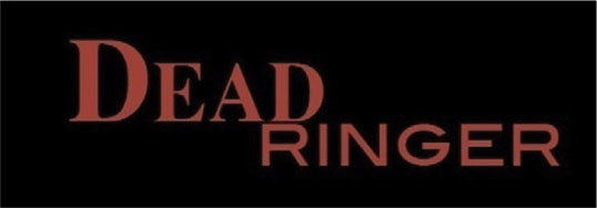
Click directly on the line to create a breakpoint and then drag it where you want. The following show the Bevel and Emboss effect with the same settings and two different contour curves.
This title has a standard linear contour.
Figure 4.45

Figure 4.46

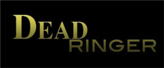
Here’s the same layer with a custom contour.
Figure 4.47

Figure 4.48
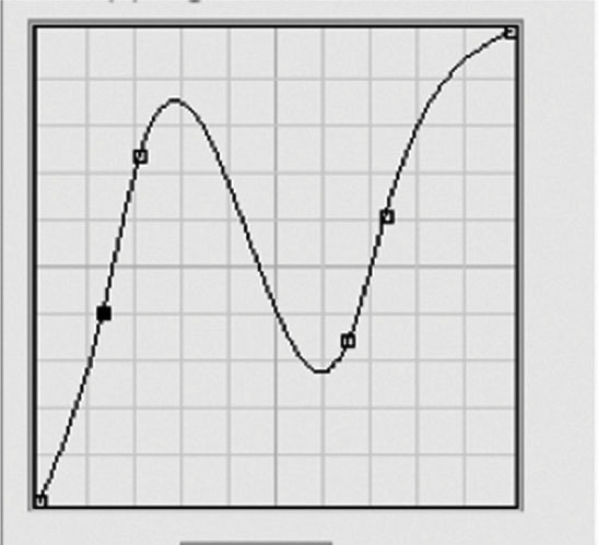
Figure 4.49

Drop Shadow
A drop shadow takes the content of the layer and creates a fake shadow based on the shape of the layer behind it. Drop shadows are a common effect throughout the history of graphic design; they are highly useful for title sequences because they can take a title that is over a background and create a sense of depth and distance from the image below it. There’s a Blend Mode control to adjust how the layer style blends with the background, an Opacity setting, an Angle control for the light source, Distance that will control the offset of the shadow, Spread that will control the size of that mask being cut for the shadow from the layer content (the higher you set it, the softer the mask’s edge will be), and Size that is the how large the shadow is. There’s also the Contour control, as discussed previously, and a Noise setting that will introduce a random distribution of static to the shadow.
Figure 4.50

Inner Shadow
Inner Shadow will basically take the effect of a drop shadow and turn it inward. It creates an inner texture and impression of depth. You will encounter many of the same controls for drop shadow in an inner shadow with a notable exception: Instead of a Spread setting, there’s a Choke setting for controlling the mask being generated, which will control how the mask moves inward instead of outward.
Outer Glow
Outer Glow will still use the shape of the layer to create an effect, but rather than create a shadow, Outer Glow creates a light that will emanate from the layer.
In the Structure section, you have controls for the way the glow will interact with the background, so there’s Blend Mode, Opacity, and Noise settings as well as a choice for the color of your glow, or you can choose a gradient.
Figure 4.51

Figure 4.52

In the Elements section, you can choose a Technique (your choices are between a sharper Precise mask or a feathered edge Softer technique) and slider settings for Spread and Size. Spread and Size have the same functionality as they did for Drop Shadow.
Finally, under Quality, you have Contour controls, with an additional Range control that will adjust the amount of effect that the Contour will have on the glow, and a Jitter control for adding a natural randomness to the gradient in a glow.
Inner Glow
At first, it might be unclear what the difference is between Inner Glow and Inner Shadow, but as you go through the controls, you’ll see that this effect has a more additive lighting effect, which is easier to use with subtlety than an Inner Shadow.
Figure 4.53

The controls will almost exactly resemble Outer Glow, with the exception of the Spread being replaced by a Choke control, for the same reasons as mentioned earlier, when we were comparing the controls of Drop and Inner Shadow
Bevel and Emboss
Although many of the layer styles are used to add a bit of depth to layers, Bevel and Emboss does an excellent job recreating many effects of sculptural type you have seen in countless places. A bevel adds shading to the edges of the layer to either push it forward or back; an emboss will do the same thing by adding shading from the outside of the layer to push it forward or back.
Figure 4.54

The first setting you choose is the Style; the bevels will work along the edge of the layer, and the embosses will work from the area immediately around the letters.
Figure 4.55

 A Stroke Emboss, Figure 4.56, will require that the Stroke layer style be activated, Figure 4.57.
Figure 4.56

Figure 4.57

After you have chosen a style, the next setting is for Technique, which gives you choices (Chisel Hard, Chisel Soft, or Smooth) of varying strength for how the chosen style will be achieved. You have a slider for the amount of depth, which will control the strength of the shading; a choice of direction (up or down); a slider for size, which controls the strength of the bevel; and a slider for softness, to add fine control of the Technique choice.
Since this is a depth effect, you have Angle and Altitude controls for the light source in the Shading section. There’s a Gloss Contour control for adjusting the curve of the shading. Finally you have the ability to control the blend for the Highlight Mode and Shadow Mode as well as the opacity of each.
Figure 4.58
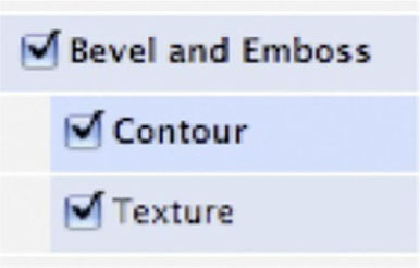
Bevel and Emboss is quite possibly the most complex layer style, because it has two substyles (I’m not sure what Adobe would call them, but I think substyle is applicable) to add a contour and a texture to the bevel. The Contour controls are familiar by now, so let’s address the Texture controls.
Figure 4.59

With Texture, you first choose a Pattern tile with an image that will be used to set the look of the texture of the bevel. Scale will allow you to adjust the size of the tile; the lower the scale, the more the tile will be repeated. Depth is the strength of the visibility of the texture. The texture here is used only with the bevel; to get a texture throughout the layer, you should use the Pattern Overlay layer style.
Satin
Satin will feel similar to Inner Shadow by adding interior shading to the layer. Satin is designed to have a glossy effect. Unlike the Inner Shadow style, it won’t use the shape of the layer; instead it relies more heavily on the Contour setting. The settings for Blend Mode, Color, Opacity, Angle, Distance, Size, and Contour will all work in the same ways, as discussed in the previous layer styles.
Figure 4.60

Color Overlay
Fairly simply, the Color Overlay style will change the color of the layer. It gives you Blend Mode, Color, and Opacity, for adding an additional color over the existing layer content. The best argument for using this effect over the idea of simply changing the base color is when it is used as a subtle blend or in addition to the layer, rather just using it to change the color overall.
Figure 4.61
Gradient Overlay
Just like the Color Overlay, a Gradient Overlay will place a gradient over the existing color of the layer. The controls for this layer style are very similar to Satin, with the addition of a picker for the gradient, where you may choose from the preset gradients or set your own. The controls here are the same as for the Gradient tool. The Style section will give you control over which of Photoshop’s five different gradient styles you’d like to use (Linear, Radial, Reflected, Angle, or Diamond).
Figure 4.62
Pattern Overlay
The Pattern Overlay layer style is for adding an overlaying tiled texture to the layer content. You’ll notice that the controls are almost exactly the same as the Texture substyle for Bevel and Emboss. Your first two choices are the familiar Blend Mode and Opacity settings. Most important, however, is the following section, where you choose Pattern, a tile with an image that will be used to set the look of the overlying pattern. Next is a Scale setting that will allow you to adjust the size of the tile; the lower the scale, the more the tile will be repeated.
Figure 4.63

Stroke
The final layer style, Stroke, is extremely useful to movie title designers. Stroke will add an outline to the inside, outside, or center of your layer. You begin by setting the size, position, Blend Mode, and opacity of your layer style. The section below that is where you will choose a fill type, though in most cases you will want to stick with Color (Gradient and Texture are rarely desirable when using Stroke). The last setting will change based on the choice you made for the fill type, with familiar settings for each.
Figure 4.64

Choosing Between Raster and Vector for Motion Titles
When you’re planning a title sequence that involves computer graphics, inevitably you come to kind of crossroads: raster or vector? First, we’ll review the difference between raster and vector. Second, we’ll address the criteria for deciding which to use.
What Is a Raster Image?
A raster image is a digital image in which the pixels are specifically assigned to exact locations in a grid. Since each pixel can be any of millions of colors, having the pixels specifically assigned to exact locations in a grid means that they are capable of a photographic image quality. However, it has a major limitation in that it will become distorted with enlargement, so when you use raster images, knowing the sizing is crucial.
Figure 4.65
Film and video are media that rely on photographic images; therefore, in most cases we should be working with raster engines and raster files. The same is true for type. Since type in most cases only needs to be graphic and not photographic, it is optimal for us to have type in a vector format, where size changes will not reduce quality. Photoshop and After Effects use continuous rasterization for type, so the type is sourced to the software as vector imagery and continuously rasterized to maintain maximum quality.
Figure 4.66
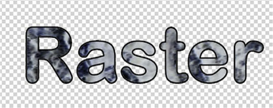
Photoshop is the world’s most popular raster image editor. However, the type engine is vector information that is continuously updated and referenced by the software, so there is no quality loss from resizing. Unfortunately, if you want to use many of Photoshop’s effects, you will have to go ahead and perform a full rasterizing of type layers, thus converting them to standard graphics layers and limiting your text’s size. Throughout this book I’ll demonstrate ways you can take advantage of After Effects to avoid ever having to rasterize the type in Photoshop. When using raster effects with type, you can get photographic textures and effects to work with your type. But nearly every raster effect can be achieved without having to rasterize the type graphics permanently.
 The reason we can avoid permanent rasterization of our type in After Effects is that After Effects’ effects are nondestructive, meaning that they can be applied and removed without permanently being applied to the graphics. Photoshop’s Smart Filters and Layer Styles are the only “live” effects.
Figure 4.67

What Is a Vector Image?
A vector image avoids the entire issue of quality loss by not specifically assigning pixels to their locations; rather, vector images use Bezier paths to map out the shape of the image and reassign pixels as the path size changes. This leads to cleaner edges, and though they will never look like photographs, in most cases for type we either won’t need photographic-styled imagery or we can find a workaround using masks, or some other combination of effects.
In short, it’s totally acceptable to perform the typesetting part of your title work in animation software such as After Effects or Motion. If you need to typeset using Photoshop, you can, but avoid using Photoshop’s effects, since there’s likely an equivalent in After Effects that will not detract from the quality of your image.
Figure 4.68

Tutorial: Using Stencil Alpha to Cut Out a Texture
1 One issue that often comes up is wanting to do a photographic texture for type. The problem is, of course, our recurring issue of needing to avoid rasterizing, and the way we can do that here is to use a blend mode called Stencil Alpha. In After Effects, create a new composition, import the texture you’d like to use, and place a type layer above it.

2 With our text layer highlighted, go to the Modes column and choose Stencil Alpha. If you see the Switches view, you might have to go to the Toggle Switches/Modes button at the bottom of the timeline.
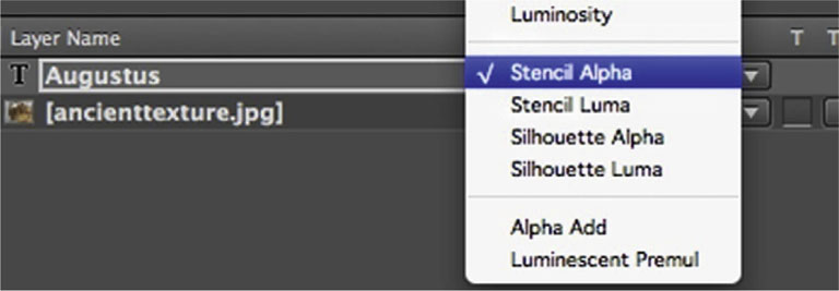
3 Now your type is cutting out your texture. The next thing to do is make it ready to be part of another scene. Highlight both layers and go to Layer | Pre-compose. Since the two layers rely on each other to make our effect, any more layers could create confusion or conflict, so it’s a good time to consolidate them.
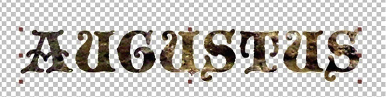
4 Highlight the pre-comp and apply Effects | Perspective | Bevel Alpha. This will give it a very pleasing false depth and help it stand out from the background.
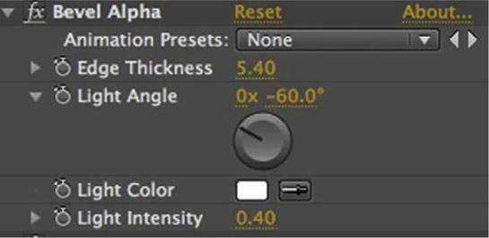
5 On your pre-comp layer, turn on the switch for Collapse Transformations. It’s the same switch as Continuous Rasterization except that when it’s applied to a pre-comp it’s called Collapse Transformations.

 In After Effects, Collapse Transformations tells the software not to render the contents and effects within the pre-comp until it has applied the effects that are applied to the pre-comp as a whole first. This helps it to maintain its resolution when the size is changed, and layers within the pre-comp that have Continuous Rasterize switched on will be continuously rasterized.
6 Done-To finish up this title card, I’ve added a background image. On the title pre-comp, I’ve added Effect | Perspective | Drop Shadow to it, to help make it easy to read over the background image. Now try adding in a Scale animation on the movie title pre-comp layer.

The Main Title Card Becomes the Movie Logo
If you think about your movies or the movies that have had the most cultural impact, you will often imagine the main title as you conjure up the movie name. Movies such as Pulp Fiction (1994), Jaws, Casablanca (1942), The Godfather (1972), Psycho, and Star Wars have movie logos as memorable as the movies themselves. But how did these logos come to matter so much?
Essentially it’s because the use of graphic design and the ability to stylize type to capture something that connects the title to the content of the film is what helps make for a memorable logo. Consider The Godfather, for example. The gothic appearance of the letters combined with the illustrative marionette element essentially sum up the feel and narrative of the film. Here we will examine some suggestions for how you can add illustrative elements to your movie title logo. I can’t promise you’ll be able to make a movie title logo as great as the ones I’ve mentioned, but it’s definitely worth a try.
Tutorial: Animating Layer Styles with After Effects
One method commonly used to slick up a title is to add Photoshop layer styles to your type. When you’re making a title sequence, the main title should have a special distinction; one way we can add that is through animating Photoshop layer styles. After Effects can add keyframe animation to the Photoshop layer styles. Here’s how you can take advantage of layer styles to add some animation.
1 Open the document deadringer.psd in Photoshop. You will see that the type layer has the Inner Shadow and Gradient Overlay styles applied.

2 Import the document into After Effects as a Composition Cropped Layers. When you come to the Photoshop Import window, select Editable Layer Styles and click OK.

3 Open the twirly arrow for the type layer, and you’ll see Transform and Layer Styles. Open Layer Styles and you’ll see the same layer styles we set up in Photoshop. Let’s open Gradient Overlay.

4 You will find keyframe tools for animating the same parameters that we initially set up in Photoshop. For a quick example, let’s set a stopwatch for Angle. Go to the 2 second mark and give the Angle three revolutions.

5 Done-You’ll get this ceiling fan-styled shadow movement throughout the type. Take a few minutes and try animating several different layer style parameters with After Effects.

Tutorial: Adding Animated Illustrative Elements to a Main Title Card
Using a simple, animated illustrative element can make the difference between the movie logos that people remember and ones they will forget. In the following tutorial, we’ll animate an organic plant element as part of a movie logo.
1 This scene was designed with Illustrator. Let’s begin by locking the background layer. Let’s add a new Shape layer to extend the e into a growing and ominous plant leaf.
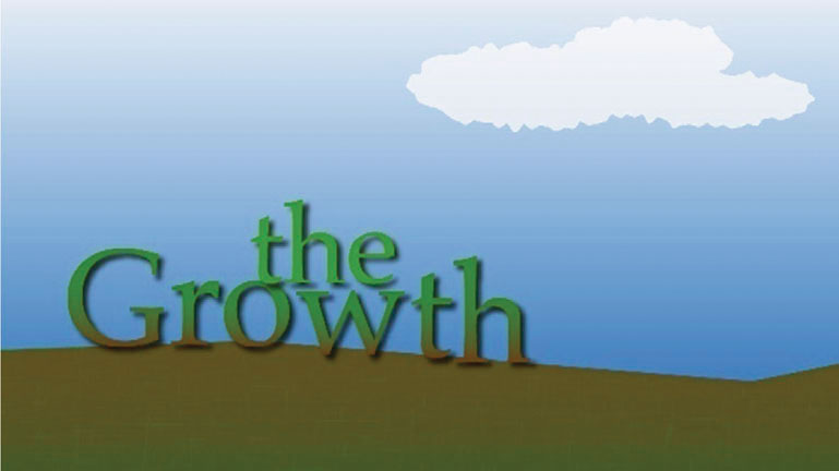
2 We’ll use the Pen tool to create the leaf. Press G on the keyboard and then look at the new buttons that arrive on the screen. You’ll see a star icon next to a half-circle icon; choose the star, which tells After Effects that we are creating a shape and not a mask. Set the Fill to match the green of the e, which you can do by clicking on Fill and using the eyedropper from the color picker. Set the stroke to No Stroke by clicking Stroke and choosing the square with the red slash.
 After Effects’ new Shape layer function allows users to create Bezier shapes that can be animated over time. However, it sounds very similar to Masks, which are also Bezier shapes that can be animated. So what’s the difference? Think of Shape layers as being like a Mask over a Solid layer, with the addition of Animators dedicated to them. Masks are designed to cut out layer content; Shapes are designed to create content.
3 It is difficult to see the shape we are making with the background we have because by default AE uses a lavender color for Shape layers. We can change this by clicking on the color chip next to where it says Shape Layer in the timeline. I chose Red.

4 Use the Pen tool to design your shape.
5 Though it might seem a little weird, I am going to set a keyframe for the Path at the 4 second mark, where I want it to complete growing. Why? Because it is a growth animation, I know what the end should look like and I don’t know what the beginning will look like, so I start my first keyframe where I know what I want. I’ll then bring the playhead to the 0 mark.
6 At the zero mark I reshape the stem into being a believable part of the e. Notice that there is a new keyframe in the timeline.

7 Done-Shape layers make it easier to add attractive illustrative elements as part of a type layer. Now, to complete our animation add Effects | Perspective | Drop Shadow to match the effect on the original layer.

Title Sequence Workflows
To keep your title sequence projects from becoming overlong processes, it’s key that you have a solid understanding of what constitutes a good workflow. So here are some highly useful workflow techniques.
Figure 4.69
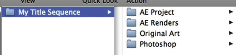
Project Management
A well-organized project is key to keeping deadlines. Project management is basically your workflow for keeping your files well organized and avoiding things like files going “offline” or missing. Here I will demonstrate the project management method that has worked extremely well for me for a long time. I learned it working at a professional postproduction house and have stuck to it, refined it, and used it for years.
Start by creating a master folder for your project, open it, and create four more folders: Original Art, Photoshop, AE Project, and AE Renders.
 I am demonstrating this technique for project management on a Mac, but it can easily be recreated in Windows.
 If you would like to use the same project management system for a project where you will use Motion instead of After Effects, you can still apply it in the same way, though you might want to name the folders Motion Project and Motion Renders.
• Original Art. In this folder we will keep any elements that are provided from the client side or any research elements such as images you found on the Web. We will not import any of these files into our actual project; we keep only provided or reference material here. For example, in a moment I’ll demonstrate how to convert a movie poster file into a graphic for our title sequence, so I’d keep the original file in this folder and the converted file in the Photoshop folder.
• Photoshop. In this folder we will keep all of the .psd documents we plan to import into After Effects. If you plan to work with Illustrator, you should name this folder Illustrator instead or, if you are going to use both, make a Photoshop folder and an Illustrator folder.
• AE Project. When you save an After Effects project, it will create an .aep file. Keep all your .aep files for this project in here. You should use the Increment and Save function in AE periodically so that you have an archive of files to look back through. Increment and Save does a Save As function except that it skips the part where it asks you to name the file and simply adds a number at the end of the file name. You might want to label your files so that you know which one is current.
• AE Renders. When you render a file in After Effects, send it to this folder. You can purge the content of this folder when you are ready to archive your project.
 In OSX, to give a file a color-coded label highlight the filename, go to the File menu from the Finder, scroll to the bottom, and choose the color you want, Figure 4.70.
Figure 4.70
Working with the Graphic Design Department
The titles in your movie will often reflect the same look as the posters, invitational cards, and other print material that will be used to promote the film. In the old days, when titles were not as valued a marketing commodity as they are today, the print materials would sometimes follow the titles by some period of time, to the point where they wouldn’t match at all. Now, since these two elements can happen simultaneously, it makes it much easier to keep them in sync.
300 dpi Becomes 72 ppi
Figure 4.71

When a motion graphics artist receives material from the print department, several things will need to be changed. If the print material comes first, it must have its resolution reduced. Print usually uses 300 dots per inch (dpi) or higher. However, screens have the advantage of needing much lower resolution, 72 pixels per inch (ppi). When lowering resolution in software such as Photoshop, we must be very careful to avoid destructive processes.
Figure 4.72

When you are adjusting the scale of image in Photoshop you should be quite careful about the three check boxes above. Let’s say that we are going to shrink down a movie title logo from a poster.
 The standard movie poster is referred to as a one-sheet. Since the 1980s the size of the one-sheet is usually 27 × 40 inches.
1 To downsize our poster logo, first go to Image | Image Size and turn off Resample Image. Resample Image allows the software to warp the image into whatever dimensions we give it (which is something we will rarely want at this point). Leave Scale Styles and Constrain Proportions on. In most cases we will want Constrain Proportions on because that will preserve our dimensions.
![]()
2 Now, under Resolution, change it to 72. Notice that the width and height of the document have become huge. That’s because we have Constrain Proportions on but Resample Image off. Leave Constrain Proportions on, and turn on Resample Image.
3 Now you have unlocked the ability to enter in Pixel Dimensions. Under Width, enter 720. Hit OK.

 The difference between Image Size and Canvas Size is that Canvas Size only addresses the size of the workspace (or canvas), not the contents. Image Size affects both.
4 Done-Now go to Image | Canvas Size. Change the Height to 480. You will be warned that this will crop the image, but in this case there’s nothing I want below the 480 mark so it is okay (if there was something below I would have to do some resizing). Since the logo in my example comes from the top of our document, I moved the Anchor to top center.
Setting Up in After Effects
Composition Settings
Figure 4.73

 The world of film has become so much more diverse in the past decade and movies can be projected in so many different formats now that your setting could range from standard small DV to 4K and higher sizes.
At the beginning of any motion graphics project, particularly a title sequence, it is very important for the designer to have a meeting with the producer, director, and editor to discuss what the final output will be.
Ideally, you will be able to work in the format that matches the final output, but that might not always be possible. Working with 4K footage and animated type will cripple even some fairly high-end systems, and on the ones it won’t cripple, it could make After Effects or Motion run so slowly that the movie’s production could grind to a halt. So, you can work with lower resolutions until the clients approve the piece and then output the high-resolution footage. How?
First, remember that if your type is vector, you can resize it at any point nondestructively. If you are animating elements as part of your title sequence, if they are vector, again, resizing is not a issue. With raster elements there’s room for more concern.
Figure 4.74

With the image being prepped, you will notice that the resolution is set to 180, which is more than double 72 ppi. Since video will be 72 ppi, After Effects will read the document purely from the number of pixel dimensions, and this image is 2592 × 1944, making it large enough to be part of a 2K film document later. But if we put it into a 720 × 480 document, we have to bring the Scale way down to make it work well in our lower-resolution document, but by doing this we have freed ourselves to make it larger later.
Tutorial: Making a Preset
In creating a title sequence with After Effects, there are a number of ways to do the same things, and we can take advantage of some workflow accelerators to save serious time. One of these is to make a preset for your animation so that we don’t get stuck in repetitive tasks.
1 When I am beginning a title sequence, I will usually experiment with the first title until I find something I like. In this case, I’ve settled on using CC Burn to make the text appear and a Scale that begins at 50 percent and ends at 70 percent.
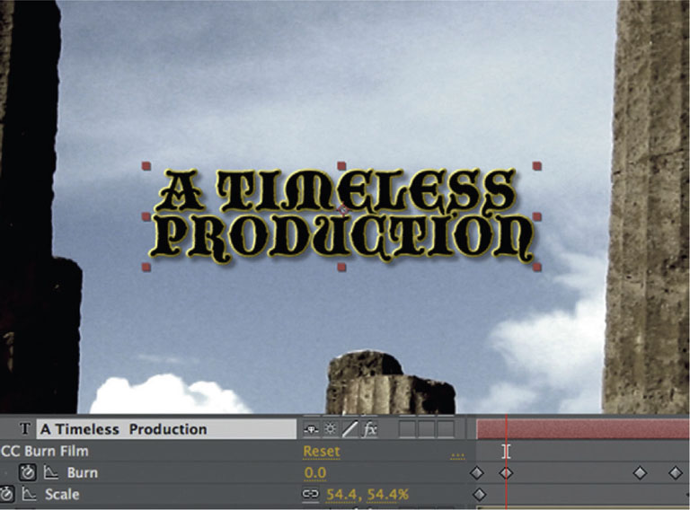
 A standard fade up and fade down are used often on titles. There are numerous Transition effects in After Effects, but the Opacity tool also does the trick. When doing a fade up/fade down, you need four keyframes. The first one set to 0, the second set to the max opacity. The third should repeat the maximum opacity, which will pause the opacity effect for the length of time between the two keyframes, and the fourth should return it to 0, Figure 4.75.
Figure 4.75
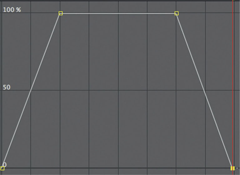
 The Add/Remove Keyframe button will add a keyframe that repeats the last value entered, if there are no other later keyframes for that parameter. So this is a quick way to add a keyframe that will pause an animation, Figure 4.76.
Figure 4.76

Figure 4.77

2 Press the U key on the keyboard, which will bring up your animation parameters. Highlight the CC Burn and Scale tools. Drag and drop them into the Effects and Presets menu. You will be prompted to enter a name. I called it Augustus_TS.

3 Done-Now we can apply the settings throughout. So, put in your next title and drag and drop our Augustus_TS preset on it and it’ll match the previous title. What’s also pretty great about this is that if the title needs tweaking, you can change the keyframe values after they are applied. In the case of the next title in this sequence, I had to lower the Scale to between 30 and 50 percent to keep the larger title between the two columns.
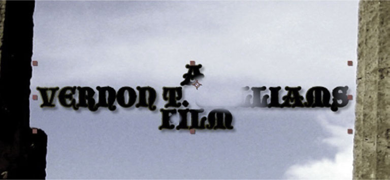
Open in Editor
One of the most useful commands for working with Photoshop and Illustrator sourced documents in After Effects is Ctrl-E (or Command-E). This will open the layer in its editor, which is the program that was used to create it. So, your computer will then launch Photoshop or Illustrator, you can make your changes, and save. Jump back to After Effects, and voilà! It’s updated to accept your change.
If it hasn’t updated—and sometimes it won’t because After Effects stores a lot in your RAM and will only return to the source files if it needs to—highlight the update information in the Project window and go to File | Reload Footage.
Figure 4.78
TED 2009: A Case Study
Motion Graphics Studio: Trollbäck + Company
Creative Director: Jacob Trollbäck
The content, sound effects and motion graphics in this piece achieve a sense of unison I’ve rarely seen. Can you elaborate on the creative process while you were working on this opening?
Many years ago I did a three-dimensional type animation for TED8. Many people have told me that it is their favorite of my TED openings. Since the 2009 conference was a jubilee of sorts—the 25th year since the first conference—I thought it would be fun to go back to the roots, as all the early conferences were explorations in moving type, and also give the type geeks something to enjoy.
Figure 4.79 Jacob Trollback.
The conference had 12 themes that we wanted to feature. The goal in all our work is to find clever ways to make an emotional connection, so here we wanted to load the type with meaning according to the themes. For example, Discover is a DNA spiral swooping upward, and Engage interacts with it in a choreographed dance. Invent forms a curious shape—later to be found to be a T —and See, Predict and Dare merge into the word Reconnect. After that, Reconnect splits into several strands of Grow that form an organically spreading shape, only to be intercepted by the word Dream that brings us into a 2001-inspired white space. More themes enter and line up in a kind of large meta-type that spell out The Great. But these letters turn out to have yet another dimension. As they rotate around their own axis, we see that they are three-dimensional objects that read differently from another angle.
I have worked with Michael Montes for 15 years, and we have an innate understanding of how music and motion can and should support each other. We create the pieces with a strong idea of what the thrust should be, and Michael finds a way to put this into sound.
Everything in this piece works elegantly, efficiently, and poignantly, from the Mac booting-up sound effects, the Discover DNA, the white flash frame after the dream sequence, until the reveal of the conference’s title. How much preparation and testing went into this project? What was the decision factor that led to the type treatment in 3D?
I came up with the rotating three-dimensional type for a title sequence for the movie True Lies many years ago. Ironically, Peter, one of our 3D designers, had made a similar discovery by himself and actually advanced the idea with type that you can read from three directions. The playful surprise seemed perfect to reveal the word Unveiling.
Figure 4.80a Still frames from TED 2009, created by Trollbäck + Company.
Figure 4.80b
Figure 4.80c
Figure 4.80d
Figure 4.80e

Figure 4.80f
Figure 4.80g
Figure 4.80h
Figure 4.80i

Figure 4.80j
Figure 4.80k

Figure 4.80l
Figure 4.80m

Figure 4.80n

Figure 4.80o
Figure 4.80p

Figure 4.80q
Figure 4.80r
Figure 4.80s

Figure 4.80t

Figure 4.80u

Figure 4.80v
Figure 4.80w
Figure 4.80x
Figure 4.80y
Figure 4.80z

Figure 4.80aa
Figure 4.80ab

Figure 4.80ac

Figure 4.80ad
Figure 4.80ae

Figure 4.80af
Figure 4.80ag
Figure 4.80ah
Figure 4.80ai

Figure 4.80aj
Figure 4.80ak

Le Tourment Vert: A Case Study
Motion Graphics Studio: Energi Design
Creative Director: Steve Holmes
Le Tourment Vert is owned by Vinet Ege
© Energi Design
What was the main concept and inspiration for this project?
We came up with three different concepts. There was a colorful version, a lighter one, and then I came up with a third, darker one, where everything was offset, cracked, and broken. There is a sense of life and new growth with a sort of clean feel that transpires from it, but there’s also a sort of a grungy, dark, and slightly twisted feel to it. I really, really liked this concept, but unfortunately it didn’t go through.
Figure 4.81 Steve Holmes.

Figure 4.82a Preliminary concept for Le Tourment Vert, created by Energi Design.
Figure 4.82b
Figure 4.82c
The finished design was very clean. What I tried to do with the launch of the product was to take it away from the historical visual that people associate with absinthe, which is the backstreets of Paris and the late 1800s and early 1900s. The product appeared very modern, and I think it needed to be approached from a slightly more historical view, and that’s where the textured paper came in. I was inspired to form a mixture of clean graphic elements and old-fashioned backgrounds and then just blend the two together to create something different.
I like the idea of a clean graphic element being used to actually spill the design elements out onto the page, which in this case blended with the general scene remarkably, almost as if the liquid was dripped onto the paper.
We went through ideas of making this almost like real liquid, having it shine or glisten. That flow became pretty much the standard for the rest of it. We followed it through on the type and everything else. Trying to keep things as connected, so like putting in maps in the background, as if you were watching the reflections and refractions in the background imagery through a glass. It really was that challenge to take new imagery and make it old; I think that’s really where it started.
There’s a nice flow to the piece, almost as if it was a script. How much has your research influenced the piece?
Well, oddly enough I had to go to Paris shortly after this brief came in. I ended up going to the Museé D’Orsay and actually viewing the unique pieces that are in there, which was perfect.
There was a series of artists who had already been featured in some of the advertising for the launch of this product, some pieces had already been put out there, but they were all really modern. Ideas like “It worked for Degas, it works for whoever.” I decided to take a look at the work of 1,800 artists such as Degas and the textures they used in their works, and I took a few pictures whilst I was there.
And that’s where my ideas for the artwork came into play, because I was able to see their work and almost imagine this green flow of liquid forming their art, ’cause that’s what they said, really; absinthe was their muse. It was good to be able to mix elements together in terms of color and historically.
What was your approach in regard to type?
I didn’t want something that was too modern, so I did a little bit of research on serif typefaces, old-fashioned typefaces, block typefaces.
It also worked nicely that the thickness of the serifs lent itself very nicely to the thickness of the swirls that would come from it. With Clarendon, our second-best choice, the slabs were so thick that the swirls coming out of them would have been too heavy, and I think this would have overwhelmed the rest.
The messaging was kind of simple and I think the typeface we used just fit it very easily, because it was condensed. It works in a good mixture of large and small, and that was the nice thing about it. I wanted all the messaging to be stacked on top of each other, keeping similar widths and just growing heights. With a condensed typeface you have a lot more flexibility in that respect.
I just like the form it’s got; it has a slight Western feel to it as well. That was probably my third choice, and the client went for it.
To what extent were you allowed creative freedom by your client?
There was a lot of creative freedom, which was really good. There were three concepts provided, 30 frames for each concept, presenting an entire story and laying the basis of the messaging right. They liked all three initially, and I believe they wanted to use all three, which was great.
But they boiled it down to the fact that the one they’ve picked was a lot cleaner and a lot sharper. And so, from this I then developed it into a texture, and as the texture got darker, that was the only time really, that they pulled back and said, “Let’s just keep it on the light side.” But really that was the only major feedback.
We changed some of the elements, as there were a lot more graphic elements originally. They wanted paintbrushes when it was all about the artist, they wanted this script in the background when it was about the poets, and that actually became a little busy.
The whole thing was only 30 seconds, there was only so much distraction you could have there, so I went back to them and exposed the problem, and they were okay with that. So it was good in that respect, it was one of those projects that flowed fairly well.
What did the project timeline look like, from beginning of the project to the deliverable?
I think we spent about two weeks on concept, and then about another week refining the final concept when it was chosen, and production was about two weeks. It was fast turnaround. And that probably affected the lack of changes and the direction the client was going in.
Since the spot was going to be used at the Sundance Festival between each of the film sections—as they were promoting the drink there—and was also going to be played in flight in Virgin America—as they became the first airline to take this drink on board—they had to have the commercial in a very short time. That’s why the timeline was kind of fast and furious. It gave it a kind of definite “We have to have it done by this time to have it by this time.”
How does the use of camera move the story forward?
The camera movement on this commercial was defined by the concept: a drink or a bottle spilled over onto a napkin or a piece of paper. So you are following all of these trails no matter how far they go across this infinite-sized piece of paper.
We wanted the camera moves to be flexible enough to rotate: not just follow a line but actually spin around 180 degrees, over the z-axis and the y-axis, but also to have a little bit of movement, a slightly handheld effect, but not too much.
The distance of the 3D camera from the paper stays essentially the same. The individual objects have a different z-space value which gives them a slight offset when things move, like having textures moving separate from the background.
By pulling those elements off separately by 100, 200 pixels each, we had the capability to use a little bit more flow with the camera. That then revealed more of the differences between those 3D layers. If we kept all the elements flat, then the camera moves would have pretty much just made it all, and I think that would have been boring.
I think we took a good decision because to randomly move the camera would have been the easy choice. We would have ended up with a more lazy, storytelling kind of view, instead of a distinctive drunken feel to it.
The only forced camera move that had to be done was right at the very end when we come in on the logo. The design element of the devil’s face here in the background bleeds in. But it is barely there, and as it gets darker toward the end of the commercial, you can see it actually becoming quite heavy, which is nice I think, it has got a nice imposing feel to it. The end frame is actually my favorite of the piece because of its dark texture and because it gets a little more foreboding. I now have this image in my head that I can’t get rid of.
The camera move on this last shot was actually a trick: It resulted from a two-dimensional rotoscope. This was because coming from 3D and revealing the two-dimensional bottle got a little too complicated. So inside essentially there’s another composition, and I just rotoscoped five or six frames to reveal it. And in the new composition there’s just another 3D camera that’s just slightly moving in. So that was really the only twist.
The French background of Paris, that was really quite nice. Was it done by a designer of yours?
No, actually a designer called iStockphoto! We found some fantastic high-res illustrations of Paris landmarks and we just acquired them, layered them, and repositioned them so they would fit the HD and the SD versions. We then filled them with texture, which I originally intended to do in paper form with the text on it, kind of like the dark design.
But in the end it was a little too dark overall, and you couldn’t see much of the detail because the texture was taking over. But they worked really well and they took a little while to render, especially the Eiffel Tower, there’s so much detail in that. Everything else was provided.
Figure 4.83a Still frames from Le Tourment Vert, designed by Energi Design.
Figure 4.83b
Figure 4.83c
Figure 4.83d
Figure 4.83e

Figure 4.83f

Figure 4.83g

Figure 4.83h

Figure 4.83i

Figure 4.83j

Figure 4.83k