
In this chapter, we'll dig into customizing the Revit system families (see Chapter 2, "Revit Fundamentals," for a definition of system families) so that you can make your office templates exactly as you need them. Knowing how to adapt the system families—by using view templates, type catalogs, and other global project settings—and include them in templates can save you headaches early in the design process. In addition, the documentation process will be a lot easier because the assemblies are created correctly from their inception.
In this chapter, you'll learn to:
Create new types of system families
Use type catalogs
Customize project settings in your template
System families in Revit are a bit different from the other family types. They represent a limited list of building elements (walls, curtain walls, floors, ceilings, roofs, stairs, mullions) that cannot be saved as files external to your project the way you can do with the component, standard families (RFA files). There are only three ways to create or add new system families to your model:
Create them in your project by duplicating one that already exists and modifying its properties
Copy and paste them in as objects from one project to another
Use the Transfer Project Standards tool available from the Manage tab in the Project Settings panel (this technique again allows copying from one project to another)
The first way is the most commonly used one in Revit. In the following sections, we will review how to modify the system families in Revit, allowing you to create your own, unique types.
Walls are made from layers that represent the construction materials used to build real walls. In Revit, these layers can be assigned functional values, allowing them to join and react to other layers in the model when walls, floors, and roofs meet. Each wall has at minimum a core, with the option to add layers of material to the core in order to create multilayered assembly wall types. These layers can be added inside the core or placed outside the core. As you'll see, this special wall core layer is a powerful element; understanding it is essential to mastering Revit.
A wall core is much more than a layer of material. The core identifies the structural part of the wall; it influences the behavior of the wall and how the wall interacts with other elements in the model such as floors and roofs. Every wall type in Revit has a core material with a boundary on either side of it. These core boundaries can be snapped and dimensioned to when you are laying out your model.
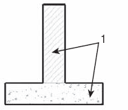
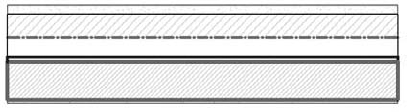
For example, when you draw a floor above your exterior walls and use the "pick walls" method, the option to extend to the core of the wall is available on the Options bar. You can choose to offset your floor from the core layer as well. This floor creation method results in an explicit relationship between the floor and the underlying wall core layer. If any wall changes position, the floor follows and stays related to the wall core layer—even if the wall type is changed. Figure 5.1, which shows a section through a wall and floor, demonstrates that the sketch of a floor representing its boundary can be constrained to a certain layer or offset from the core boundary of the wall. If you created your floor using the pick walls method, the relationship between the floor and the wall will happen automatically.

Figure 5.1. Section through wall and floor: the sketch of a floor representing its boundary can be constrained to a certain layer or offset from the core boundary of the wall.
If you decided to use the draw method instead of the pick walls method and you still want your floors to be dependent on the position of the walls and have a relationship with them, you need to manually lock the relationship so that the dependency is established. To get the locks that create constraints between aligned elements to appear, select and drag the sketch lines of the floor over the walls (or use the align tool) so that they are coincident with the boundary or core lines of the walls, and then click the blue lock icon to establish the relationship. If your floor sketch lines were already coincident with the wall lines, just select one, drag it away from the coincident wall line, and drag it back Another way to do this is to use the align tool. The lock icon will appear and you will be able to lock it.
To access and edit wall-core boundaries and material layers, first select a wall and click the Element Properties button. In the Instance Properties dialog box, click the Edit Type button to open the Type Properties dialog box. Select the Structure parameter to open the Edit Assembly dialog box. Here you can define materials, move layers in and out of the core boundary, and assign functions to each layer (see Figure 5.2).
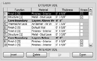
Figure 5.2. Each wall type is composed of layers of material, defined in the Layers portion of the Edit Assembly dialog box.
If you have a series of wall types that are standard in your office, you'll want to create them and add them to your project template right from the beginning so that they are available to all team members at all times. Creating new wall types involves duplicating an existing type, and then modifying wall structure and type properties. A wall can be a simple structure (a single-layered wall, which is typically used for resolving early design decisions) or a complex structure (a multilayered wall, which is used when the design becomes more resolved in terms of level of detail). If you need to make new types that are not part of your template, you can create new wall types on the fly at any stage in a project by duplicating existing types, adding or removing wall layers, and adjusting parameters to meet your requirements. The Edit Assembly dialog box, shown in Figure 5.3, is where you define the layers of the wall type. This dialog box is divided into four zones: the Preview window, the Layers table, the Default Wrapping option, and the Modify Vertical Structure option (which is available only when the section preview is active).

On the left side of the dialog box, you will see a graphical preview of the wall structure in plan view (the default one) or section view. (If you don't see the preview, click the Preview button at the bottom of the dialog box.) To switch from the default plan view preview to the section view preview, or vice versa, click the drop-down list under View to choose another viewing option. In the preview, the core boundaries of the wall are drawn with green lines. Note that in the section preview, when you select a row in the Layers table, the layer is highlighted in red.
The Layers table is where you add, delete, move, and define layers of the wall structure. Each wall layer is represented as a separate row of information. Note that two of the rows are gray: they represent the boundaries of the core of the wall, which usually define each face of the structural part of the wall. They don't represent any physical component but are just a visual representation of the separation between the structural and nonstructural components of the wall. In between those two gray zones is the wall's structural core layer.
The table is divided into four columns:
- Function
This column provides six choices for wall functions that relate to the purpose of the material in the wall assembly. Each of those functions defines a priority that determines how it joins with other walls, floors, and roofs:
- Structure [1]
Defines the structural components of the wall that should support the rest of the wall layers. This function gives the highest priority to a wall layer and allows it to join with other structural layers by cutting through lower-priority layers.
- Substrate [2]
Forms a foundation for other layers (materials such as plywood or gypsum board).
- Thermal/Air [3]
Defines the wall's thermal insulation layer.
- Membrane Layer
A zero-thickness material that usually represents vapor prevention.
- Finish 1 [4]
A finish layer to use if you have only one layer of finish (gypsum wall board).
- Finish 2 [5]
A secondary, weaker finish layer (plaster, tiles, or brick).
With the exception of the membrane layer, which has no priority assigned, all the other layers have a priority value from 1 to 5, with 1 the highest priority. Revit uses the priorities of the layers in a wall to determine how to clean up the intersections between various layers when two or more walls meet at an intersection. The principle is simple: priority 1 is the highest in order; a layer that has a value of 1 will cut through any other layer with a lower priority value (2, 3, 4, 5). A layer with priority 2 will cut layers with priority 3, 4, or 5, and so on. Logically, the layer with priority 1 should be placed between the core limits and represents the core of the wall (the structural component); the other layers should be outside the core. Revit starts sorting out wall joins by beginning with the highest-priority components and then working down the priorities. Look at Figure 5.4, in which layers with the same priority clean up when joined. Layers with priority 1 join and clean up first, and then the layers with priority 4 clean up.

- Material
Associating a material to a wall layer provides graphical as well as physical characteristics for the wall. With a material, you can calculate the quantity of that material used in your project and schedule this information. The material also knows how to graphically clean up when it joins with other walls, floors, and roofs that are made of the same material. Finally, a material will define the color and graphical pattern of a layer.
How does a material definition affect the cleanup? The material usage informs Revit how to treat wall layers at intersections. If the priority of the layers is the same and the material is the same, Revit cleans up the join between these two layers, creating a graphically consistent material representation. If the materials are different, even though their priority is the same, Revit separates the two layers graphically with a thin line. Figure 5.5 shows two layers with the same priority (1) but different materials: the cleanup between the layers isn't taking place because of the different materials used.
- Thickness
This value represents the actual thickness of the material. Note that the membrane layer is the only layer that can have a zero-thickness value.
- Wraps
Wall layers rarely end with a straight-cut finish at wall ends or wall penetrations (windows and doors). This option allows a layer to wrap around other layers. Figure 5.6 shows layer wrapping defined within a window family in the Family Editor. You can define different settings for wrapping the end of walls or openings. Looking again at Figure 5.6, the image on the left shows wrapping applied only to the first exterior component of the wall; only that layer wraps around the window opening. On the right, the first and second exterior components have wrapping active, so they both wrap around the opening of the window.
To create a wrapping solution for openings that reflect a real-life condition, this setting probably won't be sufficient. All you can define in the Wall Editor is if a material layer will wrap and whether it's an exterior or interior wrap. The Wall Editor alone can only solve wrapping conditions in a generic way. To achieve more complex wraps like the one shown in Figure 5.6, you must define another set of rules in the Family Editor while creating the window or door family itself. These additional settings, combined with the wrap function of the wall layer, will produce more complex wraps at opening conditions.

To summarize, editing the wall structure means adding or deleting wall layers. Each of those layers needs to be associated with a priority, material, thickness, and wrap information. To move layers up and down in the table, or to add and remove layers, use the buttons at the bottom of the dialog box.
Once layers have been defined and positioned, you need to consider a few more properties.
Each wall layer can either wrap or not wrap at the ends of the wall or at inserts (windows, doors, openings). To make this happen in the project, you must decide whether the wrapping should occur at openings or wall ends or at both. For inserts, you can choose Do Not Wrap, Exterior, Interior, or Both. Similarly, for wall ends, the options are None, Exterior, and Interior. The default wrapping parameters appear in both the Edit Assembly dialog box (Figure 5.3) and the wall's Type Properties dialog box, as shown here:

Walls are often complex and articulated in their composition. Cornices, reveals, corrugated metal finish, and other elements are used all the time. Revit can accommodate any of these types of design articulation, and this is the place where all that is handled. See Chapter 12, "Extended Modeling Techniques—Walls," for a detailed explanation of these functions.
Walls have only two different styles of graphic display for the three levels of detail: one for Coarse views and another for Medium and Fine views. You will notice that changing from Medium to Fine view, and vice versa, has no effect on the graphic display of the wall, because they use the same representation.
- Coarse Display
This is defined as a type property for each wall family, and is typically used for 1:200 scaled drawings. You can set both Coarse Scale Fill Pattern as well as Coarse Scale Fill Color. If no Coarse Scale fill is set, then the wall category material (set in Object Styles) will be used.
- Medium/Fine Display
This is defined in the Type Properties dialog box in the wall assembly. The materials used for each layer establish the cut and surface patterns of the wall. These types of display will be rich in detail and show each layer of the wall.
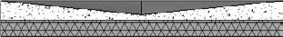
In Figure 5.7, Coarse Scale Fill Pattern is set to a solid fill and Color to black. On the left is the Coarse view: Individual layers are not displayed; a black Coarse Fill pattern is assigned. On the right, Medium/Fine view displays all wall layers. You can see the difference in how these walls present in the same plan at different scales, and thus different levels of detail.
Rather than setting the wall fill to solid black as a coarse display option, you can also use the visibility settings of a view to override the cut value of many objects (walls, floors, roofs, ceilings, and so forth) to a solid black fill at one time. This technique will save you significant time compared to manually joining geometry between host elements during design.

Figure 5.7. On the left is the Coarse view: individual layers are not displayed; a black Coarse Fill pattern is assigned. On the right: Medium/Fine view displays all wall layers.
Managing Layer Position
When you insert new wall layers, you will notice in the Layers table that the newly created wall layer is always positioned below the active wall layer (the selected layer). To position your new wall layer where you want it, either you can click the Insert button and use the Up and Down buttons to position the new wall layer, or you can select the layer you want to reposition with the mouse (place the mouse at the beginning of the line and select the entire line, as shown in Figure 5.3, and again, use the Up and Down buttons to reposition it where you need it). By default, each time you insert a new wall layer, it has a Priority value of Structure [1], a Material setting of By Category, and a Thickness value of 0. Also, Wrap is selected.

Note that you cannot delete the wall layer between the two gray lines (the core that represents the structural portion of the wall) if it is the only layer or the last one. A structural layer must exist and have at least one layer that has a value greater than zero. If you create a wall that has only one material (like a concrete foundation wall), you must place that one concrete layer between the gray core-boundary lines.
Each wall assembly has a function whose value is Interior, Exterior, Foundation, Retaining, Soffit, or Core-Shaft, as specified in the Wall Type properties. Changing this parameter doesn't affect the geometry of the wall, but setting it correctly allows you to control the visibility of walls and is useful for scheduling purposes. Another important use of this categorization is during export to DWG: you will be able to assign each functional wall type to a different CAD layer for export.
The process of creating floor and roof types is similar to that for walls. Editing the floor structure follows the same principles as editing the wall structure. One notable difference is that floors and roofs do not involve Wraps—in the Floor Editor, this parameter is always grayed out. On the other hand, multilayered floors have an additional parameter (that wall layers don't have) that allows the layer to vary in thickness if the floor is sloped. This appears in the Layers table as a new column named Variable (Figure 5.8). The Variable parameter is available only for Floor and Roof structures.

Revit allows you to slope floors and roofs by adding points and ridges that can then be manipulated to create creases and sloping forms. You do so using Shape Editing tools, which are available in the Shape Editing panel of the Modify Floors tab when a floor or roof is selected. The Shape Editing tools are explained in more detail in Chapter 13, "Extended Modeling Techniques—Roofs and Floors."

Floors or roofs that have been dynamically edited with these tools will have the Variable parameter enabled. If you select the Variable property, that layer can have a nonuniform thickness, as shown in Figure 5.9.
If the Variable property isn't selected, as in Figure 5.10, the layer in question has a uniform thickness, and the entire floor structure is going to be sloped.

Ceilings are also system families. Revit includes two different ceilings families: a generic ceiling that has no thickness or internal layers, and a multilayered ceiling that is identical to floors and roof in terms of functionality (Figure 5.11). Ceilings don't support the variable-layer thickness functionality we just mentioned, and they don't have a wrap function. What they can do (that floors and roofs cannot) is host ceiling-mounted lighting fixtures. This is very important to know: if you need to place light fixtures, you're going to have to add a ceiling.
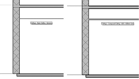
Figure 5.11. Ceilings can be generic (represented as one simple line) or compound (represented with layers).
Use the simple ceiling to model drop ceilings that are hung from the structure. These are typically only as thick as the acoustical tiles and don't need to be modeled as fully 3D forms. The multilayered ceiling is good for gypsum ceilings placed on joists.
Stairs are complex building elements and require a deep understanding of local standards, rules, and requirements. Check the local building code requirements (minimum width, maximum height) to confirm that you're using the correct stairwell dimensions and proper headroom. Formulas for calculating stairs are based on common codes and ergonomics. These may have slight variations in different regions, based on local conditions.
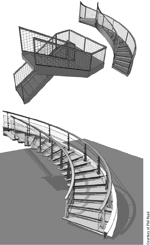
A number of parameters define the representation of stairs, including rules for risers, treads, and stringers; selection of construction techniques; and material used. All of these can be adjusted and made into types for use in your templates so that you always have the types of stairs that conform to the local building rules where you operate. Figure 5.12 illustrates different types of stairs that can be created in Revit.
In the Type Properties dialog box for stairs, you can control the following properties:
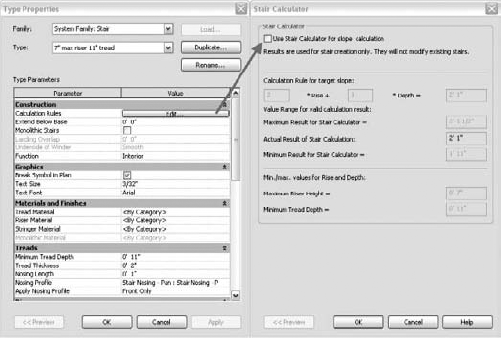
- Calculation rules
In the stair's Type Properties dialog box, in the Construction/Calculation rules, click the Edit button to open the calculation rules. To use the calculation functionality, select the option at the top of the Stair Calculator dialog box (see Figure 5.13). The calculation rule is based on the universal calculation formula that sets the value that should result depending on the size of the runs and risers. If this value can't be achieved, it should at least be within the minimum and maximum range you've defined.
- Extend Below Base
This field defines an offset between the base of the stair and the level where it starts. A positive value means the stair starts higher than its base level, and a negative value starts the stair below the base level. The top of the stair isn't affected by this parameter. This option is needed for conditions where the floor material demands that the stair start a bit higher or lower than the level.
- Monolithic Stair
When this option is checked, it changes the stair into a monolithic form where the stringers, risers, and treads are treated as the same material. This is great for making concrete stairs.
- Landing Overlap
This option is active only when the Underside of Winder option is selected (see the following explanation).
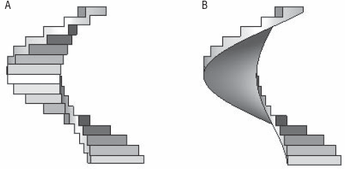
- Underside of Winder
This option is available only with monolithic stairs and has two values: Smooth and Stepped. They represent the treatment of the underside of the stairs, as shown in Figure 5.14.
- Break Symbol in Plan
This parameter shows a break line in plan. If it's selected, the break symbol appears at the cut height of the stair. The part of the stair that is beyond the break symbol (above the cut plane of the view) is shown with special subcategories of stairs: Stairs Beyond Cut Line and Stringers Beyond Cut Line. Each can be assigned a different color and line type. This setting is unique to the rest of the graphics used for the stair.
Figure 5.15 shows a stair with a visible break symbol (on the left), and the same stair with no break symbol (on the right).
- Text Size and Font
When creating stairs, you can set automatic appearance of Up and Down text that indicates the direction of the stairs. The text size and font define the properties of that text.
- Material
You can set different materials for various components of the stairs. When the Monolithic Stair option is selected, some of the options under Material will become grayed out as only one material will be considered for the entire stair.
- Minimum Tread Depth
This parameter controls the depth of a tread. Once you place a stair in a project, you can set the Actual Tread Depth in the stair's instance parameters. If this value is less than the type property Minimum Tread Depth, Revit gives you an error message alerting you to the problem.
- Tread Thickness
This parameter controls the thickness of each tread.
- Nosing Length
As the name suggests, this parameter controls the length of a nosing in a stair. When this parameter has a value of 0, no nosing is applied to the stair. A positive value for this parameter results in a nosing being exposed on all treads.
- Nosing Profile
This is where you can set the nosing profile that is used when Nosing Length has a positive value. You can create any custom Profile family for the nosing—the Family Editor includes a Profile-Stair Nosing family template you need to use. Once you have the custom nosing family, you load it in the template (project) and associate it with a certain stair type.
- Apply Nosing Profile
This determines where the nosing profile is placed relative to the tread. The available values are Front Only; Front and Left; Front and Right; and Front, Left, and Right. No Back option is available.
- Maximum Riser Height
This field defines the maximum allowed value for a riser. Usually, this setting depends on regulations set in the local building code as well as the type of building.
- Begin with a Riser, End with a Riser
These settings control the start and end of the stair and the connection with the landing.
- Riser Type
There are three possible types: None, Straight, and Slanted. As shown in Figure 5.16, this is fairly self-explanatory for the riser. For the slanted type, you can't define the angle of the slope; that value is a result of the length of the tread and the profile of the nosing.
- Riser Thickness
This value defines the thickness of the riser material.
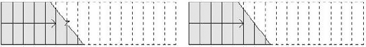
- Riser to Tread Connection
There are two options: Extend Riser behind Tread, as shown on the left, and Extend Tread under Riser, as shown on the right:

- Trim Stringers at Top
This option controls how the stringer finishes its geometry at the top of the flight (see Figure 5.17).
- Stringer Left/Right
The setting povides three options for stringer geometry:
None: No stringers applied to the stair.
Closed: The stringers are placed on the sides of the stair.
Open: The stringers are placed below the stair and are cut away by risers and treads.
Note that if you have a stair with stringers and decide to change the type to Monolithic Stair, the stringer will disappear.
- Middle Stringers
This option allows you to add one or more stringers below the stair. When more than one is added, they're evenly spaced.
- Thickness/Height of Stringers
This option gives you dimensional control over the stringers.
- Open Stringer Offset
This option is active only if the stringers are defined as open. This parameter controls the position of the stringer relative to the stair.
- Stringer Carriage Height
This is the value between the stringer height and the treads. The larger the value, the deeper the stringer goes below the treads (the tread position stays the same).

- Landing Carriage Height
This value controls the distance between the bottom of the landing and the bottom edge of the stringer.


Doors and windows are external families (RFA files) and are loaded into a project as needed. You should include door and window families that you use most frequently in your templates, and should remove content that you do not use.
You can create initial types using the Family Editor or loading from the existing library, and there is no limit to the number of additional types you can create in the context of a project. The same principle applies to other standard families such as furniture, plumbing fixtures, lighting fixtures, and so on. As you develop doors and window families that you think will be used downstream in many projects, be sure to load them into your default templates.
To see why type catalogs are useful, you need to understand the various ways types of families can be created.
Library elements (referred to as component or standard families) often come in different sizes and colors while maintaining the essential shape. Revit allows you to embed many variations of an element in terms of size and material in a single family by creating different types of that family. Each type corresponds to a combination of user-defined values that control the size and material. In Figure 5.18, you can see three types of the same table that come in three different sizes and three different chair configurations. They're all the same family, but each variation in table size is captured as a separate type. The geometry and number of chairs are all controlled parametrically, allowing for many types to be generated.

You can create types of Revit elements in different ways and places, depending on the elements as well as the intended purpose of the types or their number:
You can create types of families in the project environment using the duplication method
You can set them in the family environment
You can also use a type-catalog approach. This is used in cases where you need more than five or six types, such as 50-plus different sizes of manufactured steel columns
Keep in mind that all the family types defined in the Family Editor are loaded when the family is placed in a project, even if you only use one of the defined types. By using a type catalog, only the types that you select are loaded into the project (and you may load other types as needed as the project progresses).
When you create new types in a project environment, they exist only in that project. The process for creating a new type of element involves duplicating an existing type and giving it a new name and new parameter values. For example, select a wall and open its Instance Properties dialog box using right-click menu to access element properties. In the Instance Properties dialog box, click Edit Type and then click Duplicate. Give the wall a new name, and change its properties to reflect the new type you need. If you want to reuse that new type in another project, you can use the Transfer Project Standards tool located on the Manage tab in the Project Settings panel. This tool copies those types in another project, and they will be available for use from then on. You can create types of both standard and system families using this method.
Creating family types in the Family Editor applies only to component (standard) families. You create new types using the Types tool in the Family Properties panel of the Create tab in the Family Editor. (To open the Family Editor, you'll need to open any existing RFA family, or select the Application Menu
The strategy of defining types in the Family Editor isn't always applicable depending on the number of types you need per element. If you think you'll have more than five or six different types, consider using the type-catalog strategy instead of making the types in the family. Type catalogs are the best way to define many types by entering textual information that a family then uses to construct a list of possible types.
Each family type uses a certain amount of memory for its definition. When you load a family into a project, every type in that family is automatically loaded. There is no way to selectively load types of a given family created in the Family Editor. If you have lots of families with lots of types, this can consume unnecessary memory and bloat your file size, especially if you need just one type of each and many remain unused. Additionally, when you have several types defined in a family and you load them in a project, the list of available types can become long and the Type Selector becomes difficult to search through.
Think about it this way: each potential option creates a new permutation, so introducing another option causes the permutations to expand exponentially. A simple desk with three options each for length, width, and height? 3 × 3 × 3 = 27 permutations. What happens if you add two hardware options? 54 permutations. Three finish options? 162 possible permutations! Things can get busy fast, making your project "heavier" than necessary.
This is where type catalogs can help. They allow you to define many different types (size combinations) of an element, which can then be selectively loaded into your project. A type catalog is a text-formatted list that contains all the dimensions of the family for each type variation and can include an infinite number of types. The catalog is a separate .txt file related to the family. To create a type catalog file, all you need is a simple text editor (Notepad, for example). When you load a family associated with a type catalog, you get the option to choose which types to load in.
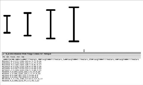
When you're creating a type catalog, the .txt file has to have the same name as the RFA family and be located in the same folder as the family. Figure 5.19 shows a steel column that comes in many different sizes (for example, in cases when you need more than 20 types) and what the corresponding type catalog looks like.
Let's take a look at how to create a type catalog.
To create and edit a type catalog, keep in mind these syntax rules:
The type catalog must have the exact same name as the family it's associated with. The only difference should be the file extension (
.txt). In the example in Figure 5.19, the family is calledMMiscellaneous Wide Flange-Column.rfaand the matching type catalog isMMiscellaneous Wide Flange-Column.txtThe type catalog has to be stored in the same directory as the family. The example mentioned can be found in the following standard installation locations:
Imperial sizes:
C:Documents and SettingsAll UsersApplication DataAutodeskRAC 2010Imperial LibraryStructuralColumnsSteelMetric sizes:
C:Documents and SettingsAll UsersApplication DataAutodeskRAC 2010Metric LibraryStructuralColumnsSteel
Each value must be delimited with a comma or semicolon, depending on the regional settings of your PC. Note that the first line must also begin with a delimiter
The first line in the type-catalog file declares the parameters that will be taken into account in the type catalog:
,W##other##,A##area##inches,d##length##inches,tw##length##inches,bf##
length##inches,tf##length##inches,k##length##inches
or
;Width##Length##millimeters; Height##Length##millimeters;Frame##other##
Let's look at the second example in more detail. The syntax is as follows:
Name of Parameter##Type of Parameter##UnitsName of Parameter corresponds to the name of a parameter in the family. You have to be careful when typing, because this value is case-sensitive. For example, if you have a Width parameter in the family, it should be shown as Width in the catalog as well. This parameter must be followed by two # symbols. Type of Parameter also must correspond to a type parameter in the family. The supported types are Length, Area, Volume, Angle, Force, and Linear Force. If the parameter in the family doesn't correspond to any of these, type Other. It may not seem obvious at first, but instance parameters may not be defined in type catalogs. You'll have to define instance parameters once the family is placed in the project.
Next, enter the units. These are the valid units that will work in a type catalog:
- Length
Inches, feet, meters, centimeters, and millimeters
- Area
Square feet, square inches, square meters, square centimeters, square millimeters, acres, and hectares
- Angle
Decimal degrees, minutes, and seconds
- Force
Newtons, decanewtons, kilonewtons, meganewtons, kips, kilograms-force, tonnes-force, and pounds
- Linear force
Newtons per meter, decanewtons per meter, kilonewtons per meter, meganewtons per meter, kips per foot, kilograms force per meter, tonnes force per meter, and pounds per foot
- Other
For Other, you don't specify a value; it can be anything. This is where you might define a material option or anything that is not defined as a length, area, or angle. In our case, it's Yes/No.
In the example, Width is a length parameter defined in millimeters, Height is also a length parameter defined in millimeters, and Frame is a parameter that has Other as its value and no defined units.
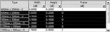
After editing the first line in the catalog, key in values to define types. Here is an example showing four types. Notice that each definition consists of name, length, height, and frame:
900mm × 400mm - D;900; 400; 1
900mm × 400mm;900; 400; 0
1200mm × 600mm − D;1200; 600; 1
1200mm × 600mm;1200; 600; 0
By having set this in the type catalog, you've created four types for one family. The first type is named 900mm × 400mm – D. The width of the element is 900mm, the height is 400mm, and there is a frame (Frame is defined in a family as a Yes/No parameter; in the type catalog, this value uses 1 for Yes and 0 for No). To better understand the principle of the type catalog, it's best to see it in table form:
Type Name | Width | Height | Frame |
|---|---|---|---|
900mm × 400mm – D | 900 | 400 | 1 |
900mm × 400mm | 900 | 400 | 0 |
1200mm × 600mm – D | 1200 | 600 | 1 |
1200mm × 600mm | 1200 | 600 | 0 |
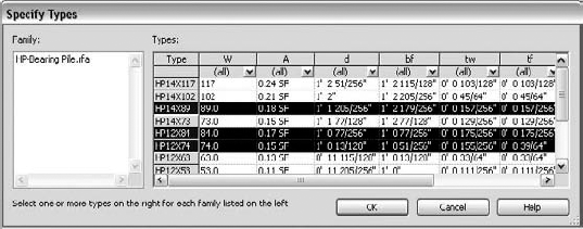
When you have a type catalog associated with a family and you load the family into a project, the Specify Types dialog box gives you the option to selectively load types from a table. This table lists type properties to help you sort and choose which types you want. Select one or many of these types (use Shift or Ctrl for multiple selections), and then click OK to load the family and selected types. Using the Ctrl key, you can select several types that aren't sequential. Figure 5.20 shows a Shift-selection, and Figure 5.21 shows a selection using the Ctrl key.
Having a well-thought-out project template can not only save you time but can also guarantee a higher level of graphical consistency between projects. This way, you don't have to become familiar with the settings in Revit and modify them each time you start a new project; you simply have to do it once and save it to a location that is accessible by everyone.
When dealing with multilayered walls, Revit uses object styles and represents the wall layers with a single cut-line style for all walls. As shown on the left in Figure 5.22, this cut line applies to the wall's outermost layer. This isn't flexible enough for some representations, where you may want to show only the core as a thick line and reduce the line weight of finish layers, as shown on the right in Figure 5.22. To add richer and more descriptive graphics to complex host structures, you need the ability to assign line thickness, type, and color to individual layers in a host structure (walls, floors, and roofs). You can do so on a per-view basis using graphical overrides; however, the settings can be stored in a view template and applied to other views.
You can change the line weight, color, and pattern of host layers. To do this, from the context menu select View Properties and open the Visibility/Graphic Overrides dialog box from a plan view. Then, choose the Overrides Host Layers option for Cut Line Styles (Figure 5.23). You need to check the Cut Line Style option to make the Edit button active.

Figure 5.22. (Left) The default representation of a cut line. (Right) The core layer can be made bolder and the finish layers thinner.

When the Host Layer Line Styles dialog box opens, you see that the wall functions are listed with options to adjust the line weight, color, and pattern. Changing these values lets you generate wall graphics. Figure 5.24 shows the effect of changing line weight, color, and pattern for walls.
You can also control the line styles for common edges. As shown in Figure 5.25, you can override host layers in the Host Layer Line Styles dialog box.
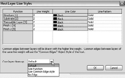
The Host Layer Line Styles dialog box also lets you define how the core layers should clean up:
- Default
All line weights, colors, and patterns use standard behavior.
- Use Function
This setting ignores the material settings (the line is never invisible) and sets the style of the separating line based on the layers' functional priorities. The style of a separating line is determined by the layer with the higher functional priority.
- Use Common Edge Style
This setting ignores the functional priorities and material settings and always uses the common edge style.
- No Edge
This option sets the separating line to invisible whenever the layers have the same fill pattern.
In addition to setting up the object styles for your templates, you should set up some other global settings in advance. In the Manage tab's Project Settings panel (Figure 5.26), you'll find global project settings that can be stored on a per-template basis.

Area and volume calculations are based on the height of the cut plane and the layer in a wall to which the calculation is measured. The Area and Volume Computations settings are located on the Home tab, after you expand the Room and Area panel. The Area and Volume Computations dialog box includes several predefinitions for you to consider (Figure 5.27). Here you can enable automatic calculation of Area only or Area and Volumes. We don't suggest enabling the volume calculation option at all times because it can slow down overall performance when you're working on your model. Do it only when you need the information or have to print out the documents that contain that information.
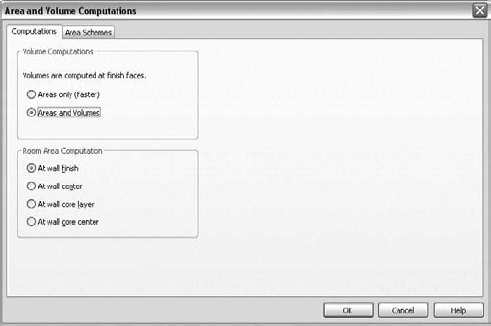
Figure 5.27. Area and Volume calculations are based on the height of the cut plane and the layer in a wall to which the calculation is measured.
You can also apply different rules for room calculations that relate to boundary options in walls. These include wall finish, center, core layer, and core center.
Finally, a very important factor for computation of rooms and areas is the cut height. The computation height is a property of a Level family. By default, it is set to Automatic, which is 4′ (1200mm) above the base level. You can change it to any other value. Changing the computational cut height in nonvertical rooms affects the perimeter used for computation. Some users apply the strategy of creating multiple-level families that use different computation heights.
These settings affect area plans that are used to convey building usage that extends beyond the shape and size of individual rooms, such as rentable area or office space. You access area plans from the View list of the Project Browser.
Depending on where the project is located or what country you work in, you'll use either metric or imperial units. In the Project Units dialog box (Figure 5.28), which is available from the Project Settings panel of the Manage tab, you can set the units for length, area, volume, angles, slope, and currency. Under each of these options, you can define a rounding value, rounding increment, and units suffix and decide whether you wish to show the plus symbol (+) for positive values.
Note that Revit allows for a combination of imperial and metric units within the context of the same project. For each unit type in the Project Units dialog box, you can specify the formatting that is most suitable. Also note that while the project settings establish a consistent baseline, you can override project unit settings for elements such as dimensions and schedules.

Keynotes are a great way to standardize on a numeric system for calling out materials and assemblies. Keynoting settings are available in the Annotate tab when you expand the Tags panel (click the little arrow in the panel). When setting up keynotes, define the following keynoting settings at the outset. First, set the keynote table path, as shown in Figure 5.29. The path defaults to the Revit library locations, but you may want to change this if you're using customized keynote files located on the office network. In this dialog box, you establish whether the numbering method for keynotes is By Keynote or By Sheet. We'll go into more detail about how to use keynoting in Revit in Chapter 19, "Annotating Your Model."

The Materials dialog can be accessed from the Manage tab (Figure 5.30). A full render appearance library ships with Revit, and you can use it to map rendering appearances to your existing Revit materials. To do so, select materials from the list on the left, and then click the Replace button to go to the Render Appearance Library (Figure 5.31).

Figure 5.30. Remapping concrete using the Materials toolset located in the Manage tab's Project Settings panel.

If you were using custom texture maps previously, then use the Generic Render appearance and remap the image files. Be sure to set appropriate scale using the Sample Size control. Keep in mind that for this to work in your templates, the images need to be accessible over the network by anyone who uses the template.
Whatever type of element you selected last with the Type Selector will be set in the project template as the default type during creation. Revit remembers the most recently used settings across sessions. It's therefore important that you set the types of your selected Revit elements as desirable defaults.
To set a default wall type, activate the Wall tool. Click the Change Element Type button to open the Type Selector. From the list, select the wall type that you wish to be the default choice. In the Element Properties dialog box or from the Options bar, select the wall height or set a top level, and select the wall location line. You never know which wall type you'll need in the next project, so we suggest setting this to a generic type. The selection of exact wall types can come later.
Your project template is loaded with windows and doors that are typically used in projects. Activate the window or door tools, then using the Change Element Type button to open the Type Selector, choose a default door and window family, and save your template. The last selected door and window will be default elements in the Type Selector when you place new elements. This applies to all other family elements in your template.
To streamline your workflow, set the dimension style used most commonly in your template. You can consider presetting:
The type of dimension (we suggest selecting Linear)
The reference selection that will be used when dimensioning a wall (to or from). Here the choices are the usual wall references: wall center, face, core face, and core center
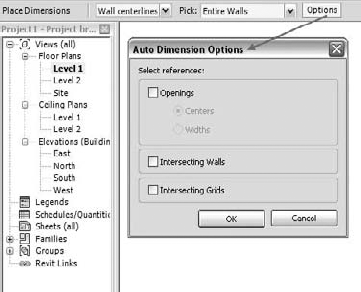
The selection method, or what we call manual versus automated dimensioning. In Revit, the Pick method can be Individual, where you're asked to click each instance you wish to dimension, or Entire Walls, where you click an element and it's dimensioned automatically. With the Entire Walls option, another dialog box prompts you to further define what elements are used as auto-dimension references when you click walls (Figure 5.32)
Many users find this to be one of the most helpful tools in Revit, as it aligns elements to any reference target in the model. Setting its options correctly will aid in smoothing your workflow. Preset which wall layer to which you want the Align tool to default. The options available for a wall are shown in Figure 5.33.

Set up levels and corresponding plan views in advance in your template to save time downstream. You can predefine the number of levels, their typical height, and naming convention (Figure 5.34).

If you've started building your template from an existing Revit template, you'll already have four default exterior elevations defined. If you started from scratch with no template (which we strongly recommend against), you'll need to create all four base elevations (south, east, north, and west) by placing elevation markers. (Note that we don't recommend that you ever start Revit using the None option when making a new file, as you'll have to define a great many things to make Revit work that are already defined in the default template.) It's very important that you also set the width and depth of the elevations. To do so, select the arrow of the elevation mark that activates the current width and depth; then you can adjust them accordingly (Figure 5.35).

For each view that you preset in the Revit template, you can define a scale, a level of detail, the state of the crop region (visible or not), and display settings (hidden lines, shaded view, and so on). But mostly, think of view templates when you preset your views, because they're the biggest time-savers—setting them in the templates will increase productivity significantly and help you maintain graphical consistency.
View templates let you define a desired set of view properties for any of your view typical types (plans, section, elevations, schedules, etc.). This is a great way to enforce graphic consistency across views. For example, if you want your architectural plan views to always show furniture as half-toned, you can define this in your plan view template. If someone changes the appearance of furniture to no longer be half-toned, you can reapply the view template to get the drawing back to its original configuration. To do this, right-click the view name in the Project Browser, and choose the Apply View Template option. Choose the desired template, and click OK.
Every view can have a default view template assigned to help streamline updating the view later in the process (Figure 5.36).
This doesn't automatically keep the view in sync with the view template, but it lets you select many views in the Project Browser and push their default view template back into the view. To do this, select multiple views in the Project Browser, and choose to apply the view template. Choose the option Default View Template.
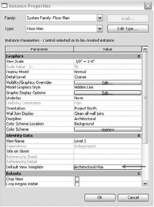
Figure 5.36. Views can have a default view template assigned to them to help streamline updating the view later in the process.
As your use of Revit on projects progresses, you'll find that you will have view settings you will use over and over again that will help quickly define many of the parameters in a new view. These can easily be for plans, details, sections, or any other view within the project. Once you've defined these view templates, add them to your project template so that you can quickly access them when you begin new projects.
All view template-related tools are available from the View tab's Graphics panel when you click the View Templates button. The last option, View Template Settings, is the place for creating, editing, and managing view templates. Look at the view templates that ship with the default template, and adjust these to suit your requirements. For example, the architectural plan scale (1:100) is set to 1/8″=1′−0″, as you can see in Figure 5.37. If this is too coarse for your needs, change the value to 1/4″=1′−0″ (1:50).

Color fill schemes let you apply color to room and area parameter values to help graphically illustrate spatial organization. Applying a color fill scheme to a plan or section view color-codes room properties such as department, name, and usage. It's good practice to predefine different color schemes that you're likely to use. Once a color scheme is defined, it can be applied to any number of plan views. Keep in mind that color is applied only to spaces that have been populated with room or area elements. If you want to make department-usage plans, think about prepopulating your color schemes with commonly used department and usage names. This will make the value available for rooms later so you don't have to manually type them in each time. For example, if you add "Accounting" as a value to a color scheme in your template that colors by department, then when you later go to a room's element properties to assign it a department, you'll see "Accounting" as a predefined choice in the drop-down list.
The Color Scheme settings are available from the Home tab when you expand the Room and Area panel.
- Create new types of system families.
Incorporating common building components in your project template is fundamental to using Revit effectively.
- Master It
How do you add/remove wall, floor, and roof types to your template?
- Use type catalogs.
Revit's type catalogs are an important tool for keeping the types you create accessible in a project.
- Master It
What are type catalogs used for?
- Customize project settings in your template.
View templates allow you to tailor views according to the requirements of a project.
- Master It
How would you set up a new view template for plan views where the surface pattern of floors is turned off?