
Chapter 18
Graphical Evaluation of Classification Models
18.1 Review of Lift Charts and Gains Charts
In Chapter 15, we learned about lift charts and gains charts. Recall that lift is defined as the proportion of positive hits in the set of the model's positive classifications, divided by the proportion of positive hits in the data set overall:
where a hit is defined as a positive response that was predicted to be positive. To construct a lift chart, the software sorts the records by propensity to respond positively, and then calculates the lift at each percentile. For example, a lift value of 2.0 at the 20th percentile means that the 20% of records that contain the most likely responders have twice as many responders as a similarly sized random sample of records. Gains charts represent the cumulative form of lift charts. For more on lift charts and gains charts, see Chapter 15.
18.2 Lift Charts and Gains Charts Using Misclassification Costs
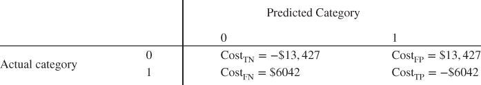
Lift charts and gains charts may be used in the presence of misclassification costs. This works because the software ranks the records by propensity to respond, and the misclassification costs directly affect the propensity to respond for a given classification model. Recall the Loans data set, where a bank would like to predict loan approval for a training data set of about 150,000 loan applicants, based on the predictors debt-to-income ratio, FICO score, and request amount. In Chapter 16, we found the data-driven misclassification costs to be as shown in the cost matrix in Table 18.1.
Table 18.1 Cost matrix for the bank loan example
 |
For illustration, classification and regression tree (CART) models were developed with and without these misclassification costs, and the resulting comparison lift chart is shown in Figure 18.1. The lift for the model with misclassification costs is shown to be superior to that of the model without misclassification costs, until about the 60th percentile. This reflects the superiority of the model with misclassification costs. This superiority is also reflected when accounting for cumulative lift, that is, in the gains chart shown in Figure 18.2.
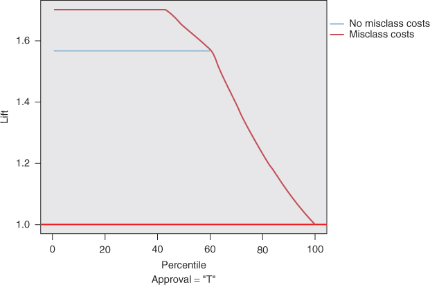
Figure 18.1 Model accounting for misclassification costs has greater lift than model without misclassification costs.
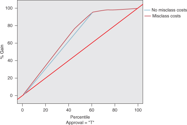
Figure 18.2 Model accounting for misclassification costs shows greater gains than model without misclassification costs, up to the 60th percentile.
18.3 Response Charts
Response charts are almost identical to lift charts, with the only difference being the vertical axis. Instead of measuring lift, the vertical axis indicates the proportion of positive hits in the given quantile (Figure 18.3). For example, at the 40th percentile, 84.8% of the most likely responder records for the model with misclassification costs are positive hits, compared to 78.1% of the most likely responder records for the model without misclassification costs. The analyst may choose when to use a lift chart or a response chart, based on the needs or quantitative sophistication of the client.
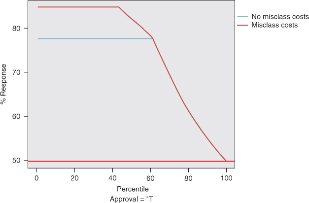
Figure 18.3 Response chart is same as lift chart, except for the vertical axis.
18.4 Profits Charts
Thus far, the model evaluation charts have dealt with positive hits, as measured by lift, gains, and response proportion. However, clients may be interested in a graphical display of the profitability of the candidate models, in order to better communicate within the corporation in terms that manager best understands: money. In such a case, the analyst may turn to profits charts or return-on-investment (ROI) charts.
Let profits be defined as follows:
To construct a profits chart in modeler, the analyst must specify the cost or revenue for each cell in the cost matrix. Figures 18.4 and 18.5 show how this may be done for the Loans data set, using derive nodes, and in Figure 18.6, using the evaluation node.
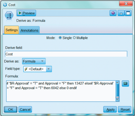
Figure 18.4 Specifying the cost of a false positive ($13,427) and a false negative ($6042) for the profits chart.

Figure 18.5 Specifying the revenue of a true positive ($6042) and a true negative ($13,427) for the profits chart.
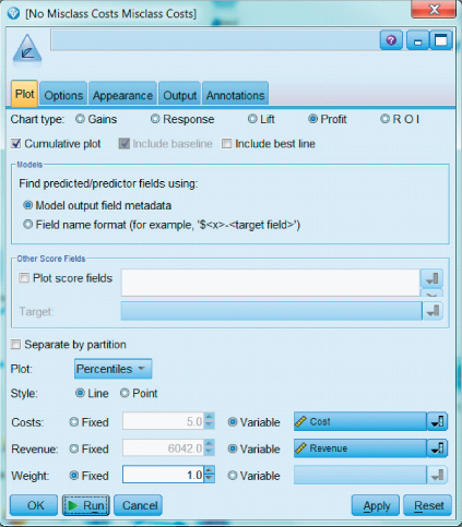
Figure 18.6 Constructing a profits chart in IBM Modeler, specifying the variable cost and revenue.
A profits chart expresses the cumulative profits that a company can expect, as we scan from the most likely hits to the less likely hits. A good profits chart increases to a peak near the center, and thereafter decreases. This peak is an important point, for it represents the point of maximum profitability.
For example, consider Figure 18.7, the profits chart for the Loans data set. For the model with misclassification costs, profits rise fairly steeply as the model makes its way through the most likely hits, and maxes out at the 44th percentile, with an estimated profit of $66,550,919. For the model without misclassification costs, profits rise less steeply, and do not max out until the 61st percentile, with an estimated profit of $53,583,427 (not shown). Thus, not only does the model with misclassification costs produce an extra $13 million, this increased profit is realized from processing only the top 44% of applicants, thereby saving the bank's further time and expense.
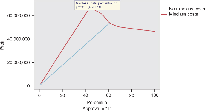
Figure 18.7 Profits chart for the Loans data set. Profits are maximized from processing only 44% of the applicants.
18.5 Return on Investment (ROI) Charts
Like profits charts, ROI plots involve revenues and costs. For each quantile, ROI is defined as follows:
That is, ROI is the ratio of profits to costs, expressed as a percentage.
The ROI chart for the bank loans data set is shown in Figure 18.8. The model without misclassification costs shows ROI of about 60% through the 60th percentile, which indicates what would normally be a fairly respectable ROI. However, the model with misclassification costs provides a very strong 150% ROI through the 60th percentile, two-and-a-half times greater than the model without misclassification costs.
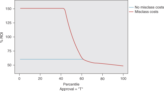
Figure 18.8 Return on investment (ROI) chart shows that the model with misclassification costs provides a very strong 150% ROI through the 60th percentile.
Note that all of these graphical evaluations, like all model evaluation techniques, need to be carried out on the test data set, not the training data set. Finally, although our examples in this chapter have dealt with the misclassification costs/no misclassification costs dichotomy, combined evaluation charts can also be used to compare classification models from different algorithms. For example, the profits from a CART model could be graphically evaluated against those from a C5.0 model, a neural network model, and a logistic regression model.
To summarize, in this chapter we have explored some charts that the analyst may consider useful for graphically evaluating his or her classification models.
R References
- Kuhn M. Contributions from Jed Wing, Steve Weston, Andre Williams, Chris Keefer, Allan Engelhardt, Tony Cooper, Zachary Mayer and the R Core Team. 2014. caret: Classification and regression training. R package version 6.0-24. http://CRAN.R-project.org/package=caret.
- Therneau T, Atkinson B, Ripley B. 2013. rpart: Recursive partitioning. R package version 4.1-3. http://CRAN.R-project.org/package=rpart.
- R Core Team. R: A Language and Environment for Statistical Computing. Vienna, Austria: R Foundation for Statistical Computing; 2012. ISBN: 3-900051-07-0, http://www.R-project.org/. Accessed 2014 Sep 30.
Exercises
1. What would it mean for a model to have a lift of 2.5 at the 15th percentile?
2. If lift and gains measure the proportion of hits, regardless of the cost matrix, why can we use lift charts and gains charts in the presence of misclassification costs?
3. What is the relationship between a lift chart and a gains chart?
4. What is a response chart? Which other chart is it similar to?
5. Which charts can the analyst use to graphically evaluate the classification models in terms of costs and revenues?
6. Describe what a good profits chart might look like.
7. What is ROI?
8. Should these charts be carried out on the training data set or the test data set? Why?
Hands-On Exercises
For Exercises 9–14, provide graphical evaluations of a set of classification models for the Loans data set. Do not include interest as a predictor. Make sure to develop the charts using the test data set.
9. Using the Loans_training data set, construct a CART model and a C5.0 model for predicting loan approval.
10. Construct a single lift chart for evaluating the two models. Interpret the chart. Which model does better? Is one model uniformly better?
11. Construct and interpret a gains chart comparing the two models.
12. Prepare and interpret a response chart comparing the two models. Compare the response chart to the lift chart.
13. Construct and interpret separate profits charts for the CART model and the C5.0 model. (Extra credit: Find a way to construct a single profits chart comparing the two models.) Where is the peak profitability for each model? At what percentile does peak profitability occur? Which model is preferred, and why?
14. Construct and interpret separate ROI charts for the two models. (Extra credit: Find a way to construct a single ROI chart comparing the two models.) Which model is preferred, and why?
For Exercises 15–18 we use rebalancing as a surrogate for misclassification costs, in order to add neural networks and logistic regression to our candidate models.
15. Neural networks and logistic regression in modeler do not admit explicit misclassification costs. Therefore undertake rebalancing of the data set as a surrogate for the misclassification costs used in this chapter.
16. Using the Loans_training data set, construct a neural networks model and a logistic regression model for predicting loan approval, using the rebalanced data.
17. Construct a single lift chart for evaluating the four models: CART, C5.0, neural networks, and logistic regression. Interpret the chart. Which model does better? Is one model uniformly better?
18. Construct and interpret a gains chart comparing the four models.
19. Prepare and interpret a response chart comparing four two models.
20. Construct and interpret separate profits charts for each of the four models. (Extra credit: Find a way to construct a single profits chart comparing the four models.) Where is the peak profitability for each model? At what percentile does peak profitability occur? Which model is preferred, and why?
21. Construct and interpret separate ROI charts for the four models. (Extra credit: Find a way to construct a single ROI chart comparing the four models.) Which model is preferred, and why?