
Chapter 15
Model Evaluation Techniques
As you may recall from Chapter 1, the cross-industry standard process (CRISP) for data mining consists of the following six phases to be applied in an iterative cycle:
- Business understanding phase
- Data understanding phase
- Data preparation phase
- Modeling phase
- Evaluation phase
- Deployment phase.
Nestled between the modeling and deployment phases comes the crucial evaluation phase, the techniques for which are discussed in this chapter. By the time we arrive at the evaluation phase, the modeling phase has already generated one or more candidate models. It is of critical importance that these models be evaluated for quality and effectiveness before they are deployed for use in the field. Deployment of data mining models usually represents a capital expenditure and investment on the part of the company. If the models in question are invalid, then the company's time and money are wasted. In this chapter, we examine model evaluation techniques for each of the six main tasks of data mining: description, estimation, prediction, classification, clustering, and association.
15.1 Model Evaluation Techniques for the Description Task
In Chapter 3, we learned how to apply exploratory data analysis (EDA) to learn about the salient characteristics of a data set. EDA represents a popular and powerful technique for applying the descriptive task of data mining. However, because descriptive techniques make no classifications, predictions, or estimates, an objective method for evaluating the efficacy of these techniques can be elusive. The watchword is common sense. Remember that the data mining models should be as transparent as possible. That is, the results of the data mining model should describe clear patterns that are amenable to intuitive interpretation and explanation. The effectiveness of your EDA is best evaluated by the clarity of understanding elicited in your target audience, whether a group of managers evaluating your new initiative or the evaluation board of the US Food and Drug Administration is assessing the efficacy of a new pharmaceutical submission.
If one insists on using a quantifiable measure to assess description, then one may apply the minimum descriptive length principle. Other things being equal, Occam's razor (a principle named after the medieval philosopher William of Occam) states that simple representations are preferable to complex ones. The minimum descriptive length principle quantifies this, saying that the best representation (or description) of a model or body of data is the one that minimizes the information required (in bits) to encode (i) the model and (ii) the exceptions to the model.
15.2 Model Evaluation Techniques for the Estimation and Prediction Tasks
For estimation and prediction models, we are provided with both the estimated (or predicted) value ![]() of the numeric target variable and the actual value y. Therefore, a natural measure to assess model adequacy is to examine the estimation error, or residual,
of the numeric target variable and the actual value y. Therefore, a natural measure to assess model adequacy is to examine the estimation error, or residual, ![]() . As the average residual is always equal to zero, we cannot use it for model evaluation; some other measure is needed.
. As the average residual is always equal to zero, we cannot use it for model evaluation; some other measure is needed.
The usual measure used to evaluate estimation or prediction models is the mean square error (MSE):
where p represents the number of model variables. Models that minimize MSE are preferred. The square root of MSE can be regarded as an estimate of the typical error in estimation or prediction when using the particular model. In context, this is known as the standard error of the estimate and denoted by ![]() .
.
For example, consider Figure 15.1 (excerpted from Chapter 8), which provides the Minitab regression output for the estimated nutritional rating based on sugar content for the 76 breakfast cereals with nonmissing sugar values. Both MSE = 84.0 and s = 9.16616 are circled on the output. The value of 9.16616 for s indicates that the estimated prediction error from using this regression model to predict nutrition rating based on sugar content alone is 9.16616 rating points.
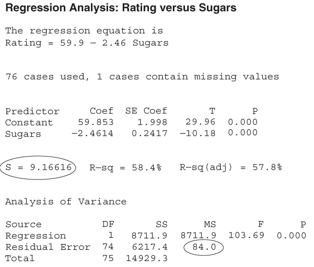
Figure 15.1 Regression results, with MSE and s indicated.
Is this good enough to proceed to model deployment? That depends on the objectives of the business or research problem. Certainly the model is simplicity itself, with only one predictor and one response; however, perhaps the prediction error is too large to consider for deployment. Compare this estimated prediction error with the value of s obtained by the multiple regression in Table 9.1: s = 6.12733. The estimated error in prediction for the multiple regression is smaller, but more information is required to achieve this, in the form of a second predictor: fiber. As with so much else in statistical analysis and data mining, there is a trade-off between model complexity and prediction error. The domain experts for the business or research problem in question need to determine where the point of diminishing returns lies.
In Chapter 12, we examined an evaluation measure that was related to MSE:
which represents roughly the numerator of MSE above. Again, the goal is to minimize the sum of squared errors over all output nodes. In Chapter 8, we learned another measure of the goodness of a regression model that is the coefficient of determination:
Where ![]() represents the proportion of the variability in the response that is accounted for by the linear relationship between the predictor (or predictors) and the response. For example, in Figure 15.1, we see that
represents the proportion of the variability in the response that is accounted for by the linear relationship between the predictor (or predictors) and the response. For example, in Figure 15.1, we see that ![]() , which means that 58.4% of the variability in cereal ratings is accounted for by the linear relationship between ratings and sugar content. This is actually quite a chunk of the variability, as it leaves only 41.6% of the variability left for all other factors.
, which means that 58.4% of the variability in cereal ratings is accounted for by the linear relationship between ratings and sugar content. This is actually quite a chunk of the variability, as it leaves only 41.6% of the variability left for all other factors.
One of the drawbacks of the above evaluation measures is that outliers may have an undue influence on the value of the evaluation measure. This is because the above measures are based on the squared error, which is much larger for outliers than for the bulk of the data. Thus, the analyst may prefer to use the mean absolute error (MAE). The MAE is defined as follows:
where ![]() represents the absolute value of x. The MAE will treat all errors equally, whether outliers or not, and thereby avoid the problem of undue influence of outliers. Unfortunately, not all statistical packages report this evaluation statistic. Thus, to find the MAE, the analyst may perform the following steps:
represents the absolute value of x. The MAE will treat all errors equally, whether outliers or not, and thereby avoid the problem of undue influence of outliers. Unfortunately, not all statistical packages report this evaluation statistic. Thus, to find the MAE, the analyst may perform the following steps:
15.3 Model Evaluation Measures for the Classification Task
How do we assess how well our classification algorithm is functioning? Classification assignments could conceivably be made based on coin flips, tea leaves, goat entrails, or a crystal ball. Which evaluative methods should we use to assure ourselves that the classifications made by our data mining algorithm are efficacious and accurate? Are we outperforming the coin flips?
In the context of a C5.0 model for classifying income, we examine the following evaluative concepts, methods, and tools in this chapter1
:
- Model accuracy
- Overall error rate
- Sensitivity and specificity
- False-positive rate and false-negative rate
- Proportions of true positives and true negatives
- Proportions of false positives and false negatives
- Misclassification costs and overall model cost
- Cost-benefit table
- Lift charts
- Gains charts.
Recall the adult data set from Chapter 11 that we applied a C5.0 model for classifying whether a person's income was low (≤$50,000) or high (>$50,000), based on a set of predictor variables which included capital gain, capital loss, marital status, and so on. Let us evaluate the performance of that decision tree classification model (with all levels retained, not just three, as in Figure 11.9), using the notions of error rate, false positives, and false negatives.
The general form of the matrix of the correct and incorrect classifications made by a classification algorithm, termed the contingency table,2 is shown in Table 15.1. Table 15.2 contains the statistics from the C5.0 model, with “![]() ” denoted as the positive classification. The columns represent the predicted classifications, and the rows represent the actual (true) classifications, for each of the 25,000 records. There
” denoted as the positive classification. The columns represent the predicted classifications, and the rows represent the actual (true) classifications, for each of the 25,000 records. There
Table 15.1 General form of the contingency table of correct and incorrect classifications
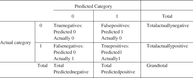 |
Table 15.2 Contingency table for the C5.0 model
 |
are 19,016 records whose actual value for the target variable income is less than or equal to 50,000, and there are 5984 records whose actual value income is greater than 50,000. The C5.0 algorithm classified 20,758 of the records as having income less than or equal to 50,000, and 4242 records as having income greater than 50,000.
Of the 20,758 records whose income is predicted by the algorithm to be less than or equal to 50,000, 18,197 of these records actually do have low income. However, the algorithm incorrectly classified 2561 of these 20,758 records as having income ![]() , when their income is actually greater than 50,000.
, when their income is actually greater than 50,000.
Now, suppose that this analysis is being carried out for a financial lending firm, which is interested in determining whether or not a loan applicant's income is greater than 50,000. A classification of income greater than 50,000 is considered to be positive, as the lending firm would then proceed to extend the loan to the person in question. A classification of income less than or equal to 50,000 is considered to be negative, as the firm would proceed to deny the loan application to the person, based on low income (in this simplified scenario). Assume that in the absence of other information, the default decision would be to deny the loan due to low income.
Thus, the 20,758 classifications (predictions) of income less than or equal to 50,000 are said to be negatives, and the 4242 classifications of income greater than 50,000 are said to be positives. The 2561 negative classifications that were made in error are said to be false negatives. That is, a false negative represents a record that is classified as negative but is actually positive. Of the 4242 positive classifications, 819 actually had low incomes so that there are 819 false positives. A false positive represents a record that is classified as positive but is actually negative.
Let TN, FN, FP, and TP represent the numbers of true negatives, false negatives, false positives, and true positives, respectively, in our contingency table. Also, let

Further, let ![]() represent the grand total of the counts in the four cells.
represent the grand total of the counts in the four cells.
15.4 Accuracy and Overall Error Rate
Using this notation we begin our discussion of classification evaluation measures with accuracy and overall error rate (or simply error rate):
Accuracy represents an overall measure of the proportion of correct classifications being made by the model, while overall error rate measures the proportion of incorrect classifications, across all cells in the contingency table. For this example, we have:
That is, 86.48% of the classifications made by this model are correct, while 13.52% are wrong.
15.5 Sensitivity and Specificity
Next, we turn to sensitivity and specificity, defined as follows:
Sensitivity measures the ability of the model to classify a record positively, while specificity measures the ability to classify a record negatively. For this example, we have
In some fields, such as information retrieval,3 sensitivity is referred to as recall. A good classification model should be sensitive, meaning that it should identify a high proportion of the customers who are positive (have high income). However, this model seems to struggle to do this, correctly classifying only 57.20% of the actual high-income records as having high income.
Of course, a perfect classification model would have sensitivity = 1.0 = 100%. However, a null model which simply classified all customers as positive would also have sensitivity = 1.0. Clearly, it is not sufficient to identify the positive responses alone. A classification model also needs to be specific, meaning that it should identify a high proportion of the customers who are negative (have low income). In this example, our classification model has correctly classified 95.69% of the actual low-income customers as having low income.
Of course, a perfect classification model would have specificity = 1.0. But so would a model which classifies all customers as low income. A good classification model should have acceptable levels of both sensitivity and specificity, but what constitutes acceptable varies greatly from domain to domain. Our model specificity of 0.9569 is higher than our model sensitivity of 0.5720, which is probably okay in this instance. In the credit application domain, it may be more important to correctly identify the customers who will default rather than those who will not default, as we shall discuss later in this chapter.
15.6 False-Positive Rate and False-Negative Rate
Our next evaluation measures are false-positive rate and false-negative rate. These are additive inverses of sensitivity and specificity, as we see in their formulas:
For our example, we have
Our low false-positive rate of 4.31% indicates that we incorrectly identify actual low-income customers as high income only 4.31% of the time. The much higher false-negative rate indicates that we incorrectly classify actual high-income customers as low income 42.80% of the time.
15.7 Proportions of True Positives, True Negatives, False Positives, and False Negatives
Our next evaluation measures are the proportion of true positives4 and the proportion of true negatives,5 and are defined as follows:
For our income example, we have
That is, the probability is 80.69% that a customer actually has high income, given that our model has classified it as high income, while the probability is 87.66% that a customer actually has low income, given that we have classified it as low income.
Unfortunately, the proportion of true positives in the medical world has been demonstrated to be dependent on the prevalence of the disease.6 In fact, as disease prevalence increases, PTP also increases. In the exercises, we provide a simple example to show that this relationship holds. Outside of the medical world, we would say that, for example, as the actual proportion of records classified as positive increases, so does the proportion of true positives. Nevertheless, the data analyst will still find these measures useful, as we usually use them to compare the efficacy of competing models, and these models are usually based on the same actual class proportions in the test data set.
Finally, we turn to the proportion of false positives and the proportion of false negatives, which, unsurprisingly, are additive inverses of the proportion of true positives and the proportion of true negatives, respectively.
Note the difference between the proportion of false-positives and the false-positive rate. The denominator for the false-positive rate is the total number of actual negative records, while the denominator for the proportion of false positives is the total number of records predicted positive. For our example, we have
In other words, there is a 19.31% likelihood that a customer actually has low income, given that our model has classified it as high income, and there is 12.34% likelihood that a customer actually has high income, given that we have classified it as low income.
Using these classification model evaluation measures, the analyst may compare the accuracy of various models. For example, a C5.0 decision tree model may be compared against a classification and regression tree (CART) decision tree model or a neural network model. Model choice decisions can then be rendered based on the relative model performance based on these evaluation measures.
As an aside, in the parlance of hypothesis testing, as the default decision is to find that the applicant has low income, we would have the following hypotheses:
- H0: income ≤ 50,000
- Ha: income > 50,000
where H0 represents the default, or null, hypothesis, and Ha represents the alternative hypothesis, which requires evidence to support it. A false positive would be considered a type I error in this setting, incorrectly rejecting the null hypothesis, while a false negative would be considered a type II error, incorrectly accepting the null hypothesis.
15.8 Misclassification Cost Adjustment to Reflect Real-World Concerns
Consider this situation from the standpoint of the lending institution. Which error, a false negative or a false positive, would be considered more damaging from the lender's point of view? If the lender commits a false negative, an applicant who had high income gets turned down for a loan: an unfortunate but not very expensive mistake.
However, if the lender commits a false positive, an applicant who had low income would be awarded the loan. This error greatly increases the chances that the applicant will default on the loan, which is very expensive for the lender. Therefore, the lender would consider the false positive to be the more damaging type of error and would prefer to minimize the proportion of false positives. The analyst would therefore adjust the C5.0 algorithm's misclassification cost matrix to reflect the lender's concerns. Suppose, for example, that the analyst increased the false positive cost from 1 to 2, while the false negative cost remains at 1. Thus, a false positive would be considered twice as damaging as a false negative. The analyst may wish to experiment with various cost values for the two types of errors, to find the combination best suited to the task and business problem at hand.
How would you expect the misclassification cost adjustment to affect the performance of the algorithm? Which evaluation measures would you expect to increase or decrease? We might expect the following:
The C5.0 algorithm was rerun, this time including the misclassification cost adjustment. The resulting contingency table is shown in Table 15.3. The classification model evaluation measures are presented in Table 15.4, with each cell containing its additive inverse. As expected, the proportion of false positives has increased, while the proportion of false negatives has decreased. Whereas previously, false positives were more likely to occur, this time the proportion of false positives is lower than the proportion of false negatives. As desired, the proportion of false positives has decreased. However, this has come at a cost. The algorithm, hesitant to classify records as positive due to the higher cost, instead made many more negative classifications, and therefore more false negatives. As expected, sensitivity has decreased while specificity has increased, for the reasons mentioned above.
Table 15.3 Contingency table after misclassification cost adjustment
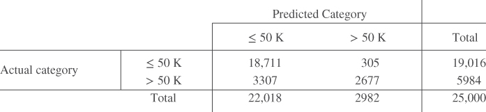 |
Table 15.4 Comparison of evaluation measures for CART models with and without misclassification costs (better performance in bold)
| Evaluation Measure | CART Model | |
| Model 1: Without Misclassification Costs | Model 2: With Misclassification Costs | |
| Accuracy | 0.8648 | 0.8552 |
| Overall error rate | 0.1352 | 0.1448 |
| Sensitivity | 0.5720 | 0.4474 |
| False-positive rate | 0.4280 | 0.5526 |
| Specificity | 0.9569 | 0.9840 |
| False-negative rate | 0.0431 | 0.0160 |
| Proportion of true positives | 0.8069 | 0.8977 |
| Proportion of false positives | 0.1931 | 0.1023 |
| Proportion of true negatives | 0.8766 | 0.8498 |
| Proportion of false negatives | 0.1234 | 0.1502 |
Unfortunately, the overall error rate has climbed as well:
Nevertheless, a higher overall error rate and a higher proportion of false negatives are considered a “good trade” by this lender, who is eager to reduce the loan default rate, which is very costly to the firm. The decrease in the proportion of false positives from 19.31% to 10.23% will surely result in significant savings to the financial lending firm, as fewer applicants who cannot afford to repay the loan will be awarded the loan. Data analysts should note an important lesson here: that we should not be wed to the overall error rate as the best indicator of a good model.
15.9 Decision Cost/Benefit Analysis
Company managers may require that model comparisons be made in terms of cost/benefit analysis. For example, in comparing the original C5.0 model before the misclassification cost adjustment (call this model 1) against the C5.0 model using the misclassification cost adjustment (call this model 2), managers may prefer to have the respective error rates, false negatives and false positives, translated into dollars and cents.
Analysts can provide model comparison in terms of anticipated profit or loss by associating a cost or benefit with each of the four possible combinations of correct and incorrect classifications. For example, suppose that the analyst makes the cost/benefit value assignments shown in Table 15.5. The “−$300” cost is actually the anticipated average interest revenue to be collected from applicants whose income is actually greater than 50,000. The $500 reflects the average cost of loan defaults, averaged over all loans to applicants whose income level is low. Of course, the specific numbers assigned here are subject to discussion and are meant for illustration only.
Table 15.5 Cost/benefit table for each combination of correct/incorrect decision
| Outcome | Classification | Actual Value | Cost | Rationale |
| True negative | ≤50,000 | ≤50,000 | $0 | No money gained or lost |
| True positive | >50,000 | >50,000 | −$300 | Anticipated average interest revenue from loans |
| False negative | ≤50,000 | >50,000 | $0 | No money gained or lost |
| False positive | >50,000 | ≤50,000 | $500 | Cost of loan default averaged over all loans to ≤50,000 group |
Using the costs from Table 15.5, we can then compare models 1 and 2:
- Cost of model 1 (false positive cost not doubled):

- Cost of model 2 (false positive cost doubled):

Negative costs represent profits. Thus, the estimated cost savings from deploying model 2, which doubles the cost of a false positive error, is
In other words, the simple data mining step of doubling the false positive cost has resulted in the deployment of a model greatly increasing the company's profit. Is it not amazing what a simple misclassification cost adjustment can mean to the company's bottom line? Thus, even though model 2 suffered from a higher overall error rate and a higher proportion of false negatives, it outperformed model 1 “where it counted,” with a lower proportion of false positives, which led directly to a six-figure increase in the company's estimated profit. When misclassification costs are involved, the best model evaluation measure is the overall cost of the model.
15.10 Lift Charts and Gains Charts
For classification models, lift is a concept, originally from the marketing field, which seeks to compare the response rates with and without using the classification model. Lift charts and gains charts are graphical evaluative methods for assessing and comparing the usefulness of classification models. We shall explore these concepts by continuing our examination of the C5.0 models for classifying income.
Suppose that the financial lending firm is interested in identifying high-income persons to put together a targeted marketing campaign for a new platinum credit card. In the past, marketers may have simply canvassed an entire list of contacts without regard to clues about the contact's income. Such blanket initiatives are expensive and tend to have low response rates. It is much better to apply demographic information that the company may have about the list of contacts, build a model to predict which contacts will have high income, and restrict the canvassing to these contacts classified as high income. The cost of the marketing program will then be much reduced and the response rate may be higher.
A good classification model should identify in its positive classifications (the >50,000 column in Tables 15.2 and 15.3), a group that has a higher proportion of positive “hits” than the database as a whole. The concept of lift quantifies this. We define lift as the proportion of true positives, divided by the proportion of positive hits in the data set overall:
Now, earlier we saw that, for model 1,
And we have
Thus, the lift, measured at the 4242 positively predicted records, is
Lift is a function of sample size, which is why we had to specify that the lift of 3.37 for model 1 was measured at n = 4242 records. When calculating lift, the software will first sort the records by the probability of being classified positive. The lift is then calculated for every sample size from n = 1 to n = the size of the data set. A chart is then produced that graphs lift against the percentile of the data set.
Consider Figure 15.2, which represents the lift chart for model 1. Note that lift is highest at the lowest percentiles, which makes sense as the data are sorted according to the most likely positive hits. The lowest percentiles have the highest proportion of positive hits. As the plot moves from left to right, the positive hits tend to get “used up,” so that the proportion steadily decreases until the lift finally equals exactly 1, when the entire data set is considered the sample. Therefore, for any lift chart, the highest lift is always obtained with the smallest sample sizes.
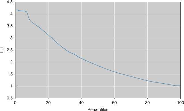
Figure 15.2 Lift chart for model 1: strong lift early, then falls away rapidly.
Now, 4242 records represents about the 17th percentile of the 25,000 total records. Note in Figure 15.2 that the lift at about the 17th percentile would be near 3.37, as we calculated above. If our market research project required merely the most likely 5% of records, the lift would have been higher, about 4.1, as shown in Figure 15.2. However, if the project required 60% of all records, the lift would have fallen off to about 1.6. As the data are sorted by positive propensity, the further we reach into the data set, the lower our overall proportion of positive hits becomes. Another balancing act is required: between reaching lots of contacts and having a high expectation of success per contact.
Lift charts are often presented in their cumulative form, where they are denoted as cumulative lift charts, or gains charts. The gains chart associated with the lift chart in Figure 15.2 is presented in Figure 15.3. The diagonal on the gains chart is analogous to the horizontal axis at lift = 1 on the lift chart. Analysts would like to see gains charts where the upper curve rises steeply as one moves from left to right and then gradually flattens out. In other words, one prefers a deeper “bowl” to a shallower bowl. How do you read a gains chart? Suppose that we canvassed the top 20% of our contact list (percentile = 20). By doing so, we could expect to reach about 62% of the total number of high-income persons on the list. Would doubling our effort also double our results? No. Canvassing the top 40% on the list would enable us to reach approximately 85% of the high-income persons on the list. Past this point, the law of diminishing returns is strongly in effect.
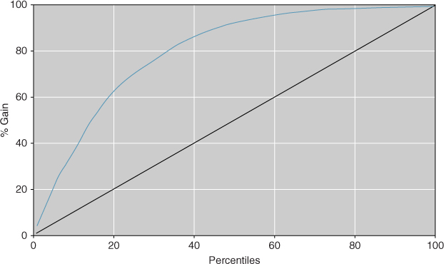
Figure 15.3 Gains chart for model 1.
Lift charts and gains charts can also be used to compare model performance. Figure 15.4 shows the combined lift chart for models 1 and 2. The figure shows that when it comes to model selection, a particular model may not be uniformly preferable. For example, up to about the 6th percentile, there appears to be no apparent difference in model lift. Then, up to approximately the 17th percentile, model 2 is preferable, providing slightly higher lift. Thereafter, model 1 is preferable.

Figure 15.4 Combined lift chart for models 1 and 2.
Hence, if the goal were to canvass up to the top 17% or so of the people on the contact list with high incomes, model 2 would probably be selected. However, if the goal were to extend the reach of the marketing initiative to 20% or more of the likely contacts with high income, model 1 would probably be selected. This question of multiple models and model choice is an important one, which we spend much time discussing in Reference [1].
It is to be stressed that model evaluation techniques should be performed on the test data set, rather than on the training set, or on the data set as a whole. (The entire adult data set was used here so that the readers could replicate the results if they choose so.)
15.11 Interweaving Model Evaluation with Model Building
In Chapter 1, the graphic representing the CRISP-DM standard process for data mining contained a feedback loop between the model building and evaluation phases. In Chapter 7, we presented a methodology for building and evaluating a data model. Where do the methods for model evaluation from Chapter 15 fit into these processes?
We would recommend that model evaluation become a nearly “automatic” process, performed to a certain degree whenever a new model is generated. Therefore, at any point in the process, we may have an accurate measure of the quality of the current or working model. Therefore, it is suggested that model evaluation be interwoven seamlessly into the methodology for building and evaluating a data model presented in Chapter 7, being performed on the models generated from each of the training set and the test set. For example, when we adjust the provisional model to minimize the error rate on the test set, we may have at our fingertips the evaluation measures such as sensitivity and specificity, along with the lift charts and the gains charts. These evaluative measures and graphs can then point the analyst in the proper direction for best ameliorating any drawbacks of the working model.
15.12 Confluence of Results: Applying a Suite of Models
In Olympic figure skating, the best-performing skater is not selected by a single judge alone. Instead, a suite of several judges is called upon to select the best skater from among all the candidate skaters. Similarly in model selection, whenever possible, the analyst should not depend solely on a single data mining method. Instead, he or she should seek a confluence of results from a suite of different data mining models.
For example, for the adult database, our analysis from Chapters 11 and 12 shows that the variables listed in Table 15.6 are the most influential (ranked roughly in order of importance) for classifying income, as identified by CART, C5.0, and the neural network algorithm, respectively. Although there is not a perfect match in the ordering of the important variables, there is still much that these three separate classification algorithms have uncovered, including the following:
- All three algorithms identify Marital_Status, education-num, capital-gain, capital-loss, and hours-per-week as the most important variables, except for the neural network, where age snuck in past capital-loss.
- None of the algorithms identified either work-class or sex as important variables, and only the neural network identified age as important.
- The algorithms agree on various ordering trends, such as education-num is more important than hours-per-week.
Table 15.6 Most important variables for classifying income, as identified by CART, C5.0, and the neural network algorithm
| CART | C5.0 | Neural Network |
| Marital_Status | Capital-gain | Capital-gain |
| Education-num | Capital-loss | Education-num |
| Capital-gain | Marital_Status | Hours-per-week |
| Capital-loss | Education-num | Marital_Status |
| Hours-per-week | Hours-per-week | Age |
| Capital-loss |
When we recall the strongly differing mathematical bases on which these three data mining methods are built, it may be considered remarkable that such convincing concurrence prevails among them with respect to classifying income. Remember that CART bases its decisions on the “goodness of split” criterion Φ(s|t), that C5.0 applies an information-theoretic approach, and that neural networks base their learning on back propagation. Yet these three different algorithms represent streams that broadly speaking, have come together, forming a confluence of results. In this way, the models act as validation for each other.
R References
- Kuhn, M, Weston, S, Coulter, N. 2013. C code for C5.0 by R. Quinlan. C50: C5.0 decision trees and rule-based models. R package version 0.1.0-15. http://CRAN.R-project.org/package=C50.
- R Core Team. R: A Language and Environment for Statistical Computing. Vienna, Austria: R Foundation for Statistical Computing; 2012. ISBN: 3-900051-07-0, http://www.R-project.org/.
Exercises
Clarifying the Concepts
1. Why do we need to evaluate our models before model deployment?
2. What is the minimum descriptive length principle, and how does it represent the principle of Occam's razor?
3. Why do we not use the average deviation as a model evaluation measure?
4. How is the square root of the MSE interpreted?
5. Describe the trade-off between model complexity and prediction error.
6. What might be a drawback of evaluation measures based on squared error? How might we avoid this?
7. Describe the general form of a contingency table.
8. What is a false positive? A false negative?
9. What is the difference between the total predicted negative and the total actually negative?
10. What is the relationship between accuracy and overall error rate?
11. True or false: If model A has better accuracy than model B, then model A has fewer false negatives than model B. If false, give a counterexample.
12. Suppose our model has perfect sensitivity. Why is that insufficient for us to conclude that we have a good model?
13. Suppose our model has perfect sensitivity and perfect specificity. What then is our accuracy and overall error rate?
14. What is the relationship between false positive rate and sensitivity?
15. What is the term used for the proportion of true positives in the medical literature? Why do we prefer to avoid this term in this book?
16. Describe the difference between the proportion of false-positives and the false-positive rate.
17. If we use a hypothesis testing framework, explain what represents a type I error and a type II error.
18. The text describes a situation where a false positive is worse than a false negative. Describe a situation from the medical field, say from screen testing for a virus, where a false negative would be worse than a false positive. Explain why it would be worse.
19. In your situation from the previous exercise, describe the expected consequences of increasing the false negative cost. Why would these be beneficial?
20. Are accuracy and overall error rate always the best indicators of a good model?
21. When misclassification costs are involved, what is the best model evaluation measure?
22. Explain in your own words what is meant by lift.
23. Describe the trade-off between reaching out to a large number of customers and having a high expectation of success per contact.
24. What should one look for when evaluating a gains chart?
25. For model selection, should model evaluation be performed on the training data set or the test data set, and why?
26. What is meant by a confluence of results?
Hands-On Analysis
Use the churn data set at the book series website for the following exercises. Make sure that the correlated variables have been accounted for.
27. Apply a CART model for predicting churn. Use default misclassification costs. Construct a table containing the following measures:
- Accuracy and overall error rate
- Sensitivity and false-positive rate
- Specificity and false-negative rate
- Proportion of true positives and proportion of false positives
- Proportion of true negatives and proportion of false negatives
- Overall model cost.
28. In a typical churn model, in which interceding with a potential churner is relatively cheap but losing a customer is expensive, which error is more costly, a false negative or a false positive (where positive = customer predicted to churn)? Explain.
29. Based on your answer to the previous exercise, adjust the misclassification costs for your CART model to reduce the prevalence of the more costly type of error. Rerun the CART algorithm. Compare the false positive, false negative, sensitivity, specificity, and overall error rate with the previous model. Discuss the trade-off between the various rates in terms of cost for the company.
30. Perform a cost/benefit analysis for the default CART model from Exercise 1 as follows. Assign a cost or benefit in dollar terms for each combination of false and true positives and negatives, similarly to Table 15.5. Then, using the contingency table, find the overall anticipated cost.
31. Perform a cost/benefit analysis for the CART model with the adjusted misclassification costs. Use the same cost/benefits assignments as for the default model. Find the overall anticipated cost. Compare with the default model, and formulate a recommendation as to which model is preferable.
32. Construct a lift chart for the default CART model. What is the estimated lift at 20%? 33%? 40%? 50%?
33. Construct a gains chart for the default CART model. Explain the relationship between this chart and the lift chart.
34. Construct a lift chart for the CART model with the adjusted misclassification costs. What is the estimated lift at 20%? 33%? 40%? 50%?
35. Construct a single lift chart for both of the CART models. Which model is preferable over which regions?
36. Now turn to a C4.5 decision tree model, and redo Exercises 17–35. Compare the results. Which model is preferable?
37. Next, apply a neural network model to predict churn. Construct a table containing the same measures as in Exercise 27.
38. Construct a lift chart for the neural network model. What is the estimated lift at 20%? 33%? 40%? 50%?
39. Construct a single lift chart which includes the better of the two CART models, the better of the two C4.5 models, and the neural network model. Which model is preferable over which regions?
40. In view of the results obtained above, discuss the overall quality and adequacy of our churn classification models.