Many years ago, when only the wealthy could afford access to education, tests and examinations were not used to evaluate the students. Instead, they were used to judge the teachers—parents wanted to know whether their children were learning enough to justify the instructors' wages. Obviously, this practice has changed over the years. Now, such evaluations are used to distinguish between high and low-achieving students, filtering them into careers and further educational opportunities.
Given the significance of this process, a great deal of effort is invested in developing accurate student assessments. A fair assessment will have a large number of questions to cover a wide breadth of topics and reward true knowledge over lucky guesses. The assessment should also include some questions requiring the student to think about a problem he or she has never faced before. Correct responses would indicate that the student can apply the knowledge more generally.
A similar process of exam writing can be used to imagine the practice of evaluating machine learners. As different algorithms have varying strengths and weaknesses, it is necessary to use tests that reveal distinctions among the learners when measuring how a learner will perform on future data.
This chapter provides the information needed to assess machine learners, such as:
- The reasons why predictive accuracy is not sufficient to measure performance, and the performance measures you might use instead
- Methods to ensure that the performance measures reasonably reflect a model's ability to predict or forecast unseen data
- How to use R to apply these more useful measures and methods to the predictive models we learned in previous chapters
As you will discover, just as the best way to learn a topic is to attempt to teach it to someone else, the process of teaching machine learners will also provide you with a greater insight into how to better the use of machine learning methods you've learned so far.
To measure classification performance in previous chapters, we used a measure of accuracy that divided the proportion of correct predictions by the total number of predictions. This number indicates the percentage of cases in which the learner is right or wrong. For instance, suppose a classifier correctly identified whether or not 99,990 out of 100,000 newborn babies are carriers of a treatable but potentially-fatal genetic defect. This would imply an accuracy of 99.99 percent and an error rate of only 0.01 percent.
Although this would appear to indicate an extremely accurate classifier, it would be wise to collect additional information before trusting your child's life to the test. What if the genetic defect is found in only 10 out of every 100,000 babies? A test that predicts "no defect" regardless of circumstances will still be correct for 99.99 percent of all cases. In this case, even though the predictions are correct for the large majority of data, the classifier is not very useful for its intended purpose, which is to identify children with birth defects.
The best measure of classifier performance is whether the classifier is successful at its intended purpose. For this reason, it is crucial to have measures of model performance that measure utility rather than raw accuracy. Toward this end, we will begin working with a variety of measures derived from predictions presented in a familiar format: the confusion matrix. Before we get started, however, we need to consider how to prepare classification results for evaluation.
There are three main types of data that are used to evaluate a classifier:
- Actual class values
- Predicted class values
- Estimated probability of the prediction
We used the first two types in previous chapters. The idea is to maintain two vectors of data: one holding the true, or actual class values and the other holding the predicted class values. Both vectors must have the same number of values stored in the same order. The predicted and actual values may be stored as separate R vectors or columns in a single R data frame. Either of these approaches will work with most R functions.
The actual class values come directly from the target feature in the test dataset. For instance, if your test data are in a data frame named test_data, and the target is in a column named outcome, we can create a vector of actual values using a command similar to actual_outcome <- test_data$outcome.
Predicted class values are obtained using the model. For most machine learning packages, this involves applying the predict() function to a model object and a data frame of test data, such as: predicted_outcome <- predict(model, test_data).
Until now, we have only examined classification predictions using these two vectors of data. Yet hidden behind-the-scenes is another piece of useful information. Even though the classifier makes a single prediction about each example, it may be more confident about some decisions than others. For instance, a classifier may be 99 percent certain that a SMS with the words "free" and "ringtones" is 99 percent spam, but is only 51 percent certain that a SMS with the word "tonight" is spam. In both cases, the classifier predicts a spam, but it is far more certain about one decision than the other.
Studying these internal prediction probabilities is useful to evaluate the model performance and is the source of the third type of evaluation data. If two models make the same number of mistakes, but one is more able to accurately assess its uncertainty, then it is a smarter model. It's ideal to find a learner that is extremely confident in making a correct prediction, but timid in the face of doubt. The balance between confidence and caution is a key part of model evaluation.
Unfortunately, obtaining the internal prediction probabilities can be tricky because the method for doing so varies across classifiers. In general, the predict() function for the classifier will allow you to specify the type of prediction you want. To obtain a single predicted class, such as spam or ham, you typically specify "class" type. To obtain the prediction probability, you typically specify a type such as prob, posterior, raw, or probability.
For example, to output the predicted probabilities for a naive Bayes classifier as described in Chapter 4, Probabilistic Learning – Classification Using Naive Bayes, you would use type = "raw" with the prediction function, such as: predicted_prob <- predict(model, test_data, type = "raw").
Similarly, the command for a C5.0 classifier as described in Chapter 5, Divide and Conquer – Classification Using Decision Trees and Rules is: predicted_prob <- predict(model, test_data, type = "prob").
Keep in mind that in most cases the predict() function will return a probability for each level of the outcome. For example, in the case of a two-outcome yes/no model, the predicted_prob might be a matrix or data frame as shown in the following expression:
> head(predicted_prob)
         no       yes
1 0.0808272 0.9191728
2 1.0000000 0.0000000
3 0.7064238 0.2935762
4 0.1962657 0.8037343
5 0.8249874 0.1750126
6 1.0000000 0.0000000
Be careful while constructing an evaluation dataset to ensure that you are using the correct probability for the class level of interest. To avoid confusion, in the case of a binary outcome, you might even consider dropping the vector for one of the two alternatives.
To illustrate typical evaluation data, we'll use a data frame containing predicted class values, actual class values, and the estimated probability of a spam as determined by the SMS spam classification model developed in Chapter 4, Probabilistic Learning: Classification Using Naive Bayes.
The sms_results data frame is simple; shown in the following command and its output, it contains three vectors of 1,390 values. One vector contains values indicating the actual type of SMS message (spam or ham), one vector indicates the model's predicted type, and the third vector indicates the probability that the message was spam:
> head(sms_results)
  actual_type predict_type    prob_spam
1         ham          ham 2.560231e-07
2         ham          ham 1.309835e-04
3         ham          ham 8.089713e-05
4         ham          ham 1.396505e-04
5        spam         spam 1.000000e+00
6         ham          ham 3.504181e-03
Notice that when the predicted type is ham, the prob_spam value is extremely close to zero. Conversely, when the predicted type was spam, the prob_spam value is equal to one, which implies that the model was 100 percent certain that the SMS was spam. The fact that the estimated probability of spam falls on such extremes suggests that the model was very confident about its decisions. But what happens when the predicted and actual values differ? Using the subset() function, we can identify a few of these records:
> head(subset(sms_results, actual_type != predict_type))
    actual_type predict_type    prob_spam
53         spam          ham 0.0006796225
59         spam          ham 0.1333961018
73         spam          ham 0.3582665350
76         spam          ham 0.1224625535
81         spam          ham 0.0224863219
184        spam          ham 0.0320059616
Notice that the probabilities are somewhat less extreme, particularly row number 73, which the classifier felt had a 35 percent chance of being spam, yet still classified as ham.
The previous six examples represent six of the mistakes made by the SMS classifier. In spite of such mistakes, is the model still useful? We can answer this question by applying various error metrics to this evaluation data. In fact, many such metrics are based on a tool we've already used extensively in previous chapters.
A confusion matrix is a table that categorizes predictions according to whether they match the actual value in the data. One of the table's dimensions indicates the possible categories of predicted values while the other dimension indicates the same for actual values. Although, we have only seen 2 x 2 confusion matrices so far, a matrix can be created for a model predicting any number of classes. The following figure depicts the familiar confusion matrix for two-class binary model as well as the 3 x 3 confusion matrix for a three-class model.
When the predicted value is the same as the actual value, this is a correct classification. Correct predictions fall on the diagonal in the confusion matrix (denoted by O). The off-diagonal matrix cells (denoted by X) indicate the cases where the predicted value differs from the actual value. These are incorrect predictions. Performance measures for classification models are based on the counts of predictions falling on and off the diagonal in these tables:

The most common performance measures consider the model's ability to discern one class versus all others. The class of interest is known as the positive class, while all others are known as negative.
Tip
The use of the terminology positive and negative is not intended to imply any value judgment (that is, good versus bad), nor does it necessarily suggest that the outcome is present or absent (that is, birth defect versus none). The choice of the positive outcome can even be arbitrary, as in cases where a model is predicting categories such as sunny versus rainy, or dog versus cat.
The relationship between positive class and negative class predictions can be depicted as a 2 x 2 confusion matrix that tabulates whether predictions fall into one of four categories:
- True Positive (TP): Correctly classified as the class of interest
- True Negative (TN): Correctly classified as not the class of interest
- False Positive (FP): Incorrectly classified as the class of interest
- False Negative (FN): Incorrectly classified as not the class of interest
For the birth defect classifier mentioned previously, the confusion matrix would tabulate whether the model's predicted birth defect status matches the patient's actual birth defect status, as shown in the following diagram:
With the 2 x 2 confusion matrix, we can formalize our definition of prediction accuracy (sometimes called the success rate) as:

In this formula, the terms TP, TN, FP, and FN refer to the number of times the model's predictions fell into each of these categories. Therefore, the accuracy is the proportion that represents the number of true positives and true negatives divided by the total number of predictions.
The error rate, or the proportion of incorrectly classified examples, is specified as:

Notice that the error rate can be calculated as one minus the accuracy. Intuitively, this makes sense; a model that is correct 95 percent of the time is incorrect 5 percent of the time.
A quick-and-dirty way to tabulate a confusion matrix is to use the table() function. It's easy to remember, and will count the number of occurrences of each combination of values—exactly what we need for a confusion matrix. The command for creating a confusion matrix for the SMS data is shown as follows. The counts in this table could then be used to calculate accuracy and other statistics:
> table(sms_results$actual_type, sms_results$predict_type)
        ham spam
  ham  1202    5
  spam   29  154
If you would like to create a confusion matrix with more detailed output, the CrossTable() function in the gmodels package offers a highly-customizable solution. If you recall, we first used this function in Chapter 2, Managing and Understanding Data. However, if you didn't install the package at that time, you will need to do so using the command install.packages("gmodels").
By default, the CrossTable() output includes proportions in each cell that indicate that cell's count as a percentage of the row, column, or total for the table. It also includes row and column totals. As shown in the following code, the syntax is similar to the table() function:
> library(gmodels)
> CrossTable(sms_results$actual_type, sms_results$predict_type)
The result is confusion matrix with much more details:

We've used CrossTable() in several previous chapters, so by now you should be familiar with the output. If you don't remember, you can refer to the table's key (labeled Cell Contents), which provides a description of each number in the table.
We can use the contingency table to obtain the accuracy and error rate. Since accuracy is (TP + TN) / (TP + TN + FP + FN), we can calculate:
> (154 + 1202) / (154+ 1202 + 5 + 29)
[1] 0.9755396
We can also calculate the error rate, (FP + FN) / (TP + TN + FP + FN) as:
> (5 + 29) / (154 + 1202 + 5 + 29)
[1] 0.02446043
This is the same as one minus accuracy:
> 1 - 0.9755396
[1] 0.0244604
Although these calculations may seem simple, it can be a helpful exercise to practice thinking about how the components of the confusion matrix relate to one another. In the next section, you will see how these same pieces can be combined in different ways to create a variety of additional performance measures.
A comprehensive description of every performance measure is not feasible. Countless measures have been developed and used for specific purposes in disciplines as diverse as medicine, information retrieval, marketing, and signal detection theory, among others. Instead, we'll consider only some of the most commonly-cited measures in machine learning literature.
The Classification and Regression Training (caret) package by Max Kuhn includes functions for computing many such performance measures. This package provides a large number of tools for preparing, training, evaluating, and visualizing machine learning models and data. In addition to its application here, we will also employ caret extensively in Chapter 11, Improving Model Performance. Before proceeding, install the package using the command install.packages("caret").
The caret package adds yet another function for creating a confusion matrix. As shown in the following commands, the syntax is similar to table(), but the positive outcome must be specified. Because the SMS classifier is intended to detect spam, we will set positive = "spam".
> library(caret)
> confusionMatrix(sms_results$predict_type,sms_results$actual_type, positive = "spam")
This results in the following output:

The output includes a confusion matrix and a set of performance measures. Let's take a look at a few of the most commonly used statistics.
The
kappa statistic (labeled Kappa in the previous output) adjusts accuracy by accounting for the possibility of a correct prediction by chance alone. Kappa values range to a maximum value of 1, which indicates perfect agreement between the model's predictions and the true values—a rare occurrence. Values less than one indicate imperfect agreement.
Depending on how your model is to be used, the interpretation of the kappa statistic might vary. One common interpretation is shown as follows:
- Poor agreement = Less than 0.20
- Fair agreement = 0.20 to 0.40
- Moderate agreement = 0.40 to 0.60
- Good agreement = 0.60 to 0.80
- Very good agreement = 0.80 to 1.00
It's important to note, however, that these categories are subjective. While "good agreement" may be more than adequate for predicting someone's favorite ice cream flavor, "very good agreement" may not suffice if your goal is to land a shuttle safely on the surface of the moon.
The following is the formula for calculating the kappa statistic. In this formula, Pr refers to the proportion of actual (a) and expected (e) agreement between the classifier and the true values:

These proportions are easy to obtain from a confusion matrix once you know where to look. Let's consider the confusion matrix for the SMS classification model created with the CrossTable() function, duplicated as follows:
Remember that the bottom value in each cell indicates the proportion of all instances falling into that cell. Therefore, to calculate the observed agreement Pr(a), we simply add the proportion of all instances where the predicted type and actual SMS type agree. Thus, we can calculate Pr(a) as:
> pr_a <- 0.865 + 0.111
> pr_a
[1] 0.976
For this classifier, the observed and actual values agree 97.6 percent of the time—you will note that this is the same as the accuracy. The kappa statistic adjusts the accuracy relative to the expected agreement, Pr(e), which is the probability that chance alone would lead the predicted and actual values to match, under the assumption that both are selected randomly according to the observed proportions.
To find these observed proportions, we can use the probability rules we learned in Chapter 4, Probabilistic Learning – Classification Using Naive Bayes. Assuming two events are independent (meaning one does not affect the other), probability rules note that the probability of both occurring is equal to the product of the probabilities of each one occurring. For instance, we know that the probability of both choosing ham is:
Pr(actual_type is ham) * Pr(predicted_type is ham)
And the probability of both choosing spam is:
Pr(actual_type is spam) * Pr(predicted_type is spam)
The probability that the predicted or actual type is spam or ham can be obtained from the row or column totals. For instance, Pr(actual_type is ham) = 0.868.
Pr(e) can be calculated as the sum of the probabilities that either the predicted and actual values agree that the message is spam, or they agree that the message is ham. Since the probability of either of two mutually exclusive events (that is, they cannot happen simultaneously) occurring is equal to the sum of their probabilities, we simply add both products. In R code, this would be:
> pr_e <- 0.868 * 0.886 + 0.132 * 0.114
> pr_e
[1] 0.784096
Since pr_e is 0.784096, by chance alone we would expect the observed and actual values to agree about 78.4 percent of the time.
This means that we now have all the information needed to complete the kappa formula. Plugging the pr_a and pr_e values into the kappa formula, we find:
> k <- (pr_a - pr_e) / (1 - pr_e)
> k
[1] 0.8888395
The kappa is about 0.89, which agrees with the previous confusionMatrix() output (the small difference is due to rounding). Using the suggested interpretation, we note that there is very good agreement between the classifier's predictions and the actual values.
There are a couple of R functions to calculate kappa automatically. The Kappa() function (be sure to note the capital K) in the Visualizing Categorical Data (vcd) package uses a confusion matrix of predicted and actual values. After installing the package using the command install.packages("vcd"), the following commands can be used to obtain kappa:
> library(vcd)
> Kappa(table(sms_results$actual_type, sms_results$predict_type))
               value        ASE
Unweighted 0.8867172 0.01918876
Weighted   0.8867172 0.01587936
We're interested in the unweighted kappa. The value 0.89 matches what we expected.
Tip
The weighted kappa is used when there are varying degrees of agreement. For example, using a scale of cold, warm, and hot, a value of warm agrees more with hot than it does with the value of cold. In the case of a two-outcome event, such as spam and ham, the weighted and unweighted kappa statistics will be identical.
The kappa2() function in the Inter-Rater Reliability (irr) package can be used to calculate kappa from vectors of predicted and actual values stored in a data frame. After installing the package using the command install.packages("irr"), the following commands can be used to obtain kappa:
> library(irr)
> kappa2(sms_results[1:2])
 Cohen's Kappa for 2 Raters (Weights: unweighted)

 Subjects = 1390
   Raters = 2
    Kappa = 0.887

        z = 33.2
  p-value = 0
In both cases, the same kappa statistic is reported, so use whichever option you are more comfortable with.
Classification often involves a balance between being overly conservative and overly aggressive in decision making. For example, an e-mail filter could guarantee to eliminate every spam message by aggressively eliminating nearly every ham message at the same time. On the other hand, a guarantee that no ham messages will be inadvertently filtered might allow an unacceptable amount of spam to pass through the filter. This tradeoff is captured by a pair of measures: sensitivity and specificity.
The sensitivity of a model (also called the true positive rate), measures the proportion of positive examples that were correctly classified. Therefore, as shown in the following formula, it is calculated as the number of true positives divided by the total number of positives in the data—those correctly classified (the true positives), as well as those incorrectly classified (the false negatives).
The specificity of a model (also called the true negative rate), measures the proportion of negative examples that were correctly classified. As with sensitivity, this is computed as the number of true negatives divided by the total number of negatives—the true negatives plus the false positives.

Given the confusion matrix for the SMS classifier, we can easily calculate these measures by hand. Assuming that spam is the positive class, we can confirm that the numbers in the confusionMatrix() output are correct. For example, the calculation for sensitivity is:
> sens <- 154 / (154 + 29)
> sens
[1] 0.8415301
Similarly, for specificity we can calculate:
> spec <- 1202 / (1202 + 5)
> spec
[1] 0.9958575
The caret package provides functions for calculating sensitivity and specificity directly from vectors of predicted and actual values. Be careful to specify the positive or negative parameter appropriately, as shown in the following lines:
> library(caret)
> sensitivity(sms_results$predict_type, sms_results$actual_type,
              positive = "spam")
[1] 0.8415301
> specificity(sms_results$predict_type, sms_results$actual_type,
              negative = "ham")
[1] 0.9958575
Sensitivity and specificity range from 0 to 1, with values close to 1 being more desirable. Of course, it is important to find an appropriate balance between the two—a task that is often quite context-specific.
For example, in this case the sensitivity of 0.842 implies that 84 percent of spam messages were correctly classified. Similarly, the specificity of 0.996 implies that 99.6 percent of non-spam messages were correctly classified, or alternatively, 0.4 percent of valid messages were rejected as spam. The idea of rejecting 0.4 percent of valid SMS messages may be unacceptable, or it may be a reasonable tradeoff given the reduction in spam.
Use sensitivity and specificity to provide a tool for thinking about such tradeoffs. Typically, changes are made to the model, and different models are tested until finding one that meets a desired sensitivity and specificity threshold. Visualizations, such as those discussed later in this chapter, can also assist with understanding the tradeoff between sensitivity and specificity.
Closely related to sensitivity and specificity are two other performance measures, related to compromises made in classification: precision and recall. Used primarily in the context of information retrieval, these statistics are intended to provide an indication of how interesting and relevant a model's results are, or whether the predictions are diluted by meaningless noise.
The precision (also known as the positive predictive value) is defined as the proportion of positive examples that are truly positive; in other words, when a model predicts the positive class, how often is it correct? A precise model will only predict the positive class in cases very likely to be positive. It will be very trustworthy.
Consider what would happen if the model was very imprecise. Over time, the results would be less likely to be trusted. In the context of information retrieval, this would be similar to a search engine such as Google returning unrelated results. Eventually users would switch to a competitor such as Bing. In the case of the SMS spam filter, high precision means that the model is able to carefully target only the spam while ignoring the ham.

On the other hand, recall is a measure of how complete the results are. As shown in the following formula, this is defined as the number of true positives over the total number of positives. You may recognize that this is the same as sensitivity, only the interpretation differs. A model with high recall captures a large portion of the positive examples, meaning that it has wide breadth. For example, a search engine with high recall returns a large number of documents pertinent to the search query. Similarly, the SMS spam filter has high recall if the majority of spam messages are correctly identified.

We can calculate precision and recall from the confusion matrix. Again, assuming that spam is the positive class, the precision is:
> prec <- 154 / (154 + 5)
> prec
[1] 0.9685535
And the recall is:
> rec <- 154 / (154 + 29)
> rec
[1] 0.8415301
The caret package can be used to compute either of these measures from vectors of predicted and actual classes. Precision uses the posPredValue() function:
> library(caret)
> posPredValue(sms_results$predict_type, sms_results$actual_type,
               positive = "spam")
[1] 0.9685535
While recall uses the sensitivity() function as we had done before.
Similar to the inherent tradeoff between sensitivity and specificity, for most real-world problems, it is difficult to build a model with both high precision and high recall. It is easy to be precise if you target only the low-hanging fruit—the easy to classify examples. Similarly, it is easy for a model to have high recall by casting a very wide net, meaning that that the model is overly aggressive at predicting the positive cases. In contrast, having both high precision and recall at the same time is very challenging. It is therefore important to test a variety of models in order to find the combination of precision and recall that meets the needs of your project.
A measure of model performance that combines precision and recall into a single number is known as the F-measure (also sometimes called the F1 score or the F-score). The F-measure combines precision and recall using the harmonic mean. The harmonic mean is used rather than the more common arithmetic mean since both precision and recall are expressed as proportions between zero and one. The following is the formula for F-measure:

To calculate the F-measure, use the precision and recall values computed previously:
> f <- (2 * prec * rec) / (prec + rec)
> f
[1] 0.9005848
This is the same as using the counts from the confusion matrix:
> f2 <- (2 * 154) / (2 * 154 + 5 + 29)
> f2
[1] 0.9005848
Since the F-measure reduces model performance to a single number, it provides a convenient way to compare several models side-by-side. However, this assumes that equal weight should be assigned to precision and recall, an assumption that is not always valid. It is possible to calculate F-scores using different weights for precision and recall, but choosing the weights can be tricky at best and arbitrary at worst. A better practice is to use measures such as the F-score in combination with methods that consider a model's strengths and weaknesses more globally, such as those described in the next section.
Visualizations are often helpful for understanding how the performance of machine learning algorithms varies from situation to situation. Rather than thinking about a single pair of statistics such as sensitivity and specificity, or precision and recall, visualizations allow you to examine how measures vary across a wide range of values. They also provide a method for comparing learners side-by-side in a single chart.
The ROCR package provides an easy-to-use suite of functions for creating visualizations of the performance statistics of classification models. It includes functions for computing a large set of the most common performance measures and visualizations. The ROCR website, http://rocr.bioinf.mpi-sb.mpg.de/, includes a list of the full set of features as well as several examples of the visualization capabilities. Before continuing, install the package using the command install.packages("ROCR").
To create visualizations with ROCR, two vectors of data are needed. The first must contain the class values predicted, and the second must contain the estimated probability of the positive class. These are used to create a prediction object that can be examined through plotting functions of ROCR.
The prediction object for the SMS classifier uses the classifier's estimated spam probabilities (prob_spam), and the actual class labels (actual_type). These are combined using the prediction() function in the following lines:
> library(ROCR)
> pred <- prediction(predictions = sms_results$prob_spam,
                     labels = sms_results$actual_type)
ROCR provides a performance() function for computing measures of performance on prediction objects such as pred, which was used in previous code example. The resulting performance object can be visualized using the R plot() function. Given these three functions, a large variety of depictions can be created.
The ROC curve (Receiver Operating Characteristic) is commonly used to examine the tradeoff between the detection of true positives, while avoiding the false positives. As you might suspect from the name, ROC curves were developed by engineers in the field of communications around the time of World War II; receivers of radar and radio signals needed a method to discriminate between true signals and false alarms. The same technique is useful today for visualizing the efficacy of machine learning models.
The characteristics of a typical ROC diagram are depicted in the following plot. Curves are defined on a plot with the proportion of true positives on the vertical axis, and the proportion of false positives on the horizontal axis. Because these values are equivalent to sensitivity and (1 – specificity), respectively, the diagram is also known as a sensitivity/specificity plot:
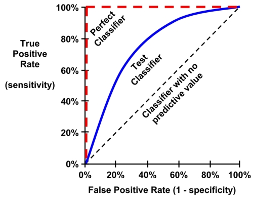
The points comprising ROC curves indicate the true positive rate at varying false positive thresholds. To create the curves, a classifier's predictions are sorted by the model's estimated probability of the positive class, with the largest values first. Beginning at the origin, each prediction's impact on the true positive rate and false positive rate will result in a curve tracing vertically (for a correct prediction), or horizontally (for an incorrect prediction).
To illustrate this concept, three hypothetical classifiers are contrasted in the previous plot. First, the diagonal line from the bottom-left to the top-right corner of the diagram represents a classifier with no predictive value. This type of classifier detects true positives and false positives at exactly the same rate, implying that the classifier cannot discriminate between the two. This is the baseline by which other classifiers may be judged; ROC curves falling close to this line indicate models that are not very useful. Similarly, the perfect classifier has a curve that passes through the point at 100 percent true positive rate and 0 percent false positive rate. It is able to correctly identify all of the true positives before it incorrectly classifies any negative result. Most real-world classifiers are similar to the test classifier; they fall somewhere in the zone between perfect and useless.
The closer the curve is to the perfect classifier, the better it is at identifying positive values. This can be measured using a statistic known as the area under the ROC curve (abbreviated AUC). The AUC, as you might expect, treats the ROC diagram as a two-dimensional square and measures the total area under the ROC curve. AUC ranges from 0.5 (for a classifier with no predictive value), to 1.0 (for a perfect classifier). A convention for interpreting AUC scores uses a system similar to academic letter grades:
- 0.9 – 1.0 = A (outstanding)
- 0.8 – 0.9 = B (excellent/good)
- 0.7 – 0.8 = C (acceptable/fair)
- 0.6 – 0.7 = D (poor)
- 0.5 – 0.6 = F (no discrimination)
As with most scales similar to this, the levels may work better for some tasks than others; the categorization is somewhat subjective.
Creating ROC curves with the ROCR package involves building a performance object for the pred prediction object we computed earlier. Since ROC curves plot true positive rates versus false positive rates, we simply call the performance() function while specifying the tpr and fpr measures, as shown in the following code:
> perf <- performance(pred, measure = "tpr", x.measure = "fpr")
Using the perf performance object, we can visualize the ROC curve with R's plot() function. As shown in the following code lines, many of the standard parameters for adjusting the visualization can be used, such as main (for adding a title), col (for changing the line color), and lwd (for adjusting the line width):
> plot(perf, main = "ROC curve for SMS spam filter",
       col = "blue", lwd = 3)
Although the plot() command, used in previous lines of code, is sufficient to create a valid ROC curve, it is helpful to add a reference line to indicate the performance of a classifier with no predictive value.
For plotting such a line, we'll use the abline() function. This function can be used to specify a line in slope-intercept form, where a is the intercept and b is the slope. Since we need an identity line that passes through the origin, we'll set the intercept to a=0 and the slope to b=1 as shown in the following plot. The lwd parameter adjusts the line thickness, while the lty parameter adjusts the type of line. For example, lty = 2 indicates a dashed line.
> abline(a = 0, b = 1, lwd = 2, lty = 2)
The end result is an ROC plot with a dashed reference line:

Qualitatively, we can see that this ROC curve appears to occupy the space in the top-left corner of the diagram, which suggests that it is closer to a perfect classifier than the dashed line indicating a useless classifier. To confirm this quantitatively, we can use the ROCR package to calculate the AUC. To do so, we first need to create another performance object, this time specifying measure = "auc", as shown in the following code:
> perf.auc <- performance(pred, measure = "auc")
Since perf.auc is an object (specifically known as an S4 object) we need to use a special type of notation to access the values stored within. S4 objects hold information in positions known as slots. The str() function can be used to see all slots for an object:
> str(perf.auc)
Formal class 'performance' [package "ROCR"] with 6 slots
  ..@ x.name      : chr "None"
  ..@ y.name      : chr "Area under the ROC curve"
  ..@ alpha.name  : chr "none"
  ..@ x.values    : list()
  ..@ y.values    :List of 1
  .. ..$ : num 0.983
  ..@ alpha.values: list()
Notice that slots are prefixed with the @ symbol. To access the AUC value, which is stored as a list in the y.values slot, we can use the @ notation along with the unlist() function, which simplifies lists to a vector of numeric values:
> unlist([email protected])
[1] 0.9829999
The AUC for the SMS classifier is 0.98, which is extremely high. But how do we know whether the model is just as likely to perform well on another dataset? In order to answer such questions, we need to better understand how far we can extrapolate a model's predictions beyond the test data.