
7.2. The ASP.NET AJAX Controls
The number of controls and extenders available from the Control Toolkit is large. There are more than 35 controls and extenders at your disposal. This section will look at these new items and how to use them in your ASP.NET applications.
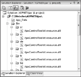
When you add an ASP.NET AJAX server control to your page, one thing you will notice is that a lot of DLLs are added to your solution in the language folders within the Bin folder. You will need to have the AjaxControlToolkit.dll with the language DLLs when you reference it. An example of what you will find is presented in Figure 7-7.
Figure 7-7. Figure 7-7
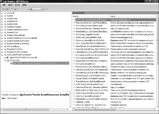
If you look at one of the DLLs with Lutz Roeder's .NET Reflector tool (www.red-gate.com/products/reflector), you will notice that it is focused on the client-side localization required by many applications. The AjaxControlToolkit.resources.dll for the Russian language within Reflector is shown in Figure 7-8.
Besides adding the localization DLLs to your project, the ASP.NET AJAX control is added the same way that any other custom server control would be in ASP.NET. Listing 7-1 shows what your ASP.NET page would look like after adding a single ASP.NET AJAX control to your page.
Example 7-1. Changes to the ASP.NET page after adding an ASP.NET AJAX control
<%@ Page Language="C#" AutoEventWireup="true"
    CodeFile="Default.aspx.cs" Inherits="_Default" %>

<%@ Register Assembly="AjaxControlToolkit"
    Namespace="AjaxControlToolkit" TagPrefix="cc1" %>

<!DOCTYPE html PUBLIC "-//W3C//DTD XHTML 1.0 Transitional//EN"
 "http://www.w3.org/TR/xhtml1/DTD/xhtml1-transitional.dtd">

<html xmlns="http://www.w3.org/1999/xhtml">
<head runat="server">
<title>First Page</title>
</head>
<body>
<form id="form1" runat="server">
<div>
<cc1:AlwaysVisibleControlExtender
ID="AlwaysVisibleControlExtender1" runat="server">
</cc1:AlwaysVisibleControlExtender>
</div>
</form>
</body>
</html> |
Figure 7-8. Figure 7-8
In this example, you can see that the ASP.NET AJAX control is registered on the page using the @Register directive. This directive points to the AjaxControlToolkit assembly and gives all controls that use this assembly reference a tag prefix of cc1, which is why you see the AlwaysVisibleControlExtender control prefixed with <cc1:[control name]>.
7.2.1. ASP.NET AJAX Control Toolkit Extenders
The first set of items that we will look at includes the new extenders that are part of the ASP.NET AJAX Control Toolkit. Extenders are basically controls that reach out and extend other controls. For instance, you can add a RequiredFieldValidator server control to a page and associate it to a TextBox control and the TextBox control will be extended. Instead of working as it normally would, just accepting text, it now has a new behavior. If nothing is entered into the control, the control will trigger an event in the RequiredFieldValidator control, whose client-side behavior is controlled by JavaScript.
What you will see with the ASP.NET AJAX Control Toolkit's extenders is that they pretty much accomplish the same thing. The controls extend the behavior of the ASP.NET server controls with additional JavaScript on the client as well as some server-side communications.
The ASP.NET AJAX extender controls are built using the ASP.NET AJAX extensions framework. The next few pages will now focus on using these new extenders within your ASP.NET applications.
7.2.2. AlwaysVisibleControlExtender
When presenting information in the browser, you may want to keep a piece of information fixed in the user's view. Screen space is a limited commodity, and there are cases where something should always be available without ever having to scroll. The AlwaysVisibleControlExtender lets you designate any ASP.NET control as having this characteristic. You specify a position for the control using the AlwaysVisibleControlExtender, and while the user scrolls the page to view other information, the control you designate is always kept in view. It seems to move around as the user scrolls the screen or resizes the window, so that it stays in the same relative position in the viewable portion of the browser window.
The AlwaysVisibleControlExtender has only six properties. An example of using this control is presented here in Listing 7-2.
Example 7-2. Using the AlwaysVisibleControlExtender
<%@ Page Language="C#" %>

<%@ Register Assembly="AjaxControlToolkit" Namespace="AjaxControlToolkit"
    TagPrefix="cc1" %>

<html xmlns="http://www.w3.org/1999/xhtml">
<head runat="server">
    <title>AlwaysVisibleControlExtender</title>
</head>
<body>
    <form id="form1" runat="server">
    <div>
        <asp:ScriptManager ID="ScriptManager1" runat="server">
        </asp:ScriptManager>
        <asp:Label runat="server" ID="todaysQuote" BorderStyle="solid"
         Style="text-align: right; border-spacing: 10px">
            Section to always show!</asp:Label>
<cc1:AlwaysVisibleControlExtender ID="AlwaysVisibleControlExtender1"
runat="server" TargetControlID="todaysQuote" VerticalSide="Top"
VerticalOffset="10" HorizontalSide="Right"
HorizontalOffset="10" ScrollEffectDuration="1.0">
</cc1:AlwaysVisibleControlExtender>
<br />
</div>
<div style="width: 400px; text-align: left">
Lorem ipsum dolor sit amet, consectetuer adipiscing elit.
Etiam nulla nisi, rutrum eu, iaculis ac, placerat vitae, enim.
Aliquam non augue. Vestibulum ante ipsum primis
in faucibus orci luctus et ultrices posuere cubilia Curae;
Mauris sollicitudin molestie
felis. Pellentesque a orci at eros tincidunt tempor.
Curabitur ultricies nunc vel
tellus. Pellentesque ullamcorper ultrices velit.
Sed tristique elementum leo. Curabitur
mi mauris, lobortis a, malesuada at, blandit tincidunt, magna.
Praesent in nulla.
Quisque a nibh vel lacus pellentesque adipiscing.... more
</div>
</form>
</body>
</html> |
In this case, a text that requires the end user to scroll the page in their browser instance is presented. For this example, I am using the Lorem Ipsum example text found at www.lipsum.com. The AlwaysVisibleControlExtender control is present, and its presence requires that you also have a ScriptManager control on the page as well (this is the same requirement for all ASP.NET AJAX controls).
The AlwaysVisibleControlExtender1 control extends the todaysQuote Label control through the use of the TargetControlID attribute. In this case, the value of the TargetControlID attribute points to the todaysQuote control.
Listing 7-2 shows setting all six to nondefault values. TargetControlID is set to the Label control as discussed. Then, following the recommendation of the Toolkit developers, the Label has been given a position using CSS to minimize flashing as it is repositioned during scrolling. The VerticalSide is set to Top (the options are Top, Middle, and Bottom). The VerticalOffset default is 0 but is set to 10px for some spacing. The HorizontalSide is set to Right (the options are Left, Right, and Center), and again the HorizontalOffset is adjusted up. Finally, the ScrollEffectDuration is set to one second. This controls the duration of the animation effect when the control is repositioned during scrolling.
The result of the code from Listing 7-2 is presented in Figure 7-9.
You can see the effect of the AlwaysVisibleControlExtender in Figure 7-9. The text "Section to always show!" is kept in view in the upper right, while the other text is allowed to scroll.
Figure 7-9. Figure 7-9

7.2.3. AnimationExtender
The AnimationExtender server control provides a tremendous number of capabilities. It allows you to program fluid animations to the controls that you put on the page. There is a lot that you can do with this control (much more than what can be shown in this chapter).
This control allows you to program elements that can move around the page based upon specific end user triggers (such as a button click). You will find that there are specific events you can use to program your animations, as listed here:
Creating animations is not as straightforward as many would like, as there is little Visual Studio support (such as wizards or even IntelliSense). For an example of creating your first animation, Listing 7-3 shows how you can fade an element in and out of the page based upon an end user action.
Example 7-3. Using the AnimationExtender to fade a background color
<%@ Page Language="C#" %>

<%@ Register Assembly="AjaxControlToolkit" Namespace="AjaxControlToolkit"
    TagPrefix="cc1" %>

<html xmlns="http://www.w3.org/1999/xhtml">
<head runat="server">
    <title>AnimationExtender</title>
</head>
<body>
    <form id="form1" runat="server">
    <div>
        <asp:ScriptManager ID="ScriptManager1" runat="server" />
        <cc1:AnimationExtender ID="AnimationExtender1" runat="server"
            TargetControlID="Panel1">
            <Animations>
                <OnClick>
                    <Sequence>
                        <Color PropertyKey="background" StartValue="#999966"
                         EndValue="#FFFFFF" Duration="5.0" />
                    </Sequence>
                </OnClick>
            </Animations>
        </cc1:AnimationExtender>
        <asp:Panel ID="Panel1" runat="server" BorderColor="Black"
            BorderWidth="3px" Font-Bold="True" Width="600px">
            Lorem ipsum dolor sit amet, consectetuer adipiscing elit.
            Donec accumsan lorem. Ut consectetuer tempus metus. Aenean tincidunt
            venenatis tellus. Suspendisse molestie cursus ipsum. Curabitur ut
            lectus. Nulla ac dolor nec elit convallis vulputate. Nullam pharetra
            pulvinar nunc. Duis orci. Phasellus a tortor at nunc mattis congue.
            Vestibulum porta tellus eu orci. Suspendisse quis massa. Maecenas
            varius, erat non ullamcorper nonummy, mauris erat eleifend odio, ut
            gravida nisl neque a ipsum. Vivamus facilisis. Cras viverra. Curabitur
            ut augue eget dolor semper posuere. Aenean at magna eu eros tempor
            pharetra. Aenean mauris.
        </asp:Panel>
    </div>
    </form>
</body>
</html> |
If you pull up the page from Listing 7-3, you will see that it uses a single AnimationExtender control that is working off the Panel1 control. This connection is made using the TargetControlID property.
As stated, typing the code that is contained within the AnimationExtender control is not enabled by IntelliSense, so you are going to have to look up the animations that you are going to want to create through the documentation. In the case of the previous example, the <OnClick> element is utilized to define a sequence of events that need to occur when the control is clicked. For this example, there is only one animation defined within the <Sequence> element — a color change to the background of the element. Here, the <Color> element states that the background CSS property will need to start at the color #999966 and change completely to color #FFFFFF within 5 seconds (defined using the Duration property).
If you pull up this page and click the Panel element, you see the color change from the described start color to the end color over a 5-second interval.
7.2.4. AutoCompleteExtender
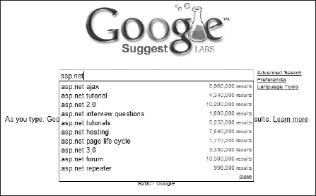
The AutoCompleteExtender control provides you the ability to help the end user find what they might be looking for when they have to type in search terms within a TextBox control. Like the product Google Suggest (shown here in Figure 7-10), once you start typing characters in the textbox, you get results from a data store that matches what you have typed so far.
Figure 7-10. Figure 7-10
To establish something similar for yourself, create a new page that contains only a ScriptManager control, an AutoCompleteExtender control, and a TextBox control. The ASP.NET portion of the page should appear as presented in Listing 7-4.
Example 7-4. The ASP.NET page
<%@ Page Language="C#" AutoEventWireup="true" CodeFile="AutoComplete.aspx.cs"
    Inherits="AutoComplete" %>

<%@ Register Assembly="AjaxControlToolkit" Namespace="AjaxControlToolkit"
    TagPrefix="cc1" %>

<html xmlns="http://www.w3.org/1999/xhtml">
<head runat="server">
    <title>AutoComplete</title>
</head>
<body>
    <form id="form1" runat="server">
    <div>
        <asp:ScriptManager ID="ScriptManager1" runat="server">
        </asp:ScriptManager>
        <cc1:AutoCompleteExtender ID="AutoCompleteExtender1" runat="server"
TargetControlID="TextBox1" ServiceMethod="GetCompletionList"
UseContextKey="True">
</cc1:AutoCompleteExtender>
<asp:TextBox ID="TextBox1" runat="server"></asp:TextBox>
</div>
</form>
</body>
</html> |
Again, like the other ASP.NET AJAX controls, you extend the TextBox control using the TargetControlID property. When you first add these controls to the page, you will not have the ServiceMethod property defined in the AutoCompleteExtender control. Using Visual Studio 2008, you can make the framework for a service method and tie the extender control to this method all from the design surface. Expanding the TextBox control's smart tag, select the Add AutoComplete page method option from the provided menu. What you will see is presented in Figure 7-11.
Figure 7-11. Figure 7-11

This action creates a service method in the code behind for your page. Listing 7-4 shows the steps necessary to complete this method to call the company names from the Northwind database.
The following example makes use of the Northwind.mdf SQL Server Express Database file. To get this database, search for "Northwind and pubs Sample Databases for SQL Server 2000." You can find this link at www.microsoft.com/downloads/details.aspx?familyid=06616212-0356-46a0-8da2-eebc53a68034&displaylang=en. Once installed, you will find the Northwind.mdf file in the C: SQL Server 2000 Sample Databases directory. To add this database to your ASP.NET application, create an App_Data folder within your project (if it isn't already there) and right-click on the folder and select Add Existing Item. From the provided dialog box, you are then able to browse to the location of the Northwind.mdf file that you just installed. If you are having trouble getting permissions to work with the database, make a data connection to the file from the Visual Studio Server Explorer by right-clicking on the Data Connections node and selecting Add New Connection from the provided menu. You will be asked to be made the appropriate user of the database. Then VS will make the appropriate changes on your behalf for this to occur.
Example 7-5. The code-behind that sets up the service method for auto-complete
using System.Collections.Generic;
using System.Data;
using System.Data.SqlClient;

public partial class AutoComplete : System.Web.UI.Page
{
[System.Web.Services.WebMethodAttribute(),
System.Web.Script.Services.ScriptMethodAttribute()]
public static string[] GetCompletionList(string prefixText, int count,
string contextKey)
{
SqlConnection conn;
SqlCommand cmd;
string cmdString =
"Select CompanyName from Customers WHERE CompanyName LIKE '" +
prefixText + "%'";
conn = new
SqlConnection(@"Data Source=.SQLEXPRESS;
AttachDbFilename=|DataDirectory|NORTHWND.MDF;
Integrated Security=True;User Instance=True");
// Put this string on one line in your code
cmd = new SqlCommand(cmdString, conn);
conn.Open();
SqlDataReader myReader;
List<string> returnData = new List<string>();
myReader = cmd.ExecuteReader(CommandBehavior.CloseConnection);
while (myReader.Read())
{
returnData.Add(myReader["CompanyName"].ToString());
}
return returnData.ToArray();
}
} |
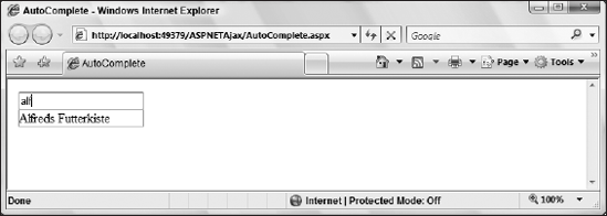
When you run this page and type the characters alf into the textbox, the GetCompletionList() method is called passing in these characters. These characters are retrievable through the prefixText parameter (you can also use the count parameter, whose default value is 10). The Northwind database is called by using the prefixText value, and this is what is returned back to the TextBox1 control. In the end, you get a drop-down list of the items that match the first three characters entered in the textbox. This is illustrated here in Figure 7-12.
Figure 7-12. Figure 7-12
It is good to know that the results after they are called the first time are cached. This caching is controlled via the EnableCaching property (it is defaulted to true). You can also change the style of the drop-down auto-complete list. You can configure the style, change how many elements appear, and alter many more points of this feature. Note that you are not required to call a method that is exposed on the same page as the control as the example in this book demonstrates, but you can call another server-side method on another page or a Web method.
7.2.5. CalendarExtender
Selecting a date is a common requirement of many applications. The CalendarExtender attaches to a textbox and pops up a calendar for selecting a date. By default, the calendar is shown when the textbox gets focus, but if you set the PopupButtonID to the ID of another control, the calendar becomes visible when that control is clicked.
The CalendarExtender control allows you to make it simple for your end users to select a date within a form. If there is one point in the form that slows form submission up, it is selecting dates and trying to figure out the format of the date the form requires.
The quickest way to select a date in a form is to get a calendar that can be navigated and allow a date to be selected quickly. The selection then is translated to a textual date format in the textbox. The CalendarExtender is very easy to use and has just a few key properties. The TargetControlID points to the textbox that gets the selected date. The Format property specifies the string format for the date input of the textbox in case you want to make any changes to the format. The CalendarExtender control gives you all the client-side code required for this kind of action. Listing 7-6 shows you an example of providing a Calendar control off your TextBox controls.
Example 7-6. Using a Calendar control from a TextBox control
<%@ Page Language="C#" %>

<%@ Register Assembly="AjaxControlToolkit" Namespace="AjaxControlToolkit"
    TagPrefix="cc1" %>

<html xmlns="http://www.w3.org/1999/xhtml">
<head runat="server">
    <title>CalendarExtender</title>
</head>
<body>
    <form id="form1" runat="server">
    <div>
        <asp:ScriptManager ID="ScriptManager1" runat="server">
        </asp:ScriptManager>
        <cc1:CalendarExtender ID="CalendarExtender1" runat="server"
         TargetControlID="TextBox1">
        </cc1:CalendarExtender>
        <asp:TextBox ID="TextBox1" runat="server"></asp:TextBox>
    </div>
    </form>
</body>
</html> |
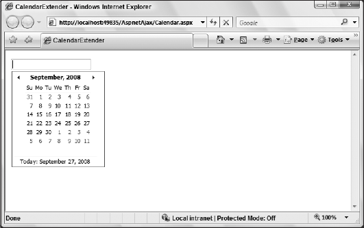
When you run this page, the result will be a single textbox on the page and the textbox will appear no different from any other textbox. However, when the end user clicks inside of the textbox, a calendar will then appear directly below the textbox as shown in Figure 7-13.
Figure 7-13. Figure 7-13
Then, when the end user selects a date from the calendar, the date is placed as text within the textbox as illustrated in Figure 7-14.
Figure 7-14. Figure 7-14

Some of the properties exposed from this control are FirstDayOfWeek and PopupPosition (which include the options Left, Right, BottomLeft, BottomRight, TopLeft, and TopRight). You can also change how the calendar is initiated on the client. Some sites like to have a calendar button next to the textbox and only pop-up the calendar option when the end user clicks on this button. If this is something that you like to do on your pages, then you are going to want to make use of the PopupButtonID property, which should point to the ID of the image or button that you are using.
7.2.6. CollapsiblePanelExtender
The CollapsiblePanelExtender server control allows you to collapse one control into another. When working with two Panel server controls, you can provide a nice means to control any real estate issues that you might be experiencing on your ASP.NET page.
The CollapsiblePanelExtender is similar to the Accordion control (presented later in this chapter) but does not target multiple content areas. An ASP.NET Panel control is shown or hidden from view based on the user's interaction with a given control. This allows you to hide something the user does not always need to see. The TargetControlID is shown when the ExpandControlID is clicked or hidden when the CollapseControlID is clicked. Alternatively, it can be shown or hidden based on a mouse hover if the AutoCollapse and AutoExpand properties are set to true.
Listing 7-7 demonstrates the use of a CollapsiblePanelExtender to set the panel size to 0 when it is collapsed and to 300 pixels when it is expanded. Another panel is used as the selector for expanding and collapsing the panel. In addition, a label is included that is designated as the TextLabelID. The value of the Label control is changed between the ExpandedText and CollapsedText values based on the current state.
Example 7-7. Using the CollapsiblePanelExtender with two Panel controls
<%@ Page Language="C#" %>

<%@ Register Assembly="AjaxControlToolkit" Namespace="AjaxControlToolkit"
TagPrefix="cc1" %>

<html xmlns="http://www.w3.org/1999/xhtml">
<head id="Head1" runat="server">
    <title>CollapsiblePanelExtender</title>
</head>
<body>
    <form id="form1" runat="server">
    <div>
        <asp:ScriptManager ID="ScriptManager1" runat="server">
        </asp:ScriptManager>
        <asp:Panel ID="Panel1" runat="server" BackColor="#000066"
         ForeColor="White">
            <asp:Label ID="Label2" runat="server"
             Text="This is my title"></asp:Label>
            <asp:Label ID="Label1" runat="server"></asp:Label>
        </asp:Panel>
        <asp:Panel ID="Panel2" runat="server" Style="overflow: hidden;" Height="0">
            Lorem ipsum dolor sit amet, consectetuer adipiscing elit.
            Donec accumsan lorem. Ut consectetuer tempus metus. Aenean tincidunt
            venenatis tellus. Suspendisse molestie cursus ipsum. Curabitur ut
            lectus. Nulla ac dolor nec elit convallis vulputate.
            Nullam pharetra pulvinar nunc. Duis orci. Phasellus a tortor at nunc
            mattis congue. Vestibulum porta tellus eu orci. Suspendisse quis massa.
            Maecenas varius, erat non ullamcorper nonummy, mauris erat eleifend
            odio, ut gravida nisl neque a ipsum. Vivamus facilisis. Cras viverra.
            Curabitur ut augue eget dolor semper posuere. Aenean at
magna eu eros tempor pharetra. Aenean mauris.
</asp:Panel>
<cc1:CollapsiblePanelExtender ID="CollapsiblePanelExtender1" runat="server"
TargetControlID="Panel2" Collapsed="true" ExpandControlID="Panel1"
CollapseControlID="Panel1"
CollapsedSize="1"
ExpandedSize="300" CollapsedText="[Click to expand]"
ExpandedText="[Click to collapse]" TextLabelID="Label1"
SuppressPostBack="true">
</cc1:CollapsiblePanelExtender>
</div>
</form>
</body>
</html> |
In this case, when the page is pulled up for the first time, you will only see the contents of Panel1 — the title panel. By default, you would usually see both controls, but since the Collapsed property is set to true in the CollapsiblePanelExtender control, you will only see Panel1. Clicking on the Label1 control within the Panel control will then expose out the contents of Panel2. In fact, the contents will slide out from the Panel1 control. Tying these two controls together to do this action is accomplished through the use of the CollapsiblePanelExtender control. This control's TargetControlID is assigned to the second Panel control — Panel2, as this is the control that needs to expand onto the page. The ExpandControlID property is the control that initiates the expansion.
Once expanded, it is when the end user clicks on the Panel1 will the contents disappear by sliding back into Panel1. This is accomplished by assigning the CollapseControlID property to Panel1.
7.2.7. ConfirmButtonExtender and ModalPopupExtender
The ConfirmButtonExtender is slick. I believe slick is the technical term. Usually before allowing your end users to delete data via a browser application, you want to confirm that they really want to do such actions. The ConfirmButtonExtender allows you to question the end user's action and reconfirm that they want the action to occur.
In order to work with this control, you set the TargetControlID to a Button control or a control that is derived from a button. When the button is clicked, the value of the ConfirmText property is shown, along with OK and Cancel buttons. If the user clicks the OK button, the button fires normally. If not, the button click is canceled. Listing 7-8 is a page that updates a label with the time on the server each time the button is clicked but only if the ConfirmButtonExtender allows the submission to occur.
Example 7-8. Using the ConfirmButtonExtender control to reconfirm a user action
<%@ Page Language="C#" %>

<%@ Register Assembly="AjaxControlToolkit" Namespace="AjaxControlToolkit"
    TagPrefix="cc1" %>

<script runat="server">
protected void Page_Load(object sender, EventArgs e)
{
Label1.Text = DateTime.Now.ToLongTimeString();
}
</script>
<html xmlns="http://www.w3.org/1999/xhtml">
<head id="Head1" runat="server">
<title>ConfirmButtonExtender</title>
</head>
<body>
<form id="form1" runat="server">
<div>
<asp:ScriptManager ID="ScriptManager1" runat="server">
</asp:ScriptManager>
<asp:Label ID="Label1" runat="server"></asp:Label><br />
<cc1:ConfirmButtonExtender ID="ConfirmButtonExtender1" runat="server"
TargetControlID="Button1"
ConfirmText="Are you sure you wanted to click this button?">
</cc1:ConfirmButtonExtender>
<asp:Button ID="Button1" runat="server" Text="Button" />
</div>
</form>
</body>
</html> |
In this case, the ConfirmButtonExtender extends the Button1 server control and adds a confirmation dialog using the text defined with the ConfirmText property. This dialog is shown in Figure 7-15.
Figure 7-15. Figure 7-15

If the end user clicks the OK button in this instance, the page functions normally as if the dialog never appeared. However, if the Cancel button is clicked, by default the dialog disappears and the form isn't submitted (it will be as if the button was not clicked at all). In this case, you can also capture the Cancel button being clicked and perform a client-side operation through the OnClientClick() event, giving it the value of a client-side JavaScript function.
Instead of using the browsers modal dialogs, you can create your own to use as the confirmation form. To accomplish this task, you need to use the new ModalPopupExtender server control. The ModalPopupExtender control points to another control to use for the confirmation.
The ModalPopupExtender prevents the user from interacting with the underlying page until a modal dialog has been addressed by the user. It is very similar to the HoverMenuExtender, except that the user must work with the control designated by the PopupControlID before he or she can proceed. It has properties for specifying the OkControlID and the CancelControlID, along with OnOkScript and OnCancelScript properties that will run based on the user's selection. Listing 7-9 shows how to make use of this control.
Example 7-9. Using the ModalPopupExtender control to create your own confirmation form
<%@ Page Language="C#" %>

<%@ Register Assembly="AjaxControlToolkit" Namespace="AjaxControlToolkit"
 TagPrefix="cc1" %>

<html xmlns="http://www.w3.org/1999/xhtml">
<head runat="server">
    <title>ConfirmButtonExtender</title>
</head>
<body>
    <form id="form1" runat="server">
    <div>
        <asp:ScriptManager ID="ScriptManager1" runat="server">
        </asp:ScriptManager>
        <cc1:ConfirmButtonExtender ID="ConfirmButtonExtender1" runat="server"
         TargetControlID="Button1"
         DisplayModalPopupID="ModalPopupExtender1">
        </cc1:ConfirmButtonExtender>
        <cc1:ModalPopupExtender ID="ModalPopupExtender1" runat="server"
            CancelControlID="ButtonNo" OkControlID="ButtonYes"
            PopupControlID="Panel1"
            TargetControlID="Button1">
        </cc1:ModalPopupExtender>
        <asp:Button ID="Button1" runat="server" Text="Button" />
        <asp:Panel ID="Panel1" runat="server"
         style="display:none; background-color:White; width:200;
         border-width:2px; border-color:Black; border-style:solid; padding:20px;">
         Are you sure you wanted to click this button?<br />
         <asp:Button ID="ButtonYes" runat="server" Text="Yes" />
         <asp:Button ID="ButtonNo" runat="server" Text="No" />
        </asp:Panel>
    </div>
    </form>
</body>
</html> |
In this example, the ConfirmButtonExtender still points to the Button1 control on the page, meaning that when the button is clicked, the ConfirmButtonExtender takes action. Instead of using the ConfirmText property, the DisplayModalPopupID property is used. In this case, it points to the ModalPopupExtender1 control — another extender control.
The ModalPopupExtender control, in turn, references the Panel1 control on the page through the use of the PopupControlID property. The contents of this Panel control are used for the confirmation on the button click. For this to work, the ModalPopupExtender control has to have a value for the OkControlID and the CancelControlID properties. In this case, these two properties point to the two Button controls that are contained in the Panel control. If you run this page, you get the results presented in Figure 7-16.
Figure 7-16. Figure 7-16
7.2.8. DragPanelExtender
The DragPanelExtender allows you to allow the end user to move an element in defined area around the page as desired. The end user actually has the ability to drag and drop the element anywhere on the browser page.
To enable this feature, you have to do a few things. The first suggestion is to create a <div> area on the page that is large enough for you to drag the item around in. From there, you are going to need a control that will be used as the drag handle and another control that will follow the drag handle around. In the example in Listing 7-10, the Label control is used as the drag handle, while the Panel2 control is the content that is dragged around the screen.
Example 7-10. Dragging a Panel control around the page
<%@ Page Language="C#" %>

<%@ Register Assembly="AjaxControlToolkit" Namespace="AjaxControlToolkit"
    TagPrefix="cc1" %>

<html xmlns="http://www.w3.org/1999/xhtml">
<head runat="server">
    <title>DragPanel control</title>
</head>
<body>
    <form id="form1" runat="server">
    <div>
        <asp:ScriptManager ID="ScriptManager1" runat="server">
        </asp:ScriptManager>
        <div style="height: 600px;">
            <cc1:DragPanelExtender ID="DragPanelExtender1" runat="server"
             DragHandleID="Label1" TargetControlID="Panel1">
            </cc1:DragPanelExtender>
            <asp:Panel ID="Panel1" runat="server" Width="450px">
                <asp:Label ID="Label1" runat="server"
                 Text="Drag this Label control to move the control"
BackColor="DarkBlue" ForeColor="White"></asp:Label>
<asp:Panel ID="Panel2" runat="server" Width="450px">
Lorem ipsum dolor sit amet, consectetuer adipiscing elit.
Donec accumsan lorem. Ut consectetuer tempus metus. Aenean tincidunt
venenatis tellus. Suspendisse molestie cursus ipsum. Curabitur ut
lectus. Nulla ac dolor nec elit convallis vulputate. Nullam pharetra
pulvinar nunc. Duis orci. Phasellus a tortor at nunc mattis congue.
Vestibulum porta tellus eu orci. Suspendisse quis massa. Maecenas
varius, erat non ullamcorper nonummy, mauris erat eleifend odio, ut
gravida nisl neque a ipsum. Vivamus facilisis. Cras viverra. Curabitur
ut augue eget dolor semper posuere. Aenean at magna eu eros tempor
pharetra. Aenean mauris.
</asp:Panel>
</asp:Panel>
</div>
</div>
</form>
</body>
</html> |
In this case, a <div> element with a height of 600 pixels is created. Within this defined area, a DragPanelExtender control is used and targets the Panel1 control through the use of the TargetControlID property being assigned to this control.
Within the Panel1 control are two other server controls — a Label and another Panel control. The Label control is assigned to be the drag handle using the DragHandleID property of the DragPanelExtender control. With this little bit of code in place, you are able to drag the Panel1 control around on your browser window. Figure 7-17 shows the Label control being held and used as a handle to drag around the Panel control.
Figure 7-17. Figure 7-17

7.2.9. DropDownExtender
The DropDownExtender control allows you to take any control and provide a drop-down list of other options below it for selection. It provides a different framework than a typical DropDownList control as it allows for an extreme level of customization. Listing 7-11 shows how you can even use an image as the initiator of drop-down list of options.
Example 7-11. Using an Image control as an initiator of a drop-down list
<%@ Page Language="C#" %>

<%@ Register Assembly="AjaxControlToolkit" Namespace="AjaxControlToolkit"
    TagPrefix="cc1" %>

<script runat="server">
    protected void Page_Load(object sender, EventArgs e)
    {
        Image1.ImageUrl = "Images/Creek.jpg";
    }

    protected void Option_Click(object sender, EventArgs e)
    {
        Image1.ImageUrl = "Images/" + ((LinkButton)sender).Text + ".jpg";
    }
</script>
<html xmlns="http://www.w3.org/1999/xhtml">
<head runat="server">
    <title>DropDownExtender Control</title>
</head>
<body>
    <form id="form1" runat="server">
    <div>
        <asp:ScriptManager ID="ScriptManager1" runat="server">
        </asp:ScriptManager>
        <asp:UpdatePanel ID="UpdatePanel1" runat="server">
            <ContentTemplate>
                <cc1:DropDownExtender ID="DropDownExtender1" runat="server"
                 DropDownControlID="Panel1" TargetControlID="Image1">
                </cc1:DropDownExtender>
                <asp:Image ID="Image1" runat="server">
                </asp:Image>
            <asp:Panel ID="Panel1" runat="server" Height="50px" Width="125px">
                <asp:LinkButton ID="Option1" runat="server"
                 OnClick="Option_Click">Creek</asp:LinkButton>
                <asp:LinkButton ID="Option2" runat="server"
                 OnClick="Option_Click">Dock</asp:LinkButton>
                <asp:LinkButton ID="Option3" runat="server"
                 OnClick="Option_Click">Garden</asp:LinkButton>
            </asp:Panel>
            </ContentTemplate>
        </asp:UpdatePanel>
    </div>
    </form>
</body>
</html> |
In this case, a DropDownExtender control is tied to an Image control that on the Page_Load() event displays a specific image. The DropDownExtender control has two specific properties that need to be set. The first is the TargetControlID property that defines the control that becomes the initiator of the drop-down list. The second property that is important to understand is the DropDownControlID property that defines the element on the page that will be used for the drop-down items that appear below the control. In this case, it is a Panel control with three LinkButton controls.
Each of the LinkButton controls designates a specific image that should appear on the page; selecting one of the options changes the image to the selected choice through the Option_Click() method. Running this page gives you the results illustrated in Figure 7-18.
Figure 7-18. Figure 7-18

7.2.10. DropShadowExtender
The DropShadowExtender allows you to add a DropShadow effect to an ASP.NET Panel or image on the page. You set the TargetControlID and can then control the Width, Opacity, and whether or not the corners should be Rounded. If the panel can be moved or resized, you can also set the TrackPosition property to true to indicate that JavaScript should run to track the panel and update the DropShadow as needed.
The first thought for an example is an image (as shown here in Listing 7-12), but you can use it for any control that you wish.
Example 7-12. Using the DropShadowExtender with an Image control
<%@ Page Language="C#" %>

<%@ Register Assembly="AjaxControlToolkit" Namespace="AjaxControlToolkit"
    TagPrefix="cc1" %>

<html xmlns="http://www.w3.org/1999/xhtml">
<head runat="server">
<title>DropShadowExtender Control</title>
</head>
<body>
<form id="form1" runat="server">
<div>
<asp:ScriptManager ID="ScriptManager1" runat="server">
</asp:ScriptManager>
<cc1:DropShadowExtender ID="DropShadowExtender1" runat="server"
TargetControlID="Image1">
</cc1:DropShadowExtender>
<asp:Image ID="Image1" runat="server" ImageUrl="Images/Garden.jpg" />
</div>
</form>
</body>
</html> |
Here, it is as simple as using the DropShadowExtender control with a TargetControlID of Image1. With this in place, the image will appear in the browser as shown here in Figure 7-19.
Figure 7-19. Figure 7-19

As stated, in addition to images, you can use it for almost anything. Listing 7-13 shows how to use it with a Panel control.
Example 7-13. Using the DropShadowExtender with a Panel control
<%@ Page Language="C#" %>

<%@ Register Assembly="AjaxControlToolkit" Namespace="AjaxControlToolkit"
TagPrefix="cc1" %>
<html xmlns="http://www.w3.org/1999/xhtml">
<head runat="server">
<title>DropShadowExtender Control</title>
</head>
<body>
<form id="form1" runat="server">
<div>
<asp:ScriptManager ID="ScriptManager1" runat="server">
</asp:ScriptManager>
<cc1:DropShadowExtender ID="DropShadowExtender1" runat="server"
TargetControlID="Panel1" Rounded="True">
</cc1:DropShadowExtender>
<asp:Panel ID="Panel1" runat="server" BackColor="Orange" Width="300"
HorizontalAlign="Center">
<asp:Login ID="Login1" runat="server">
</asp:Login>
</asp:Panel>
</div>
</form>
</body>
</html> |
In this case, a Panel control with a Login control is extended with the DropShadowExtender control. The result is quite similar to that of the Image control's results. However, one addition to the DropShadowExtender control here is that the Rounded property is set to true (by default, it is set to false). This gives the following results as shown here in Figure 7-20.
Figure 7-20. Figure 7-20

As you can see from Figure 7-20, not only are the edges of the drop shadow rounded, but also the entire Panel control has rounded edges. Other style properties that you can work with include the Opacity property (this controls the opacity of the drop shadow only) and the Radius property (this controls the radius used in rounding the edges and obviously only works if the Rounded property is set to true). By default, the Opacity setting is set at 1, which means 100% visible. To set it at, say, 50% opacity, you have to set the Opacity value to .5.
7.2.11. DynamicPopulateExtender
The DynamicPopulateExtender control allows you to send dynamic HTML output to a Panel control. For this to work, you will need one control or event that triggers a callback to the server to get the HTML that in turn gets pushed into the Panel control, thereby making a dynamic change on the client.
As with the AutoCompleteExtender control, you need a server-side event that returns something back to the client asynchronously. Listing 7-14 shows the code required to use this control on the .aspx page.
Example 7-14. Using the DynamicPopulateExtender control to populate a Panel control
.ASPX
<%@ Page Language="C#" AutoEventWireup="true"
    CodeFile="DynamicPopulateExtender.aspx.cs"
    Inherits="DynamicPopulateExtender" %>

<%@ Register Assembly="AjaxControlToolkit"
    Namespace="AjaxControlToolkit" TagPrefix="cc1" %>

<html xmlns="http://www.w3.org/1999/xhtml">
<head runat="server">
    <title>DynamicPopulateExtender Control</title>
    <script type="text/javascript">
      function updateGrid(value) {
        var behavior = $find('DynamicPopulateExtender1'),
        if (behavior) {
            behavior.populate(value);
        }
      }
    </script>
</head>
<body>
    <form id="form1" runat="server">
    <div>
        <asp:ScriptManager ID="ScriptManager1" runat="server" />
        <cc1:DynamicPopulateExtender ID="DynamicPopulateExtender1" runat="server"
            TargetControlID="Panel1" ServiceMethod="GetDynamicContent">
        </cc1:DynamicPopulateExtender>
        <div onclick="updateGrid(this.value);" value='0'>
        <asp:LinkButton ID="LinkButton1" runat="server"
         OnClientClick="return false;">Customers</asp:LinkButton></div>
        <div onclick="updateGrid(this.value);" value='1'>
        <asp:LinkButton ID="LinkButton2" runat="server"
         OnClientClick="return false;">Employees</asp:LinkButton></div>
        <div onclick="updateGrid(this.value);" value='2'>
        <asp:LinkButton ID="LinkButton3" runat="server"
         OnClientClick="return false;">Products</asp:LinkButton></div>
<asp:Panel ID="Panel1" runat="server">
</asp:Panel>
</div>
</form>
</body>
</html> |
This .aspx page is doing a lot. First, there is a client-side JavaScript function called updateGrid(). This function calls the DynamicPopulateExtender control that is on the page. You will also find three LinkButton server controls, each of which is encased in a <div> element that calls the updateGrid() function and provides a value that is passed into the function. Since you want the <div> element's onclick event to be triggered with a click and not the LinkButton's click event, each LinkButton contains an OnClientClick attribute that does nothing. This is accomplished by using return false;.
The DynamicPopulateExtender control on the page targets the Panel1 control as the container that will take the HTML that comes from the server on an asynchronous request. The DynamicPopulateExtender control knows where to go get the HTML, using the ServiceMethod attribute. The value of this attribute calls the GetDynamicContent() method, which is in the page's code-behind file.
Once you have the .aspx page in place, the next step is to create the code-behind page. This page will contain the server-side method that is called by the DynamicPopulateExtender control. This is presented in Listing 7-15.
Example 7-15. The code-behind page of the DynamicPopulateExtender.aspx page
using System.Data;
using System.Data.SqlClient;
using System.IO;
using System.Web.UI;
using System.Web.UI.WebControls;

public partial class DynamicPopulateExtender : System.Web.UI.Page
{
    [System.Web.Services.WebMethodAttribute(),
     System.Web.Script.Services.ScriptMethodAttribute()]
    public static string GetDynamicContent(string contextKey)
    {
        SqlConnection conn;
        SqlCommand cmd;
        string cmdString = "Select * from Customers";

        switch (contextKey)
        {
            case ("1"):
                cmdString = "Select * from Employees";
                break;
            case ("2"):
                cmdString = "Select * from Products";
break;
}
conn = new
SqlConnection(@"Data Source=.SQLEXPRESS;
AttachDbFilename=|DataDirectory|NORTHWND.MDF;
Integrated Security=True;User Instance=True");
// Put this string on one line in your code
cmd = new SqlCommand(cmdString, conn);
conn.Open();
SqlDataReader myReader;
myReader = cmd.ExecuteReader(CommandBehavior.CloseConnection);
DataTable dt = new DataTable();
dt.Load(myReader);
myReader.Close();
GridView myGrid = new GridView();
myGrid.ID = "GridView1";
myGrid.DataSource = dt;
myGrid.DataBind();
StringWriter sw = new StringWriter();
HtmlTextWriter htw = new HtmlTextWriter(sw);
myGrid.RenderControl(htw);
htw.Close();
return sw.ToString();
}
} |
This code is the code-behind page for the DynamicPopulateExtender.aspx page and contains a single method that is called asynchronously. The GetDynamicContent() method takes a single parameter, contextKey, a string value that can be used to determine what link the end user clicked.
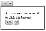
Based upon the selection, a specific command string is used to populate a DataTable object. From here, the DataTable object is used as the data source for a programmatic GridView control that is rendered and returned, as a string, to the client. The client takes the large string and uses the text to populate the Panel1 control that is on the page. The result of the clicking on one of the links is shown in Figure 7-21.
7.2.12. FilteredTextBoxExtender
The FilteredTextBoxExtender control works off a TextBox control to manipulate the types of characters that can be input into the control by the end user. For instance, if you want the end user to be able to enter only numbers in the textbox, then you can associate a FilteredTextBoxExtender with the TextBox control and specify such behavior. An example of this is presented in Listing 7-16.
Figure 7-21. Figure 7-21
Example 7-16. Filtering a textbox to use only numbers
<%@ Page Language="C#" %>

<%@ Register Assembly="AjaxControlToolkit" Namespace="AjaxControlToolkit"
    TagPrefix="cc1" %>

<html xmlns="http://www.w3.org/1999/xhtml">
<head runat="server">
    <title>FilteredTextBoxExtender Control</title>
</head>
<body>
    <form id="form1" runat="server">
    <div>
        <asp:ScriptManager ID="ScriptManager1" runat="server">
        </asp:ScriptManager>
        <cc1:FilteredTextBoxExtender ID="FilteredTextBoxExtender1" runat="server"
         TargetControlID="TextBox1" FilterType="Numbers">
        </cc1:FilteredTextBoxExtender>
        <asp:TextBox ID="TextBox1" runat="server"></asp:TextBox>
    </div>
    </form>
</body>
</html> |
In this case, a FilteredTextBoxExtender control is attached to the TextBox1 control through the use of the TargetControlID property. The FilteredTextBoxExtender control has property called FilterType that has the possible values of Custom, LowercaseLetters, Numbers, and UppercaseLetters.
This example uses a FilterType value of Numbers, meaning that only numbers can be entered into the textbox. If the end user tries to enter in any other type of character, then nothing happens; it will seem to the end user as if the key doesn't even function.
Another property the FilteredTextBoxExtender control exposes is the FilterMode and the InvalidChars properties. An example of using these two properties is presented here:
<cc1:FilteredTextBoxExtender ID="FilteredTextBoxExtender1" runat="server"
 TargetControlID="TextBox1" InvalidChars="*" FilterMode="InvalidChars">
</cc1:FilteredTextBoxExtender>
The default value of the FilterMode property is ValidChars. When set to ValidChars, the control works from the FilterType property and allows only what this property defines. When set to InvalidChars, you then use the InvalidChars property and put the characters here (multiple characters just all go together with no space or item required between them).
7.2.13. HoverMenuExtender
The HoverMenuExtender control allows you to make a hidden control appear on the screen when the end user hovers on another control. This means that you can build either elaborate tooltips or provide extra functionality when an end user hovers somewhere in your application.
One example is to change a ListView control so that when the end user hovers over a product name, the Edit button for that row of data appears on the end user's screen. The code for the <ItemTemplate> in the ListView control is partially shown here in Listing 7-17.
Example 7-17. Adding a hover button to the ListView control's ItemTemplate
<ItemTemplate>
   <tr style="background-color:#DCDCDC;color: #000000;">
      <td>
         <cc1:HoverMenuExtender ID="HoverMenuExtender1" runat="server"
          TargetControlID="ProductNameLabel" PopupControlID="Panel1"
          PopDelay="25" OffsetX="−50">
         </cc1:HoverMenuExtender>
         <asp:Panel ID="Panel1" runat="server" Height="50px" Width="125px">
            <asp:Button ID="EditButton" runat="server"
             CommandName="Edit" Text="Edit" />
         </asp:Panel>
      </td>
      <td>
         <asp:Label ID="ProductIDLabel" runat="server"
          Text='<%# Eval("ProductID") %>' />
      </td>
      <td>
         <asp:Label ID="ProductNameLabel" runat="server"
Text='<%# Eval("ProductName") %>' />
</td>
<! -- Code removed for clarity -- >
</tr>
</ItemTemplate> |
Here, a HoverMenuExtender control is attached to the Label control with the ID of ProductNameLabel, which appears in each row of the ListView control. This is done using the TargetControlID property, while the PopupControlID property is used to assign the control that dynamically appears when a user hovers the mouse over the targeted control.
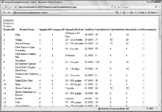
The HoverMenuExtender control exposes a number of different properties to control the style and behaviors of the pop-up. First, the PopDelay property is used in this example and provides a means to delay the pop-up from appearing (in milliseconds). The OffsetX and OffsetY properties are used to specify the location of the pop-up based upon the targeted control. In this case, the offset is set to −50 (pixels). The results of the operation are presented in Figure 7-22.
Figure 7-22. Figure 7-22
7.2.14. ListSearchExtender
The ListSearchExtender control extends either a ListBox or a DropDownList control. However, it does not always produce the best results in browsers such as Opera and Safari. This extender allows you to provide search capabilities over large collections that are found in either of these controls. This alleviates the need for end users to search through the collection to find the item they are looking for.
When utilized, the extender adds a search text area above the control that shows the characters the end user types for her search. Listing 7-18 shows the use of this extender.
Example 7-18. Extending a ListBox control with the ListSearchExtender
<%@ Page Language="C#" %>

<%@ Register Assembly="AjaxControlToolkit" Namespace="AjaxControlToolkit"
    TagPrefix="cc1" %>

<html xmlns="http://www.w3.org/1999/xhtml">
<head runat="server">
    <title>ListSearchExtender Control</title>
</head>
<body>
    <form id="form1" runat="server">
    <div>
        <asp:ScriptManager ID="ScriptManager1" runat="server">
        </asp:ScriptManager>
        <cc1:ListSearchExtender ID="ListSearchExtender1" runat="server"
         TargetControlID="ListBox1">
        </cc1:ListSearchExtender>
        <asp:ListBox ID="ListBox1" runat="server" Width="150">
            <asp:ListItem>Aardvark</asp:ListItem>
            <asp:ListItem>Bee</asp:ListItem>
            <asp:ListItem>Camel</asp:ListItem>
            <asp:ListItem>Dog</asp:ListItem>
            <asp:ListItem>Elephant</asp:ListItem>
        </asp:ListBox>
    </div>
    </form>
</body>
</html> |
In this case, the only property used in the ListSearchExtender control is the TargetControlID property, to identify which control it extends. Running this page produces the results shown in Figure 7-23.
Figure 7-23. Figure 7-23

As an end user, when you start typing, you see what you are typing in the text above the control (as shown in Figure 7-24).
Figure 7-24. Figure 7-24

You can customize the text that appears at the top of the control through the use of the PromptCssClass, PromptPosition, and PromptText properties. By default, the PromptPosition is set to Top (the other possible value is Bottom) and the PromptText value is Type to search.
7.2.15. MaskedEditExtender and MaskedEditValidator
The MaskedEditExtender control is similar to the FilteredTextBoxExtender control in that it restricts the end user from entering specific text within a TextBox control. This control takes the process one-step further in that it provides the end user a template to follow within the textbox. If the end user does not follow the template, he will be unable to proceed and might get a validation warning from the control using the MaskedEditValidator control.
Listing 7-19 provides an example of using both of these controls.
Example 7-19. Using both the MaskedEditExtender and the MaskedEditValidator controls
<%@ Page Language="C#" %>

<%@ Register Assembly="AjaxControlToolkit"
    Namespace="AjaxControlToolkit" TagPrefix="cc1" %>

<html xmlns="http://www.w3.org/1999/xhtml">
<head runat="server">
    <title>MaskedEditExtender Control</title>
</head>
<body>
    <form id="form1" runat="server">
    <div>
        <asp:ScriptManager ID="ScriptManager1" runat="server">
        </asp:ScriptManager>
        <cc1:MaskedEditExtender ID="MaskedEditExtender1" runat="server"
         TargetControlID="TextBox1" MaskType="Number" Mask="999">
        </cc1:MaskedEditExtender>
        <asp:TextBox ID="TextBox1" runat="server"></asp:TextBox>
        <cc1:MaskedEditValidator ID="MaskedEditValidator1" runat="server"
         ControlExtender="MaskedEditExtender1" ControlToValidate="TextBox1"
         IsValidEmpty="False" EmptyValueMessage="A three digit number is required!"
         Display="Dynamic"></cc1:MaskedEditValidator>
    </div>
    </form>
</body>
</html> |
In this case, the MaskedEditExtender control uses the TargetControlID to associate itself with the TextBox1 control. The MaskType property supplies the type of mask or filter to perform on the textbox. The possible values include:
None: No validation will be performed.
Date: A date validation will occur.
DateTime: A date and time validation will occur.
Number: A number validation will occur.
Time: A time validation will occur.
Listing 7-19 uses Number and then specifies the mask or template the numbers need to take. This is done through the use of the Mask property. In this case, the Mask property is set to 999. This means that all numbers can only be three digits in length.
Using 999 as a value to the Mask property means that when the end user enters a value in the textbox, three underscores display inside the textbox. This is the template for entering items. This is presented in Figure 7-25.
Figure 7-25. Figure 7-25
If the Mask property is changed to 99,999.99 as such:
<cc1:MaskedEditExtender ID="MaskedEditExtender1" runat="server"
 TargetControlID="TextBox1" MaskType="Number" Mask="99,999.99">
</cc1:MaskedEditExtender>
This change will mean that the textbox template will now appear as illustrated here in Figure 7-26.
Figure 7-26. Figure 7-26
From Figure 7-26, you can see that the comma and the period are present in the template. As the end user types, he does not need to retype these values; when the first two numbers are filled in, the cursor simply moves to the next section of numbers required.
As you can see from the Mask property value, numbers are represented by the number 9. When working with other MaskType values, you also need to be aware of the other mask characters. These are provided here in the following list:
9: Only a numeric character
L: Only a letter
$: Only a letter or a space
C: Only a custom character (case sensitive)
A: Only a letter or a custom character
N: Only a numeric or custom character
?: Any character
In addition to the character specifications, the delimiters used in the template are detailed in the following list:
/ — Date separator
: — Time separator
. — Decimal separator
, — Thousand separator
— Escape character
{ — Initial delimiter for repetition of masks
} — Final delimiter for repetition of masks
Using some of these items, you can easily change the MaskedEditExtender to deal with a DateTime value:
<cc1:MaskedEditExtender ID="MaskedEditExtender1" runat="server"
 TargetControlID="TextBox1" MaskType="DateTime" Mask="99/99/9999 99:99:99">
</cc1:MaskedEditExtender>
The template created in the textbox for this is presented in Figure 7-27.
Figure 7-27. Figure 7-27
The MaskedEditExtender control has a ton of properties that control and manipulate the behavior and style of the textbox. The MaskedEditExtender control can work in conjunction with the MaskedEditValidator control, which provides validation against the TextBox controls.
From the earlier example, the validation was accomplished through an instance of the MaskedEditValidator control:
<cc1:MaskedEditValidator ID="MaskedEditValidator1" runat="server"
 ControlExtender="MaskedEditExtender1" ControlToValidate="TextBox1"
 IsValidEmpty="False" EmptyValueMessage="A three digit number is required!"
 Display="Dynamic"></cc1:MaskedEditValidator>
This control uses the ControlExtender property to associate itself with the MaskedEditExtender control and uses the ControlToValidate property to watch a specific control on the form. By default, the IsValidEmpty property is set to true, but changing it to false means that the end user will be required to enter some value in the textbox in order to pass validation and not get the error message that is presented in the EmptyValueMessage property.
Triggering the MaskedEditValidator control will give you something like what is presented here in Figure 7-28. It is important to remember that you can style the control in many ways to get the validation message appearance that you are looking for.
Figure 7-28. Figure 7-28
7.2.16. MutuallyExclusiveCheckBoxExtender
There are many times when you want to have a list of checkboxes that behave as if they are RadioButton controls. That is, when you have a collection of checkboxes, you want the end user to make only a single selection from the provided list of items. However, unlike using a radio button, you also want the end user to be able to deselect the item and make no selection whatsoever.
Using the MutuallyExclusiveCheckBoxExtender control, you can perform such an action. Listing 7-20 shows you how to accomplish this task.
Example 7-20. Using the MutuallyExclusiveCheckBoxExtender control with checkboxes
<%@ Page Language="C#" %>

<%@ Register Assembly="AjaxControlToolkit" Namespace="AjaxControlToolkit"
    TagPrefix="cc1" %>

<html xmlns="http://www.w3.org/1999/xhtml">
<head runat="server">
    <title>MutuallyExclusiveCheckBoxExtender Control</title>
</head>
<body>
    <form id="form1" runat="server">
    <div>
        <asp:ScriptManager ID="ScriptManager1" runat="server">
        </asp:ScriptManager>
        <cc1:MutuallyExclusiveCheckBoxExtender
         ID="MutuallyExclusiveCheckBoxExtender1" runat="server"
         TargetControlID="CheckBox1" Key="MyCheckboxes" />
        <asp:CheckBox ID="CheckBox1" runat="server" Text="Blue" /><br />
        <cc1:MutuallyExclusiveCheckBoxExtender
         ID="MutuallyExclusiveCheckBoxExtender2" runat="server"
         TargetControlID="CheckBox2" Key="MyCheckboxes" />
        <asp:CheckBox ID="CheckBox2" runat="server" Text="Brown" /><br />
        <cc1:MutuallyExclusiveCheckBoxExtender
         ID="MutuallyExclusiveCheckBoxExtender3" runat="server"
         TargetControlID="CheckBox3" Key="MyCheckboxes" />
        <asp:CheckBox ID="CheckBox3" runat="server" Text="Green" /><br />
        <cc1:MutuallyExclusiveCheckBoxExtender
         ID="MutuallyExclusiveCheckBoxExtender4" runat="server"
         TargetControlID="CheckBox4" Key="MyCheckboxes" />
<asp:CheckBox ID="CheckBox4" runat="server" Text="Orange" /><br />
</div>
</form>
</body>
</html> |
It is impossible to associate a MutuallyExclusiveCheckBoxExtender control with a CheckBoxList control; therefore, each of the checkboxes needs to be laid out with CheckBox controls as the preceding code demonstrates. You need to have one MutuallyExclusiveCheckBoxExtender control for each CheckBox control on the page.
The way in which you form a group of CheckBox controls is through the use of the Key property. All the checkboxes that you want in one group need to have the same Key value. In the example in Listing 7-20, all the checkboxes share a Key value of MyCheckboxes.
Running this page displays a list of four checkboxes. When you select one of the checkboxes, a check will appear. Then, if you select another checkbox, the first checkbox you selected is deselected. The best part is that you can even deselect what you have selected in the group, thereby selecting nothing in the checkbox group.
7.2.17. NumericUpDownExtender
The NumericUpDownExtender control allows you to put some up/down indicators next to a TextBox control that enable the end user to control a selection more easily.
A simple example of this is illustrated in Listing 7-21.
Example 7-21. Using the NumericUpDownExtender control
<%@ Page Language="C#" %>

<%@ Register Assembly="AjaxControlToolkit" Namespace="AjaxControlToolkit"
    TagPrefix="cc1" %>

<html xmlns="http://www.w3.org/1999/xhtml">
<head runat="server">
    <title>NumericUpDownExtender Control</title>
</head>
<body>
    <form id="form1" runat="server">
    <div>
        <asp:ScriptManager ID="ScriptManager1" runat="server">
        </asp:ScriptManager>
        <cc1:NumericUpDownExtender ID="NumericUpDownExtender1" runat="server"
         TargetControlID="TextBox1" Width="150" Maximum="10" Minimum="1">
        </cc1:NumericUpDownExtender>
<asp:TextBox ID="TextBox1" runat="server"></asp:TextBox>
</div>
</form>
</body>
</html> |
The NumericUpDownExtender control here extends the TextBox control on the page. When using the NumericUpDownExtender control, you have to specify the width of the control with the Width property. Otherwise, you see only the up and down arrow keys and not the textbox area. In this case, the Width property is set to 150 (pixels). The Maximum and Minimum properties are used to provide the range that is used by the up and down indicators.
With a Maximum value setting of 10 and a Minimum value of 1, the only range in the control will be 1 through 10. Running this page provides the results presented in Figure 7-29.
Figure 7-29. Figure 7-29
In addition to numbers as is shown with Listing 7-21, you can also use text, as illustrated in Listing 7-22.
Example 7-22. Using characters instead of numbers with the NumericUpDownExtender
<cc1:NumericUpDownExtender ID="NumericUpDownExtender1" runat="server" TargetControlID="TextBox1" Width="150" RefValues="Blue;Brown;Green;Orange;Black;White"> </cc1:NumericUpDownExtender> |
In this case, the words are defined within the RefValues property (all separated with a semicolon). This gives you the results presented in Figure 7-30.
Figure 7-30. Figure 7-30
7.2.18. PagingBulletedListExtender
The PagingBulletedListExtender control allows you to take long bulleted lists and easily apply alphabetic paging to the list. For an example of this, Listing 7-23 will work off of the Customers table within the Northwind database.
Example 7-23. Paging a bulleted list from the Northwind database
<%@ Page Language="C#" %>
<%@ Register Assembly="AjaxControlToolkit" Namespace="AjaxControlToolkit"
TagPrefix="cc1" %>
<html xmlns="http://www.w3.org/1999/xhtml">
<head runat="server">
<title>PagingBulletedListExtender Control</title>
</head>
<body>
<form id="form1" runat="server">
<div>
<asp:ScriptManager ID="ScriptManager1" runat="server">
</asp:ScriptManager>
<cc1:PagingBulletedListExtender ID="PagingBulletedListExtender1"
runat="server" TargetControlID="BulletedList1">
</cc1:PagingBulletedListExtender>
<asp:SqlDataSource ID="SqlDataSource1" runat="server"
ConnectionString="Data Source=.SQLEXPRESS;
AttachDbFilename=|DataDirectory|NORTHWND.MDF;
Integrated Security=True;User Instance=True"
ProviderName="System.Data.SqlClient"
SelectCommand="SELECT [CompanyName] FROM [Customers]">
</asp:SqlDataSource>
<asp:BulletedList ID="BulletedList1" runat="server"
DataSourceID="SqlDataSource1" DataTextField="CompanyName"
DataValueField="CompanyName">
</asp:BulletedList>
</div>
</form>
</body>
</html> |
This code pulls all the CompanyName values from the Customers table of the Northwind database and binds those values to the BulletList control on the page. Running this page will give you the results illustrated in Figure 7-31.
Figure 7-31. Figure 7-31
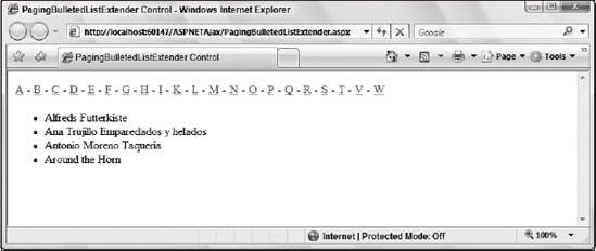
In this figure, you can see that the paging is organized alphabetically and it is sorted on the client. Only the letters for which there are values appear in the linked list of letters. Clicking any of the other letters gives you the items from the bulleted list that starts with that character.
7.2.19. PopupControlExtender
The PopupControlExtender control allows you to create a pop-up for any control on your page. For instance, you can completely mimic the CalendarExtender control that was presented earlier by creating a pop-up containing a Calendar control off a TextBox control. Listing 7-24 mimics this behavior.
Example 7-24. Creating a CalendarExtender control with the PopupControlExtender
<%@ Page Language="C#" %>
<%@ Register Assembly="AjaxControlToolkit" Namespace="AjaxControlToolkit"
TagPrefix="cc1" %>
<script runat="server">
protected void Calendar1_SelectionChanged(object sender, EventArgs e)
{
PopupControlExtender1.Commit(Calendar1.SelectedDate.ToShortDateString());
}
</script>
<html xmlns="http://www.w3.org/1999/xhtml">
<head runat="server">
<title>PopupControlExtender Control</title>
</head>
<body>
<form id="form1" runat="server">
<div>
<asp:ScriptManager ID="ScriptManager1" runat="server">
</asp:ScriptManager>
<cc1:PopupControlExtender ID="PopupControlExtender1" runat="server"
TargetControlID="TextBox1" PopupControlID="UpdatePanel1" OffsetY="25">
</cc1:PopupControlExtender>
<asp:TextBox ID="TextBox1" runat="server"></asp:TextBox>
<asp:UpdatePanel ID="UpdatePanel1" runat="server">
<ContentTemplate>
<asp:Calendar ID="Calendar1" runat="server" BackColor="White"
BorderColor="White" BorderWidth="1px" Font-Names="Verdana"
Font-Size="9pt" ForeColor="Black" Height="190px"
NextPrevFormat="FullMonth" Width="350px"
OnSelectionChanged="Calendar1_SelectionChanged">
<SelectedDayStyle BackColor="#333399" ForeColor="White" />
<TodayDayStyle BackColor="#CCCCCC" />
<OtherMonthDayStyle ForeColor="#999999" />
<NextPrevStyle Font-Bold="True" Font-Size="8pt"
ForeColor="#333333" VerticalAlign="Bottom" />
<DayHeaderStyle Font-Bold="True" Font-Size="8pt" />
<TitleStyle BackColor="White" BorderColor="Black"
BorderWidth="4px" Font-Bold="True" Font-Size="12pt"
ForeColor="#333399" /></asp:Calendar>
</ContentTemplate>
</asp:UpdatePanel>
</div>
</form>
</body>
</html> |
When you run this page, you get a single textbox on the page. Clicking within the textbox pops up a calendar that allows you to select a data that will then be populated back into the textbox (as illustrated in Figure 7-32).
Figure 7-32. Figure 7-32

You will want to place your pop-up control within an ASP.NET AJAX UpdatePanel control and to pass the value from the pop-up control back to the target control (the TextBox1 control), you are going to use the Commit() method.
PopupControlExtender1.Commit(Calendar1.SelectedDate.ToShortDateString())
7.2.20. ResizableControlExtender
In many situations, you may want to limit the size of an element when it is initially displayed but allow users to grow or shrink the element as they see fit. The ResizableControlExtender makes this easy. You place the ResizableControl on the page and point it to an ASP.NET Panel control, using the TargetControlID property.
The ResizableControlExtender control allows you to take a Panel control and give end users the ability to grab a handle and change the size of the element (smaller or bigger). Anything you put inside the Panel control changes in size according to how the end user extends the item. For this to work, you are going to have to create a handle for the end user to work from in pulling or contracting the item.
You use the HandleCssClass property to specify the style information about the appearance of the handle the user selects to begin resizing the panel. The ResizableCssClass property refers to style information shown while the panel is being altered.
The control also exposes events that are raised that you can attach code to in order to react to the panel being resized: OnClientResizeBegin, OnClientResizing, and finally OnClientResize. These are very useful for actions such as altering text size or retrieving additional data if the panel is grown or hiding elements if the panel is minimized. Listing 7-25 is an example of using the ResizableControlExtender with the CSS information inline in the page. The example shows you how to use the ResizableControlExtender with an image.
Example 7-25. Using the ResizableControlExtender with an image
<%@ Page Language="C#" %>
<%@ Register Assembly="AjaxControlToolkit" Namespace="AjaxControlToolkit"
TagPrefix="cc1" %>
<html xmlns="http://www.w3.org/1999/xhtml">
<head runat="server">
<title>ResizableControlExtender Control</title>
<style type="text/css">
.handle
{
width:10px;
height:10px;
background-color:Black;
}
.resizable
{
border-style:solid;
border-width:2px;
border-color:Black;
}
</style>
</head>
<body>
<form id="form1" runat="server">
<div>
<asp:ScriptManager ID="ScriptManager1" runat="server">
</asp:ScriptManager>
<cc1:ResizableControlExtender ID="ResizableControlExtender1" runat="server"
TargetControlID="Panel1" HandleCssClass="handle"
ResizableCssClass="resizable">
</cc1:ResizableControlExtender>
<asp:Panel ID="Panel1" runat="server" Width="300" Height="225"><asp:Image ID="Image1" runat="server" ImageUrl="Images/Garden.jpg"
style="width:100%; height:100%"/>
</asp:Panel>
</div>
</form>
</body>
</html> |
In this example, the ResizableControlExtender control depends upon CSS to create the handle for the end user to grab and hold to resize the Panel control. The TargetControlID property points to the control to be resized.
There are two CSS references in the ResizableControlExtender control. One deals with the control as it sits on the screen with no end user interaction. This is done to show the end users that they have the ability to resize the element. This is done through the HandleCssClass property. The value of this property points to the CSS class handle contained within the same file. The second CSS reference deals with the control when the end user clicks and holds (does not let up on the mouse button). This one is done with the ResizableCssClass property. The value of this property points to the CSS class resizable.
The page generated when the code is compiled and run is presented in Figure 7-33.
Figure 7-33. Figure 7-33

From these screenshots, you can see in the image on the top how the image looks when there is no end user interaction. In this case, there is a black square (as defined by the CSS) in the lower-right corner of the image. The image on the bottom shows what happens when the end user grabs the handle and starts changing the shape of the control.
7.2.21. RoundedCornersExtender
The RoundedCornersExtender control allows you to put rounded corners on the elements on your page. As with the ResizableControlExtender control, you are going to want to put the element you are interested in working with inside of a Panel control. Listing 7-26 shows this done with a Login server control.
Example 7-26. Rounding the corners of the Panel control containing a Login server control
<%@ Page Language="C#" %>
<%@ Register Assembly="AjaxControlToolkit" Namespace="AjaxControlToolkit"
TagPrefix="cc1" %>
<html xmlns="http://www.w3.org/1999/xhtml">
<head runat="server">
<title>RoundedCornersExtender Control</title>
</head>
<body>
<form id="form1" runat="server">
<div>
<asp:ScriptManager ID="ScriptManager1" runat="server">
</asp:ScriptManager>
<cc1:RoundedCornersExtender ID="RoundedCornersExtender1" runat="server"
TargetControlID="Panel1">
</cc1:RoundedCornersExtender>
<asp:Panel ID="Panel1" runat="server" Width="250px"
HorizontalAlign="Center" BackColor="Orange">
<asp:Login ID="Login1" runat="server">
</asp:Login>
</asp:Panel>
</div>
</form>
</body>
</html> |
Here, the RoundedCornersExtender control simply points to the Panel control with the TargetControlID property. This Panel control has a background color of orange to show that the corners are indeed rounded. The result of this bit of code is shown in Figure 7-34.
Figure 7-34. Figure 7-34

You can control the degree of the rounded corners using the Radius property of the RoundedCornersExtender control. By default, this property is set to a value of 5. You can even go as far as to choose which corners you want to round using the Corners property. The possible values of the Corners property include All, Bottom, BottomLeft, BottomRight, Left, None, Right, Top, TopLeft, and TopRight.
7.2.22. SliderExtender
The SliderExtender actually extends a TextBox control to make it look like nothing it normally does. This ASP.NET AJAX control gives you the ability to create true slider control that allows the end user to select a range of numbers using the mouse instead of having to type in the number. Listing 7-27 shows a simple example of using the slider.
Example 7-27. Using the Slider control
<%@ Page Language="C#" %>
<%@ Register Assembly="AjaxControlToolkit" Namespace="AjaxControlToolkit"
TagPrefix="cc1" %>
<html xmlns="http://www.w3.org/1999/xhtml">
<head runat="server">
<title>SliderExtender Control</title>
</head>
<body>
<form id="form1" runat="server">
<div>
<asp:ScriptManager ID="ScriptManager1" runat="server">
</asp:ScriptManager>
<cc1:SliderExtender ID="SliderExtender1" runat="server"
TargetControlID="TextBox1">
</cc1:SliderExtender>
<asp:TextBox ID="TextBox1" runat="server"></asp:TextBox>
    </div>
    </form>
</body>
</html> |
This little bit of code to tie a SliderExtender control to a typical TextBox control is simple and produces the result presented in Figure 7-35.
Figure 7-35. Figure 7-35
This is fine, but it is hard for end users to tell what number they are selecting. Therefore, you might find it better to give a signifier to the end user. Adding a Label control to the page (called Label1) and changing the SliderExtender control to include a BoundControlID property gives you this result. The code for this change is presented here:
<cc1:SliderExtender ID="SliderExtender1" runat="server" TargetControlID="TextBox1"
 BoundControlID="Label1">
</cc1:SliderExtender>
This small change produces the results (with the appropriate Label control on the page) presented here in Figure 7-36.
Figure 7-36. Figure 7-36
Now when the end user slides the handle on the slider, they see the number that they are working with quite easily. Some of the following properties are available to the SliderExtender control as presented here in the following list.
Decimals: Allows you to specify the number of decimals the result should take. The more decimals you have, the more unlikely the end user will be able to pick an exact number.
HandleCssClass: The CSS class that you are using the design the handle.
HandleImageUrl: The image file you are using to represent the handle.
Length: The length of the slider in pixels. The default value is 150.
Maximum: The maximum number represented in the slider. The default value is 100.
Minimum: The minimum number represented in the slider. The default value is 0.
Orientation: The orientation of the slider. The possible values include Horizontal and Vertical. The default value is Horizontal.
RailCssClass: The CSS class that you are using to design the rail of the slider.
TooltipText: The ToolTip when hovering on the slider. Using {0} within the text provides the means to show the end user the position the slider is currently in.
7.2.23. SlideShowExtender
The SlideShowExtender control allows you to put an image slideshow in the browser. The slideshow controls allow the end user to move to the next or previous images as well as simply playing the images as a slideshow with a defined wait between each image. Listing 7-28 shows an example that creates a slideshow.
Example 7-28. Creating a slideshow with three images
.ASPX
<%@ Page Language="C#" AutoEventWireup="true" CodeFile="SlideShowExtender.aspx.cs"
    Inherits="SlideShowExtender" %>

<%@ Register Assembly="AjaxControlToolkit" Namespace="AjaxControlToolkit"
    TagPrefix="cc1" %>

<html xmlns="http://www.w3.org/1999/xhtml">
<head runat="server">
    <title>SlideShowExtender Control</title>
</head>
<body>
    <form id="form1" runat="server">
    <div>
        <asp:ScriptManager ID="ScriptManager1" runat="server">
        </asp:ScriptManager>
        <asp:Panel ID="Panel1" runat="server" Width="300px"
         HorizontalAlign="Center">
            <cc1:SlideShowExtender ID="SlideShowExtender1" runat="server"
                ImageTitleLabelID="LabelTitle" TargetControlID="Image1"
                UseContextKey="True" NextButtonID="ButtonNext"
                PlayButtonID="ButtonPlay"
                PreviousButtonID="ButtonPrevious"
                SlideShowServiceMethod="GetSlides"
                ImageDescriptionLabelID="LabelDescription">
            </cc1:SlideShowExtender>
            <asp:Label ID="LabelTitle" runat="server" Text="Label"
             Font-Bold="True"></asp:Label><br /><br />
            <asp:Image ID="Image1" runat="server"
             ImageUrl="Images/Garden.jpg" /><br />
            <asp:Label ID="LabelDescription" runat="server"
             Text="Label"></asp:Label><br /><br />
            <asp:Button ID="ButtonPrevious" runat="server" Text="Previous" />
            <asp:Button ID="ButtonNext" runat="server" Text="Next" />
            <asp:Button ID="ButtonPlay" runat="server" />
        </asp:Panel>
    </div>
    </form>
</body>
</html> |
The SlideShowExtender control has a lot of properties available to it. You can specify the location where you are defining the image title and description using the ImageTitleLabelID and the ImageDescriptionLabelID properties. In addition to that, this page contains three Button controls. One to act as the Previous button, another for the Next button, and the final one to act as the Play button. However, it is important to note that when the Play button is clicked (to start the slideshow), it will turn into the Stop button for you.
One important property is the SlideShowServiceMethod property as this points to the server-side method that returns the images that are part of the slide show. In this case, it is referring to an image called GetSlides, which is represented here in Listing 7-29.
Example 7-29. The GetSlides method implementation
public partial class SlideShowExtender : System.Web.UI.Page
{
    [System.Web.Services.WebMethodAttribute(),
     System.Web.Script.Services.ScriptMethodAttribute()]
    public static AjaxControlToolkit.Slide[] GetSlides(string contextKey)
    {
        return new AjaxControlToolkit.Slide[] {
            new AjaxControlToolkit.Slide("Images/Creek.jpg",
              "The Creek", "This is a picture of a creek."),
            new AjaxControlToolkit.Slide("Images/Dock.jpg",
              "The Dock", "This is a picture of a Dock."),
            new AjaxControlToolkit.Slide("Images/Garden.jpg",
              "The Garden", "This is a picture of a Garden.") };
    }
} |
With the code-behind in place, the SlideShowExtender now has a server-side method to call for the photos. This method, called GetSlides(), returns an array of Slide objects which require the location of the object (the path), the title, and the description. When running this page, you get something similar to the following results illustrated in Figure 7-37.
Figure 7-37. Figure 7-37
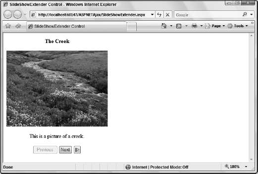
Clicking the play button on the page rotates the images until they are done. They will not repeat in a loop unless you have the SlideShowExtender control's Loop property set to true (it is set to false by default).
The other important property to pay attention to is the PlayInterval property. The value of this property is an Integer that represents the number of milliseconds that the browser will take to change to the next photo in the series of images. By default, this is set to 3000 milliseconds.
7.2.24. TextBoxWatermarkExtender
The TextBoxWatermarkExtender control allows you to put instructions within controls for the end users, which gives them a better understanding of what to use the control for. This can be text or even images (when using CSS). Listing 7-30 shows an example of using this control with a TextBox server control.
Example 7-30. Using the TextBoxWatermarkExtender control with a TextBox control
<%@ Page Language="C#" %>

<%@ Register Assembly="AjaxControlToolkit" Namespace="AjaxControlToolkit"
    TagPrefix="cc1" %>

<html xmlns="http://www.w3.org/1999/xhtml">
<head runat="server">
    <title>TextBoxWatermarkExtender Control</title>
</head>
<body>
    <form id="form1" runat="server">
    <div>
        <asp:ScriptManager ID="ScriptManager1" runat="server">
        </asp:ScriptManager>
        <cc1:TextBoxWatermarkExtender ID="TextBoxWatermarkExtender1" runat="server"
         WatermarkText="Enter in something here!" TargetControlID="TextBox1">
        </cc1:TextBoxWatermarkExtender>
        <asp:TextBox ID="TextBox1" runat="server"></asp:TextBox>
    </div>
    </form>
</body>
</html> |
In this case, the TextBoxWatermarkExtender control is associated with a simple TextBox control and uses the WatermarkText property to provide the text that will appear inside the actual TextBox control. Figure 7-38 shows the results of the code from this listing.
Figure 7-38. Figure 7-38
The text in the image from Figure 7-38 is straight text with no style inside of the TextBox control. When the end user clicks inside of the TextBox control, the text will disappear and the cursor will be properly placed at the beginning of the textbox.
To apply some style to the content that you use as a watermark, you can use the WatermarkCssClass property. You can change the code to include a bit of style, as shown in Listing 7-31.
Example 7-31. Applying style to the watermark
<%@ Page Language="C#" %>

<%@ Register Assembly="AjaxControlToolkit" Namespace="AjaxControlToolkit"
    TagPrefix="cc1" %>

<html xmlns="http://www.w3.org/1999/xhtml">
<head runat="server">
    <title>TextBoxWatermarkExtender Control</title>
    <style type="text/css">
        .watermark
        {
         width:150px;
         font:Verdana;
         font-style:italic;
        color:GrayText;
        }

    </style>
</head>
<body>
    <form id="form1" runat="server">
    <div>
        <asp:ScriptManager ID="ScriptManager1" runat="server">
        </asp:ScriptManager>
        <cc1:TextBoxWatermarkExtender ID="TextBoxWatermarkExtender1" runat="server"
         WatermarkText="Enter in something here!" TargetControlID="TextBox1"
         WatermarkCssClass="watermark">
        </cc1:TextBoxWatermarkExtender>
        <asp:TextBox ID="TextBox1" runat="server"></asp:TextBox>
    </div>
    </form>
</body>
</html> |
This time, the WatermarkCssClass property is used and points to the inline CSS class, watermark, which is on the page. Running this page, you see the style applied as presented in Figure 7-39.
Figure 7-39. Figure 7-39
7.2.25. ToggleButtonExtender
The ToggleButtonExtender control works with CheckBox controls and allows you to use an image of your own instead of the standard checkbox images that the CheckBox controls typically use. Using the ToggleButtonExtender control, you are able to specify images for checked, unchecked, and disabled statuses. Listing 7-32 shows an example using this control.
Example 7-32. Using the ToggleButtonExtender control
<%@ Page Language="C#" %>
<%@ Register Assembly="AjaxControlToolkit" Namespace="AjaxControlToolkit"
TagPrefix="cc1" %>
<html xmlns="http://www.w3.org/1999/xhtml">
<head runat="server">
<title>ToggleButtonExtender Control</title>
</head>
<body>
<form id="form1" runat="server">
<div>
<asp:ScriptManager ID="ScriptManager1" runat="server">
</asp:ScriptManager>
<cc1:MutuallyExclusiveCheckBoxExtender
ID="MutuallyExclusiveCheckBoxExtender1" runat="server" Key="MyCheckBoxes"
TargetControlID="CheckBox1">
</cc1:MutuallyExclusiveCheckBoxExtender>
<cc1:MutuallyExclusiveCheckBoxExtender
ID="MutuallyExclusiveCheckBoxExtender2" runat="server" Key="MyCheckBoxes"
TargetControlID="CheckBox2">
</cc1:MutuallyExclusiveCheckBoxExtender>
<cc1:ToggleButtonExtender ID="ToggleButtonExtender1" runat="server"
TargetControlID="CheckBox1" UncheckedImageUrl="Images/Unchecked.gif"
CheckedImageUrl="Images/Checked.gif" CheckedImageAlternateText="Checked"
UncheckedImageAlternateText="Not Checked" ImageWidth="25"
ImageHeight="25">
</cc1:ToggleButtonExtender>
<asp:CheckBox ID="CheckBox1" runat="server" Text=" Option One" />
<cc1:ToggleButtonExtender ID="ToggleButtonExtender2" runat="server"
TargetControlID="CheckBox2" UncheckedImageUrl="Images/Unchecked.gif"
CheckedImageUrl="Images/Checked.gif" CheckedImageAlternateText="Checked"
UncheckedImageAlternateText="Not Checked" ImageWidth="25"
ImageHeight="25">
</cc1:ToggleButtonExtender>
<asp:CheckBox ID="CheckBox2" runat="server" Text=" Option Two" />
</div>
</form>
</body>
</html> |
This page has two CheckBox controls. Each checkbox has an associated ToggleButtonExtender control, along with a MutuallyExclusiveCheckBoxExtender control to tie the two checkboxes together. The ToggleButtonExtender control uses the CheckedImageUrl and the UncheckedImageUrl properties to specify the appropriate images to use. Then, if images are disabled by the end user's browser instance, the text that is provided in the CheckedImageAlternateText and UncheckedImageAlternateText properties is used instead. You also have to specify values for the ImageWidth and ImageHeight properties for the page to run.
Running this page, you will get results similar to those presented in Figure 7-40.
Figure 7-40. Figure 7-40
7.2.26. UpdatePanelAnimationExtender
Animating an UpdatePanel as its content is being refreshed is a common scenario. The UpdatePanelAnimationExtender allows you to use the broad set of animations available in the Toolkit and will automatically coordinate playing them when the specified UpdatePanel is being updated or when the update has completed.
The UpdatePanelAnimationExtender control allows you to apply an animation to a Panel control for two specific events. The first is the OnUpdating event, and the second is the OnUpdated event. You can then use the animation framework provided by ASP.NET AJAX to change the page's style based on these two events. Listing 7-33 shows an example of using the OnUpdated event when the end user clicks on a specific date within a Calendar control contained within the UpdatePanel control on the page.
Example 7-33. Using animations on the OnUpdated event
<%@ Page Language="C#" %>

<%@ Register Assembly="AjaxControlToolkit" Namespace="AjaxControlToolkit"
    TagPrefix="cc1" %>

<script runat="server">
    protected void Calendar1_SelectionChanged(object sender, EventArgs e)
    {
        Label1.Text = "The date selected is " +
           Calendar1.SelectedDate.ToLongDateString();
    }
</script>
<html xmlns="http://www.w3.org/1999/xhtml">
<head runat="server">
    <title>UpdatePanelAnimationExtender Control</title>
</head>
<body>
    <form id="form1" runat="server">
    <div>
        <asp:ScriptManager ID="ScriptManager1" runat="server">
        </asp:ScriptManager>
        <cc1:UpdatePanelAnimationExtender ID="UpdatePanelAnimationExtender1"
         runat="server" TargetControlID="UpdatePanel1">
            <Animations>
                <OnUpdated>
                    <Sequence>
                        <Color PropertyKey="background" StartValue="#999966"
                         EndValue="#FFFFFF" Duration="5.0" />
                    </Sequence>
</OnUpdated>
</Animations>
</cc1:UpdatePanelAnimationExtender>
<asp:UpdatePanel ID="UpdatePanel1" runat="server">
<ContentTemplate>
<asp:Label ID="Label1" runat="server"></asp:Label><br />
<asp:Calendar ID="Calendar1" runat="server"
onselectionchanged="Calendar1_SelectionChanged"></
asp:Calendar>
</ContentTemplate>
</asp:UpdatePanel>
</div>
</form>
</body>
</html> |
With this bit of code, when you click on a date within the Calendar control, the entire background of the UpdatePanel holding the calendar changes from one color to another over a 5-second duration according to what is specified in the animation. The animations you define can get pretty complex, and building deluxe animations are beyond the scope of this chapter.
7.2.27. ValidatorCalloutExtender
The last extender control covered is the ValidatorCalloutExtender control. This control allows you to add a more noticeable validation message for end users working with a form. You associate this control not with the control that is being validated but instead with the validation control itself. An example of associating the ValidatorCalloutExtender control to a RegularExpressionValidator control is presented in Listing 7-34.
Example 7-34. Creating validation callouts with the ValidationCalloutExtender
<%@ Page Language="C#" %>
<%@ Register Assembly="AjaxControlToolkit" Namespace="AjaxControlToolkit"
TagPrefix="cc1" %>
<html xmlns="http://www.w3.org/1999/xhtml">
<head runat="server">
<title>ValidatorCalloutExtender Control</title>
</head>
<body>
<form id="form1" runat="server">
<div>
<asp:ScriptManager ID="ScriptManager1" runat="server">
</asp:ScriptManager>
<cc1:ValidatorCalloutExtender ID="ValidatorCalloutExtender1" runat="server"
TargetControlID="RegularExpressionValidator1">
</cc1:ValidatorCalloutExtender>
Email Address: <asp:TextBox ID="TextBox1" runat="server"></asp:TextBox>
<asp:RegularExpressionValidator ID="RegularExpressionValidator1"
runat="server"
ErrorMessage="You must enter an e-mail address" Display="None"
ControlToValidate="TextBox1"
ValidationExpression="w+([-+.']w+)*@w+([-.]w+)*.w+([-.]w+)*">
</asp:RegularExpressionValidator><br />
<asp:Button ID="Button1" runat="server" Text="Submit" />
</div>
</form>
</body>
</html> |
This page has a single textbox for the form, a submit button, and a RegularExpressionValidator control. You build the RegularExpressionValidator control as you normally would, except that you make use of the Display property and set it to None. You do not want the normal ASP.NET validation control to also display its message, as it will collide with the one that will be displayed with the ValidatorCalloutExtender control. While the Display property is set to None, you still use the ErrorMessage property to provide the error message. Running this page produces the results presented in Figure 7-41.
Figure 7-41. Figure 7-41
