
Now that we have finished the first iteration of our analysis sheet, it is time to start creating the new Dashboard sheet. As was defined before, we will need to visualize the following KPIs and metrics:
- Load Factor %: This gives the number of enplaned passengers versus the number of available seats
- Performed versus scheduled flights: This gives the number of flights that were performed versus those that were scheduled
- Air time %: This gives the time spent flying versus total ramp-to-ramp time
- Enplaned passengers (in millions): This gives the number of transported passengers, in millions
- Departures performed (in thousands): This gives the number of flights performed, in thousands
- Revenue Passenger Miles (millions): This gives the total number of miles that all passengers were transported, in millions
- Available Seat Miles (millions): This gives the total number of miles that all seats (including unoccupied seats) were transported, in millions
- Market Share: This is based on enplaned passengers
As we want to have a consistent interface throughout our sheets, let's first set up the new sheet and common objects by following these steps:
- Add a new sheet by selecting Layout | Add Sheet… from the menu.
- Right-click on the new sheet workspace and select Properties….
- On the General tab, set the Title of the sheet to
Dashboardand click on OK to close the dialog. - Right-click on the tab area of the new Dashboard sheet and select Promote Sheet to place the Dashboard sheet to the left of the Analysis sheet.
- Then, navigate to the Analysis sheet.
- Repeat the following process for each of the objects shown in the following screenshot. Right-click and select Copy to Clipboard | Object, select the Dashboard tab, and right-click on an empty space and select Paste Sheet Object as Link.

Now, when we switch between the Dashboard and Analysis tabs, we can see that the surrounding listboxes, current selection box, buttons, and bookmark object remain consistent; only the contents in the center area of the screen will differ from one tab to the other.
When we created the Dashboard sheet in the previous exercise, we used the Paste Sheet Object as Link command instead of Paste Sheet Object to paste the copied objects to the new sheet.
The difference between these two options is that using Paste Sheet Object creates a copy of the object, which is independent of the source object. The Paste Sheet Object as Link option, on the other hand, creates an additional instance (or linked object) of the source object. Any changes made to the layout properties of a linked object will be applied to all other linked objects, with the exception of size and position.
When the same object is used in many different places, such as listboxes that appear on every sheet, using linked objects can make maintenance a lot more convenient.
Tip
Drag and drop to copy or create linked objects
Objects can also be copied or linked by dragging and dropping.
To copy an object, hold down the Ctrl key while clicking on the object's caption and drag the object. A small green plus sign on your cursor will indicate that you are copying an object. Release the mouse cursor on an empty space on the worksheet to create a copy.
Creating a linked object works very similarly to copying an object. Hold down Ctrl + Shift while clicking on the object's caption. A small chain icon on your cursor indicates that you are linking an object. Drag and release the mouse cursor on an empty space on the worksheet to create the linked object.
Of course, we can also create copies or linked objects on sheets other than the source sheet. To do this, instead of dragging the object to an empty space on the worksheet, drag it to the tab corresponding to the target sheet. The object will appear in exactly the same position as the source object, but on the other sheet.
Let's see how linked objects work by following these steps:
- On the Dashboard tab, create a copy of the Carrier Name listbox by holding down the Ctrl key, clicking on the header, and dragging the listbox to an empty space on the worksheet.
- Right-click on the new copy and select Properties….
- On the General tab, set the Title of the listbox to
Copy. - On the Font tab, set the Font Style to Bold and the Font Size to 16.
- Click on OK to close the Properties dialog.
- Now, create a linked object of the listbox Aircraft Group by holding down Ctrl + Shift, clicking on the header, and dragging the listbox to an empty space on the worksheet.
- Right-click on the new linked object and select Properties….
- On the General tab, set the Title to
Linked Object. - On the Font tab, set the Font Style to Bold and the Font Size to 16.
- Click on OK to close the Properties dialog.
The result shows the difference between copied and linked objects. Changes that were made to the copied Carrier Name listbox have not been applied to the original, while changes that were made to the linked Aircraft Group object were also applied to the original. In fact, they have even been applied to the Aircraft Group listbox on the Analysis sheet as well.

Let's undo the changes we've made by pressing Ctrl + Z until we are back to the original layout.

After our little detour on linked objects, let's start building the dashboard by adding three gauge charts, one showing a global indicator of Load Factor %, the second showing Performed vs Scheduled Departures ratio value, and the third showing the Air Time % value.
- Start by adding a new chart object with the Create Chart button located on the design toolbar.
- From the first dialog window, make sure to select Gauge as Chart Type.

- In the Window Title field, enter
Load Factor %as the name of the chart and click on Next. - This chart type does not make use of dimensions, so we'll skip this window and click on Next once more to get to the Expressions dialog window.
- Add the following expression in the Edit Expression dialog window and click on OK to continue:
Sum ([# Transported Passengers]) / Sum ([# Available Seats])
- The expression that we just created will calculate the percentage of occupied seats compared to those that were available on each flight.
- The Label we'll assign to this expression will be the same as the Window Title field that we previously defined:
Load Factor %. - Click on Next three times, until you are at the Presentation window, and set the following configuration under the Gauge Settings section:
- Min and Max values will be
0.5and1respectively - From the Segment Setup section, we will add two more segments by clicking on the Add… button twice
- Deselect the Autowidth Segments checkbox at the bottom of the window
- Min and Max values will be
When selected, the Autowidth Segments function automatically sizes the segments based on the Min and Max values of the gauge. We want to avoid this as we want to set the values ourselves.
We should now have four segments and will set up each of the four segments is in the following manner:
- Segment 1:
- Lower Bound:
0.5 - Color set to Two Colors Gradient with the Base Color option set to Red (R:
255; G:0; B:0) and the Second Color option set to Orange (R:255; G:128; B:0) - Color Gradient Style option should be set to Vertical
- Lower Bound:
- Segment 2:
- Lower Bound:
0.625 - Color set to Two Colors Gradient with the Base Color option set to Orange (R:
255; G:128; B:0) and the Second Color option set to Yellow (R:255; G:255; B:0) - Color Gradient Style option will be set to Vertical
- Lower Bound:
- Segment 3:
- Lower Bound:
0.75 - Color set to Two Colors Gradient with the Base Color option set to Yellow (R:
255; G:255; B:0) and the Second Color option set to Light Green (R:128; G:255; B:128) - Color Gradient Style option will be set to Vertical
- Lower Bound:
- Segment 4:
- Lower Bound:
0.85 - Color set to Two Colors Gradient with the Base Color option set to Light Green (R:
128; G:255; B:128) and the Second Color option set to Green (R:0; G:255; B:0) - Color Gradient Style option should be set to Vertical
- Lower Bound:
In these steps we configured the gauge to display values from 50 to 100 percent. Within this range we defined four separate segments, each with their own color. You may have noticed that we only set the lower boundary for each segment; this is because the upper boundary is automatically defined by the lower boundary of the following segment, or by the upper boundary of the gauge. In our example, Segment 1 runs from 50 to 62.5 percent (although we specified the limits in decimal form, that is, 0.5 and 0.625), Segment 2 covers the area ranging from 62.5 to 75 percent, and so on.
Let's continue setting up our gauge.
- Still on the Presentation tab, enable the checkboxes corresponding to Show Scale, Show Labels on Every Major Unit, Hide Segment Boundaries, and Hide Gauge Outlines.
- Set the value of Show Scale to 6 Major Units, set the value of Show Labels on Every to 1 Major Unit.
- Click on Next three times, until you get to the Number dialog window, set the format to Integer, and mark the checkbox corresponding to Show in Percent (%).
- Click on Next to open the Font dialog window and set the Size to 8.
- Click on Finish to create the chart.
The result should be the following gauge chart:

As at this point it's hard to see what exact number the chart is presenting, we'll add a Text in Chart attribute to show the corresponding result value using the following steps:
- Bring up the Properties… dialog window again by right-clicking on the Gauge chart option and activating the Presentation tab.
- Locate the Text in Chart section and click on the corresponding Add… button. This brings up the Chart Text dialog, which is shown in the following screenshot:

- We'll add an expression in the Text field. Open the Edit Expression window by clicking on the … button.
- Type the following expression and click on OK:
=Num (Sum ([# Transported Passengers]) / Sum ([# Available Seats]), '##.#%')
The expression we just created calculates the Load Factor % value and formats it as a percentage using the
Num()function. Let's finish the text. - From the Chart Text window, make sure to set the Alignment option to Centered and change the Font option to Tahoma, Font Style to Regular, and Size to 14.
- Click on OK in all of the dialog windows that remain open to apply the changes.
Initially, the added text will be placed at the upper-left corner of the object and we'll need to relocate it. To do that, follow these steps.
- Activate the gauge object by clicking on the caption. Then, press Ctrl + Shift.
This will show a red border line around the text we want to move as well as around the other chart components (that is, the chart area itself, the legend, if any, and the title).

- Use your mouse to drag the text we added to an appropriate location in the chart and size it accordingly, as shown in the previous screenshot.
One final adjustment we are going to make to this chart is to remove the caption bar and border and to make the background of the chart fully transparent. To do this we use the following steps:
- Right-click the gauge chart and select Properties….
- Navigate to the Colors tab and move the Transparency slider (under the Frame Background option) to 100%.
- Navigate to the Layout tab and disable the Use Borders option.
- From the Caption tab, deselect the Show Caption checkbox.
- Click on OK to close the Chart Properties window.
The end result should be a gauge chart that looks like this:

Since we have already created a gauge chart with several specific configurations, let's make use of it to create a new one without having to do the whole process over again.
Right-click on the gauge chart we created previously and click on the Clone option. A new copy of the object will be created exactly as the previous one; the only thing we will need to do is re-position it and change its expression and title, as well as the text in the chart.
Right-click on the new cloned object and select Properties… to make the following changes:
- In the General tab, the Window Title field will be
Performed vs Scheduled. - The expression we will use is:
Sum([# Departures Performed]) / Sum([# Departures Scheduled])
- The label for the expression is the same as the Window Title field:
Performed vs Scheduled. - On the Presentation tab, change the following settings:
- Set the Max value for the gauge to
1.2 - Set the Show Scale value to 8 Major Units
- Set the Show Labels on Every value to 1 Major Unit
- Highlight the Text in Chart expression that we added previously and click on the Edit… button. Change the expression to:
=Num(Sum([# Departures Performed]) / Sum([# Departures Scheduled]), '##.#%')
- Set the Max value for the gauge to
The final gauge that we will be creating is the Air Time %. Now that you have seen how to create a new gauge and how to clone an existing one, take a chance and see if you can create this gauge yourself:
- The Window and Expression Title fields should be
Air Time %. - The expression to calculate the Air Time % is as follows:
Sum ([# Air Time]) / Sum ([# Ramp-To-Ramp Time])
- The Max value for the gauge should be
1. - The Show Scale value should be set to 6 Major Units.
- The Show Labels on Every value should be set to 1 Major Unit.
After applying the changes and rearranging the objects, our dashboard should look like this:

While we selected the default speedometer look for our three gauges, QlikView has a few other styles as well. These styles can be selected from the Styles tab of the Chart Properties dialog.
The following screenshot shows, pictured from left to right and top to bottom, a speedometer, vertical speedometer, thermometer, traffic light, horizontal thermometer, and digital digit gauge. These objects are included in this chapter's solution file on the Gauge Styles tab.

Now that we have added the gauges, it is time to add the following four metrics:
- Enplaned passengers (in millions)
- Departures performed (in thousands)
- Revenue Passenger Miles (in millions): the number of miles that paying passengers were transported
- Available Seat Miles (in millions): the total number of miles that paying passengers could have been transported, based on airplane capacity
To display these metrics, we will be using Text Objects. A text object can be used to display a static or calculated text and, somewhat counter-intuitively, images as well.
Let's follow these steps to create the first text object that will display Enplaned Passengers:
- Right-click anywhere on an empty space in the worksheet and select New Sheet Object | Text Object.
- In the Text input box enter the following expression:
=Num(Sum ([# Transported Passengers]) / 1000000, '#,##0.00')
- Move the Transparency slider, at the bottom of the window, to 100%.
- Go to the Font tab and set the Font option to Tahoma, Font Style to Bold, and Size to 16.
- On the Layout tab, enable the Use Borders checkbox.
- On the Caption tab, check the Show Caption checkbox and define the Title Text field as
Transported passengers (millions). - Set the Horizontal Caption Alignment option to Centered.
- Mark the Wrap Text checkbox under Multiline Caption.
- Click on OK to close the dialog window.
After some resizing, the resulting object should look like the following screenshot.

Looking at the steps we went through to create this text object, you may have noticed a few things:
- The expression we used was prefixed with an
=(equal to) sign. This is to tell QlikView to treat the entered text as an expression and evaluate it accordingly, instead of treating it as a static text. - The Text object does not have the Number properties tab which is often seen on other objects, that is why we used the
Num()function to properly format the expression output. - By checking the Wrap Text option we can create a multiline caption, this can be very useful when we have long caption texts and limited horizontal space.
Now that we have created the first text object, take a few minutes to create the remaining three. Remember that you can press Ctrl and drag the mouse pointer to copy an object, so you do not have to create each text object from scratch. The caption's display and expressions are shown in the following table.
|
Caption |
Expression |
|---|---|
|
Departures performed (in thousands) |
=Num(Sum ([# Departures Performed]) / 1000, '#,##0.00')
|
|
Revenue Passenger Miles (in millions) |
=Num(Sum ([# Transported Passengers] * Distance) / 1000000, '#,##0.00')
|
|
Available Seat Miles (in millions) |
=Num(Sum ([# Available Seats] * Distance) / 1000000, '#,##0.00')
|
After creating all four text objects, position them under the gauges in the following manner:

As we said at the start of this section, a text object can also be used to display an image. For example, we may want to display a small "warning" icon on our Enplaned Passengers text object whenever the amount of passengers is lower than 1 million. We can achieve that by following these steps:
- Go to Layout | New Sheet Object | Text Object in the menu bar.
- Do not enter any text; instead, select the Image radio button located in the Background section and click on Change....
- Next, navigate to the
Airline OperationsDesignfolder and select thewarning.gifimage file. - On the Layout tab, set the Layer to Top.
- Click on OK to close the dialog window.
- Position the warning icon over the Transported passengers (millions) text object so that it looks like the following screenshot:

One thing to make note of is the Layer setting. By setting it to Top, we ensure that the icon is always superimposed over the Transported passengers (millions) text object. This is important, otherwise we will not be able to select it using the mouse. Furthermore, if we hadn't set the 100% transparency in the Transported passengers text object, having the icon in a lower layer would prevent it from being visible to the user.
The current result is almost what we want. However, you'll notice that the icon is displayed, even though there are more than 1 million transported passengers, which is the specified limit. Let's take a moment to fix it by using the following steps:
- Right-click on the warning icon and select Properties….
- Go to the Layout tab and select the Conditional radio button under Show.
- Enter the following expression:
Sum([# Transported Passengers]) < 1000000.
- Click on OK to close the Text Object Properties dialog window.
Now the warning icon will only be shown when the specified condition is met; that is, when the number of transported passengers is lower than 1 million. To test it, you can make a few selections, for example, by selecting the year 2011 and Piston, 1-Engine/Combined Single Engine from the Aircraft Group.
Adding these type of visual cues to our dashboard will make it easier for the users to spot potential issues.
Another interesting feature of the Text object is that we can assign actions to it, essentially making it function as a button.
We could use this button-like functionality to allow for quick navigation across the document. For example, a text object could be used to switch to a detail sheet when a user clicks on it from a general-level dashboard. In the next example, we will assign an action that will open the Analysis sheet when a user clicks on one of the text objects:
- Go to the Analysis sheet.
- Bring up the Sheet Properties window by pressing Ctrl + Alt + S.
- On the General tab, set the Sheet ID to
SH_Analysisand click on OK to close the dialog. - Go back to the Dashboard tab.
- Right-click on the Transported passengers (millions) text object and select Properties….
- Go to the Actions tab and click on the Add button.
- Select the Layout option from the Action Type section and select the Activate Sheet option from the Action section. Then click on OK.
- From the Actions tab, locate the SheetID input box and enter
SH_Analysis. Click on OK. - Repeat steps 5 to 8 for each of the three remaining text objects.
Now, whenever the user clicks on one of the text objects, the Analysis sheet will be automatically activated. Note that instead of the sheet's name we used the Sheet ID to refer to the Analysis sheet. As explained earlier, object IDs are used internally to reference objects.
Note
Gauges can h ave actions assigned to them as well, using the Actions tab of the Properties window. A typical use case for this is to let the user drill down to a detailed view for a single KPI or metric. For example, we could create a detailed sheet specifically for the Load Factor % metric to analyze it from many different angles (over time, by airline, and so on.) and then reference it from the corresponding gauge chart.
The final metric that we want to display on our dashboard is Market Share. This metric is based on the number of enplaned passengers per carrier, relative to the total. We will use a Pie Chart to visualize this measure. Let's follow these steps:
- Right-click on an empty space in the sheet and select New Sheet Object | Chart.
- On the General tab, select the Pie Chart option as the Chart Type, the third icon from the left on the bottom row, and click on Next.
- On the Dimension tab, select Carrier Name from the Available Fields/Groups list and click on the Add > button to add it to the Used Dimensions list. Click on Next to continue.
- In the Edit Expression dialog, enter the following expression and click on OK:
Sum([# Transported Passengers])
- Enter Market Share in the Label input box.
- From the Expressions tab, enable both the Relative and the Value on Data Points checkboxes.
- Click on Finish to create the pie chart.
The result should look like the following screenshot:
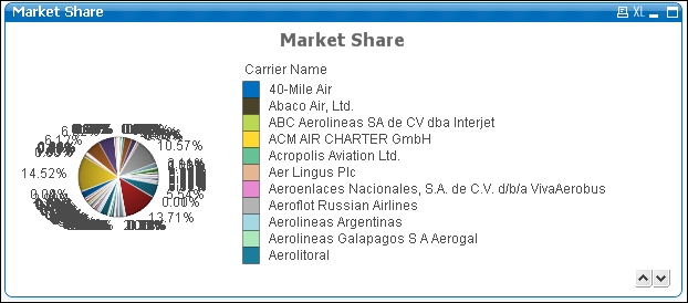
You will notice that this does not look like a pie chart at all. Maximizing the chart to full screen does show the pie, but it is unusable this way. The reason for this is that there are simply too many dimension values; with hundreds of airlines the chart looks more like a candy-cane than a pie.
As the goal of this chart is to display who the big players on the market are, we will modify the chart so that it will only show the airlines that make up 50 percent of the market. All other airlines will be grouped in an Others group.
Follow these steps:
- Right-click on the pie chart and select Properties….
- Go to the Dimension Limits tab.
- Mark the Restrict which values are displayed using the first expression checkbox.
- Select the Show only values that accumulate to radio button and set the corresponding value to 50% relative to the total. Enable the Include Boundary Values checkbox as well.
- Click on OK to close the properties dialog.
The updated pie chart should look like the following screenshot:

We now see that there are actually only five airlines that, put together, account for 50 percent of transported passengers. Also note that the amounts are shown as a percentage, even though the expression we used returns an absolute number (amount of passengers transported). This is because we have set the Relative checkbox on the Expressions tab, which makes QlikView automatically calculate the relative amount versus the total amount for each slice.
The Dimension Limits option we have used to achieve this is a very useful feature that was introduced in QlikView 11 and enables us to control the number of dimension values handled by a chart.
In the Dimension Limits window, all dimensions available in the chart are listed to the left. Simply highlight the desired dimension to which the Dimension Limits configuration should apply to and select any of the following settings to control the number of dimension values displayed:
- From the Show only option we can select First, Largest, or Smallest x values
- From the Show only values that are option we can select Greater than, Less than, Greater than or equal to, or Less than or equal to a certain value, which can be given as:
- A percentage relative to the total
- An exact amount
- From the Show only values that accumulate to option we can select a certain value, which can be given as:
- A percentage relative to the total
- An exact amount
The difference between the second and the third options is that the former evaluates the individual result corresponding to the dimension's value, while the latter evaluates the cumulative total of that value by either sweeping from largest to smallest or vice versa. This can be used, for instance, in a Pareto analysis in which we would present all carriers that make up the 80 percent of the flights, leaving all the rest out.
Additional options can be set when working with dimension limits:
- Show Others: When this option is enabled, all dimension values that are found off-limits will be grouped into an Others category, which will be visible on the chart.
- Collapse Inner dimensions can also be used in conjunction with the Show Others setting to either hide or display subsequent dimensions' values on the Others row, in case the chart has further dimensions than the one highlighted. This is useful mainly on straight tables.
- Show Total: When this option is enabled a new total row will be displayed, which is independent from the Total Mode control of the Expressions tab. This means you can set the Total Mode option to perform an operation over the rows, while the Dimension Total will hold the actual total, considering on and off-limit dimension values.
- Global Grouping Mode: This option determines if the restrictions defined should be calculated considering the inner dimensions or based on a sub total, disregarding the remaining dimensions.
You may have noticed already that this option is not only found on pie charts but on all charts, with the exception of the gauge chart and pivot tables.
While looking at the pie chart we created, you may notice that it is somewhat inconvenient to have to switch between the pie slices and the legend to see which slice represents which carrier. Fortunately, there is a little "hack" that we can apply to place the labels on the data points as well. Follow these steps:
- Right-click on the pie chart and select Properties….
- Go to the Expressions tab, and select Add to add a new expression.
- Enter the following expression:
if(count(distinct [Carrier Name]) = 1, [Carrier Name], 'Others')
- For the Label field of the expression, enter
Carrierand enable the Values on Data Points option. - On the Presentation tab, uncheck the Show Legend checkbox.
While we're at it, let's apply some extra styling:
- On the Font tab, set the Size to 8.
- On the Layout tab, uncheck the Use Borders option.
- On the Caption tab, uncheck the Show Caption option.
- Click on OK to close the Properties window.
Now the carrier names, along with their respective market share, are shown directly on the pie slices. Since there is no need for a legend anymore, we have disabled it. The expression that we used: if(count(distinct [Carrier Name]) = 1, [Carrier Name], 'Others')uses a conditional function to check if the current slice corresponds to a single carrier by counting the distinct number of carrier names (count(distinct [Carrier Name]) = 1). If the count equals one, the carrier name is used; if not, it must mean that we are looking at the "others" slice of the pie, so the "Others" label is applied. Our finished dashboard should now look like the following screenshot:

We've now finished the dashboard sheet. We re-used quite a few objects from the Analysis sheet, and added gauges, text objects, and a pie chart. Besides creating new objects, we were also introduced to linked objects, actions, and dimension limits.
Let's move on to the last sheet, the Reports sheet.