
Over the course of this chapter, we looked at the most common charts found within QlikView. There are, however, some charts that we did not use, and we will use this final section to take a quick glance at them. Do not worry though; with the knowledge you picked up earlier in this chapter you should have no problem creating these charts as well. Examples of these charts are also included on the Other Charts tab of this chapter's solution file.
The Radar Chart can be used to depict information that is cyclical in nature. For example, the following screenshot illustrates the number of enplaned passengers per month. In this example you can clearly see that travel increases during the summer months:

The Mekko Chart is basically a bar chart with the ability to handle an additional dimension. Our example, shown in the following image, displays the number of enplaned passengers by Flight Type and Year. The width of the bar is determined by the relative amount versus the total, considering the first dimension: Flight Type; and the segment distribution within the bar is determined by the relative amount versus the total, considering the second dimension: Year. Looking at this chart we can clearly see that most passengers are being transported on Domestic, US Carrier Only flights, and that the number of passengers transported is roughly equally distributed over the years.

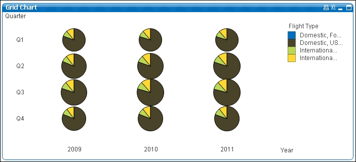
A Grid Chart can contain three different dimensions. In the following example, we've used the Year, Quarter, and Flight Type dimensions. The bubble size represents the number of transported passengers. By taking a closer look, and probably with some imagination, we can spot the same discoveries we made in the first two charts. Bubble sizes are bigger in Q2 and Q3, indicating increased travel during the summer. We can also easily see that most passengers are being transported on Domestic, US Carriers Only flights. Additionally, we can see how Q3 has been smoothly increasing over the last three years.
A Funnel Chart is often used in sales reports to visualize the "sales funnel", that is, which sales opportunities are in which phase of the sales process. The following screenshot shows an example chart that shows the various stages in the sales process and how many clients are present in that phase:

A Block Chart can be used to display hierarchical information, by displaying blocks within blocks. In our example, the size of the block corresponds to the number of passengers that were transported. Each block represents a destination city, and they are all grouped into bigger blocks according to their corresponding countries.
In this example we can clearly see that the majority of passengers have arrived somewhere in the United States. Within the US, we can see that Atlanta, GA and Chicago, IL are the most popular destinations.
By comparing blocks within the chart, we can see that the combined total number of people traveling from US to Canada, Mexico, and the United Kingdom is smaller than the number of people traveling to Atlanta, GA.

The Trellis Chart is not really a separate chart, but a chart option that exists on all charts; with the exception of the straight tables and pivot tables. It creates a grid in which a separate chart is created for each distinct value of the first dimension. To facilitate easy comparisons between charts, each chart's axis uses the same scale.
In the following chart, we have created a chart with two dimensions: Flight Type and Month. We have enabled the Trellis Chart option for the first dimension. The result is a chart that shows, within a grid, a separate chart for each Flight Type. Each separate chart shows the Load Factor % per Month.

The Trellis option can be set by going into the Chart Properties of a chart. On the Dimensions tab you will find the Trellis button; clicking this brings up the Trellis Settings, shown in the following screenshot:

To create a trellis chart, we click on Enable Trellis Chart. Optionally, we can manually set the Number of Columns and/or Number of Rows options.