
The output of the Aggr function can be likened to the list of values a straight table would display when evaluating an expression over a certain dimension. For instance, the following straight table has the Flight Type field as the dimension and Sum([# Departures Performed]) as the expression.

Essentially, the Aggr function creates a virtual straight table, similar to the earlier one, so that we can further process the list of values that would appear in the expression column, without even creating the actual object. The result of the Aggr function can be used to:
- Create a calculated dimension and perform a nested aggregation
- Perform additional aggregations based on the resulting set of values
Let's see examples for both of these.
Since HighCloud Airlines' users are interested in discovering key players in the industry from different perspectives, they now require a visualization object that clearly identifies carrier coverage of interstate routes.
To know how many interstate routes each carrier covers, we would simply create a chart similar to the following screenshot:

Taking this a step further, we can ask a different, but in a way similar, question: If we were to classify carriers by the number of interstate routes they serve, how many carriers would fall under each category?
We could display a straight table with the number of Interstate Routes as the dimension and the number of carriers that fall under each "category" as the expression. The problem is that we don't have a "number of interstate routes" field in our data model, nor can we add it as a calculated field in the script because the calculation varies with each user selection; having a pre-aggregated field is simply not the answer.
What we can do is perform a nested aggregation that dynamically constructs the chart's dimension. To do that, follow these steps:
- Create a new sheet to allocate the examples in this section; name it
Advanced Expressions. - Then, click on the New Chart button from the design toolbar.
- From the initial dialog window, select Straight Table in the Chart Type section and set the Title field to
Carrier Classification by # of Interstate Routes. - Click on Next and, from the Dimensions dialog window, click on the Add Calculated Dimension…button.
- The Edit Expression window will pop up and there we will enter the dimension's definition, based on the
Aggrfunction. Type the following expression and click OK:Aggr(Count(DISTINCT [From - To State Code]), [Carrier Name])
This expression will result in a list of values corresponding to the different number of interstate routes each carrier serves, which is basically the expression column in the straight table shown in the previous screenshot. That list will now be our chart's dimension.
- From the Dimensions window, highlight the calculated dimension we just created from the Used Dimensions list and, in the Label field below, type
Interstate Routes. - Then, click on Next to move on to the Expressions dialog window. On the Edit Expression window, enter the following and click on OK:
Count(DISTINCT [Carrier Name])
This expression will count all different carriers so that the final chart shows the number of carriers each interstate-routes classification has.
- From the Expressions dialog window, assign the
# of Carrierslabel to our expression. - Click on Finish and we will be left with the following chart:

According to the table we see in the earlier screenshot, there are 41 carriers that fall into the two-route category. 32 more serve a single interstate route, 20 other serve 4 interstate routes, and so on.
To design such a table, as you just saw, it's not necessary to create any pre-aggregations in the source tables, nor is it required to have an "Interstate Routes" field per se. The chart, along with its calculated dimension, is completely self-contained and does not require other objects to function.
As useful as they are, calculated dimensions (such as the one we created earlier) are not performance-friendly. Besides delaying calculation time, they can sometimes prevent a chart's state from being cached to RAM, hence stopping QlikView's caching algorithm from coming into play.
As calculated dimensions are sometimes necessary for advanced aggregations, it is advisable to use this feature only when there is no other way of accomplishing certain visualizations. Whenever a calculated dimension can be created as a new field from the script, it is advisable to do so in order to use it in a more natural way in chart objects.
It's also possible to perform additional aggregations over the result set that the Aggr function outputs. Let's look at the following example:
To build upon the insight gained from the previous example, suppose we want to use a text object to present the maximum, minimum, and average number of interstate routes served by all carriers; our starting point would, again, be the following chart:

Since the chart is sorted by number of interstate routes in descending order, we can easily see that the maximum value, regarding number of interstate routes per carrier, belongs to Delta Air Lines Inc. and is 1,145. To get the minimum value, we would sort the table in ascending order. To get the average value, however, it gets kind of tricky. Let's use the Aggr function to display all three values at once. Follow this procedure:
- Click on the Create Text Object button in the design toolbar.
- The New Text Object window will appear, with the General tab initially active. The text we want displayed by the object is entered into the Text field.
On the Text field, type the following expression:
=Max(Aggr(Count(DISTINCT [From - To State Code]), [Carrier Name]))
Notice that the
Aggrfunction part in the earlier expression is the same as that which we used in the previous example to create the chart's dimension. We are now adding theMaxaggregation function to obtain the largest number from the resulting list of values. - Click on OK to close the New Text Object dialog window. The text object should display 1145.

We now
have one of the three values we are interested in. To get the other two values we will use essentially the same expression, only changing the Max function with the Min and Avg functions to get the minimum and average values, respectively.
- Right-click on the text object we just created and select Properties….
- We will modify the Text definition to add the rest of the values. Replace the previous expression with the one that follows:
='Max Value: ' & Max(Aggr(Count(DISTINCT [From - To State Code]),
[Carrier Name])) & Chr(10) &
'Min Value: ' & Min(Aggr(Count(DISTINCT [From - To State Code]), [Carrier Name])) & Chr(10) &
'Avg Value: ' & Avg(Aggr(Count(DISTINCT [From -
To State Code]), [Carrier Name]))
As you can see from this expression, it gets quite lengthy and the
Countfunction is used three times with the same parameters. In this case, it would be a good idea to apply the expression-in-variable concept described earlier in this chapter. Once a neweRoutesvariable is created, the preceding expression could be changed to the following:='Max Value: ' & Max(Aggr($(eRoutes), [Carrier Name])) & Chr(10) & 'Min Value: ' & Min(Aggr($(eRoutes), [Carrier Name])) & Chr(10) & 'Avg Value: ' & Avg(Aggr($(eRoutes), [Carrier Name]))
- Click on OK to apply the changes and the text object should display the following:

In some of our previous expressions, we have used the Distinct qualifier in our Count aggregation function. The Distinct qualifier is used in this case to avoid duplicate counts. However, the use of this qualifier can make the calculation perform poorly as it causes the operation to be single-threaded.
In some cases, it is advisable to avoid using the Count function and the Distinct qualifier by creating a counter field in the script (a field with the value of 1) and then using a more direct aggregation such as Sum(RouteCounter) in the final chart's expression.
HighCloud Airlines have a new requirement in which the Aggr function will prove useful. They want to know the average load factor percentage per airline, but over each route. In this case, a direct aggregation function like the Avg function will not give the result we need because of the additional "dimension" required in the calculation. To illustrate, take the following chart:
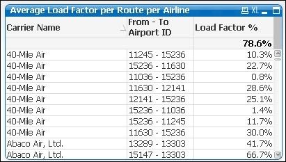
In this chart, we can see the different routes each carrier serves along with the corresponding load factor. We should now take the individual load factor per route and perform an average operation over the list of values for each airline to obtain the value we are looking for.
We can't simply remove the Route dimension because even though we will get a grouped Load Factor % value for each airline, it will not be what we are looking for as the Average Load Factor per Route per Airline value is not the same as the Load Factor per Airline value. Instead, we will use the Aggr function to solve the requirement by entering the chart expression as follows:
Avg(Aggr($(eLoadFactor), Airline, [From - To Airport ID]))
Notice how we've included both dimensions in the Aggr function. Additionally, this function will also account for routes with zero or missing load factors, which are by default not shown in the straight table.
We will keep a second expression with the Load Factor per Airline value to show the difference in both calculations. The second expression column will have the following definition:
$(eLoadFactor)
Now, we can remove the Route dimension from our chart and we will get the following:

With the use of the Aggr function, a QlikView document can be empowered enormously and we are able to accomplish things that are almost impossible with other tools, especially because all calculations are being performed on the fly.