
Now that we've created our Dashboard and Analysis sheets, it is time to create the final sheet from our DAR setup: the Reports sheet.
As was defined in the requirements, we will be creating the following objects:
- Aggregated flights per month
- KPIs per carrier
But before we begin creating new objects, let's first take a quick look at how we can re-use the expressions that we have created earlier.
By now you may have noticed that we are using the same expressions in many places. While we could simply type in the same expression every time, this approach has two disadvantages:
- We risk introducing (minor) variations in the way expressions are calculated. For example, one "revenue" expression might contain sales tax while another does not.
- It makes maintenance harder; if the way an expression is calculated changes we'd have to change it in many different places in our document, though the Expression Overview window can help us simplify that task.
Enter variables. Variables make it easy to store expressions (and other statements, but more on that later) in a central location from where they can be referenced anywhere in our document.
Let's start by creating a variable to store the expression for the Load Factor % KPI:
- Go to Settings | Variable Overview in the menu, or click Ctrl + Alt + V, to open the Variable Overview window.
- Click on Add, enter
eLoadFactorin the Variable Name input box, and click on OK. - While you would expect it, the new variable is not selected by default after creation. Highlight the eLoadFactor variable and enter the following in the Definition input box
:(Sum ([# Transported Passengers]) / Sum ([# Available Seats]))
- In the Comment box, enter the description as
The number of transported passengers versus the number of available seats. - Click on OK to close the Variable Overview window.
- Go to the Dashboard tab.
- Open the properties for the Load Factor % gauge by right-clicking on the object and selecting Properties….
- On the Expressions tab, replace the definition for the Load Factor % expression with
$(eLoadFactor). - On the Presentation tab, replace the expression defined in the Text in Chart with:
=Num($(eLoadFactor), '##.#%')
- Click on OK to close the Chart Properties dialog.
Now, when you look at the Load Factor % gauge, you will notice that visually nothing has changed. Behind the scenes, the gauge is now referencing the centrally managed eLoadFactor variable. If we were to change this variable in the Variable Overview window, the change would automatically be reflected in the gauge.
There are a few points about the steps we used that you will want to take note of:
- Enclosing the expression in parentheses: As we want to make sure that the expression always gets calculated in the right order, we enclose it in parentheses. Imagine, for example, we had an expression
vExamplecontaining10 + 5without parentheses. If we were to use that variable in an expression containing a fraction, for example,$(vExample) / 5, the wrong result would be returned (11instead of3). - Not prefixing the variable expression with an equals sign: When the expression in a variable definition is prefixed with an equals sign (=), the variable gets calculated globally. In our example this would mean that the Load Factor % value is calculated once for the entire data model. When used in a chart, all dimensions would be ignored and the expression would just return the same global value for each dimension. As we obviously do not want this to happen, in this example we do not prefix our expression with an equals sign.
- Dollar Sign Expansion: Enclosing a variable (or an expression) between a dollar sign and parentheses (Dollar Sign Expansion), as we did on the chart's expressions, tells QlikView to interpret the contents, instead of just displaying the contents. For example,
$(=1 + 1)will not return the static text1 + 1, but will return2. We will look at Dollar Sign Expansion in more detail in Chapter 11, Advanced Expressions. For now, it's sufficient to note that, when referencing variables, we should use the Dollar Sign Expansion syntax in order for them to be interpreted. - The variable name begins with an e: This is for administration purposes mainly. Having a consistent naming convention helps you, as the developer, as well as any other third-party, to easily identify the purpose of any given variable. We commonly use the following prefixes when naming variables:
eVariableName: When the purpose of the variable is to serve as an expression definitionvVariableName: When the purpose of the variable is to store a value, whether static or calculated
Of course, creating variables for often-used expressions requires knowing which expressions will be used often. This is not always known beforehand. Fortunately, as we have seen earlier, we can use the Expression Overview window to find and replace expressions in a document. Let's see how this approach works by swapping the Performed vs Scheduled KPI with a variable:
- Select Settings | Variable Overview from the menu, or click Ctrl + Alt + V, to open the Variable Overview window.
- Click on Add, enter
ePerformedVsScheduledin the Variable Name input box, and click on OK. - Highlight the ePerformedVsScheduled variable and enter the following in the Definition input box:
(Sum([# Departures Performed]) / Sum([# Departures Scheduled]))
- In the Comment box, enter
Ratio between scheduled and performed flights. - Click on OK to close the Variable Overview window.
- Open the Expression Overview window by selecting Settings | Expression Overview from the menu, or by pressing Ctrl + Alt + E.
- Be sure to mark all different expression types from the filtering controls in the window.
- Click on the Find/Replace button.
- Enter
Sum([# Departures Performed]) / Sum([# Departures Scheduled])in the Find What input box. - Enter the following in the Replace With input box:
$(ePerformedVsScheduled)
- Disable the Case Sensitive checkbox and click on Replace All.
- Click on Close to close the Find/Replace dialog.
If everything went well, you should be able to see the updated expressions for the Performed vs Scheduled gauge chart on the Dashboard sheet.

Now that we've seen how to create a new variable and how to retroactively update hard-coded expressions to variables, it is left as an optional exercise to you, the reader, to update the remaining expressions. The rest of this chapter will reference the variables names, but you can also use the expression; the result will be the same.
Should you want to update the remaining expressions, their corresponding definitions are shown in the following table.
|
Variable name |
Expression |
Description/Comment |
|---|---|---|
|
eAirtime
|
(Sum ([# Air Time]) / Sum ([# Ramp-To-Ramp Time]))
|
Time spent flying versus total ramp-to-ramp time |
|
eEnplanedPassengers
|
(Sum ([# Transported Passengers]) / 1000000)
|
Total enplaned passengers in millions |
|
eAvailableSeats
|
(Sum ([# Available Seats]) / 1000000)
|
Total available seats in millions |
|
eDeparturesPerformed
|
(Sum ([# Departures Performed]) / 1000)
|
Total departures performed in thousands |
|
eRevenuePassengerMiles
|
(Sum ([# Transported Passengers] * Distance) / 1000000)
|
The total number of miles (in millions) that all passengers were transported |
|
eAvailableSeatMiles
|
(Sum ([# Available Seats] * Distance) / 1000000)
|
The total number of miles (in millions) that all seats, including unoccupied seats, were transported |
Now that we've seen how we can create variables and how we can use them to re-use expressions in our document, let's create the Reports sheet.
While building the Dashboard sheet, we created a new sheet and copied linked versions of all the relevant objects. Another approach is to copy an existing sheet and remove all the unnecessary objects from it. We will take this approach to create our initial Reports sheet:
- Go to the Analysis sheet.
- Right-click on an empty space on the worksheet and select Copy Sheet from the context menu.
- Open the Sheet Properties window for the new copy of the Analysis sheet by pressing Ctrl + Alt + S.
- Rename the sheet by entering
Reportsin the Title input box from the General tab. Click on OK to close the Properties dialog. - From the new sheet, remove the objects that we do not need: the container object and the scatter chart at the center, and the distance statistics box.
Now we're ready to start adding our reporting objects.
Our first requirement is to create a table that shows Load Factor %, Performed vs scheduled flights, and Air time %. We also want to be able to alternate the dimension so we can see these KPIs by Airline, Origin Country, and Destination Country.
Since we want to be able to switch between dimensions in our table, we will be using a cyclic group. As we saw before, cyclic groups can be used to dynamically switch the dimension of a chart. We can cycle through the dimensions by clicking on the circular arrow, or by selecting a specific dimension by clicking on the drop-down arrow or right-clicking on the circular arrow.

In Chapter 3, Seeing is Believing, we described a way to create drill-down and cyclic groups. However, there is another approach, which we will follow here:
- Select Settings | Document Properties from the menu bar to open the Document Properties window.
- Go to the Groups tab and click on New.
- Make sure that the Cyclic Group radio button is selected in the Group Settings dialog window.
- Enter
Airline_Origin_Destinationin the Group Name input box. - Select the Airline, Origin Country, and Destination Country fields from the list of Available Fields and click on Add > move them under the Used Fields list.
- Click on OK to close the Group Settings dialog window.
- Click on OK to close the Document Properties window.
We have now created a cyclic group called Airline_Origin_Destination that we can use as a dimension in our charts.
A few interesting things to take note of:
- In the Group Settings dialog, the Label input box can be used to override the display label of the field.
- Besides fields from the data model, an expression can also be used to define a field. This field can be added using the Add Expression button and will behave as a calculated dimension.
- In our example, we opened the Group Settings dialog via the Document Properties window. It can also be opened via the Edit Groups… button, which can be found on the Dimensions tab of chart objects. This method is probably more convenient, as it fits better into the workflow of creating a new chart object; it is the one we previously discussed in Chapter 3, Seeing is Believing.
A drill-down group is created in the same way as a cyclic group, the only difference is that the fields in the Used Fields list are not cycled through, but represent the various levels in a drill-down hierarchy. The top field is the highest aggregation, while the lowest field has the most detail. Our Traffic per Year chart uses a drill-down group based on time; its defined hierarchy consists only of two fields: Year and Month.
It is advisable to ensure that only fields that have a "proper" hierarchy are used for drill-down groups.
What is known as a straight table in QlikView is in fact a regular table. It can contain dimensions and calculated expressions, which makes it the ideal candidate to display our KPIs.
Tip
Straight table versus Table box
New QlikView developers often confuse the straight table with the table box. While a straight table can contain both dimensions and expressions, a table box, which is created by selecting Layout | New Sheet Object | Table Box from the menu bar, can only contain dimensions. This makes it unsuited to display calculated aggregations. The table box can be very useful to display a quick list of possible combinations of fields in the data model, though.
Let's follow these steps to create our KPI straight table:
- Go to Layout | New Sheet Object | Chart in the menu bar.
- On the General tab, select the Straight Table option in the Chart Type section (bottom right icon).
- In the Window Title input box, place the following expression and click on Next:
='KPIs per ' &GetCurrentField(Airline_Origin_Destination)
- On the Dimensions tab, select the Airline_Origin_Destination cycle group from the Available Fields/Groups list and double-click on it to move it to the Used Dimensions list.
- Click on Next to go to the Expressions tab.
- Create three new expressions using the predefined variables (or enter their expressions directly, if you did not create the variables) and their corresponding labels:
- Load Factor %:
$(eLoadFactor) - Performed vs Scheduled flights:
$(ePerformedVsScheduled) - Air time %:
$(eAirTime)
- Load Factor %:
- Click on Next twice to go to the Presentation tab.
- Change the Alignment settings for all three expressions so that Label and Data (Text) are set to Right and Label (Vertical) is set to Bottom.
- Under the Totals section, select the Totals on Last Row radio button.
- Under Multiline Settings, mark the Wrap Header Text checkbox.
- Click on Next to go to the Visual Cues tab.
- For all three expressions, set the Upper >= value to
0.85and the Lower <= value to0.5. - Click on Next to go the Style tab.
- Set Stripes every Rows to
1and click on Next to go to the Number tab. - Set the Number Format Settings option for all three expressions to Fixed to 1 Decimals and enable the Show in Percent (%) checkbox.
- Click on Next three times to go to the Caption tab.
- Tick the Auto Minimize checkbox.
- Click on Finish to create the straight table.
The result should look more or less like the following screenshot:

Most of the settings will seem pretty straightforward by now, except for the following expression that we used for the Window Title input box:
='KPIs per ' & GetCurrentField(Airline_Origin_Destination)
In this expression, we
used the GetCurrentField function. This function takes the name of a cycle or drill-down group, Airline_Origin_Destination in our example, and returns the name of the currently active field. When you cycle through the three dimensions, you will notice that the table's caption changes to reflect the active dimension.
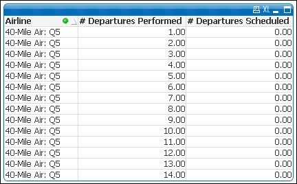
Another thing you may notice in the final result is that some values have a hyphen symbol (–) instead of a value. This happens when the result of the expression is null or missing. We can illustrate this by creating a temporary table box containing the Airline, # Departures Performed, and # Departures Scheduled fields. We will see that, while 40-Mile Air has actually performed flights, none of them were scheduled. This means that the Performed vs Scheduled flights KPI cannot be calculated (division by zero is not possible).
Note that, in a table box, each possible combination of values resulting from the enabled fields will occupy one row. All table records in the data model resulting in the same combination of values are grouped into a single row. In our example, 40 Mile Air could have 10 records with 1.00 Departures Performed and these will all be grouped into a single row in the table box.
If we want an exact count of the number of rows for each combination of dimensions, we need to use a straight table and include the count function as an expression.
A nice feature of straight tables (and pivot tables as well) is that not all expressions need to be numbers. Take a look at the Expressions tab of the Chart Properties window and you'll see a drop-down menu labeled Representation. By default this is set to Text, but there are other interesting options:
- Image: This option works in the same way as the text object we used earlier. For example, we could use this setting to display an upward arrow when a certain indicator is showing positive results, or a downward arrow in case of negative performance.
- Circular Gauge: When using this option, we are able to embed a circular gauge chart, similar to the ones we added to the Dashboard sheet, into the table cells. The in-cell chart will keep most of the functionality that a typical gauge chart offers.
- Linear Gauge: A circular gauge takes up quite a bit of vertical space, making it less suited for use within tables. The linear gauge, which mainly occupies horizontal space, doesn't share this downside and is therefore better suited for use within table cells.
- Traffic Light Gauge: This option shows a traffic light with the corresponding value lit up. Alternatively, this can show a single light with the associated color of the expression's value.
- LED Gauge: This option shows the expression's value using an LED-style display.
- Mini chart: This option displays a trend using a line-based (sparkline, line with dots, and dots) or bar-based (bars and whiskers) mini chart. It requires an additional dimension on which the trend is based, for example, month.
- Link: This option is used to enable hyperlinking in the table cells. In this case a
<url>tag must be used within the expression to separate the cell display text and the actual link. For example:=Company &'<url>'& [Company URL].
These options are useful to add visual cues to the otherwise plain table and help the user spot trends quickly within the table.
The following screenshot shows a table with a linear gauge, a traffic light, and mini chart embedded in the cells. This object is included on the Other representations tab in this chapter's solution file.

Note that when tables are exported to Excel, images such as gauges or mini charts will not be included in the export.
Moving on to our second requirement for the report sheet, we now have to create a table that shows enplaned passengers and departures performed across the Carrier Group, Airline, Year and Month dimensions. This table should show totals for each year, and subtotals for each carrier group.
To create this table we will use a pivot table, which offers more flexibility over a straight table when working with multiple dimensions. Let's follow these steps to create our table:
- Right-click on an empty space in the worksheet and select New Sheet Object | Chart.
- On the General tab, select the Pivot Table option in the Chart Type section (top-right icon) and click on Next.
- On the Dimensions tab, select Carrier Group, Airline, Year, and Month from the Available Fields/Groups list and add them to the Used Dimensions section by clicking the Add> button.
- In the Edit Expression dialog enter the previously defined expression for Enplaned Passengers
$(eEnplanedPassengers), and define the Label field asEnplaned passengers (millions). - Add a second expression to calculate departures performed:
$(eDeparturesPerformed), and define the corresponding Label asDepartures Performed (thousands). - Click on Next twice to go to the Presentation tab.
- Add a drop-down selection box for the Carrier Group, Airline, and Year dimensions by selecting them in the Dimensions and Expressions listbox and checking the Dropdown Select checkbox.
- In the same way, enable the Show Partial Sums checkbox for the Carrier Group and Airline dimensions.
- The Enplaned passengers (millions) and Departures performed (thousands) expressions will have the Alignment label set to Right.
- Mark the Wrap Header Text checkbox and set the Header Height option to
3. - Click on Next three times to go to the Number tab.
- For the Enplaned passengers (millions) expression, set the Number Format Settings option to Fixed to and set it to 3 Decimals.
- For the Departures performed (thousands) expression, set the Number Format Settings option to Fixed to and set it to 2 Decimals.
- Click on Next three times to enter the Caption tab.
- Enable the Auto Minimize checkbox.
- Click on Finish to create the pivot table.
Once the pivot chart is created it will initially have all dimension values collapsed, and only the first one will be visible. Use the plus icons to the side of each dimension cell to expand it to the underlying level of aggregation. When a dimension value is expanded, you can use the minus icon to collapse it.
Because we set the Drop-down Select option on Carrier Group, Airline, and Year, we can open a pop-up listbox by clicking on the downward arrow in the header of these fields. In big pivot tables, this makes searching for particular dimension values a lot easier.
By right-clicking on the column header and selecting Expand all or Collapse all, we are able to expand/collapse all corresponding dimension values at once.
One of the advantages of pivot tables is the ability to not only list dimension values as rows, but display them as columns as well, creating a cross-table:
- Expand any of the Carrier Group values to show the Airline column.
- Now, expand any of the Airline values to show the Year column.
- Click and drag the Year column to place it above the Enplaned passengers (millions) column; this should place all the corresponding values at the top horizontally. It is worth noting that it can sometimes require a bit of patience to get the field placed in the right location.
The resulting pivot table should look like the following screenshot.

In many ways, the pivot table is similar to the straight table. However, you may notice that there are a few differences:
- In a pivot table, expressions can be "rolled up" with subtotals (using the Show Partial Sums setting) for different levels.
- It is possible to drilldown to a deeper level by clicking on the expand icons. This can be overridden, however, by enabling the Always fully expanded checkbox on the Presentation tab, which will make the table to always show all possible dimension values.
- A cross-table can be created by dragging dimensions, like we just did with the Year dimension. We can prevent this from happening by unchecking the Allow Pivoting checkbox on the Presentation tab of the Chart Properties window.
We have now created two chart objects in our Reports sheet, a straight table and a pivot table. These two tables do not necessarily need to be consulted at the same time. Additionally, these objects would both benefit from being sized as large as the screen space allows, so it's a good idea to display them one at a time.
Fortunately, while creating the tables we enabled the Auto Minimize option (located on the Caption tab) for both of these objects. When the Auto Minimize option is set for an object, it is automatically minimized whenever another object is restored. For this to work, the corresponding objects must have the Auto Minimize option enabled.
Let's make sure that both objects can utilize the maximum amount of space by following these steps:
- Minimize both the straight table and pivot table.
- Position and resize the minimized tables in the space between the buttons and the Bookmarks object.
- Now, restore the straight table by double-clicking on its minimized icon.
- Resize the table so that it occupies all the available space in the center of the screen.
- Next, restore the pivot table by double-clicking on its minimized icon. At this point, the straight table should be automatically minimized; if it is not, then check the Auto Minimize checkbox on the Caption tab for both objects.
- Expand the fields in the pivot table and size it so that it uses all available space in the center of the screen.
The resulting Reports sheet should look like the following screenshot:

Our observant readers may have noticed that the menu bar also includes a Reports option. If we did not need it to create these reports, what does it do then?
While the "reports" we created in the Reports sheet show detailed information in tabular form, they are limited to single tables. Another disadvantage is that these reports can only be shared with others that have access to the QlikView document, or by exporting them to Excel, in which case proper formatting will be lost.
Enter the Report Editor. The Report Editor window lets us design static reports that can be used for printed distribution or saved to PDF files. While the Report Editor is far from being a pixel-perfect reporting solution, it can be quite useful to quickly create some static reports.

Let's see how the Report Editor window works by building a small report:
- Go to Reports | Edit Reports in the menu.
- From the Report Editor window, click the Add… button to create a new report.
- Enter
Static Reportas the Name for our new report and click on OK. - Click on the Edit>> button to begin editing the report.
We are now shown a single, empty report page. We can add objects to this page by simply dragging them from our QlikView document. The implication of this is that, to display an object on our report, it must also exist within our document.
Note
In the following example, we will be using objects that we have already created on our Dashboard, Analysis, and Report tabs. In your own environment, you might create a separate, hidden tab where you create and store objects that are exclusively used for static reports. Such objects could be formatted differently as well. For example, where we would want sort and selection indicators on our objects used on a dashboard, we would want to suppress these on the "reporting" object. That way, they are not shown in the static report.
We will now add a few objects to our empty report:
- Drag the Flight Type listbox from the app and into the Report Editor window.
- Go to the Dashboard tab and drag the Market Share pie chart into the Report Editor window.
- Next, go to the Analysis tab and drag the Traffic per Year line chart into the Report Editor window.
- Select Page | Page Settings from the menu bar of the Report Editor window.
- Activate the Banding tab and check the Loop page over possible values in field checkbox.
- Select Flight Type from the drop-down box and click on OK.
- Click on OK to close the Report Editor window.
We have now created a very simple report that loops over all values in the Flight Type field and creates a single page showing the corresponding Flight Type, Market Share, and Number of Flights. A shortcut to the report is placed under the Reports menu.

Other options in the Report Editor window to take note of:
- Single versus multi page: When creating a new page for a report, we can decide if it should be single page, or multi page. The multi page version is useful for printing tables that wrap over multiple pages.
- Report Settings | Header/Footer: It is used to set headers and footers for our report. It has a few default variables that can be shown, such as page number, date, time, filename, report name. An image can be included as well; this can be useful to add a logo on our reports.
- Report Settings | Selections: Instead of basing our report on the current selection in our document, we can also clear all selections or define a bookmark as a starting point. Besides selections, we can use the
Bandingfunction to loop the report over all possible values of a field. By settingBandingat the report level, instead of applying it to a single report page, it is applied to all pages in the entire report.
Although it is technically a "static report", it's also dynamic because the report output, either a printed page or a PDF file, will be generated the moment the user executes the report by selecting it from the Reports menu. This means that all selections the user has in place when creating the report will also be applied to the output, unless otherwise specified via the Report settings.
Now that we have created our Reports sheet and have created a static report, this chapter is almost at its end. The new objects we encountered in this section are the straight table, table box, and pivot table. Besides these objects, we also learned about variables, cyclic and drill-down groups, auto minimizing, and the Report Editor.
Now let's go to the final part of this chapter, in which we will take a short look at some of the objects that have not been covered in detail.