
Exploring Business Intelligence Web Parts
SharePoint provides chart and status indicator web parts that allow you to create and add charts and KPIs (key performance indicators or the status indicators) to a SharePoint site. Using these web parts you can represent data stored in SharePoint lists, external lists, Business Data Services, Excel Services, and so on, graphically and create visually appealing information dashboards.
This section introduces charting and status indicator web parts and explains with examples how you can use these web parts in your SharePoint site to build interesting dashboards.
Working with the Chart Web Part
Chart web part helps you visualize your data on SharePoint sites and portals. You can connect the chart web part to a variety of data sources. Further, the web part supports a number of chart types, which include bar chart, area chart, line chart, point/bubble chart, pie chart, range chart, and so on.
Try It Yourself: Graphically Represent Tasks with the Chart Web Part

Figure 22.2. Pie chart displaying tasks along with days required to complete a task
1. To achieve this, add an integer value calculated column (call it Time Required), to the task list to calculate the number of days required to complete a task. Let the calculation be based on the formula [Due Date]-[Start Date].
2. Populate the task list with some tasks, as shown in Figure 22.3.

Figure 22.3. Random tasks added to a task list
3. Next insert a chart web part on a wiki or a web page. The chart web part is present under the Business Data folder, as shown in Figure 22.4.

Figure 22.4. Inserting a chart web part on a page
4. When not configured, the chart web part initially displays a dummy bar chart image, as shown in Figure 22.5.

Figure 22.5. Chart web part added to a page
5. Click the Data & Appearance link (refer to Figure 22.5) to either customize your chart or connect the chart to data, as shown in Figure 22.6.
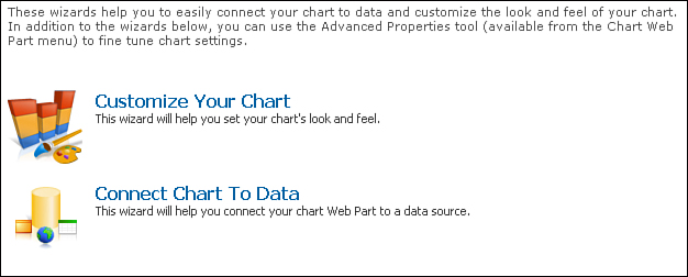
Figure 22.6. Configuring data and appearance of a chart web part
6. Select the Connect Chart To Data option to launch the wizard to connect your chart web part to a data source, which is a SharePoint list in this case.
7. In step 1 of the wizard, select the Connect To a List option, as shown in Figure 22.7 and click the Next button.

Figure 22.7. Choosing a data source
8. In step 2, select the Tasks list, as shown in Figure 22.8 and again click Next.
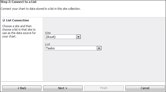
Figure 22.8. Selecting the Tasks list
9. In step 3, you should see the screen shown in Figure 22.9 displaying data retrieved from the selected list. Review the data and click Next.

Figure 22.9. Data retrieved from the Tasks list
10. In step 4, select Time Required as the Y axis field and Title as the X axis, as shown in Figure 22.10.

Figure 22.10. Binding chart to data
11. That’s it. You are done with the initial configuration. Click Finish and your chart should look similar to the one shown in Figure 22.11.

Figure 22.11. Tasks versus Time Required plotted as a bar chart
12. Next you see how to convert this bar chart to a pie chart.
13. Again click the Data & Appearance link, and this time select the Customize Your Chart option (refer to Figure 22.6). Select Pie chart from the next screen as shown in Figure 22.12.

Figure 22.12. Selecting a chart type
14. Click Next and set the chart title as All Tasks, as shown in Figure 22.13.

Figure 22.13. Configuring the chart title
15. Click the Data Labels and Markers tab and enter the #VALX (#VALY Days) value in the Custom Value text box, as shown in Figure 22.14. This causes Task Name and Days Required to appear in the format shown in Figure 22.14.

Figure 22.14. Configuring chart labels
16. That’s it. Click Finish to see the effect of your changes. You should now see the pie chart as shown previously in Figure 22.2.
Working with the Status Indicator Web Part
This section looks at the status indicator web part. As the name suggests, the status indicator web part displays a visual indicator, against a chosen measure, indicating the value is good or bad. For example, suppose that for all the tasks in the tasks list, you want to visually know whether you are on track as far as completion of the tasks is concerned—that is, if the average completion % of all tasks is above 80, you are in good shape. If it’s between 50% and 80% you are still okay, but anything below 50% is real danger. Let’s see how to set up a status indicator to display this information visually, as shown in Figure 22.15.

Figure 22.15. Status indicator web part configured to display task completion status
Try It Yourself: Display Task Completion Status Using the Status Indicator Web Part
1. Create a new Status List called Task Status List, as shown in Figure 22.16.
2. Once the list is created, click the New button and select the option to create a SharePoint list based status indicator, as shown in Figure 22.17, since your list is going to be based on a SharePoint task list.
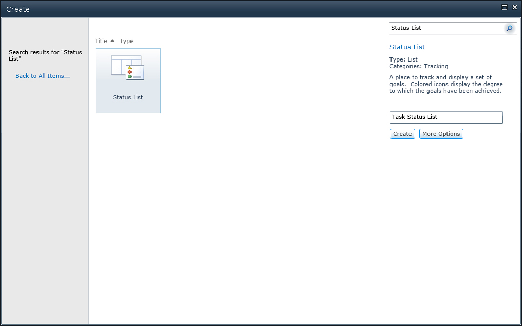
Figure 22.16. Creating a Task Status List

Figure 22.17. Creating a SharePoint task list based status indicator
3. Enter All Tasks Status as the name of the indicator and configure the List URL to point to the Tasks list, as shown in Figure 22.18. Since you are going to do this for all tasks in the list, base your indicator on the All Tasks view.

Figure 22.18. Configuring the status indicator name and list URL
4. Next configure the criteria for the indicator, that is, the value on the basis of which a red, green, or orange indicator would be displayed. Base the criteria on the average of % Complete for all tasks, as shown in Figure 22.19.

Figure 22.19. Configuring the indicator value
5. Finally, complete the configuration by configuring the Status Icon Rules, as shown in Figure 22.20. Anything above 80% is green, between 50% and 80% is orange, and anything else is red.

Figure 22.20. Configuring Status Icon Rules
You can also display the status indication data on a web part or wiki page, by adding the Status List web part to the page and configuring it to display data from the Task Status list, as shown in Figure 22.21.
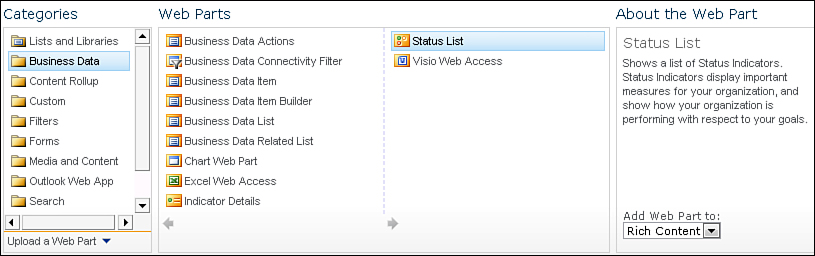
Figure 22.21. The Status List web part can be used to display status data on a page.