A scatterplot is an essential visualization type for understanding the relationship between the two measures. Consider a scatterplot when you find yourself asking questions such as:
- Does how much I spend on marketing really make a difference in sales?
- How much does power consumption go up with each degree of heating/cooling?
- Is there any correlation between hours of study and test performance?
Each of these questions seeks to understand the correlation (if any) between two measures. Scatterplots are great for seeing these relationships and also for locating outliers.
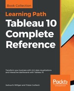
Consider the following scatterplot that looks at the relationship between the measures: the sum of Sales (on the X axis) and the sum of Profit (on the Y-axis):

The dimensions of Department and Category on the Marks card define the view level of detail. Color has been used to make it easy to see the department where the category belongs. Each mark in this preceding view represents the total sales and total profit for a particular Category in a particular Department. The Size of each circle indicates the number of distinct orders for that category/department. The scatterplot points out an issue with Tables. They have high sales but are unprofitable. Telephones, on the other hand, have high sales and high profit.