
Chapter 36. Building Custom Controls
In This Chapter
• Overview of Custom Control Building
• View State and Control State
• Processing Postback Data and Events
• Working with Control Property Collections
• Creating a Better Designer Experience
• Summary
In this chapter, you learn how to extend ASP.NET Framework by building custom controls. You learn how to create controls in exactly the same way that Microsoft developed the standard ASP.NET controls, such as the TextBox and Button controls. Although the standard toolbox of controls available to developers is full of useful controls, you might need something more specific for your application, or you might intend to build controls available throughout your organization or for resale to other developers.
Overview of Custom Control Building
Answer two questions before writing a custom control:
• What type of control do I want to write?
• From what class do I inherit?
The two basic types of controls are fully rendered and composite controls. When you build a fully rendered control, you start from scratch. You specify all the HTML content that the control renders to the browser.
When you create a composite control, on the other hand, you build a new control from existing controls. For example, you can create a composite AddressForm control from existing TextBox and RequiredFieldValidator controls. When you create a composite control, you bundle together existing controls as a new control and potentially add new behaviors and properties.
The second question that you must address is the choice of the base control for your new control. You can inherit a new control from any existing ASP.NET control. For example, if you want to create a better GridView control, you can inherit a new control from the GridView control and add additional properties and methods to your custom GridView control.
Typically, when building a basic control, you inherit your new control from one of the following base classes (or from a control that derives from one of these):
• System.Web.UI.Control
• System.Web.UI.WebControls.WebControl
• System.Web.UI.WebControls.CompositeControl
The CompositeControl class inherits from the WebControl class, which inherits from the Control class. Each of these base classes adds additional functionality.
The base class for all controls in ASP.NET Framework is the System.Web.UI.Control class. Every control, including the TextBox and GridView controls, ultimately derives from this control. This means that all the properties, methods, and events of the System.Web.UI.Control class are shared by all controls in the Framework.
All Web controls inherit from the base System.Web.UI.WebControls.WebControl class. The difference between the Control class and WebControl class is that controls that derive from the WebControl class always have opening and closing tags. Because a WebControl has an opening and closing tag, you also get more formatting options. For example, the WebControl class includes BackColor, Font, and ForeColor properties.
For example, the ASP.NET Literal control inherits from the base Control class, whereas the Label control inherits from the base WebControl class. The Repeater control inherits from the base Control class, whereas the GridView control (ultimately) inherits from the WebControl class.
Finally, the System.Web.UI.WebControls.CompositeControl should be used as the base class for any composite control. The CompositeControl automatically creates a naming container for its child controls. It also includes an overridden Controls property that forces child controls to appear in Design view.
Building Fully Rendered Controls
Let’s start by creating a simple fully rendered control. When you create a fully rendered control, you take on the responsibility of specifying all the HTML content that the control renders to the browser.
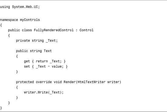
The file in Listing 36.1 contains a fully rendered control that derives from the base Control class.
Listing 36.1. FullyRenderedControl.cs
Note
Add the control in Listing 36.1 to your App_Code folder. Any code added to the App_Code folder is compiled dynamically.
The control in Listing 36.1 inherits from the base Control class, overriding the base class Render() method. The control simply displays whatever value that you assign to its Text property. The value of the Text property is written to the browser with the HtmlTextWriter class’s Write() method.
The file in Listing 36.2 illustrates how you can use the new control in a page.
Listing 36.2. ShowFullyRenderedControl.aspx

Note
In Listing 36.2, the custom control is registered in the page through use of the <%@ Register %> directive. Alternatively, you can register the control for an entire website by registering the control in the <pages> section of the web configuration file.
If you open the page in Listing 36.2 in a browser and select View Source, you can see the HTML rendered by the control. The control simply renders the string "Hello World!".
Rather than inherit from the base Control class, you can create a fully rendered control by inheriting a new control from the base WebControl class. When inheriting from the WebControl class, you override the RenderContents() method instead of the Render() method.
For example, the control in Listing 36.3 contains a simple, fully rendered control that inherits from the WebControl class.
Listing 36.3. FullyRenderedWebControl.cs

The page in Listing 36.4 illustrates how you can use the new control (see Figure 36.1). The BackColor, BorderStyle, and Font properties are set. Because the control in Listing 36.3 derives from the base WebControl class, you get these properties for free.
Figure 36.1. Displaying a fully rendered WebControl.

Listing 36.4. ShowFullyRenderedWebControl.aspx

After opening the page in Listing 36.4, if you select View Source in your browser, you can see the rendered output of the control. It looks like this:
A WebControl, unlike a control, renders an enclosing <span> tag by default.
Understanding the HtmlTextWriter Class
When you create a fully rendered control, you use the HtmlTextWriter class to write the HTML content to the browser. The HtmlTextWriter class was specifically designed to make it easier to render HTML. Here is a partial list of the methods supported by this class:
• AddAttribute()—Adds an HTML attribute to. the tag rendered by calling RenderBeginTag().
• AddStyleAttribute()—Adds a CSS attribute to the tag rendered by a call to RenderBeginTag().
• RenderBeginTag()—Renders an opening HTML tag.
• RenderEndTag()—Renders a closing HTML tag.
• Write()—Renders a string to the browser.
• WriteBreak()—Renders a <br /> tag to the browser.
You can call the AddAttribute() or the AddStyleAttribute() method as many times as you please before calling RenderBeginTag(). When you call RenderBeginTag(), all the attributes are added to the opening HTML tag.
The methods of the HtmlTextWriter class can use the following enumerations:
• HtmlTextWriterTag—Contains a list of the most common HTML tags.
• HtmlTextWriterAttribute—Contains a list of the most common HTML attributes.
• HtmlTextWriterStyle—Contains a list of the most Cascading Style Sheet attributes.
When using the methods of the HtmlTextWriter class, you should strive to use these enumerations to represent HTML tags and attributes. If a particular tag or attribute is missing from one of the enumerations, you can pass a string value instead.
For example, the control in Listing 36.5 renders a table of HTML colors by using an HTML table (see Figure 36.2). The RenderContents() method takes advantage of the methods of the HtmlTextWriter class to render the HTML table.
Figure 36.2. Displaying a table of HTML colors.

Listing 36.5. ColorTable.cs
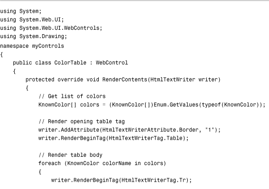

You should notice a number of things about the control in Listing 36.5. First, the AddAttribute() method is called to add the table border attribute. When the RenderBeginTag() method is called, the table border attribute is added to the opening table tag.
Furthermore, you do not specify the tag when calling the RenderEndTag() method. This method automatically closes the last tag opened with the RenderBeginTag() method.
Note
The downloadable code on the website that accompanies this book includes a ShowColorTable.aspx page that you can open in your browser to view the rendered output of the ColorTable control.
The control in Listing 36.6, the DropShadow control, illustrates how you can use the AddStyleAttribute() method of the HtmlTextWriter class to add Cascading Style Sheet (CSS) attributes to an HTML tag.
Listing 36.6. DropShadow.cs

The control in Listing 36.6 renders a drop shadow behind whatever text you assign to the control’s Text property (see Figure 36.3). The drop shadow is created with the help of an Internet Explorer DropShadow filter.
Figure 36.3. Displaying a drop shadow with the DropShadow control.

The Filter attribute is added to the <div> tag with a call to the AddStyleAttribute() method. The AddStyleAttribute() method works just like the AddAttribute() method, except that the AddStyleAttribute() method adds a CSS attribute instead of an HTML attribute.
Web Standards Note
Filters are an Internet Explorer extension to the CSS standard. They don’t work with Firefox or Opera. Firefox has its own extensions to CSS with its -moz style rules.
Specifying the Containing WebControl Tag
By default, a WebControl renders an HTML <span> tag around its contents. You can specify a different tag by overriding the WebControl’s TagKey property. For example, the control in Listing 36.7 renders its contents within an HTML <div> tag.
Listing 36.7. Glow.cs


The control in Listing 36.7 displays a glowing effect around any text that you assign to its Text property. The control takes advantage of the Internet Explorer Glow filter to create the glow effect (see Figure 36.4). In a real production application, you would want to either provide an alternate rendering for other browsers, or stick to more CSS-compliant rendering.
Figure 36.4. Displaying glowing text with the Glow control.

The control overrides the base WebControl’s TagKey property. Because the overridden property returns a <div> tag, the WebControl renders a <div> tag.
Note
You can use several methods to modify the tag rendered by a WebControl. You can override the TagName property instead of the TagKey property. The TagName property enables you to specify an arbitrary string for the tag. (It doesn’t limit you to the HtmlTextWriterTag enumeration.) You also can specify the tag rendered by a WebControl in the WebControl’s constructor. Finally, you can override a WebControl’s RenderBeginTag() and RenderEndTag() methods and completely customize the opening and closing tags.
Furthermore, the control in Listing 36.7 overrides the AddAttributesToRender() method. If you override this method, you can add HTML or CSS attributes to the opening HTML tag rendered by the control. When overriding this method, be careful to call the base AddAttributesToRender() method or the standard control attributes, such as the control ID, won’t be rendered.
Building Composite Controls
If you don’t want to start from scratch when building a custom control, you can build a composite control. When you create a composite control, you create a new control from existing controls.
Every ASP.NET control has a Controls property that represents all its child controls. If you add child controls to a control, the child controls are automatically rendered when the parent control is rendered.
When you create a composite control, you typically override a control’s CreateChildControls() method. This method is called when a control builds its collection of child controls.
For example, the control in Listing 36.8 combines a TextBox control and RequiredFieldValidator control.
Listing 36.8. RequiredTextBox.cs


The control in Listing 36.8 inherits from the base CompositeControl class. Furthermore, rather than override the base control’s RenderContents() method, the control overrides the base control’s CreateChildControls() method.
You should notice one other special thing in Listing 36.8. The EnsureChildControls() method is called in both the Get and Set methods of the Text property. The EnsureChildControls() method forces the CreateChildControls() method to be called; however, it prevents the CreateChildControls() method from being called more than once.
The Text property gets or sets a property of a child control (the TextBox control). If you attempt to use the Text property before the CreateChildControls() method is called, you receive a null reference exception. The child controls must be created before you can access any of the child control properties.
The page in Listing 36.9 illustrates how you can use the RequiredTextBox control in a page.
Listing 36.9. ShowRequiredTextBox.aspx


The page in Listing 36.9 has tracing enabled. If you look at the control tree for the page, you see that the RequiredTextBox control includes both a TextBox and RequiredFieldValidator control as child controls.
Building Hybrid Controls
In practice, you rarely build pure composite controls. In most cases in which you override a control’s CreateChildControls() method, you also override the control’s RenderContents() method to specify the layout of the child controls.
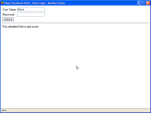
For example, the control in Listing 36.10 represents a Login control. In the control’s CreateChildControls() method, two TextBox controls are added to the control’s collection of child controls.
Listing 36.10. Login.cs


In Listing 36.10, the RenderContents() method is overridden to layout the two TextBox controls. The TextBox controls are rendered within an HTML table (see Figure 36.5). Each TextBox is rendered by calling the RenderControl() method.
Figure 36.5. Performing layout with an HTML table.
The default RenderContents() method simply calls the RenderControl() method for each child control. If you override the RenderContents() method, you have more control over the layout of the control.
The Login control in Listing 36.10 uses an HTML table for layout. From a web standards perspective, using HTML tables for layout is frowned upon. The modified Login control in Listing 36.11 uses <div> tags instead of a <table> tag for layout.
Listing 36.11. LoginStandards.cs


The control in Listing 36.11 works quite nicely in all recent browsers (Internet Explorer 6, Firefox, Opera 8) without requiring an HTML table for layout (see Figure 36.6).
Figure 36.6. Performing CSS layout.

View State and Control State
The standard ASP.NET controls retain the values of their properties across postbacks. For example, if you change the text displayed by a Label control, the Label control continues to display the new text even if you repeatedly post the page containing the Label control back to the server.
The ASP.NET Framework takes advantage of a hidden form field named __VIEWSTATE to preserve the state of control properties across postbacks. If you want your controls to preserve the values of their properties, you need to add the values of your control properties to this hidden form field using the appropriate APIs—never access this hidden form field directly.
The ASP.NET Framework supports two methods of preserving values across postbacks. You can take advantage of either View State or Control State.
Supporting View State
You can use the ViewState property of the Control or Page class to add values to View State. The ViewState property exposes a dictionary of key and value pairs. For example, the following statement adds the string Hello World! to View State:
ViewState["message"] = "Hello World!"
Technically, you can add an instance of any serializable class to View State. In practice, however, you should add only simple values to View State, such as Strings, DateTimes, and Integers. Remember that anything that you add to View State must be added to the hidden __VIEWSTATE form field. If this field gets too big, it can have a significant impact on your page’s performance.
The control in Listing 36.12 has two properties: Text and ViewStateText. The first property does not use View State, and the second property does use View State. The value of the ViewStateText property is preserved across postbacks automatically.
Listing 36.12. ViewStateControl.cs


The ViewStateText property uses the Control’s ViewState collection to preserve whatever value is assigned to the ViewStateText property across postbacks. When you add a value to the ViewState collection, the value is stuffed into the hidden __VIEWSTATE form field automatically.
Warning
View State is loaded after the Page InitComplete event, and View State is saved after the Page PreRenderComplete event. This means that you should not attempt to retrieve a value from View State before or during the InitComplete event. You also should not attempt to add a value to View State after the PreRenderComplete event.
The page in Listing 36.13 includes ViewStateControl. The text Hello World! is assigned to both control properties in the Page_Load() handler. However, if you post the page back to itself by clicking the button, only the value of the ViewStateText property is preserved across postbacks.
Listing 36.13. ShowViewState.aspx

Supporting Control State
The ASP.NET Framework includes a feature named Control State, which is similar to View State. Just like View State, any values that you add to Control State are preserved in the hidden __VIEWSTATE form field. However, unlike View State, Control State cannot be disabled. Control State is intended to be used only for storing crucial information across postbacks.
Control State was introduced to address a problem that developers encountered in the first version of ASP.NET Framework. You can disable View State for any control by assigning the value False to a control’s EnableViewState property. Often, this is a good idea for performance reasons; however, disabling View State also made several controls nonfunctional.
For example, by default a GridView control retains the values of all the records that it displays in View State. If you display 500 database records with a GridView control, by default all 500 records are stuffed into the hidden __VIEWSTATE form field. To improve performance, you might want to disable View State for the GridView.
However, a GridView uses the __VIEWSTATE form field to remember crucial information required for the proper functioning of the control, such as the current page number and the currently selected row. You don’t want the GridView to forget this critical information even when View State is disabled.
The concept of Control State was introduced to enable you to save critical information in the hidden __VIEWSTATE form field even when View State is disabled. Microsoft makes it slightly more difficult to use Control State because they don’t want you to overuse this feature. You should use it only when storing super critical information.
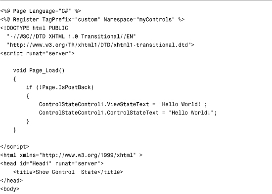
For example, the control in Listing 36.14 includes two properties named ViewStateText and ControlStateText. View State preserves the value of the first property, and Control State preserves the value of the second property.
Listing 36.14. ControlStateControl.cs


The control in Listing 36.14 overrides the base Control class’s OnInit(), SaveControlState(), and LoadControlState() methods. In the OnInit() method, the RegisterRequiresControlState() method is called to indicate that the control needs to take advantage of Control State.
The SaveControlState() and LoadControlState() methods are responsible for saving and loading the Control State. Control State is saved as an object. The object is serialized by ASP.NET Framework into the hidden __VIEWSTATE form field automatically.
The page in Listing 36.15 illustrates the difference between View State and Control State. In the Page_Load() handler, the value Hello World! is assigned to both properties of the ControlStateControl. The control has View State disabled; however, if you click the button and post the page back to itself, the value of the ControlStateText property is not lost.
Listing 36.15. ShowControlState.aspx

Processing Postback Data and Events
The ASP.NET Framework is built around web forms and controls pass information from the browser to the server by submitting a form to the server. This process of posting a form back to the server is called a postback.
When an ASP.NET page processes a form that has been posted back to the server, two types of information can be passed to the controls in the page. First, if a control initiates a postback, a server-side event can be raised when the form is posted to the server. For example, if you click a Button control, a Click event is raised on the server when the form containing the Button is posted back to the server. This event is called a postback event.
Second, the form data contained in the web form can be passed to a control. For example, when you submit a form that contains a TextBox control, the form data is passed to the TextBox control when the web form is submitted to the server. This form data is called the postback data.
When building a custom control, you might need to process either postback data or a postback event. In this section, you learn how to implement the required control interfaces for processing postbacks.
Handling Postback Data
If your control needs to process form data submitted to the server, you need to implement the IPostbackDataHandler interface. This interface includes the following two methods:
• LoadPostData()—Receives the form fields posted from the browser.
• RaisePostDataChangedEvent()—Enables you to raise an event indicating that the value of a form field has been changed.
For example, the control in Listing 36.16 is a simple TextBox control that implements the IPostbackDataHandler interface to preserve the state of an input field across postbacks.
Listing 36.16. CustomTextBox.cs


The LoadPostData() receives the form fields posted from the browser. The method in Listing 36.16 is passed a collection of all the form fields posted to the server. The postDataKey represents the name of the field that corresponds to the current control.
Note
If the name of a form field rendered by a control does not match the name of the control, you need to notify the page containing the control to pass the form data to the control. You can call the Page.RegisterRequiresPostBack() method inside (or before) the control’s PreRender() event to notify the page that the control is interested in receiving the postback data. In other words, if you discover that your control’s LoadPostData() method is never called, call the Page.RegisterRequiresPostBack() method in your control.
If the value of the form field has changed—in other words, it does not match the current value of the control’s Text property—the Text property is updated and the method returns the value True. Otherwise, the method returns the value False.
When the LoadPostData() method returns True, the RaisePostDataChangedEvent() method is executed. Typically, you implement this method to raise a change event. In Listing 36.16, this method is used to raise the TextChanged event, indicating that the contents of the TextBox have been changed.
The page in Listing 36.17 illustrates how you can use the custom TextBox control in a page (see Figure 36.7).
Figure 36.7. Handling postback data.

Listing 36.17. ShowCustomTextBox.aspx


The custom TextBox control works in a similar manner as the standard ASP.NET TextBox control. The control preserves its state across postbacks and raises a TextChanged event when its contents have been modified.
Note
You will discover that you need to implement the IPostbackDataHandler interface quite often when building custom JavaScript controls. A common method of passing data from a JavaScript control back to the server is to use a hidden form field. You can process the contents of the hidden form field by using the IPostBackDataHandler interface.
Handling Postback Events
Only one control in a page at a time can cause a form to be submitted back to the server. When a control initiates a postback, the control can raise a postback event.
To process a postback event, you need to implement the IPostBackEventHandler interface. This interface includes a single method:
• RaisePostBackEvent()—Called on the server when a control initiates a postback.
The control in Listing 36.18 illustrates how you can implement the IPostBackEventHandler interface.
Listing 36.18. CustomLinkButton.cs
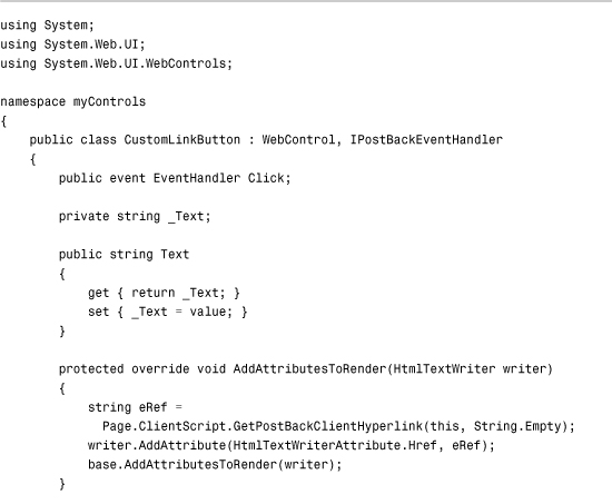

The control in Listing 36.18 is a simple custom LinkButton control. It works much like the standard ASP.NET LinkButton control. When you click the link rendered by the control on the browser, the form containing the control is posted back to the server, and the RaisePostBackEvent() method is called. In Listing 36.18, the RaisePostBackEvent() method simply raises the Click event.
The Page.ClientScript.GetPostBackClientHyperlink() method is called in the control’s AddAttributesToRender() method. The GetPostBackClientHyperLink() method returns the JavaScript that initiates the form postback in the browser. When this method is called in Listing 36.18, it returns the following JavaScript:
javascript:__doPostBack('CustomLinkButton1','')
The __doPostBack() JavaScript method calls the client-side form submit() method, which causes the form to be submitted back to the web server. (You can see all this by selecting View Source in your web browser.)
Note
There is a closely related method to the GetPostBackClientHyperLink() method named the GetPostBackEventReference() method. The GetPostBackClientHyperLink() method includes the "JavaScript:" prefix, whereas the GetPostBackEventReference() does not.
The page in Listing 36.19 demonstrates how you can use the custom LinkButton in an ASP.NET page.
Listing 36.19. ShowCustomLinkButton.aspx


The page in Listing 36.19 contains a TextBox control and the custom LinkButton control. When you click the LinkButton, the form is posted back to the server. The Click handler displays the value of the TextBox control’s Text property in a Label control (see Figure 36.8).
Figure 36.8. Using the CustomLinkButton control.

Passing Postback Event Arguments
When you call the GetPostBackClientHyperLink() method, you can supply the method with an optional argument. The argument is passed from the browser to the server when a postback is initiated. The value of the argument is passed to the RaisePostBackEvent() method on the server.
Imagine, for example, that you want to create a custom pager control that you could use with the GridView control. You want the custom control to display a list of page numbers you can click to navigate to a particular page of records displayed by a GridView.
To create this control, you need to render multiple links that initiate a postback event. Each link needs to pass the correct page number.
Listing 36.20 contains the custom pager control.
Listing 36.20. Pager.cs

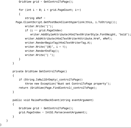
In Listing 36.20, the RenderContents() method renders the page numbers. Each page number is rendered as a link. When you click a link, the associated GridView control changes the page that it displays (see Figure 36.9).
Figure 36.9. Using the Pager control.

The href attribute for each link is created by calling the GetPostBackClientHyperLink() method. The page number is passed as an argument to this method. When the pager is rendered to the browser, the following series of links is rendered:
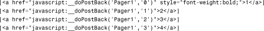
When you click a page number link, the corresponding page number is posted back to the server. The RaisePostBackEvent() method receives the page number and changes the page displayed by its associated GridView.
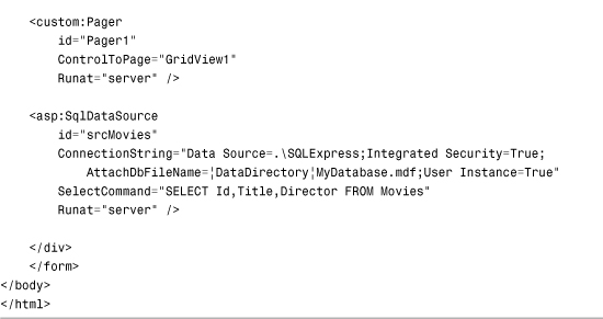
The page in Listing 36.21 illustrates how you can use the pager control to navigate to different pages of records displayed by a GridView control.
Listing 36.21. ShowPager.aspx

Using Postback Options
Postbacks are more complicated than you might think. A postback can involve cross-page posts, validation groups, and programmatic control of control focus. To implement these advanced features in a custom control, you need to specify advanced postback options.
You specify advanced postback options by taking advantage of the PostBackOptions class. This class has the following properties:
• ActionUrl—Enables you to specify the page where form data is posted.
• Argument—Enables you to specify a postback argument.
• AutoPostBack—Enables you to add JavaScript necessary for implementing an AutoPostBack event.
• ClientSubmit—Enables you to initiate the postback through client-side script.
• PerformValidation—Enables you to specify whether validation is performed (set by the CausesValidation property).
• RequiresJavaScriptProtocol—Enables you to generate the JavaScript: prefix.
• TargetControl—Enables you to specify the control responsible for initiating the postback.
• TrackFocus—Enables you to scroll the page back to its current position and return focus to the control after a postback.
• ValidationGroup—Enables you to specify the validation group associated with the control.
Imagine that you need to create a form that enables users to place a product order. However, imagine that you want to create an advanced options check box. When someone clicks the advanced options check box, the current form data is submitted to a new page that includes a more complex form.
The AdvancedCheckBox control in Listing 36.22 supports cross-page posts. When you click the check box, the form data is submitted to the page indicated by its PostBackUrl property.
Note
Cross-page posts are covered during the discussion of Button controls in Chapter 2, “Using the Standard Controls.”
Listing 36.22. AdvancedCheckBox.cs


In the AddAttributesToRender() method in Listing 36.22, an instance of the PostBackOptions class is created. The ActionUrl property is modified to support cross-page posts. The instance of the PostBackOptions class is passed to the GetPostBackEventReference() method to generate the JavaScript for initiating the postback.
The page in Listing 36.23 illustrates how you can use the AdvancedCheckBox control to submit form data to a new page when you click the check box (see Figure 36.10). The AdvancedCheckBox control’s PostBackUrl property is set to the value ShowAdvancedOptions.aspx. When you click the check box, the form data is posted to this page.
Figure 36.10. Using the AdvancedCheckBox control.

Listing 36.23. ShowAdvancedCheckBox.aspx


Working with Control Property Collections
When you build more complex controls, you often need to represent a collection of items. For example, the standard ASP.NET DropDownList control contains one or more ListItem controls that represent individual options in the DropDownList. The GridView control can contain one or more DataBoundField controls that represent particular columns to display.
In this section, we build several controls that represent a collection of items. We build multiple content rotator controls that randomly display HTML content, and a server-side tab control that renders a tabbed view of content.
Using the ParseChildren Attribute
When building a control that contains a collection of child controls, you need to be aware of a ParseChildren attribute, which determines how the content contained in a control is parsed.
When the ParseChildren attribute has the value True, content contained in the control is parsed as properties of the containing control. If the control contains child controls, the child controls are parsed as properties of the containing control. (The attribute should have been named the ParseChildrenAsProperties attribute.)
When the ParseChildren attribute has the value False, no attempt is made to parse a control’s child controls as properties. The content contained in the control is left alone.
The default value of the ParseChildren attribute is False. However, the WebControl class overrides this default value and sets the ParseChildren attribute to the value to True. Therefore, you should assume that ParseChildren is False when used with a control that inherits directly from the System.Web.UI.Control class, but assume that ParseChildren is True when used with a control that inherits from the System.Web.UI.WebControls.WebControl class.
Imagine, for example, that you need to create a content rotator control that randomly displays content in a page. There are two ways of creating this control, depending on whether ParseChildren has the value True or False.
The control in Listing 36.24 illustrates how you can create a content rotator control when ParseChildren has the value False.
Listing 36.24. ContentRotator.cs

The file in Listing 36.24 actually contains two controls: ContentRotator and a Content. The ContentRotator control randomly selects a single Content control from its child controls and renders the Content control to the browser. This all happens in the control’s RenderContents() method.
The ParseChildren attribute has the value False in Listing 36.24. If you neglected to add this attribute, the Content controls would be parsed as properties of the ContentRotator control, and you would get an exception.
The page in Listing 36.25 illustrates how you can use the ContentRotator and Content controls (see Figure 36.11).
Figure 36.11. Randomly displaying content with the ContentRotator control.

Listing 36.25. ShowContentRotator.aspx


If ParseChildren is not set to the value False, you need to add a property to your control that corresponds to the child controls contained in the control. For example, the control in Listing 36.26 includes an Items property that represents the Item controls contained in the control.
Listing 36.26. ItemRotator.cs

In Listing 36.26, the second value passed to the ParseChildren attribute is the name of a control property. The contents of the ItemRotator are parsed as items of the collection represented by the specified property.
Unlike the ContentRotator control, the controls contained in the ItemRotator control are not automatically parsed into child controls. After the CreateChildControls() method executes, the ItemRotator control contains only one child control (the randomly selected Item control).
The page in Listing 36.27 illustrates how you can use the ItemRotator control to randomly display page content.
Listing 36.27. ShowItemRotator.aspx

There is no requirement that the contents of a control must be parsed as controls. When building a control that represents a collection of items, you can also represent the items as objects. For example, the ImageRotator control in Listing 36.28 contains ImageItem objects. The ImageItem class does not represent a control.
Listing 36.28. ImageRotator.cs


The ImageItem class is just a class and does not derive from the base Control class. Because the ImageItem class does nothing more than represent a couple of properties, there is no reason to make it a full-blown control.
The page in Listing 36.29 illustrates how you can use the ImageRotator control to display different images randomly.
Listing 36.29. ShowImageRotator.aspx

The page in Listing 36.29 has tracing enabled. If you look in the Control Tree section, you see that the ImageRotator control does not contain any child controls (see Figure 36.12).
Figure 36.12. The ShowImageRotator.aspx page control tree.

Using the AddParsedSubObject() Method
When the ParseChildren attribute has the value false, the contents of a control are automatically added to the control’s collection of child controls (represented by the Controls property). You need understand that all content contained in the control, even carriage returns and spaces, are added to the controls collection.
Any content contained in a control that does not represent a server-side control is parsed into a Literal control. In some cases, you might want to allow only a certain type of control to be added to the Controls collection.
The AddParsedSubObject() method is called as each control is added to the Controls collection. By overriding the AddParsedSubObject() method, you can block certain types of controls—such as Literal controls—from being added to the Controls collection.
For example, the ContentRotator control in Listing 36.20 overrides the base AddParsedSubObject() method and prevents anything that is not a Content control from being added to the ContentRotator Controls collection. If you removed the AddParsedSubObject() method from this control, all the carriage returns and spaces between the Content controls would be added to the Controls collection as Literal controls.
Using a ControlBuilder
The AddParsedSubObject() method enables you to specify which parsed controls get added to a Controls collection. Sometimes, you must take even more control over the parsing of a control.
When the ASP.NET Framework parses a page, the Framework uses a special type of class called a ControlBuilder class. You can modify the way in which the content of a control is parsed by associating a custom ControlBuilder with a control.
Here’s a list of the most useful methods supported by the ControlBuilder class:
• AllowWhiteSpaceLiterals()—Enables you to trim white space from the contents of a control.
• AppendLiteralString()—Enables you trim all literal content from the contents of a control.
• GetChildControlType()—Enables you to specify how a particular tag gets parsed into a control.
The GetChildControlType() method is the most useful method and enables you to map tags to controls. You can use the GetChildControlType() method to map any tag to any control.
For example, the file in Listing 36.30 contains a ServerTabs control that renders multiple tabs (see Figure 36.13). Each tab is represented by a Tab control.
Figure 36.13. Using the ServerTabs control.

Listing 36.30. ServerTabs.cs


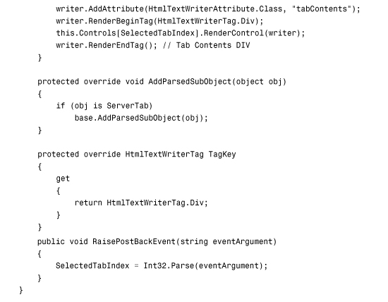

The ServerTabs class is decorated with a ControlBuilder attribute. This attribute associates the ServerTabs control with a ControlBuilder class named ServerTabsBuilder.
The ServerTabsBuilder class overrides the base ControlBuilder GetChildControlType() method. The overridden method maps the <tab> tag to the Tab control. Because of this mapping, you do not need to use a prefix or use the runat="server" attribute when declaring a tab within the ServerTabs control.
The page in Listing 36.31 illustrates how you can use the ServerTabs control.
Listing 36.31. ShowServerTabs.aspx


The ControlBuilder enables you to declare instances of the Tab control by using the <tab> tag instead of using a <custom:Tab runat="server"> tab.
Creating a Better Designer Experience
Up to this point, we’ve ignored the Design view experience. In other words, we’ve ignored the question of how our custom controls appear in the Visual Web Developer or Visual Studio .NET Design view.
You can modify the appearance of your control in Design view in two ways. You can apply design-time attributes to the control, or you can associate a ControlDesigner with your control. We explore both methods in this section.
Applying Design-Time Attributes to a Control
Design-time attributes enable you to modify how control properties appear in Design view. Some attributes are applied to the control itself, whereas other attributes are applied to particular properties of a control.
Here is the list of the design-time attributes you can apply to a control:
• DefaultEvent—Enables you to specify the default event for a control. When you double-click a control in Visual Web Developer or Visual Studio .NET, an event handler is automatically created for the default event.
• DefaultProperty—Enables you to specify the default property for a control. When you open the Property window for a control, this property is highlighted by default.
• PersistChildren—Enables you to specify whether child controls or properties are persisted as control attributes or control contents.
• ToolboxData—Enables you to specify the tag added to a page when a control is dragged from the toolbox.
• ToolboxItem—Enables you to block a control from appearing in the Toolbox.
Here is the list of design-time attributes you can apply to a control property:
• Bindable—Enables you to indicate to display a Databindings dialog box for the property.
• Browsable—Enables you to block a property from appearing in the Properties window.
• Category—Enables you to specify the category associated with the property. The property appears under this category in the Properties window.
• DefaultValue—Enables you to specify a default value for the property. When you right-click a property in the Properties window, you can select Reset to the return the property to its default value.
• Description—Enables you to specify the description associated with the property. The description appears in the Properties window when the property is selected.
• DesignerSerializationVisibility—Enables you to specify how changes to a property are serialized. Possible values are Visible, Hidden, and Content.
• Editor—Enables you to specify a custom editor for editing the property in Design view.
• EditorBrowsable—Enables you to block a property from appearing in Intellisense.
• NotifyParentProperty—Enables you to specify that changes to a subproperty should be propagated to the parent property.
• PersistenceMode—Enables you to specify whether a property is persisted as a control attribute or control content. Possible values are Attribute, EncodedInnerDefaultProperty, InnerDefaultProperty, and InnerProperty.
• TypeConverter—Enables you to associate a custom type converter with a property. A type converter converts a property between a string representation and a type (or vice versa).
The Editor attribute enables you to associate a particular editor with a property. Certain types in the Framework have default editors. For example, a property that represents a System.Drawing.Color value is automatically associated with the ColorEditor. The ColorEditor displays a color picker (see Figure 36.14). To view the list of editors included in .NET Framework, look up the UITypeEditor class in the .NET Framework SDK Documentation.
Figure 36.14. Using the ColorEditor to pick a color.

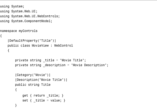
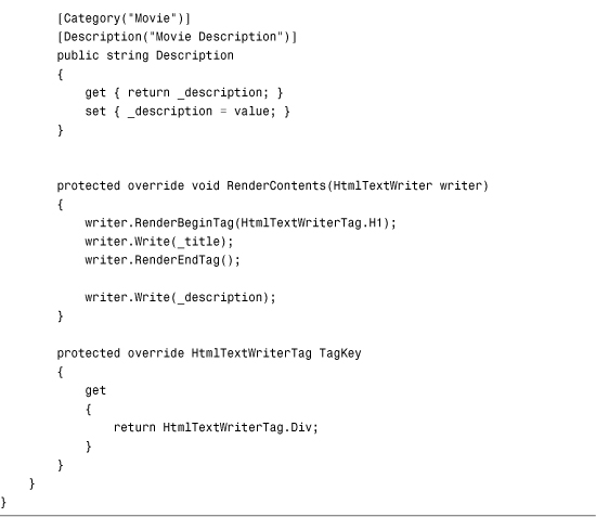
The MovieView control contained in Listing 36.32 illustrates how you can use several of these attributes. The control displays a single movie.
Listing 36.32. MovieView.cs
The page in Listing 36.33 contains the MovieView control. Open the page in Design view to see the effect of the various design-time attributes. For example, a category and description are associated with both the Title and Description properties in the Properties window (see Figure 36.15).
Figure 36.15. The MovieView control in Design view.

Listing 36.33. ShowMovieView.aspx

Creating Control Designers
You can modify the appearance of your custom controls in Design view by creating a ControlDesigner. The ASP.NET Framework enables you to implement a number of fancy features when you implement a ControlDesigner. This section focuses on just two of these advanced features.
First, you learn how to create a ContainerControlDesigner. A ContainerControlDesigner enables you to drag and drop other controls from the Toolbox onto your control in Design view.
You also learn how to add Smart Tags (also called Action Lists) to your control. When a control supports Smart Tags, a menu of common tasks pop up above the control in Design view.
Creating a Container ControlDesigner
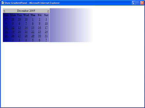
If you associate a custom control with a ContainerControlDesigner, you can add child controls to your control in Design view. For example, the file in Listing 36.34 contains a GradientPanel control. This control displays a gradient background behind its contents (see Figure 36.16).
Figure 36.16. Displaying the GradientPanel control.
Listing 36.34. GradientPanel.cs


The GradientPanel control uses an Internet Explorer filter to create the gradient background. The filter is applied in the AddAttributesToRender() method. You can set the StartColor, EndColor, and Direction properties to control the appearance of the gradient background.
The GradientPanel control is decorated with a ControlDesigner attribute. This attribute associates the GradientPanelDesigner class with the GradientPanel control.
The GradientPanelDesigner is also included in Listing 36.34. One method is overridden in the GradientPanelDesigner class. The AddDesignTimeCssAttributes() method is used to apply the gradient background in Design view.
Warning
The file in Listing 36.34 doesn’t compile unless you add a reference to the System.Design.dll assembly to your application. You can add the necessary reference by selecting Website, Add Reference and selecting the System.Design assembly.
The page in Listing 36.35 illustrates how you can declare the GradientPanel in a page. However, to understand the effect of the ContainerControlDesigner, you need to open the page in Design view in either Visual Web Developer or Visual Studio .NET.
Listing 36.35. ShowGradientPanel.aspx

When you open the page in Listing 36.35 in Design view, you can drag other controls from the toolbox onto the GradientPanel control. For example, if you drag a Calendar control onto the GradientPanel control, the Calendar control is added automatically to the control collection of the GradientPanel (see Figure 36.17).
Figure 36.17. Editing the GradientPanel control in Design view.

Adding Smart Tasks
If you add a GridView control to a page when you are in Design view, a menu of common tasks appears above the GridView. For example, you can select a Smart Task to enable sorting or paging.
You can add your own Smart Tasks to a custom control by inheriting a new class from the base DesignerActionList class.
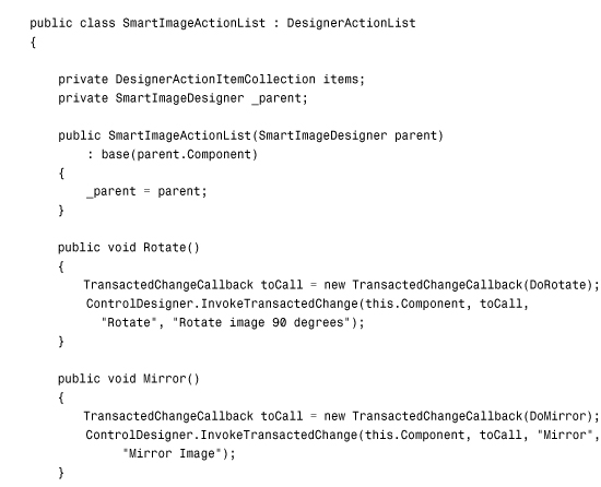
For example, the file in Listing 36.36 contains three classes. It contains a custom control, named the SmartImage control, which enables you to rotate and mirror images. It also contains a ControlDesigner. Finally, it contains a DesignerActionList class that contains two Smart Tasks.
Listing 36.36. SmartImage.cs


The SmartImage control takes advantage of an Internet Explorer filter named the BasicImage filter. This filter enables you to manipulate images by rotating, mirroring, and changing the opacity of images. In Listing 36.36, the filter is applied in the AddAttributesToRender() method.
The SmartImage control is associated with a ControlDesigner named the SmartImageDesigner through the control’s Designer attribute. The SmartImageDesigner class overrides the base class’s ActionLists property to expose a custom DesignerActionList.
The DesignerActionList is the final class declared in Listing 36.36. This class contains four methods named Rotate(), DoRotate(), Mirror(), and DoMirror(). The GetSortedActionItems() method exposes the Rotate and Mirror actions.
When all is said and done, the custom ActionList enables you to display Rotate and Mirror Smart Tags for the SmartImage control in Design view. When you open a page in the browser after clicking the Rotate action in Design view, the image is rotated (see Figure 36.18).
Figure 36.18. Adding Smart Tags to a control.

Note
You can view the SmartImage control by opening the ShowSmartImage.aspx page included in the downloadable code on the website that accompanies this book.
Summary
In this chapter, you learned how to build basic controls in ASP.NET Framework. First, you learned how to create both fully rendered and composite controls. You also learned how to combine the features of fully rendered and composite controls by creating hybrid controls.
You learned how to preserve the values of control properties in View State. You learned the difference between View State and Control State and how to use both features of the framework.
Next, you learned how to handle postback data and events. You saw how you can process form data submitted to the server. You also learned how you can raise a server-side event that is initiated by a postback.
This chapter examined the topic of building controls that represent a collection of items. You learned how to use the ParseChildren attribute to parse the inner content of a control in different ways. You also learned how to alter the parsing of a control’s content by overriding the AddParsedSubObject() method and by creating custom ControlBuilders.
Finally, you saw two methods of modifying the appearance of a control in Design view. You learned how to apply design-time attributes to a control and its properties. You also learned how to associate a ControlDesigner with a custom control.